News
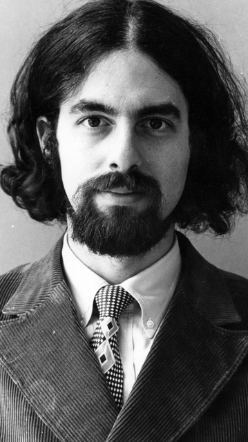
This Just In: Aaron Marcus
Letterform Archive gratefully acknowledges Aaron Marcus’s recent donation of an archive of his work.
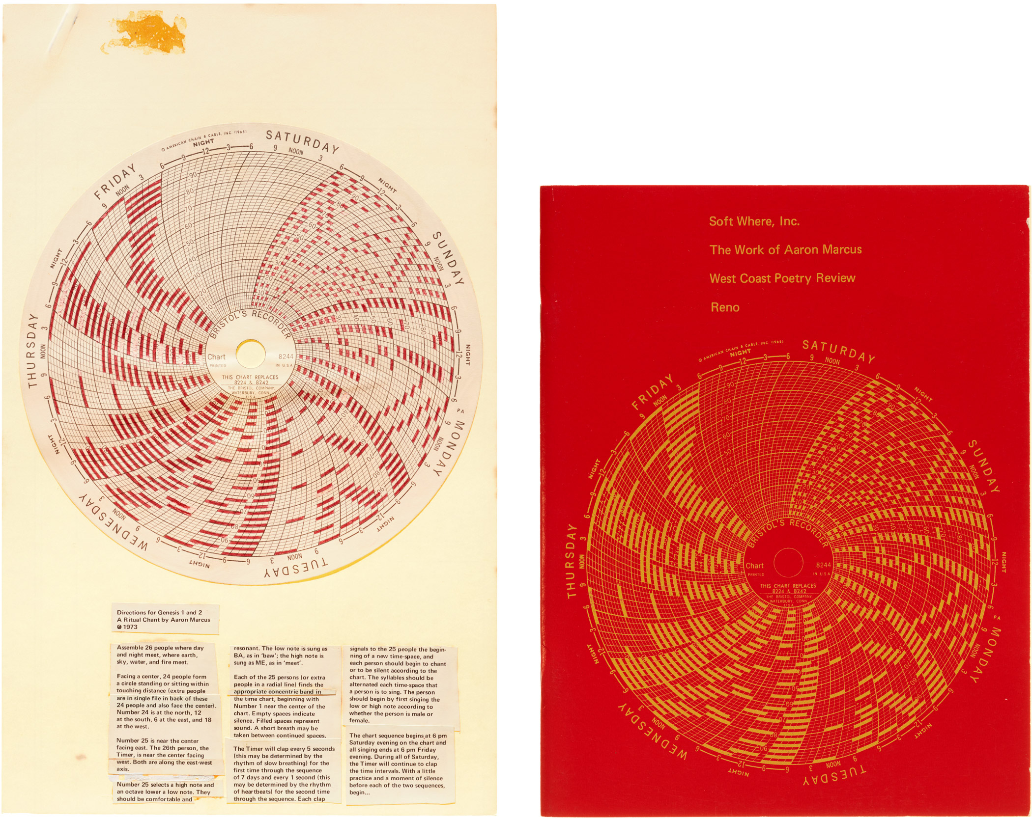
Aaron Marcus, Soft Where, Inc., Vol. 1, 1975
The newly acquired collection encompasses a broad swath of Marcus’s works and interests, ranging from art and design to physics and computer science. Through his experimental design works and creative explorations, Marcus challenges both our notion of what letters are and how they are constructed. His explorations — through both hand work and computer code — prefigure a computer-assisted approach to creative expression that is widely utilized by artists and designers today.
Serendipity, curiosity, or faith: Aaron Marcus’s efforts blaze a path with effects that will continue to reverberate. Our interview with Marcus is below.
Tell us about your transition from physics to design.
My transition from studying physics to studying graphic design was memorable. All my life in school, I had been good in science [and] math and also art.
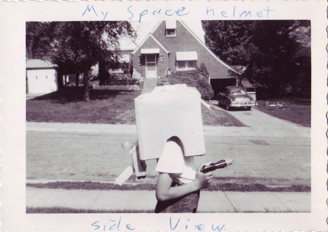
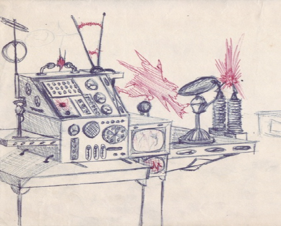
I loved memorizing the value of the mathematical constant pi to 50 decimal places when I was 8-10, loved to read and collect science fiction comics and pocket books, subscribed to Scientific American beginning when I was about 8, designed my own space helmet (shown here being modeled by my late brother Stephen), and designed my own rocket ship control room and dashboard in my basement when I was 10-15. I also loved to draw: cartoon characters, rocket ships, ray guns, robots, and scenes on other planets. I was very interested in publishing, producing my own little neighborhood newsletter on a tiny press with rubber type, becoming editor of my letterpress-printed high-school paper, art editor of my university humor magazine, and pursuing my own self-education in calligraphy, photography, graphic arts printing, painting, and drawing.
After being graduated from the Physics Department, Princeton University, I took a leap of faith, and found myself in the graduate courses of the Graphic Design Department, Yale University School of Art and Architecture. For half the first academic year, I had little understanding of what people meant by their comments. “That works!”, they said. “What works?”, I wondered. I was taking a “baby graphics year” learning in one year what undergraduate graphic design students learned in four, eventually to receive two degrees simultaneously, a BFA and an MFA in 1968. Gradually the words acquired meaning, and I felt like I was in an “experimental laboratory,” which I knew from the study of physics. I was thinking out the implications of principles in the process of design, exploring innovations and opportunities, evaluating them, and finding a “saddle-point” solution: some things might be optimized; others might not.
What I also discovered was that I had more fun than I had ever had in my life. Everything was new and interesting. Basically, I did not sleep for three years… or, as little as I could, often going to bed at 2-4 in the morning and getting up in time for an 8am class.
I also carried on an interest in science: computer science. I took a course in the philosophy of computing and in 1967 interviewed with AT+T recruiters Michael Noll and the late Peter Denes to become a summer intern at Bell Telephone Laboratories in Murray Hill, New Jersey. I went into the interview and said exactly what someone should never say: “I have no idea why you would want to hire me… I studied physics, learned to program Fortran by myself in the Yale Computer Center, and now am a graduate graphic design student in an art school.” They looked at me blankly, turned to each other, smiled, turned back to me, and Peter said, “Well, as a matter of fact, we are looking for someone EXACTLY like you!” That was my beginning in computer graphics, computer art, user-interface design, etc., that carried me through the rest of my life. That summer, I became (as far as I know) the first graphic designer in the world to work full-time with computers.
What prompted your exploration of letterforms as objects?
I have been interested in the history and transformation of alphabets since childhood. I recall a full-page table in the Funk and Wagnall’s Encyclopedia that my parents had obtained as a give-away. We couldn’t afford the full set, but I had access to the “Aa-Az” volume. I loved looking at the changes of Egyptian (hieroglyphics to hieratics to demotics), Hebrew, and our own Graeco-Roman alphabet. I learned at an early age to read Hebrew as well as English languages, and later learned enough Greek to read signs in Greece and some Russian signs. As a graphic design student, I was introduced to the formal study of letter shapes, their counters, their contours, their history of transformations, and became fascinated with specific fonts in which I had interest, like Helvetica and Times Roman.
Along the way, I designed alphabets based on the circle, and I explored letterforms that had lateral symmetry, like E, B, H, etc. and produced small, short books about them. In the early 1970s, I became fascinated with Letraset letters pressed onto scientific chart papers, creating a strange surrealistic “landscape” of spaces and letterforms. Some of these experiments were published in TM by Wolfgang Weingart. I also programmed computers to generate “artificial visible languages”, like hieroglyphics from another planet. It fascinated me that I could enable the rational computer to make random choices about placement of marks and signs, of layout, of form, to generate something that had human characteristics. I also loved the visual texture of these “semiotic tapestries.” They seemed mysterious, beautiful, seeming to capture hidden meanings.
I was content with 2D depictions, but had an opportunity to create them in a simulated virtual-reality environment in 1971-73 at Princeton, where I was teaching. In my “Cybernetic Landscape” 1971-73, I programmed letterforms in signs situated in 3D space and as a kind of twirling, dynamic sculpture. As far as I know, these are the first virtual reality depictions to be designed and programmed by a professional designer. I was involved with numerous concrete poetry and visual poetry activities in the 1970s and into the 1980s. I published two monographs about my work, Soft Where, Inc., Volumes 1 and 2, through the West Coast Poetry Review.
Why did you choose Letterform Archive as the new home for your collection? (How did you initially hear about us?)
I learned about Letterform Archive from my friend and colleague Michael Arent, who has had contact with the Archive for some time. Michael was my first employee and contributed greatly to our first years of work during about 1982-86, especially to our DARPA-funded research project to redesign the typography of the C programming language during 1982-85. Upon his recommendation, and after visiting the Archive, I was so impressed by the quality of its collection, and the close alliance of interests in everything “letterformish” and related to a broad definition of graphic design and visible language, that I felt Letterform Archive would be an excellent repository for my lifetime’s work.
Currently — although the San Francisco Museum of Modern Art’s design department has acquired some of my poster collection and about 100 of my various art works; the Victoria and Albert Museum in London has acquired a number of my computer art works; and the Computer History Museum in Mountain View, CA, has acquired some of my computer art works and my user-interface design work — Letterform Archive currently has the largest collection in the world of my work, with about 250 pieces total. I am very grateful and thankful for their interest and support.
What do you think researchers, educators, etc. will learn from your work at the Letterform Archive?
I can only speculate about what researchers, educators, professionals, and students will learn from my work at the Archive!
Certainly, they will find a snapshot or brief encounter with art and design movements of the 1960s, 70s, 80s, and beyond. These include the heritage of the Swiss-German graphic design philosophy and practice of the 1950s and 60s, which I learned from people like Paul Rand, and continued in my own practice starting in the late 60s.
They will see some examples of early computer graphics art movements of that period. They will see some examples of the concrete poetry, visual poetry, and visible-language experimentation of that period. They will see some in-process pieces that show the works under construction; from these pieces, they may acquire some understanding and appreciation of for the working methods and thinking/planning that went into making these works.
Finally, they may get some feeling for my own personality and history, the cultural, religious, geographic, and other circumstances that shaped my own career in letterform-related art and design.
— Kate Long, Assistant Librarian
Download a hi-res sampler of Marcus’s work
See Marcus’s work in the Online Archive
Watch a Marcus Lecture on sci-fi UI design
To receive notifications about other new collections and interviews, please join our mailing list. We send occasional updates on upcoming events, workshops, exhibitions, and more.