Over 200 experiments by the San Francisco printer have arrived at the Archive.
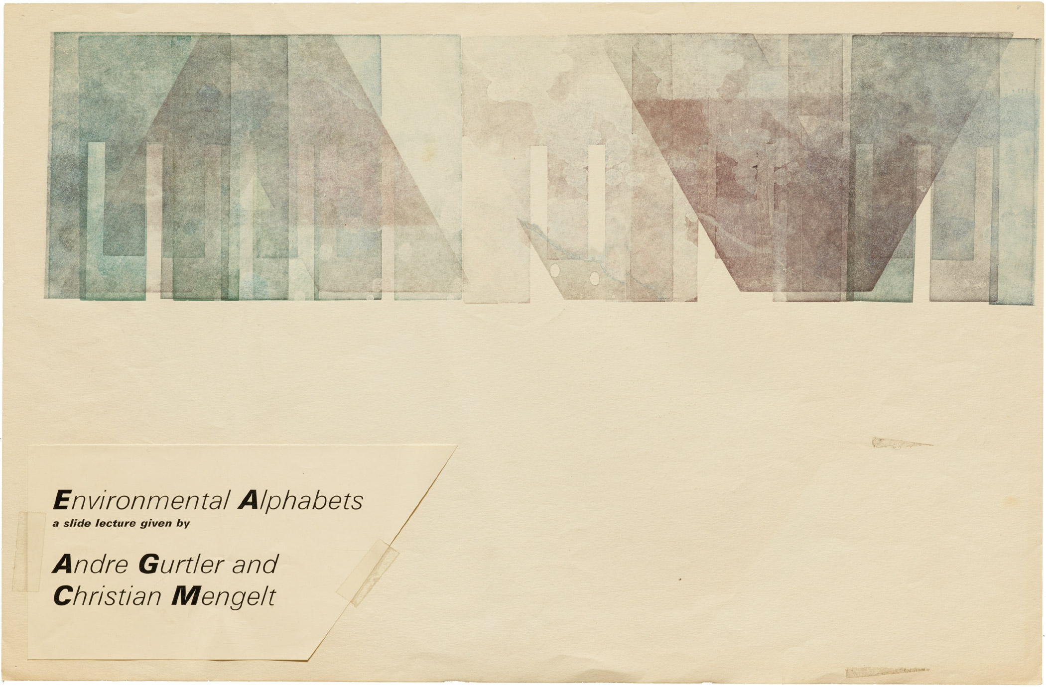
Jack Stauffacher, wood type print, 13’’ x 20’’
Jack Stauffacher (who celebrated his 96th birthday in December 2016) has been making books since age 16 — which means 80 years spent practicing and perfecting the interrelated arts of printing, typography, design, and publishing. A 2004 AIGA medalist, the self-taught Stauffacher is one of the most distinguished printers in the United States today.
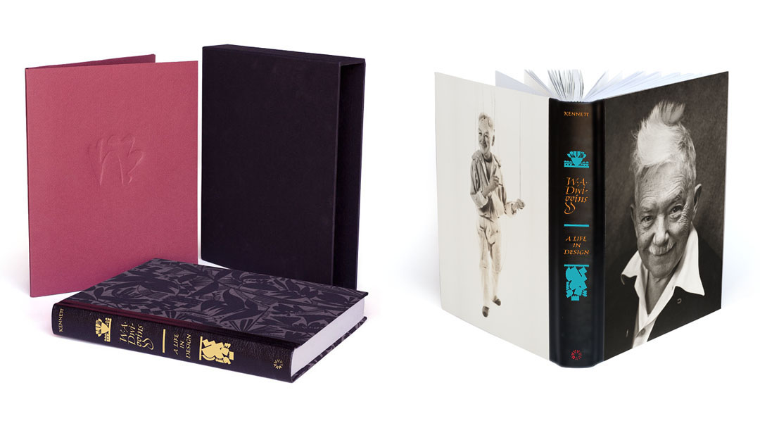
W. A. Dwiggins: A Life in Design is a comprehensive illustrated book on the innovative type designer, illustrator, and lettering artist.
Letterform Archive’s publishing program debuts with W. A. Dwiggins: A Life in Design, a comprehensive illustrated biography of the innovative type designer, illustrator, and lettering artist, William Addison Dwiggins. Written and designed by Bruce Kennett, with a foreword by Steven Heller, this book is essential for anyone interested in graphic design, publishing, and the book arts.
After a successful Kickstarter campaign, the book is now available directly from Letterform Archive.
A stretch goal for our Kickstarter campaign would allow us to digitize the rarest Dwiggins objects in our collection and share them in a public.
W. A. Dwiggins is the subject of our first publication, a comprehensive biography of one of the most innovative designers of the 20th century.
W. A. Dwiggins has a posse. We launched our Kickstarter campaign for A Life in Design on March 27 with the hope of reaching some of his many fans around the world. Here we are, twenty-six days later, and the community has responded in force, manifesting a genuine and widespread interest in the man and his work. While our original fundraising goal represented only a fraction of the actual costs needed to develop and produce this book at a level that does justice to Bruce Kennett’s remarkable biography, we now have received the resources needed to cover our expenses.
As a nonprofit organization, we are committed to using all proceeds to further our mission. Therefore, in response to the phenomenal outpouring of support, we feel compelled to do more. As we head into the last week of the campaign, we’re introducing a stretch goal of $175,000. The additional funds would allow us to digitize the rarest Dwiggins objects in our collection and share them in a public, online gallery of zoomable, downloadable images. While “A Life in Design” includes over 1200 illustrations, it represents only a segment of Letterform Archive’s holdings, which include process work, original sketches, typeface proofs, and other unique material rarely seen outside our doors. A rich web gallery will introduce Dwiggins to designers and makers around the globe. Here’s a sample of what’s possible.
W. A. Dwiggins’s 1943 plea for peace uses his own illustrations and type.
In honor of Earth Day 2017, we bring you this small pamphlet, written and designed by W. A. Dwiggins nearly seventy-five years ago, and published by the Typophiles in 1943. The context for this piece was World War II. Influenced by his Quaker background, Dwiggins created, on more than one occasion, vivid work that advocated for an end to aggression and violence. The message of The Crew of the Ship Earth still resonates today, and it seems appropriate to look again at this tiny pamphlet and appreciate its powerful vision: “… an entirely new mental picture of the world’s population: a picture of all of us together sharing the same needs, the same dangers, the same fate … the same hope … .
On behalf of Bruce Kennett, Rob Saunders, Stephen Coles, and everyone here at Letterform Archive, I would like to thank all 1,059 backers who helped bring the Dwiggins book project to life and ensure Kennett’s remarkable biography will be published.
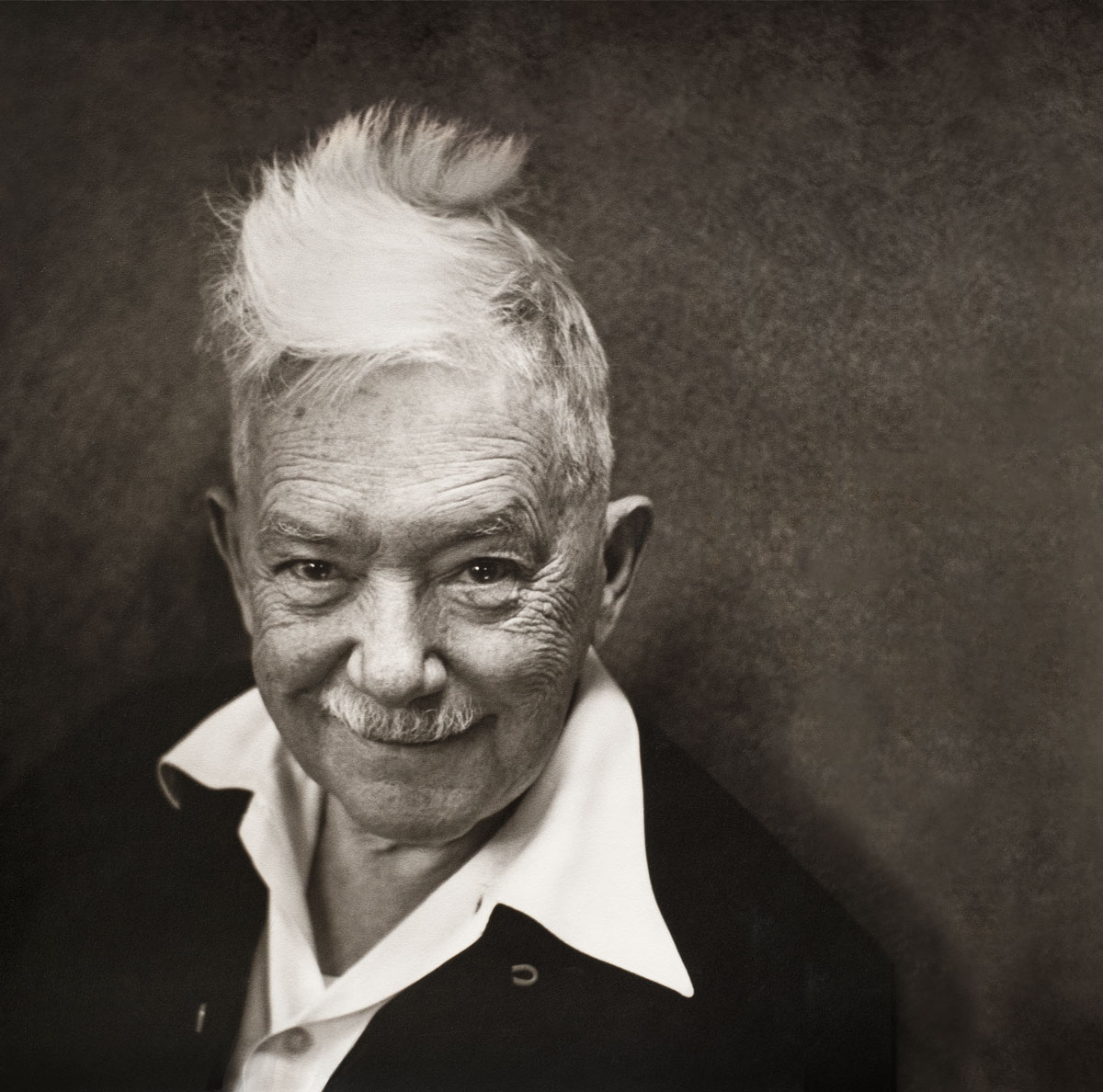
W. A. Dwiggins, 1941. Photograph by Robert Yarnall Richie.
We are grateful for the outpouring of support, and thrilled to have connected with this worldwide community of Dwiggins fans. If we include the direct, offline orders we received from individuals and institutions who could not use Kickstarter, we surpassed our stretch goal. Therefore, in addition to publishing this book, we are committed to digitizing our entire Dwiggins collection, starting with the rarest materials.
Orders for the deluxe edition have now closed, but in case you or someone you know would like a copy of the standard edition and missed the opportunity to get one on Kickstarter, we have set up a page on Indiegogo InDemand to collect all remaining preorders until we go to press in August. Update: You can now order the book directly from the Letterform Archive shop.
Jim Parkinson tells us about reviving Electra for Bruce Kennett’s W. A. Dwiggins biography.
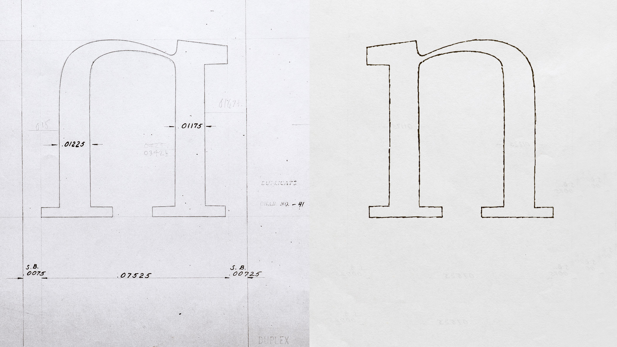
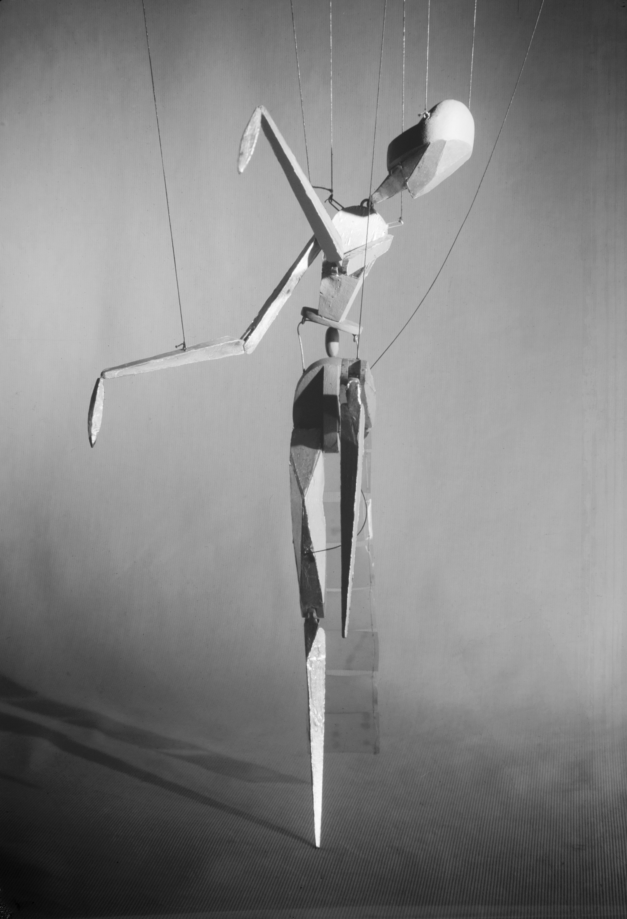
Left: Original drawing for Electra; Right: Jim Parkinson’s pencil sketch on the back of the printed sheet, drawn on a light table to flop the letter before scanning it.Dwiggins made this puppet — Aluminia — in the 1930s just as his Electra type was being released by Linotype. He imagined her as an agile dancer, and built her from cardstock covered with aluminum foil. Dwiggins used these words to describe his Electra type: “Electricity . . . sparks, energy — high-speed steel — metal shavings coming off a lathe — precise, positive . . . take your curves and streamline ‘em.” Jim Parkinson’s new font perfectly captures these qualities, and we’ve decided to name it Aluminia in honor of Dwiggins’s other creation.
Those of you who have followed the progress of Letterform Archive’s first publication, the forthcoming W. A. Dwiggins: A Life in Design, already know that this book will be both a celebration of this prolific author, artist, and designer, and also the culmination of forty years of passionate research and collecting by two of his biggest fans — the book’s author, designer, and chief visionary, Bruce Kennett, and Letterform Archive’s founder, Rob Saunders. At nearly 500 pages and including 1,200 illustrations, the book is a labor of love and has received unstinting attention to the writing, editing, design, and production. In keeping with our ambition to present Dwiggins in a publication worthy of him, Letterform Archive also commissioned Oakland-based type designer Jim Parkinson to create a digital revival of Dwiggins’s Electra typeface that honors the design’s original personality and strength. The resulting fonts — which we have named “Aluminia” after one of the marionettes Dwiggins designed and fabricated in the 1930s — will be used throughout the Dwiggins biography and are now available for purchase.
For backers who have already purchased the fonts, we expect to deliver these along with your license within the next two weeks. Watch your inbox and, if you haven’t yet responded to our survey requesting your delivery address, please do so as soon as possible, or email us directly at [email protected].
Now that the fonts are finished, we are making steady progress towards sending the book to press and will soon follow this update with additional news and information. In the meantime, we hope you enjoy this recent interview with Jim Parkinson, in which he shares both the challenges and the delights of this intriguing project.
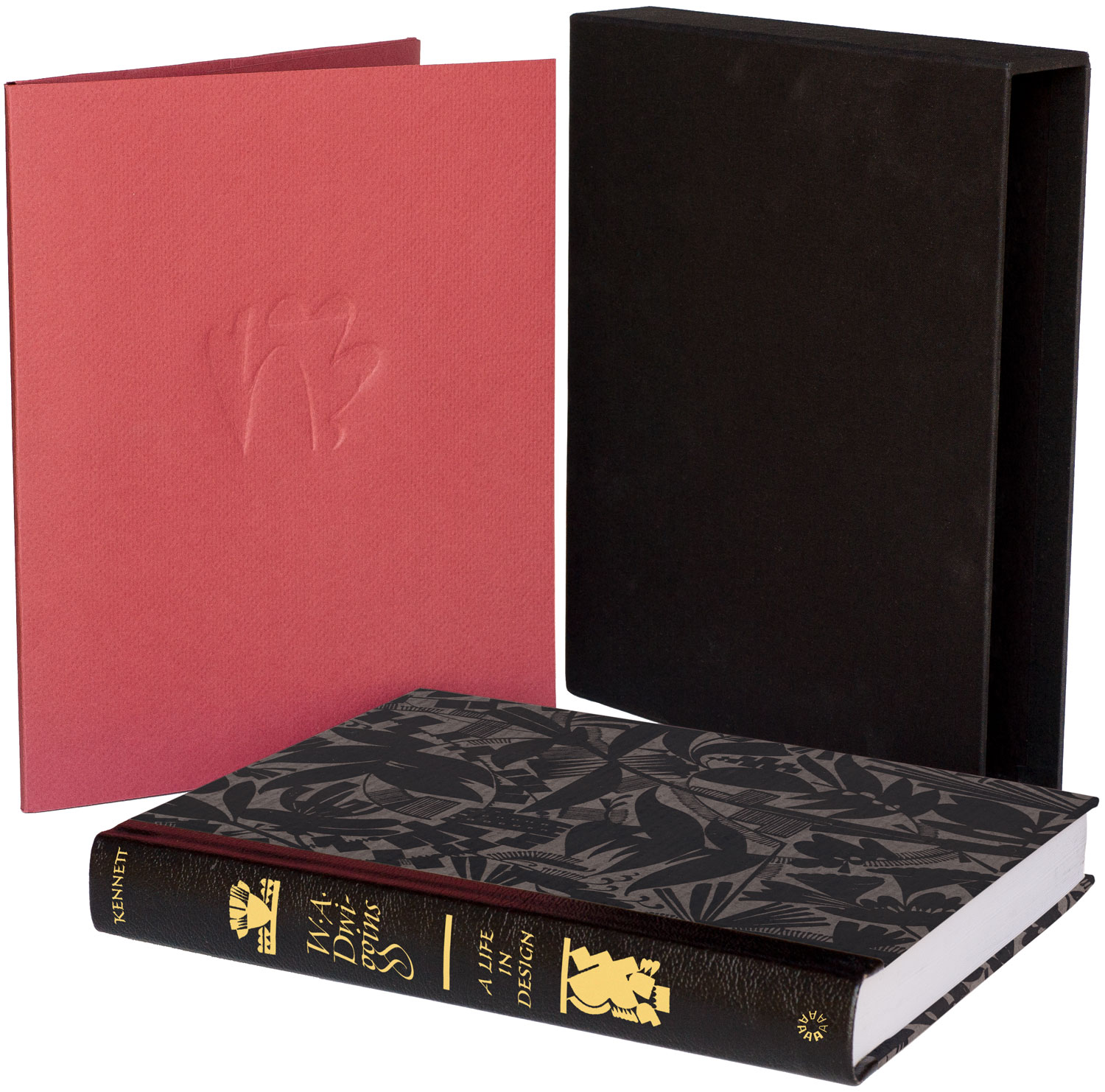
The deluxe edition of W. A. Dwiggins: A Life in Design with letterpress portfolio, slipcase, and spine foil-stamped in gold.
Bruce Kennett’s biography of W. A. Dwiggins is nearly ready to go to press. A few lucky backers of the project are set to receive the deluxe edition of the book, bound with a leather spine that features gold foil-stamped lettering by master calligrapher, Richard Lipton. This week we talked to Richard about penning the proper spine for Letterform Archive’s first publication.
What’s your relationship to Dwiggins’s work?
Richard Lipton: Like so many graphic designers, calligraphers, and type designers, I had something of a love affair with his multifaceted work. He was a consummate craftsman and there is much to admire in so many aspects surrounding his many interests, accomplishments, and sense of humor.
I came to his work first as a budding calligrapher. I had the opportunity to visit his Hingham studio along with Ed Karr and Jackie Sakwa in the early 1980s and was given a personal guided tour by Dorothy Abbe. I was just fascinated by everything I saw there and heard the admiration in Dorothy’s voice as she described his talent and dedication to everything he touched. There is a warmth and human touch present in all of his work that spoke clearly to the time in which he lived.