News
Typefaces Inspired by the Bauhaus
From Futura to ITC Bauhaus, our survey of Bauhaus type continues with a look at typefaces that adopted the school’s simplified, geometric ideals.
Our first installment of this two-part series showcased the various typefaces found in official publications and other objects by Bauhaus instructors and students. We learned that the type used at the school was primarily utilitarian, readily available to printers at the time. But what about the radical geometric letterforms we connect to Bauhaus principles? Let’s look at minimalist typefaces inspired by the school, many of which live on as commercial successes long after the institution was forced to close down.
Experimental Alphabets
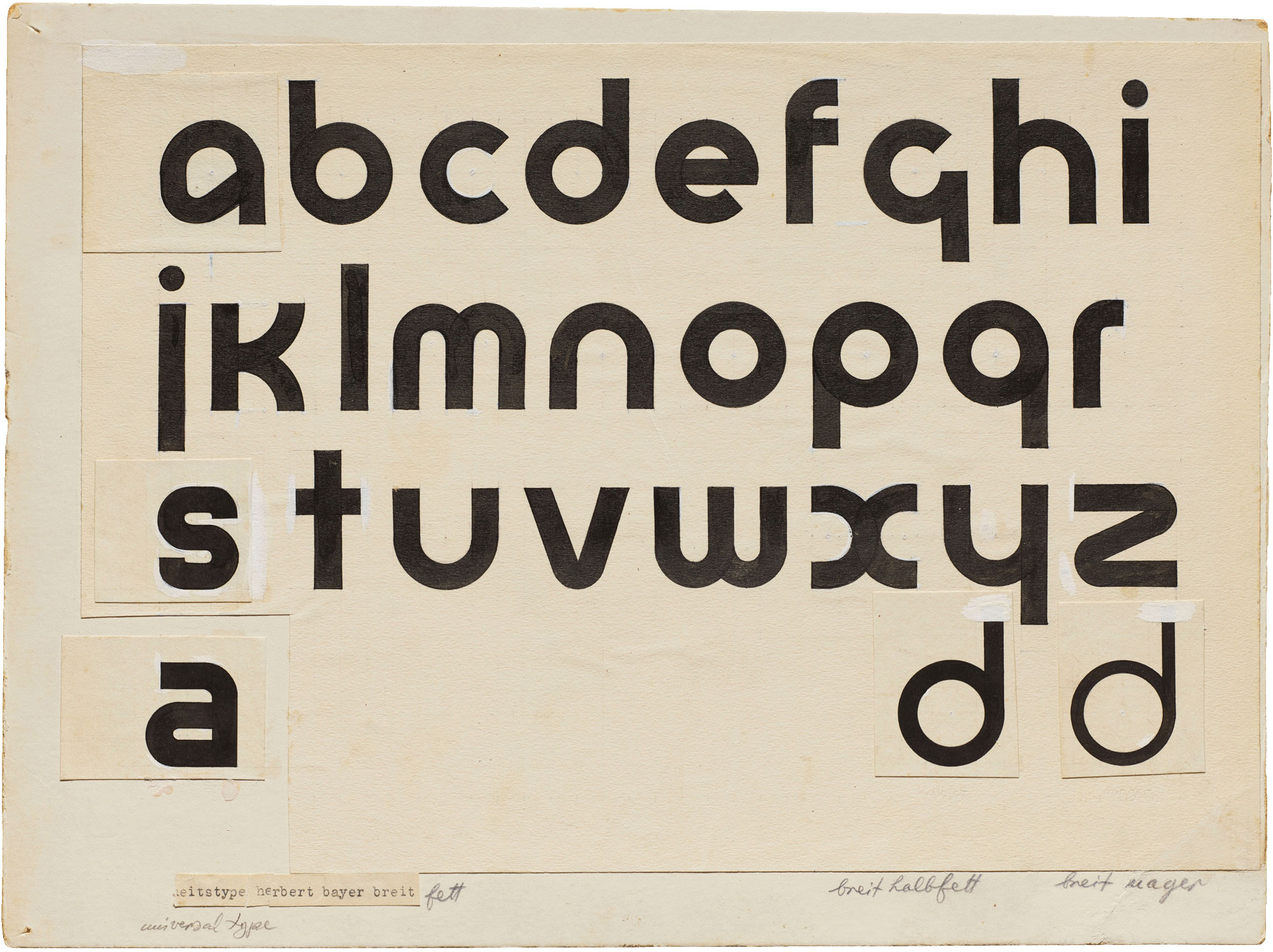
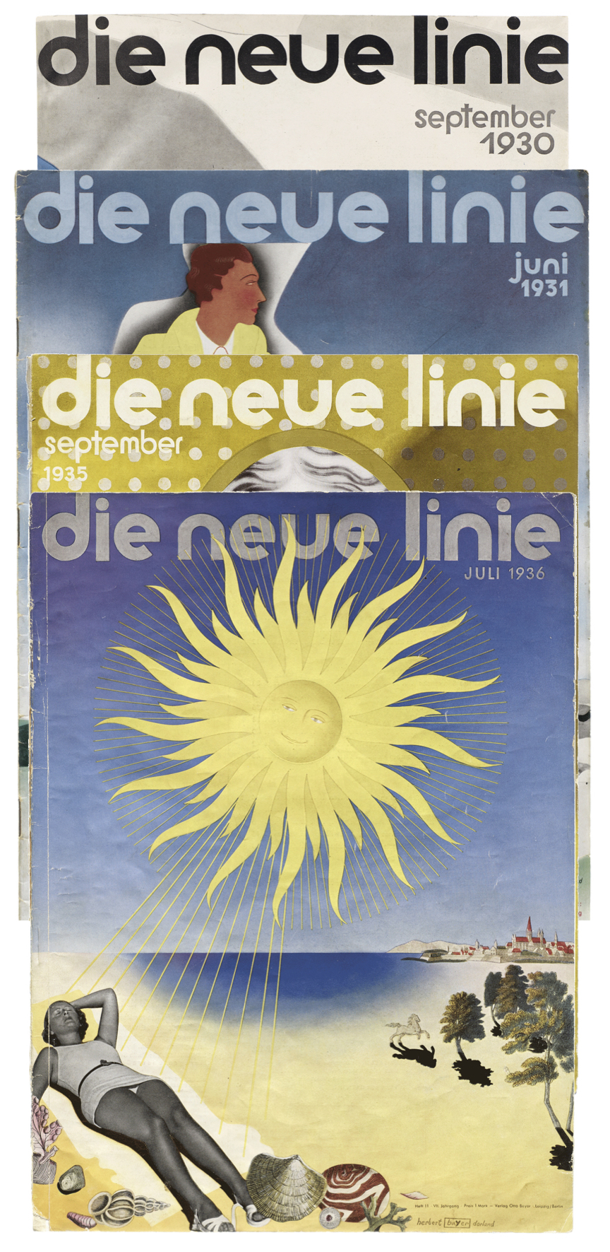
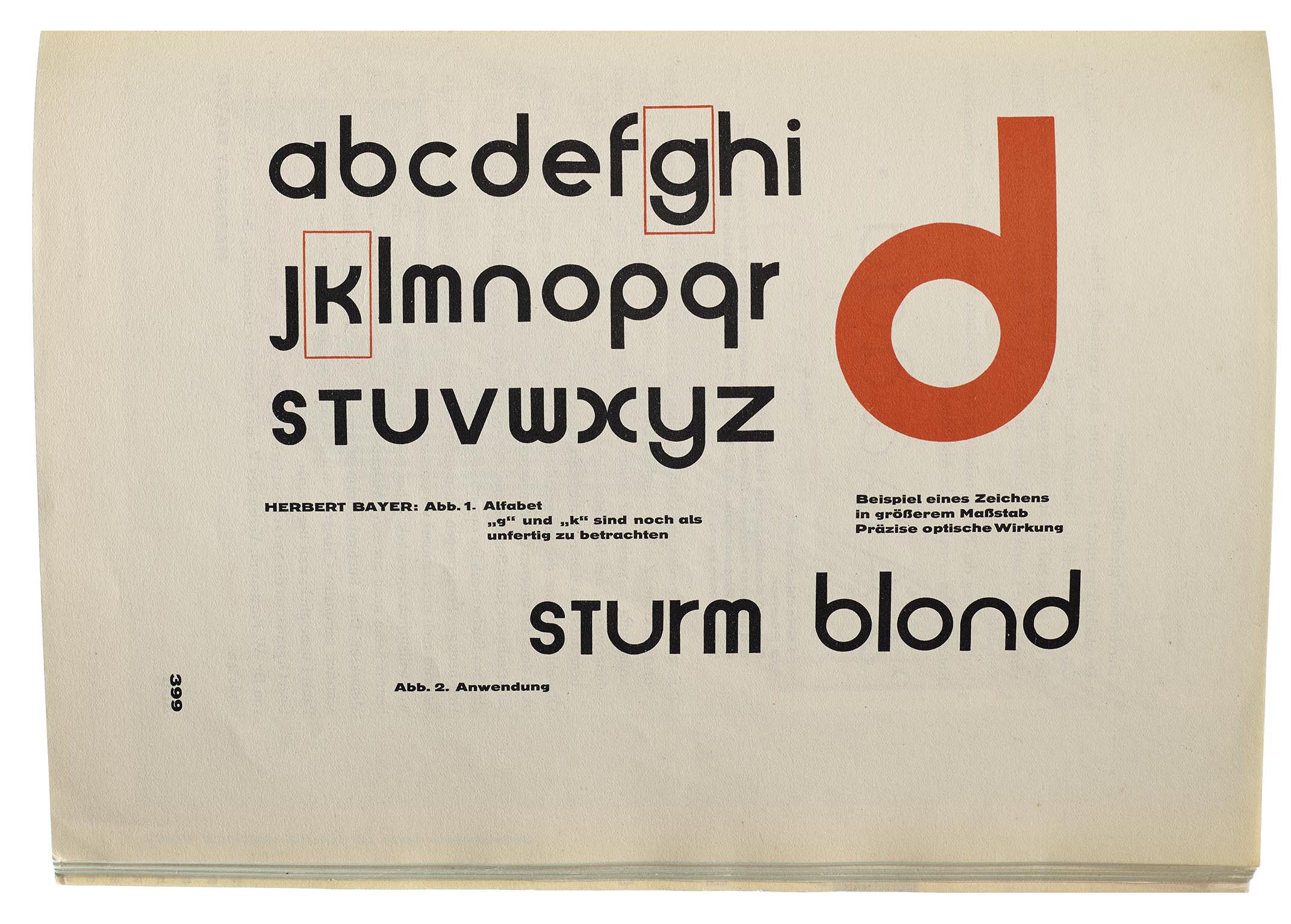
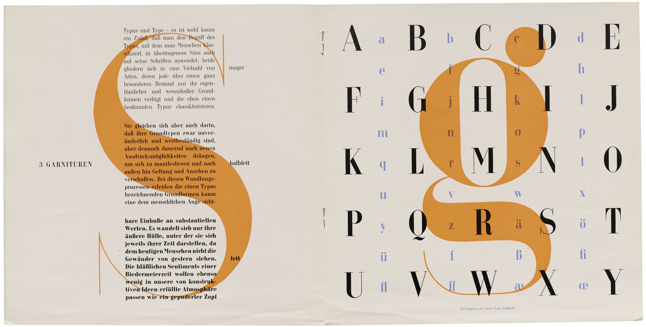
Herbert Bayer, a Bauhaus student and later director of printing and advertising, was a flag bearer of the school’s spirit of minimalism. His proposal for a Universal Type sought to reduce the alphabet to only lowercase letters and pure geometric forms that could be drawn with ruler and compass. Over several years Bayer developed multiple revisions and variations of the idea. The Bauhaus Typography at 100 exhibition features an original drawing for one of his Universal Type experiments. An alternate a and two lighter weights (ds) hint that Bayer was planning a more complete type family. While the design was never cast as a font, it became a lettering model for Bauhaus students, colleagues, and followers alike. Many were exposed to the design after it appeared in the Bauhaus publication, Offset No. 7. Bayer himself adapted versions of Universal Type for his own work, such as the logo for fashion magazine Die Neue Linie. He used a condensed variant for Section Allemande, an exhibition catalog.
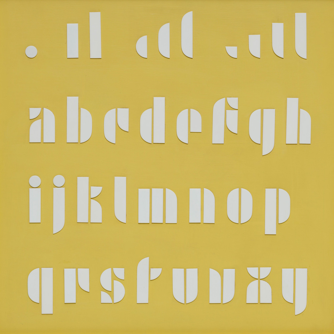
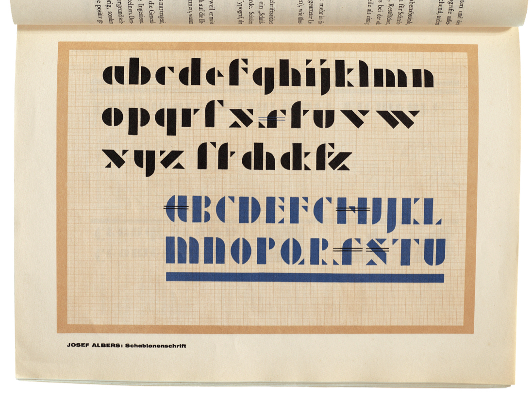
Meanwhile, Bauhaus masters Josepf Albers and Joost Schmidt explored another way to build geometric alphabets. They broke down parts of letters into a system of modular segments. Rectangles, circles, semicircles, and quarter circles were arranged on a grid to create stencil letterforms. Again, these designs were only produced as alphabet drawings or constructed objects, not as metal typefaces to be used in printing. It was only when type designers and foundries outside the walls of the school reinterpreted the Bauhaus ideas that they were realized as working fonts.
Early Typefaces
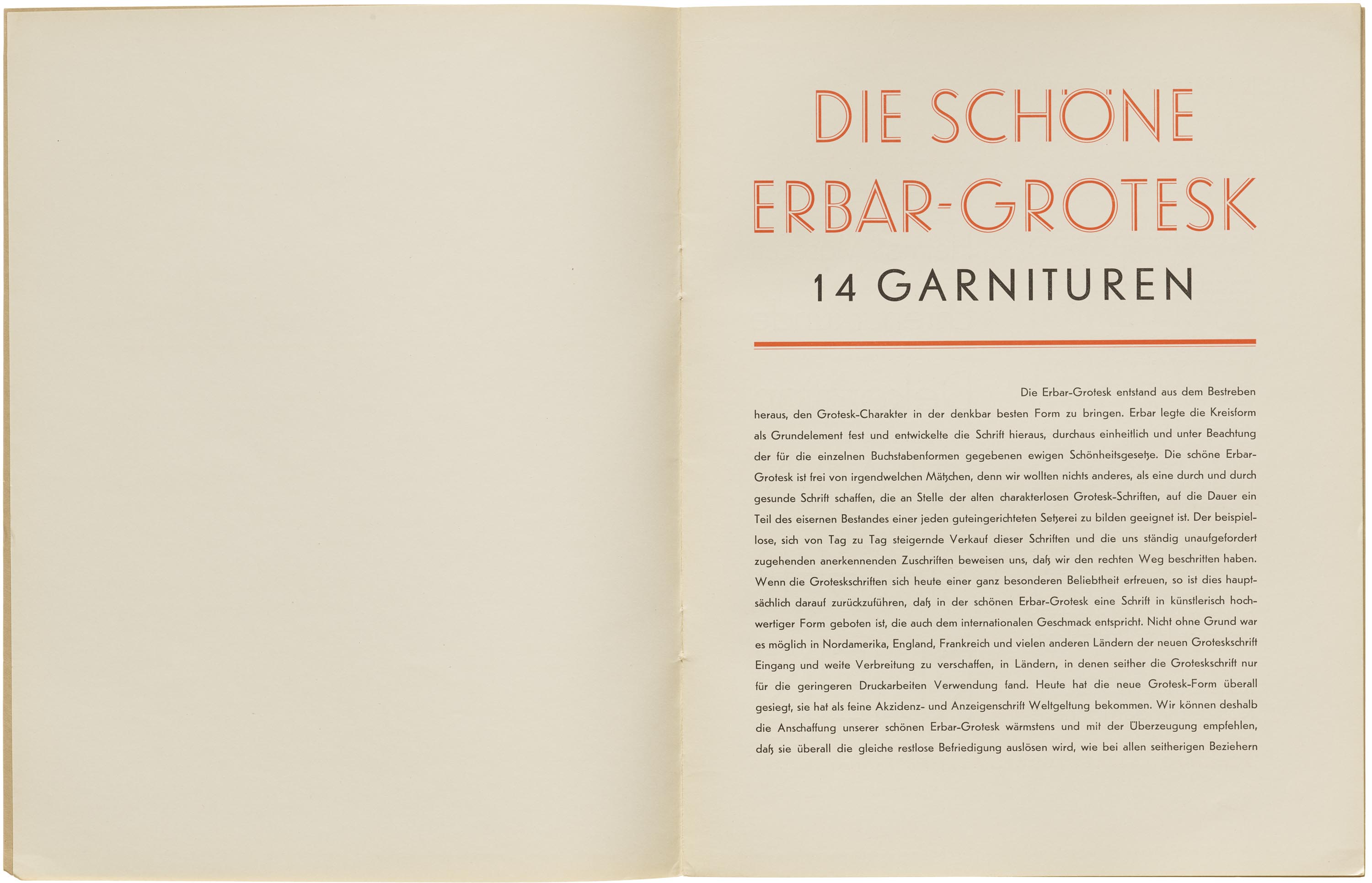
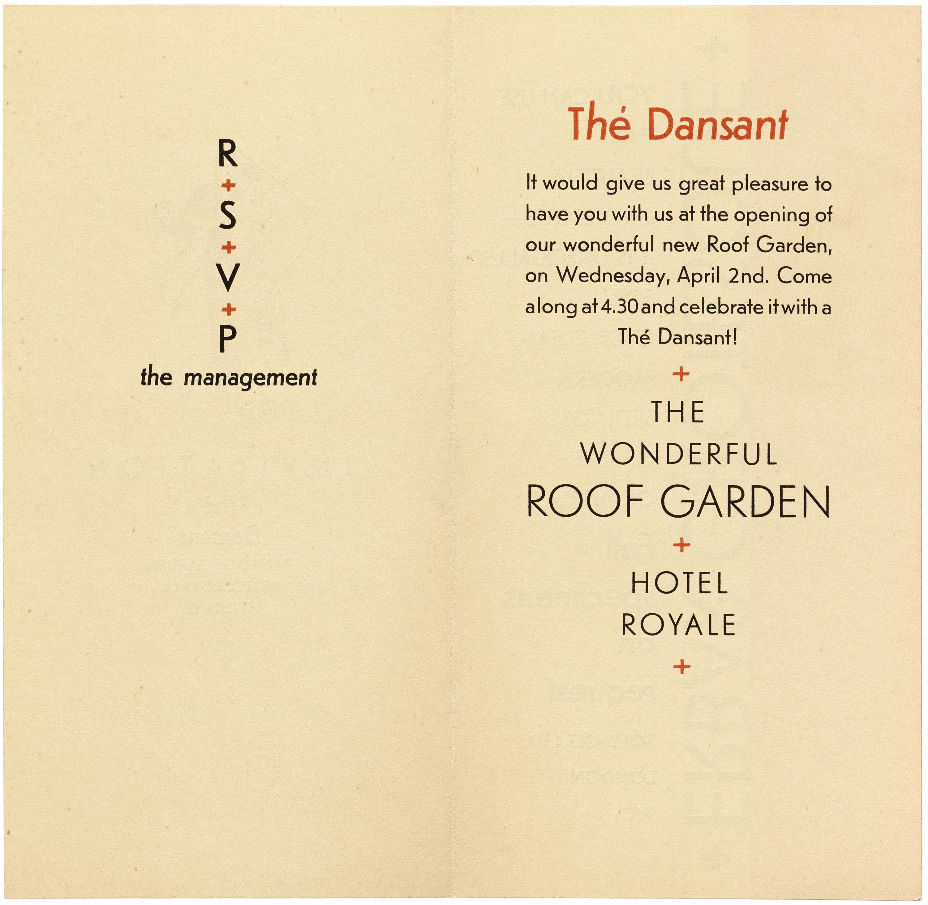
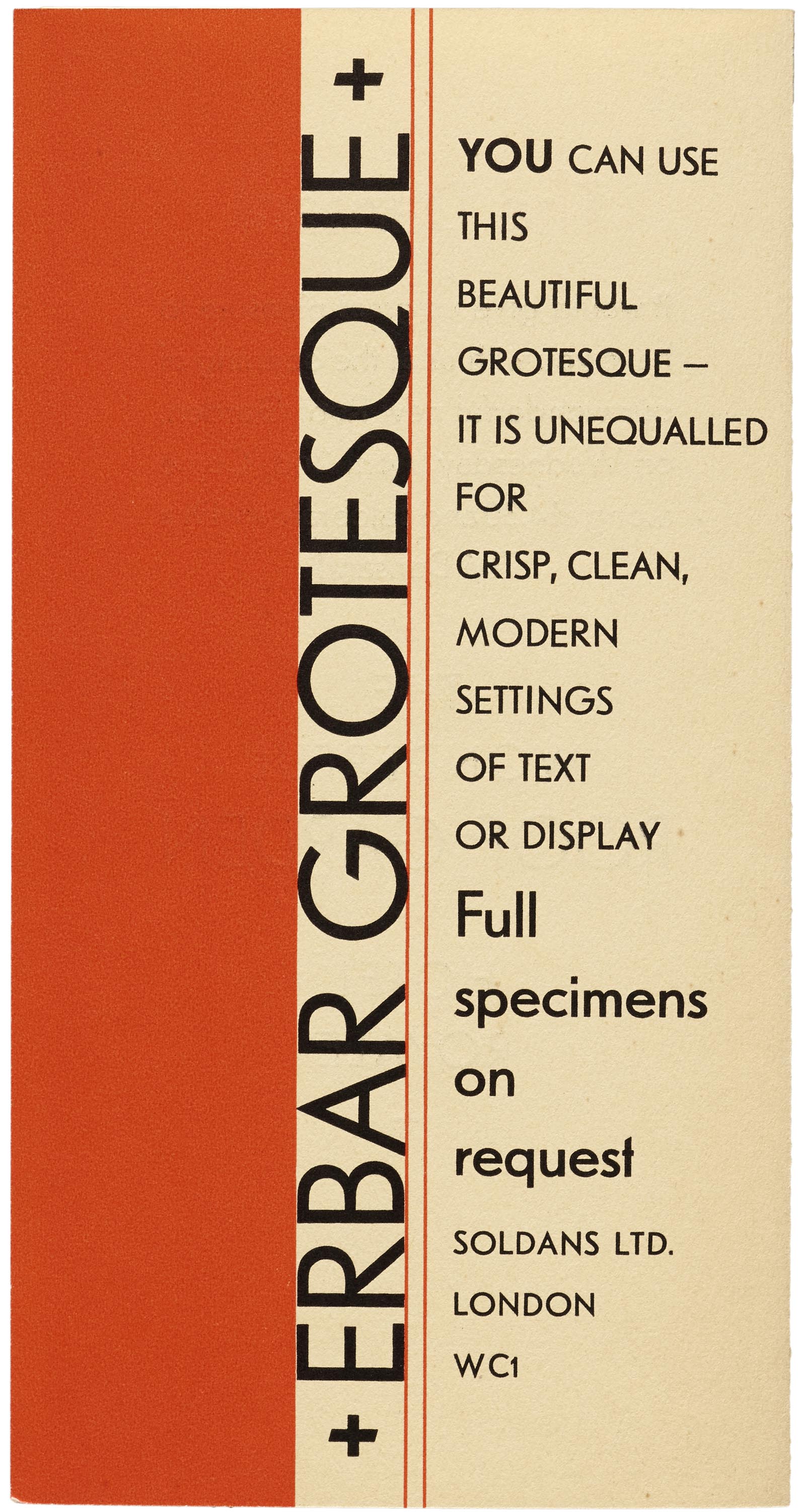
Erbar

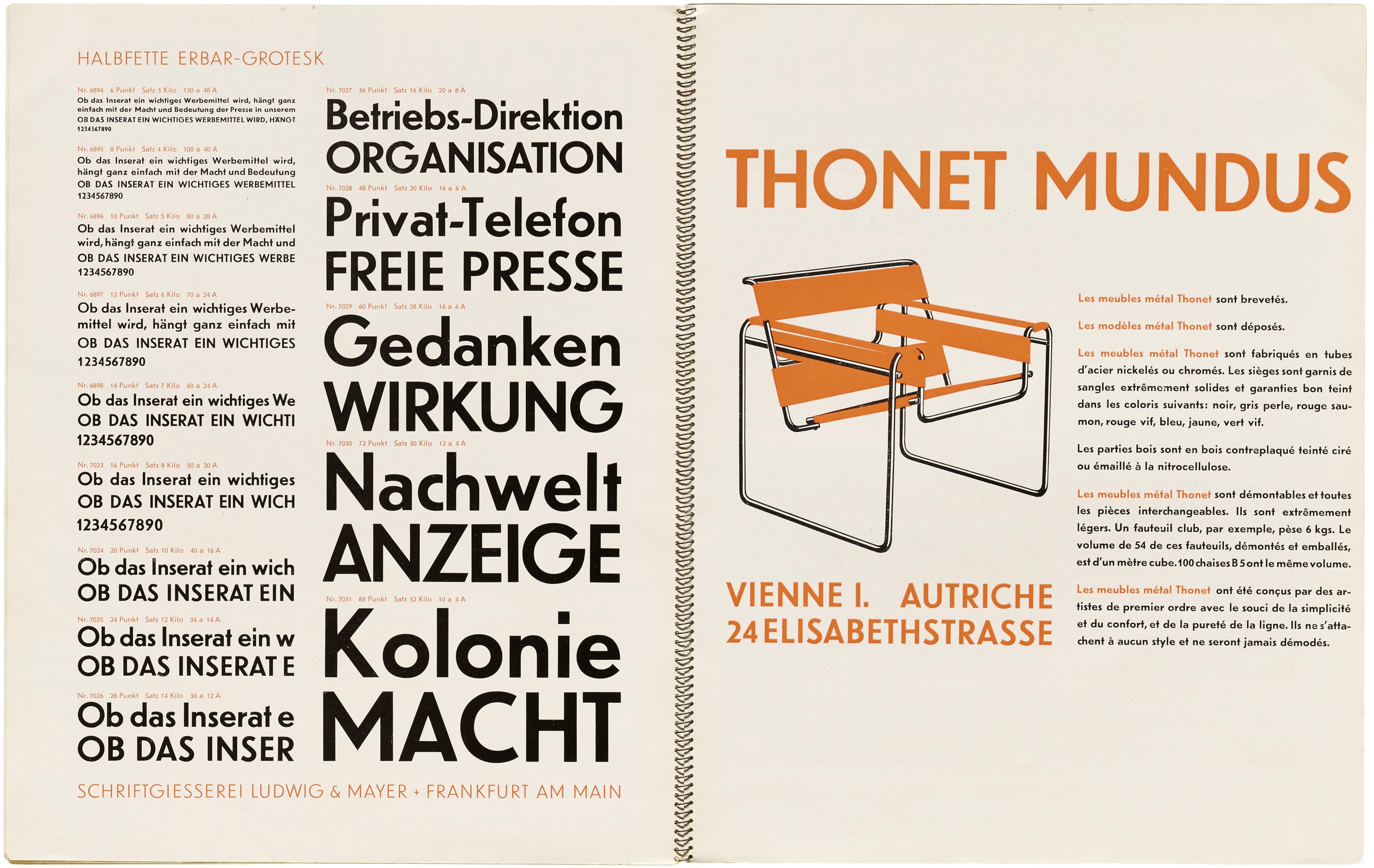
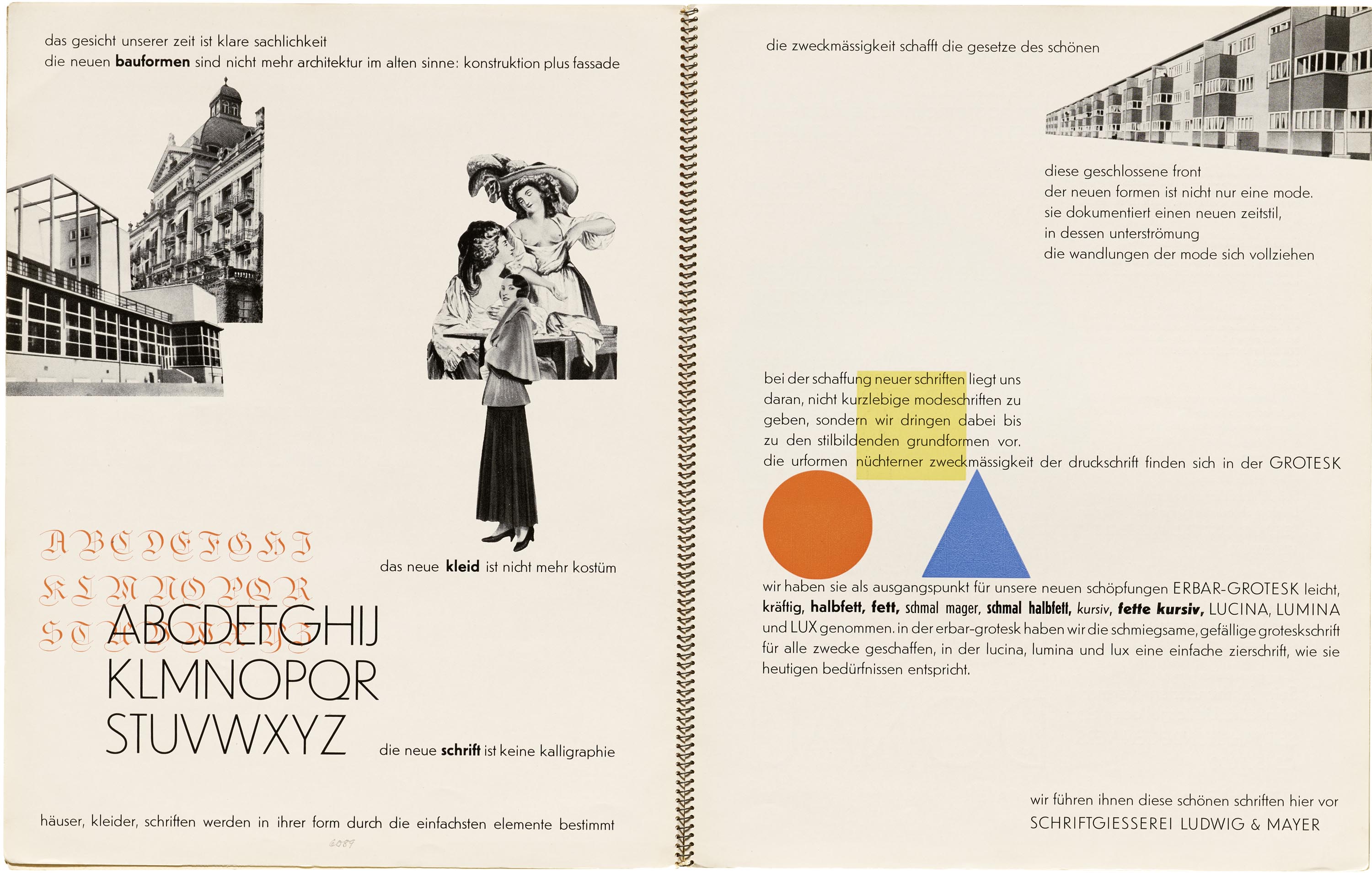
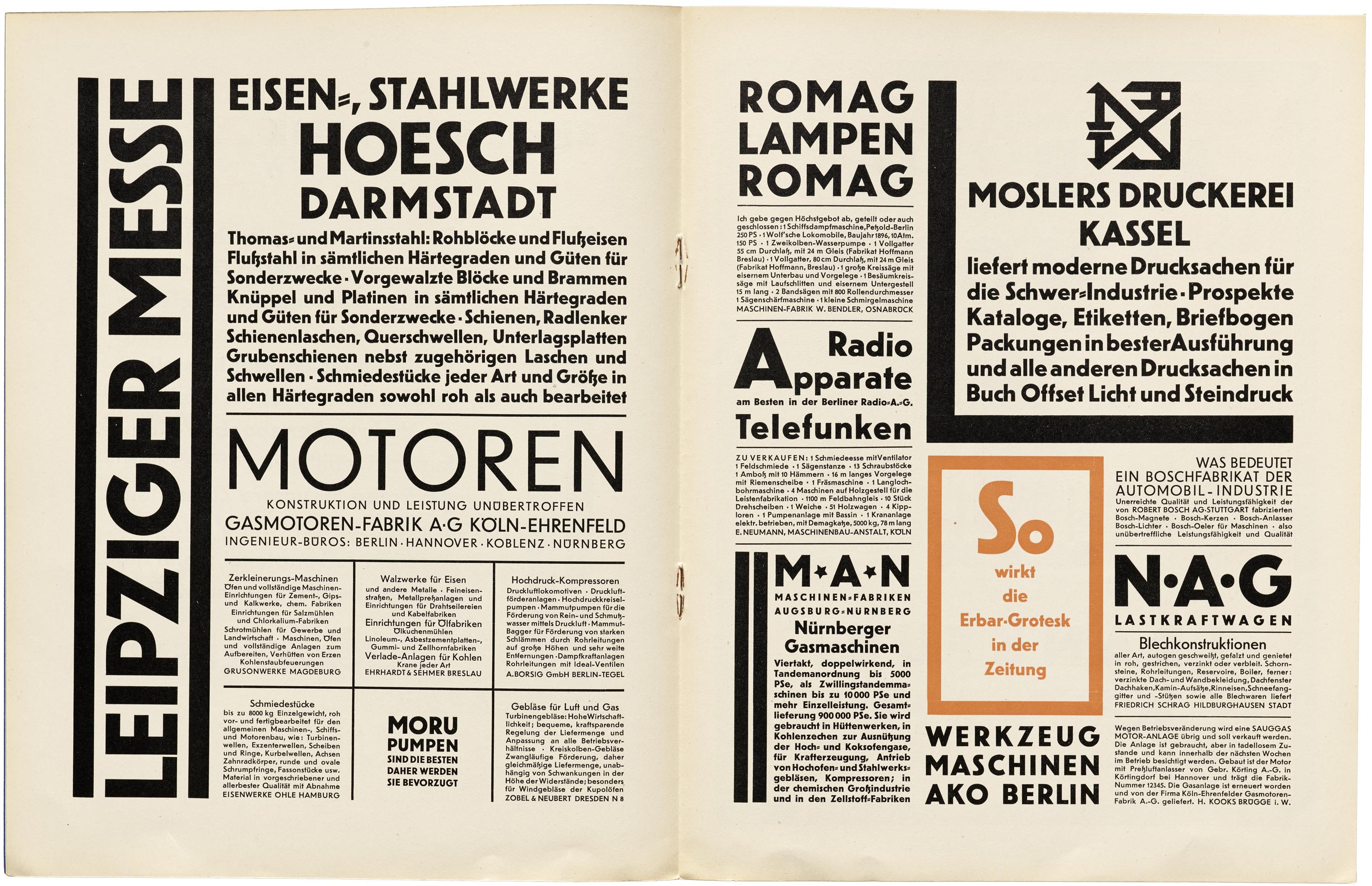
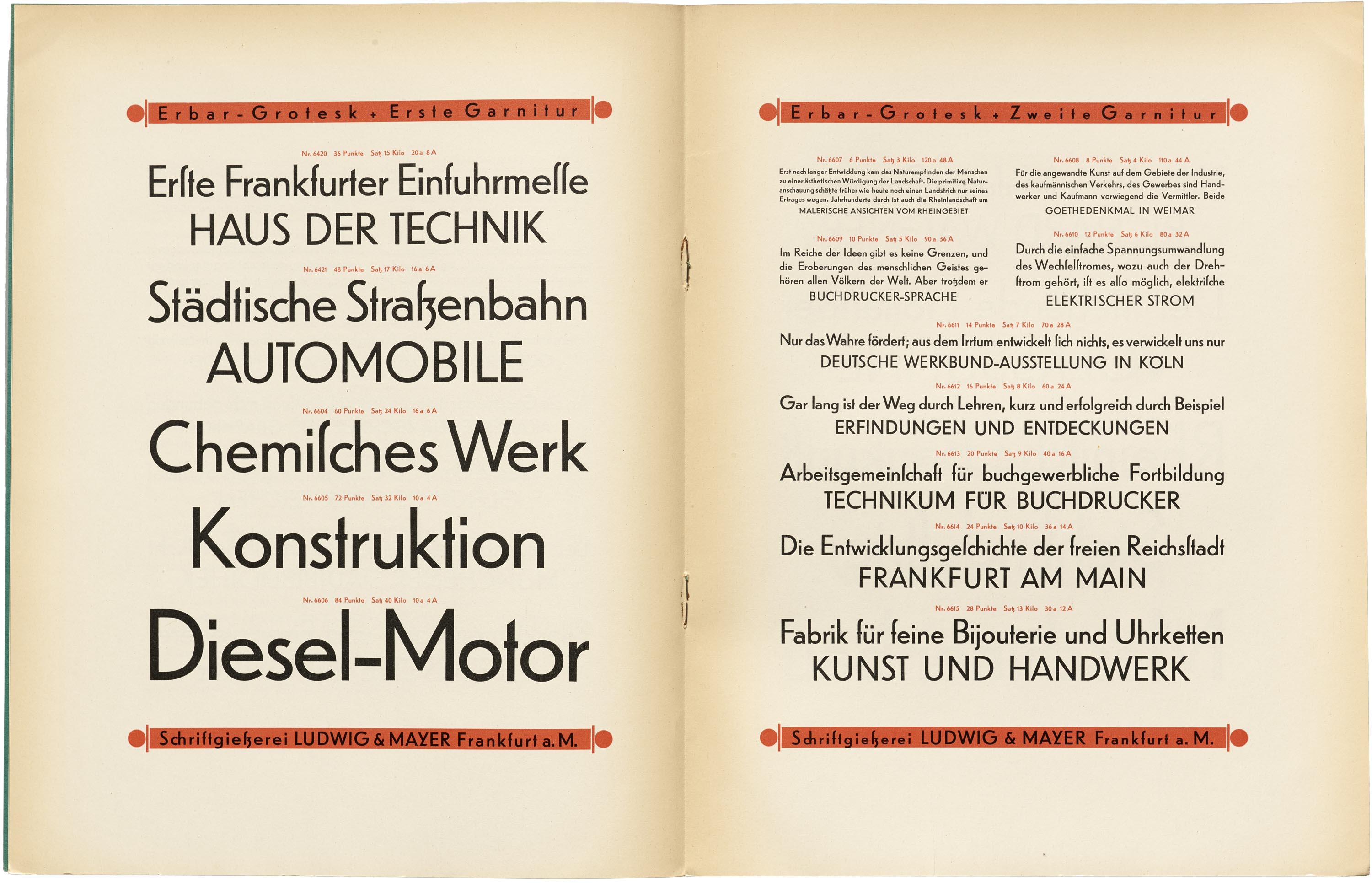
One of the first attempts to translate the Bauhaus’s geometric letterform experiments into workable fonts was Erbar-Grotesk. The eponymous designer Jakob Erbar was an experienced type maker with many existing designs under his belt. While his typeface was never quite as popular as Futura, it was the first to market, issued by Ludwig and Mayer in 1926. The foundry went on to release a wide range of accompanying styles and weights, including two x-height variations and a few alternate letterforms. Erbar-Grotesk was initially shown using traditional, centered typography and densely packed layouts surrounded by heavy rules and geometric shapes, but later specimens drew a more direct connection to the Bauhaus and the spare, asymmetrical layouts of “The New Typography”. One page calls for abandoning Fraktur and other calligraphic type styles, comparing them to antiquated fashion and architecture.
Erbar Type Specimens
All images in this gallery are hi-fi captures from Letterform Archive’s collection unless otherwise noted. Click an image to enter fullscreen view, then pinch or use browser zoom to enlarge.

Futura
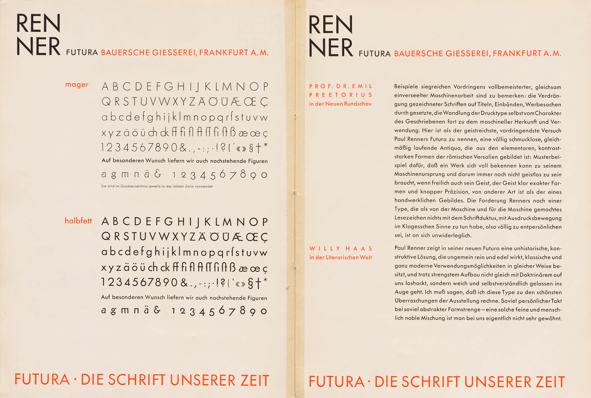


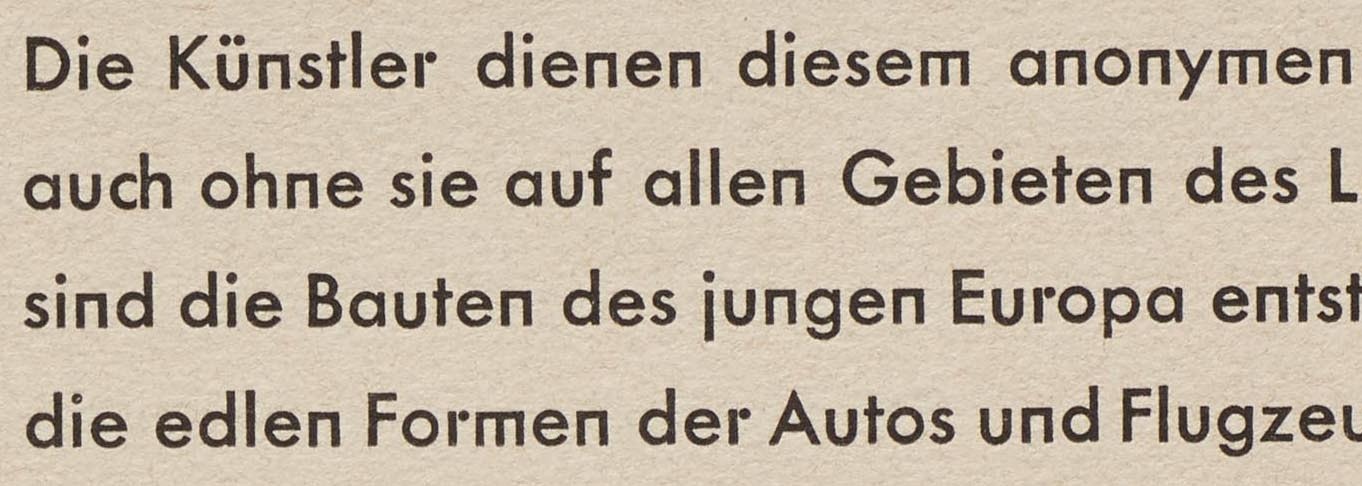
On the heels of Erbar-Grotesk, and arguably in development long before it, Futura was released in 1927 by Bauersche Gießerei (Bauer). While Paul Renner was not officially tied to the Bauhaus, he went on to create one of the most successful responses to the school’s ideals. Our online exhibition takes you on a walkthrough of the first Futura specimen, which shows Renner’s release in its most experimental form. Right angles and circles abound. Yet while one would assume these highly geometric shapes are best suited for showy headlines, they were also meant for text. Readers today might easily overlook the square m and n, or stick-and-ball r, at small sizes. Printers in 1927, however, weren’t ready for the more adventurous forms, and they were soon abandoned. Futura was otherwise immediately popular, which led to several expansions of the family. Distantly related designs, like Futura Black (likely inspired by Albers’s and Schmidt’s stencil experiments) and Steile Futura were named to capitalize on the brand value of the original.
Futura Type Specimens
All images in this gallery are hi-fi captures from Letterform Archive’s collection unless otherwise noted. Click an image to enter fullscreen view, then pinch or use browser zoom to enlarge.

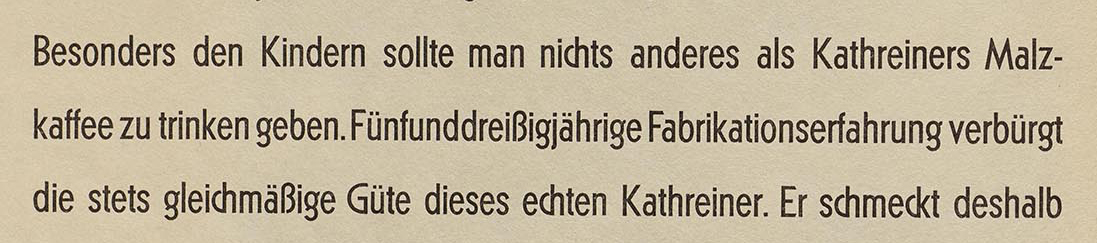
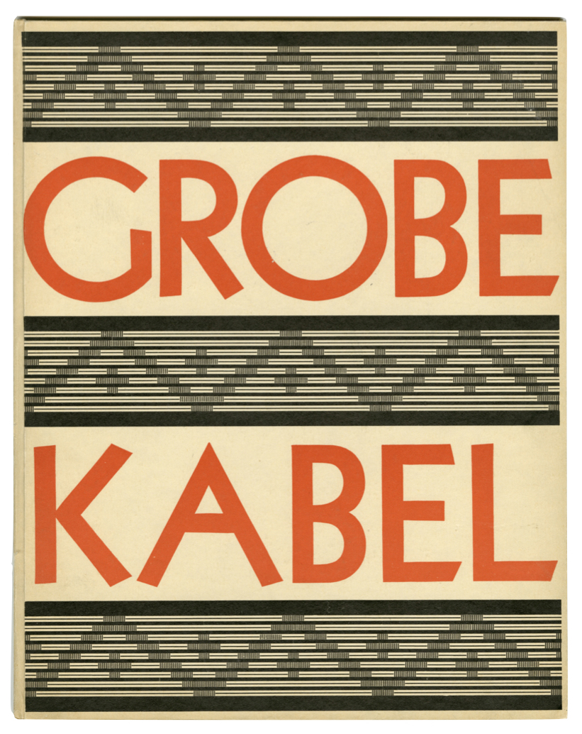
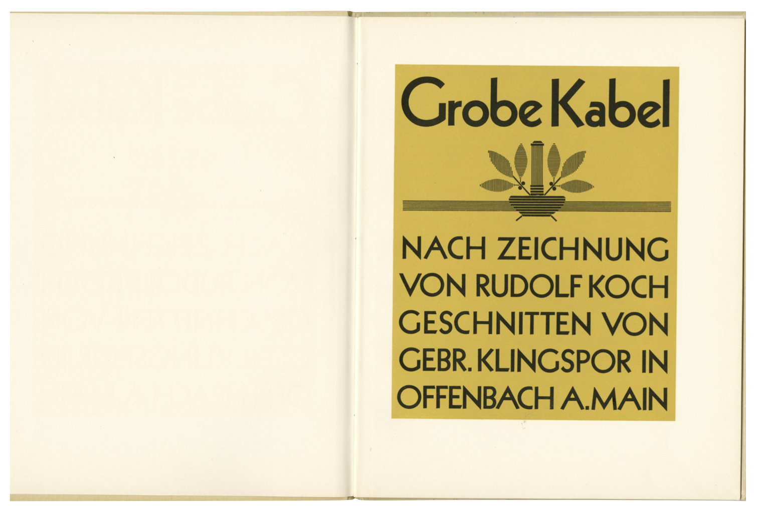
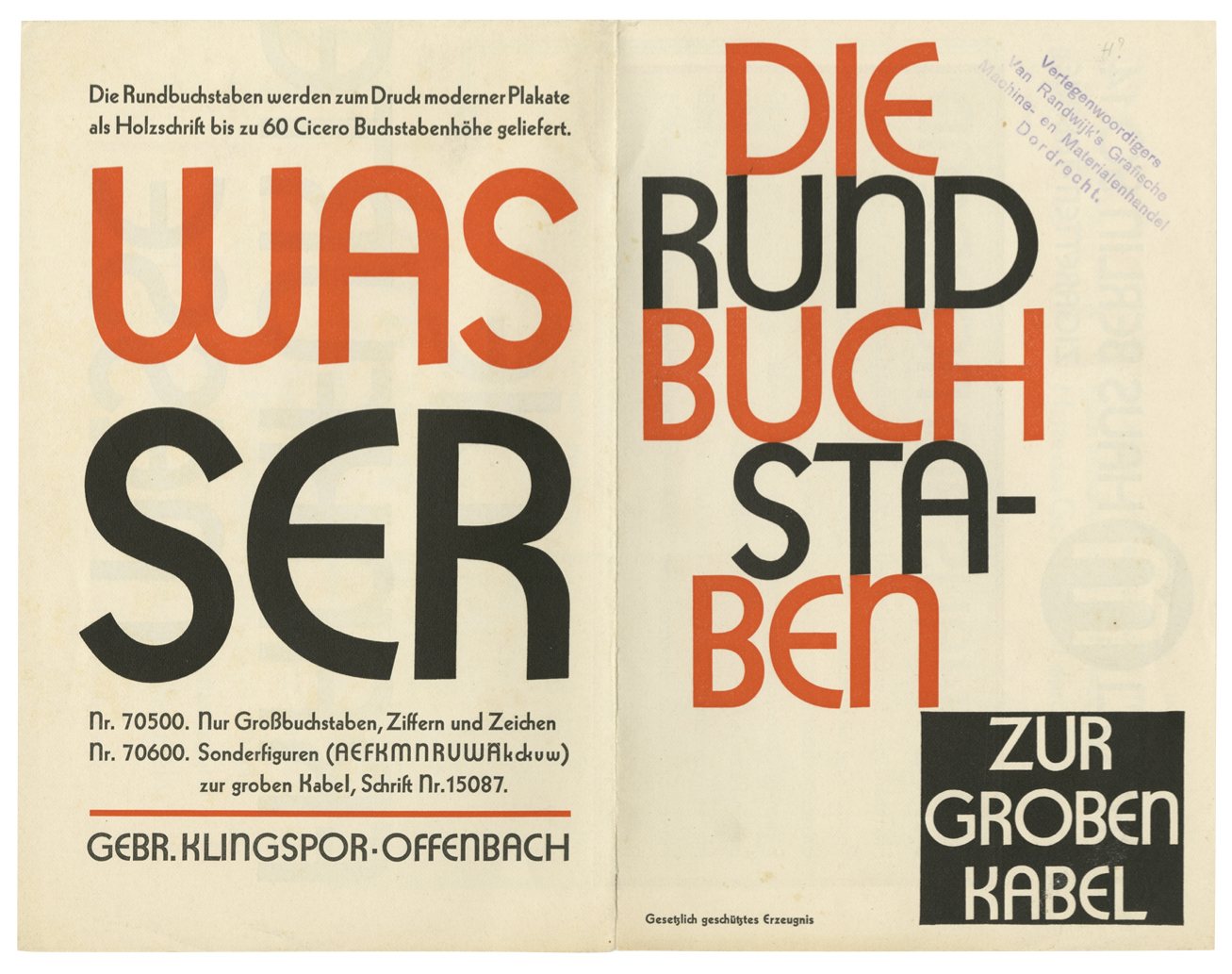
Kabel
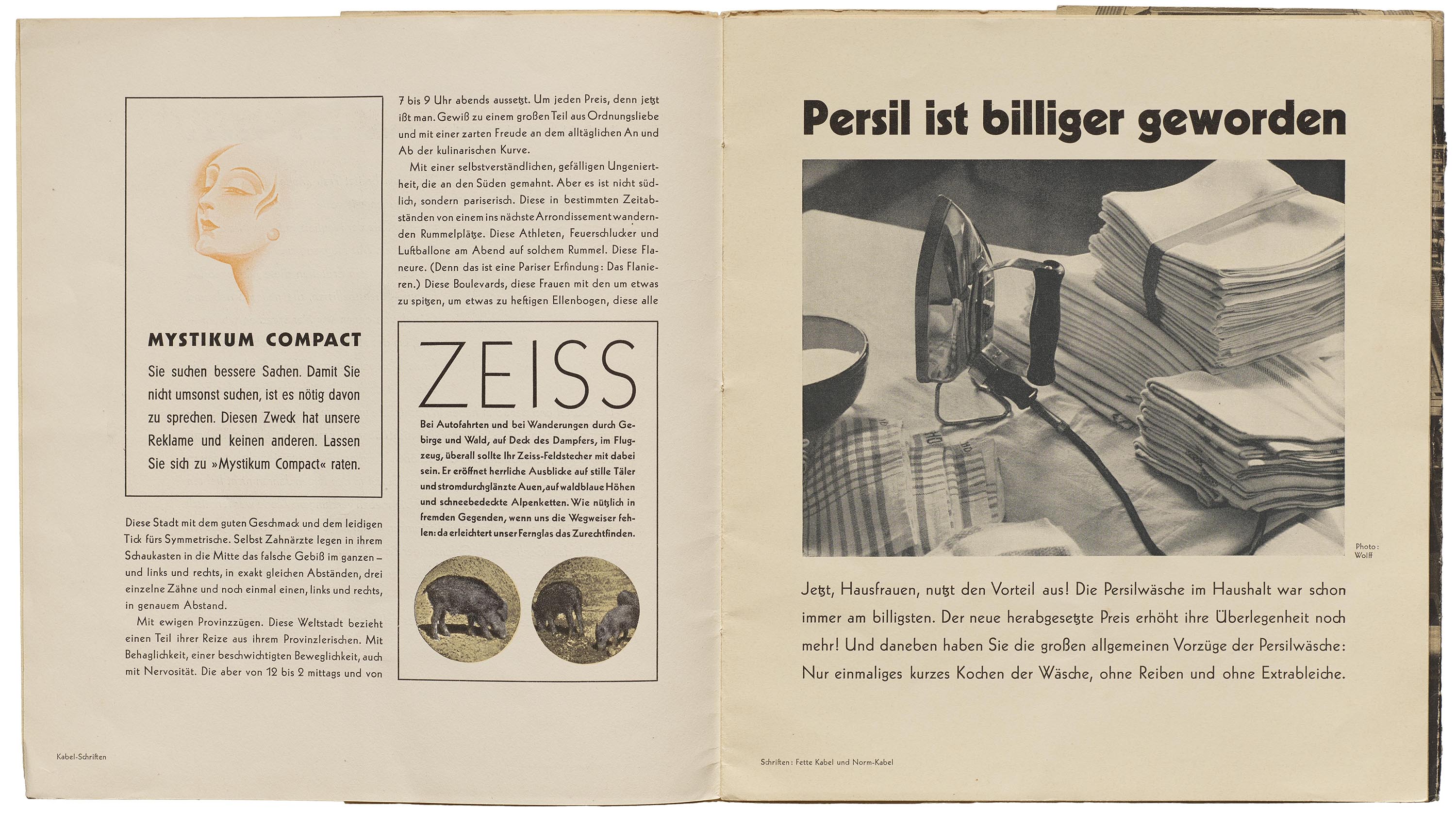

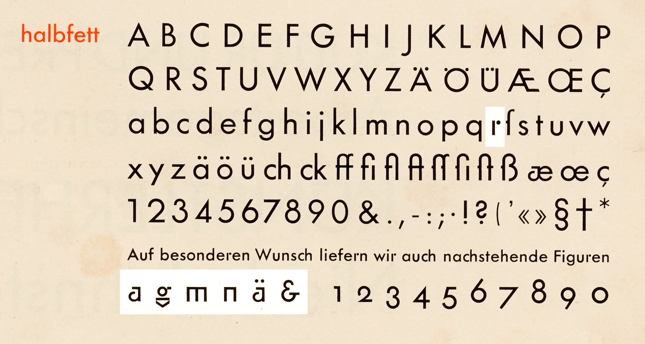
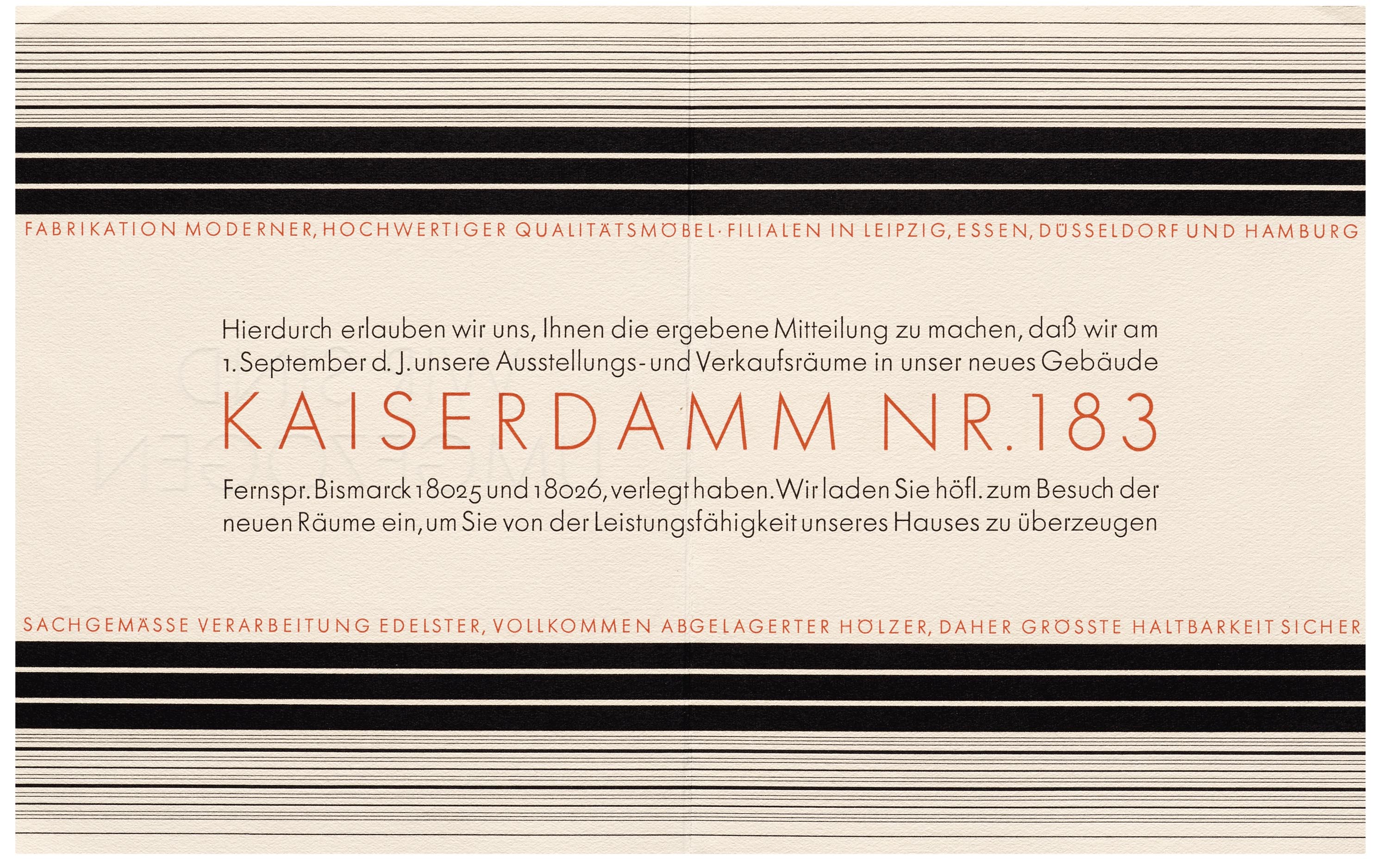
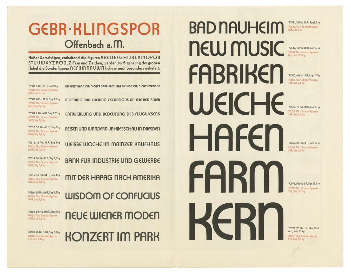
Calligrapher Rudolph Koch took a different approach in his take on the geometric sans serif. Kabel carefully explores the tension between the calligraphic and the mechanical. Unlike Futura, which aimed for nearly strict geometry, Kabel reveals a bit of the pen in its subtle stroke variation and angled terminals. Like the two previous designs that invoke the Bauhaus, its Os are still circular, and its capitals follow Roman inscriptional proportions. It later had alternate rounded capitals, offering an art deco option. Koch also created related multiline variations, and Zeppelin, which, as we’ll see later, inspired many display typefaces in the later part of the century.
Kabel Type Specimens
All images in this gallery are hi-fi captures from Letterform Archive’s collection. Click an image to enter fullscreen view, then pinch or use browser zoom to enlarge.
Bayer-Type

Surprisingly, a serif can be included in the list of Bauhaus-inspired typefaces. Like his earlier experiments in geometric letterforms, Bayer’s eponymous Bayer-Type discards any calligraphic origins of the seriffed roman, and reconstructs it in a mechanical way, following the Didone model. One of the consequences of making a typeface for the retail market was that Bayer had to compromise his lowercase-only principles and include capital forms. Bayer-Type could be considered the only typeface designed by a Bauhaus master while the school was still running. It was publicly released in 1933, however, around the time the Bauhaus had to dissolve, so was it never used in official school publications. Bayer and others did put it to work throughout the mid-20th century.
Phototype Revivals
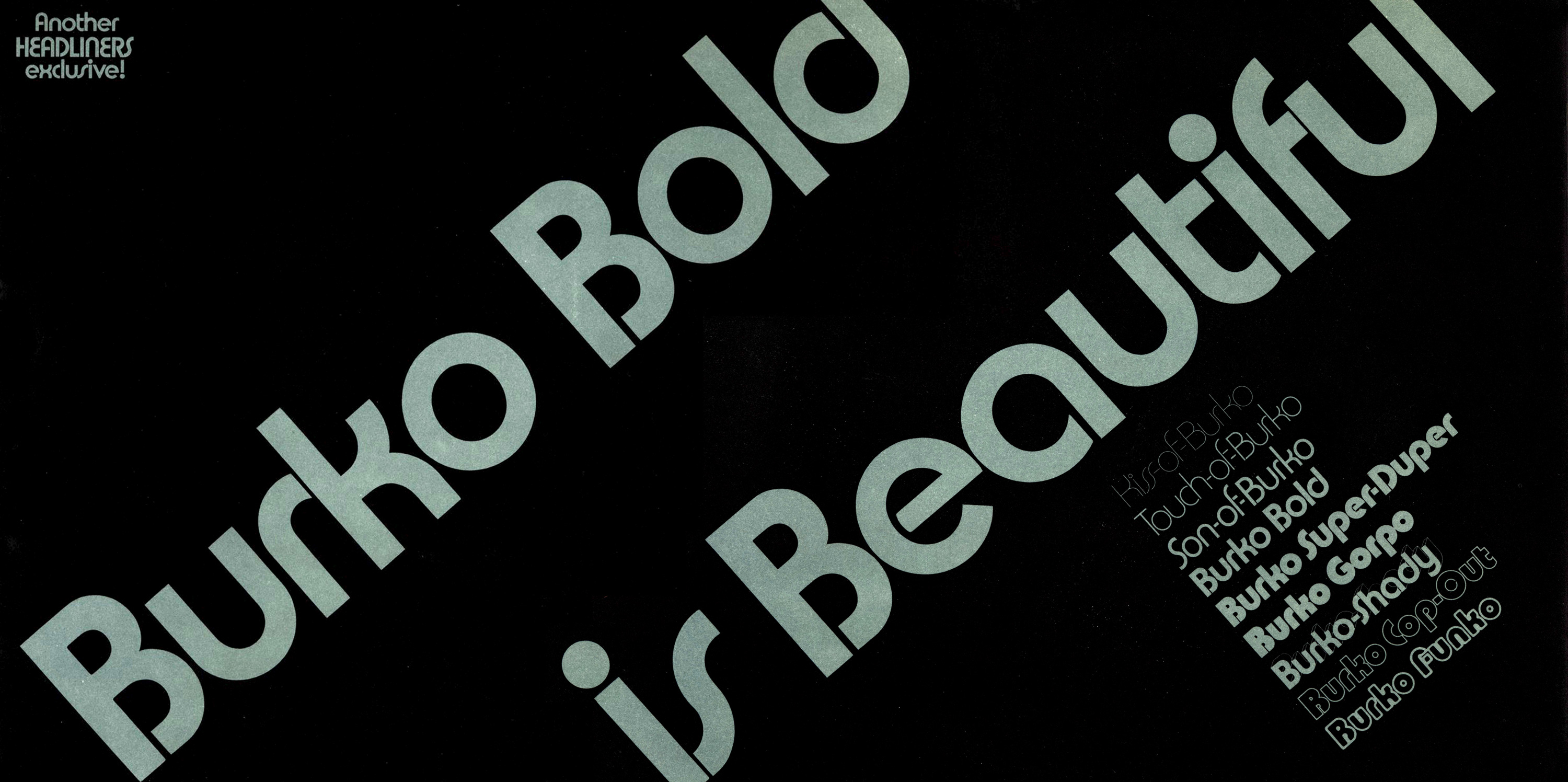


Fifty years after the Bauhaus dissolved due to Nazi pressure, there was a resurgence in the design concepts of the school. The booming advertising and publishing industries were hungry for new fonts, and phototype suppliers churned out hundreds of new designs every year. One deep well of inspiration was Bayer’s Universal Type experiments. Marty Goldstein’s Harry (VGC, 1966) was possibly the first close interpretation of a Bayer alphabet, and it led to a flood of other followers over the next five years. David L. Burke’s Burko (Headliners, 1967–69) also drew from Bayer’s work, but introduced stencil-like gaps in the strokes. It also offered an even wider variety of weights and styles, with a funky naming system (see image above) that reflects its era. Other Bauhaus-inspired releases included Blippo (Joe Taylor, FotoStar, 1969) and Pump (Bob Newman, Letraset, 1970).
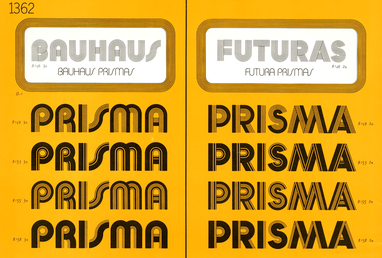
It is Ed Benguiat’s take that is perhaps the most pervasive, thanks to both its versatile design and the marketing savvy of Photo-Lettering, Inc. who gave it its name. Bauhaus was born in 1969 as a custom typeface for Metrecal, a meal replacement shake. It was soon released by Photo-Lettering as Bauhaus Geometric (1970). As 1970s fashions moved away from clean modernism and toward expressionism, the family was extended to many exuberant multiline styles recalling the art deco variants of the first geometric sans serifs like Lux (a cousin of Erbar-Grotesk) and Prisma (a cousin of Kabel). Now available as ITC Bauhaus (1975), and even further removed from its Bayer origins, the typeface is often mistakenly used in an attempt to reference the school, from television dramas to buildings in Dessau itself.
Digital Restorations
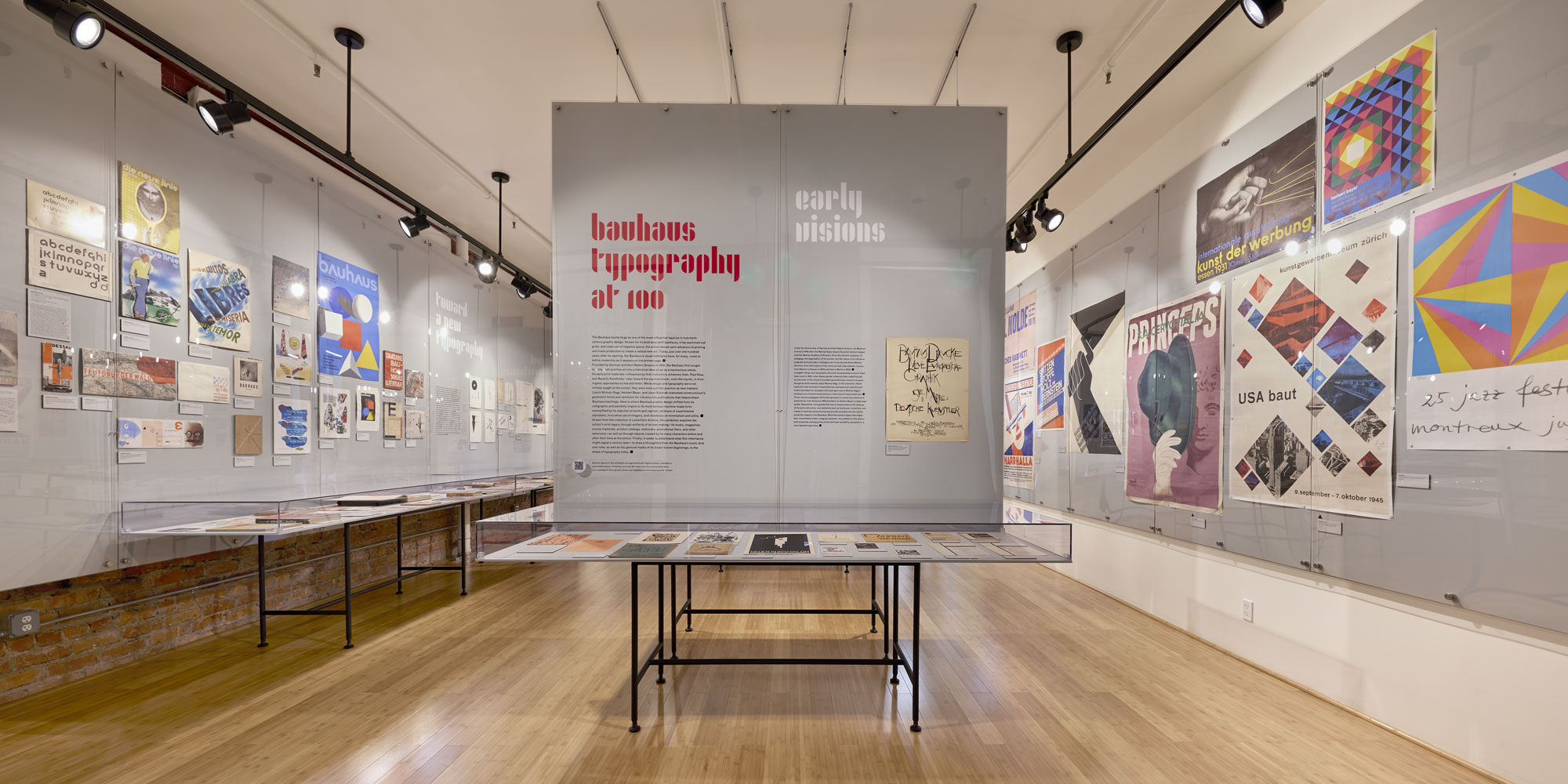

The letterform innovations of the Bauhaus continue to inspire type designers. In 2018, Adobe, Erik Spiekermann, and Fedinand Ulrich collaborated on a project inviting several students to transform lesser-known Bauhaus alphabets into fonts. Sources included drawings from Alfred Arndt, Carl Marx, Reinhold Rossig, and Xanti Schawinsky. Flavia Zimbardi started with just six letters from one of Joost Schmidt’s unfinished stencil alphabets from 1930 to create Joschmi. Her typeface now serves up title text for the Bauhaus Typography at 100 wall graphics and catalog.
Bauhaus typography has lived many lives, from its unconventional use of everyday typefaces, to its radical letterform experiments that inspired countless new designs. While the school’s typographic legacy of simplicity and geometry remains intact, the story of how it got there is anything but a straight line.
Experience Bauhaus Typography at 100
If you are in San Francisco, visit the Archive to see the exhibition in person. If you can’t make it to the Archive, the Bauhaus Typography at 100 website will be available to all until the show closes on May 21, and permanently accessible to Archive members.
— Tanya George and Stephen Coles