News
Periodicals as Collections, No. 3: Information and ulm
Our survey of avant-garde periodicals continues with two magazines that represent the enduring influence of the Bauhaus through the 20th century.
Two weeks ago, our “Periodicals as Collections” series featured bauhaus magazine, the quarterly journal of the German art school that was founded 100 years ago this month. Today, we will explore two more magazines that together weave a narrative about the enduring influence of the Bauhaus through the 20th century. It is also the story of how a particular Bauhaus student would have a hand in continuing the school’s legacy.
In 1928, bauhaus ran a series of interviews with students across two issues of the magazine. One of the students featured was Max Bill, who had arrived at the Bauhaus in 1927 and was studying architecture as well as metalworking, painting, and stage design. His responses are evidence that he was intensely committed to the school (“to leave the Bauhaus is pointless as long as things outside the Bauhaus look as they do today”) and its spirit (“the Bauhaus is an intellectual and progressive direction, a mental attitude, which one might call a religion”). And yet, he also had an expansive view of the Bauhaus that was not tied directly to its campus or its attendees, saying, “I take the Bauhaus to be larger than it is in reality: Picasso, Jacobi, Chaplin, Eiffel, Freud, Stravinsky, and Edison, and others, are actually also part of the Bauhaus” (translations from Bauhaus, MIT Press, 1969). In 1929, Bill would leave the Bauhaus for Zurich, in his native Switzerland, but he was able to carry a part of the Bauhaus with him throughout the rest of his life.
“The Bauhaus is an intellectual and progressive direction, a mental attitude, which one might call a religion” — Max Bill
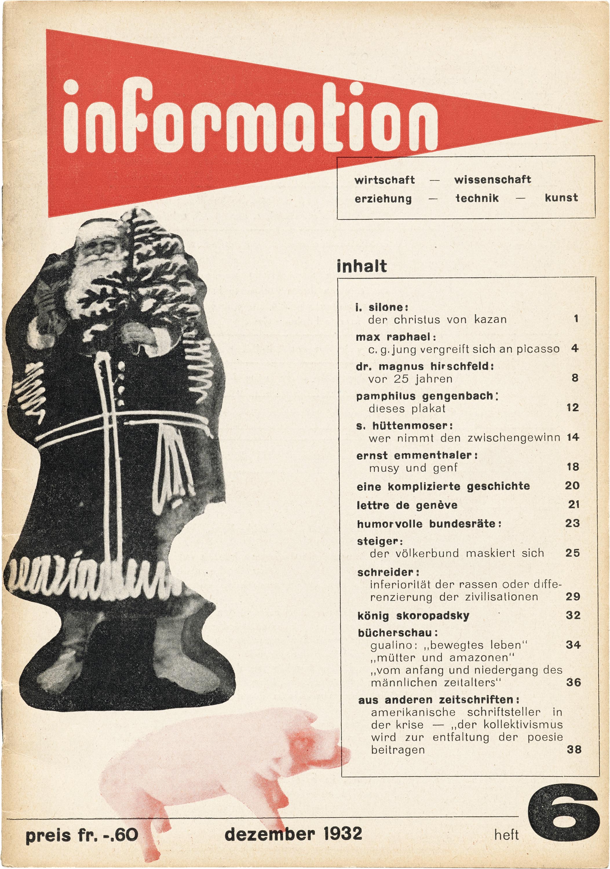
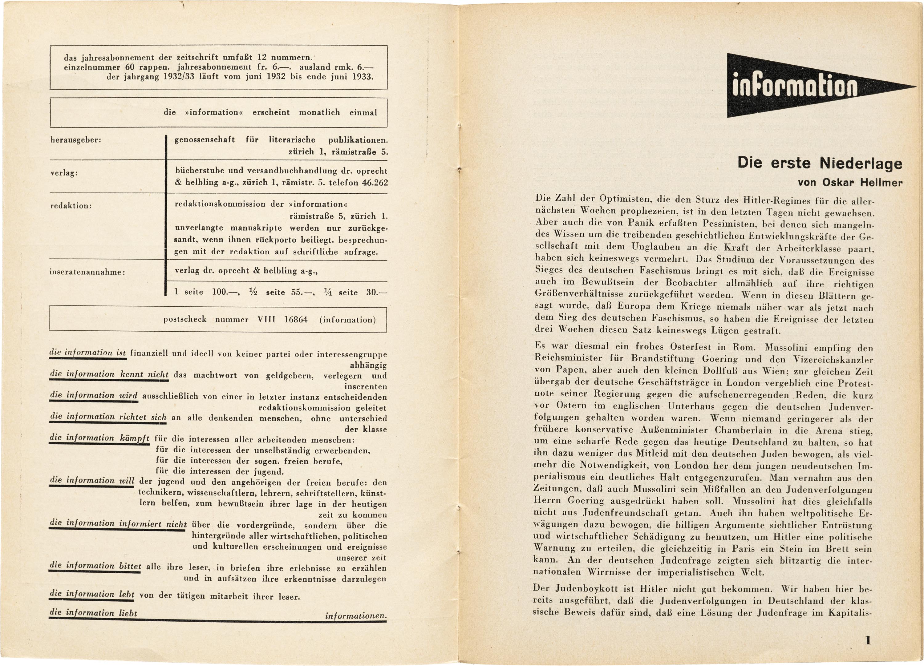
While paying his bills with advertising design, and practicing art and architecture in his studio, he debuted as typographer for a magazine called Information in 1932. Information was edited by Italian author, communist, and refugee from fascist police, Ignazio Silone. As such, the contents of the magazine have a strident Marxist socio-political bent, with many articles closely analyzing and denouncing the ideology of fascism as it was ascendant in Europe, particularly of the Nazi Party of neighboring Germany.
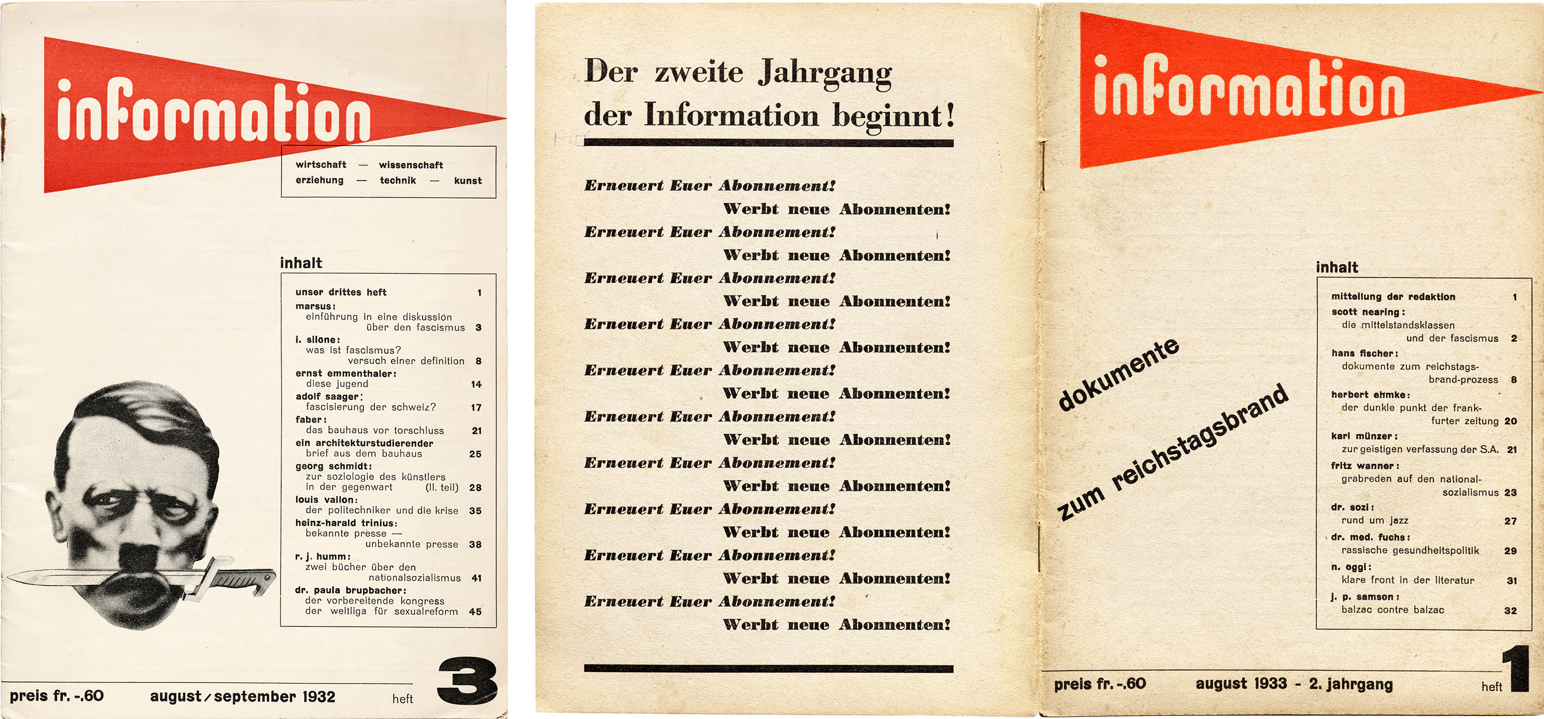
The cover designs clearly show the influence of Bauhaus typography, especially the bauhaus magazine under the direction of Joost Schmidt, with its knocked-out, lowercase, sans-serif logo lettering, and all-lowercase sans-serif type set in boxes. On the other hand, Bill’s lettering for the Information logo is somewhat unprecedented — from our contemporary perspective, its spurless forms and rounded terminals make it seem more like an artifact of the early computer age than the pre-televisual one.
For the first year of the magazine, Bill also complemented Information’s unique logo and partisan contents with efficient and striking photomontage. The most dramatic of these appears on the cover of issue 3, which depicts Adolf Hitler holding a dagger in his mouth like some menacing marauder. However, in its second year, Information simplified its design by ditching the images and the tagline, and setting bold cover-story headlines at an angle next to the table of contents.
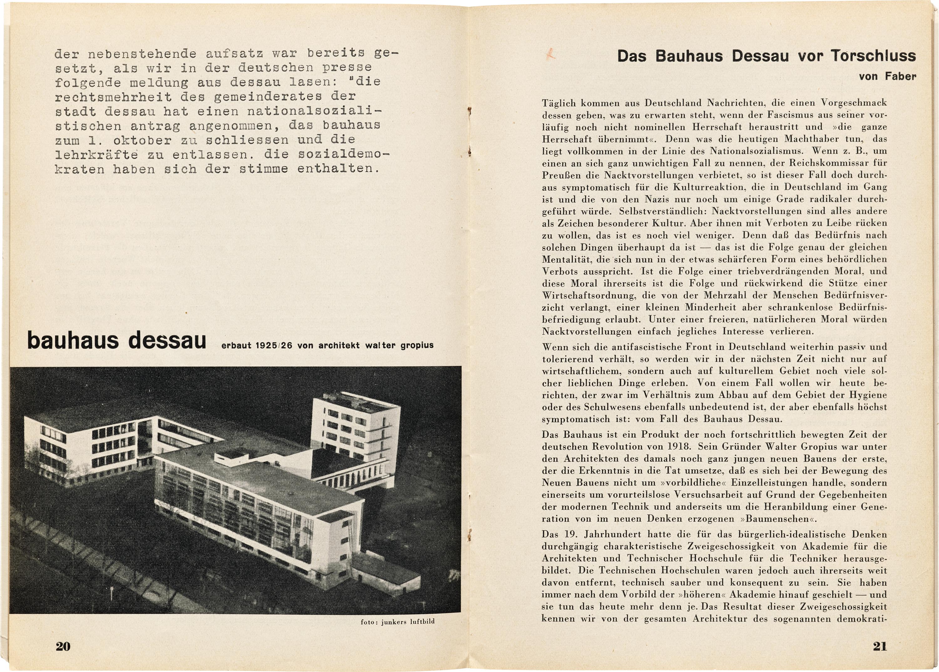
Alas, the Bauhaus school was being threatened by those same reactionary forces that Information was beginning to denounce in neighboring Switzerland. The Bauhaus had by then become the German heart of the international avant-garde art movements — and therefore a target of the cultural conservatives of the Nazi Party who had begun a smear campaign against modernism, labeling it “degenerate art”, “cultural Bolshevism”, and “un-German”. The same issue of Information that features the pirate-Hitler cover also contains an article titled “The Bauhaus Dessau Before the Gates Close”, concerning the threats of shutdown the school was facing from the state government. In fact, the headline was fated to be outdated by the time it was published, since on the facing page, a short typewritten text is reproduced, which reads:
The following essay was already set when we read the following message from Dessau in the German press: “The majority of Dessau’s municipal council has accepted a Nazi proposal to close the Bauhaus on October 1 and dismiss the teaching staff. The social democrats have abstained.”
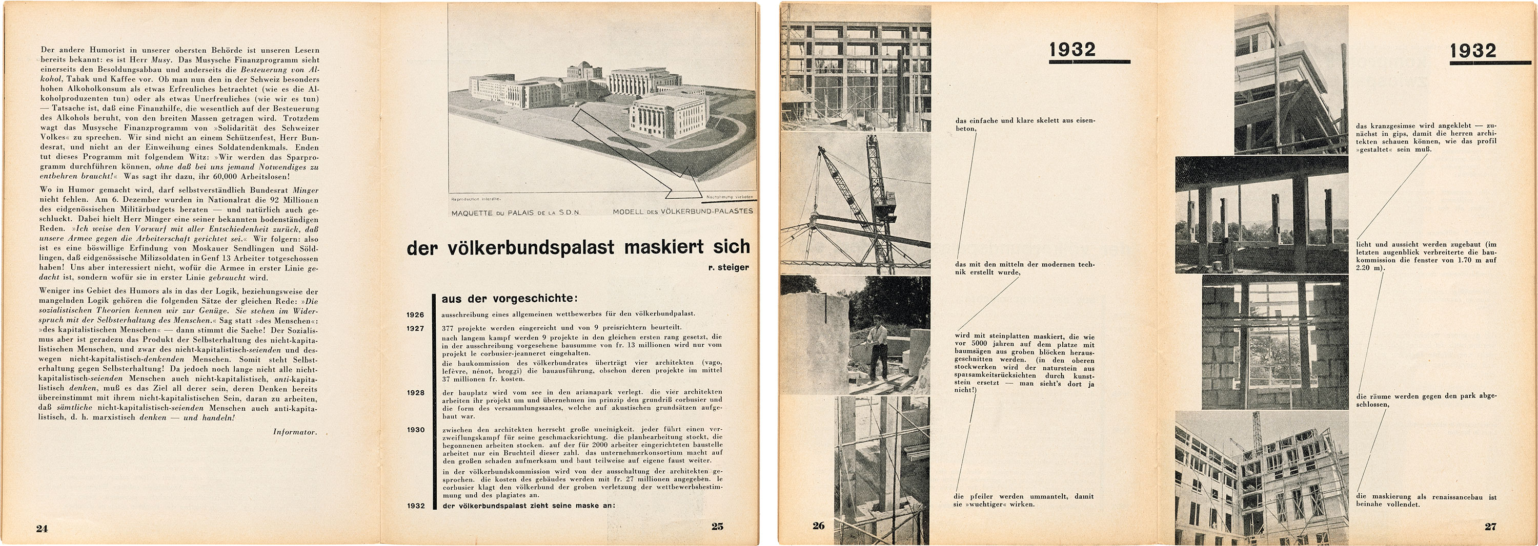
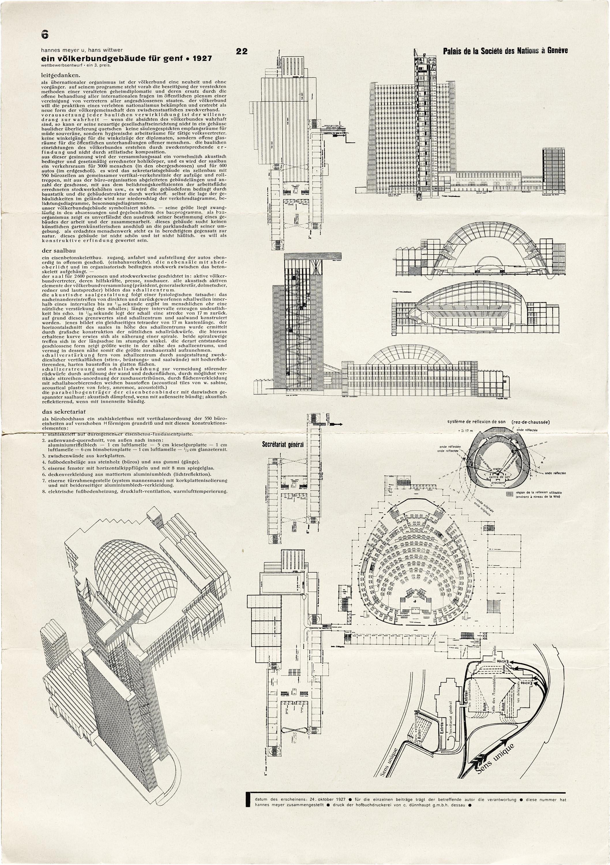
Information would have an opportunity to comment on conservative suppression of modernism at home in Switzerland, too. Issue 6 of the first year ran an article, “The Palace of Nations Masks Itself”, about the construction of the Palace of Nations in Geneva, the headquarters of the League of Nations (later replaced by the United Nations). In 1927, an architectural competition was held to determine a plan for the palace, which drew a remarkable 377 submissions. Among the finalists, Le Corbusier’s ultra-modernist, reinforced concrete plan attracted both official skepticism and public support. While his submission was ultimately rejected, the final project overseen by four architects bore more than a passing resemblance to aspects of Le Corbusier’s plan, including his reinforced concrete skeleton — but now decorated in a neoclassical exterior — leading him to accuse the architects of plagiarism. This “masking” of a modernist plan in neoclassical garb is what Information refers to in the title, and Bill’s typography for the article further emphasizes this tension. The lead image of the article shows a sketch of the building, over which Bill has added a large arrow drawing attention to the phrase “reproduction prohibited” in the lower right corner — sardonically highlighting the architects’ alleged plagiarism of Le Corbusier’s plan. On the next spread, the body of the article is laid out with columns of photographs of the construction and “masking” of the building, with blocks of text commentary connected by thin typographic rules, mirroring with typography the steel bars that strengthen the concrete slabs of the building.
Selections from Information
All images in this gallery are hi-fi captures. Click an image to enter fullscreen view, then pinch or use browser zoom to enlarge.

After the end of World War II, Germany underwent a period of cultural and financial reconstruction. This allowed for the establishment of new, sometimes experimental institutions, the exemplar of which was the Hochschule fur Gestaltung Ulm (hereafter “HfG”), the Ulm School of Design, founded in 1953. The HfG, co-founded by none other than Max Bill, along with Inge Aicher-Scholl and Otl Aicher, was committed to extending the integration of design and technology into daily life begun by the Bauhaus. Bill also designed the HfG school building and served as its first rector. As you’ll see, his Bauhaus schooling informed the early direction of the curriculum.
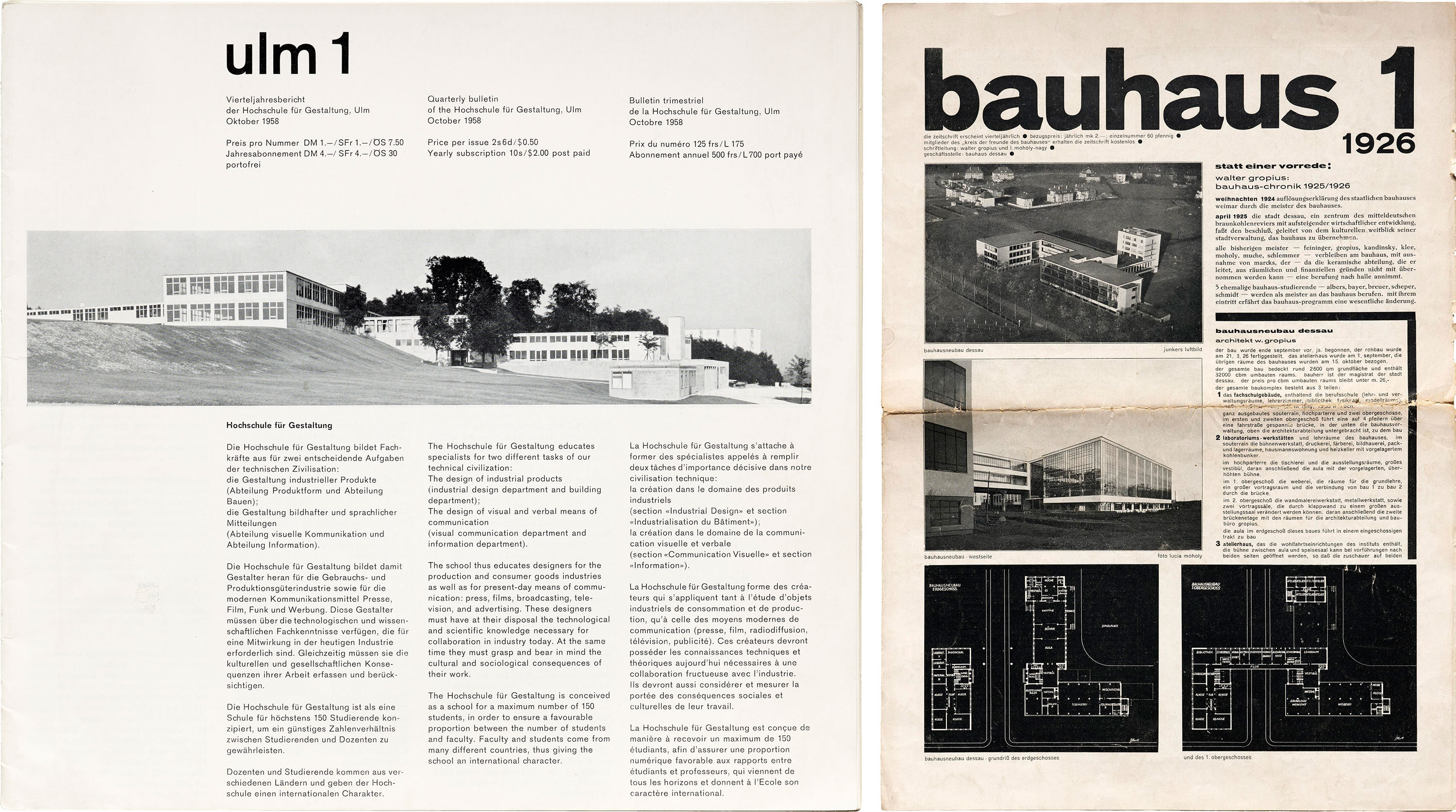
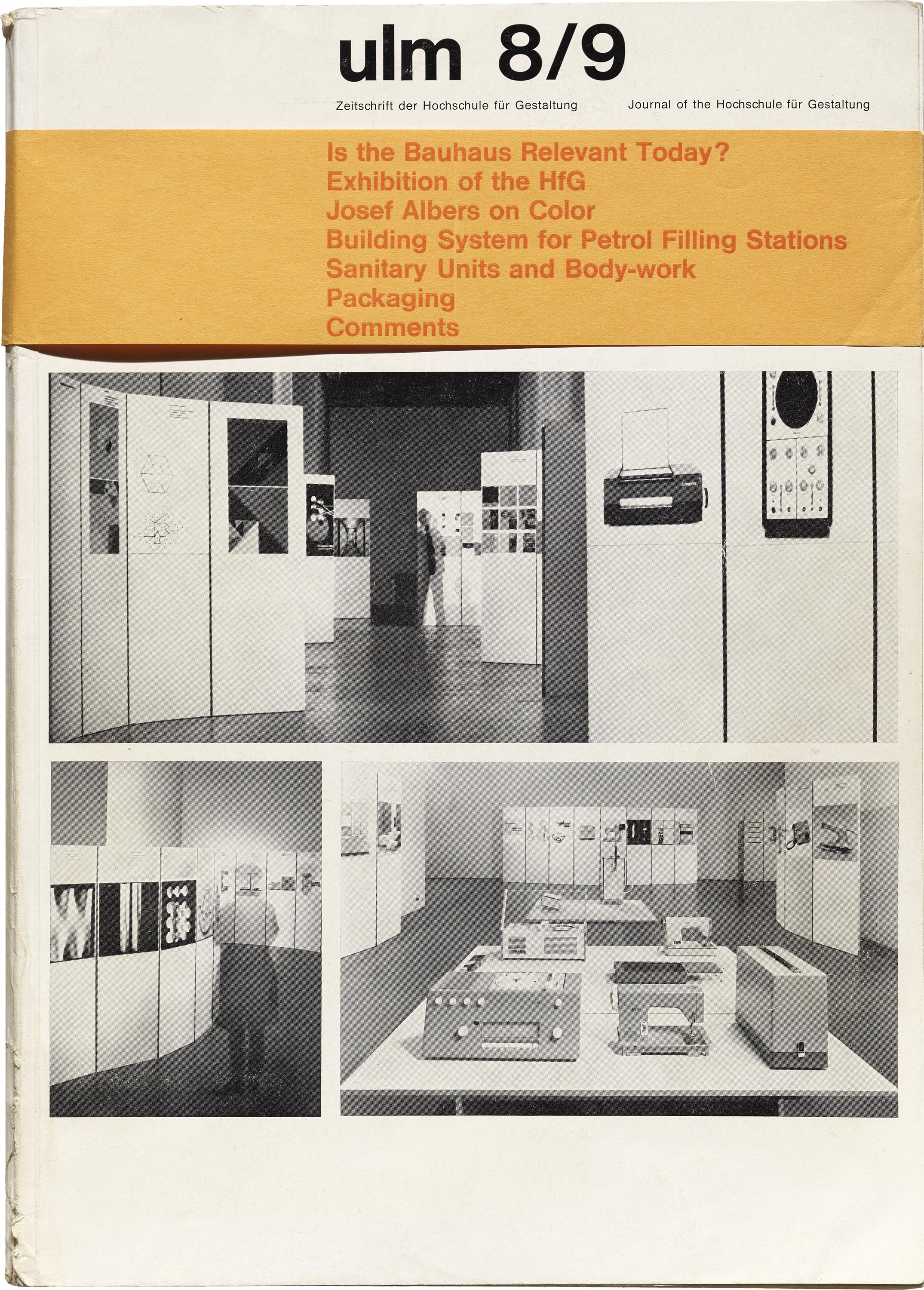
The HfG also had its own magazine, ulm, which on the surface appears remarkably similar to the magazine of its spiritual predecessor, bauhaus. Like bauhaus 1, the first issue of ulm introduces readers to its lowercase, sans-serif nameplate* and its quintessentially modernist school building designed by its founder and first director. (Though by the time of the first issue of ulm in 1958, Max Bill had left the school over pedagogical disagreements).
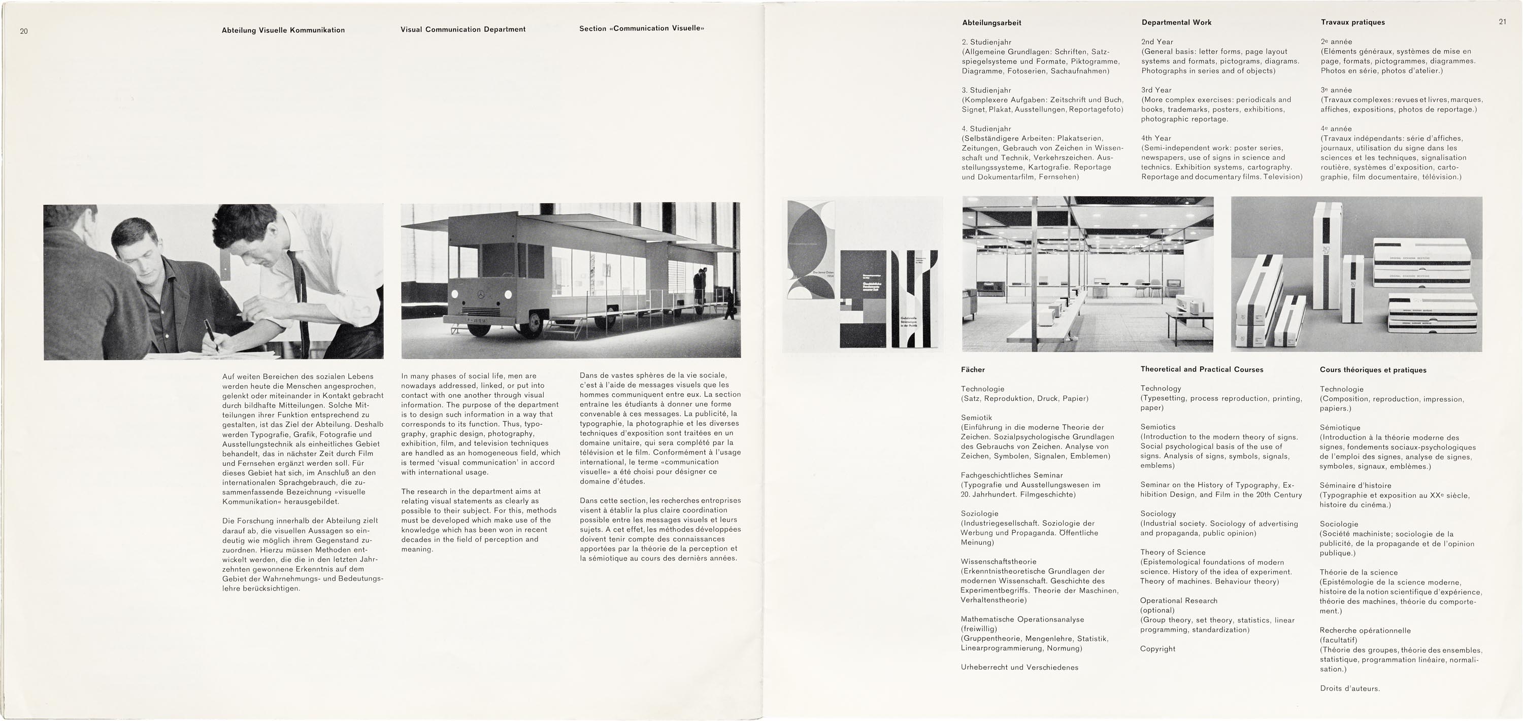
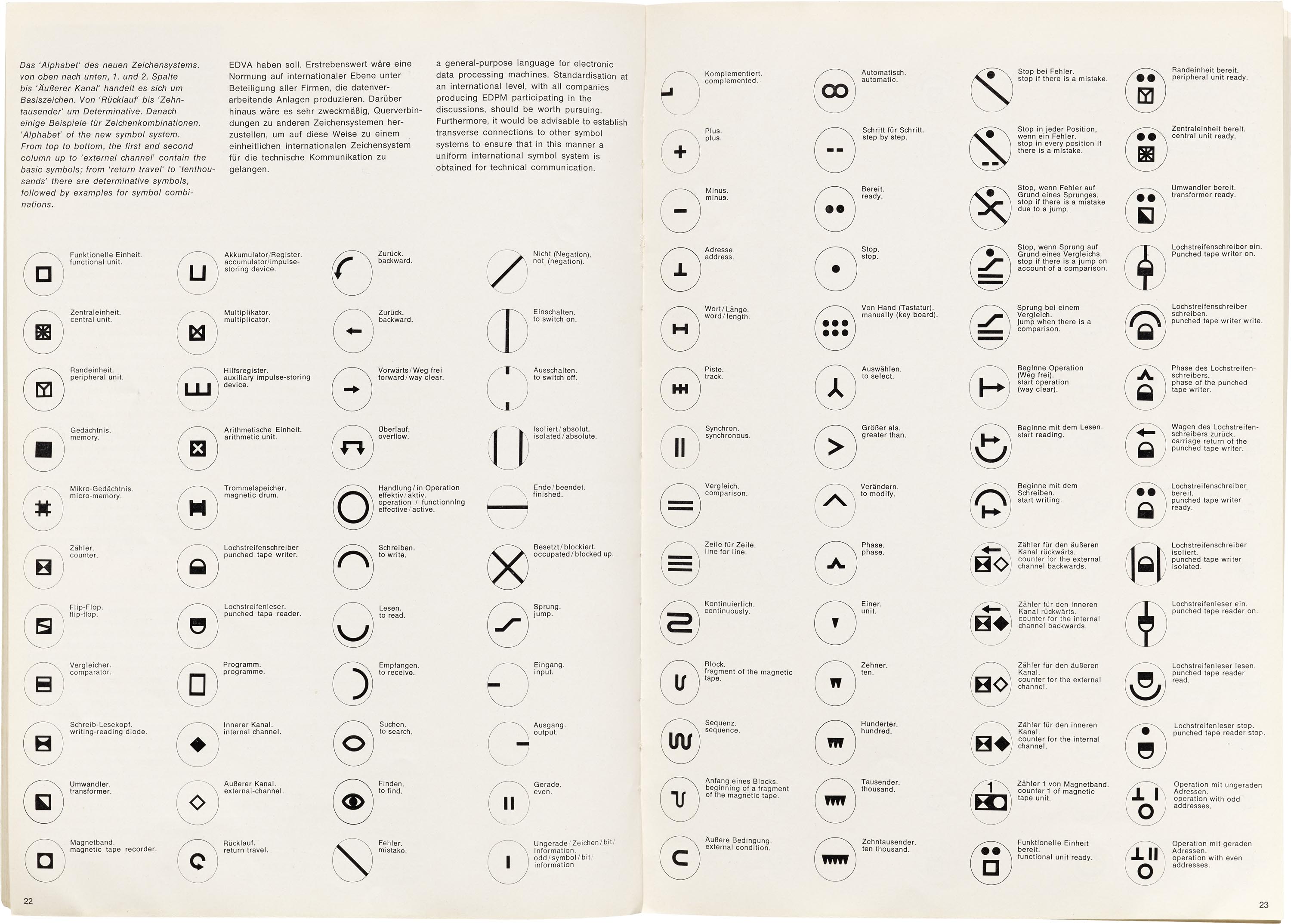
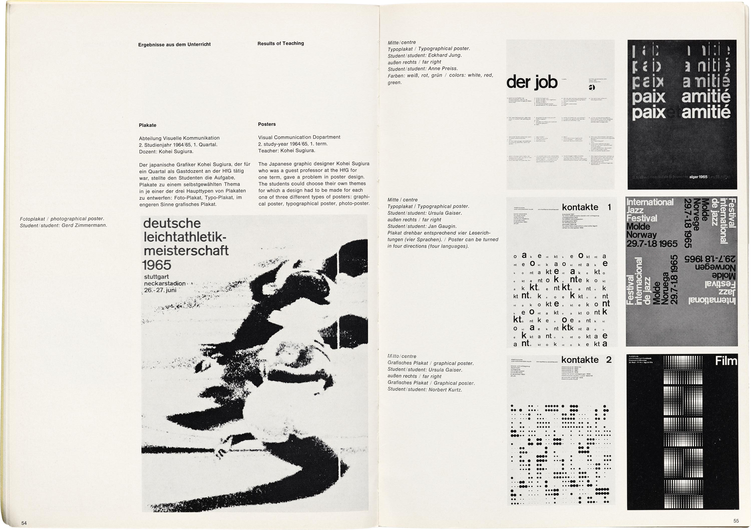
Upon closer inspection of the magazine, however, it is clear that the HfG had started down a somewhat different path than Bill’s original Bauhaus-inflected focus on art and aesthetics, instead reconfiguring around systematic, theoretical, analytical, and scientific considerations. This can be seen in the emphasis placed on semiotics — a field in which signs and symbols (verbal, visual, etc.) are regarded as parts of larger systems — by the school’s new rector, Tomás Maldonado.The entirety of issue 5 of ulm is given over to Maldonado’s lecture notes on “Communication and Semiotics” (which are accompanied by an exhaustive bibliography in three columns across four pages).
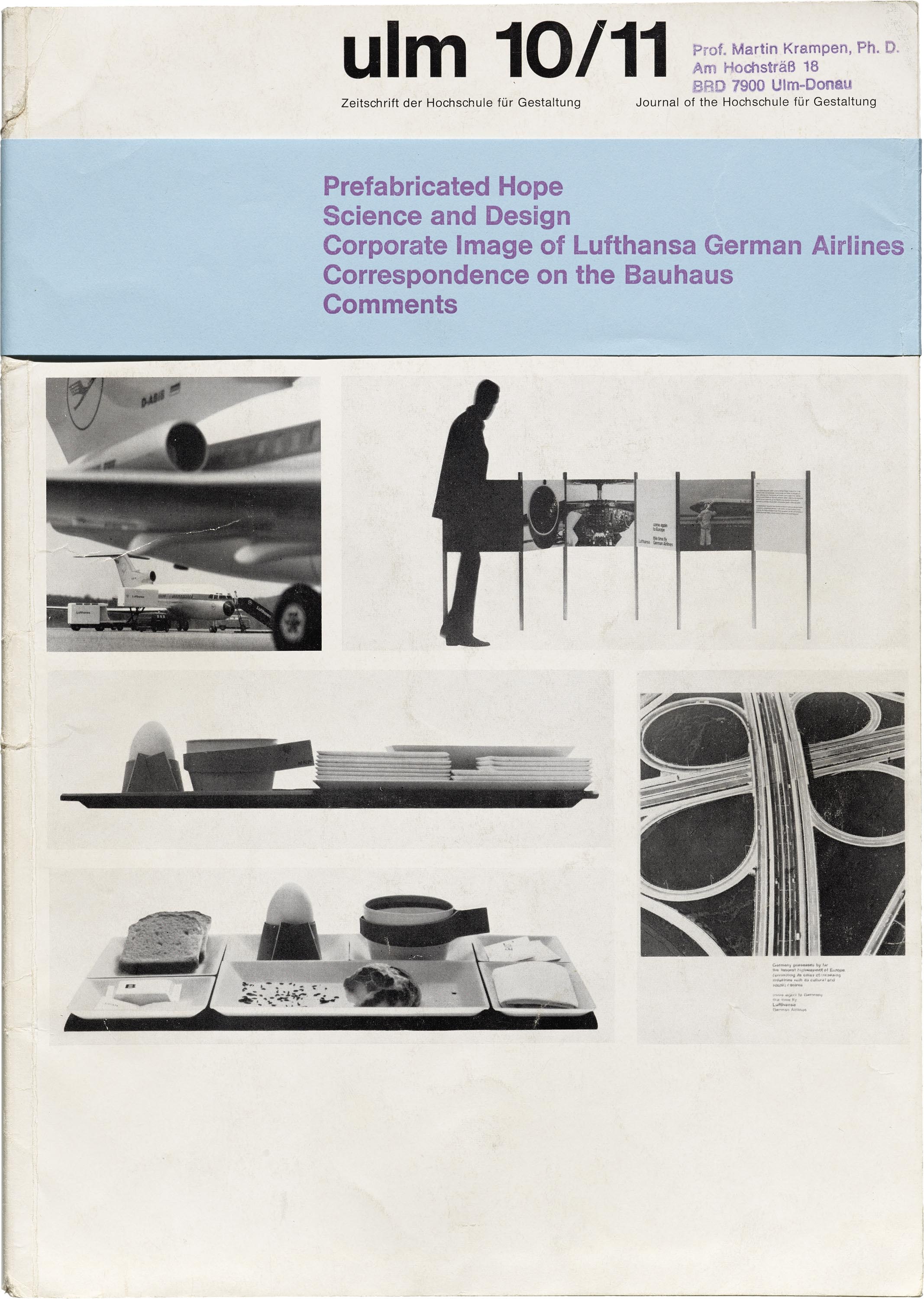
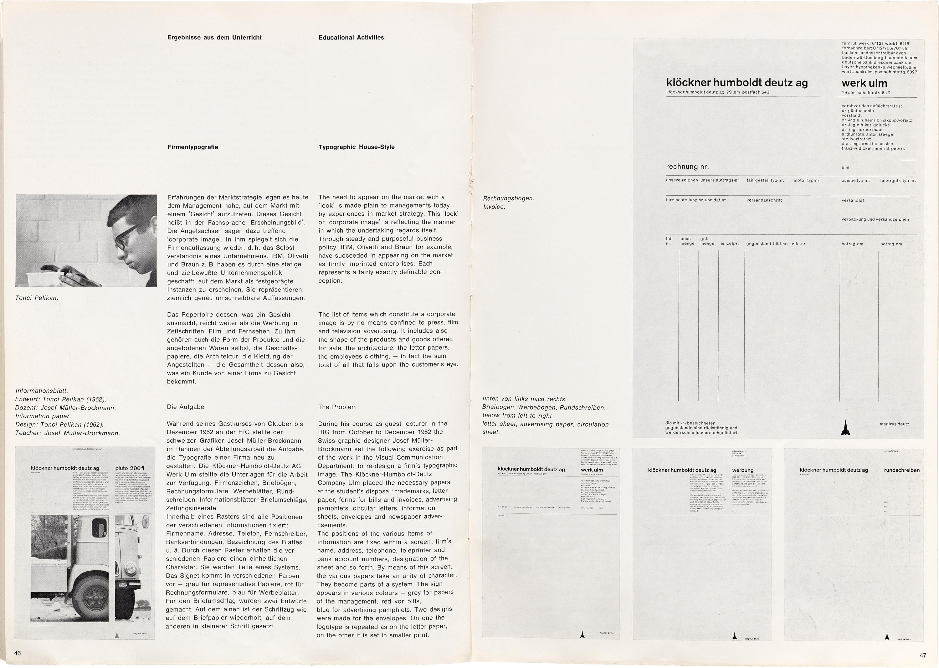
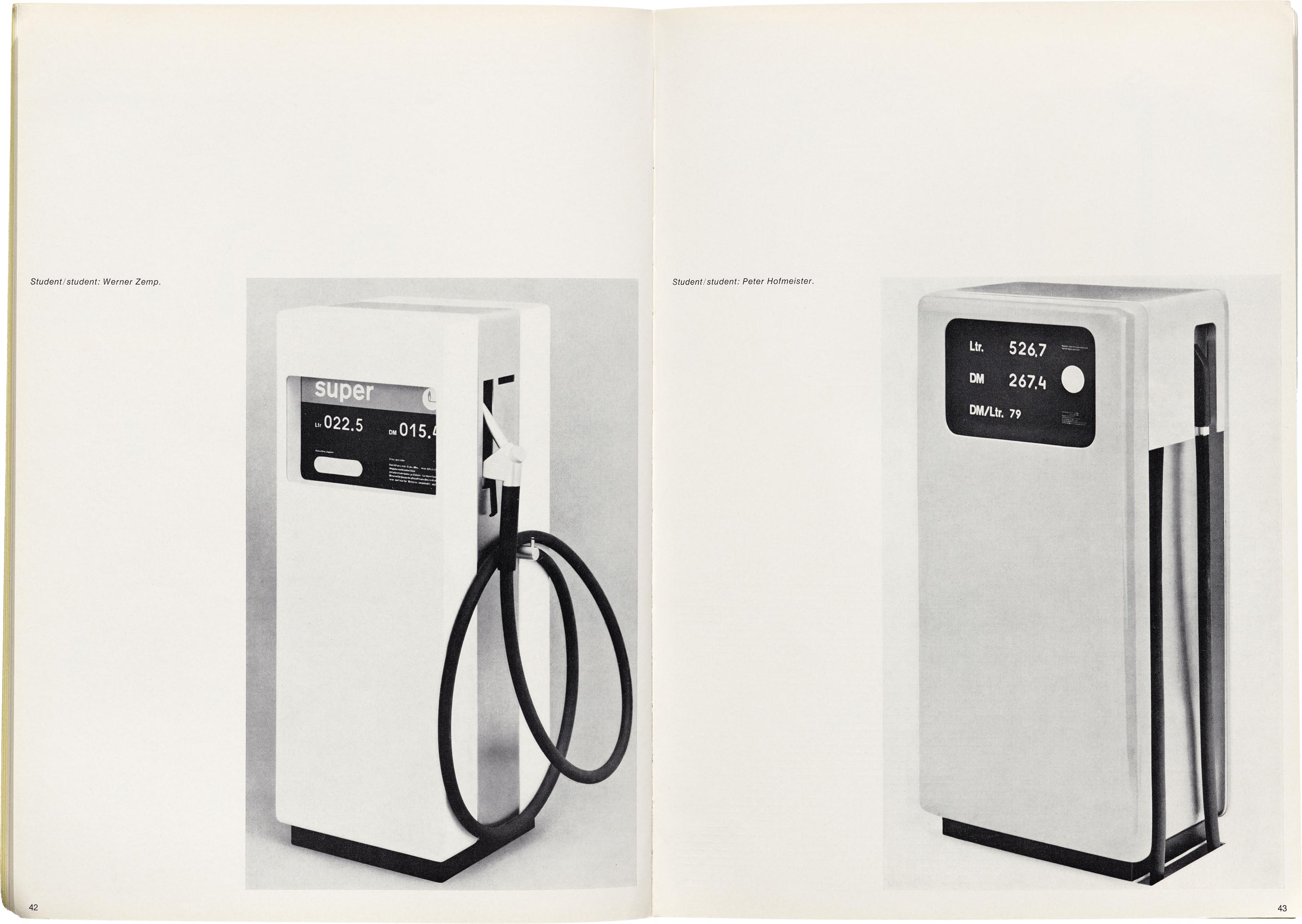
Another unique aspect of what would become the “Ulm Model” was the advent of “development groups”, in which interdisciplinary teams of students and teachers partnered with industrial professionals to execute real-world design commissions. The most iconic of these commissions is probably the suite of audio equipment designed for Braun, which is usually affixed with the sole signature of Dieter Rams but was actually an implementation of ideas developed collaboratively with HfG students.
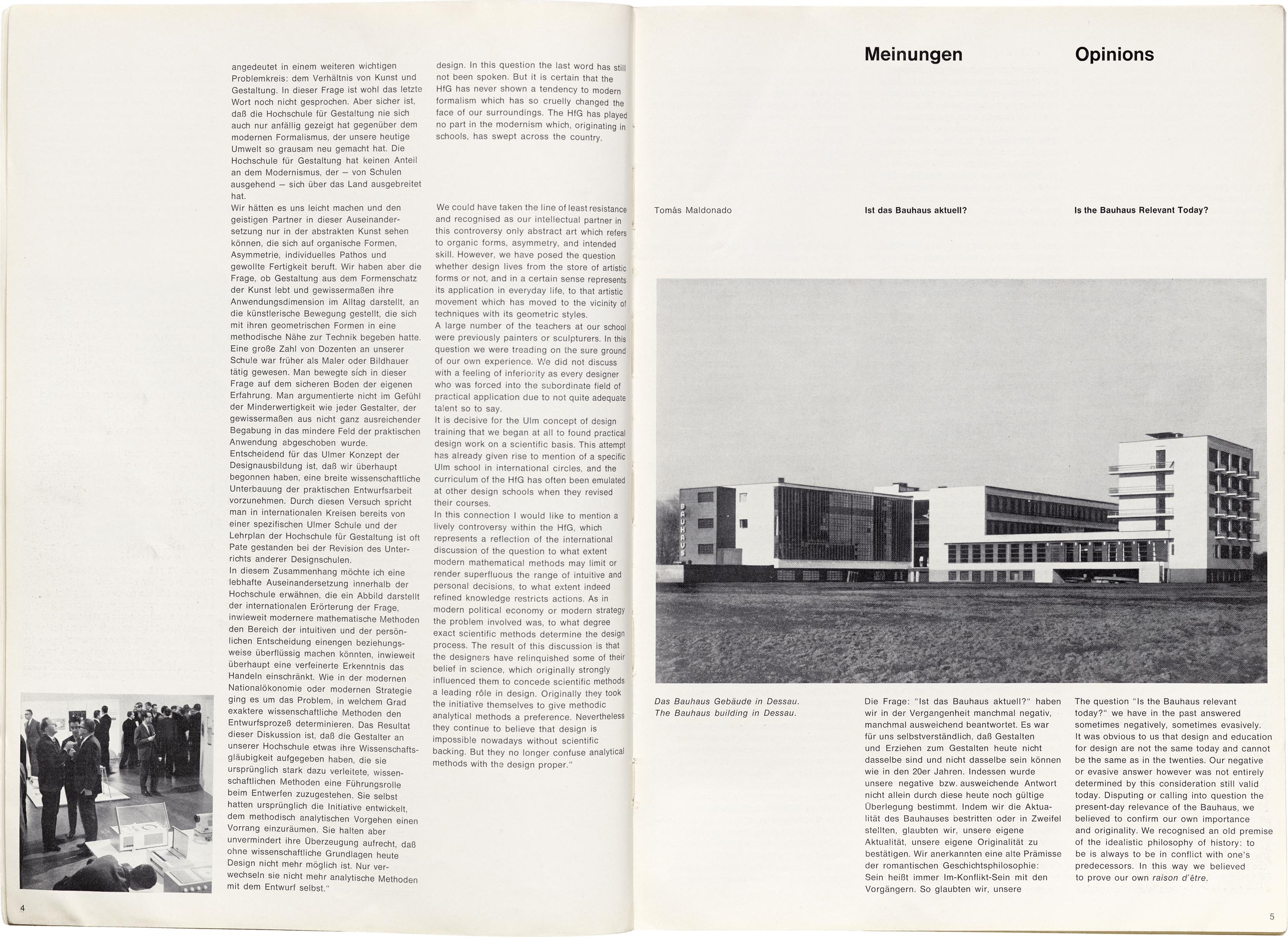
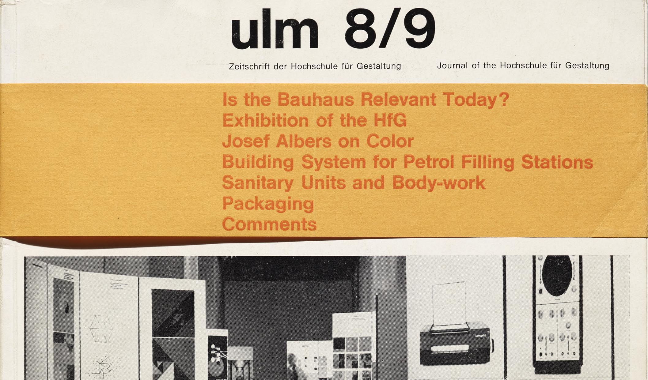
Still, the specter of the Bauhaus evidently loomed large over Ulm, especially as history seemed ominously to repeat itself in the HfG’s tumultuous later years. For issue 8/9 of ulm in September 1963, Maldonado wrote a long, reflective article, exploring the question, “Is the Bauhaus Relevant Today?” The occasion for the article is suggested by vague reference to a “defamatory campaign recently launched against the HfG” in the press. As a consequence, what begins as a confession of the HfG’s tendency to deny or shrug off the importance of the Bauhaus, “to confirm our own importance and originality”, quickly pivots to the desperate need to identify with the progressivism and experimentalism which made the Bauhaus (and the HfG) controversial, in the hopes of learning how to avoid the same fate. The article elicited a spate of reader responses which were published in the next issue, including a letter from former Bauhaus teacher Josef Albers, as well as a back-and-forth between Maldonado and Bauhaus founder Walter Gropius clarifying and quibbling over minutiae of Bauhaus history and legacy.
Selections from ulm
All images in this gallery are hi-fi captures. Click an image to enter fullscreen view, then pinch or use browser zoom to enlarge.


Ultimately, the “Ulm Model” was destined to meet a fate similar to the “Bauhaus Idea”, as the government decided to cut subsidies to the HfG in 1968. However, there are certainly aspects of both visions that are merely awaiting reaffirmation, as Max Bill himself asserted in his piece “The Bauhaus must go on” in the 1970 book Bauhaus and Bauhaus People:
Inspite [sic] of all these wrong developments I am still firmly convinced that the basic principle of the Bauhaus carried over today, adapted to present developments, is the only real chance to escape the insecurities of design in our world and to counteract the flourishing commercial-design drive by genuine and responsible design.
— Hank Smith, Collections Assistant
Periodicals as Collections
- No. 1: Het Overzicht and Wendingen
- No. 2: bauhaus
- No. 3: Information and ulm
- No. 4: Counterculture Newspapers