News
Processing Paul Rand
In the first of our new series of volunteer journals, Bethany Qualls recounts her experience sorting and listing the Paul Rand collection and how it changed the way she sees design.

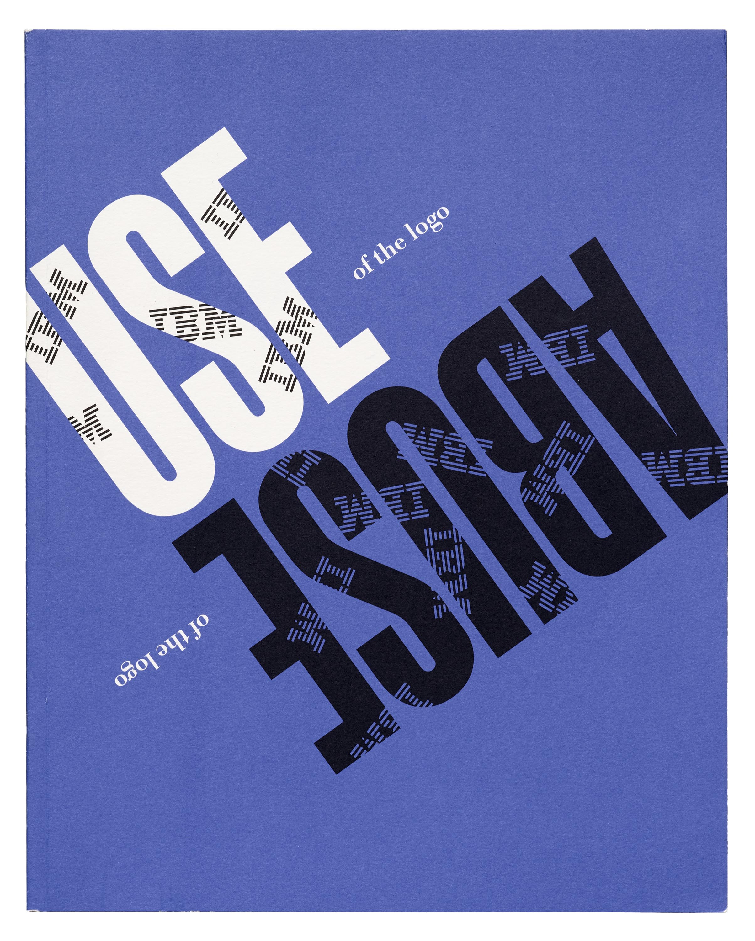
Though I knew exactly zero about Paul Rand a year ago, I now think of him every time I enter a BART station. That Westinghouse logo found at the top and bottom of most station escalators? He designed that. Same goes for IBM’s logo. He also designed logos for ABC, AIGA, Cummins, Colorforms, Maidenform, Yale University… the list goes on. And on.
From March to September 2019, I had the joy of processing objects from Paul Rand’s personal archives recently acquired from Wright’s Paul Rand: The Art of Design auction. One of the best parts of learning about a designer in this hands-on way is that I come to understand their work directly from their creations, not through conventional wisdom or others’ views about their body of work. Rand’s perhaps best known for his logos for major corporate brands, but his client list also included magazines, printers (like Mossberg & Company who still use the logo he made in 1991), universities, and smaller manufacturers of alcohol, cigars, clothing, fabric, and toys. My task list included hundreds of objects to measure, describe, and research. Finishing every box felt like a real victory.
Since he made so many great examples of twentieth-century graphic design, narrowing things down to some my favorites was a real challenge. But here are some lessons I learned while processing the Archive’s Paul Rand collection:
Collage works for everything.
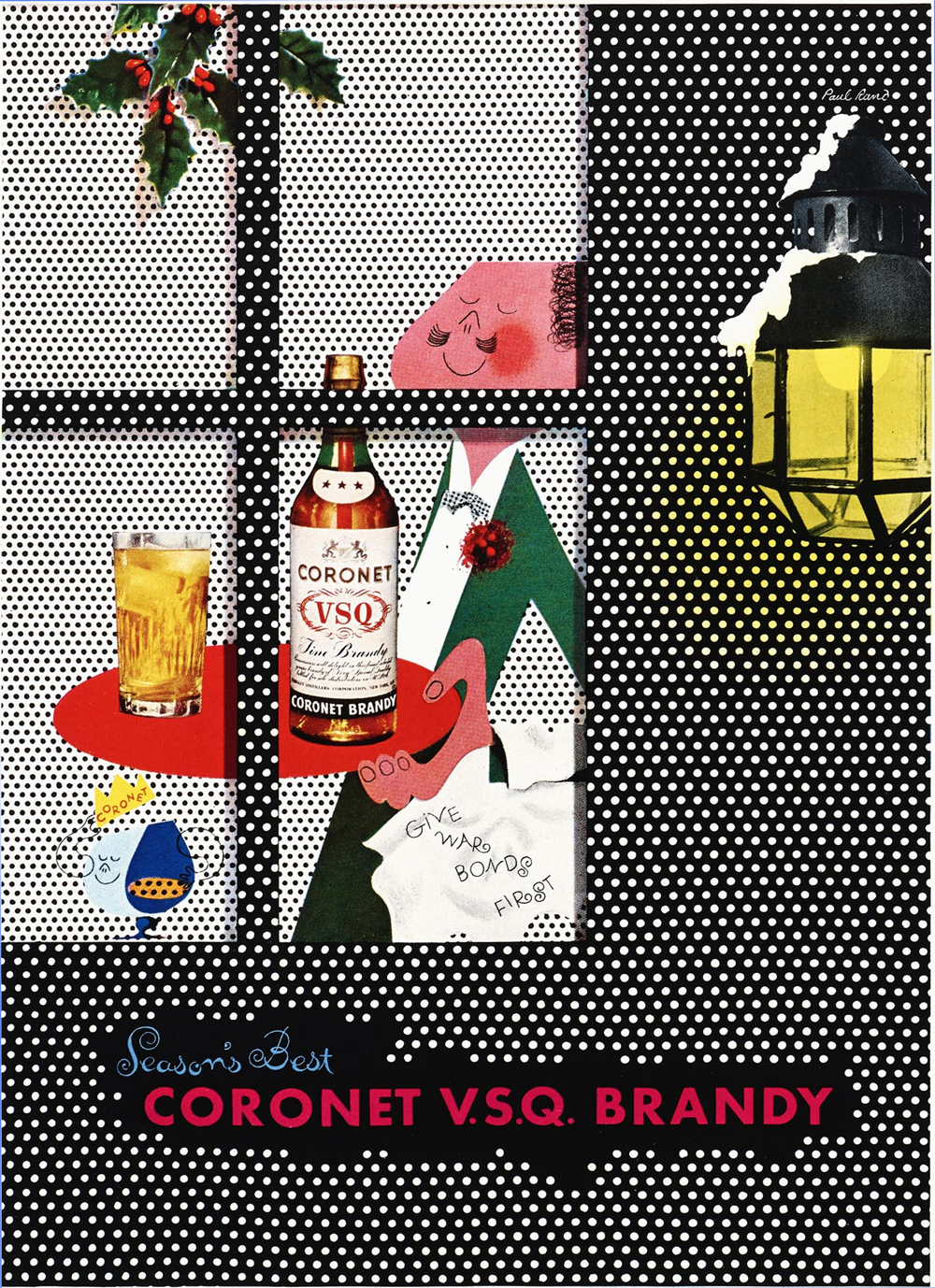
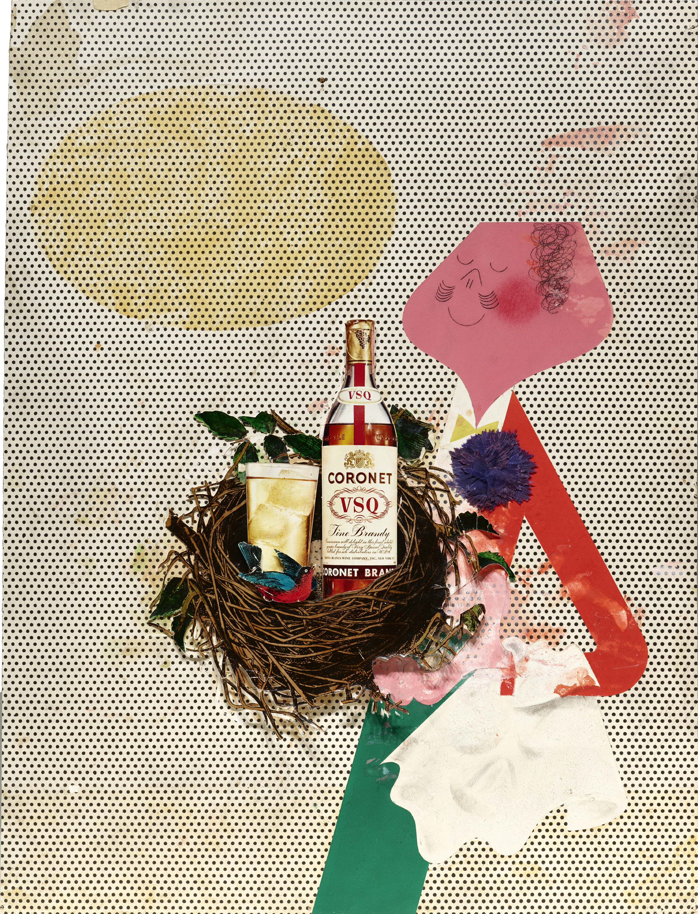
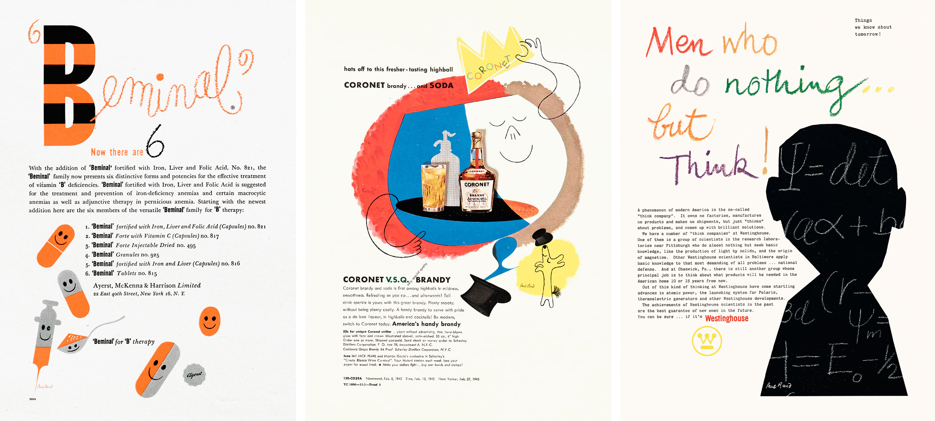
Rand’s early advertising work is a true delight to explore in all its 1940s and 1950s glory. There were so many iterations of fashion and cocktails, all done with playful collage that mixed prints with a freedom rarely seen in design up to that point. Take the advertisements for Coronet VSQ brandy: variations of a waiter holding a tray (or a bird’s nest!) in a range of settings, including parachuting.

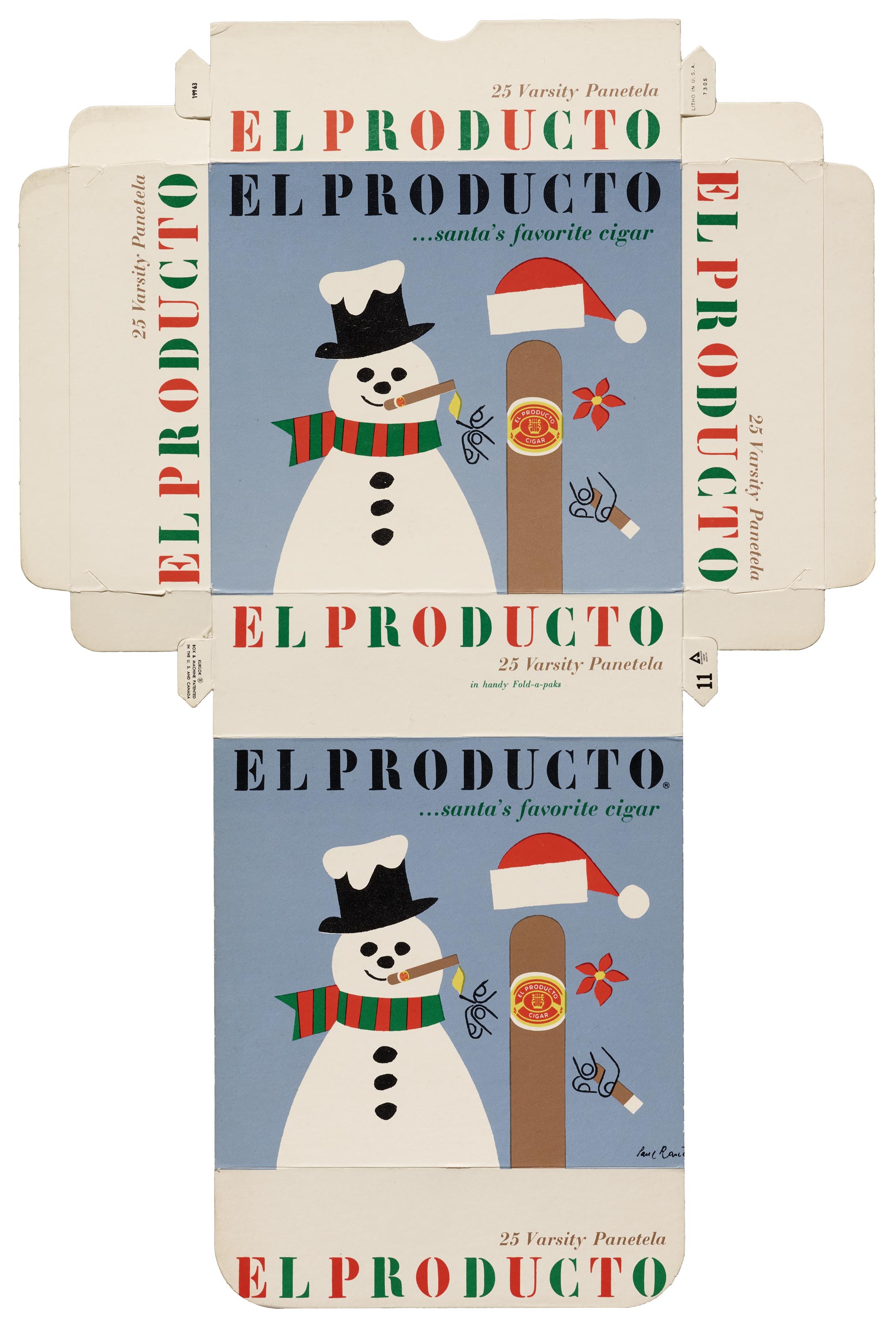
The almost childlike exuberance of Rand’s bubble motifs and bold, bright colors repeat across clients. The series of El Producto Cigar ads and boxes have the cigar dressed up in different seasonal costumes, one with a snowman smoking. Their playfulness still holds up, even if the glue and tape that held together the original objects have not.
Dating is difficult.
More than ever before, I truly appreciate publications, advertisement proofs, and other pieces of paper that include dates on them. To all you designers out there: please put the year on invitations, announcements, catalogs; “23 February” doesn’t help us determine when something was made. Still, I’m a researcher by training and inclination. So, armed with the power of the internet and reference books, I did my best to label everything with the correct decade, if not a narrower date range. This involved some cross-referencing that went way beyond the Wright auction listings. Again, “circa 1965” only gets one so far, but I wanted to provide a useful guide to anyone who accesses this great collection in the future, whether they are staff, in-person researchers, or users of the Online Archive.
One of the coolest moments was later coming across Ginza Graphic Gallery’s Paul Rand book (1992) during my next volunteer project and recognizing pieces I’d described months before. I was able to go back and date a few Westinghouse and El Producto Cigar advertisements more precisely, showing how Rand’s aesthetic continues over decades.
Letterhead is labor intensive.
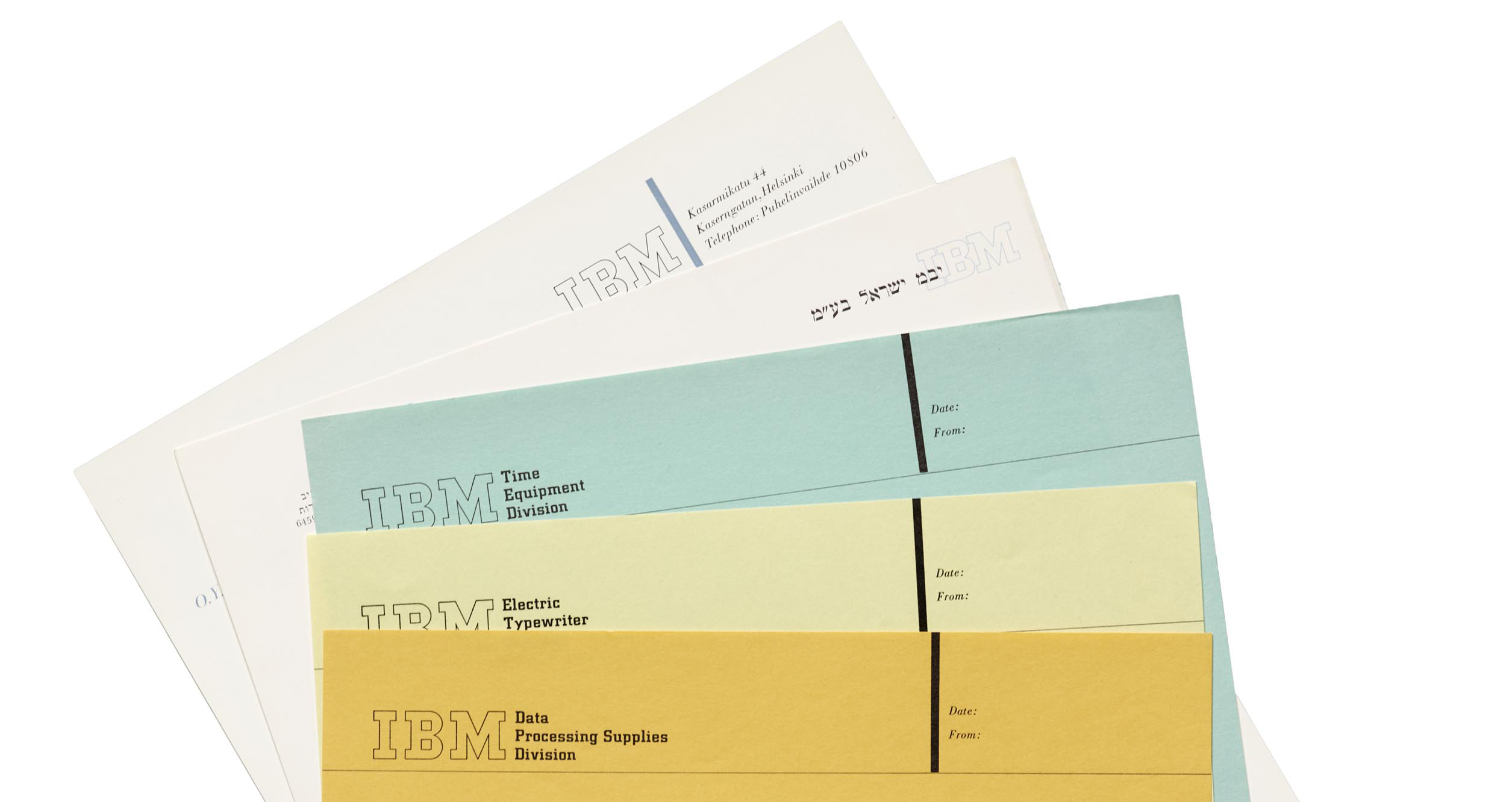
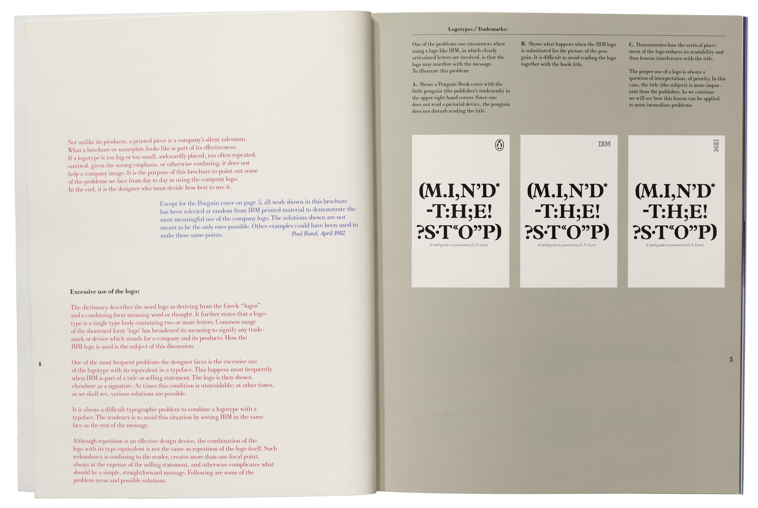
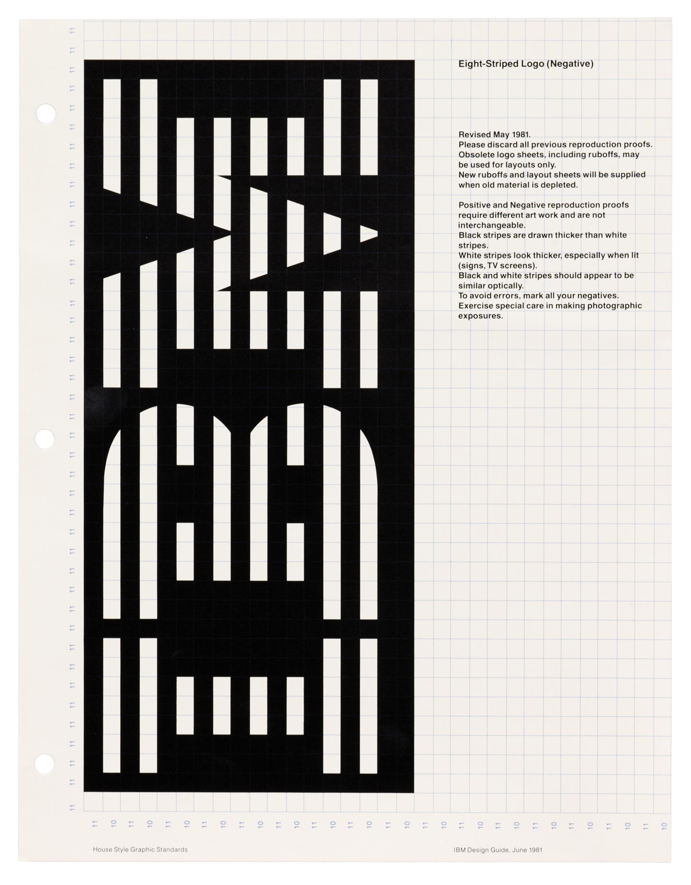
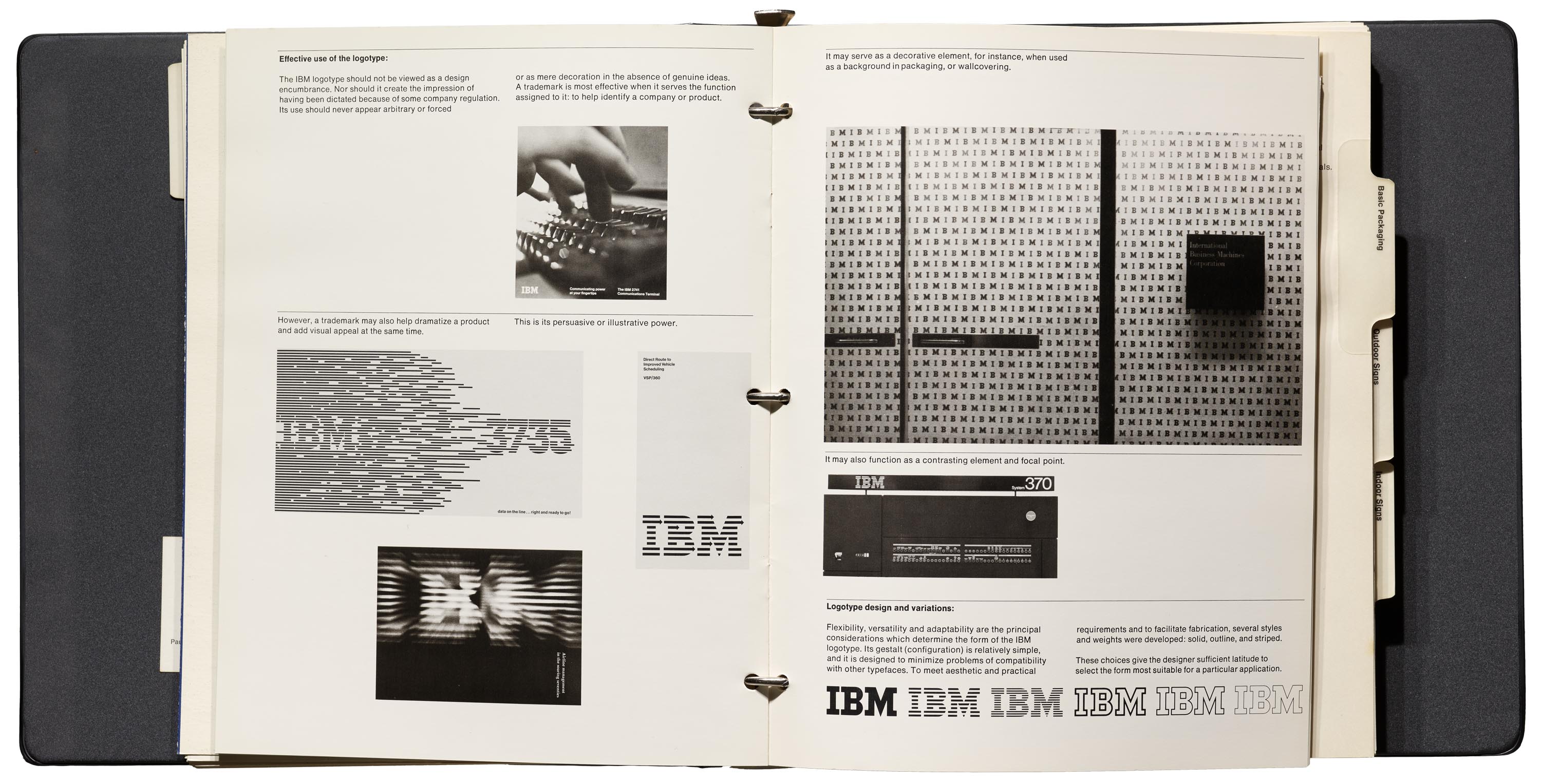
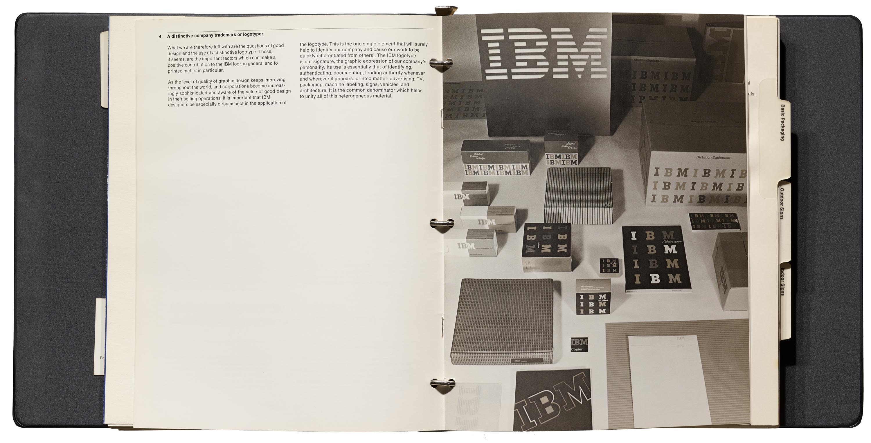
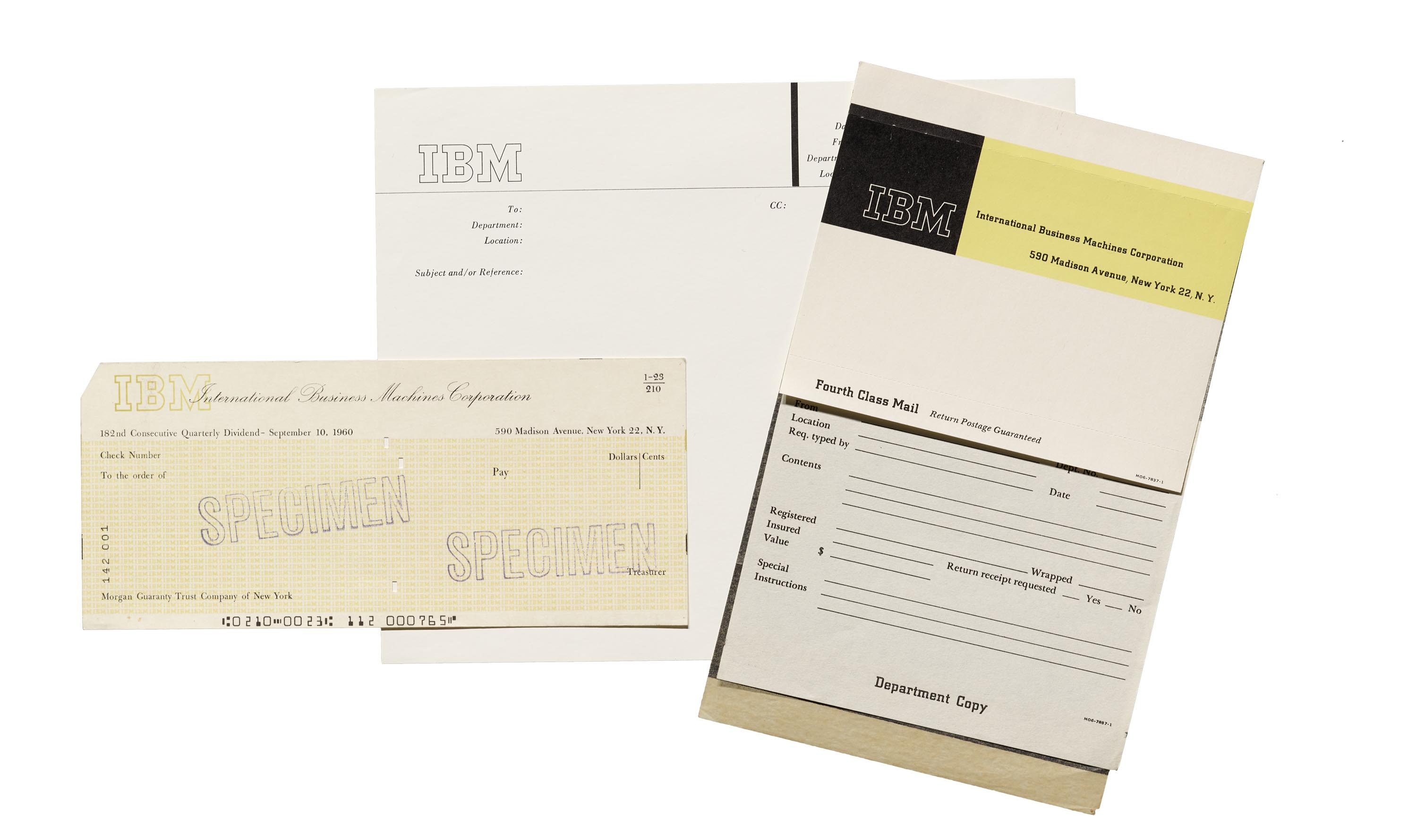
Kate Long (Librarian) and Paola Zanol (Collections Associate) were true supports as I worked through the seemingly endless variants of IBM and other corporate stationery. Part of the trick was identifying multiple versions of envelopes, cards, and letterhead, so that objects and descriptions match when they were double-checked and photographed. This was especially complicated for IBM in particular, which had pieces for different departments across the US and the world, like the Time Equipment Division or Helsinki office. Knowing the many variants of the IBM logo (e.g., open versus stripes) was helpful in being precise.

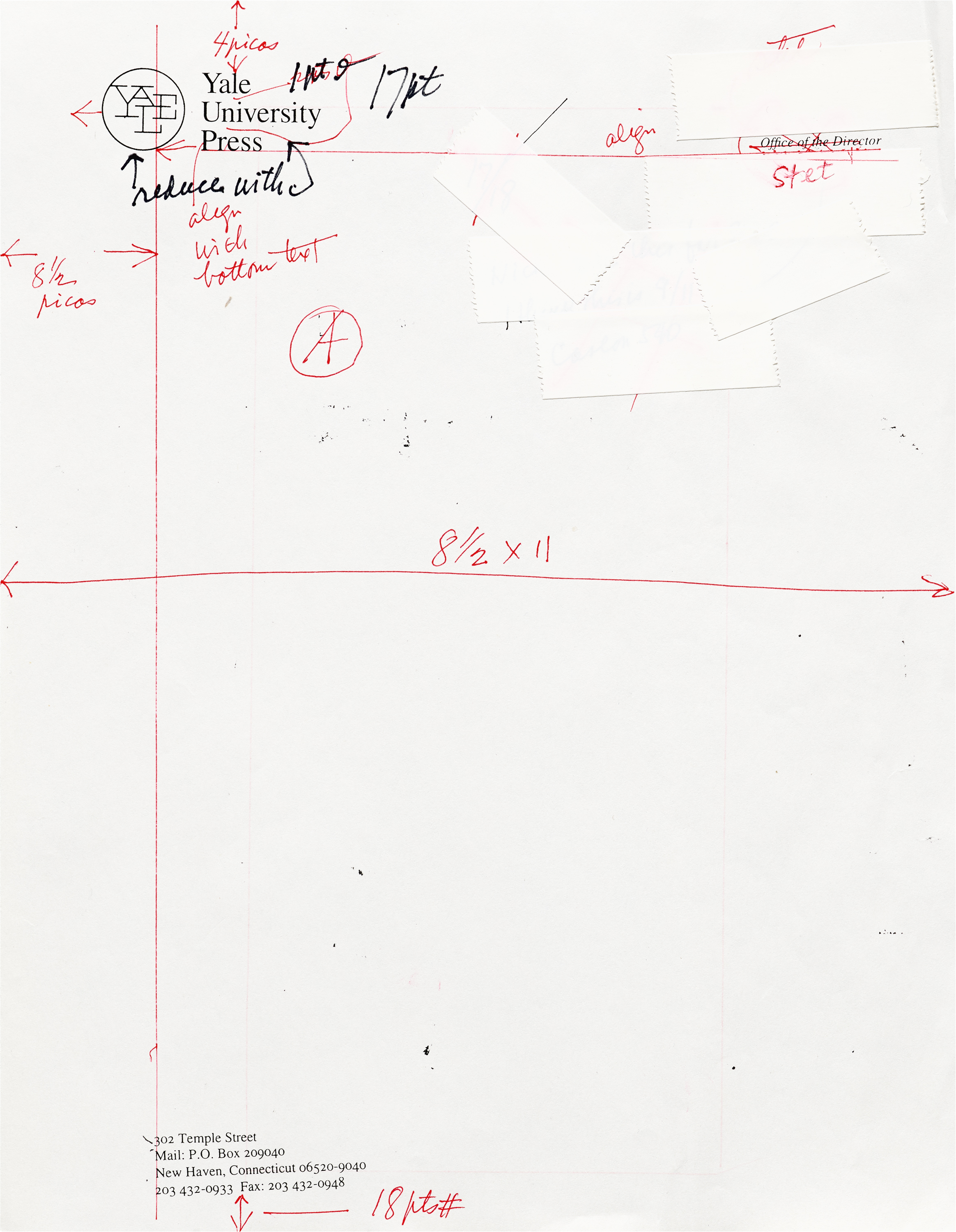
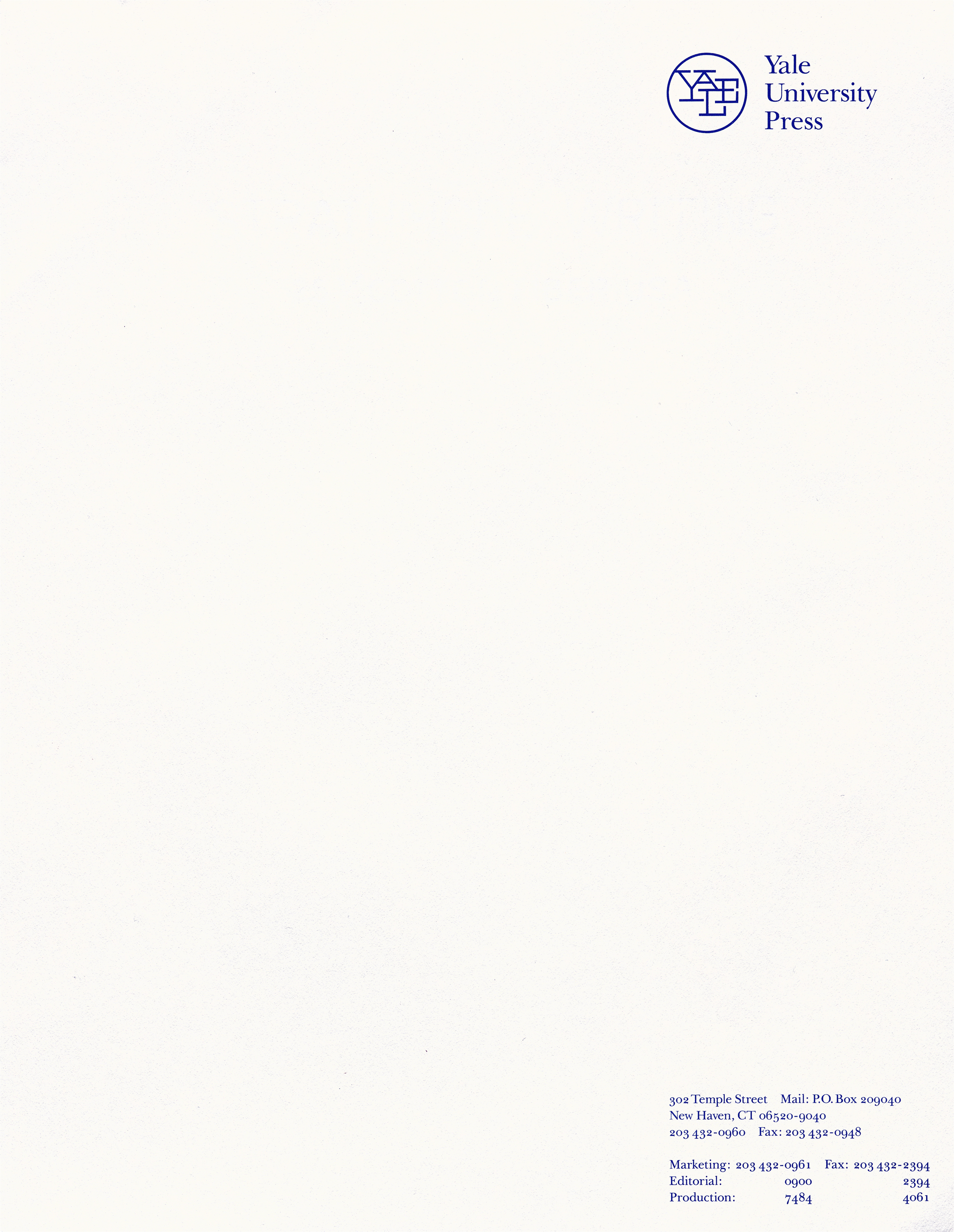
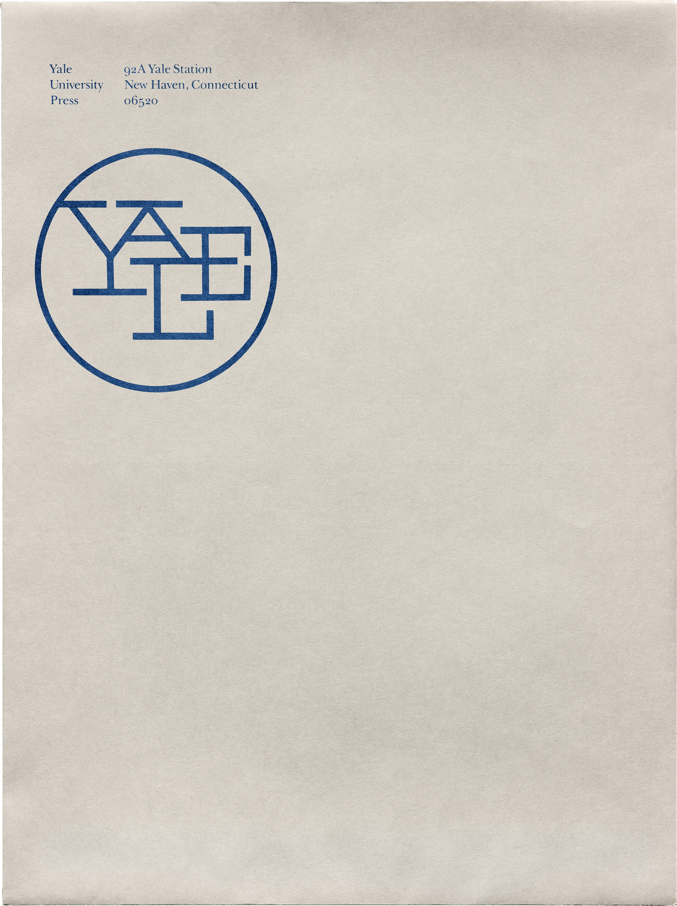
The situation was similar with the Yale letterhead, with its different logo positions and variations of blue ink. The memo cover sheets, check specimens, and mailing labels made me think about just how much paper was required for interoffice communication before the move to email. All these variations seem almost quaint in 2020, but they remind us that even the most quotidian objects involve a design process that many of us never see.

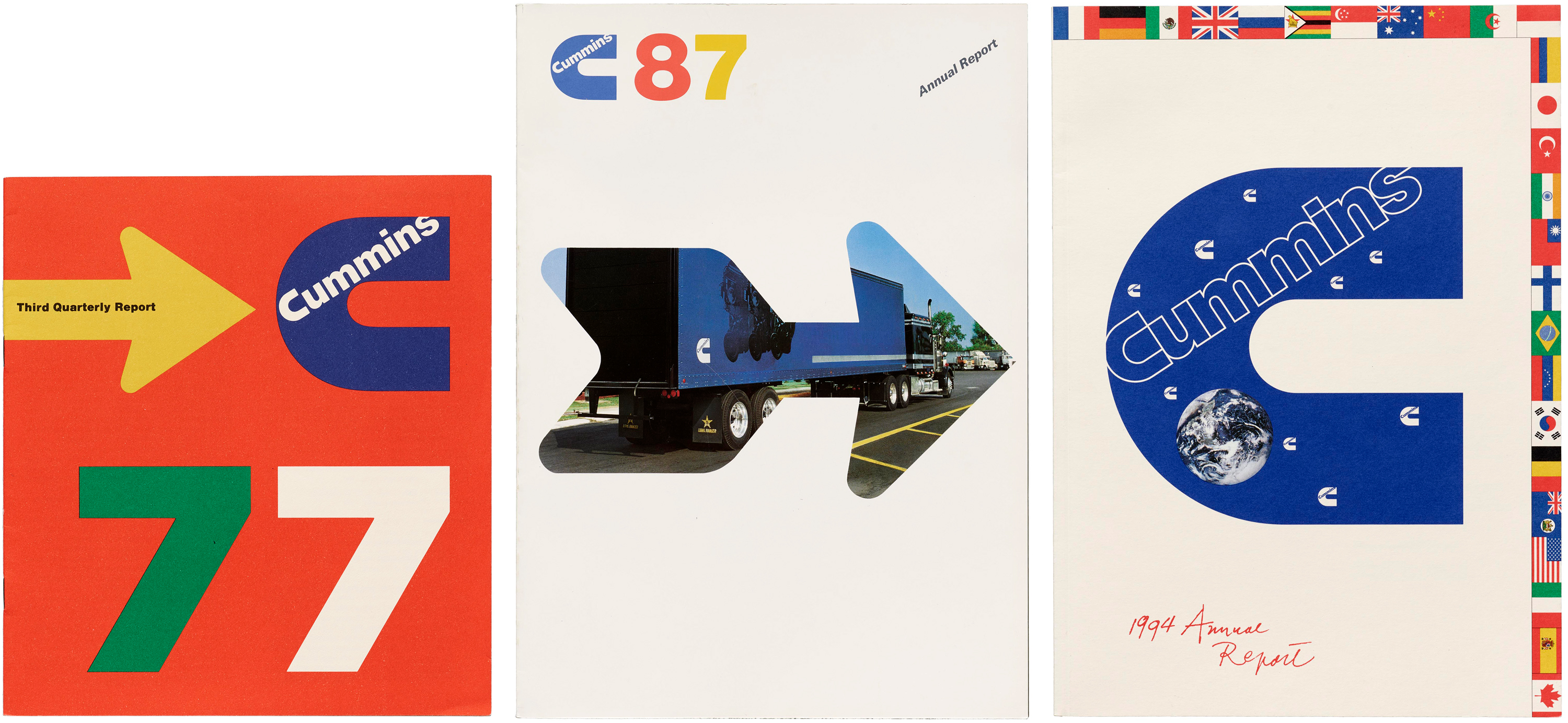
Annual reports can be sleek…
Cummins Engine quarterly and end-of-year reports have some incredible covers and interior graphics. They almost (but not quite) made me want to read them in detail. I loved seeing how the quarterly and annual reports would be linked via graphic elements and colors.
…and old advertisements are often strange.
Some of Westinghouse’s visions of the future were, ummm, particular. Besides the sexism of “men who do nothing… but think!” (where are the women!?), Westinghouse had a plan in 1961 to send planes to teach people in rural areas via telecast — forward-thinking idea with a forward-thinking advertisement (using collage, of course).
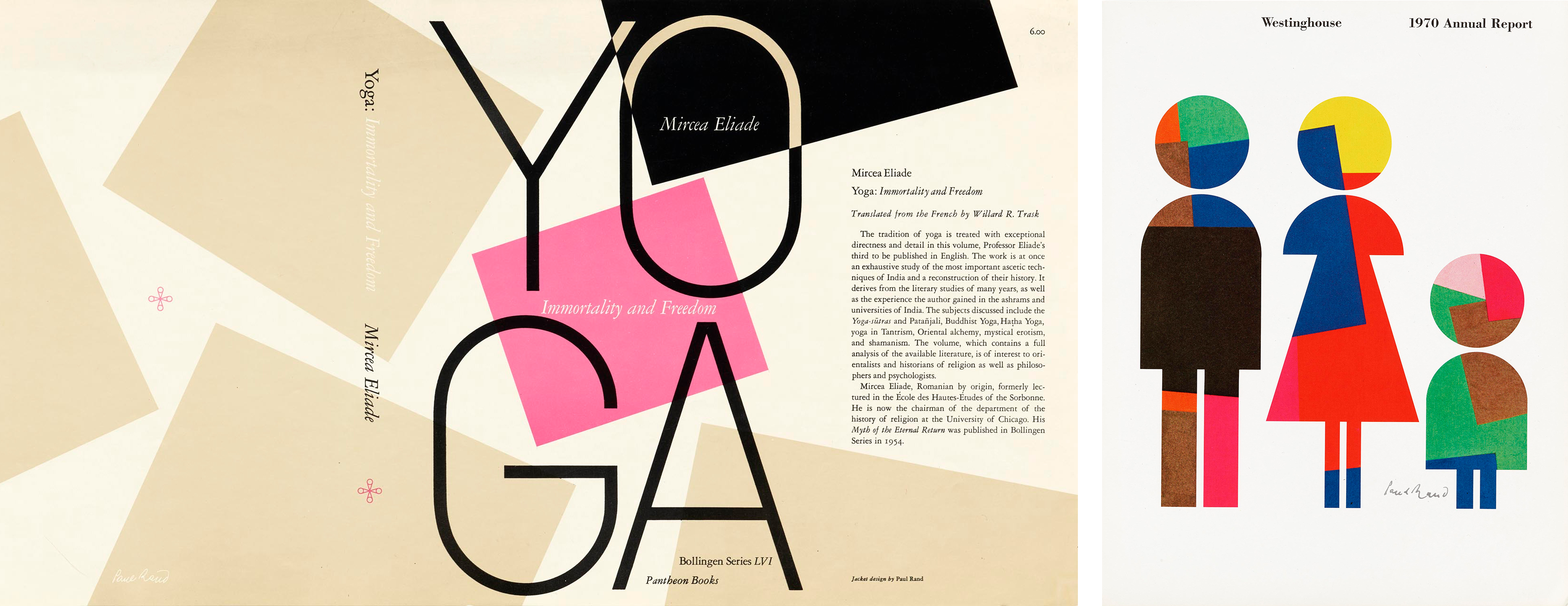
Great minds recycle.
The range of Rand’s work spans decades, but, like all designers, you can see his stamp throughout. So have a good idea? Don’t just use it once. Take, for example, the bouncing squares motif used for a book jacket in 1958 and revisited for an annual report in 1970.
You can see some of these Paul Rand objects (and even more I didn’t mention!) by searching in the Online Archive. I bet you’ll be as surprised as I was to learn just how much he designed of our world. Working with his archive has made me even more aware of just how much thought goes into making good design seem inevitable — even natural — and fun.
Bethany Qualls is a freelance writer, editor, and teacher based in San Francisco. She’s also using her research skills to pursue a PhD on the role of gossip in eighteenth-century British print culture at UC Davis. She has volunteered for the Archive in various capacities, including cataloging materials made by W. A. Dwiggins and Amos Kennedy Jr., since 2018.