News
Lipton Calligraphy for the Dwiggins Spine
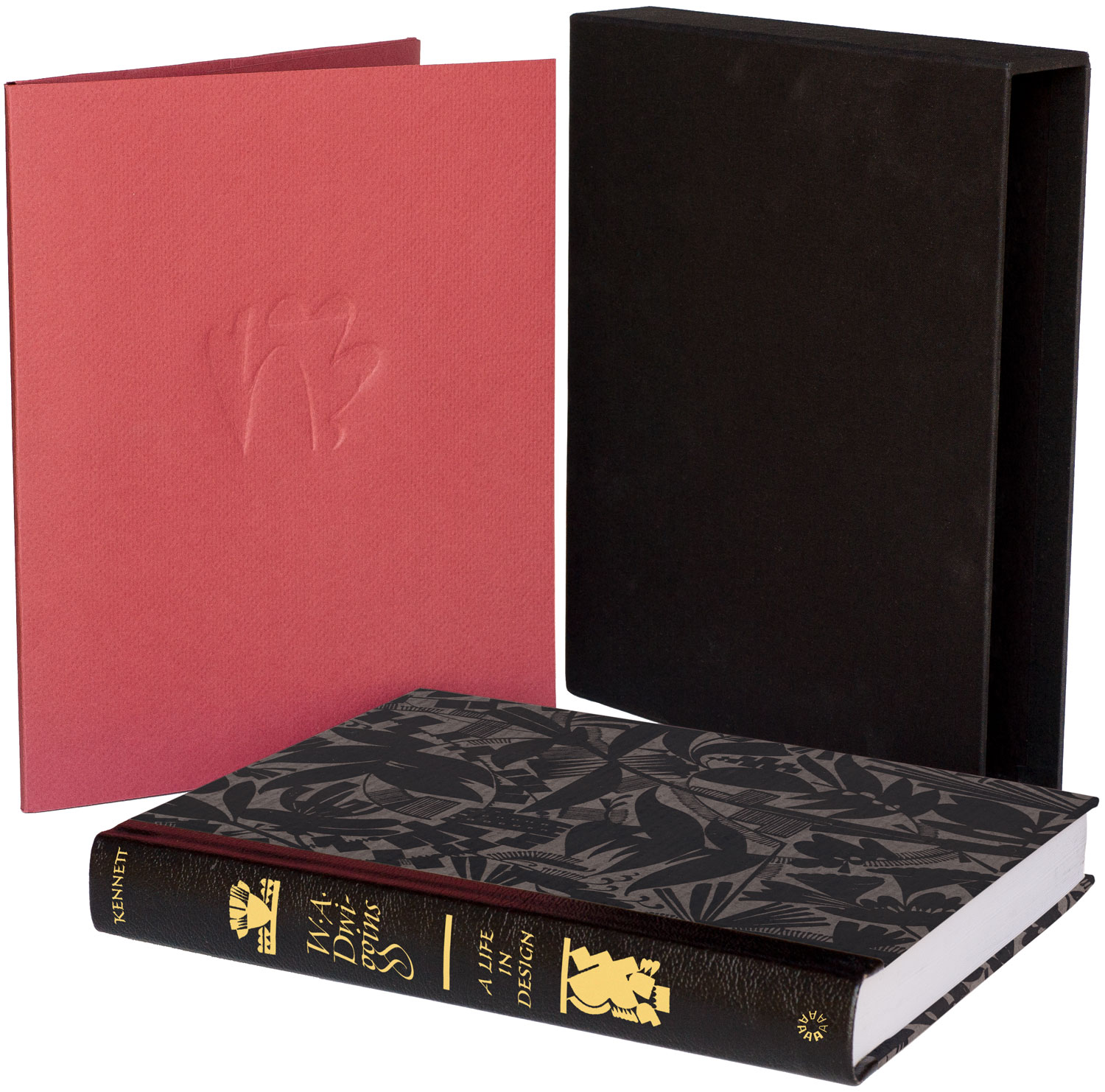
Bruce Kennett’s biography of W. A. Dwiggins is nearly ready to go to press. A few lucky backers of the project are set to receive the deluxe edition of the book, bound with a leather spine that features gold foil-stamped lettering by master calligrapher, Richard Lipton. This week we talked to Richard about penning the proper spine for Letterform Archive’s first publication.
What’s your relationship to Dwiggins’s work?
Richard Lipton: Like so many graphic designers, calligraphers, and type designers, I had something of a love affair with his multifaceted work. He was a consummate craftsman and there is much to admire in so many aspects surrounding his many interests, accomplishments, and sense of humor.
I came to his work first as a budding calligrapher. I had the opportunity to visit his Hingham studio along with Ed Karr and Jackie Sakwa in the early 1980s and was given a personal guided tour by Dorothy Abbe. I was just fascinated by everything I saw there and heard the admiration in Dorothy’s voice as she described his talent and dedication to everything he touched. There is a warmth and human touch present in all of his work that spoke clearly to the time in which he lived.
Dwiggins explored many different lettering styles over his career. What sort of calligraphy seemed appropriate for the spine?
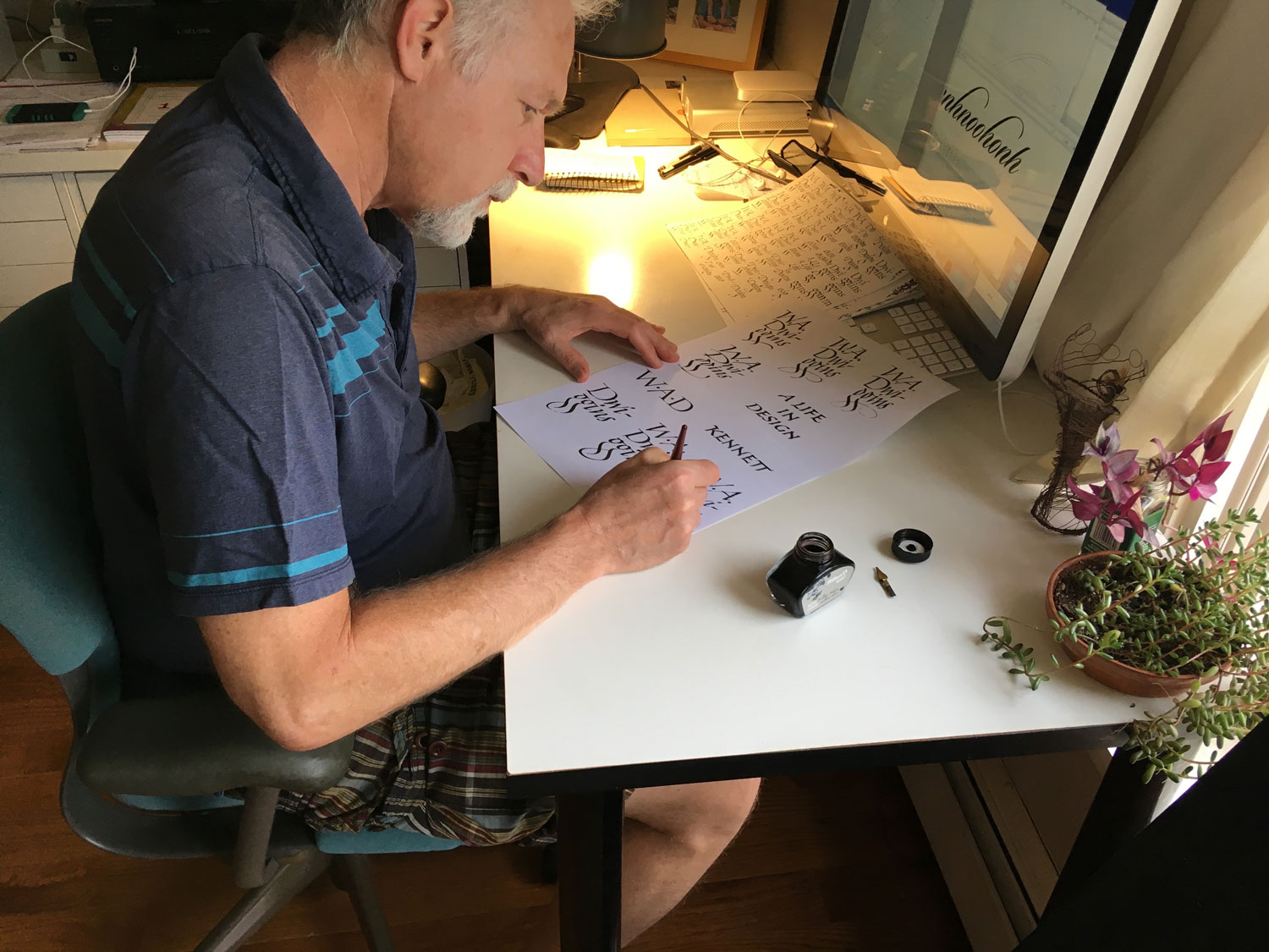
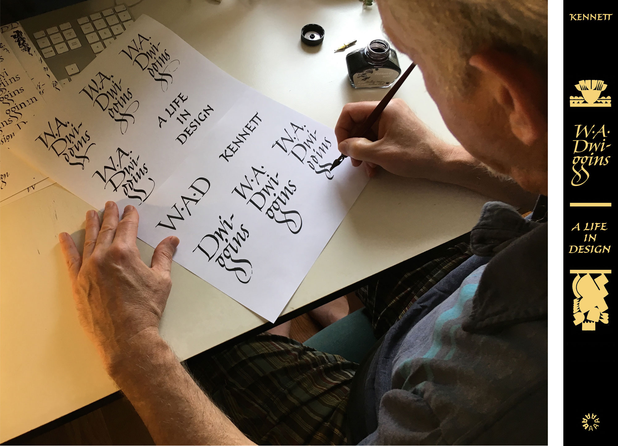
RL: Well this was a bit of a challenge as I had to decide at the outset how much of Dwiggins’s lettering style would directly influence my approach. After many dubious initial sketches trying to follow his calligraphic style(s), I took a break and had a bit of an epiphany. WAD’s friendly warm smile was hovering nearby and gently nudged me to just do my own thing and he would be happy.
So I let the pen just find its own way through the letters.
Have you used this style in other work, or is it a new approach for you?
RL: It wasn’t really a new approach. I tend to work best from what I already know, so the style I ended up using was a variation of a core italic for “W. A. Dwiggins”. The details are the fun part, the joins/ligatures that arise naturally for certain letter combinations. The challenge in a small piece of lettering, like on a spine or in a logo, is to find the right balance and harmony in all of the design spaces that the lettering creates.
What kind of pen did you use?
RL: My trusty old standby, a Speedball C-2.
Tell us more about the hyphe-
nation.
RL: Bruce suggested that I honor Dwiggins’s preference for the spines of his book designs by keeping the lettering upright, so that titles and authors can be easily read by not having to tilt your head. This of course necessitates having to break up words to accommodate the narrow design space in a spine. The particular challenge I had in lettering Dwiggins was the fact that I had to deal with four dots and one hyphen in such a tight space. These small but possibly distracting elements finally found their rightful places.
Dwiggins was known for his modular ornamentation. Did you emulate that here with your own ornaments, or did you find some of his that worked?
RL: Bruce offered the opportunity to let me design the ornaments for the spine. After some thought, I decided that Dwiggins was the master here and my lettering would be more than happy to stand next to his designs.
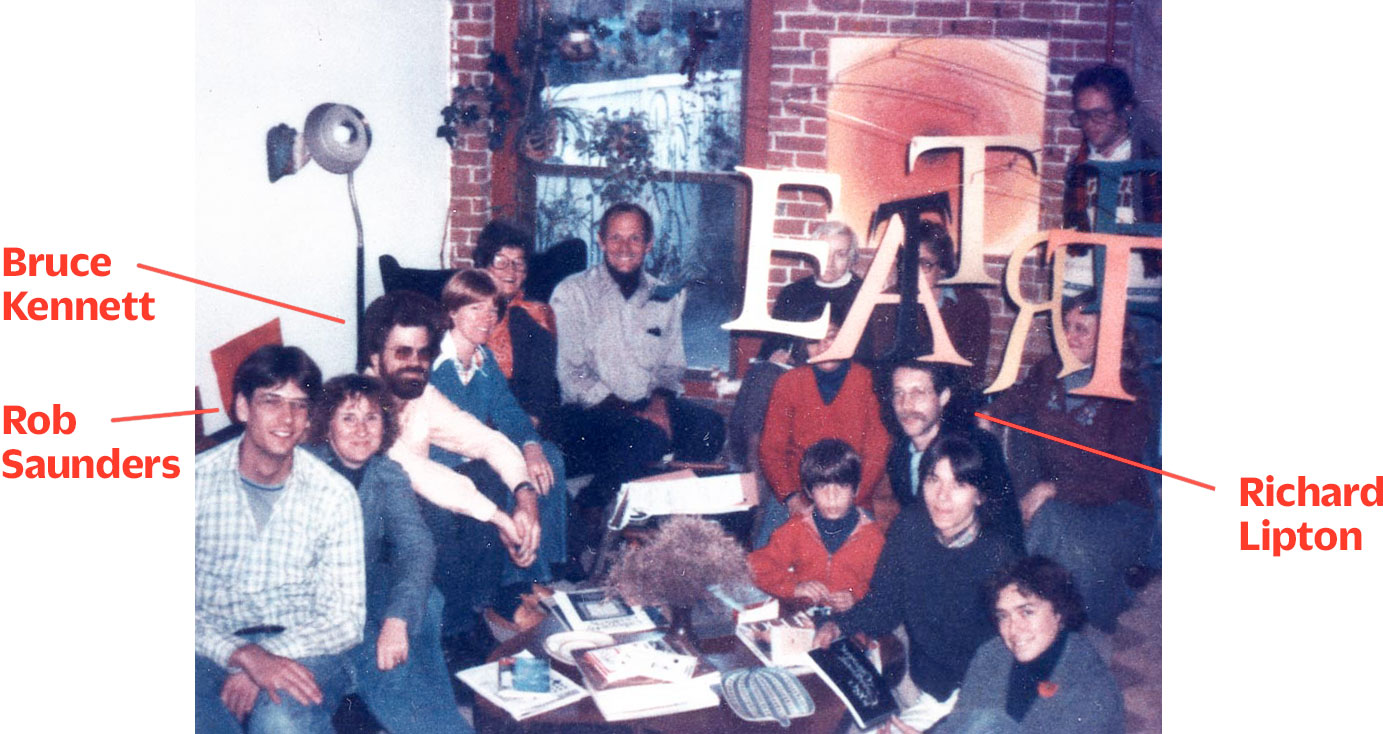
An Epilogue from Author Bruce Kennett
Since its inception in 2003, this project has become a veritable “band of brothers and sisters.” I have worked steadily with Penmor (printer) and Acme (binder) since the early 1980s, and with editor-proofreader Doris Troy since the early 2000s; all of them have been signed on to the Dwiggins biography for more than ten years. Four years ago I joined forces with Rob Saunders (publisher); I’ve known Rob since the late 1970s, as we were both members of the Lettering Arts Guild — a group of calligraphers and letter-carvers active in Boston from the late 1970s well into the 1980s. All of us in the LAG were tremendously supportive of one another, and there was a strong level of affection among us. Richard Lipton has also been a friend of forty years, as he was another member of the Lettering Arts Guild. I have watched Richard’s work over the decades and knew that he admired Dwiggins, so as the project began to evolve I thought, why not ask Rich if he’d like to join up with us. And of course he agreed immediately! It feels very fine to me as author and designer to be surrounded by so many old friends, and all of them feel deep respect and affection for Dwiggins. — Bruce Kennett