News
Type West 2021 Typefaces
A new website showcases the results of Letterform Archive’s yearlong program in type design.
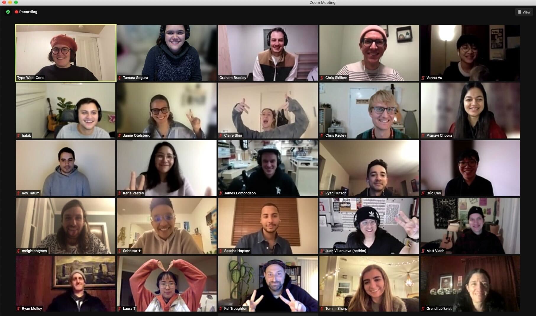
The Class of 2021 was the first Type West cohort to meet entirely online. The program brought together a group of 19 students from across the globe who logged into sessions multiple times a week. It was not only a space for learning the tools and techniques necessary to make fonts, but an international gathering place of shared interests and goals.
The Postgraduate Certificate Program in Type Design gave students the opportunity to delve deeper into the field over the course of a year from the comfort and safety of their homes. The class welcomed guest lecturers, near and far, for talks, critiques, and workshops, while still providing remote access to an unparalleled typographic library as they researched and created their own original designs. Librarians, curators, and other members of the Archive’s staff offered additional guidance through the collection’s thousands of type specimens, reference books, and original examples of lettering and graphic design.
The cohort emerged from this yearlong program with the skills to craft original type. Their highly innovative and individual designs are showcased on a dedicated website and below.
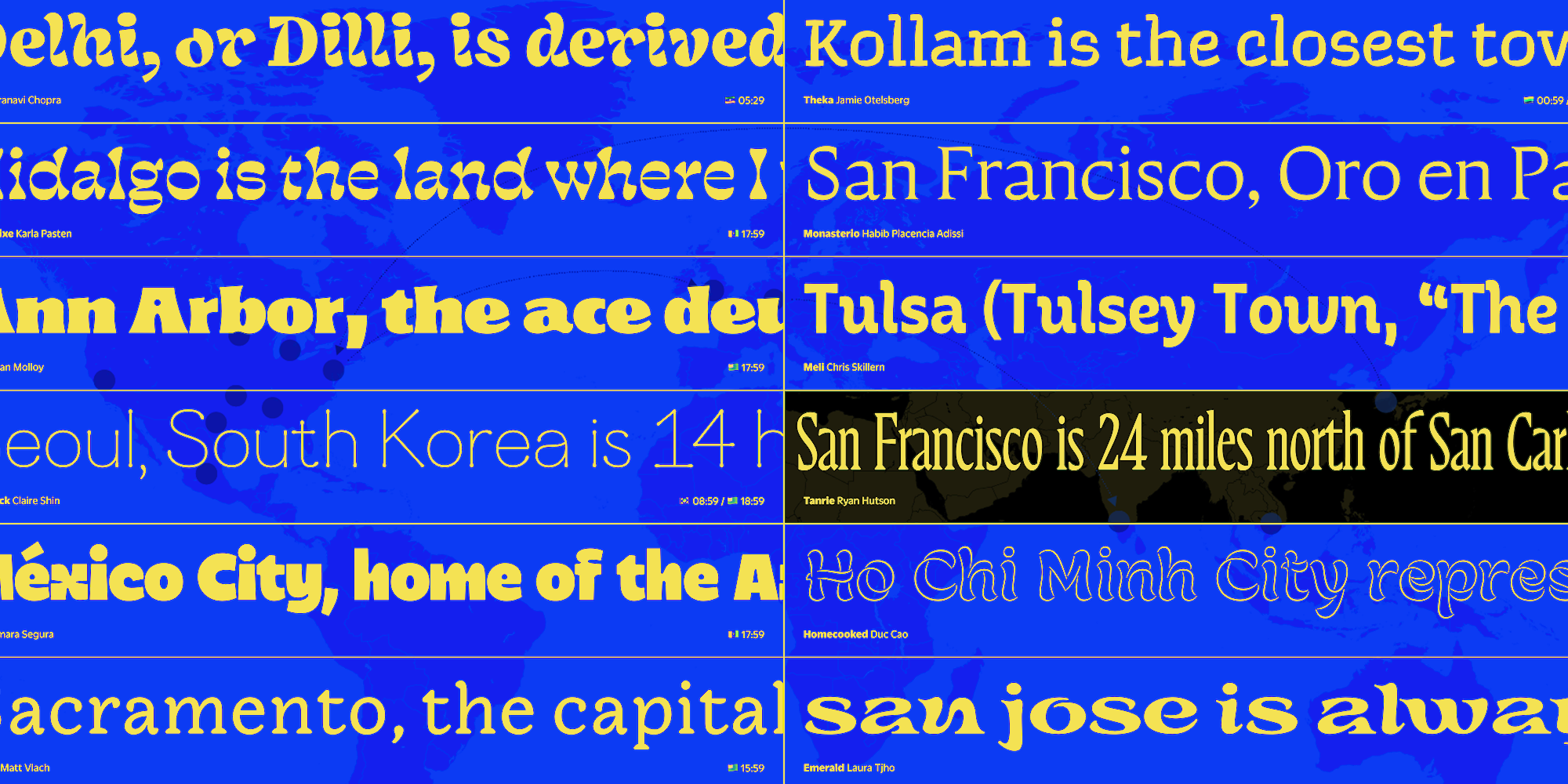
The Typefaces
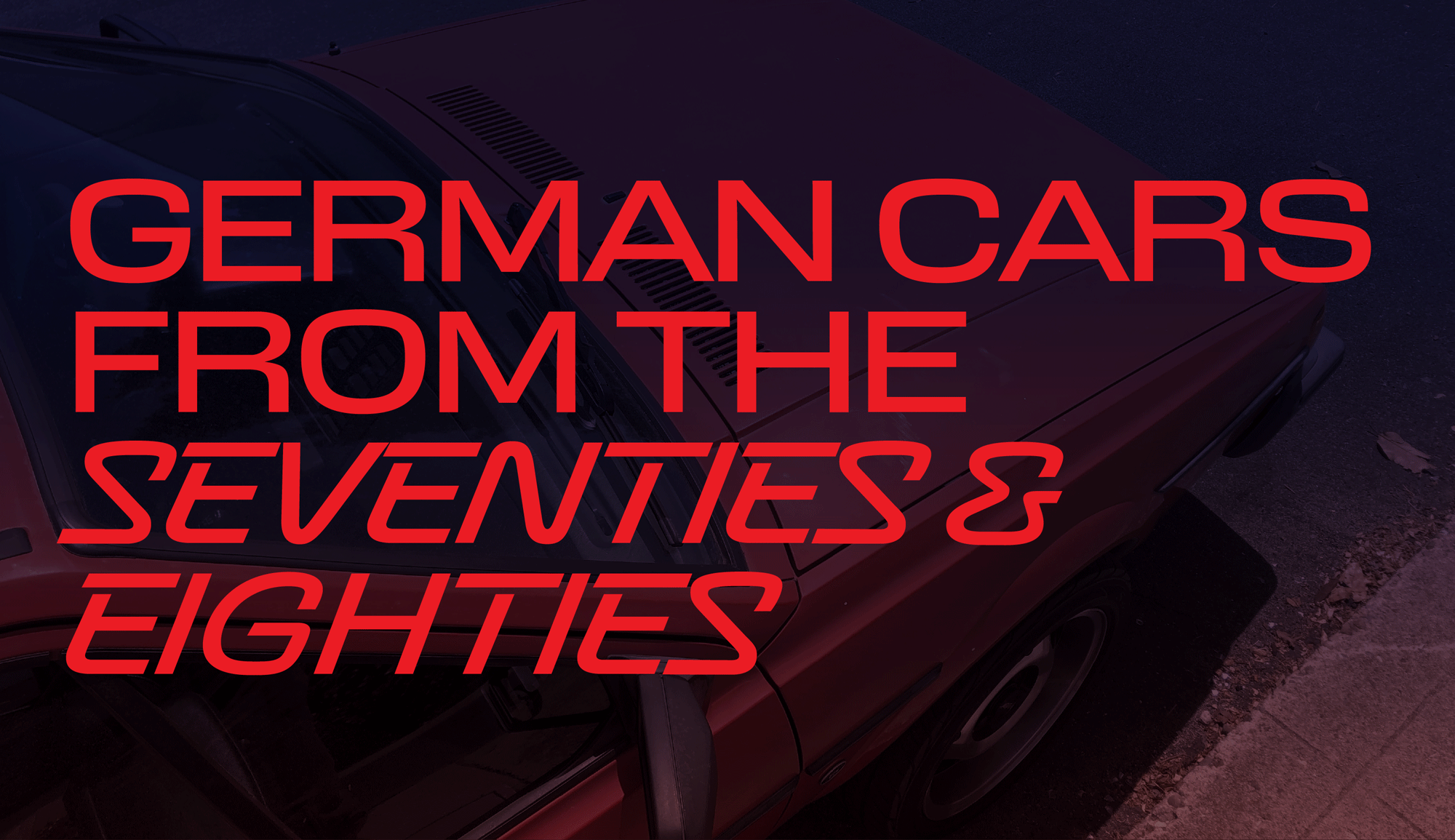
Turbochron by Chris Pauley
Turbochron is a retrofuturistic type family that pays homage to car design and typography. The monolinear scripty sans comes in two styles. Imagine taking Turbochron for a drive if you’re looking for something that conveys strength and speed, but with a step into the last century.
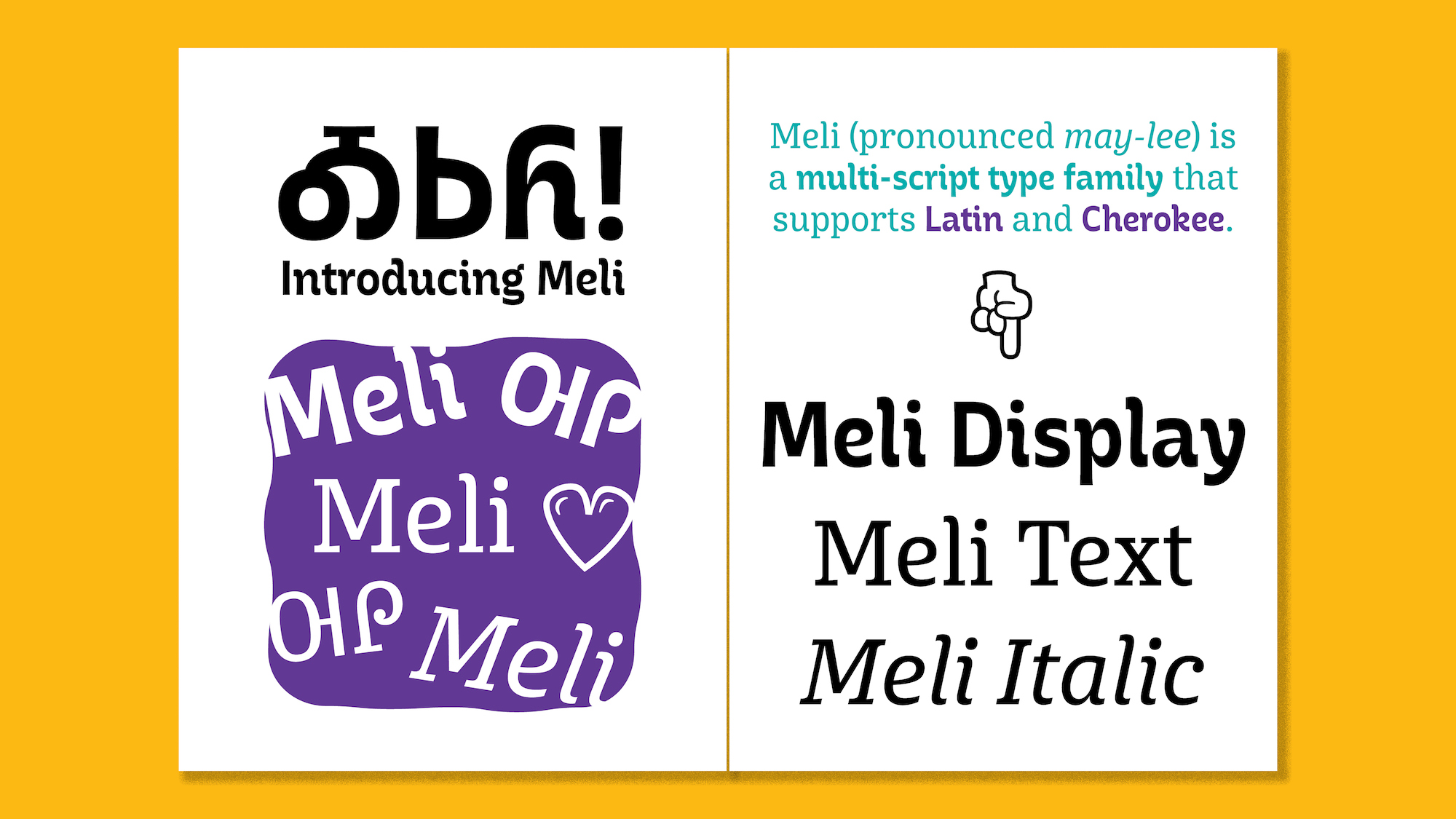
Meli by Chris Skillern
Meli (pronounced may-lee) is a slightly unconventional type family for children’s books that consists of three distinct styles intended to be used together. Designed to provide a dynamic and flexible textual environment, Meli is multiscript family supporting both the Latin alphabet and the Cherokee syllabary.
Matchstick by Claire Shin
The Matchstick family was inspired by inky pools that form at the beginning and end of calligraphic strokes. Its two display styles create playful variations adding a spark to the page.
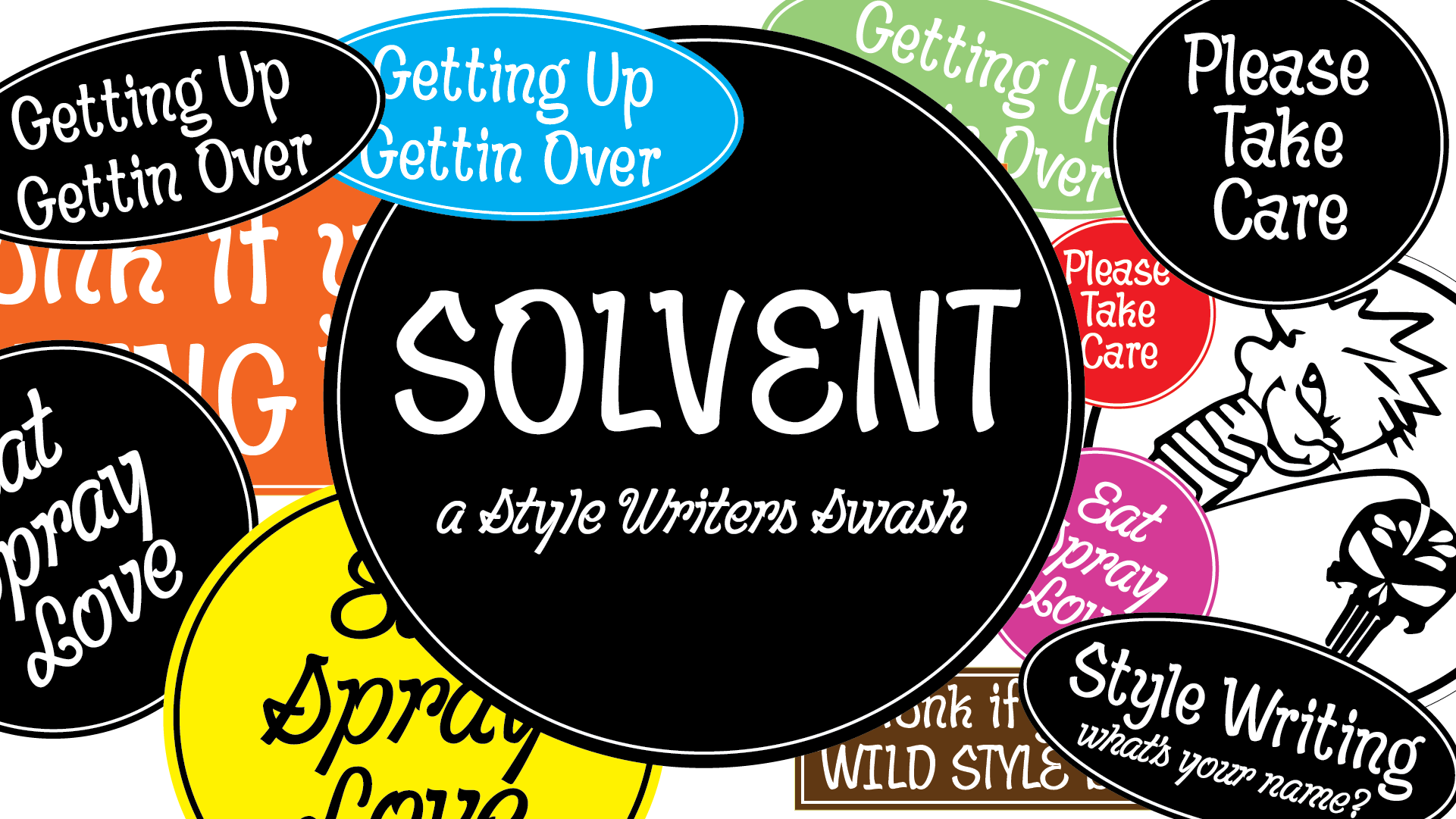
Solvent by Creighton Tynes
Solvent pays tribute to the roots of “Style Writing”, a term used for NYC subway graffiti traditions of the 1970s–80s. Its distinctive entry and exit strokes pair with springy curves to give its three styles a funky rhythm.
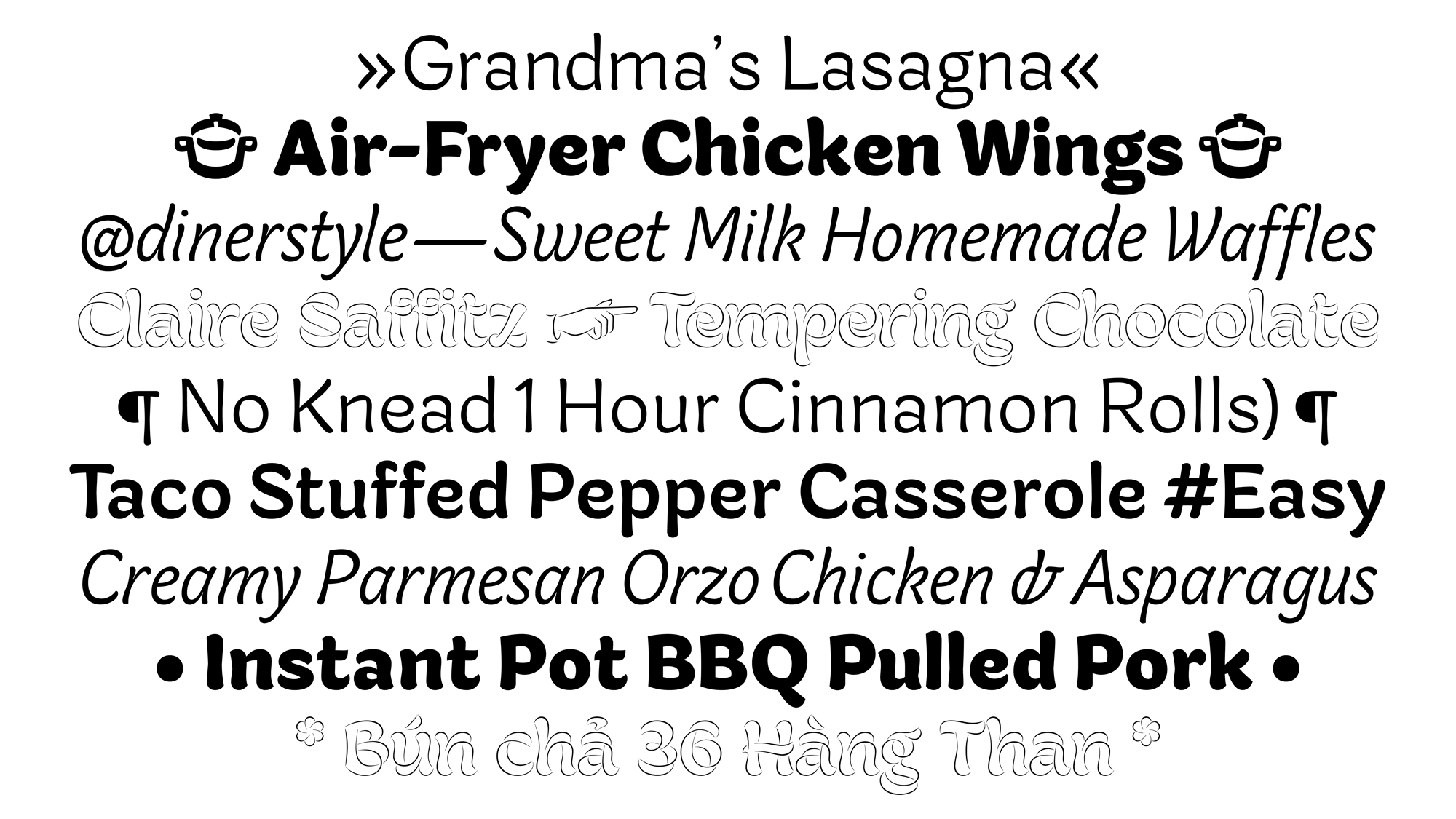
Homecooked by Duc Cao
Homecooked is a casual sans-serif typeface designed to explore the warmth and expressiveness of the flat brush. The regular style, with its range of weights, works well for all kinds of text, after which designers can garnish their work with Homecooked Display.
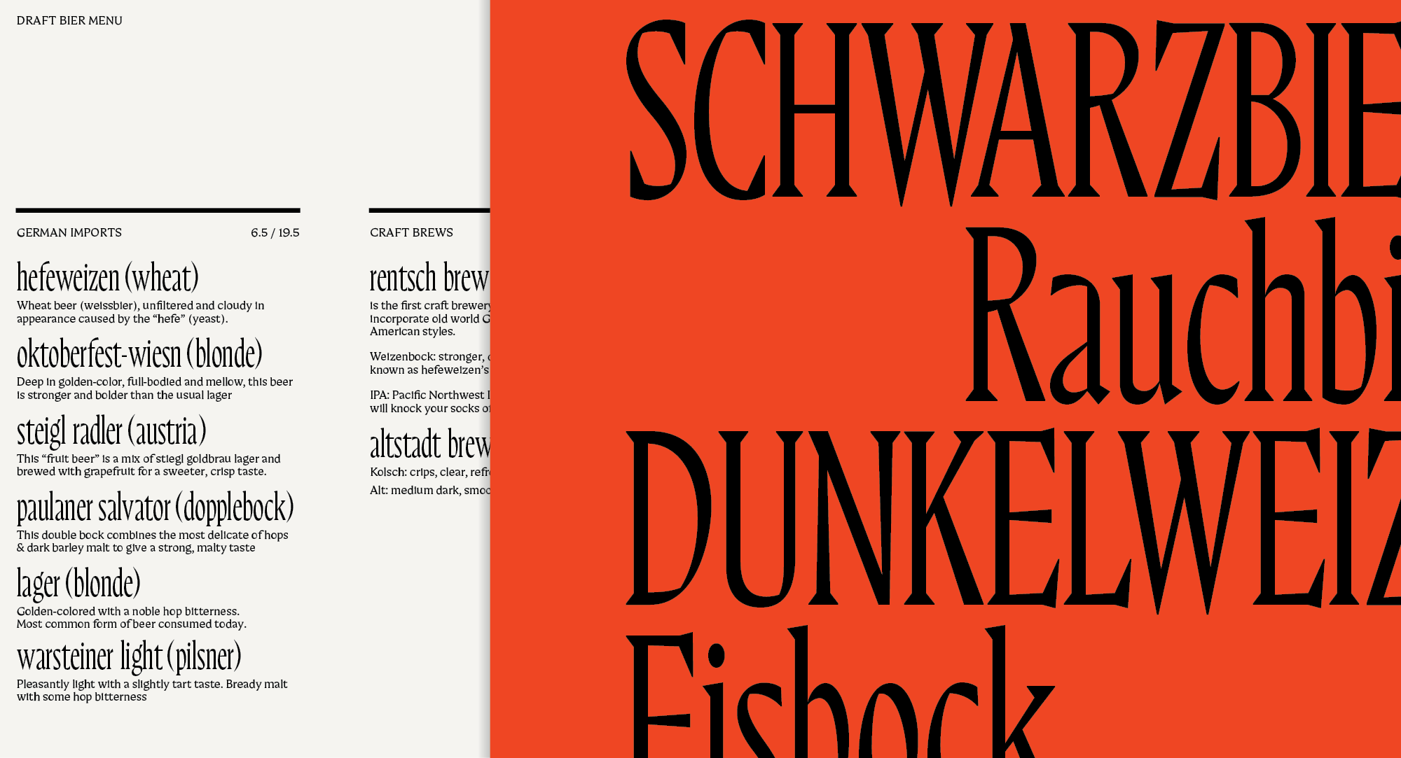
Monasterio by Habib Placencia Adissi
Monasterio is a family exploring Adissi’s interest in texture and the dimensional works of sculptor Luiz Ortiz Monasterio and stonecutter Edward Catich. Intended for two ends of a typographer’s scale, the Display roman and italic are optimized for large sizes, while the Micro is tuned for text.
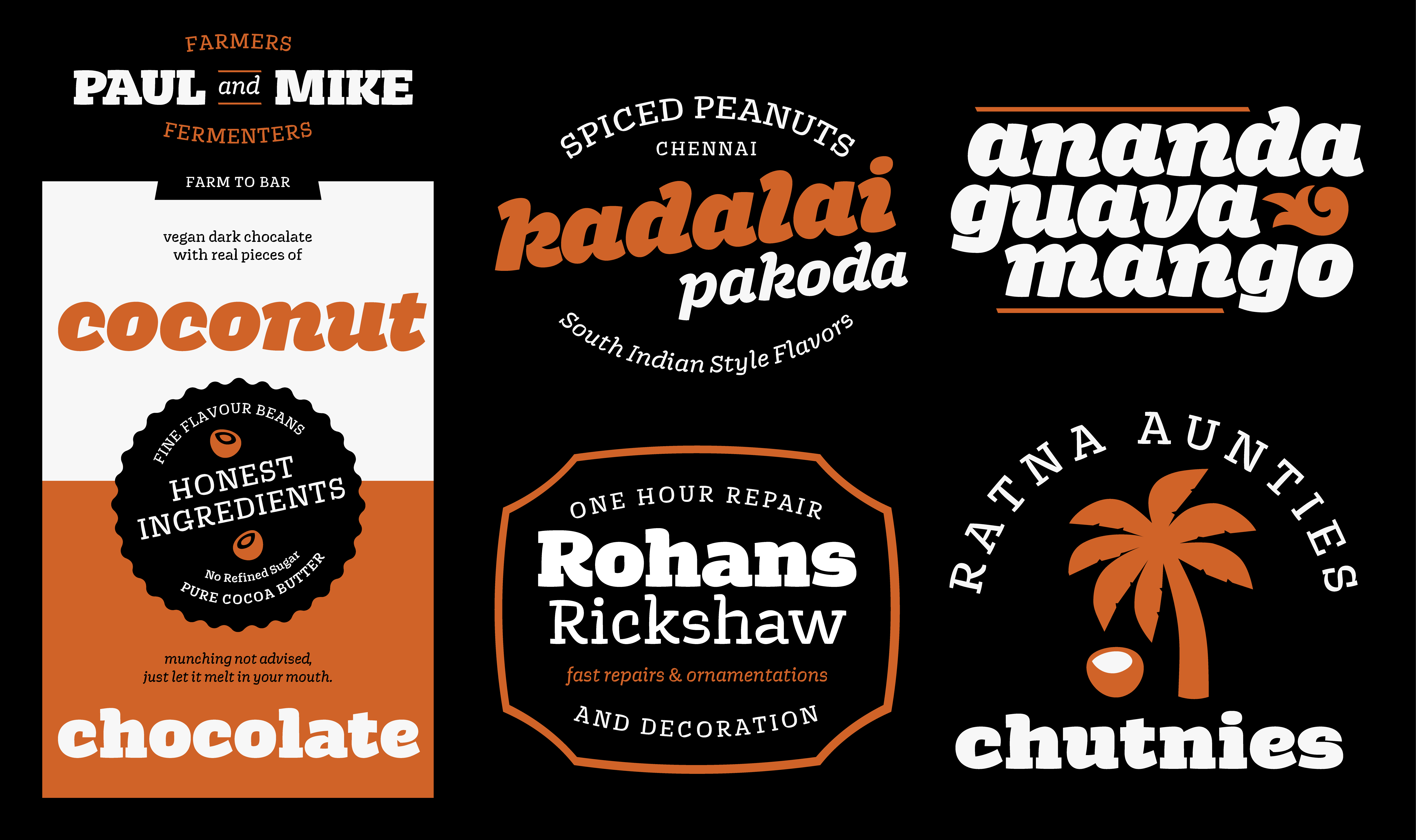
Theka by Jamie Otelsberg
Theka is a casual Latin display family with roots in hand painted Malayalam signs seen in South India. With upright and italic styles available across weights, Theka’s signature design is ideal for timeless branding, packaging, and other labels.
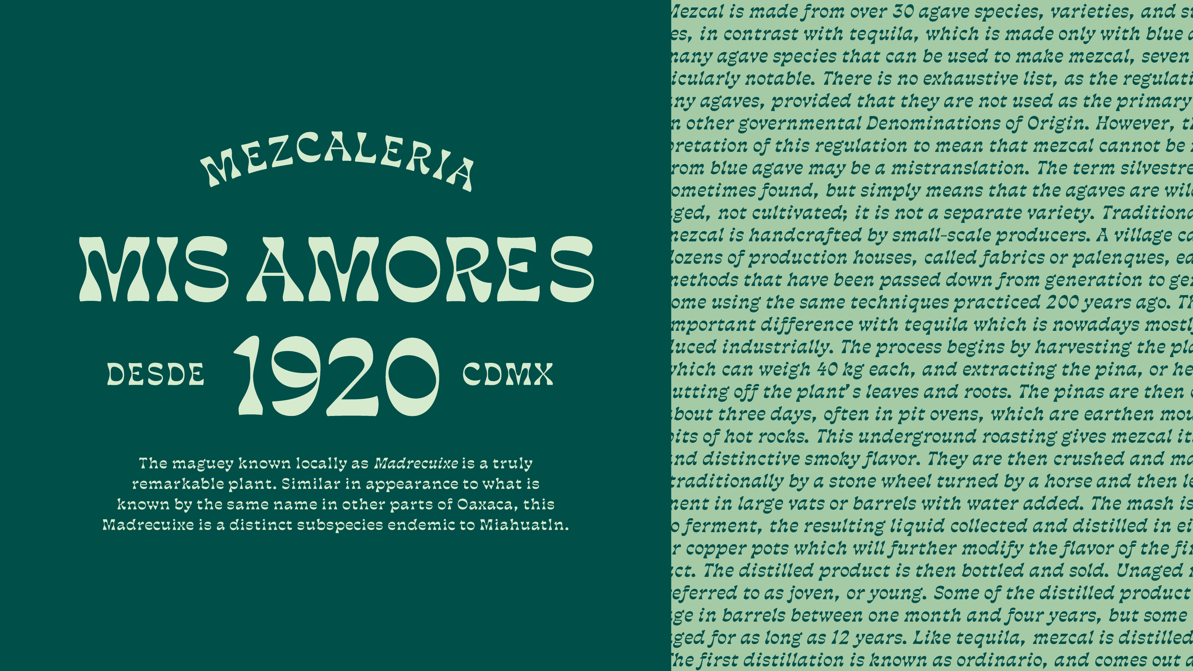
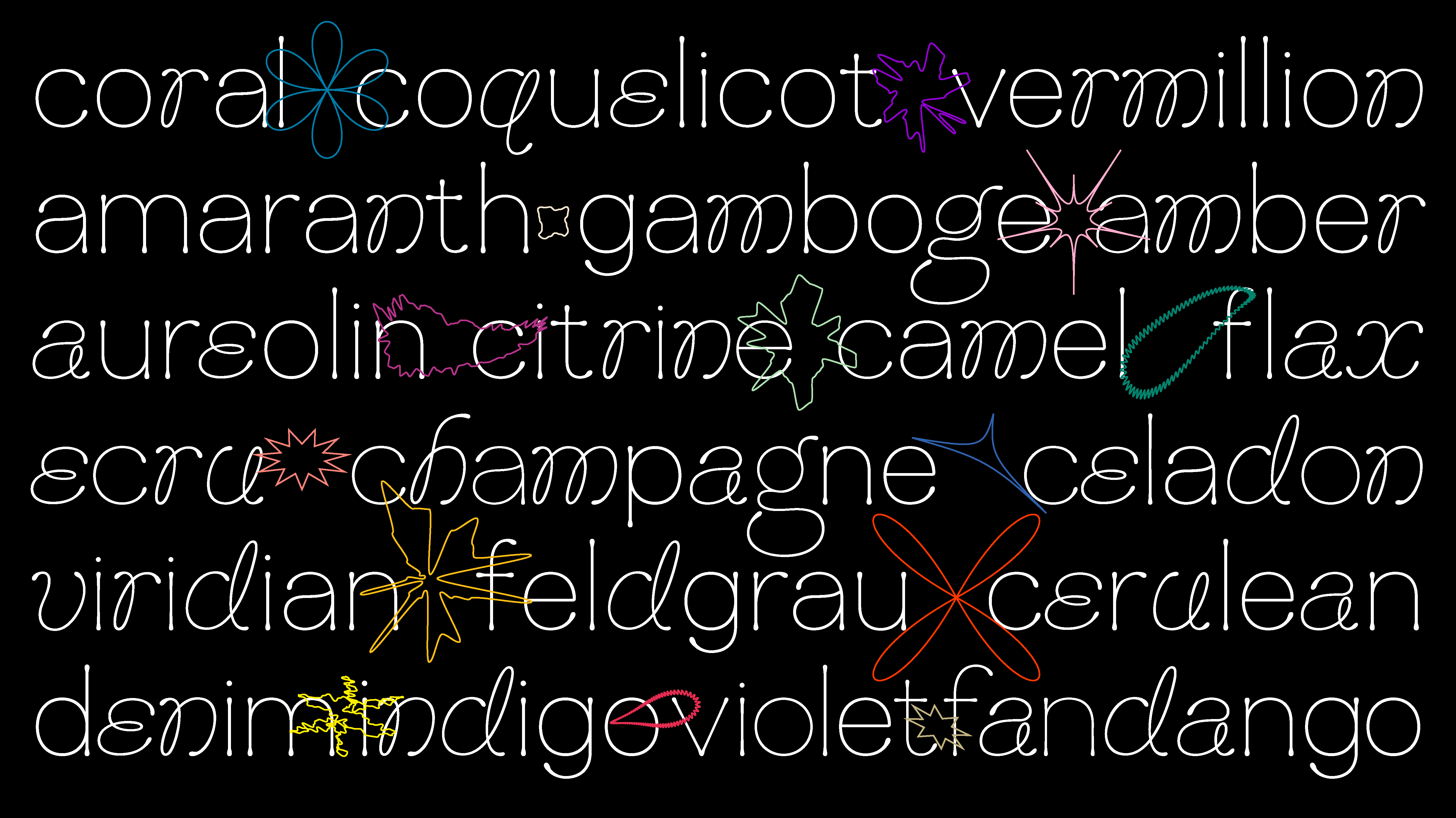
Madrecuixe by Karla Pasten
Madrecuixe is inspired by the endemic wild agaves used to elaborate mezcal in Mexico. The forms evolve depending on which style is used, providing an expressive design rooted in natural forms.
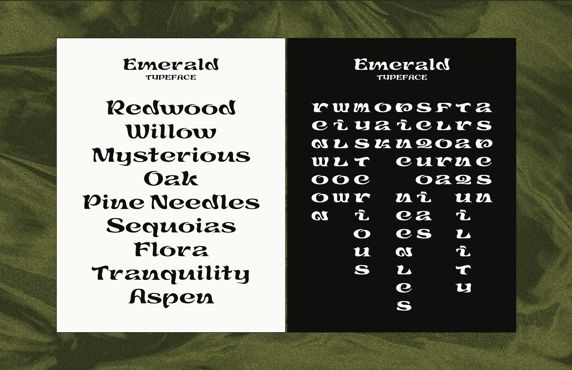
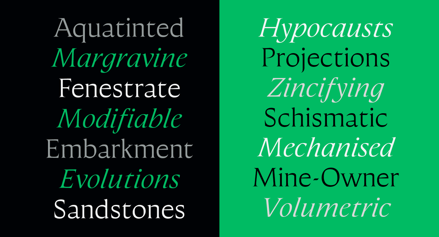
Emerald by Laura Tjho
Emerald gets its forms from the strength and flow of moving meditation. It has two Latin styles and a complementary Hanzi set that interplay and inform one another.
The Hills by Matt Vlach
The Hills is a group of typographic tools that set out to evoke an approachable feeling with a casual, warm, easy-going personality. It can also stretch to be either classically refined or boisterous and outgoing.
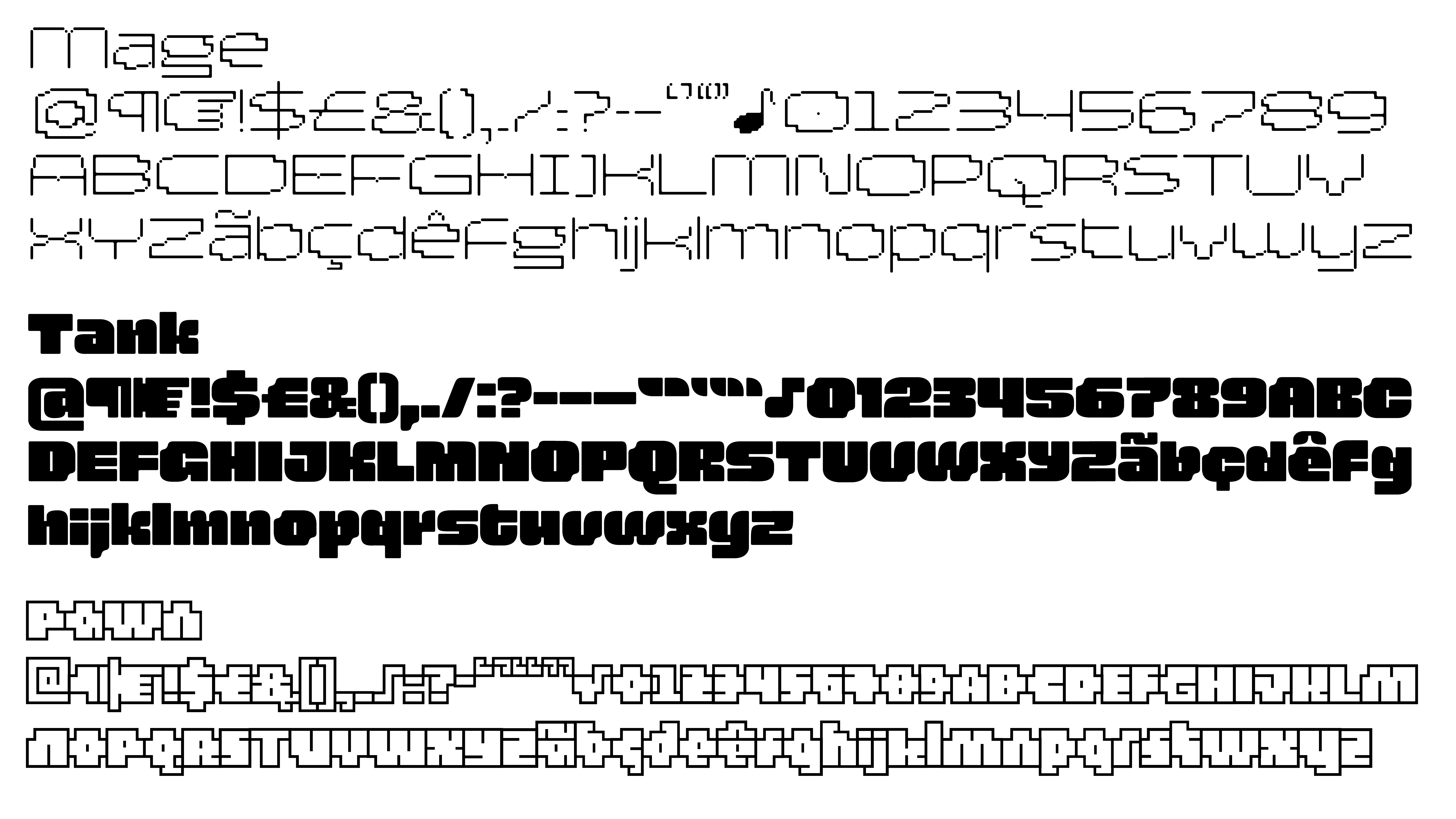
Arcadia by Michelle Devlin
This unconventional font family offers three distinct display styles inspired by video-game stories, with their typographic tradition of geometric shapes and stair-step curves.
Mynah by Pranavi Chopra
Chopra developed Mynah through her experiments with twisting the parallel pen. The four-style family is characterized by flowing letterforms and a rhythmic texture.
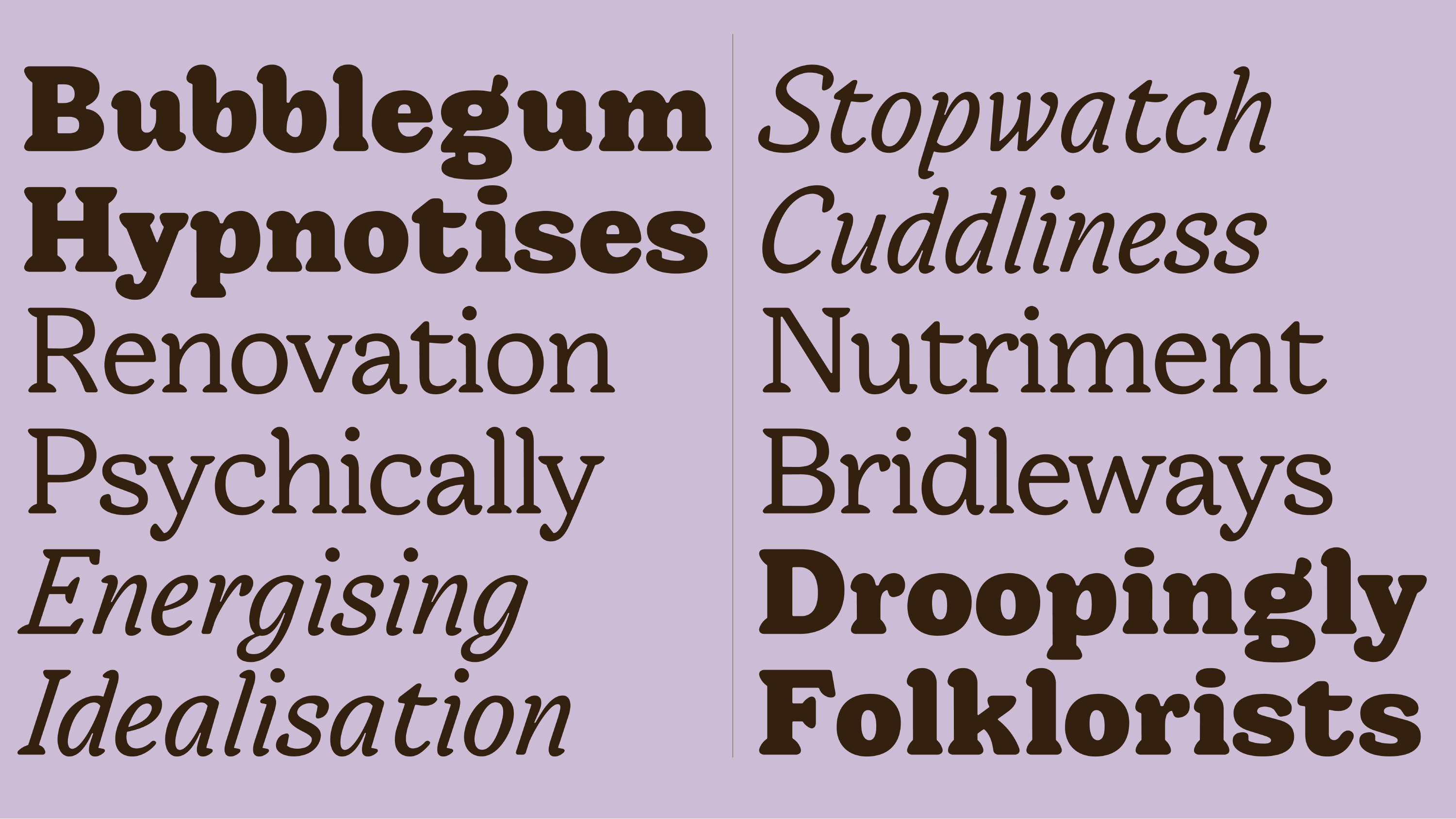
Bruce Slab by Roy Tatum
Inspired by weighty 19th-century type from the Bruce foundry, Bruce Slab exemplifies the quirky character of early grotesques, with geometric elements added for a contemporary spin. The family is excels in editorial applications where the range of styles provides for different narrative voices.
Tanrie by Ryan Hutson
Tanrie revisits 20th-century American book jackets by designers like George Salter and Philip Grushkin. It explores how particular lettering traits can be distilled across a family of four styles, providing fodder for logotypes or editorial layouts.

Banch by Ryan Molloy
Banch explores how digital fabrication methods, such as CNC milling, can create novel letterforms. Created as a solution to minimize tool changes during the wood type production process, while also embracing an interest to make smaller type, Banch became a sturdy yet playful material for design.
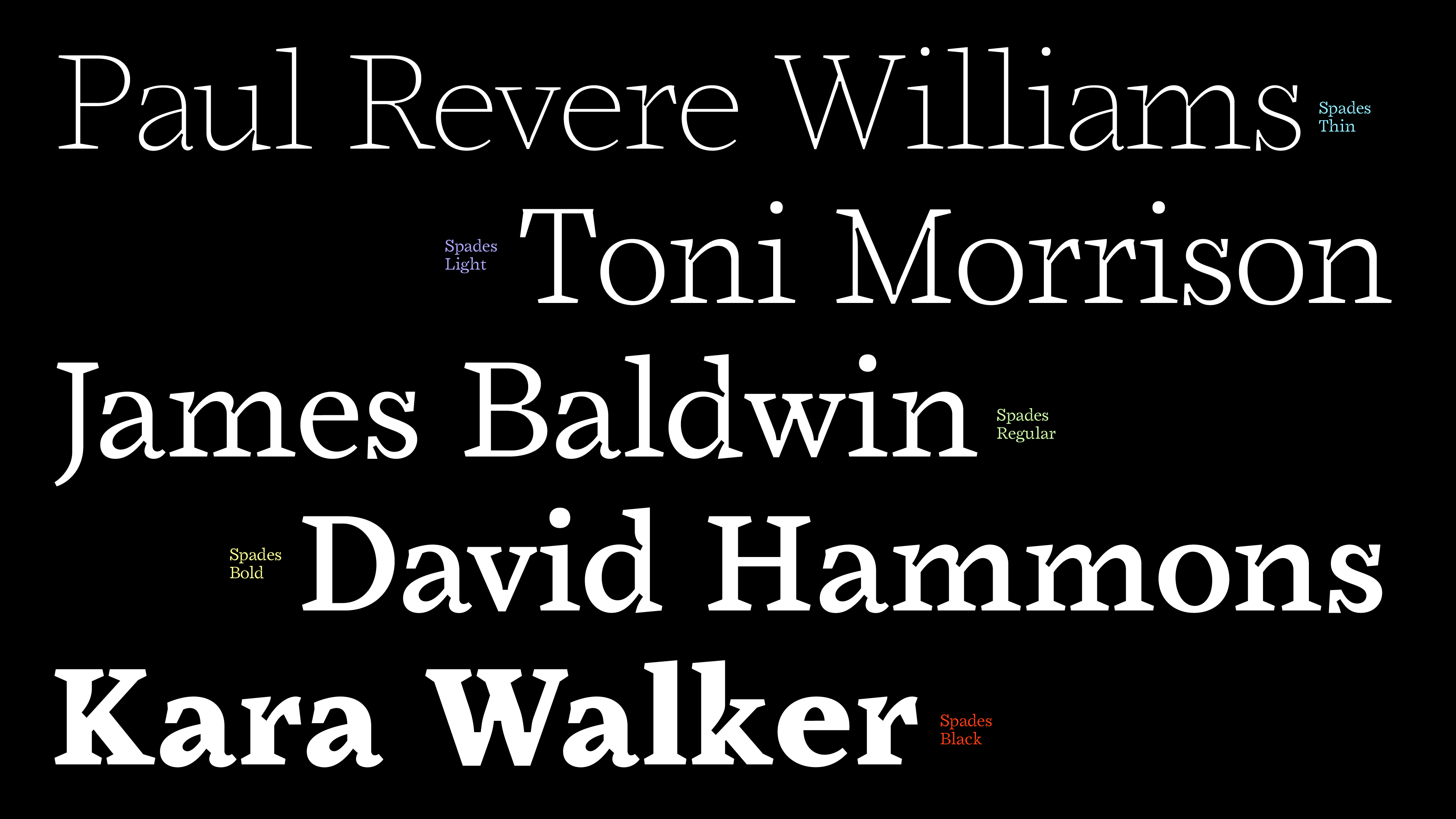
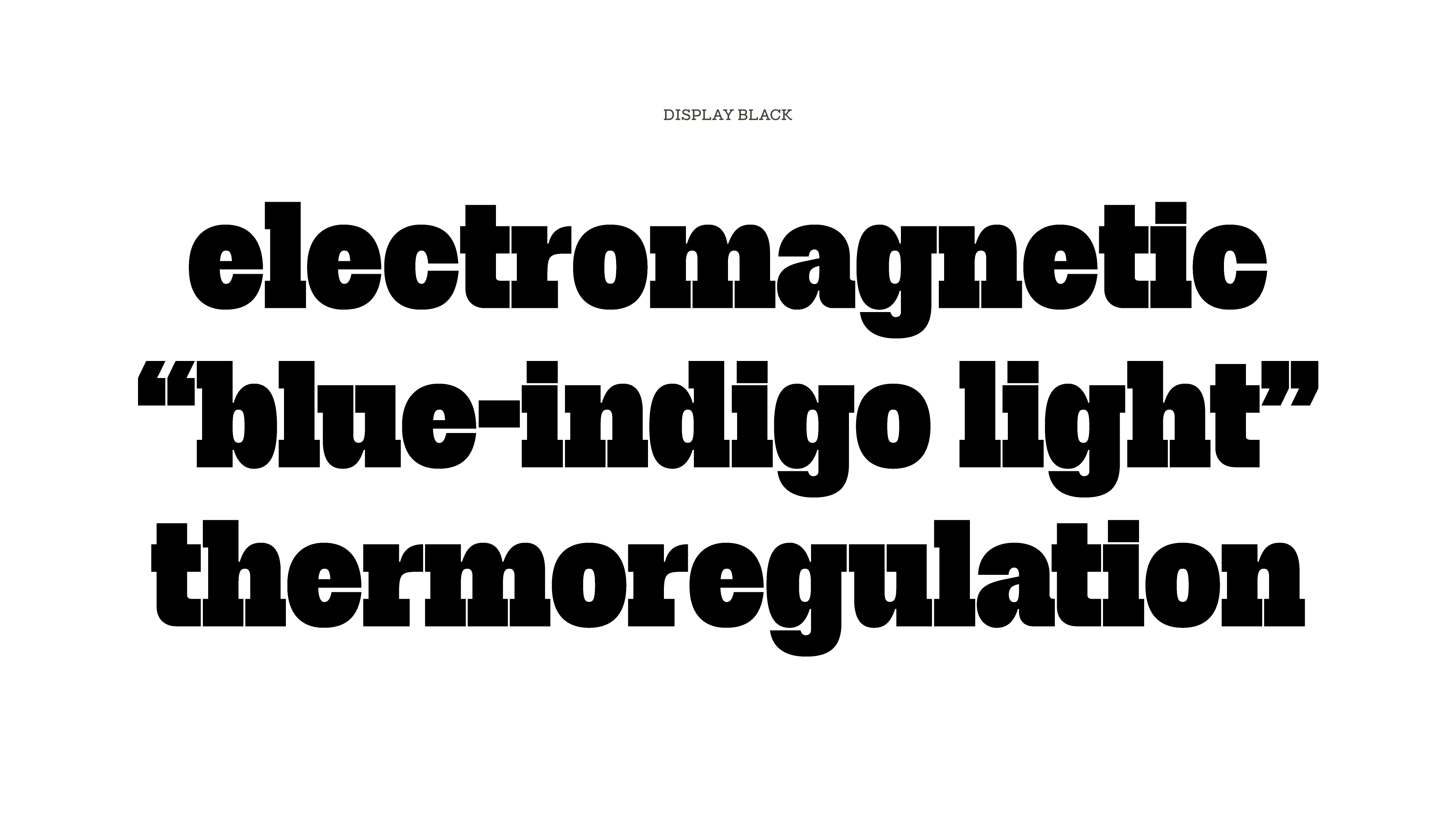
Spades by Sascha Hopson
A display face with expressive ink traps and sharp serifs, Spades is inspired in part by the early Black Arts Movement and ’70s sci-fi cinema. Its five weights exude style yet incorporate utilitarian principles, allowing it to function at large and small sizes.
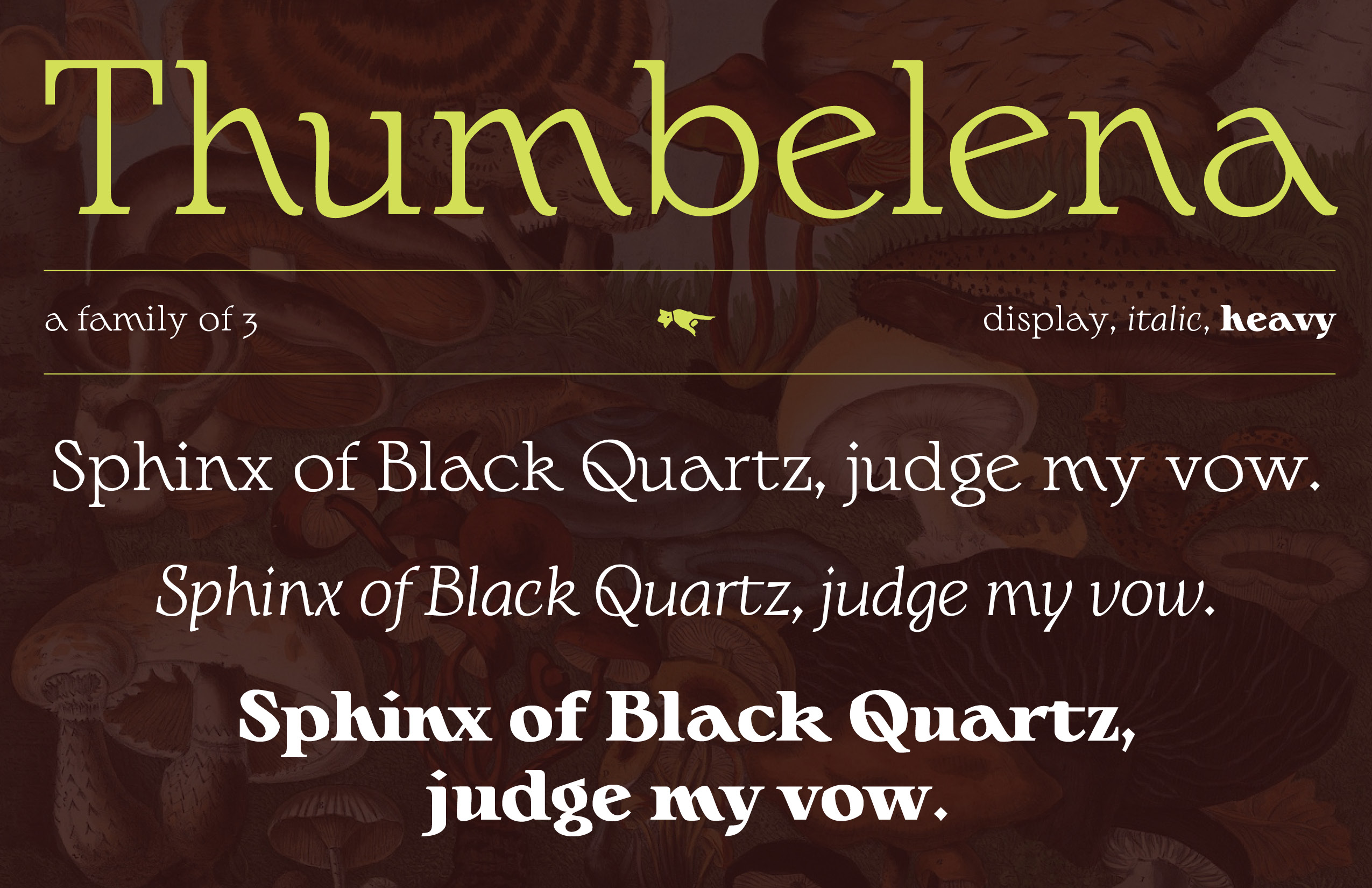
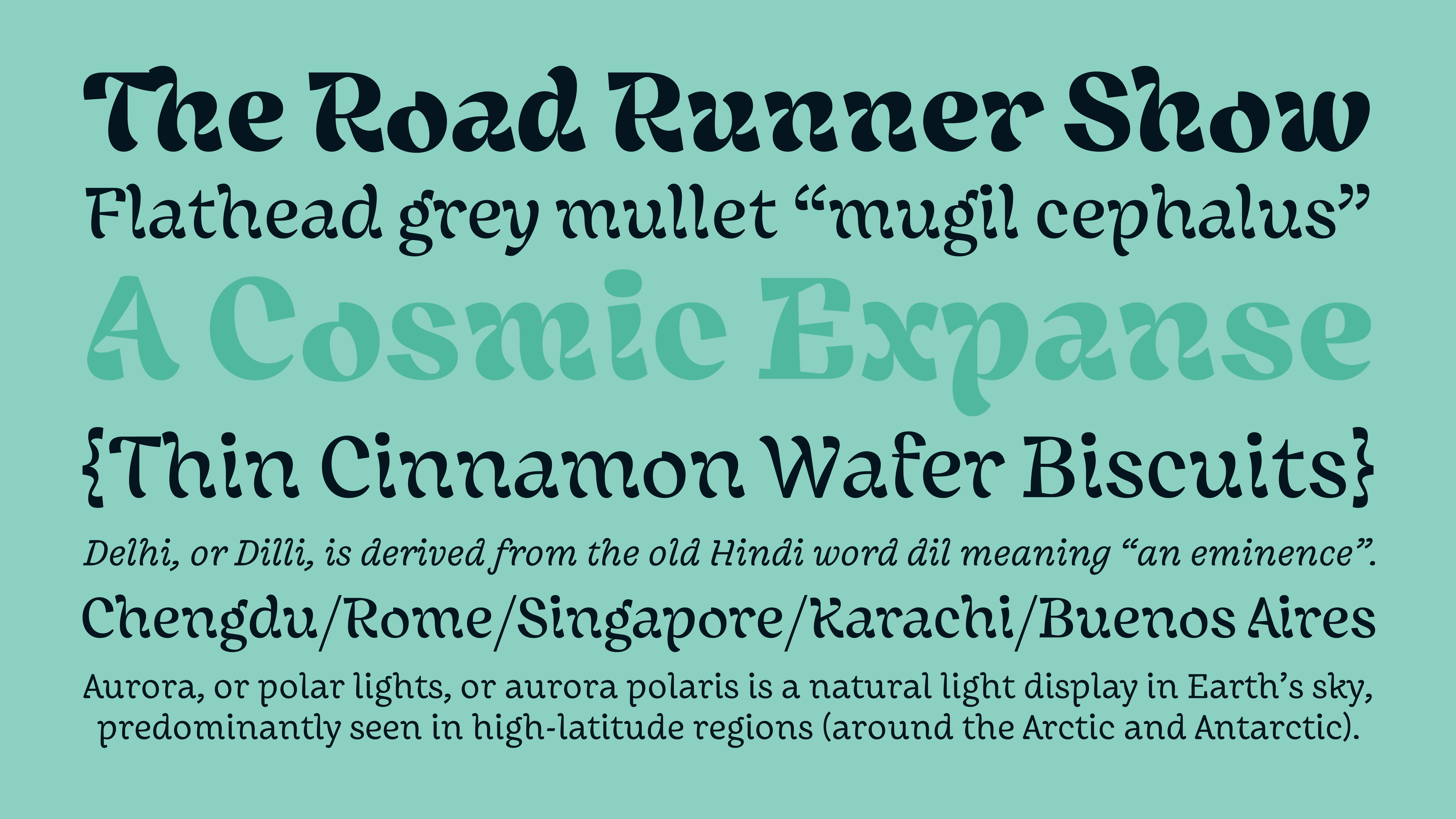
Thumbelena by Schessa Garbutt
Thumbelena is a whimsical serif inspired by uncial letterforms, folklore, and forest plant life. The family conjures an atmosphere of warm magick, whether it’s in the creation of spellbinding potion labels or other, less mystical, branding and editorial design.
Sorry by Tamara Segura
This jaunty variable type family started as an experiment in subtraction: to create a shape by carving the light out of a black square with as few moves as possible. Yet it ended up being so much more than that, unapologetically multiplying the delight of any design.
Ambi by Vanna Vu
An abstract brush style combines with a more practical sans for this editorial font collection. Inspired by the eclectic typography of Vietnamese-American/Vietnamese restaurant menus and food packaging, Ambi pairs seemingly unrelated styles, facilitating designs that defy genres.
Explore all the typefaces in detail and watch the Class of 2021 graduation presentation where each student walks through their personal growth, process, and final output.