News
Now Online: Color, Ornament, and Type at the Turn of the 20th Century
New additions to the Online Archive let you reach back to a vibrant period of ornamentation and letterform expression.
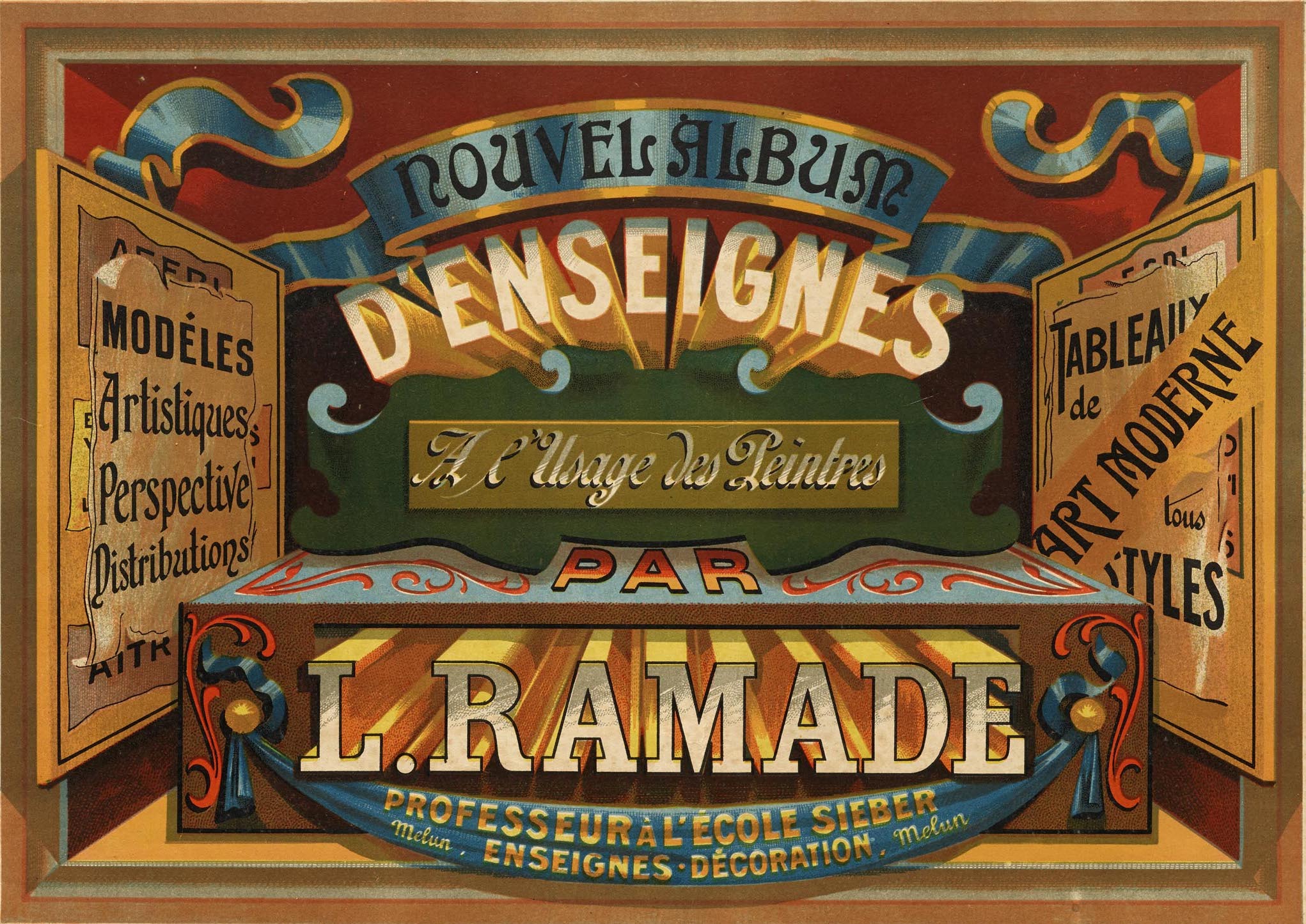
As the second industrial revolution hit its stride in the late 1800s and early 1900s, leaps in electrification, manufacturing, and transportation led to rapid changes in Western economies and societies. Advancements in paper making, printing, and typographic technologies followed suit, resulting in cheaper and more plentiful books, new forms of advertising to meet the demands of expanding commerce, and a burst of color and special effects that were previously impossible or too costly to produce. Meanwhile, as populations became vastly more urbanized, artists and printers waxed poetic about country life, incorporating the natural world into their work.
The latest batch of items in the Online Archive represents several dozen highlights from this era in our collection, including work by Will Bradley and Alphonse Mucha, sign painter portfolios from France, early type foundry ephemera, and a remarkable English catalog of wood type.
Will H. Bradley’s Chap-Books
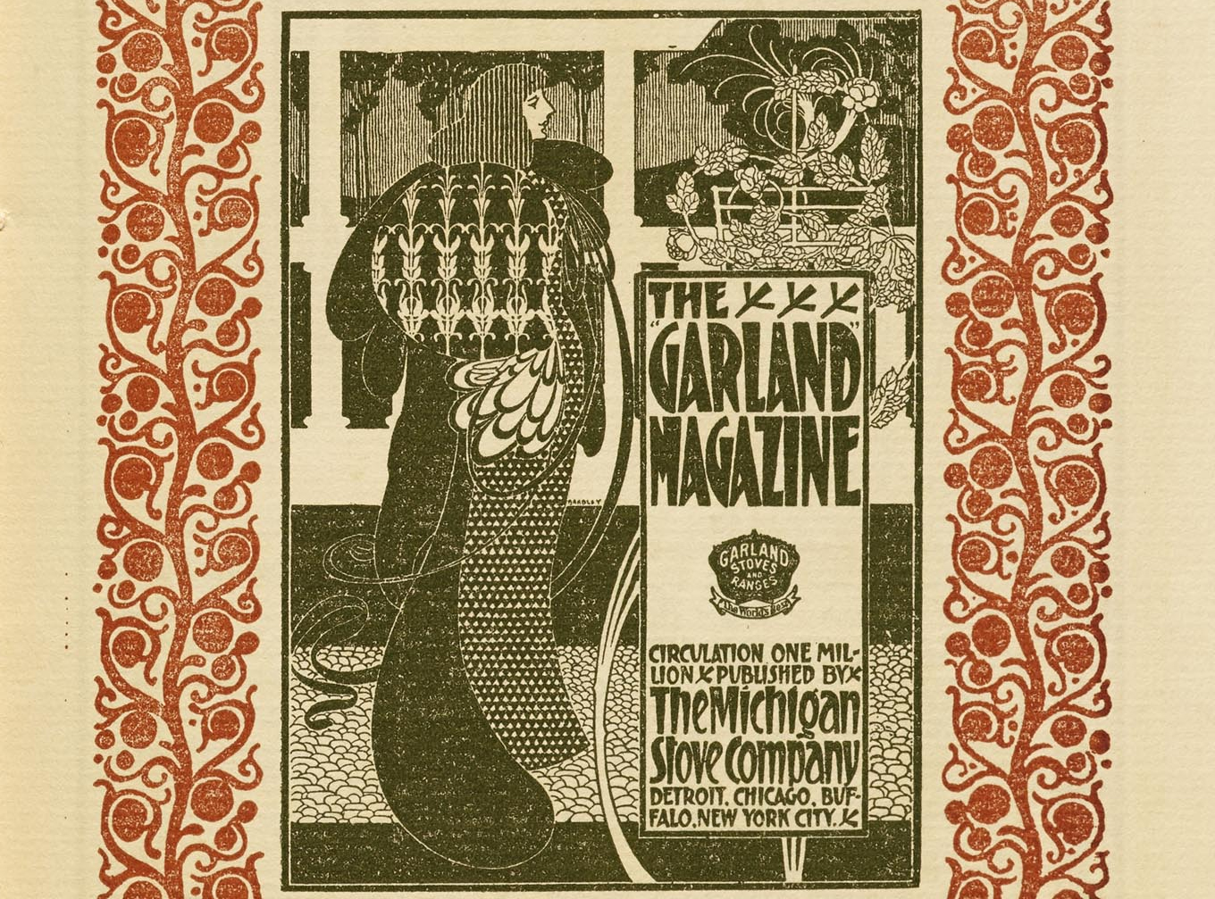
Will H. Bradley is one of the foremost artists of the art nouveau and arts and crafts movements in the United States. His diverse illustrations, poster designs, and typefaces borrowed from Japanese block printing and were often adorned with botanical elements and patterns. The Online Archive now includes ten issues of The American Chap-Book, a publication for the American Type Founders, and the first issue of His Book, a miniature magazine of sorts that Bradley used to showcase his own work along with like-minded contemporaries like Edward Penfield.
Alphonse Mucha’s Le Pater
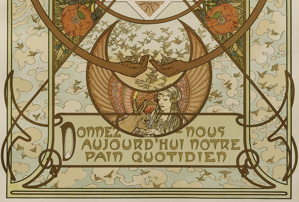
In Paris, at the turn of the 20th century, Czech artist Alphonse Mucha created Le Pater, a monumental illustrated book that reflected his own spiritual awakening and interest in Masonic philosophy. Mucha analyzed verses of the model Christian prayer, and created illustrations and photogravure prints based on his interpretations. Mucha’s dreamlike and reverent compositions are highly decorated with art nouveau lettering, blooming flowers, intricate borders, and luminous female figures.
French Sign Painter Portfolios
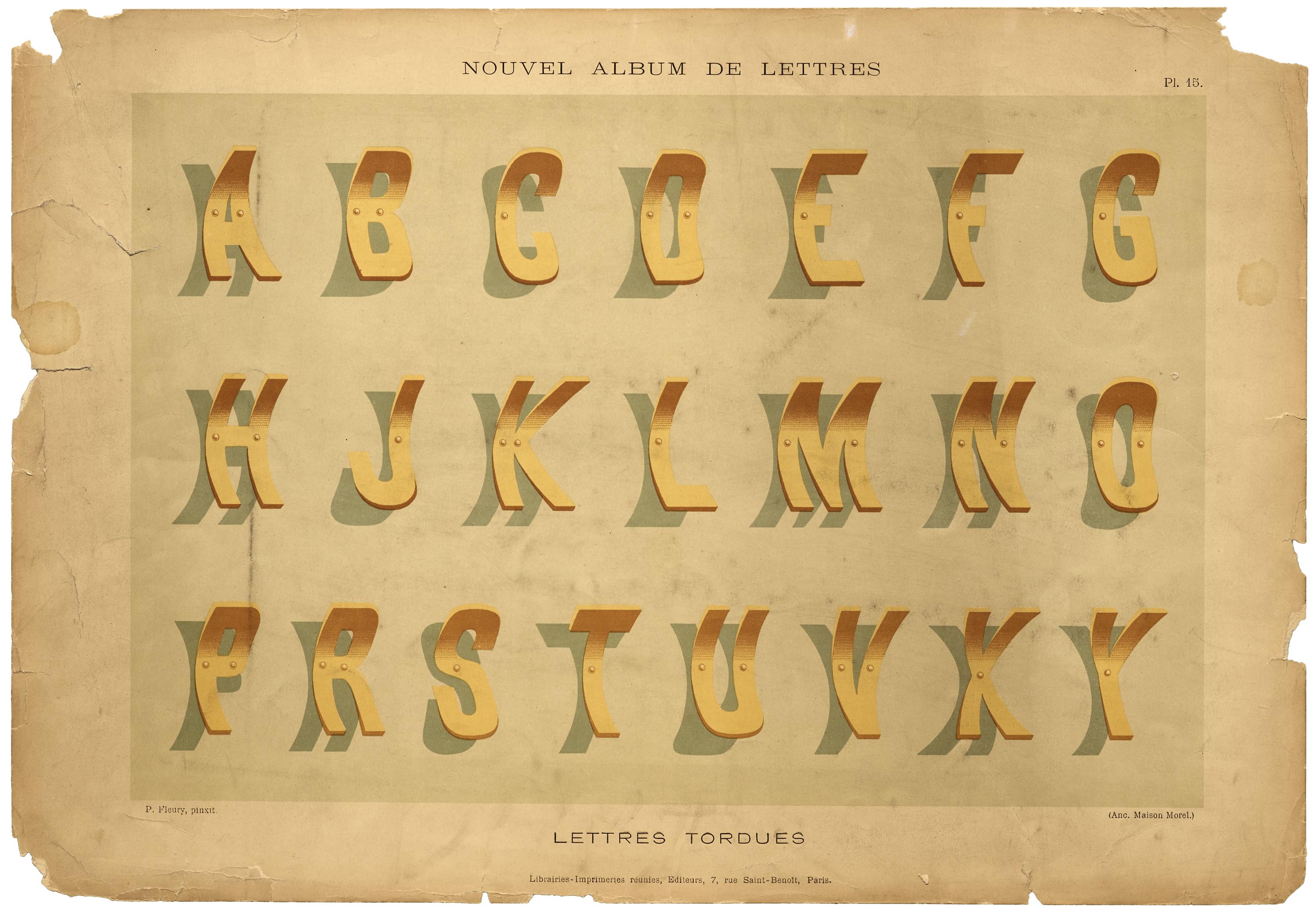
Paul Fleury’s Nouvel Album de Lettres Peintres is a vibrant and illustrative portfolio of alphabet prints that cover a range of lettering styles: two-toned and four-toned engraved letters, twisted metal letters, jagged letters, and more. A bonus print includes a few manicule (pointing hand) styles.

Louis Ramade’s D’Enseignes Décoratives á l’Usage des Peintres is a fantastic chromolithographic portfolio showcasing elaborate sign designs. Chromolithography allowed for colored prints to be produced faster and cheaper, but rarely did Ramade sacrifice quality. Each print must have required several stones to create detailed composition and effects: showing off techniques including dimension, shading, highlights, draping, and varying lettering styles from script to art nouveau.
Type Foundry Ephemera
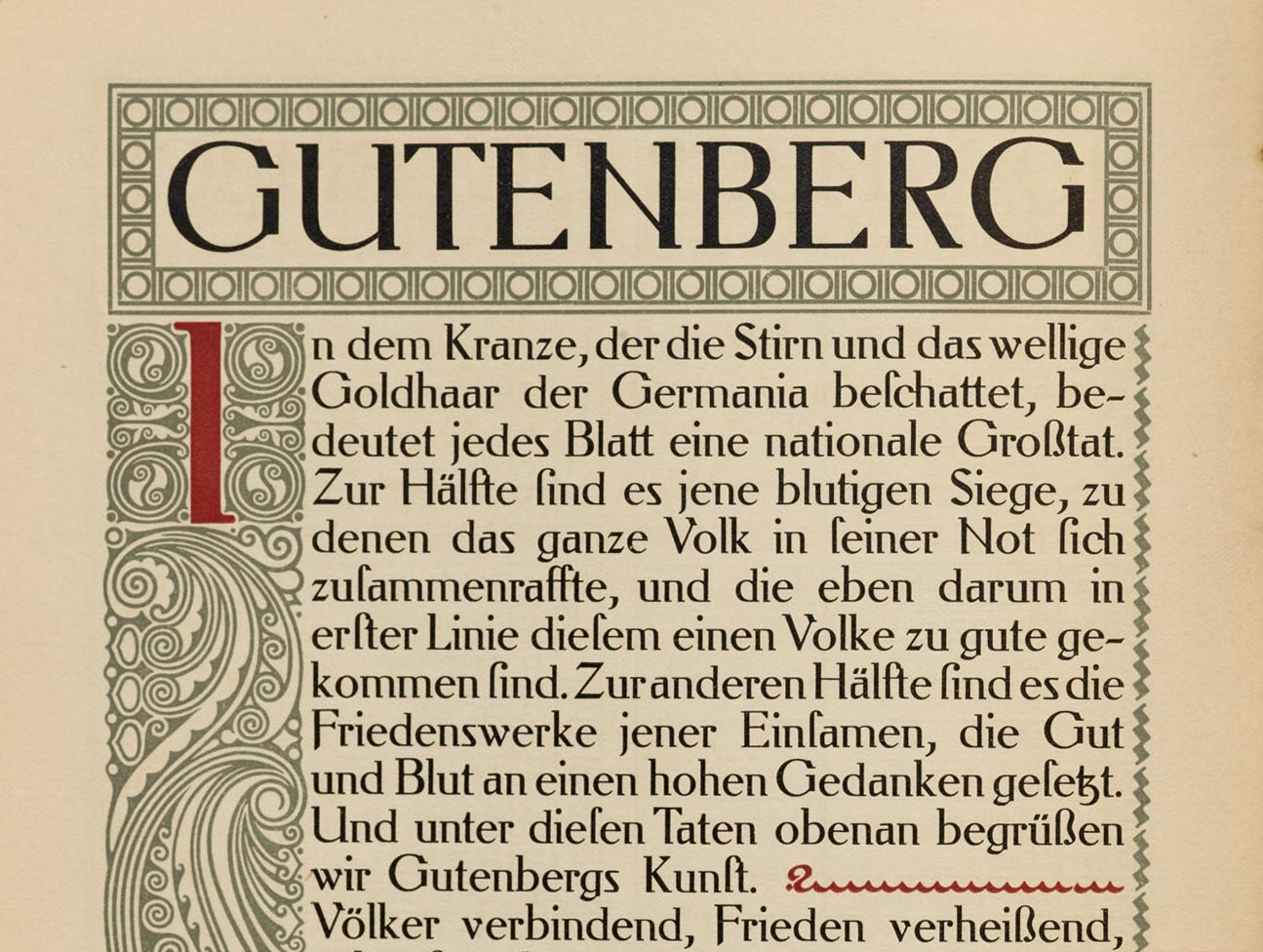
We’ve added several ephemeral type specimens to the Online Archive’s existing collection from the turn of the century, including Behrens Antiqua, an unusual slabbish roman by architect and industrial designer Peter Behrens, a pioneer of early modernism. While the unorthodox typeface foreshadows serif concepts that would follow, it includes companion ornaments and initials, a common feature of typefaces released in the early 1900s. The specimen booklet demonstrates how the type kit works together to build beautiful exemplars of Germany’s Jugendstil movement.
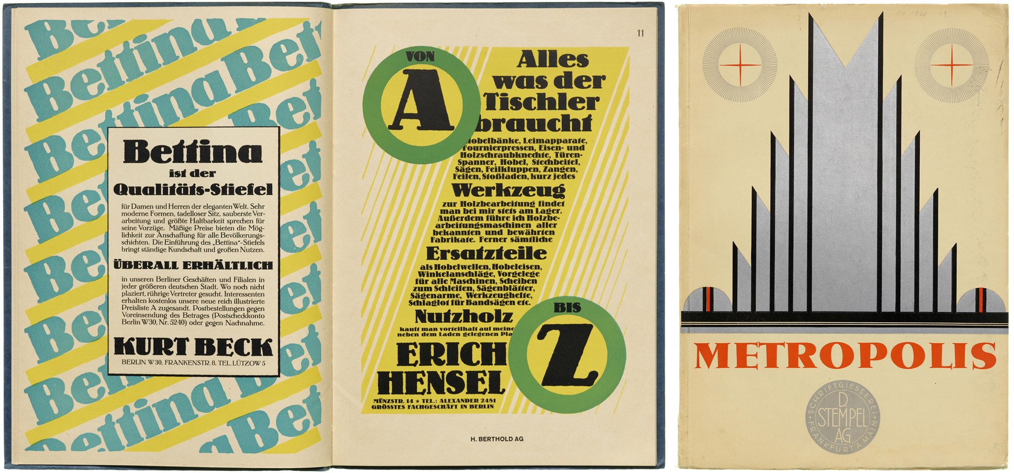
Also from Germany, specimens for Lo Schriften and Metropolis are pinnacles of art deco style. Each multicolor booklet features extensive waterfall samples and a wide variety of fictional advertising to show off typefaces that each reflect their moment in visual culture.
Harrild & Sons Wood Type Catalog
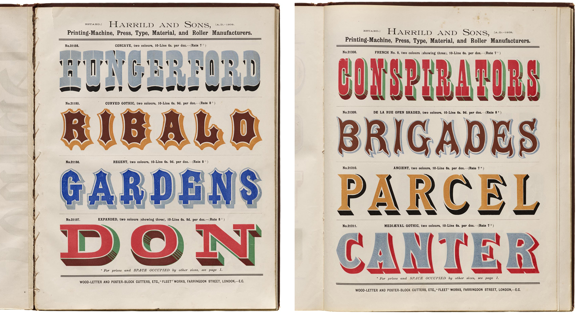
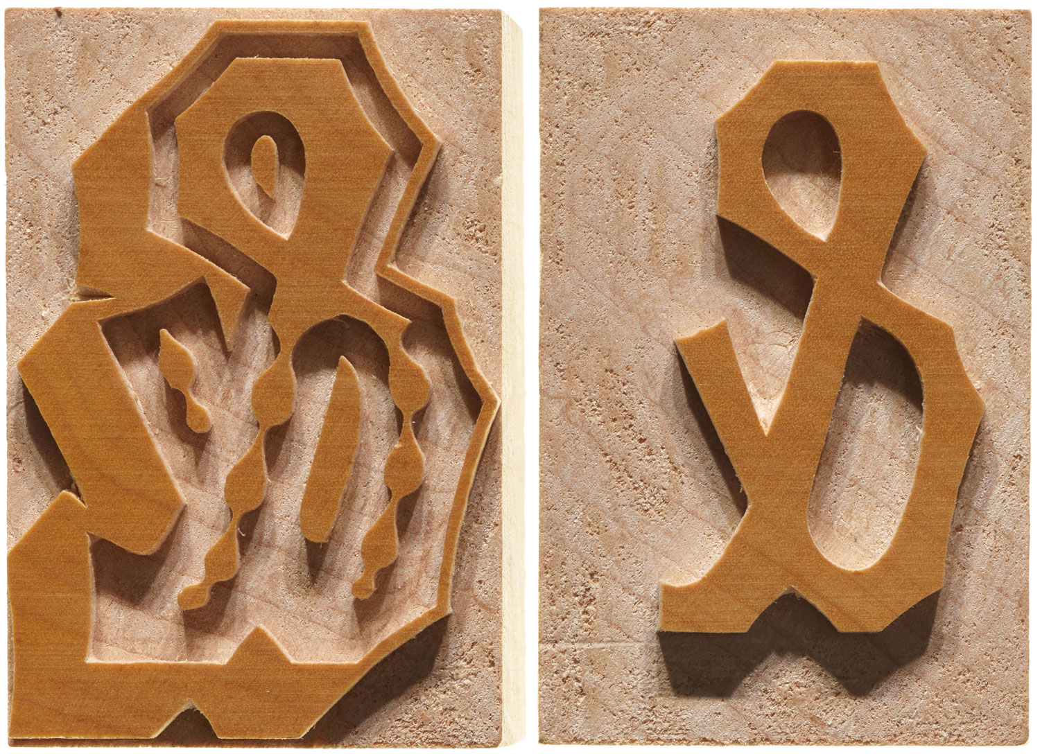
Harrild & Sons’ exemplary catalog is an Archive staff and visitor favorite. It’s one of the first books we pull for anyone who wants to see the head-turning possibilities that wood type offered for advertising during the industrial revolution. The London manufacturer of printing machines and material shows over 500 styles, from compact gothics and hefty slabs, commonly used in broadsides of the period, to fantastical and flamboyant designs that we haven’t seen in any other catalog. It’s the back section, however, that really captures the imagination. Over a dozen pages of chromatics — multicolor letter blocks — show how wood type began to achieve some of the effects previously reserved for sign painters.
New items are added to the Online Archive on a regular basis, and we just surpassed the 10,000-image milestone. We hope you enjoy exploring this latest cornucopia of design, and if you’re a member, don’t forget you can now set a Table full of inspiration.
— Stephen Coles and Florence Fu
