Type for All! Ten Years of Type West
The Archive’s type design certificate program celebrates its tenth year! Over 260 examples of student work will be on display in our main gallery from September 26 to November 15, 2026.
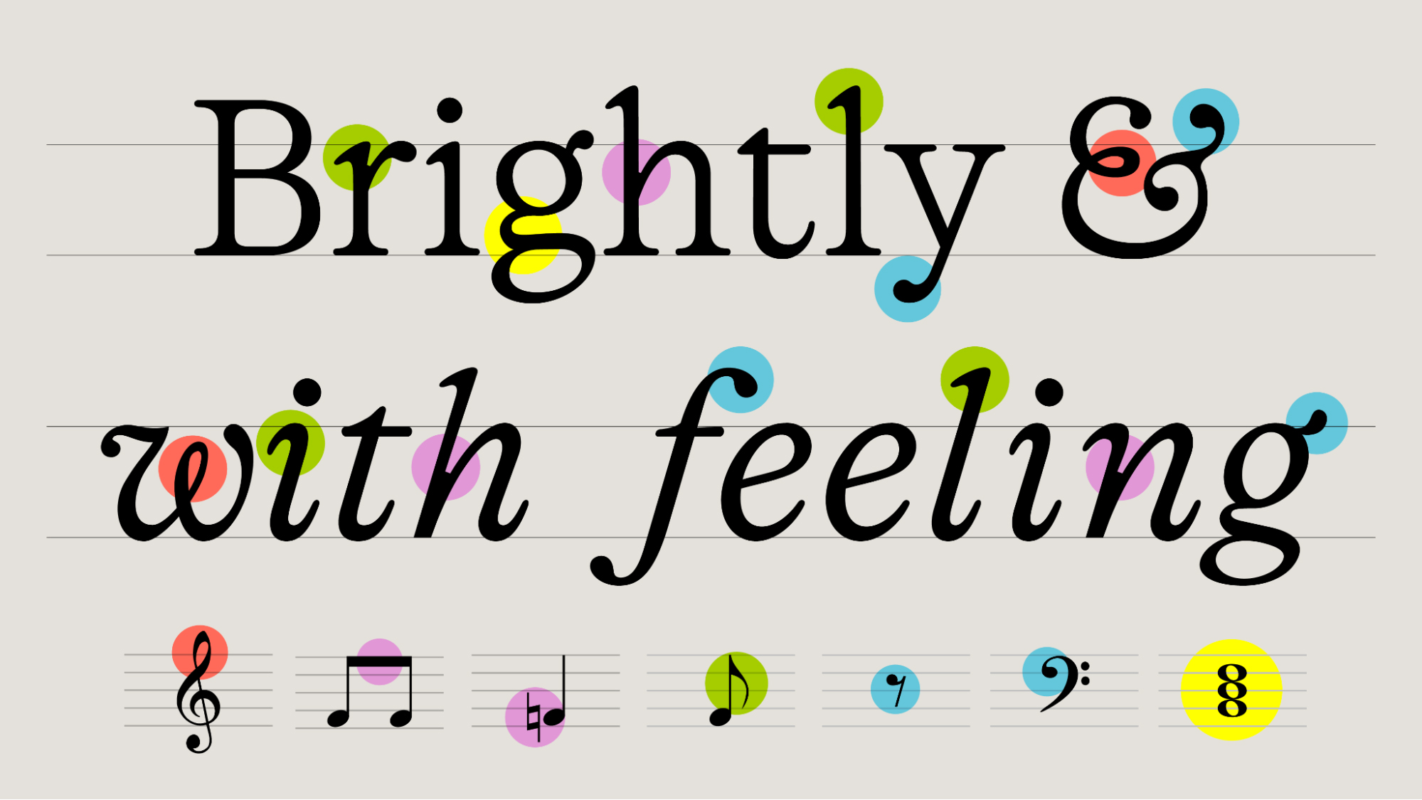
The Archive’s type design certificate program celebrates its tenth year! Over 260 examples of student work will be on display in our main gallery from September 26 to November 15, 2026.
Our next pop-up exhibition is on view in the Reading Room gallery from September 26 to November 8, 2026. Jon Sueda speaks to Martin Venezky about the body of work that inspired it.
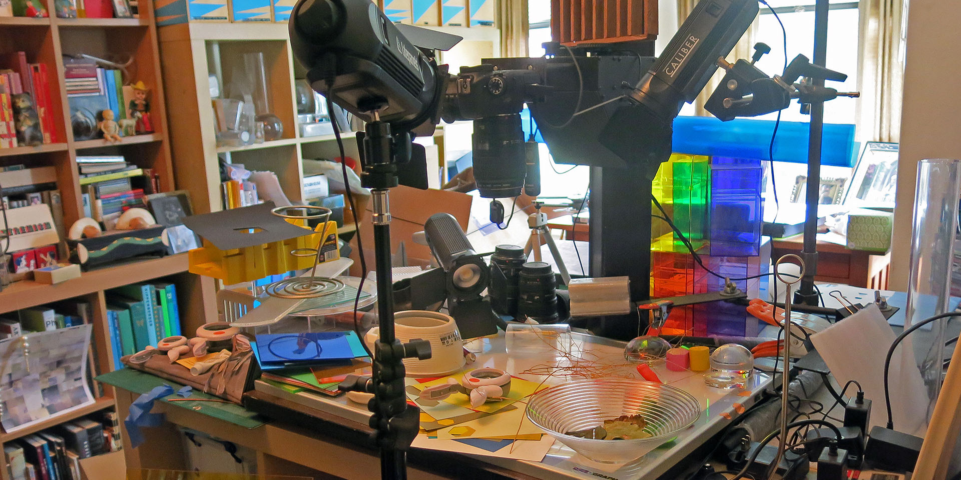
Since January 2025, Letterform Archive’s reading room has served as a display case for small, short-run exhibitions. Our eighth show, Martin Venezky: Process Work, explores an intrinsic but lesser known aspect of Venezky’s creative practice: a body of collage and photographic work that exists as a byproduct of “finished” graphic design objects. This process work is the physical embodiment of the rigor and devotion Venezky puts into his craft, giving viewers a peek into how he creates his signature typographic compositions. The show highlights our rare collection of the artist’s process materials and underscores the Archive’s commitment to providing open access to both design artifacts and the creative practices that inform them.
Our next pop-up exhibition is on view in the Reading Room gallery from April 28 to July 10, 2026. Jada Simone Haynes describes the very personal process of curating the show.
Discover the designer who showed how type alone could carry a brand’s voice. Two hundred objects are on view at Letterform Archive through Sep 6, 2026.
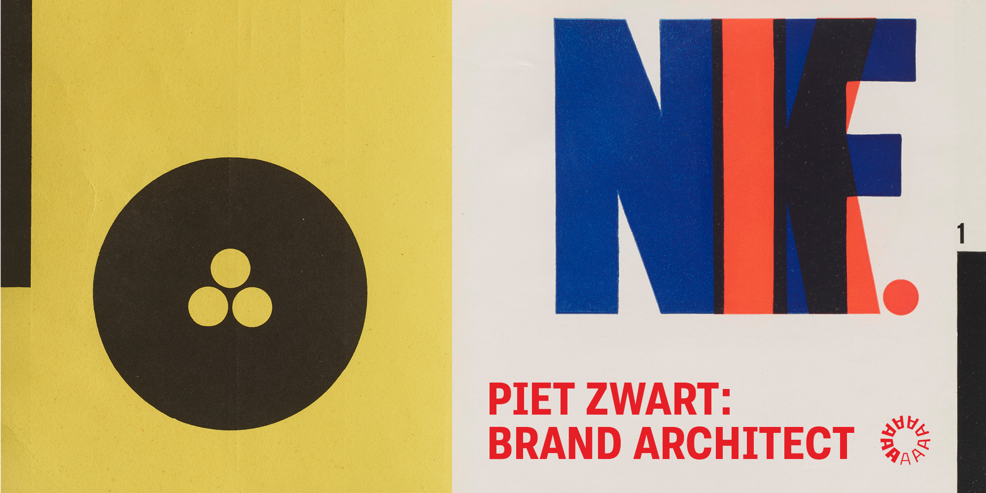
The brilliant Dutch modernist Piet Zwart (1885–1977) described himself as a “typotekt”. The term captured his multidisciplinary approach, creating a legacy that bridged architecture, industrial design, interior design, graphic design, typography, and photography.
Our new pop-up exhibition celebrates LetterSeed, the seminal journal of Korean typography. Curators Chris Hamamoto, Su Hyun Leem, and Jeewoon Jung tell us how it reinvigorated the Hangul script.
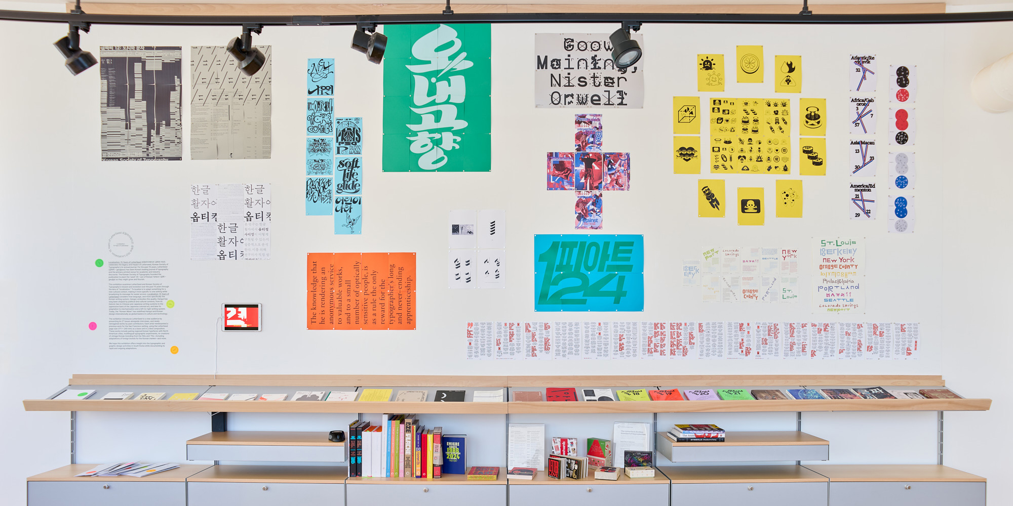
Letterform Archive’s reading room now serves as a display case for small, short-run exhibitions. Our third show, Localization: 15 Years of LetterSeed, opened this week and runs through the fall. It explores the rich typographic landscape of Korean typography and specifically Hangul, the unique writing system of the Korean language, through the lens of a single publication, LetterSeed, which has been published by the Korean Typographic Society since 2010.
We’re celebrating our 10th anniversary with an exhibition of our most beloved artifacts. The show runs April 26 – October 19, 2025.
Since opening in 2015, Letterform Archive has grown from a 15,000-item private collection, to a publicly accessible resource of over 100,000 objects. The works of lettering, typography, and graphic design span movements and continents, but what ties everything together is text, the essential material of culture. This common thread lets anyone—from type nerds to poets, coders to cooks—have an entry point into the collection. Our dedication to radical access has made the Archive a thriving community hub, welcoming thousands of visitors from more than 40 countries, and offering an unparalleled opportunity to engage directly with masterpieces of design.
Our new exhibition space not only brought us Good Luck, but also a fantastic set of zodiac posters by a three-headed monster.

The big wall in Letterform Archive’s reading room now serves as a display case for small, short-run exhibitions. Our first pop-up opened in January to celebrate Lunar New Year. Curated by members of the Archive exhibition team, Jen Dao (姚逸雯) and Sherry Chou (徐雪俐), Good Luck explores the rich cultural heritage and modern interpretations of the holiday through a blend of custom red envelopes, holiday ephemera, and celebration event posters.
Among the contemporary pieces in Good Luck are four large screen prints featuring complex, stylized animals intertwined with letterforms. The posters come from the hive mind of Omnivore, a graphic design studio formed by “second-generation Asian-Americans, working mothers, design educators, small business owners, food lovers, justice seekers, and friends.” Alice Chung (Brooklyn), Karen Hsu (Portland, Oregon); and Julie Cho (Los Angeles) have been collaborating since 2002 and often think of themselves as a three-headed monster. Their firm is M/WBE (Minority- & Woman-owned) certified.
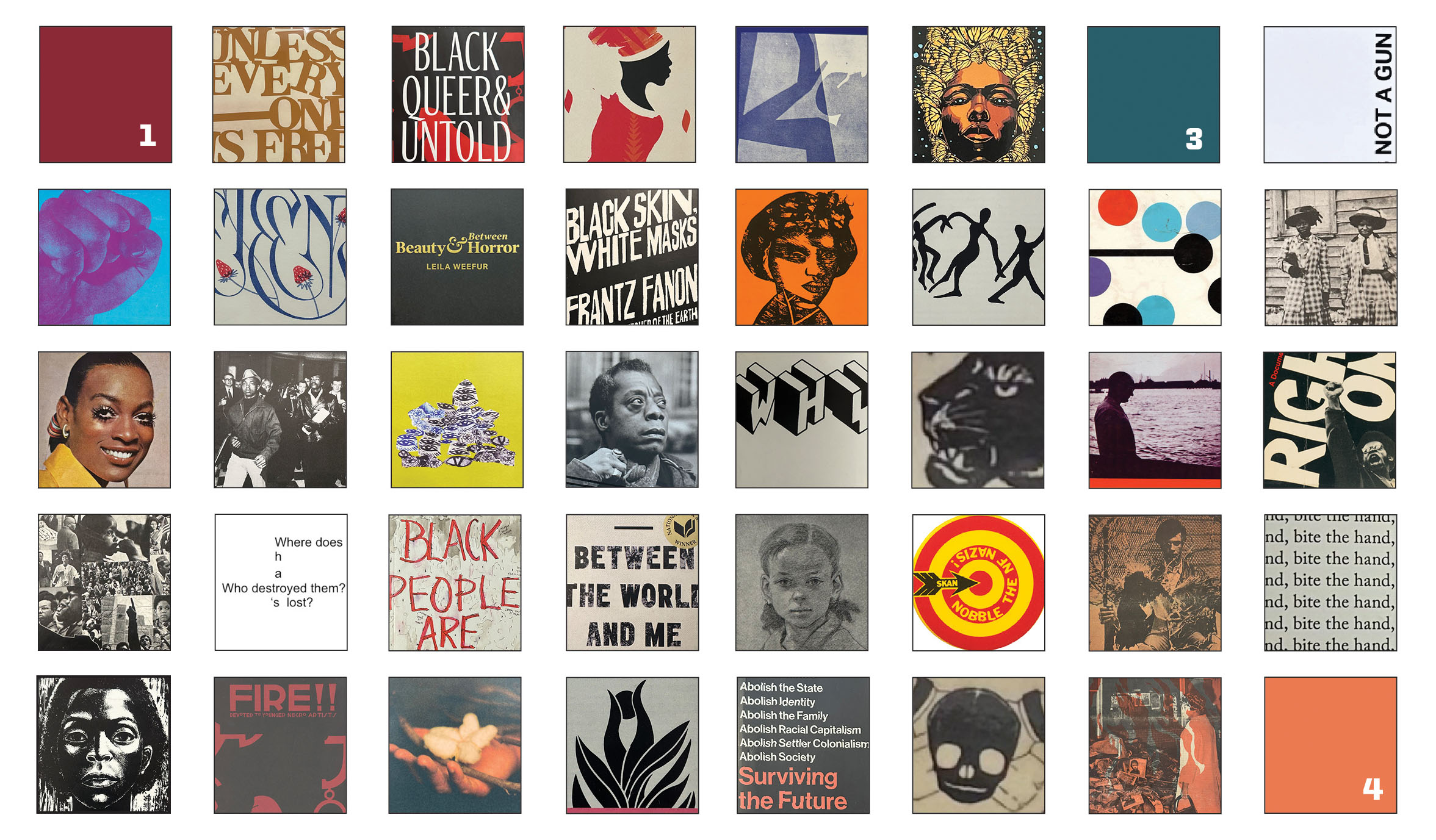
The major solo exhibition features over 150 type-driven artifacts from the self-described “humble negro printer”. Join us on July 20 for an opening reception with Kennedy and curator Kelly Walters.
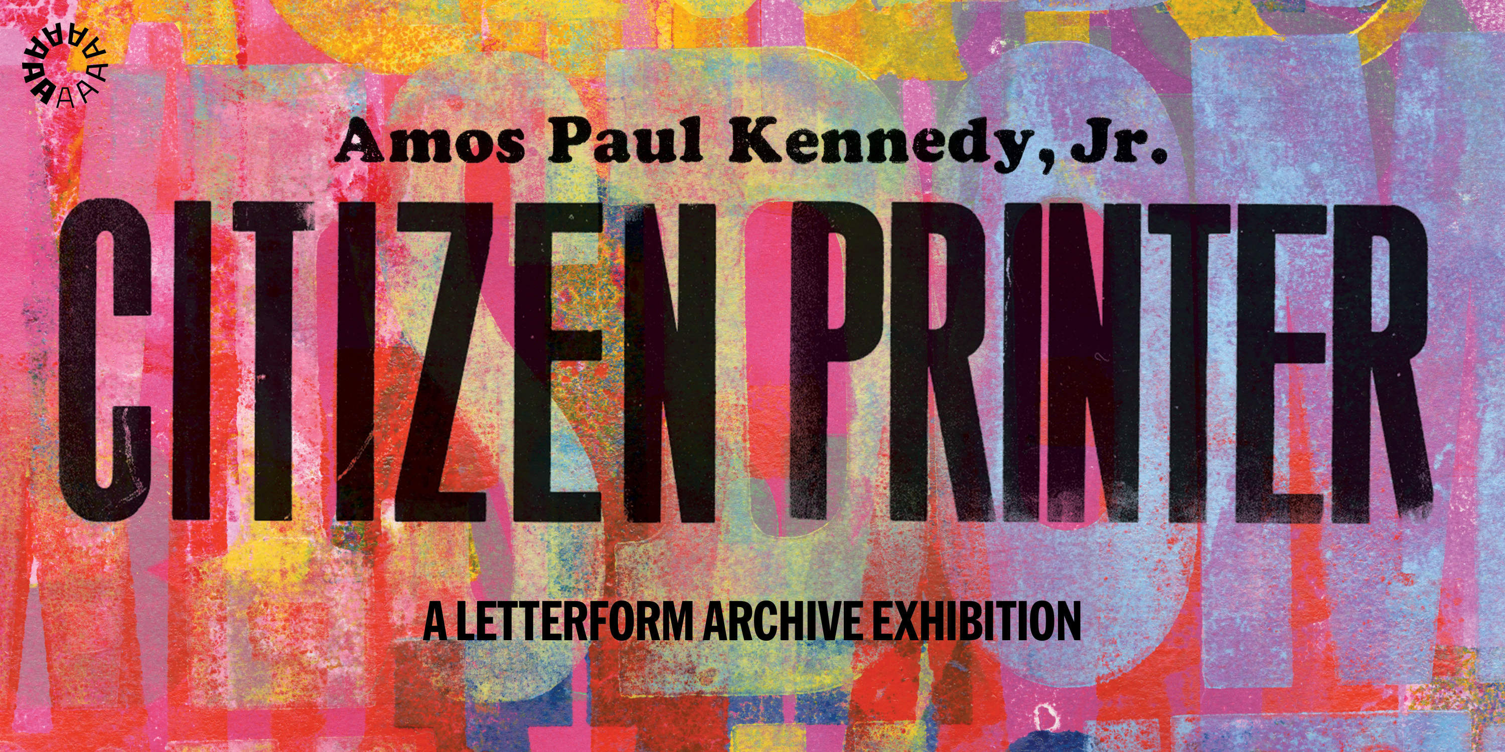
Through the use of bold language, graphic typography, and colorful layers, Amos Paul Kennedy, Jr.’s prints embody an intensity that catches the eye and provokes the mind. He is extremely outspoken about the impact of white supremacy and racism. These themes are reflected in Kennedy’s work and encompass the evolving trajectory of Black liberation in the United States. From growing up in the 1960s during the Civil Rights Era, to the rise of Black Nationalism in the 1970s, to the present Post-Civil Rights era, Kennedy has seen how these movements shaped Black identity in the United States and has drawn from this as inspiration.