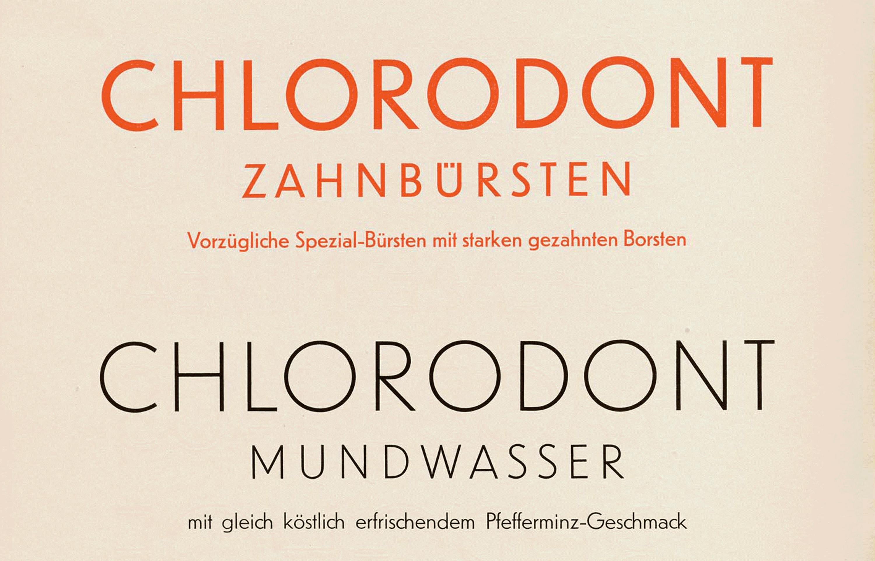
Inside Our New Facsimile: Die Fläche and the Design of the Vienna Secession
Our latest book opens the vault on Vienna 1900, sharing a graphic design showpiece of the Secession’s leading artist-designers and their students.

Search the collection and set Tables in the Online Archive.
This article by activist and educator Sabiha Basrai is the result of her 2023 research fellowship at Letterform Archive where she studied collections of global typefaces and collaborated with staff on curriculum development.
We love to hear how the Online Archive is enhancing design courses around the world. Teachers are using the Tables feature to create and share design artifacts and inspiration with their students, or present curated sets as slideshows in class. During the pandemic, when we weren’t able to welcome students to the Archive, the staff created our own tables* to help navigate type history and highlight works in the collection that exemplify major movements. Now we’re sharing a few of these tables with you!
The first artists and printers to call themselves “designers” advertised their work in the mid- to late nineteenth century. This period of the industrial revolution marked a peak of experimentation and extravagance in the trade, when printed ephemera flourished to meet the demands of expanding commerce and increasingly urban populations. Engravers, lithographers, and letterpress printers used a wide variety of opulent colors, lettering styles and typefaces, illustration techniques, and production methods to attract customers—both companies and consumers. They added dazzle and vibrancy to the stuff of everyday life: advertising, calling cards, invoices, labels, packaging, postcards, and tickets.
Up to that point, most people experienced printed material that was relatively dull, drab, and monochrome. Innovation in technology and craft changed everything. It was as if someone switched on the light.
Sometime in the 1990s, my father-in-law Bill Hermes—who’d retired from his career as an art director—gifted me neatly organized boxes of his professional books, tools, and supplies. In this thrilling collection of stuff, which spanned decades, was the 1971 edition of Photo-Lettering’s One Line Manual of Styles.
This aptly named book is a mind-boggling, 470-page compendium featuring 6,500 eclectic examples of display typefaces from the most prolific supplier of phototypesetting. I browsed it often over the years, but, one day in the summer of 2018, something in the volume made me stop short.
In the sea of 252 names—including titans of modern graphic design such as Joseph Albers, Milton Glaser, and Bradbury Thompson—I counted 10 women. At that moment I decided to try and find them.
As an omnipresent artifact of design, signs have a universal ability to both impart information and evoke a feeling. Sign documentation — whether online or in a book — can be a portal into a place’s cultural history. It captures a typographic snapshot of a city. It tells a story about evolving reproduction technologies and how they affect design choices, how commercial dynamics affect cityscapes, and how typography can communicate the intangibles of a business and its clientele.
Our next exhibition celebrates a combination seldom seen on museum walls. Featuring Greg Lamarche’s archives and Letterform Archive’s collection of graffiti magazines, Subscription to Mischief explores 1990s graffiti zines with a special focus on the making of Skills. It highlights original works by prominent and lesser-known writers of the ’90s through the pieces, throwups, and handstyles featured in letters, flick trade photos, and magazine submissions. Taking a close look at practitioners as documentarians, and how magazines served as launch pads for creative careers, Subscription to Mischief is a time capsule of graffiti letterforms and a tribute to the community formed through snail mail.
Letterform Archive members have long been able to save sets of images in the Online Archive as Tables. With our latest update, all members can now share Tables! Teachers can share sets of design artifacts with their class, or designers can share a mood board with their team or clients. We can’t wait to see how you use Tables now that you can make them available to anyone.