What connects a 1930s type specimen to a student’s assignment from the 1950s? A century-old oral hygiene brand from Germany!
Spanning stylistic and topical boundaries, Letterform Archive’s collection often invites unexpected and evocative connections. Seen Together is a new blog series featuring our favorite object pairings—works that may come from very different times and places, yet sit next to each other in dialogue on a tour table.
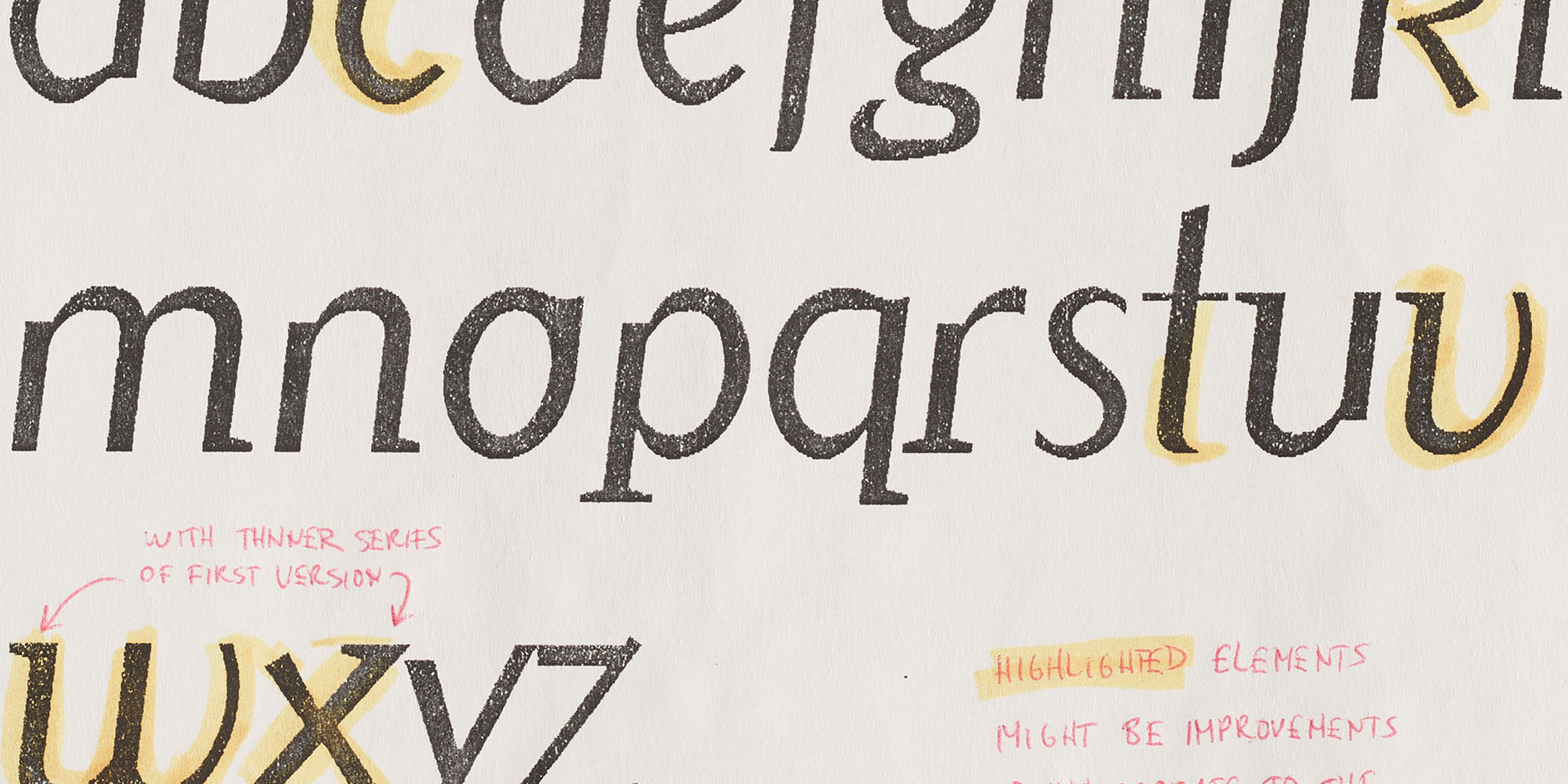
Drawing from her experience working with the collection, and conversations with its principle designers, Digitization Specialist Eve Scarborough reflects on the materiality of type design.
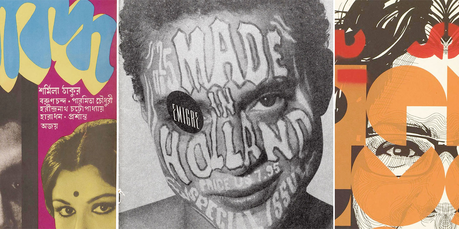
Donated along with their collection in 2016, Emigre’s font development files represent a rare comprehensive view of a digital type foundry’s process. After two years of work, the collection is now digitized in full, a world’s first for such an archive. A selection of objects will be made available to the public through the Online Archive.
अक्षरों के इतिहास और डिज़ाइन की कहानियाँ, अब हिन्दी में। / An introduction in Hindi to Letterform Archive’s collection.
यह लेटरफॉर्म आर्काइव पर प्रकाशित होने वाला पहला हिंदी लेख है। इसमें दुनिया भर से आई वस्तुएँ शामिल हैं, और यह लेख उनके कुछ चुने हुए उदाहरण प्रस्तुत करता है। इसे लिखने का उद्देश्य सिर्फ़ नए पाठकों तक पहुँचना नहीं है, बल्कि रॉडिकल एक्सेस के विचार को आगे बढ़ाना है, जिस पर लेटरफॉर्म आर्काइव की नींव रखी गई है।
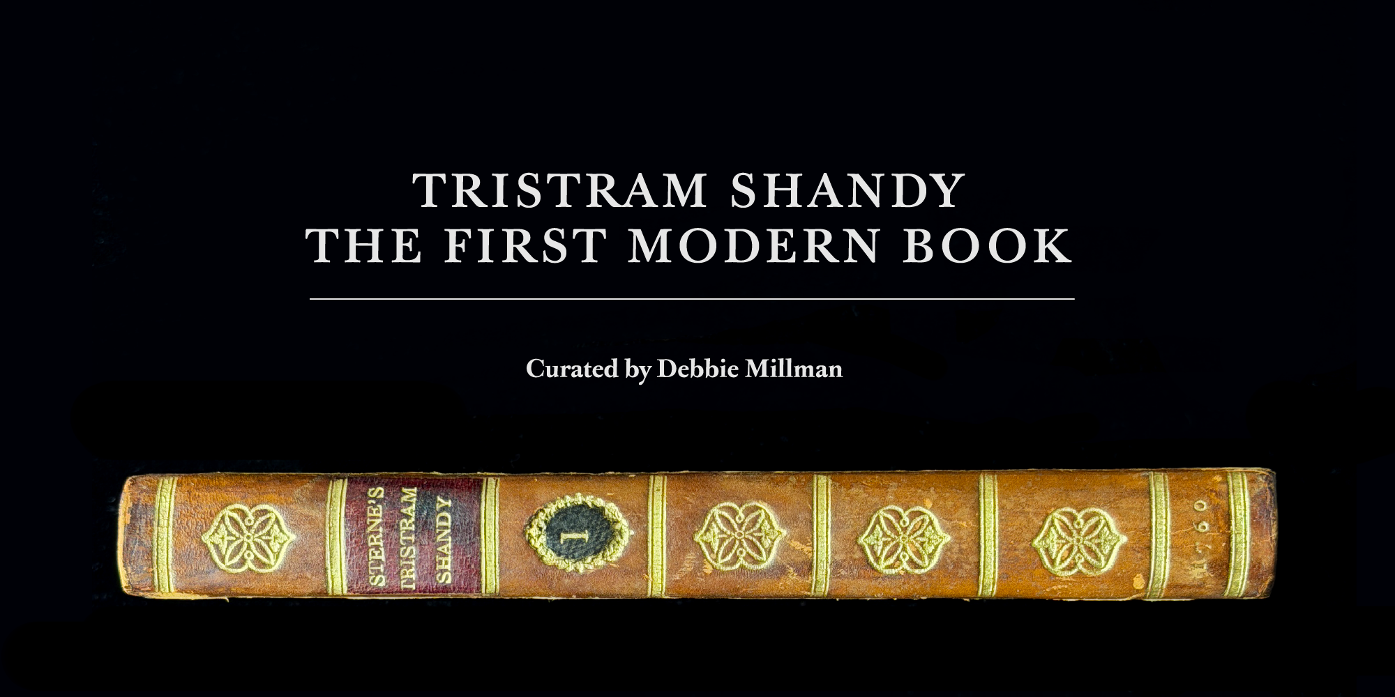
Tristram Shandy, The First Modern Book is on view in the our Reading Room gallery until April 26, 2026.
Letterform Archive is honored to welcome author, artist, educator, designer, and podcast pioneer Debbie Millman as a guest curator for our latest reading room exhibition. Tristram Shandy, The First Modern Book showcases a book that, in many ways, feels astonishingly modern—even though it was first published 266 years ago in 1760.
We return to Switzerland to consider the impact of the provocative designer who pushed modern typography to its limits.
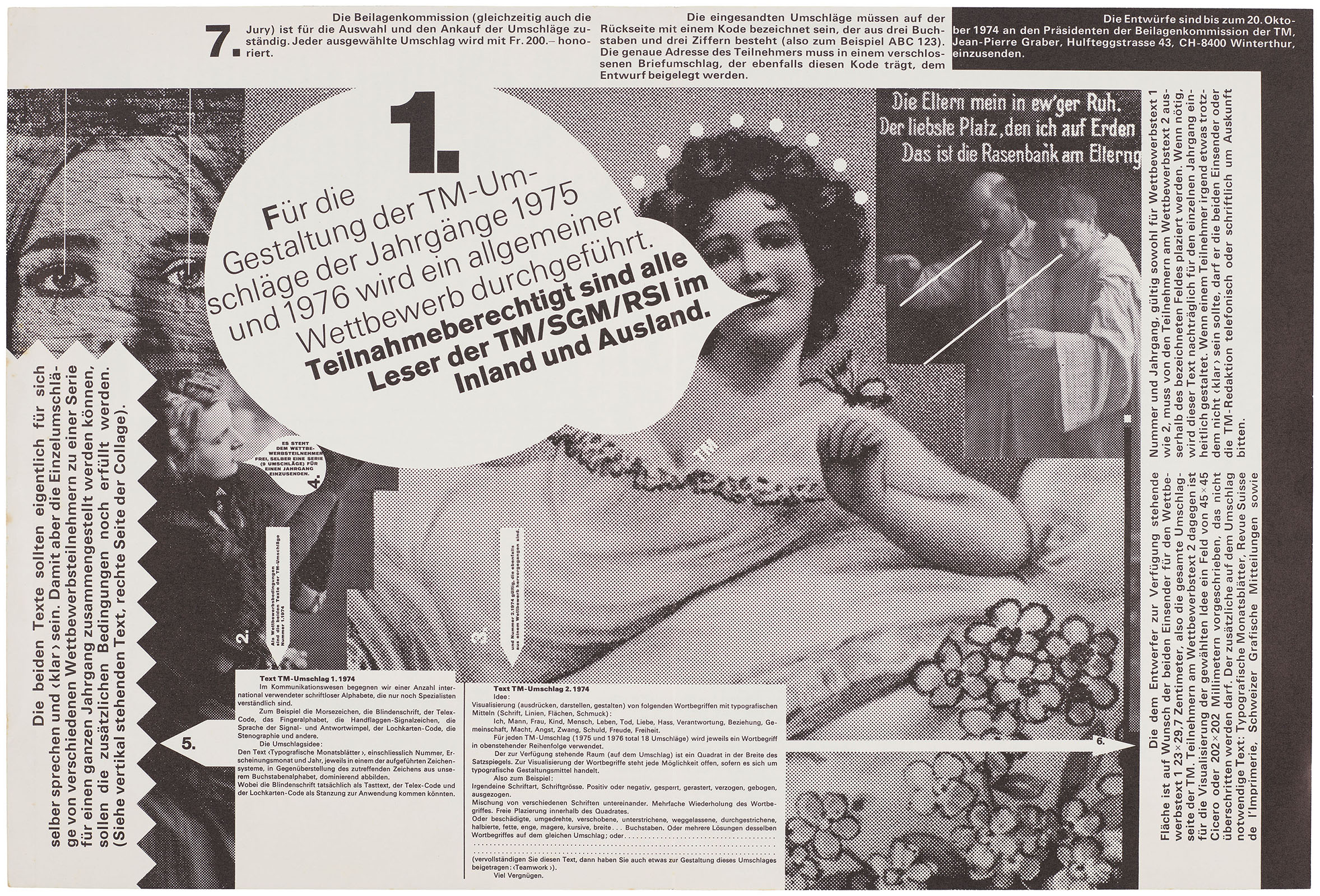
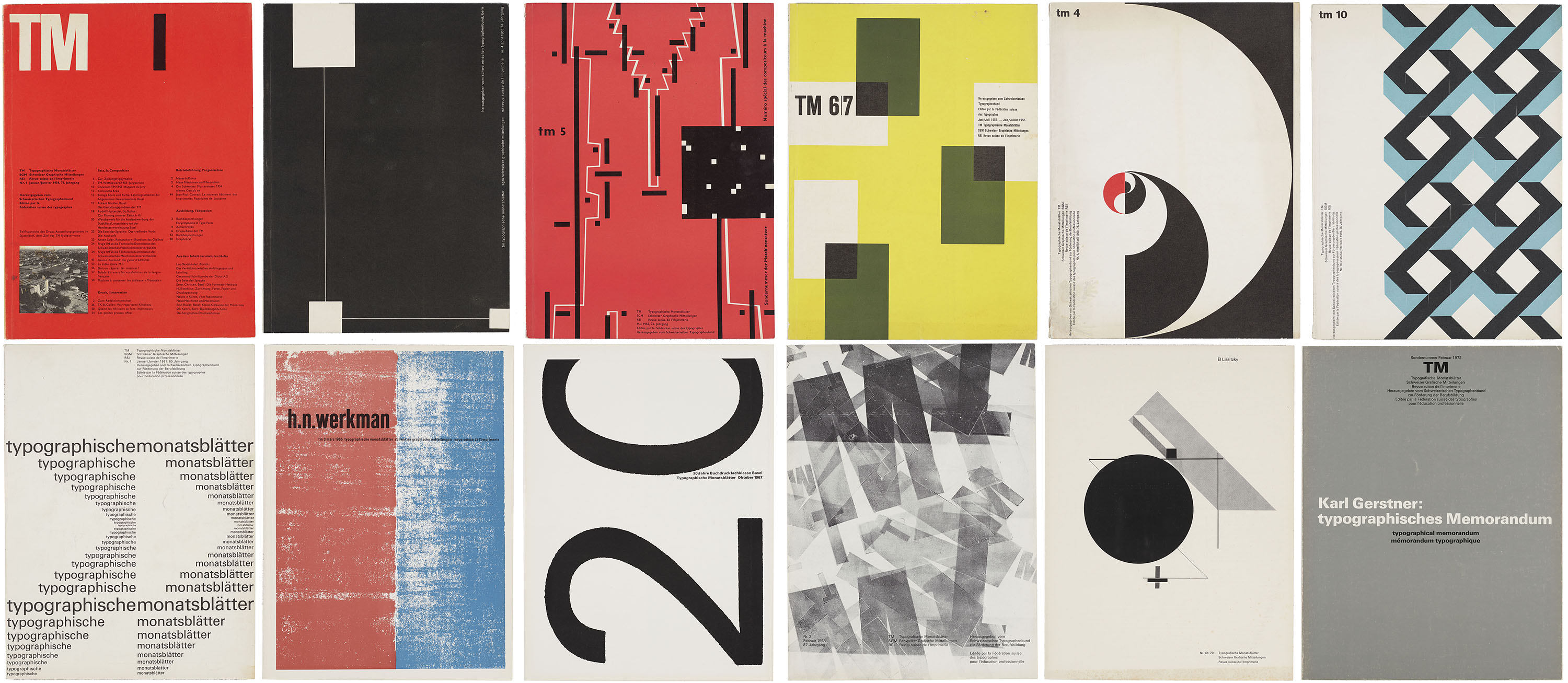
In 1972, the editorial board of Typografische Monatsblätter (TM), one of the leading trade journals in Switzerland, approved a series of cover designs intended to lay the groundwork for the publication’s new artistic direction. Enlisting newly appointed board member Wolfgang Weingart (1941–2021) to produce fifteen covers for the 1972 and ’73 print runs, the outcome inspired both high praise and harsh criticism from a design milieu accustomed to the quiet precision of former art director Robert Büchler (1914–2005) and regular contributor Emil Ruder (1914–1970). Weingart’s provocative covers invited an unprecedented level of controversy by appearing to flout the fundamental principles of modernist design. Instead, his iconoclastic approach struck at the very heart of the Swiss tradition.
An influential trade journal reveals the origins of Swiss typographic style and provokes conversation between objects at Letterform Archive.
In 1952, the competing Swiss trade journals Schweizer Graphische Mitteilungen and Revue suisse de l’imprimerie merged with Typografische Monatsblätter (TM), a monthly periodical advertised as the leading publication of the Swiss graphic design industry. Tailored to a diverse audience of design professionals, the magazine published articles in German, French, and English under the editorial direction of Rudolf Hostettler (1919–81), with Robert Büchler (1914–2005) overseeing its initial art direction. Unlike many contemporary trade publications that focus primarily on showcasing finished work, TM combined writing on professional practice with long-form essays devoted to design theory and criticism. From the early ’50s through the ’60s, both the journal’s editorial content and visual approach were strongly influenced by contributing editor Emil Ruder (1914–70), whose tenure at the Allgemeine Gewerbeschule Basel helped to establish the foundational principles of Swiss Style.
The work of 50 living designers joins 50 historical objects from the collection to celebrate our 10th anniversary.
Letterform Archive is a living archive, a perpetual project to not only preserve historic design, but also inspire new work. To mark our 10th anniversary we teamed up with COLLINS to create 100 Tens: 50 interpretations of the number 1 from the Archive’s collection, paired with 50 contributions from some of the most innovative designers working today.
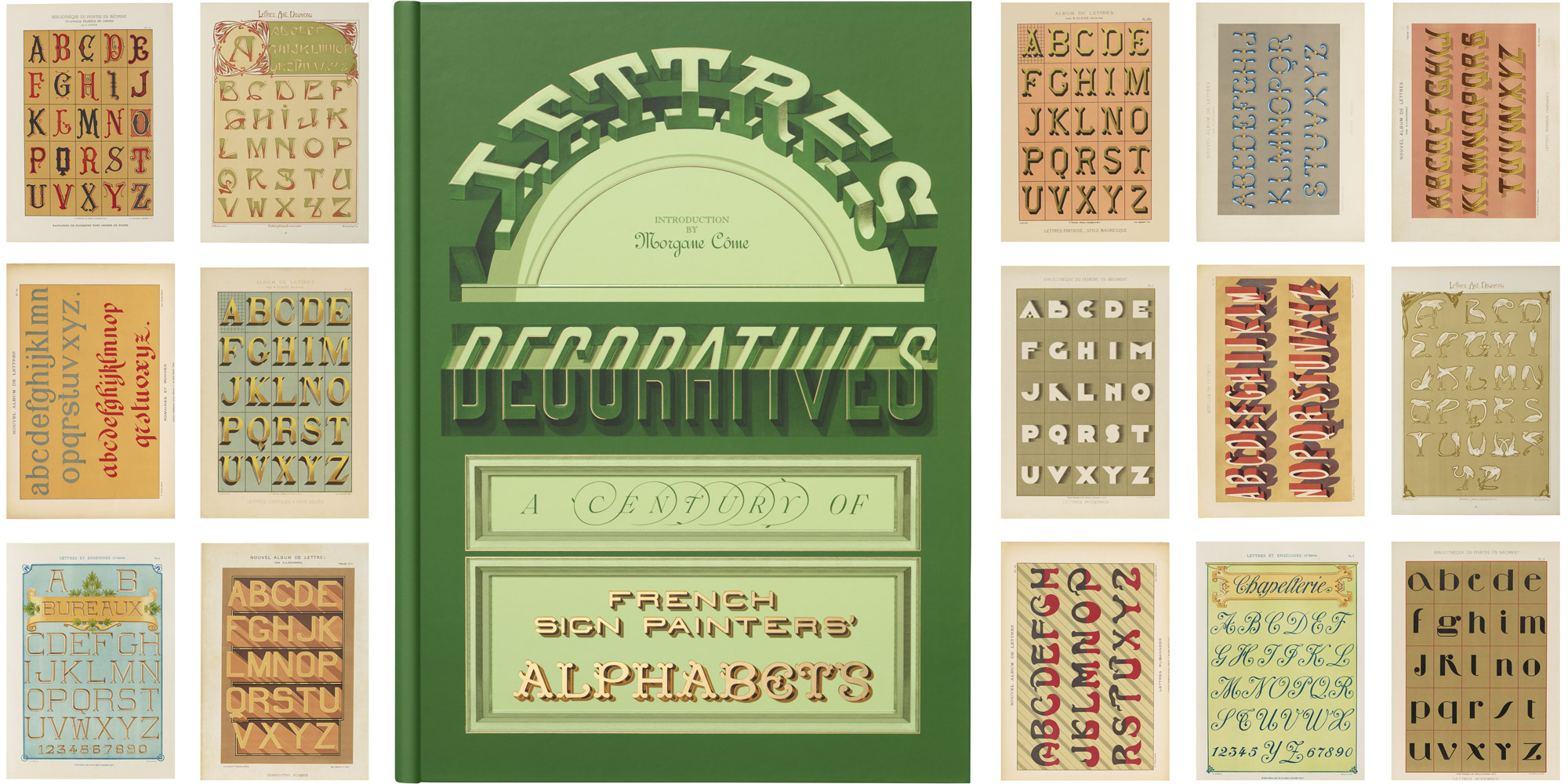
With alphabets from 12 grand portfolios that brought the sign painter’s art to the page, our new book is a trip through time to the golden age of urban lettering.