News
Now on View: Localization: 15 Years of LetterSeed
Our new pop-up exhibition celebrates LetterSeed, the seminal journal of Korean typography. Curators Chris Hamamoto, Su Hyun Leem, and Jeewoon Jung tell us how it reinvigorated the Hangul script.
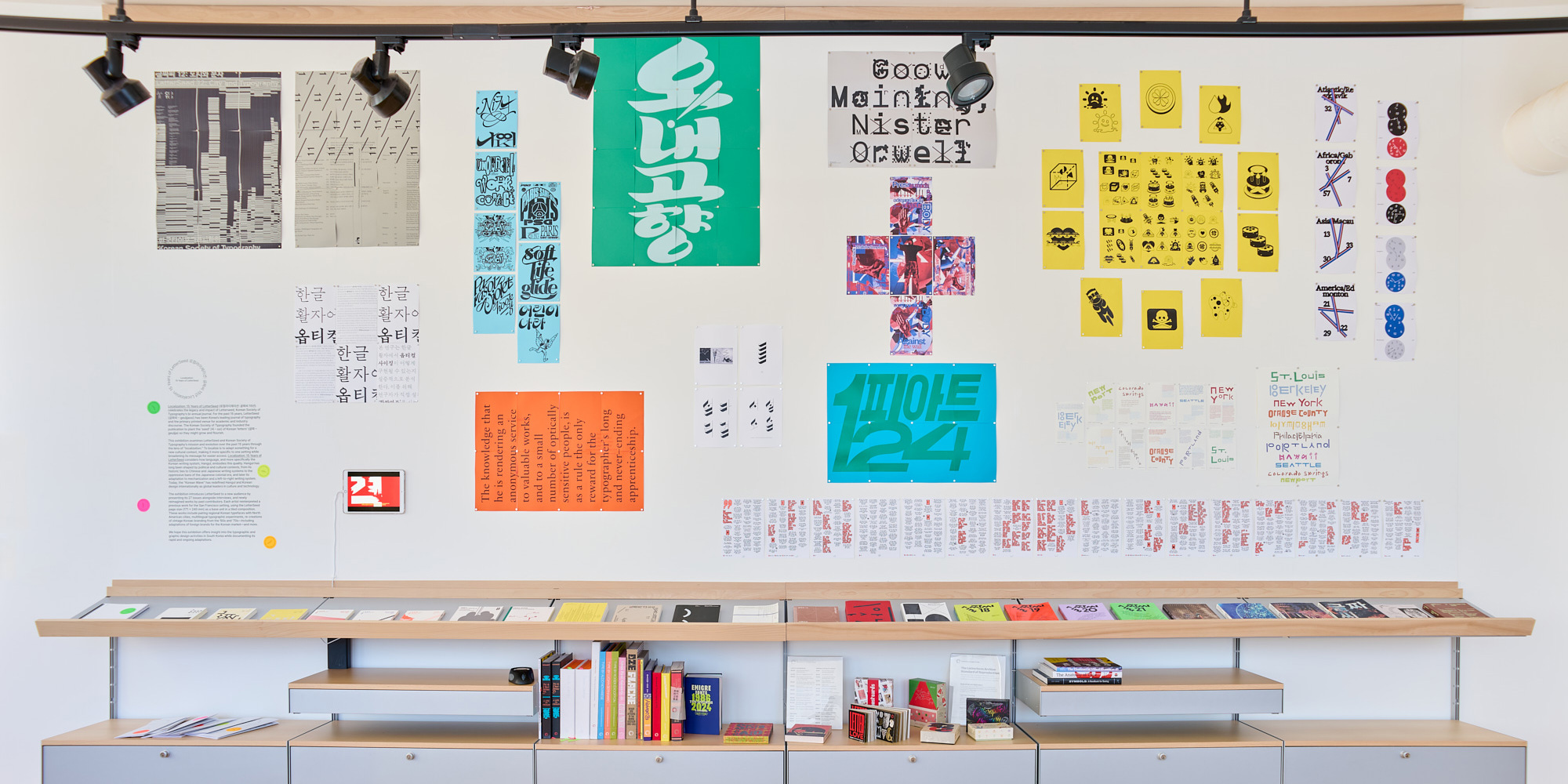
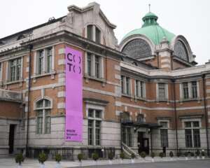
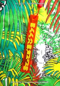
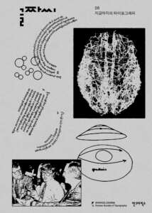
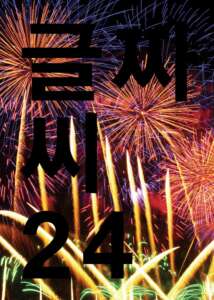
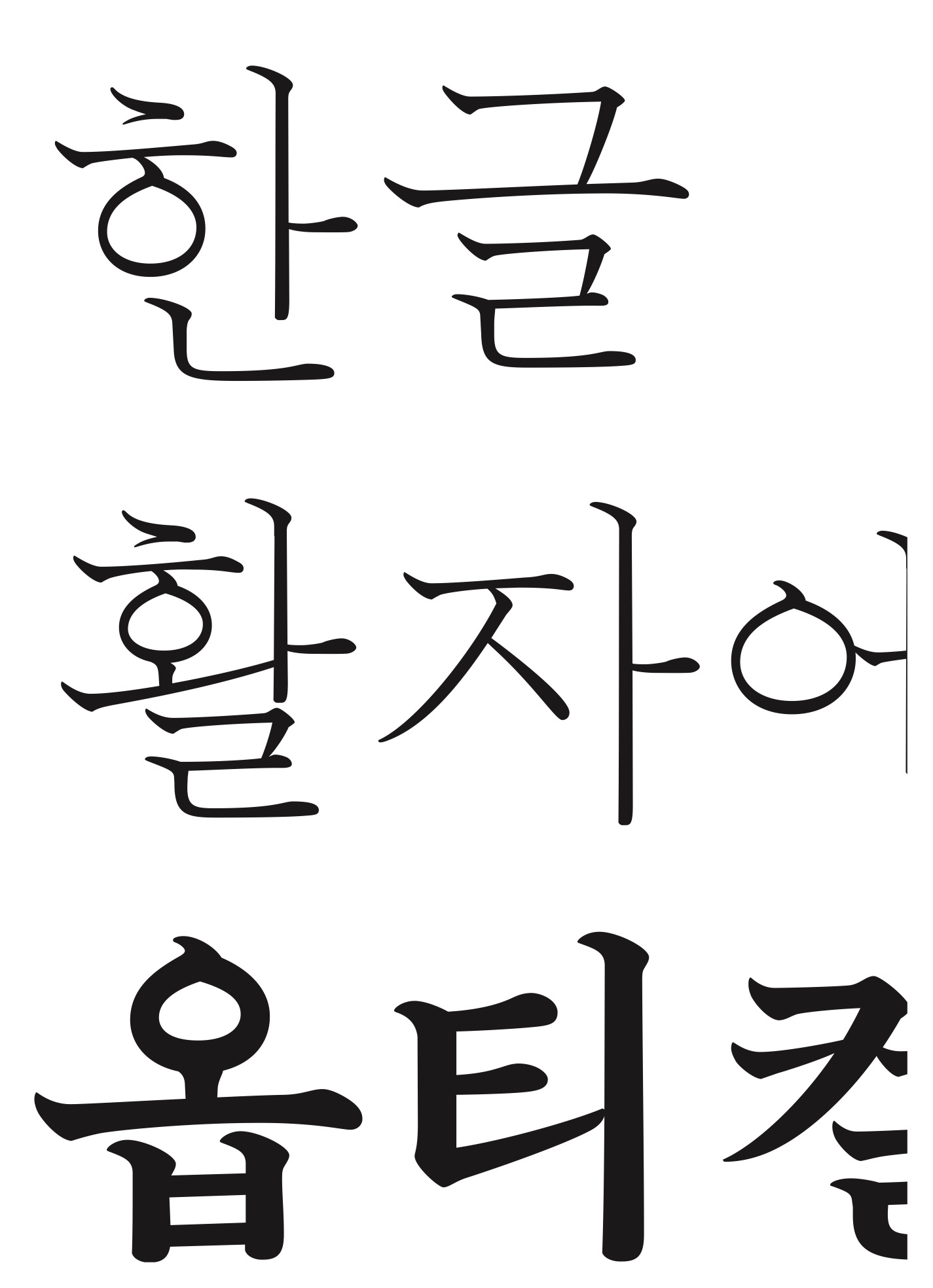
Letterform Archive’s reading room now serves as a display case for small, short-run exhibitions. Our third show, Localization: 15 Years of LetterSeed, opened this week and runs through the fall. It explores the rich typographic landscape of Korean typography and specifically Hangul, the unique writing system of the Korean language, through the lens of a single publication, LetterSeed, which has been published by the Korean Typographic Society since 2010.
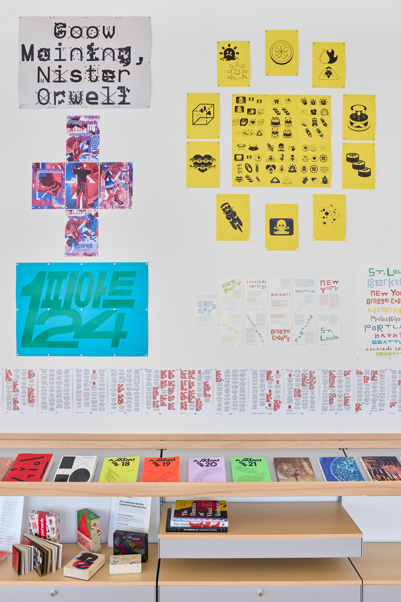
The exhibition is curated and designed by American designer and educator Chris Hamamoto with his graphic design students from Seoul National University (SNU), Su Hyun Leem and Jeewoon Jung. The show includes 27 issues of LetterSeed along with some of their favorite material from the publication. Work by Chris Ro, Dahyun Kang, Dokho Shin, Hepziba Kim, Hezin O, Hyewon Park, Hyoju Gil, James Chae, Jay Jeong, Jaeyoung Lee (6699press), Jieun Yu, Jin-Hoo Park, Kyungmin Lee, Lee Reum, Min Bon, Orange Slice Type, Paper Press, Rebel9, Sang Mun, Sarok, SeongJeen Pai, Sumin Park, Sungwoo Bae, Suzin Kwon, Uigyeong Kim, and Yejin Cho is reinterpreted for display, using the trim size of the publication and tiling to create different scaled representations in the show. LetterSeed is contextualized through an interview with current and past presidents of the Korean Society of Typography, Kyungsun Kymn, Sulki Choi, and Wujin Sim.


The Archive received the collection thanks to a gift from Ahn Graphics, a publishing imprint launched in 1985 by Korean Design legend Ahn-Sang Soo with the agenda to “create a new page in the history of Korean graphic design.” In celebration of this exhibition and generous donation, Letterform Archive’s Associate Curator of Exhibitions, Jon Sueda, had a conversation with exhibition curators Chris Hamamoto and his students.
Jon Sueda: Being that you are an American designer teaching in Korea, how did you encounter LetterSeed and what is its significance to you? For the students studying in Korea, what is your experience with LetterSeed?
Chris Hamamoto: In one of my trips to Korea before moving here, designer and professor Chris Ro shared an issue with me when I was asking him how to learn more about Korean typography. Initially, I was impressed that there would be a journal dedicated to typography within a relatively small design community. Since then I’ve become more familiar with LetterSeed and I’ve come to appreciate it as a venue for in-depth sharing about typographic ideas, as well as a through-line for the Korean graphic design industry for the past 15 years.
Designing a single Hangul font family often requires creating more than 10,000 individual glyphs. While this makes type design especially difficult, it offers many more opportunities for experimentation. Through LetterSeed, I was able to rediscover the possibilities of Hangul typography. — Jeewoon Jung
Jeewoon Jung: This project was my first time encountering LetterSeed. While looking through it, I was reminded of the unique appeal of Hangul and its compositional nature. Because Hangul syllables are built by combining letters into blocks, each glyph changes shape depending on the combination. As a result, designing a single Hangul font family often requires creating more than 10,000 individual glyphs. While this makes Hangul type design especially difficult, I also think it offers many more opportunities for experimentation from a graphic design perspective because the appearance of a glyph can shift depending on its position and surrounding elements. Through LetterSeed, I was able to rediscover the possibilities of Hangul typography. It was exciting to see how much thoughtful work is being done in this field.
JS: Who is responsible for LetterSeed and what is its agenda as a typography publication? Is it to promote Korean design culture or to expose Korean designers to international/global perspectives?
CH: LetterSeed is organized by the Korean Society of Typography (KST) and published by Ahn Graphics. I don’t think I can do justice to all of the motivations behind the journal, but my understanding is that LetterSeed aimed to grow the discourse and activity around the Korean language and typography. So, I’d say it was first meant to promote design culture within Korea and beyond by enabling discourse, sharing resources, etc.
The exposure to global perspectives may be a bit incidental, and due to the international nature of contemporary design in Korea (many prominent Korean designers studied overseas, design for multinational corporations, work in K-Pop and the Korean film industry, etc.) there was naturally an international character to the publication. For instance, there are features with Gideon Kong, Studio Spass, David Reinfurt, and Helmut Schmidt, just to name a few. And while I don’t know for sure, I think the editorial staff and members of the KST knew these people and their involvement came about naturally.
I also think LetterSeed’s relationship to the KST and its unique mission further increases the international character of the publication as well. For instance, Typojanichi — the typography biennial — isn’t a KST project, but the KST is deeply connected to the conference in various ways through its editorial board, funding, as participating artists, and more. Because Typojanchi is the only typography biennial in the world, it became a hub for international typographic exhibition and discourse, which LetterSeed then reflects.
JS: When looking at the full collection of the journal that began in 2010, its format changes along with design and editorial approach, how has LetterSeed evolved over the lifespan of the series?
CH: In an interview we conducted for the exhibition, which is included in the show, Sulki Choi describes — to paraphrase — LetterSeed as an academic journal that also expands the boundaries of what is considered academic. I interpret this as being due to LetterSeed’s place within a larger initiative by the KST, which also organizes exhibitions and conferences. These activities naturally exist in dialogue with one another, as well as with developments in the broader design “culture,” since the KST stays connected to design practice through them. Because of this, I see LetterSeed reflecting the state of graphic design in Korea in a surprisingly contemporary way—whether through the editorial staff’s own interests or through deliberate efforts, such as interviews and snapshots of the type design industry.

For instance, early issues in the mid 2010s may discuss Kinetic Typography, around the late 2010s there was an issue dedicated to gender, and more recently there’s been essays about the impact of Instagram on design discourse, accessibility, LBTQ rights, and a renewed interest in screen-based type. These topics aren’t exclusive to these timeframes, but I think you can see trends over time.
Global interest in Korea has surged — tourism to Korea, Korean cuisine, and K-media have grown worldwide — bringing more visitors willing to learn the language … more people are coming to Korea to connect, rather than Koreans having to go abroad. — Chris Hamamoto
Another example of how LetterSeed mirrors the contemporary moment: Until recently LetterSeed was bilingual, but a few years ago it became a Korean-only publication. I don’t know why this happened, but my intuition is that it was a practical decision to speed up the production cycle, lower costs, etc. It also reflects shifts in Korean graphic design’s relationship to international audiences. The graphic design field is relatively young in Korea, often traced back to the 1960s as the starting point, and many designers studied abroad to “bring back” knowledge and methods since the post-graduate education infrastructure wasn’t as developed in Korea. More recently this trend has waned, with more designers seeing no need to leave Korea to engage with design culture. Post-pandemic, global interest in Korea has surged — tourism to Korea, Korean cuisine, and K-media have grown worldwide — bringing more visitors willing to learn the language. Making LetterSeed Korean-only may not directly respond to this, but it suggests a new reality: more people are coming to Korea to connect, rather than Koreans having to go abroad or adapt for accessibility.
I’d also just mention that I think the journal has increasingly grown in size. And every few years a new governing board takes over, including editorial direction of LetterSeed.
JS: In this exhibition you are showing a full collection of all 27 issues of LetterSeed along with new works made by its contributors. Can you explain the concept of the show?
CH: The primary focus of the show was to share LetterSeed and its impact — which may not be well-known outside of Korea although it has a significant international footprint. For instance, authors who contributed to LetterSeed and are part of the KST have worked on projects at Apple that impact our daily lives (e.g., co-designing the San Francisco typeface), or have had work collected by the MoMA in NYC (ZXX), or otherwise worked, studied, and/or taught all around the world. We then thought more about what happens in the process of sharing a cultural artifact, and the idea of “localization” took hold.
As a half-Japanese person from California, I always find it interesting how disconnected my perception of “Japanese-ness” seems to “real” Japanese people when I describe the culturally Japanese stuff I identify with. Most often it will seem old-fashioned, like pounding rice cakes with a big hammer in a stone bowl for the traditional mochi-making festival, or look really different than how the same thing may be practiced today, such as going to a Japanese Buddhist “church” which is structured similarly to an American Christian church.
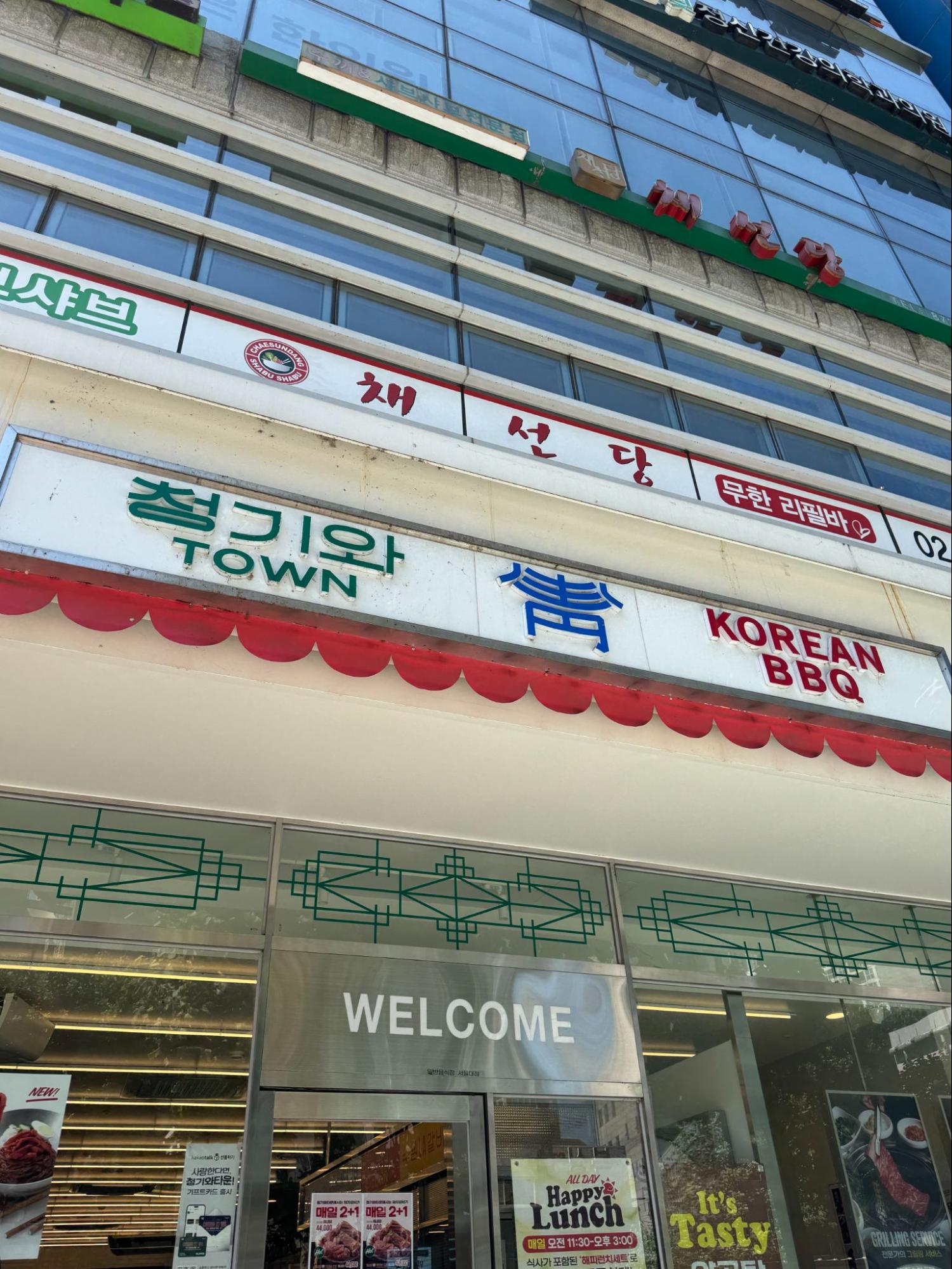
A similar thing I found interesting since moving to Korea is how Korean-Americans have created a unique culture in the US as well, and how cultural feedback loops take shape. For instance, there’s a Los Angeles K-Town inspired BBQ restaurant near Seoul National University I’ll go to with my colleagues and students which has become quite popular.
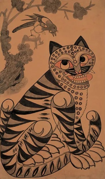

JJ: Another good example of this is Derpy and Sussie from KPop Demon Hunters. There are many traditional Korean folk paintings known as “작호도(鵲虎圖)”, which depict a tiger and a magpie. Inspired by this imagery, Derpy and Sussie appear in a Netflix animation and they became popular around the world.
CH: In the show there are several examples of this, such as The Chemical Reactions of Letterforms in Localization, designs using Latin letters by Paper Press who isn’t a native English speaker; Hangul Lettering Archive, 1950–1989 by Orange Slice type, recreations of Hangul lettering used in ads during that time—often for international brands that originated outside of Korea; and Current Location, which expressed designer James Chae’s feelings about US politics as an American living in Korea.
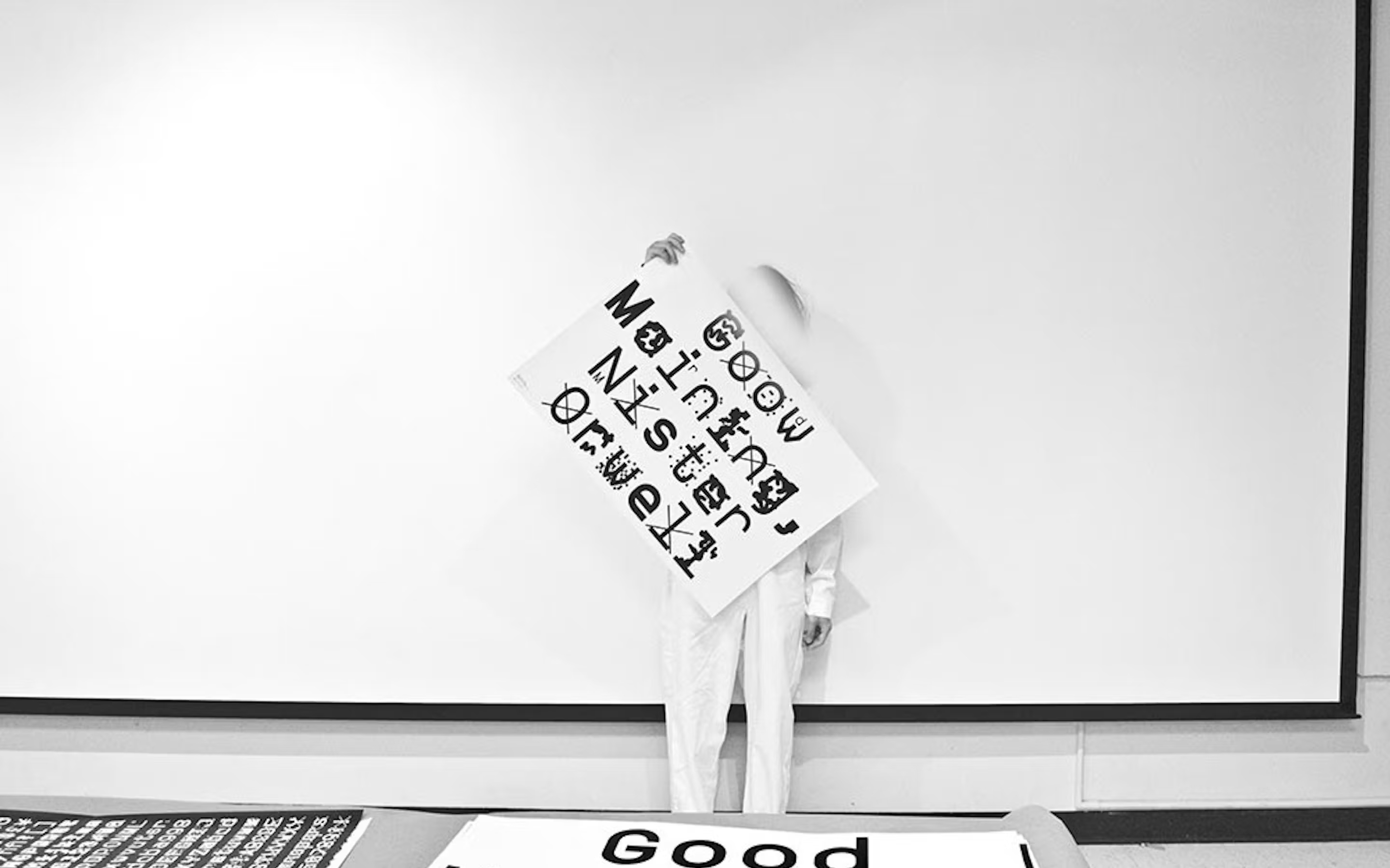
As we conceptualized the exhibition, we were thinking about what it means for LetterSeed to travel internationally, and how, like other cultural information, it may take on new shapes and meaning. In LetterSeed’s case we hope it becomes part of new cultural and design heritages and practices. So, in addition to collecting the issues of LetterSeed we also asked contributors to LetterSeed to adapt their previous works from LetterSeed for the San Francisco context, using LetterSeed’s physical size as a formal constraint (each piece could take up one signature of an issue of LetterSeed (16 pages measuring 171 × 240 mm).
JS: Students from SNU also worked on the show, can you describe your involvement?
SHL: I was part of the SNU team that worked on the LetterSeed show, which was a fantastic opportunity to share Korea’s contemporary design scene with San Francisco — a city I love and visit often.
My involvement began with curating the exhibition. We went through all the past issues of LetterSeed to select works, which sometimes meant literally running around the city to track down physical copies. Once we finalized the selections, I reached out to the featured artists to confirm their participation.
I also contributed to the show's visual identity. We all came up with various concepts and contributed to what became the final graphics. I then helped with coming up with a layout that displays the works in an optimal way and printing out all the works. That turned into a real hands-on challenge: the papers were heavy, didn’t come in the sizes we needed, and constantly jammed the printer—so there was a lot of trimming, lifting, and re-printing involved.
Once everything was ready, we carefully packed and mailed it all to San Francisco, just hoping it would arrive on time. I also helped design the exhibition catalog and takeaway materials.
JW: I was also part of the SNU team, majoring in Visual Design. I’ve been working on various projects in Chris’s lab, and I joined LetterSeed as a part of that journey.
I joined this project a little later than Su Hyun. At first, I was just following along with how the team was researching LetterSeed and reaching out to artists, and then I gradually got involved as the overall curation process took shape.
For the visual identity of the exhibition, we explored different directions and shared feedback along the way. It was interesting to see how the visuals shaped depending on which feature of the LetterSeed we chose to highlight. One of the trickiest parts was finding a typeface that could handle both Korean and English without feeling awkward. I remember testing a lot of different sans-serif fonts. [The final choice was Pretendard, designed by Kil Hyung-jin as a “replacement for San Francisco and Apple SD Sans Gothic Neo in environments where they're absent.”]
I also worked on some of the physical materials for the exhibition space, especially the catalog. Unlike the tiled wall that displayed all the works at once, the catalog offered a more personal way to experience each piece. I hope visitors will be able to get a deeper sense of meaning and detail through the book.

JS: What impact do you think LetterSeed has had on graphic design in Korea? What are your goals for introducing this work to an American audience in this exhibition at Letterform Archive?
CH: As I mentioned earlier, I feel like LetterSeed is a great resource for understanding Korean typography as well as the design scene in South Korea over the past 15 years. In terms of impact, I feel it has been a resource for young designers and those new to Korean typography and type design to learn. As well as a great platform for young designers to share their work and theories. This includes as authors, as well as joining the board to become editorial directors, and including KST’s activities more broadly sharing their works in exhibitions, creating graphics to promote KST events, and so on.
My hope through sharing LetterSeed is that it will help people understand the context in which Korean design is being made, and for those who are more knowledgeable, I hope it’s a resource for them to delve into Korean typography more deeply.
SHL: It was a lot of work in a short amount of time, but incredibly rewarding to see it come together—and to help connect Korean design with a wider international audience.
JW: As a native Korean speaker, it was very fun to explore Hangul typography that plays between text and image. I'm curious how these works will be perceived by the local audience at the exhibition site. It was such a rewarding experience, and I hope it helps share the beauty of Hangul typography with people around the world.
JS: You are working on a future project with us at the moment, an exhibition about contemporary Korean graphic design. This show in some ways is a preview of a more expansive view of this exciting work being made today. What have you learned from LetterSeed, and are there any elements of this exhibition that you will elaborate on in the larger show to come?
CH: From developing the LetterSeed show I got an insight into another dimension of how the Graphic Design scene in Korea incubates talent and discourse. In the US there’s a significant barrier between education and industry, and within my career I’ve seen this distinction grow. Institutions like AIGA, which did a lot to bridge the gap between school and work when I first started working in the late 2000s, seem much less active these days. When I moved to Korea I assumed there was a similar siloing between school and work, but organizations like the KST and publications like LetterSeed do a lot to extend education into the professional space and vice versa. I also don’t want to compare AIGA and the KST too much since I found AIGA to be biased towards industry in a way that I feel the KST is not.
The future show at the Archive is focused on the concept of “rapidity” and how that expresses itself in graphic design from South Korea. After living in Korea for a few years as a Californian and American, I realized my internal clock is set to a slower pace. In the same way that the pace of a California lifestyle may lead to certain graphic ideas and outcomes, this too is apparent in graphic design from South Korea. While developing the LetterSeed show, and also serving on the board of the KST this year and seeing behind the scenes a bit, it has helped me understand what goes into cultivating such a dynamic and fast-paced design culture.
I’m still planning the next show, and understanding how to incorporate what I’ve learned, but at this moment I see LetterSeed as a great source for locating topics, works, and designers to feature. At the same time, I hope the upcoming show can go beyond any single reference. While the KST and LetterSeed is one “center” of graphic design discourse, it can only represent a fraction of what’s happening in South Korea today. My hope is that the upcoming show can incorporate the learnings from this show—which just scratches the surface of KST’s and LetterSeed’s impact, while also sharing ideas that aren’t represented by LetterSeed.
Localization: 15 Years of LetterSeed is on view now in Letterform Archive’s reading room, open to all with admission to our main gallery. Plan your visit.