Event
Lecture
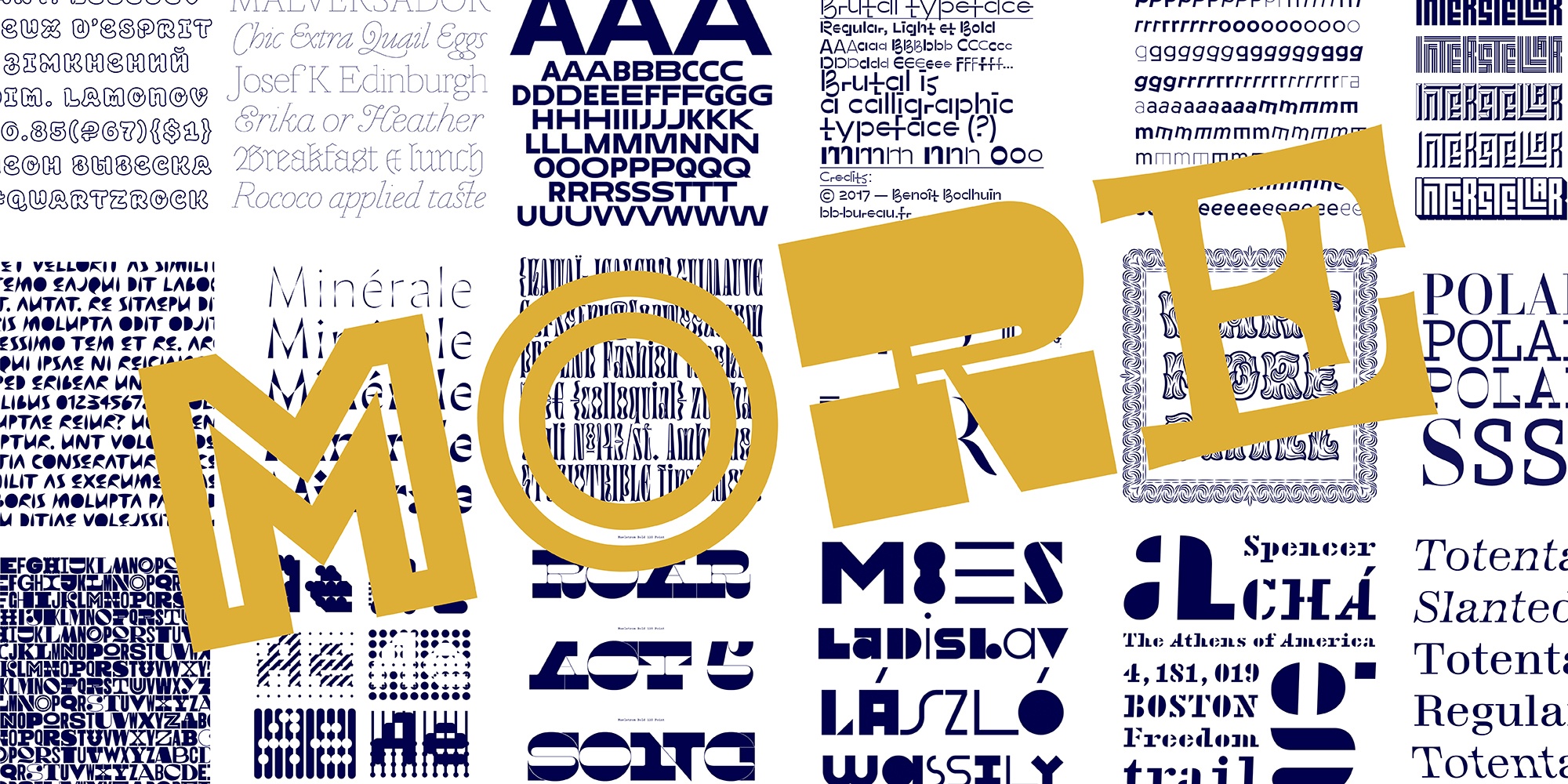
More is More, Sometimes. In Defense of Display Typefaces.
- Date
- Time
Display type is not taken seriously enough. Modernism with its “less is more” and “ornament is a crime” teaches us that display letters are unnecessary: they are too loud, they stand out too much, they distort letter shapes, they are not easy to read. Moreover, display typefaces are somehow considered playful and fun and therefore easier to design.
If we go back to the origin of display types, we’ll see that they were invented exactly to distinguish themselves from text ones, to be catchy, to be interesting, to embrace the spirit of their time.
We all enjoy a sleek grotesque or the perfect texture of a book typeface. But why not enriching our usual typographic palette with something decorative, catchy and not necessarily timeless?