Event
Workshop
Proportions
- Date
- Time
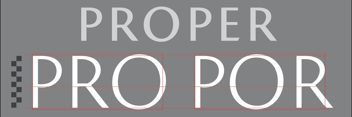
This course will address matters of concern regarding character proportions, stroke weights, curve descriptions, and miscellaneous ratios in type design. To quote the late American type designer, R. Hunter Middleton: “‘Relationship’ is the most important word in type design.”
But, in order for letterforms to perform correctly, they must be spaced correctly. Drawing letters and spacing them are simultaneous activities. The voids between characters must be allowed to play a role in determining character proportions. Secrets of spacing will be laid bare, as Mr. Downer demystifies the process and explains established principles via basic exercises.
Learning, applying, and remembering special hierarchies which pertain to the discipline of type design will help novices avoid countless common mistakes. And, even though makeshift ,gauges and calipers may be of use, “eyeballing” will ultimately determine correctness of form and arrangement.
Required Materials
- no. 2 Pencil
- eraser
- 12” ruler
- scissors
- 1” black artists’ tape
- clear scotch tape
- 1 zig memory systems brand calligraphy pen, 2 ended with 2.0 mm and 5.0 mm felt nibs black.
- pad of 14 x 17 layout paper (or tabloid copier paper)
A workshop offered by Type@Cooper West, a collaboration between Letterform Archive and The Cooper Union Continuing Education Department, and held in the Monotype Classroom at Letterform Archive.