News
This Just In: Angel DeCora’s The Indians’ Book and Wigwam Stories
The inventive early-20th-century lettering of Ho-Chunk artist Hinook-Mahiwi-Kalinaka opens windows to the design of North American tribes.
Guest Post by Neebinnaukzhik Southall (Chippewas of Rama First Nation)
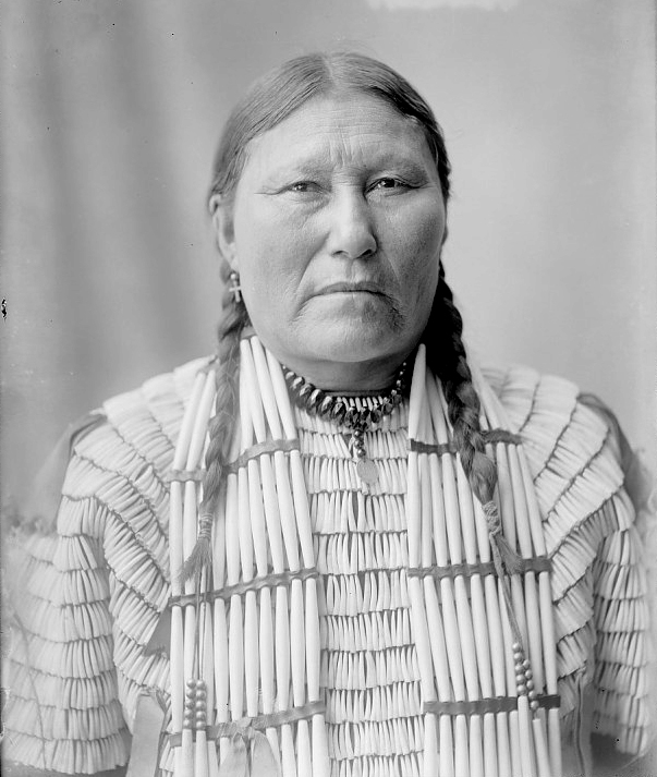
Hinook-Mahiwi-Kalinaka (1871–1919), also known as Angel DeCora (alternatively spelled “de Cora” and “De Cora”), was a Ho-Chunk (Winnebago) artist, designer, and educator who promoted the value of Native arts at a time when Native cultures were devalued, and forced assimilation of Native people into the dominant European mainstream was the norm. She was born in Nebraska on the Winnebago Reservation, and was taken from her family as a child to attend a boarding school in Virginia. Despite patronizing attitudes towards Native peoples and women, she persisted and led a brilliantly creative life. She was a college graduate, studied under respected artists of the time, and embarked on her own career as a commercial artist. As a teacher to Native students, she was passionate about the application of Indigenous design work to commercially appealing objects.
She worked on several book and magazine projects as an illustrator and designer. She wrote stories for two issues of Harper’s New Monthly Magazine in 1899, “The Sick Child” and “Gray Wolf’s Daughter”, accompanied by her painted realistic illustrations. She also painted illustrations and designed the cover for Old Indian Legends (1901), written by her friend Zitkála-Šá (Yankton Dakota). She designed the cover and painted the frontispiece for The Middle Five: Indian Boys at School (1901).
Wigwam Stories
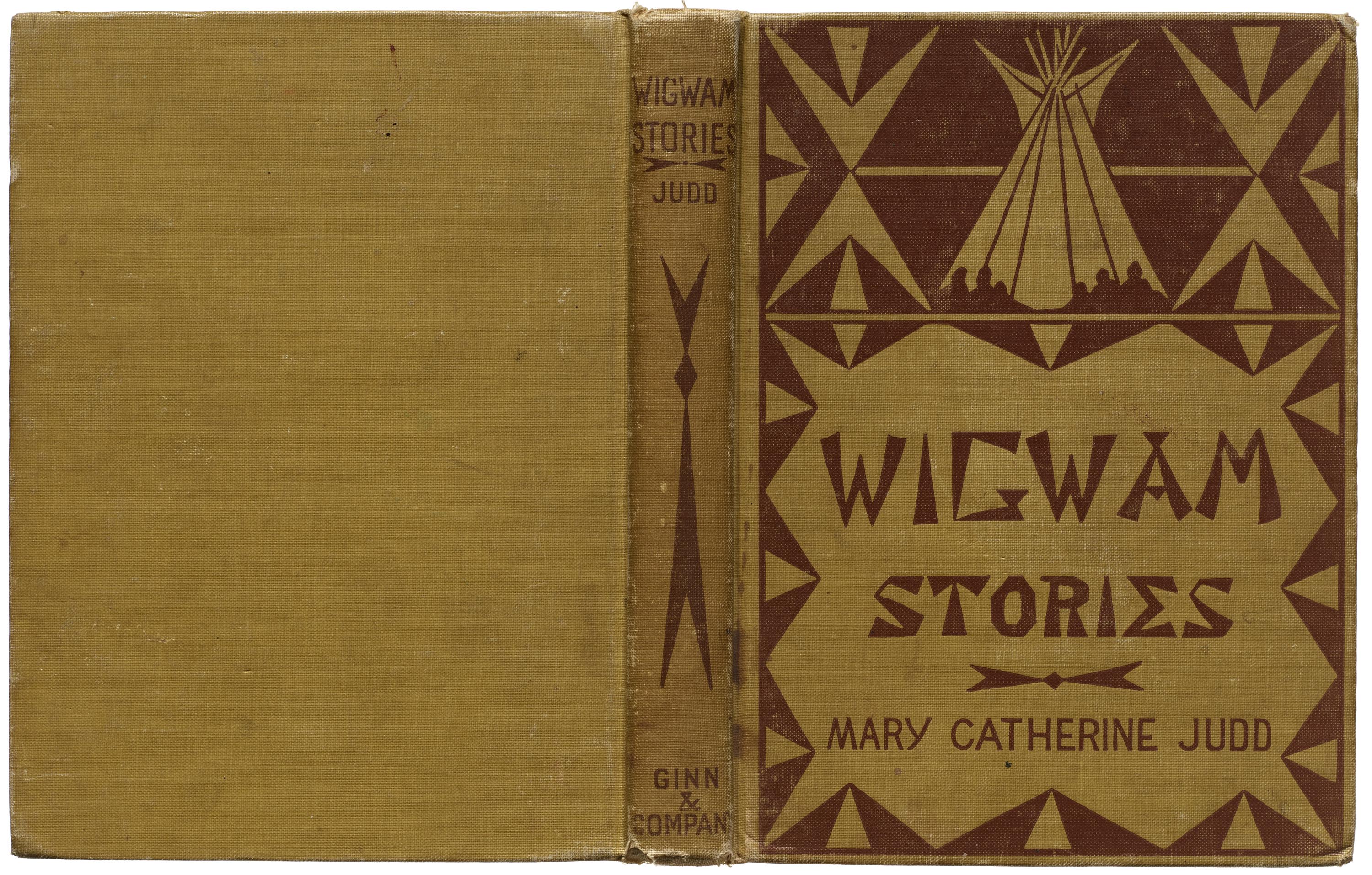
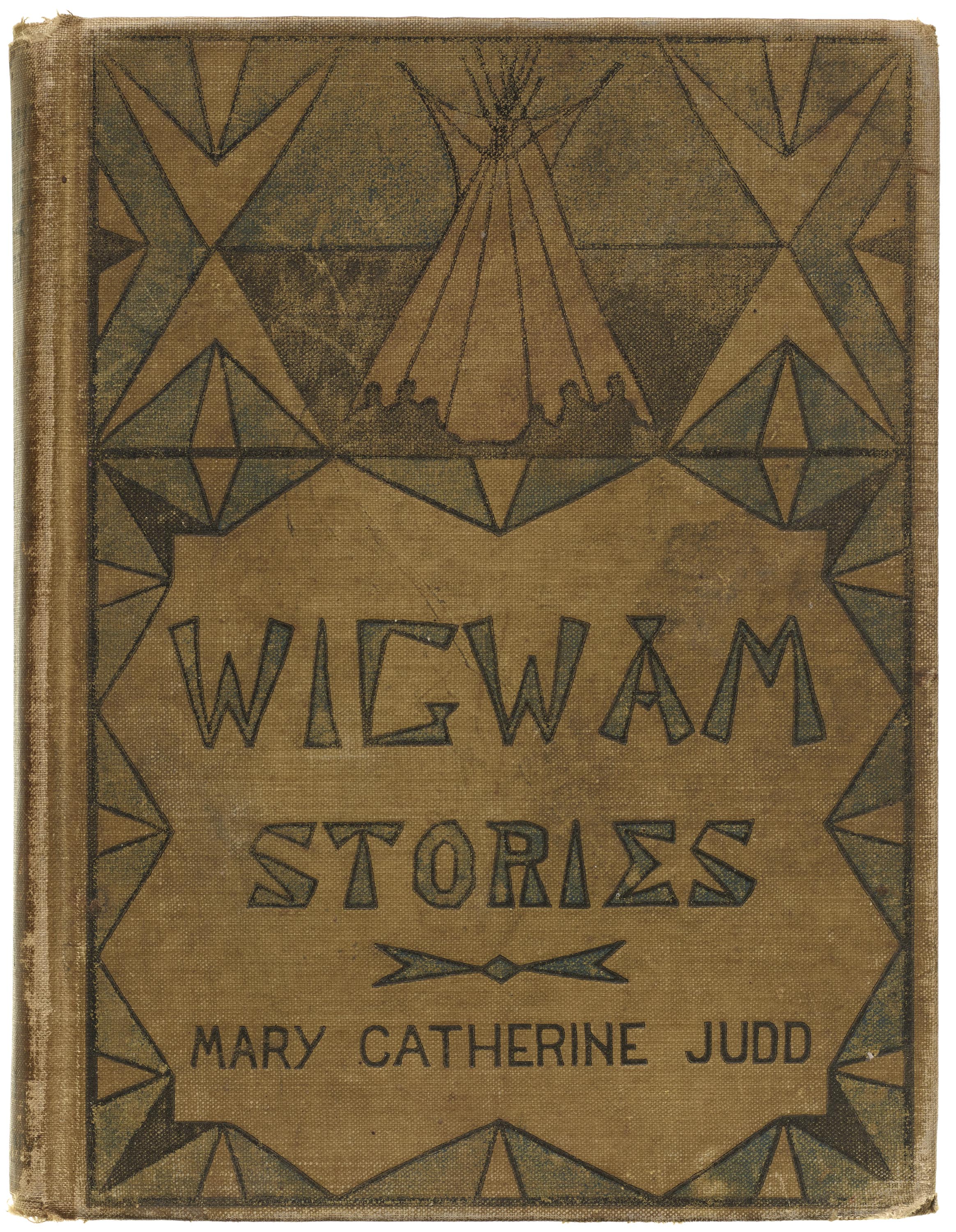

DeCora’s work on Wigwam Stories (first published in 1901) was extensive, including the cover design, a painted illustration for the frontispiece, title page design, and charming illustrated initials. Presumably, she was also responsible for several ink illustrations accompanying the stories.
The Indians’ Book
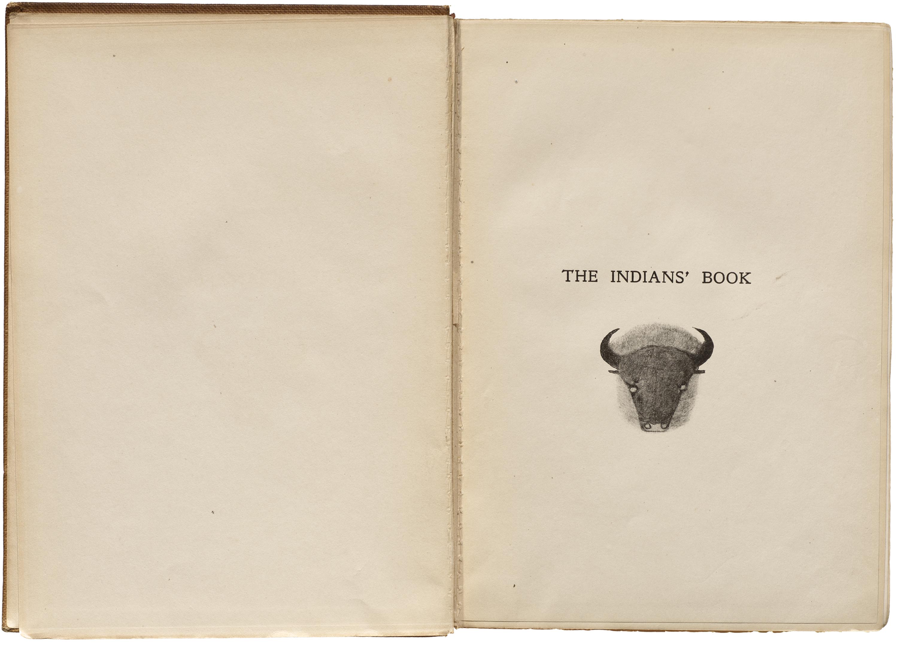
She had a number of other creative projects as well, including The Indians’ Book (1907), which recently arrived at Letterform Archive. The book was edited by ethnomusicologist Natalie Curtis, one of a small group of women who made important efforts to document and disseminate Native and African America culture at the beginning of the 20th century. The Indians’ Book collected stories and songs from a variety of tribal peoples in an effort to preserve them.
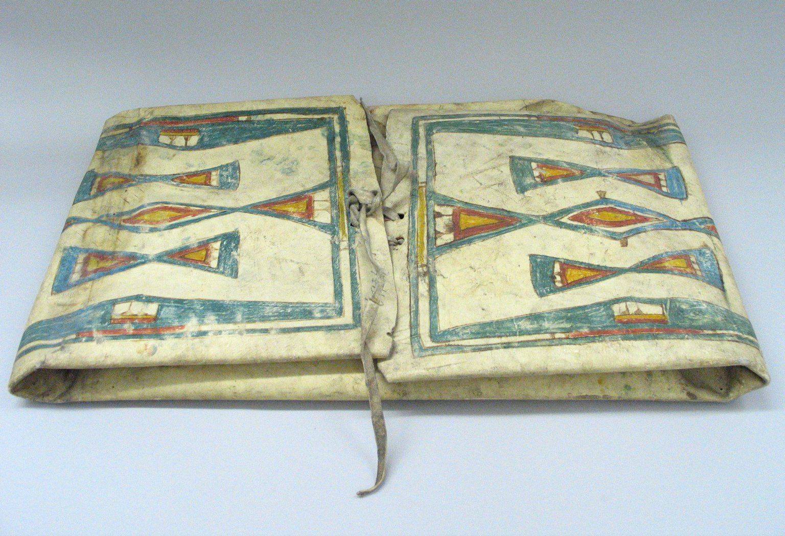
The book is visually striking, with a cover design based on a parfleche (a rawhide case used by Plains and other tribes) painted by Cheyenne artist Wihunahe (Chief Woman). Curtis explained how the imagery serves a purpose that is more than aesthetic: “The idea in choosing this design is that the cover of the book is in itself a parfleche to keep those possessions of the Indian which he must carry ever with him — the songs and legends of his race.” DeCora designed the title page, which is described in the book:
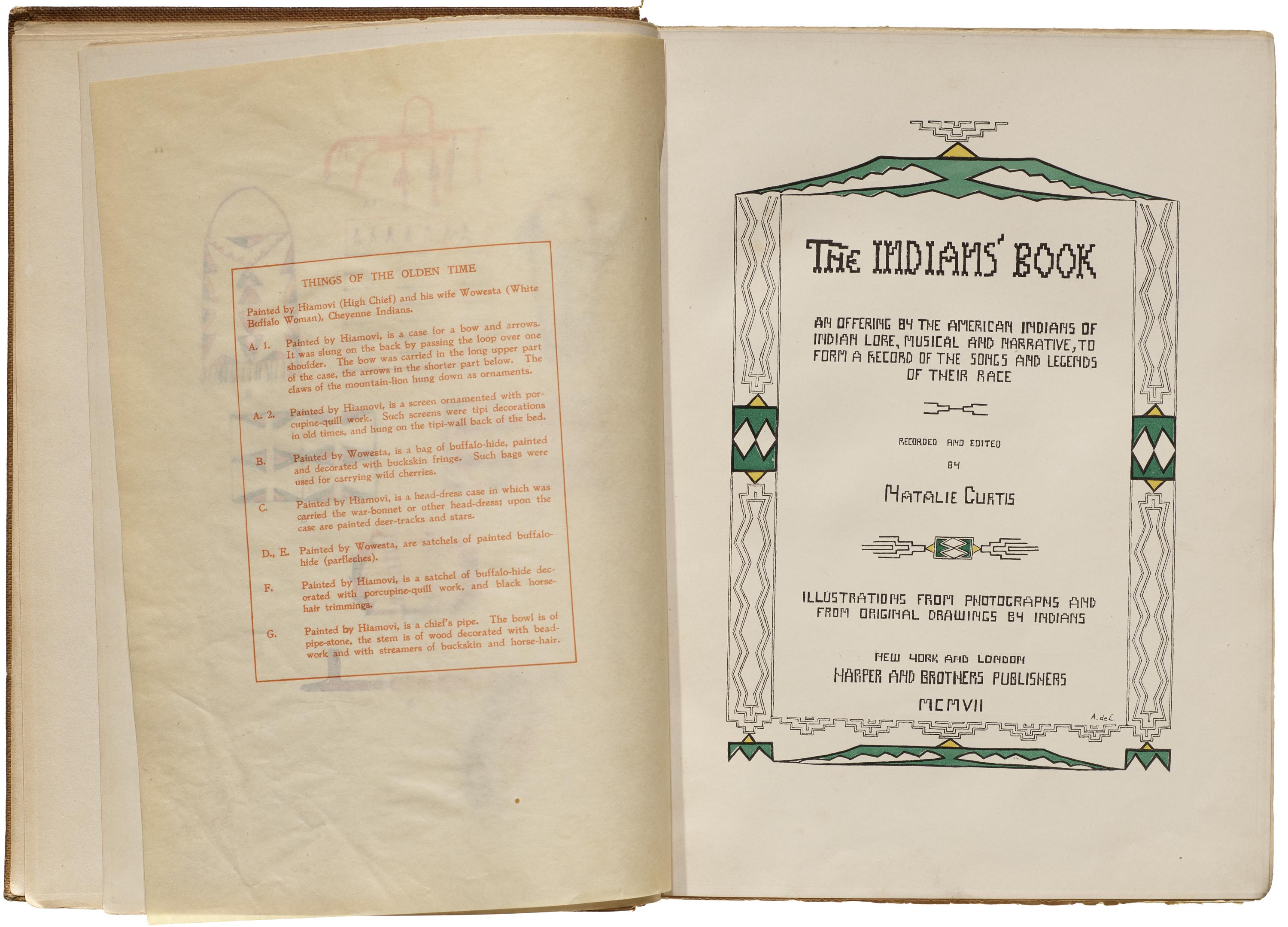
The title-page, by Angel De Cora, (Hinook Mahiwi Kilinaka), has for the motive of its design an adaption of an old Indian design which represents in highly conventionalized form the Eagle, and the Eagle’s Song. The soaring eagle is seen in the grey figure whose points are the two out-spread wings, with the tail in the centre. The paler spot at the top of the figure is the eagle’s head; from the beak rises the song – waving lines which broaden out as the song floats on the air. The whole symbol is used in decorative form throughout the page, two eagles being joined together by the tips of wings and tails to form a symmetrical design. In the centre of the page, at the top and bottom, and at the sides, is seen the eagle-symbol, while the page is framed, as it were, in the symbol of the song.
The eagle is loved and revered by the Indians. He is the strongest of all birds. He soars aloft, and he may look upon the sun, the giver of life, the celestial emblem of divine force. Therefore has the symbol of the Eagle and the Eagle’s Song been chosen for the title-page of “The Indians’ Book.”
Notably, DeCora was also a member of the Thunderbird clan, which resonates with her choice to depict a raptor in the book’s opening. The songs, stories, and art are divided into sections for the various tribes included; 18 of these open with title pages illustrated by relevant tribal artists, with lettering and sometimes border motifs created by DeCora to accompany each image, forming a larger composition.
“You would be surprised,” I said to the designer, “to know that the ‘genius’ is a young Indian girl!” He thought a minute, then said, “Well, no, I am not really surprised, because no white man could have done this.” — Natalie Curtis, 1920
In her feature obituary on DeCora in The Outlook (January 14, 1920), Curtis recounted the story behind DeCora’s innovative lettering of the title pages:
I was about to publish my collection of Indian songs and legends, decorated by original Indian drawings and the names of the tribes represented. Most of the drawings had been made on the reservations by the old Indians, but I asked Angel De Cora to make a design for the title-page of her own tribe, the Winnebago people. When she brought me the finished pages, it bore, in addition to the design, the legend, “Lake Indians — Winnebago,” in letters so beautiful and of such startling originality that my publishers declared: “We can’t have one page looking like this and the others labeled with prosaic printing! We must have this sort of lettering all through the book. We will show this to our designer upstairs and ask him to copy this style.”
“Our designer” looked at the page and gave a low whistle. “I never saw anything like this in my life before,” he said. “Whoever did that lettering is a genius! Don’t ask me to make letters like that. I really advise you to get the person who did this page to do all the others.”
“You would be surprised,” I said to the designer, “to know that the ‘genius’ is a young Indian girl!”
He thought a minute, then said, “Well, no, I am not really surprised, because no white man could have done this.”
This was true, for the letters were not conceived as letters; the Indian girl had looked on them as so many different shapes and as structural ideas for decorative forms. And the forms were Indian.
“Take my advice,” said the designer again. “Get that girl to do all the lettering in the book and you will have something unlike anything that’s ever been done with the alphabet before.”
So the order was given; but when the pages came back we found to our astonishment that the lettering was not in the least like that with which Angel had decorated the Winnebago section. She had invented a different kind of lettering for every Indian picture, and the forms of the letters were composed of motifs from the drawings which they accompanied. Her artist nature had compelled her to go on creating, even though this was more than had been asked of her. And in response the publishers, not to be outdone, sent her a check that surprised her.
While DeCora is referred to as a “young Indian girl”, by this time in 1907 she was an accomplished creative in her mid-30s.
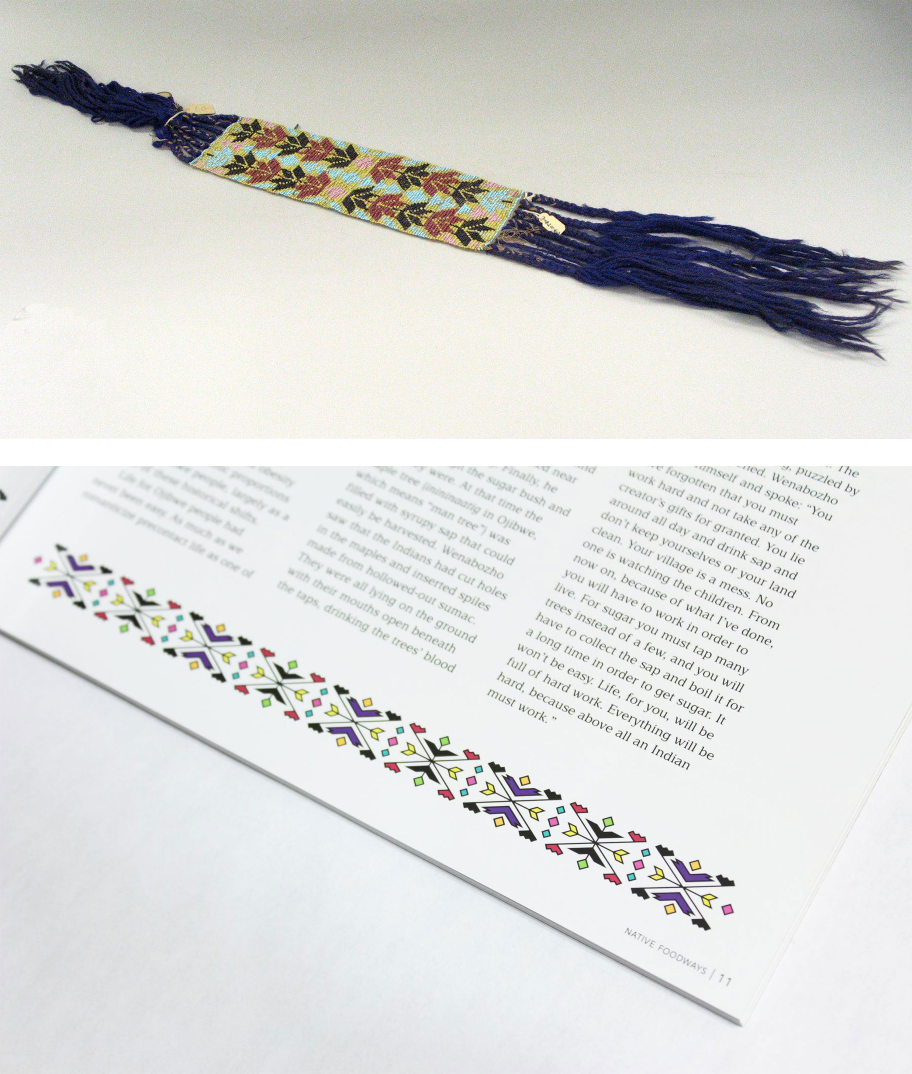
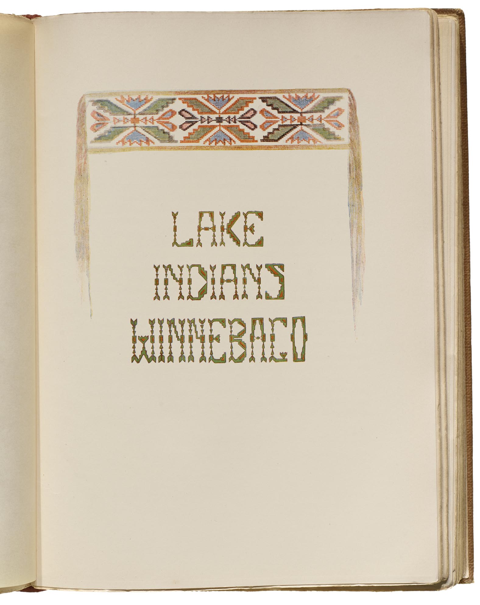
For the Winnebago title page, DeCora created an illustration based on loom beadwork made with glass seed beads, likely based on a garter worn around the knees to hold up leggings, or perhaps an armband. The center of the design is depicted in detail, which then fades out to strings rendered in a wash. The pattern is very typical for Great Lakes tribes, and is also seen in Anishinaabe designs — I created a very similar pattern for a border design accompanying an article by Ojibwe writer David Treuer in Native Foodways Magazine, Issue 3. DeCora’s letters draw from the beadwork design, not only in the green and orange color scheme, but also in their use of square motifs as anchors flanked by triangles. DeCora also uses the stepped form in most of the letters, notably the K, and the jagged floral-like form in several letters — the two Es, the W, and G.
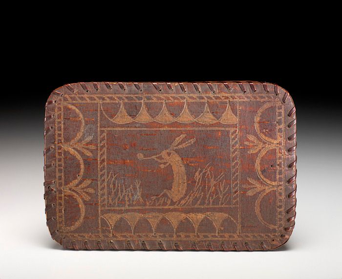
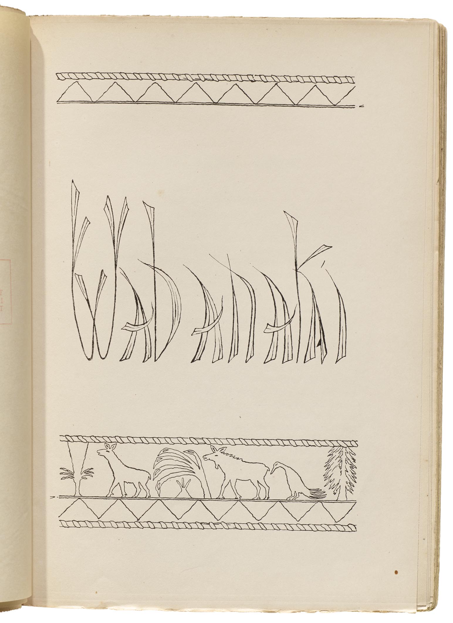
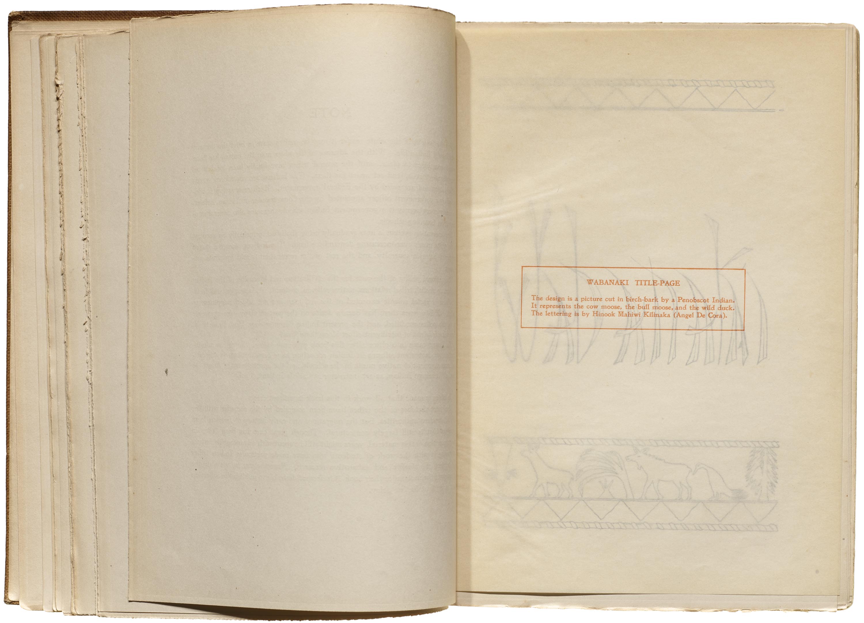
A tissue overlay with explanatory text precedes each title page. For the Wabanaki title it reads, “The design is a picture cut in birch-bark by a Penobscot Indian. It represents the cow moose, the bull moose, and the wild duck.” The Penobscot are part of the Wabanaki Confederacy, which also includes the Mi’kmaq, Malisset, Pasamaquoddy, and Western Abenaki. Birchbark from the North American paper birch, Betula papyrifera, is a material that is widely used by tribes across its range of growth, and can be etched with decorative and informative designs. The borders have a pattern representing spruce root stitching on the edges, as would be used to bind baskets, canoes, and other objects. A similar usage of etched designs on birchbark and spruce root stitching can be seen in the work of Tomah Joseph, a Passamaquoddy artist working at the time. His box lid has a rabbit smoking a pipe in the grass, surrounded by a wealth of border designs. DeCora’s Wabanaki letters seem to fancifully hearken to natural plant forms, perhaps the leafy forms depicted in the Penobscot artwork itself.
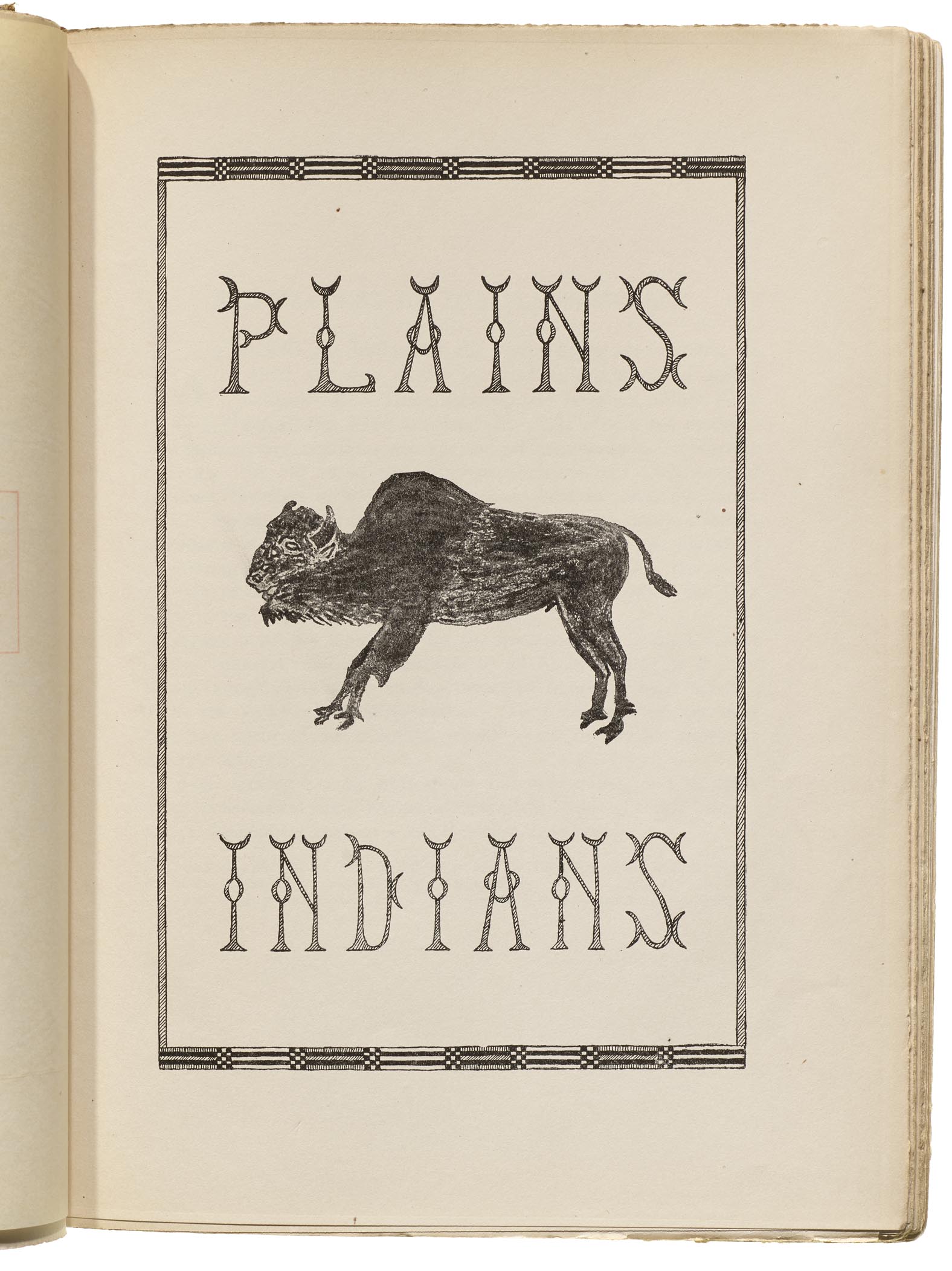
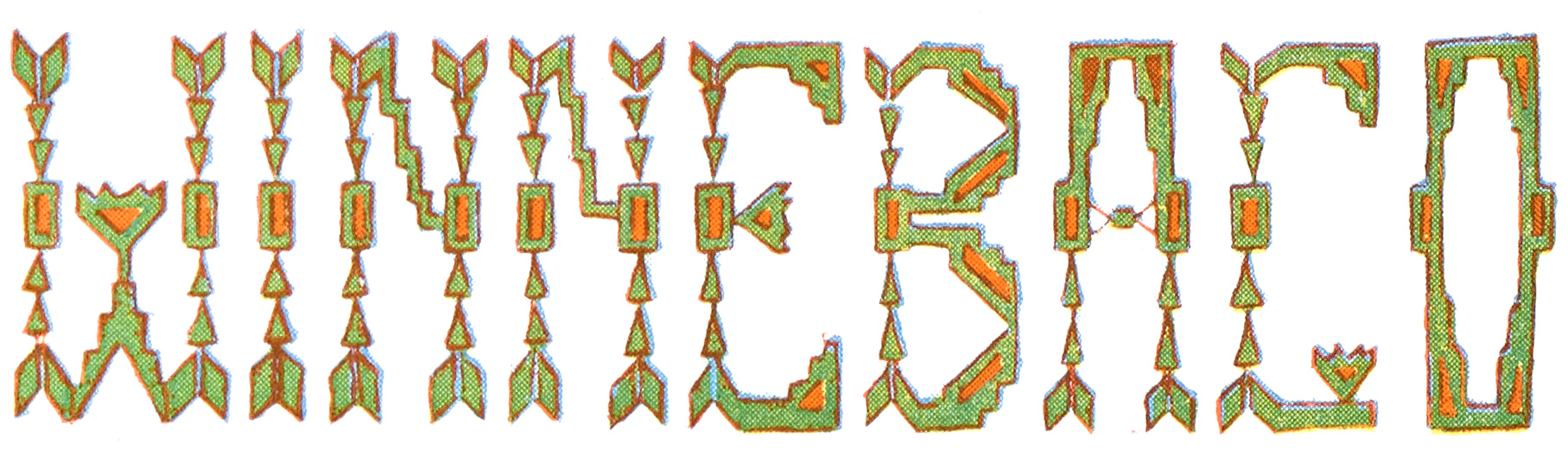
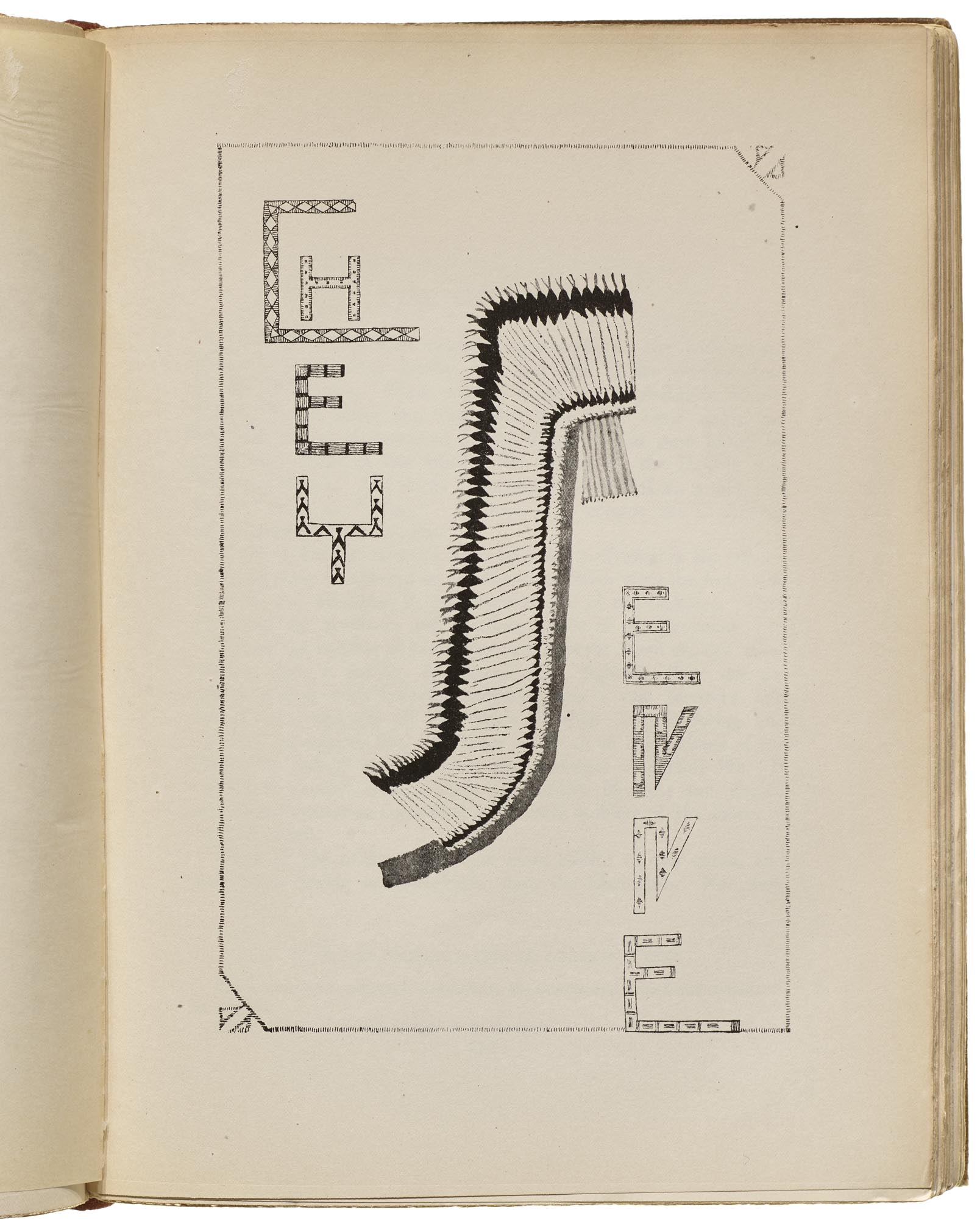
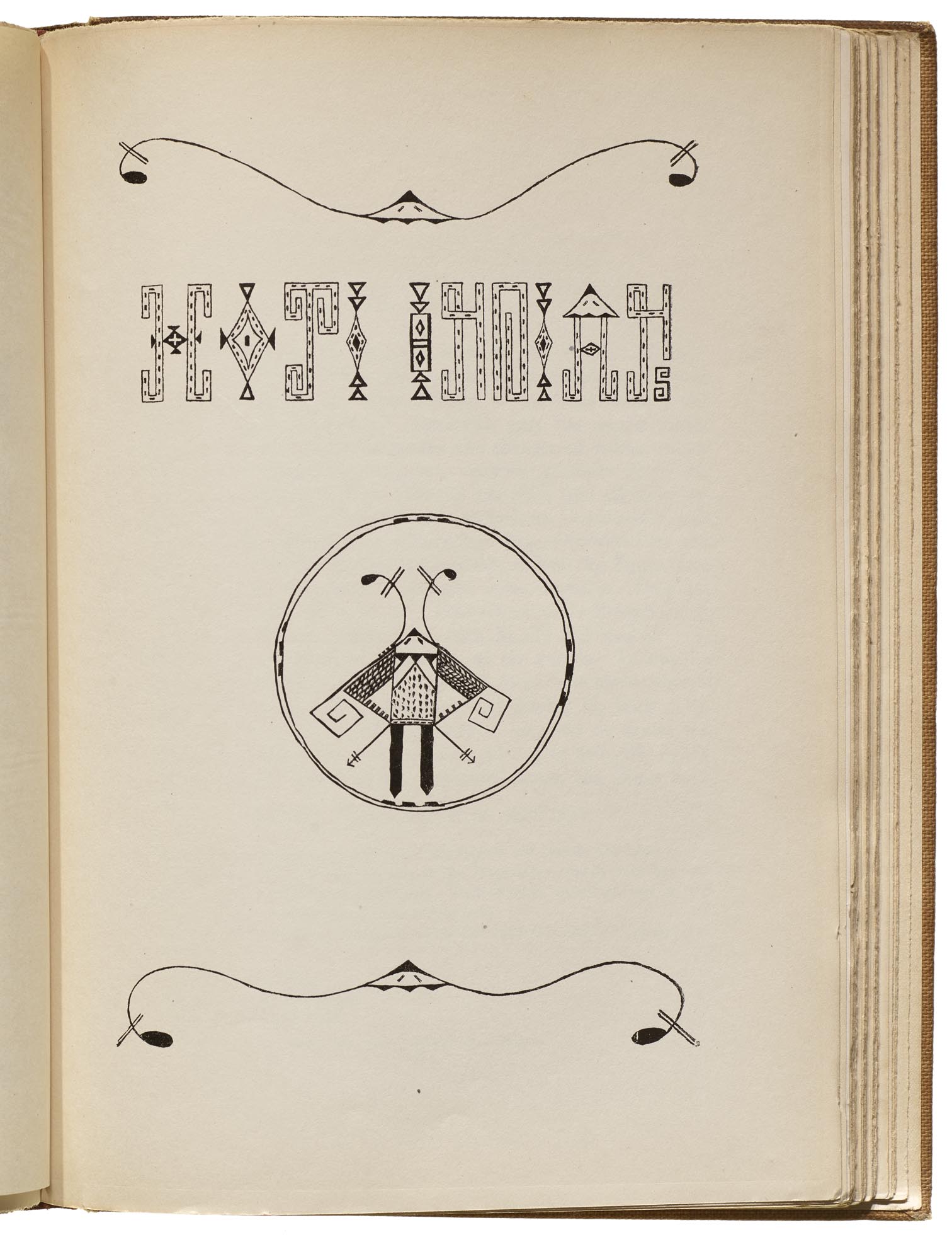
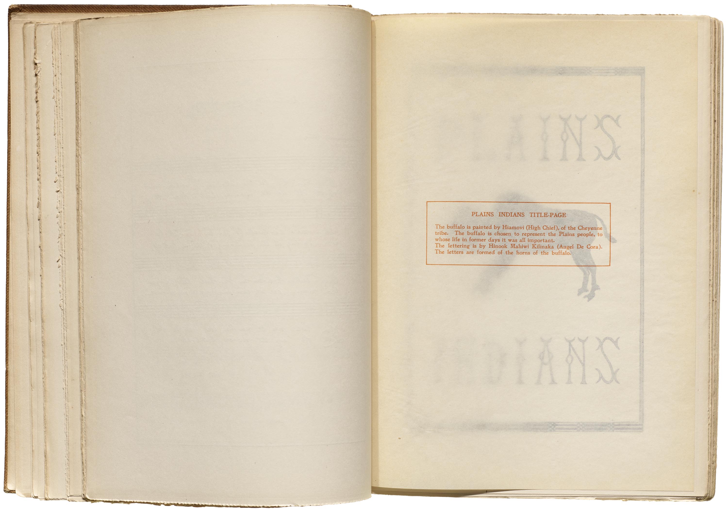
For the Plains Indians title page, DeCora created lettering with crescent motifs that “are formed of the horns of the buffalo”, which was illustrated by Hiamovi (Cheyenne). The border motif calls to mind quillwork or beadwork strips, such as can be seen on Plains men’s shirts and blankets.
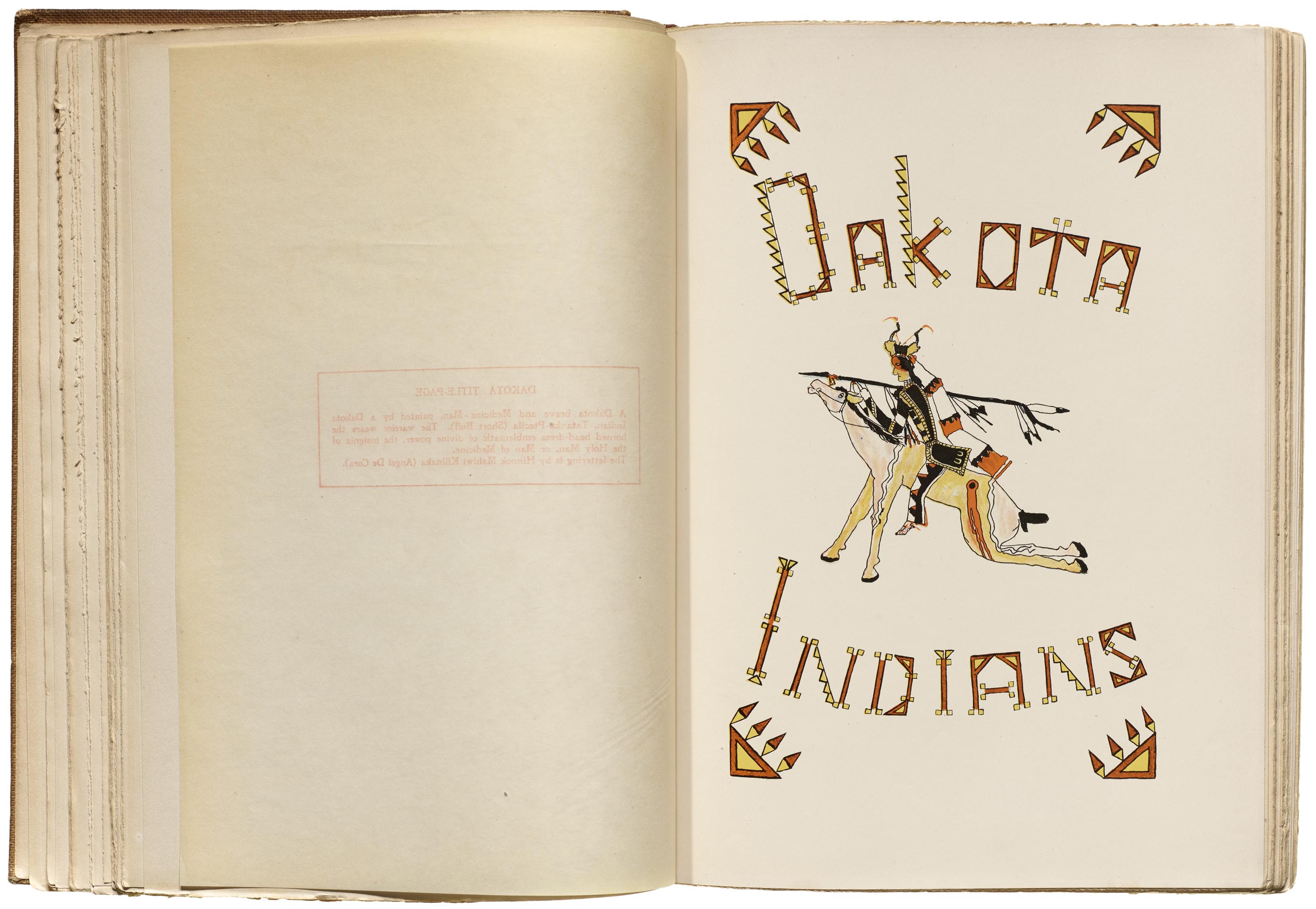
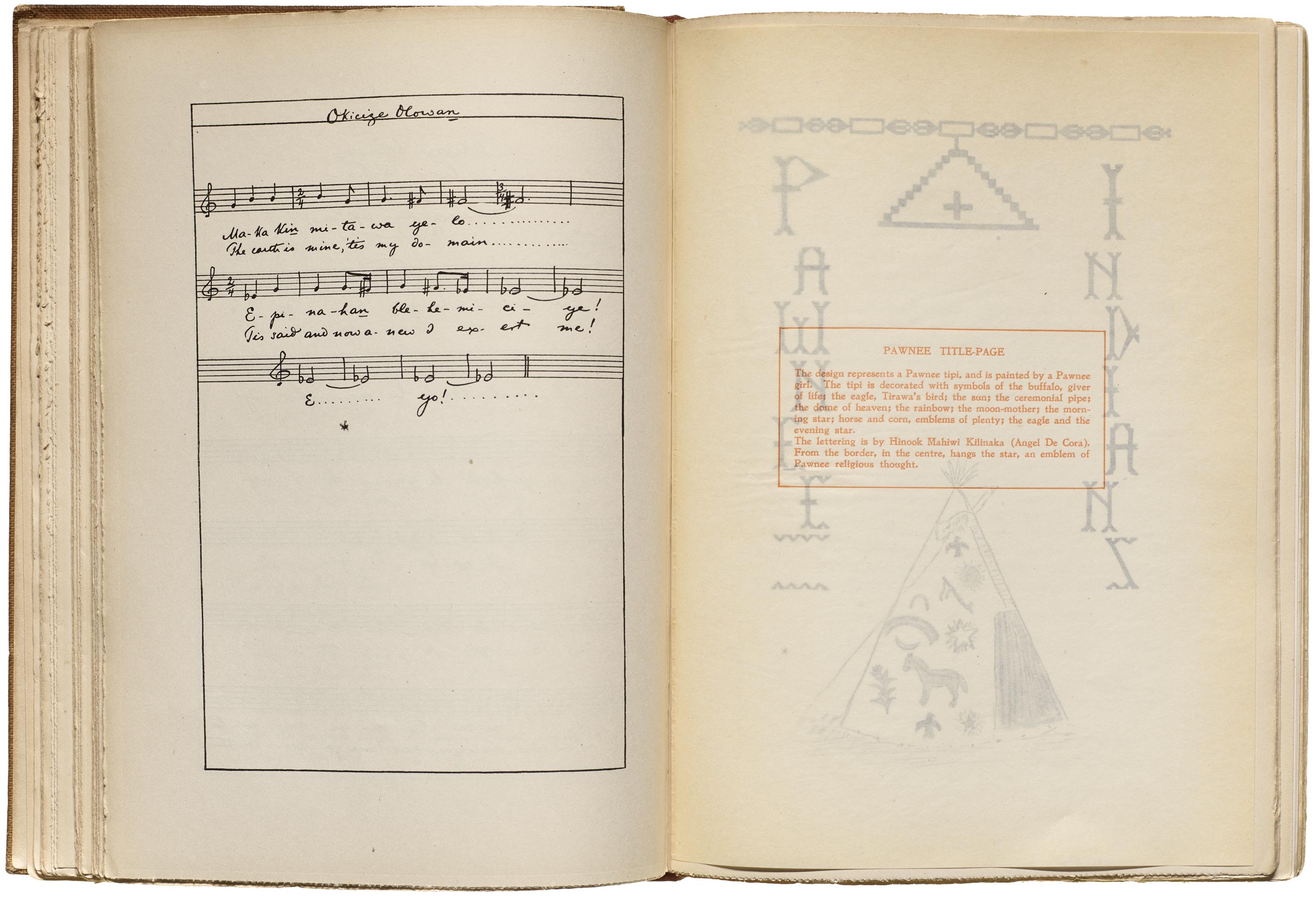
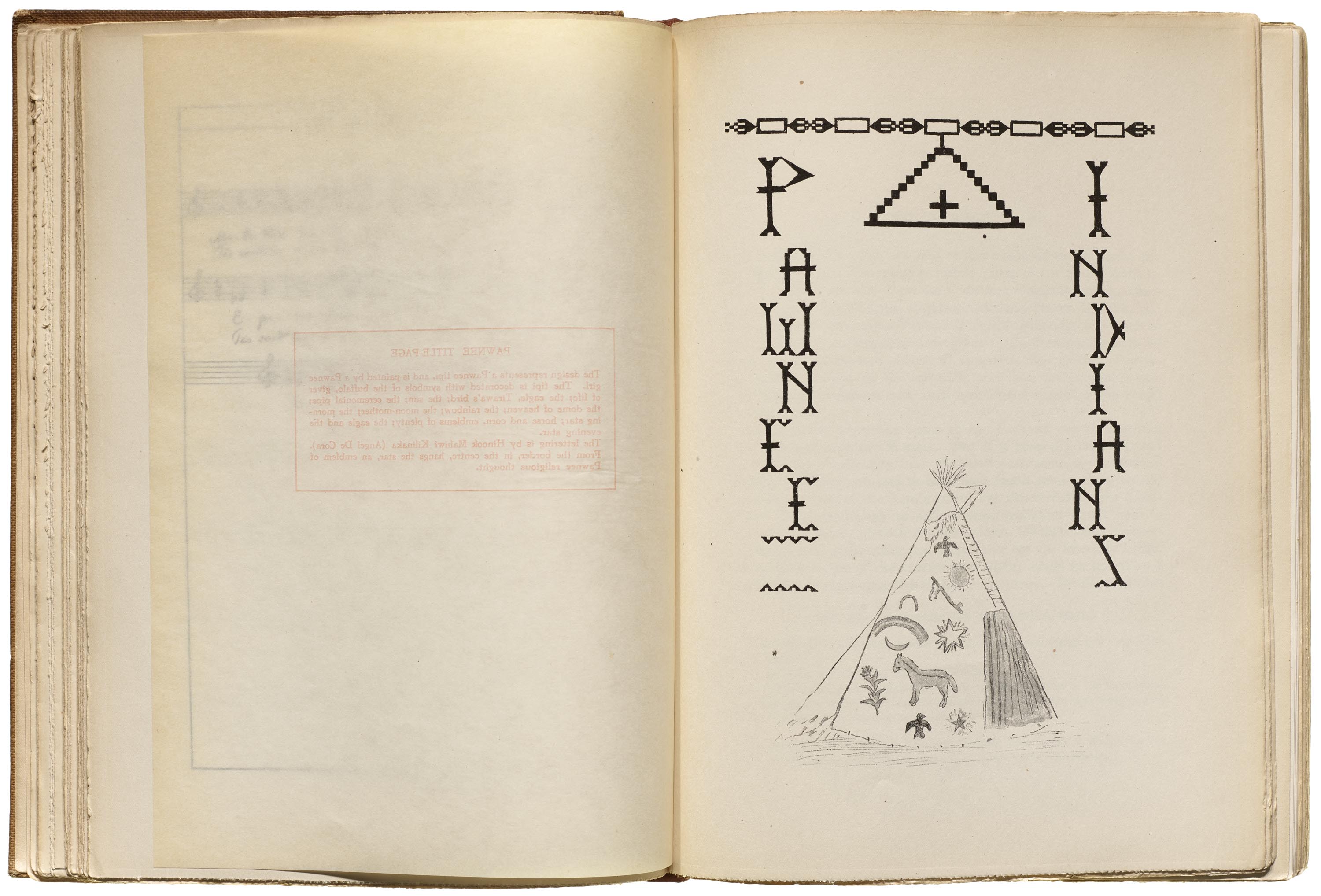
The lettering for the Cheyenne title page is an interesting formal experiment, with the word divided into two parts by a feather headdress drawn by Cheyenne artist Hotuwasu (Little Buffalo Bull). For example, the first E resembles a bone bead necklace, which would have long white bone beads and shorter beads or leather between the bone beads. The stacked vertical lettering for the Pawnee title page (see gallery below) utilizes geometric forms and sharp angles, which potentially derive from motifs seen in Pawnee lane-stitched beadwork. DeCora plays with geometry for the Dakota Indians lettering (see below), which does not have obvious ties to the drawing made by Dakota artist Tatanka-Ptecila (Short Bull).
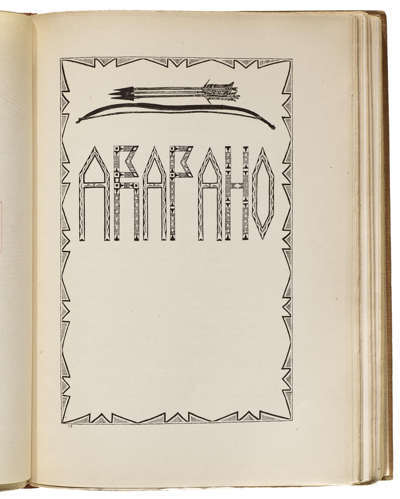
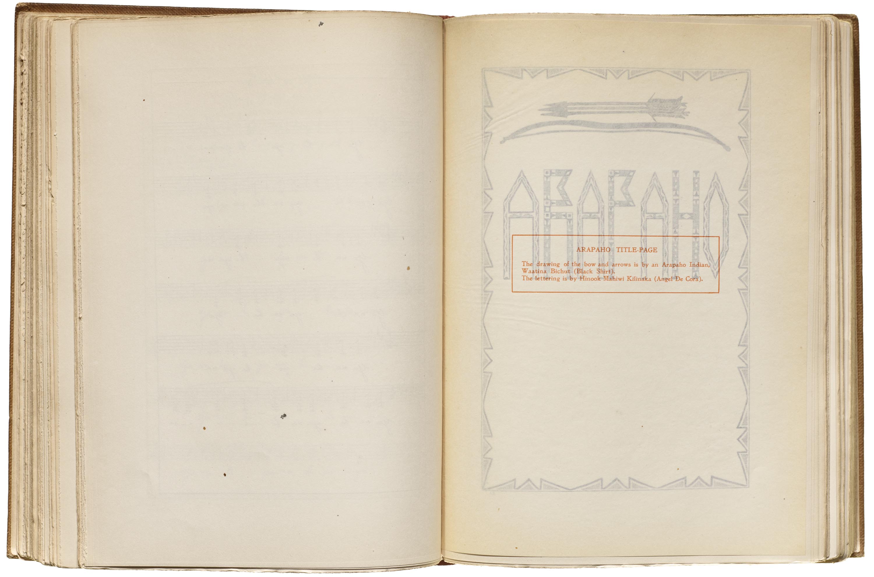
For the Arapaho title page, the centerpiece is less the drawing of a bow and arrows by Arapaho artist Waatina Bichut (Black Shirt) and more so the lettering (and presumably border) by DeCora. The all-caps letters are condensed, geometric, and high-waisted. The border riffs on painted parfleche designs, as do the As and the O in their internal patterning. The R, P, and H look similar to strips of beadwork, but quite possibly incorporate aspects of rawhide wrapped with porcupine quillwork as well, particularly suggested where the black lines are broken by white spaces, as if a porcupine quill was interwoven between the wrapped quills.
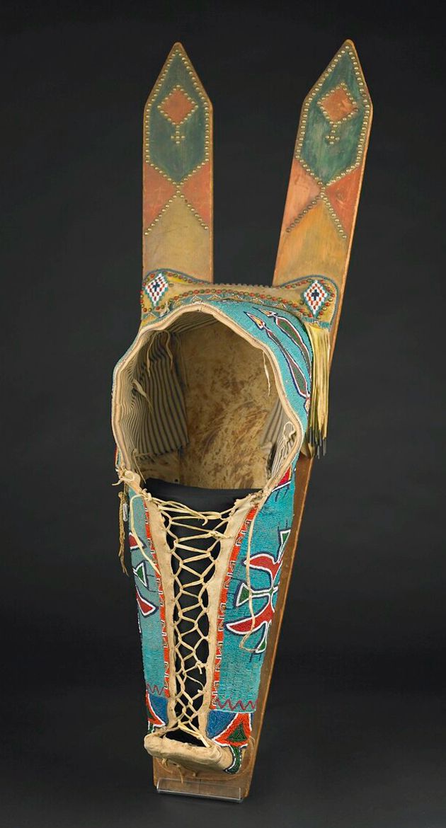
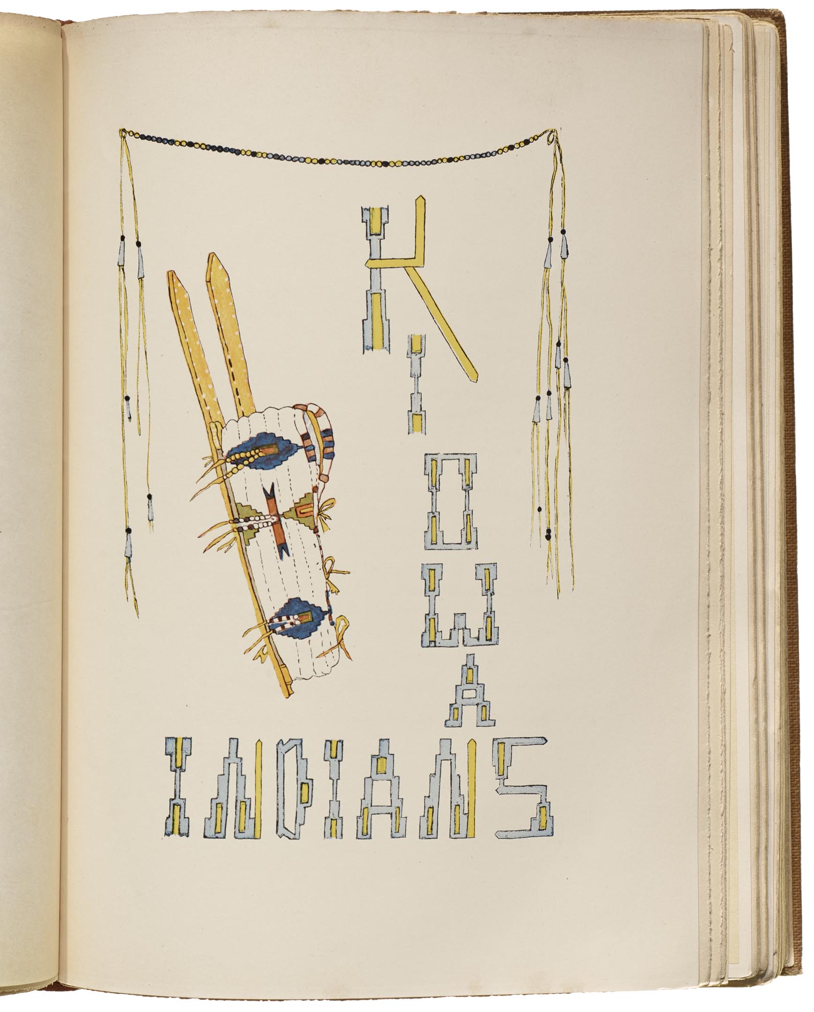
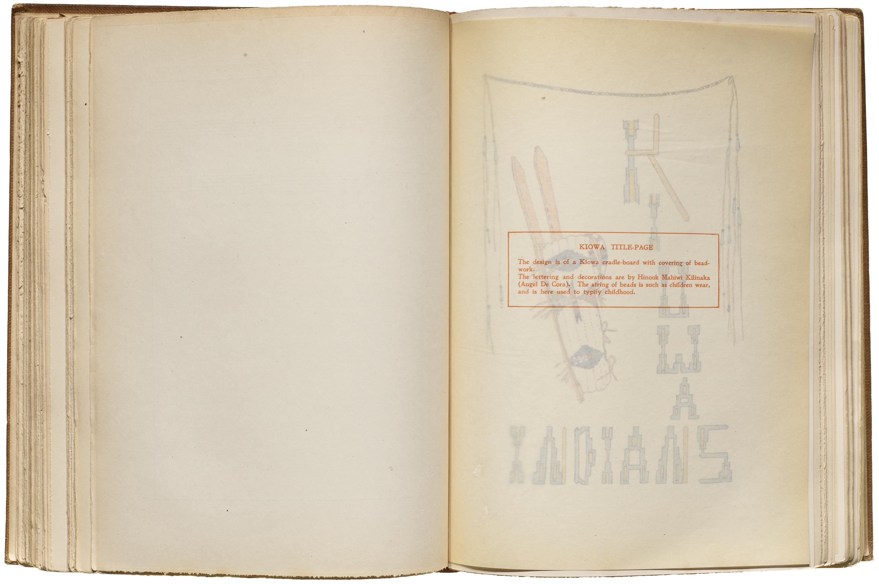
The Kiowa Indians title page features a drawing of a Kiowa cradleboard, perhaps by DeCora, as another artist is not credited. An example of a similar piece can be seen in a photo of a cradleboard possibly made by Kiowa or Comanche people between 1850 and 1875, in the collection of the Birmingham Museum of Art. Of the border motif, Curtis notes: “the string of beads is such as children wear, and is here used to typify childhood.” The lettering mimics the effect of the lane-stitched beadwork on the cradleboard cover, with the K and N incorporating the pointed shapes seen in the wooden frame of the cradleboard.
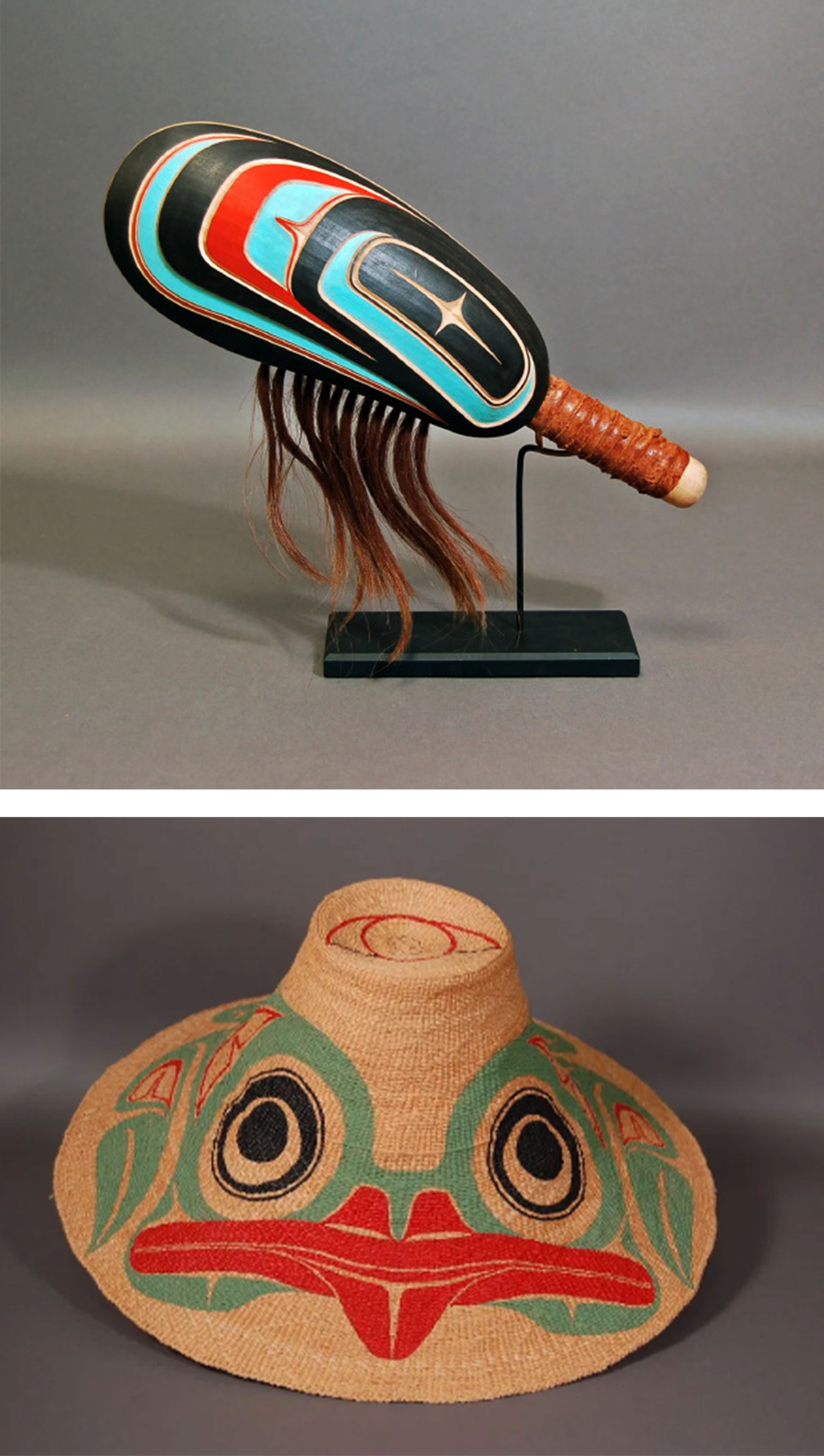
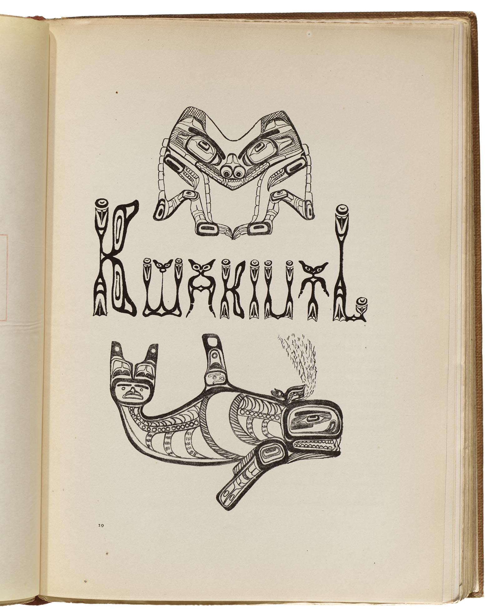
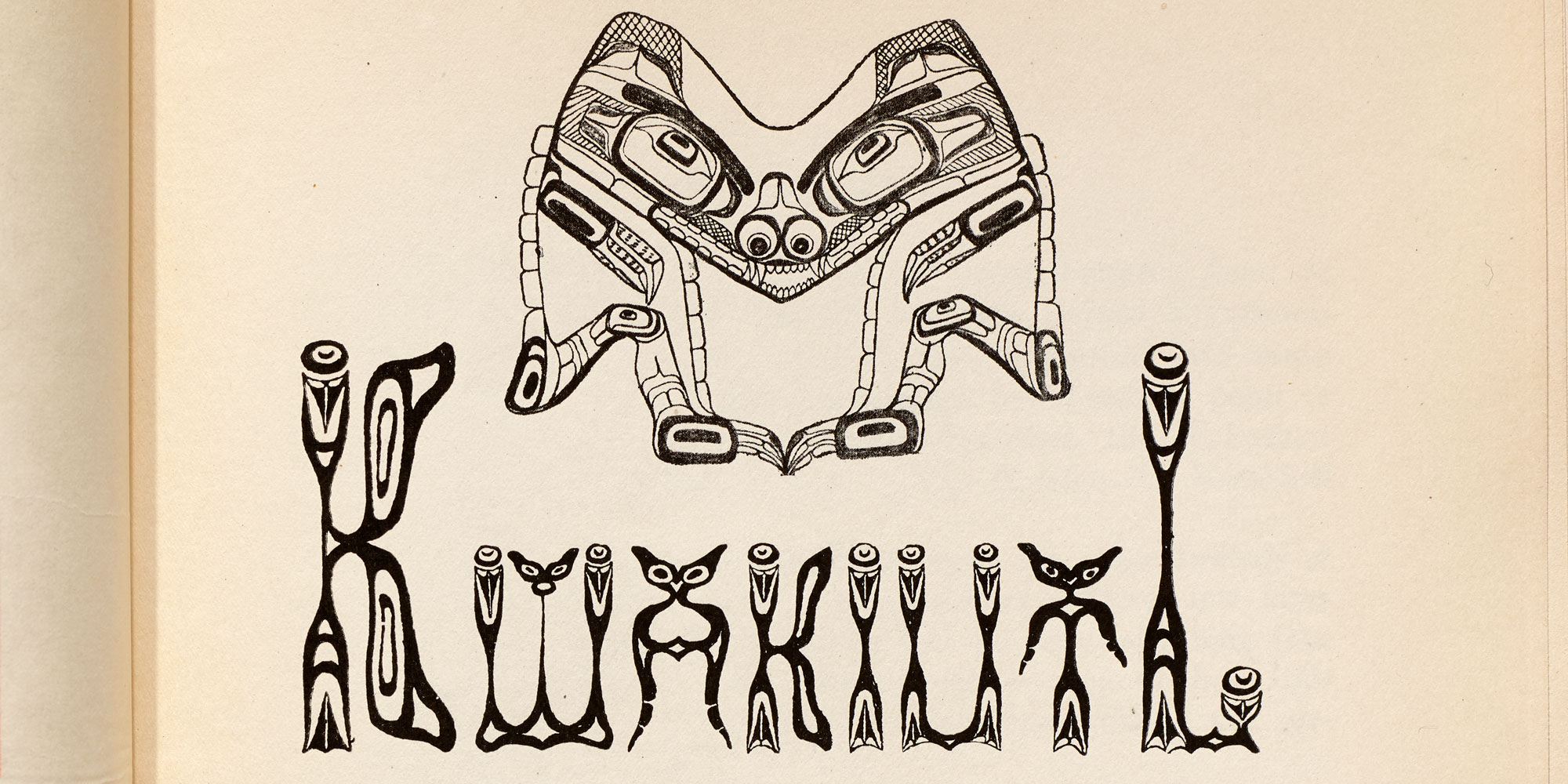
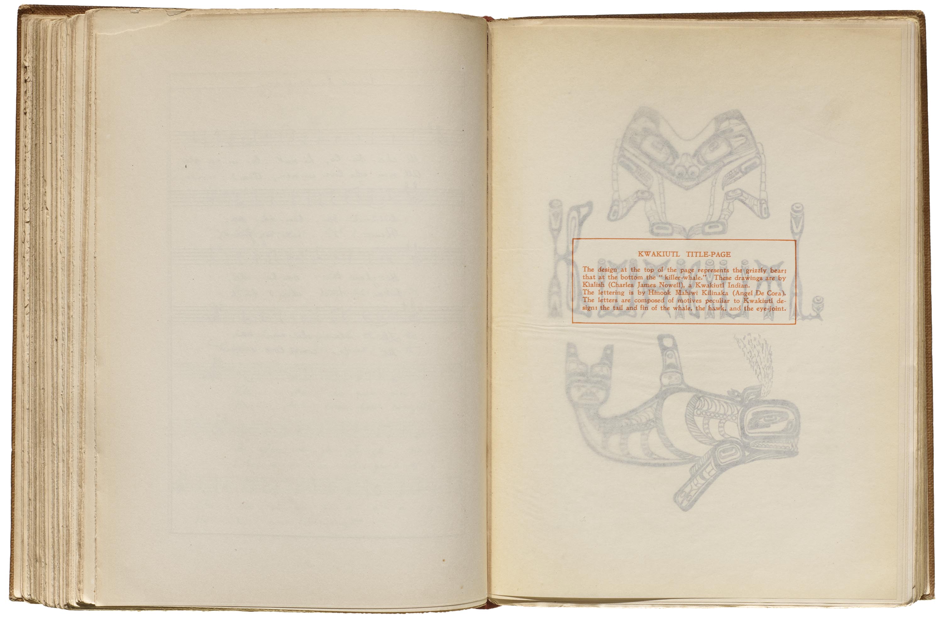
The Kwakiutl title page, made for the more properly termed Kwakwa̱ka̱ʼwakw people of the Pacific Northwest Coast, includes a grizzly bear and an orca rendered by Klalish (Charles James Nowell) in the formline design style for which several Northwest Coast tribes are well known. The book explains that “The letters are composed of motives peculiar to Kwakiutl design: the tail and fin of the whale, the hawk, and the eye-joint.” The lettering doesn’t strictly follow the conventions of formline design, but is rather an interpretation of it. DeCora pulls from some of the motifs and shapes to create her letters, notably thick black formlines, ovoids, u-shapes, and cresents, and she mimics the mirroring of the grizzly bear within letters like the K, W, B, and T, the latter of which looks like a creature all its own. The bold conventions of the artwork style can be seen in a contemporary Kwakwa̱ka̱ʼwakw rattle by carver Beau Dick depicting a mussel, or in a hat by Haida artist Primrose Adams painted with a symmetrical frog design, both in the collections of the Ralph T. Coe Center for the Arts.
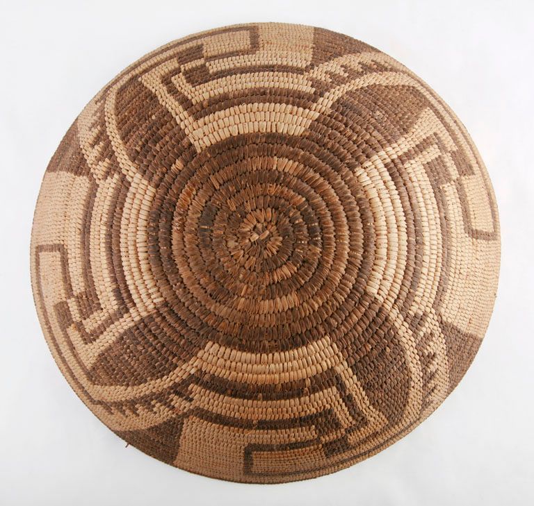
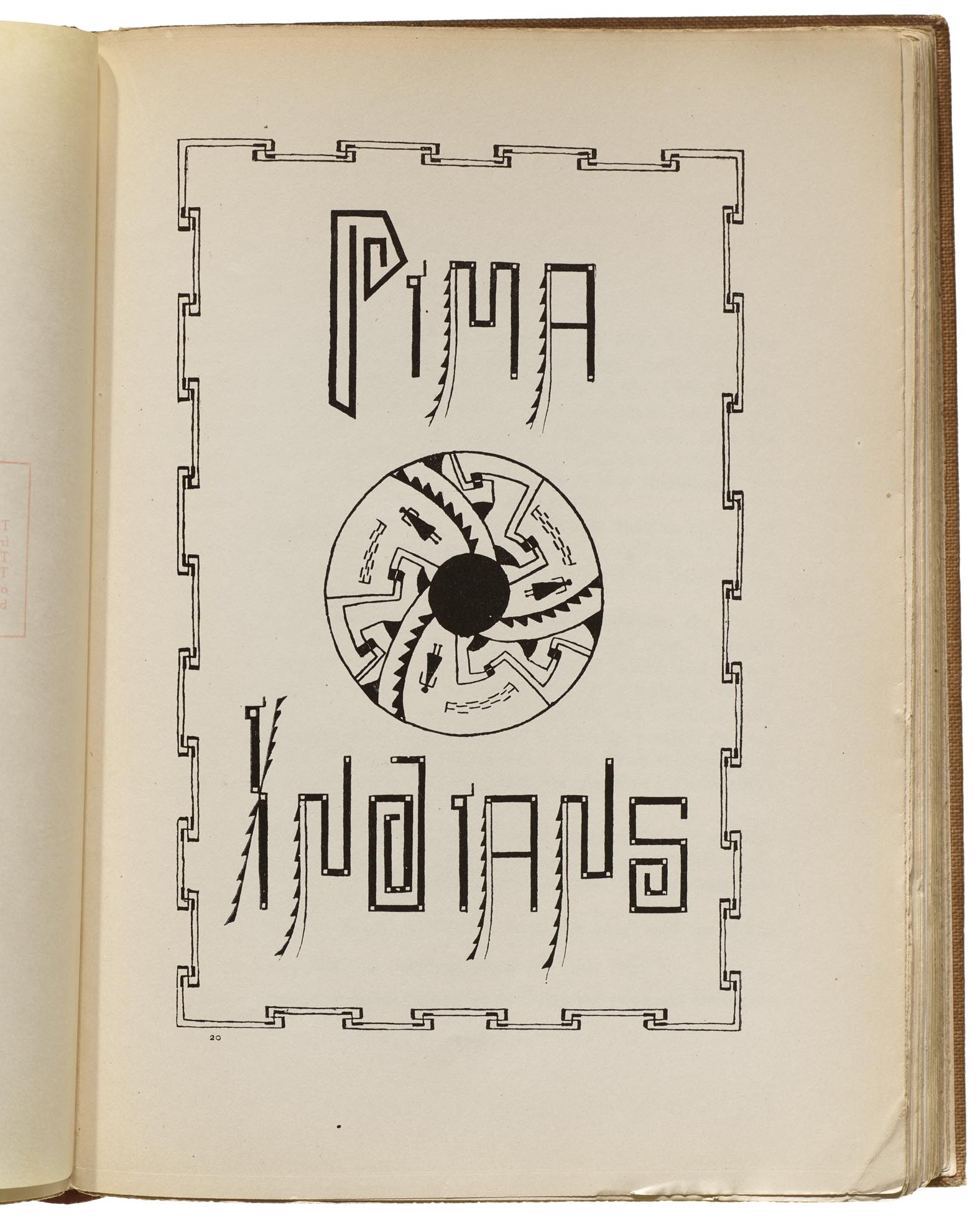
For the Pima title page, “the letters suggest the motives in the basket design,” drawn by Ataloya, a female Akimel O’odham artist. (Note: Akimel O’odham is the autonym for their people — they were called Pima by the Spanish.) DeCora takes the sweeping woven designs of the basket, such as the stepped ridges, and incorporates them into several dynamic letters. The P, D, and S incorporate maze-like elements, which are not unlike the swirling coils of a basket itself.
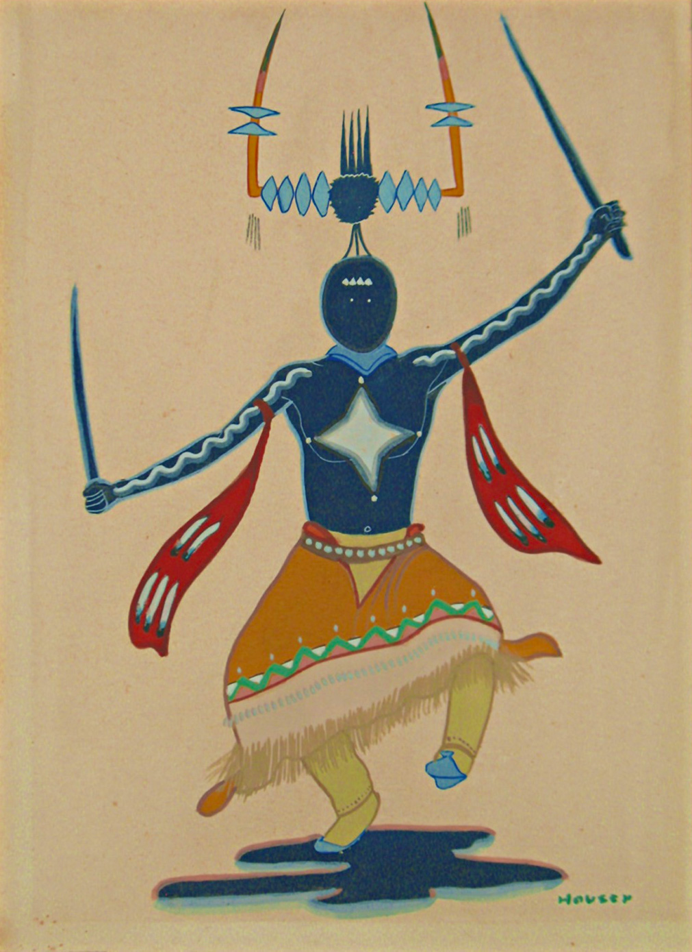
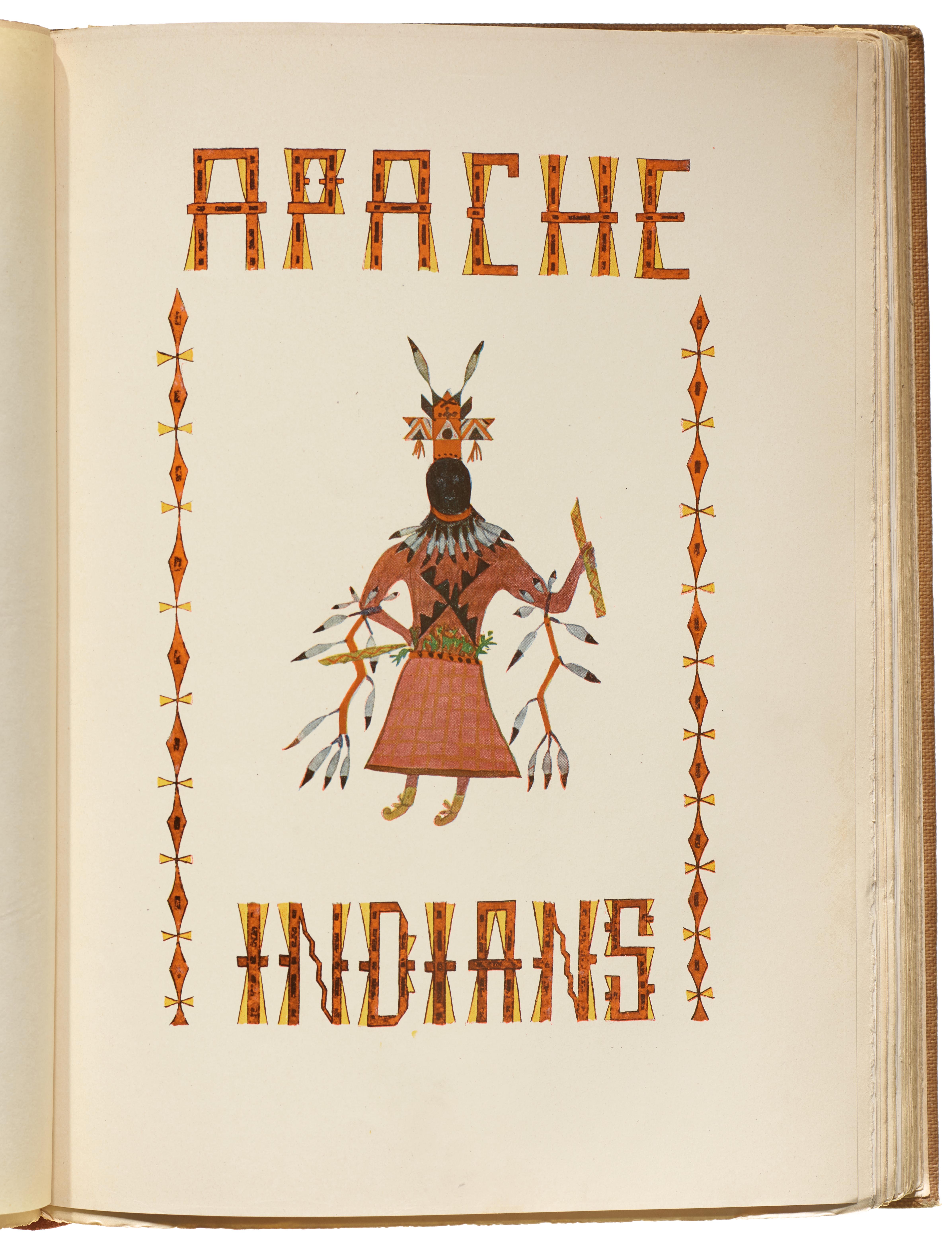
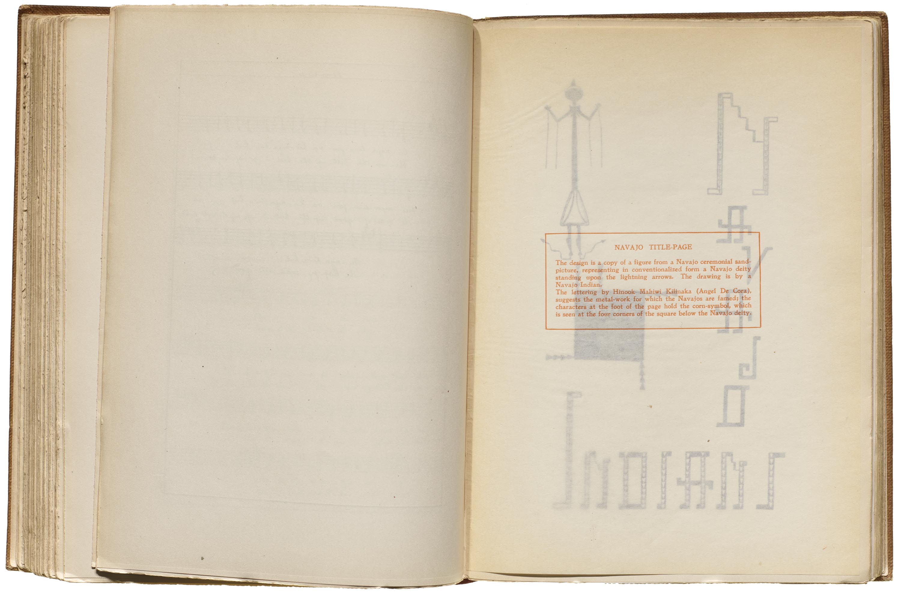
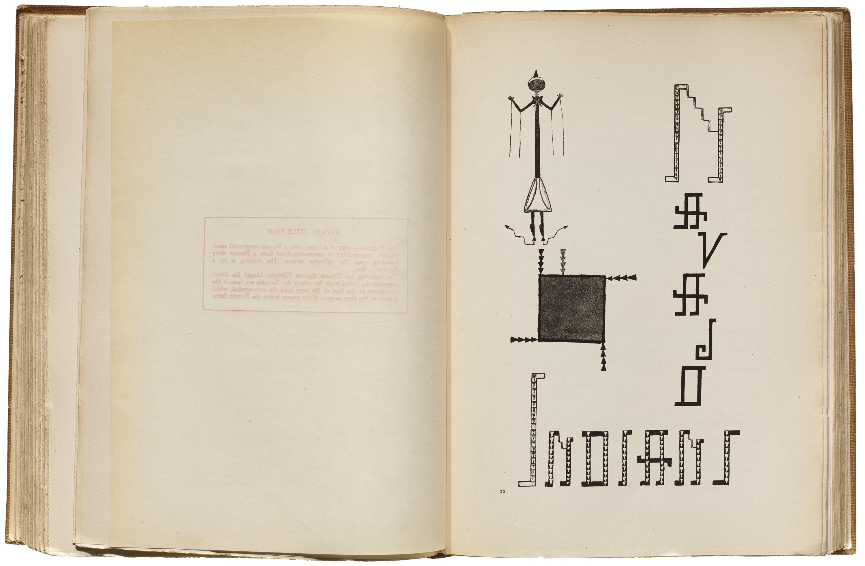
The orange and yellow lettering for the Apache Indians title page seems to be on the abstract side, perhaps drawing from the Apache Ga’an Dancer’s crown or belt. The Navajo Indians title page lettering (see gallery below) incorporates the right angles and arms of a Diné whirling log, which originates from an important Diné ceremony.
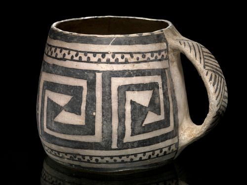
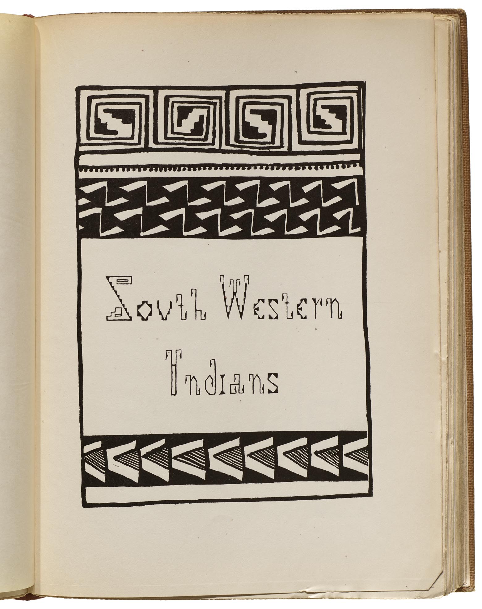
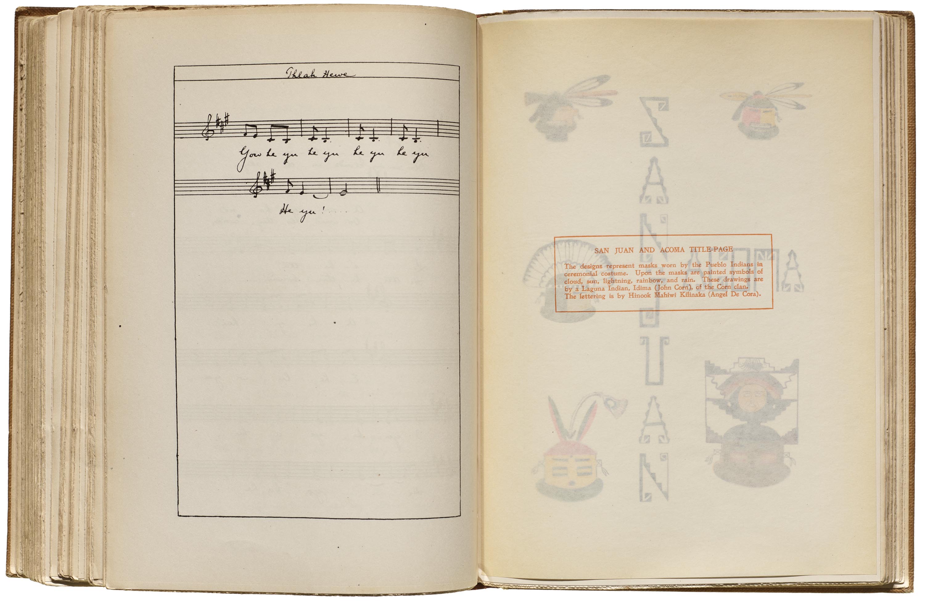
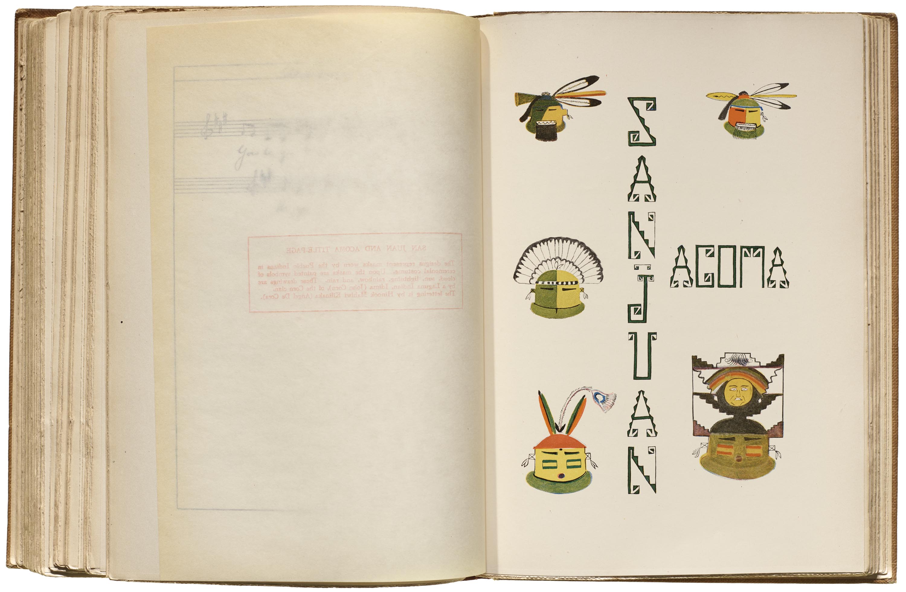
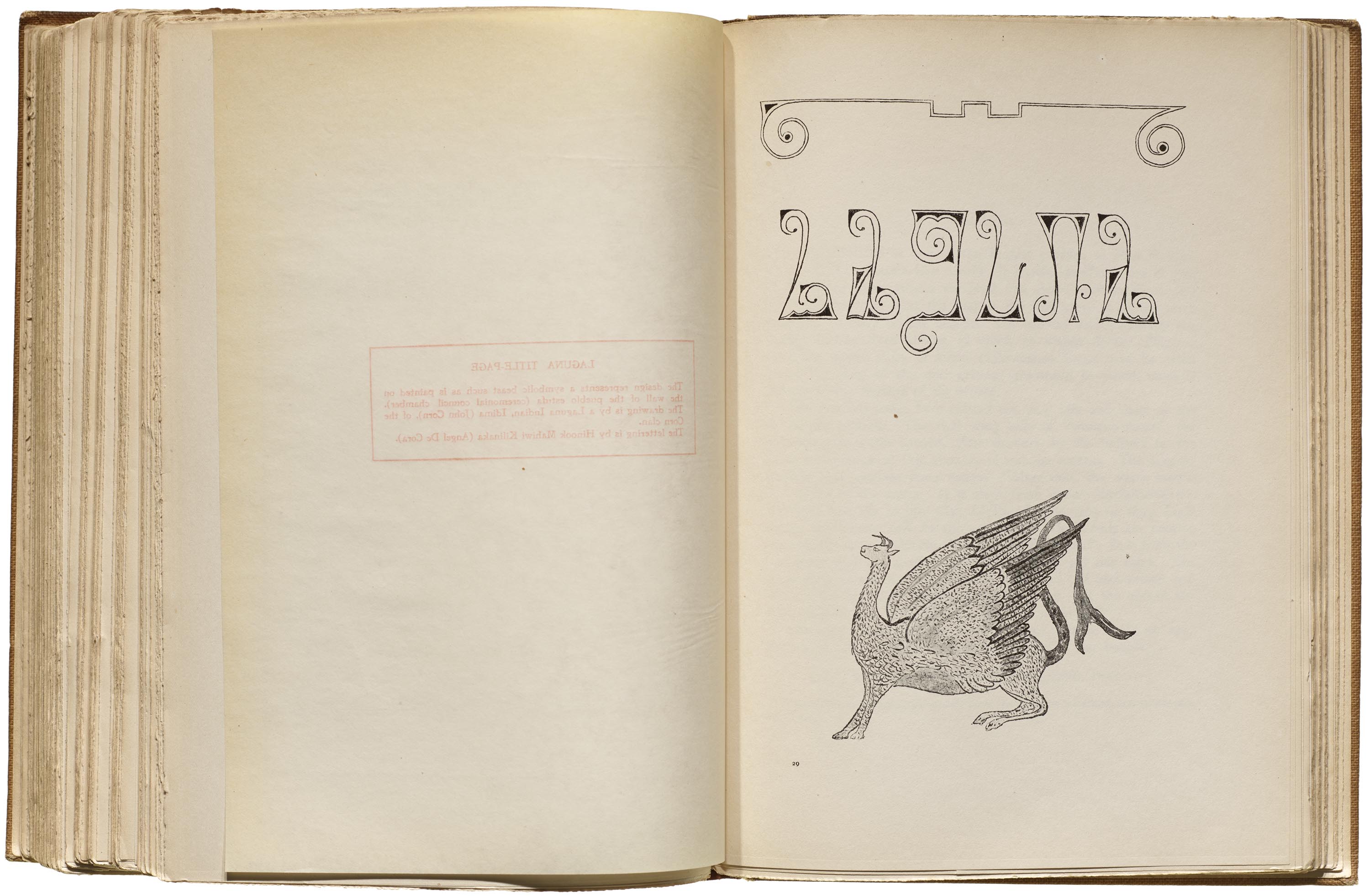
The Southwestern Indians border design draws from the bold painted artwork of ancestral Pueblo pottery. As Curtis notes, “The designs are copies of decorations on Southwestern prehistoric pottery. These copies were painted free-hand by Pueblo Indians of Laguna, New Mexico. The uppermost design has for its central figure a cloud-form; the dots on the line below are grains of corn, and the design immediately beneath represents the young corn-shoots. At the bottom of the page is seen the corn-stalk with its joints. Corn might also be called a symbol of the life of the Southwestern Indians, who are, before all else, agriculturalists.” The lettering itself is akin to Pueblo pottery designs, or perhaps textile designs, and is one of two title pages using lowercase letters, though the Es are like small caps. The styling of these letters are similar to the title page for San Juan and Acoma.
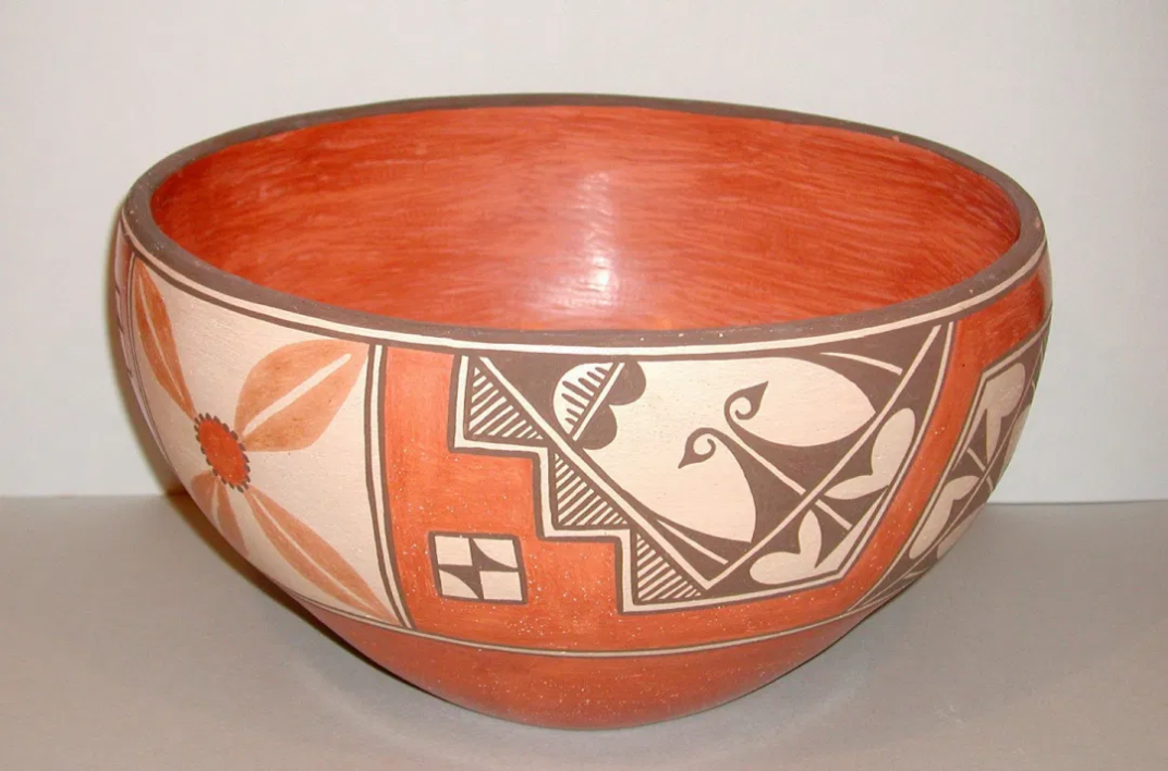
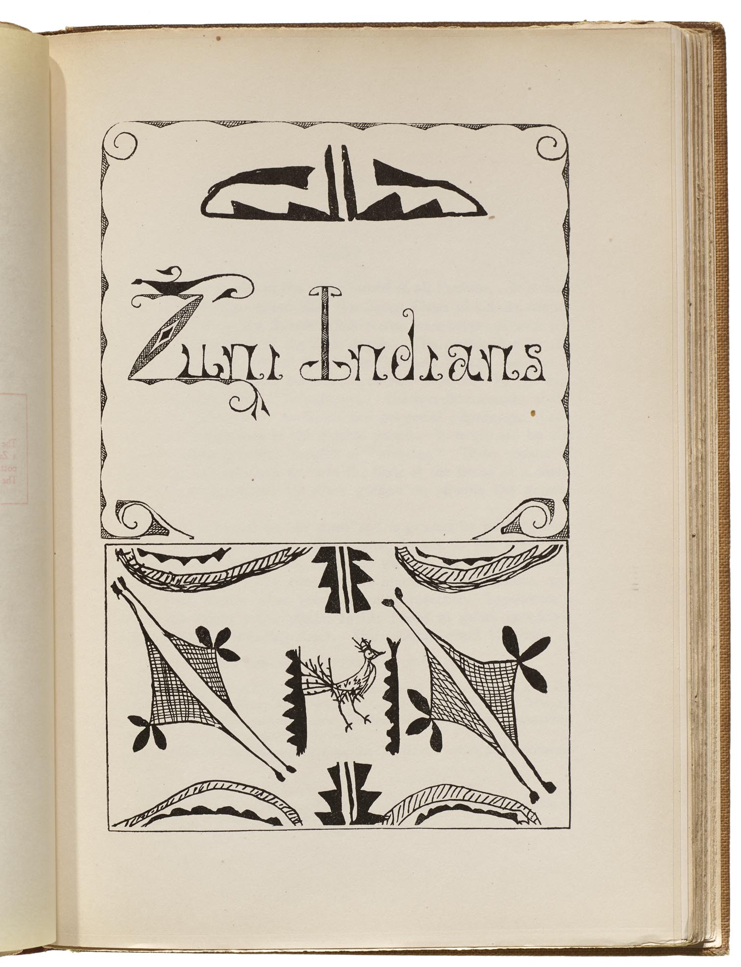
DeCora seems to also reference painted pottery designs for the lettering of The Zuni Indians and Laguna title pages. For the Zuni illustration, Curtis notes that “the designs are Zuni pottery patterns. Painted by Ema-liya, a Zuni girl. The Zunis, like most Pueblo Indians, are skilled potters.”
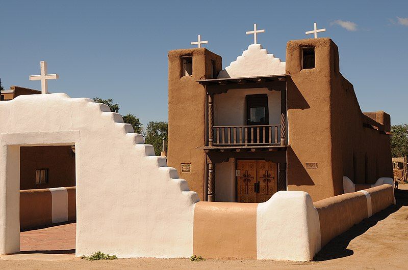
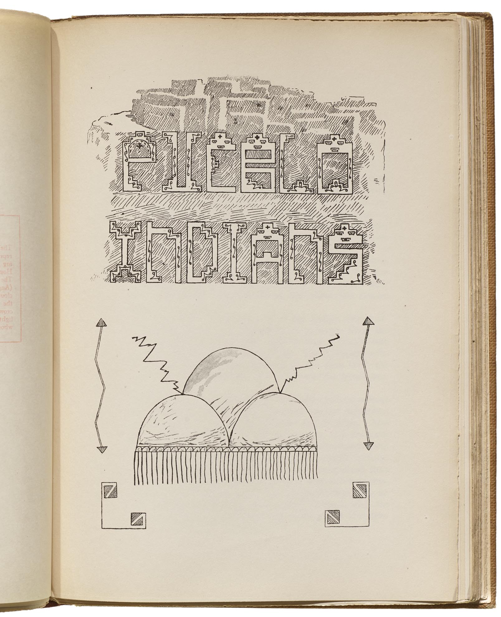
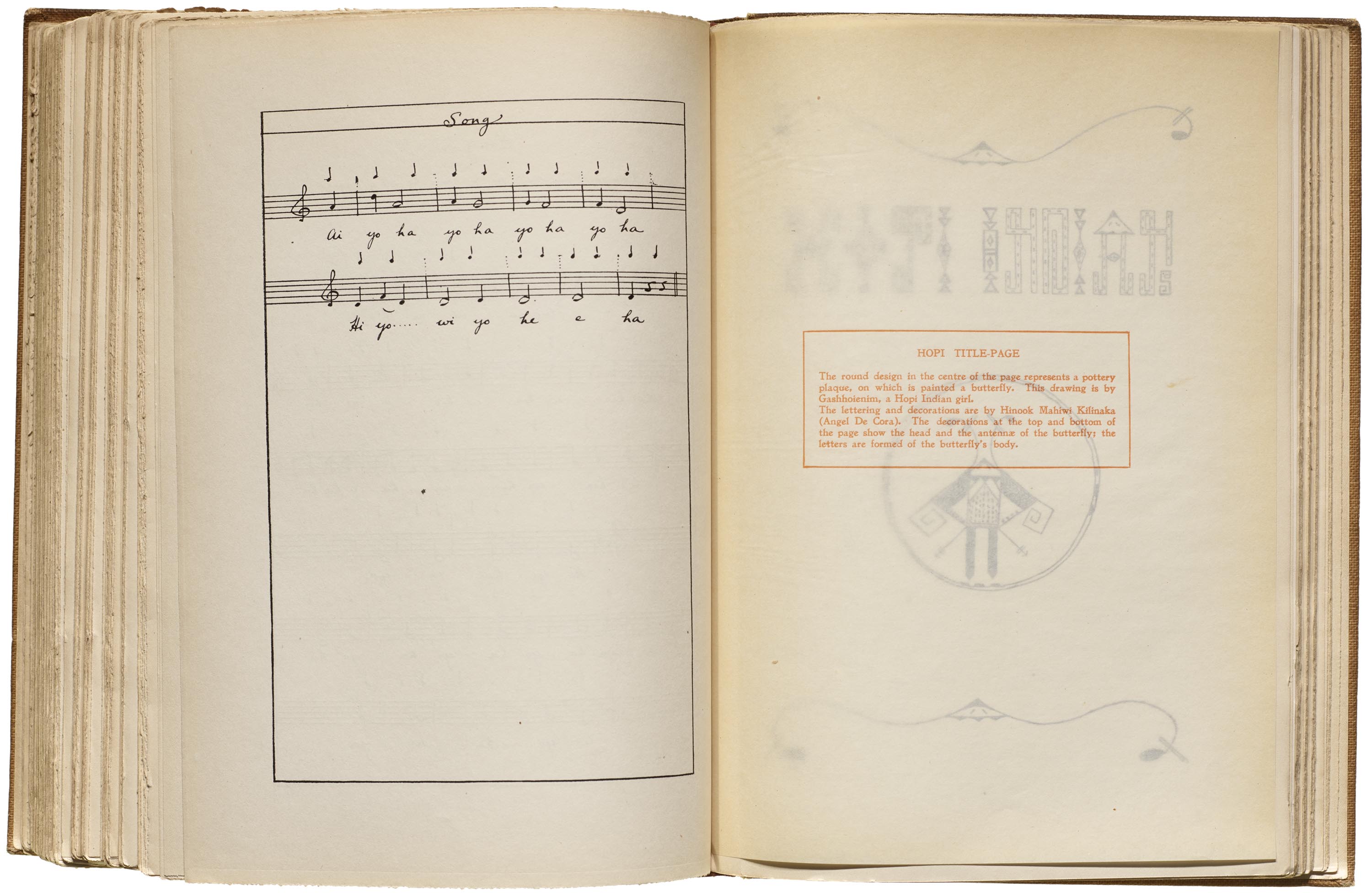
The title page for Pueblo Indians incorporates the symbol of a stylized rain cloud drawn by Gashhoienim, a Hopi girl. The lettering “is composed of the terraced cloud-form, typical of Southwestern Indian designs. Behind the words “Pueblo Indians” is seen a suggestion of a pueblo crowning a steep mesa. On each side of the cloud-design are lighting arrows. The page speaks of the village people, in whose agricultural life the great necessity is rain.” DeCora may have also drawn from the architectural characteristics of adobe buildings, such as churches.
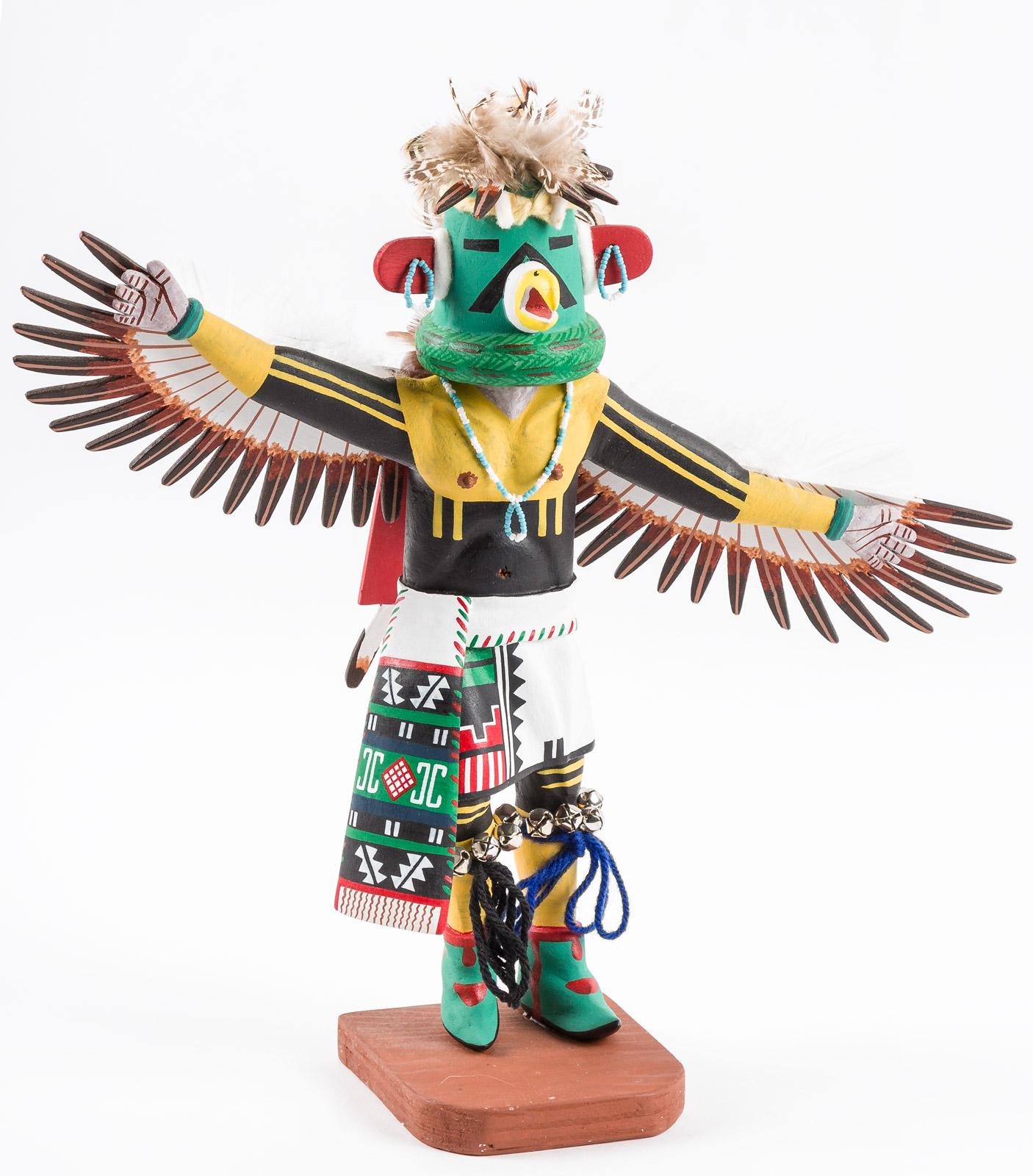
The motif for Hopi Indians takes a more fanciful approach, pulling from elements in the accompanying illustration of a butterfly pottery design by the aforementioned Gashhoienim. Curtis notes that “the decorations at the top and bottom of the page show the head and the antennae of the butterfly; the letters are formed of the butterfly’s body.” The letters also incorporate geometric features not found in the art, which may draw from elements painted on katsina (kachina) dolls, or woven into Hopi textiles. The lettering pushes legibility with a few of the letters, particularly the N, D, and A, and the last N and S are combined into a sort of ligature form. The A shares the stylized butterfly head with the border elements.
More title pages and caption overlays from The Indians’ Book


Contemporary Native Design
More than one hundred years after The Indians’ Book was published, Native graphic designers continue to experiment with typography with the same creative spirit as Angel DeCora, across the spectrum of graphic design. Some designers are particularly known for their publication and layout design, such as Kathleen Sleboda (Nlaka’pamux/Okanagan), the cofounder and design director of Draw Down Books. Victor Pascual (Diné/Maya) does branding work for organizations across Indian Country. Sebastian Ebarb (mixed Choctaw Apache) has created a stunning array of logos and other typographic work for many diverse clients.
Others use Indigenous languages in their design work, like Jessica Harjo (Otoe-Missouria/Osage/Pawnee/Sac & Fox), who designed a typeface for the Osage orthography as part of her master’s in design thesis project at the University of Minnesota, and Kaylene Big Knife (Chippewa Cree), who uses Cree syllabics in her designs.

In Type@Cooper’s Summer 2020 Display Type Design class, Leo Vicenti (Jicarilla Apache) created Daanazaa, a display typeface optimized for the Jicarilla Apache language, and explored typography in his MFA graduate project ha’nas zani at the School of the Art Institute of Chicago.
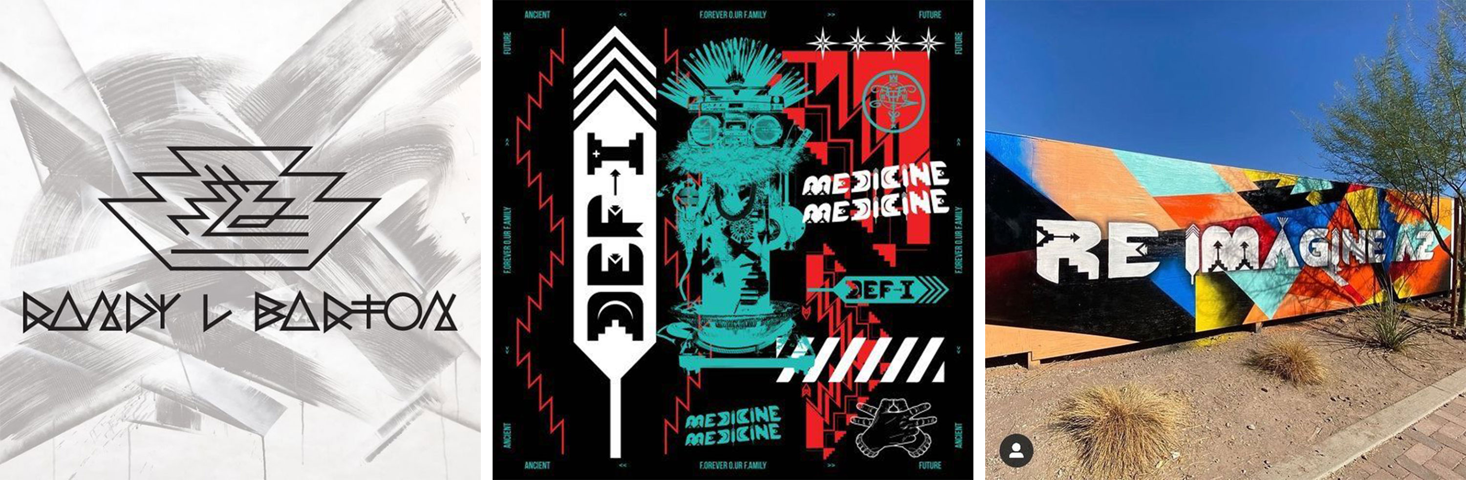
Like DeCora, there are designers who utilize cultural visuals to create letterforms. Diné designer Randy L Barton’s roots in vibrant hip hop and graffiti scenes influence his creative approach to lettering. His “Boogie Letters”, which appear in both his personal branding and client projects, include steps, curves, music notes, fire, arrowheads, crosses, and feathers.
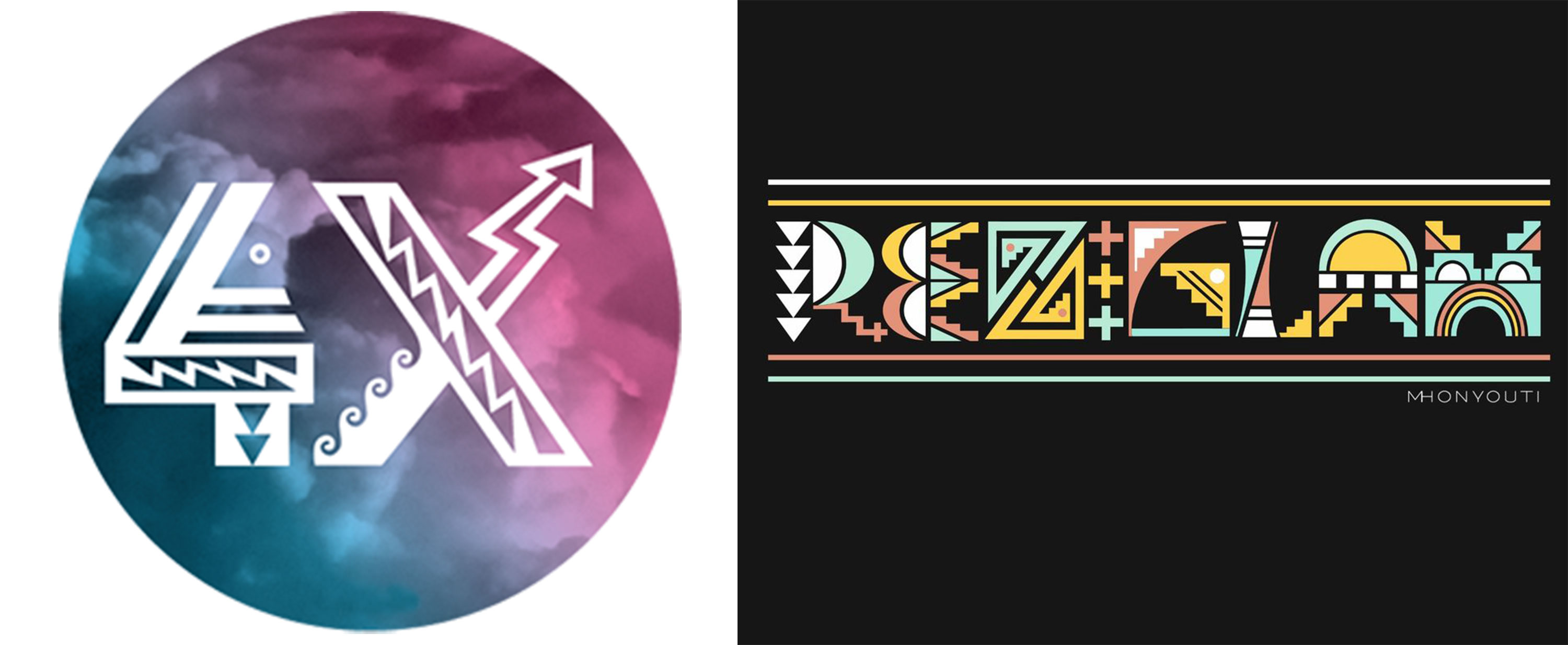
Shon Quannie (Hopi/Acoma) incorporated cultural design elements like lightning and water into his logo for his design company 4X Studio. Award-winning Hopi woodcarver Mavasta Honyouti created lettering based on visual motifs from Hopi culture for his wife Carmen Honyouti’s brand Rez Glam. The M, for example, resembles a dance tableta.
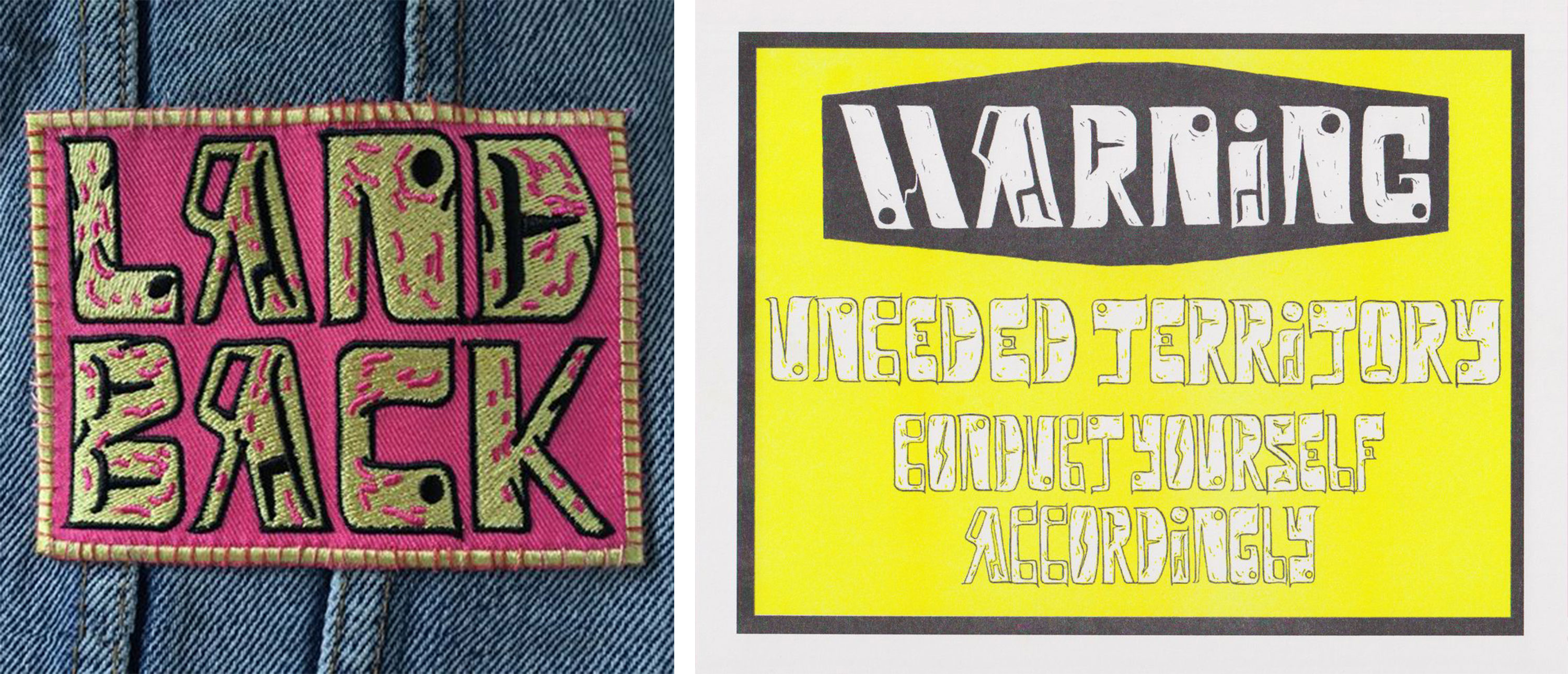
Whess Harman (Carrier Wit’at) uses handmade lettering inspired by formline design across many of their design and art projects, including a “Land Back” patch, the profits from which are used to raise funds for relevant causes, such as 1492 Land Back Lane, or previously the . The design was also used by electronic music group A Tribe Called Red for their single “Land Back Ft. Boogey The Beat & Northern Voice”.
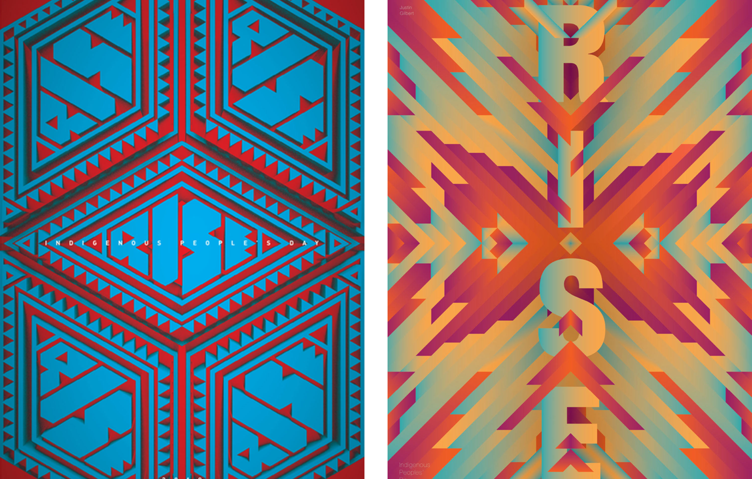
Brian Skeet (Diné) created the brand identity for the 2019 RISE: Indigenous Peoples’ Day Poster Show, organized by Indige Design Collab, which also includes Shon Quannie and Eunique Yazzie (Diné) as members. The logo features lettering that fill a rhombus-shaped design. One of the poster designers, Justin Gilbert (Southern Ute), designed a vibrant poster using stacked type intersecting with chevrons, the energy of which was intended “to encourage our communities to Rise.”
Many more Native designers continue to push lettering and typography in innovative ways across North America, laying foundations for future Indigenous designers. Who knows what the next hundred years will bring?
Neebinnaukzhik Southall, a member of the Chippewas of Rama First Nation, is a graphic designer, artist, photographer, and writer based in Santa Fe, New Mexico. She runs Neebin Studios and maintains a list of Indigenous graphic designers at the Native Graphic Design Project. Tomorrow, learn more about Southall and her work in a Typographica interview published in concert with this article.
More About North American Tribes, Design, and Typography
- First American Art Magazine
- The Native Graphic Design Project
- First Nations Development Institute Reading List
- NCAI Tribal Directory
- National Museum of the American Indian
- Coe Collection of Native American Arts
- Native North American Type Designers
- Native American Culture Index
- Native Languages of the Americas
- Native Writing Systems FAQ
- Typeface: Huronia (review)
- Typeface: Ilisarniq
- Typeface: Phoreus Cherokee (review)
- Learning to Design the Cherokee Syllabary
- Indigenous Font Design and the Ripple Effect
- Type Design for American Native Languages