News
Beyond the Bauhaus: Ecuador, Land of the Shuar
Vanessa Zúñiga Tinizaray refocuses geometric and systematic design principles on a culture far from 20th-century Europe.

Letterform Archive’s current exhibition celebrates, among many things, the centenary of the Bauhaus. Such recognition indicates the significant impact of the school in modern culture. The Bauhaus has become synonymous with minimal and geometric systems of design. This makes it convenient to attribute this school of thought as a source for any graphic work that shares these characteristics, but similar ideas have been around long before the Bauhaus. The Ecuador, the Land of the Shuar poster that is part of the “Beyond the Bauhaus” section of the show is an example of contemporary designers practicing some of the principles associated with the school, and, in this case, principles rooted in a marginalized history.
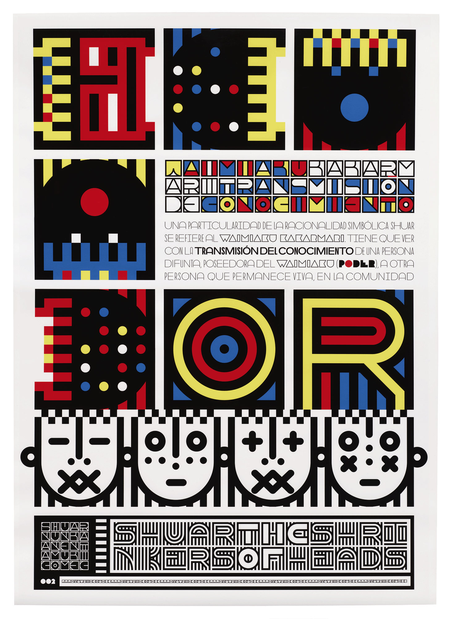
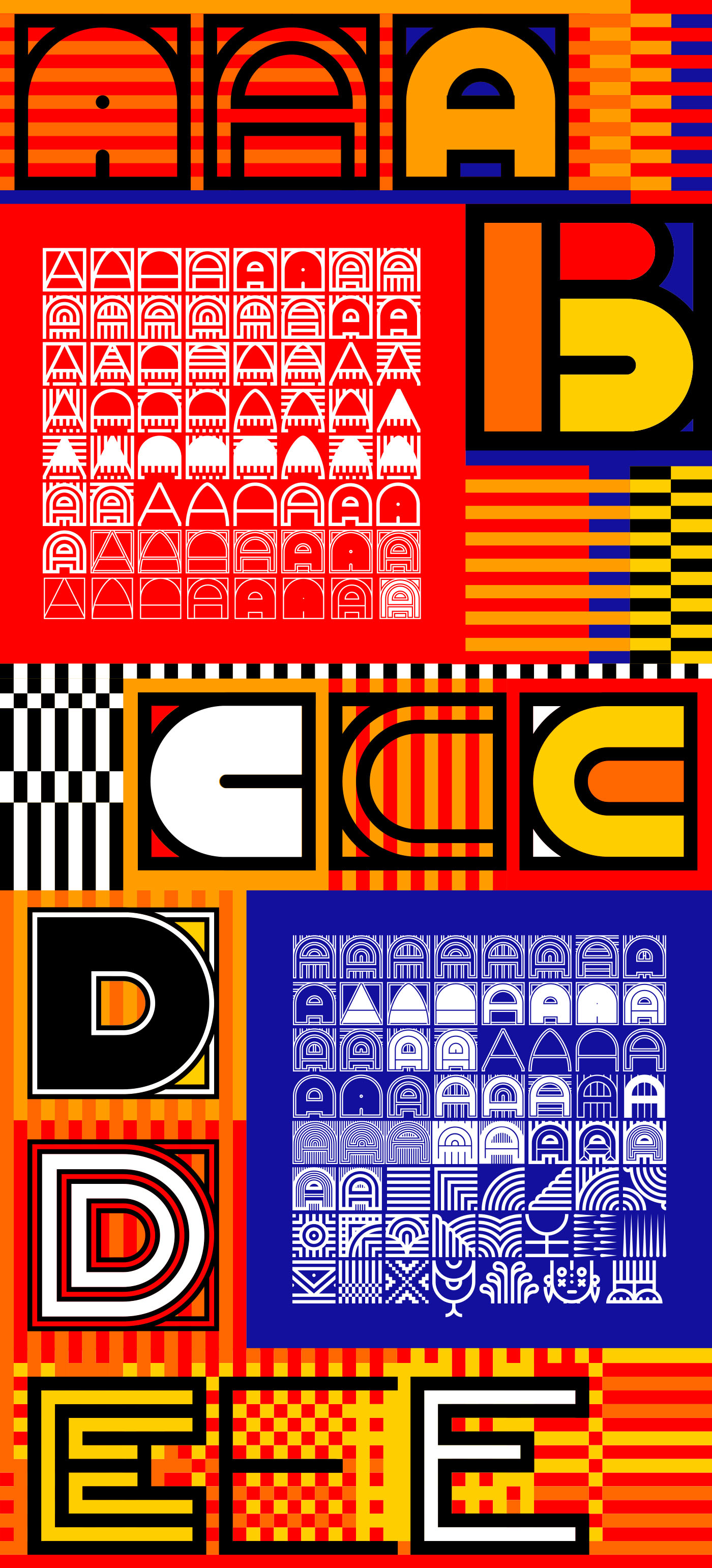
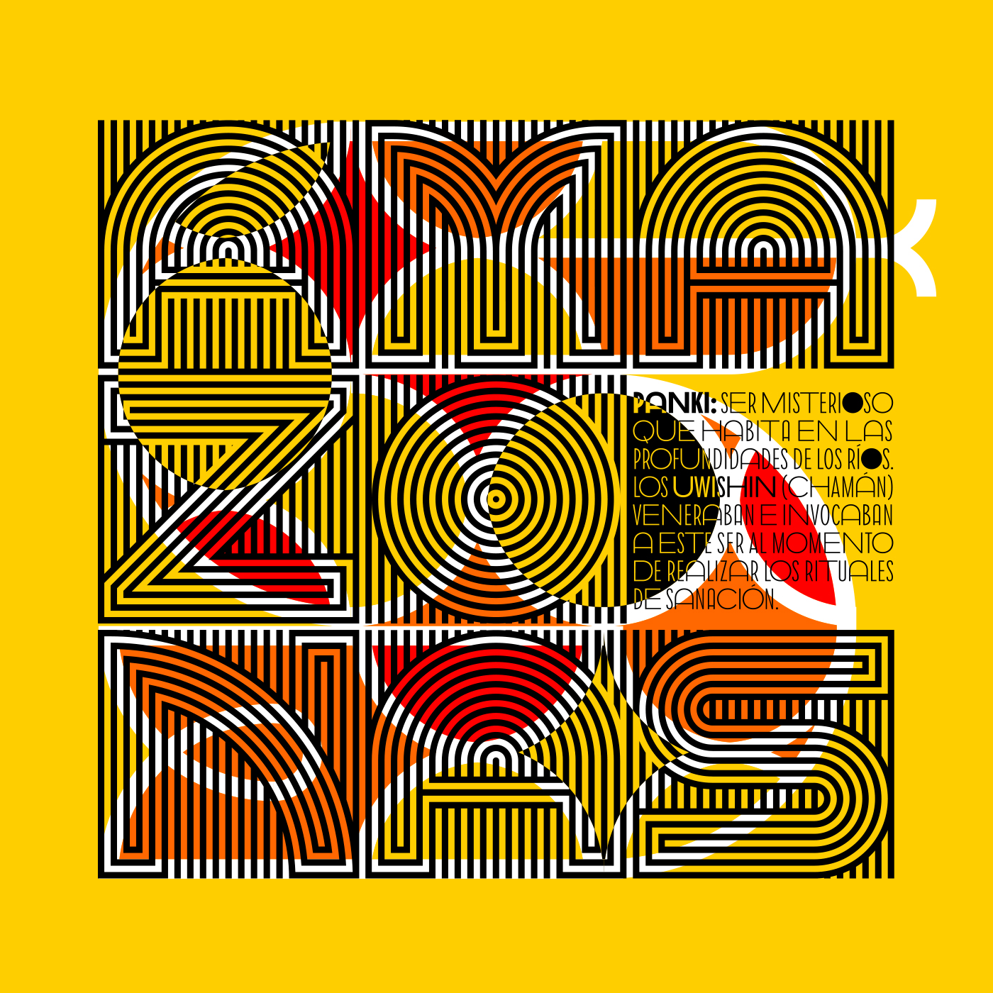
The Shuar poster series is part of a project by Vanessa Alexandra Zúñiga Tinizaray that spans almost two decades. As part of the series she attempts to understand the worldview of the Shuar people and translate it into graphical marks and letterforms that can be read by people who understand the Latin Alphabet.
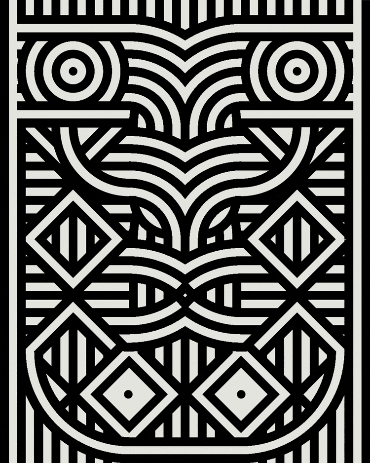
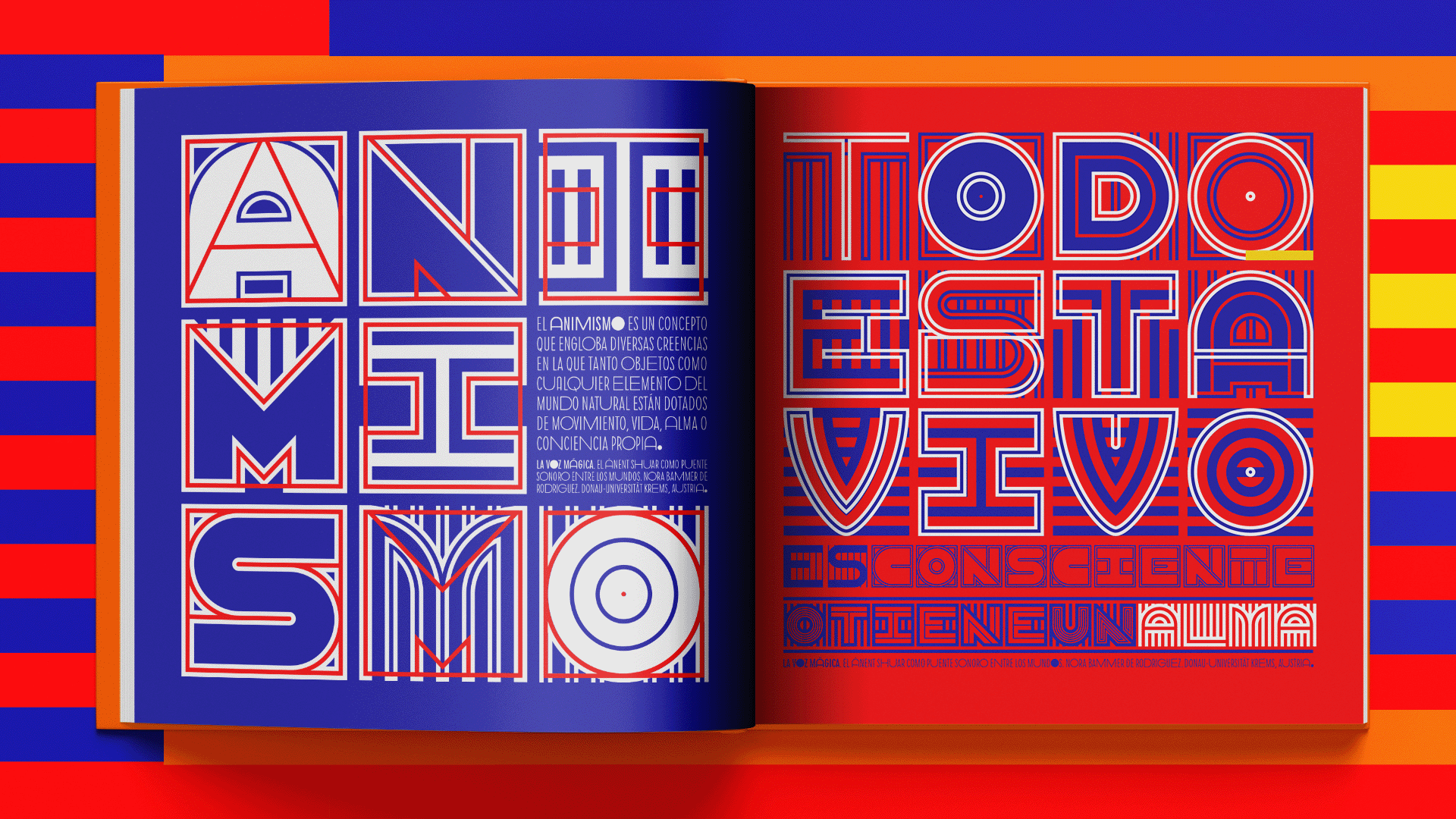
The Shuar have inhabited the Ecuadorian Amazon for centuries. Long before European settlers claimed to have discovered the continent, the Shuar lived and thrived in their territory. Their customs and way of life include deep respect for the land, and their patterned facial designs channel qualities from the plants and animals that surround them. The designs can represent anger, strength, wisdom, and agility, among other attributes.1 The most commonly found symbols are boas, spears, and tigers, all of which are examples of Arútam, a multidimensional spiritual concept that can take the form of a human, flora, fauna, or even an idea, such as the power that inhabits the souls of the deceased. Scholar Nora Bammer writes, “In the Shuar cosmovision the human being, his environment, and the souls of the deceased are part of the magical universe of the spirits.”2
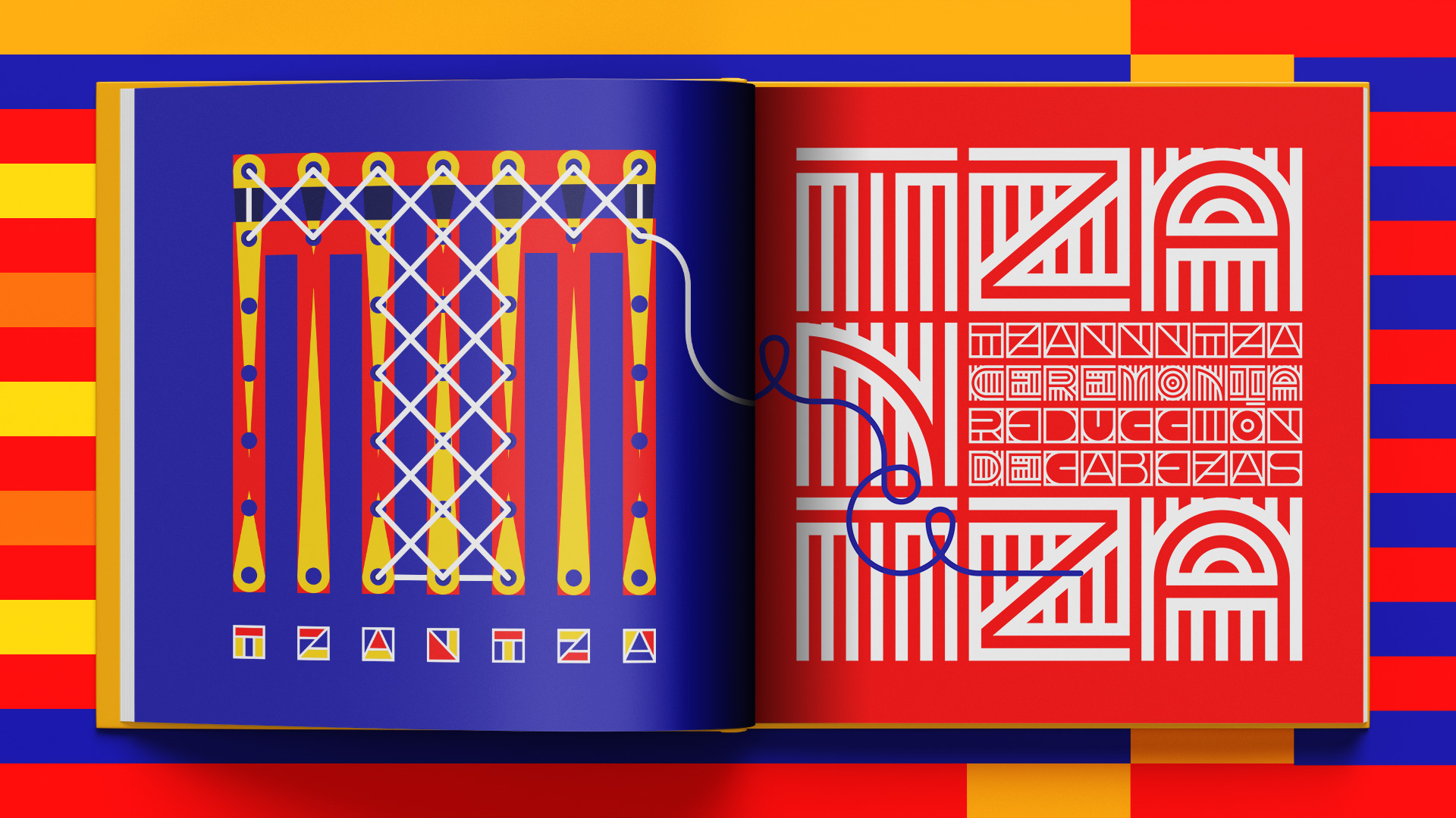
The Shuar also bear the unjust reputation of being unforgiving warriors due to their practice of Tzantza, a ritual they performed after battle to shrink the heads of defeated enemies to the size of a fist. The Shuar believed that this ceremony allowed them to reestablish balance in their community after receiving negative energy in the vengeful spirit of their enemies.

Zúñiga Tinizaray interpreted the Shuar culture as part of a project that started in 2007 called “Crónicas Visuales del Abya Yala”, meaning Visual Chronicles of the Abya Yala. Abya Yala, or Blooming Land, is the self determined name for the continent also known as South America. Through this project, Zúñiga Tinizaray has been working to build a visual library rooted in her home continent rather than looking towards others. The project’s bilingual name sets the tone for the amorphous nature of her experiments — attempts to give form to not only tangible artifacts but also stories and cultural practices. She creates a system of modules as geometric fonts, patterns, and dingbats that she then uses to design objects.
The poster that is part of the Archive’s Bauhaus exhibition, as well as the other graphics seen here, use the typeface family Nunka Ánent, which can be translated to “prayer from the earth”. Zúñiga Tinizaray created the set of fonts after analyzing the cosmovision, clothing, accessories, and face paint worn by the Shuar. The project demonstrates that simplified geometric forms can come from influences beyond the Bauhaus. The array of interlocking, multilinear forms combine to create dense graphics of letter and image — a stark contrast to the restraint seen in modular Bauhaus designs.
Still, despite being separated by a century and a continent, the Bauhaus and Zúñiga Tinizaray share an experimental approach that defies the norms of their time and place.
It is nearly impossible to be oblivious to Bauhaus principles, especially if one has studied design formally, as Zúñiga Tinizaray has, but she describes how this 18-year-old project is guided mainly by her close study of her local visual environment. She notes that geometry is at the heart of those cultures. “Depending on the period and particular culture you’re studying,” she says, “you’ll be able to analyze the evolution of basic geometric shapes and how they were used, to the repetition of different motifs and visual narratives that are far more complex.”
Bauhaus masters have found inspiration in these cultures, too. After emigrating to America Josef Albers and his wife Anni Albers, both teachers at the Bauhaus, traveled extensively to Latin America and their appreciation for the art and craft of the people as well as its impact on their practice is well documented. Albers, who drew a modular alphabet system while still a teacher at the school, cited the economy of space and material as a case for his stencil-like design. He would have found the geometric patterns in his later travels as a springboard for further explorations. His arrangement of colored squares and Anni Albers’s geometric patterns seem to draw from their experiences that they documented and objects that they acquired from these travels south of the United States.
Zúñiga Tinizaray’s work shows how modular letterforms with very different origin stories can have connections that go beyond their appearances. She hopes to release the fonts to the public in the future, and particularly wishes to see them used by organizations and communities who fight against extractivism, pollution, and other abuses of the planet.
Experience Bauhaus Typography at 100
Bauhaus Typography at 100 was just extended to June 26, 2022. Visit the Archive to see the exhibition — and Tinizaray’s poster — in person. If you can’t make it to the physical gallery, the online exhibition will be available to all until the show closes, and permanently accessible to Archive members.
— Tanya George