News
From the Collection: Design in the ’90s
For the second year in a row, we’re collaborating with Astro Studios on a San Francisco Design Week exhibition. This time, we’re taking you back to the 1990s.
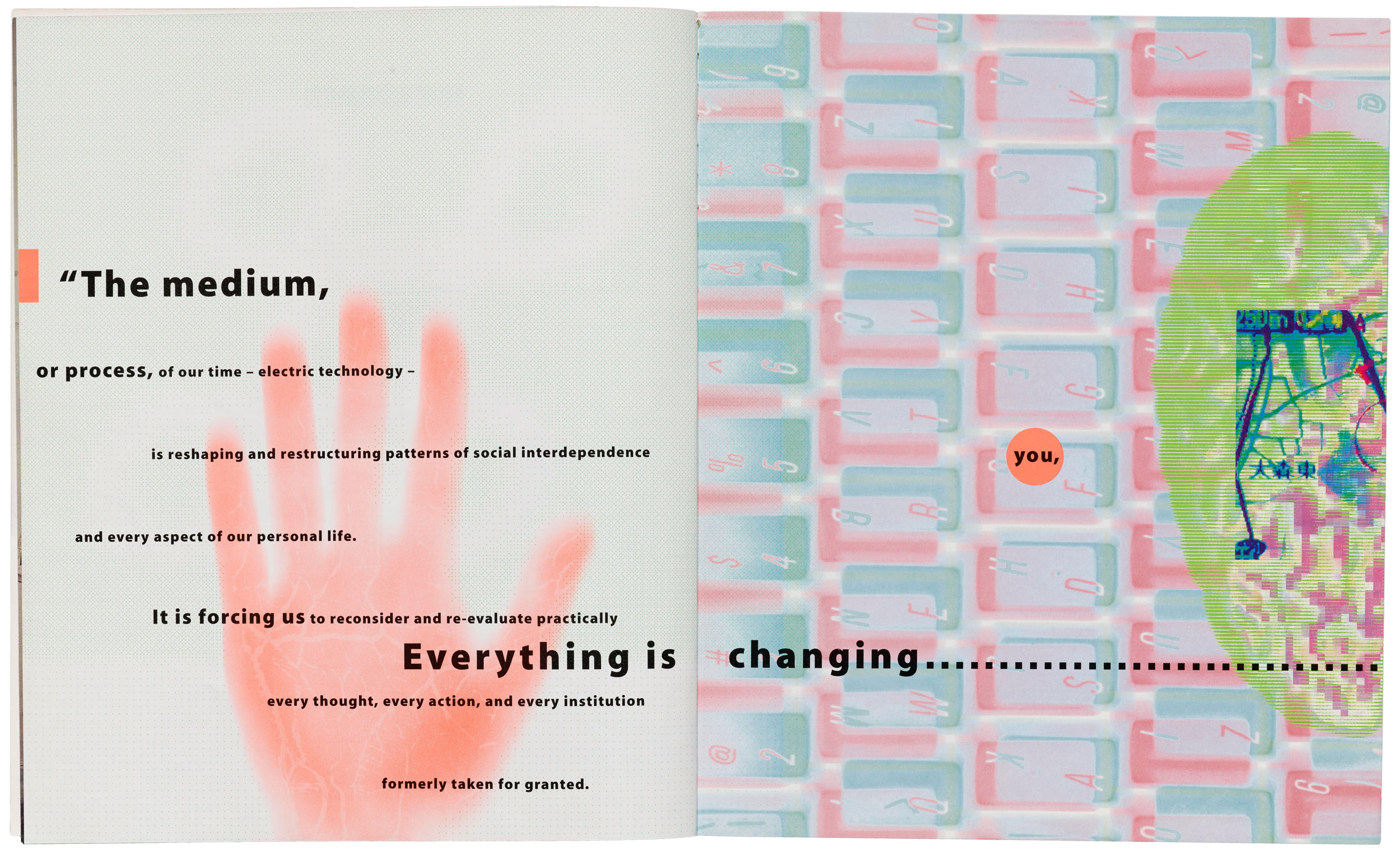
The Archive is excited to partner up with Astro Studios for our second SF Design Week exhibition on Thursday, June 27. Digital Revolution: Designing in the ’90s explores the impact of technologies on design created in this transformative period — the decade when Astro Studios got their start. To celebrate Design Week and Astro’s 25th anniversary, we’re doing a special collaboration, featuring some of Astro’s most notable projects from their early years alongside posters, type specimens, magazines, and ephemera from the Archive’s collection.
Culture
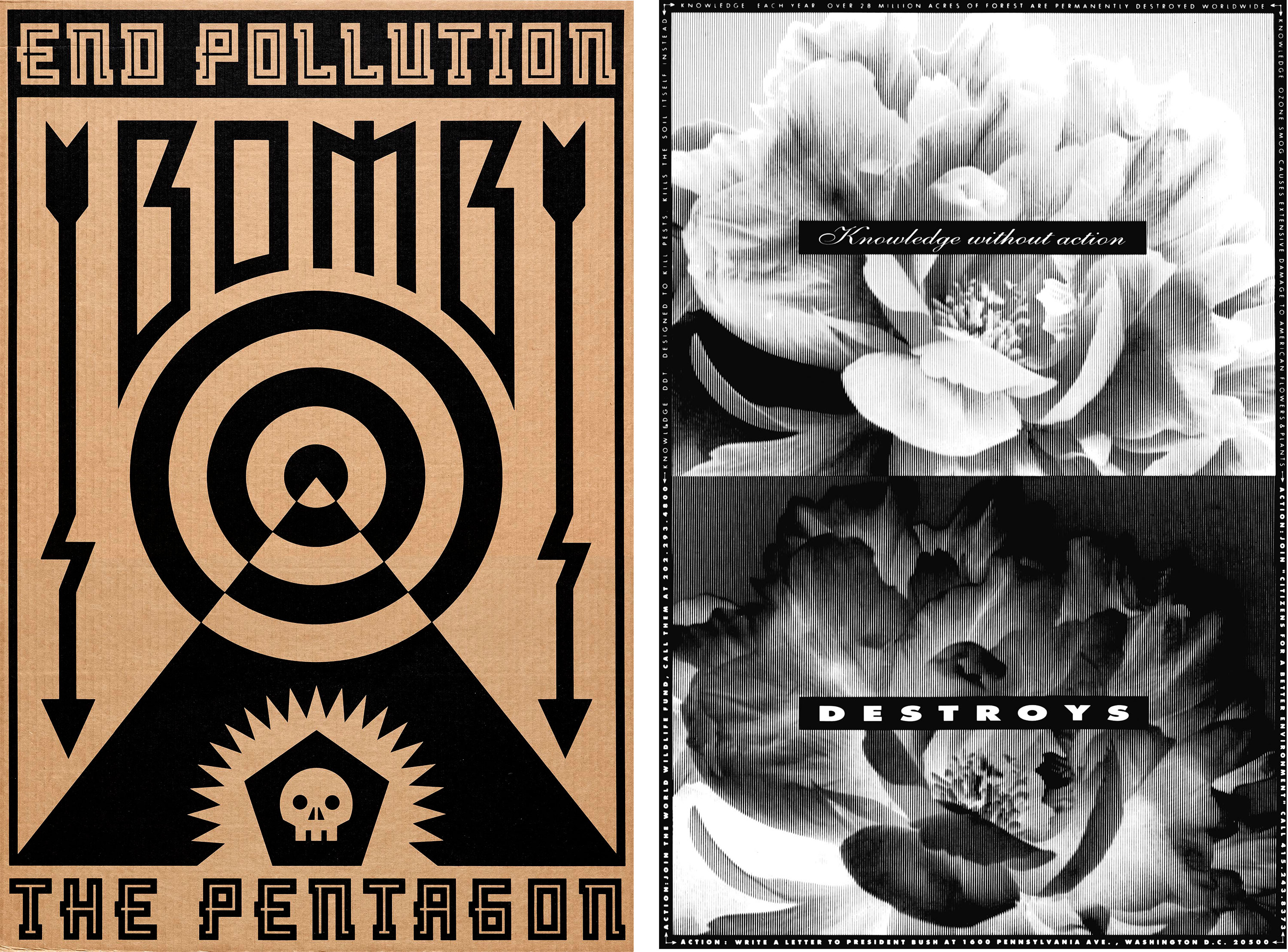
It’s hard not to look back on the ’90s in North America without feeling the decade’s overwhelming sense of optimism. The U.S. was operating with a surplus, feminism was back with the third wave’s “girl power” anthem, and Michael Jordan claimed the NBA’s MVP honor for the fifth time. Californian influence on style was gaining traction. David Carson’s Beach Culture, a surf and skate magazine plastered with grunge type and bold photos, won over 150 design awards. The extreme sports X Games competition hit the scene in 1995, and kids were skateboarding and rollerblading through every city and suburban street in America. Around this time, Astro worked with brands like Subpar Golf to create identity programs, advertising campaigns, and products. So much of popular culture revolved around being outdoors that it’s not surprising this coincided with a time of serious environmental activism. There seemed to be a unity around saving the planet and curbing pollution.
Technology
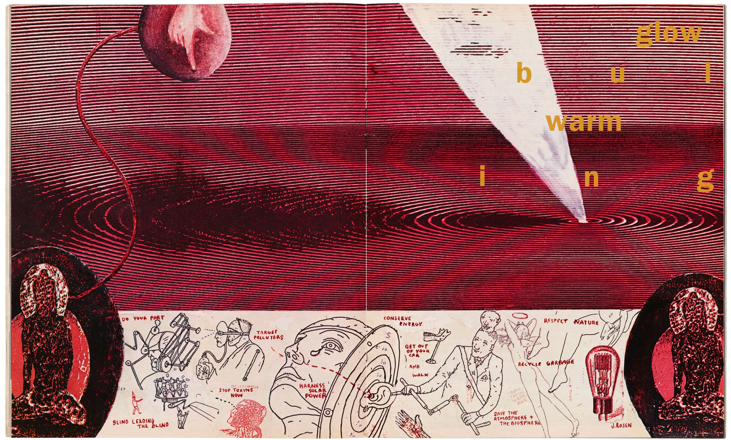
The irresistible sense of possibility was pervasive in every industry, especially tech. The desktop publishing and printing developments from the ’80s advanced print production beyond paste-up boards and hand-made mechanicals for reproduction. Design shifted from analog to digital, and consumers had new equipment in their homes and offices. Astro partnered with Kensington to design the award-winning SmartSockets surge protectors to help protect electronic devices like PC towers. When the World Wide Web opened up for commercial use in 1991, Astro was ready. The studio designed the product for COMPAQ Presario 1400 mobile PC, which enabled easy online access with its “Internet Zone” feature and 4-Way Internet Scroll for navigating web pages, documents, or presentations. And, for the first time, people could even purchase fonts online from digital type foundries and download them to their desktop in minutes.
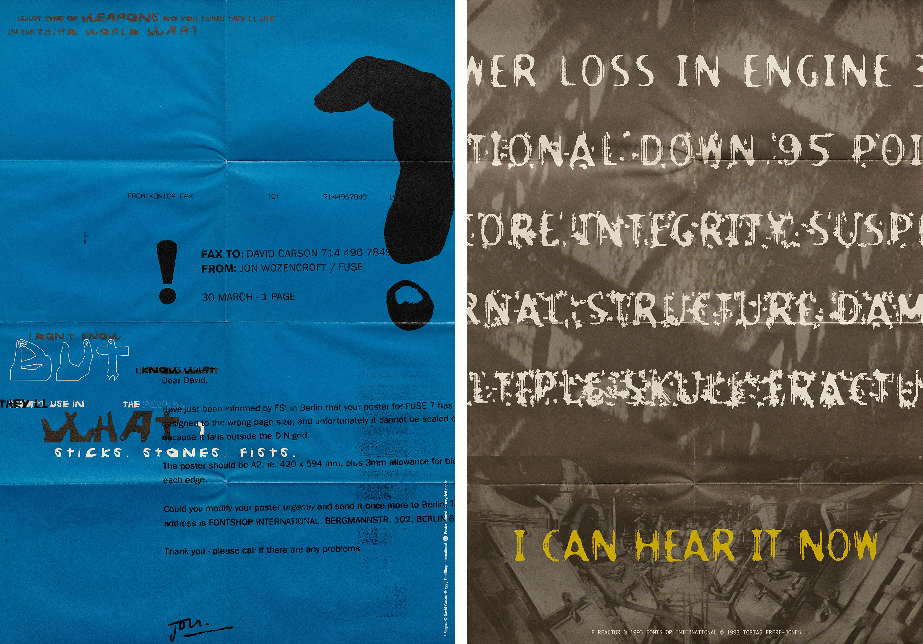
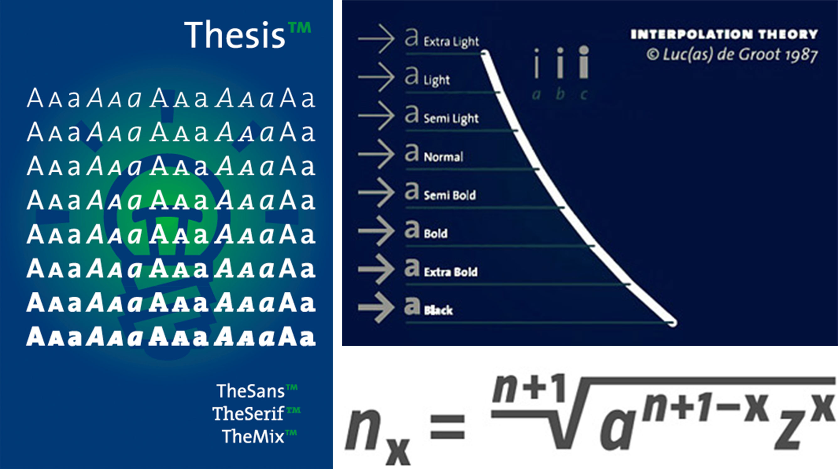
In the world of type technology, Adobe’s invention of PostScript (1982), a language capable of describing text and images on a printed page, made fonts accessible on computers and allowed for typefaces to be designed and distributed independent of printing systems. Digital font editors like Ikarus and Fontographer made a ripple within the industry — significantly increasing the pace of font creation and family expansion. This decade gave birth to the first typeface superfamily: Thesis, designed by Dutch type designer Lucas de Groot, was made possible by his theory of interpolation — a formula to generate intermediate weights between two basic values — and has continued to be applied in contemporary type design.
Type
The personal computer revolution placed graphic design, typesetting, and desktop publishing in the hands of everyday people — tasks that were previously limited to specialists. The Graphical User Interface (GUI) allowed designers to directly manipulate text, image, and pixels on a screen — producing works that were equal parts experimental and typographic. Type became an ingredient designers played with freely: densely layering type, warping type, and setting type on curves. Typeface designs were equally chaotic. Nascent font makers irreverently broke traditional rules, remixed historical genres, and flaunted legibility by hacking their letters with scratch marks and splinters.
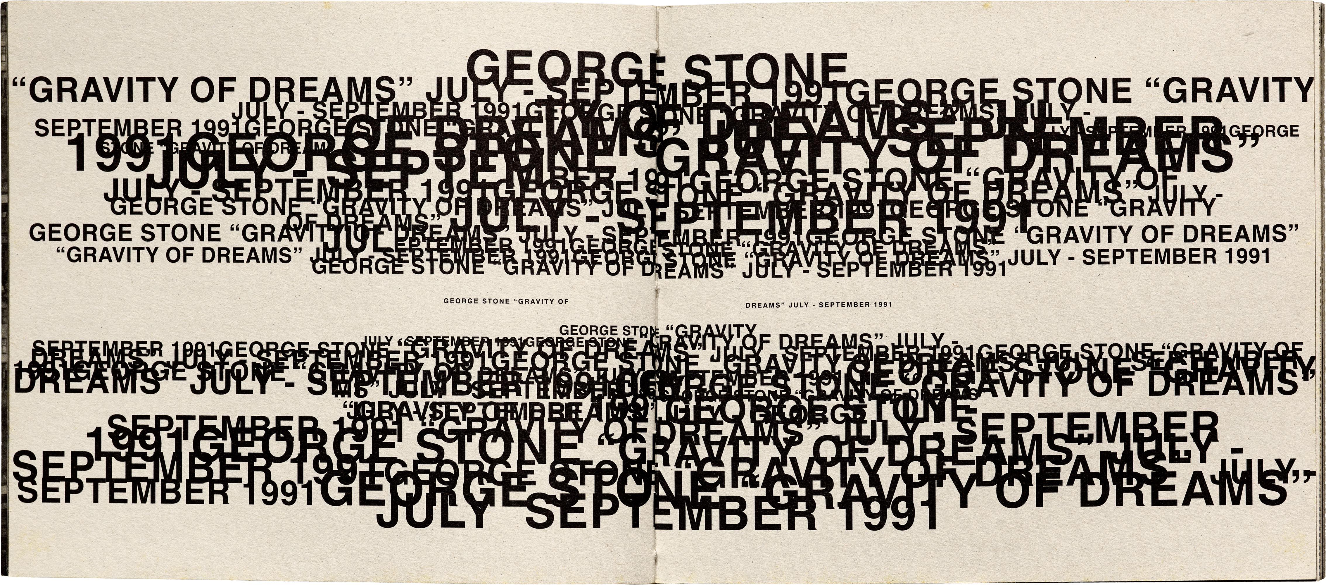
While some designers resisted integrating the computer into their design practices — believing that the computer degraded typographic standards held since the days phototype replaced lead type — other designers like David Carson, April Greiman, and Jennifer Morla proudly embraced the potential of the digital canvas. Martin Venezky, on the other hand, is an interesting case study — a designer who prefers analog methods, but whose works fit into the layered aesthetics of the ’90s digital age. Emigre #11 further explores and gathers artifacts of this new relationship between graphic designers and the Macintosh computer. The grittiness of postmodern typography expressed new possibilities for print design and letterforms — going against traditions by breaking free of the grid, contesting legibility, and favoring expression over function.
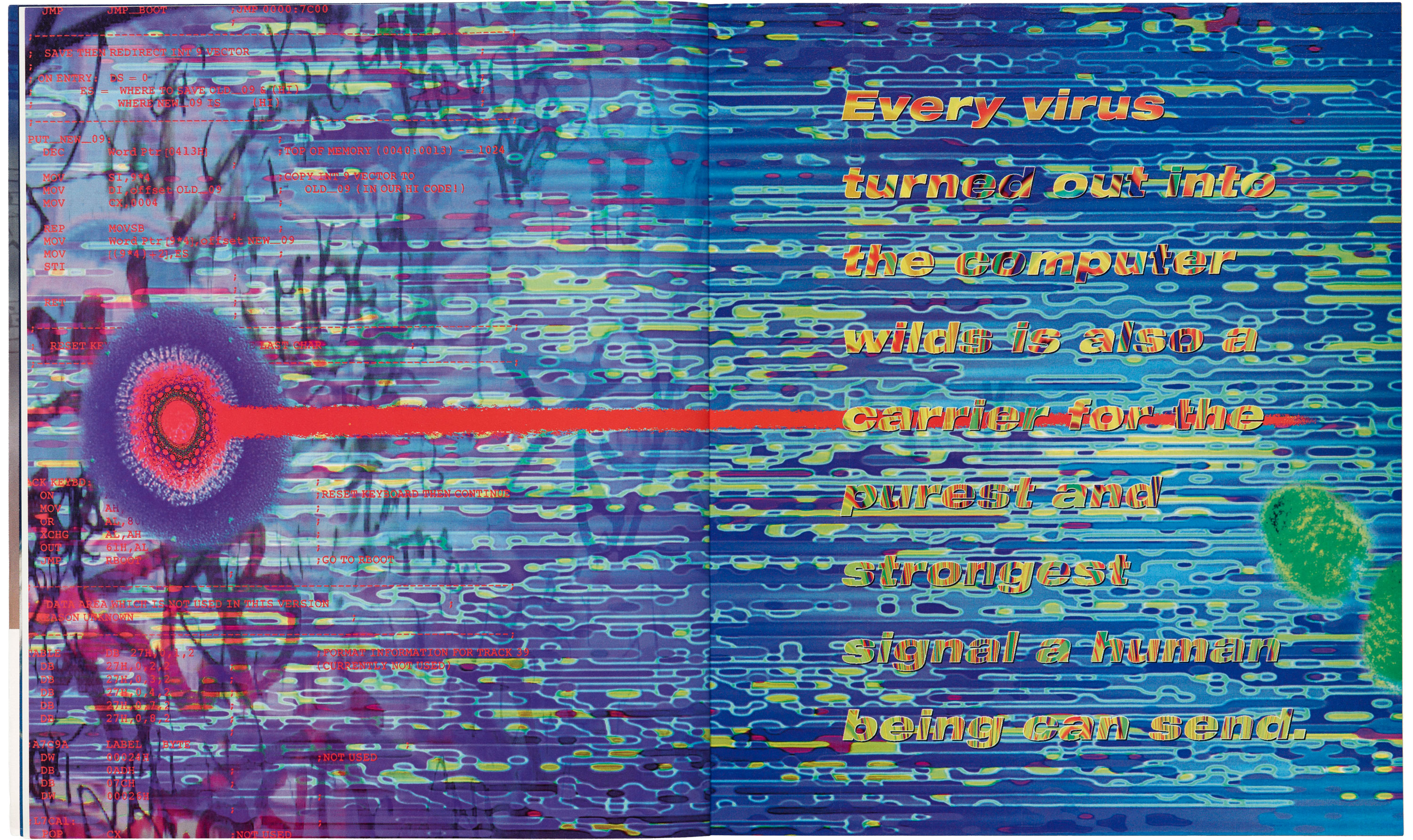
Almost two decades later, we are still witnessing the influence and impact of the ’90s on the design industry. While much of the software and devices we used back then have become obsolete, with newer products rapidly replacing the old, this exhibition invites us to look back and celebrate the designers who boldly rode this technological wave. Digital Revolution: Designing in the ’90s opens Thursday, June 27 from 5 to 8 p.m. at Astro Studios. All proceeds will go toward the Archive’s design preservation efforts. We hope to see you there!
Register for the exhibit opening
— Kate Long, Assistant Librarian and Florence Fu, Editorial Associate
