News
Designing Only on Saturday
There may be no task more daunting than designing a book about a designer — especially when that designer was your friend of 30 years. That was the case with Chuck Byrne, who wrote and designed our book on the work of Jack Stauffacher.
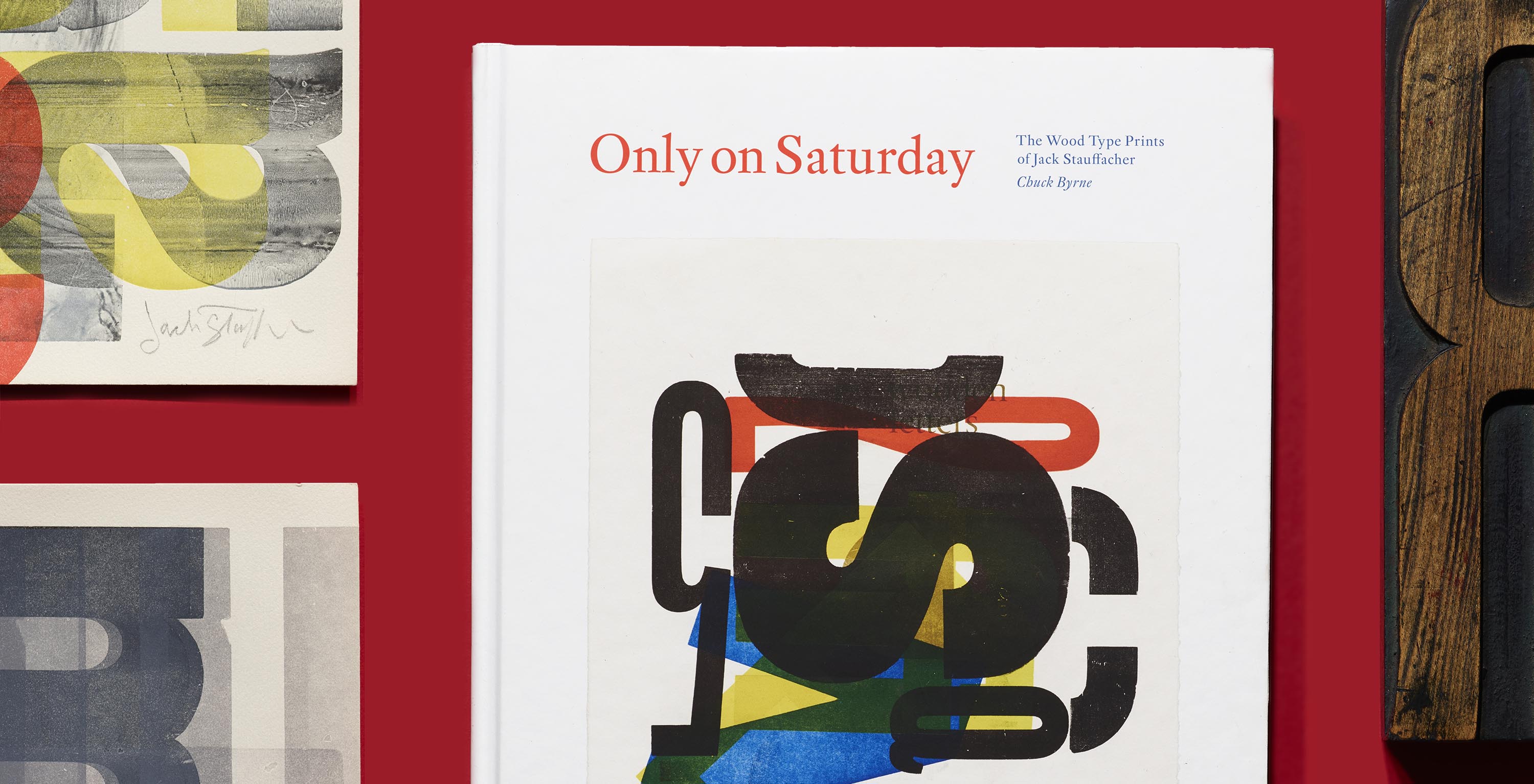
While some may say that Jack Stauffacher’s wood type prints transcend design, Only on Saturday author and designer Chuck Byrne points out that Stauffacher’s biggest fans have always been his fellow graphic designers. “Jack was working with the same elements that designers and typographers work with daily,” he says. “But with Jack’s prints, they saw these elements come together using a 500-year-old technology in new ways that were not only exciting and inspiring, but personal and joyful.”
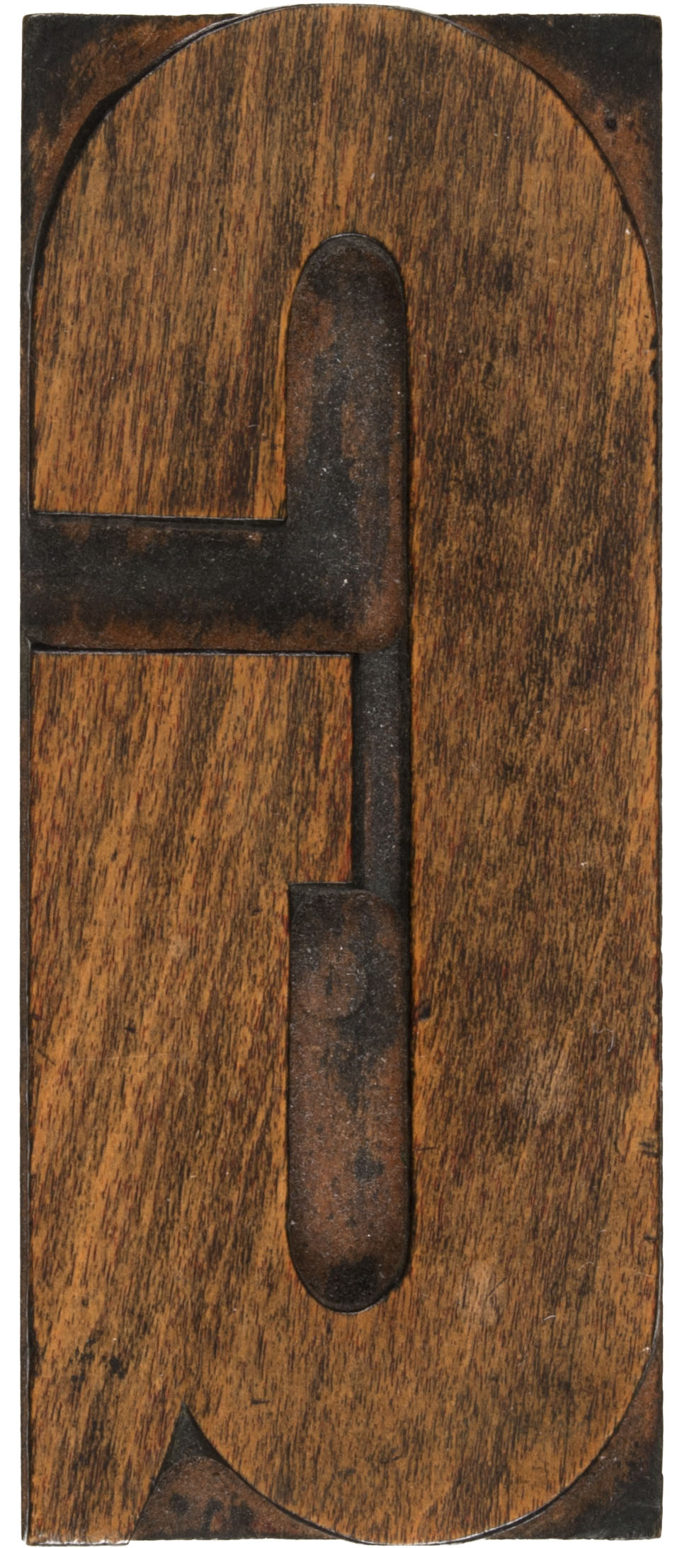
Free from the usual client relationships, Stauffacher was able to wield design tools not in service of official communication, but in self-directed studies that served his own curiosity. And, as in all design exercises, Stauffacher operated within a set of constraints, which both lent structure and afforded new opportunities: With only 66 mismatched wooden letters (and not a full alphabet between them), he was free to focus on type’s formal and textural possibilities instead of its role in constructing explicit meaning.
Understandably, any book about the work of Jack Stauffacher would present its own design challenges, especially since Stauffacher himself would have had strong opinions. Read on to discover author/designer Chuck Byrne’s process for devising a layout for Only on Saturday, Letterform Archive’s third book, which closes on Kickstarter on Friday, November 15.
Putting the Wood Type Back on Press
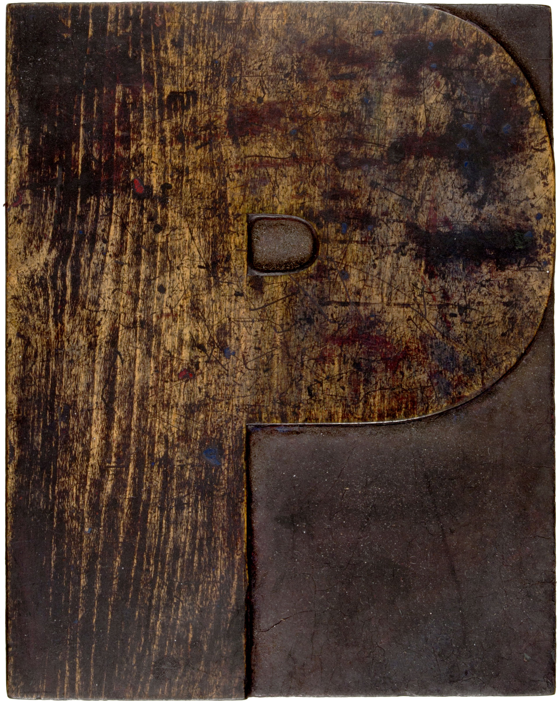
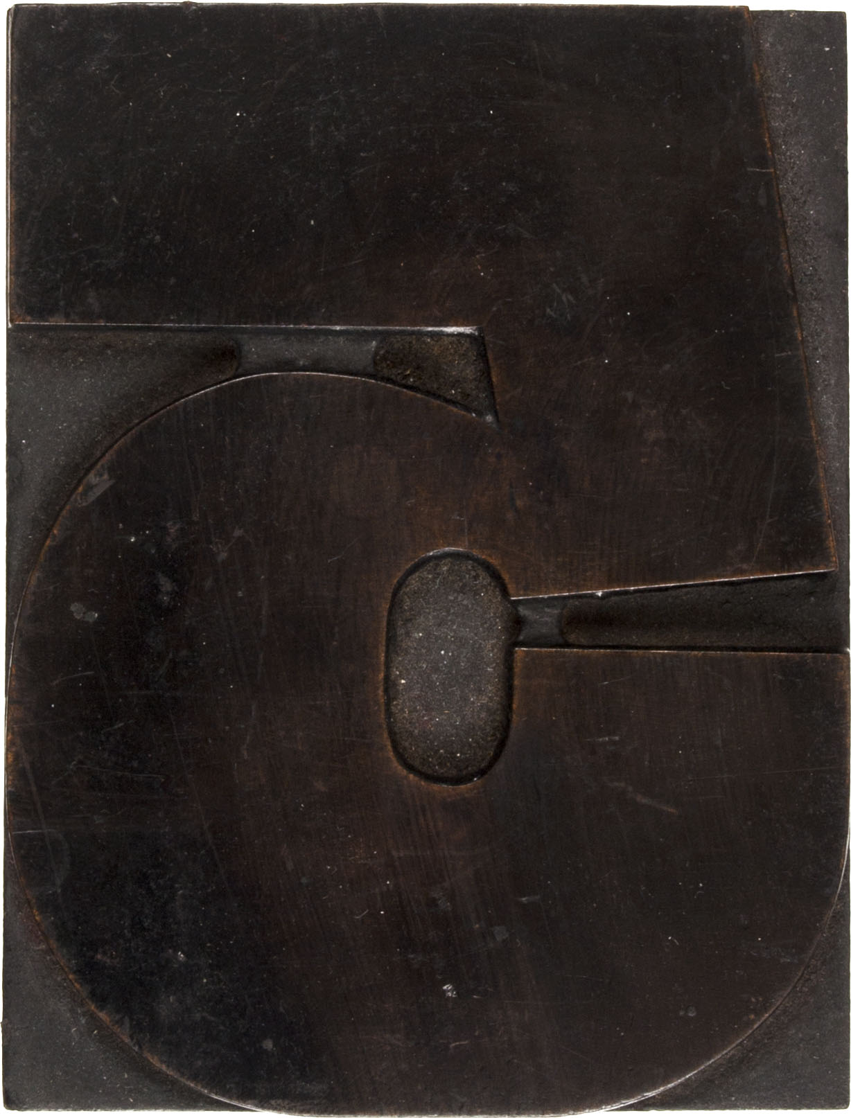
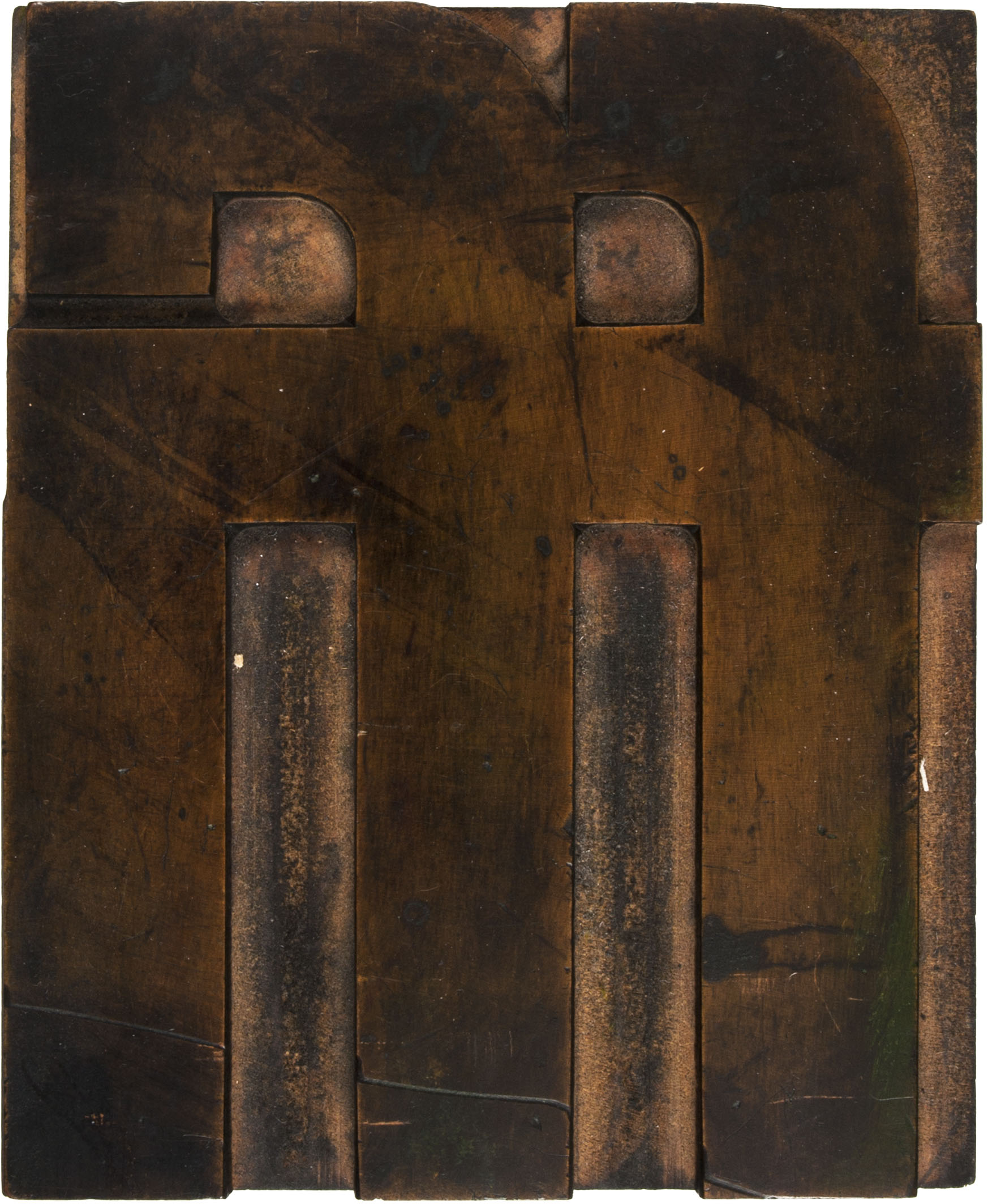
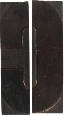
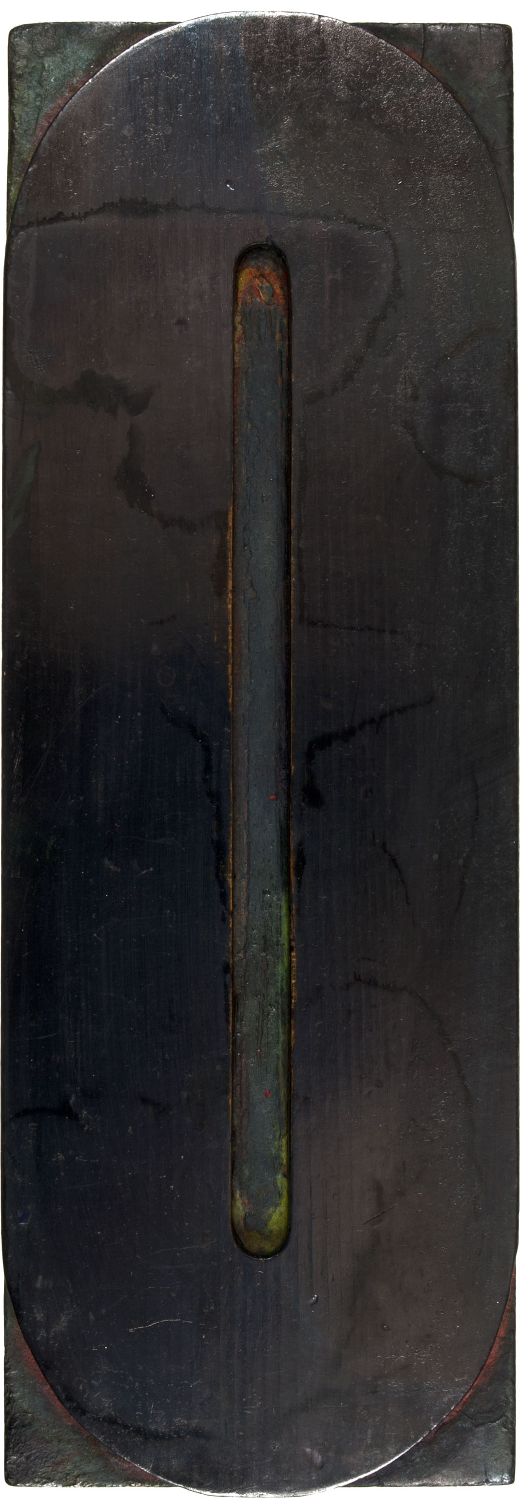
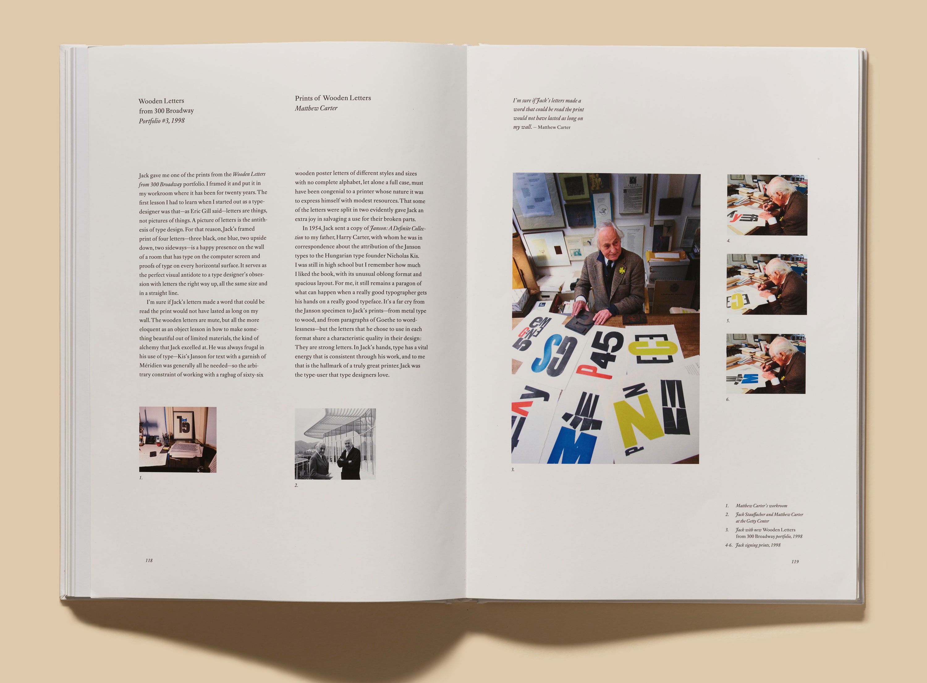
From the project’s start, it was an immediate wish to give Stauffacher fans something “real” in the deluxe edition. “He didn’t use that word [real] but, being a letterpress printer, it was a concept he believed in,” Byrne shares. “That led to the idea of proofing ten pieces of wood type from Jack’s collection.” These ten proofs — printed on Rives lightweight paper (Stauffacher’s favorite) — feature individual letters from his box of wood type, locked up plainly and printed in black ink to highlight their surface and form.
The collection of wood type was in the care of Stauffacher’s daughter, Francesca, who agreed to loan a selection of it for use in the letterpress portfolio. Byrne then turned to one of Stauffacher’s friends and fellow printer, Peter Koch, for printing. “Peter seemed to be a natural choice,” Byrne says. “He’d been a lifelong friend of Jack’s and he understood what the project was about.”
Koch was pleased to contribute to the project — on a professional and personal level. “Throughout the late 1970s and early 1980s, while we (Shelley, Max, and I) lived in the city, the presence of Jack Stauffacher was a gift,” he reminisces. “On weekdays after work, we would close up our studio in the Mission and head over to North Beach. Those were the days of Rick’s Café American on Columbus Avenue. We gathered there for a glass of red with Jack, Josie, and a rotating group of friends to talk about politics, Plato, and printing inks. Conversations would run the gamut from the elegiac to the polemic. We were living the bohemian life from the 1950s that I had read about. Not a reenactment, but instead, in the presence of Jack and Josephine, a living continuum. We lived those days at the heart of San Francisco and we knew it. Jack’s philosophical turn of mind and his curiosity engaged us all in a seemingly endless socratic dialogue. I think of him still, each time I pass 300 Broadway or the site of the old Café American. (Ars longa, vita brevis.)”
“— to work with Jack’s wood letters today is like opening a vintage red from Tuscany — an experience to be savored slowly and with a certain reverence. The compositors and pressmen of yesterday live on in the type that once inhabited 300 Broadway. I can feel them now as the cylinder rolls over the surface . . . the printers of old.” — Peter Koch
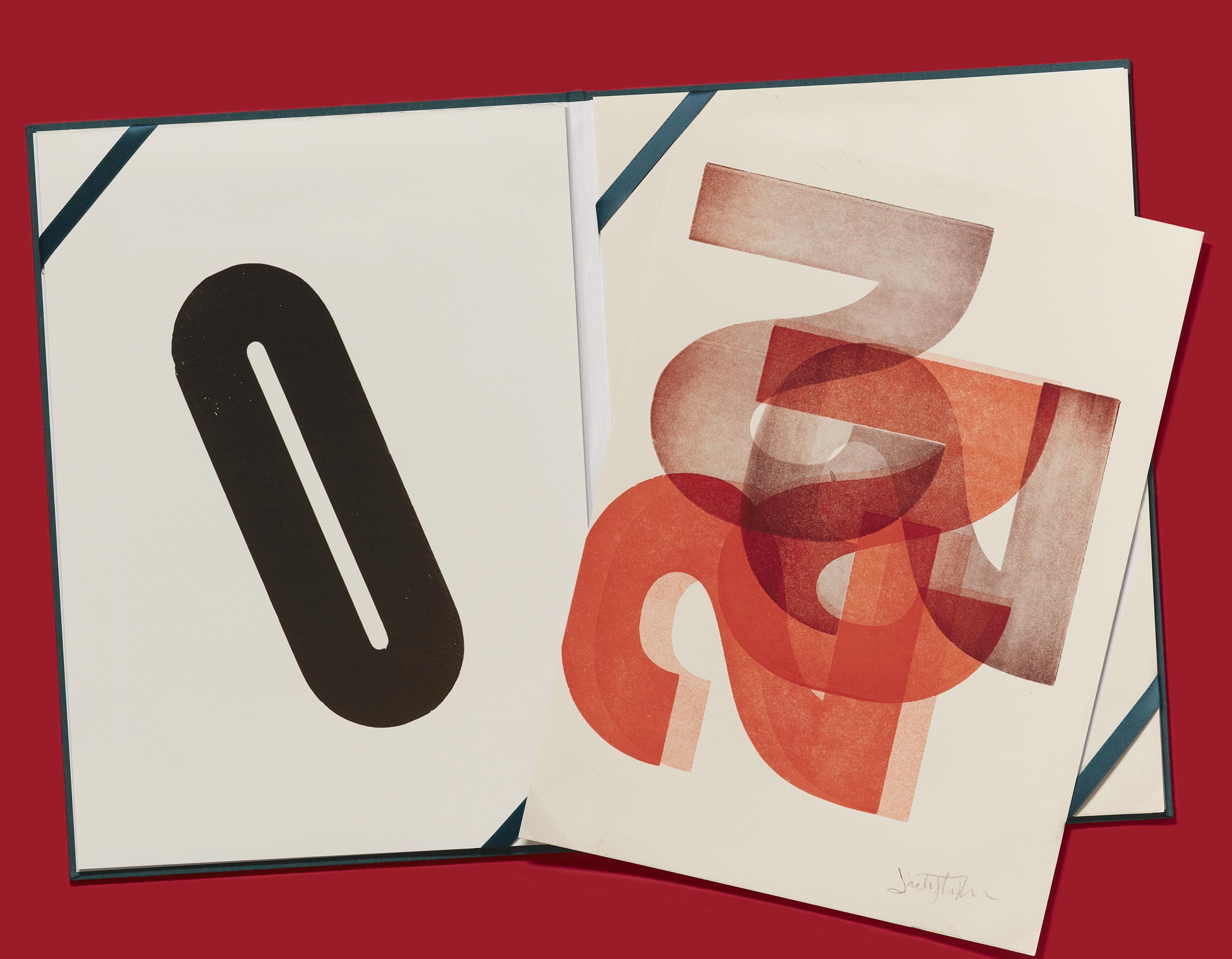
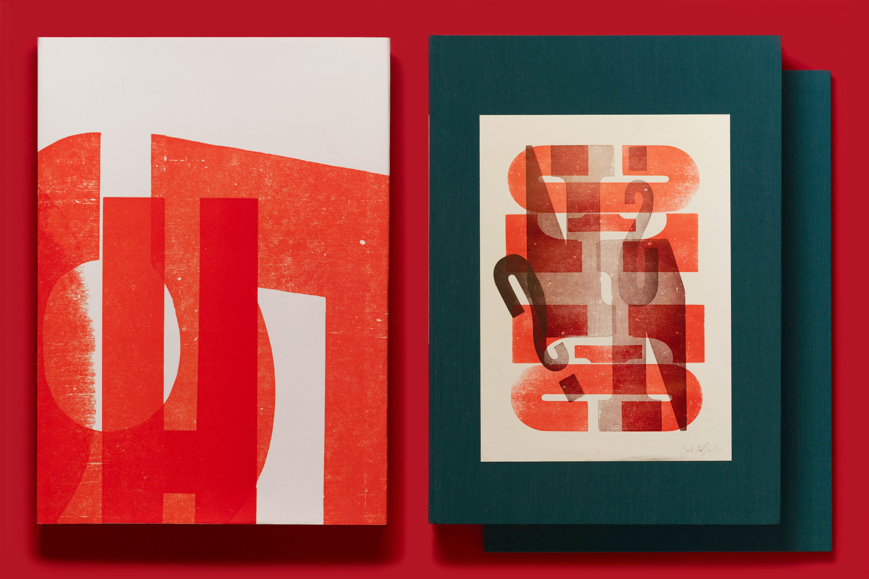
Also included in the portfolio are ten facsimiles of prints reproduced in the book, which will be offset-printed in full color. Together, they make a keepsake set, or can be displayed as individual pieces.

Making the Process the Cover Story
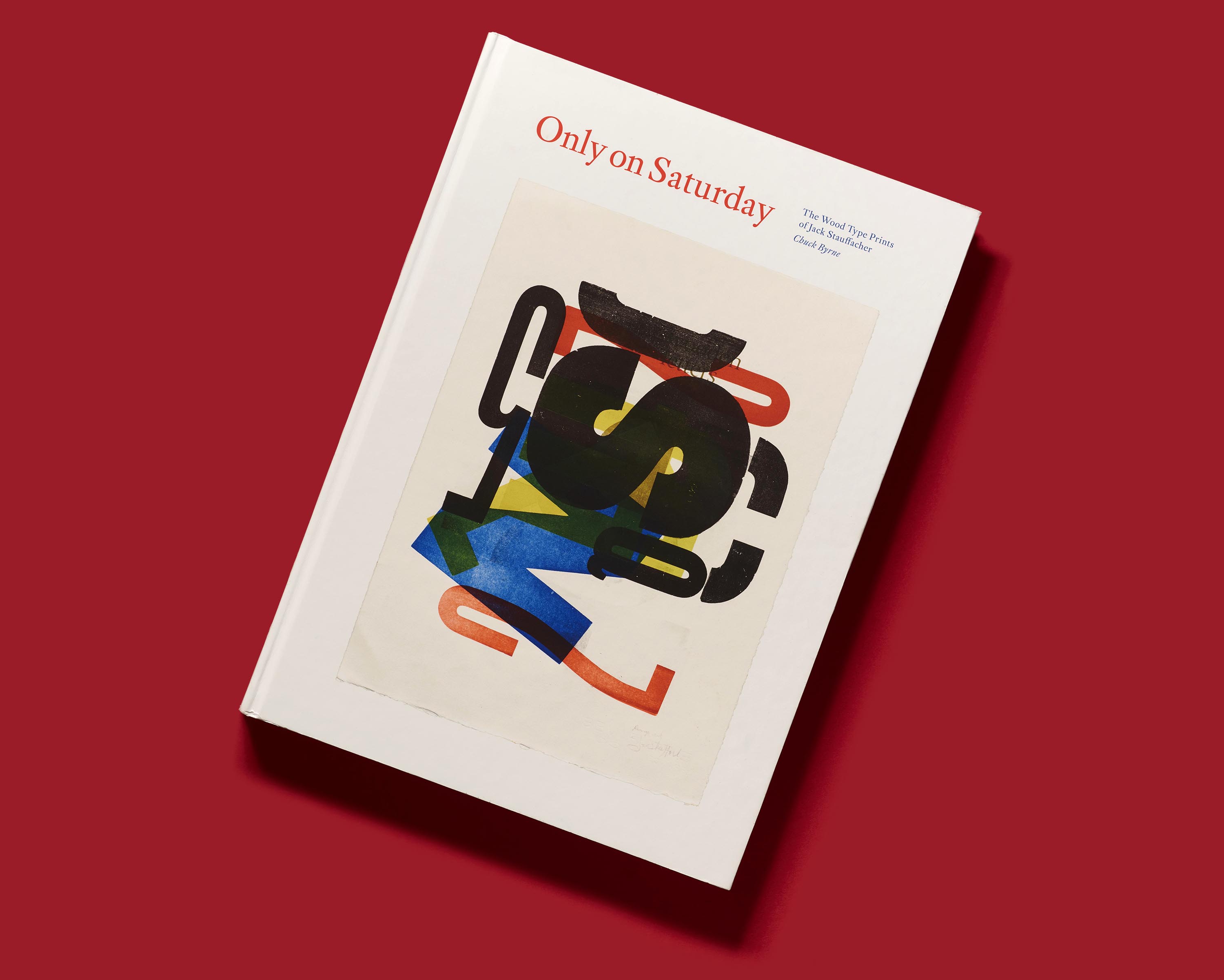
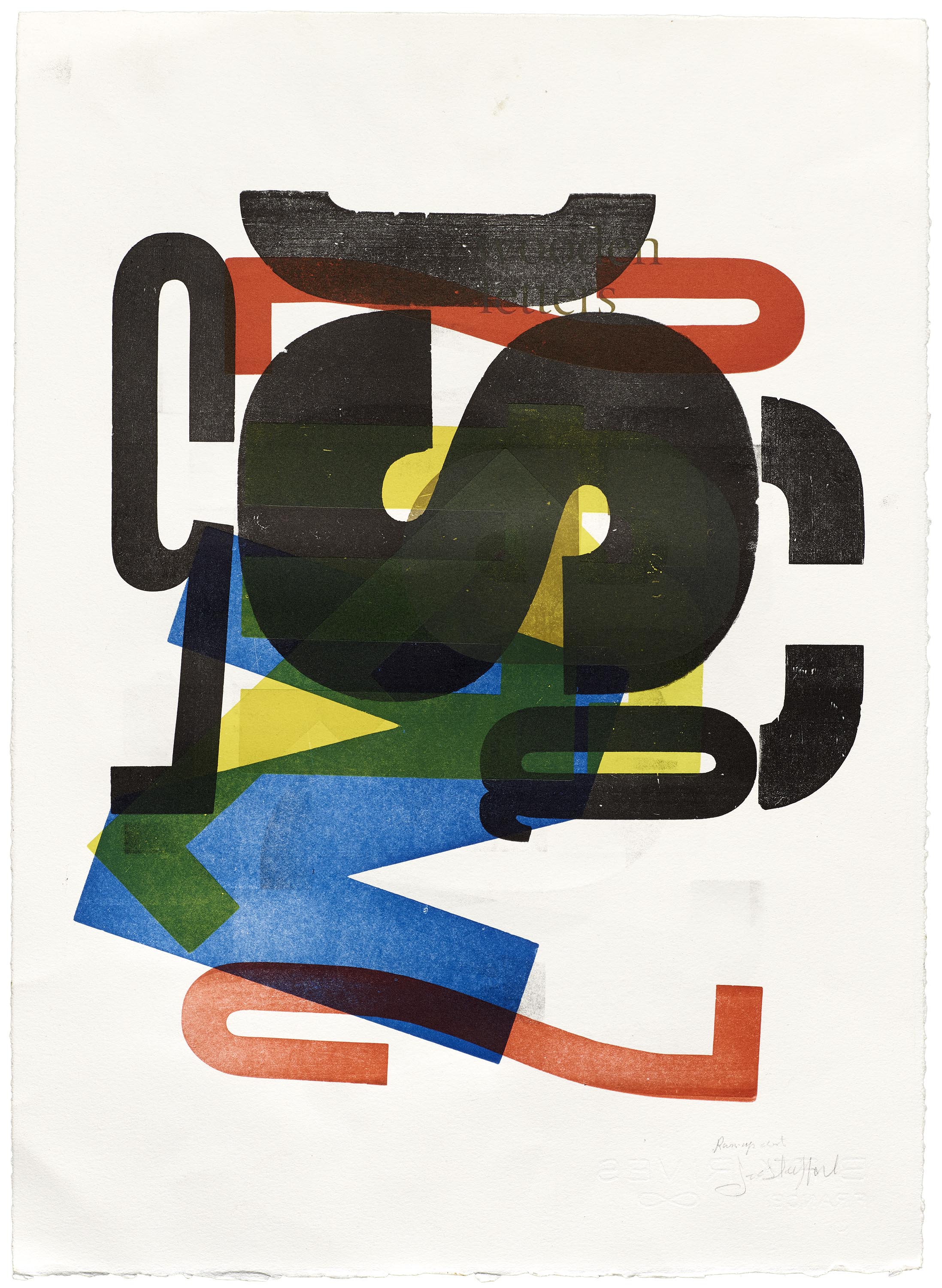
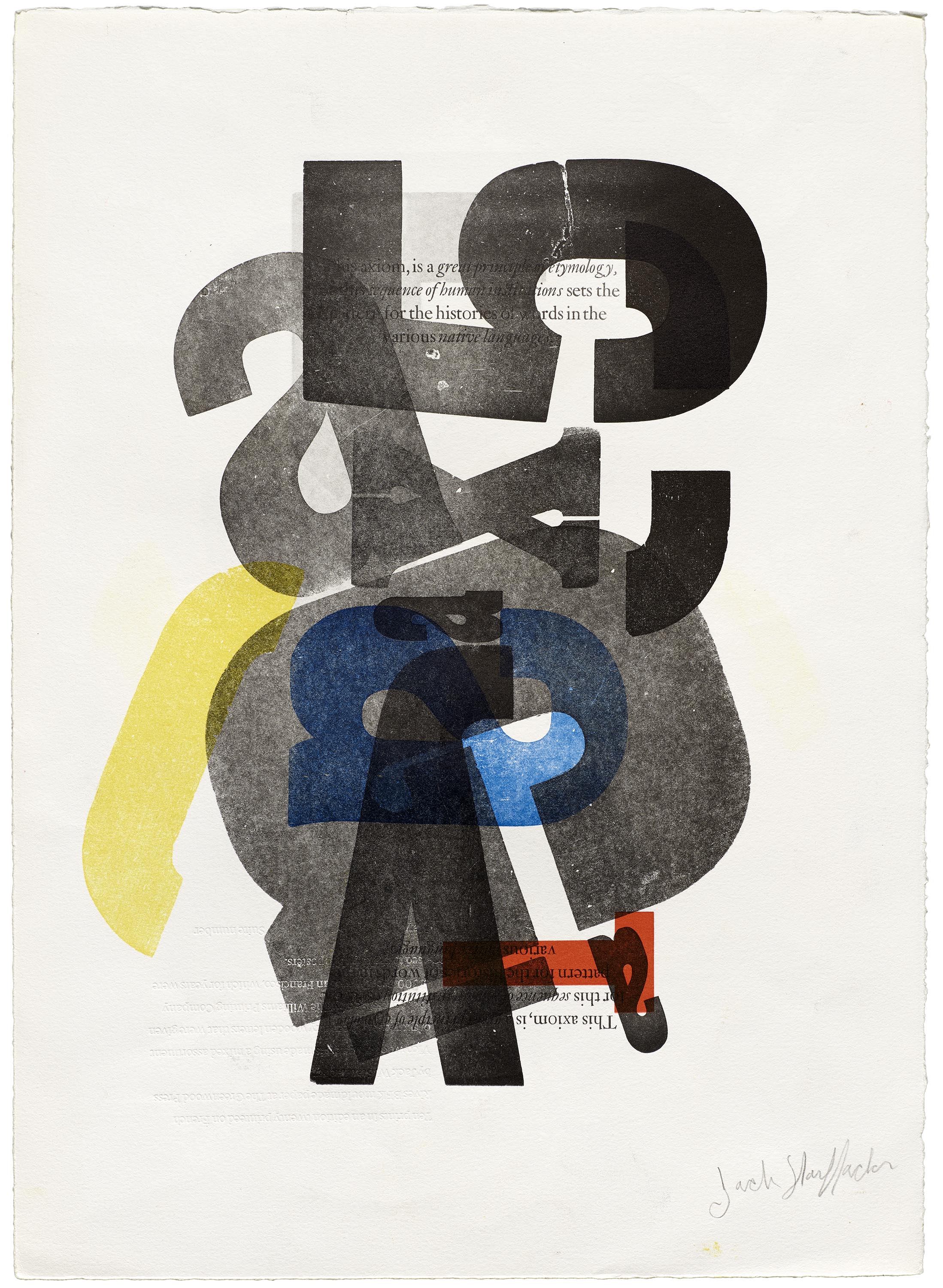
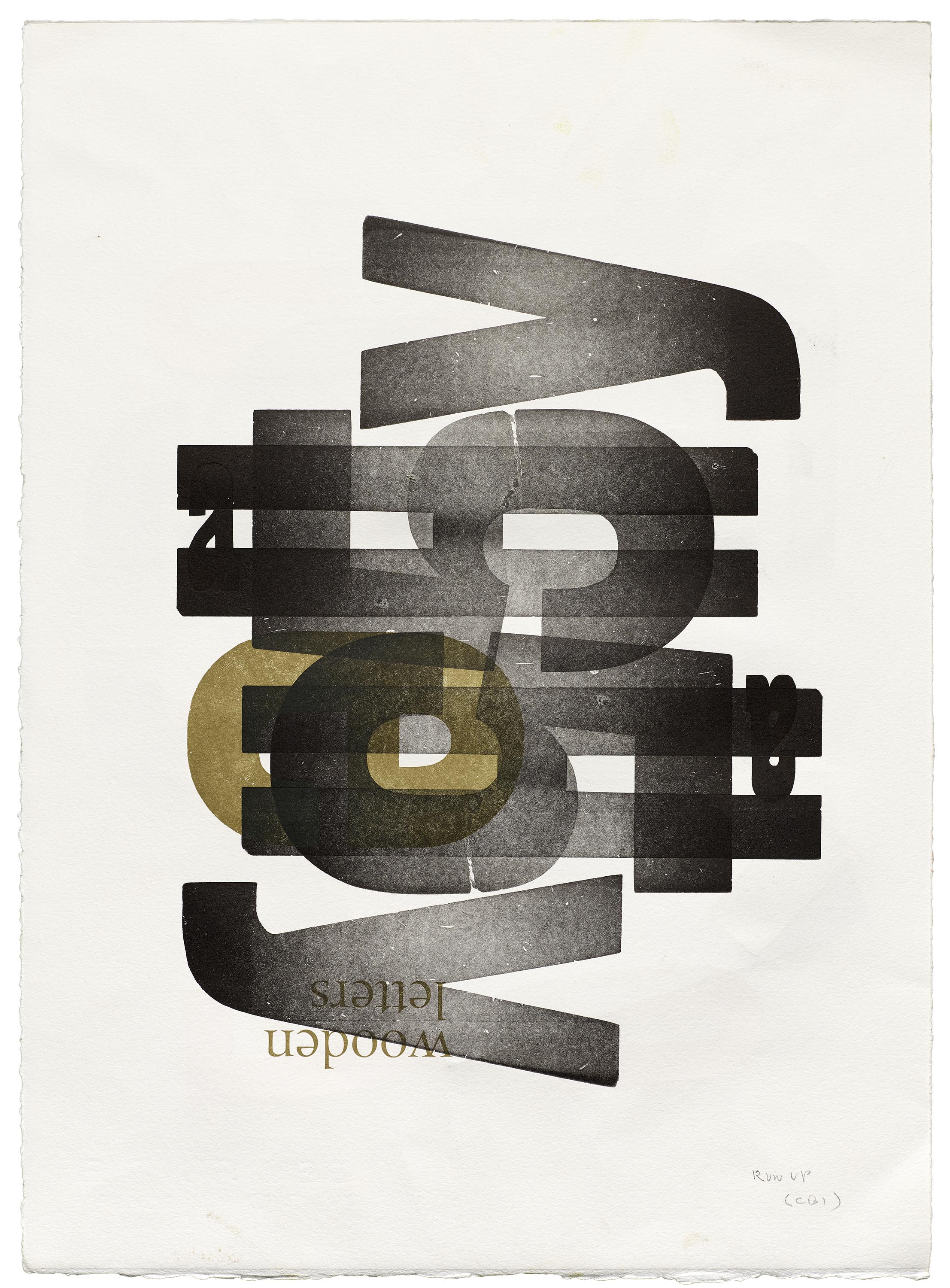
When it came time to select the cover art for the regular edition of Only on Saturday, an unusual direction emerged: the choice to feature one of Stauffacher’s make-ready prints. A printer feeds these sheets through the press to check position and ink density, often resulting in a riot of color and graphics accumulated from multiple print jobs. “Over many years, Jack would save these sheets if he felt they had something visually interesting going on that could be further developed into a successful print,” Byrne explains. “The result of this approach leads to a spontaneity that can be hard to come by.”
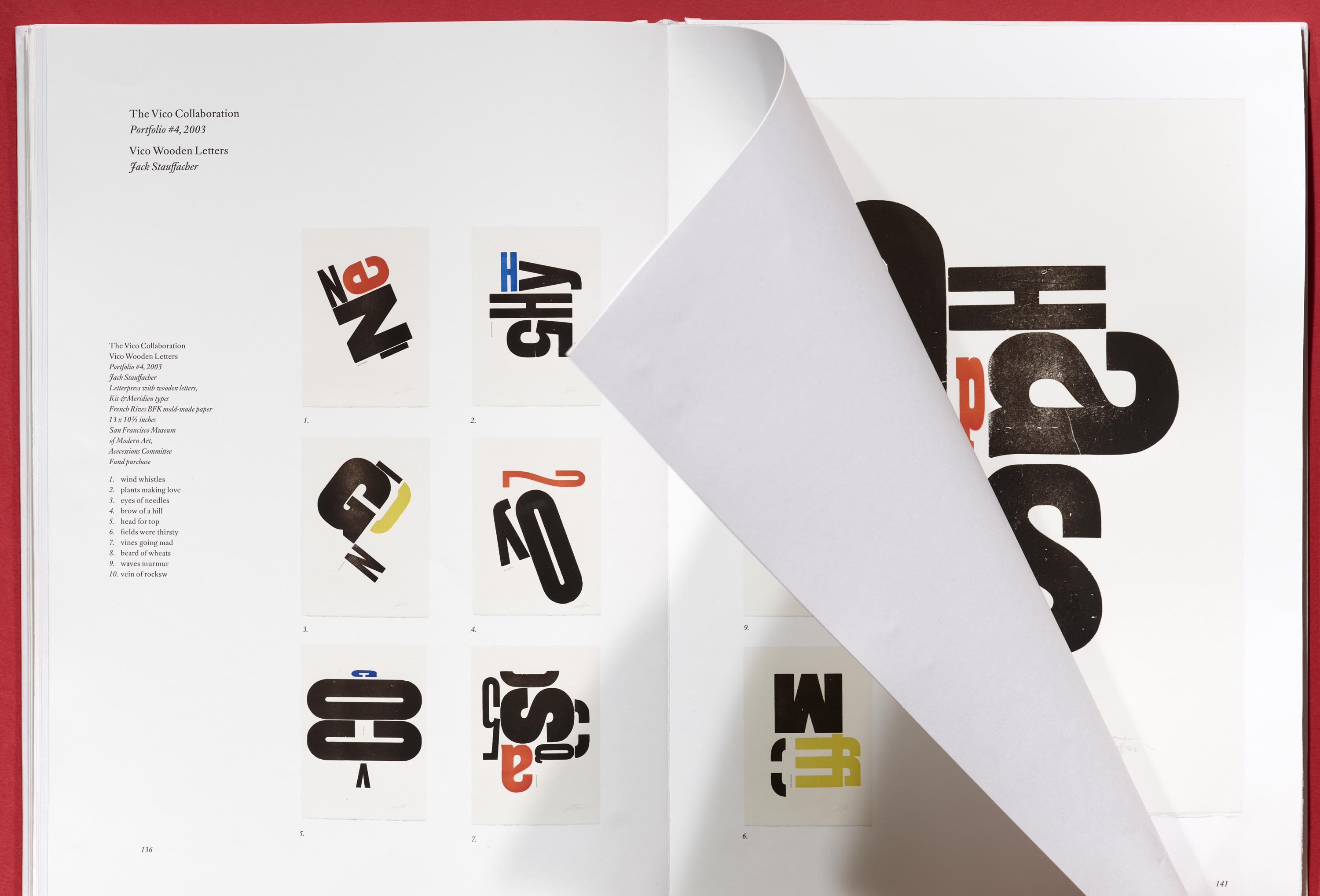
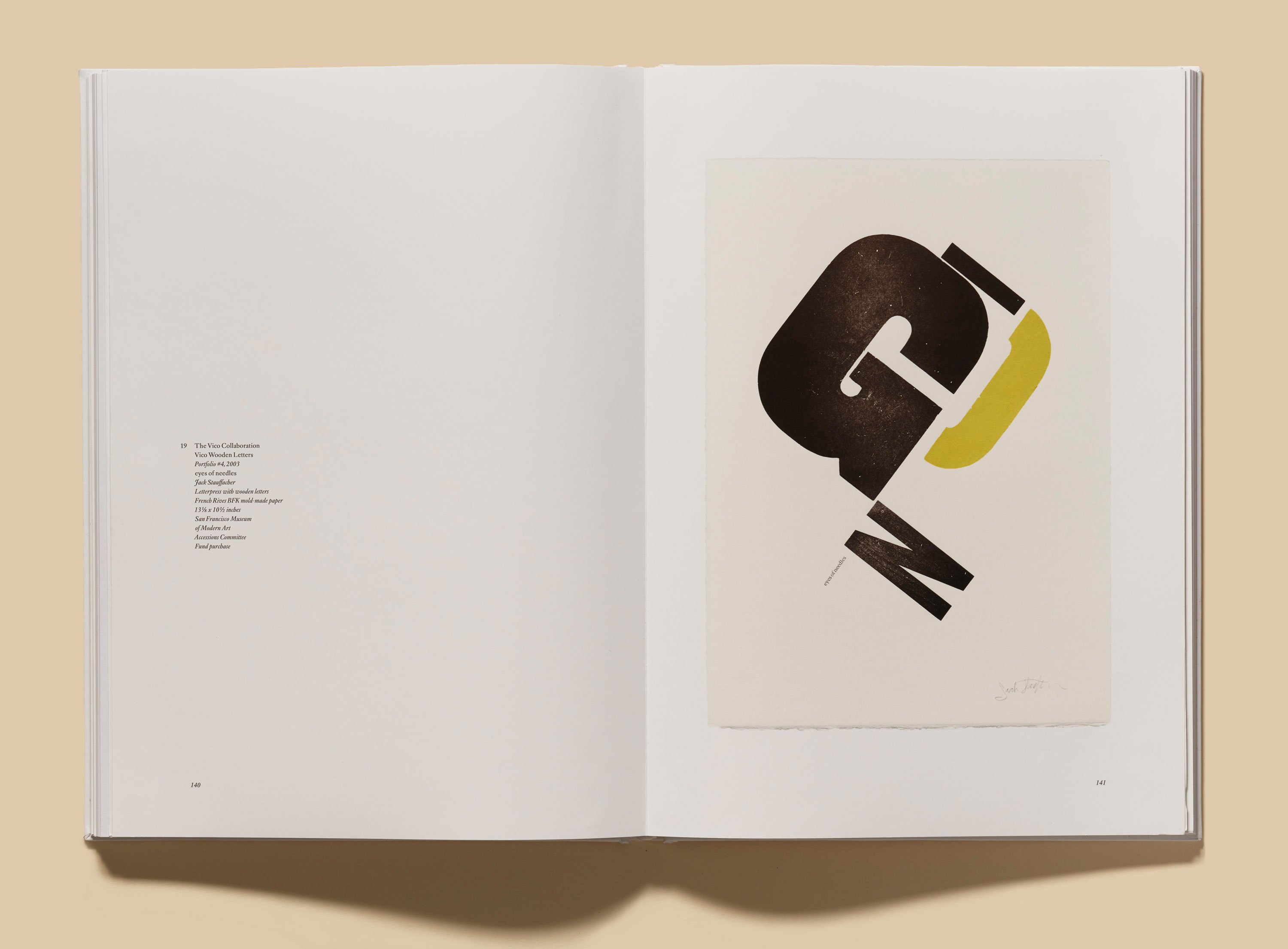
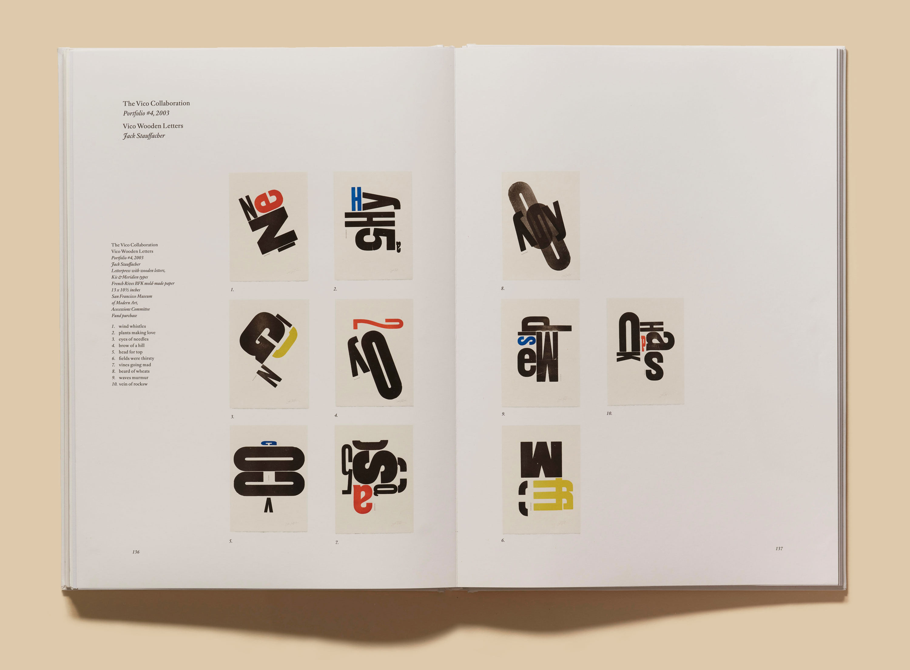
Byrne chose a make-ready sheet unique in its richness. A pair of red-orange 2s flanks an askew N in bold blue, while an indistinguishable jumble of acid-yellow letterforms peeks through. The brightness is tamped down by a layer of heavy black type (a loose grid composed of an S, a 5, an A, and Stauffacher’s famous broken C). At top center, readers can just barely make out the phrase “wooden letters” — the color and position of which signal that this make-ready might have first passed through the press around 2003, when Stauffacher was at work on Vico Wooden Letters, his fourth portfolio.
Why let a piece of process work speak for the book as its cover art? At Letterform Archive, we often find the process just as compelling as the finished product and look for ways to highlight design as an iterative practice. And Stauffacher himself singled out a handful of his make-ready sheets, signing them as intentional, complete pieces despite their more pragmatic origins. “Anyone who has ever seen a stack of make-ready sheets at the end of an offset press has said, ‘God, I wish I could design like that,’” Byrne half-kids. “The fact that Jack decided to work with them goes back to the fact that he was a real adventurer.”
The piece of cover art in question was gifted to Byrne by Stauffacher. “It became clear that this print was not a one-off thing but that Jack had done several of them,” Byrne continues. “We discovered that Jack had been exploring a viable new idea because these sheets were worked on — they’re not accidents by a long shot. In the end it made sense as the cover because it was the last thing we discovered about Jack. Over the last ten years of his life, I encouraged him to do more, but something that began as a series of chance events and then developed over many years was hard to replicate.”

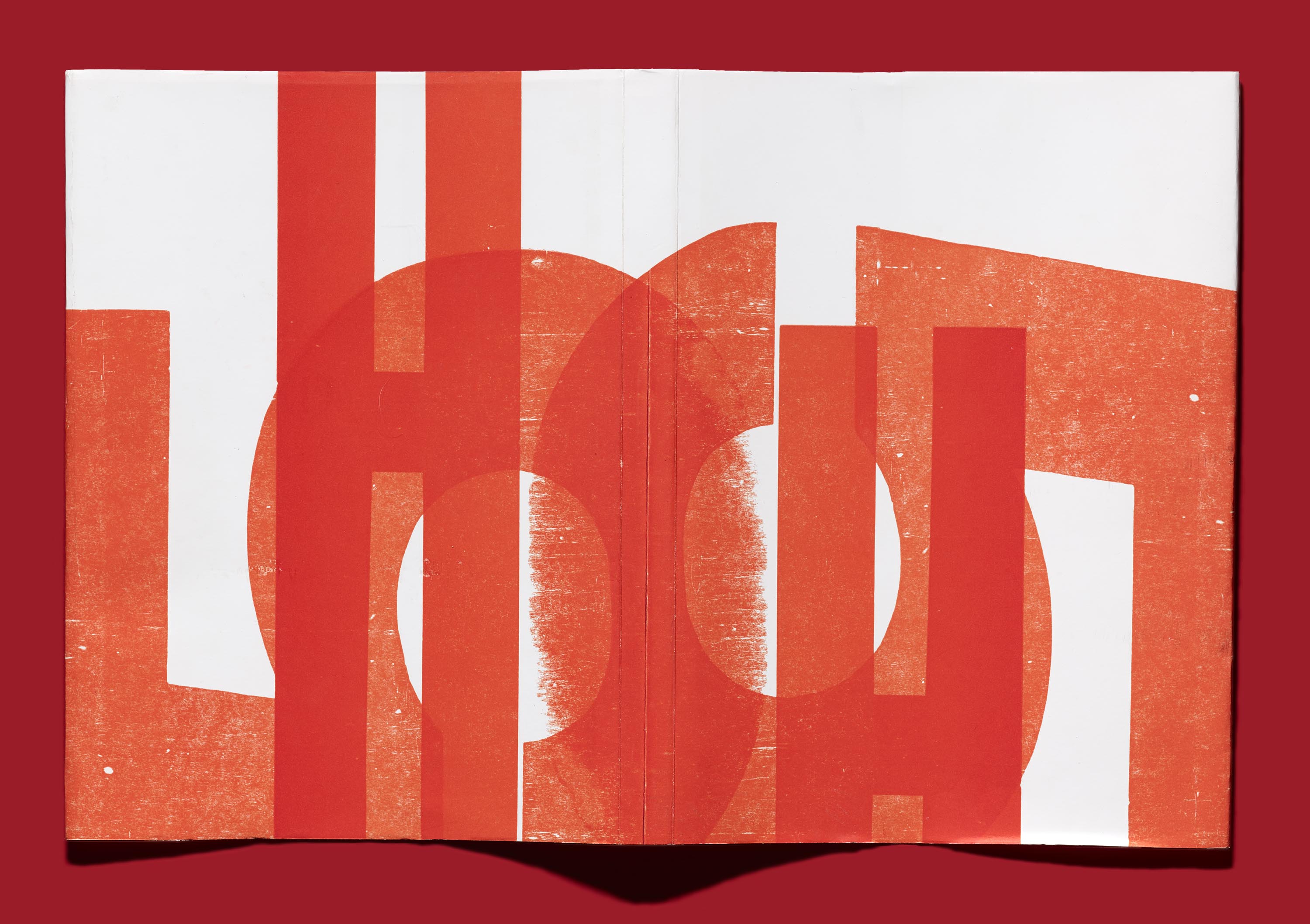
Stauffacher’s experimental make-ready sheets informed the jacket for the regular edition as well. Byrne shares, “Jack would regularly wrap a new book with an old make-ready sheet so that the book had a cover of his own making.” For his 1973 book At Hand, he produced two-page spreads with overlapping impressions of wood type running across them, which he then wrapped around pages of poetry so that only a single page with wood type appeared at a time. Letterform Archive curators had been involved in organizing Jack’s studio after his death, where they found a few of these press sheets. “We decided to reproduce a portion of one as the dust jacket for Only on Saturday”, Byrne relays, much like Stauffacher might have done.
“A lot of the material that is reproduced in the book was not known of or completely understood until the Archive gathered it up and evaluated it, and it became clear it was historically valuable,” Byrne says. “If the Archive hadn’t been there, I’m pretty sure this would have ended up in the dumpster.”
Designing for a Silent Client
Byrne was friends with Jack Stauffacher for nearly 30 years, so he knew firsthand what a vocal design critic Stauffacher could be. Representing that voice became crucial. “When I would meet to discuss the book with [Letterform Archive publisher Rob Saunders and associate publisher Lucie Parker], I would keep saying, ‘There’s a fourth person here, and it’s Jack,’” Byrne recollects.
“Doing a book on Jack required some adjustments to the way I usually work,” Byrne continues. “As usual, some decisions were easy and some hard; for instance, to what degree do you let Jack and his book design work influence the design of a book about him? Some things he held fast as practice — ‘There are a few good typefaces, and then the rest of them are a waste of time.’ But otherwise he was actually very good at trying to understand something that was new, that he had not tried before, or that had different criteria.”
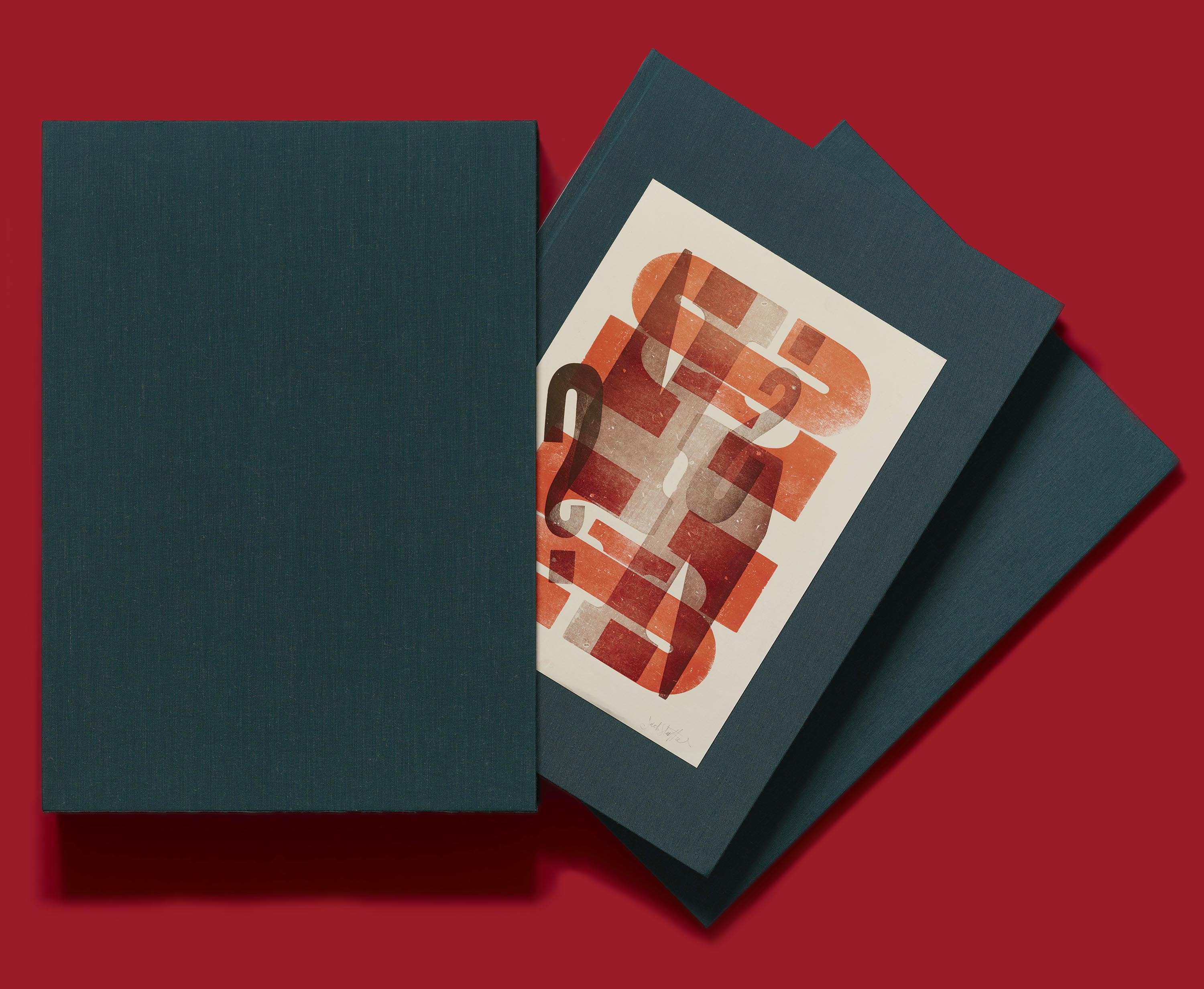
Stauffacher passed away in 2017, but he left ample breadcrumbs — all in the form of books, which he created for his Greenwood Press, fine arts institutions, and libraries. Byrne took care to choose materials and design elements that Stauffacher himself loved and used often. The book’s trim matches the size of Stauffacher’s standard portfolio (10 by 14 inches), and its pages are printed on paperstock similar in handfeel to his signature Mohawk Superfine. While Stauffacher liked sheets that are more natural in color, Only on Saturday is printed on white paper in order to better reproduce the ink colors he used in his prints. All three components of the deluxe edition (book, portfolio, and slipcase) are wrapped in Haromi Mohair Pine, the same deep-emerald Japenese silk that Stauffacher chose for his autobiography, A Typographic Journey, in 1999.
Peek into the interiors, and you’ll see a spare and restrained design with generously sized reproductions and inset portraits, many supplied by Dennis Letbetter, Stauffacher’s long-time collaborator and somewhat of a personal paparazzi. Byrne also set the book’s text in Stauffacher’s hallmark typeface, Kis, which he used for more than fifty years. “Kis was Jack’s favorite typeface but I had never used it. I would joke with him about his swearing allegiance to it. One time for his birthday I had a bunch of buttons made that said ‘Kis me.’ Everybody that knew him thought it was hysterical. But he took Kis so seriously he couldn’t figure out what the joke was,” Byrne remembers. “It turned out to be rugged enough to succeed in the book, which needed many different typographic conditions.”
Another consideration was accommodating the book’s components — essays, gallery thumbnails, and large-scale reproductions — in a clear and refined manner. “The book needed a somewhat complex grid to handle all the material’s various requirements,” Byrne shares. “But a complex grid was not something Jack would work with. His formats were simple. So, in the end, I think the book reflects Jack’s values but deals with organizational problems that he did not face. I think he would have gone along with what I have done — but only after he told me what was wrong with it, of course.”
A big decision involved selecting an image size for the portfolios and series prints. “I felt it was important to see all the prints in a portfolio [in a single spread] so that an entire concept could be seen and understood,” Byrne explains. “With the advancements in the Archive’s photography capabilities, we are able to use smaller images without a loss of clarity — even with small type in the prints. The improvement in resolution and the raking light technique has even made it possible to reproduce the texture of the paper that Jack used for most of his prints. Seeing so many images at the same time is very unusual when dealing with graphic arts reproduction.”
In the end, Byrne sought the elegant balance that Stauffacher was known for. “Jack’s approach to book layout was a matter of designing it so that the visual material did not override the organization and the organization did not override the visual. You want them to work together.”
You can learn more about Jack Stauffacher and Only on Saturday on our Kickstarter page. Only three days remain to help us make this book a reality! We are so grateful to our backers and to our community at large — thank you for helping us spread the word about this beautiful project and gentleman-printer.
— Lucie Parker, Associate Publisher