News
This Just In: Diamond Wooden Type Works
An untitled catalog and some tiny wood blocks from India invite us to rewrite type history.
In the North Indian city of Meerut, not far from the national capital of New Delhi, there was once a thriving wood type manufacturing scene. The industry there continued to operate much later than in other parts of the world, churning out letter blocks until the turn of the millennium, and contributing significantly to letterpress printing in the region and beyond.
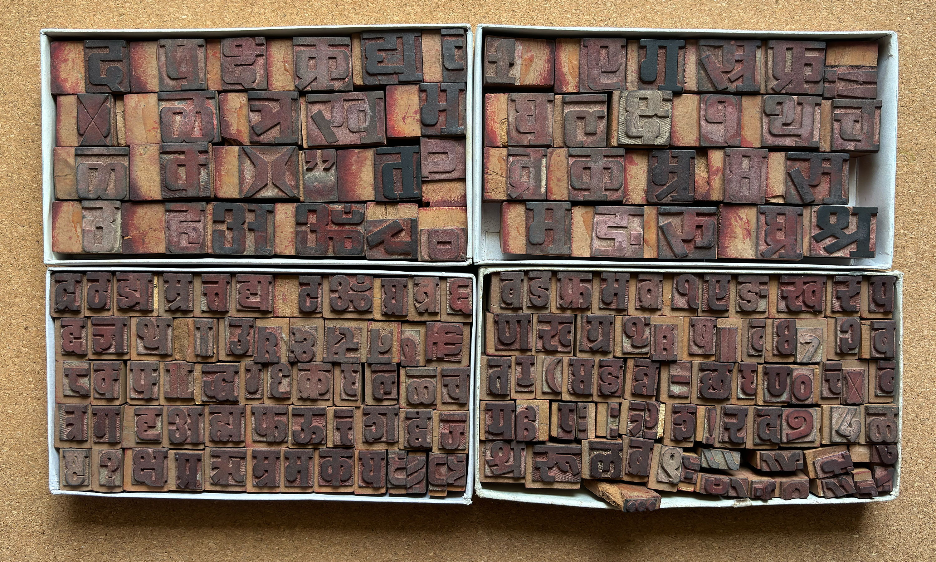
Letterform Archive holds two specimen books from Diamond Wooden Type Works, along with a few small blocks of type. Roughly hand-bound in blank covers, the catalogs nonchalantly contain a wealth of fascinating type history, from both India and the West, spanning languages and technologies. When the Archive first acquired these books a few months ago, we were struck by the range of styles and scripts represented, and knew there was a story to tell, so we sent our Indian correspondent on a mission to dig up some Diamonds.
Meerut’s Contribution to Printing in India
Book printing and publishing in India have evolved significantly since 1556, when a printing press bound for Abyssinia (modern-day Ethiopia) arrived on the Western shores of India in Goa. Jesuit priests stationed there used this press to publish religious texts. Initially, printing progressed slowly and was confined to Southern India, but it eventually spread to the northern territories.
The East India Company and the British government later accelerated printing and publishing efforts, producing official texts, circulars, and notifications. In Northern India, British administrative towns and cantonments, such as Calcutta, Lucknow, Kanpur, Agra, Meerut, and Lahore, were among the first to acquire printing presses in the 1800s. These companies in the North produced works primarily in Urdu, later adding Hindi to the mix.
Meerut, being an important military base, had many presses, with 48 listed across the 19th century. By the 1880s, the city boasted seven newspaper presses, the highest among the North Western Provinces. Additionally, Meerut benefited from a missionary establishment in nearby Sardhana, where religious presses contributed to the local publications.
Meerut grew to be an important center for wood type manufacturing in the country, and in the middle of the 20th century there were some 400 wood type companies in the area around Shahpeer Gate at the center of the city. Among these were Diamond Wooden Type Works, as well as Well Done Type Works and Excellent Type Works. Each shop would have 10–12 workers skilled in hand-cutting the letters for various print jobs, and it was not uncommon to find multiple generations trained in similar roles.
From Rubber to Wood: How Diamond Type Was Made
The preferred woods used for making type were Haldu (Haldina cordifolia) and Phaldu (Mitragyna parvifolia) from the Rubiaceae family. Both species were commonly found in the wild and were easily carved, making them ideal for detailed engravings and suitable for creating wood type. Wood from Haldu has a yellowish hue, while Phaldu reveals a reddish color when cut.
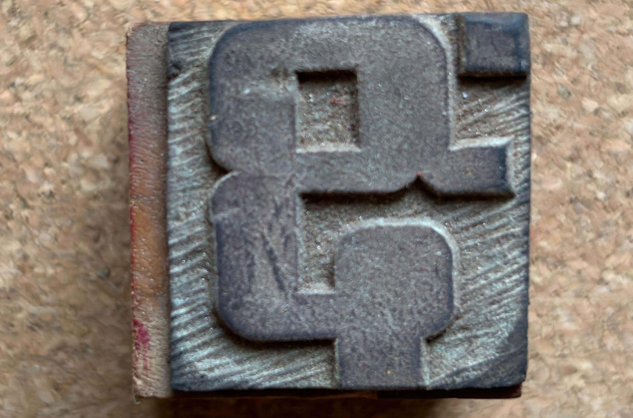
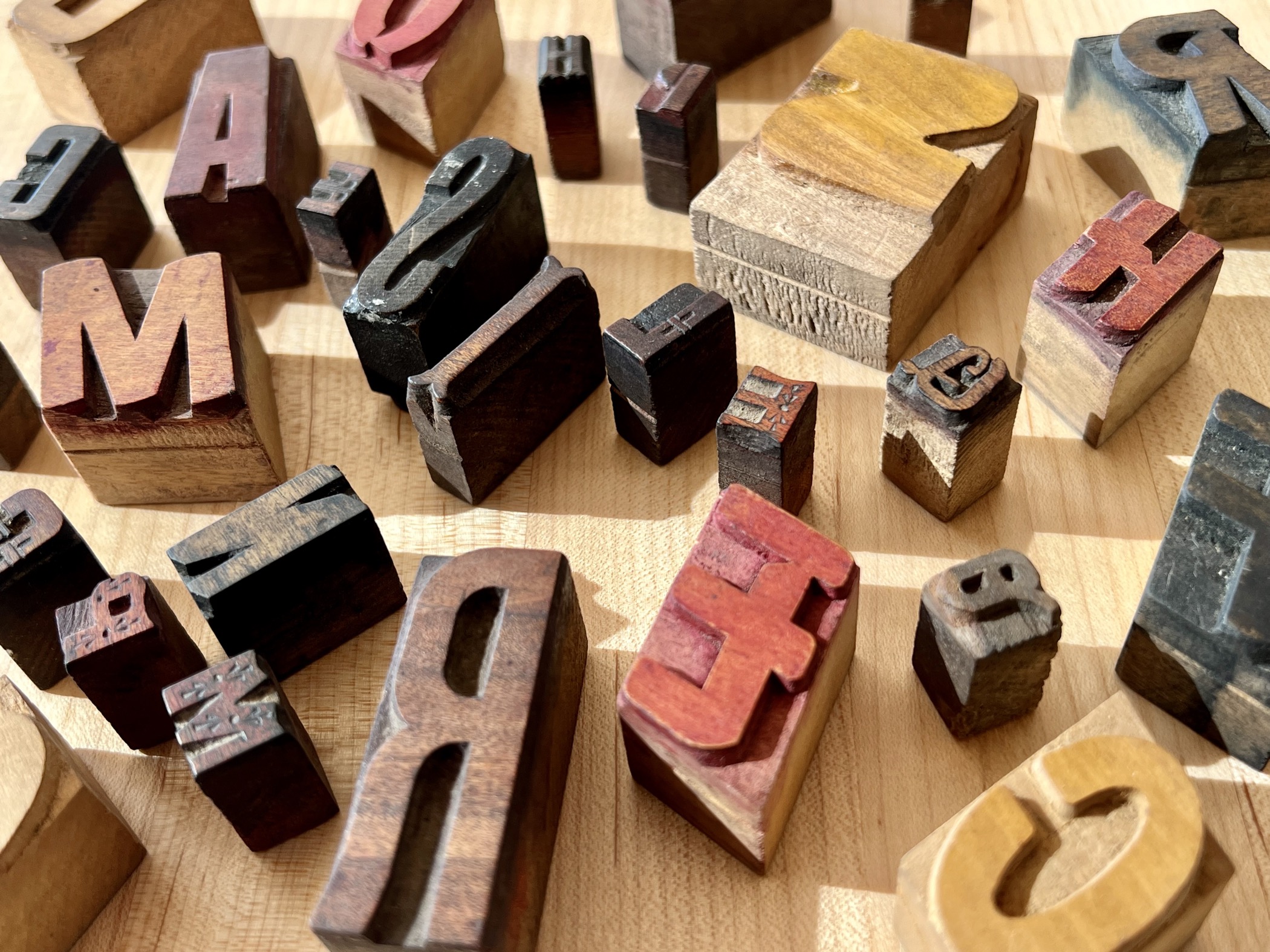
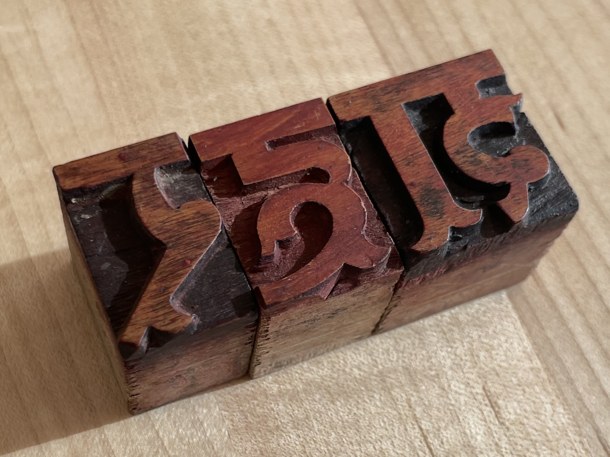
Once the timber was processed, flat blocks were marked with rubber stamps, imprinting letter designs with a mirror (wrong-reading) image. The exact method used to make these stamp patterns is unclear, but visible chisel marks indicate they were hand cut as well, a notable departure from the more mechanical way of making wood type in the West, where the pantograph was the primary tool. The rubber sheets containing the letter patterns were then glued onto pieces of wood, forming stamps. Stamped blocks were then hand-carved to create the final type that would be packaged and sold as font sets.
The Catalogs
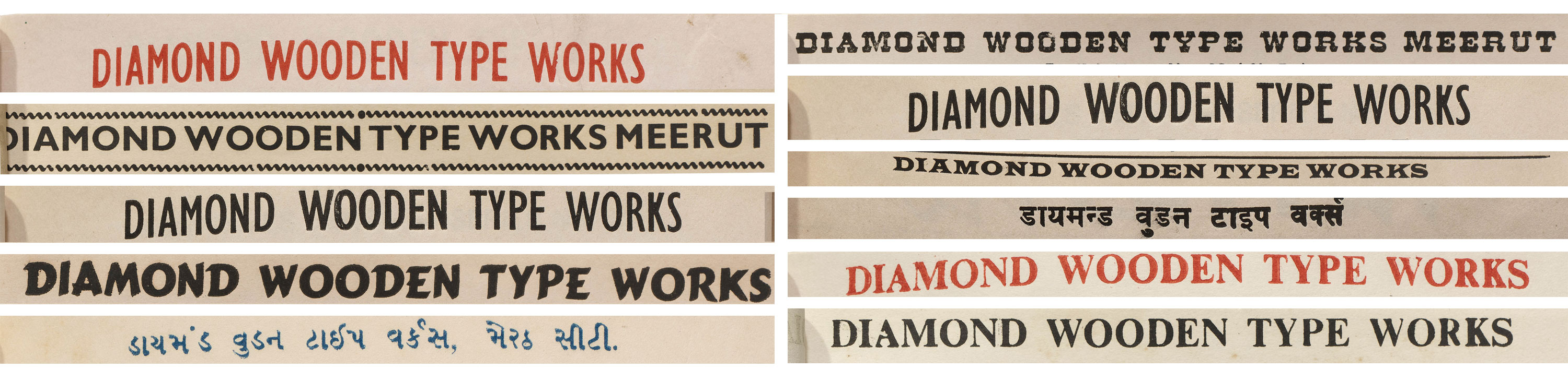
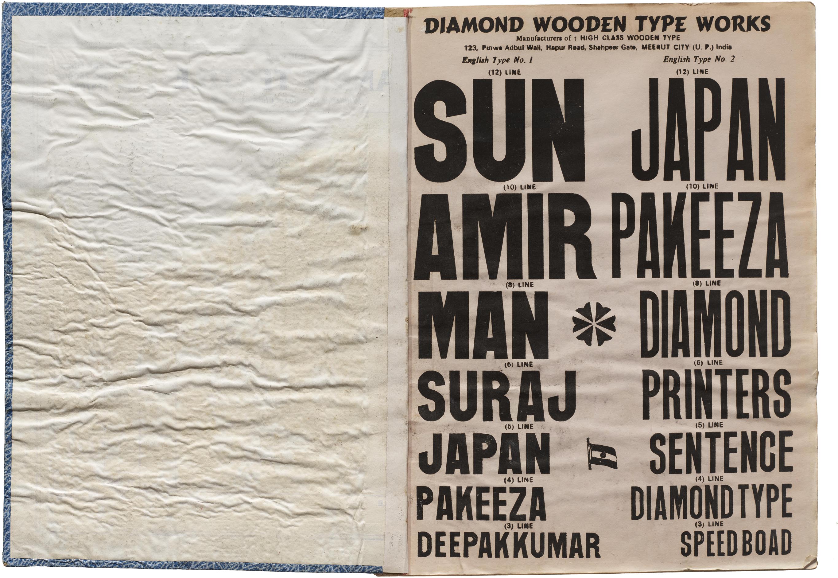
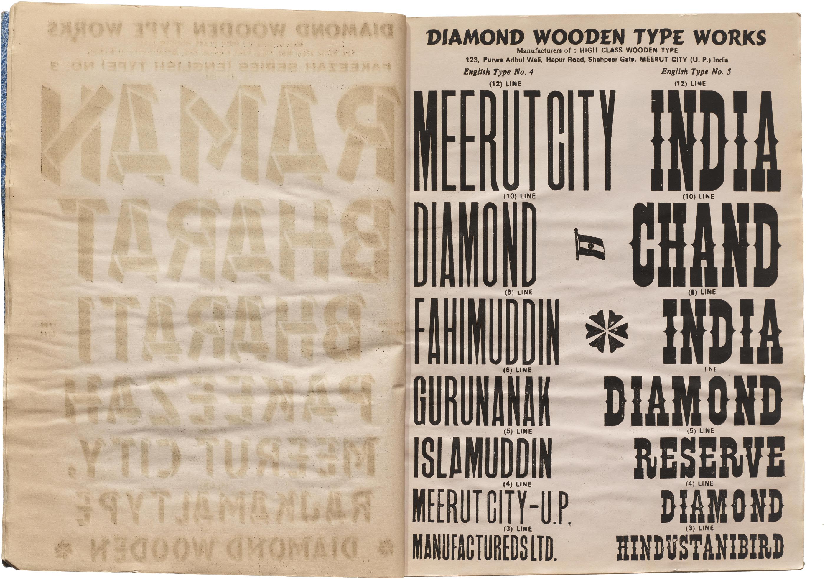
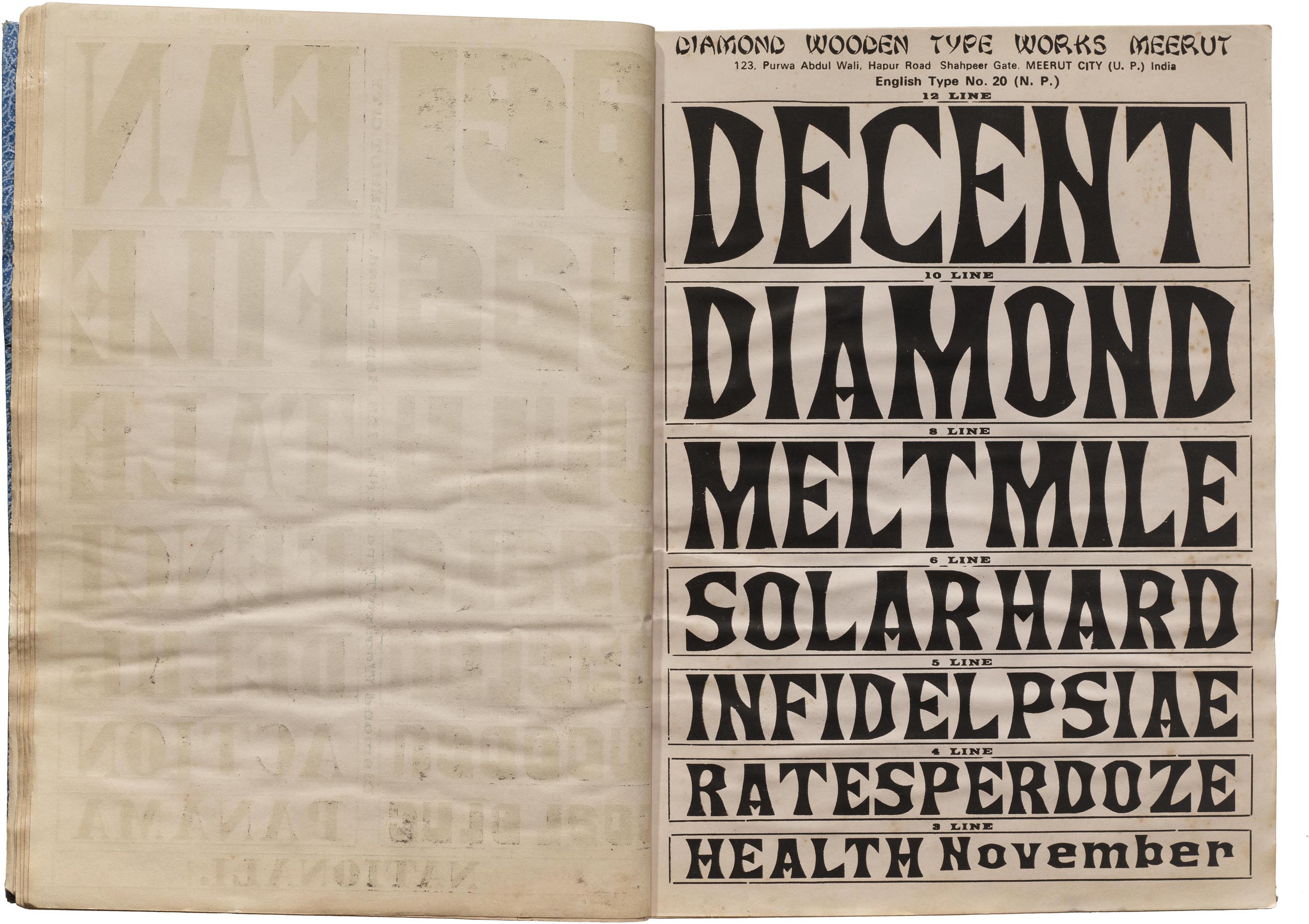
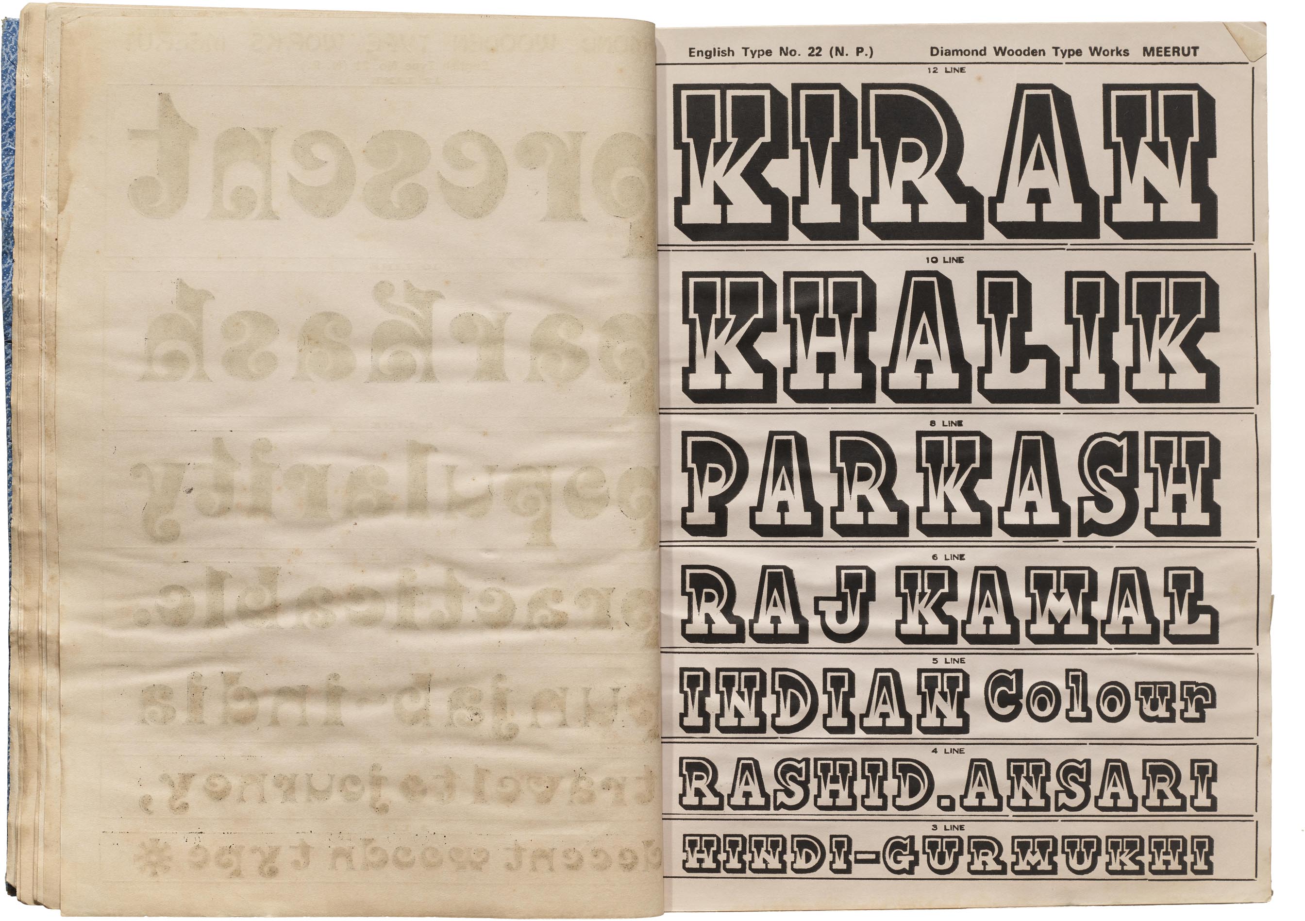
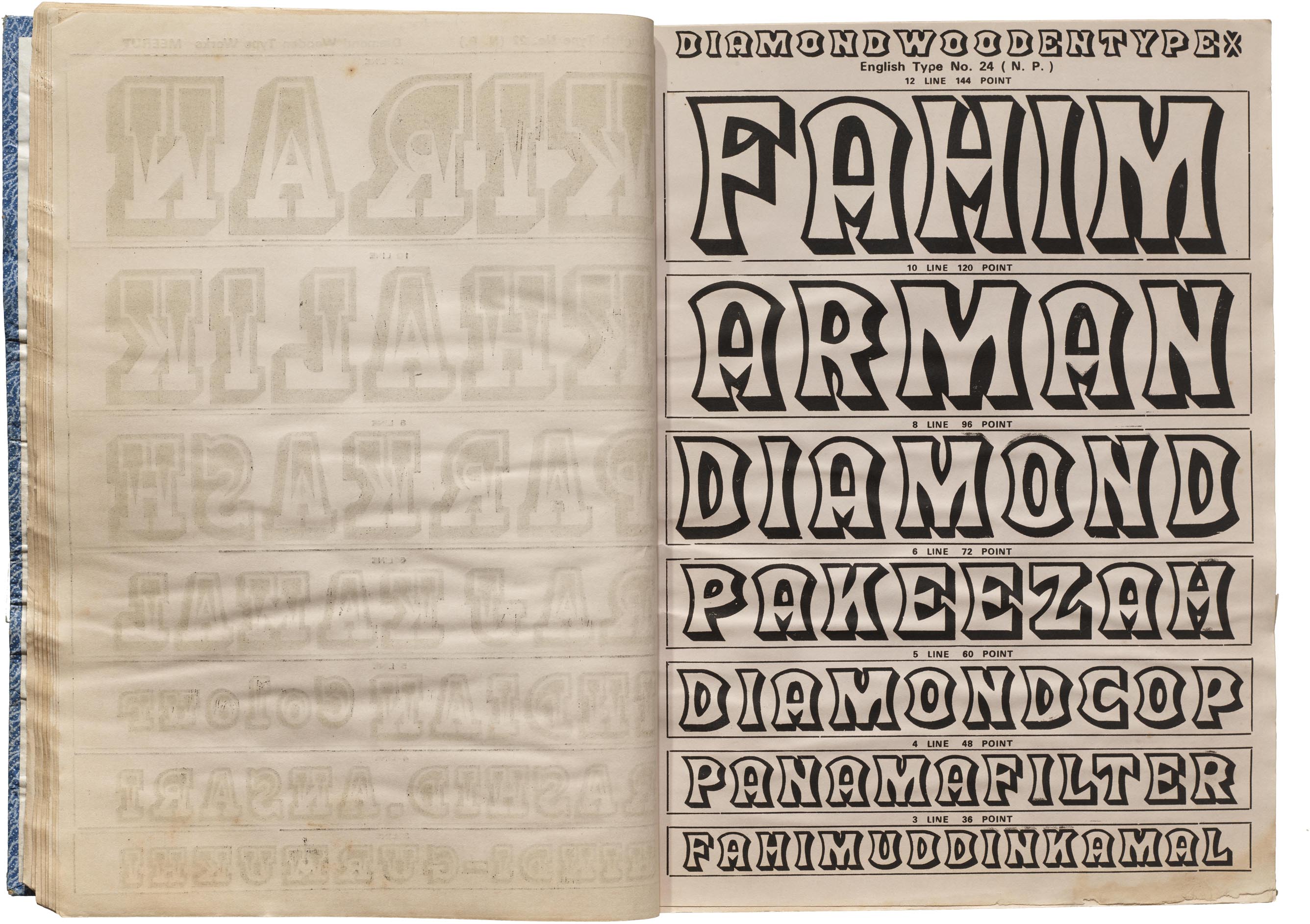
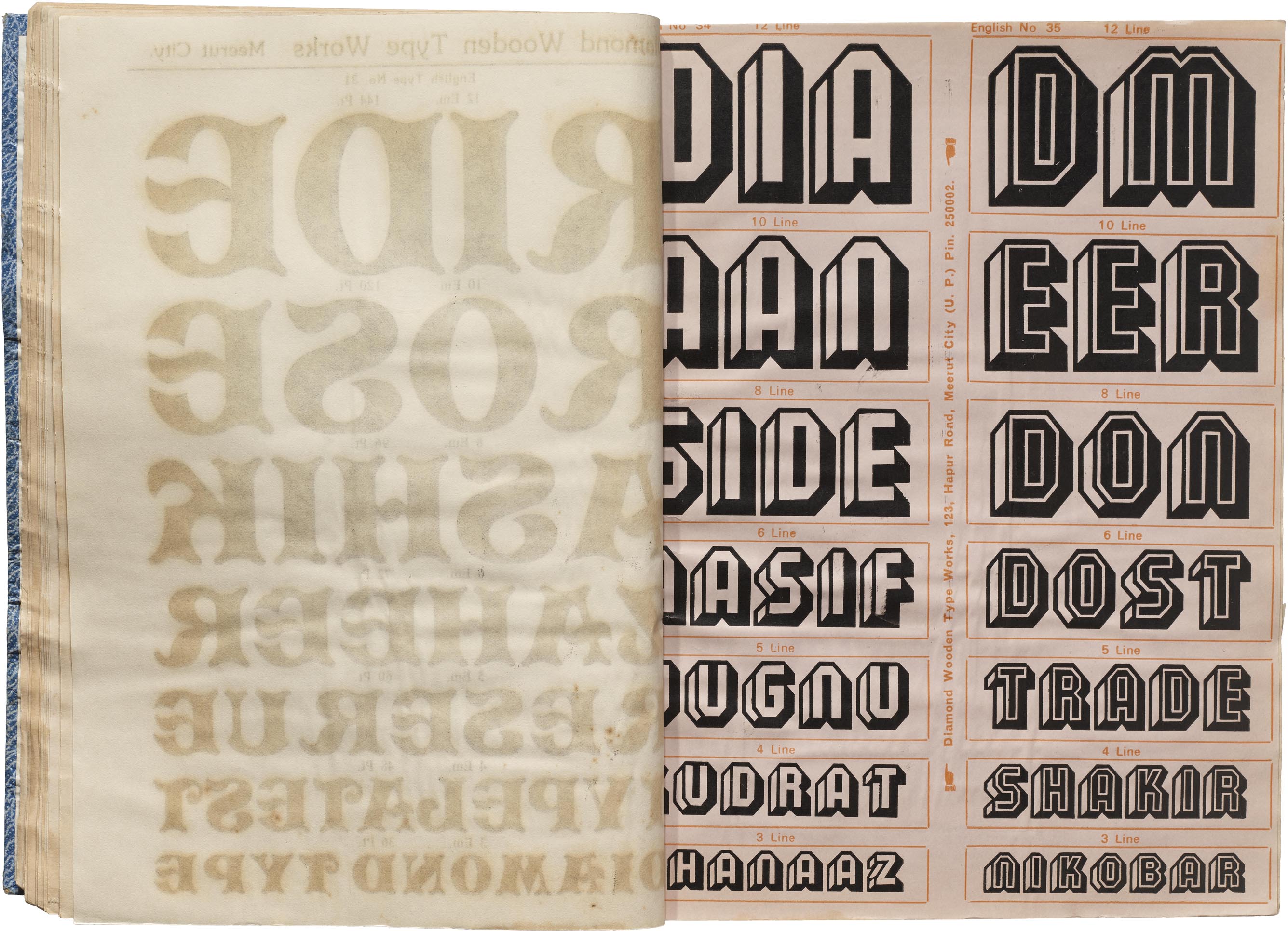
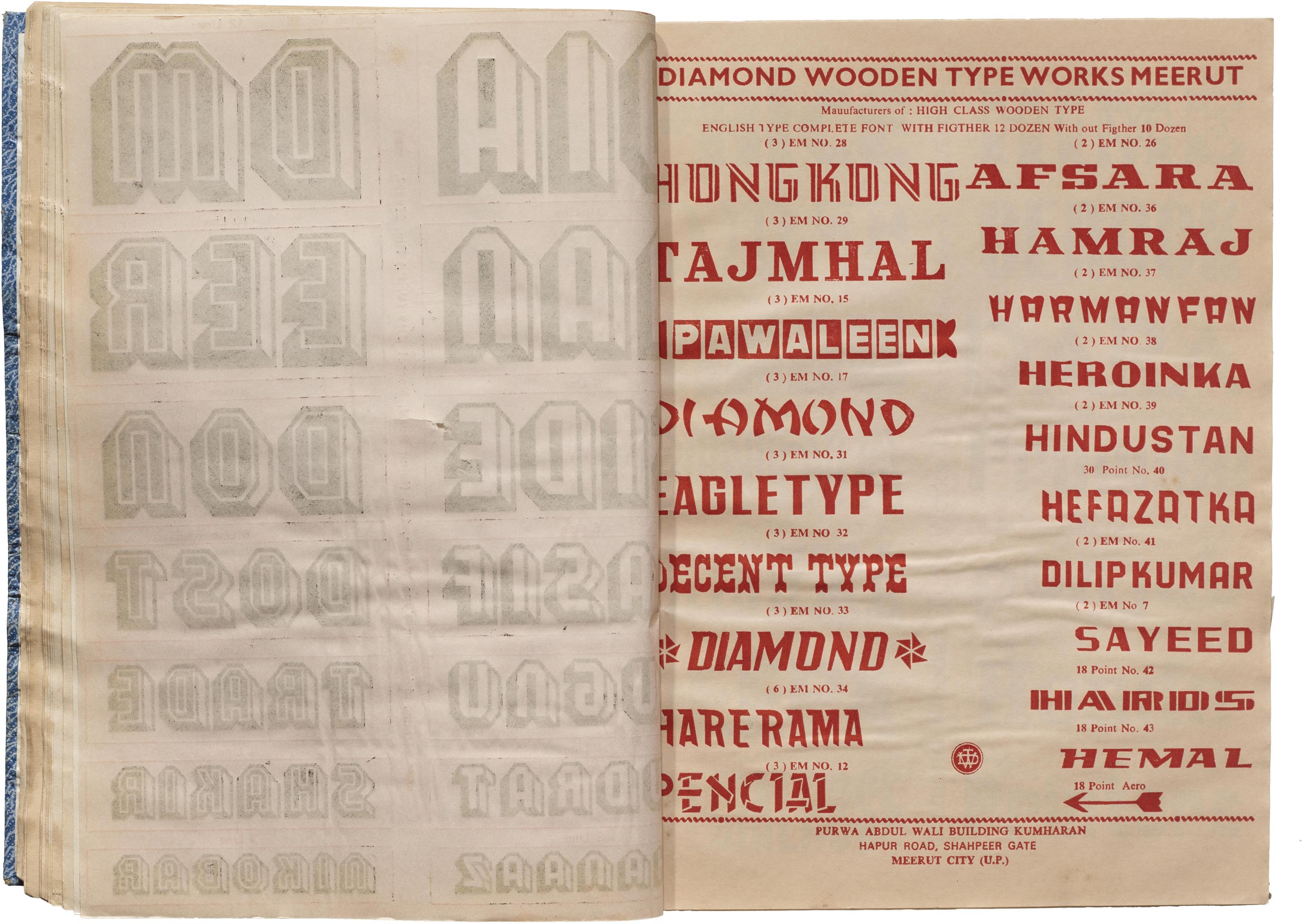
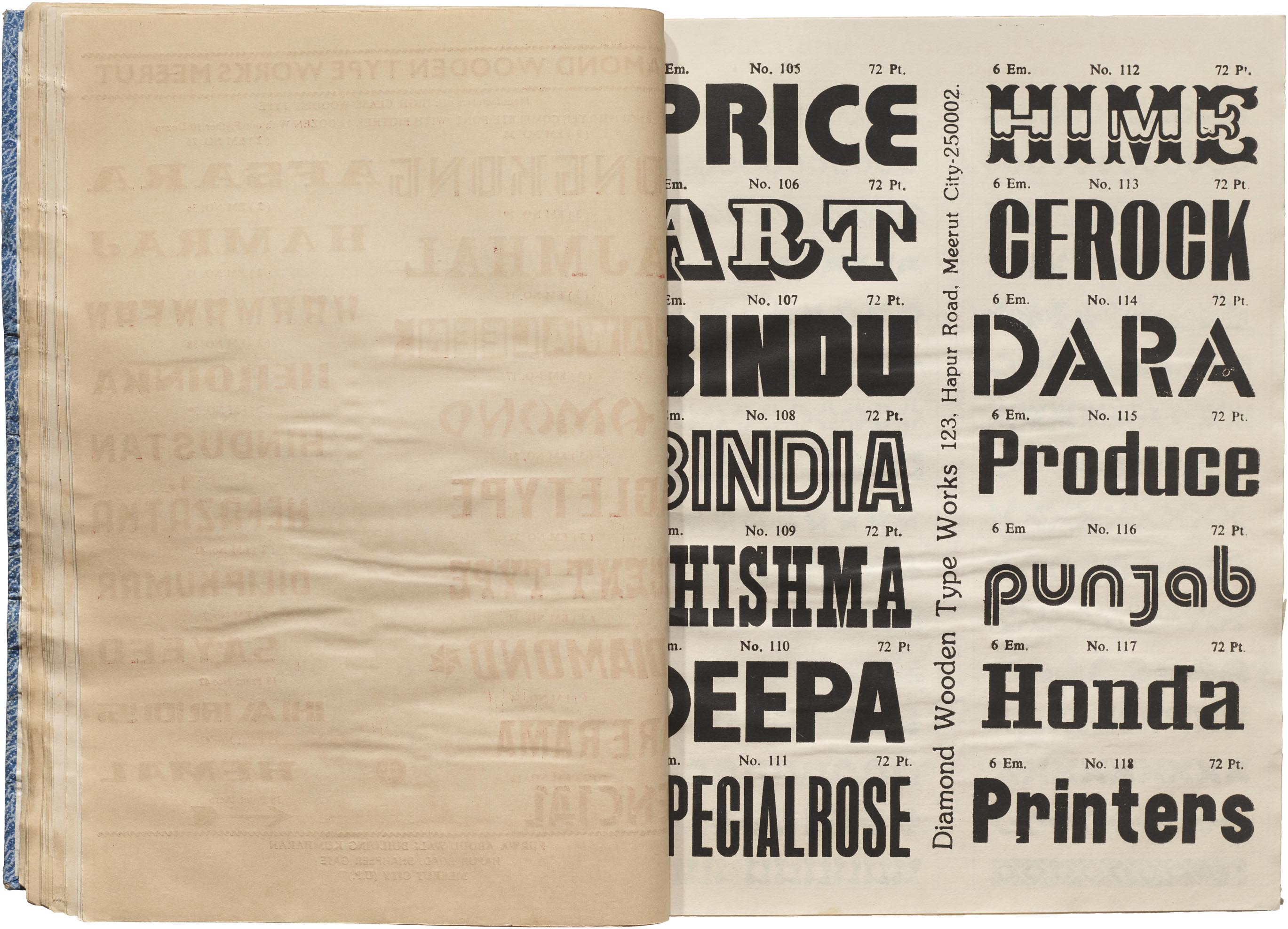
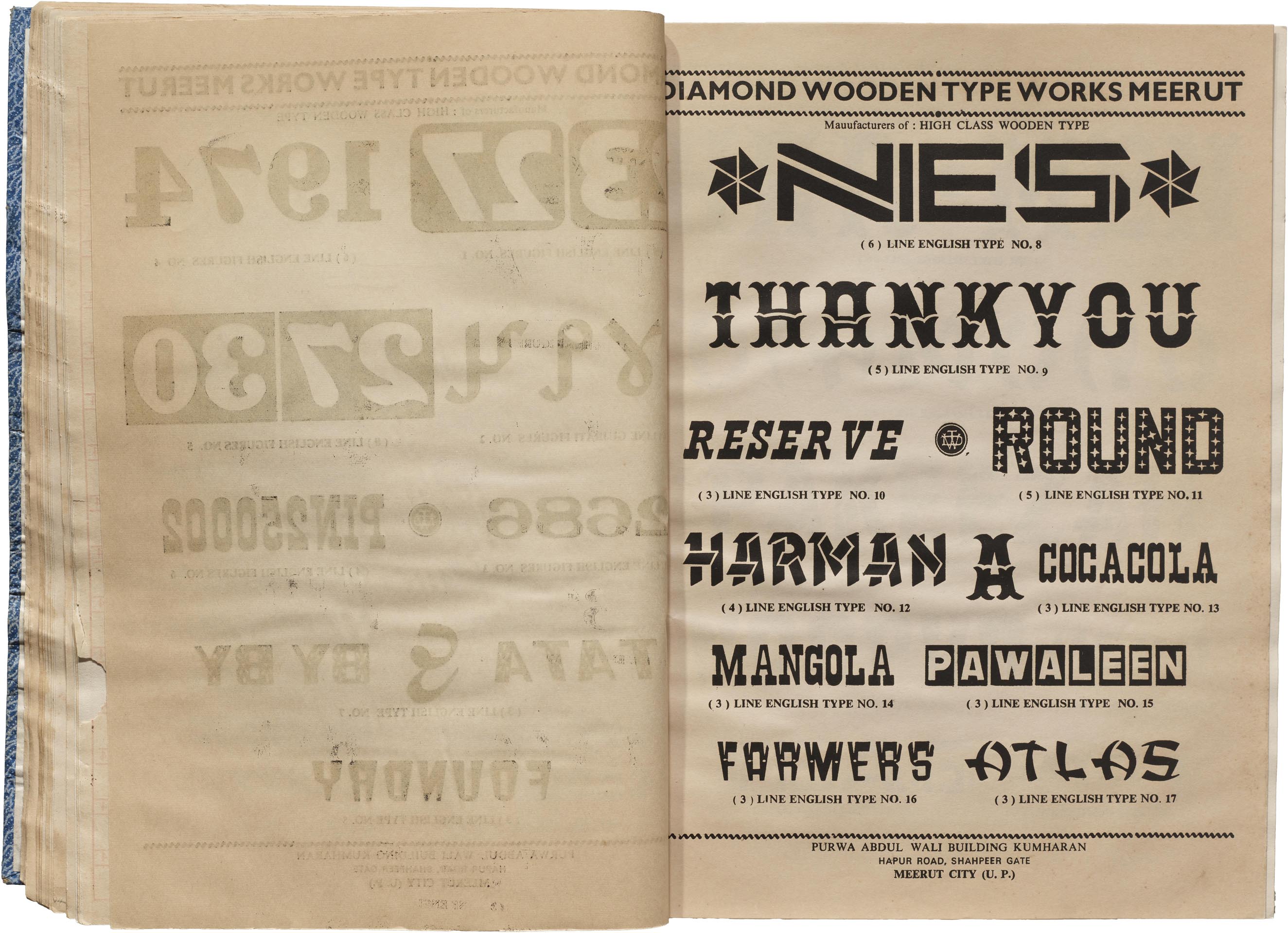
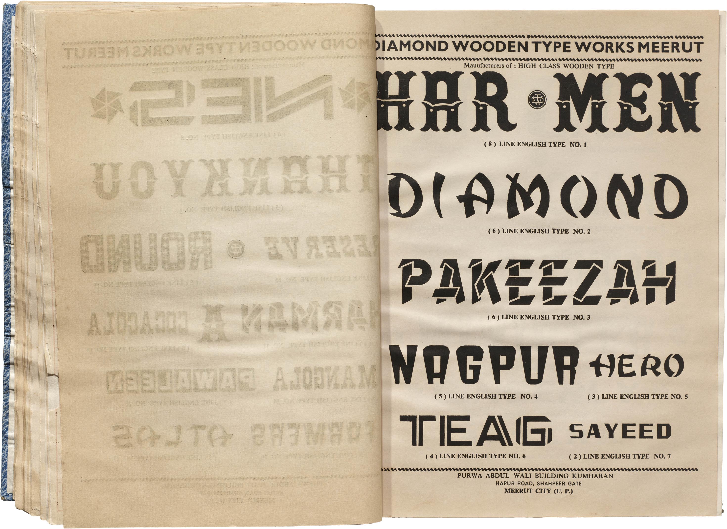
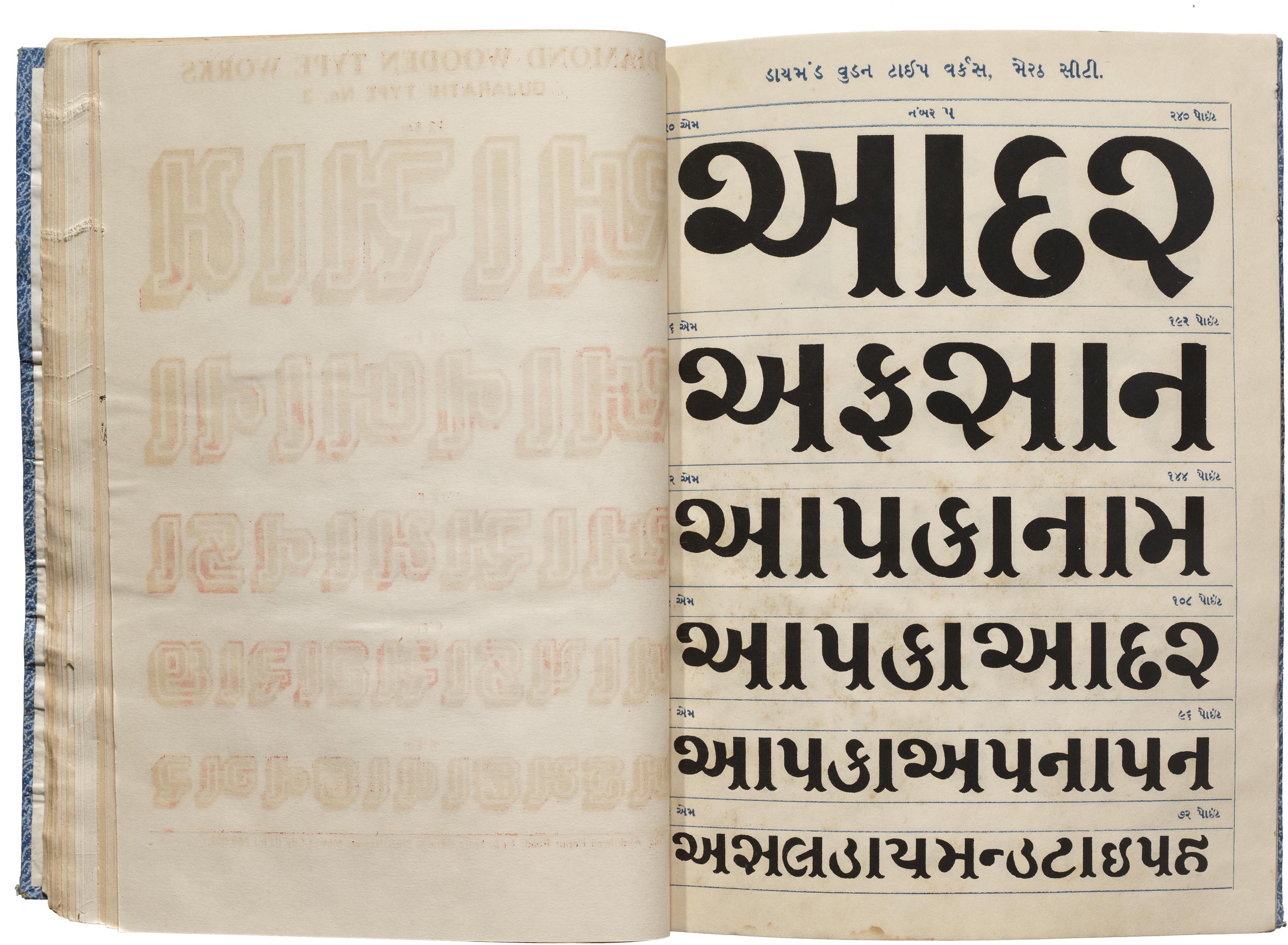
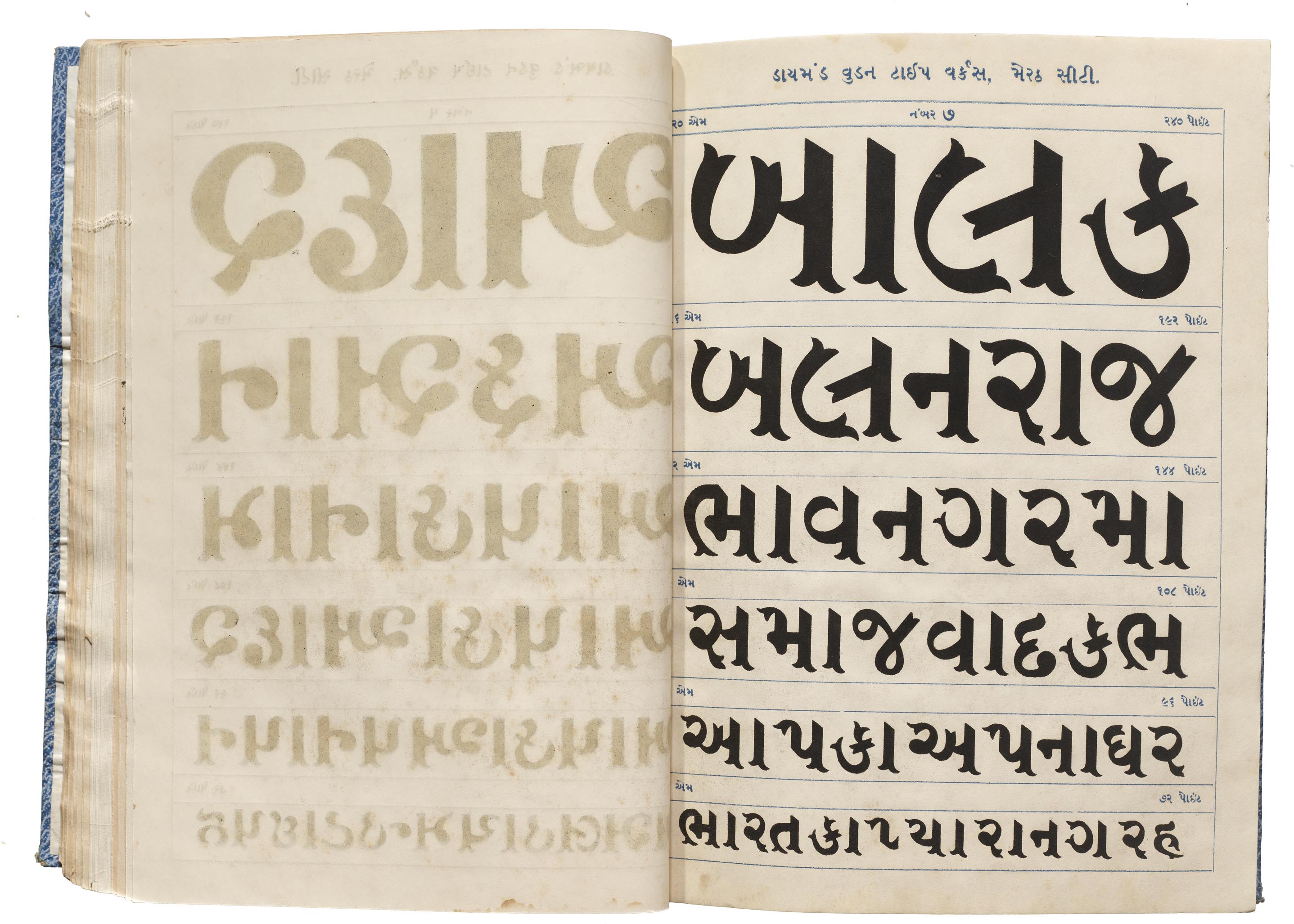
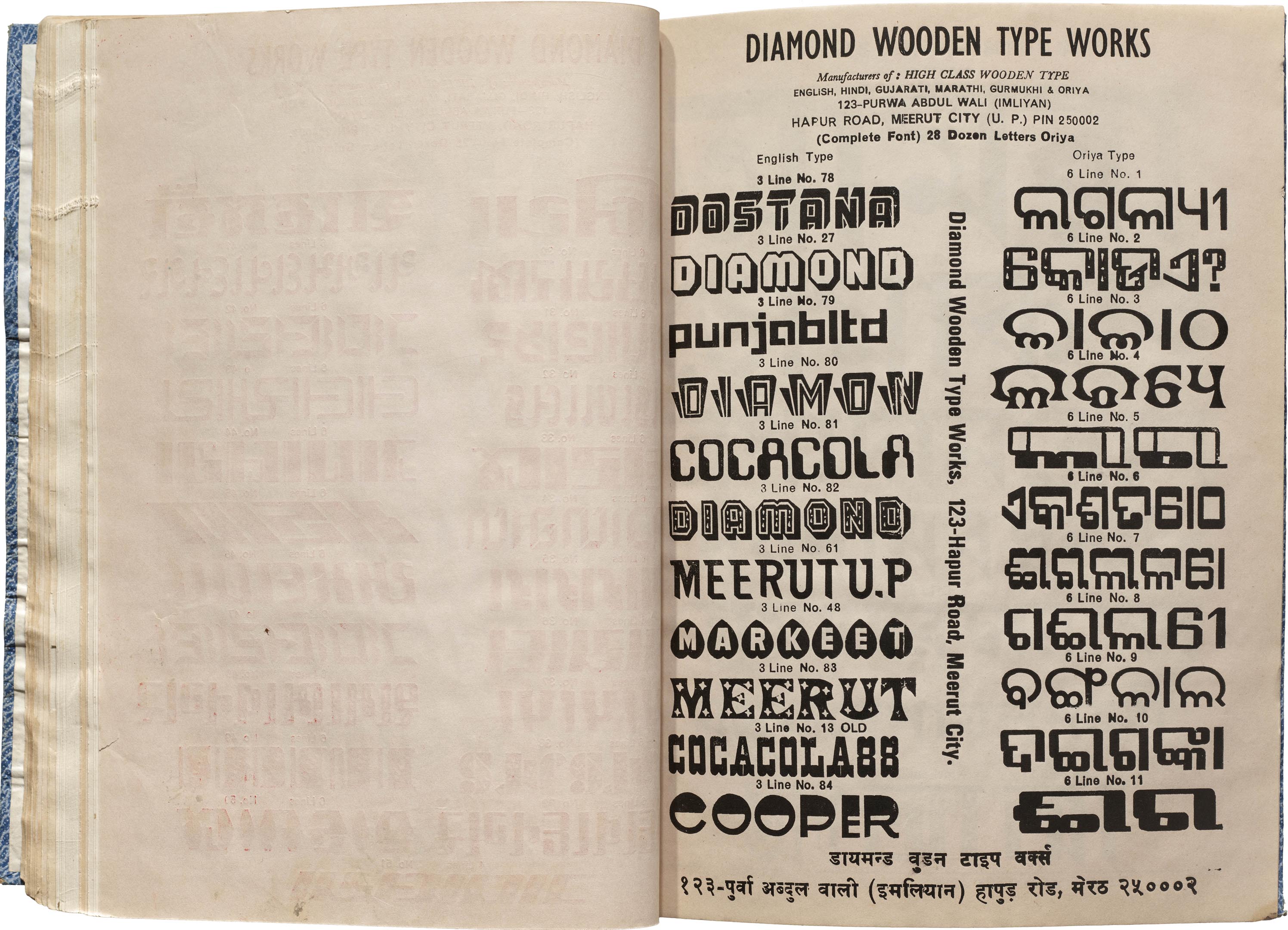
The two Diamond specimen books in the Archive’s collection are undated. They are bound collections of loose sheets printed over the years, as evidenced by the changing headers throughout. The typeface names are consistently in English, with some exceptions on a few Gujarati specimen sheets, and the designs range widely, from sans to serif, from a wide brush style to a very condensed display, from traditional to modern, with decorative deviations throughout. Many page titles are accompanied by the tagline, “Manufacturers of: HIGH CLASS WOODEN TYPE,” and most pages include the company’s address, effectively turning each page into a visiting card, so individual sheets could be distributed on their own. One of the page footers also mentions A. N. Printers, a Meerut-based press where the specimen was published.
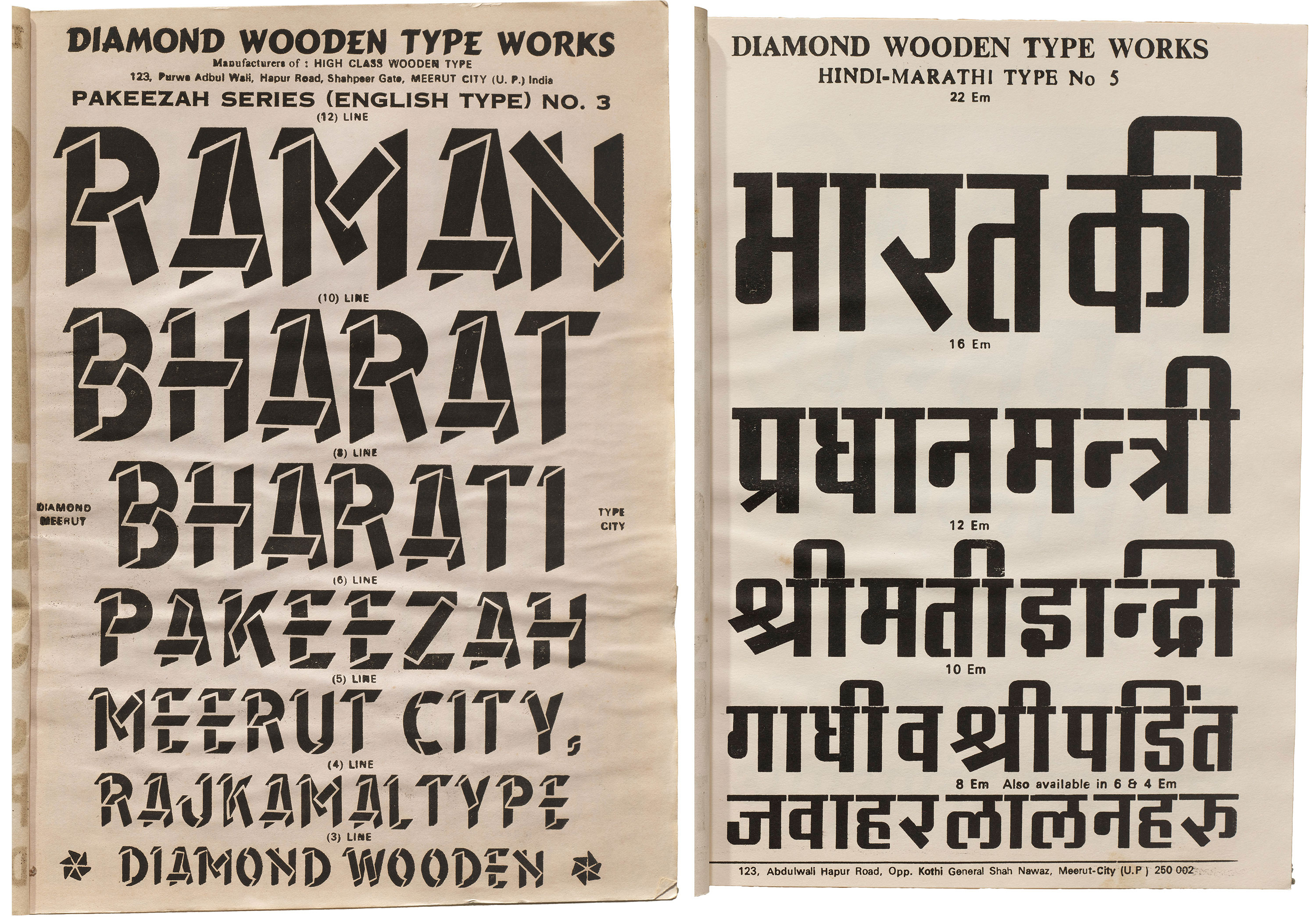
Diamond’s typeface names and specimen texts borrowed from popular culture to make them stick in the minds of printers. A Latin typeface called Pakeezah shares its name with the highest grossing Bollywood film of 1972. Another page uses the names of two Indian Prime Ministers, one of which is India’s first female PM, Indira Gandhi, who led the country for two terms in the 1970s. These words suggest that the sheets were printed around that time period.
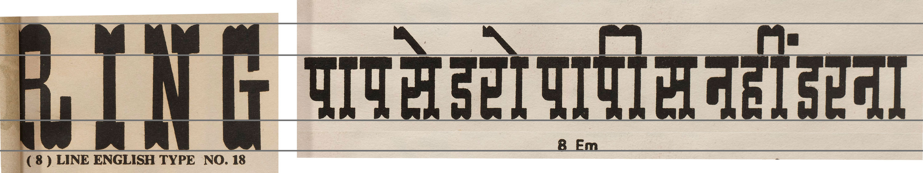
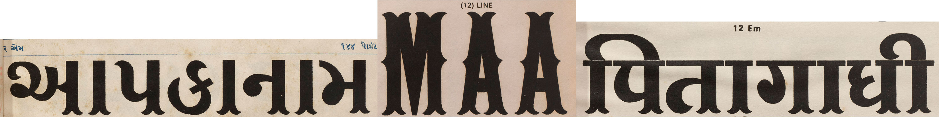
Curiously, throughout the books, the size labels keep changing. Latin types are initially listed in “lines,” as is common in British and American wood type where one line equals 12 points. Suddenly, however, the unit of measurement shifts to “em,” which Diamond uses interchangeably with “line”. This inconsistency can be found across multiple catalogs and suggests an evolution in the company’s standard terminology, as there is no sure way to date each of the pages.
Diamond’s types are advertised at sizes as small as 2 line (24 point). Traditionally, in Western printing practices, wood was predominantly used for large type, as casting metal at such sizes was heavy and costly. These catalogs demonstrate how Indian printers used wood type for a variety of purposes, large and small – possibly due to the availability of labor for hand-cutting the blocks. One such application, and perhaps the last, is still ongoing: printing plastic bags known as pinnis for small shops.
The Scripts
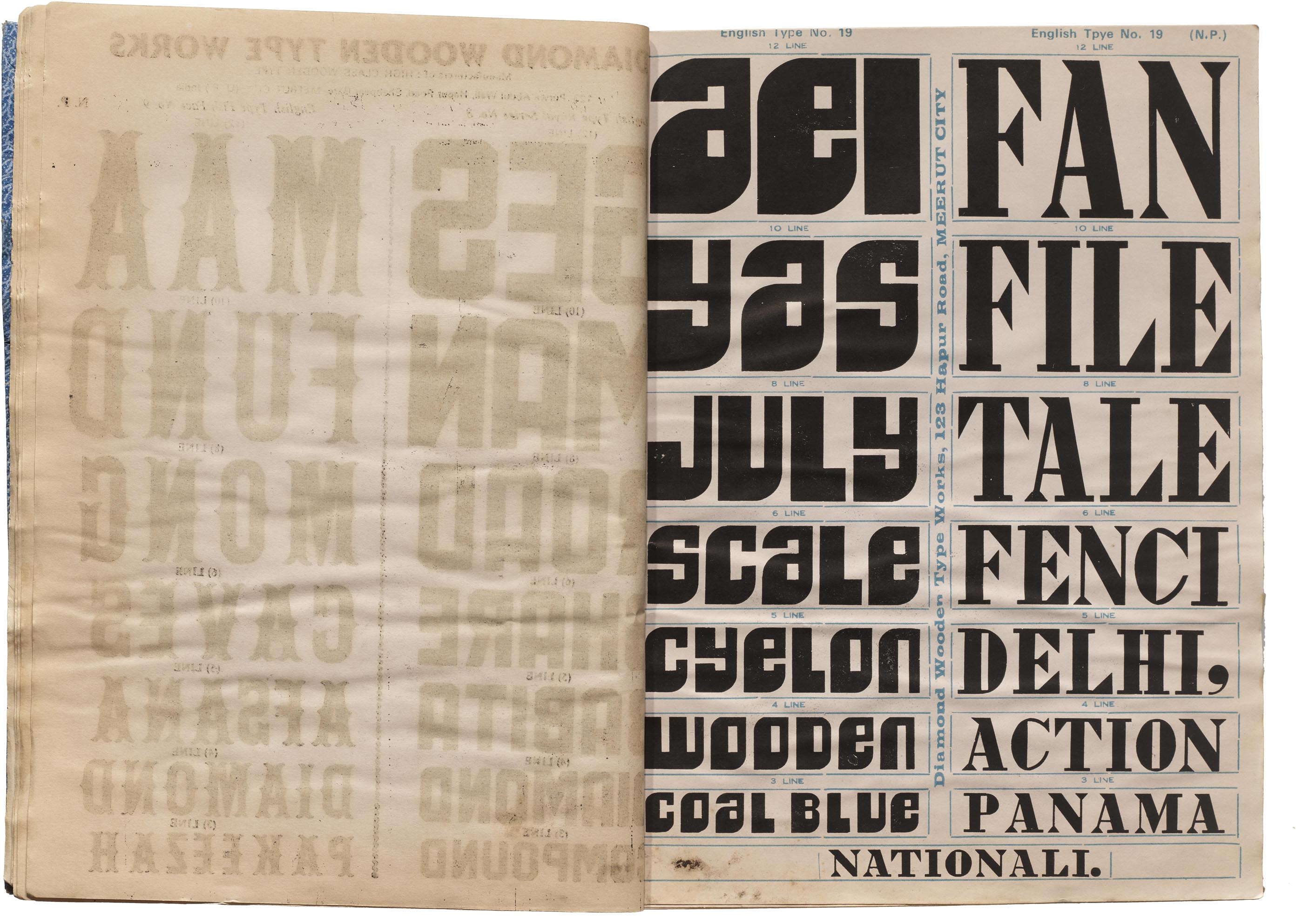
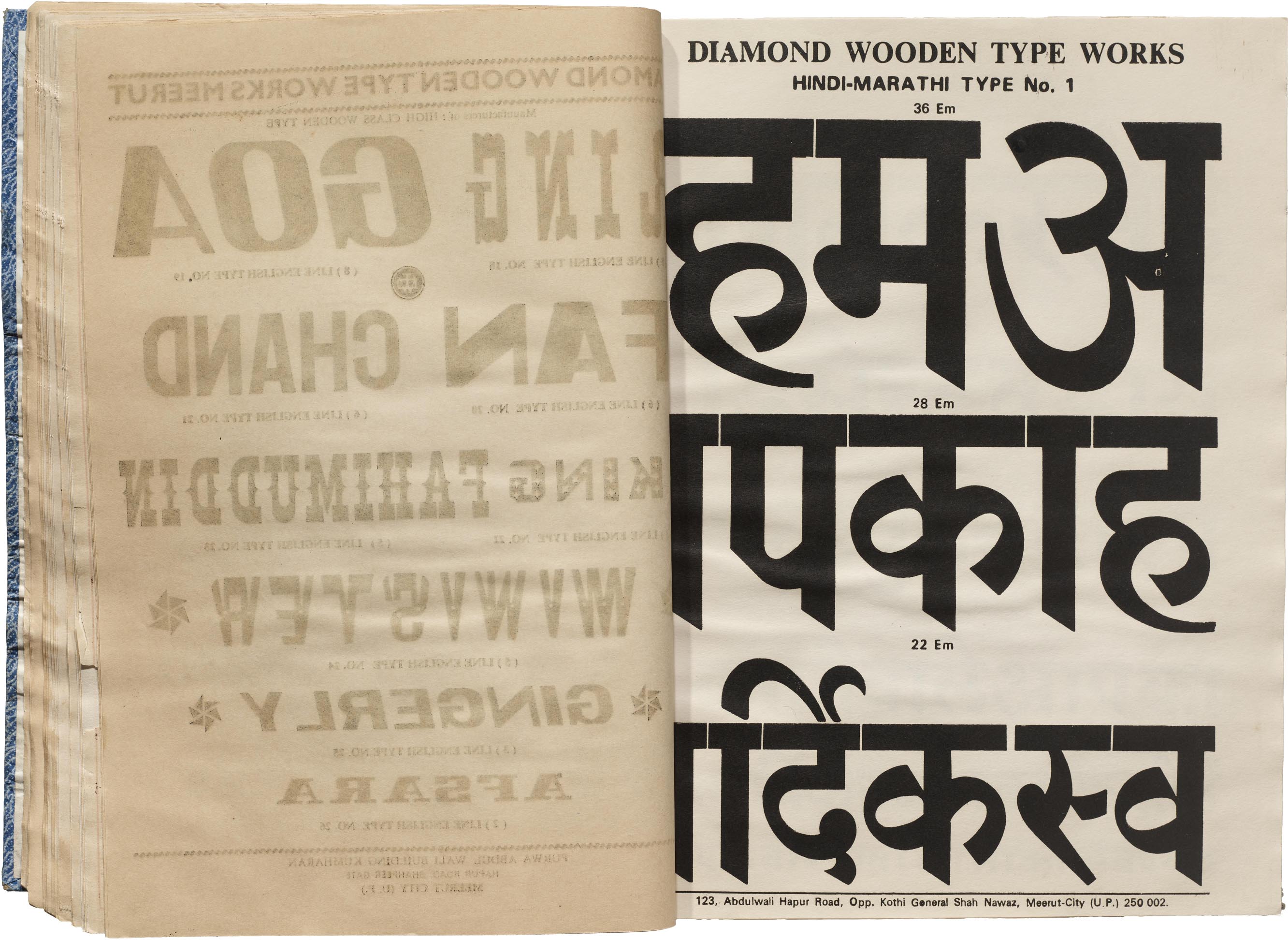
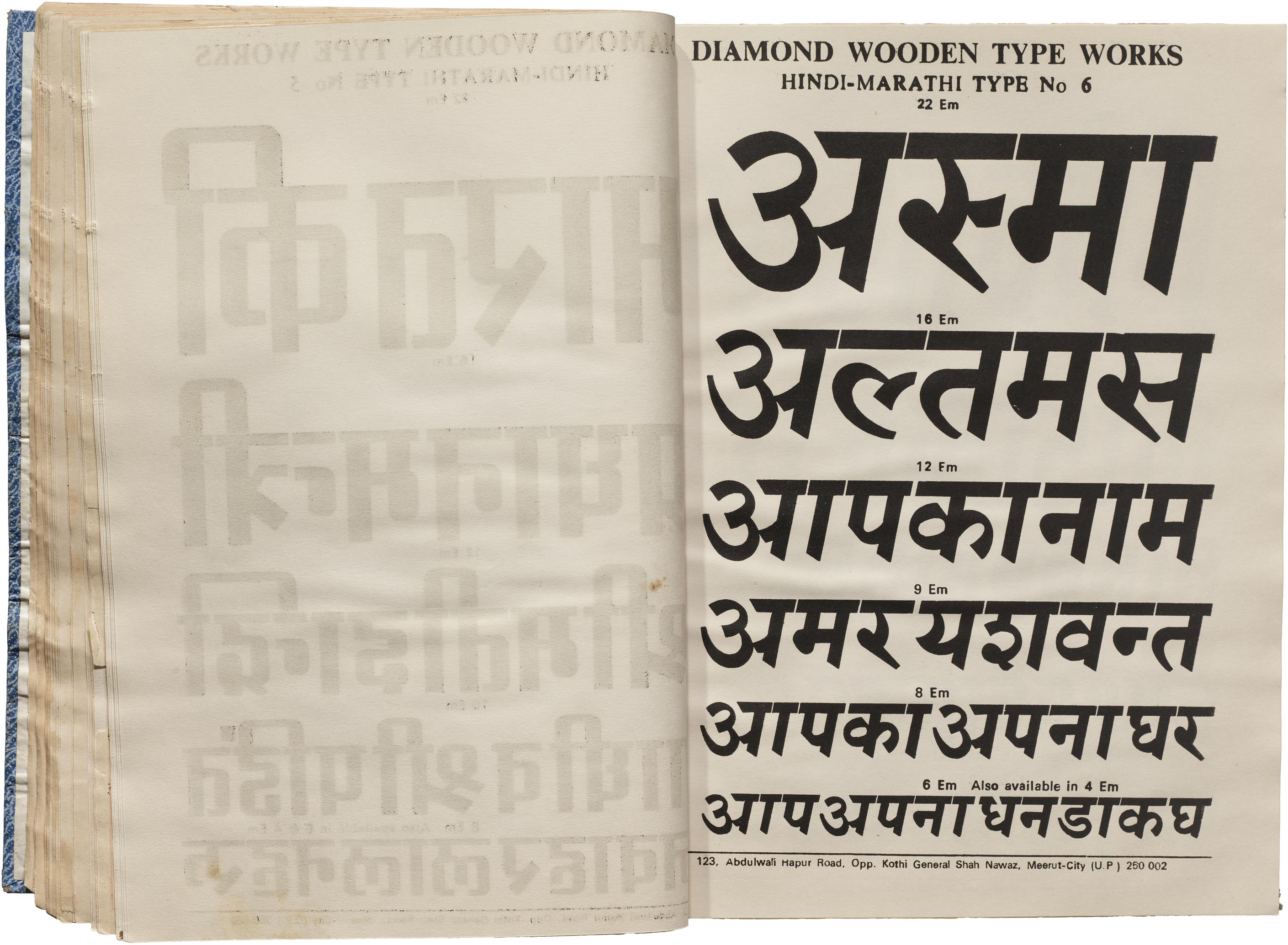
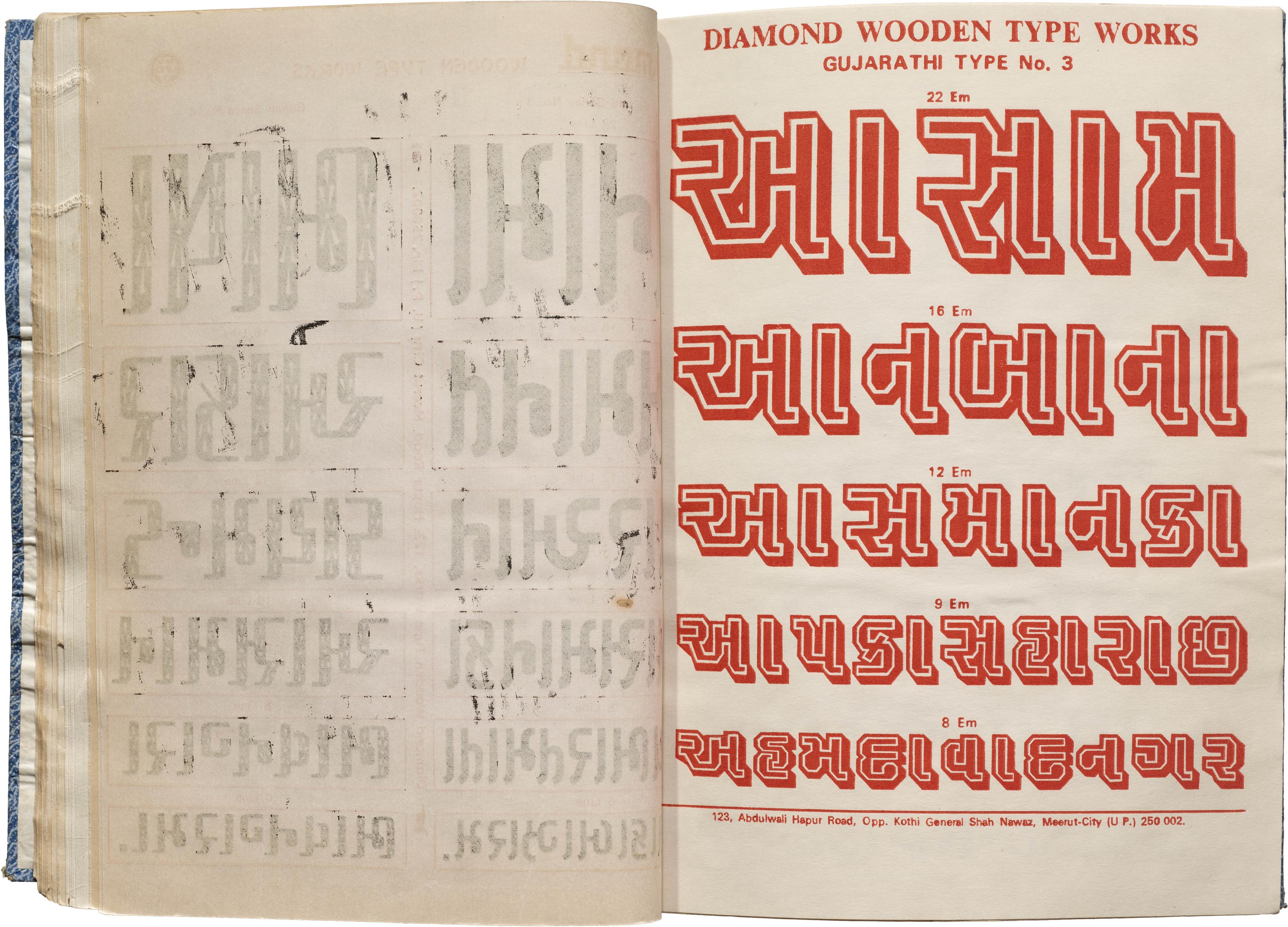
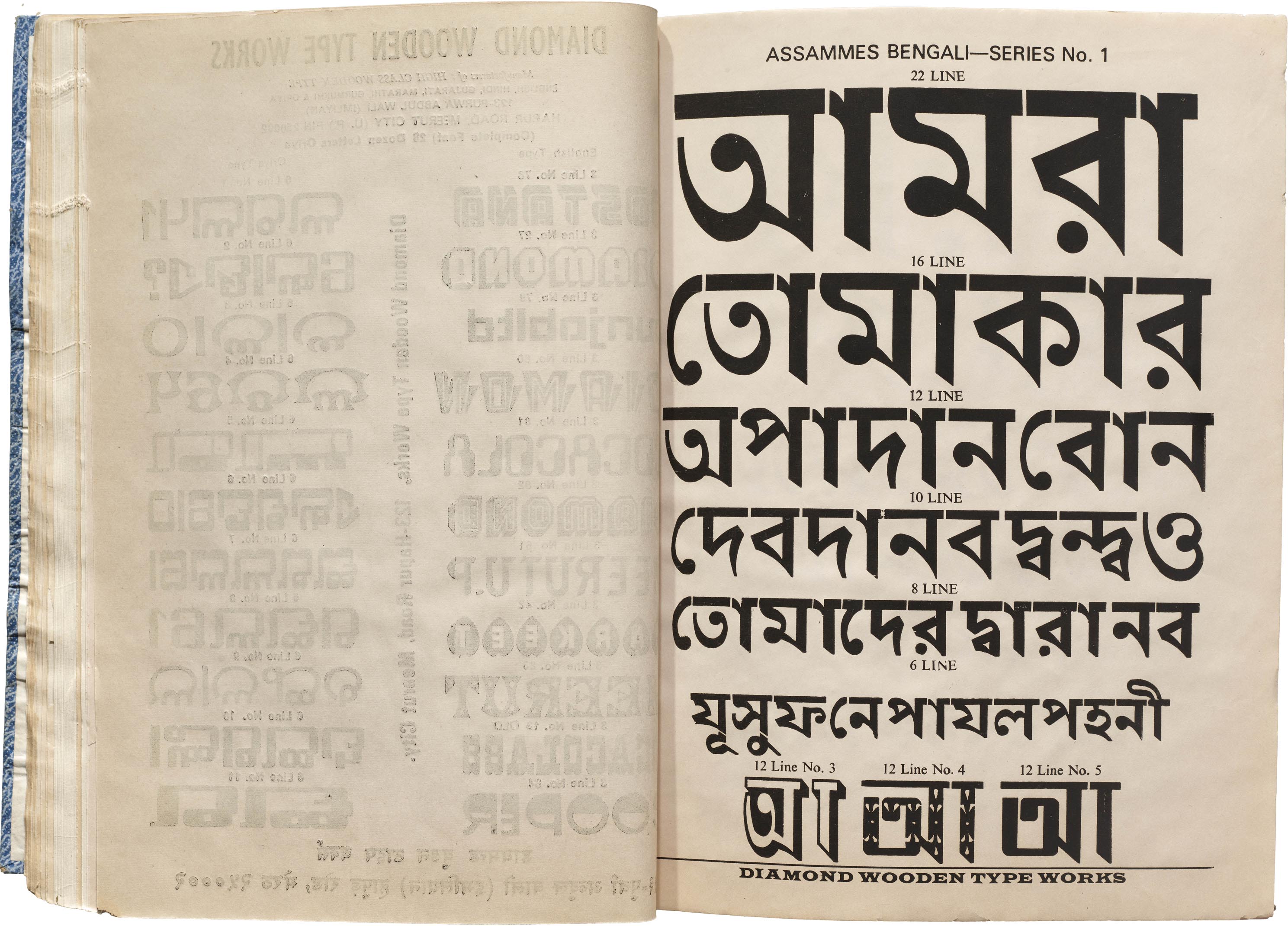
Diamond’s catalogs open with a wide array of Latin designs, reaching almost 60 different styles, many of which offer various size options. The next most frequent script is Devanagari, labeled as “Hindi-Marathi”, with 34 designs. There are only 25 examples of Gujarati typefaces spread across five sheets, but the labeling goes up to No. 51, suggesting that more styles exist but are not included in these particular bind-ups. The inventory represents a range of eccentric influences, from ornamental circus letters to LCD displays. One Gujarati typeface even includes a shirorekha, the connecting topline used in Hindi but abandoned by Gujarati by the 19th century. The Oriya script is represented by 11 designs, which occupy just one column of a page but include some fascinating explorations in reverse contrast and squarish forms—unusual for a script that is traditionally far more rounded. There are just five Bengali typefaces, but they snuck in shadowed and low-contrast, cubic forms to show that the script offers plenty of possibilities.
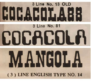
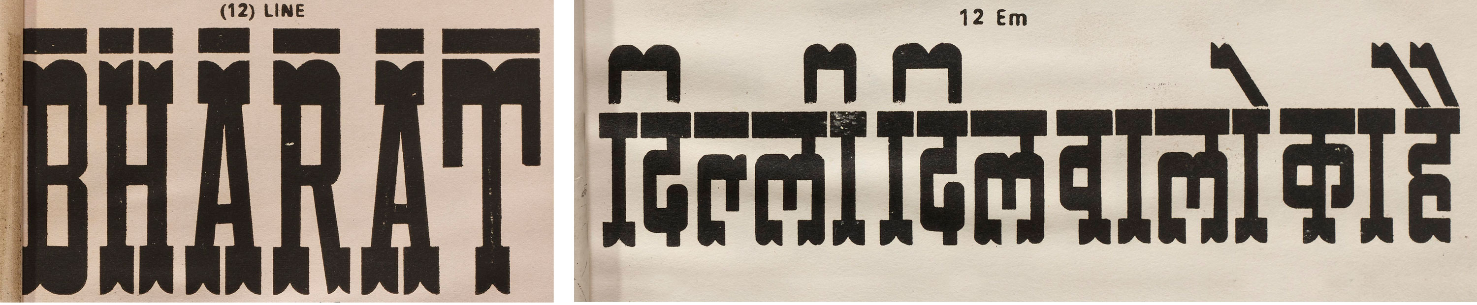
The multilingual specimen texts include the names of people, countries, and cities. Bharat (another name for India), Delhi, and Mumbai get featured in Hindi; Ahmedabad Nagar (the capital of the state of Gujarat) in Gujarati; and a misspelled Bengal in Bengali. Bandra is a delightful inclusion as the only suburb to get a mention. The specimens also include popular brand names, such as “Cocacola” and its one-time Indian competitor, Mangola, in designs that look nothing like the logos themselves. At times, the Hindi text invites readers to use the fonts for posters and calendars.
Unfortunately, Oriya, Bengali, and Gujarati samples do not form meaningful words in most cases. Given the shop’s Meerut location, it’s likely there were few readers of these scripts available to proofread the text. This could also be why the Devanagari designs, while being labeled as “Hindi-Marathi”, never use any Marathi text but compensate for this by using Marathi forms of the letters ल and श. Despite their lack of native knowledge in all the languages, Diamond’s script range indicates that the company did have a market among printers in these distant regions.
From Film to Wood: Type Revivals in Reverse
One surprise that first drew the Archive to the Diamond Wooden Type Works catalog is that some of the typefaces shown are wood type conversions of designs originally made in photocomposition and rubdown formats of the 1960s and 1970s. This is a curious anachronism for Western typographers, given that almost all wood type in North America and Europe has much earlier origins in the 19th- and early 20th-century.
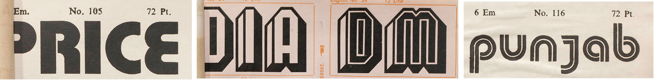


Diamond shows loose interpretations of at least six late-20th-century typefaces under its own aliases. Wood versions of designs that were otherwise available only in film strips and transfer sheets allowed Diamond customers to use these typefaces on more surfaces than was intended. Blippo and Buxom, part of the FotoStar catalog, are masquerading as English Types No. 105 and No. 35, giving Indian customers the ability to print 1960s phototype novelties with letterpess. Dubbeldik made its way from Mecanorma sheets to Diamond wood.
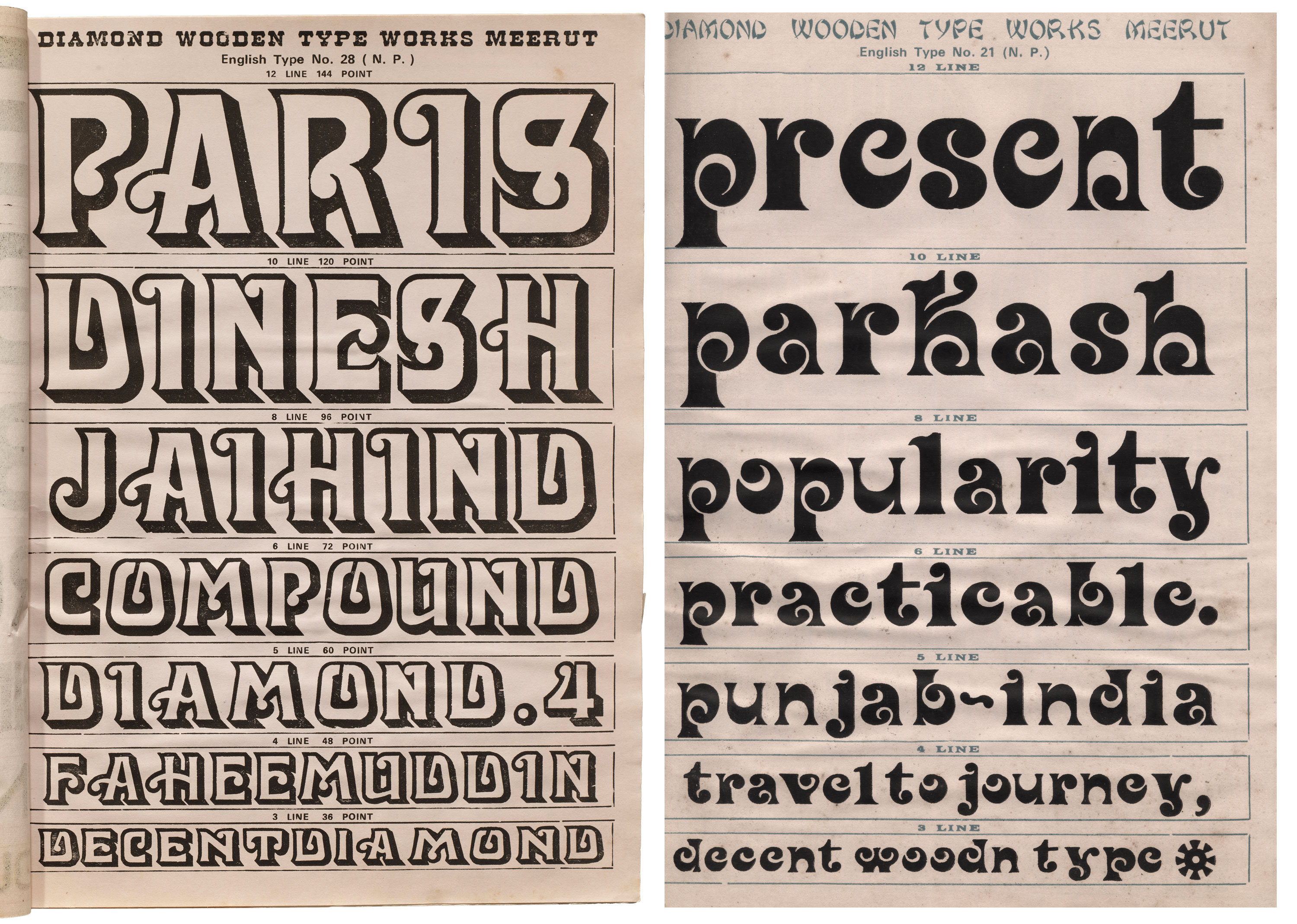


Davida, by Louis Minott in 1965 for phototypositor company VGC, and Spring, designed by Bernard Jacquet in 1971 for transfer type company Mecanorma, are each given a full page in the catalog as English Types No. 28 and No. 21. They aren’t mere facsimiles of their sources, however. Diamond produced their own size-specific variants, redrawing smaller fonts to be broader and more open. And their Davida is an openface, shaded take on the original.
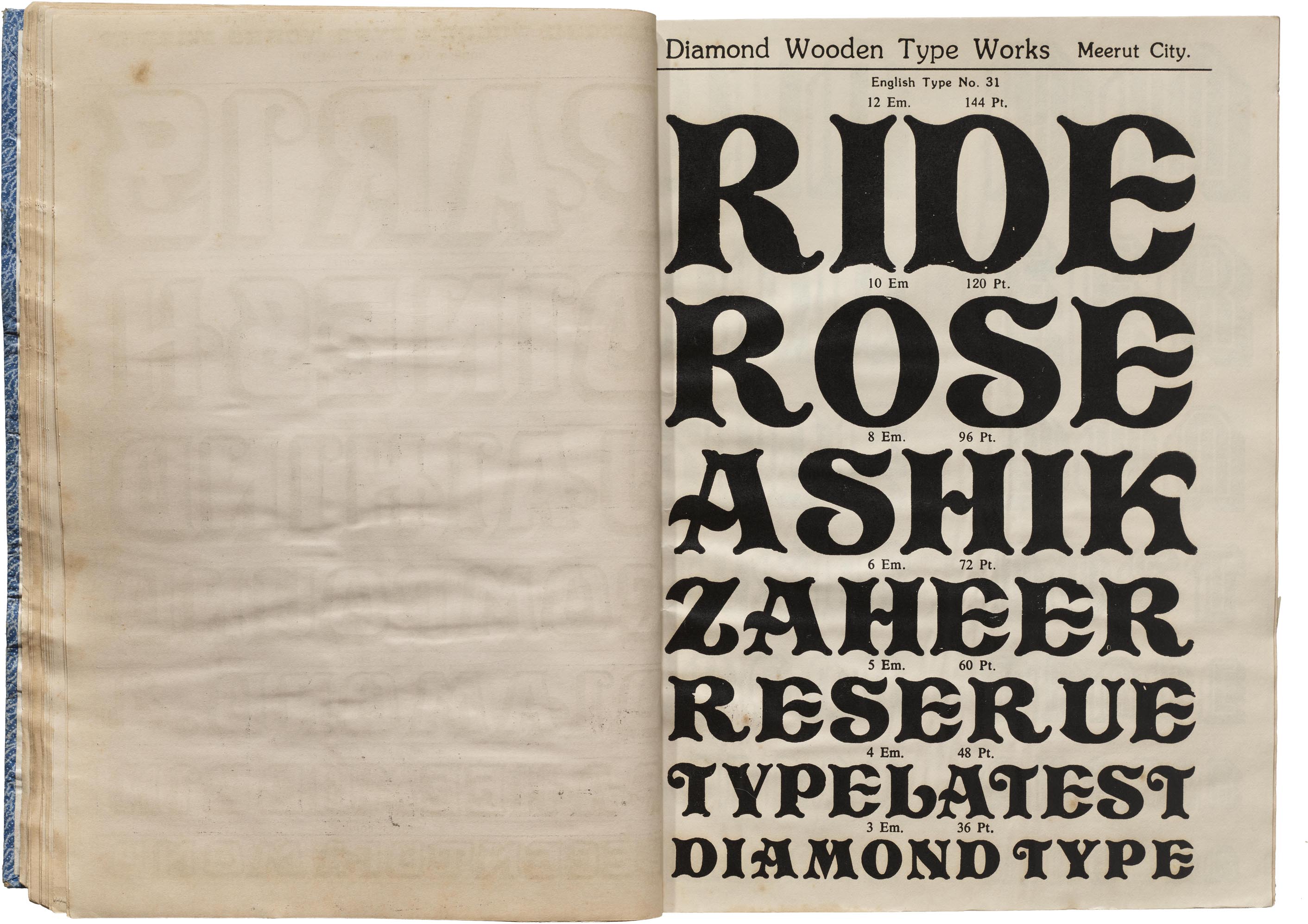

Pretorian lived a longer life, starting out in metal around the beginning of the 20th century before being adapted to phototype, from which it most likely made its way to the Diamond catalog as English Type No. 31.
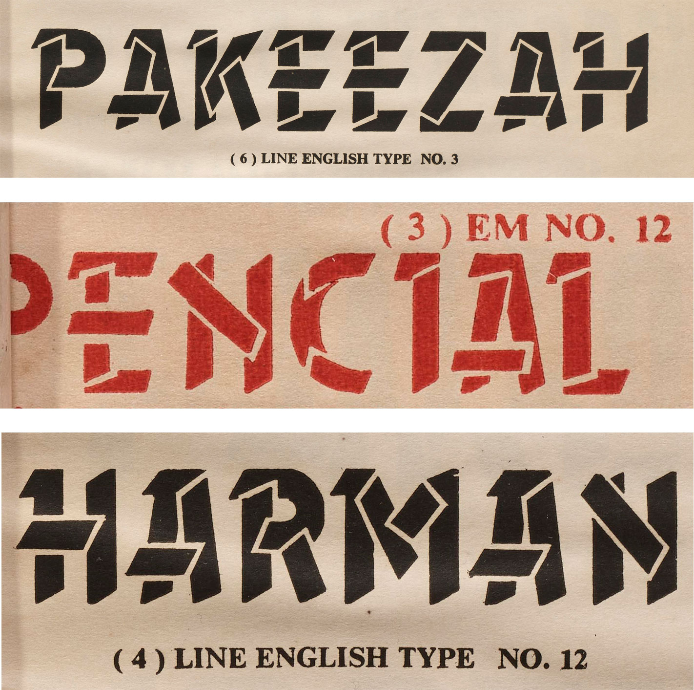
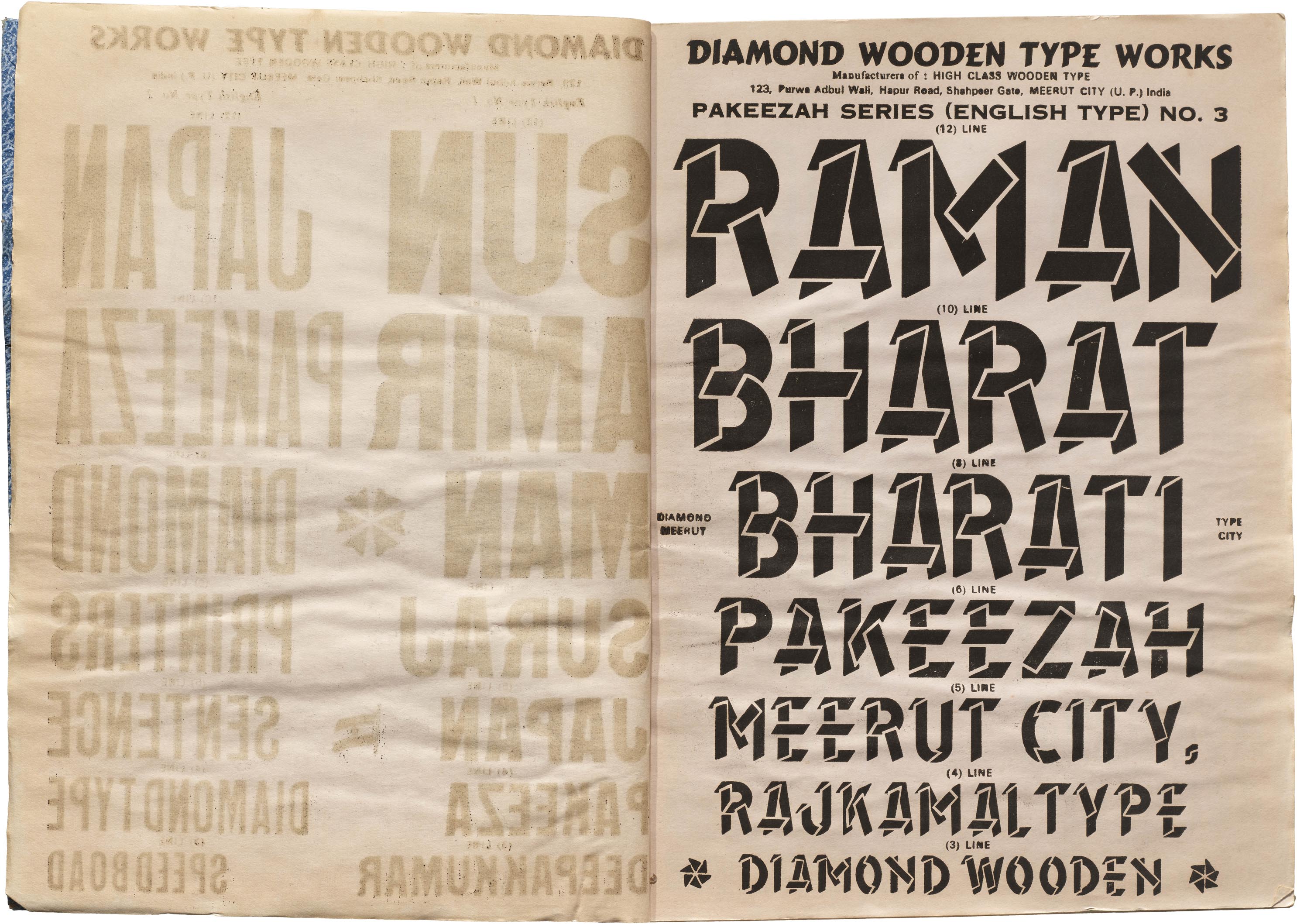
There are also a few original creations scattered throughout the Diamond catalog. The Pakeezah Series, for example, is the only Latin face to have an Urdu name, meaning “pure.” Mimicking wooden planks, Pakeezah’s outline provides gaps to maintain definition where the boards overlap. This typeface was available as small as 3 line (36 point), but it really dazzled at larger sizes all the way up to 12 Line (144 point).
Fishtails and Starlings: Tools for Multilingual Typography
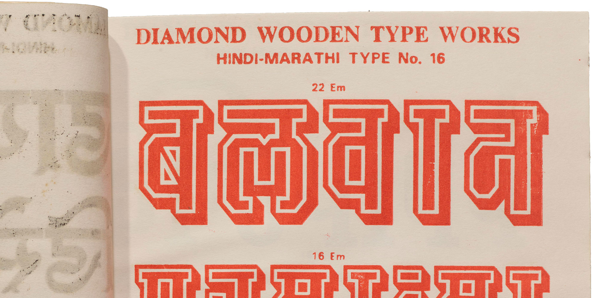
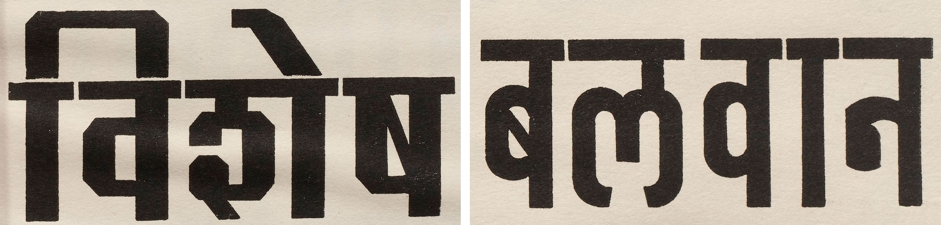
Intriguingly, Diamond Wooden Type Works offered a surprising number of script-spanning designs. In the Latin collection we see a few slab serifs similar to the Tuscan Egyptians of the West. English Type No. 6 has the style’s signature bifurcated endings, and a heavy horizontal stroke. The emphasis running across the top of all its letters makes an interesting parallel to the shirorekha seen in the Devanagari companion, Hindi Marathi No. 3.
The catalogs contain a variety of Tuscan Egyptians at various sizes, that conveniently match the the other sizes offered in Hindi Marathi No. 3. Not only does the Devanagari type echo the Latin with its wavy slabs stuck onto all its vertical strokes (or kanas) it also shares its counterpart’s boxy counters. The Hindi text used to typeset Hindi Marathi No. 3 conveniently shows matras, or vowel marks, that are only above the headline, along with some half forms. It would be interesting to see how the design dealt with matras that interact with the serif forms below the letters. Across the Devanagri designs, the matras are considered as part of the full height of design, so while em and line heights are used interchangeably, the sizes the Devanagari designs look smaller because they account for spaces above and below the base characters.
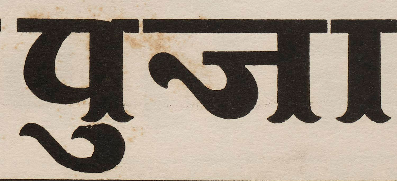
A more traditional Tuscan, labeled English Type Fish Face No. 9, pairs with Hindi-Marathi Type No. 10, which also sports tailfin serifs. The Devanagari design also enjoys a lot more swashy end strokes in the ज and ु matra (see below). The specimen text for Hindi-Marathi Type No. 10 has a mix of matras above and below the characters that are tight but don’t touch. Reminiscent of clipped text in digital documents, the longer matras pay the price of a flattened curve, ensuring legibility. This keeps the height of the above-character matras consistent. Both sets of matras are the same size across all Devanagari designs, which is perhaps a way to streamline production and reduce wood waste.
Variants of the Tuscan serif can be seen across sizes in Devanagari, Gujarati, and Bengali.

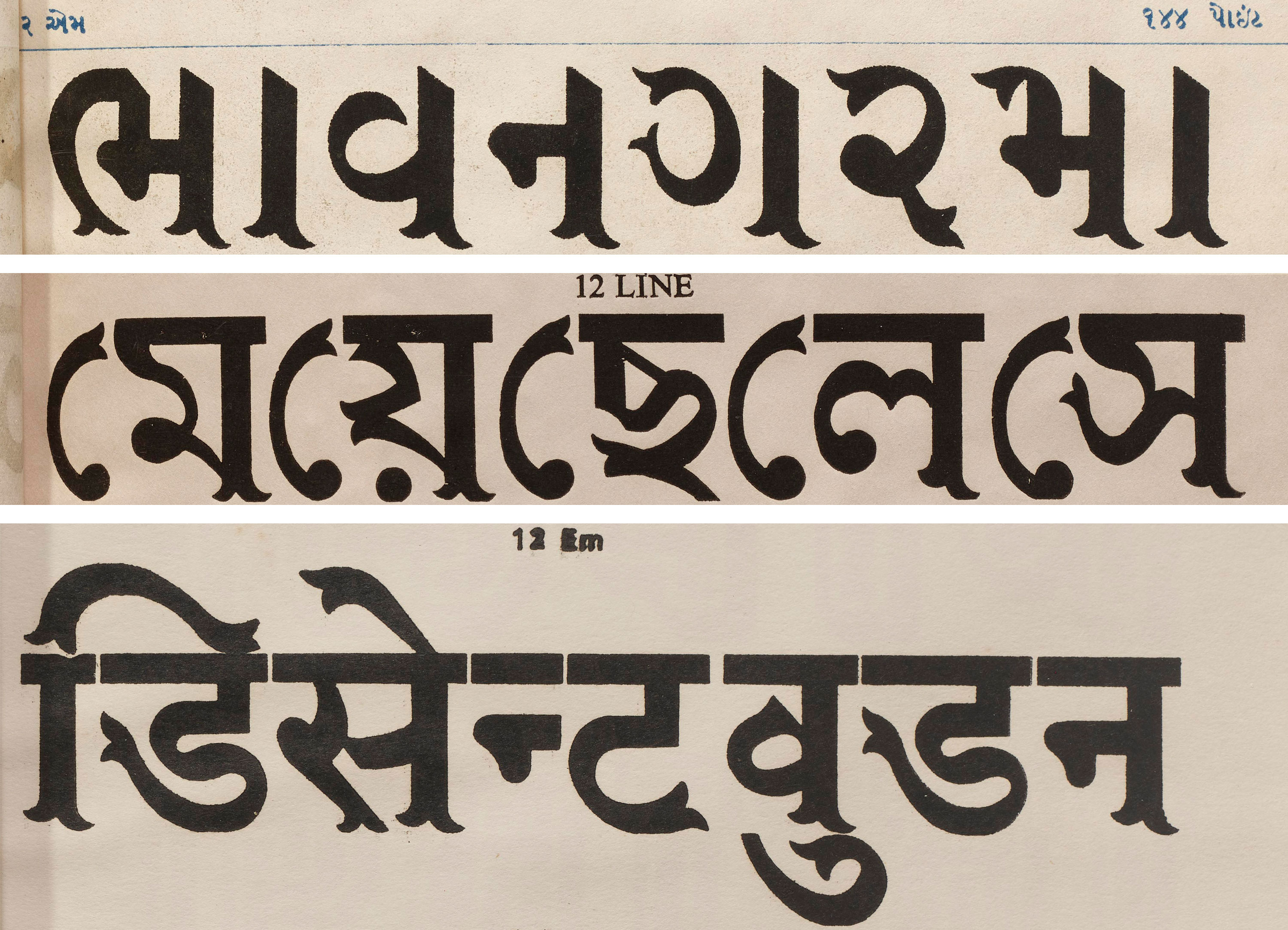
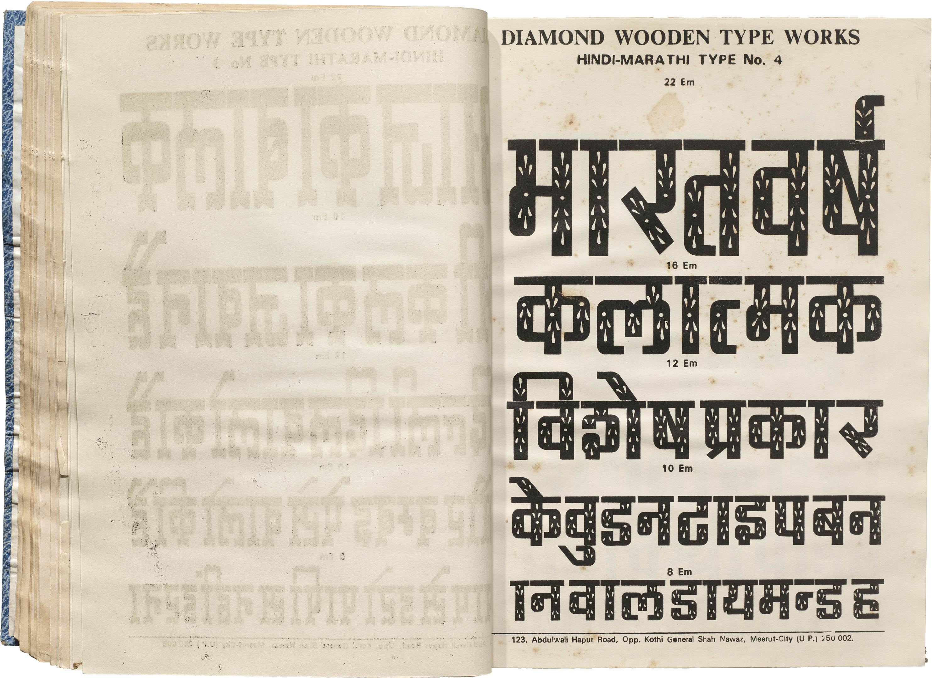
Hindi-Marathi Type No. 4 is a boxy Devanagari design available in a variety of sizes, each optically adjusted. (Like the photo and transfer revivals mentioned earlier, smaller sizes have wider proportions.) Decorative cuts, like little stars, fill the letters, adding festive details to the type. Similar details are echoed in the Gujarati Series No. 4. A few pages in, farewell greetings “TATA” and “BY BY”, are printed in English using a matching English Type No. 7. The page for Assamese Bengali sneaks a letter at the bottom of the page, with the same squarish design and ornamental fill.
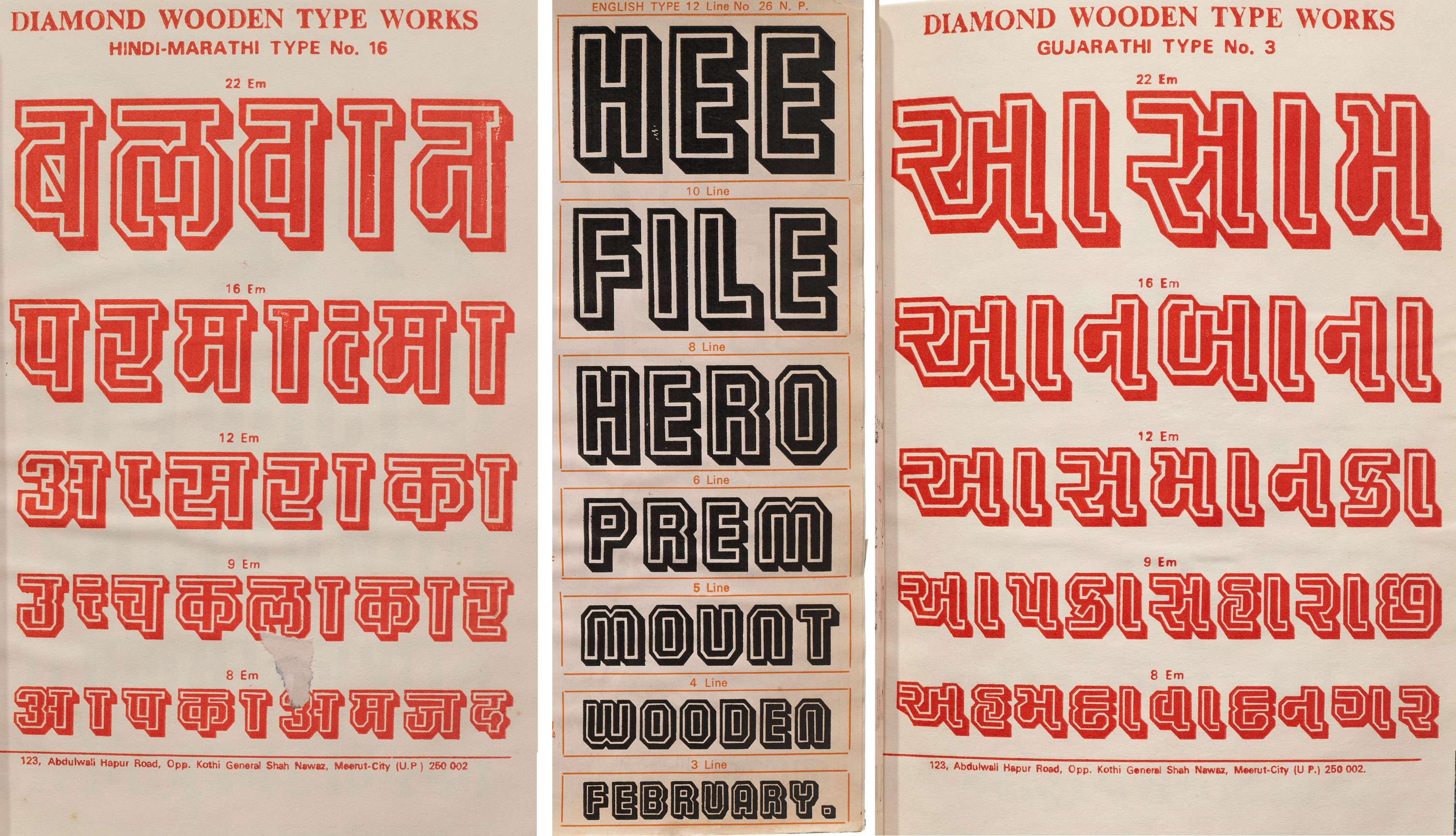
Another style available in multiple scripts is English Type No. 26, Hindi-Marathi Type No. 16, and Gujarathi Type No. 3, a geometric, curveless design with a double outline and shadow. The base letterforms are closely related to English No. 35, the Buxom tribute shown above.
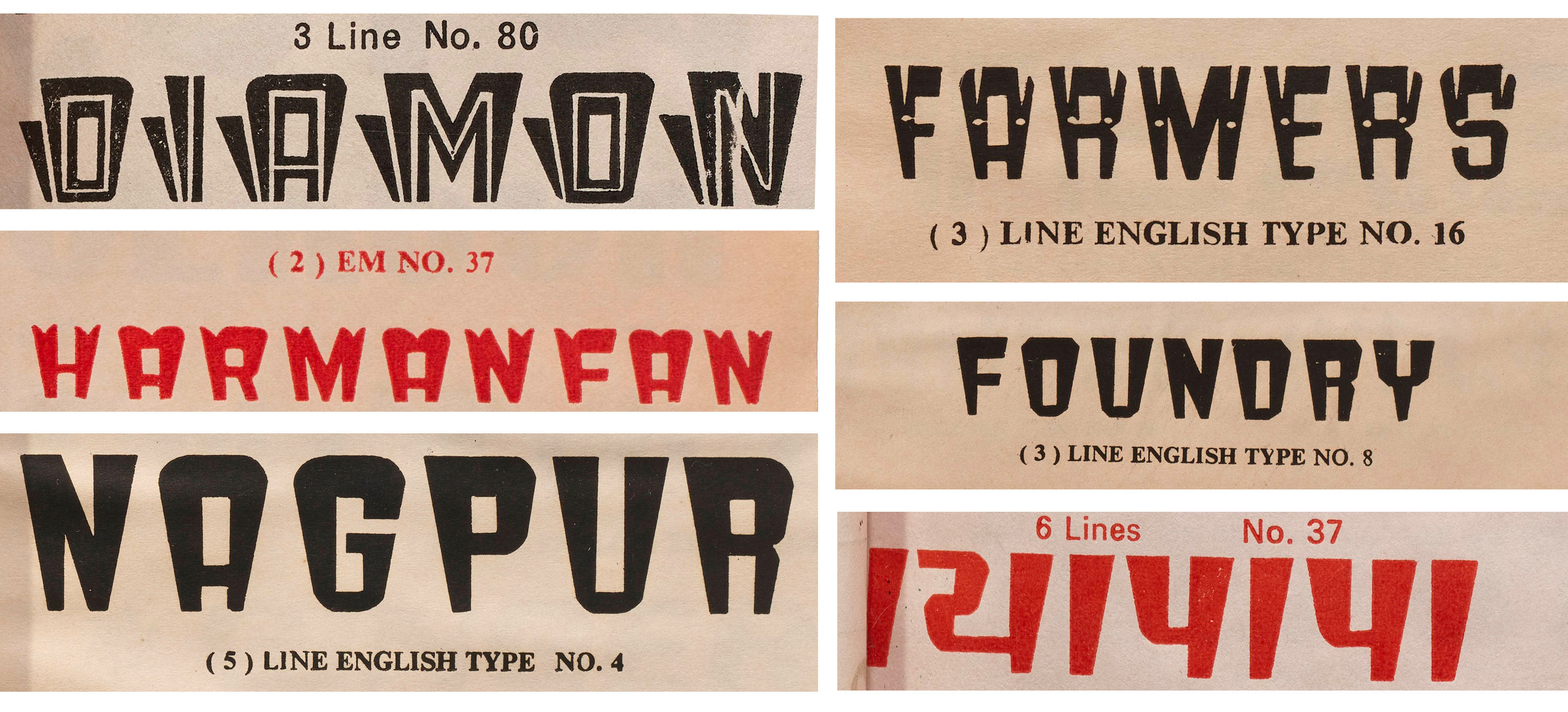
Cartoonish, top-heavy English Type No. 4 and No. 8 are shown in multiple variations: inline and shadow (No. 80), with a scalloped top (No. 37), and with a decorative fill (No. 16). The solid style gets a matching Gujarati typeface in No. 37.
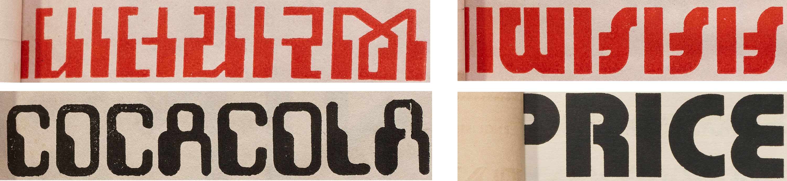
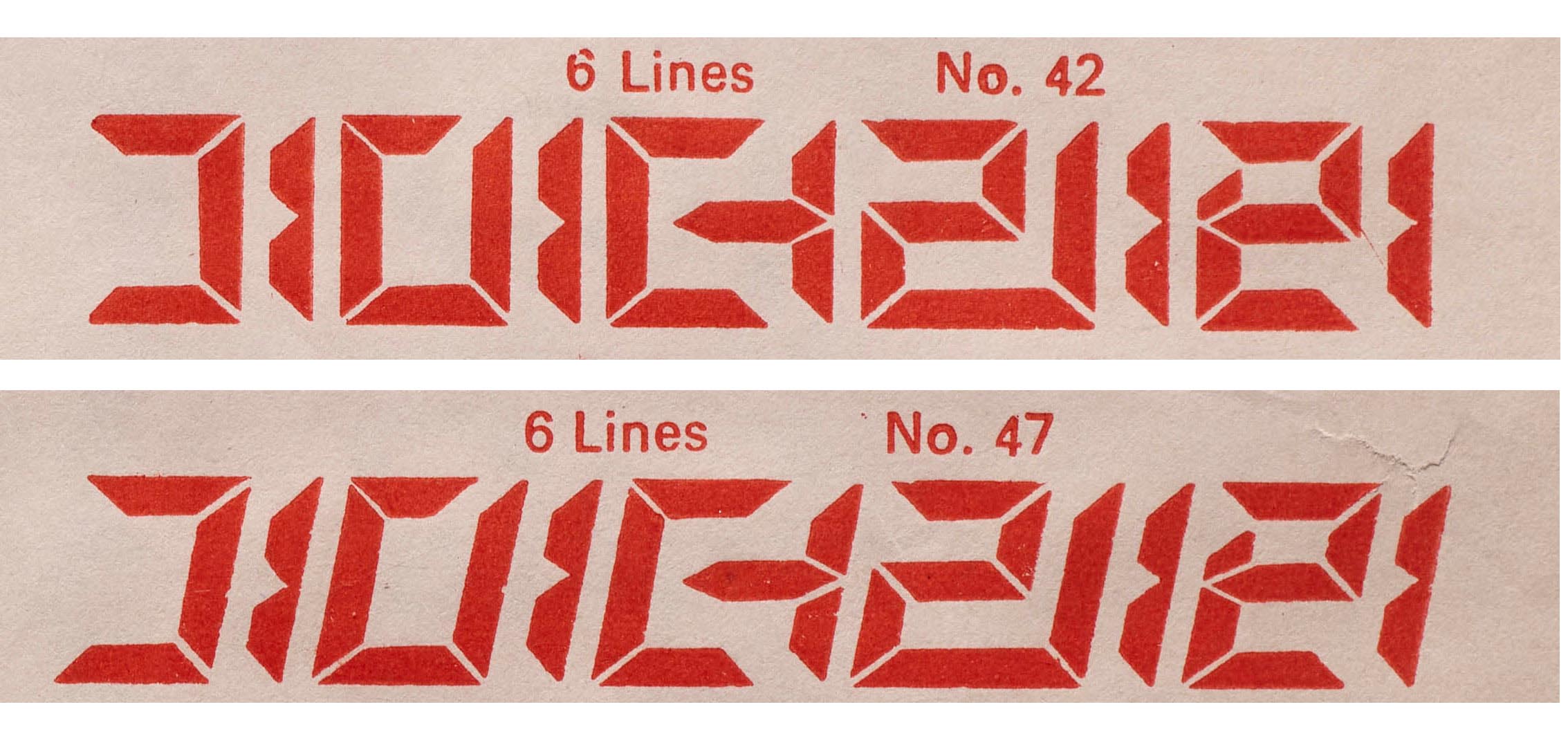
Meanwhile, on the same page we find Gujarati/Latin partners for Diamond’s interpretation of Blippo, as well as dual takes on the computerized MICR genre that was all the rage in the 1960s and ’70s (think Amelia and Westminster).
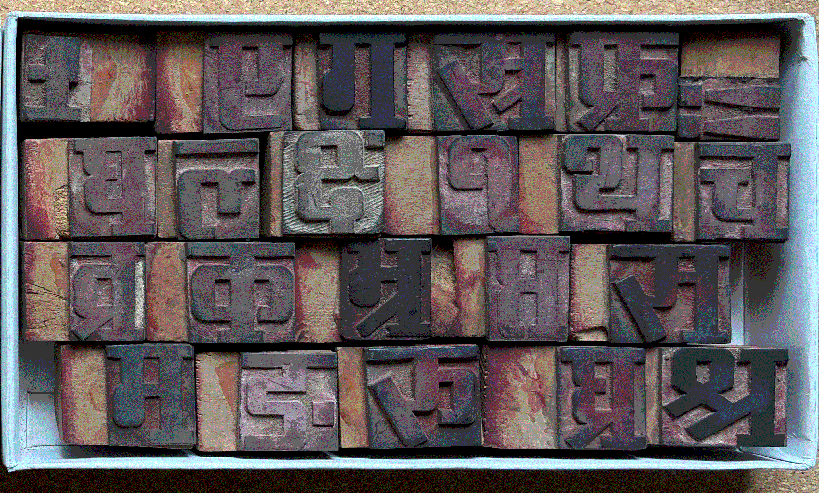
While researching Diamond Wooden Type Works I acquired my own collection of stamp patterns. Comparing these with the printed specimens reveals other companion designs. One serifed Devanagari pattern shares design features — such as the angled strokes in र and श्र, and the knots in म and ग— with Hindi Marathi No. 5 in the catalog, making it a rare “sans-serif” Devanagari typeface. While it’s unclear if this was done intentionally to develop a comprehensive typographic system across different scripts, it does suggest that the company was removing serifs from designs to expand their catalog. (This method of generating many typefaces from the same base design was common in Western wood type, too.)
The idea of building type families across different scripts may seem like a modern innovation, but it has long been a part of typographic history. Still, it is remarkable to observe such thoughtful multi-script designs in a catalog of 1970s wood type. This demonstrates that the integration and harmonious development of typographic designs across multiple scripts was already being meticulously considered several decades ago.
Diamond Wooden Type Works Catalogs
Selected specimens from one of two Diamond catalogs in Letterform Archive’s collection. All images below are hi-fi captures. Click an image to enter fullscreen view, then click or pinch to enlarge.

End of an Era
With the advent of offset printing, the role of letterpress printing significantly declined across the country, which naturally impacted the wood type industry, too. Diamond Wooden Type Works ceased operation in the early 2000s, resulting in the loss of skilled artisans capable of hand-cutting patterns in rubber and letters in wood. Some of these craftspeople transitioned to related crafts, while others sought different lines of work, though a few presses are still whirring (see the bag printing above). Despite this decline, the Diamond Wooden Type Works collection is a visual document of innovative type manufacturing and Indian script design, a testament to the rich typographic heritage of Meerut, and an invitation to rethink traditional type timelines.
Tanya George is a Mumbai-based designer and educator with a wide-ranging freelance practice that includes designing letterforms for brand identities as well as fonts across different Indian scripts. She also conducts type walks around Mumbai, along with typography workshops, and writes about type.