News
Behind the Scenes with Licko & VanderLans
We connect with the duo responsible for Emigre Fonts, whose specimens are reproduced in the latest title from Letterform Archive Books.
With cutting-edge fonts based on the bitmap as well as digital revivals that transcended the screen, Emigre Fonts pioneered type design in the early days of the pixel. But it was their formidable commitment to print that documented—and helped affirm—their contributions to twentieth-century visual culture.
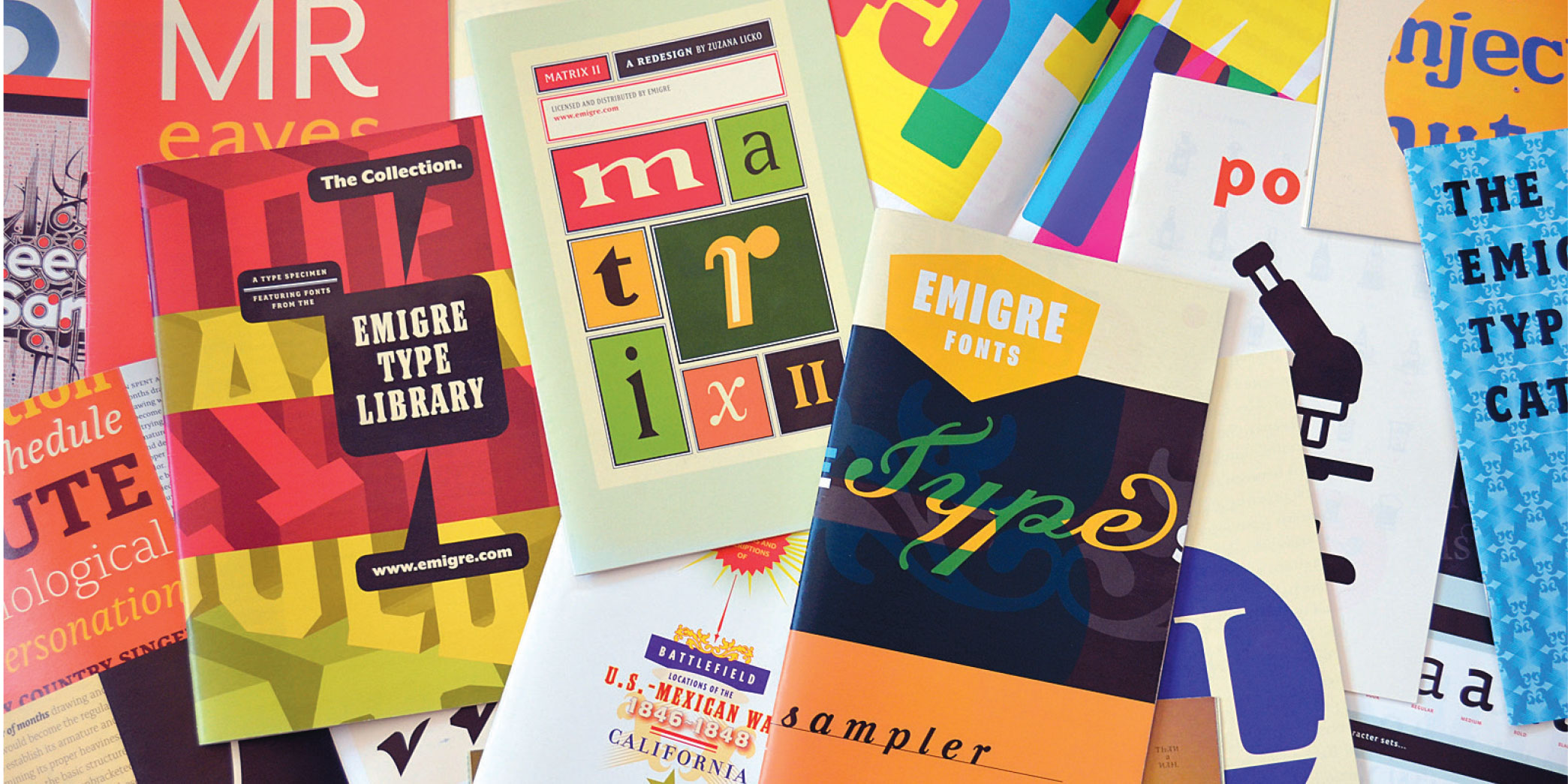
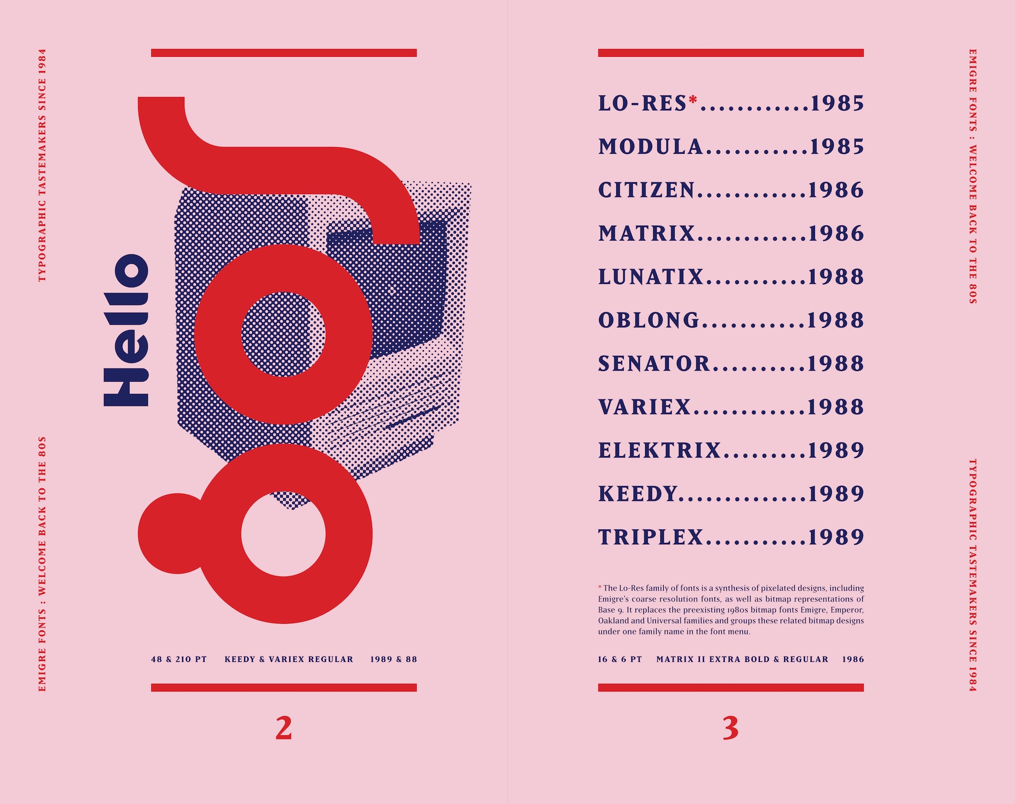
In March 2025, Letterform Archive published Emigre Fonts: Type Specimens, 1986–2024, an ambitious compendium of 40 promotional booklets from one of the world’s first digital foundries, led by type designer Zuzana Licko and graphic designer Rudy VanderLans.
Building on the centuries-old legacy of the printed type specimen, each Emigre Fonts booklet was designed specifically to support the font it sold, with savvy concepts, eye-grabbing graphics, and carefully curated text that allowed potential customers to see the type in action. Reproduced by Letterform Archive Books in one massive volume designed by VanderLans, they tell the story of an independent creative enterprise emboldened by the major shift from mechanical to digital type design and distribution.
Here, Letterform Archive Associate Curator Stephen Coles asks Licko and VanderLans how they approached the crafts of both producing and selling type during this historic transition, and what it was like to reflect on a legacy four decades in the making.
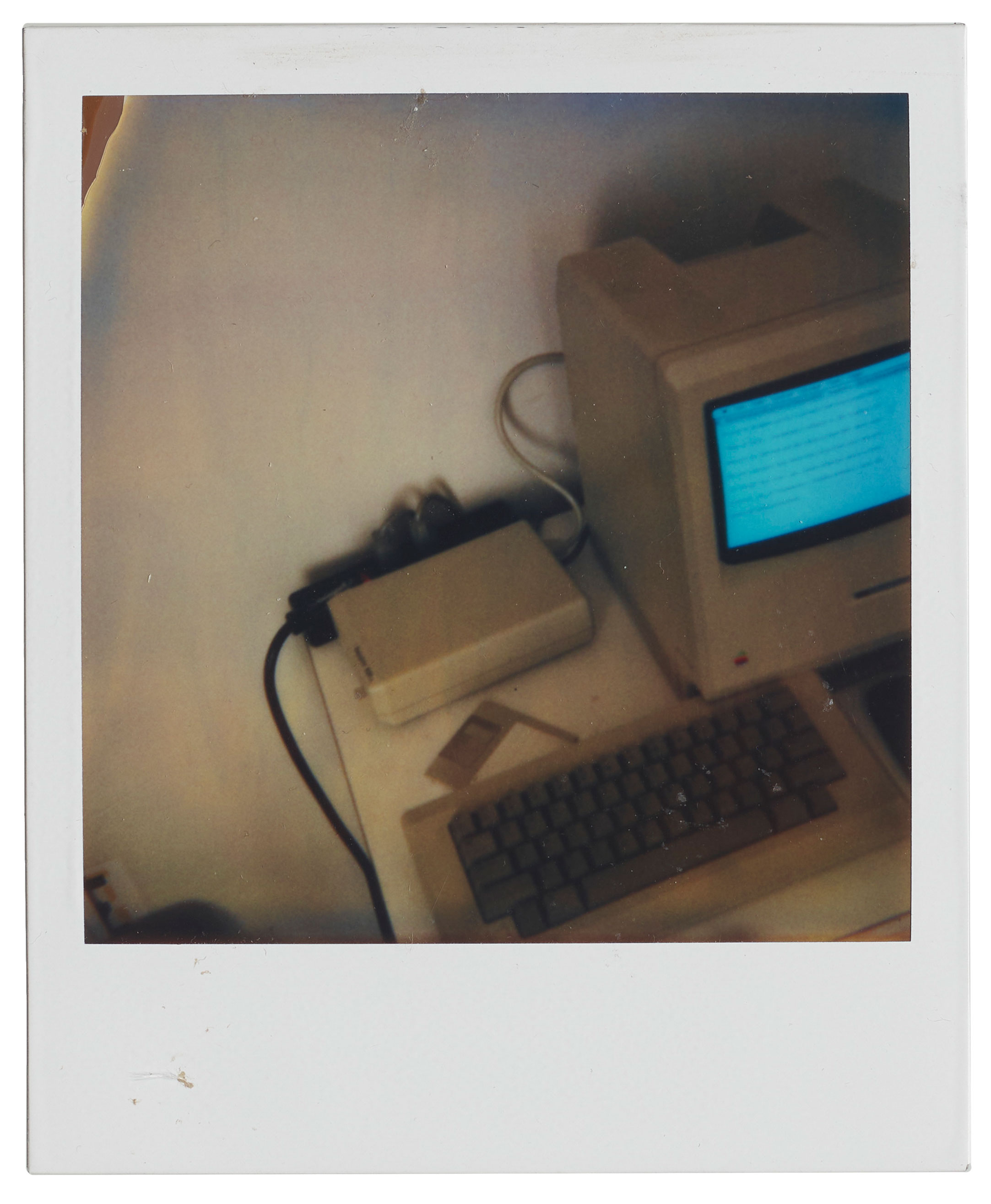
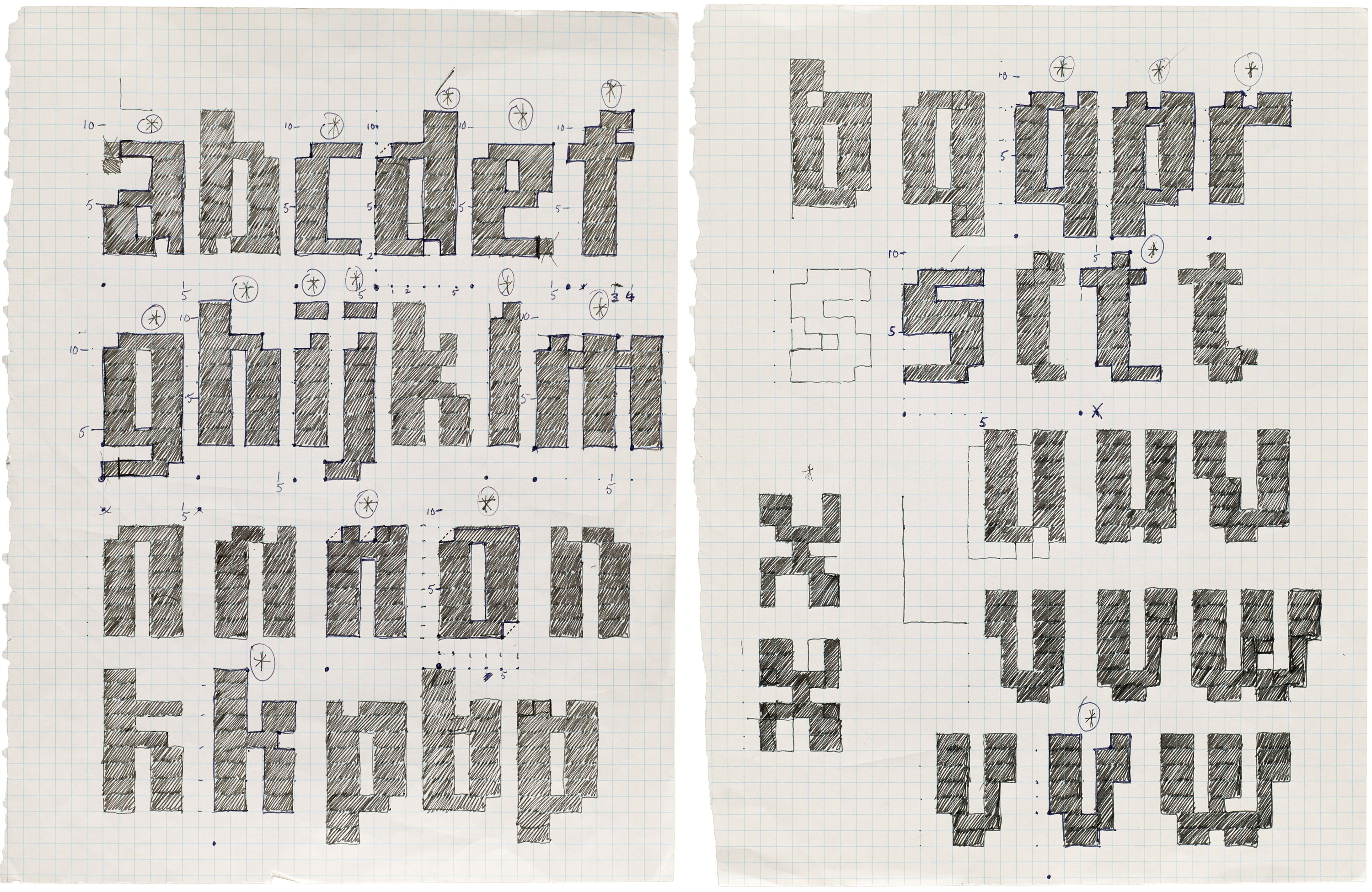
Putting together this book gave you an opportunity to look back at nearly 40 years of Emigre Fonts. The “Behind the Scenes” chapter features objects from your font development files, which have pride of place in Letterform Archive’s collection. Many of these items are appearing in print for the first time, and they give us a new window into your process. What surprised you as you looked back at your archive?
VanderLans: I was amazed at the crudeness of the early ideas of some of our first typefaces. How we managed to turn them into workable fonts that people ended up using is a miracle to me.
Licko: Yes, I looked at that work, and some of it feels like it was made by a different person or in a different life. I barely recognize the stages some of the fonts went through. With some pieces we even had trouble remembering who did what.
VanderLans: Yes, let that be a lesson. Mark all of your work, in all of its stages, as best you can: names, dates, anything. Future archivists will love you for it!
I have to credit Peter Koch for us having an archive at all. He was the first person to tell us to start saving and organizing our work – sketches, correspondence, anything at all. After seeing his archive, we started editing and saving the work we felt was worth preserving.
Licko: We had it all stored in our basement. So we were super-fortunate to get to know [Letterform Archive founder] Rob [Saunders], just when he was in the process of making Letterform Archive public. It was an easy decision to hand it all over to him.
As one of the first small companies to offer digital fonts, did you have any models for the business?
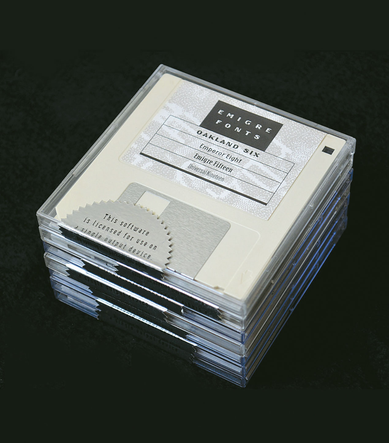
Licko: Not really. The foundry started organically. We didn’t really plan on it. Neither of us had any kind of background in type. We initially made fonts for our own use in Emigre magazine and for a handful of design jobs. Soon after these new fonts appeared in the pages of Emigre, designers started inquiring about their availability as software. So we made copies on floppy disks and sold them, and our foundry was born. There was no model for this.
VanderLans: We were not exactly industry insiders. We were novices on so many levels. And there were only a handful of companies who were creating digital fonts at the time, and they were in a different league. There was Adobe, Agfa, Bitstream, and ITC, and they were very much involved in digitizing the classics. That was not a model we particularly wanted to emulate. But they did give us ideas and standards for our licensing agreements, and the $39 price for a single font—I believe that came from Adobe. For the longest time that was—and still is—the base price for fonts in the industry.
Licko: Other than that, we just stumbled along, often just following what the latest technology presented us with. We had a digital product, and then the world wide web came about, and we figured out how to transmit font files over phone lines using modems, etc. We had our own server setup. But again there were no models for any of that.
It’s my understanding that Zuzana was firmly planted in type design, and Rudy in graphic design (with Rudy crossing over to design fonts now and then), but how true is that when it comes to your type specimens? What role did Zuzana play in their design?
VanderLans: Yes, Zuzana was single-handedly responsible for all the font-related issues. Everything from design to production and whatever else was necessary to make the fonts ready for prime time. And while I designed a couple of fonts, I never learned how to actually use any of the font programs. The few fonts I designed were sketched out on paper, and Zuzana produced them using Fontographer or whatever program she was using at the time.
Licko: And, yes, Rudy is the font specimen guru! Although, I did design and produce the very first booklet, called “Digital Fonts,” which I initially printed in a small quantity on the Apple LaserWriter, the first laser printer with Adobe’s PostScript interpreter. I used parchment paper and bound them on a manual spiral-binding machine. Later, I designed the Whirligig, Puzzler, Tangly, and Crackly specimens. But Rudy’s fine typography shines in all the other specimen booklets and posters.
VanderLans: Yes, I get complete freedom to do what I like with the specimens, until I don’t. I pick the themes and do most of the writing. But ultimately we do have to both be happy with the result. And that goes for everything we do. Over time, we’ve come to learn what’s acceptable to the other. I just read this sentence in a book by Daniel Mason that spells it out perfectly: “We know the contours of our grievances.”
Type specimen design has a long history, from the basic one-liners and waterfalls of early printing to the elaborate in-use showings of the 20th century. What historical models influenced your specimen design?
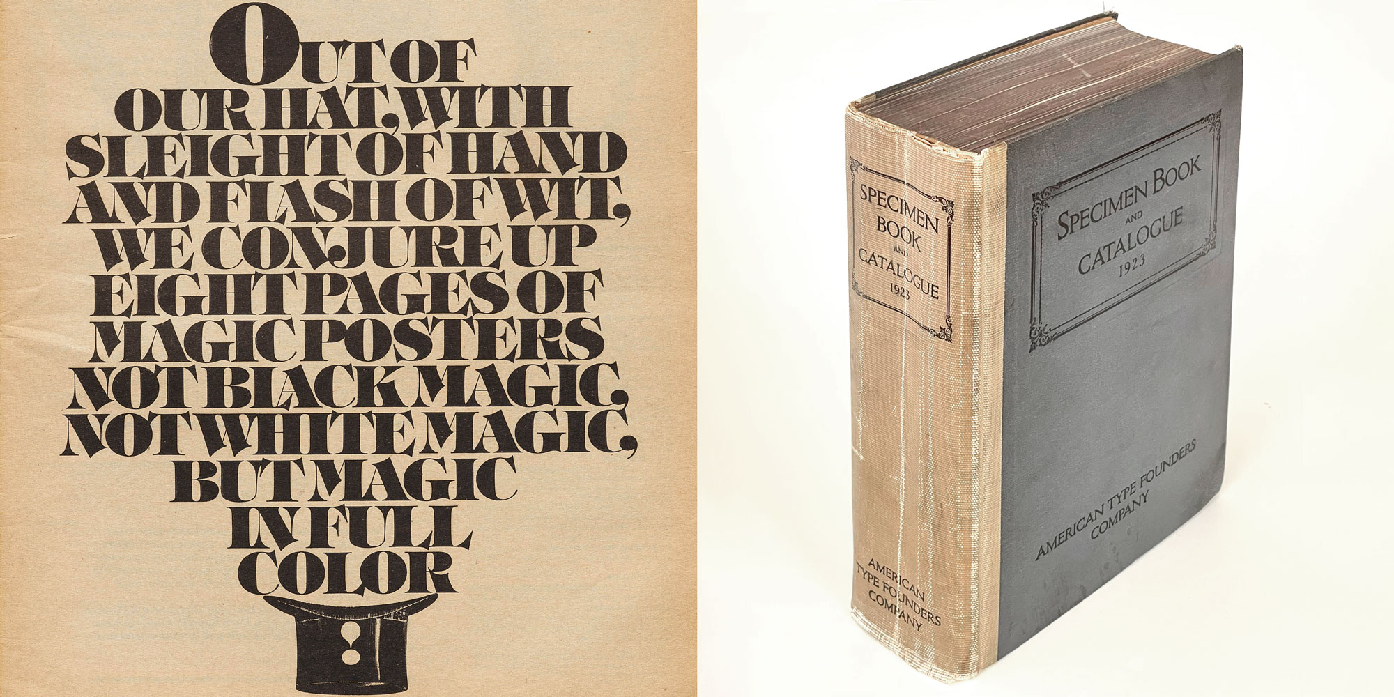
VanderLans: During my formative years, my only exposure to any kind of type specimen that excited me was U&lc magazine. I saw my first copies in the late ’70s when I was still in art school in Holland. But at that time I had no idea I would end up running a digital type foundry, so I looked at it from the perspective of a young design student and just marveled at the playfulness of the work, especially that of Herb Lubalin, which stood in stark contrast to the International Style design we were being taught. Much later on, the one specimen that always impressed me to no end was the 1923 ATF type specimen catalog. I just could not wrap my head around the incredible amount of hours that must have gone into producing that 1,148-page book, featuring a typographic surprise with every turn of the page. But now I know, in order to accomplish such a feat, it helps if you have nearly 40 years to accomplish it.
Licko: Yes, and I think, with our book, we beat them by 116 pages!
VanderLans: So we win?
How did you settle on this booklet trim size for most of your specimens?
VanderLans: It’s just a very economical size. It’s called a digest, and it’s a standard trim used by web offset printers. It also fits nicely into a 6-by-9-inch envelope. And I like the intimacy of reading these small booklets.
Licko: Also, those 40 specimens that are reprinted in Emigre Fonts are just a fraction of all the material we put out to promote the fonts. We went through all kinds of formats—from posters, to tabloid-size folders, to postcards—and finally arrived at the digest format. It does make a wonderful series.
What ingredients does a good type specimen include?
VanderLans: A good type specimen needs several key ingredients. First, it should actually demonstrate how the fonts perform in real-world use. We found that using real text, rather than just arbitrary words or the classic “quick brown fox” sentence, gives readers a much better sense of how a typeface functions. You really need to read it to judge it properly. We also believe in shedding light on the concepts and process behind the font’s design. For example, our specimens for fonts like Littlebit, Lo-Res Outlined, and Filosofia included detailed backstories about how their designs developed, including technical and historical references.
Licko: Exactly. This helps people understand that these designs don’t just appear out of nowhere. Beyond just showing the letters, we try to elevate our specimens into objects of deeper interest with actual content. We’ve included things like David Barringer’s love letters to our fonts, histories of the Mexican-American War, and even chapter openings from classic California novels. This approach makes the specimens more engaging and gives readers a more natural way to experience how the fonts work.
We derive real creative satisfaction from producing these specimen booklets, and we’ve found it’s also the most effective way to market our font library. Even in this digital age, we still believe in the power of print for showcasing type. And producing printed specimens keeps us connected to the history and traditions of our profession.
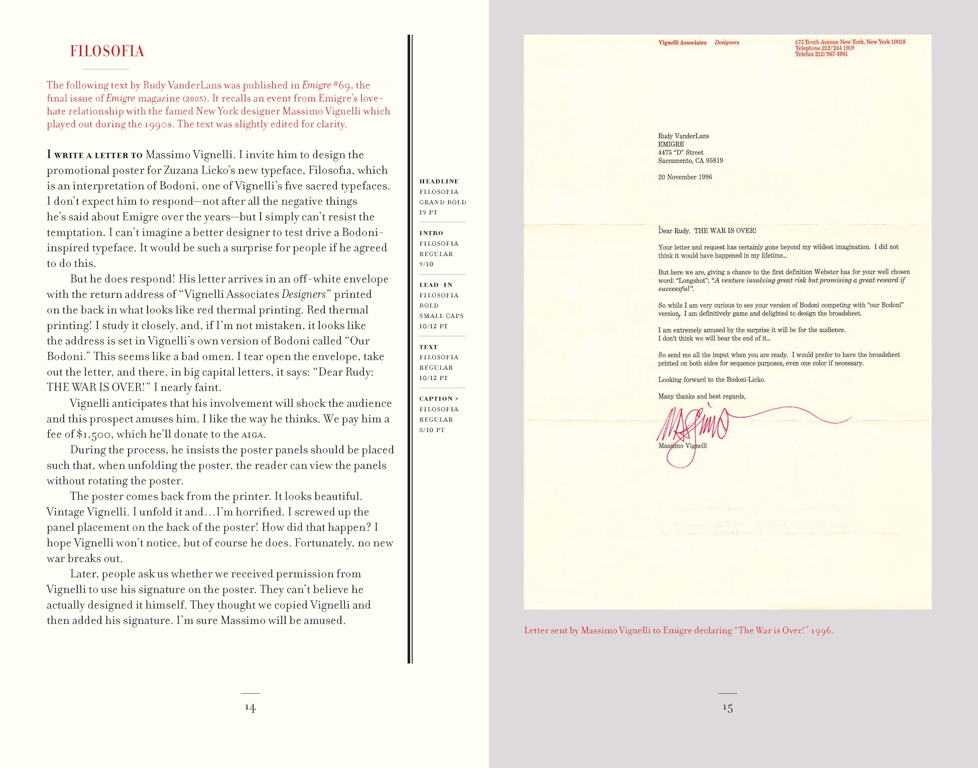
Emigre, the magazine, was known as a vehicle for design discourse. But sometimes the specimens include some of this dialog, such as the fascinating and entertaining interchange between Emigre and Massimo Vignelli in “Notes on Filosofia.” In what other ways did Emigre fonts or specimens spark debate?
Licko: When I brought up the idea in Emigre #15 that we read best what we read most, and that typefaces like Helvetica and Times Roman are not inherently legible, but that instead typefaces become legible through repeated usage—that did spark quite a bit of debate within the field of type design. We often used that line in our type catalogs, so it became kind of a slogan for Emigre.
VanderLans: Yes, that and the kind of experimenting we were doing with Zuzana’s typefaces and our typography and the reactions to that work resulted in what Robert Kinross ended up calling the “Legibility Wars.” But what stands out for me is that there was actual debate about these issues. People really cared about them. They took the time to write and reply, and to publish their ideas. And since the discourse was concentrated in a handful of design magazines and conferences, it was easy to follow the major dialogs within graphic design. I don’t see this kind of concentrated debate anymore.
Licko: Perhaps everything’s been said on the topic, and it’s all been internalized.
VanderLans: Maybe.
After the first few years of releasing only your own fonts, you began to publish work by other designers. What influenced that decision?
Licko: After we released some of our own fonts and were able to sell them, we realized there might be quite a market for more original designs. For a little while, we were the only small foundry putting out fairly experimental type, and we promoted it through Emigre magazine and mailers, and people noticed. So other designers who were making type on the Macintosh started contacting us, showing us their experiments.
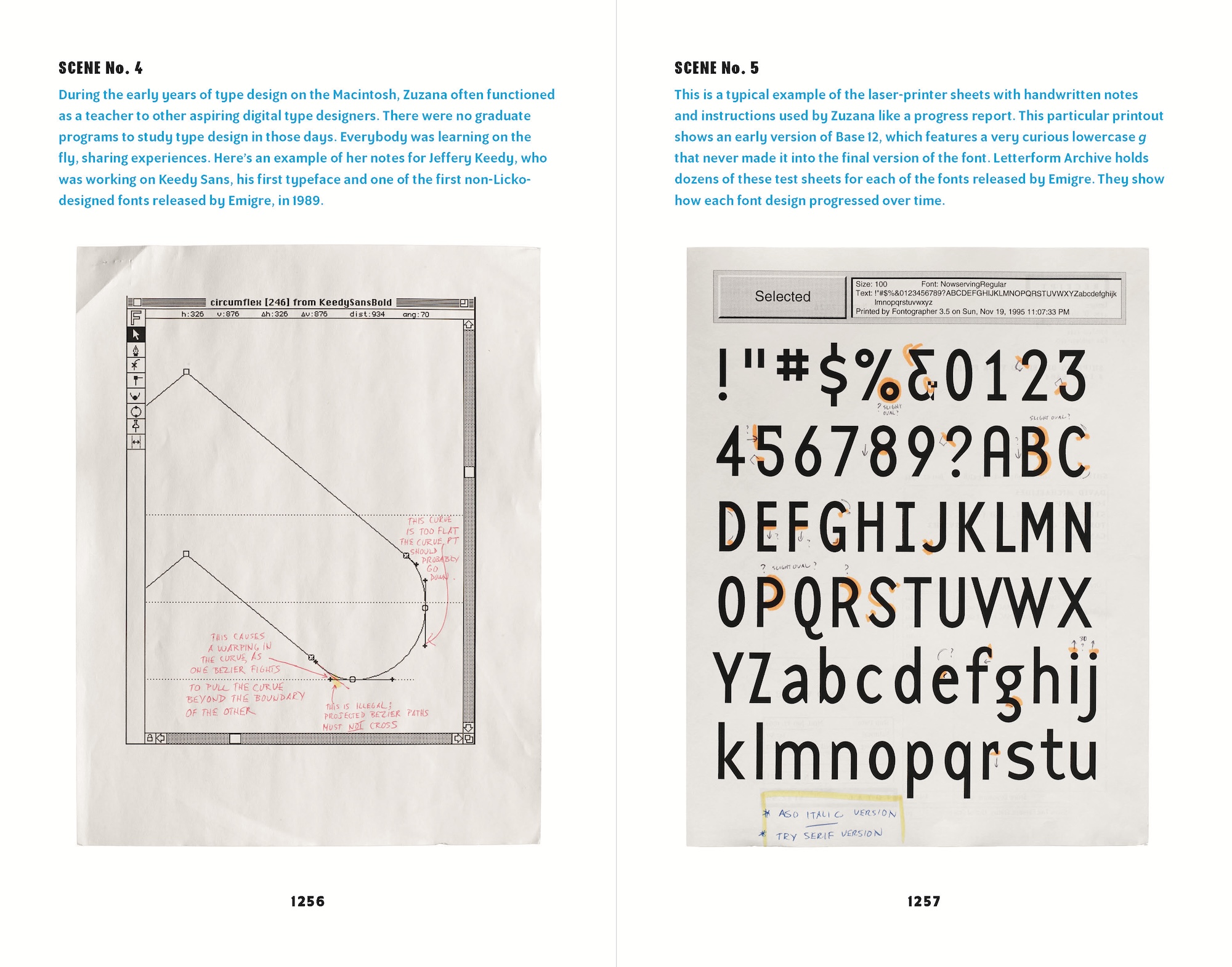
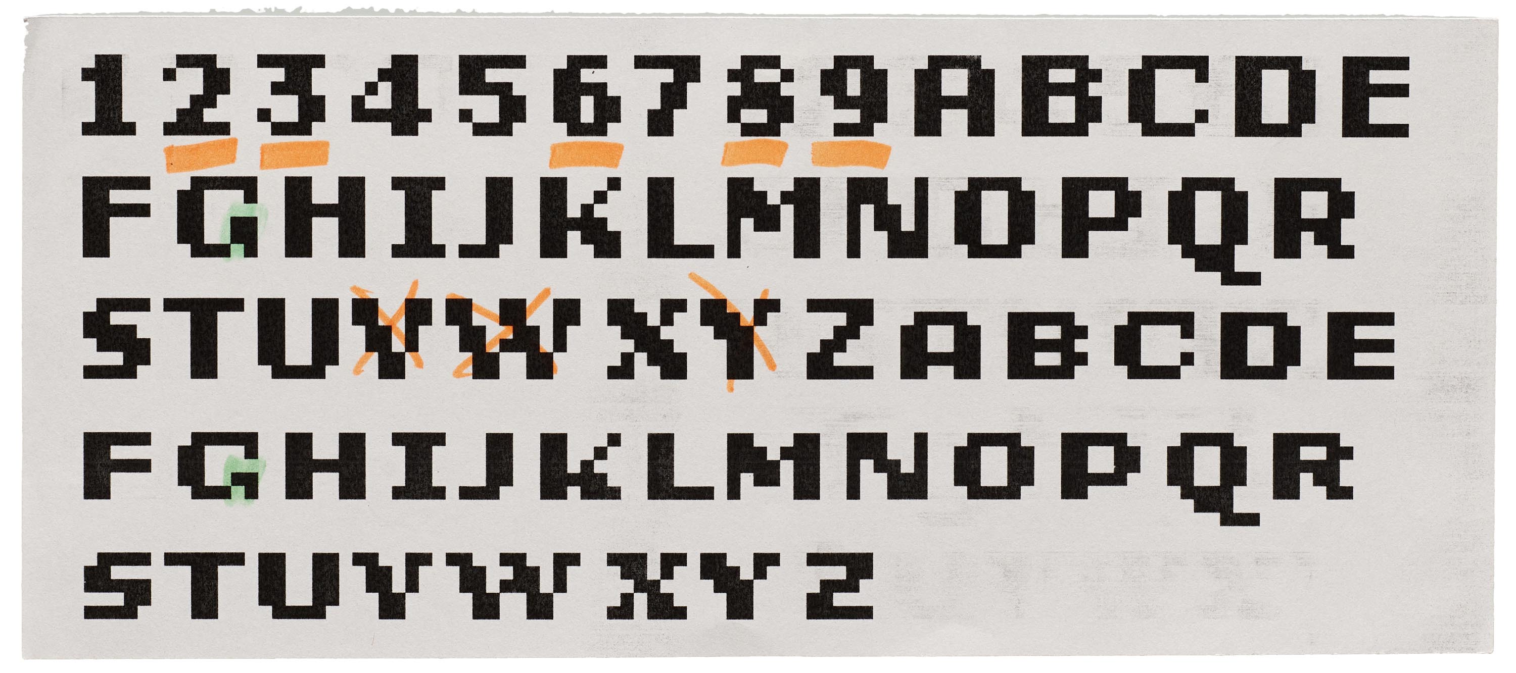
VanderLans: Yes, that’s how we first met Jeffery Keedy and Barry Deck. Jeffery was teaching at CalArts and, together with his colleagues Ed Fella and Laurie Haycock Makela, they brought their entire graduate class to visit our studio in Berkeley. Barry Deck was one of the students. This was probably around 1988 or so. That’s when we first saw Keedy Sans and Template Gothic. Later we asked them if they were interested in having us release those fonts through Emigre.
Licko: Yes, and I remember Jeffery being very skeptical, saying, “Who would want these fonts?” Well, it turned out that quite a few people did want them.
VanderLans: And then later, as our library grew, more and more designers started sending us their fonts. There were very few outlets like Emigre for digital fonts that were a little off center, so to speak. But we felt these fonts were worthy of being put out into the world, and it allowed us to expand our library and bring in more variety.
What role did external type designers play in the specimens of their fonts?
VanderLans: Some of the designers we worked with were graphic designers who also happened to design type. People like Jeffery Keedy and the late Frank Heine, for instance, are first and foremost graphic designers, so it made sense to ask them to design their own specimens. And in such cases they had free reign. We would pretty much print whatever design they would provide us with. The only parameters we would give them were the dimensions of the booklets and whatever product information the piece needed to convey to customers. Again, it helped us create a tremendous variety of styles and approaches.
Jeffery Keedy, Keedy Sans type specimen, 2002.
For all other specimens I pretty much designed them with practically no layout input from the type designer. That might sound a bit harsh, but I figured the type designers might as well get used to seeing their fonts used in ways they never imagined.
What is your criteria for accepting typeface submissions into the Emigre label?
Licko: Our criteria for accepting new typefaces has always been quite personal and intuitive. We look for designs that excite us and offer something unique, not just another variation on what’s already out there. They don’t necessarily have to be radical or experimental, but they should have a clear point of view or solve a specific design problem in an interesting way. We also consider how well a new typeface might complement our existing library.
One thing that’s important to us is that we genuinely like the work. Since we’re a small operation, just Rudy and myself, we have to be personally invested in every font we release. We’re not just looking at commercial potential, but also at cultural, technical, and artistic value. If we can’t get excited about a typeface ourselves, it’s hard to imagine successfully promoting it to others.
VanderLans: Over the years, we’ve received hundreds of typeface submissions, and we’ve turned down the bulk of them. We always stayed true to our beliefs and our own aesthetic preferences. And we passed a few times on what became huge sellers, like Hannes van Doren’s Brandon Grotesque, which for years was the number-one bestselling font on MyFonts. He sent it to us to see if we were interested in releasing it, but at the time it just didn’t feel like it would add anything new to the Emigre Fonts library.
The book compiles a mix of specimens for individual typefaces with broader catalogs, representing how you published Emigre Fonts specimens over time. How was this program developed? When did you decide to dedicate an entire booklet to a single release?
VanderLans: Upon release, each single font family was promoted either with a number of pages in Emigre magazine, a poster, or a type specimen mailer or booklet. And then, from time to time, we would create catalogs that showed the entire library, or a collection of all text types, or all headline types. It seemed like the right thing to do. This wasn’t exactly a side gig anymore. This is how we were making a living. So we had to be serious about properly promoting the fonts and deriving an income.
Licko: By the mid-nineties, our mailing list was reaching upward of 40,000 to 50,000 potential customers. So we would mail out these promotional materials, be it a specimen booklet, a poster, or an issue of Emigre, to the entire list, free of charge. This would run upward of $30,000 to $40,000 per mailing. Each time we did this, it seemed like a lot of money, but we would usually recoup those costs and then some. Unfortunately, that’s no longer possible. There is now such a glut in the type market that it’s nearly impossible for us to recoup the cost of properly producing and promoting a new font family. We’re still producing fonts, and we’re still creating type specimens, but we now do it purely for the fun of it. Not to say that we didn’t enjoy ourselves before.
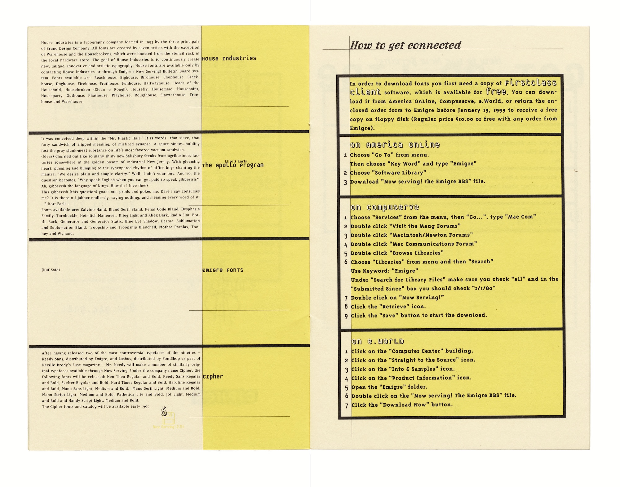
Your first specimens were essentially mail-order catalogs. Fonts were delivered on floppy disks by mail. In 1994 you pioneered digital distribution, offering fonts through a bulletin board system (BBS). How did that platform change your business? How long was it running?
Licko: The BBS ran very shortly, because it was soon replaced by the internet. Working with this early online delivery helped prime us for setting up our website and e-commerce. Of course, instant delivery of the fonts was a game changer, but doing away with shipping disks took away the opportunity to include printed materials, t-shirts, and other ephemera.
VanderLans: Before BBS and the internet, we had to hand-assemble each order. Orders would come in by phone, fax, or snail mail. We would copy the font onto a floppy disk, attach a label to the disk to identify the font on the floppy, and place the floppy into a microcase, along with a little instruction sheet on how to install the font and a license. Then we would close the case with a seal which, when broken, would tie the customer to the license. Then, as Zuzana said, we’d gather some promotional materials and pack it all up for FedEx or UPS and mail it out. In those days we had several people working in our office doing just that, all day. The internet eventually replaced all that manual work.
How has the type craft and industry changed since you started?
Licko: It has turned upside down. When we started, very few people even knew what a typeface was. Now, just about everybody has at least used a font. I would hazard a guess that there are more foundries today than there were typefaces when we began our journey.
VanderLans: The changes in type craft and the industry since we started have been truly remarkable. When we began in the mid-eighties, type design was still considered this arcane business that required a lifetime’s dedication to produce even a single typeface family. The Macintosh computer completely democratized font design and manufacture, which had previously been the private domain of just a handful of large type foundries who owned the proprietary systems.
Licko: Today, the industry is radically different. There’s been an explosion of new type designs over the past fifteen years, with dozens of new fonts added each month. There are now numerous type design programs graduating designers who are cranking out professional fonts. The ease with which one can now technically produce fonts has completely democratized the field. Designers can easily launch their own websites to sell directly or use numerous distribution channels. We’ve gone from having very few outlets for new digital type designs to having almost too many options.
To a degree, type design has become a victim of its own success because, perhaps ironically, with all the new typefaces being designed today, it’s become far more challenging to recoup the investment of releasing a new typeface.
What’s the most surprising appearance of your fonts in the wild?
Licko: On a few occasions, I have seen a text and didn’t immediately recognize my own font. This happened when we visited the Contemporary Jewish Museum in San Francisco a few years back for a show of Roz Chast’s work. They had these huge wall-graphic texts that I was reading, but it wasn’t until Rudy pointed out that it was all set in Mr Eaves that I realized I had designed the type. It had just been released, so we hadn’t seen it used very much. It was a real crystal goblet* moment for me.
VanderLans: For me it was when the Tampa Bay Buccaneers football team adopted Totally Gothic, of all typefaces, for their logo and identity. To see that logo printed in the endzone, with letters measured in yards, not points, was impressive. And no crystal goblet moment there—those letters screamed to be seen for what they were: big, crazy, swashbuckling glyphs.
What is the most rewarding part of running a type foundry?
VanderLans: The most rewarding part has really been having complete creative control over our work. We’ve never had to answer to clients or follow anyone else’s vision. Everything we do, from developing new typefaces to designing specimens, comes from our own creative impulses.
Licko: There’s something really satisfying about creating tools that other designers use to express themselves. When we see our fonts out in the world being used in interesting ways, it’s incredibly gratifying. We’ve managed to stay true to our vision while building something sustainable, and that feels like a real achievement.
What is the worst?
Licko: Well, the piracy, which peaked in the early internet days, was very disheartening. But we tried to think of it as a form of flattery.
VanderLans: Having to tell people we’re not releasing the font they submitted. I know from personal experience how devastating it is to see the work you’ve labored over be turned down.
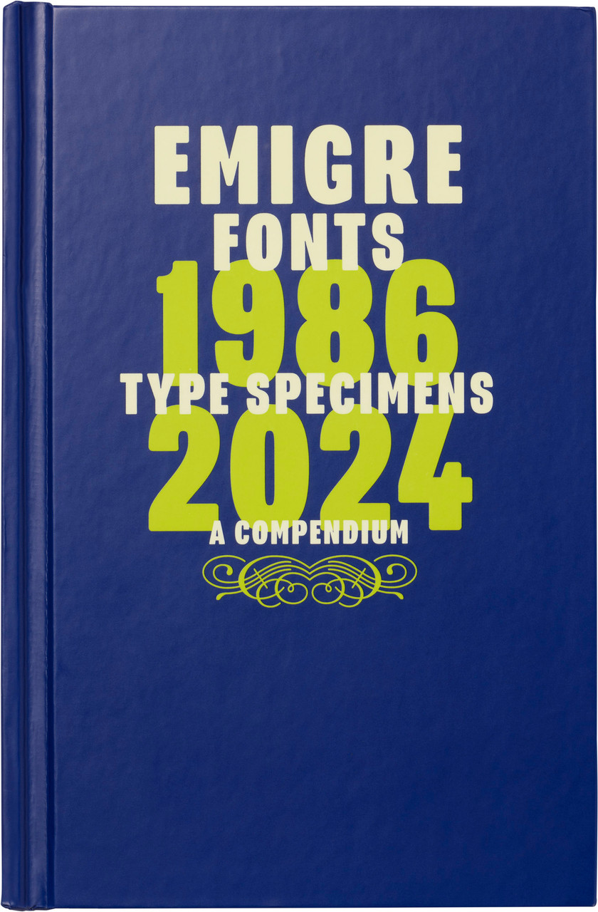
Hardcover, 5.25 × 8.25 inches, 1,264 pages.
What is next for the foundry? Will we see more specimens?
VanderLans: Well, we just published the second in a series of look-back specimens. The first one, titled “Grody to the Max,” featured all the fonts we released in the ’80s. The current one, “Whatever,” covers the ’90s.
Licko: You know, we’re taking a different approach these days. While we still have a few new designs in production, we’re not in any rush to keep expanding our library—definitely not at the pace we used to maintain. Instead, we’re focusing more on marketing and promoting our existing library. We’re particularly interested in finding novel ways to show our existing fonts in new contexts. It’s actually quite challenging and creatively satisfying to use fonts with a history in unexpected ways.
VanderLans: Most of all, we hope to continue doing this and remain independent for a long time to come.
Subscribe to our newsletter for more exciting announcements about the Emigre collection at Letterform Archive.