News
Now Online: Landmarks of Early Western Typography
From Gutenberg to Granjon, new additions to the Online Archive represent major developments in letterpress printing.
In her recent update, librarian Kate Long mentioned the ways we use the Archive as a teaching tool, especially in our Survey of Type History for the MFA Design program at the California College of the Arts. Now in its third year, the course tells the story of design firsthand through a curated selection of artifacts from our collection. This year, of course, the pandemic is forcing us to meet remotely, which means we’re prioritizing key historical objects for digitization and virtual presentation. The beauty of this pivot is that everyone benefits – even those who aren’t master’s students – because the Online Archive is open to all. As a taste, here are a few recent additions to the site that represent typographic milestones over the first 150 years of letterpress printing.
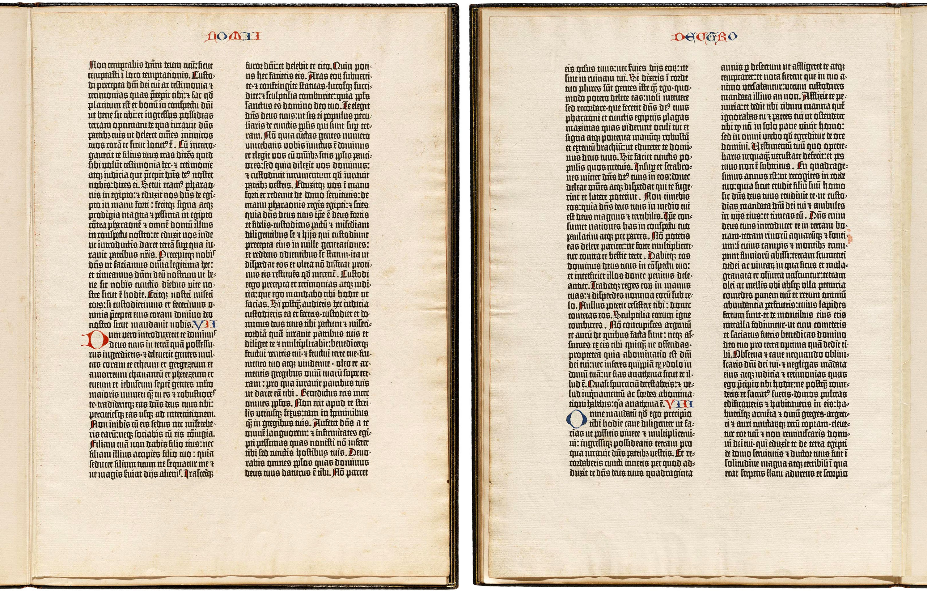
Johannes Gutenberg, Bible leaf, 1450–1455

Our “Book of Deuteronomy” leaf comes from one of the imperfect copies of Gutenberg’s original printing that were disbound and dispersed in 1920. It includes a 1921 biographical essay by author and book collector Alfred Edward Newton. Gutenberg’s book famously represents the first practical example of movable type in the western world. We often show it next to a manuscript Bible leaf made just a few years before, to demonstrate how closely Gutenberg sought to mimic the traditional page layout and scribal handwriting of the time. While main text was printed with type, the colored initials, chapter numbers, and other illuminations were still applied by hand.
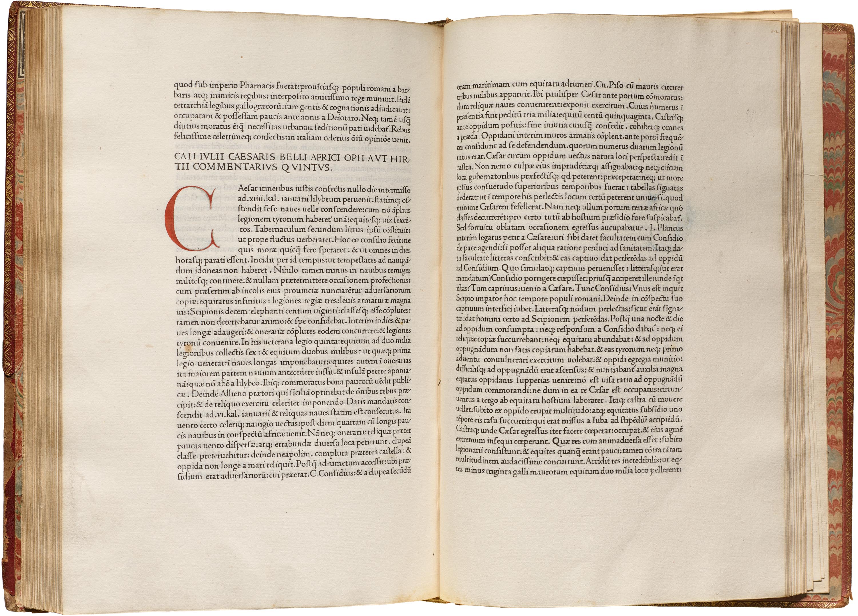
Nicholas Jenson, Caesar Commentarii, 1471

The roman typeface, by Nicholas Jenson in Venice, is the best known archetype of the oldstyle or “Venetian” serif, and remained influential for hundreds of years. Twentieth-century revivals include Centaur and Adobe Jenson. Caesaris Commentariorum Liber Primus de Bello Gallico (Caesar’s commentaries on the Gallic War) offers a good example of Jenson’s fine punchcutting (type design) and printing. This book, along with the Nuremberg Chronicle and Hypnerotomachia Poliphilii (below), make up a significant trio of incunabules (books printed before 1501) in our collection.
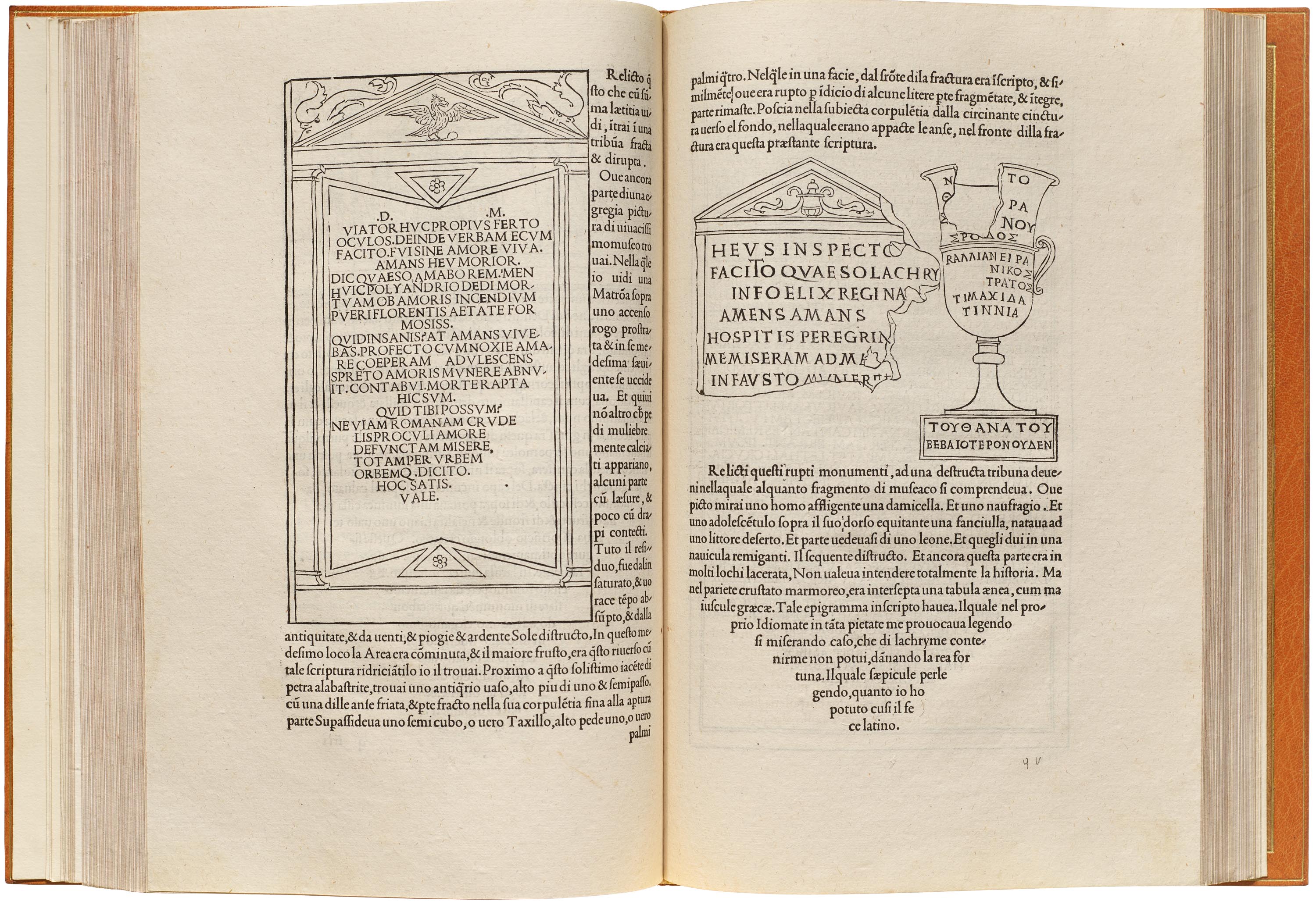
Aldus Manutius, Hypnerotomachia Poliphilii, 1499

Hypnerotomachia Poliphili is a romance and allegory beautifully printed by Aldus Manutius. The book’s 168 illustrations depict the fantastical dreams of the central character Poliphili which elegantly complement the typography. The type — known for its quality and clarity — was cut by Francesco Griffo and was a template for many classic 20th-century book faces, such as Monotype’s Poliphilus (a direct revival) and Bembo (a reinterpretation). It is expertly set and printed, offering our visitors a tangible glimpse at one of the best examples of an early roman. The spread shown above contrasts an illustration using the type (left) with an illustration using woodcut lettering (right).
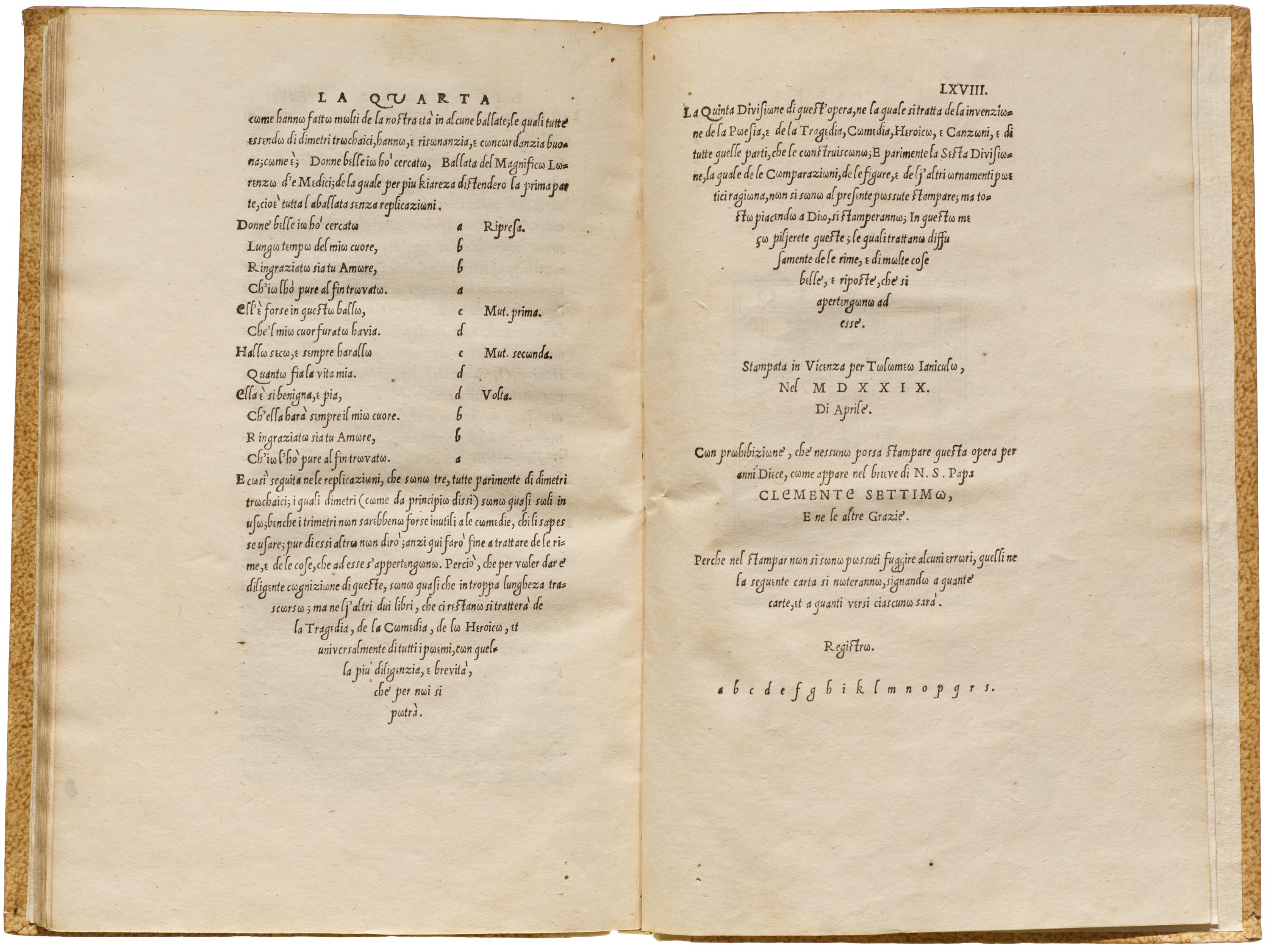
Ludovico Vicentino degli Arrighi, Trissino: La Poetica, 1529

This book is set in one of the earliest and narrowest italic typefaces, designed by Arrighi, a scribe in the papal chancery. The text presents Gian Giorgio Trissino’s idea for a new orthography, resulting in the appearance of characters, like ω, where you would not expect them. The spread shown above includes an uncommon example of a type specimen at the end of the book, emphasizing that many of the “scholar printers” of this period were not only designing books, but also the type that appears in them. Arrighi’s work inspired many italic companions to 20th-century Venetian revivals, such as Blado (paired with Poliphilus), Arrighi (paired with Centaur), Adobe Jenson’s Swash Italic, and Requiem.
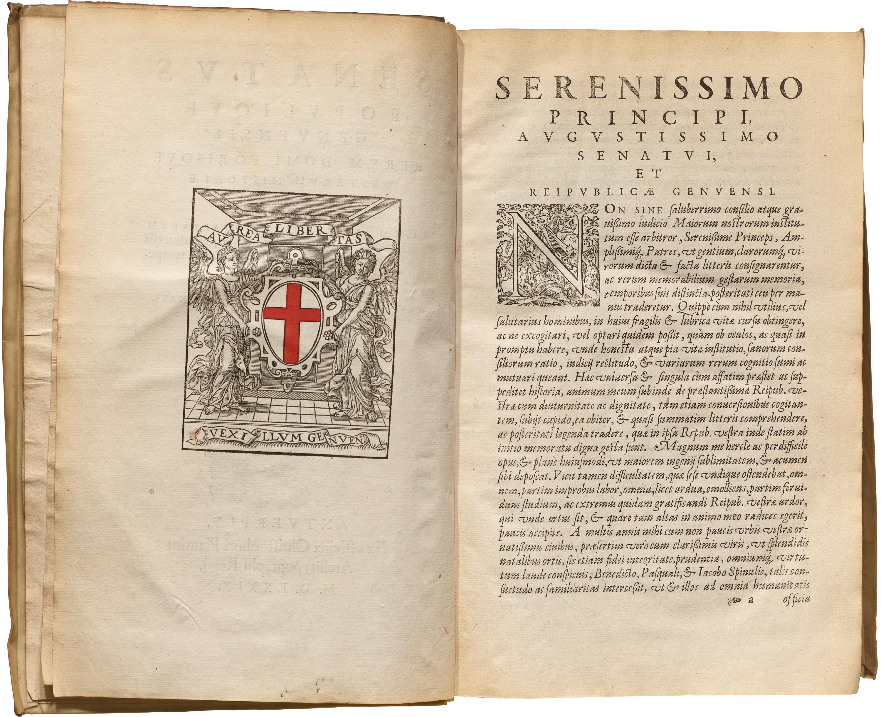
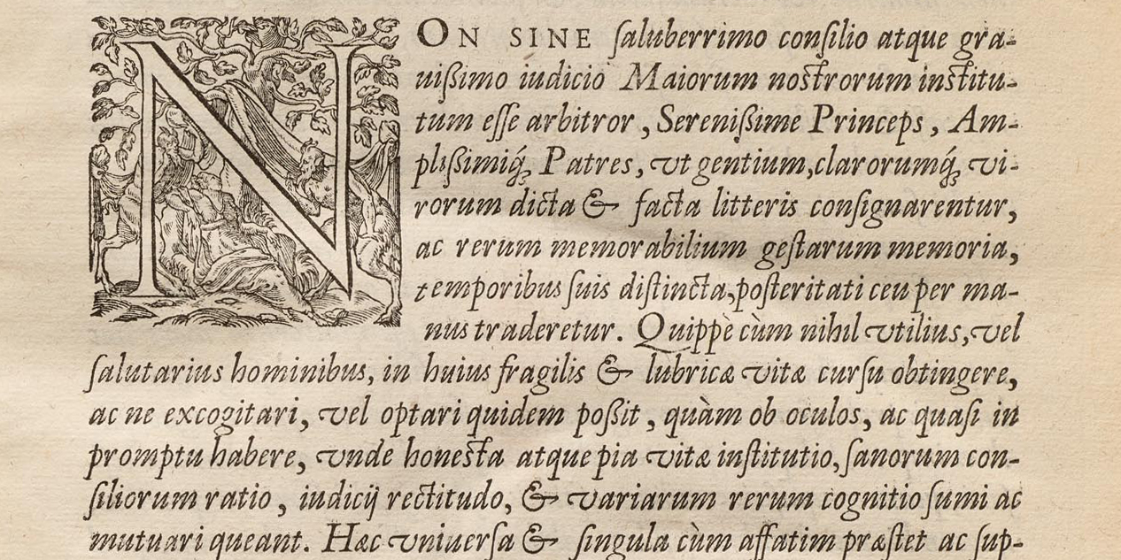
Christophe Plantin, Senatus Populique Genvensis…, 1579

This record of the Genoese Senate showcases two masters at work: Dutch printer Christophe Plantin and French punchcutter Robert Granjon. The text opens with a sharp and vibrant italic flaunting many ligatures (two letters combined into one form, such as st) and decorative swash glyphs (such as M). Granjon’s type — often paired with Jean Jannon’s romans (sometimes misnamed “Garamonds”) — was a significant model for italics over the next five centuries.
— Stephen Coles, Associate Curator & Editorial Director
Explore 1500–1700 in the Online Archive
Further Reading
- John Boardley, Typographic Firsts
- Riccardo Olocco on early roman type
- Stan Knight, Historical Types: From Gutenberg to Ashendene
- Philip Meggs, Revival of the Fittest
- James Mosley, “Garamond or Garamont?”
- Paul Shaw, Revival Type: Digital Typefaces Inspired by the Past
- Hendrik D. L. Vervliet, The Palaeotypography of the French Renaissance