News
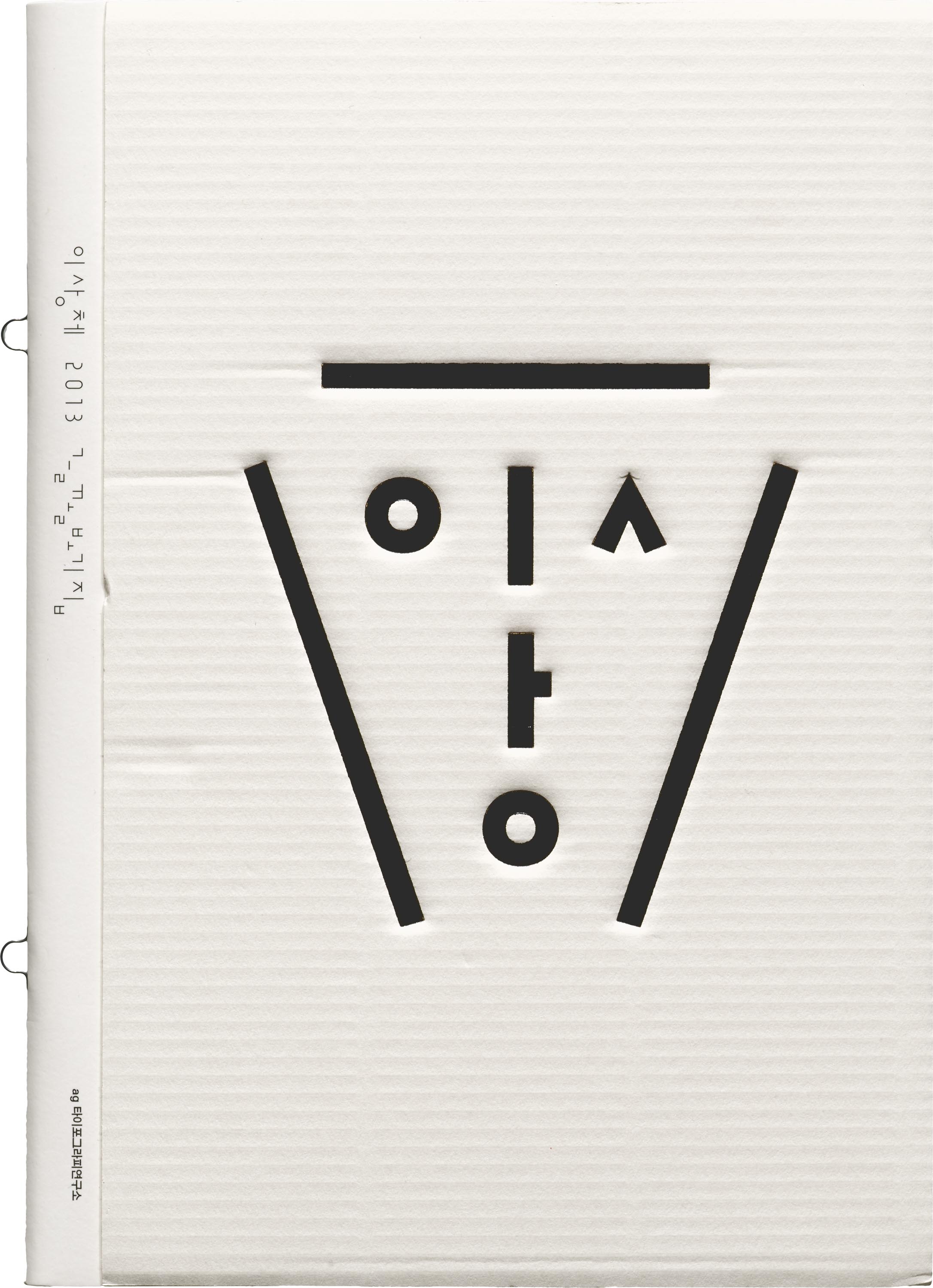
From the Collection: Ahn Sang Soo and AG Typography Institute
Dating back to 1985, specimens of the Korean’s digital type represent the origins of exploration and play found in Hangul design today.
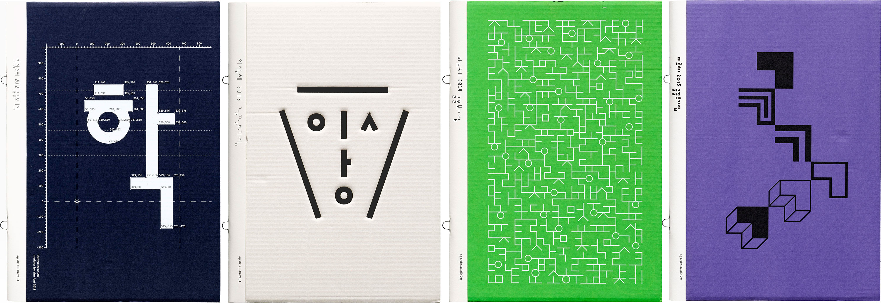
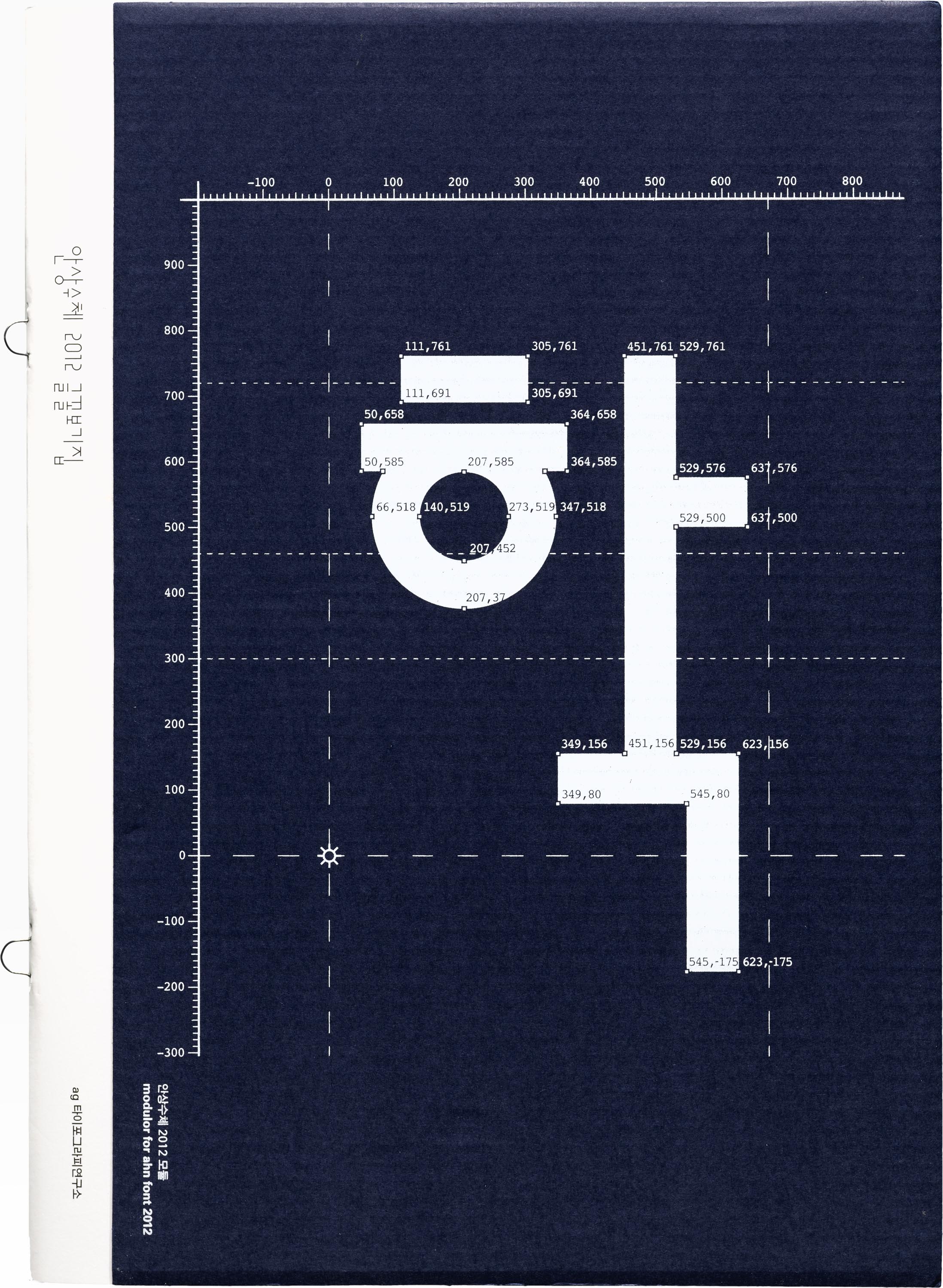
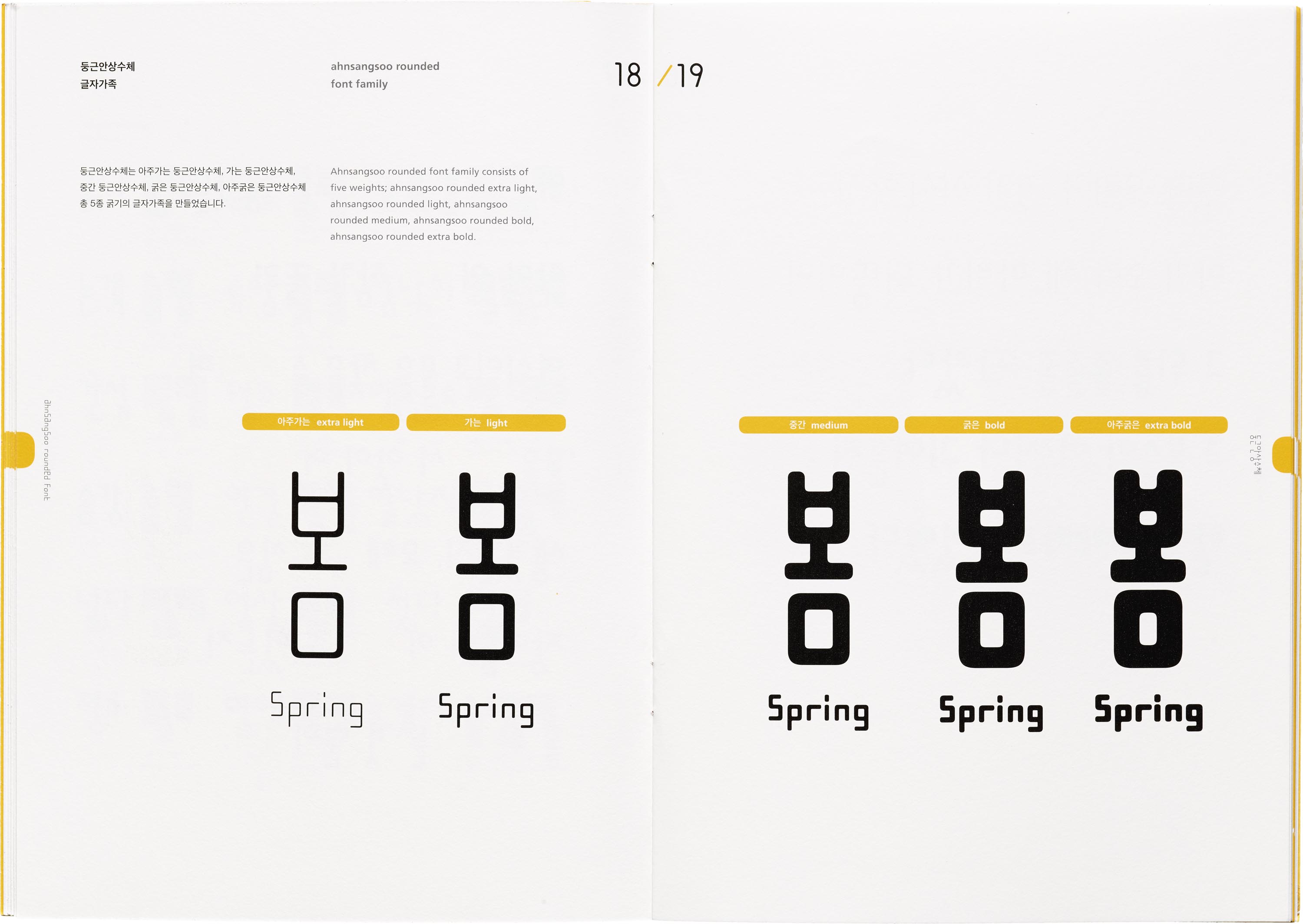
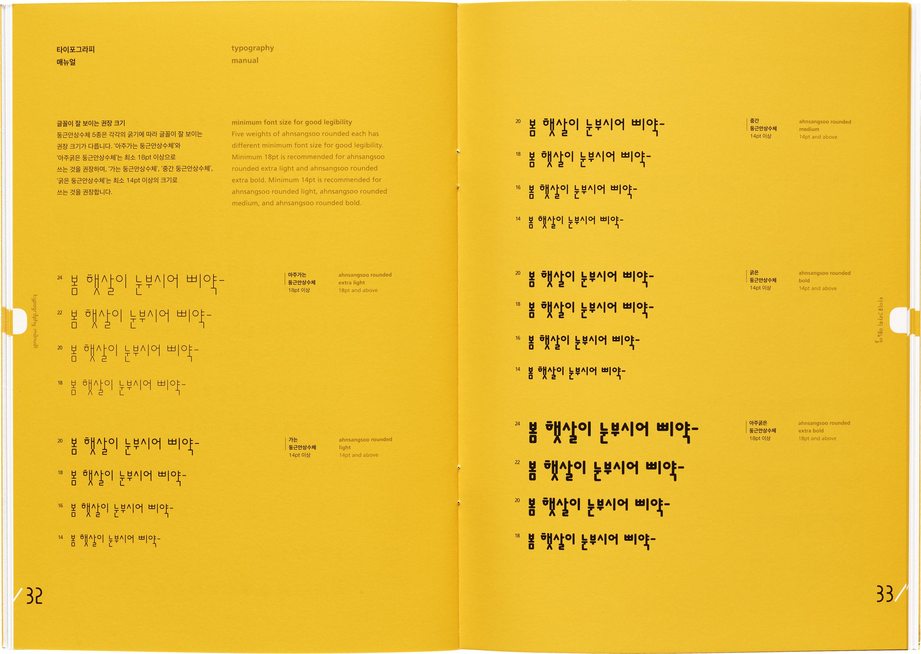
Ahn Sang Soo is often recognized as the father of contemporary Korean type design, and for good reason. His first typeface designed in 1985 broke the molds of Hangul’s traditional design and paved a path of experimentation for the young script. An alumnus and now a professor and Head of the Graphic Design department of Seoul Hongik University, he’s made major typographic contributions in both design and discourse. In 2012, he founded the Paju Typography Institute (PaTI), an alternative design school, as well as AG Typography Institute, an organization that’s dedicated to not only the design of new typefaces, but research, writing, exhibitions, and book design. He’s also published several design books and translated seminal works on typography by Jan Tschichold and Emil Ruder into Korean. Since AG’s founding, Ahn’s original designs have expanded and new faces have been developed. Throughout his career, his typographic lens has also been applied to print magazines, visual arts, photography, poetry, architecture, and more — altogether representing Ahn’s legacy, and his emphasis on the importance of design, research, and play.
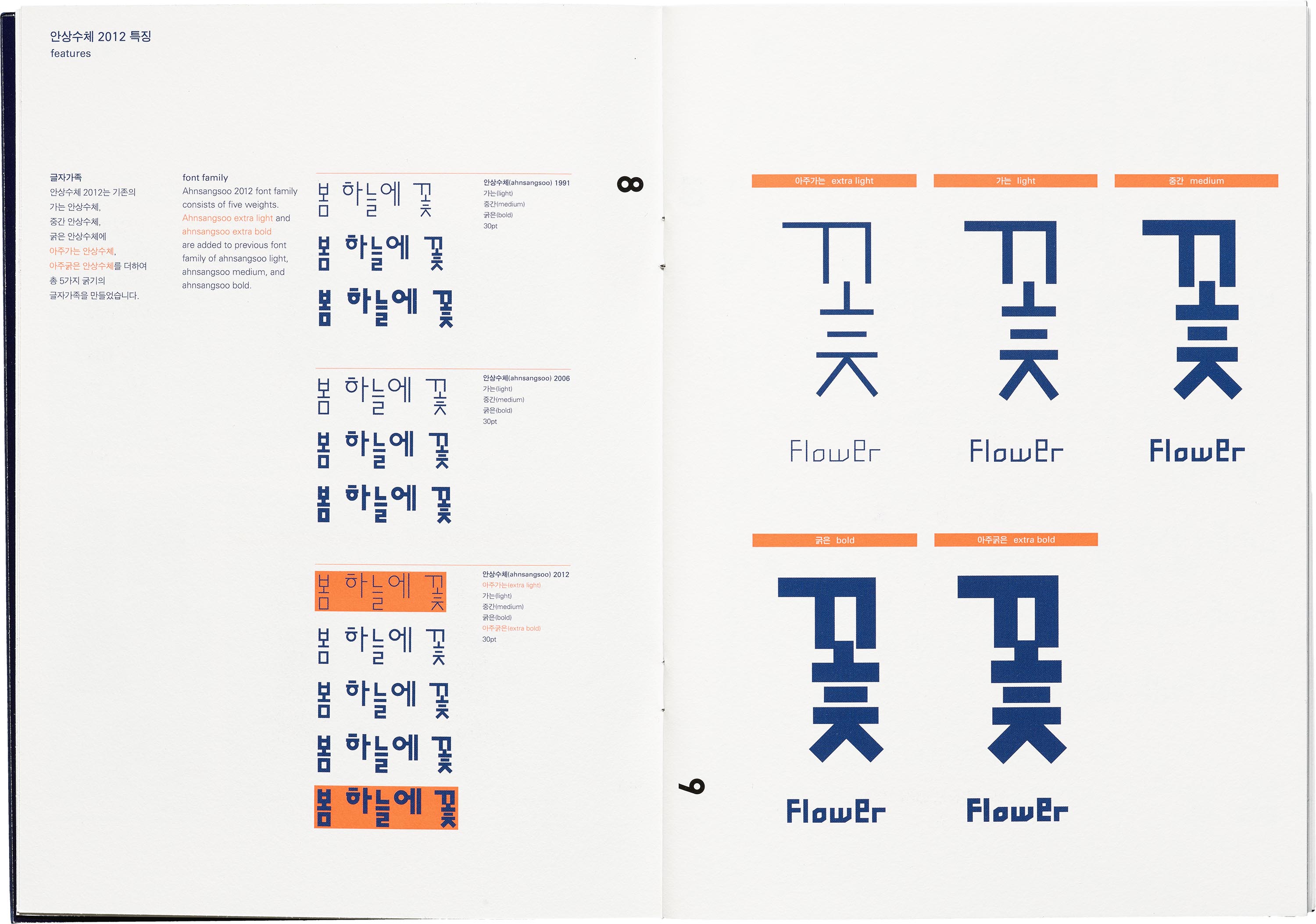
For Hangul designers, coming into contact with Ahn’s work was pivotal in shaping how they see the letterforms and have applied Ahn’s philosophies to their own practices. Type designer and Type Media graduate Ham Minjoo describes Ahn as being one of her heroes since she came across his work in university. One of the most groundbreaking works for her is Ahn’s first typeface named after himself. “If you look at Ahnsangsoo, even though it was designed in 1985, it’s very modern and natural. Hangul is modular by design, and this typeface is clearly based on Hangul’s philosophy and construction. With this typeface, Ahn defined a new way of looking at Hangul,” Ham said.
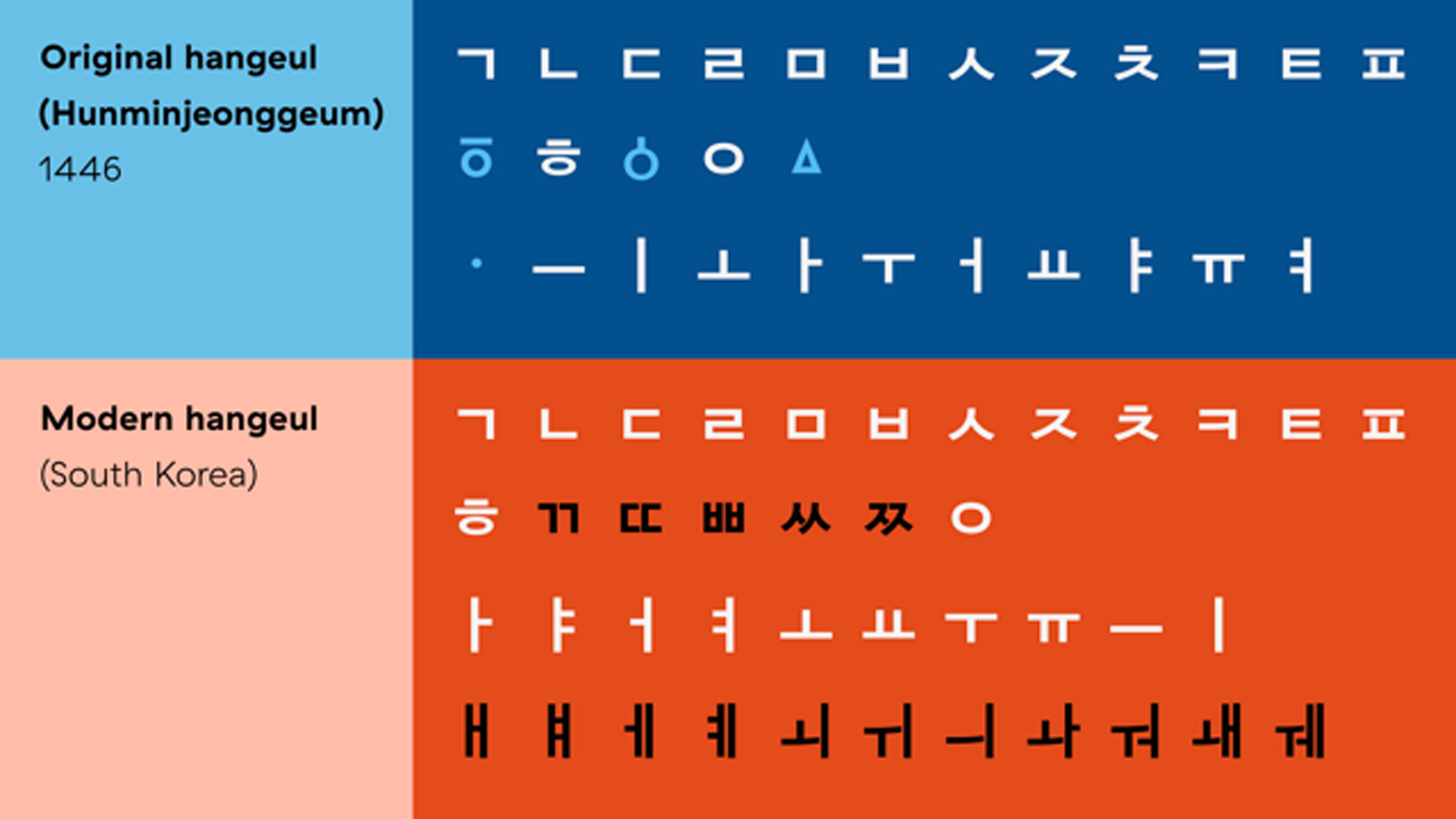
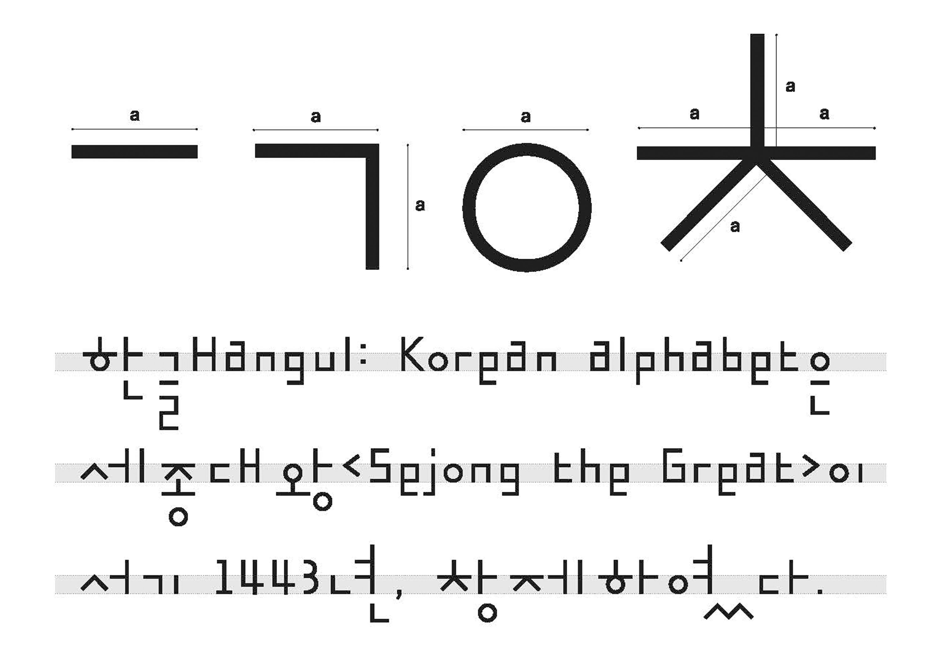
Understanding Ahn’s designs goes hand in hand with the history of Hangul’s construction. Up until the mid-15th century, Chinese was the main script of the Joseon dynasty, and the practice of reading and writing Chinese characters was only available to the educated elite. King Sejong, the ruler at the time, felt dissatisfied that his subjects could not communicate their concerns to him and decided to come up with a new system. He’s known for saying that using Chinese characters for Korean was “like trying to fit a square handle into a round hole” and developed 28 letters for the new writing system, 24 of which still remain today. These letters make up components called jamo, the building blocks for Hangul’s syllables. He said, “It is my wish that people may learn these letters easily and that they be convenient for daily use.” Today, South Korea has one of the highest literacy rates in the world.
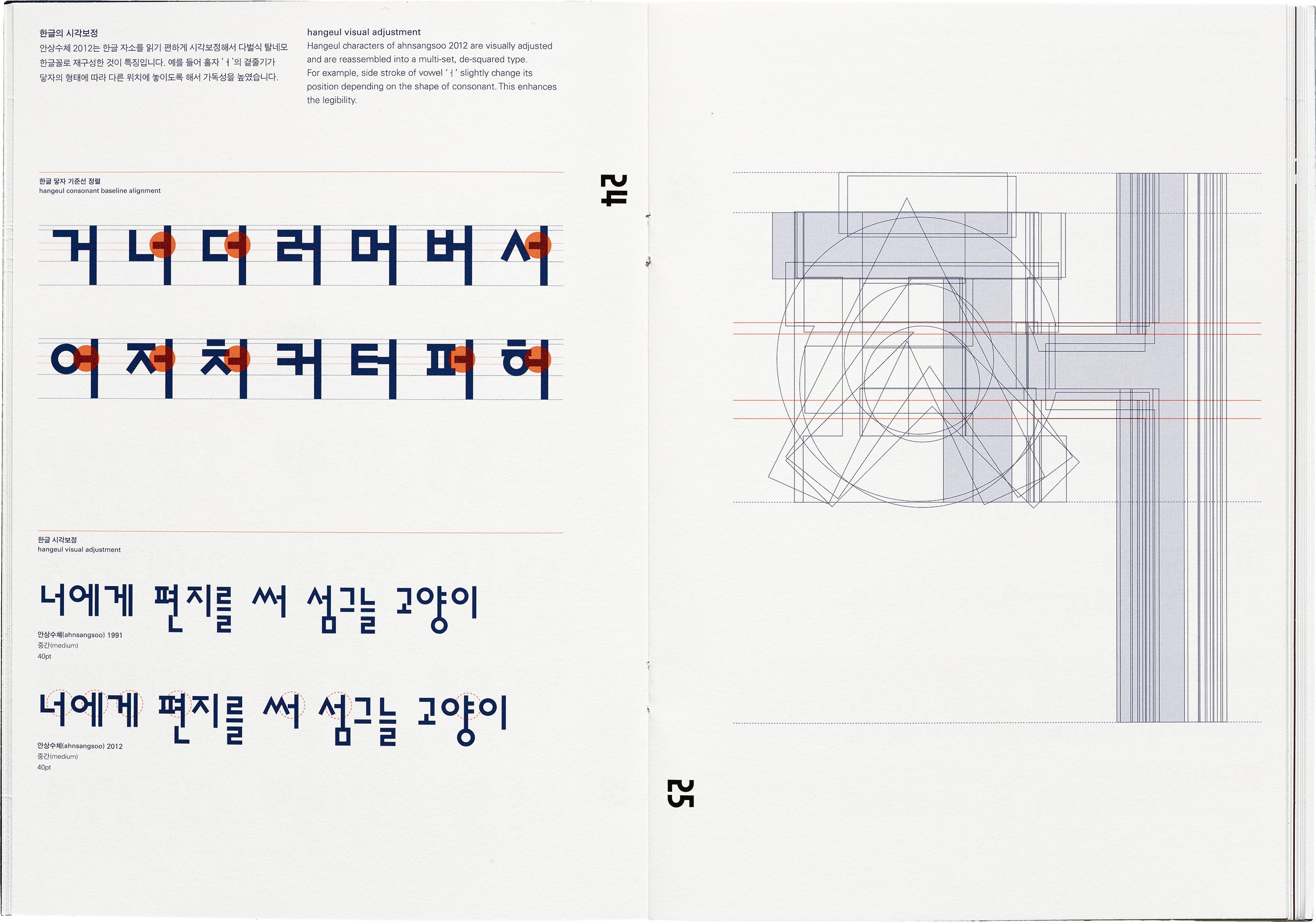
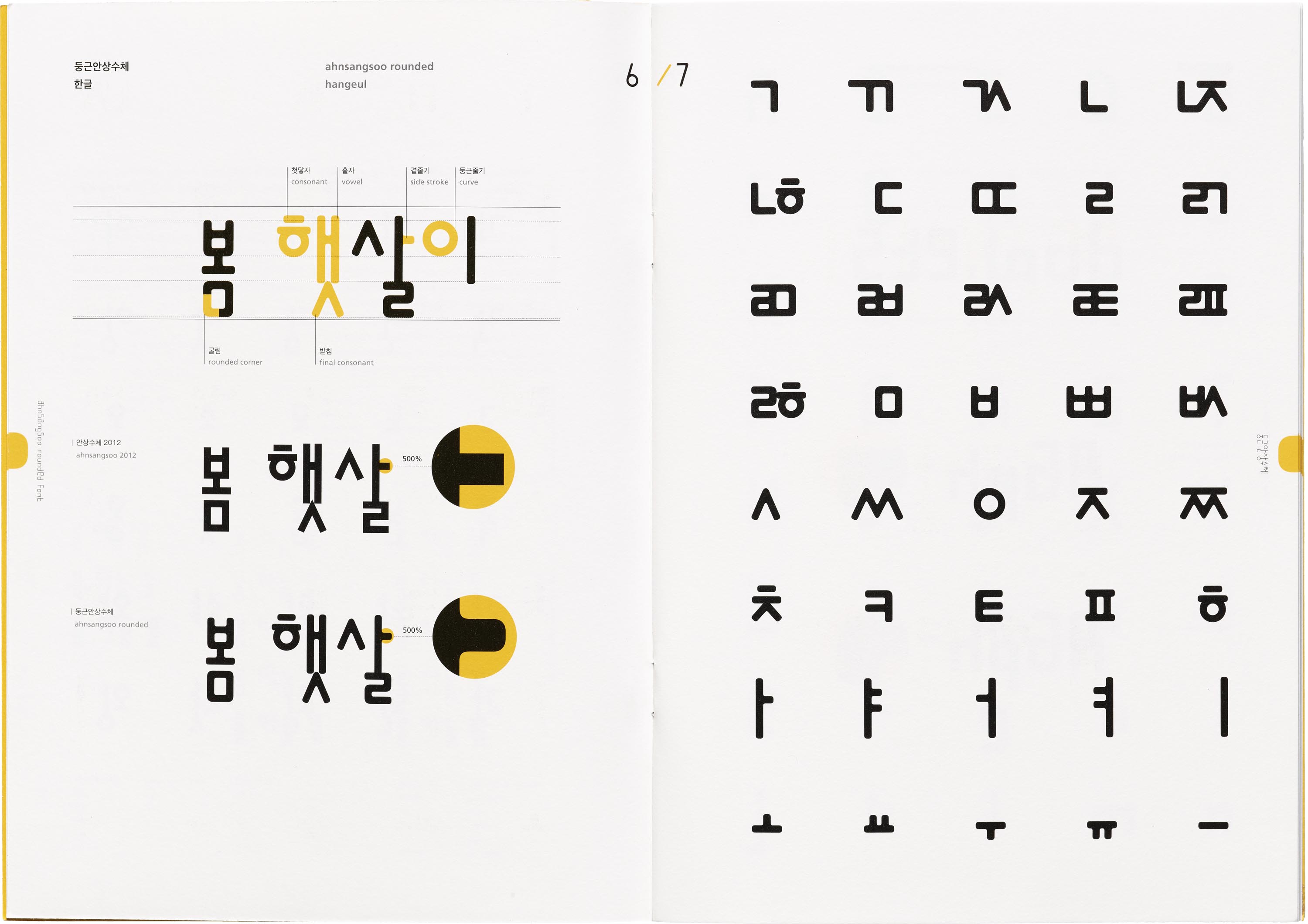
The simple and modular letterforms are made by combining basic shapes like circles, squares, triangles, and lines. Lars Kim, a designer and letterpress printer who recently spoke about Korean typography in our Letterform Lecture series, explains: “Ahn played with how letterforms interact, whether by elongating connecting lines between characters, breaking them apart with empty space or treating individual letters as purely graphic elements. He broke from tradition but also drew from it to create a new paradigm in Korean typography,”
-
- Choseong (initial): ᄀᄁᄂᄃᄄᄅᄆᄇᄈᄉᄊᄋᄌᄍᄎᄏᄐᄑᄒ
- Jungseong (medial): ㅏㅑㅓㅕㅗㅛㅜㅠㅡㅣㅐㅒㅔㅖㅘㅙㅚㅝㅞㅟㅢ
- Jongseong (final): ㄱㄲㄳㄴㄵㄶㄷㄹㄺㄻㄼㄽㄾㄿㅀㅁㅂㅄㅅㅆㅇㅈㅊㅋㅌㅍㅎ
For modern Korean typesetting, a font should include at least the basic syllables (2,780 Hangul syllables). The full set measures up to a little over 11,000 syllables.
Source: Creating a Hangeul Font by Minjoo Ham and Aaron Bell, 2018, Glyphs.
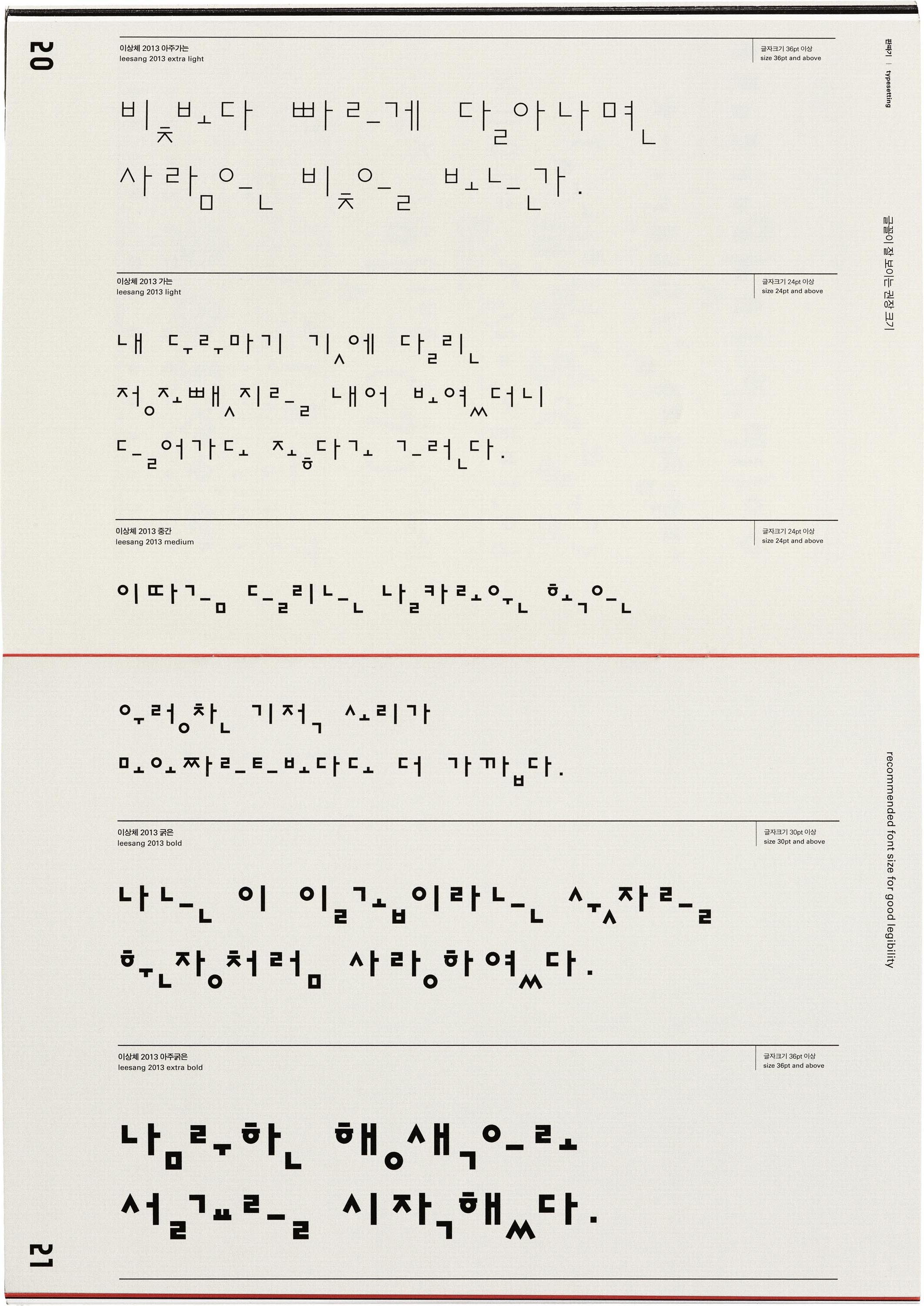
The Leesang typeface is a prime example of Ahn innovating on Hangul’s forms while honoring the past. First designed in 1988 and expanded in 2013, it was inspired by Korean avant-garde and surrealist novelist and poet, lee sang. “This typeface breaks apart the syllabic block of Hangul into “disassembled” characters (풀어 쓰기)”, said Yoon Min Goo, a designer currently pursuing an MA in Type Design at ECAL who worked on expanding and refining Leesang. “Each consonant, vowel, and final consonant are rearranged one after the other on the baseline. This dissemblance makes room for appreciating and focusing on the construction, beauty, and materiality of each individual letter.

For Lars, Ahn’s work reminds her that beauty can be found in older visual forms, and still evolve along with cultural identity over time. “My work is often inspired by yeobaek, or emptiness and blank space, a concept which comes from classical brush painting but can also be seen in Ahn’s typefaces. When I design for letterpress, I add extra breathing room in between letters, which aids in legibility and honors the relief process. Beginning with space also allows me to slow down and connect with new visual ideas. That’s where I feel most creatively inspired and free,” Kim said.
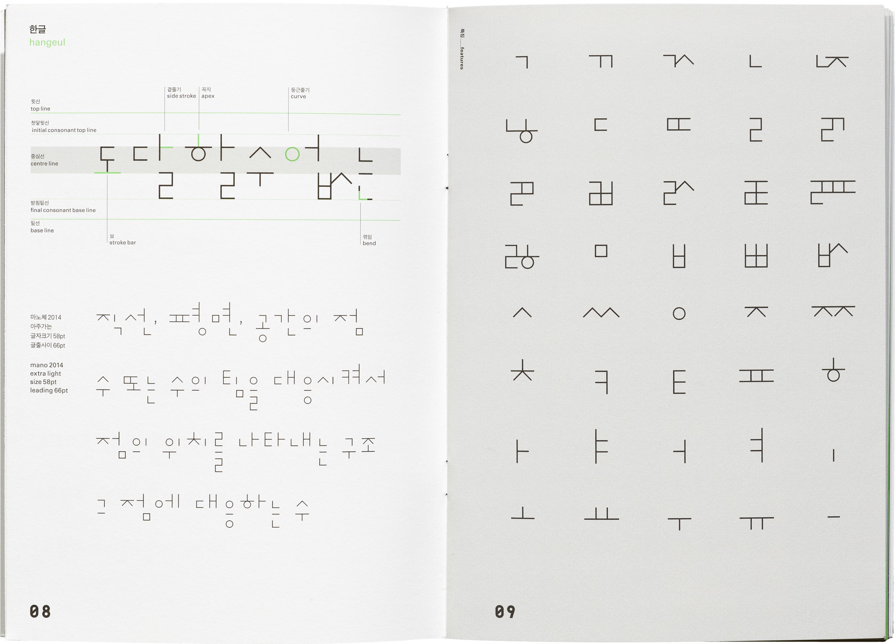
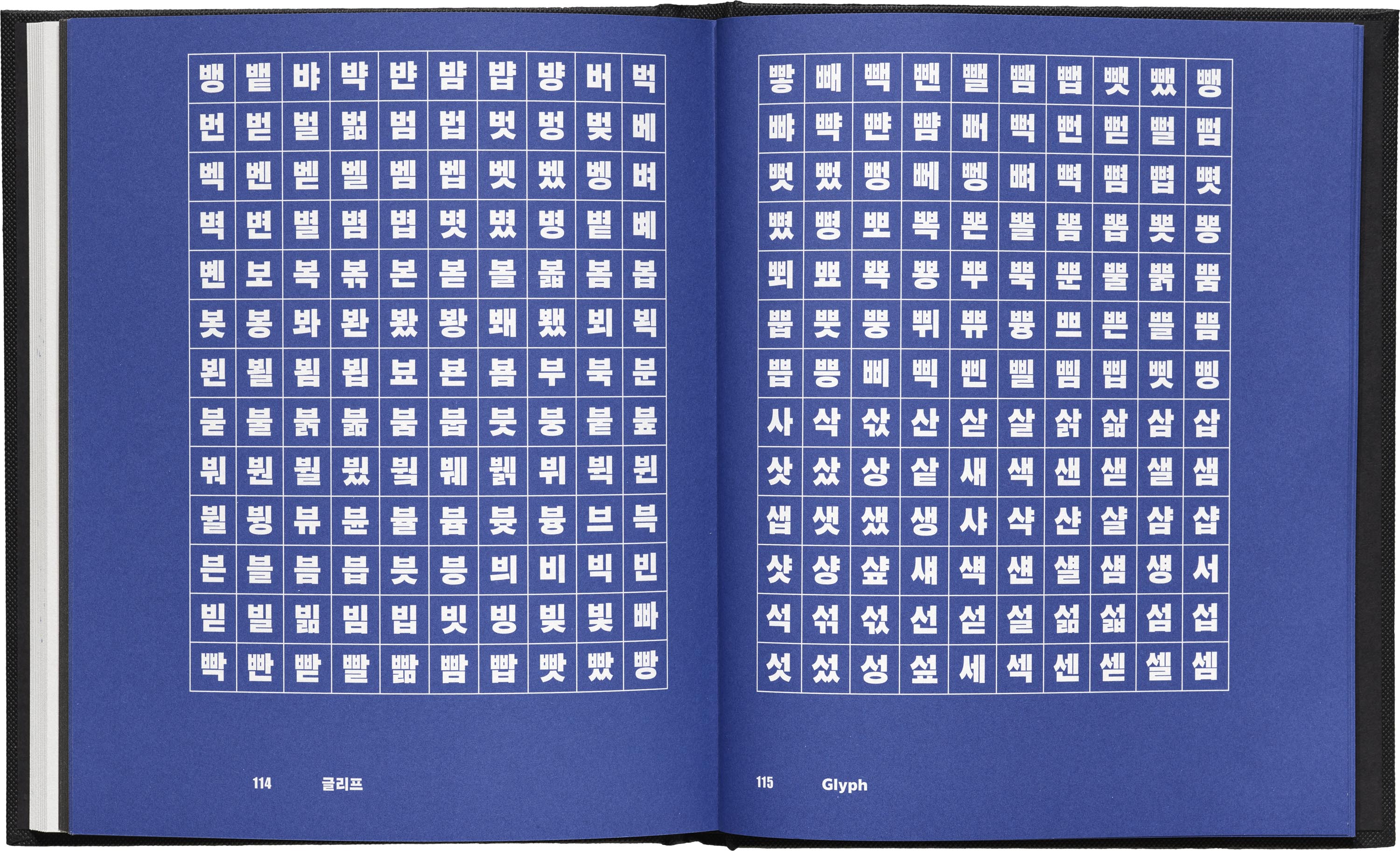
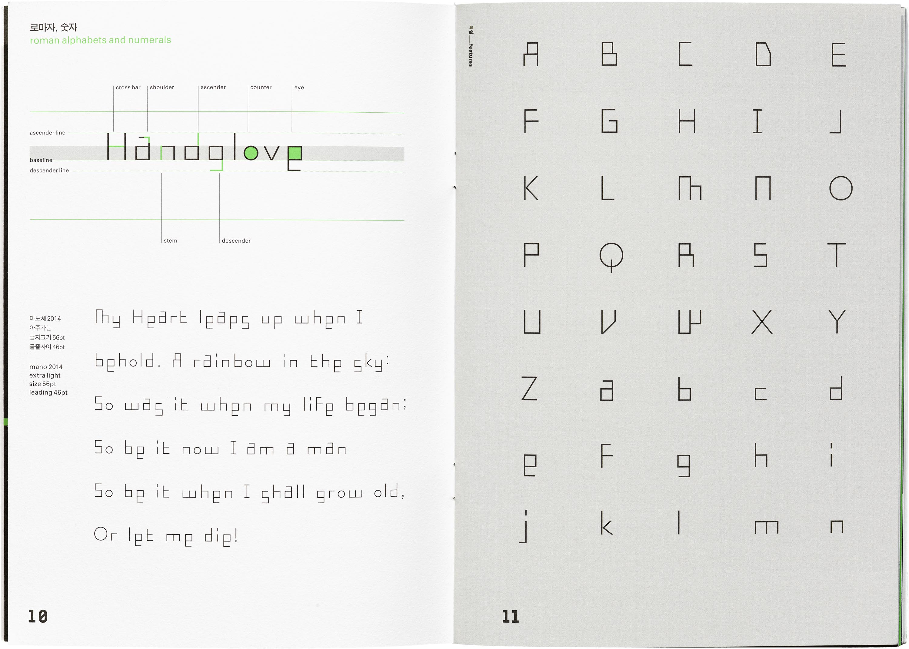
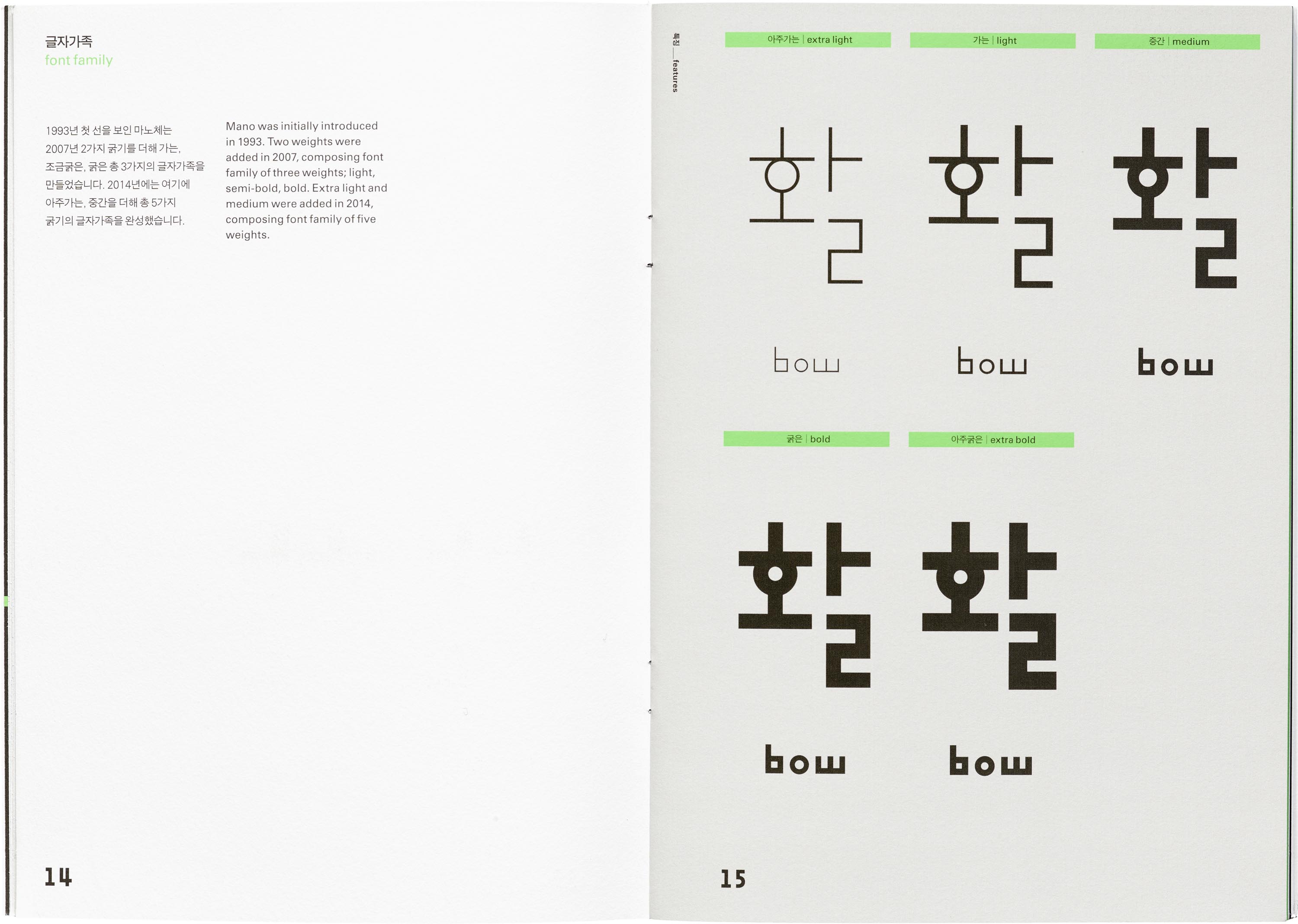
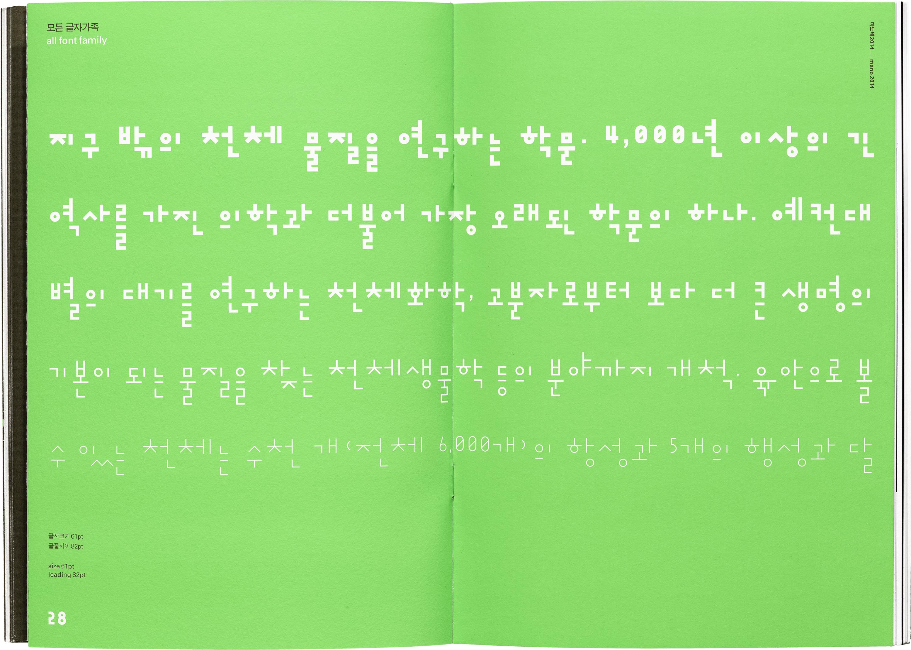
Mano, introduced in 1993, plays with the stroke module. Aside from the round characters, anything else with an angle is comprised of a stroke that’s fixed in length and width. This modularity results in interesting design characteristics, like how some characters end up sharing a side stroke (ㄻ and ㄼ), or how characters that take up more vertical space (ㄹ and ㅂ) are dramatically lengthened. The quirkiness of the Mano shines even more when characters are formed into syllabic blocks, typeset and result in a rhythmic line. In its Latin counterpart, which is included in each of Ahn’s typefaces, the wavy baseline is all the more apparent — with the lowercase ‘e’ and ‘s’ descending, and the ‘g’, and ‘a’ ascending.
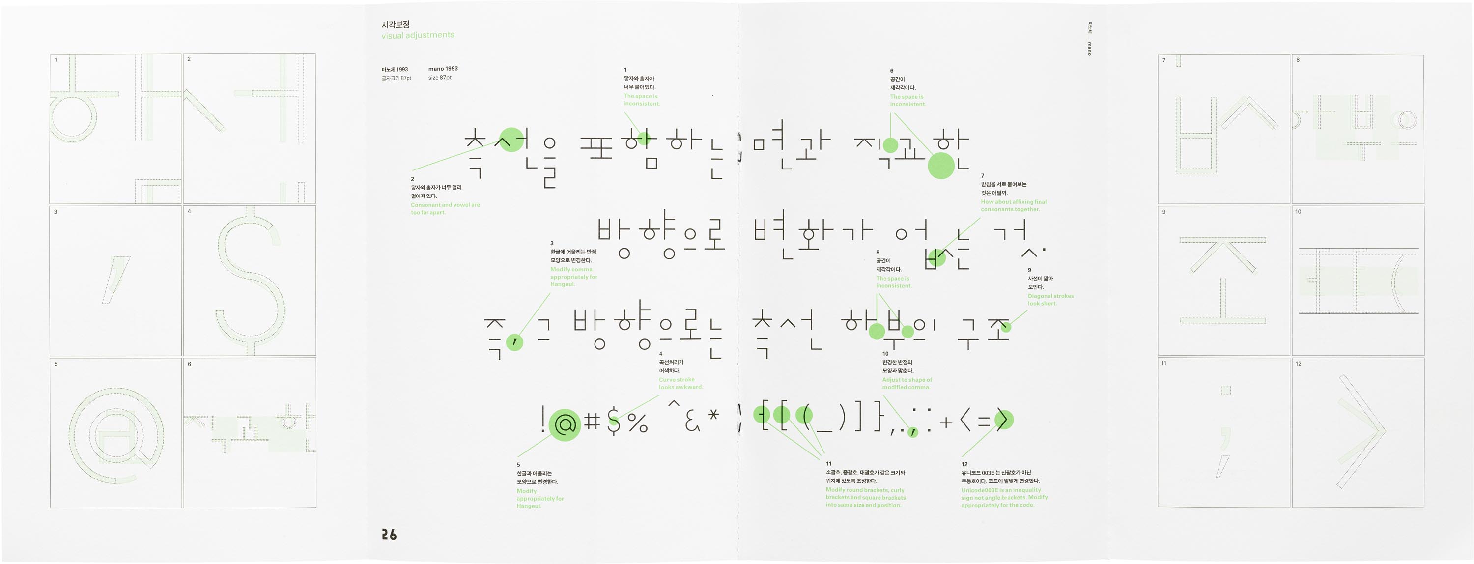
As with all type design, even with a rule in place, sometimes it has to be broken. The specimen for Mano includes a fold-out detailing the visual adjustments made after the modularity created quirks in spacing. Some of the tweaks include attatching final consonants together, tightening the spacing between first consonant and vowel, and lengthening the diagonal strokes a bit to optically match the lengths of the horizontal and vertical strokes.
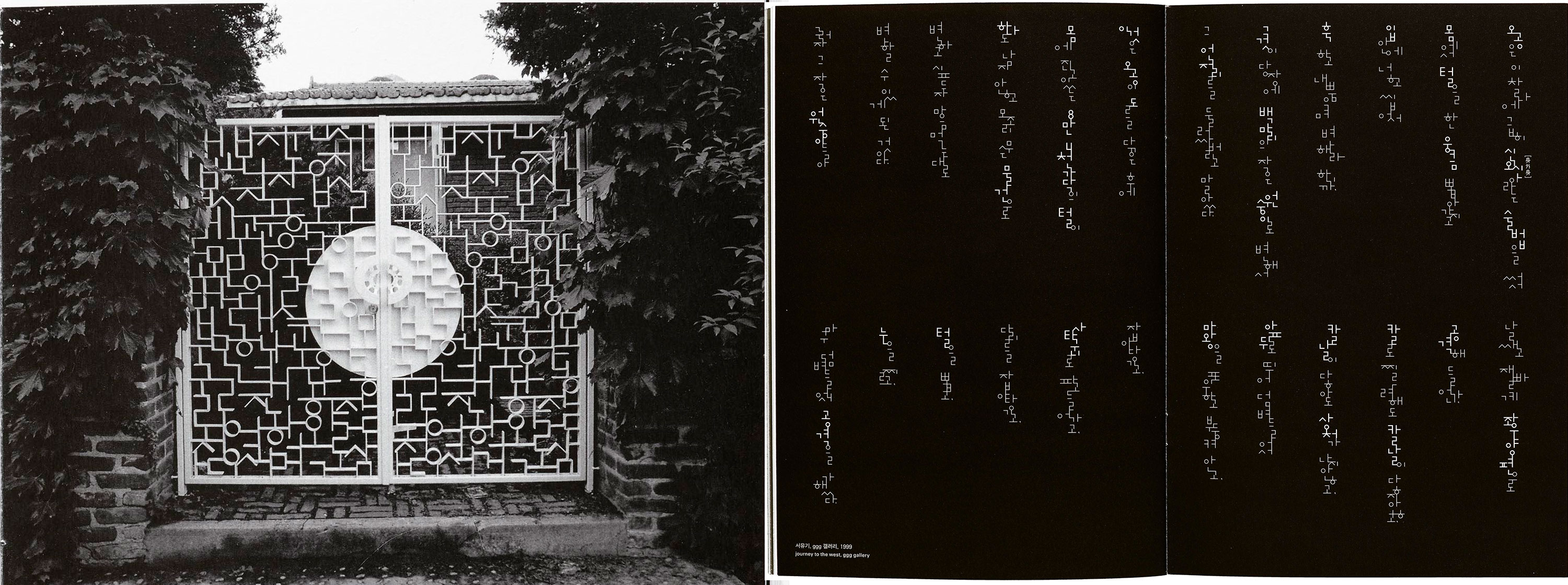
Ahn’s view on Hangul as a graphic material is especially apparent in his projects outside of type design. For the gate of his personal residence, the uniform stroke widths of Mano were the perfect puzzle pieces for the pattern. “[That gate] stuck with me as a beautiful and stunning piece of typographic design. I love how at first glance it feels like random shapes, but when you look closer all of the jamo immediately become apparent and clear,” said Aaron Bell, founder of Saja Type based in Seattle. “What always struck me about Ahn Sang Soo’s work was his willingness to play with the concept of Hangul; treating it not just as a writing system, but as graphic medium of expression. This opens up an entirely new way of perceiving and designing with the script. In my lettering work, I really like creating pieces that express joy, and have an element of play. I can’t help but think that some of that lively spirit is inspired by his example.”
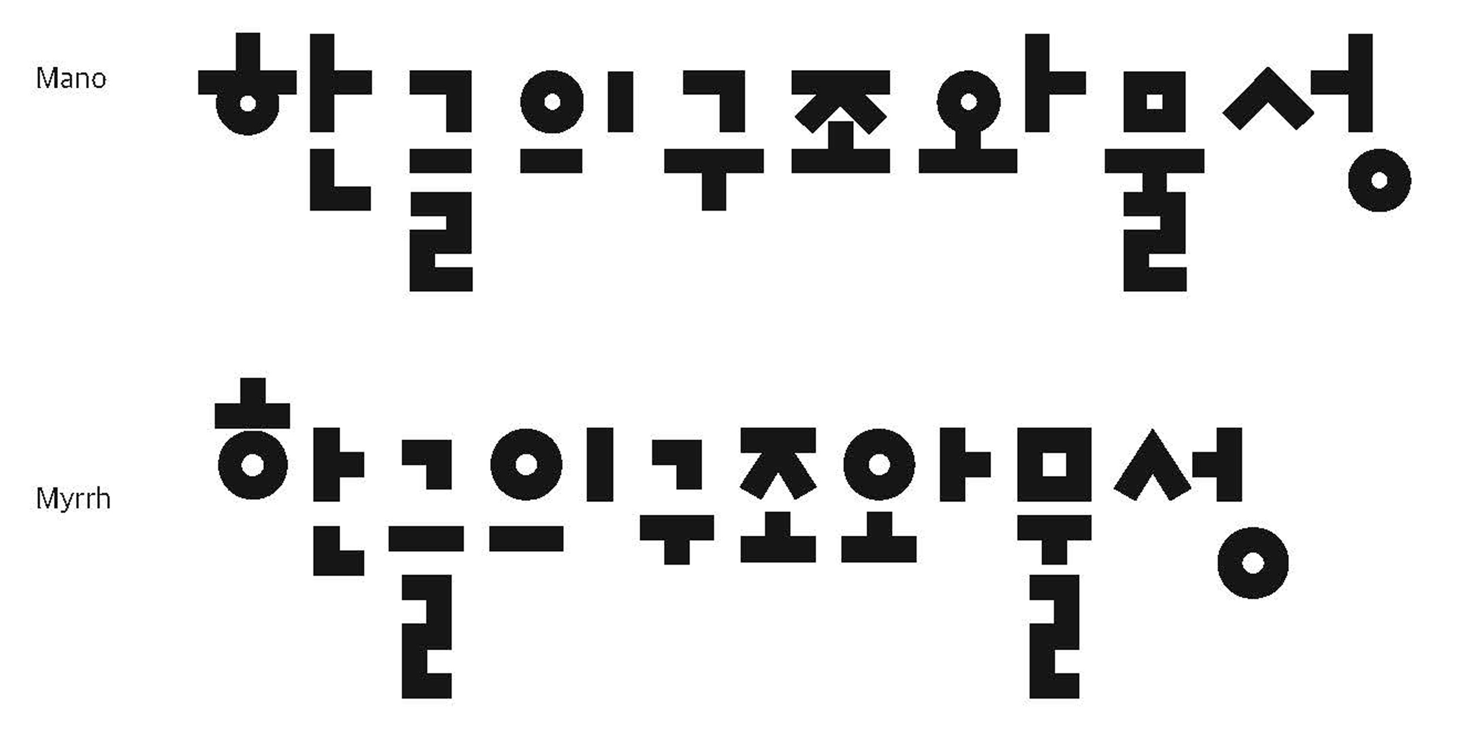
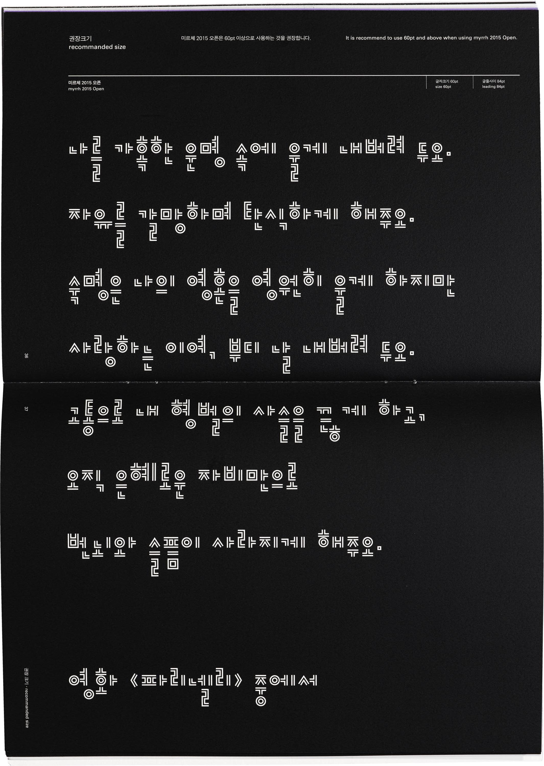
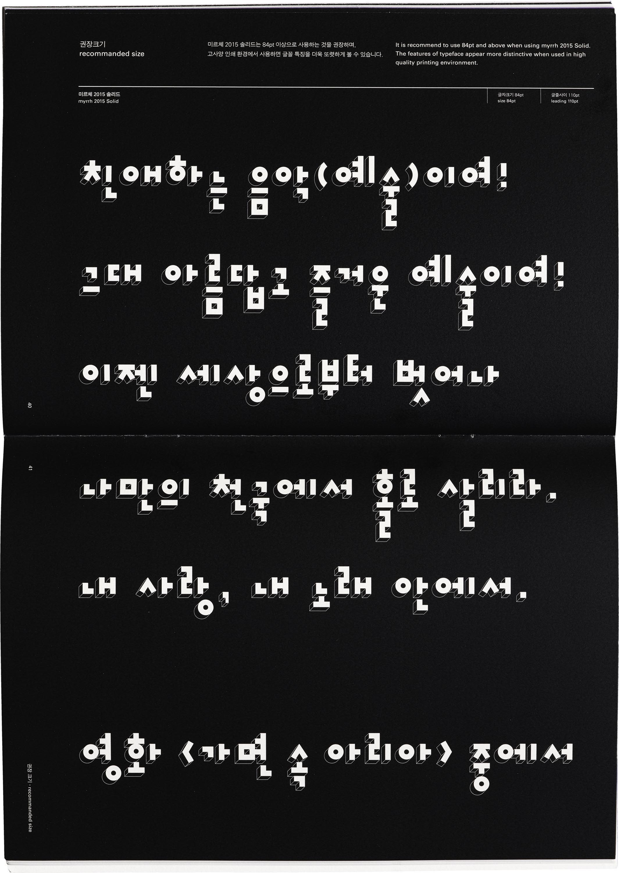
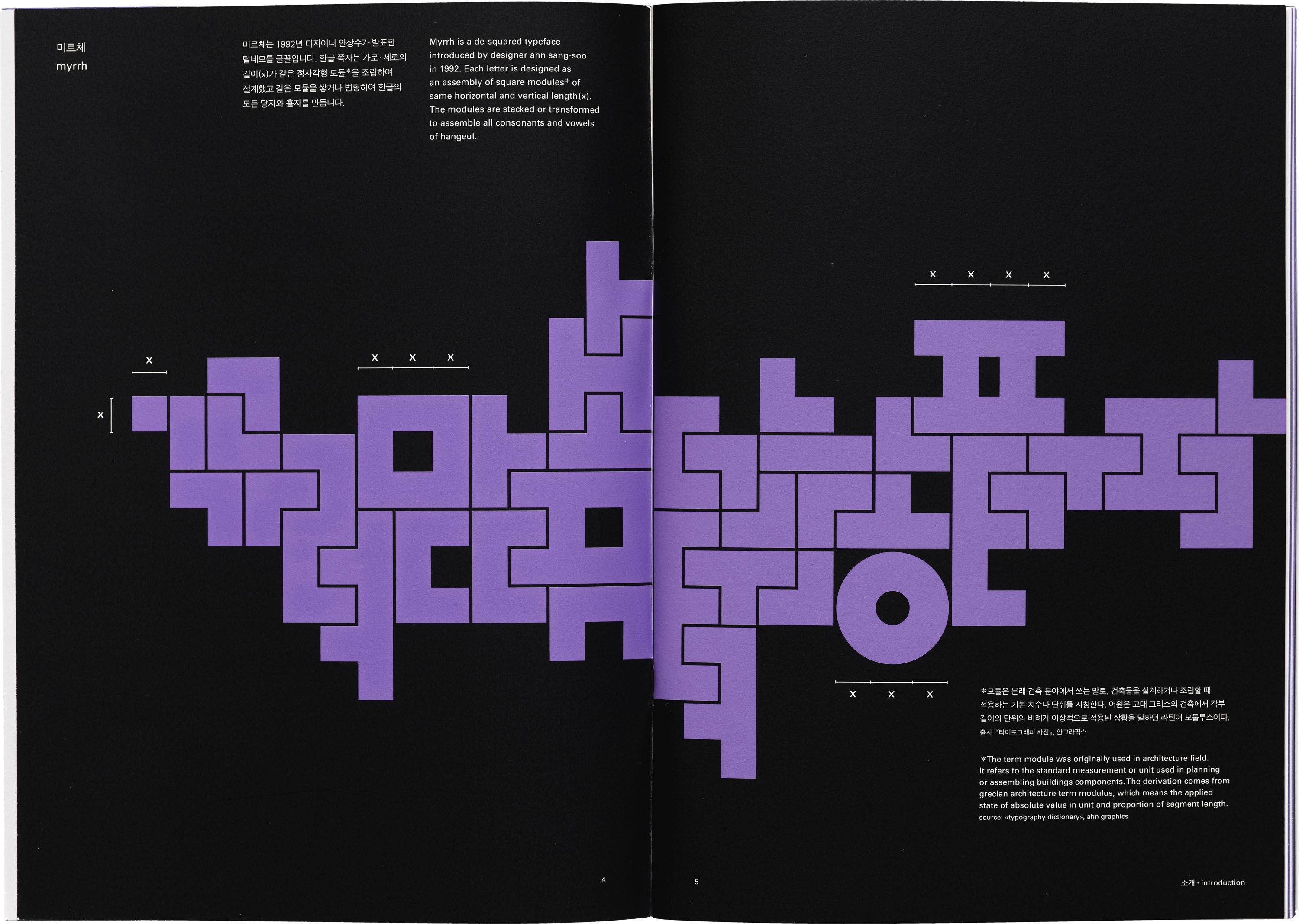
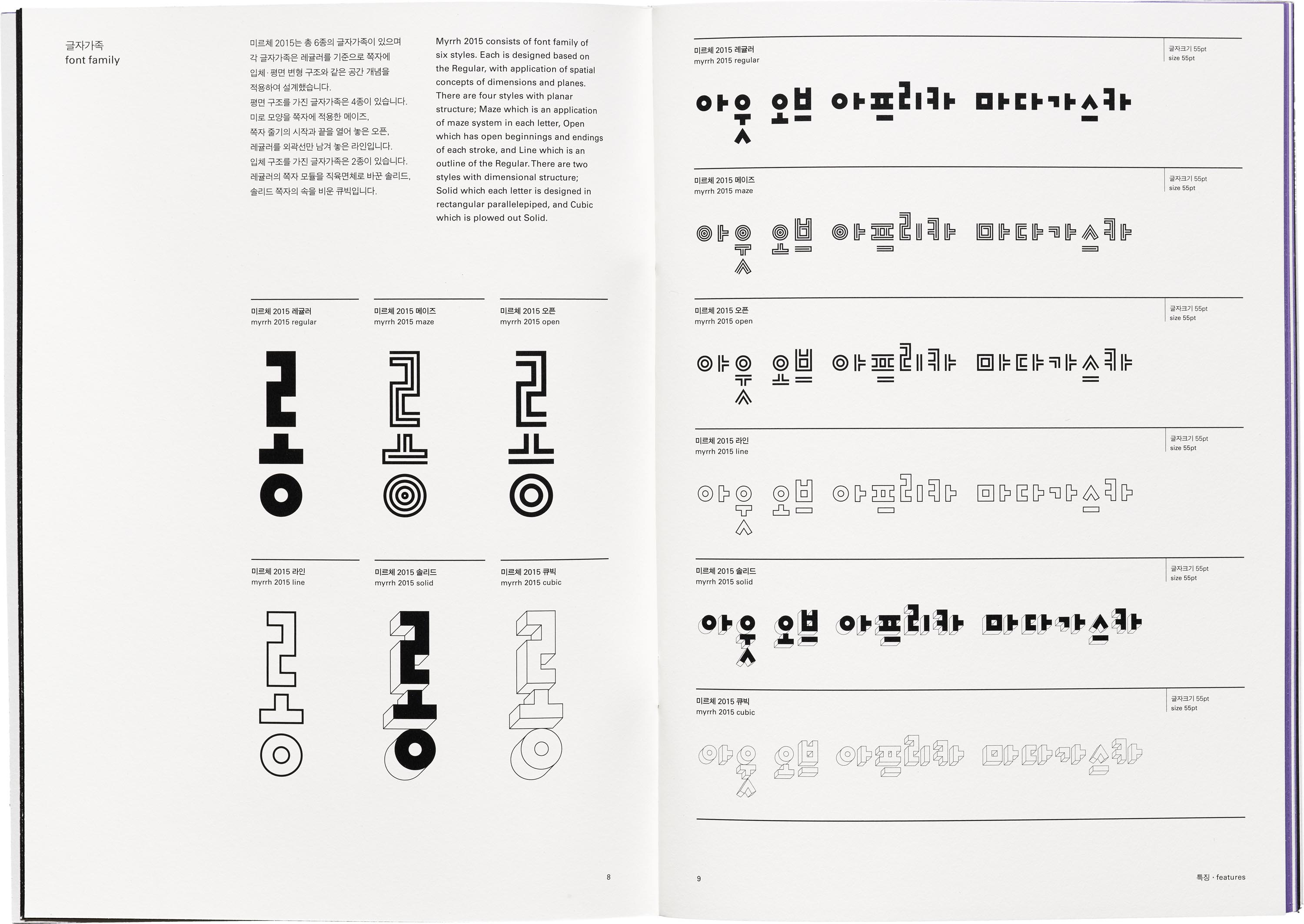
Myrrh, one of Ahn’s newer typeface families, consists of six styles that explore space and dimension. Maze applies the visual structure of a maze inside the letterforms, Open is like an inline style, while Solid and Cubic are dimensional explorations of the typeface. Myrrh looks related to Mano, and according to Yoon, “In the case of Mano, much discussion was needed in designing the extra-bold thickness. If the stroke is too thick, it can look really similar to Myrrh regular. While designing, it was important to keep in mind the impression and character of Mano different from Myrrh as it got bolder.” What definitively distinguishes these two typefaces apart is the way they each approach modularity. Instead of using one stroke as the modular element, Myrrh uses one square unit.
Considering these subtleties and the importance of context was a major lesson Yoon learned while at the Institute. “I learned from Ahn the attitude of approaching Hangul in terms of ‘graphics’ rather than simple letters, that we always have to think about whether a detail, a decision is right for the place and design. No matter how small the design detail might be, we should approach type with care,” Yoon said. “Hangul, being a younger script, has a shorter history within the world of type design. For that reason, there are not many kinds of Hangul fonts. This also means that the direction of Hangul font design is unlimited, and I hope that many people around the world will pay attention to the new possibilities, experiments, and beauty of Hangul font design.”
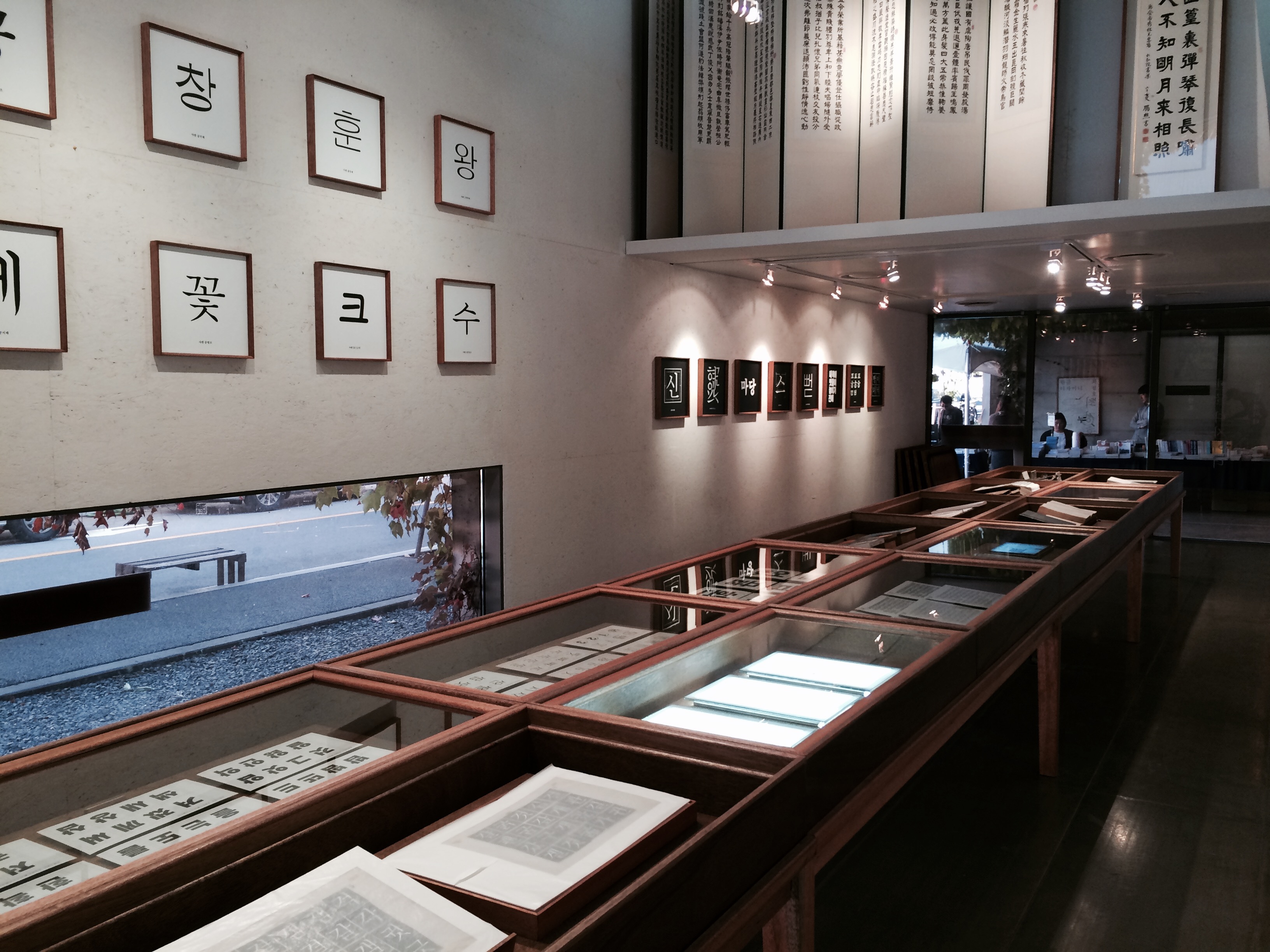
Next time you’re at the Archive, we invite you to take a closer look at these specimens, which were awarded a Red Dot: Grand Prix Design Award in 2015. They offer a look into the local history of Korean language and design, and are also an important part of our global type history and discourse. We have Ahn to thank for opening up Hangul to more experimentation and play, and hopefully inspiring this attitude in our own practices too.
— Florence Fu, Editorial Associate