

News
From the Collection: Emigre Font Development Files
Drawing from her experience working with the collection, and conversations with its principle designers, Digitization Specialist Eve Scarborough reflects on the materiality of type design.
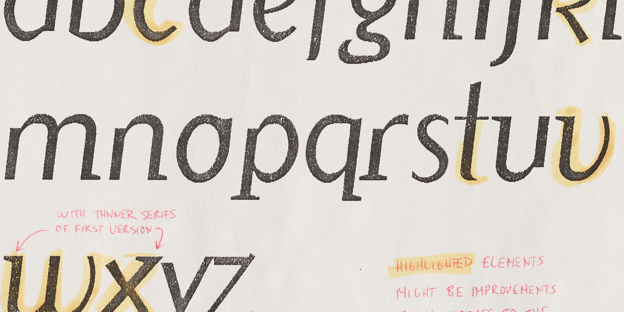
Donated along with their collection in 2016, Emigre’s font development files represent a rare comprehensive view of a digital type foundry’s process. After two years of work, the collection is now digitized in full, a world’s first for such an archive. A selection of objects will be made available to the public through the Online Archive.
Archive and Self
At the time I joined the project, a number of posters and magazines had already been digitized. Having worked mostly in cataloging and processing at the Archive—and before that as a student worker in the Heller Rare Book Room at Mills College—I was still relatively new to the imaging process. Digitization Archivist Ellis Martin suggested the Font Development Files as a good starting point; the objects were primarily flat works on paper and relatively similar in size, which allowed me to focus on the finer points of digitization while moving through a substantial collection.
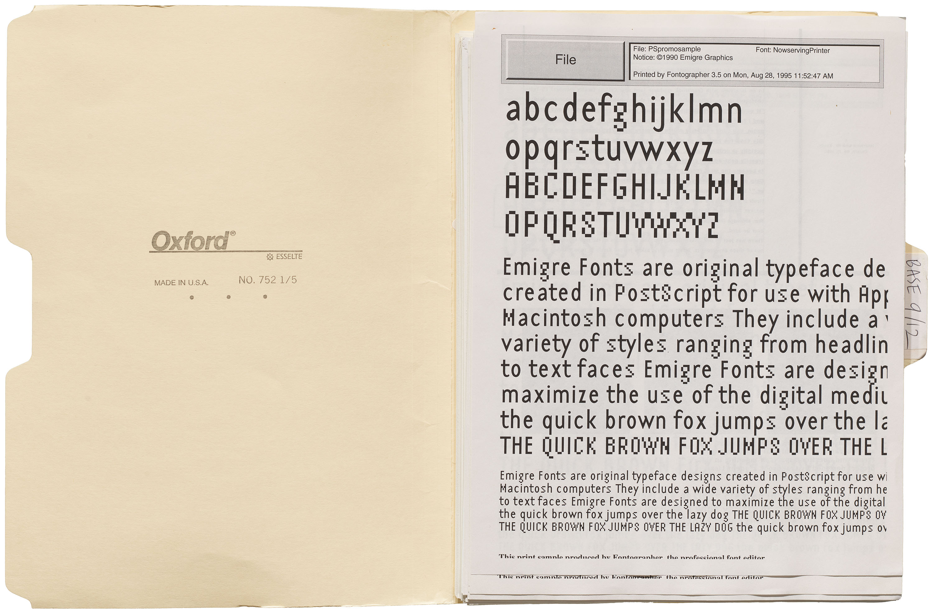
Process work is special because it provides us with a clearer idea of how typefaces are constructed. The journey from idea to finished object is rarely linear, and its methods are seldom made visible to audiences. The development files contain a range of marked proofs, references, and revisions; correspondences between designers and collaborators; and mail from readers of Emigre magazine. Some of my favorite reference material appears in the “Mrs Eaves” folder, which includes photocopies of The Baskerville Bible and a list of visitor protocols from the Bancroft Library at the University of California, Berkeley. As an archivist and steward of the collection, it was reassuring to see the similarities between Bancroft’s guidelines and those of the Archive, demonstrating that archival research practices haven’t changed much over the past thirty years.
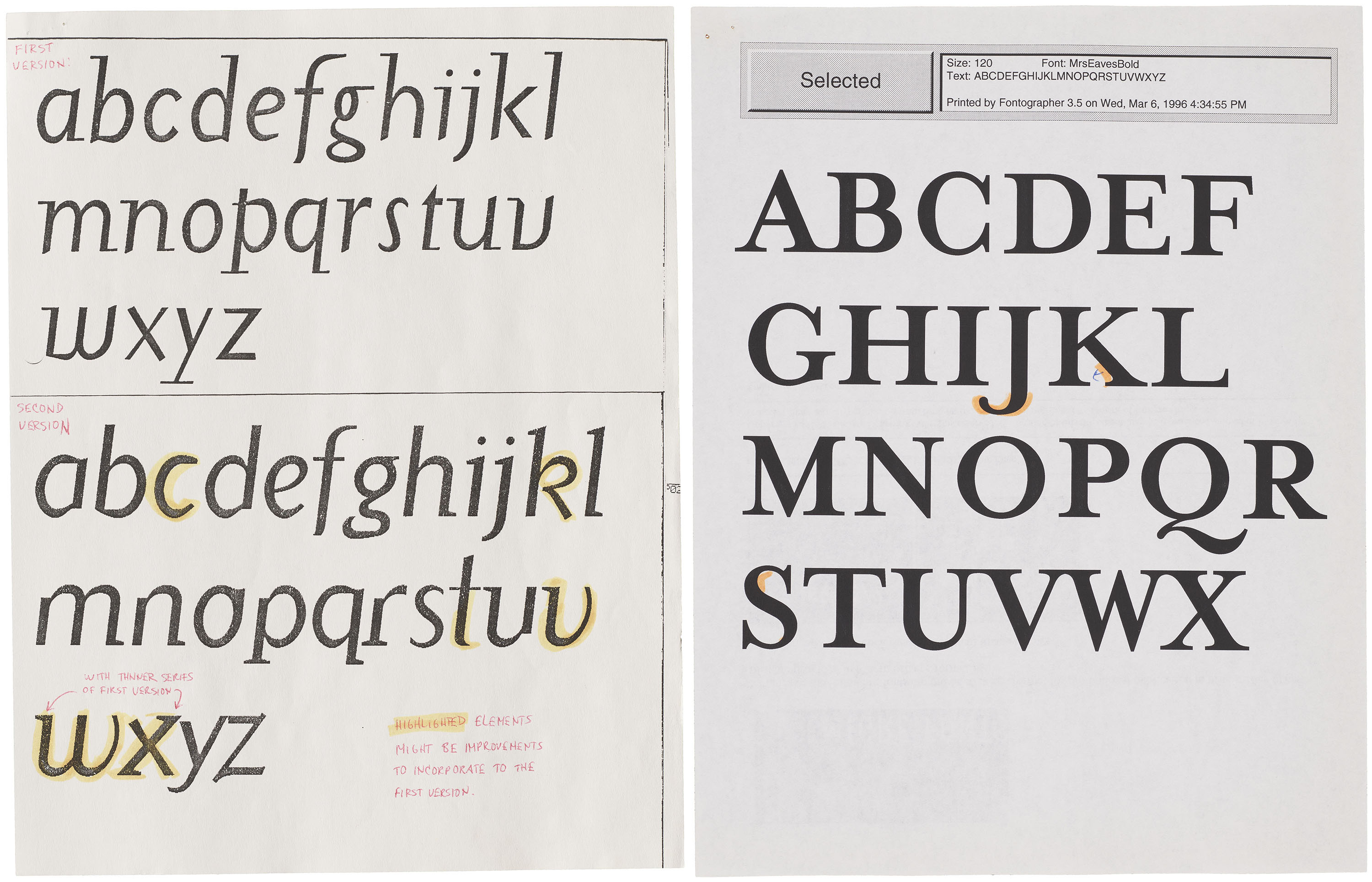
Typefaces are unique in that they can be used over and over again, and are continually revived and reapplied in different contexts and settings. Type design is a modular process, with each element edited on a smaller scale before revisions are implemented across the entire character set. Associate Curator and Editorial Director Stephen Coles compares fonts to software: capable of infinite application, updates, and reinventions. Naturally, this analogy works particularly well when it comes to digital typefaces, whose flexibility highlights the creative possibilities of the technologies that facilitate their creation. This range of potentialities is reflected in the Emigre files, which illustrate both the seeds of fully-realized designs and diverging paths left untraveled.
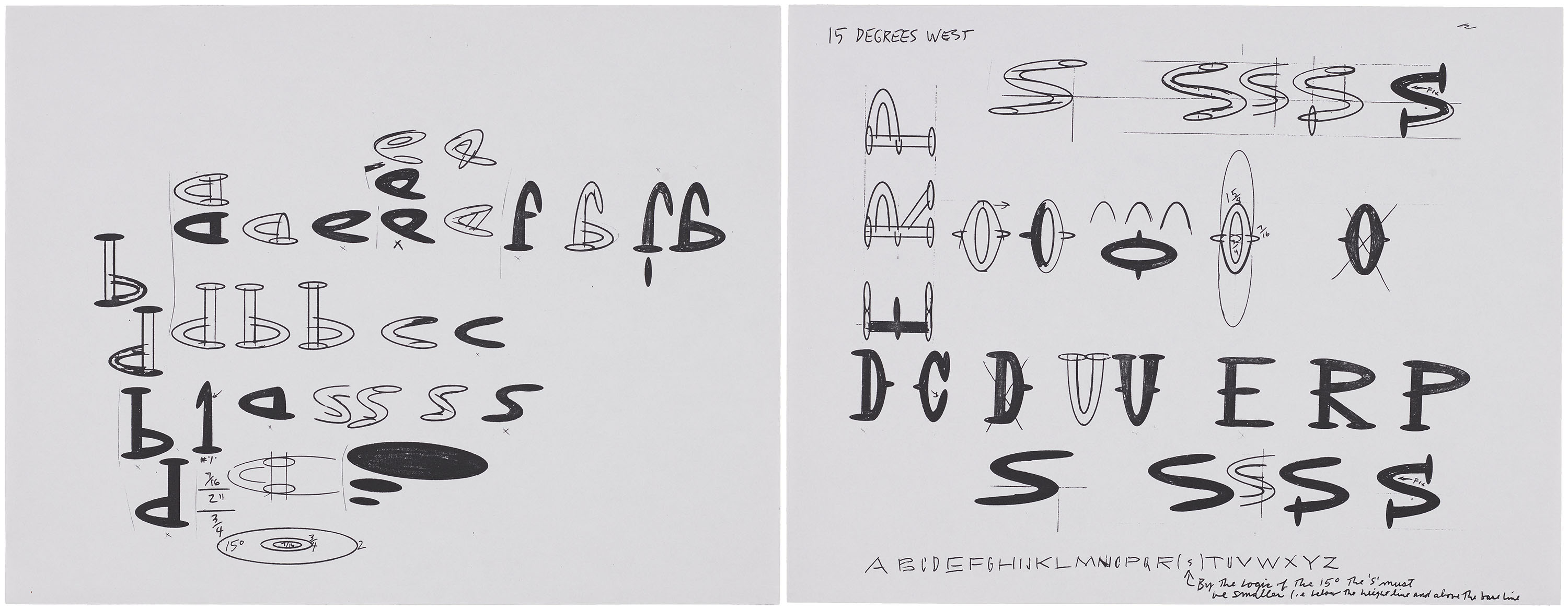
Reflecting the transitional period of the ’80s and ’90s, the files reveal a striking combination of analog and digital practices. Those familiar with Emigre’s history know that its founders, Rudy VanderLans and Zuzana Licko, were inspired by the promise of the early Macintosh computer. Emigre magazine became a vehicle for the pair to showcase their fonts at work, as well as a platform for avant-garde, experimental design discourse. Containing both iterative drafts and designer correspondences, the files serve as a bridge between two ways of understanding Emigre’s body of work and how it circulated throughout the creative community.
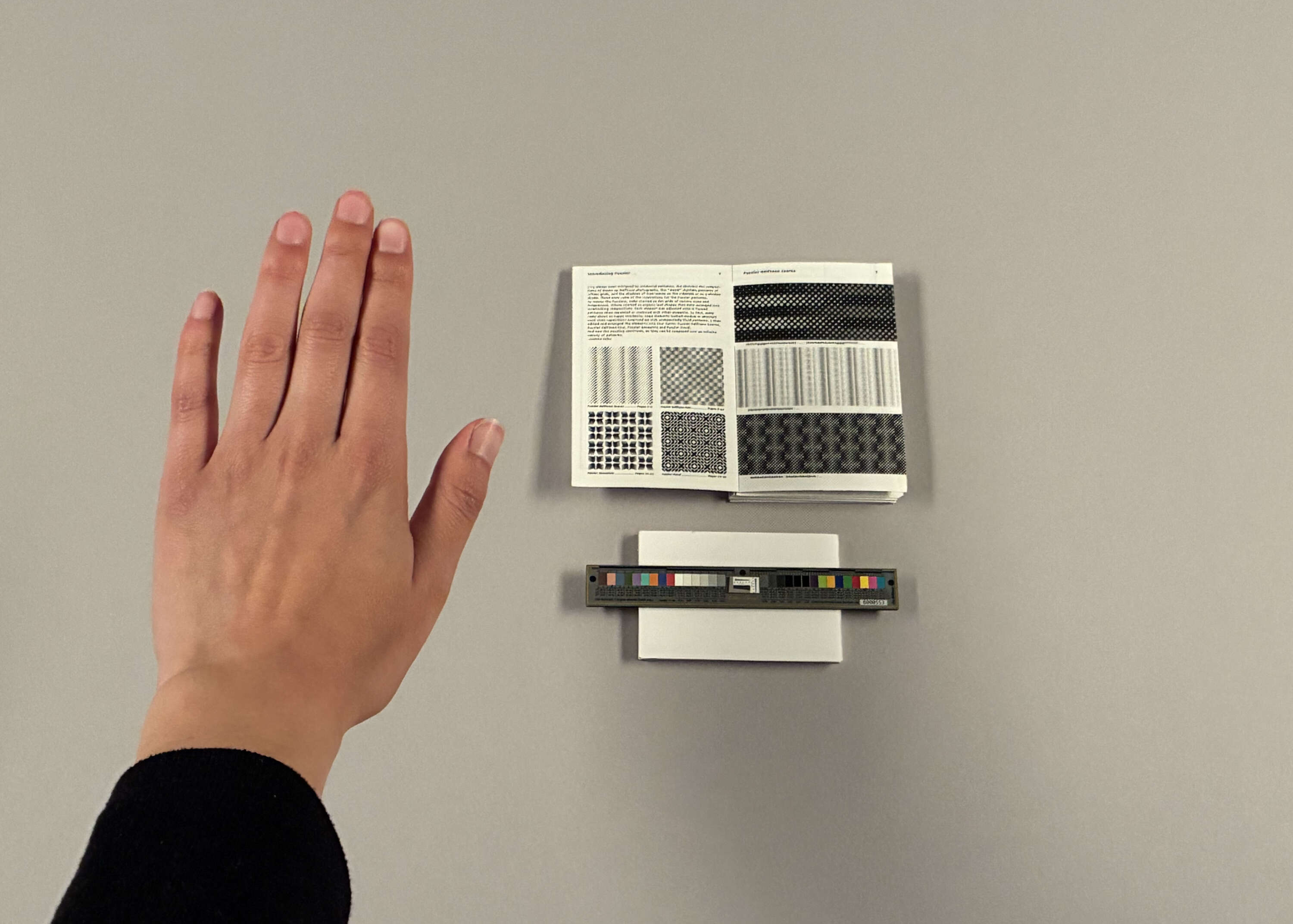
As I imaged the materials, I started to notice that the files functioned not only as a record of process, ideation, and dialogue, but also as a record of emerging community networks. I thought about how the concept of ownership has changed as more designers have come to favor digital software as the primary medium for drafting, editing, and distribution. In an interview with Emigre’s principal designers, Rudy notes:
What stands out to me from those Emigre magazine years is that there was a lot of debate. People really cared and took positions on such issues as legibility, design criticism, authenticity, style, commercialism, modernism vs. postmodernism…. And since the discourse was concentrated in a handful of design magazines and conferences, it was easy to follow the major dialogues within graphic design. I don’t see this kind of concentrated debate anymore. Perhaps everything’s been said on those topics, and it’s all been internalized. Or perhaps the conversation has simply dispersed across so many online channels that it’s impossible to follow it as a coherent dialogue.
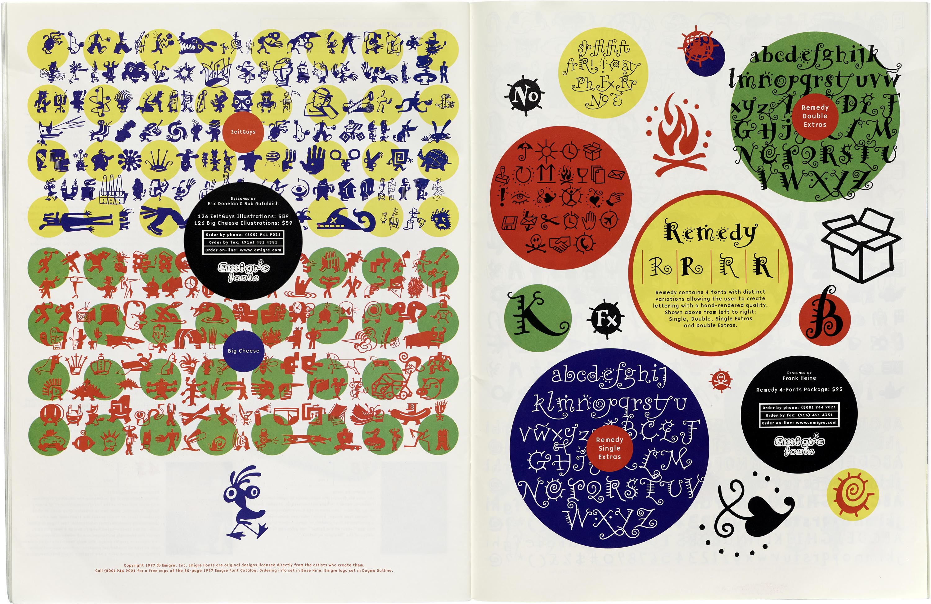
In later years, Emigre began accepting fonts from others in the community, including California designers Bob Aufuldish and Jeffery Keedy. Zuzana’s own work, which began as pixel-based design and moved into vector format, evolved to include revivals of classic typefaces—like Filosofia, her interpretation of Bodoni. This adapted font sold well, but Emigre’s legacy tends towards the experimental and DIY. Rudy explains that this aesthetic emerged partially due to the constraints of the early Macintosh, as well as collaborators’ respective backgrounds:
The bulk of the people we collaborated with … were graphic designers, not necessarily type designers. They all learned how to design fonts on the computer. And we were particularly attracted to those typefaces, because when graphic designers design type, there is a decidedly different intent and aesthetic at play. They’re less restricted by tradition and established reading habits. Their type is usually filled with contradictions, critiques, and idiosyncrasies, which often lends their typefaces a unique appeal.
Notes and Challenges
The majority of the collection consists of 8.5 × 11-inch proofs on white printer paper. To me, these proofs felt contemporary enough to subvert the researcher’s preconceptions. White printer paper is an object already familiar to us, and to interact with it as the primary medium for ideation demystified the font development process for me. The letterforms reflected on the proofs were first designed in Fontographer on the Mac, then printed out, annotated, and edited before being digitally corrected. When asked about the process, Zuzana explains:
The sophistication of my type design abilities evolved in parallel with the Mac’s increasing capabilities, so it has continued to be the ideal tool for me. Each phase…presented new learning, but each new capability also opened new possibilities. It never felt like an obstacle so much as an ongoing conversation.
Ordinary printer paper provides us with an immediate link to the design process, and reminds us that the history of digital type design is still relatively young compared to histories of printing and writing at large.
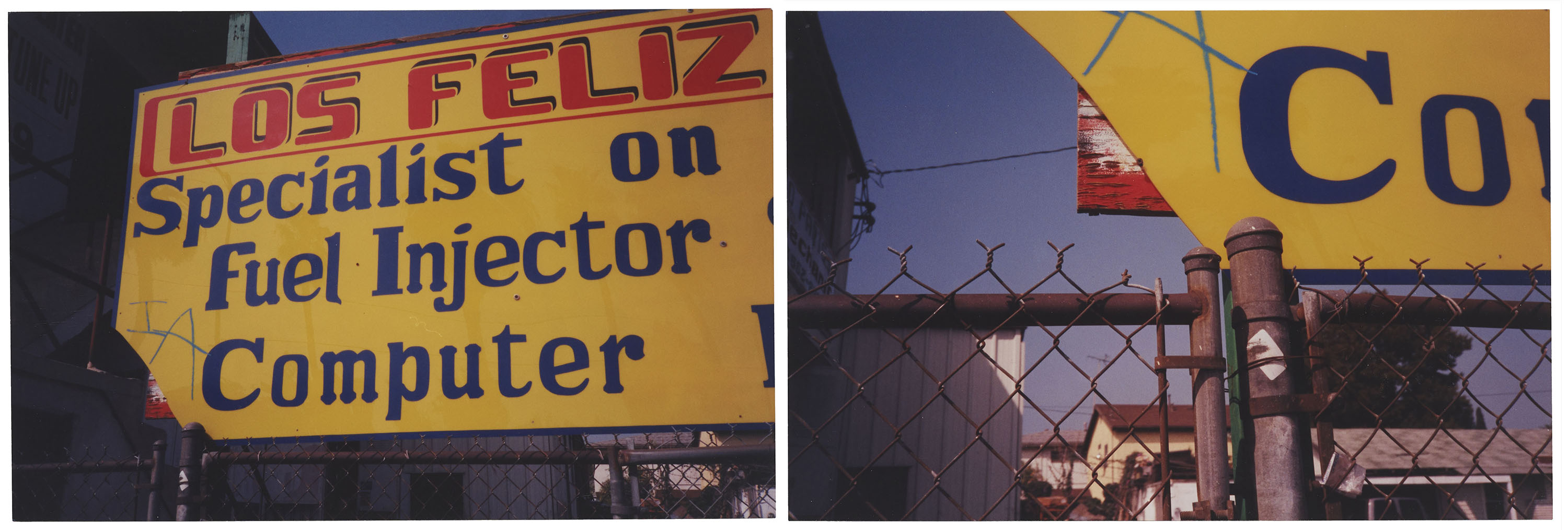
In turn, the presence of analog material like sketches and photographs became something I looked forward to finding and examining. Source images of a hand-painted sign taken in the Los Angeles neighborhood of Los Feliz, for example, show analog letters that may have inspired a transition into the digital realm. Here, the viewer experiences the close observations of the designer and an everyday pedestrian scene. Looking up, we see the sign in the context of its urban locale: the handwritten “IA” scrawled beside “Computer,” the chain-link fence against low buildings, and behind them, the cloudless Los Angeles sky.
All images in the gallery below are hi-fi captures. Click an image to enter fullscreen view, then click or pinch to enlarge.
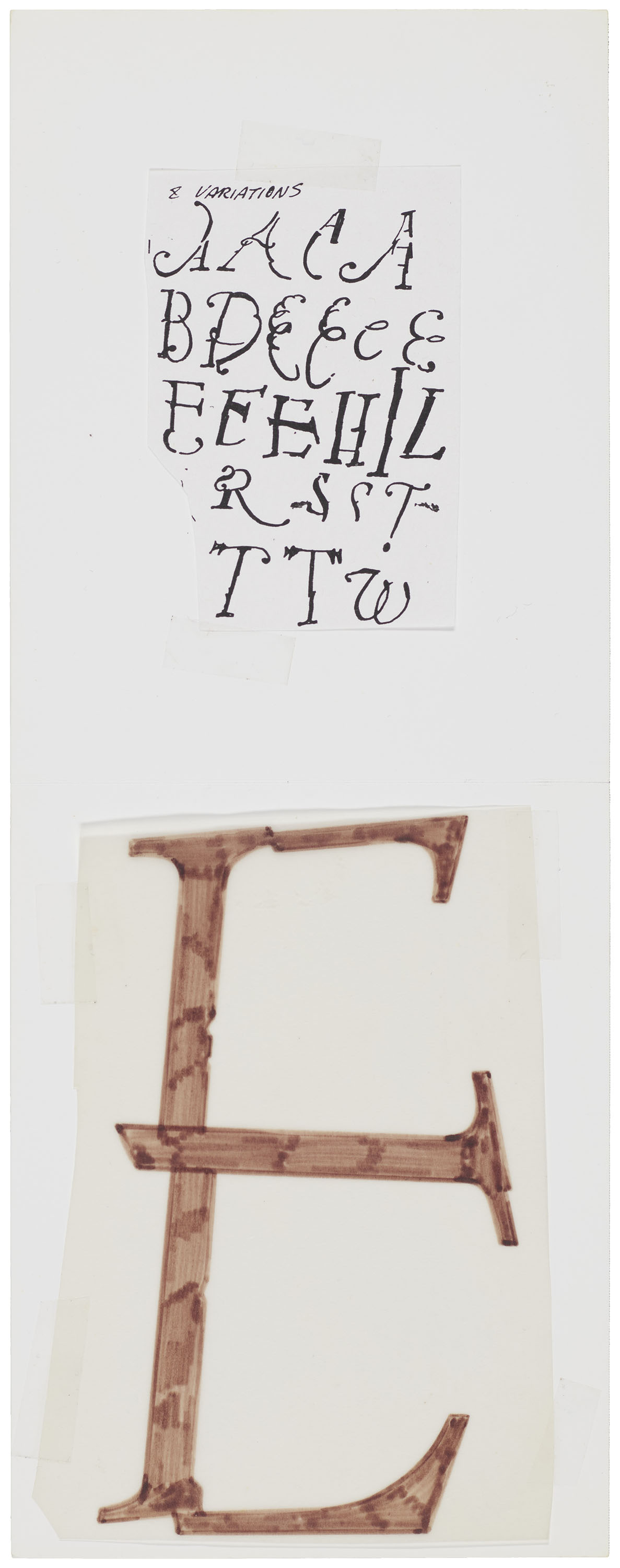
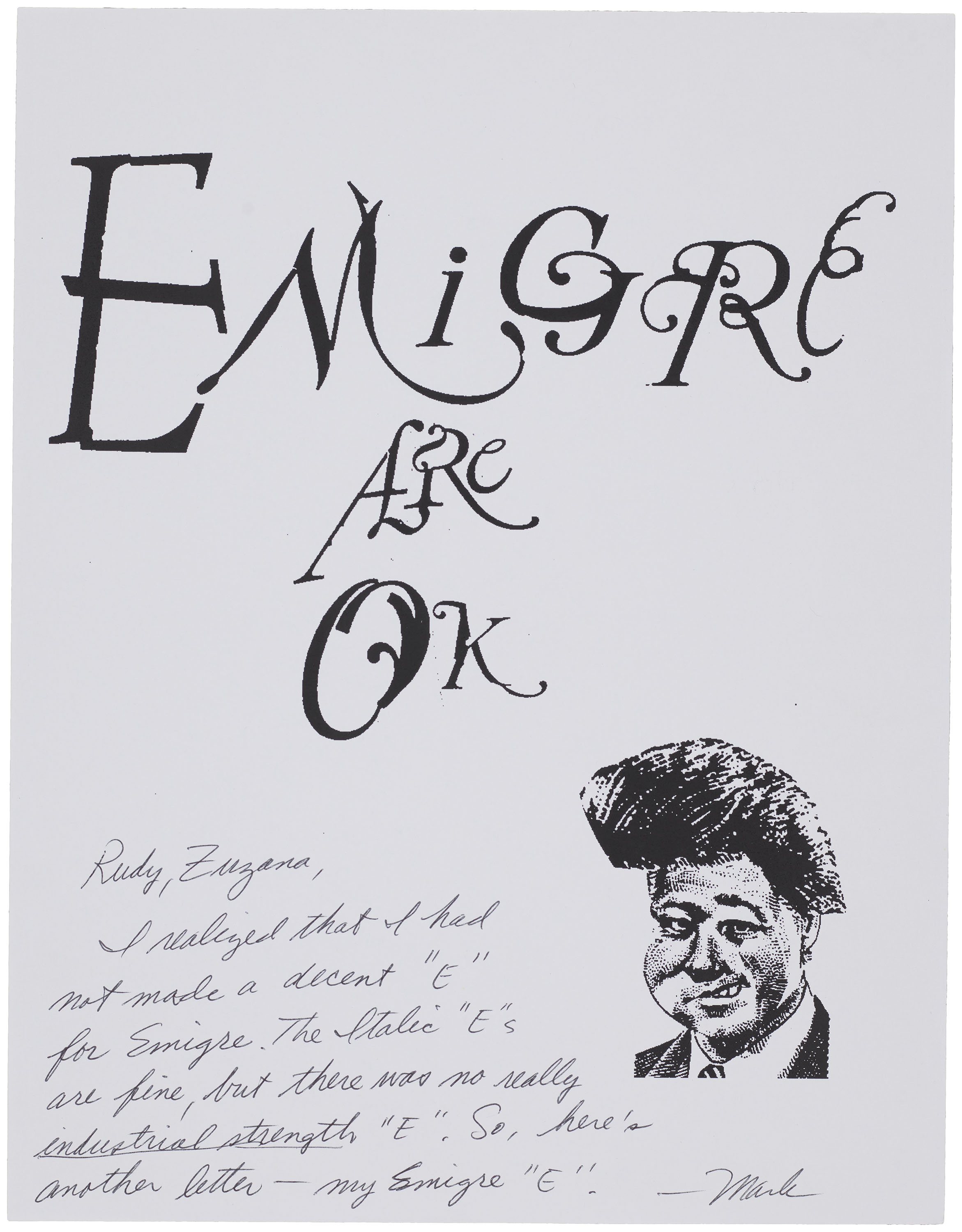
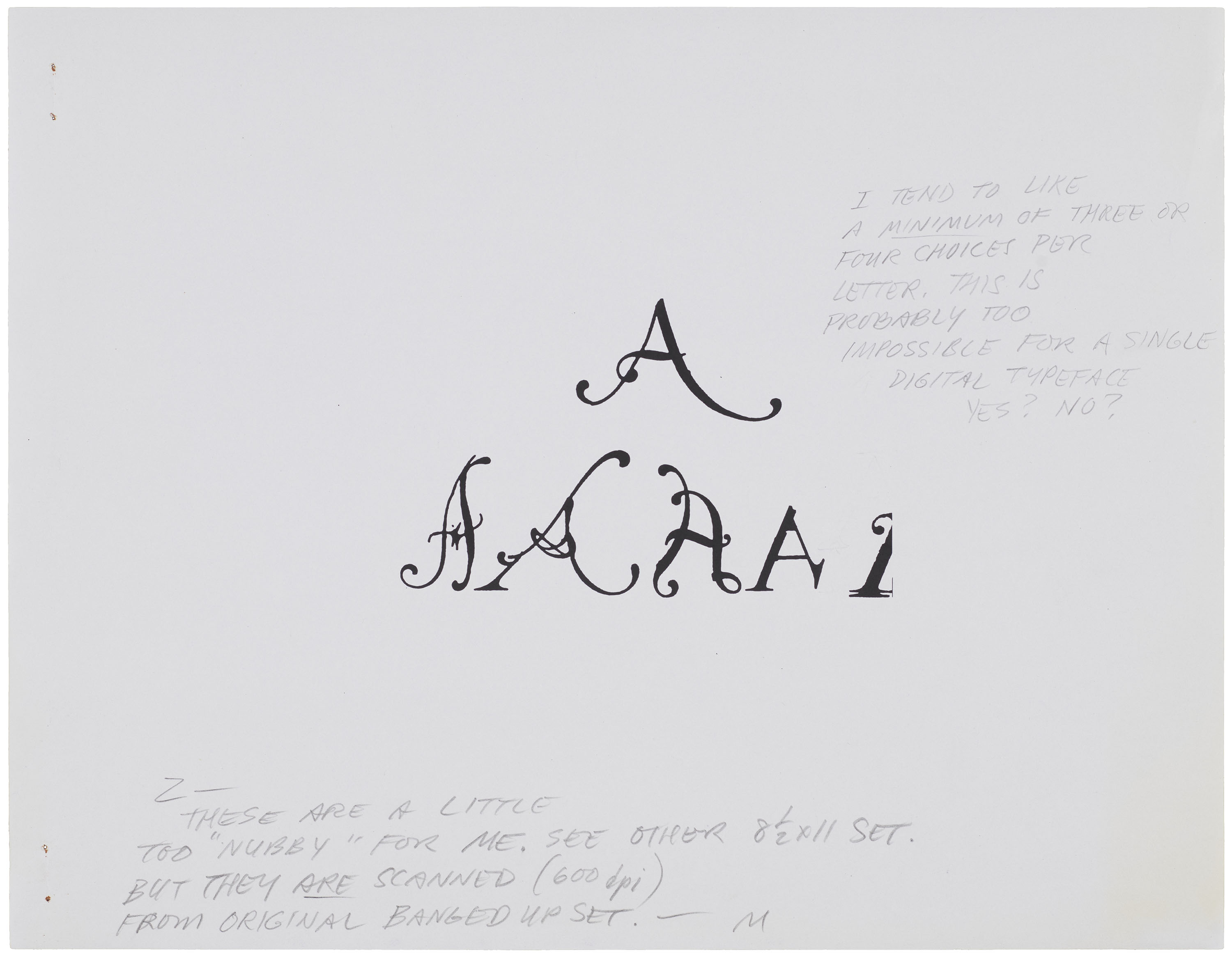
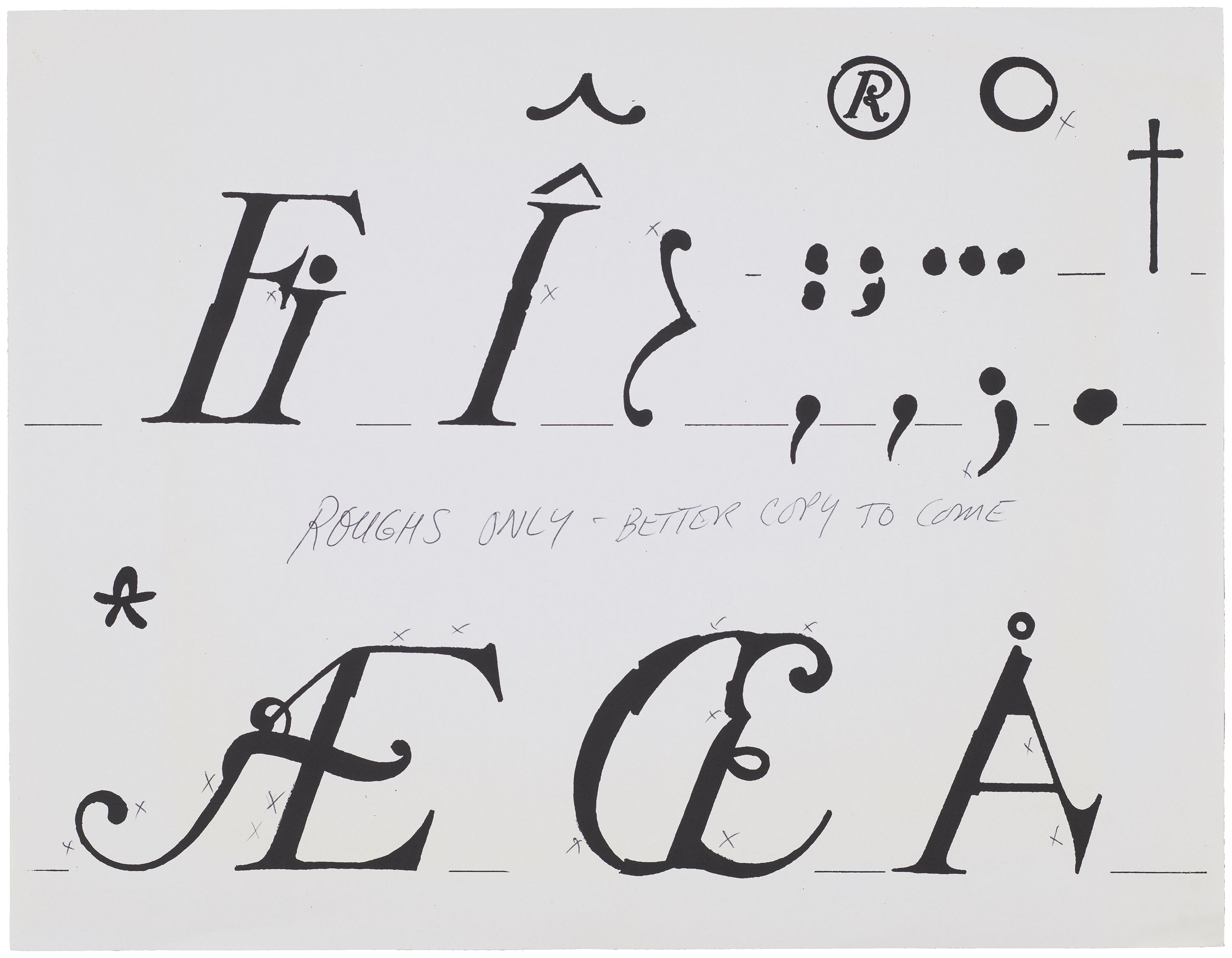
Looking ahead, it is unclear how designers will choose to house digital process work. In most cases, drafts exist only as layers within a software program, instead of the sketches or printouts we encounter in the Emigre files. When learning to write, we are taught that understanding our audience is key to compelling rhetoric. I am not a designer, yet I see the parallel between strong design and strong writing. Moving through this collection and seeing annotations, such as those made by Mark Andresen (see above) as he and Zuzana developed NotCaslon, serve as a reminder to archivists, designers, and researchers the value of documenting and preserving the process.
—Eve Scarborough, Digitization Specialist