News
From the Collection: Laini (Sylvia Abernathy)
The Chicago-based activist’s dynamic album covers of the 1960s expand our sense of design history.
In late 1960s Chicago, Sylvia Abernathy was all at once a college student, activist, and graphic designer. Having later changed her name to “Laini”, Abernathy is best known for working on the Wall of Respect, a community mural in the South Side on 43rd and Hayward Streets. The effort was collaborative, a creative orchestration by the Visual Arts Workshop arm of the Organization of Black American Culture (OBAC). During these years, Abernathy was also designing album covers for jazz musicians under Delmark Records. Four of Abernathy’s albums live at the Archive and hold a special place in our collection. They represent a part of her work that has yet to be researched extensively, and they demonstrate a way of combining type, image, and color that sets her apart from her contemporaries.
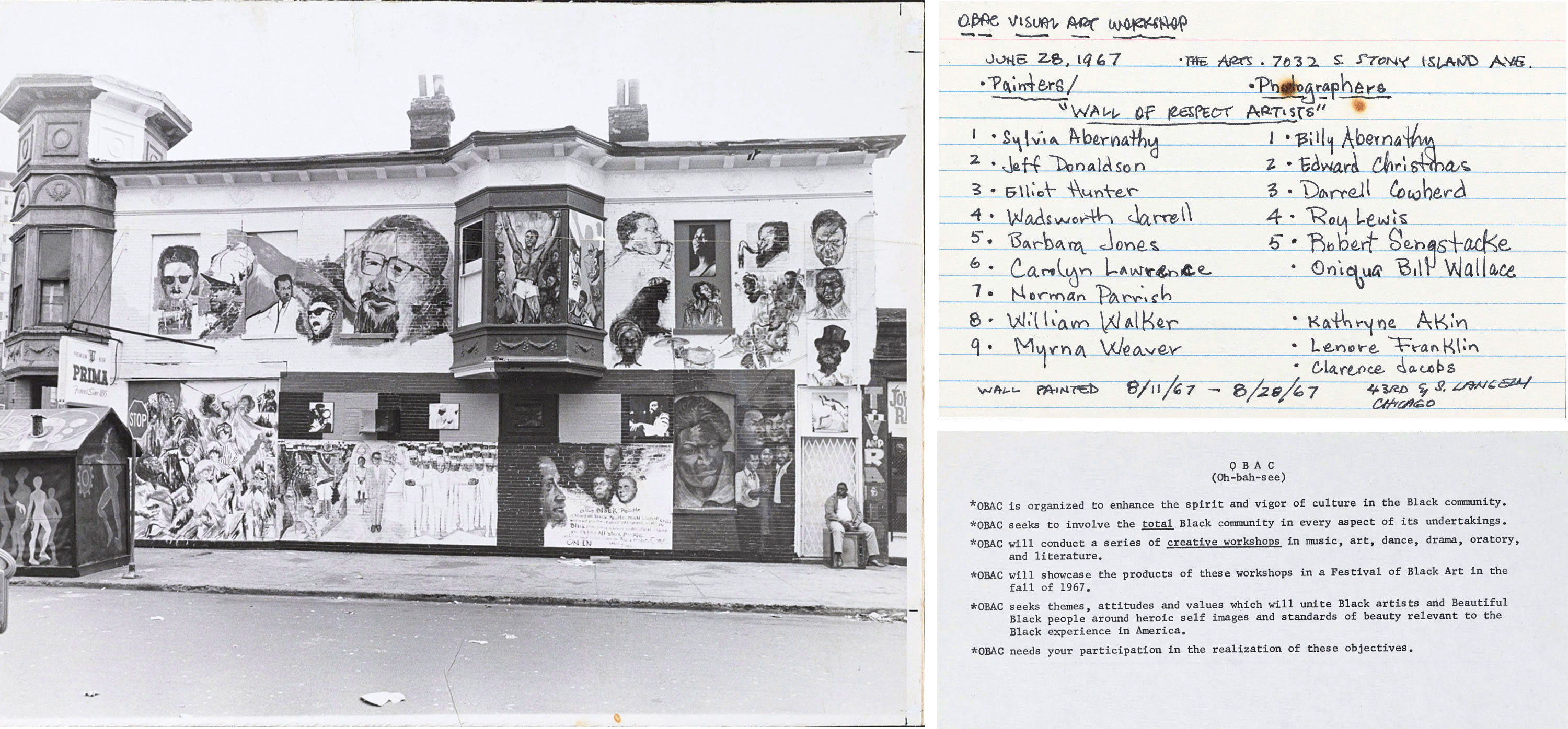
“Black Heroes” was the chosen theme for the Wall, and out of many design proposals submitted, Abernathy’s was chosen. Based on the architecture of the building, she proposed to divide the mural into thematic sections, which included more than fifty portraits of Black Americans in realms of politics, music, athletics, drama, literature, and religion. According to the poet Don L. Lee, the Wall of Respect defied the modernist notion of “art for art’s sake” and was instead “art for the people’s sake”, reflecting a core belief of the Black Arts Movement which called for artists to turn to their local communities and define Black art on their own terms. Multiple artists collectively worked on bringing the mural to life, photographers captured the process, and the site also became a place where the community came together for concerts, poetry readings, community events, protests, and rallies.
During the late ’60s, Chicago’s explosive jazz scene was a prime canvas for typographic expression on album covers. For a musical genre with roots in African-American culture, the jazz section of the graphic design canon is instead filled with the names of white men, such as Reid Miles and Paul Bacon. Abernathy, on the other hand, was one of the few women working in a male-dominated industry and is believed to be the first Black woman to be credited as a designer on album covers. Her keen typographic eye and deft use of abstraction and contrast made her work stand out from long-established, formulaic styles, and a quick listen to any album reveals her natural talent for translating the unique sound of each musician into a graphic form.
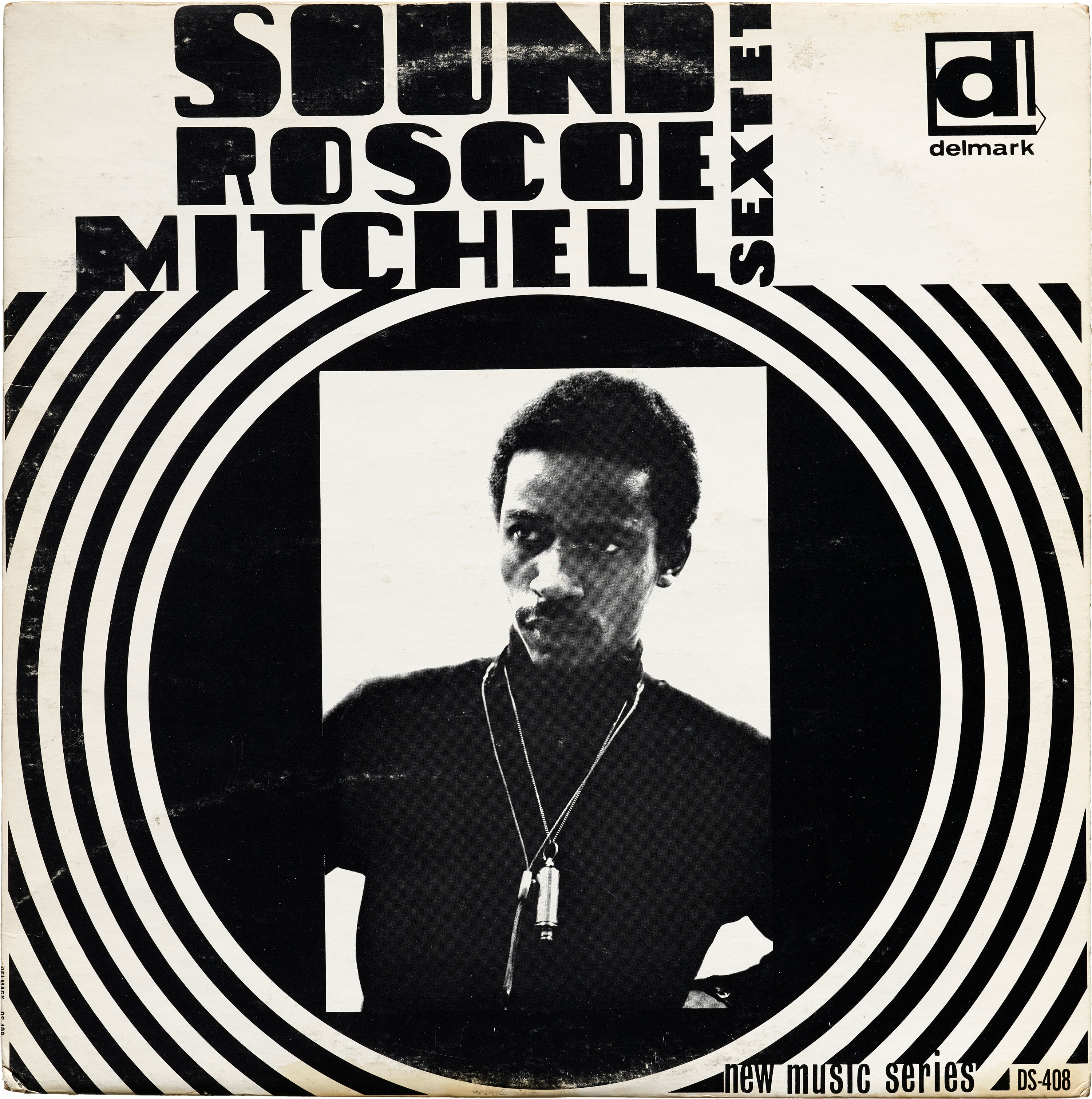
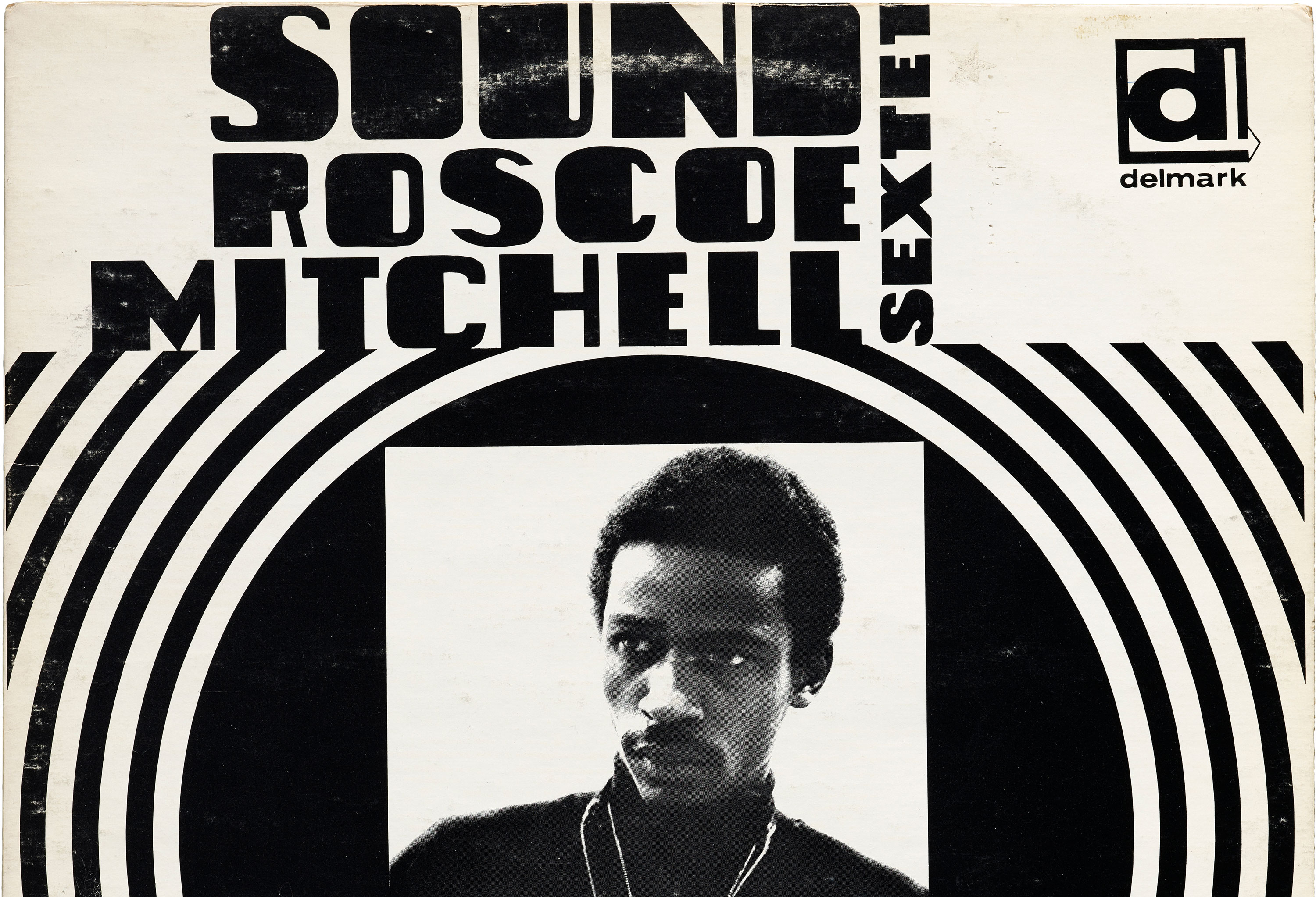
Unfortunately, very little is written about Abernathy’s album art specifically. However, one can see the ways her approach to design embodied the same principles and values as her art; to create work that represented Black life on her own terms. This is best illustrated on the cover for the Roscoe Mitchell Sextet. At the center is a photograph of Mitchell, taken by Abernathy’s husband Billy, in a style emblematic of the photography of the Black Arts Movement which used high contrast to “emphasize the dignity, beauty, and blackness of the subject.” Abernathy packs a punch by using only black and white, enclosing the dignified portrait of Mitchell with circles that ripple out like waves beyond the frame. Abernathy’s lettering adds to this hypnotic moment with a high-contrast, blocky sans that swings abruptly from bold to thin stems.
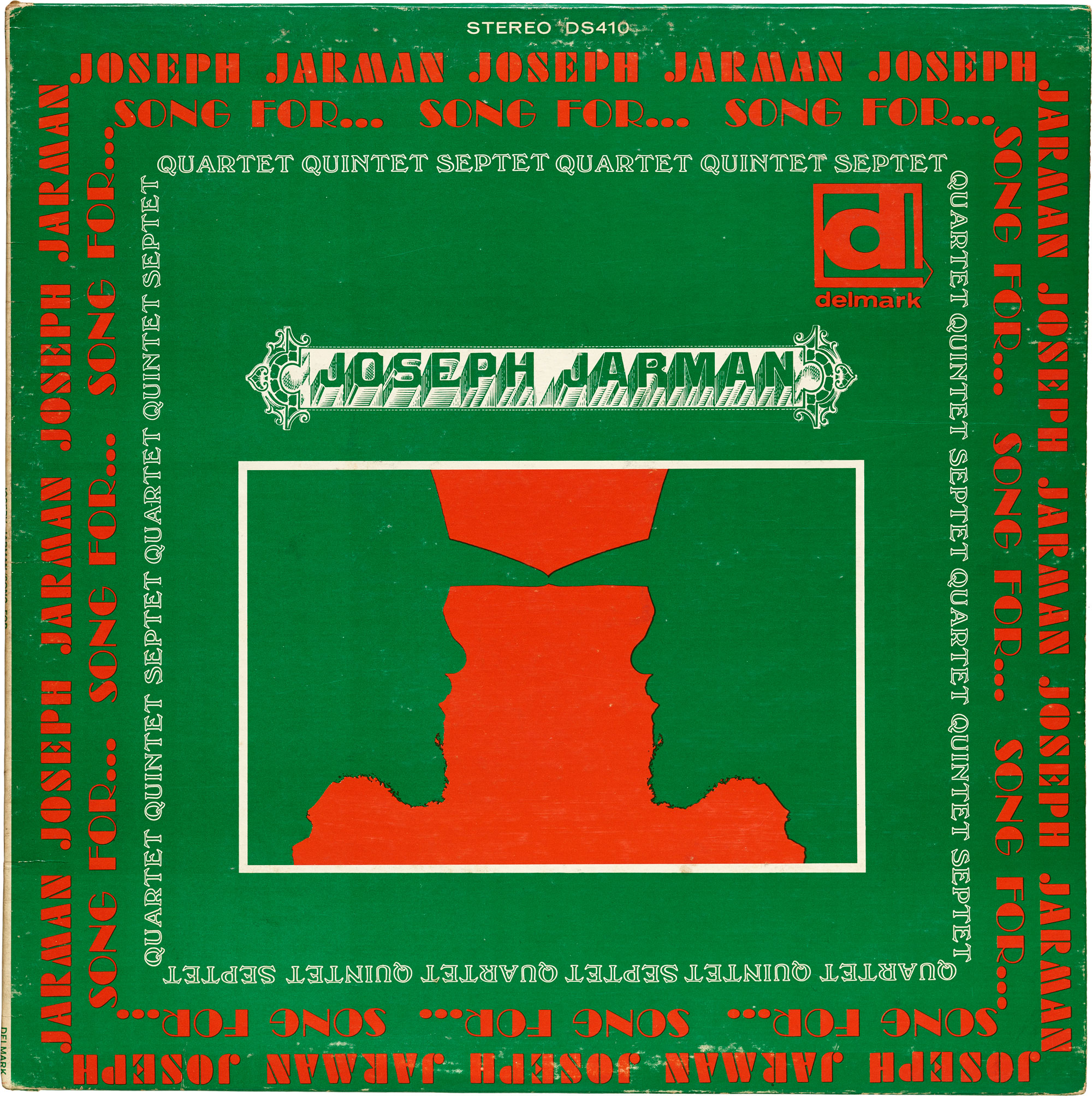
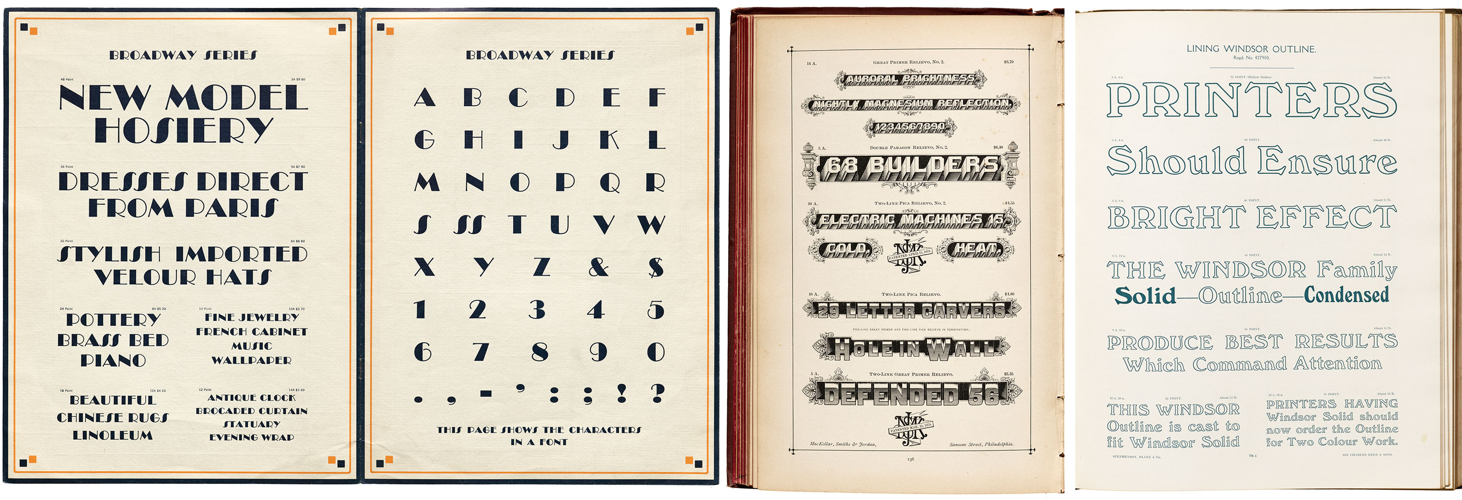
Among her album designs, the cover for Joseph Jarman’s Song For… is the most elaborate and typographic, making modern use of antique typefaces, including the Victorian-era Relievo No. 2 (1879) and Windsor Outline (1904). Futura Black and Broadway form a dizzying text frame. Unlike other albums of the time that either take on a cool, mysterious attitude with tinted monochrome photography, or a bouncy, energetic character with kinetic type, Abernathy takes a different approach. By only using contrasting colors of red and green, she produces a vibrating, psychedelic effect where their edges meet — echoed by the optically-ambiguous mirrored portrait in the center.
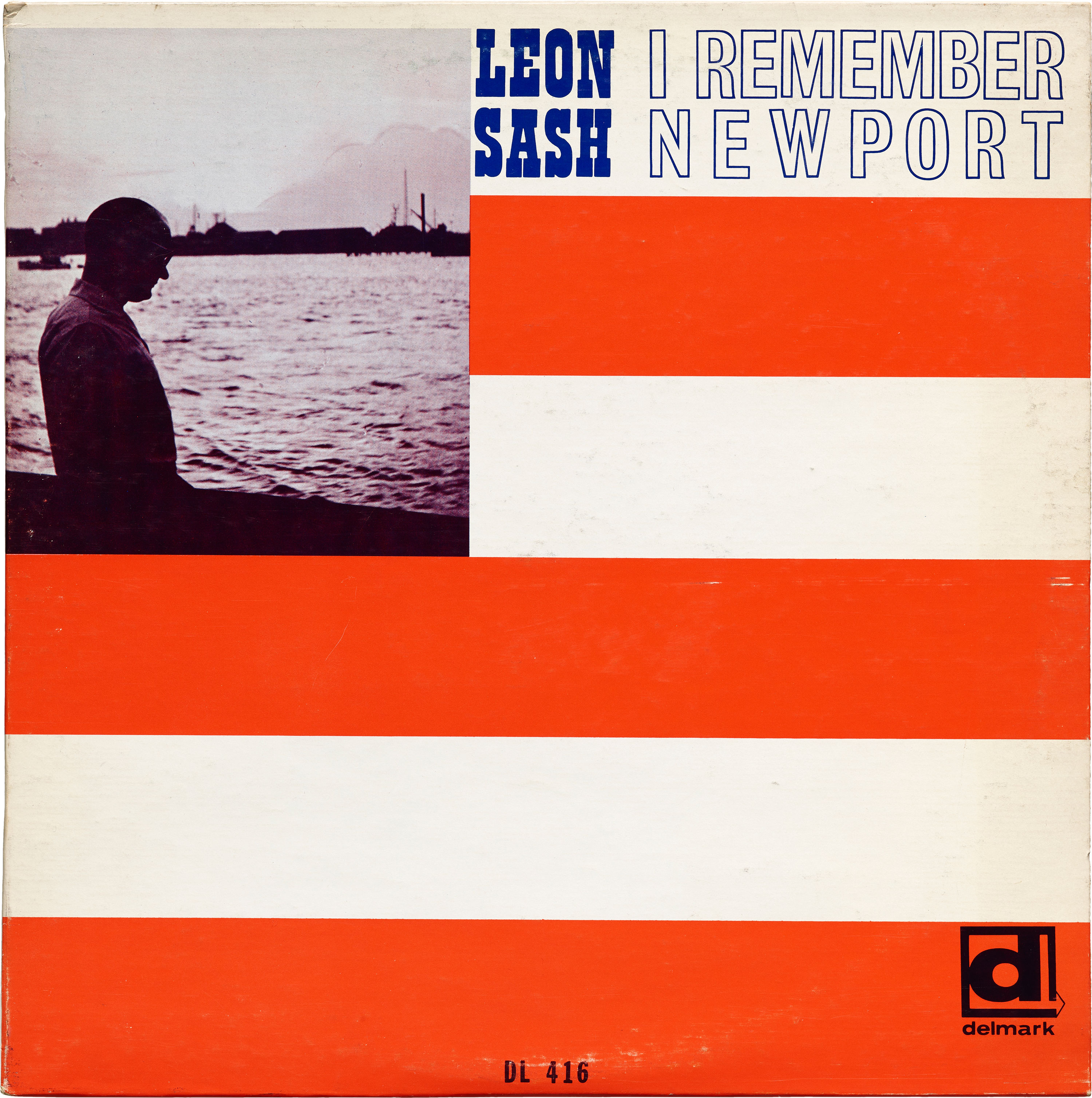
For Leon Sash’s I Remember Newport, Abernathy continues to play with contrast, but in a more subdued composition appropriate for the accordionist’s feel-good, straight-forward tunes. Abernathy simplifies the graphic of the American flag with a few stripes of red and white and a black-and-white image of Sash in place of the field of stars. The album is topped off with stacked blue type, set in a solid Playbill and an outlined Grotesque No. 9.

For the avant-garde musician Sun Ra, type takes a back seat so the illustration can shine. Abernathy abstracts a drawing of the sun into painterly swirls with rays of sunlight that beam to the edge of the frame — fitting for the artist whose stage name was coined in honor of the Egyptian God of the Sun. The glowing, orange mass against the red background reflects the surge of energy in the Afrofuturist’s synthy, cosmic sound.
The Archive thanks Jerome Harris, curator of As, Not For: Dethroning Our Absolutes, for introducing us to Abernathy’s record covers. Her work contributes to our growing album art collection, which represents a unique cross-section of music, design, and typography. There is much more to learn about Abernathy, who passed away a few years ago. We welcome insights from those who lived and worked with her. Until then, we’re honored to share a sliver of her work with an audience who can appreciate the intersection of art and history from this chapter of her life.
— Florence Fu, Editorial Associate
You can see Abernathy’s album art in person at our exhibition co-presented by Astro Studios, Between Measures: The Intersection of Design and Music. Our next event at the show is Designing for Musicians, a panel on Thursday, March 21.
Update: February, 2021 — We recently acquired a book designed by Abernathy: In Our Terribleness, a book of poetry by Amiri Baraka and photography by Fundi (Billy Abernathy).