News
New in the Online Archive: Giovanni Pintori for Olivetti
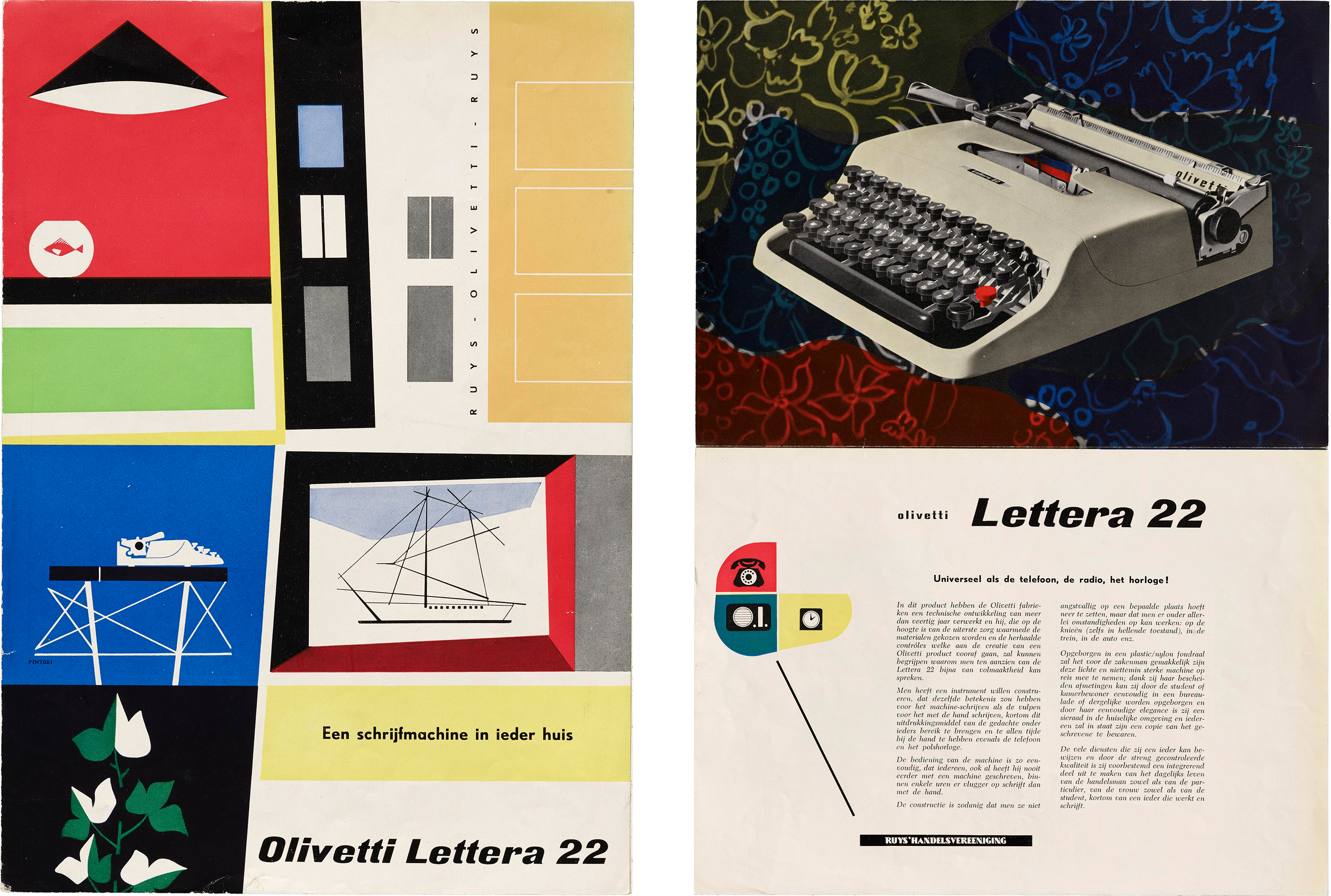
In the 1950s, Pintori revisualized the typewriter, transforming it from esoteric machine to a charming companion of modern office life.
See all this work at our hi-fi web resolution in the Online Archive.
The lifeless, rectangular slabs of metal we type on these days were preceded by tools with personality. Sculptural, colorful, and often weighty, typewriters were transformative machines that shaped modern industry and communication in the 20th century. The Italian brand Olivetti, founded in 1908, was among the many key players in the market and was unique in the way they saw approachable design as core to their identity. Part of Olivetti’s success is owed to Giovanni Pintori, who was the company’s art director from 1950 to 1967. Pintori’s color palettes, shapely abstraction, and smart use of the grid conveyed both the mechanic power of an Olivetti device and the joyful ease one should feel when using it.
Olivetti’s attention to design extended throughout the whole brand. The company collaborated with several artists and designers to craft their corporate image: from the factories, machines, and housing units for employees, to stores and printed advertising. After graduating from the School of Industrial Arts in Milan, Pintori joined Olivetti’s Advertising and Development Office, where he worked for three decades and eventually rose to the Art Director position in 1950.
“Pintori excelled at visualizing the soul of the machine.”
Two years later, the Museum of Modern Art in New York organized Olivetti: Design in Industry — which marked the first time a European company was exhibited at the renowned museum, subsequently launching both Olivetti and Pintori to international fame. Marcello Nizzoli, one of Pintori’s teachers, was the industrial mastermind behind several Olivetti products, including the Lexicon 80, Lettera 22, and the Divisumma. Curators also praised Nizzoli’s talent in combining “sculptural mass with architectural balance” and encouraged American industries to follow Olivetti’s lead and high standards of integrated design.
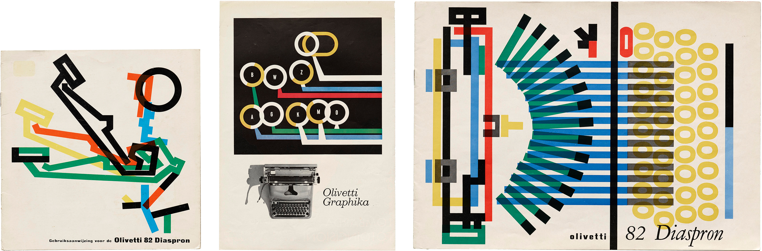
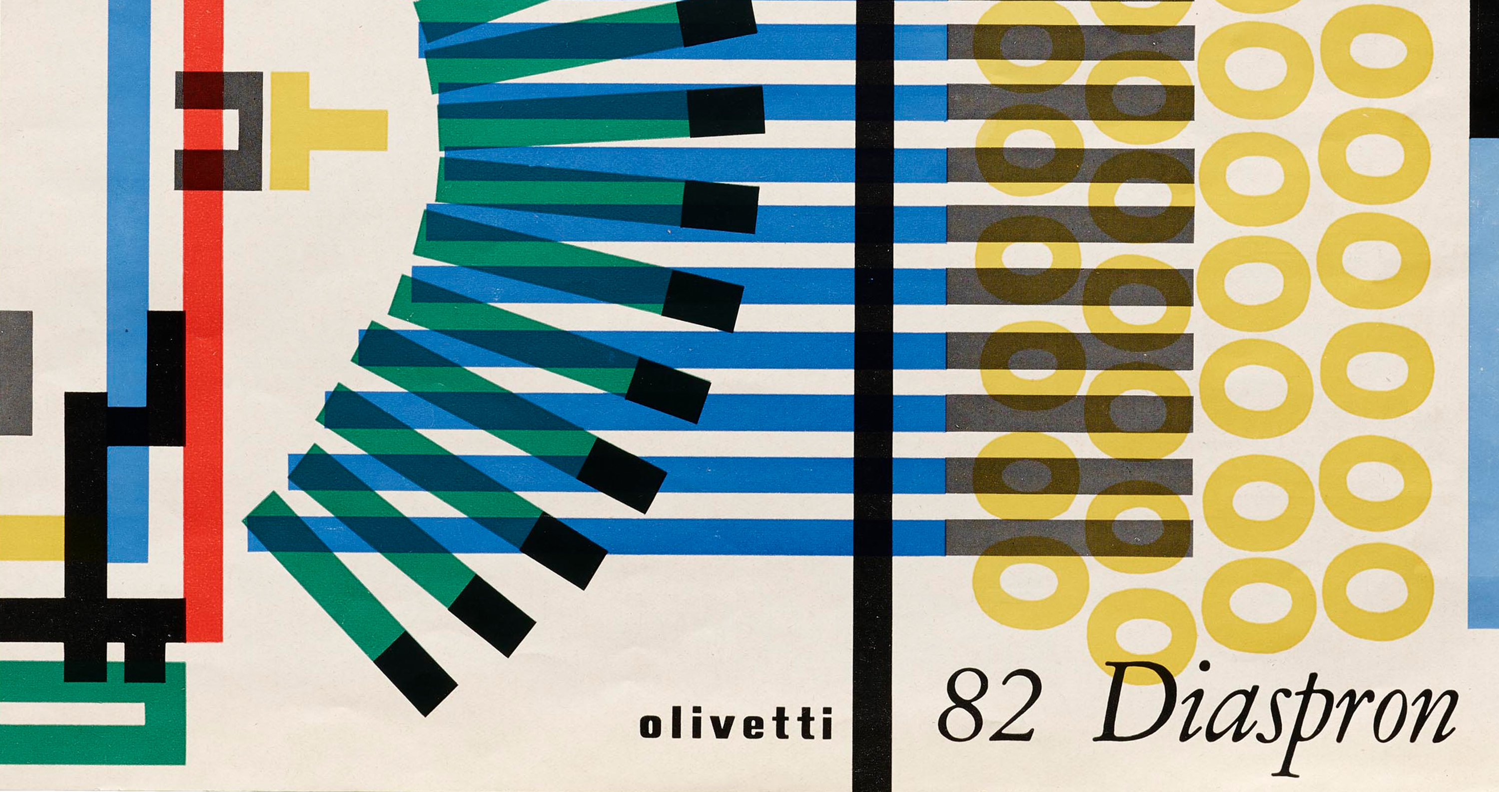
Graphika pamphlet, 1965; 82 Diaspron pamphlet, 1965.
Pintori’s designs are awash with vibrant colors. From the cover art, to the highly organized interiors that don’t sacrifice legibility for design, Pintori excelled at visualizing the soul of the machine. In his more figurative works, he illustrates the complex internal organs of the typewriter to a concise graphic. His brochure for 82 Diaspron is illustrated with a kind of bird’s-eye x-ray, revealing the skeleton that holds the machine together with overlapping hues bound by simple strokes and geometric forms. For the Graphika, Pintori highlights the mechanics between keys and underlying type bars.
“Giovanni Pintori maintains that ‘a page or a poster must be rich in significance and that its meaning must derive from the inherent qualities of the object or of the function to be publicized.’ These requirements can be met with conviction, lucidity, and taste, but another ingredient is needed to put the breath of life into print or a three dimensional display — the personality and the vision of the artist.”— Museum of Modern Art
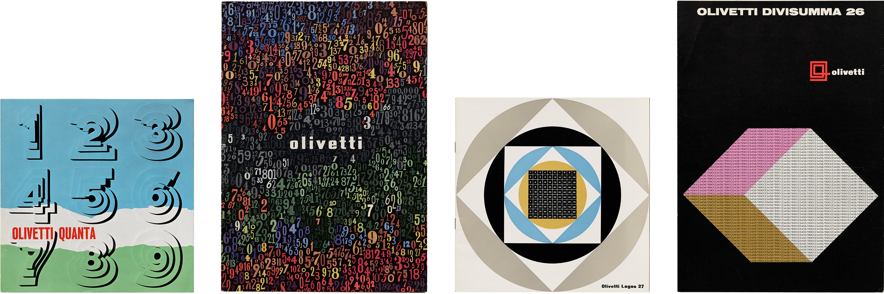
Divisumma pamphlet, 1972; Divisumma 26 pamphlet, 1960s; Logos 27, 1960s.
In addition to typewriters, Olivetti also manufactured calculators. It may seem natural to design with numbers to represent their computing power, but Pintori played with unexpected variations on this theme. For the Quanta Adding Machine brochure, numbers are quite literally added on top of one another to create a three-dimensional effect. For the more powerful Divisumma 26, Pintori incorporates colorful hand-drawn numbers, illustrating the abstract wonder and expanded limits of a calculation machine. Other examples use shape and color to frame numbers in interesting ways.
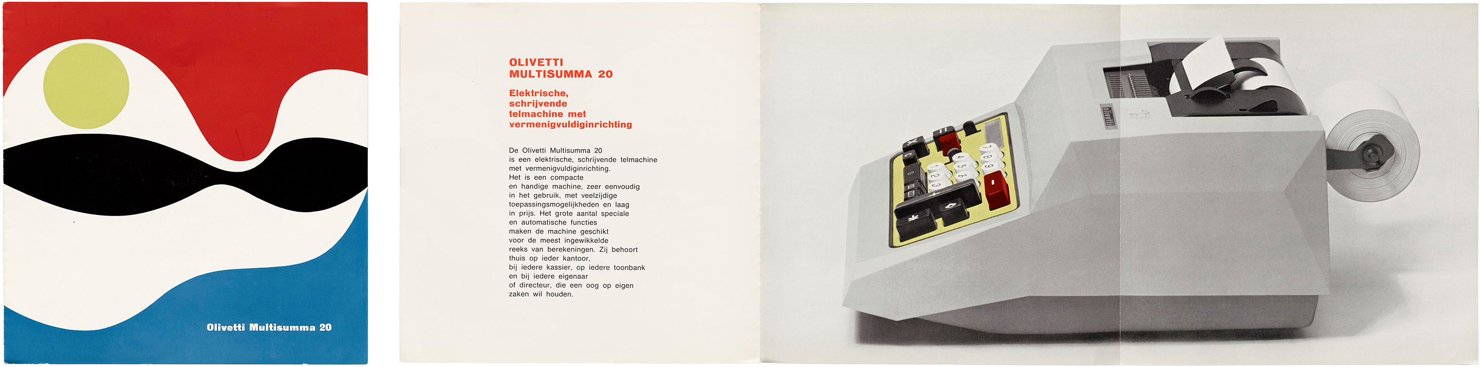
Our collection also includes more minimal brochures that place form at the forefront to produce optic rhythms. The cover graphic for an Olivetti Multisumma 20 brochure abstracts the machine’s rolls of paper with sweeping white curves around a green cylinder. On other brochures that don’t represent the machine, Pintori used shape and signature color palettes to create interesting forms where hard and soft edges meet.
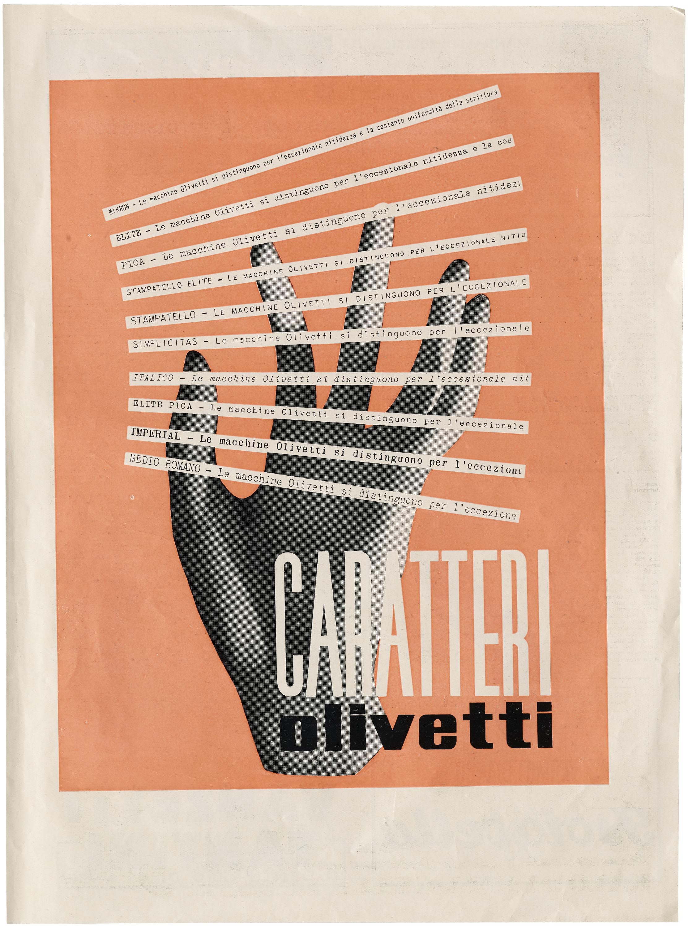
The brand’s personality was also translated in the offerings of typefaces. Olivetti had an in-house type design studio with a catalog featuring typefaces by A. M. Cassandre, Wim Crouwel, Imre Reiner, Josef Müller-Brockmann, and H. Lindinger. The Caraterri pamphlet stands out among the rest of the collection as a rare use of photography. An image of a hand appears behind strips of paper typeset with Olivetti typefaces, as if reaching to make a destined selection. Typewriters including those by Olivetti put typesetting into the hands of the user, giving them a newfound agency to pick and choose, and act as text compositors. The Olivetti Caraterri pamphlet features Olivetti’s in-house typefaces, including serifs and sans serifs, proportional and lining styles, and types for small sizes. Type designer Maria Ramós’s dissertation for the MA in Typeface Design in Reading includes more in-depth research on type design for Olivetti typewriters.
At the height of Olivetti’s success, the company’s typewriters and calculators were exported all over the world. While expanding in scale and global reach, one thing stayed constant: the Olivetti brand identity. Uniting a vibrant color palette and measured balance between organic and geometric form, Pintori’s design vision illustrated Olivetti machines as reliable, approachable, and stylish companions in modern office life.
Florence Fu is a writer and type designer in New York. She holds a B.A. in Art History and a B.S. in Journalism from Northwestern University, and is a graduate of Type West’s year-long type design certificate program. She is an Editorial Associate at Letterform Archive and currently an intern at Sharp Type Co.