News
From the Collection: Gujarati Type Foundry’s 1937 Specimen Book
Reporting from India, Tanya George offers a glimpse into one of the country’s most extensive catalogs of locally produced metal type.
Based in Bombay for most of the twentieth century, the Gujarati Type Foundry was one of India’s leading metal type manufacturers. Tanya George, our new regular correspondent, makes her Letterform Archive News debut with an in-depth look at the Indian scripts shown in the company’s catalog, a highlight of the Tholenaar Collection.
See it in the Online Archive
The Gujarati Type Foundry was set up in October of 1900 in Girgaon, the Southwestern part of the Bombay peninsula. The bubonic plague that had ravaged the inhabitants for the previous couple of years was finally manageable, and businesses and establishments were returning to the pace for which the city was known. The foundry was established by Ichharam Suryaram Desai in partnership with Maganlal Thakordas Modi. Both men were born in Surat in the mid 1800s, only a year apart, and had eventually moved to Bombay to make their fortunes. Desai was a well-known author and at the time editor of Gujarati, a popular magazine in the Gujarati* community which survived both him and his son well into the twentieth century. The foundry was originally created to supply type for the Gujarati Printing Press, publishers of Gujarati magazine. The partner Modi was a wealthy merchant who eventually would go on to fund the MTB college in his hometown of Surat. In 1921 he was also awarded the CIE (Companion, Order of Indian Empire) by King George V. It was his son, Manilal Chhaganlal Modi, who would work closely with craftsmen employed at the foundry to create new styles and who spearheaded the creation of the specimen book featured in this article.
Letterform Archive holds two bound catalogs published by the Gujarati Type Foundry (GTF): one narrow softcover dated 1928, and the larger format hardback with a blue binding shown here. These are among many printed by GTF between 1926 and 1937. English type scholar, Geoffrey Osbourne 1 suggests that it was under the guidance of Manilal Modi that the work began, and he rightly compares it to catalogs by European and American foundries at the height of their production. The book is filled with hundreds of type styles across several scripts and languages used in India at the time, as well as ornaments and decorative borders. Like many foundry catalogs of the time, it also offered other equipment that a print shop might need.
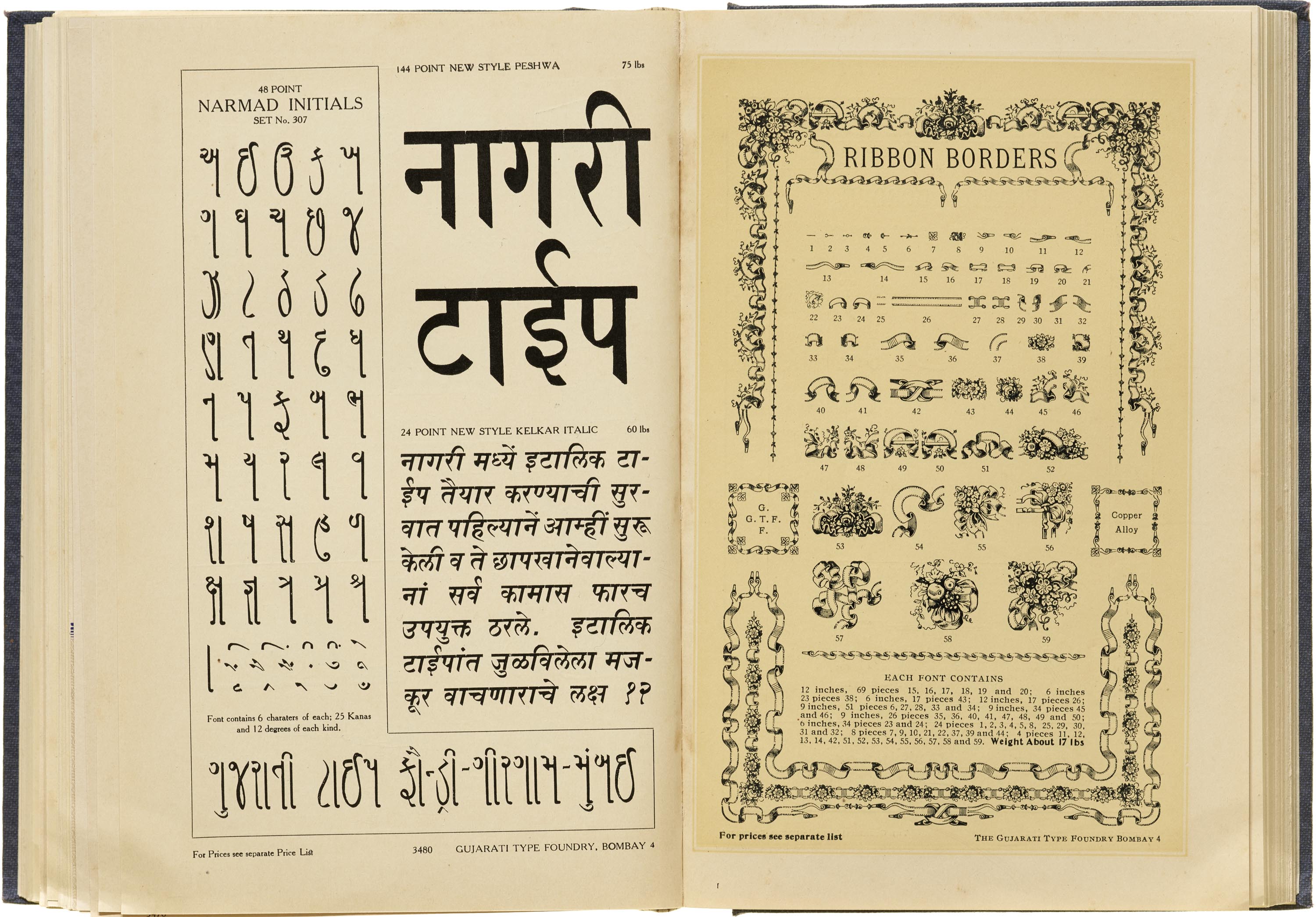
Indian print scholar Bapurao S. Naik 2 credits Desai for introducing to Devanagari and Gujarati italic designs that were slanted to the right, along with typefaces that supported Marathi, Urdu, Sindhi, Kannada, and Gurumukhi. He identified Narayan Sonu, a goldsmith, as the punch cutter at GTF for a quarter of a century. Sonu is said to have worked on a total of 45 typefaces in his time at the foundry, of which 15 were original designs. Naik mentions that the remaining 30 were duplicates of faces cut for the much acclaimed Nirnayasagar foundry which was active in Mumbai at the same time. It is telling that not all Devanagari designs in the GTF book carry the “Original” tag, and a few that don’t exhibit flared kana (vertical strokes), a distinctive feature seen in Nirnayasagar Primer designs, thus giving more weight to the claim.
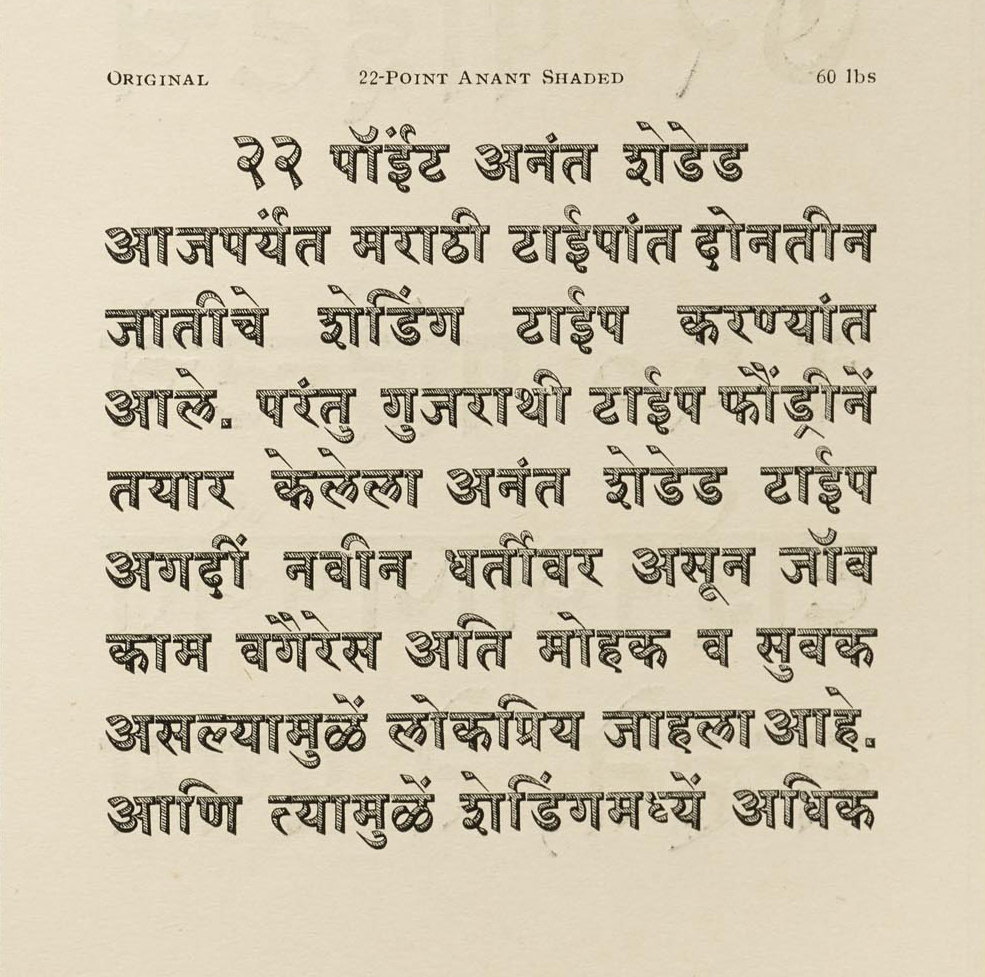
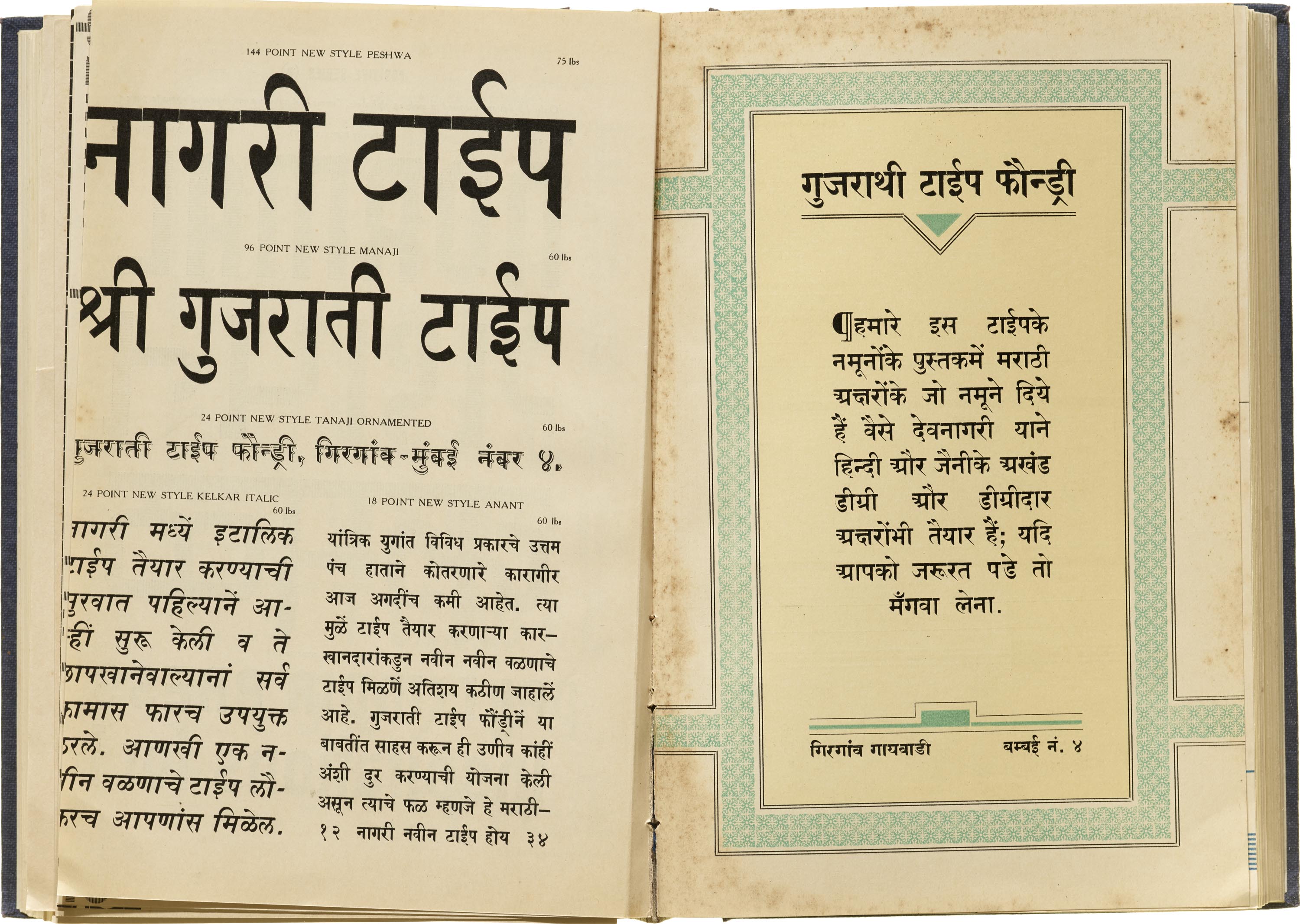
This is not to take away from the contributions to type design made by GTF. The specimen book exhibits quite a few italic designs for Marathi at various sizes. Promotional text by GTF within the specimen claims design credit for the first Devanagari italics. Along with this the book also introduced shaded designs for the script. Naik credits another punch cutter, Anant Chari, for inventing these around 1917–18 and having the typeface Anant Shaded named after him. Later, in the 1930s, GTF employed another Anant (Salaskar) who designed the 18pt New Style Anant. The book contains Marathi typefaces as small as 10pt, as well as display sizes of Peshwa at 144pt and Manaji at 96pt.
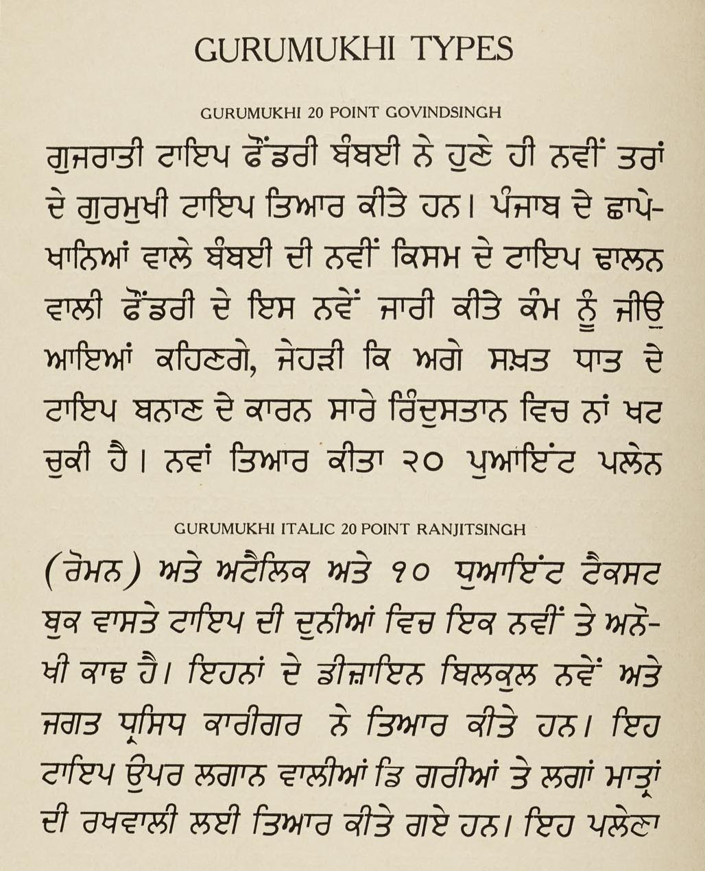
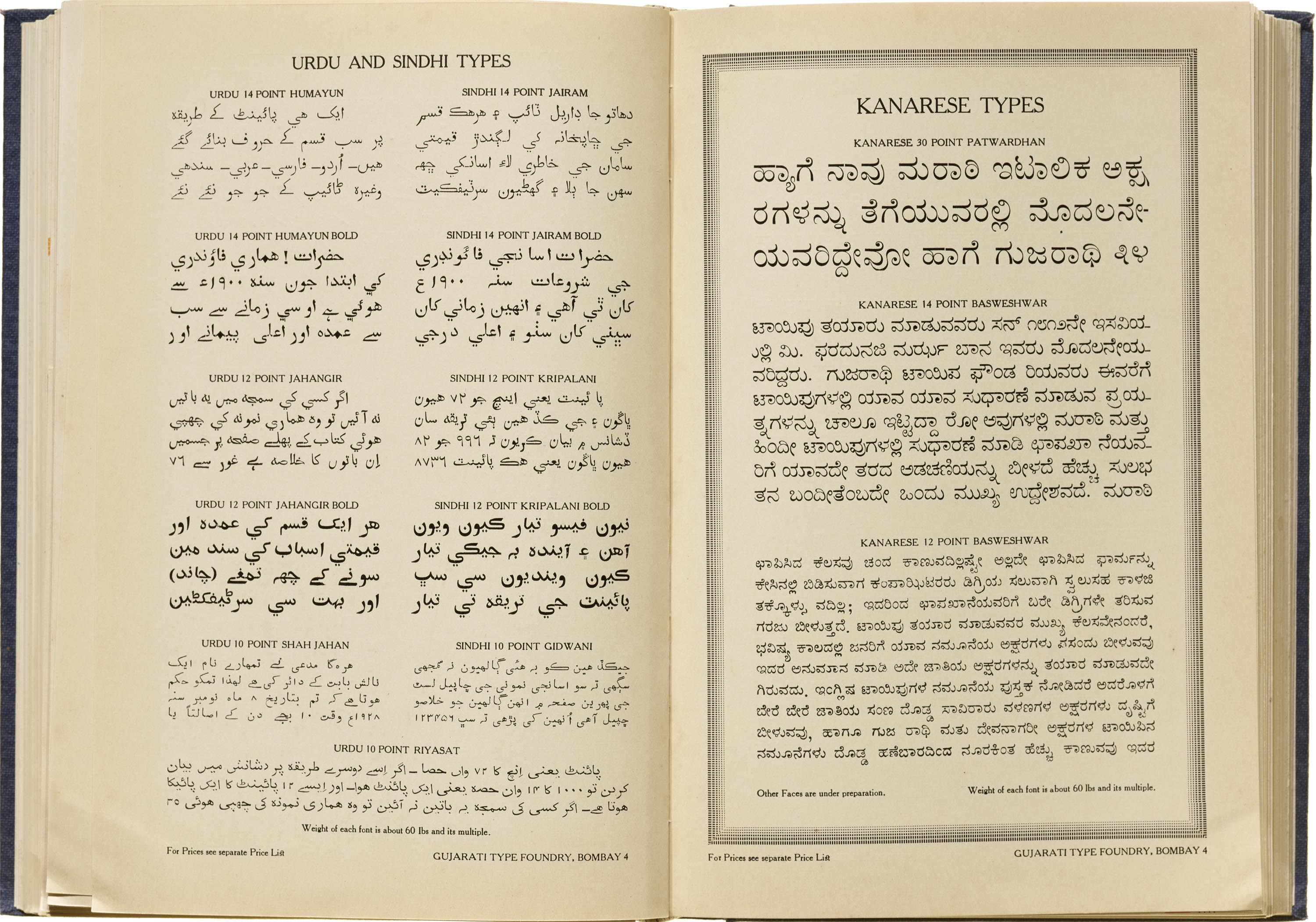
The book also has designs for other Indian scripts. Urdu and Sindhi Naskh types are printed on two sides of the same page, and while the designs are the same with a slightly varied character set for the two languages, they are sold under different names. One page is dedicated to a few designs for Kannada labeled Kanarese, and its flip side carries Gurumukhi typefaces including an italic style. The Gurumukhi seems to be the foundry’s only low-contrast design for an Indian script.
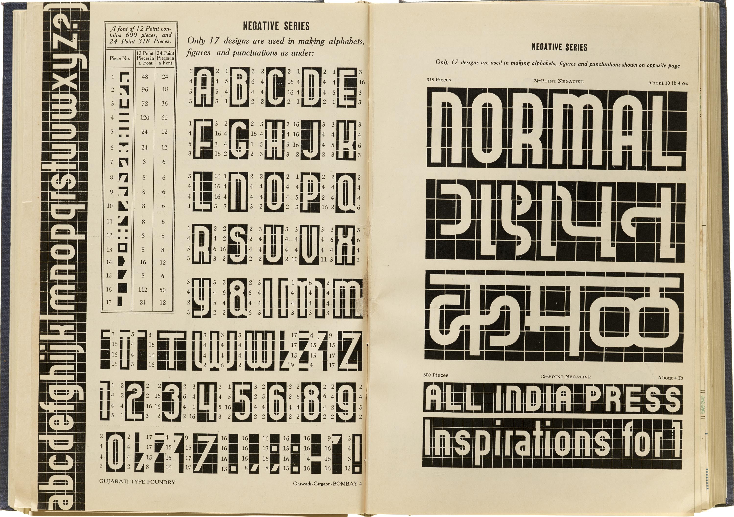
A striking sample of Indian scripts in the book can be found on the pages for the Negative-Positive series. The set was first issued by the Schriftguss foundry in Dresden as Ne-Po and was thus originally intended for producing Latin words. Ne-Po consists of just 17 modular pieces of metal to create alphabets, numerals, and punctuation, but the GTF specimen also uses the pieces to create Devanagari and Gujarati letters. The modularity ends up making the letterforms look very futuristic, especially for the era, but arguably even for today because of the unusual constructions in this specimen. The irregular proportions and lack of contrast traditionally found in these scripts make the forms stand out, but executing the entire character set along with maatras (vowel marks used to write the script) with so few modular pieces would be a challenge.
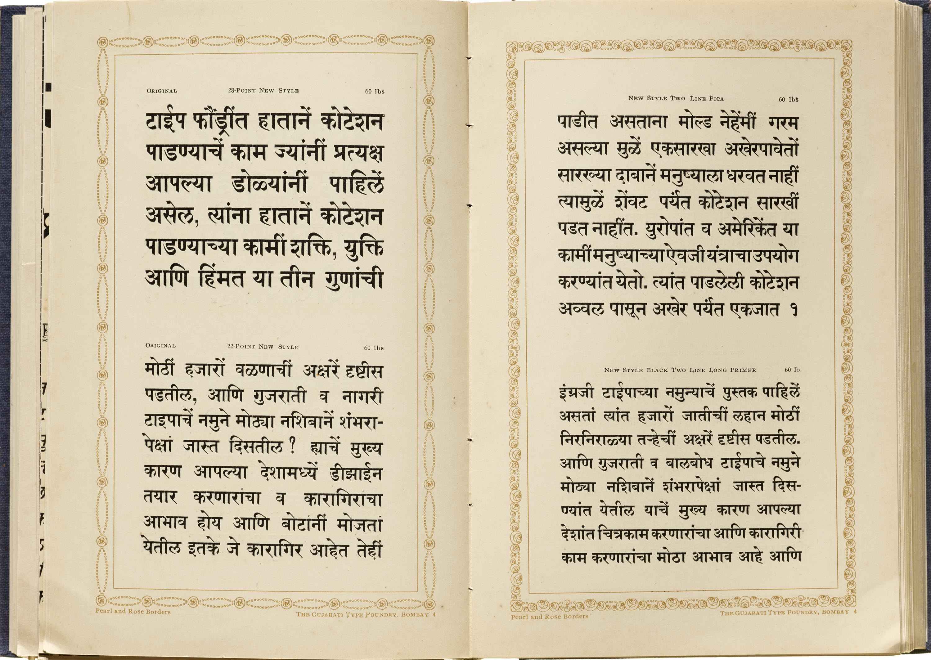
With the exception of two layouts — one in Hindi advertising that they also have fonts to support Hindi and Jaini, and a second showcasing Sanskrit text — all the Devanagari designs are in Marathi, which suggests that they catered primarily to regional printers in the Bombay province. GTF avoids showing the full glyph set for most of the typefaces; Narmad Initials in Gujarati and the spreads for the Negative Positive series are the most notable exceptions. Instead, their book is filled with mock advertisements and sells the potential buyer of the fonts on possibilities of using their products, employing all the muscle a foundry might have at hand: ornaments, borders, inks, and, of course, type. It also focuses on the quality and resilience of the product. Right from the spine, which says “Copper Alloy” in golden foil printing, to the text within the specimen, GTF boasts of the superiority of their type over the metal used by its competitors.
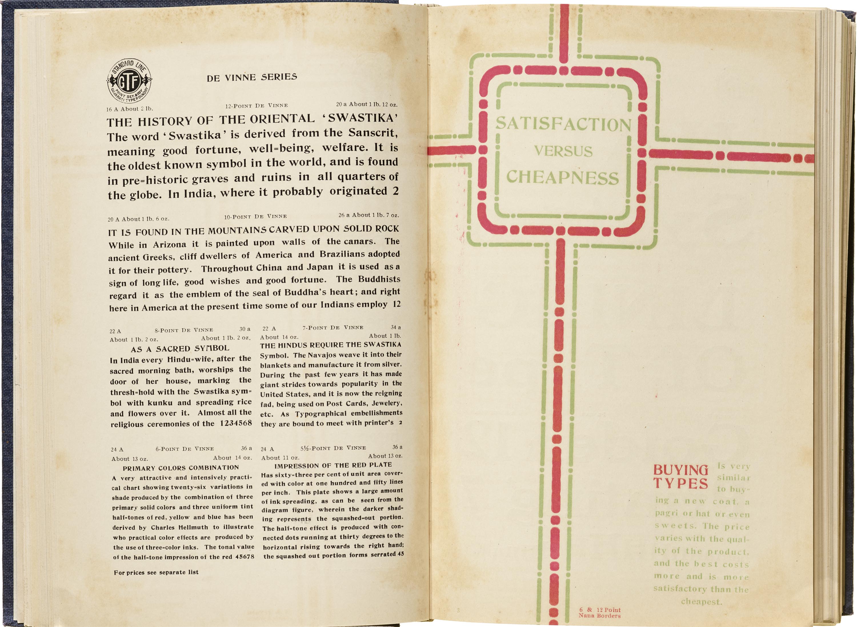
The specimen text throughout the catalog not only promotes these distinguishing features — something one expects to see in a foundry publication — it is also filled with informational content, such as the original meanings of the swastika (a symbol that had been co-opted by the Nazi party by the time the book was published), and instructions for printers on how to do high quality work. Other pages are punctuated with humor: a fictional letter from a “Bachelor of Printing” advises the public that he must now raise his prices as he is about to be married.
Another notable feature is that all the book’s pages are unnumbered, allowing for various combinations of the catalog to be bound and sold to printers according to the market and supply. The Urdu-Sindhi designs on two sides of the same page are an example of how GTF planned ahead for this kind of flexibility. Printer and historian Gregory Walters mentions that his copy from the 1980s was one of many sold to hobby printers in the West. It has only four pages of local scripts, which he attributes to the foundry presuming a lack of interest in those scripts from Western buyers. It might also suggest the foundry having run out of those leaves, since his copy was bound almost half a century after they were printed.
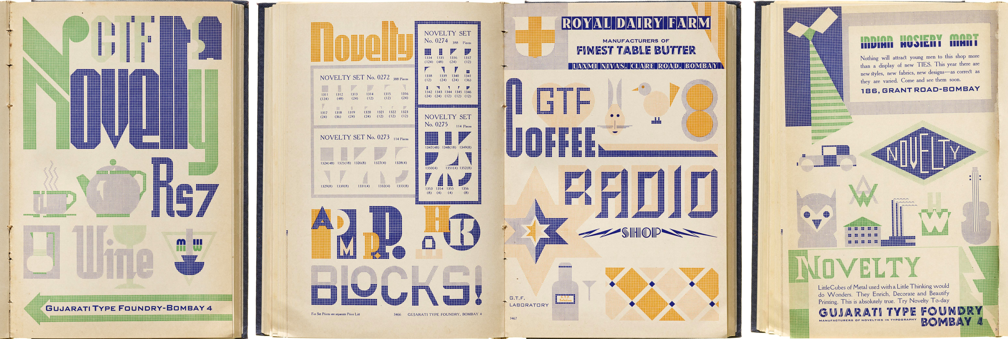
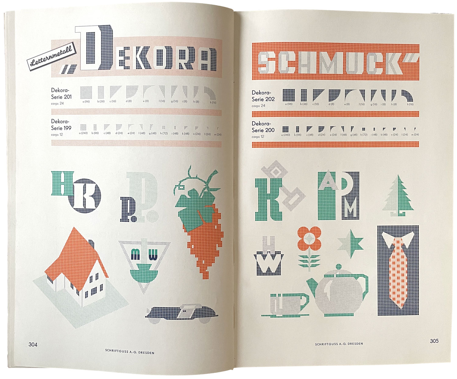
While this review focuses on the book’s showings of Indian scripts, there is more to discover in the Latin and ornament samples. One colorful example: GTF’s playful illustrations built with the modular Novelty, first issued by Schriftguss as Dekora, contrast with the restrained way the product is shown by its originating foundry in Germany. Explore more pages in the Online Archive.
This wide-ranging catalog was a project that would have required a great deal of vision and expertise to reach GTF’s ambitions. The quality of designs and variety in the book suggests that it was successful in achieving what it set out to do. The foundry survived for decades but fell short of its centenary as it could not compete with the arrival of offset printing.
Tanya George is a Mumbai-based designer and educator with a wide-ranging freelance practice that includes designing letterforms for brand identities as well as fonts and across different Indian scripts. She also conducts type walks around Mumbai, along with typography workshops, and writes about type.
Notes
- Geoffrey Osbourne, “An Unusual Type Specimen Book from India,” Matrix No. 2, 1982, p. 100–102
- Bapurao S. Naik, Typography of Devanagari Volume 2, Directorate of Languages.
Mumbai, 1971, p. 314–316