News
This Just In: Herbert Matter Letters & Logos
Sketches, comps, and cut paper tell the visual tale of a master designer at work.
Process material is an important focus for us at the Archive. It can help us understand how things are made. It can explain why something looks and works the way it does. And it can give us a glimpse into the mind of a designer, showing us how they (and their client) made decisions, corrections, additions, and eliminations on the way to a final product. That’s why we were thrilled to receive – through a generous grant from The Buddy Taub Foundation – a large collection of process material by Herbert Matter, one of the most innovative minds in 20th-century design.
“Herbert Matter is a magician. To satisfy the needs of industry, that’s what you have to be. Industry is a tough taskmaster. Art is tougher. Industry plus Art, almost impossible. … His work of ’32 could have been done in ’72, or even in ’82. It has that timeless, unerring quality one recognizes instinctively.” — Paul Rand, Symbols Signs Logos Trademarks, ca. 1977
Matter’s life reads like a who’s who of iconic designers and firms. Born in 1907 in Switzerland, he spent his early career in Paris, working with A.M. Cassandre on poster design and with Le Corbusier on architecture and exhibit design. In the early 1930s he created brochures and posters for the Swiss Tourist Office. He soon moved to New York City where he continued his photographic work, shooting for Alexey Brodovitch and Harper’s Bazaar, for Condé Nast publications, and for his own exhibitions. In the 1940s he designed for Charles and Ray Eames, arts & architecture magazine, and began long-running consultancies with Knoll Associates and the Guggenheim Museum. He taught graphic design for 15 years at Yale and went on to make multiple films.
Another Matter
While Matter is best known for his photography, his novel photomontage techniques, and his relationship with big names in design, he also created striking logos and identities for many uncelebrated clients. Some of this lesser-known work can now be seen at Letterform Archive in the form of sketches on grid and tissue paper, cut letters and shapes, and maquettes. The collection joins several pieces by Matter that were already in the Archive’s collection, including some of his iconic Swiss posters, a portfolio of logotype maquettes (referenced above), and some of his wonderful catalogs for Knoll.
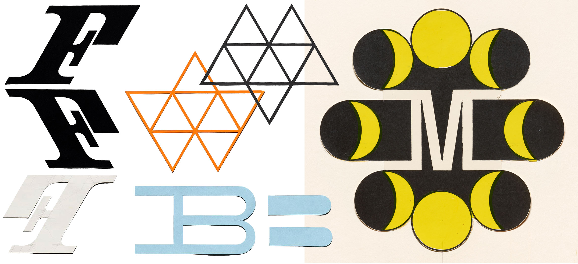
This new donation includes dozens of objects, both in-progress and complete. There’s so much to explore we can’t do it justice all at once, so we’re starting with three logo projects: First National Bank of Miami, Houston First Savings, and Moon Over East Hampton. The latter was a nightclub that never opened, but given Matter’s mystical, futuristic vision, we so wish it did.
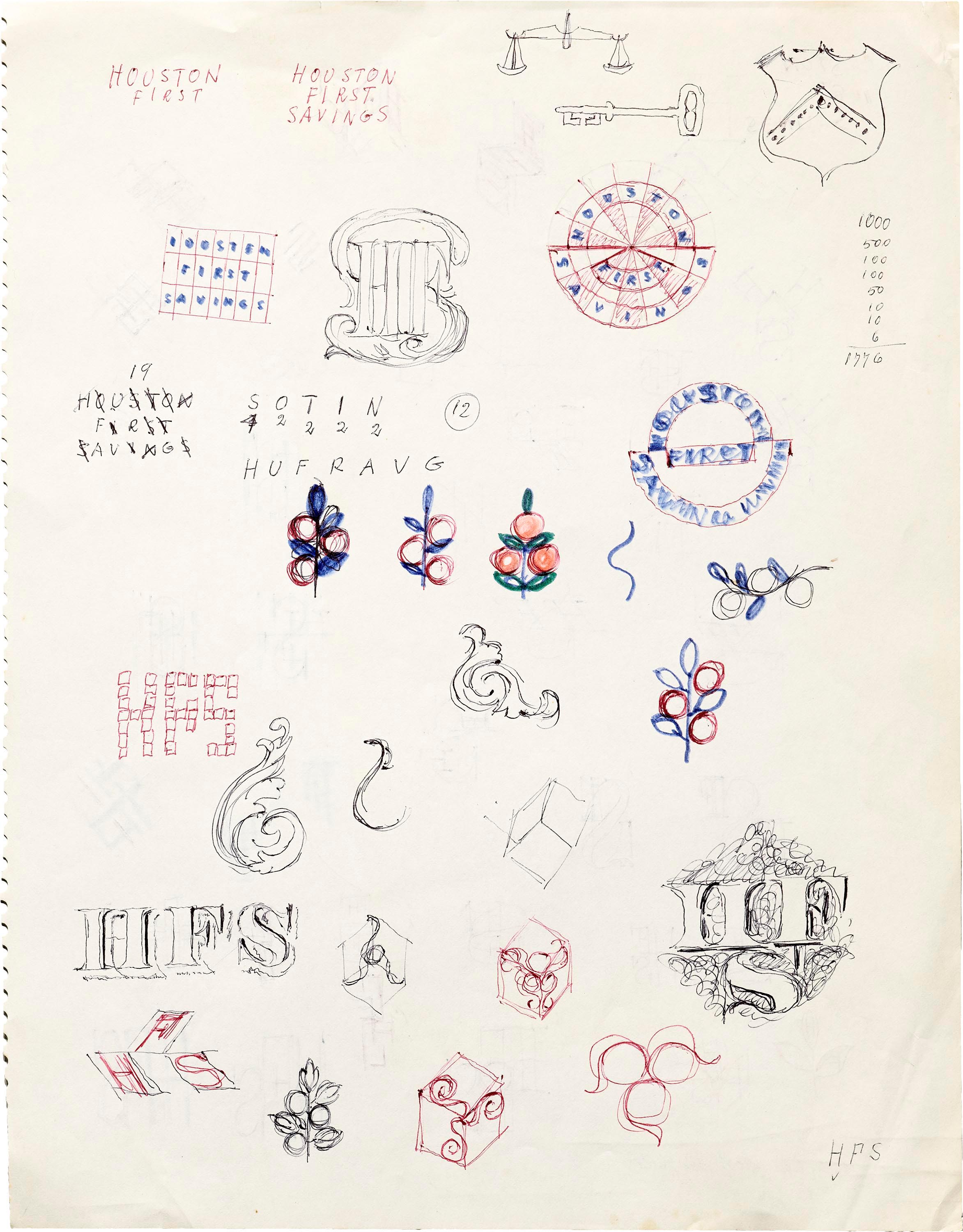
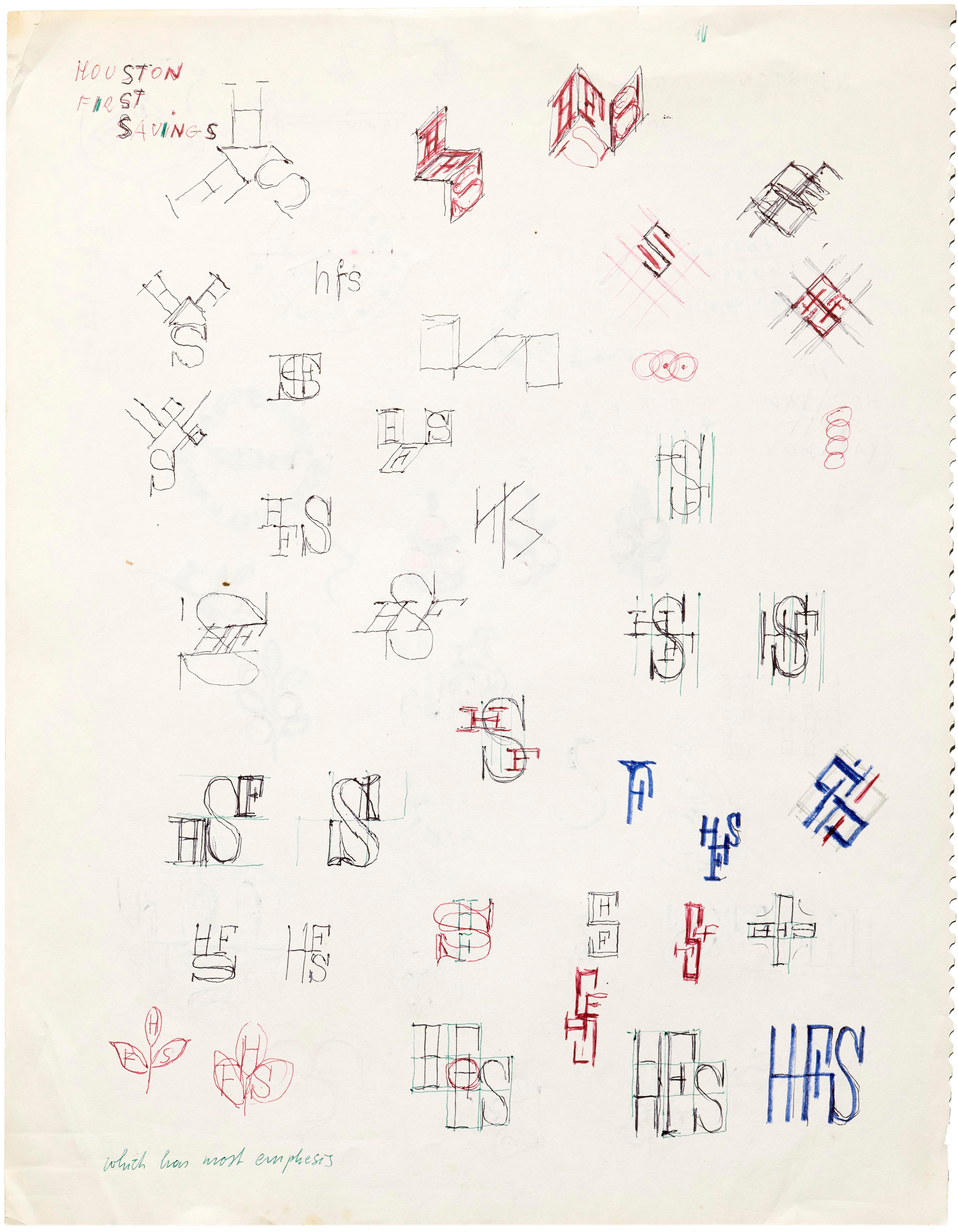
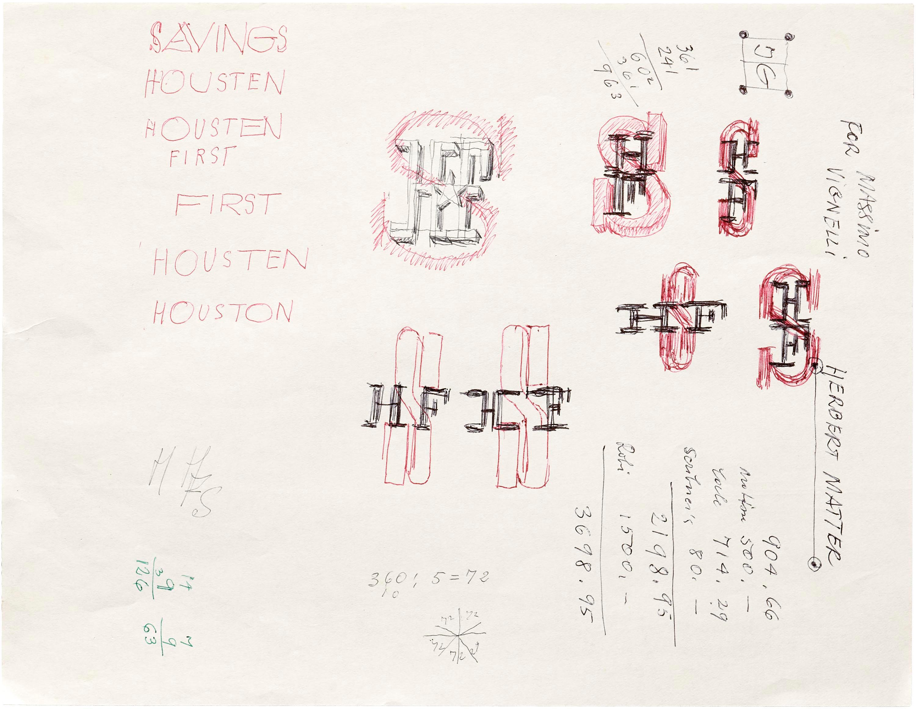
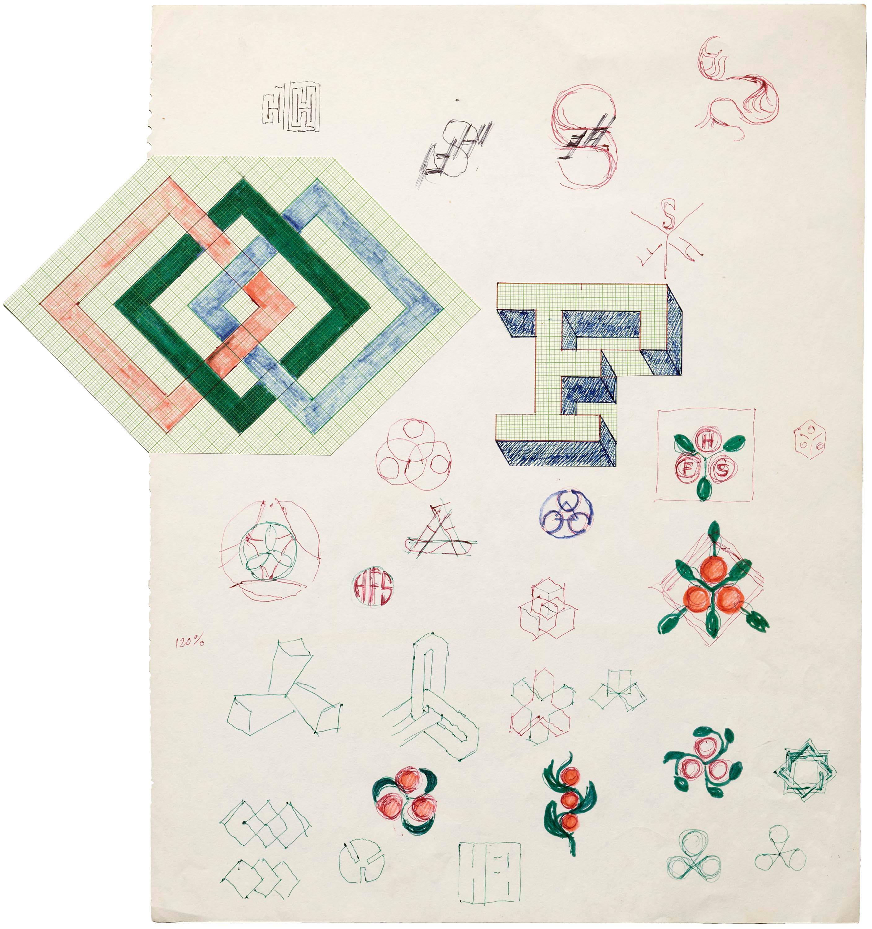
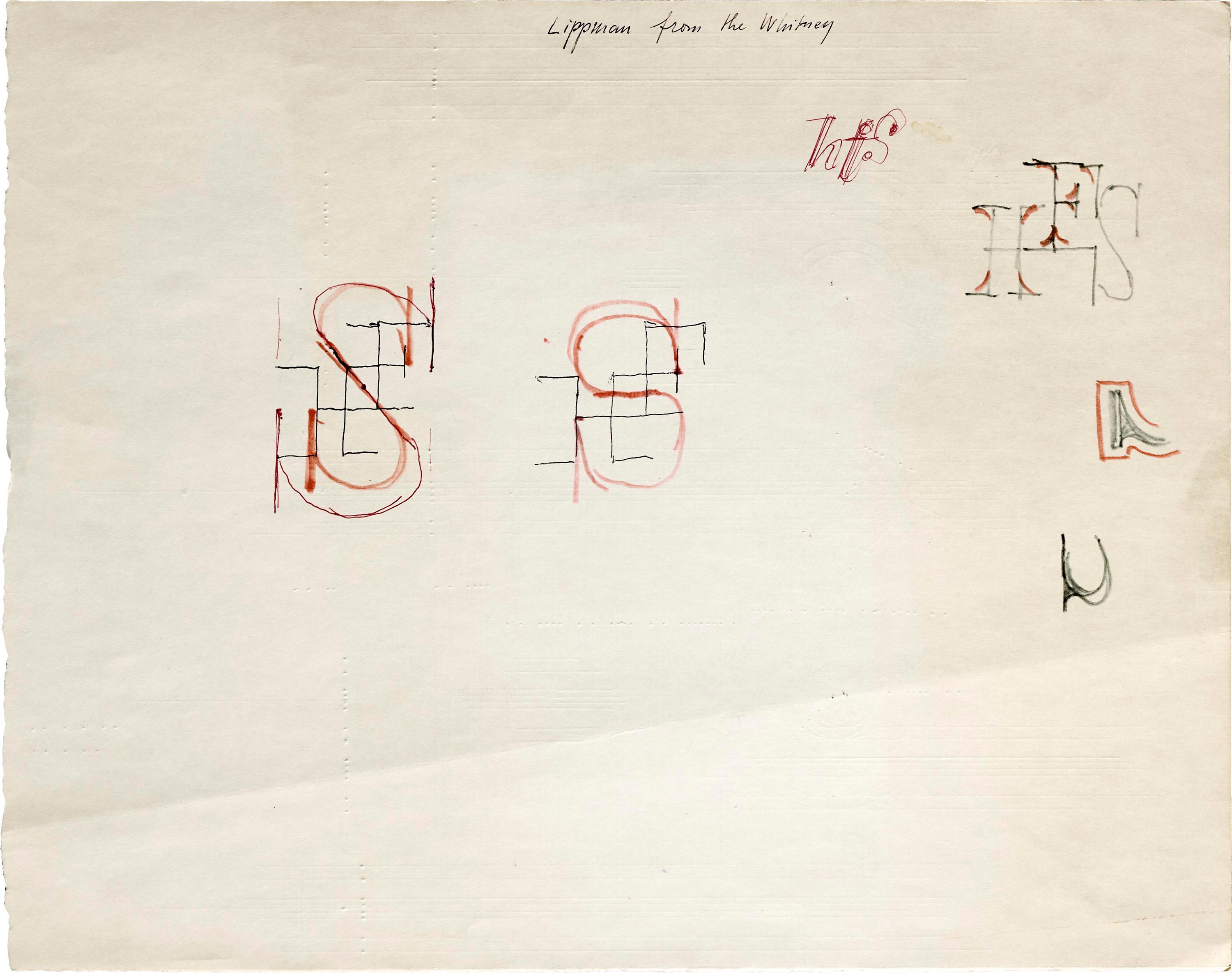
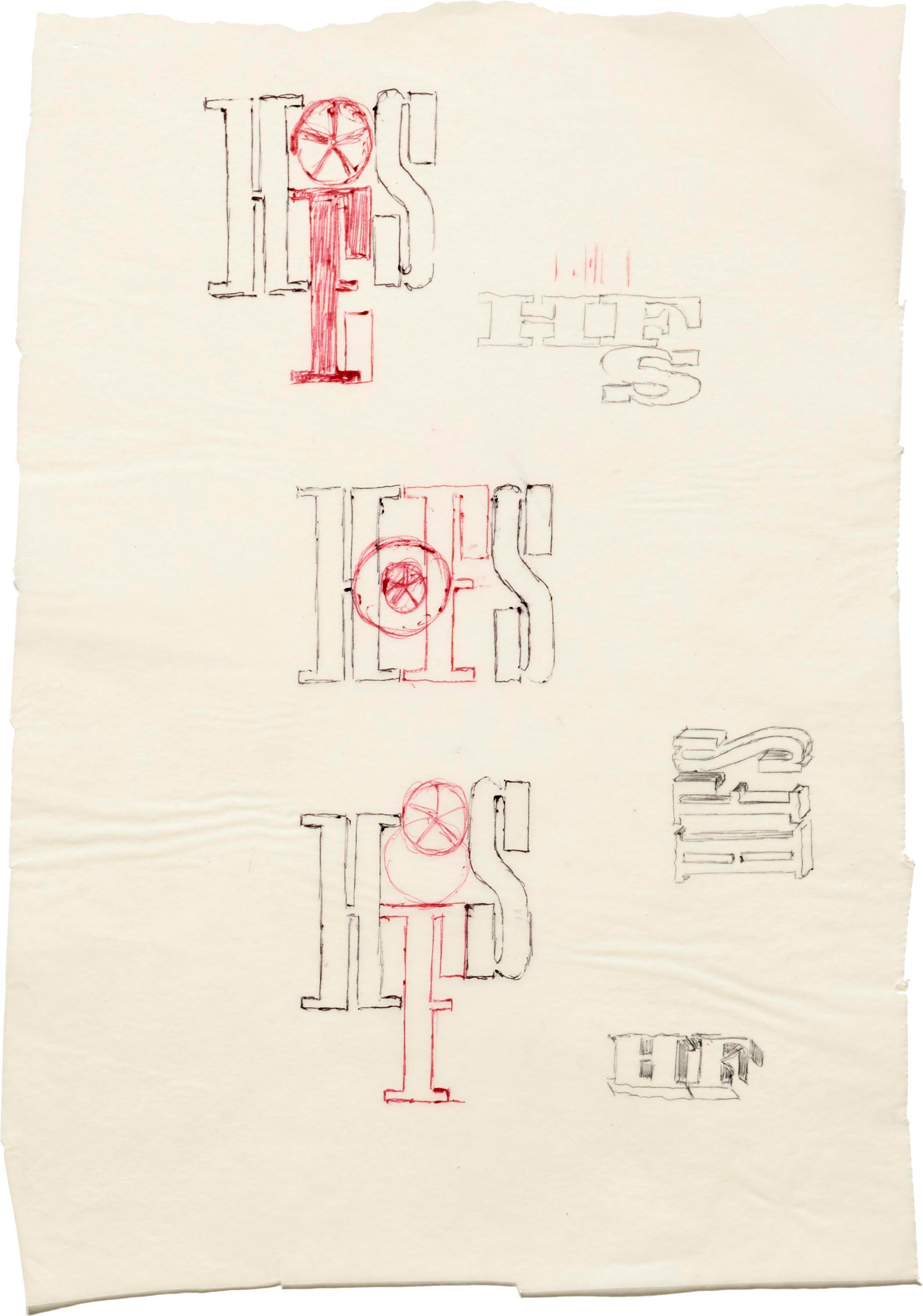
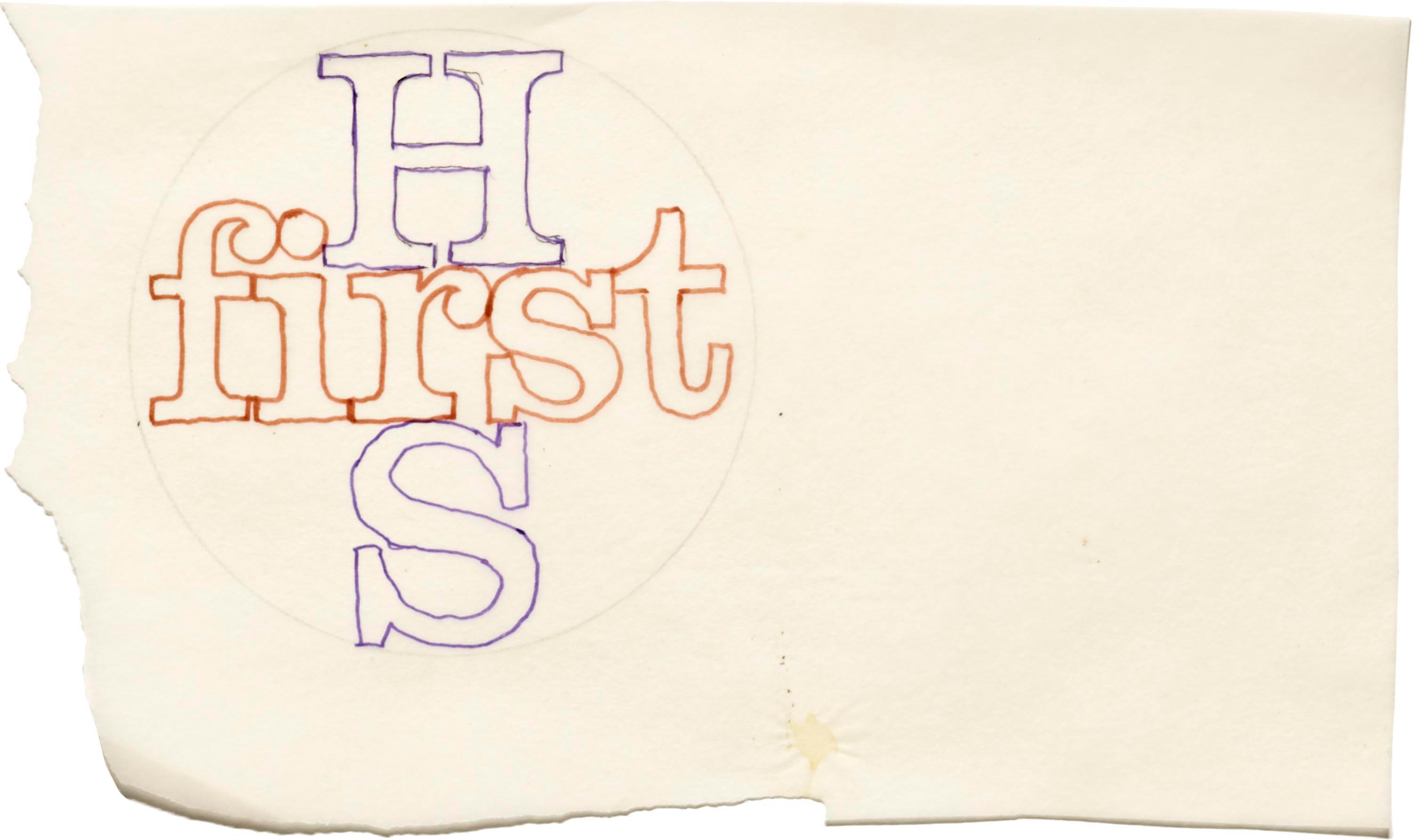
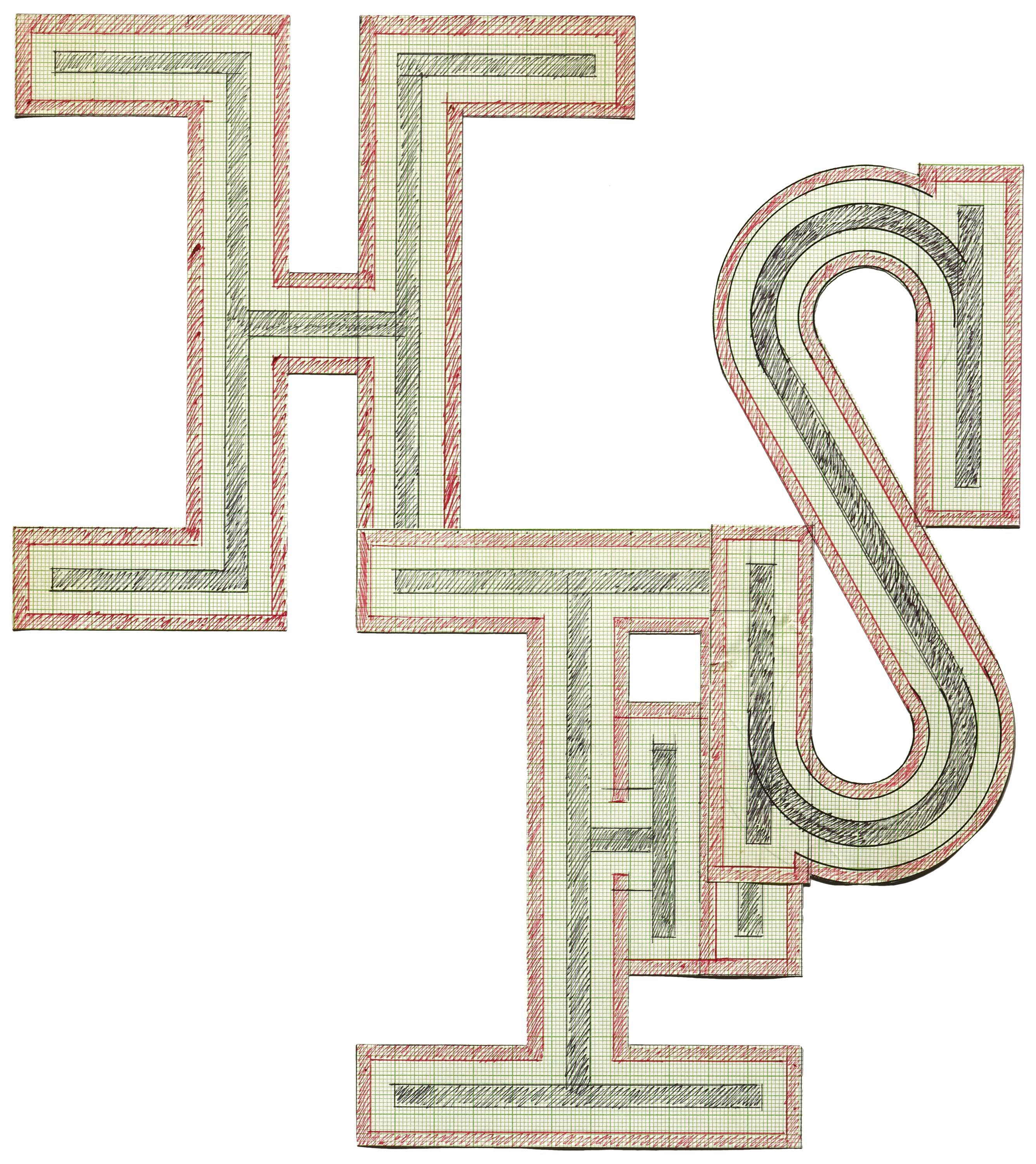
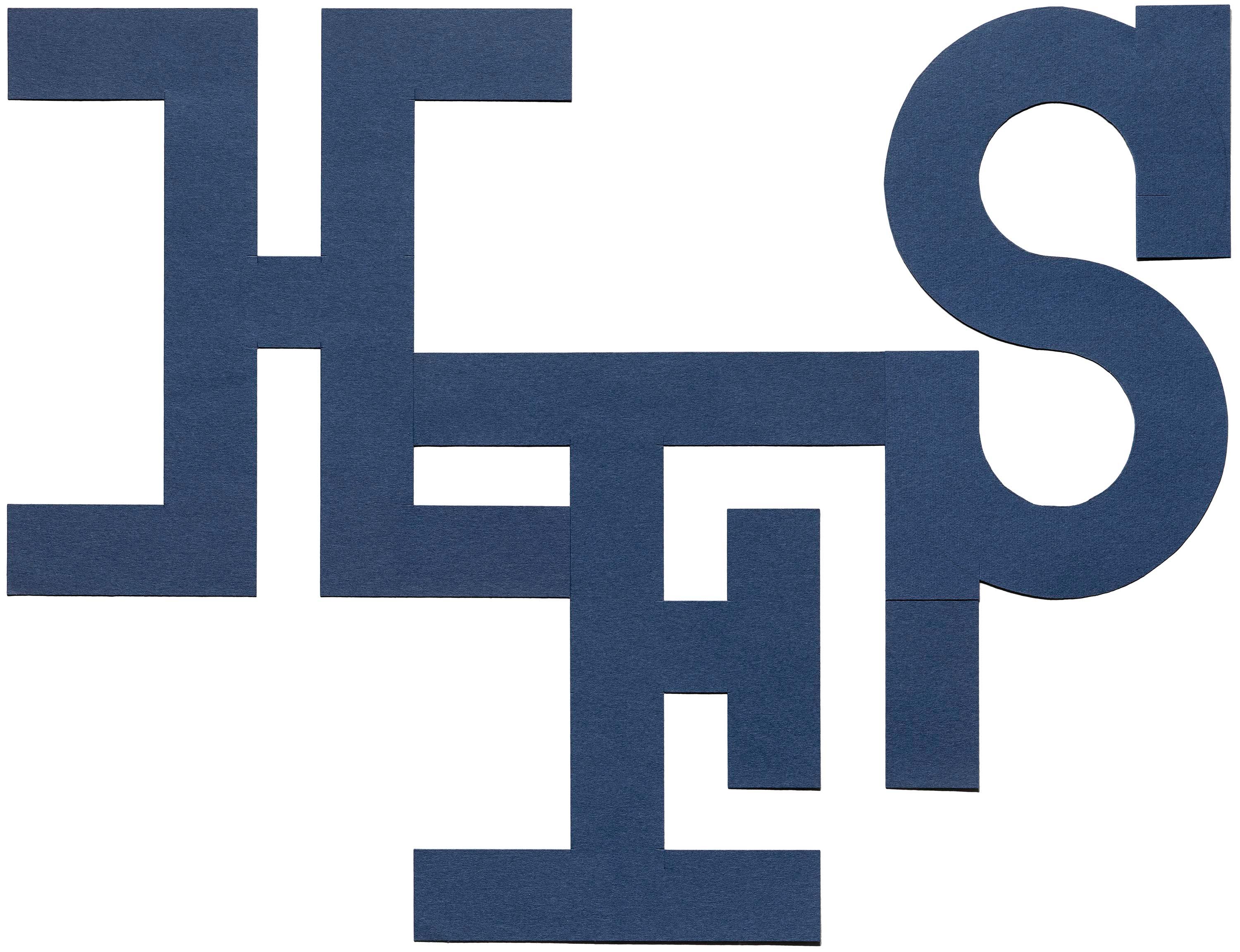
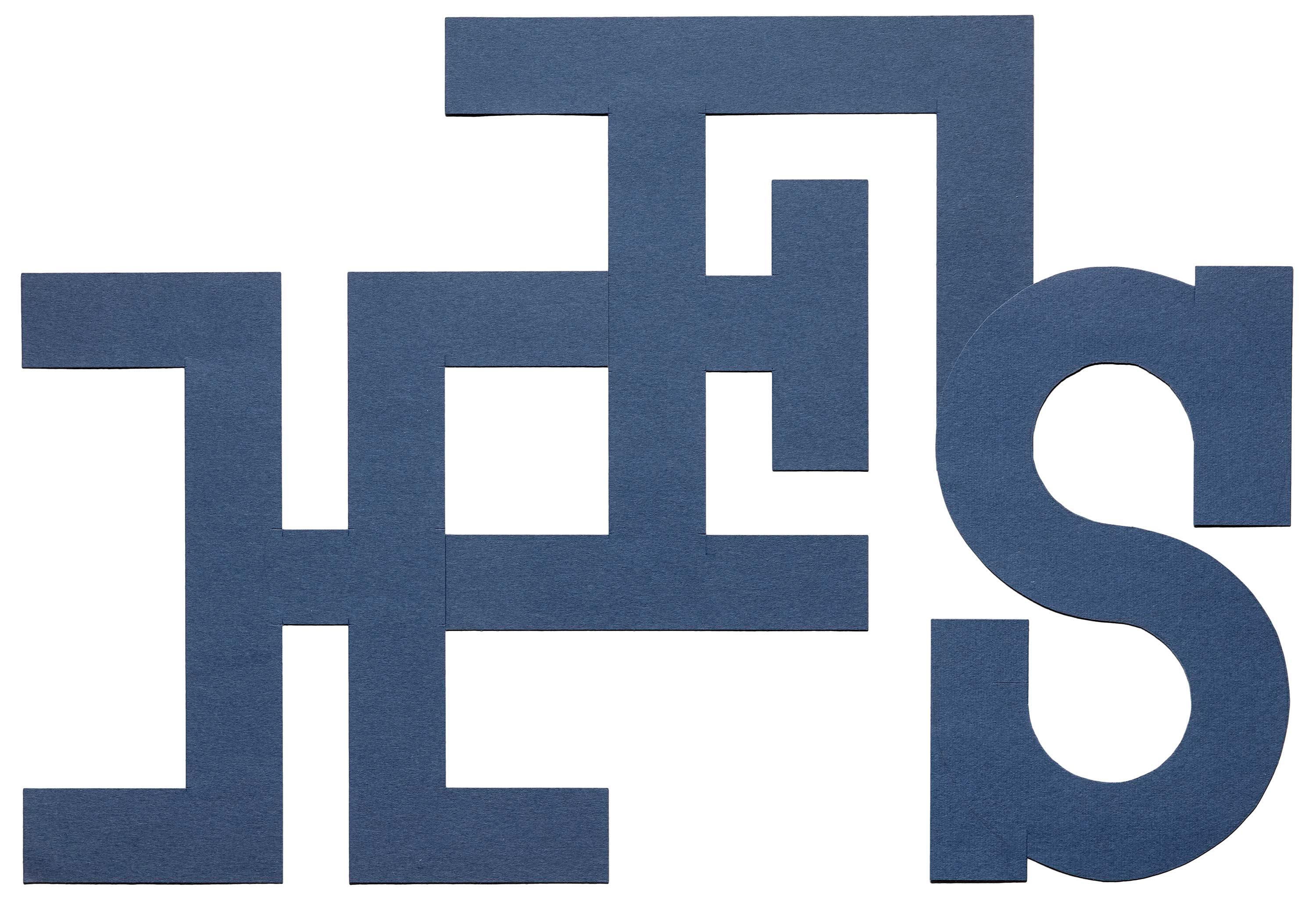
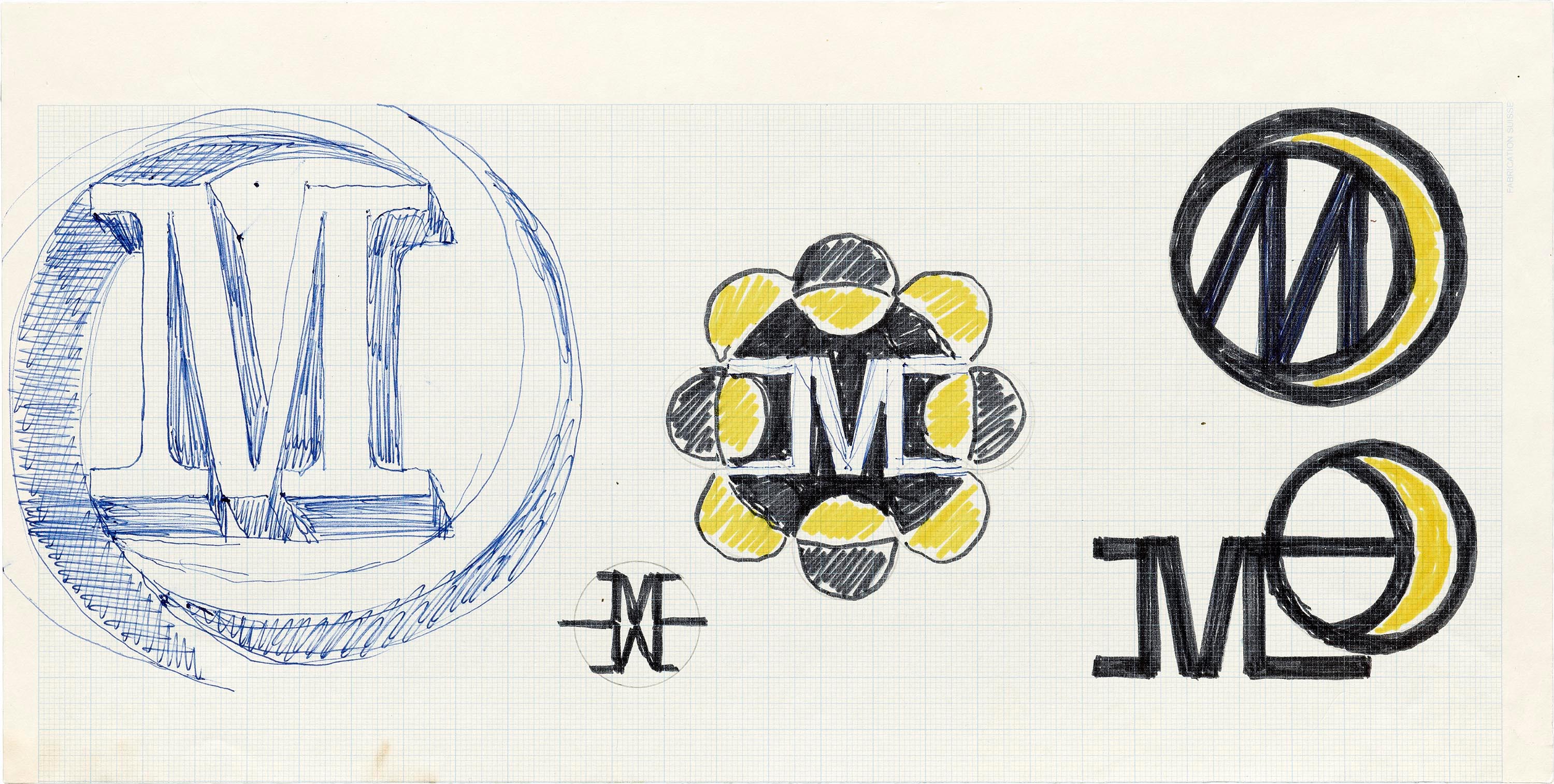
Houston First Savings
The sketches for this undated identity project shed a lot of light on Matter’s working process. You can see him considering symbol and lettering possibilities, and even counting out the letters in the name to work out alignments and composition. Multiple versions of the “HFS” monogram are drawn and cut from grid and colored paper. All images in these galleries are high resolution. Zoom to see detail.


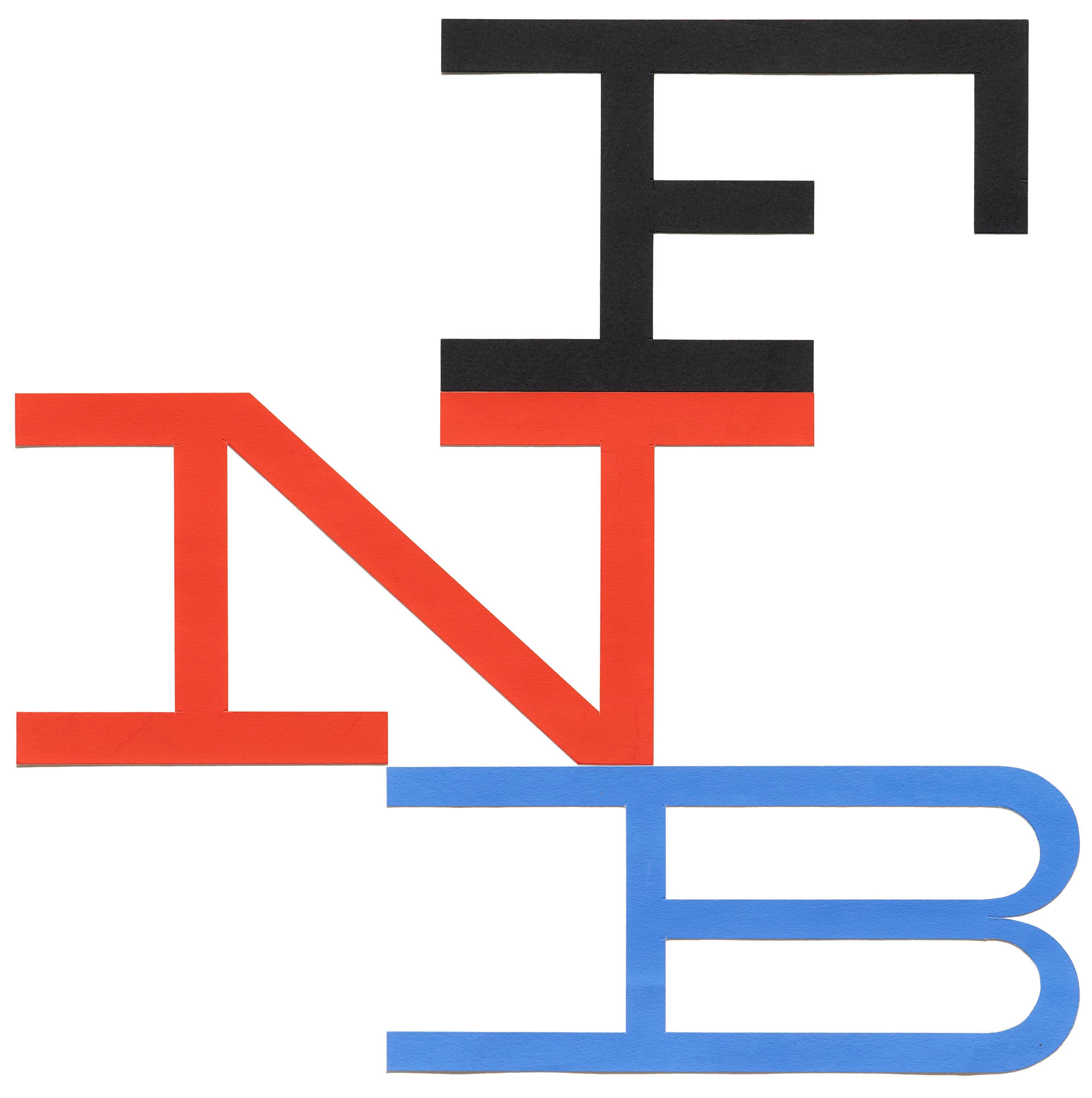
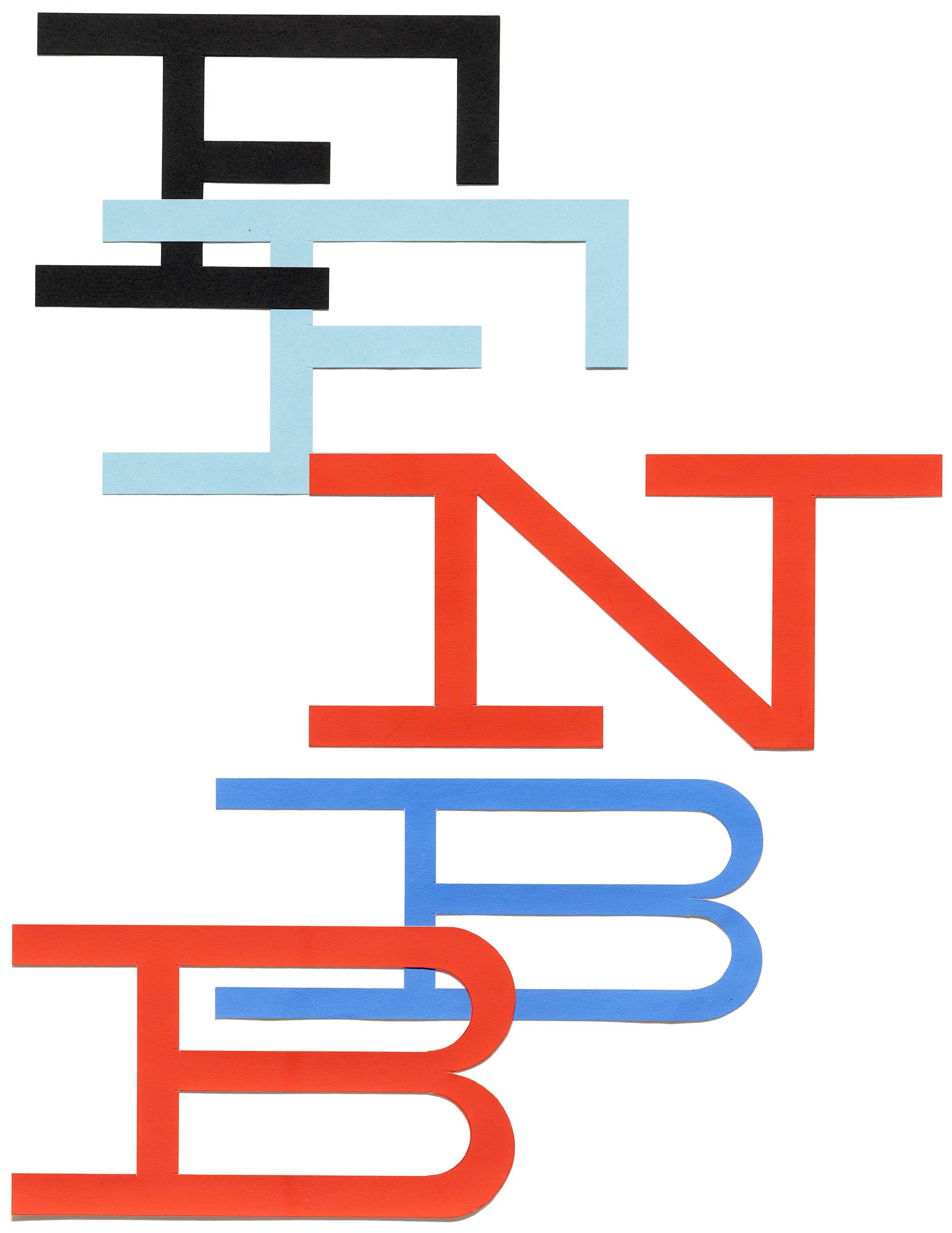
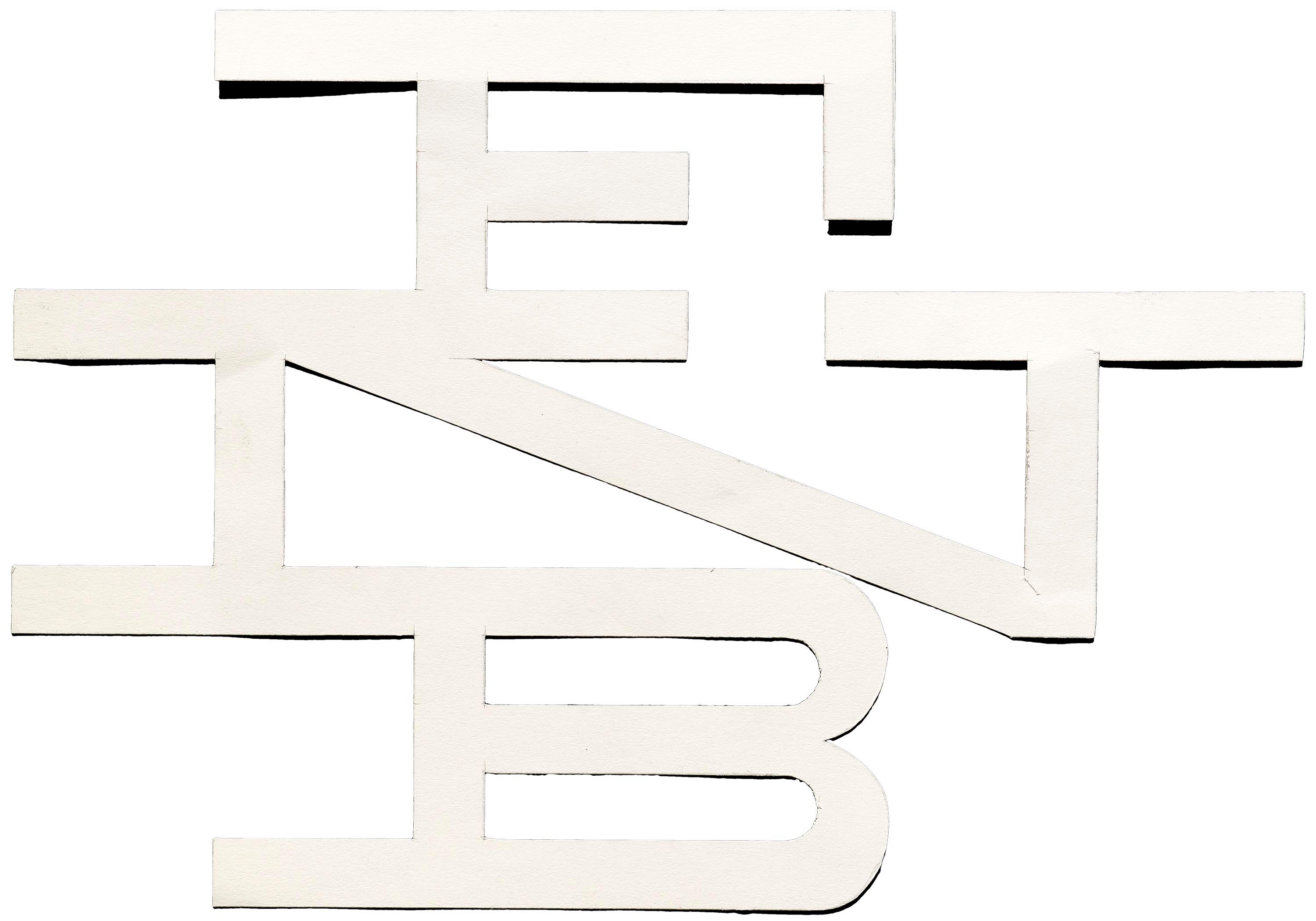
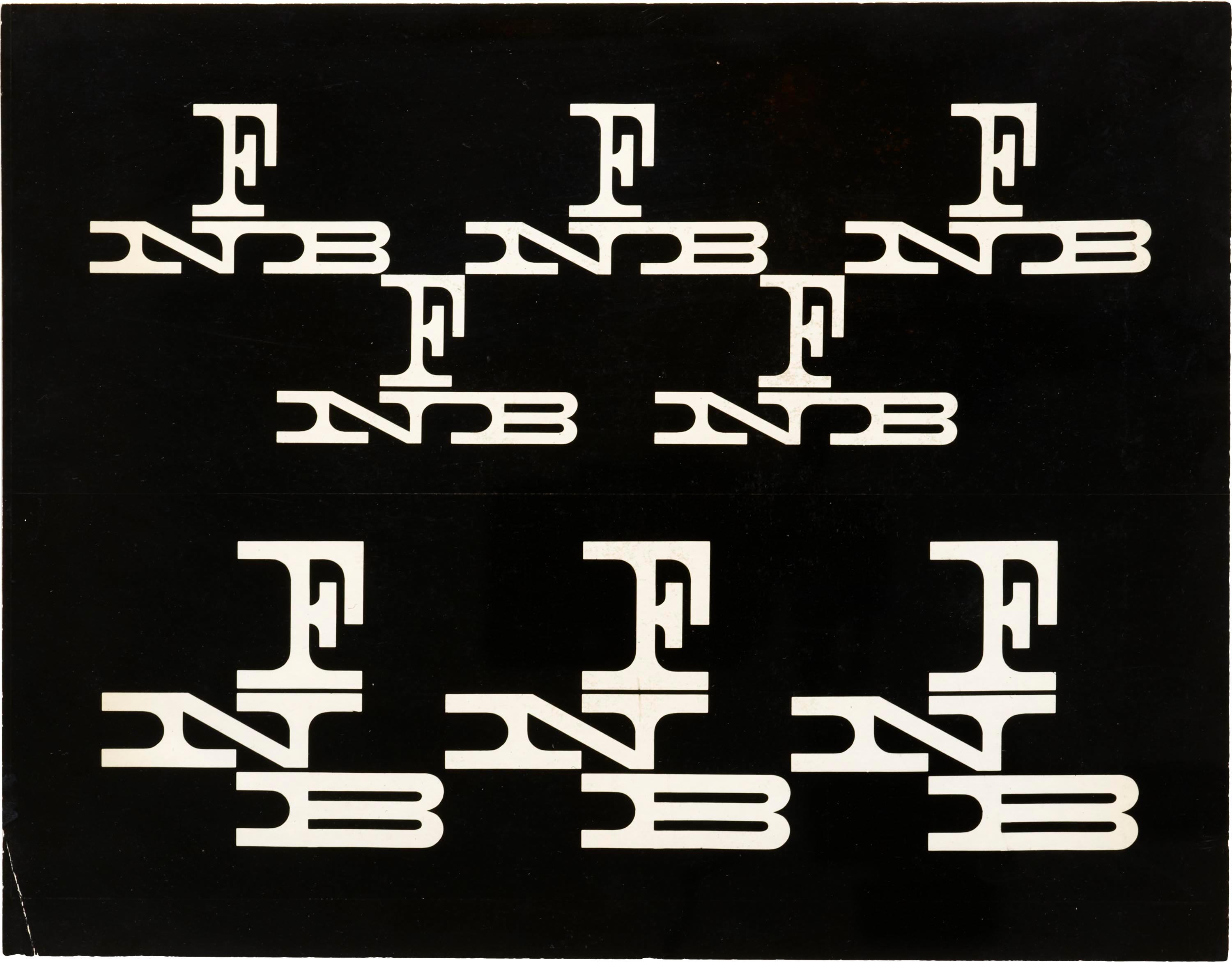
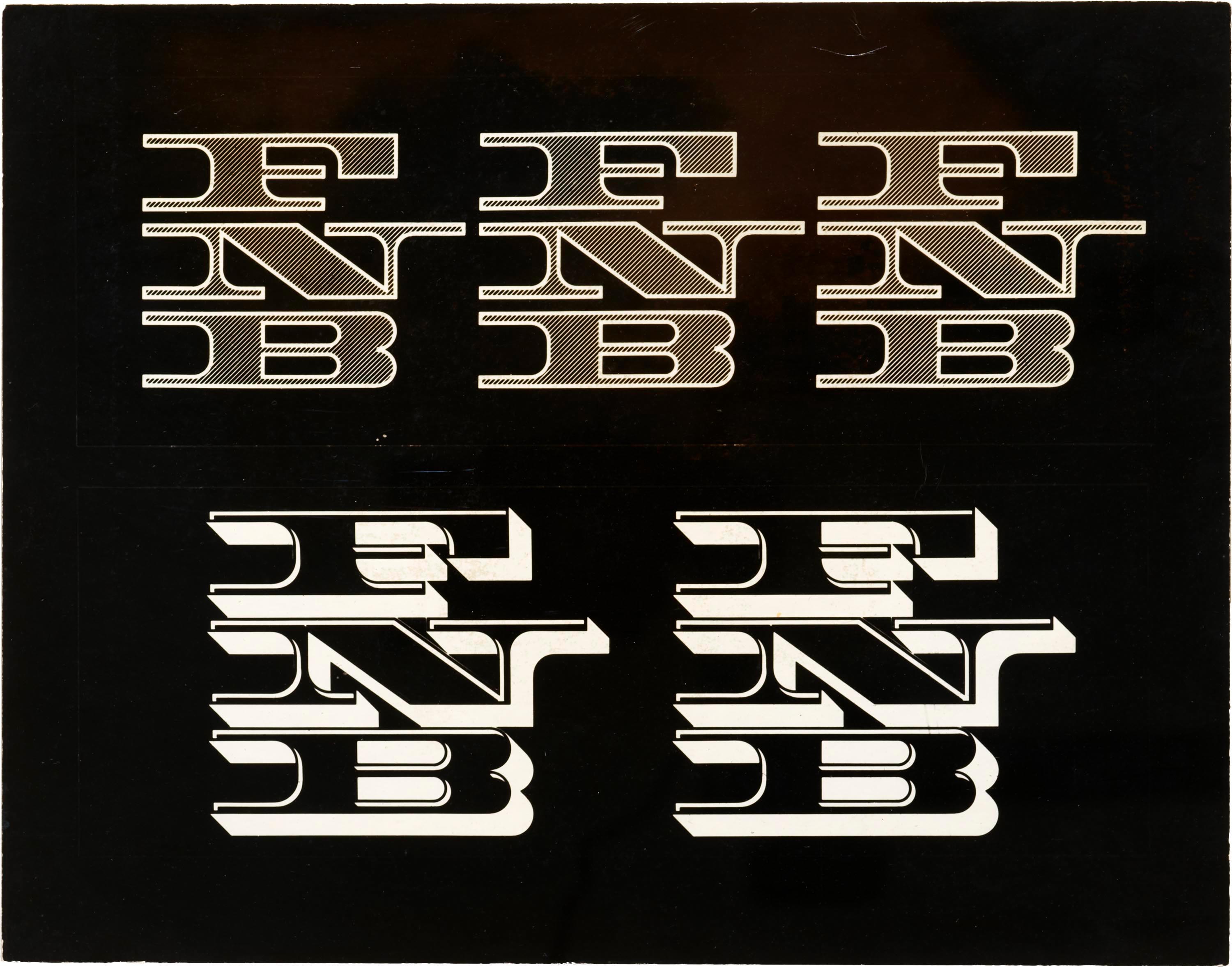
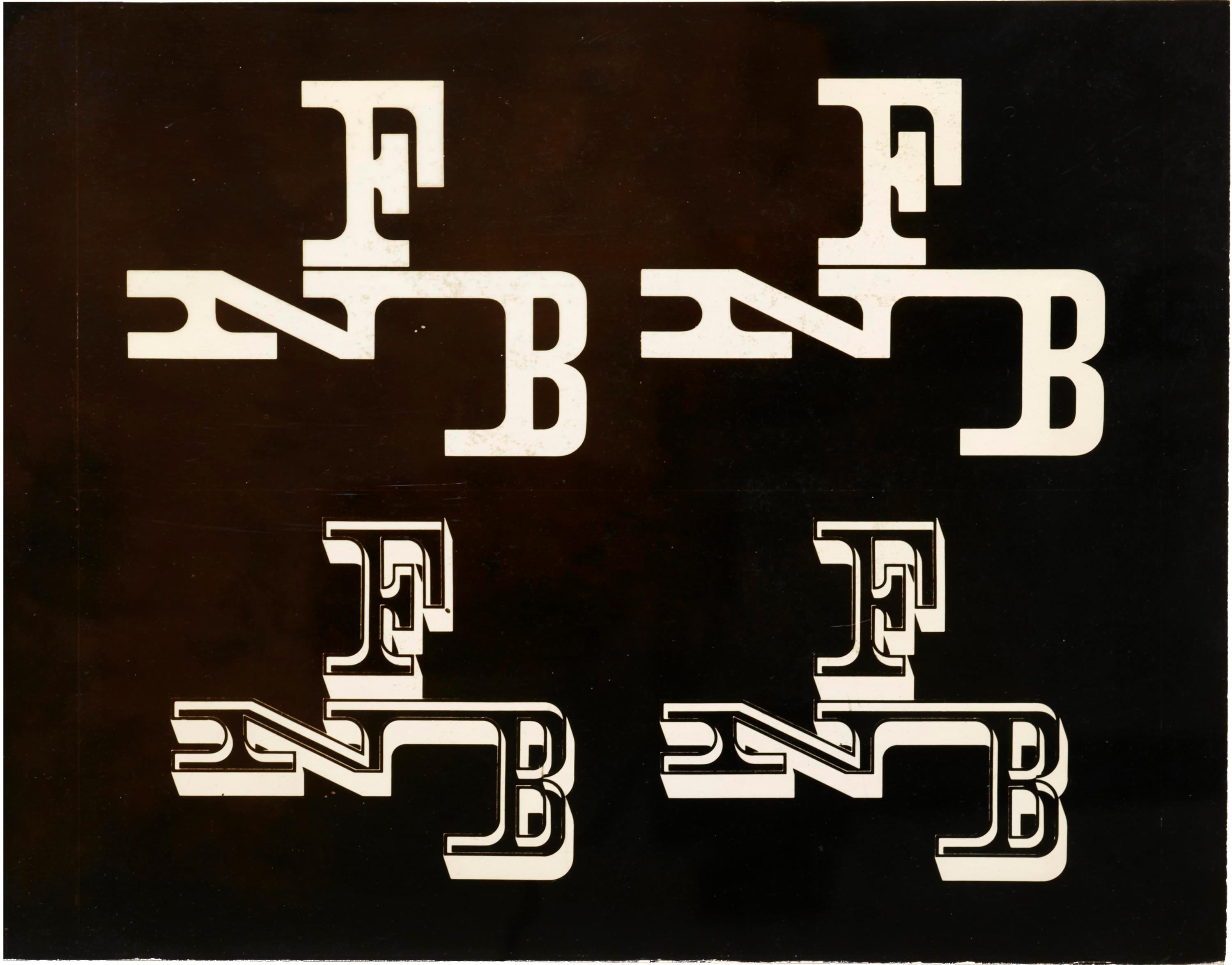
First National Bank of Miami
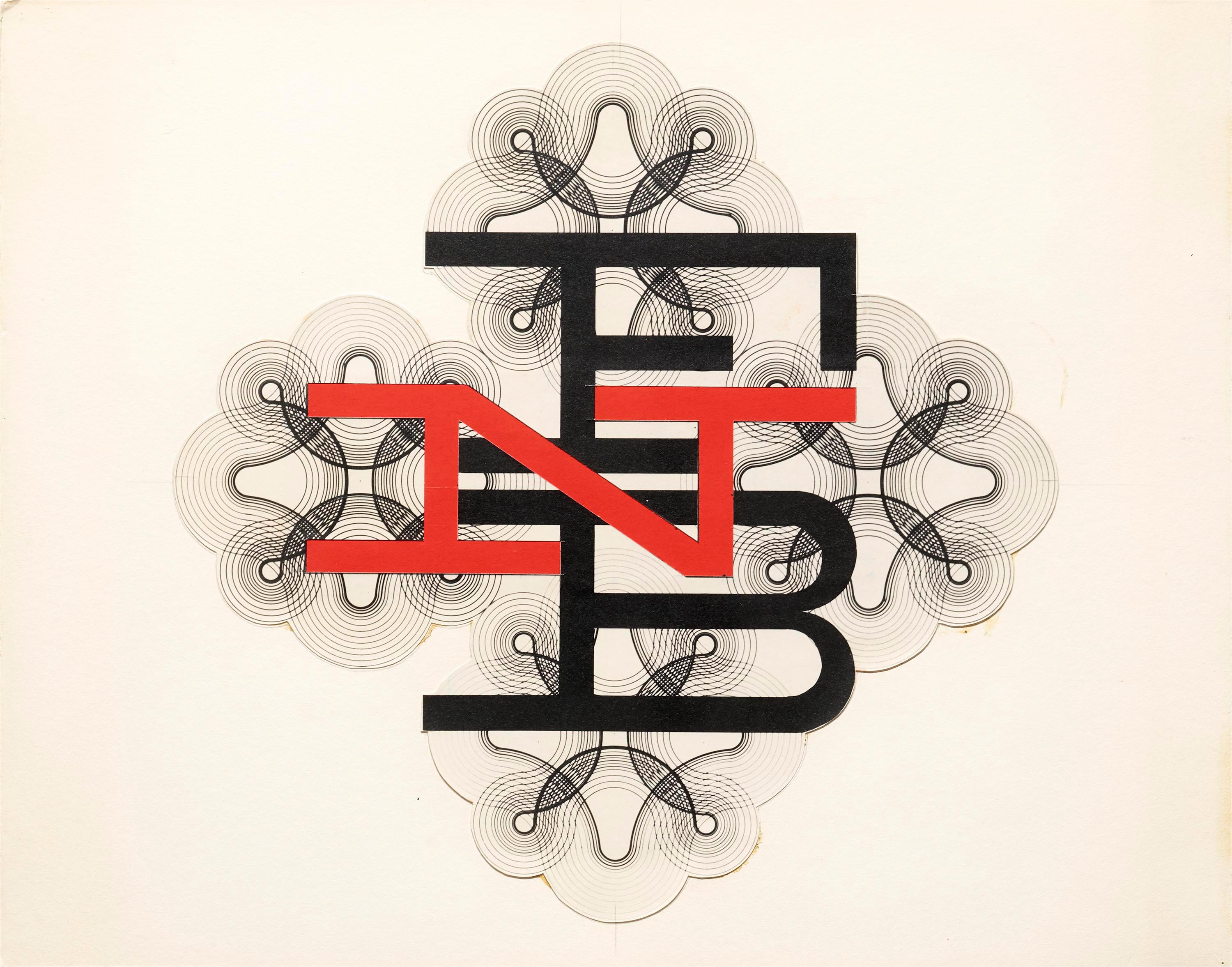
In 1957, Knoll Associates, for whom Matter was a design consultant, began work on the interiors for First National Bank of Miami. This mark may have been designed during that time. The collection includes cut-paper letters and photostats. The final image in this gallery, from a Matter portfolio maquette previously acquired by the Archive, shows the FNB mark combined with guilloché/spirographic patterns commonly found on bank notes, currency, and stock certificates to protect against forgery.

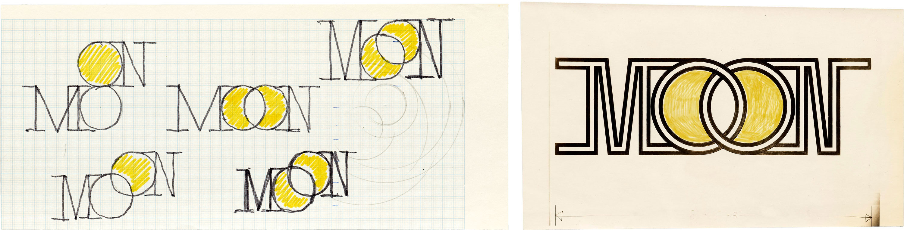
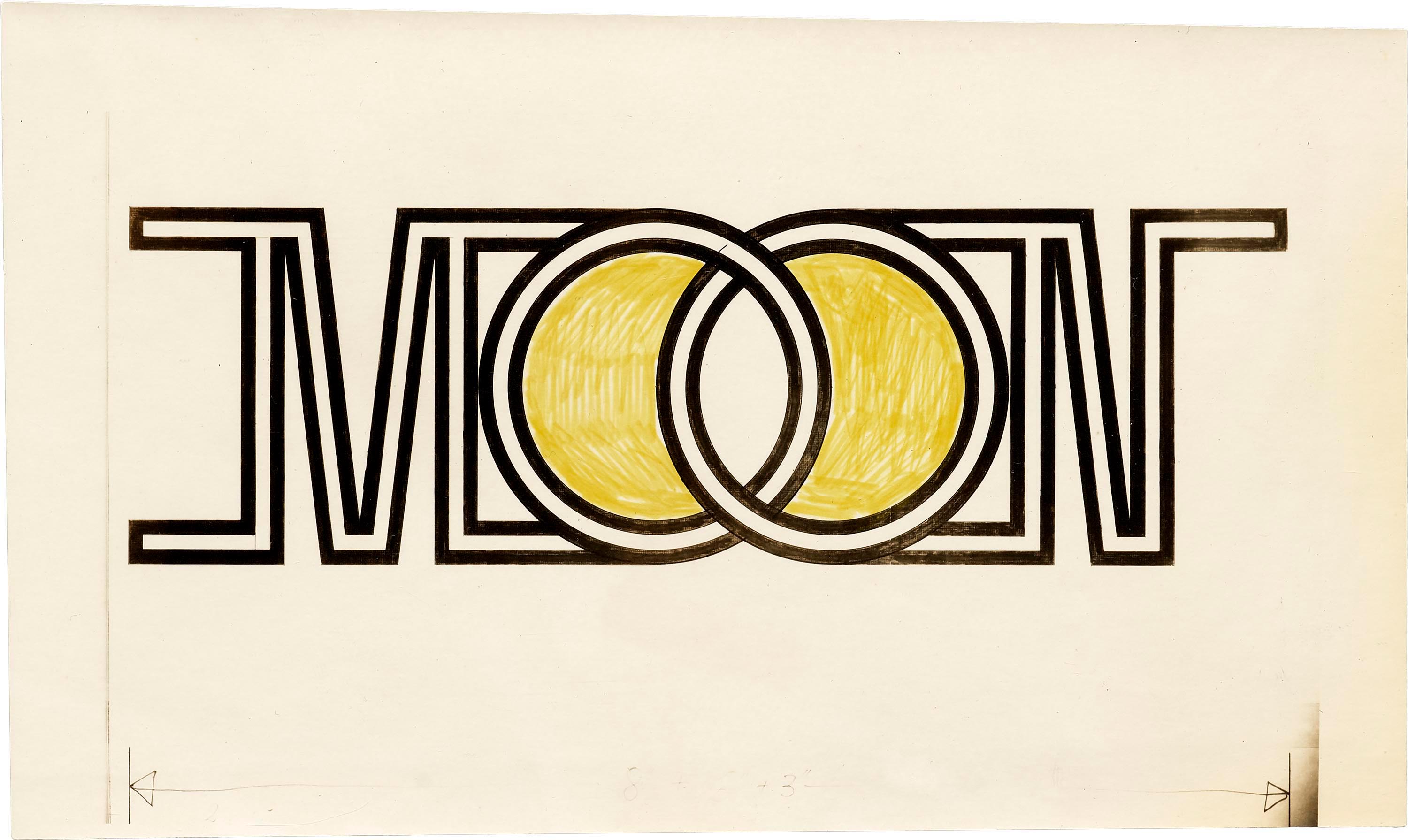
Moon Over East Hampton
The collection includes many sketches, cut-paper comps, and color studies for a discotheque sign in East Hampton, New York. The nightclub was conceived by Herbert’s son, Alex Matter, and as far as we can tell, it never opened. The final, selected logo is unknown, though multiple versions appear in Matter’s portfolio booklet Symbols, Signs, Logos, Trademarks (ca. 1977).
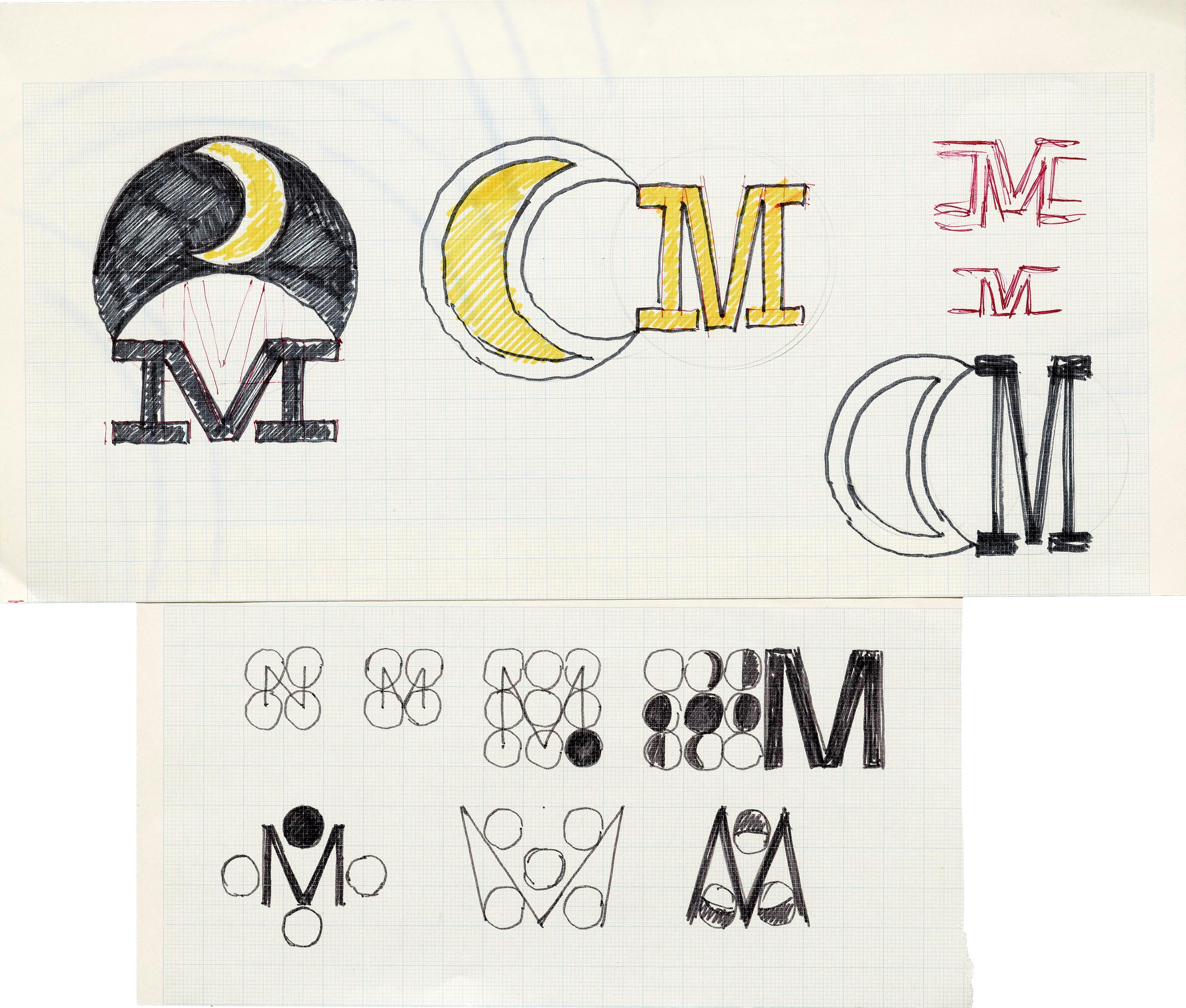
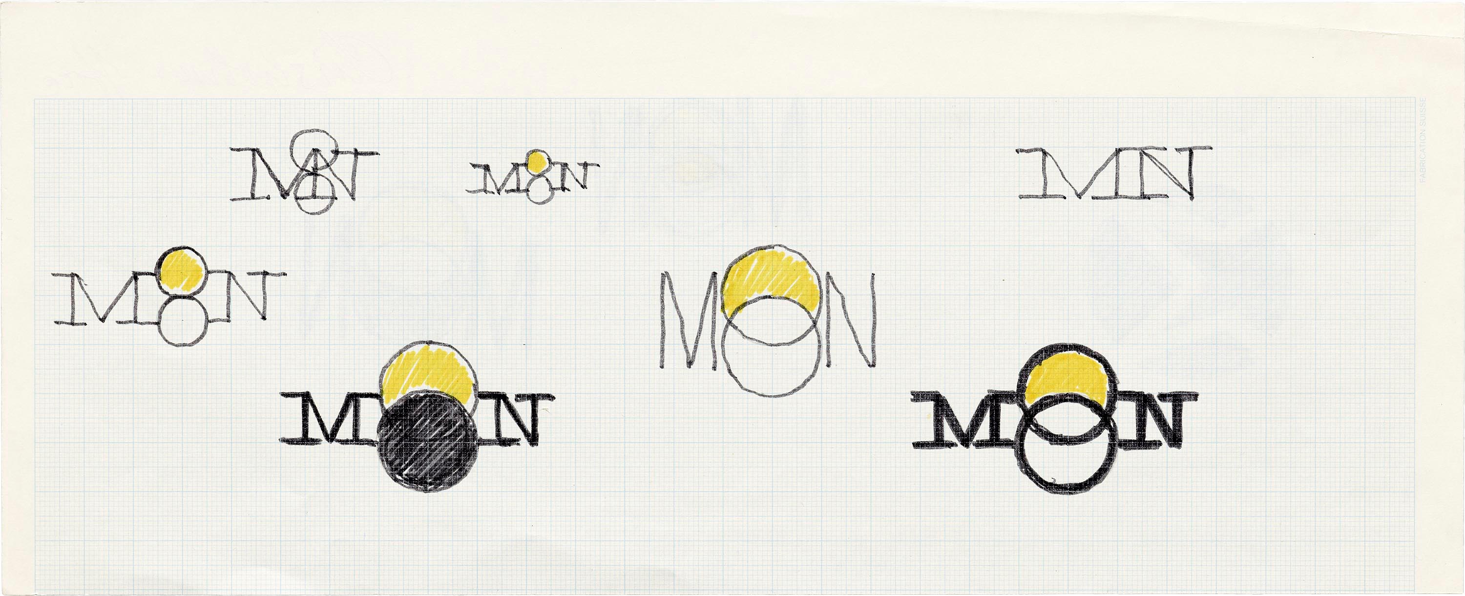
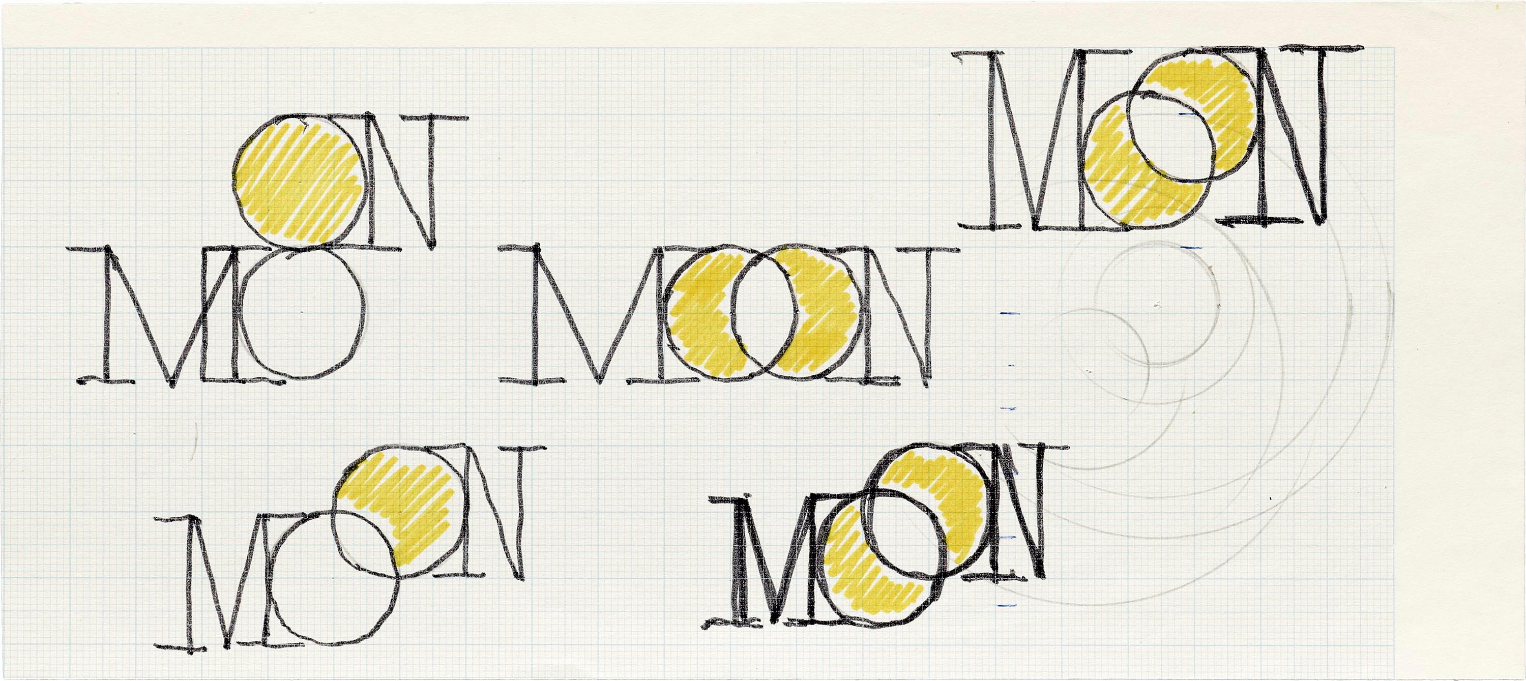
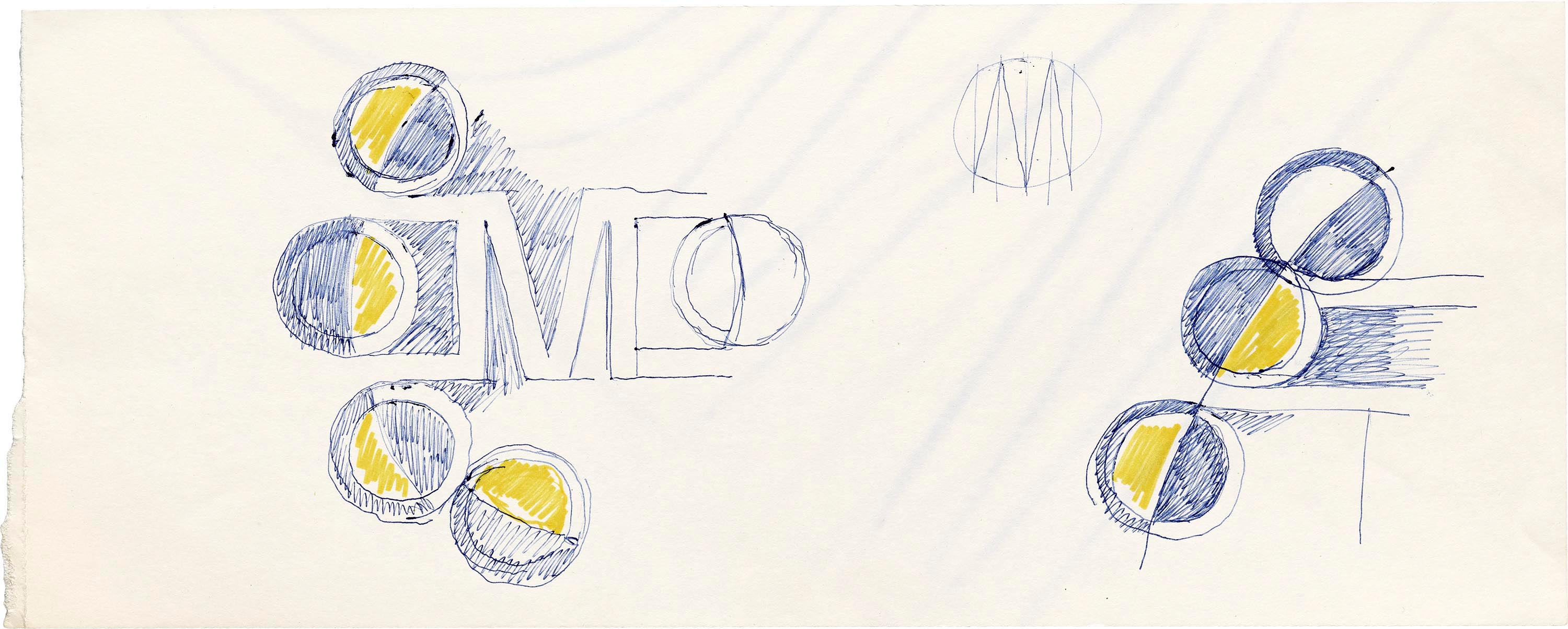

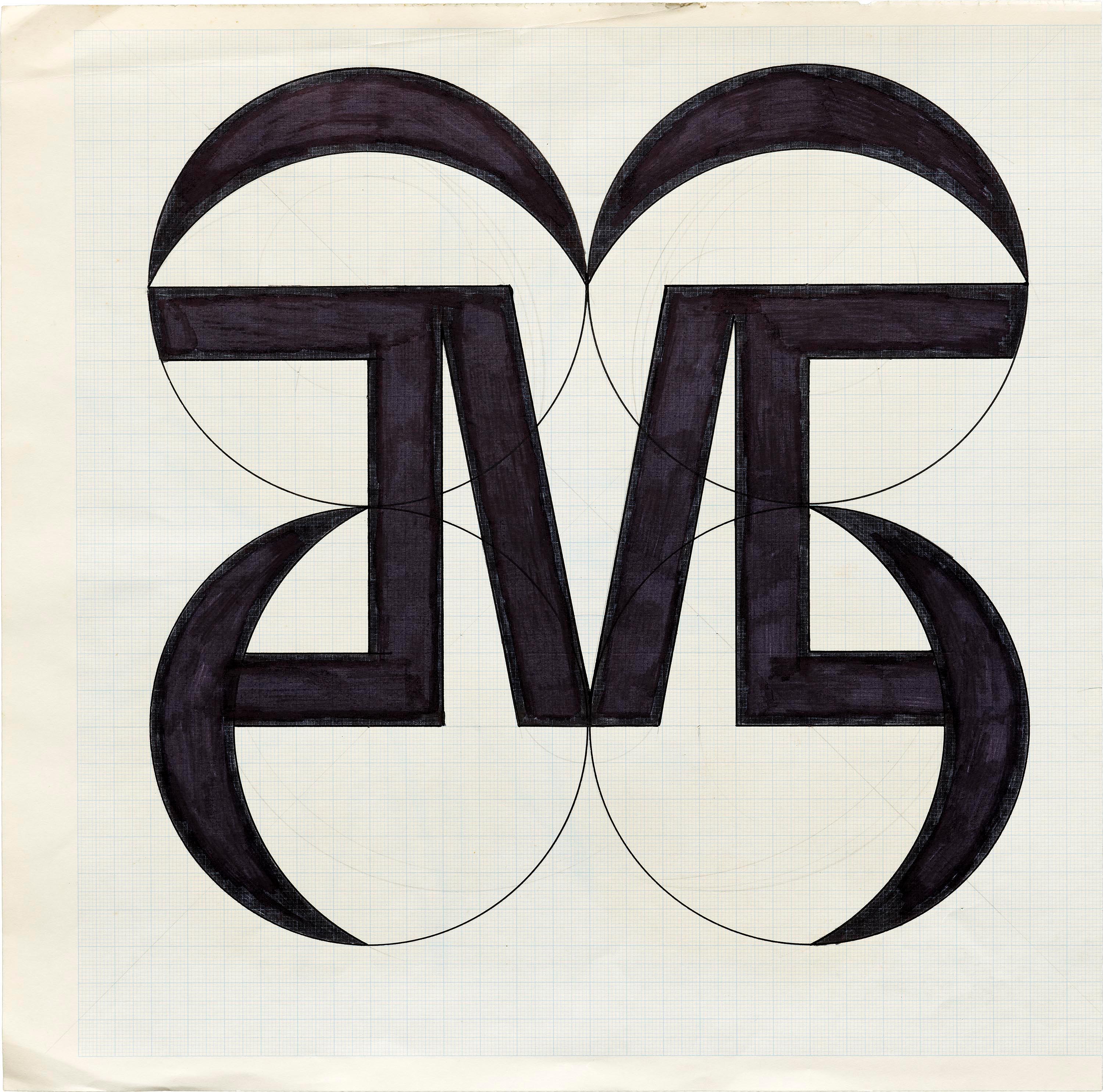
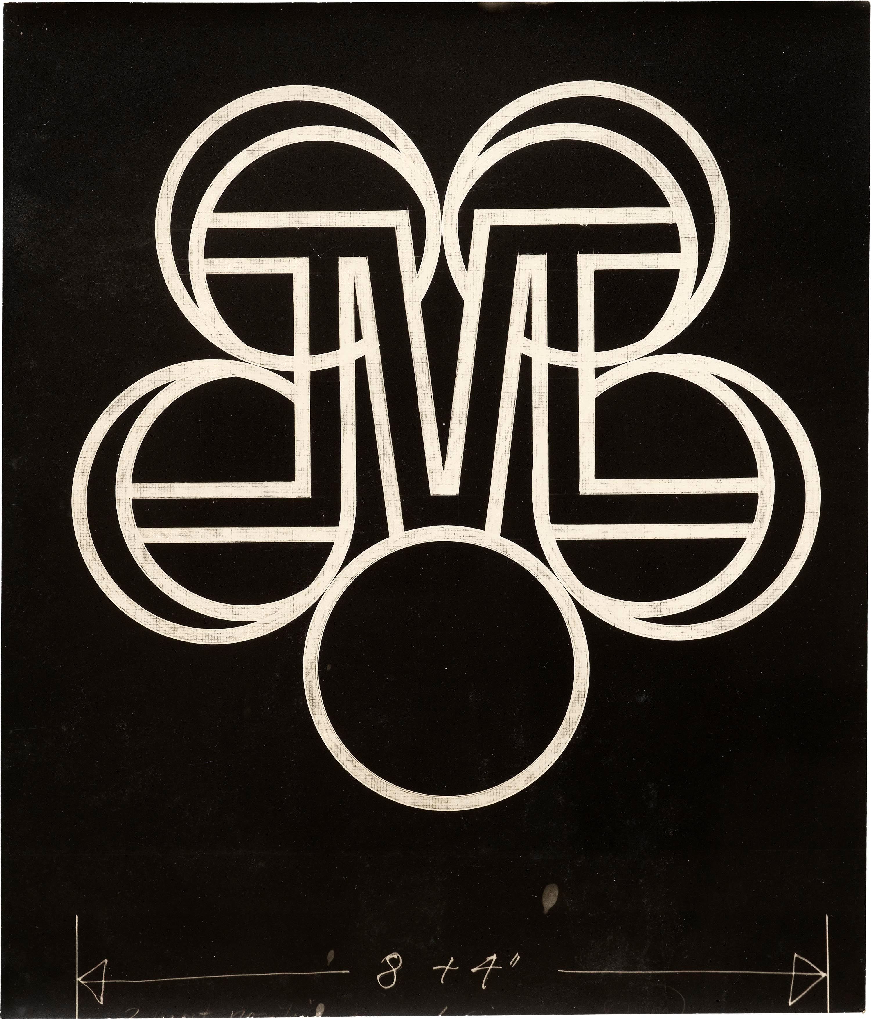
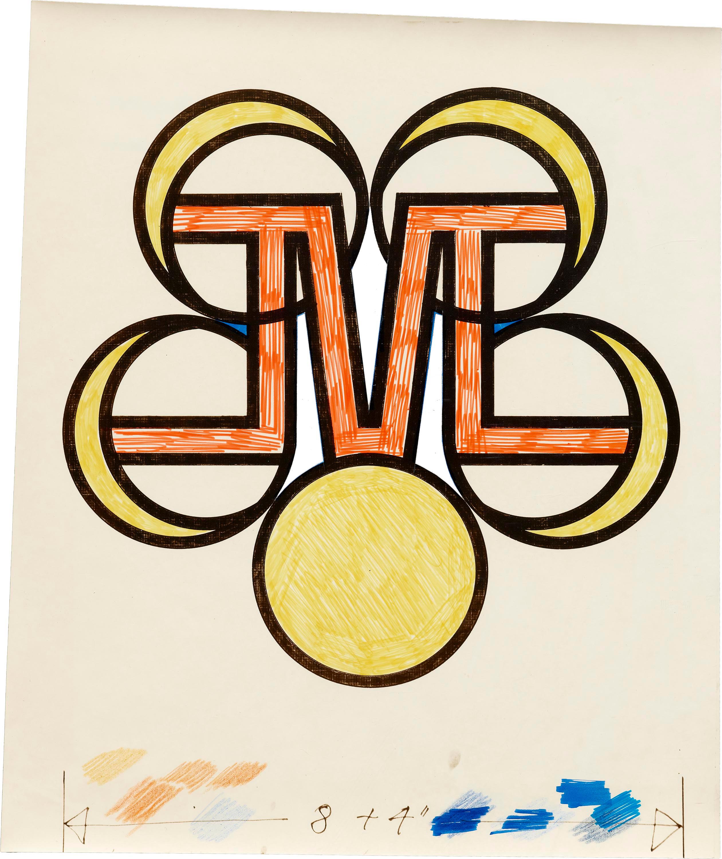
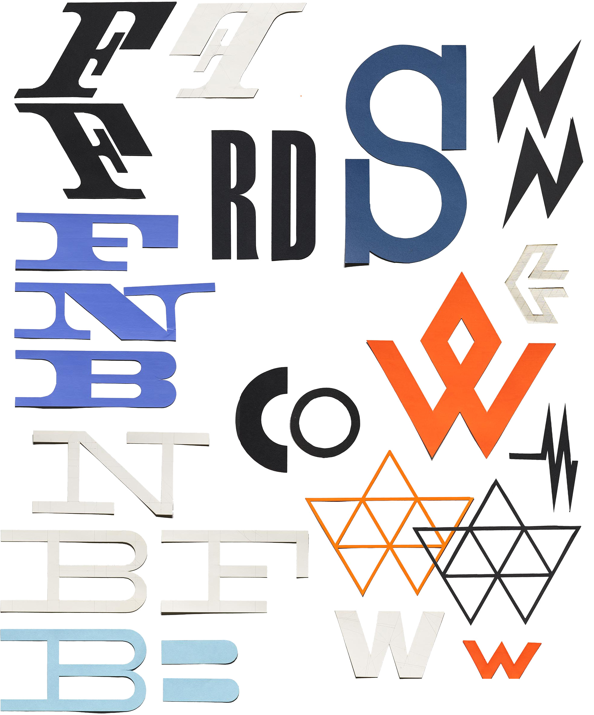
This collection begs for more research and interpretation, but there are some things we can surmise from the material. Early, rough concepts were sketched with pen, often on grid paper which informed Matter’s highly geometric and modular compositions. Lettering was obviously core to his identity concepts, and many of the logos start with a monogram. Once a general lettering style was worked out, he would sometimes cut individual or grouped letters out of colored paper.
As Archive staff and volunteers processed the collection, we noticed that arranging the letters on a table seemed to trigger ideas that may never have arisen on a digital canvas. There is a freedom of movement and invention that comes from manipulating the work with our hands. Perhaps there are parts of the creative brain that can only be sparked with analog tools and material. Or maybe we’re just under Matter’s magic spell.
What we do know is that seeing the designer’s journey to the final result dispels the notion that successful work spills directly out of the head and onto the page, fully formed. For those of us who are beguiled by the output of masters like Matter – whether in a design history book or image collections on the web – it’s a good reminder that most design is an iterative process of trial and error, from roughest sketch to published artwork.
— Stephen Coles, Associate Curator & Editorial Director