News
Inside Hotel Retro: Vintage Luggage Labels Get New Life as Charming Stickers in Our Latest Book
Both a feat of production and a feast for the eyes, Hotel Retro reproduces exquisite twentieth-century steamer trunk labels as hundreds of full-color stickers that readers can actually peel off the page and adhere.
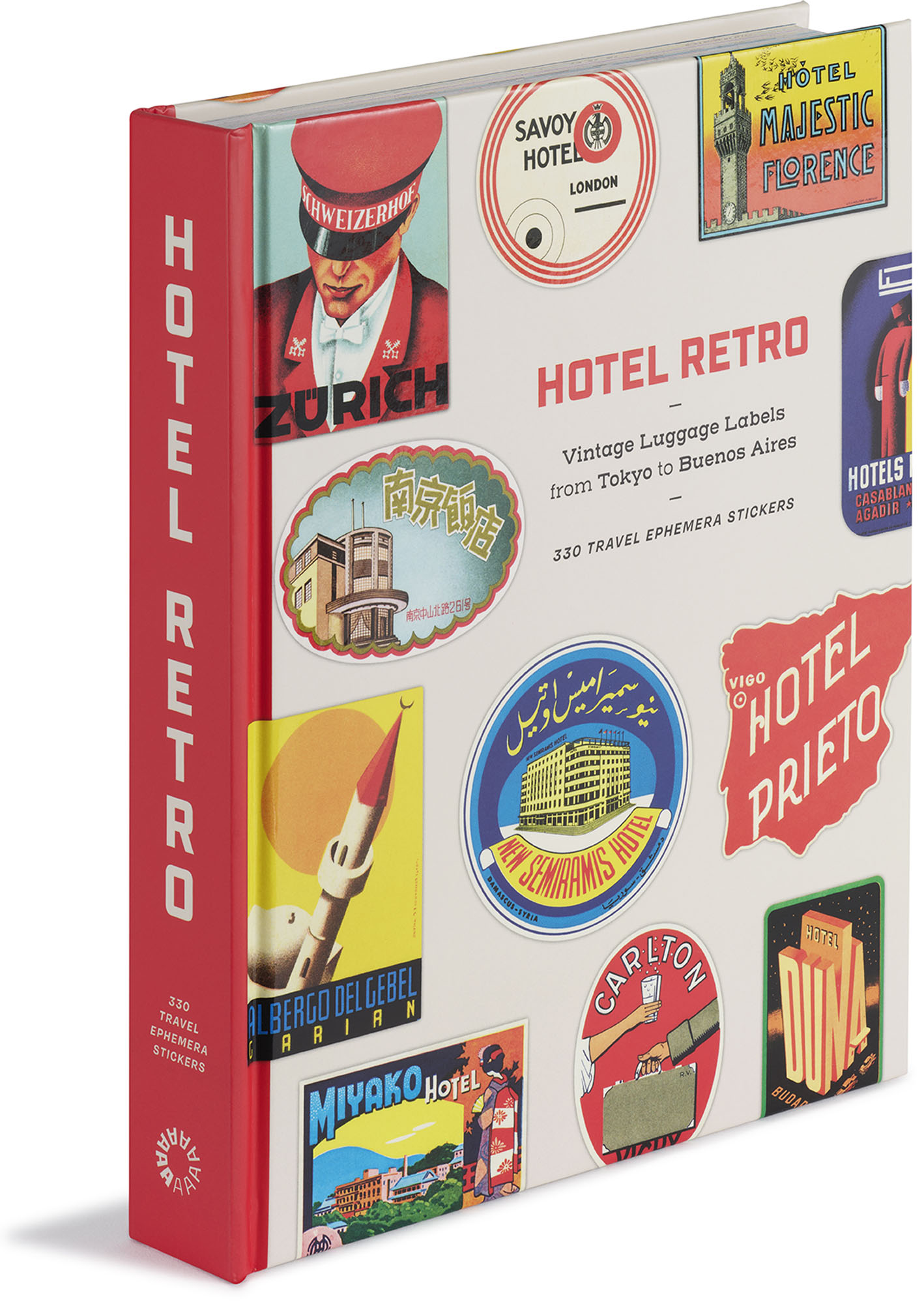
Hardcover with sticker pages containing 330 removable stickers, 6.75 × 8.5 inches, 240 pages
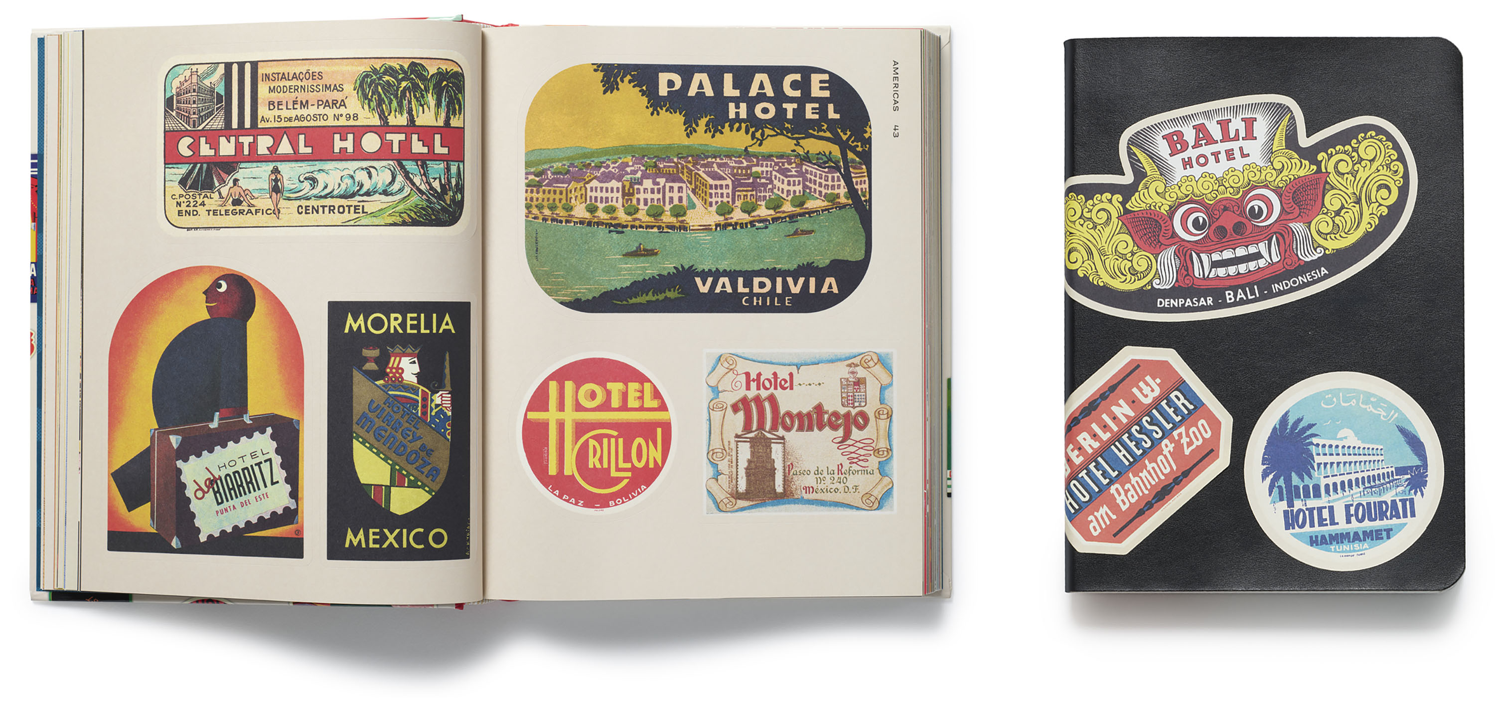
Of the many fascinating areas in the stacks of Letterform Archive, one in particular always delights our ephemera lovers: a shelf that is home to more than half a dozen worn leather binders, filled to the brim with gorgeously designed steamer trunk labels, produced as promotions by grand hotels around the globe in the early-to-mid twentieth century.
Here, the publishing team found ample inspiration for its first sticker book, Hotel Retro: Vintage Luggage Labels from Tokyo to Buenos Aires, a title replete with 330 peelable labels that readers can actually use as they were first intended: by applying them to their luggage (or whatever they like)!
With a fresh book design from noted San Francisco agency MacFadden & Thorpe, the labels on view in Hotel Retro’s pages were all selected as examples of fantastic lettering and illustration, then organized into regional chapters that demonstrate the breadth of the international trend. Printed on sophisticated uncoated paper, they have been lovingly reproduced to honor the vision of the era’s often anonymous designers.
We’ve posted the book’s introduction below to provide a glimpse into the luggage label’s origin story, with callouts to some of our collection favorites.
All images in the galleries below are hi-fi captures. Click an image to enter fullscreen view, then click or pinch to enlarge.
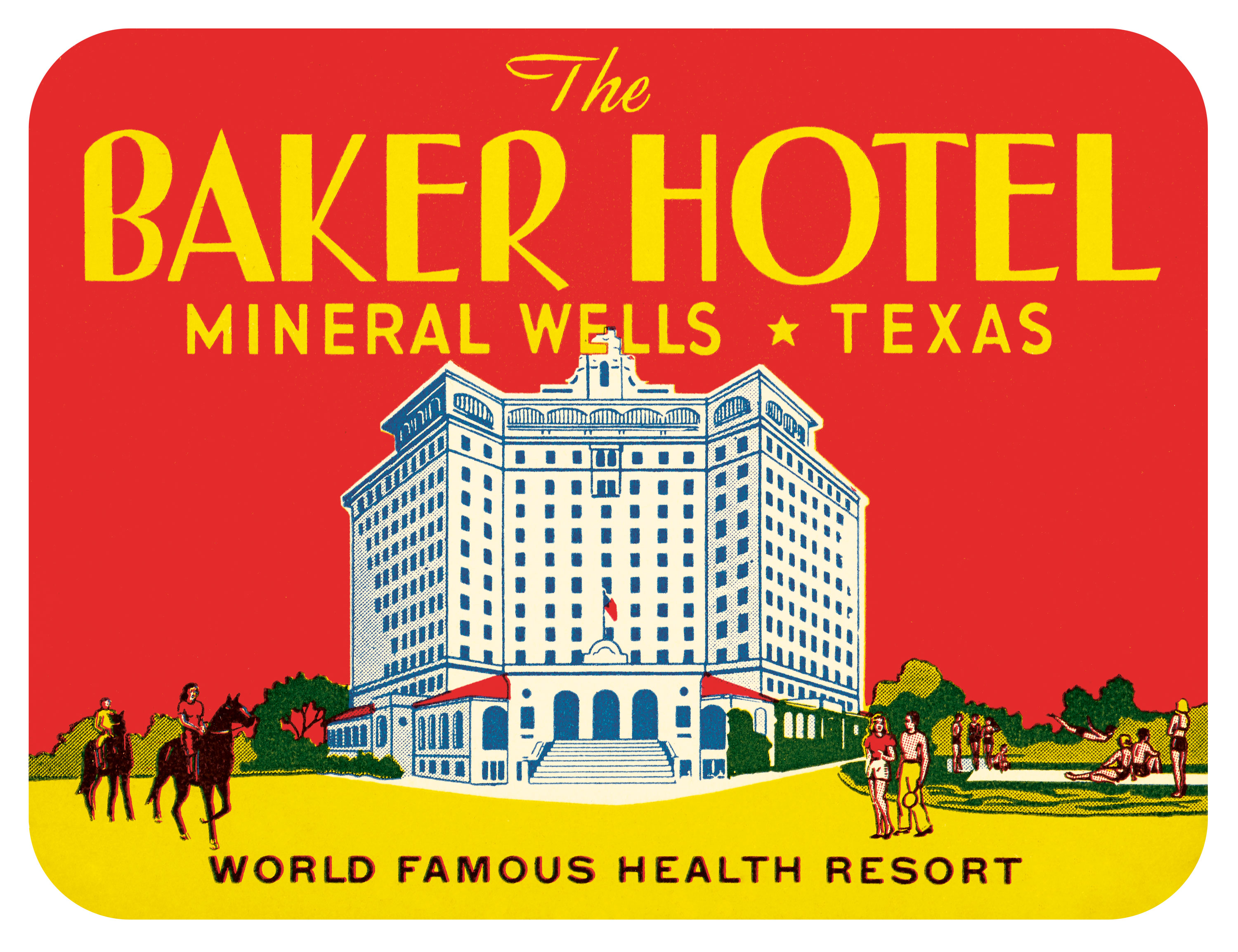
Before the nineteenth century, international travel typically took the form of the Grand Tour—a voyage around Europe in the name of cultural education, enjoyed predominantly by high society. But as the Industrial Revolution redistributed wealth and the steam engine enabled more affordable journeys by train and sea, a new leisure class began seeing the sights well beyond the walls of their home towns and villages. This coincided with the creation of the steamer trunk in the 1870s and—not long after—the appearance of the steamer trunk label: a decorative tag adhered to guests’ luggage by bellhops, serving both as a charming memento for the visitor and a cunning marketing tool for the hotel.
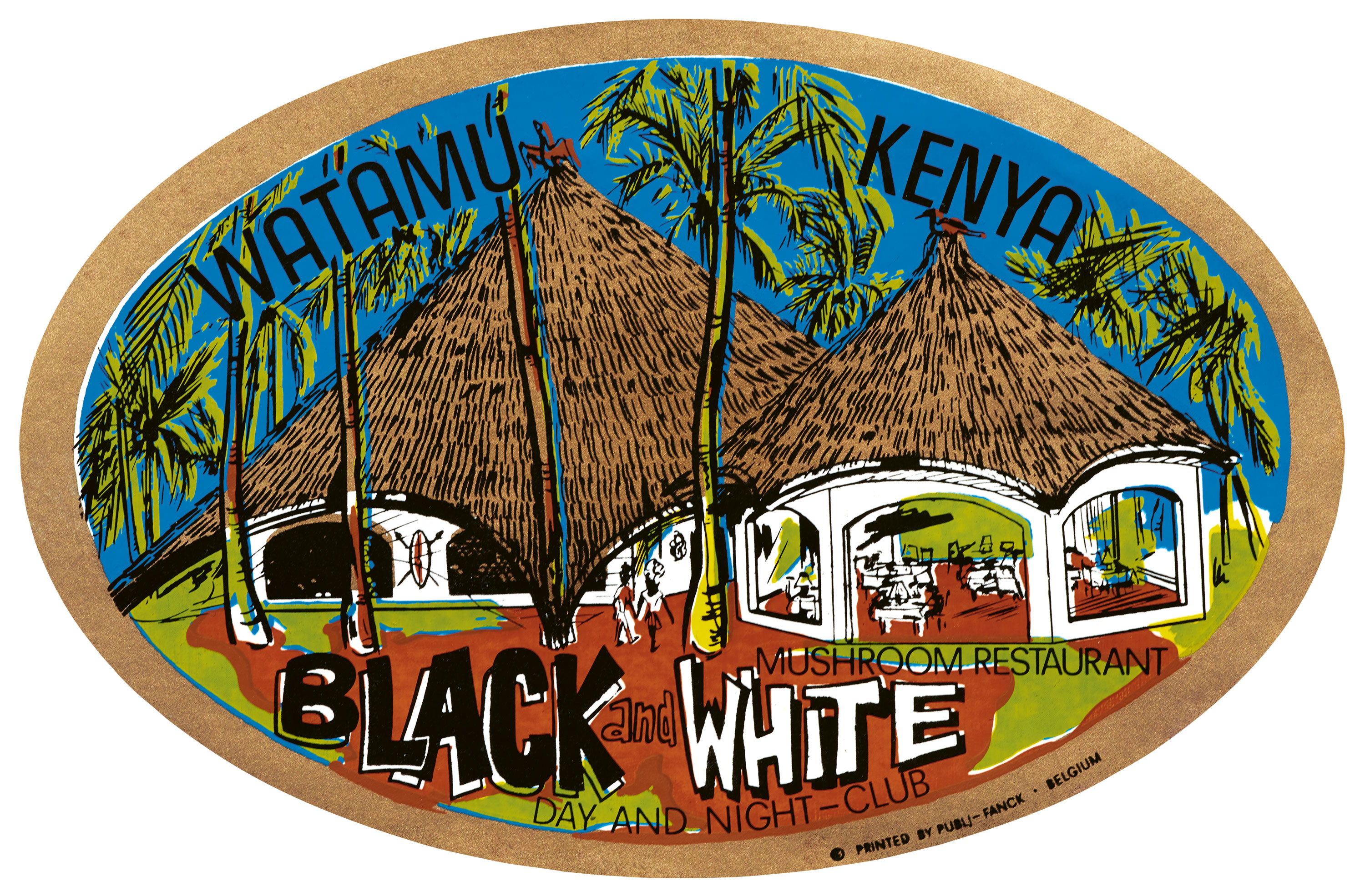
According to collector and historian João-Manuel Mimoso, the first steamer trunk labels were modest—little more than slips of paper printed with a hotel’s name and address, some with an architectural sketch. Then, around the turn of the twentieth century, as advances in lithography led to a boom in print advertising, hotels began commissioning visually splendid productions, with full-color illustrations, ambitious die-cuts, and striking typography.
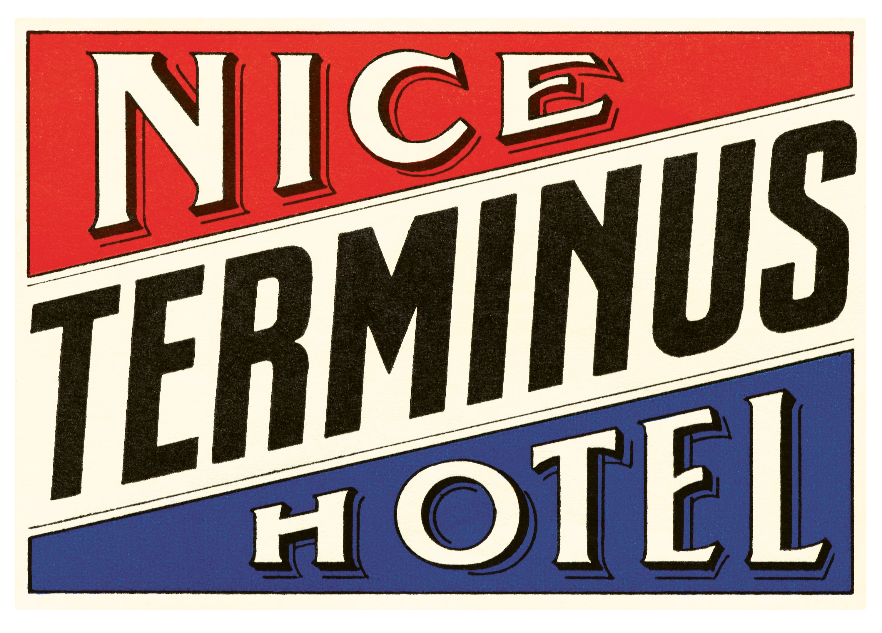
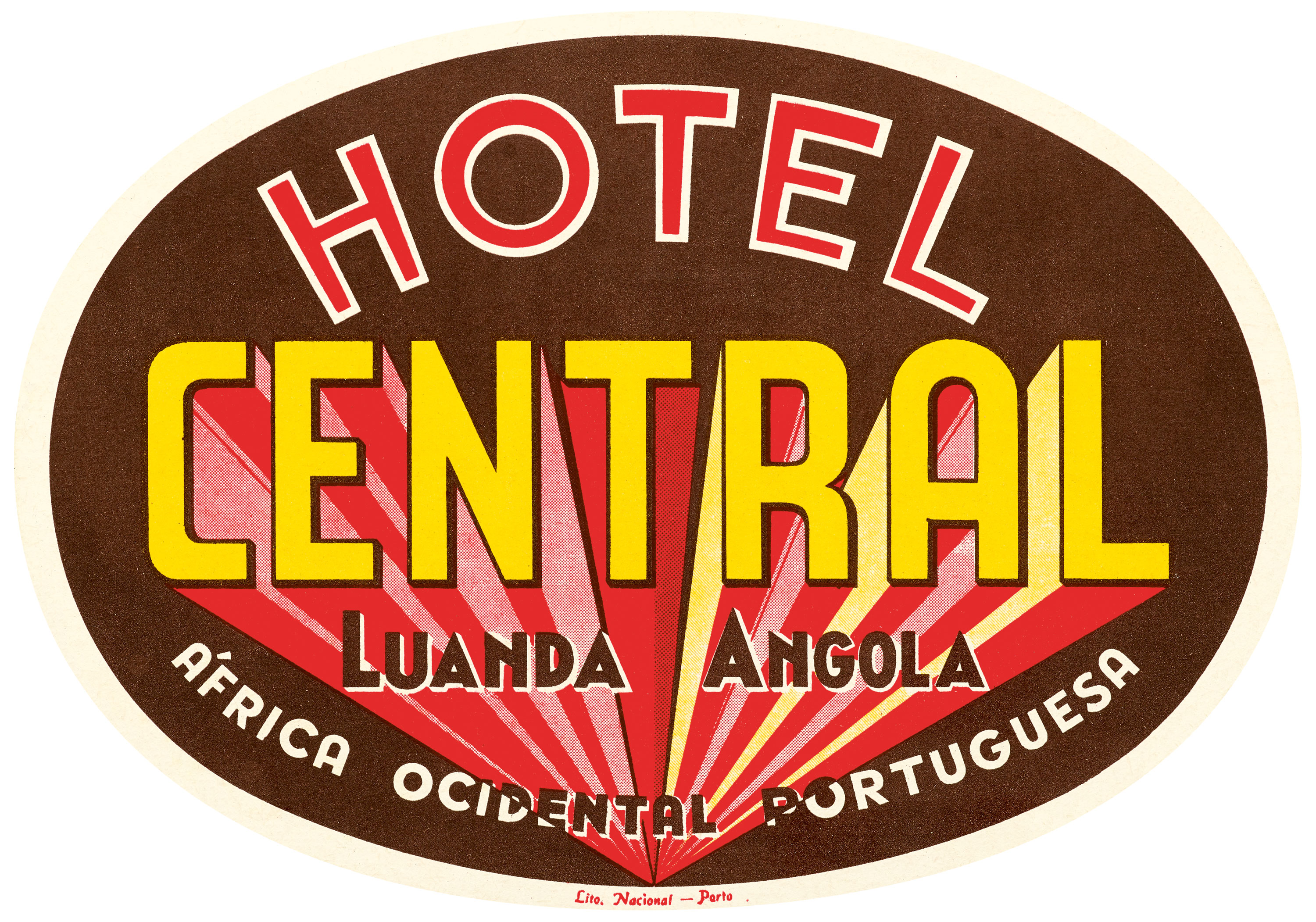
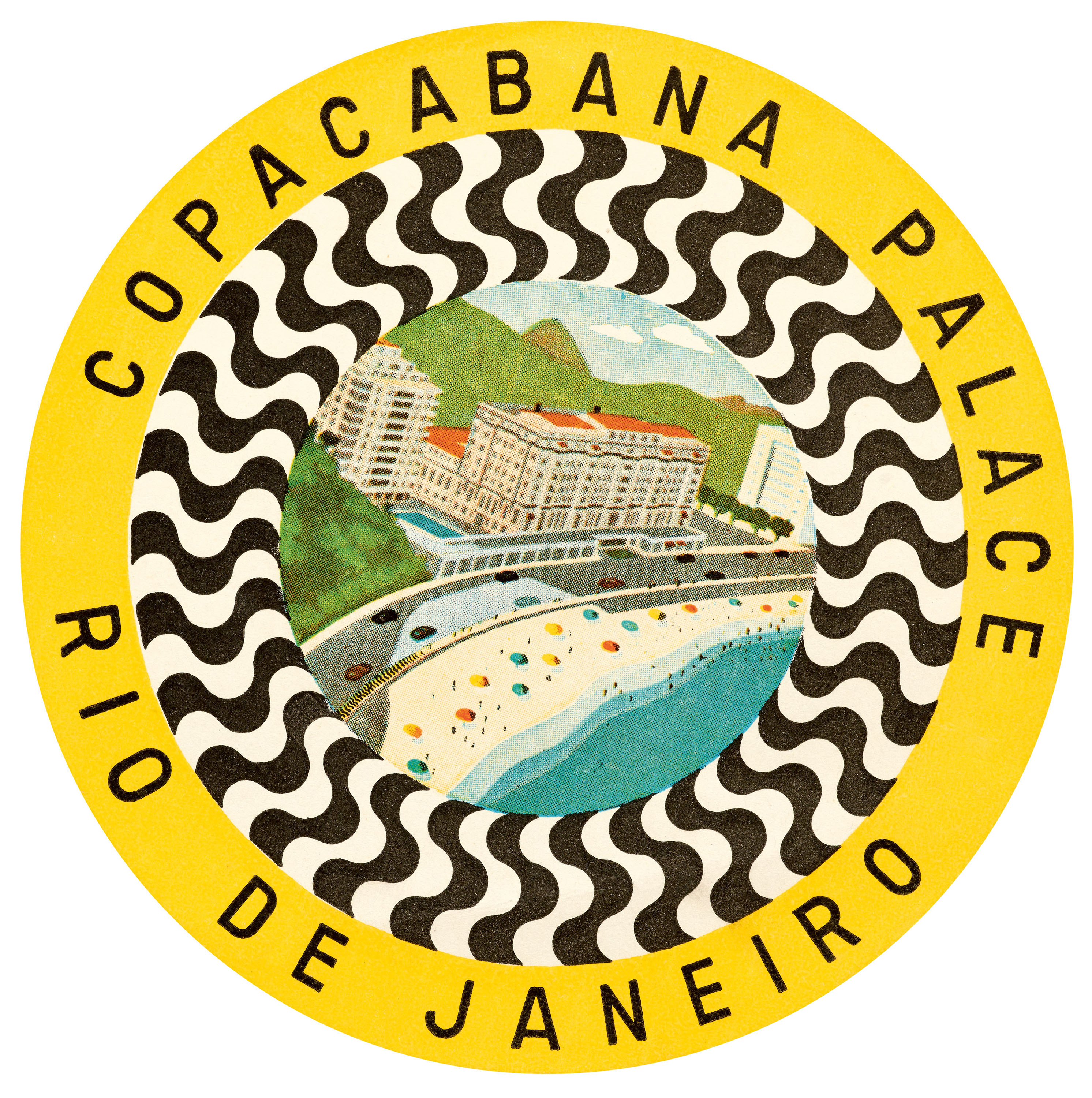
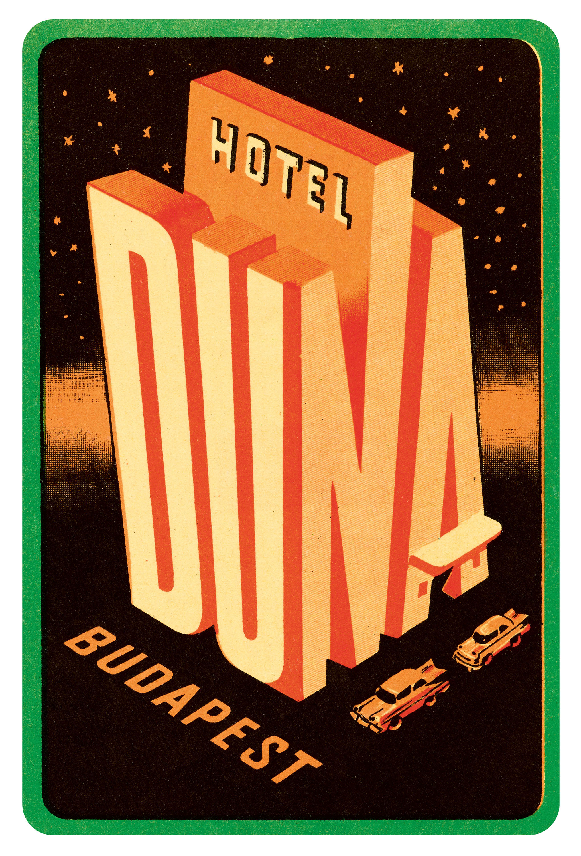
The design strategies of these more sophisticated labels varied. Some establishments, like Nice’s Terminus Hotel, relied purely on lettering to convey their cachet, filling their labels with distinctive scripts, stately serifs, or bold grotesque typefaces (some with fancy effects, such as the dimensional drop shadows on a label for Hotel Central in Luanda, Angola). Illustrations also proved their appeal, with facades rendered in stylish detail, often zoomed out to include enticing surroundings—like the white shore stretching before Rio de Janeiro’s Copacabana Palace, confettied with umbrellas. Some especially pleasing luggage labels united art and typography, as did Budapest’s Hotel Duna, with the letters of its name arranged into an isometric drawing of its building, complete with an awning forming the A’s crossbar.
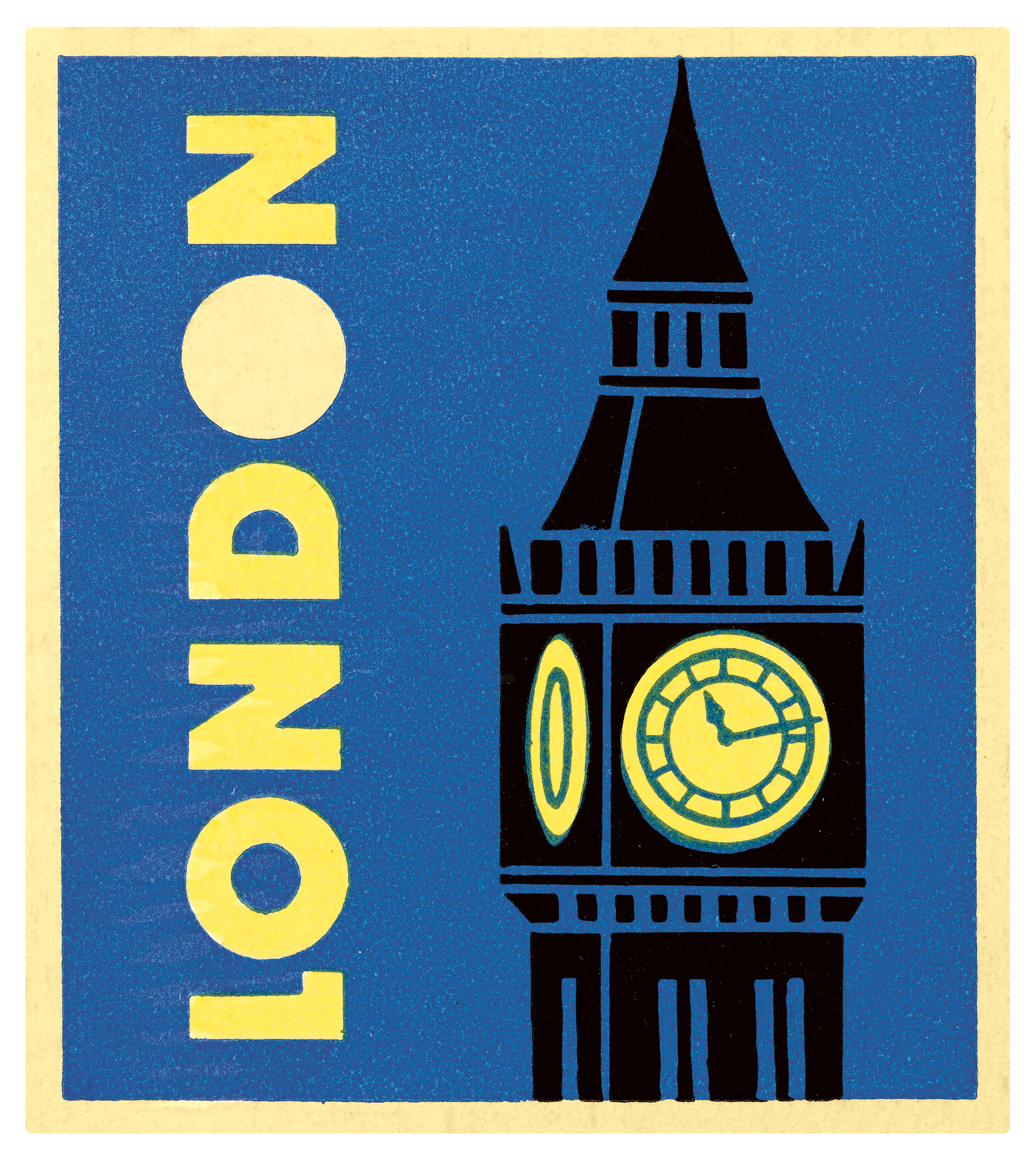
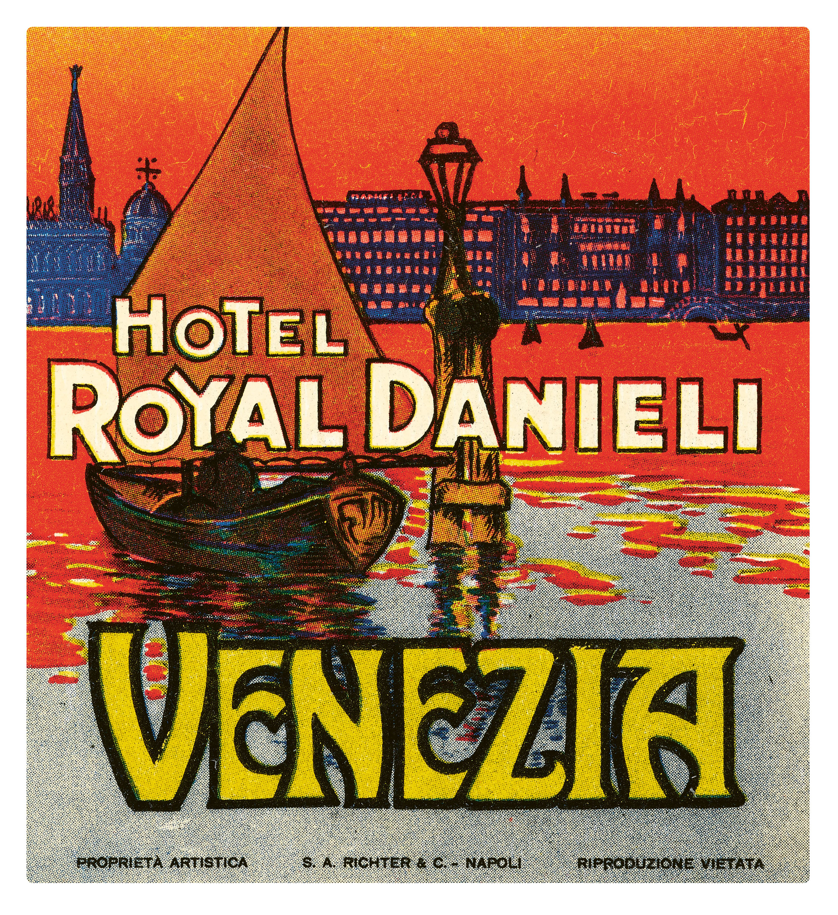
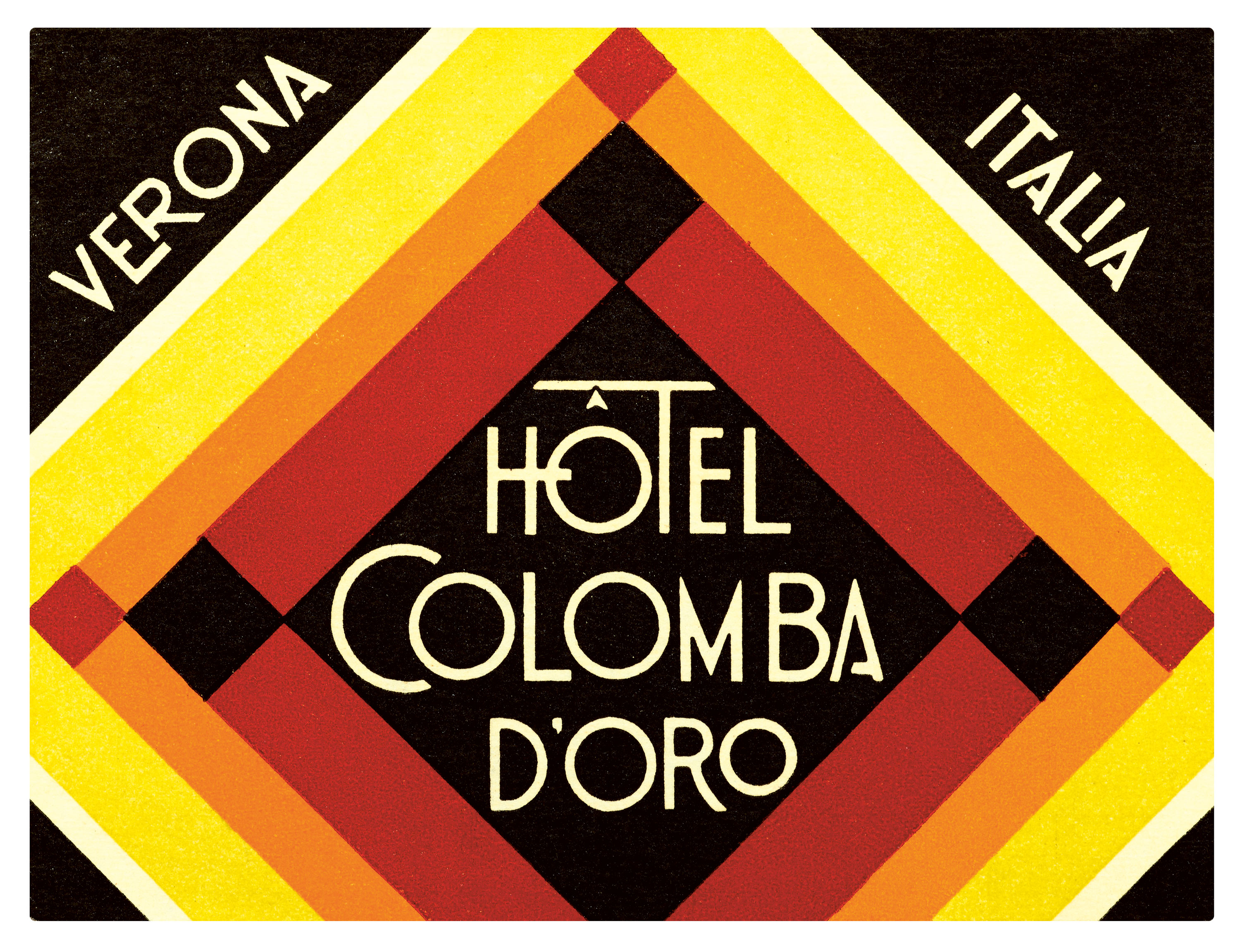
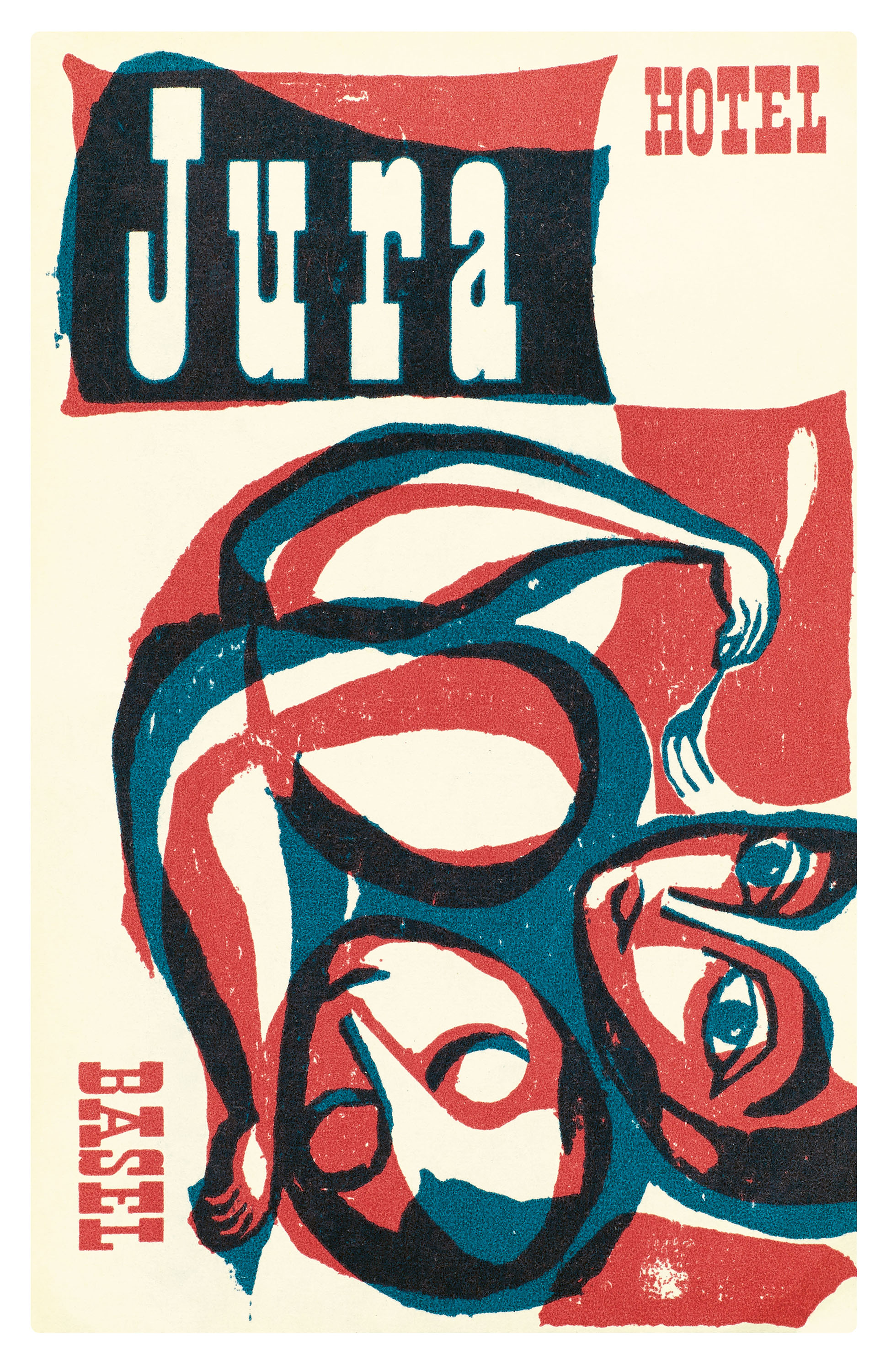
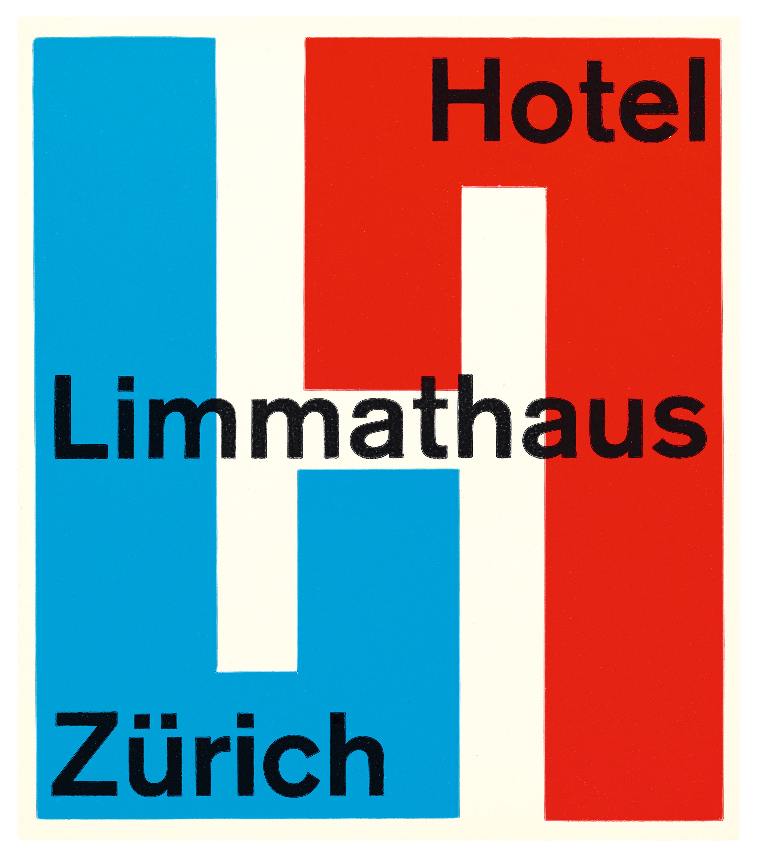
Across the continents, labels referenced contemporary art, design, and typography movements in their bids to catch the eye of the would-be tourist. The poster also exploded in popularity at the turn of the twentieth century, and its stylized aesthetic greatly informed the luggage label look, with flattened forms, limited palettes, and stippled print surfaces, all on display in an example from the Hotel Royal Danieli in Venice. These influences range from geometric art deco, seen in the telescoping diamonds on a label for Verona’s Hôtel Colomba d’Oro; the gestural paintwork of early twentieth-century abstraction, alluded to on a label for the Jura Hotel in Basel; or the type-driven minimalism of mid-century Swiss Style, glimpsed in the H created by mirrored Ls on the label for Zurich’s Hotel Limmathaus.
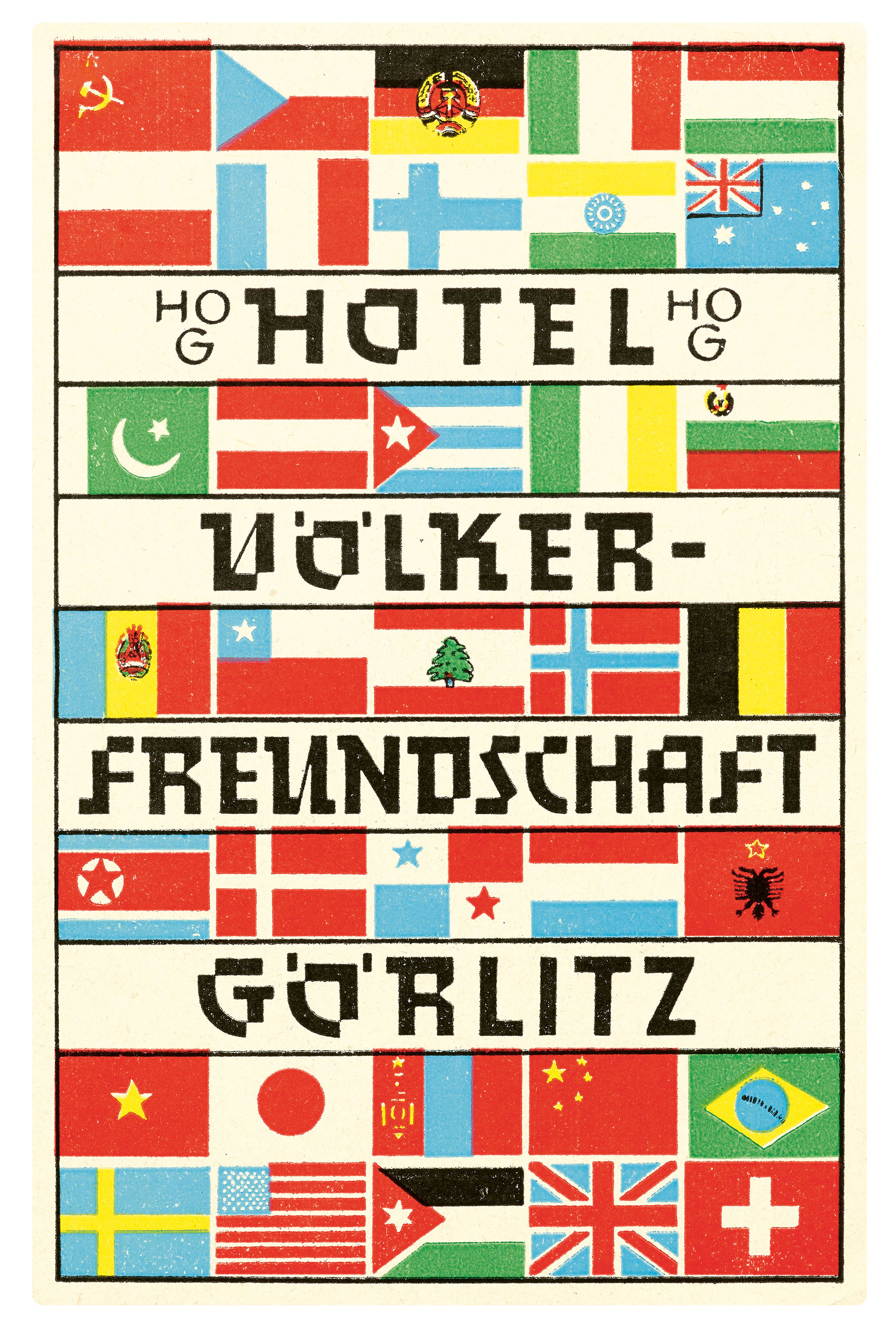
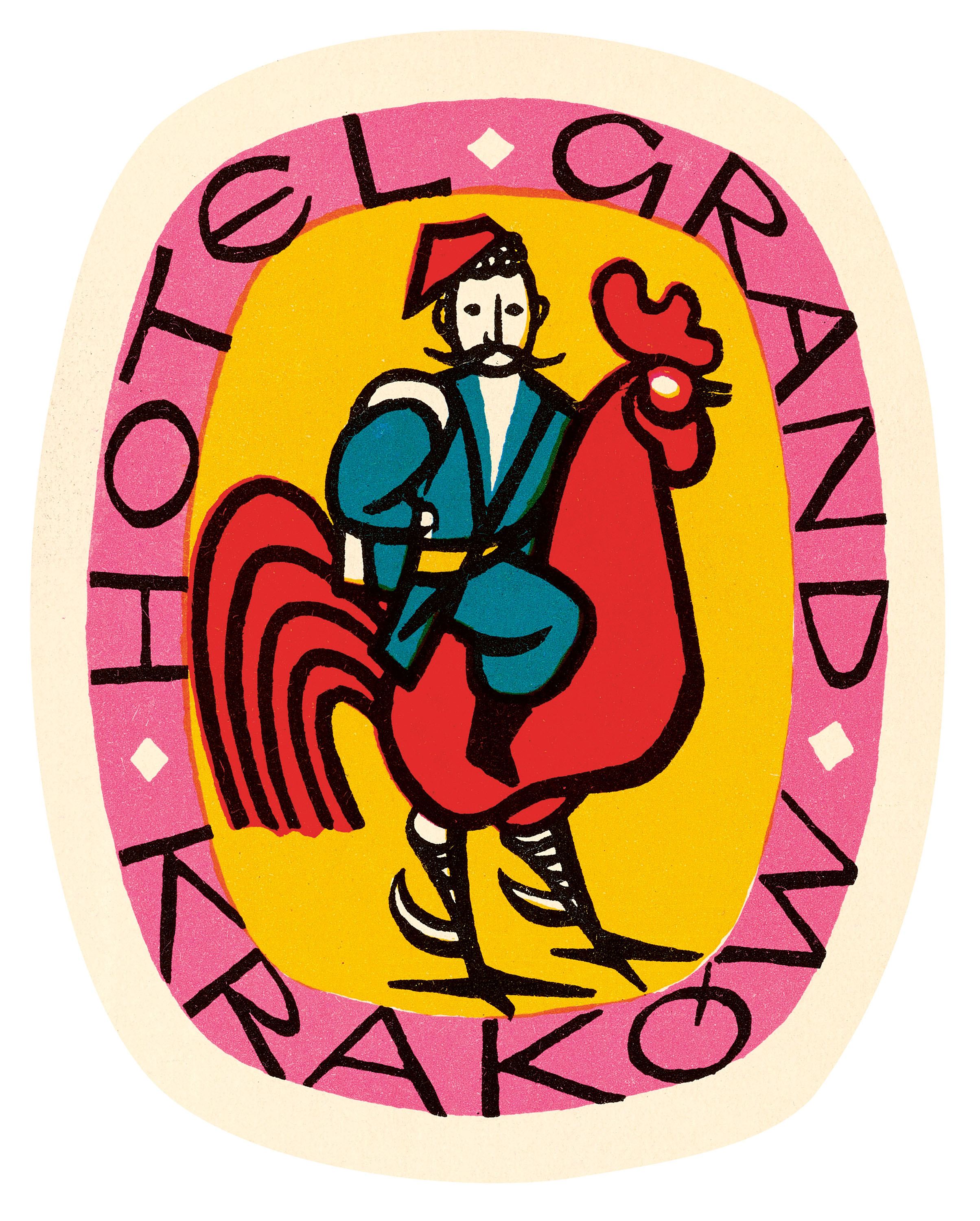
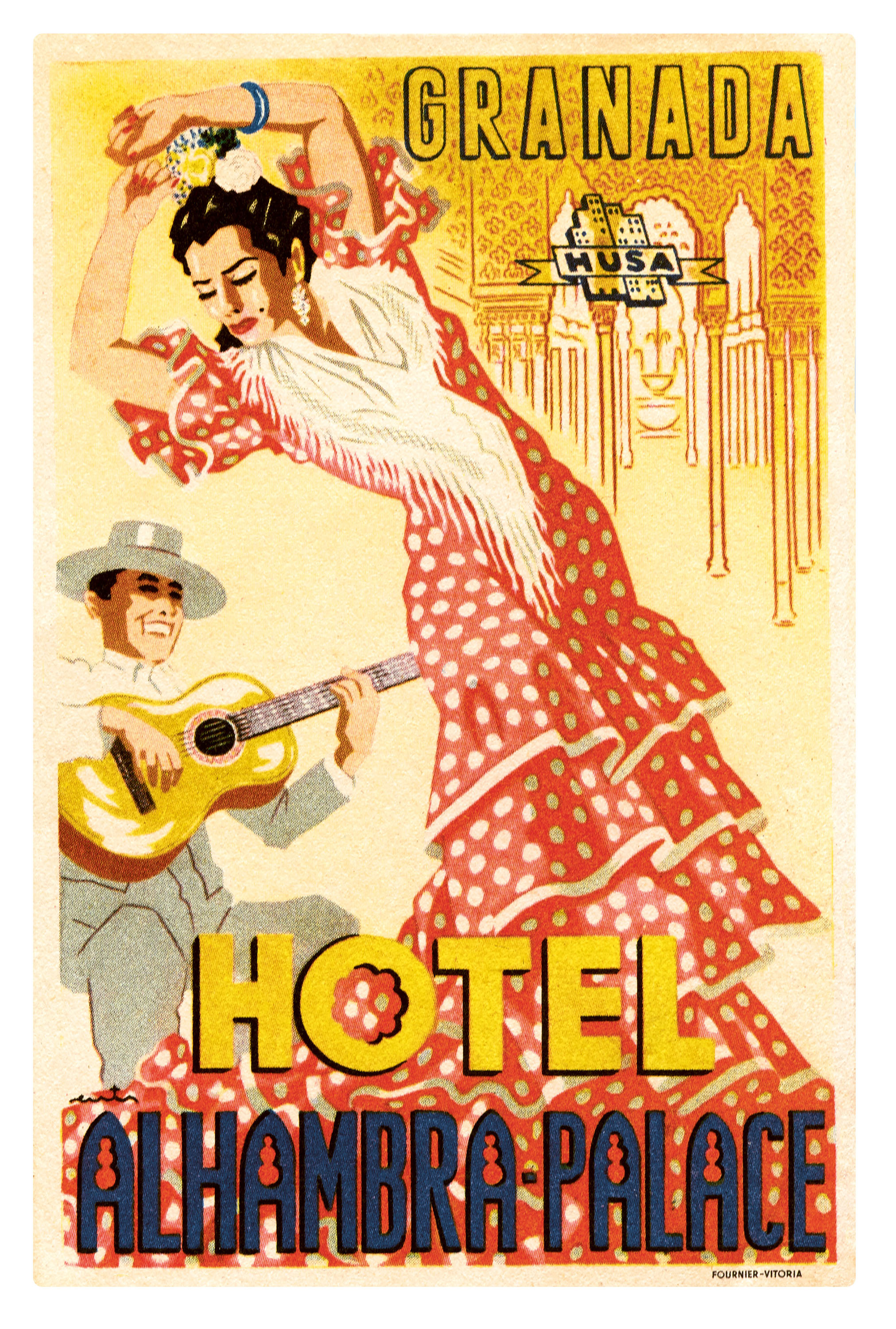
Some hotels revived regional lettering and illustration styles to attest to their authenticity, like the modernized German blackletter chosen by the Hotel Völkerfreundschaft or the folk-inspired artwork for Poland’s Hotel Grand Kraków. Several labels honor cultural legacy, like that of the Hotel Alhambra Palace in Granada, whose lettering incorporates the arches and geometric motifs of Moorish architecture.
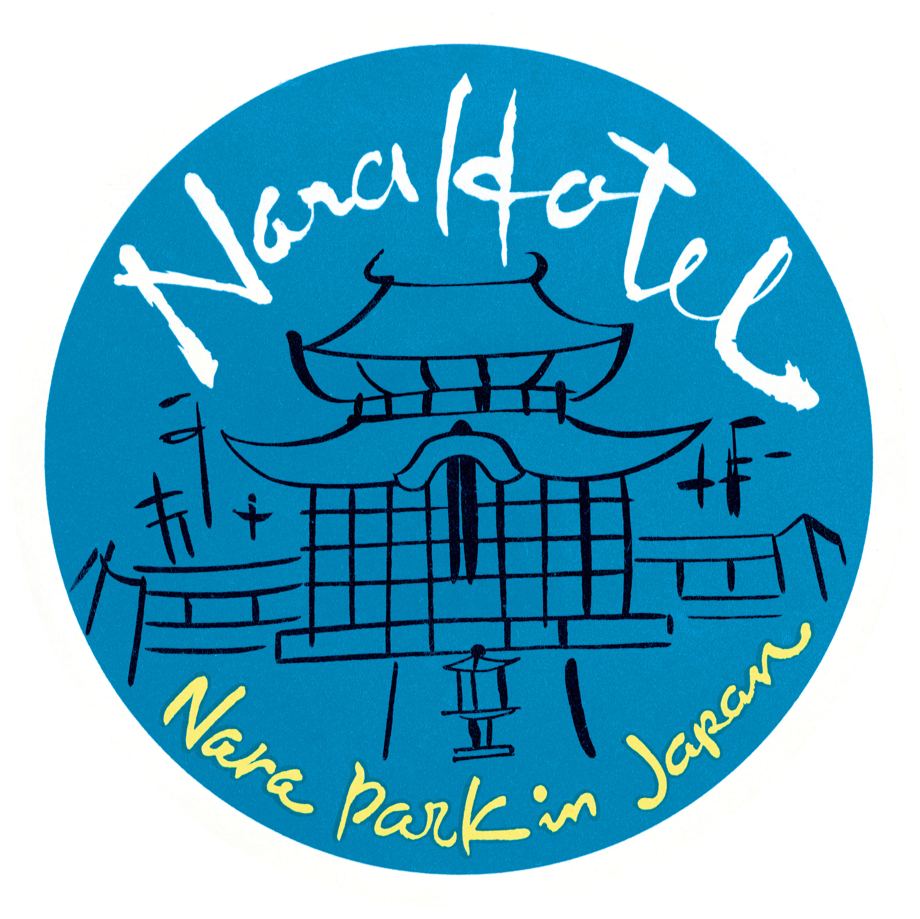
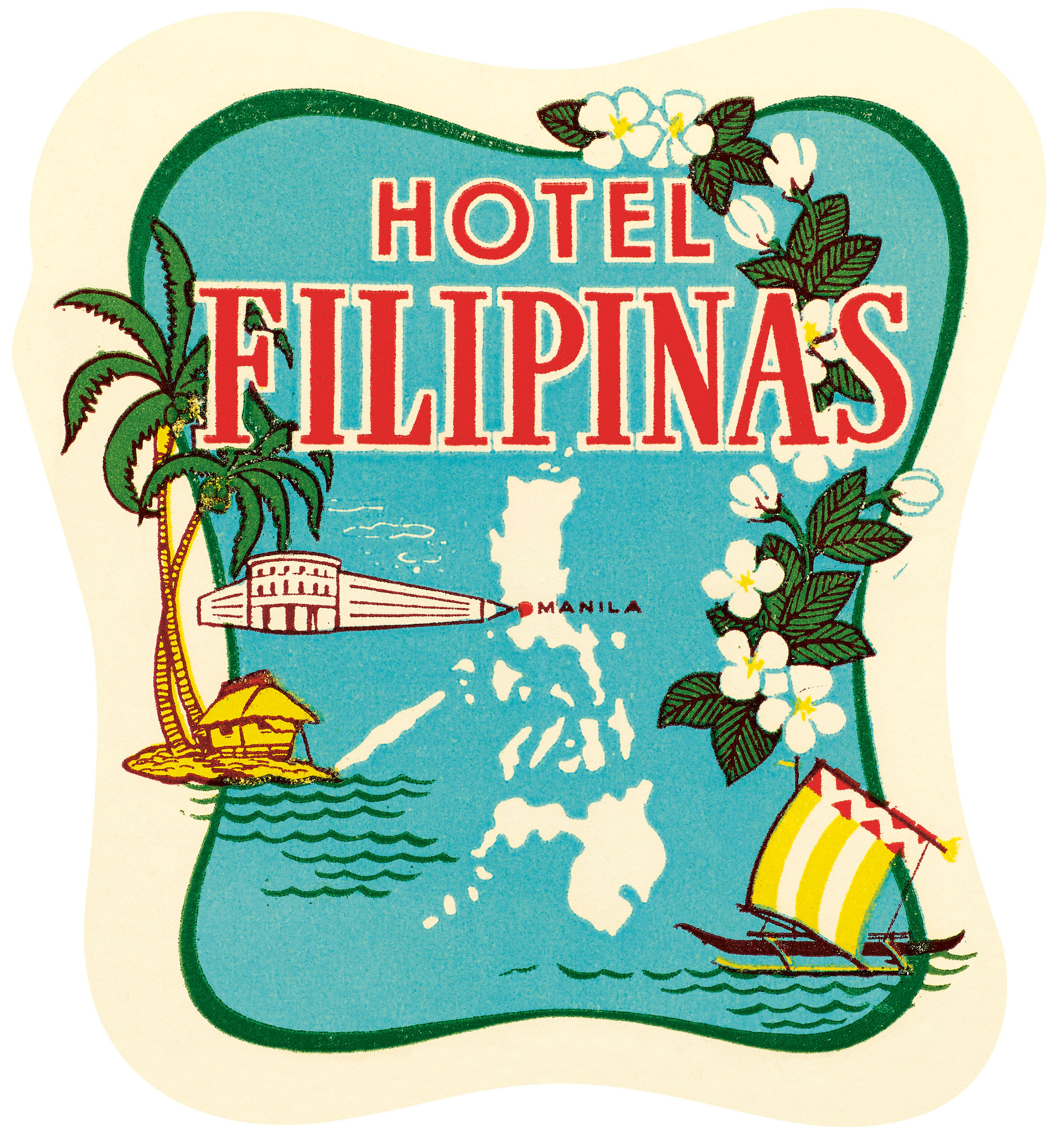
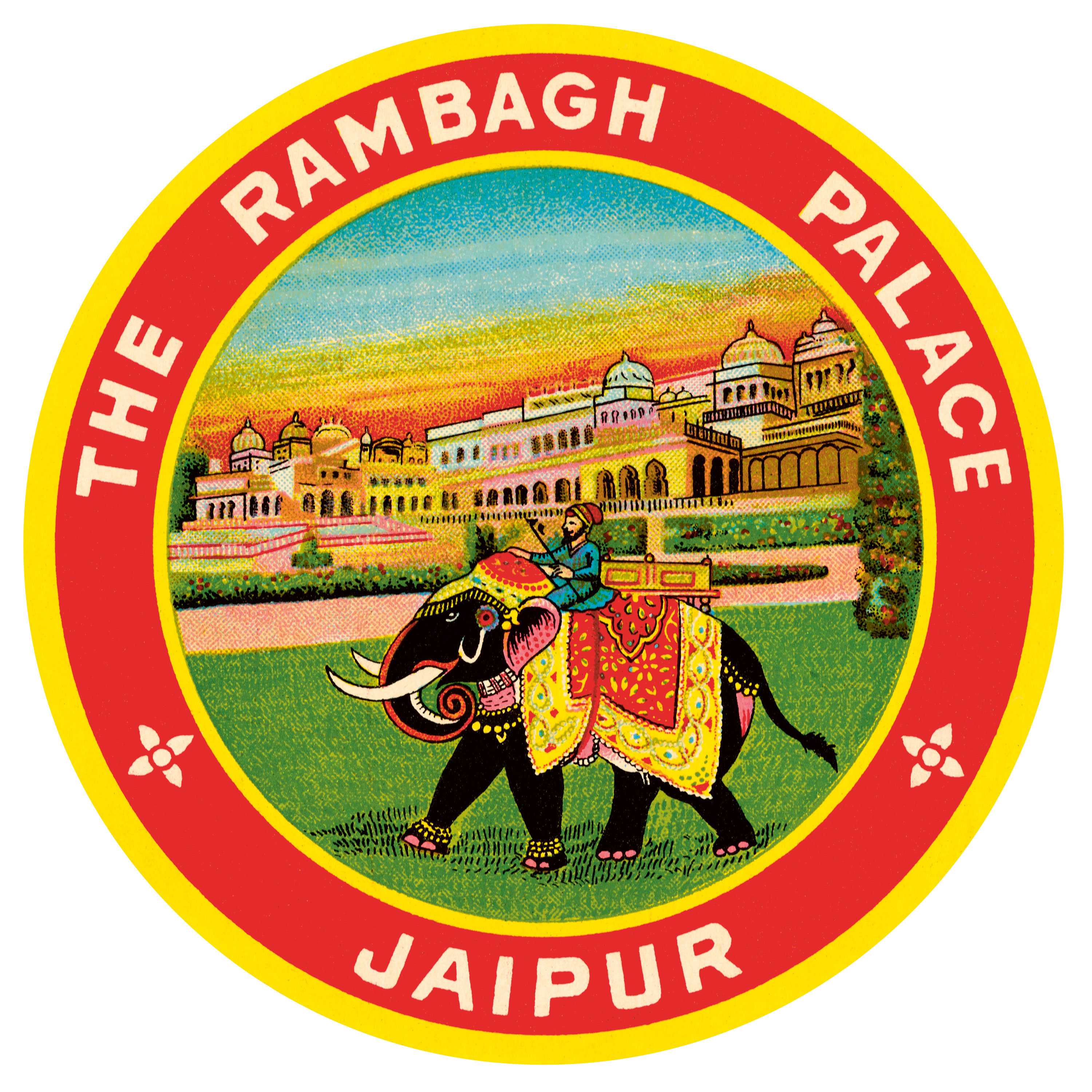
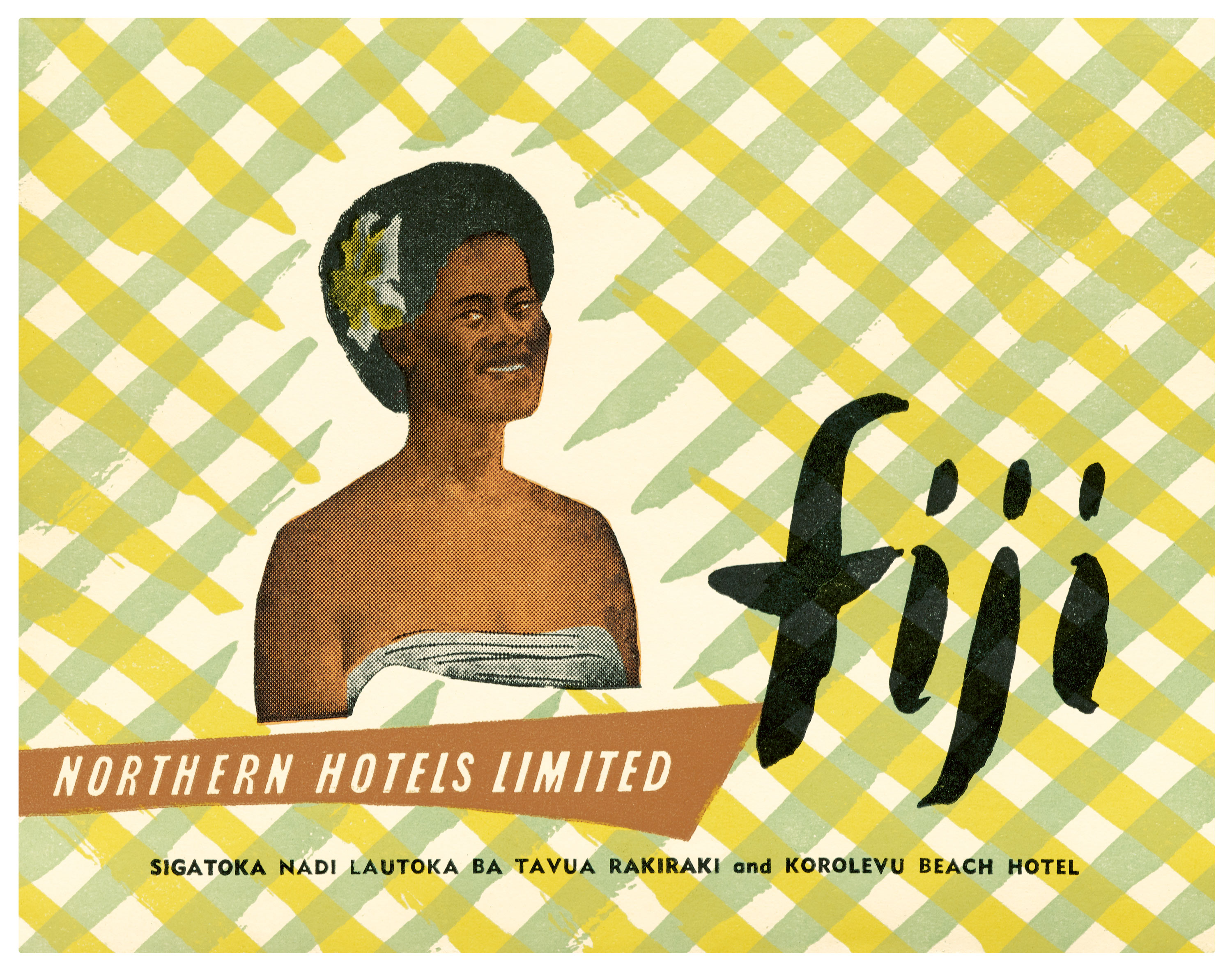
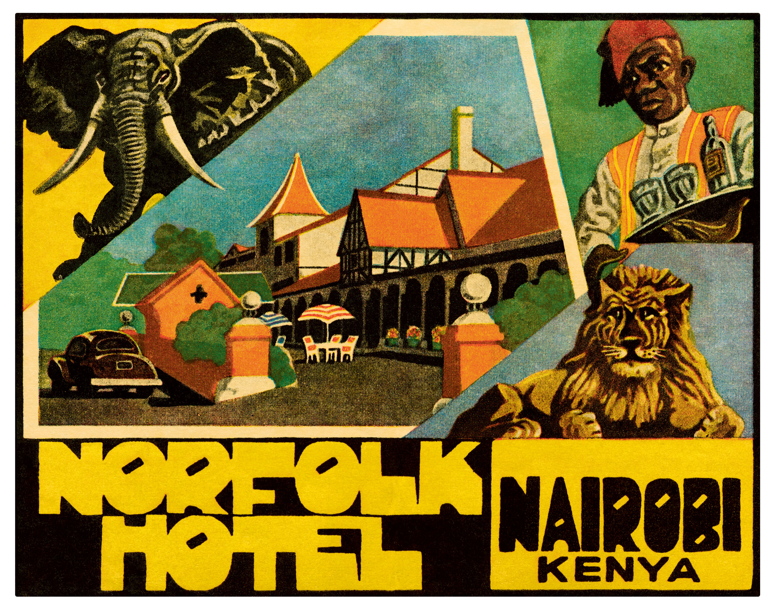
While the steamer trunk label trend began in Europe, vacationers soon imported it to the Americas, Africa, the Middle East, Asia, and Oceania. Some examples from these regions highlight unique flora and fauna, like the Rambagh Palace in Jaipur, whose label boasts of both adventure and ceremony with elephants in ornate attire. Sometimes, however, hotels played to continental ideas about the “exotic” that today read as troubling reminders of colonial tourism, such as an indigenous woman with a flower in her hair, accompanied by brush calligraphy, used to advertise a Fiji hotel chain, and imagery suggesting big-game hunting—and support from African waitstaff—on a label for the Norfolk Hotel in Nairobi.
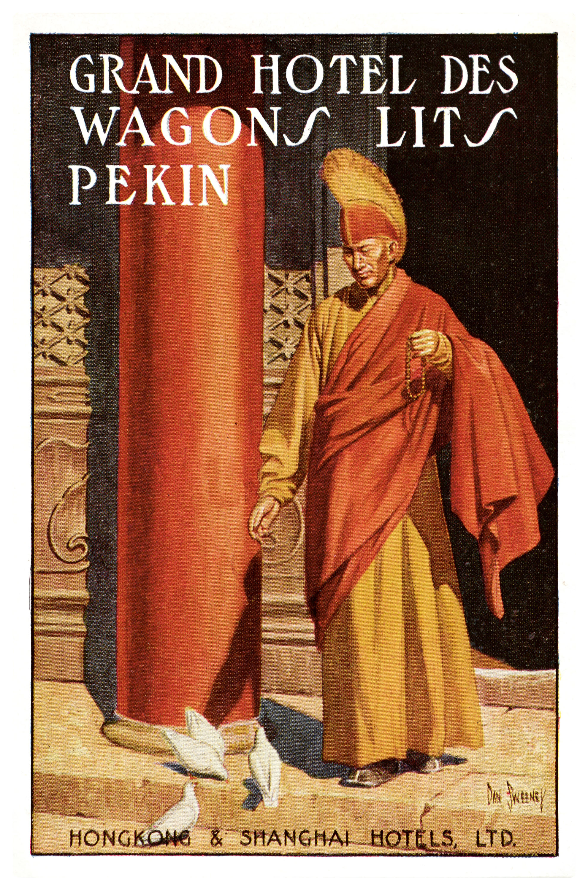
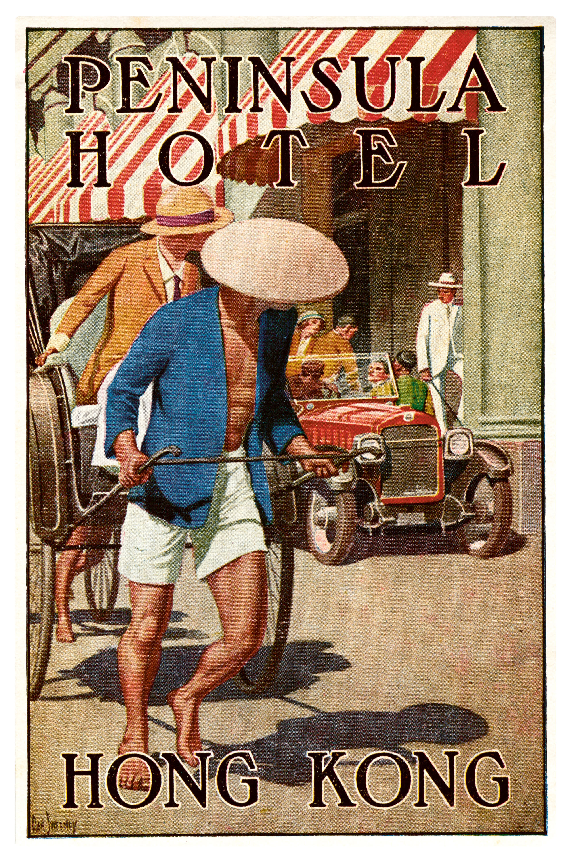
The identities of the artists and designers behind these miniature creations are largely lost to history, as commercial ephemera of this age rarely bears more than the initials of its makers. One notable exception that fully credited its productions was the Neapolitan print house Richter & Co., which, under the art direction of Mario Borgoni, dominated European tourism graphics from 1900 to 1930. Another exception is U.S. magazine illustrator Dan Sweeney, whose 1920s labels for high-end hotels in China are united by their tasteful realism and distinctive serif lettering.
The Golden Age of Travel, as the era roughly between 1870 and 1940 came to be called, was not without disruption. World Wars I and II both limited excursions within Europe, and many hotels were converted for military service or changed hands during regional instability, all of which impacted the production of travel ephemera. But ultimately, the demise of the luggage label was due to a new luxury waiting in the wings: air travel, which replaced travel by train and sea in the middle of the twentieth century, rendering the heavy steamer trunk all but obsolete.
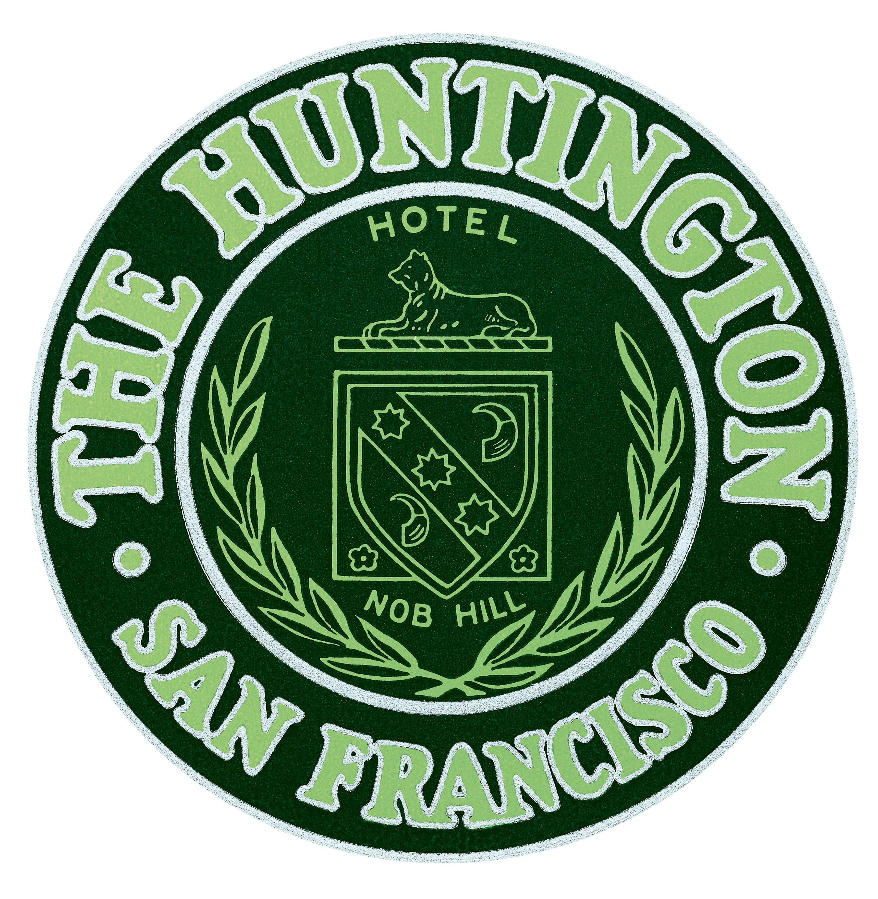
Today, these small relics of early twentieth-century wanderlust are a source of nostalgic delight for both travel and design enthusiasts. The luggage label collection at Letterform Archive numbers in the thousands, dating from 1920 to 1970. Many of its specimens came from a local source: San Francisco’s own historic Huntington Hotel, a luxury accommodation first opened in 1922, where a binder of treasured labels was assembled by a concierge whose name has also slipped from record.
Acquired by the Archive as examples of appealing type and lettering from across the globe, these pieces of print ephemera attest to advertising’s early heyday, when stunning illustration, inventive letterforms, and novel color printing made every surface—no matter how small—a vehicle for transport to a far-off land, if only in the imagination.
—Lucie Parker, Letterform Archive Books Publisher