News
How Type Traveled Across Nations and Foundries
Our correspondent Tanya George dives into the Archive’s type specimen collection to explore the many ways typeface designs changed hands in the metal era.
Archives can be intimidating spaces. They’re usually filled with objects and materials that are valuable and relevant to building knowledge but require someone to know what they’re looking for and ask the right questions to the right people. So here is a small gateway into the type specimen collection at Letterform Archive. I ask a question — “Why does the same typeface design reappear in specimens from other foundries?” — and try to answer it by using objects found at the Archive and other accessible resources.
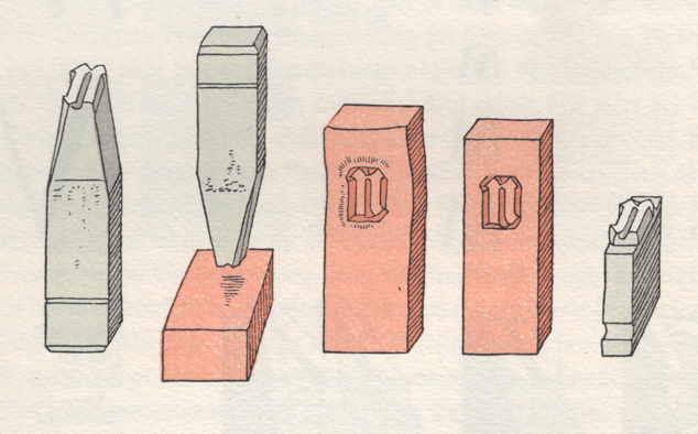
Before we look at the various type designs and how they traveled, let’s start with a brief understanding of the technology behind the type. Letterpress printing flourished in Europe due to the nature of the scripts that were involved, such as Latin, Greek and Cyrillic. The alphabetic quality of a script like the Latin meant that it could be broken down to individual characters and punctuations. These characters could then be cast on individual pieces of metal, allowing them to be rearranged and reused for printing different texts. Each sort was a cube of metal with an inverted image of a character in relief at one end. When inked and printed, the image would appear in a readable form on paper. Sorts were cast by pouring liquid metal alloy into a mould, and this technique allowed multiple copies also known as sorts, of the same character to be cast. This collection would then be sold by weight to printers. The mould required a matrix that had the design of the character punched into it the right way. The matrix allowed a printer to generate any number of sorts of the character. As the physical source of a type design, the matrix was very valuable. And, in certain cases, as we will see below, it was the matrix, not the sort, that was the product traded between type companies.
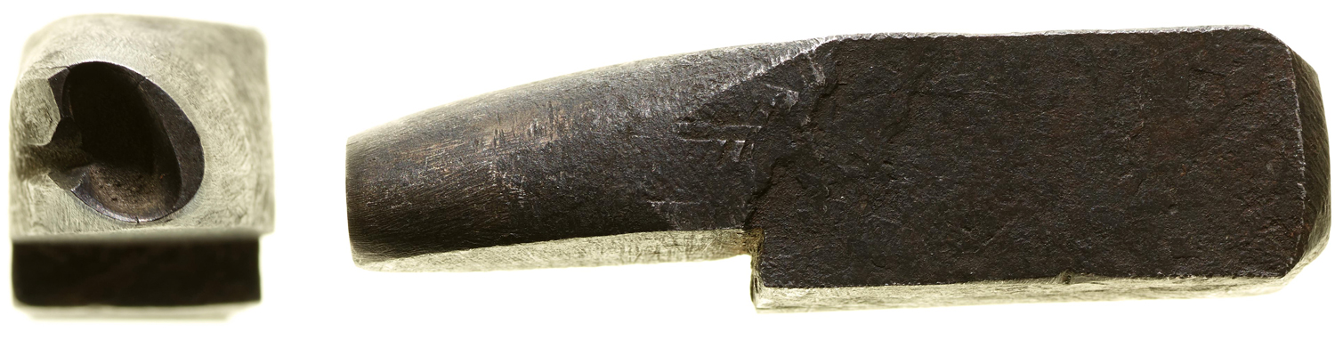
The punch used to create the matrix was traditionally carved by the hand of a punch cutter. Sometimes it was the punch cutter who interpreted the designs that were drawn by someone else and in essence translated the drawings to metal while keeping in mind technical requirements.
For a comprehensive video explanation of this process, we highly recommend Carl Dair and P. H. Rädisch at Enschedé: The Last Days of Metal Type, a 1950s film that was restored in 2015.
In the initial years of letterpress printing in Europe, the printer also performed the jobs of a foundry, that required them to house a host of skilled craftspeople, who together produced fonts, as well as a publisher, editor and bookseller. The type they cast was for proprietary use at their own presses, but eventually selling them to smaller printshops became an additional source of income. As these roles gradually began to separate, commercial type foundries became entities that designed, cast and sold typefaces to various printers. Foundries could sell a set of sorts of a particular typeface to printers. Prints that showcased the design and character set of a typeface came to be known as specimens. These catalogs not only advertised the design but also included technical details such as number of sorts per character and cost by weight to aid its sale.
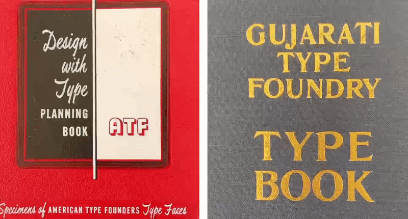
The Archive is home to a vast collection of specimens from hundreds of type providers covering a wide range of typefaces styles, weights and scripts. A closer look at these specimen books reveals that the same type designs pop up in specimens for different foundries, and sometimes with a completely different name. Some of these occurrences can have simple explanations. First, it was common for the specimens belonging to the same foundry to showcase popular typefaces in various editions. Foundries often printed specimen sheets without any page numbers. This allowed the sheets to be bound in various combinations depending on the printers’ request. This also allowed older specimen pages to be bound in the future alongside newer designs. In case a foundry or its catalog was purchased by another, its typefaces might be included in the specimens for the newer foundry, which might also lead to repetitions. In this article I focus on typefaces that appear in type specimens from different manufacturers or foundries. I broadly stay in the time period of the late 1800s to early 1900s and look at metal type. I take a closer look at the reasons for the same designs appearing in multiple specimens and try and trace the routes the designs might have taken, that in many cases crosses continents.
The Same Design Appearing in Different Type Specimens
De Vinne
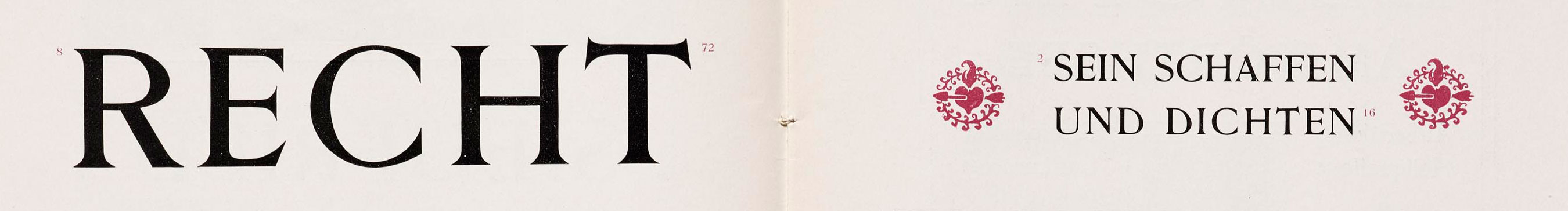
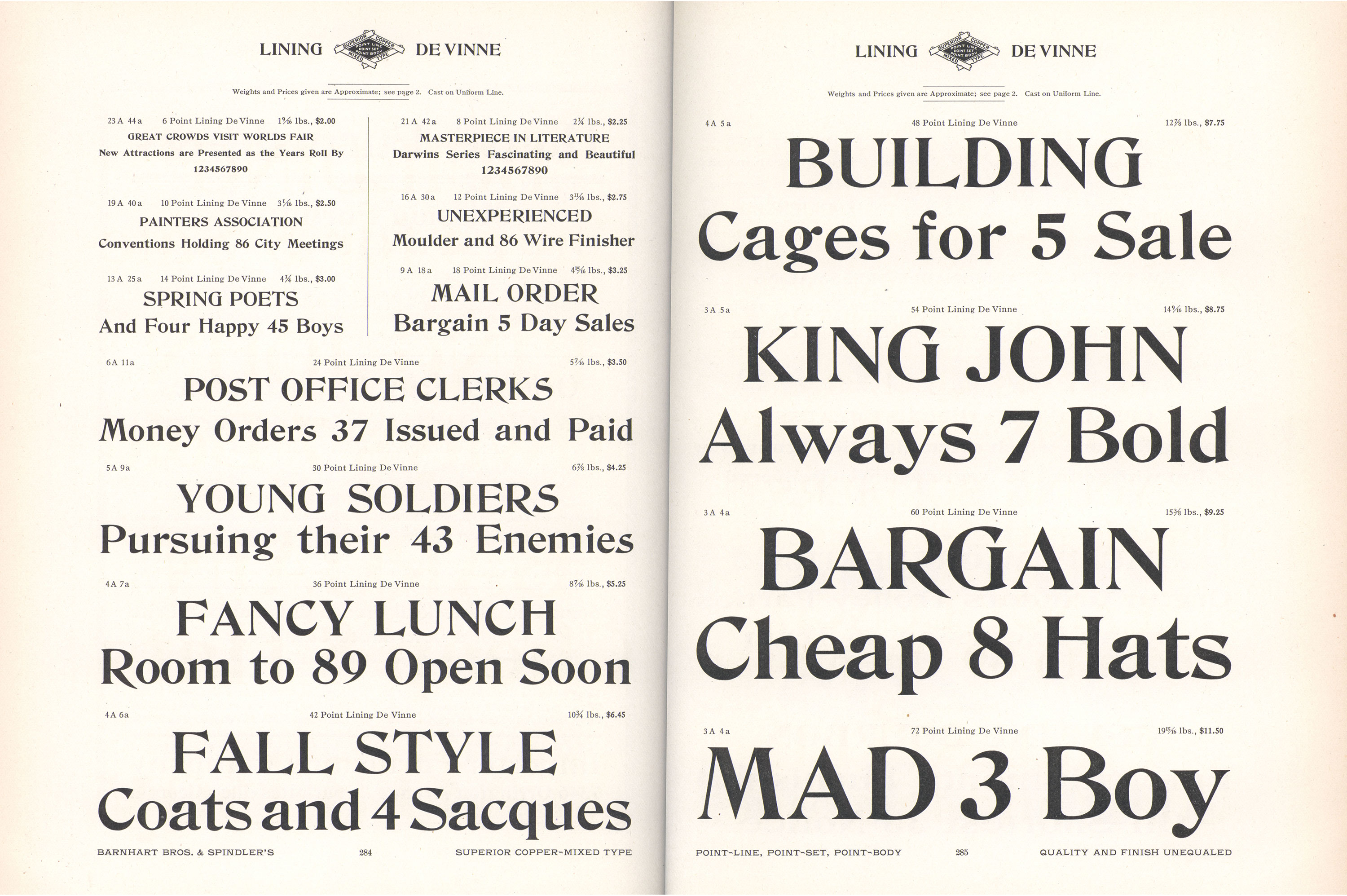
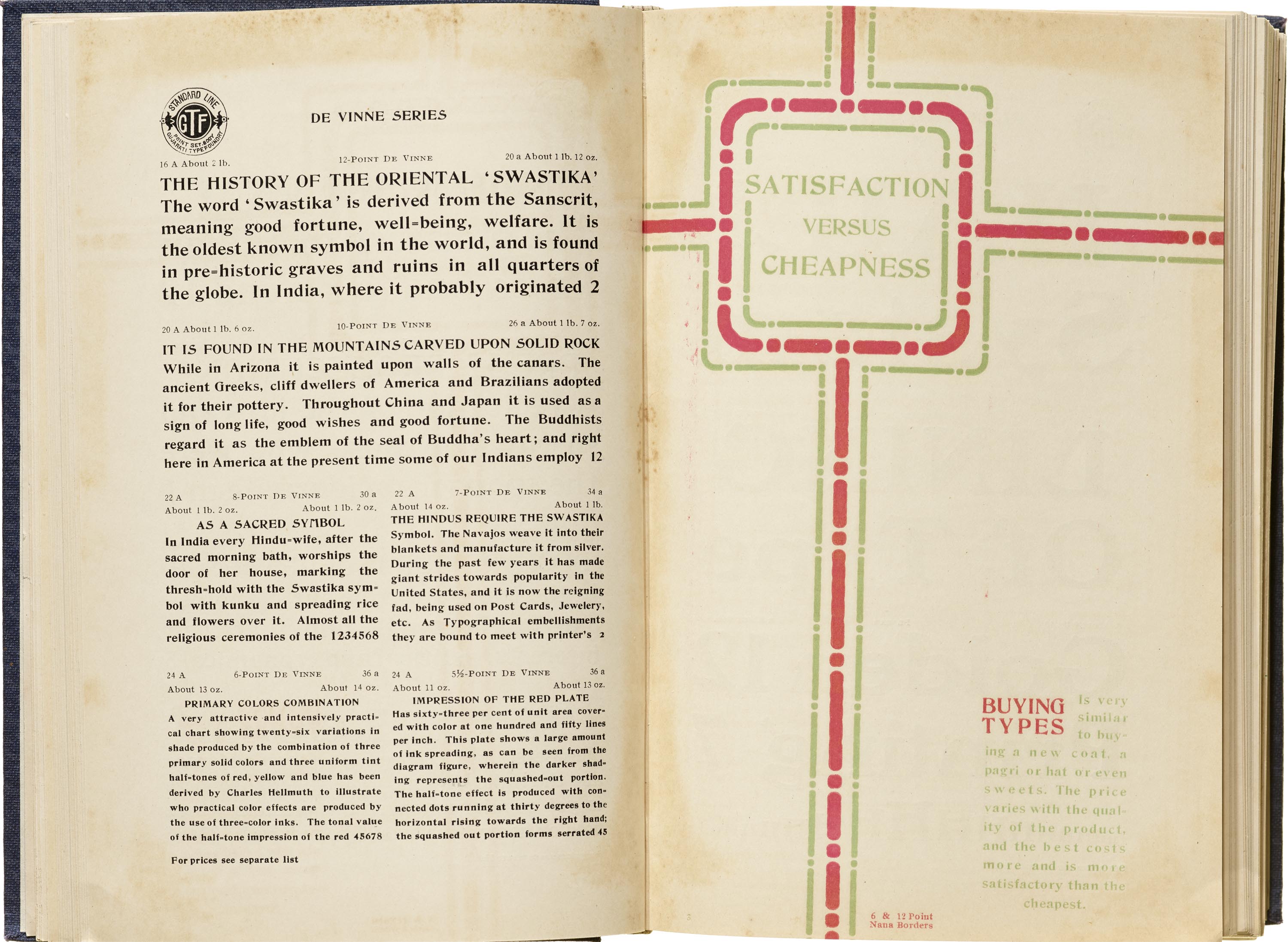
The De Vinne typefaces have lived a long and illustrious life, appearing in many catalogs for various foundries. From its transatlantic origins, to becoming a popular design across the globe that continues to inspire current-day designers, De Vinne has come a long way in the last 130 years. The design was a commission by the prestigious De Vinne Press to the Boston-based Central Type Foundry, with a brief to create a new typeface that responded to a “need of plainer types of display, to replace the profusely ornamented types in fashion”. De Vinne Press acquired Römische Versalien, from Genzsch & Heyse and this was to be the basis of the design. While the press or its owner made no contribution to its design or production, the Central Type Foundry owners named it De Vinne to possibly honor the correspondence between the two that led to its creation. The name would have also created an association between the new design and the well-known press. It proved to be a popular typeface that allowed for more weights and styles to be added soon after it first made its debut around 1892. De Vinne’s popularity carried it back to its ancestral country as it appears in a specimen for the German foundry Hoffmeister, where it eventually is got renamed Amerikanische Mediäval, emphasizing its foreign origins. It continued to be adapted to various typesetting technologies, including the Monotype machine, and the family expanded to include expanded and open styles, as well as italics.
The De Vinne series can also be found in a specimen for the Gujarati Type Foundry. This meant that the Indian company may have licensed the design to sell to Indian printers. Since they were retailing sorts, it’s most likely that they would have acquired matrices for the design and use them to cast sorts to be sold to printers in the subcontinent.
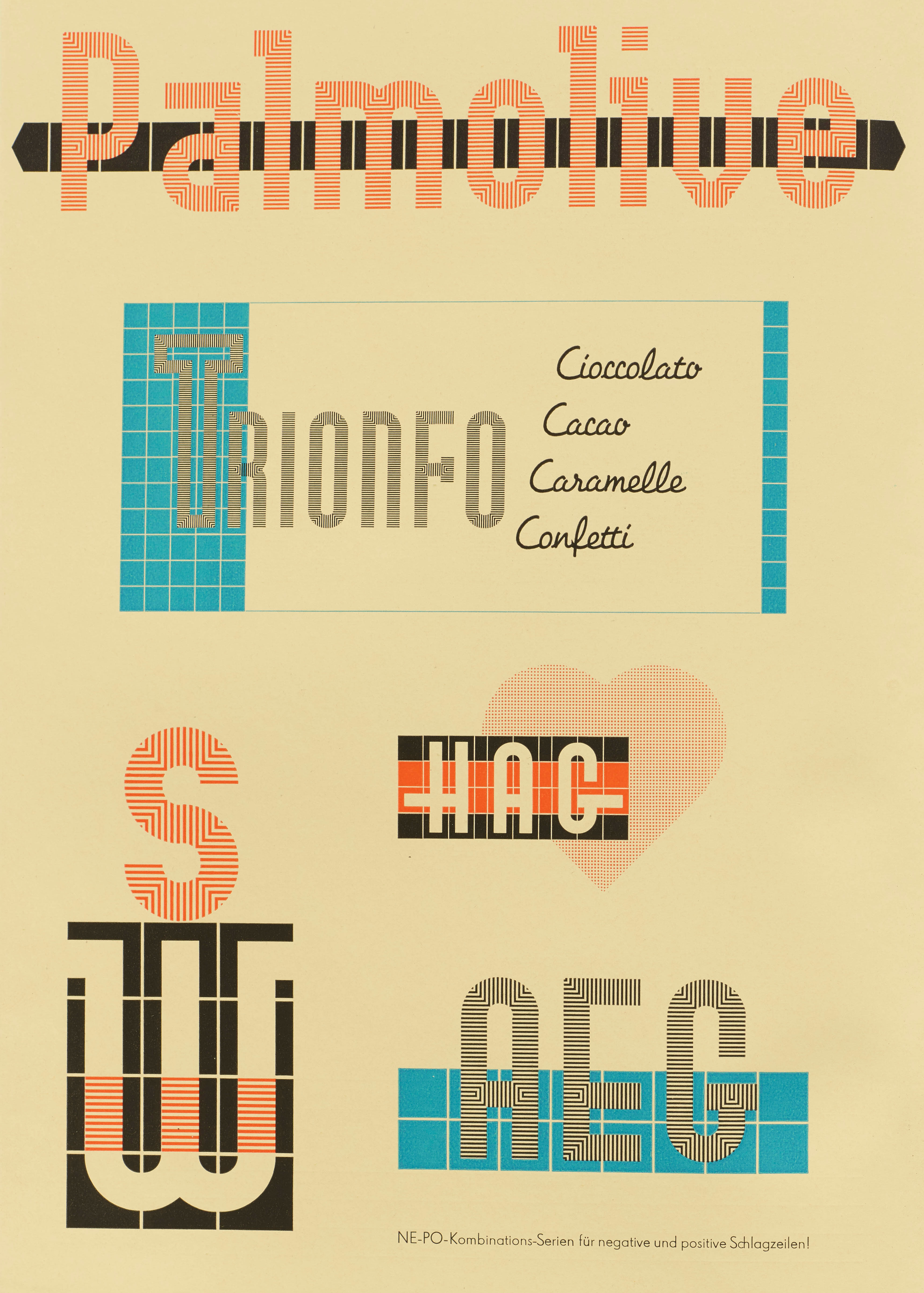
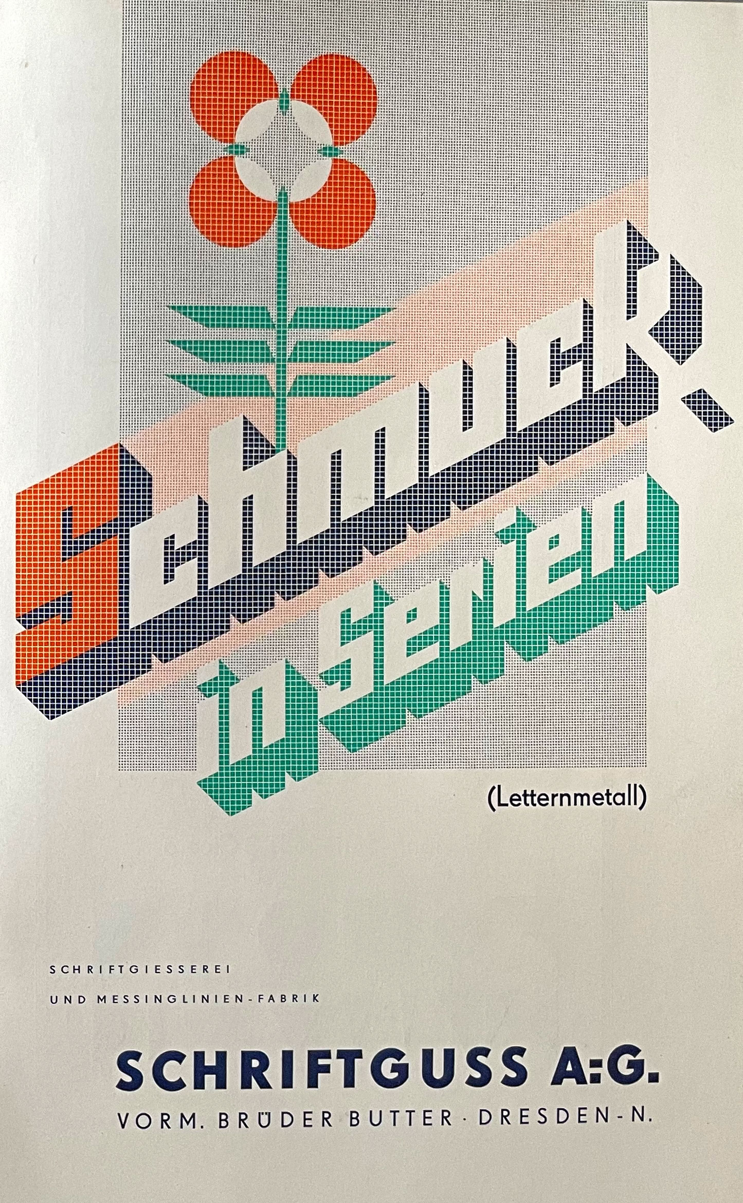
NE-PO
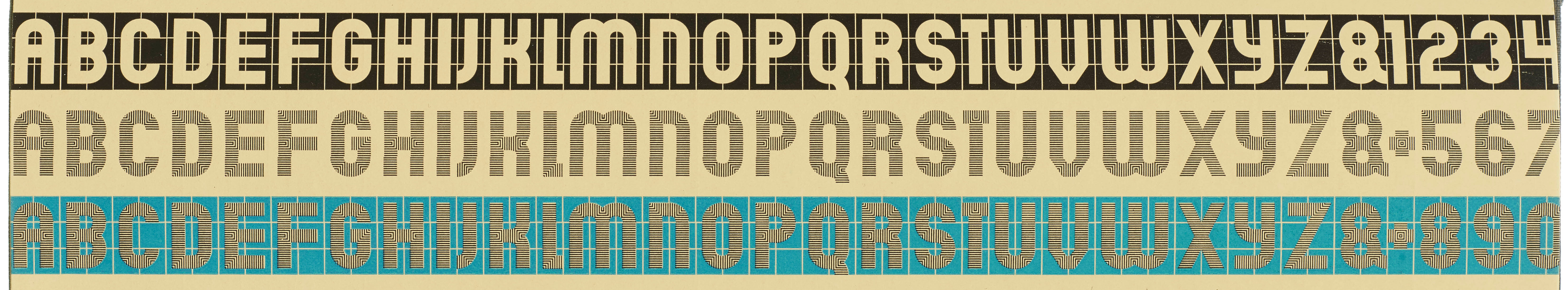
Ne-Po was a modular typeface, named for the abbreviation of Negative-Positive. The design is attributed to the German foundry Brüder Butter that eventually came to be known as Schriftguss. The design itself was intended for the Latin script and used modular patterns on a block that, when repeated in particular combinations, would create the alphabets. The Negative design had the letters in the non-printed area, requiring 17 modules, while the intricately lined Positive series required only 15. The designs could also be used to create borders and abstract patterns and was available in three sizes. While the design was first released in the early 1930s in Germany, it also made its way to India and was retailed by the Gujarati Type foundry as seen in its specimen book. The Gujarati Type foundry used the typeface to also create words in Gujarati and Marathi, with an aim to market it as a display type for Indian scripts. Since the design was advertised for sale, similar to De Vinne series, it’s likely that they would have acquired the matrices rather than shipped the metal sorts for every order.
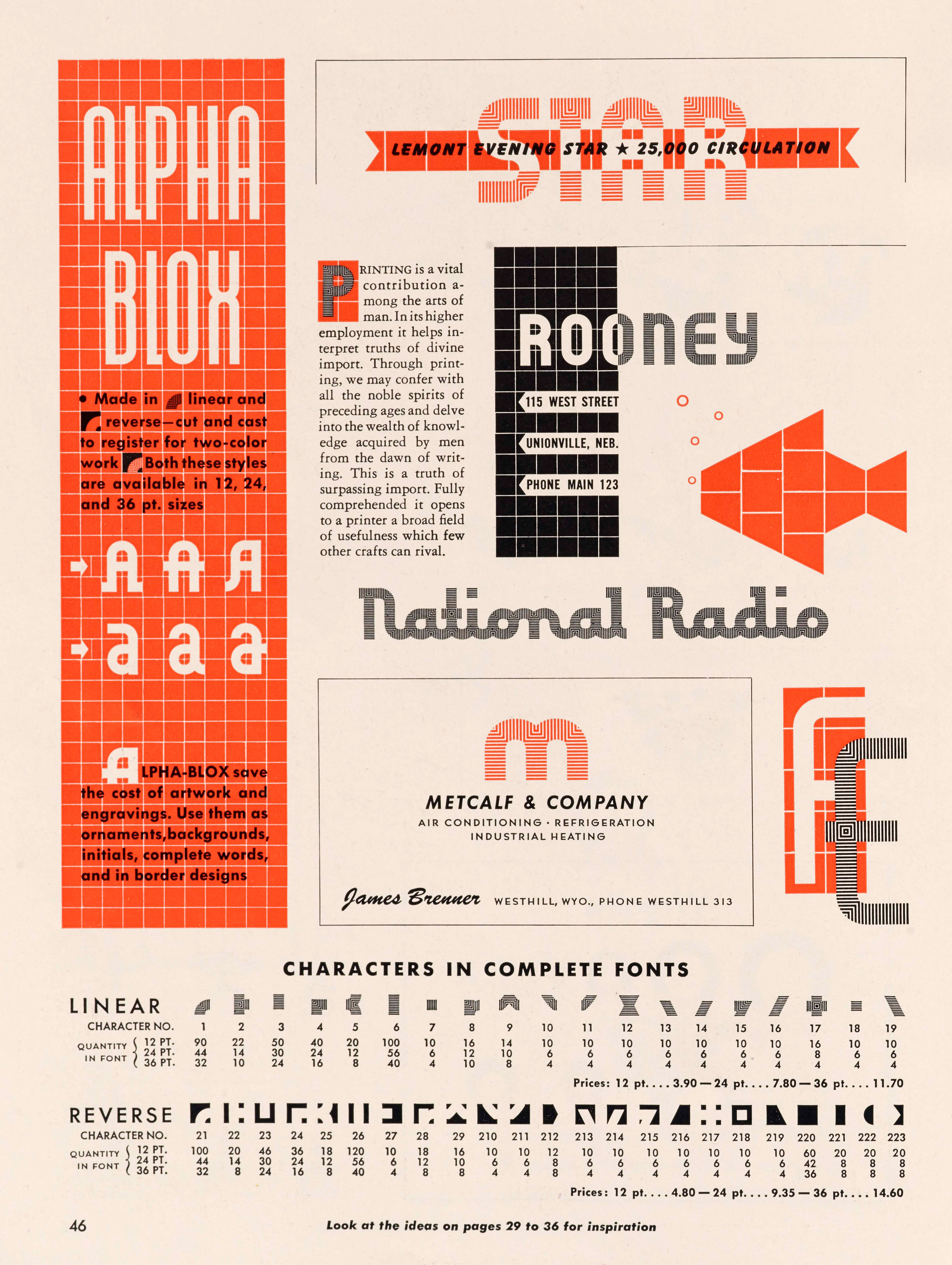
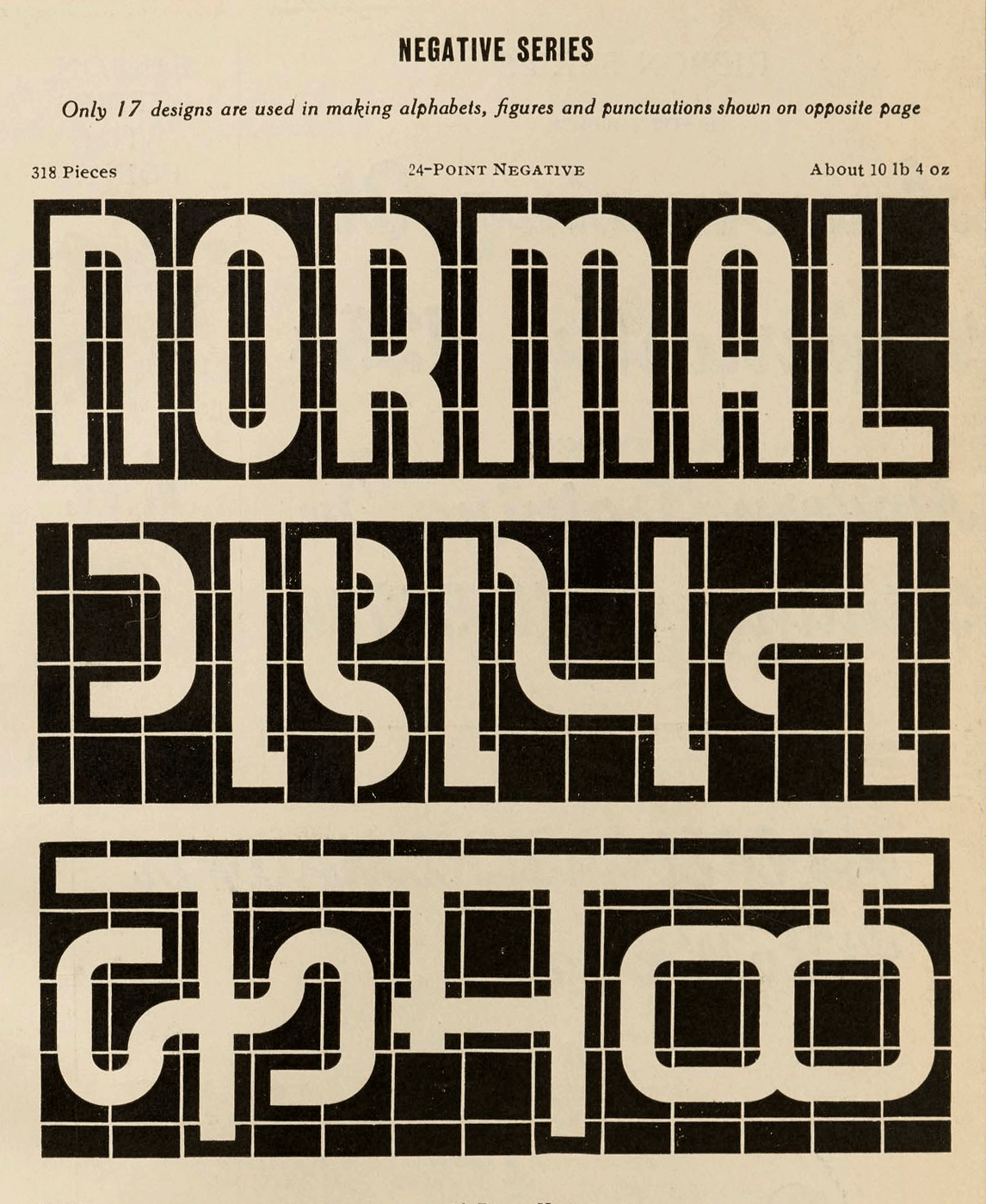
Across the pond, and a decade later, the American Type Foundry seemed to have similar ideas or borrowed1 some from Schriftguss without credit. The resulting design christened Alpha-Blox was released in 1944 and also available in three sizes. It used 23 modules for its Negative design that it named Reverse, while the positive base modules, called Linear, went up to 19. The ATF specimen also expanded on the kinds of letters that could be created, including a connected script.
Same Typeface with Different Names
Post Old Style No. 2
Post Old Style, named after the Saturday Evening Post, had two variants labeled No. 1 and No. 2. Both were designed in 1900 by E. J. Kitson who was working at the newspaper and inspired by the arts and crafts movement. The fonts were first cast by ATF, but went on to be produced by other foundries under different names. Seen below is a page from a Bruce Type Foundry catalog. Post Old Style’s popularity encouraged many foundries to release their own interpretations of bold, hand-wrought type with wobbly edges. Post Old Style No. 2 was also available from several other foundries, including Wilhelm Wöllmer as Kolonial, Lettergieterij Amsterdam as Columbia, and H.C. Hansen Foundry of Boston as Buffalo.
Post Old Style also appears anonymously in the opening pages of a specimen for India-based Gujarati Type Foundry, alongside Post Old Style Italic. The italic was patented by Herman Ihlenburg and based on the lettering of Guernsey Moore, another founding artist of the Saturday Evening Post. The Gujarati specimen text also advertises printing services offered by the foundry. The Indian foundry’s catalog contains a lot of original typefaces for Indian scripts but their Latin typefaces were mostly designs sourced from various Western foundries.
Bard
The wide, spiky display face, Bard, was originally seen in a Barnhart Brothers & Spindler specimen from 1883 as Acme Series, along with Acme Title with an Open variation. Only later in a specimen from 1907 was it advertised as Bard as seen in the specimen below from the Archive. An outlined version of its design was available at various point sizes and also renamed Bard Open. Gujarati Type Foundry’s specimen uses various sizes of Bard to boast of their superior typography. Similar to how Post Old Style No. 2 was included, the designs for Bard were anonymously featured in the opening section of the specimen, to advertise the library of designs available at their print shop. The foundry also offered printing services, and they would have only purchased the fonts to print with, not the matrices. These designs were exclusive to the GTF printers, and possibly why the designs were used to advertise those particular services.
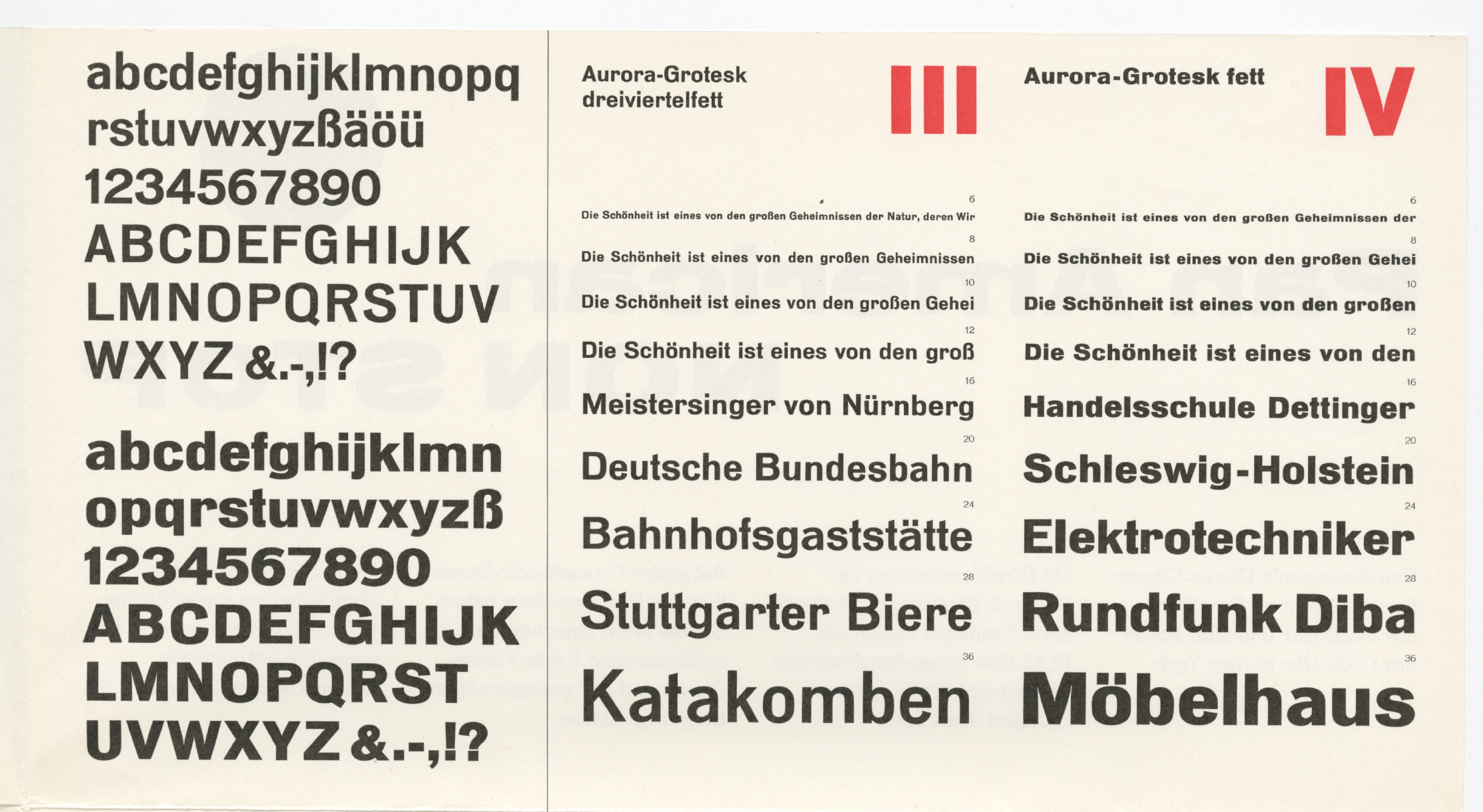
Aurora
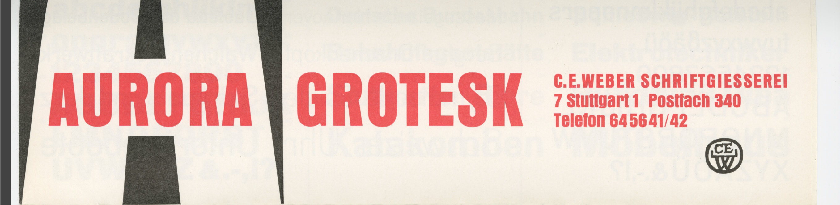
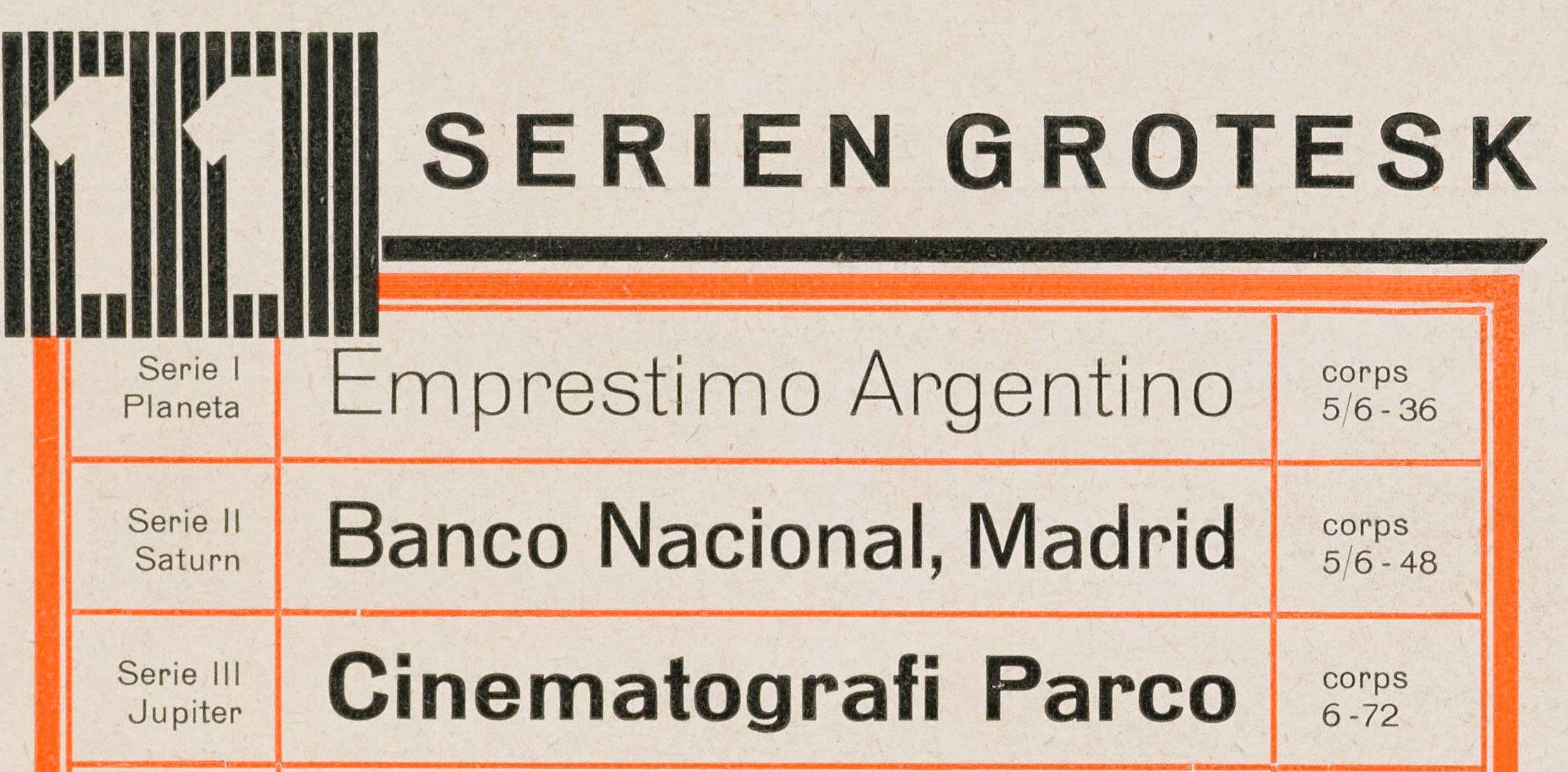
Aurora is a design by a German punch-cutting company Wagner & Schmidt located in Leipzig. They came up with a plan for a typeface system that would house multiple weights and widths, as opposed to the more conventional route, expanding a family once a design became popular. They also did not produce fonts themselves, instead licensing the matrices to various foundries who then retailed the design under different names. The Stuttgart-based Weber foundry named the series Aurora and numbered the weights, while in a specimen for Dresden-based Schriftguss it was called Serien Grotesk and all the weights were named after celestial bodies. One of the most recognisable uses of the various styles of the design is on the headlines of bauhaus 1. The design was eventually revisited by Haas foundry, and, responding to the ultra-normalized Swiss style of the mid twentieth century, evolved it into Helvetica.
Dekora
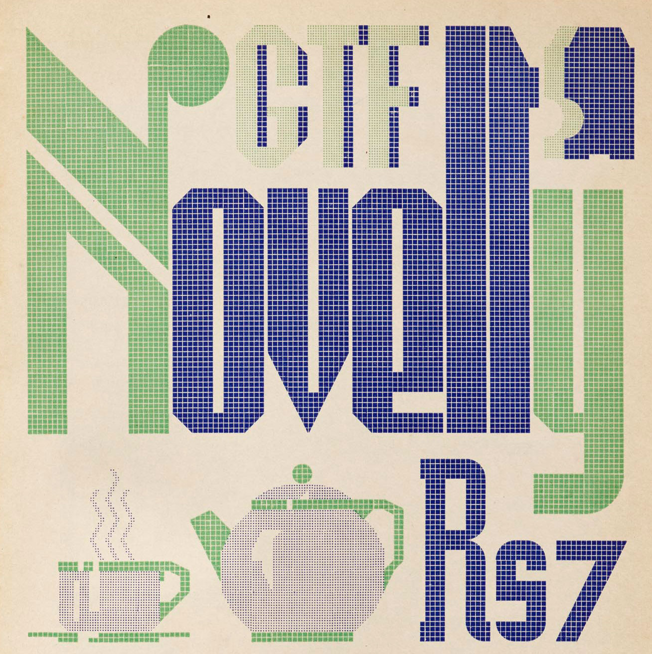
Dekora was first cast by the German foundry Schriftguss around 1930. Its grid-based design, with 46 geometric shapes, allowed it to quickly build a wide variety of text and visuals. It also appears in various foundries under different names. Italian foundry Fausto Gallico called it Frego Gloria and at the French foundry Fonderie Typographique Française, it was called La vignette Décor. All the specimens show the two styles in two point sizes. These were then assembled to create both single- and multi-color visuals. The lettering created with it could even have depth and dimension, and some samples creatively use unprinted) space to form words. The French specimen also showed a sample of lowercase letterforms. The cover for a German book trade journal shows Dekora in use for its title, and it forms Hebrew lettering to spell the name Habima, a theater in Tel Aviv. The design also traveled to India and was christened Novelty by the Gujarati Type Foundry. Its specimen, too, shows a mixed use of the design, but didn’t attempt Indian scripts, as the foundry had with Ne-Po.
Same Typeface with Different Character Sets
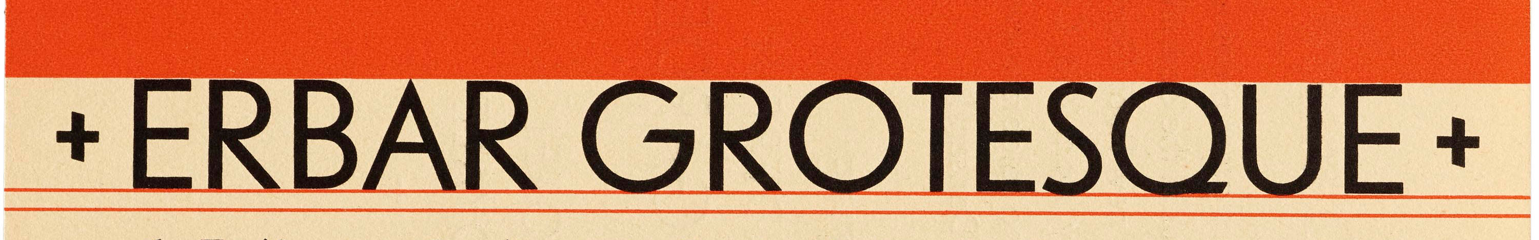
Erbar Grotesk
Released by Ludwig and Mayer in 1926, the eponymous sans typeface by Jakob Erbar was one of the first typefaces based on Bauhaus principles. Erbar-Grotesk had two x-height based variations (see “Erste and Zweite Garnitur”) along with various alternates, and was quickly expanded to add more weights and styles. Most of the marketing material aimed at German foundries would have obviously been typeset in German, but in its initial years, it also followed a denser German typography, seen in designs using Blackletter fonts. The specimens for the German market also showed language-specific punctuations such has the low-high quote marks and the use of ch and tz ligatures, along with designs for vowels adjusted to accommodate diacritics commonly found in the language, such as the umlaut on the ä. The double hyphen and descending z are peculiar to today’s readers, but were common in designs of the period.
Erbar-Grotesk was sold in the United Kingdom by Soldans, a London-based company dealing with printer’s machinery and typefaces. Soldans specimens offer a different look at Erbar, with English text and looser typography, allowing room for the type to breathe. The character set used catered to the English-speaking audience, including the raised quote marks, and omitting the ch ligature.

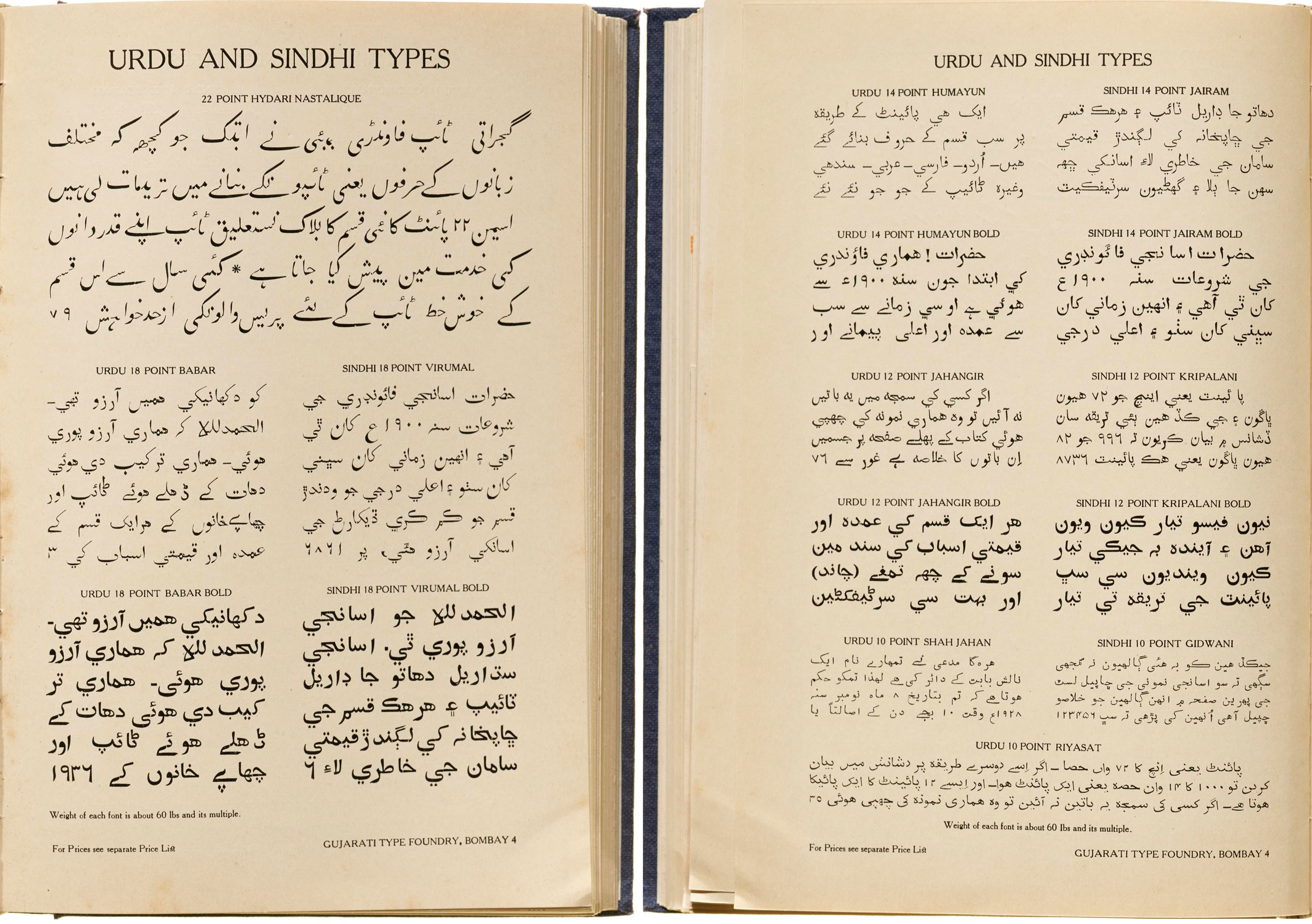
GTF Urdu-Sindhi type
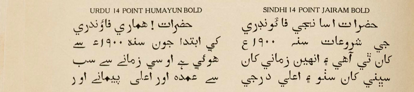
The Gujarati Type Foundry catalog advertised Latin and Devanagari scripts, but it also had some pages dedicated to other scripts from the subcontinent. Two sides of one page in the book were dedicated to Urdu and Sindhi languages using the Persio-Arabic2 script. The designs were consolidated onto a single page rather than a double spread so as to be easily inserted to create a custom specimen as per the printer’s requirements. The designs for both Urdu and Sindhi languages appear next to one another and share a lot characters, but certain characters have alternate forms such as the Bari Yeh. The text itself talks about the designs being similar, barring particular shapes that have been modified to suit the preference of each language’s users. It also briefly touches on the history of the foundry and educates the reader about the point and pica system. The different character sets are grouped under different names, with the Urdu set borrowing from Indian Mughal Kings, such as Babar, Humayun, and Shah Jahan. Even “Riyasat” meant rule or dominion. These designs strangely used the Naskh style, which is uncommon for Urdu as its readers prefer the cascading baseline seen in the Nastaliq hand. The Hydari Nastalique is the only design that would have been considered suitable. The Sindhi designs are named after well-known freedom fighters, such as Acharya Kriplani, the Gidwani family, and Jairamdas Daulatram, from the Sindh province (that falls in present-day Pakistan). They were active in the fight for independence from British rule.
In trying to answer the question “Why does the same typeface design reappear in specimens from other foundries?” this article attempts to bring together various fonts emerging from different time periods and geographies under the same theme, and there are bound to be overlaps. Some obvious examples where a foundry was bought over by another and reissued have not been included. What was acceptable once might be considered bizarre by today’s standards. The idea of a typeface having many names might sound strange, but it was common practice in the late nineteenth to early twentieth centuries. Fonts were identified by their characteristics and grouped accordingly. For example, Midolline became a type classification term in Germany, used to describe all blackletter-roman hybrids in the second half of the nineteenth century. The list above is nowhere close to exhaustive, but serves as a way to look at typefaces beyond an element of design. The examples above are limited to just a few typefaces found in specimens at Letterform Archive, but they can serve as a lens to look at typefaces found in specimens everywhere and examine the decisions that informed the design.
Postscript
This article was built over a few months as I slowly recognized the same font name, or a similar design across various sources. These lists were gradually built and referenced with sources available online, also by reaching out to a network of people. For the Sindhi-Urdu examples I called on a few of its language speakers and readers who assisted in translating and verifying what was written, as I don’t speak or read either language. I was fortunate enough to get input from Stephen Coles, the Archive’s curator and editorial director, as well as design historian Dan Reynolds, both of whom responded with valuable insight. Laura Serra, who is a docent at the Archive assisted in sharing images of specimens that can be found in person, but are not yet online, as I am far from San Francisco. Archives can be challenging and byzantine spaces, but they also tend to reward curiosity and persistence. They offer clues to answer a question, or at least point you in the right direction. And as an independent type researcher based in India, I am grateful to the many ways I was able to access the Archive and engage with it from afar.
Tanya George is a Mumbai-based designer and educator with a wide-ranging freelance practice that includes designing letterforms for brand identities as well as fonts across different Indian scripts. She also conducts type walks around Mumbai, along with typography workshops, and writes about type.