News
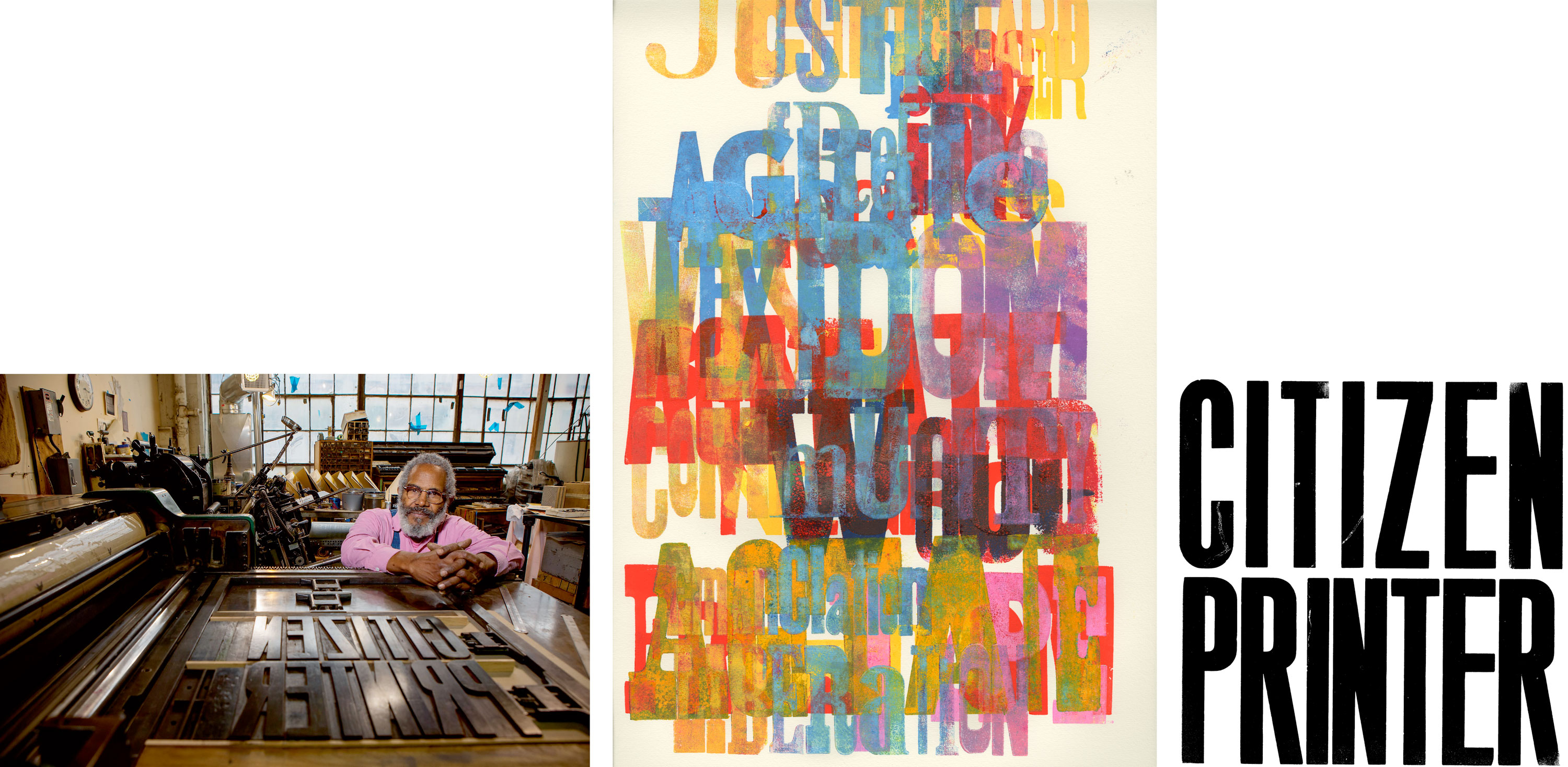
Inside Citizen Printer
Letterform Archive’s monograph of Amos Paul Kennedy, Jr., packs a lifetime of letterpress achievement into an ecstatic meditation on the power of print.
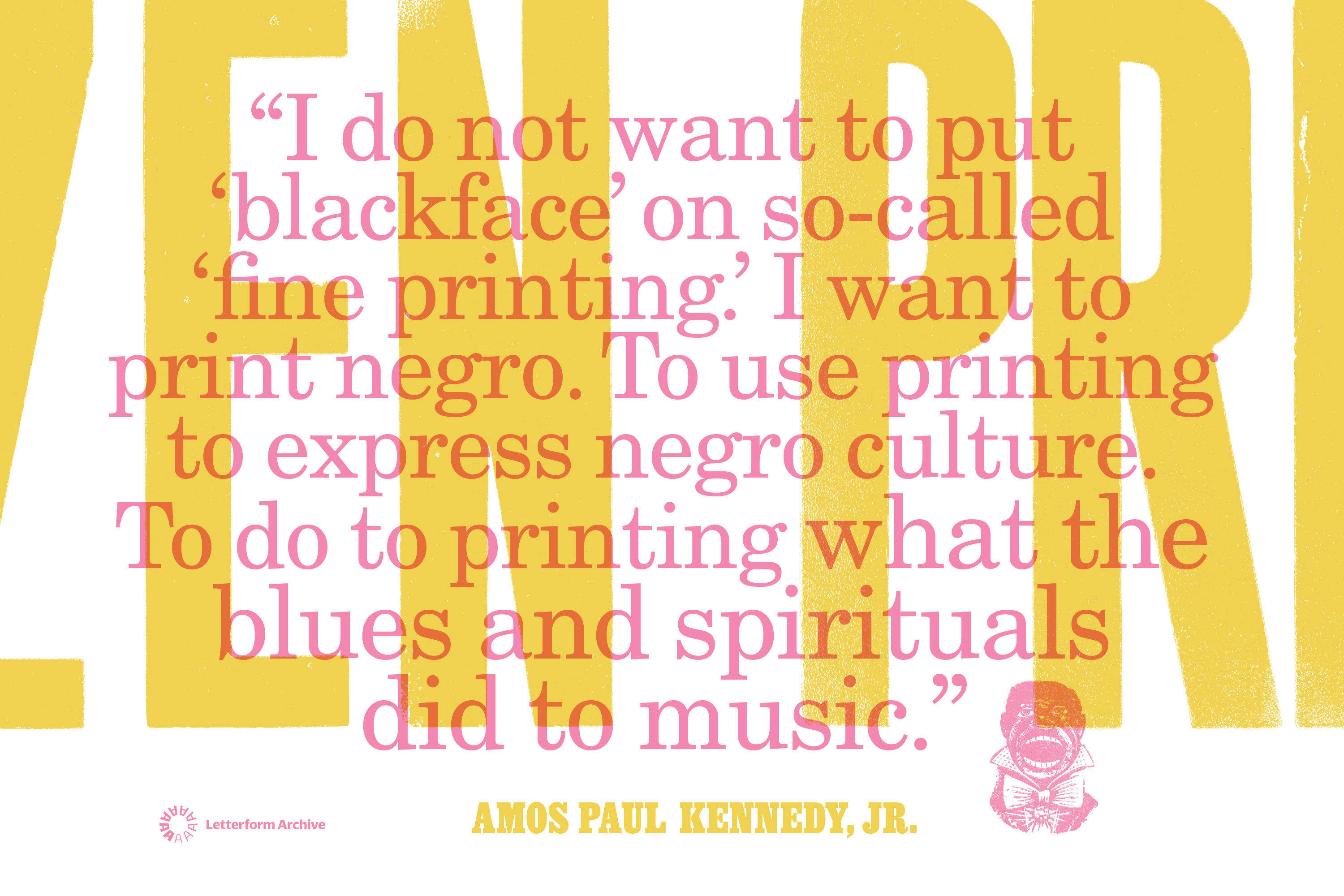
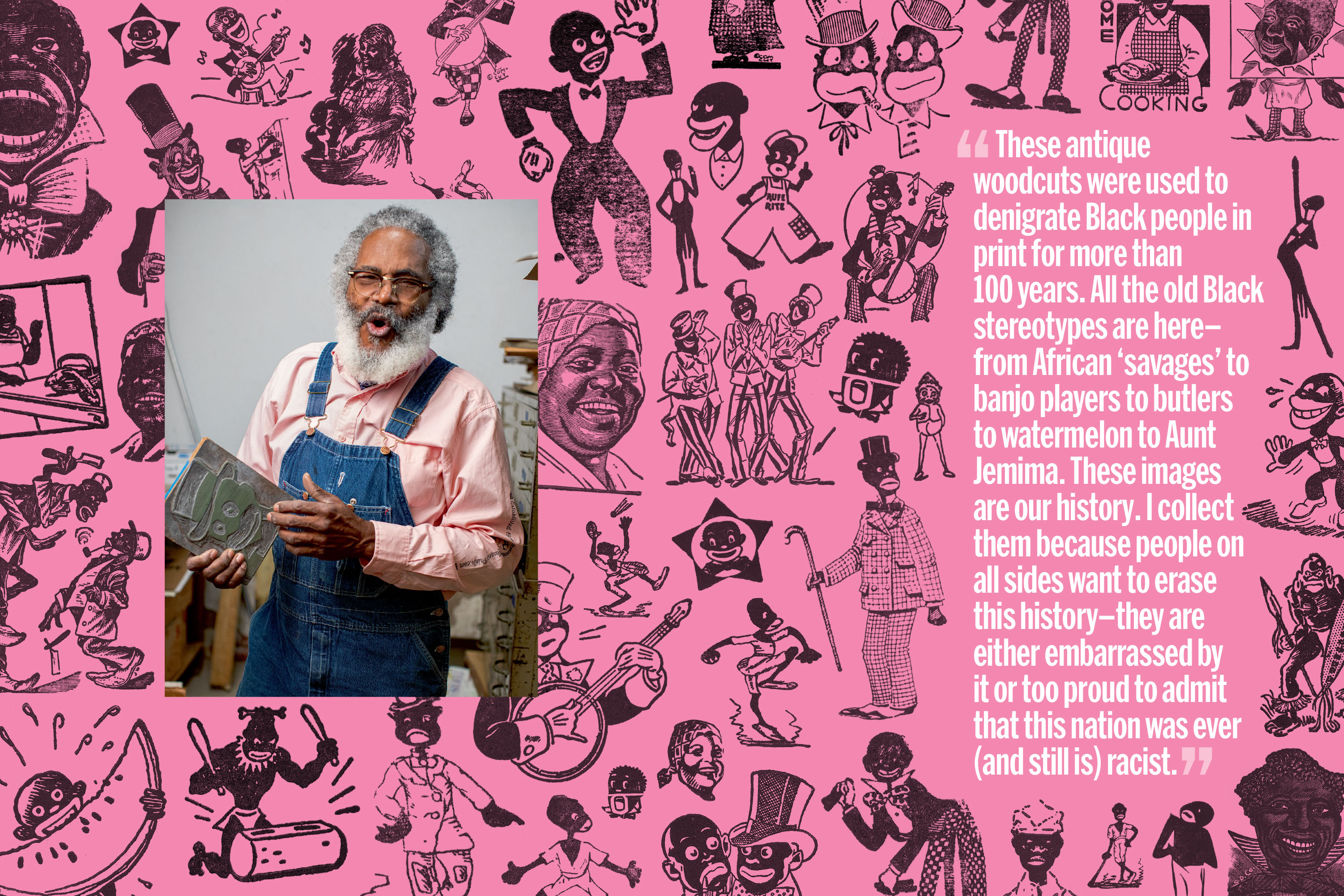
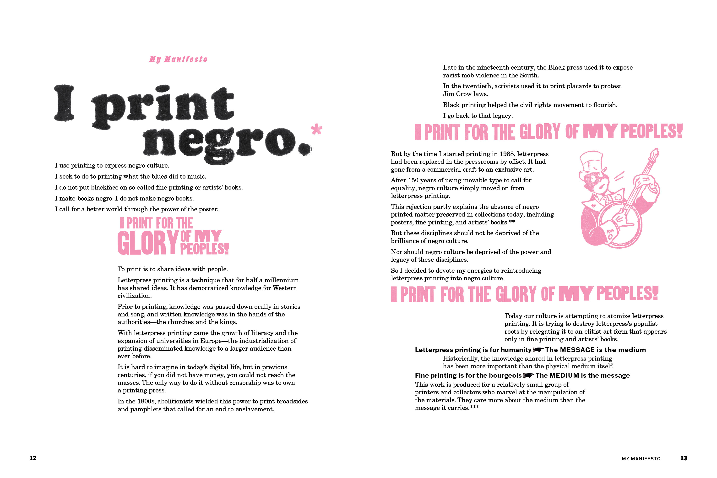
I do not want to put blackface on so-called “fine printing.” I want to print negro. To use printing to express negro culture. To do to printing what the blues and spirituals did to music.
So begins Amos Paul Kennedy, Jr.’s Citizen Printer, a compendium of works spanning the 35-year career of a storied letterpress printer and righteous maker whose practice demands justice while delivering joy.
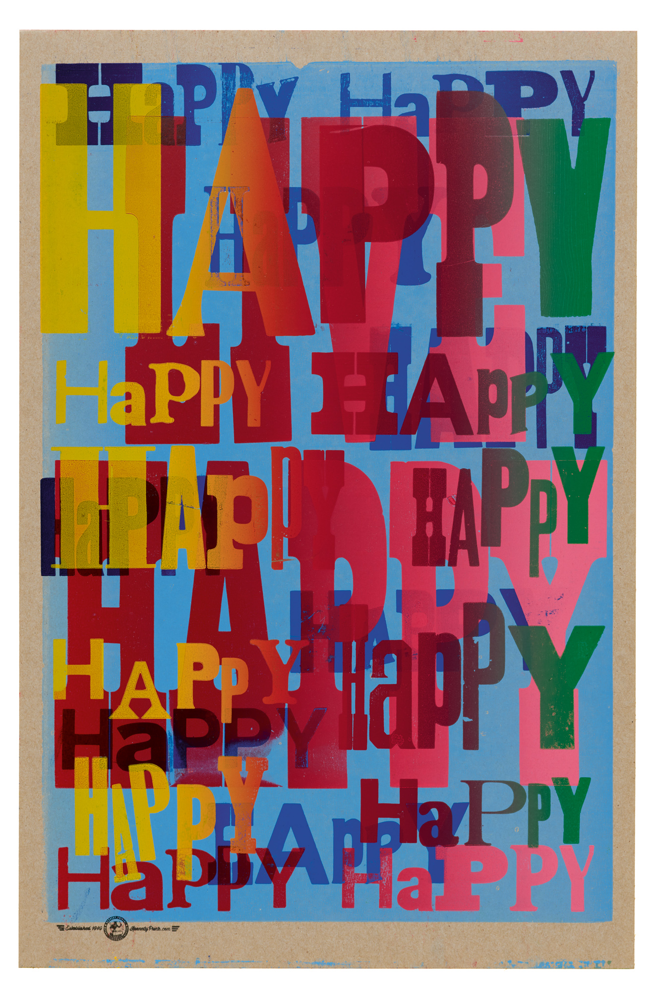
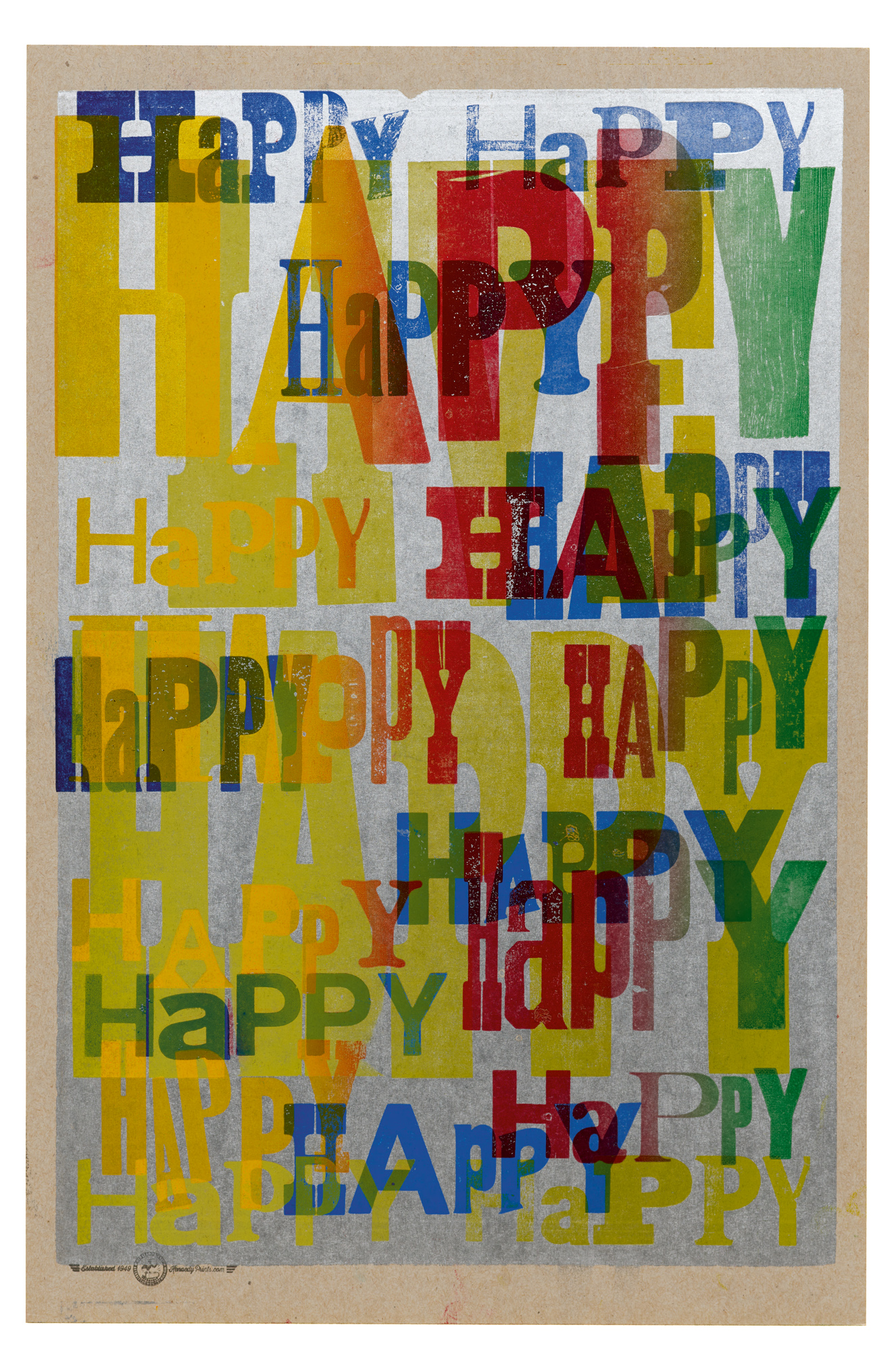
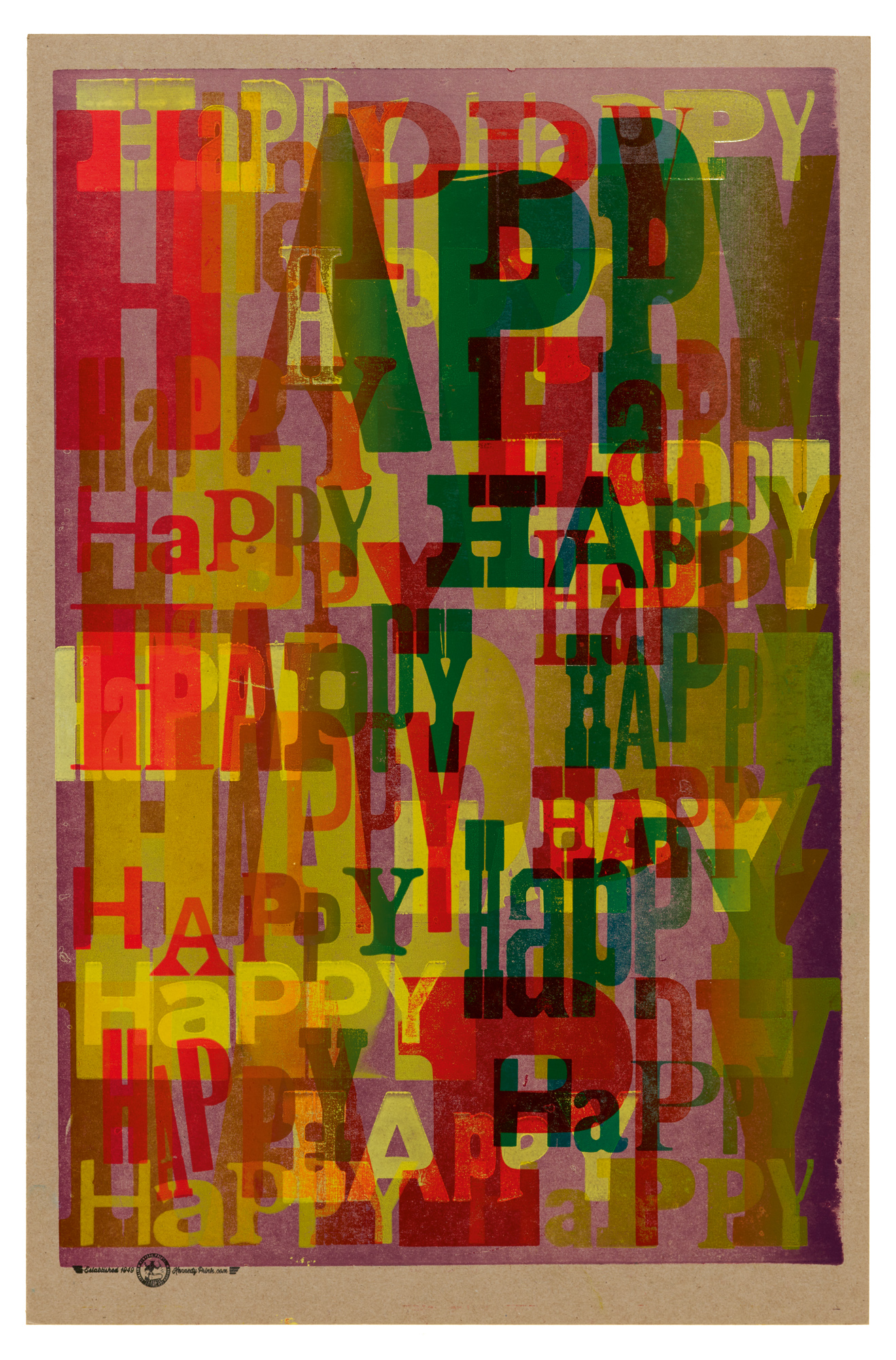
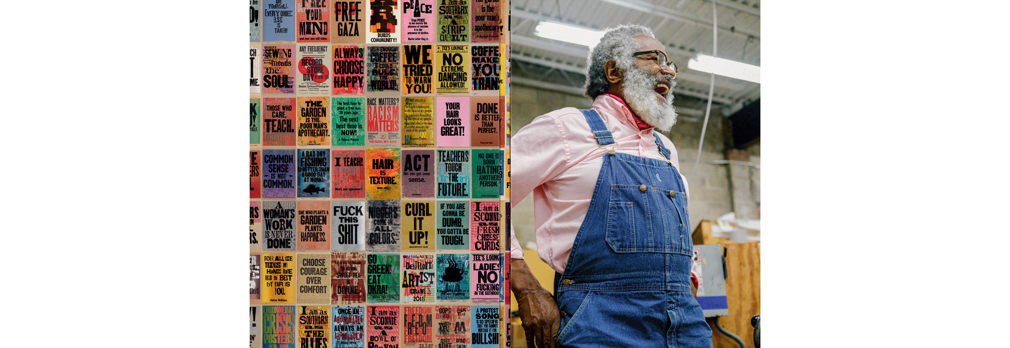
In 800 full-color reproductions, divided into chapters on social justice, shared wisdom, and community, Citizen Printer immerses readers in Kennedy’s bold and colorful output. Armed with salvaged ink and type, the self-described “humble negro printer” layers his audacious calls to action over dense typographic or geometric backgrounds. Sourced from civil rights activists across U.S. history, ranging from Frederick Douglass and Sojourner Truth to Malcolm X and Rosa Parks, Kennedy’s chosen messages revive the ongoing fight for abolition and ensure that its lessons still reverberate today.
Supported by texts from New York Times bestselling author Austin Kleon, American studies scholar Myron M. Beasley, and design educator Kelly Walters, who is also the curator of the Letterform Archive exhibition by the same name, Citizen Printer situates Kennedy’s life and work within the entwined histories of Black protest and Black printing.
Read on to learn how you can help share Amos’s story with Black students at historically Black colleges and universities.
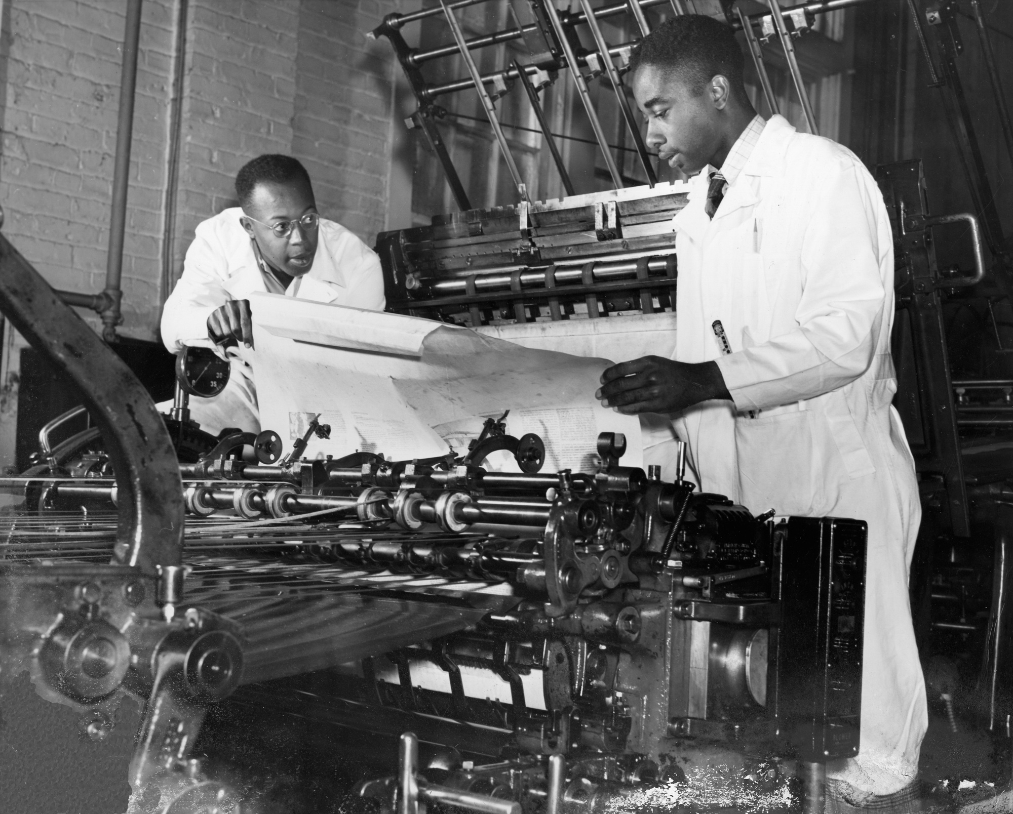
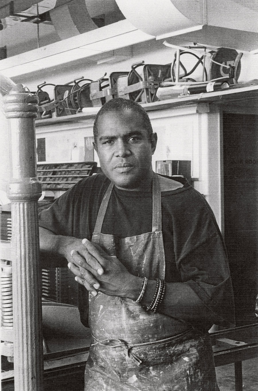
With a gorgeous and astute design from lauded creatives Gail Anderson (a 2008 AIGA medalist) and Joe Newton, as well warm and charismatic portraits of Kennedy at work by Aundre Larrow, Citizen Printer also celebrates the printmaking process of one of our most exuberant artists.
To Be Young, Gifted, and Black
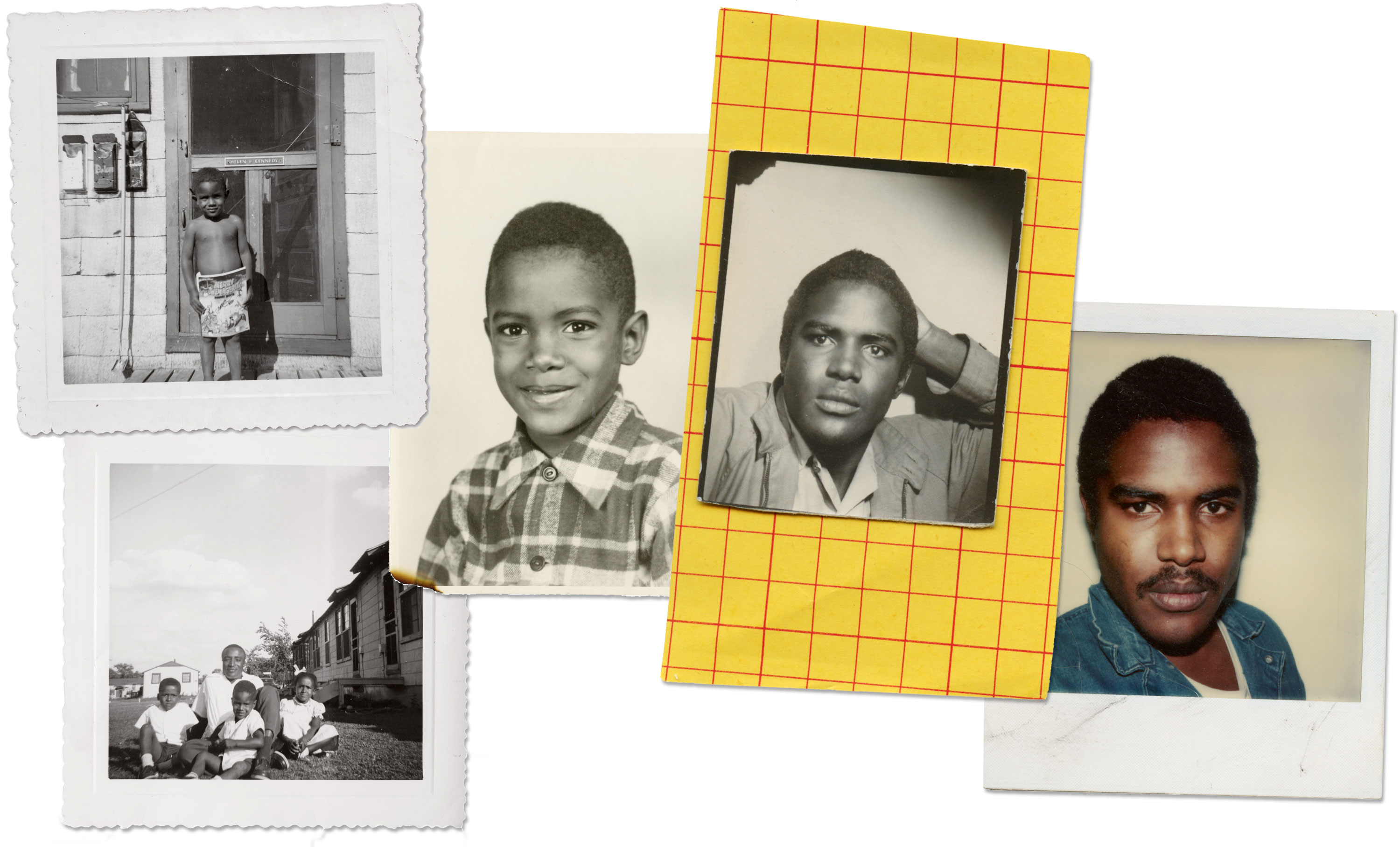
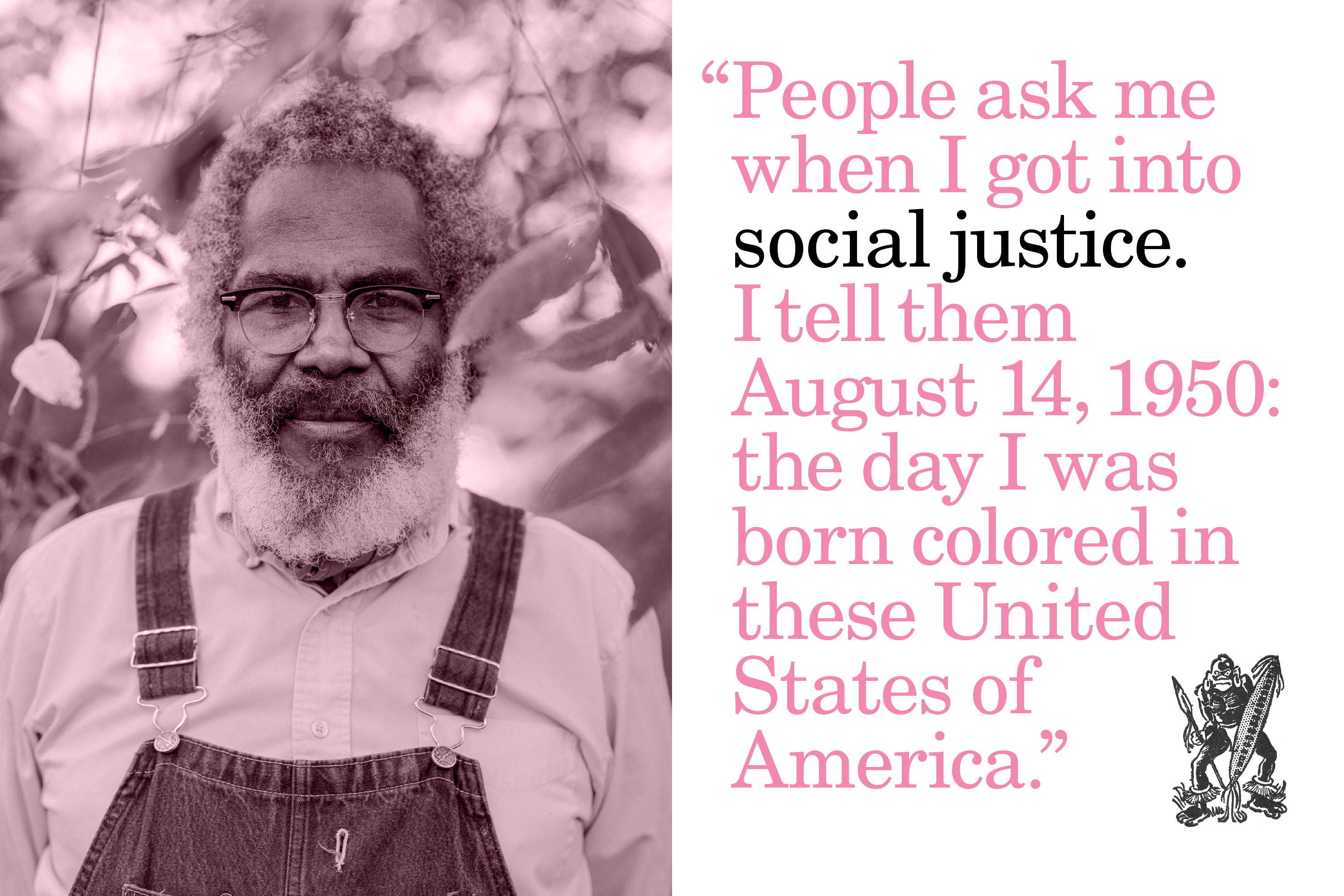
Born in Louisiana in 1950, Kennedy grew up the middle son of five children in a highly educated family, raised by two parents with doctorate degrees. He spent his formative years in the town of Grambling, home to one of more than one hundred historically Black colleges and universities (HBCUs) founded to educate African Americans in the late 1800s and early 1900s.
As detailed by Beasley in his biographical overview, Grambling provided a robust Black community for Kennedy. There, he met Black professionals like press operator Nathaniel Blake, who provided an early taste of what would become Kennedy’s lifelong preoccupation, and studied the words of civil rights thinkers like Martin Luther King, Jr., and emergent Black Arts writers like Nikki Giovanni and Amiri Baraka. In college at Grambling in the early 1970s, Kennedy also first saw The Black Panther newspaper — a foundational piece of print protest designed by Emory Douglas for the revolutionary Black Panther Party. After graduating with a degree in mathematics, he traveled to Africa, serving as a peace corps volunteer in Liberia.
Kennedy’s education prepared him for a successful middle-class life as a computer programmer, but shortly before turning forty, he witnessed a Black re-enactor printing on an eighteenth-century press during a tour of Colonial Williamsburg with his young sons. Suddenly, a new way of life opened up before him — one lived off the corporate clock, cultivating his own talent and exploring Black print culture in his own time.
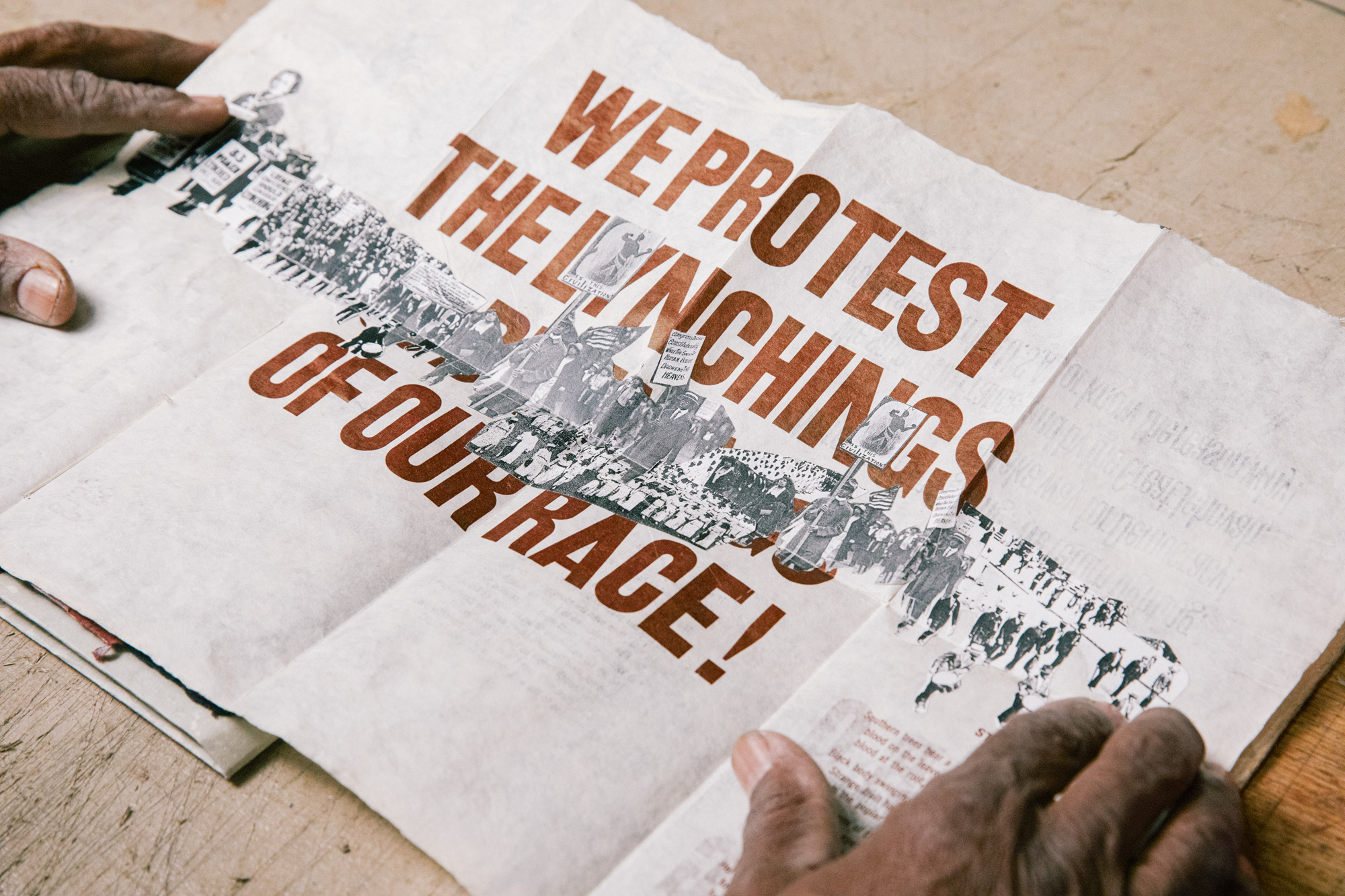
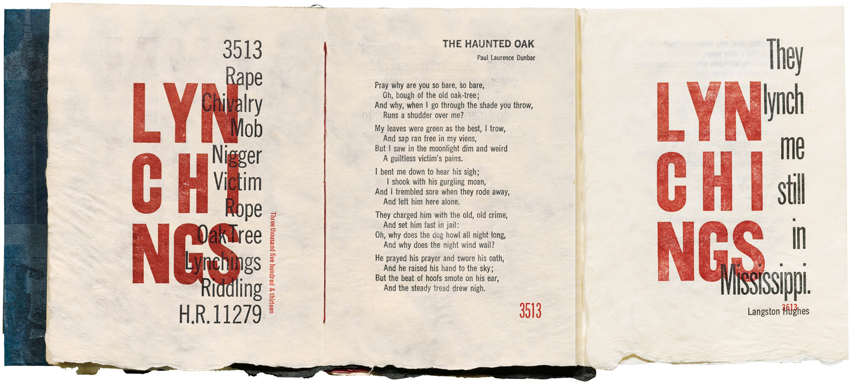
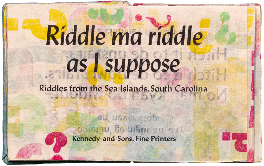
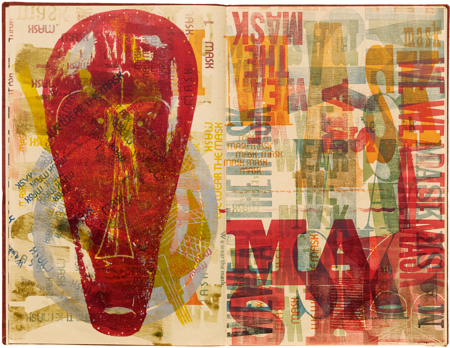
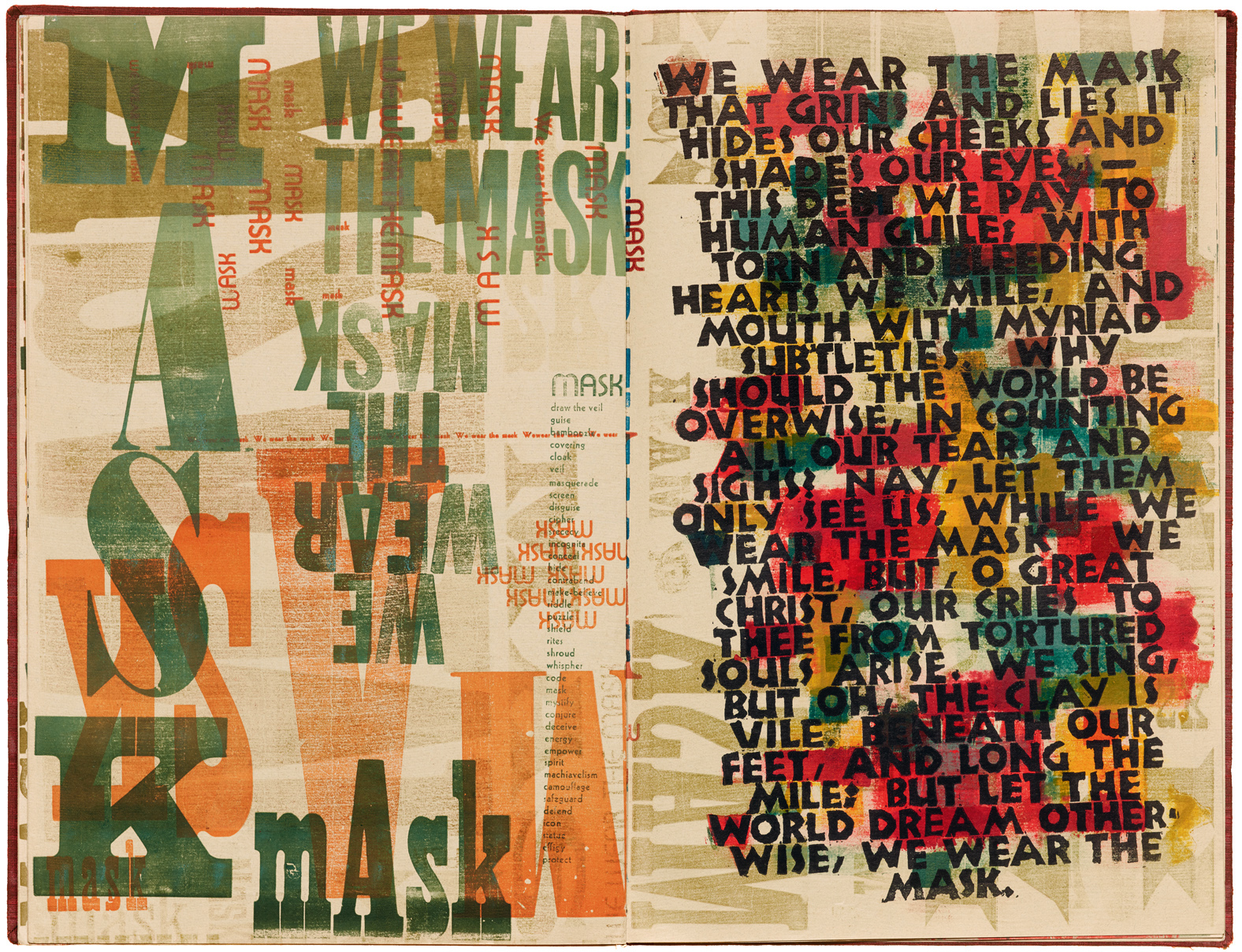
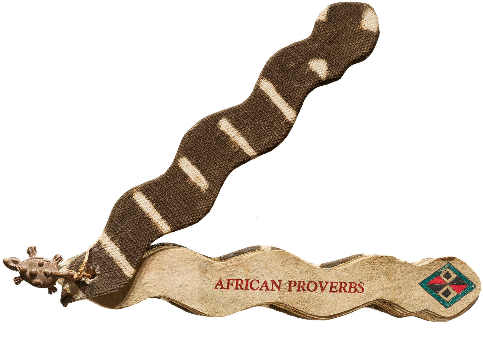
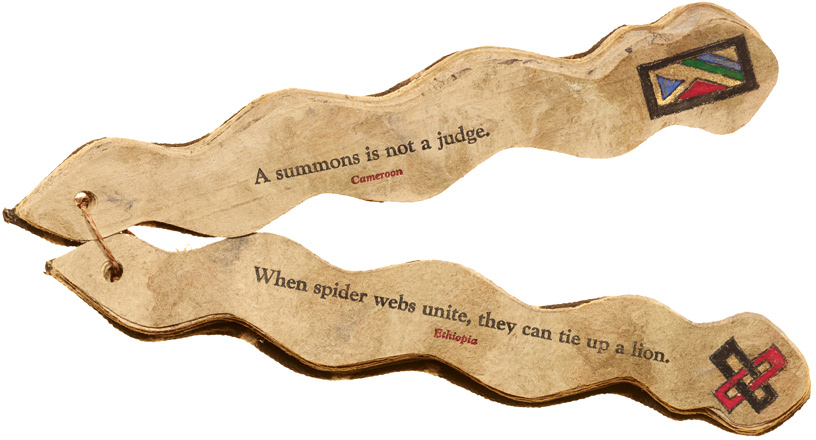
Kennedy followed his new passion to the University of Wisconsin–Madison, where he studied under book artist Walter Hamady. Shown in print for the first time in Citizen Printer, Kennedy’s early artist’s books demonstrate a deep reverence for Black authorship, both written and spoken. They include Strange Fruit (1994), a collage of lynching imagery countered by antilynching poems from Paul Laurence Dunbar and Claude McKay; Riddle Ma Riddle (1996), which preserves the playful patois of the Gullah, descendents of enslaved peoples from the islands of the southeastern seabord; Mask (2000), an oversize book printed with Masonite carvings and “We Wear the Mask,” again by Dunbar; and African Proverbs (1996), a snake-shaped book featuring communal wisdom from various African kingdoms, bound in traditional mudcloth.
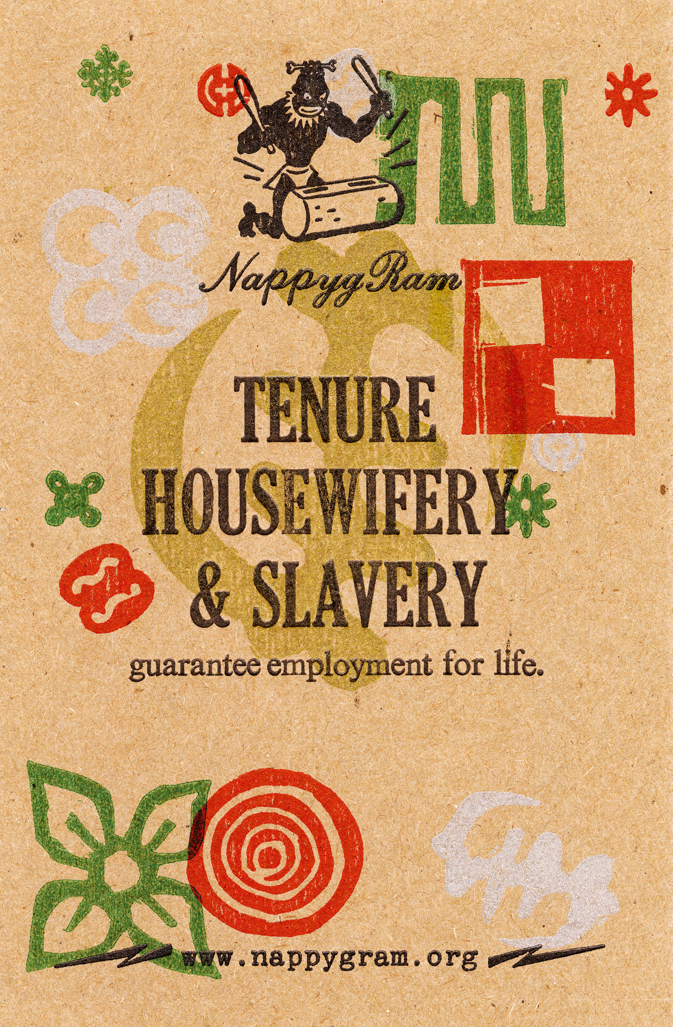
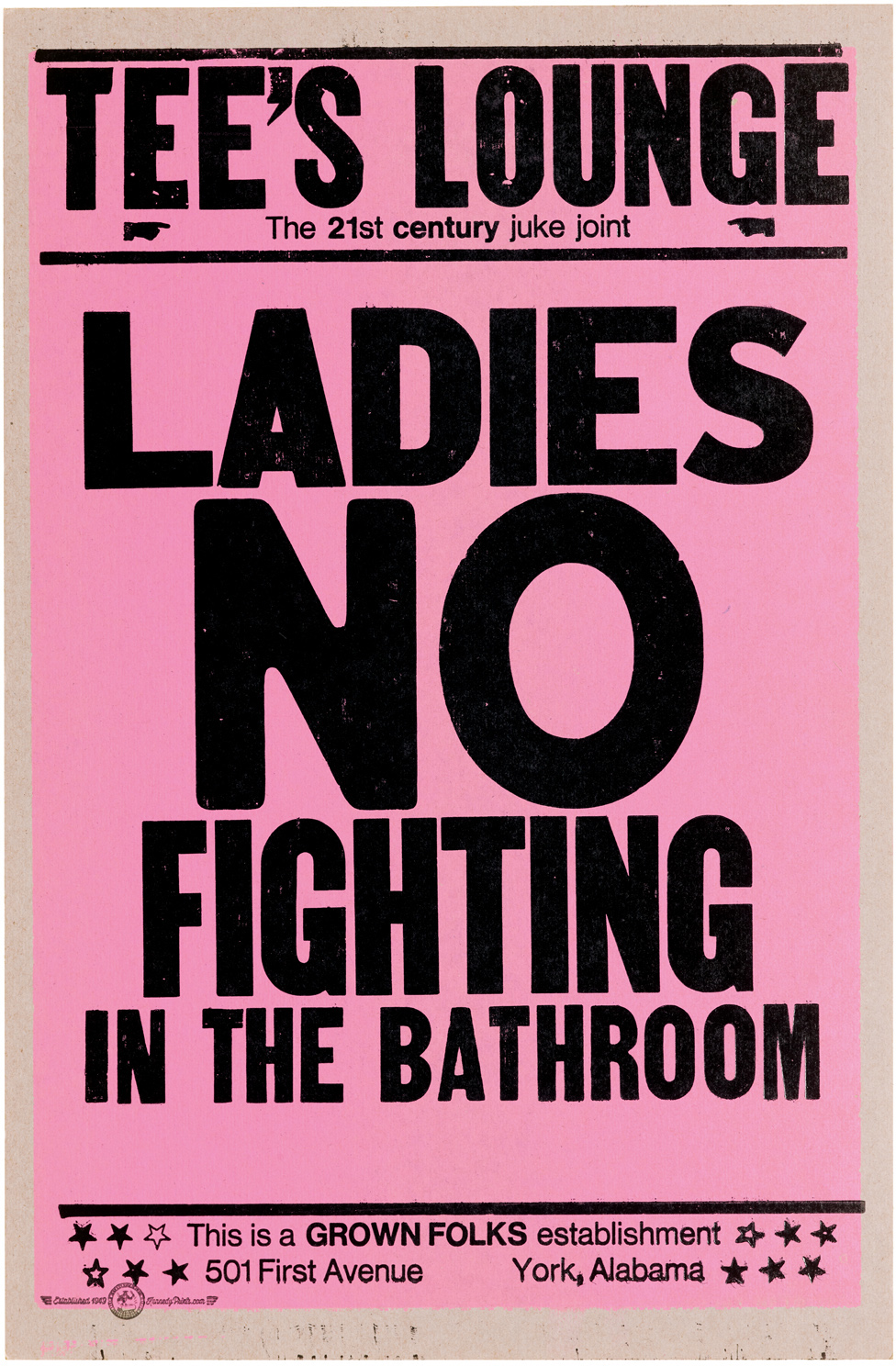
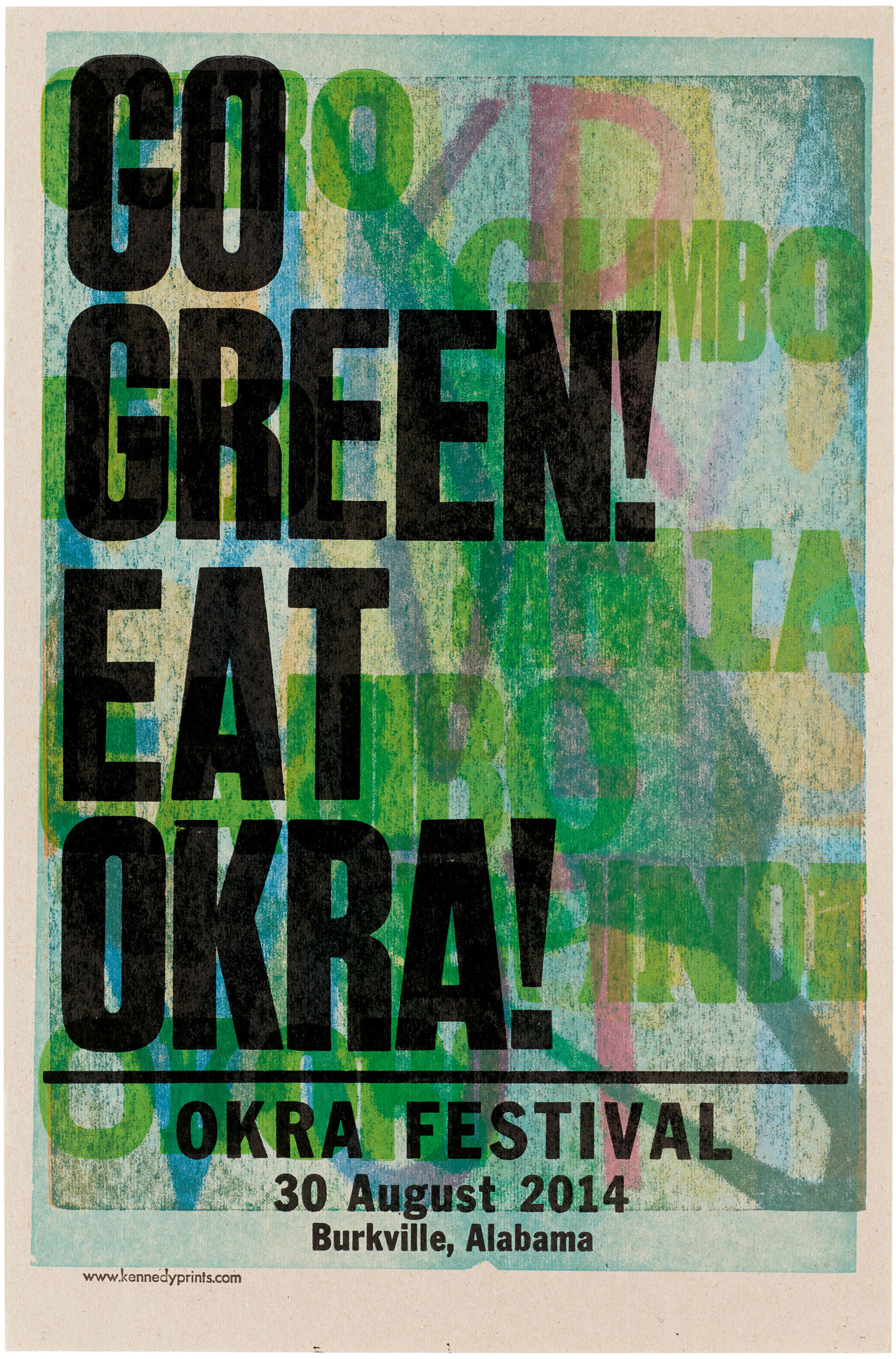
After a brief stint as the first Black tenure-track professor in the art department at Indiana University, where he gained notoriety for his Nappygrams, a series of postcards decrying the racism he experienced in academia, Kennedy took up refuge in an artist residency in Alabama in 2002. There, he discovered the power of the poster while printing promotional pieces for community spaces and events, such as his infamous public service announcement Ladies, No Fighting in the Bathroom (2003), created for juke joint Tee’s Lounge, and prints for the annual Okra Festival (2006–2015).
Kennedy became enthralled by the poster’s immediacy and the possibility of efficiently printing and disseminating so many multiples to the masses. He was inspired by its connections to Black culture, spanning from the abolitionist broadsides of the eighteenth and nineteenth centuries to the oversize R&B concert advertisements that he saw as a young man in the twentieth, as expertly covered by Kelly Walters in her essay on Kennedy and the legacy of Black printing. He embraced the poster as his newly chosen medium, proudly declaring that it allows him to “put the message in the hands of the people and move on.”
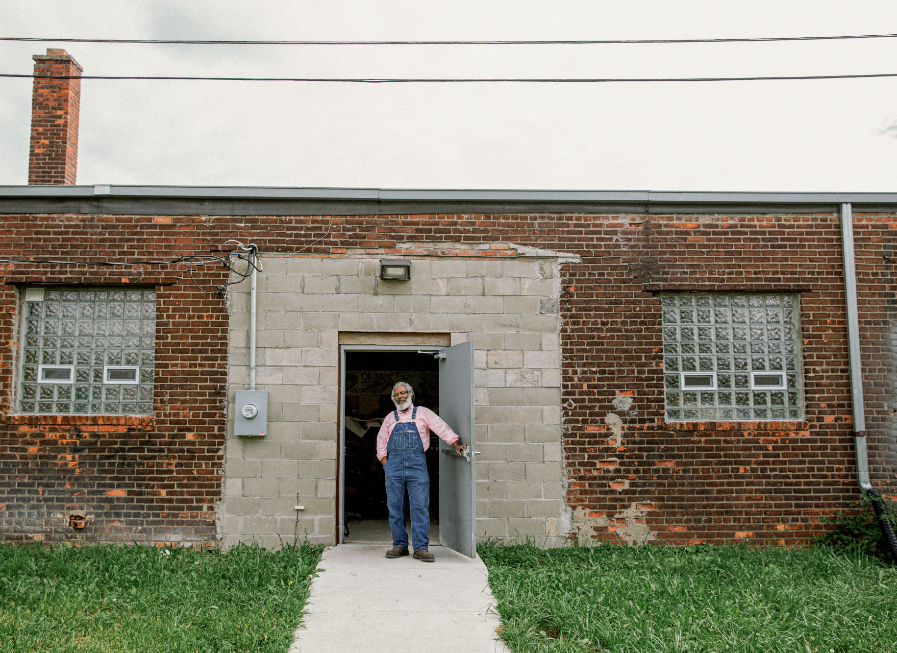
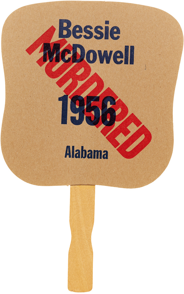
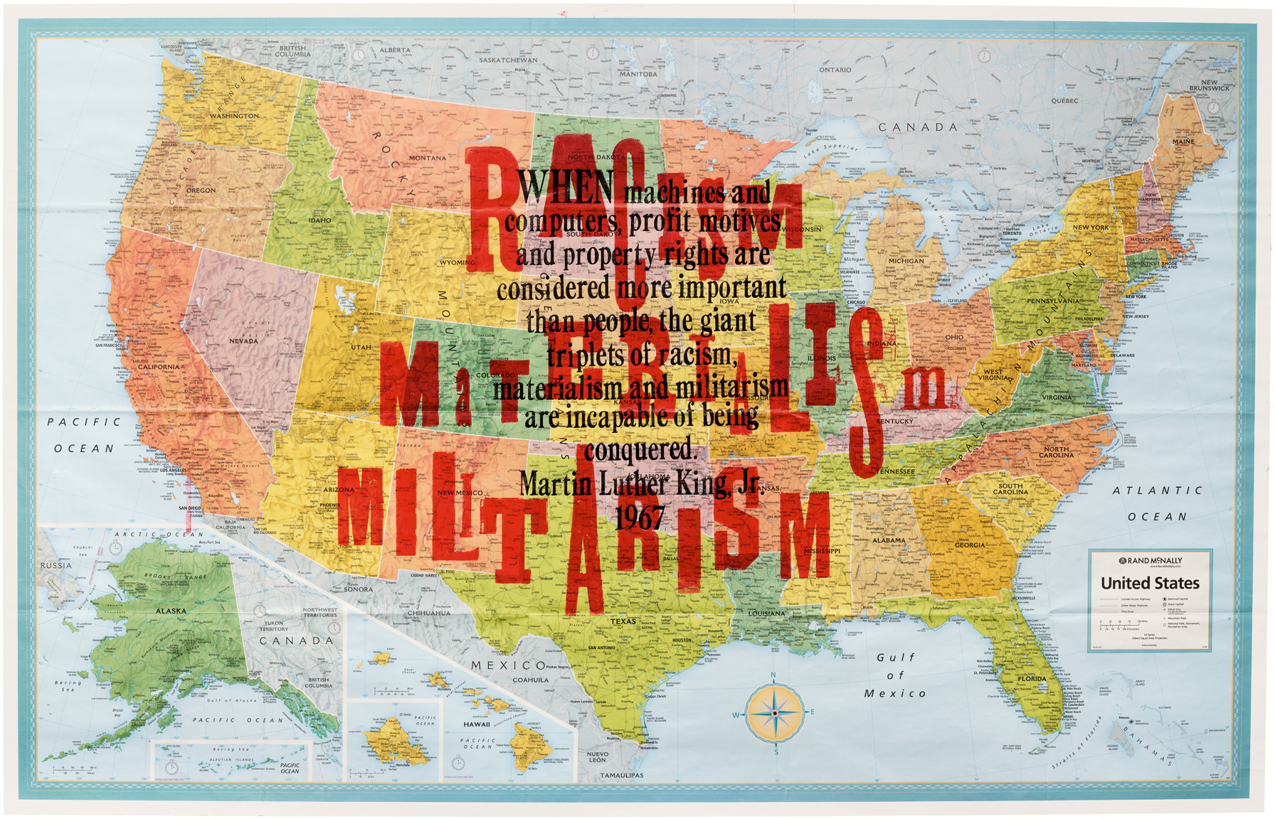
After a decade in Alabama, he moved to Detroit in 2012, where he set up shop in what he calls the Pile of Bricks. There, he continues to print posters and handbills with political messaging from civil rights icons, young and old, and words of wisdom from everyday folk, and experiments with printing on maps, fans, and flags.
A Tribute in Print
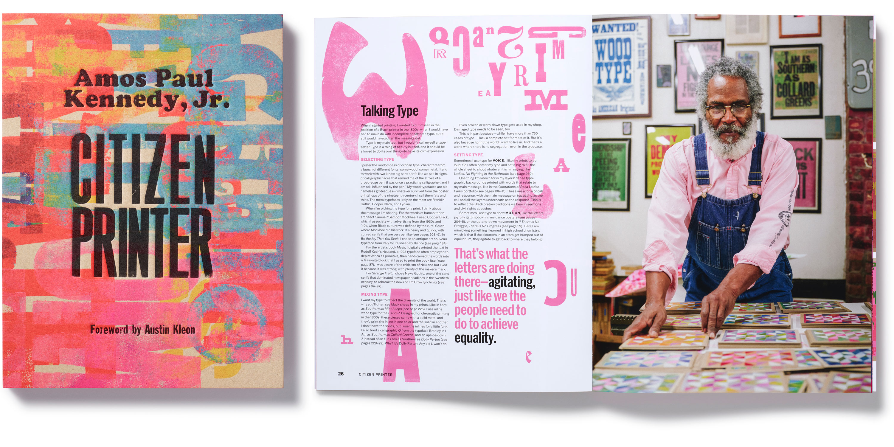
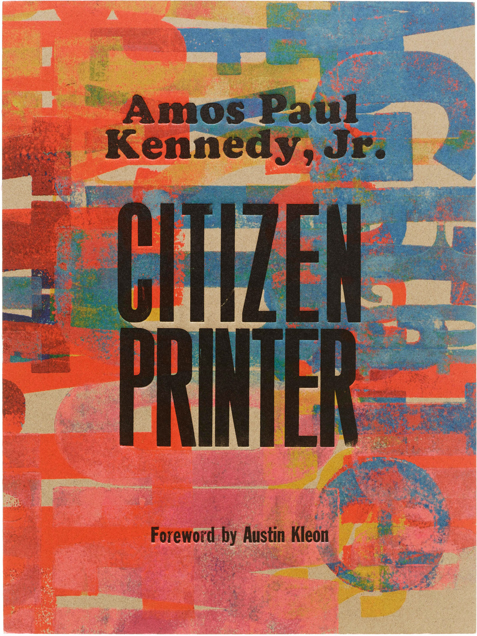
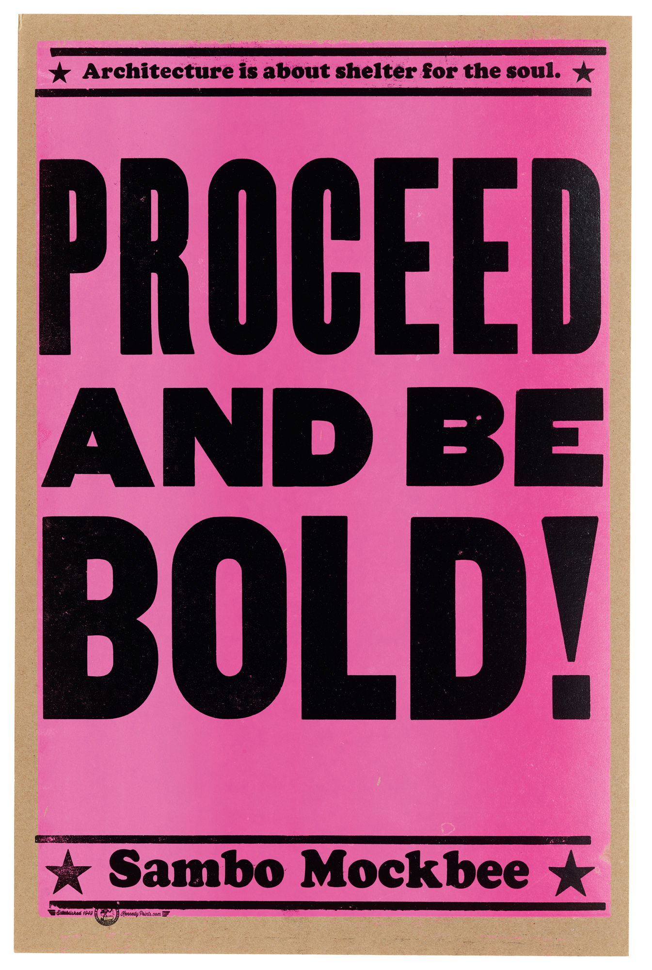
While developing Citizen Printer, a key goal was to evoke the materiality of Kennedy’s letterpress prints but adapted for mass-manufacturing processes. Working closely with Kennedy, the Letterform Archive team and the book’s designers, Gail Anderson and Joe Newton, selected a trim size of 9 by 12 inches and, for the cover, opted for exposed boards set flush with the edges of the book block. A lightweight kraft board adhered to the case mimics chipboard, Kennedy’s substrate of choice, while the exposed spine gives readers a glimpse of the book’s signatures and binding.
While it wasn’t practical to print a trade book cover using letterpress technology, the team wanted the cover to feel authentic, reflecting Kennedy’s printing process and reminding fans of his trademark typographic layers. For simplicity’s sake, Kennedy printed each text component individually before they were digitally combined into the final cover art. Using wood type, he first locked up the book title in all caps — stacked and justified — on his Vandercook press, and then set his author attribution in Cooper Black and that of foreword contributor Austin Kleon in condensed Franklin Gothic.
For the heavily inked and loud background, he selected resonant words from the book’s interior — justice, agitate, negro, civil disobedience, liberation, wisdom, community, emancipation — and printed them in different typefaces and colors on white Hahnemühle paper to faithfully capture the mix of their overprinted hues.
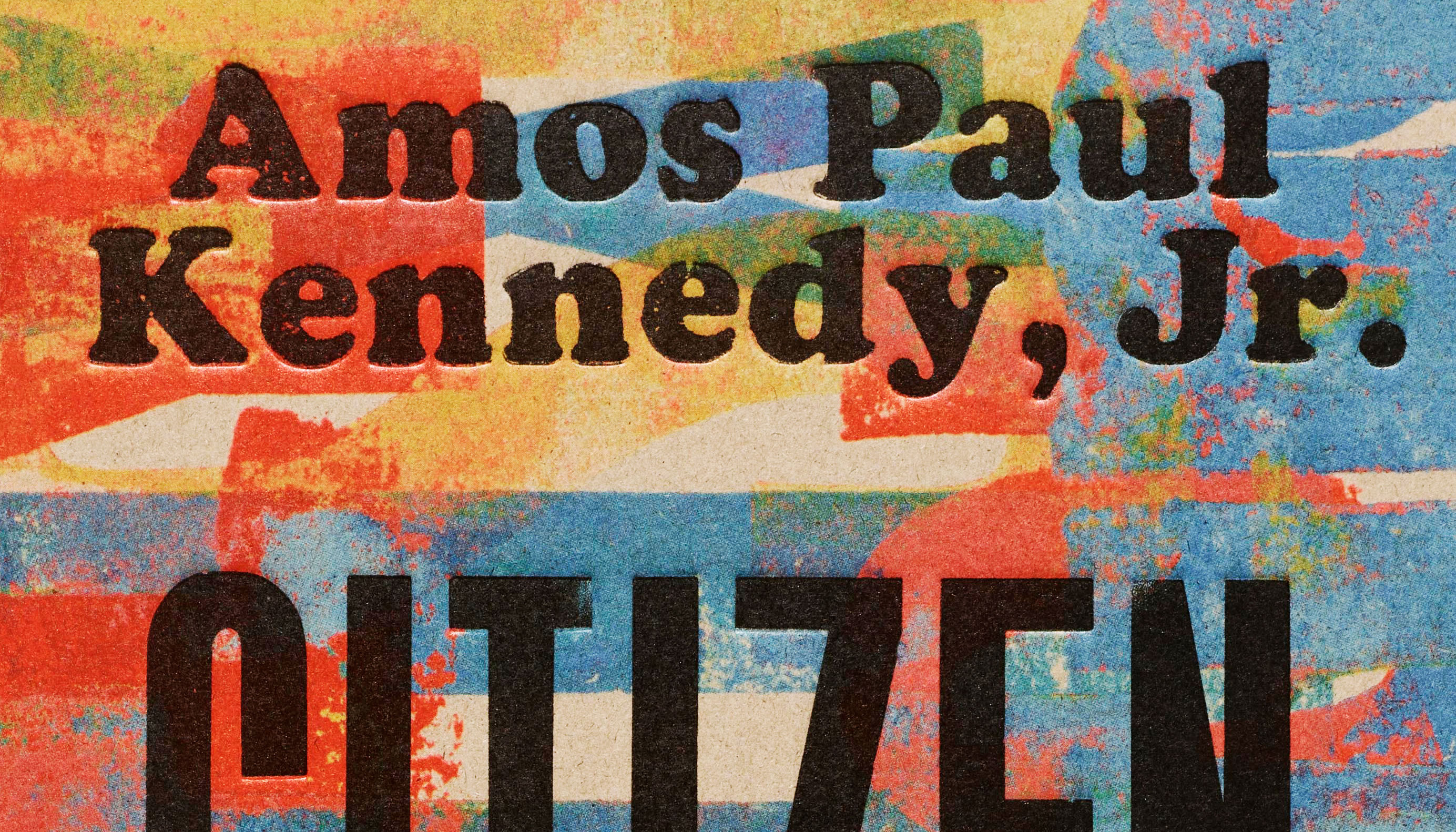
To preserve this vibrancy against the humble and earthy paper of the cover (which reminds Kennedy of the soil of the Southern states where he grew up), designers Anderson and Newton suggested swapping out the magenta color used in the four-color printing process with a neon equivalent. A deep deboss stamped with an inky black re-creates the indent of letterpress and shares the tactile imperfections of Kennedy’s beloved antique type — its chips, dings, and worn edges.
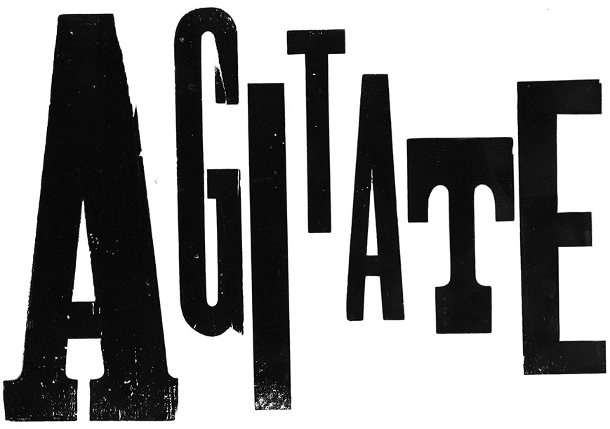
The cover isn’t the only original artwork Kennedy created for Citizen Printer. Using an eclectic mix of typefaces, he printed keywords from his maker’s manifesto — such as “agitate, agitate, agitate” (his personal motto — and email signature!) and the manifesto’s refrain, “I print for the glory of my peoples!”. He also inked his personal collection of nineteenth-century racist woodcuts so readers could experience their troubling but essential history.
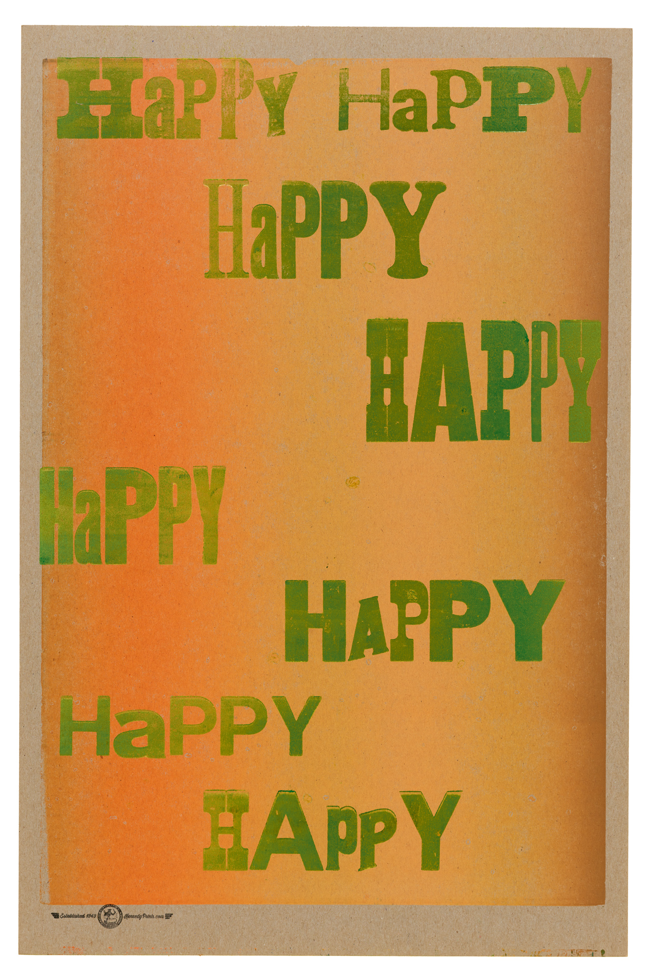
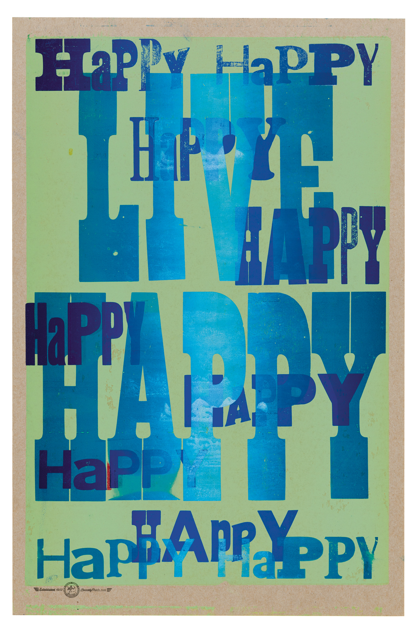
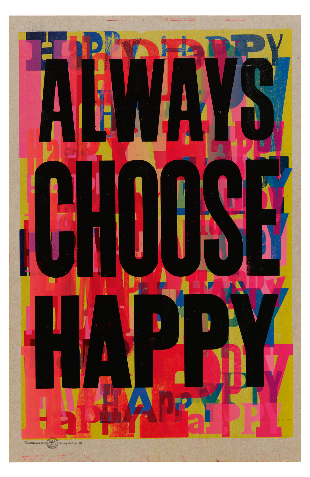
In a section titled “Lessons from the School of Bad Printing” in which he outlines his intentionally imperfectionist methods, Kennedy includes an ambitious series called Always Choose Happy. It consists of 100+ prints that show how he builds his typographic layers, deliberately varying ink colors across an edition in order to randomize the results. No two prints look alike.
As an accent color for the book’s interiors, Anderson and Newton quickly homed in on the pink shirt that Kennedy wears every day, always under denim overalls. This pink wraps around the book’s fore edge and is used to set quotations from Kennedy inside its pages, casting his strong voice in a surprisingly soft hue that rightly complicates our preconceptions about power.
As for the book’s type, Anderson and Newton took Kennedy’s preferences to heart, choosing honest and humble typefaces developed to be “loud and legible for the masses,” like Century Schoolbook and Franklin Gothic. For extra style, they opted for Nick Sherman’s HEX Franklin, a 2022 tribute to Morris Fuller Benton’s 1902 sans serif, which allows for tight spacing and other adjustments that provide character and voice.
Kennedy’s generous spirit and characteristic humor are also on full display in Aundre Larrow’s original portraits for Citizen Printer. One of these lifts to open a double gatefold, revealing hundreds of thumbnail images of Kennedy’s work arranged in an epic grid, fastidiously assembled by Joe Newton. It is a testament to Kennedy’s stunning prolificacy.
Designers Anderson and Newton traveled to Kennedy’s studio in Detroit, printing together and going through flat files of oversize posters and bins of posters and handbills. They also selected from stacks of preprinted backgrounds, created by Kennedy using hand-carved Linocut blocks, which they ultimately used as the book’s endpapers and chapter openers.
Of the collaboration, the two shared:
Working with Amos was an absolute joy. He is exactly who he appears to be in Audre Larrow’s photographs: ebullient and playful but also profoundly concerned with the state of the world. Experiencing—not just visiting—Amos’s “pile of bricks” made me wish we were neighbors. I’d be there every day, scheming, printing, and learning from Amos, one of the most interesting and kindest people I’ve ever met. — Gail Anderson
Amos’ relentless, joyful mischief was so infectious. After visiting his studio and soaking in his prolific output (and personal energy), we decided to include as much as possible: “More is more.” But to keep the book typography from competing with that super-abundance, we wanted simple, bold typefaces that wouldn’t steal the show (including an Amos favorite: Franklin Gothic).
Amos often quotes other people, and we felt his monograph should feature his work AND his voice. We employed large-scale type to give his quotes equal standing with the rest of the statements in the book. — Joe Newton
An Ask from Amos
In Kennedy’s acknowledgments at the end of the book, after nearly 300 pages of anger and joy, humor and wisdom, practice and play, he briefly meditates on the book’s title, remarking that “a citizen is an individual who uses their talent for the community” and entreating you, the reader, to “go find your talent and use it as a citizen would.”
For Kennedy, finding his citizen talent — printing — began in his youth, with the formative time he spent at the historically Black Grambling State University. As a thank-you to the network of HBCUs who have supported Black education for more than a hundred years, and as a means of helping Black students discover their own talent to use as citizens, it is Kennedy’s sincere wish that every HBCU have a copy of Citizen Printer.
To help realize this dream, we aim to get Citizen Printer into the libraries of each of the U.S. Department of Education’s 100+ HBCUs. You can help us make that a reality by purchasing a copy of Citizen Printer at a 20 percent discount, plus free shipping, in our webshop today. Either add the discounted item to your cart, or click on “Donate a copy of Citizen Printer to an HBCU” when you buy your copy, and we will take care of the rest.
— Lucie Parker, Publisher, Letterform Archive Books