News
Inside Emigre Fonts, Type Specimens, 1986–2024
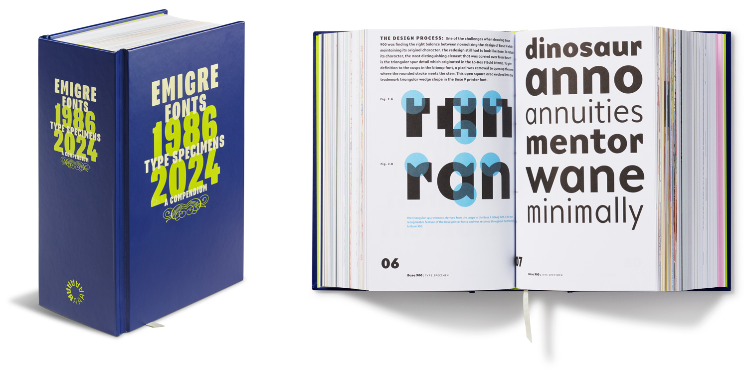
With 40 complete type specimens packed into 5 pounds, this compendium documents the output of one of the earliest (and most prolific) digital type foundries. Here’s a peek at the book’s foreword.
When Rudy VanderLans and Zuzana Licko donated the Emigre papers to Letterform Archive not long after we opened our doors in 2015, we were spoiled for all collections to follow.
It wasn’t just that their archive was rich with material that defined an important era in design—one in which the new digital tools of the 1980s and ’90s created a surge in independent publishing and type design, with VanderLans and Licko’s innovative Emigre magazine and digital foundry at the forefront.
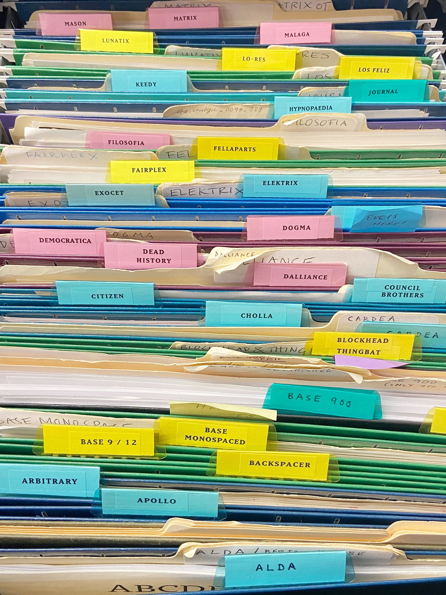
We were also spoiled in that their archive was unusually well organized. Bluelines and process work for the magazine, edited and designed by VanderLans, had been systematically preserved, while Licko’s folders for font projects—either her own designs or those she collaborated on with others—were sorted by typeface name, with descriptive lists, instructive notes, and correspondence all thoroughly documented and neatly grouped together. Their carefully assembled archive remains more or less organized in our stacks the way it was when it first arrived, as it speaks volumes about a pair of designers who are fairly methodical in the way they think and work.
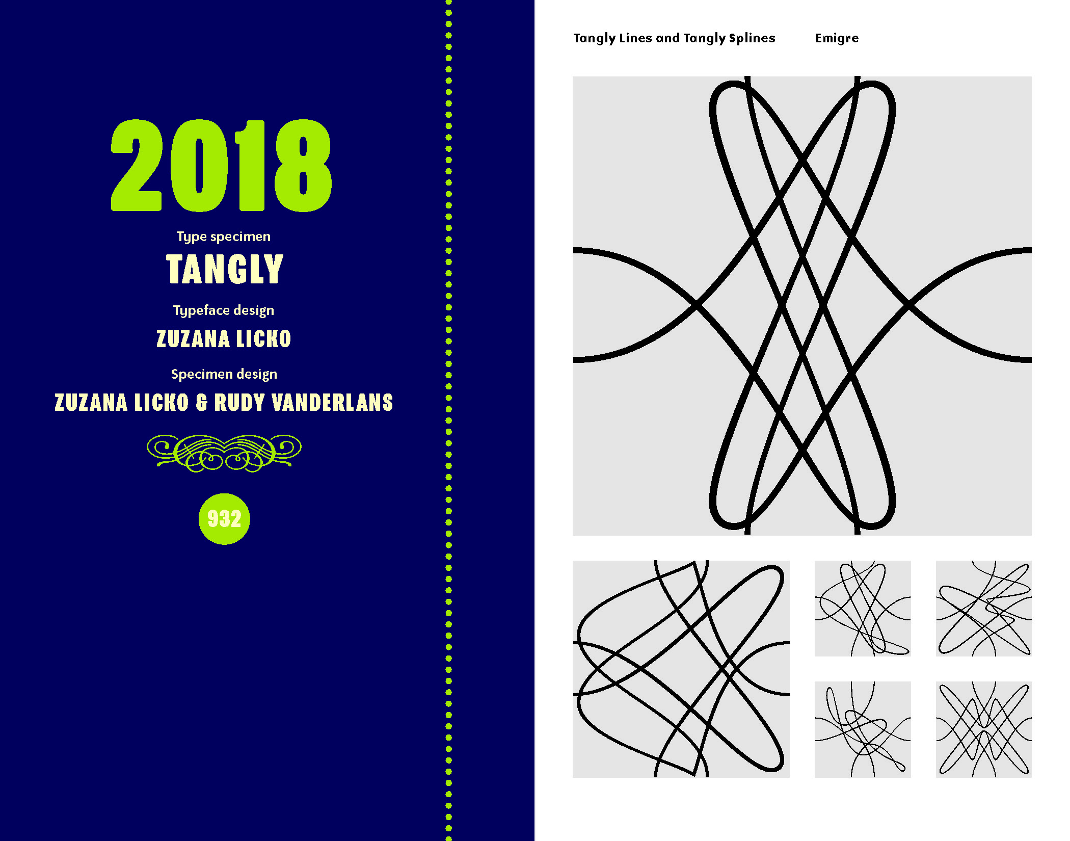
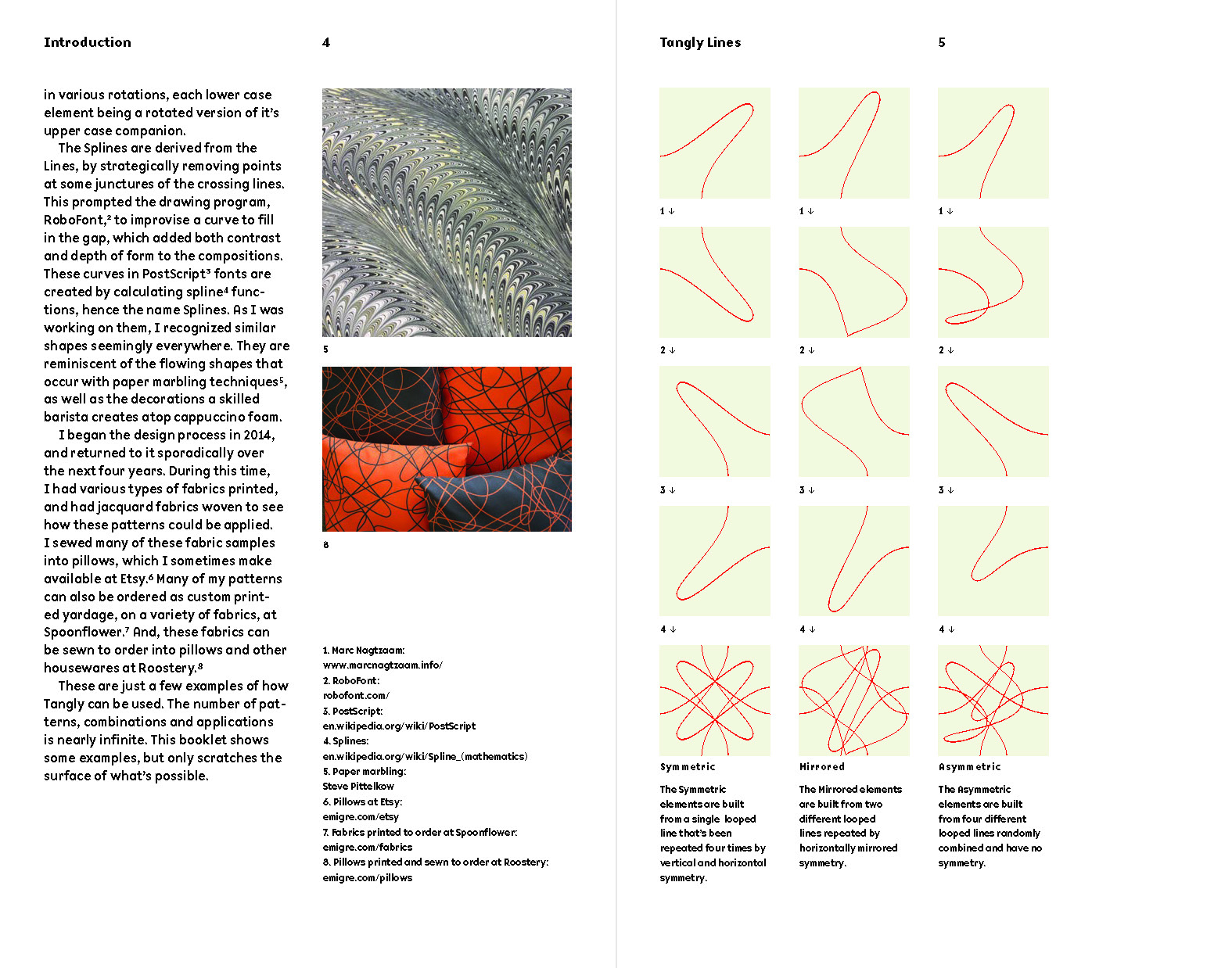
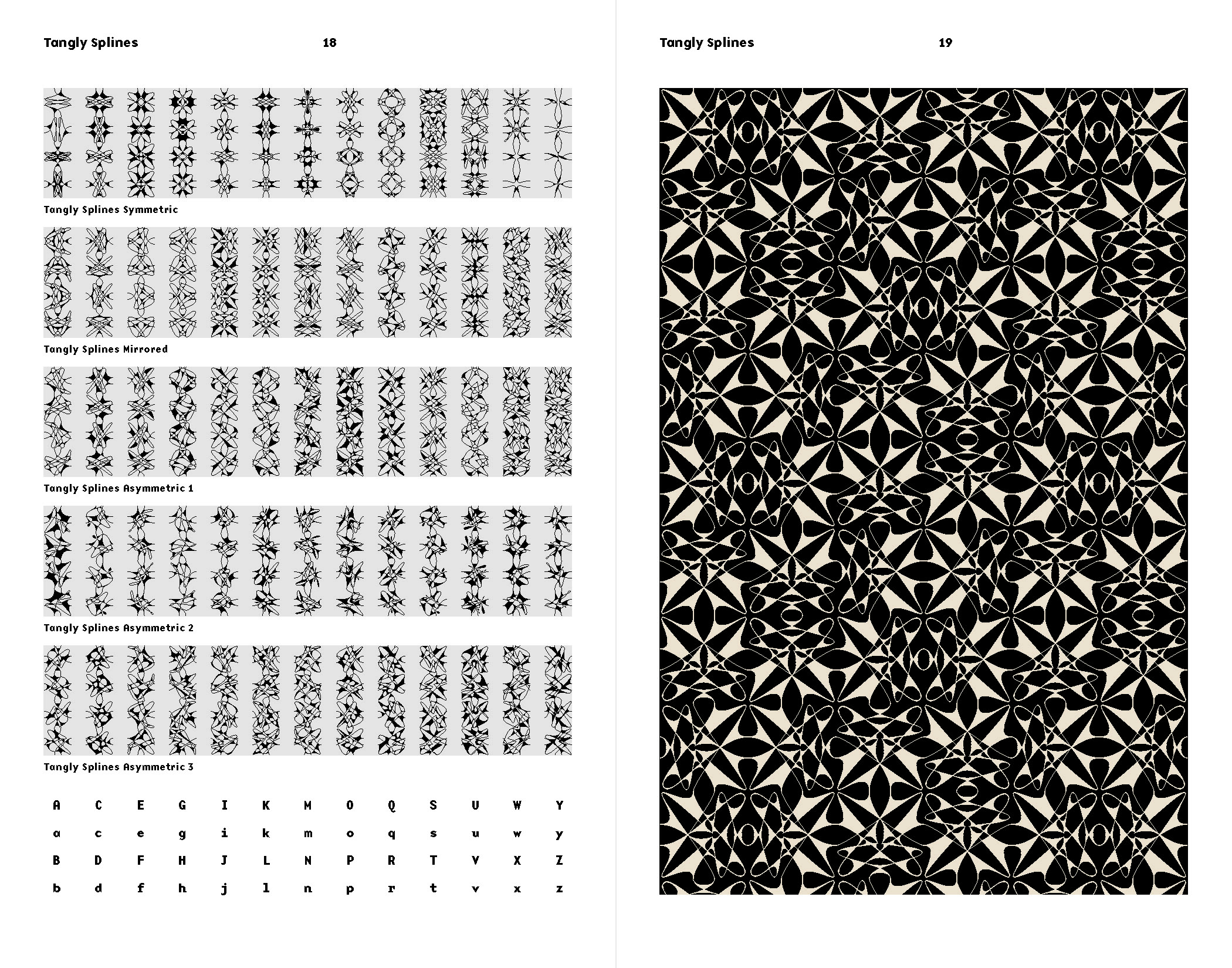
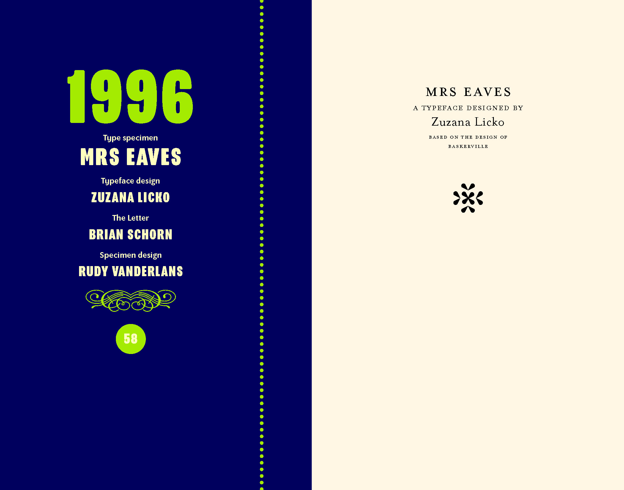
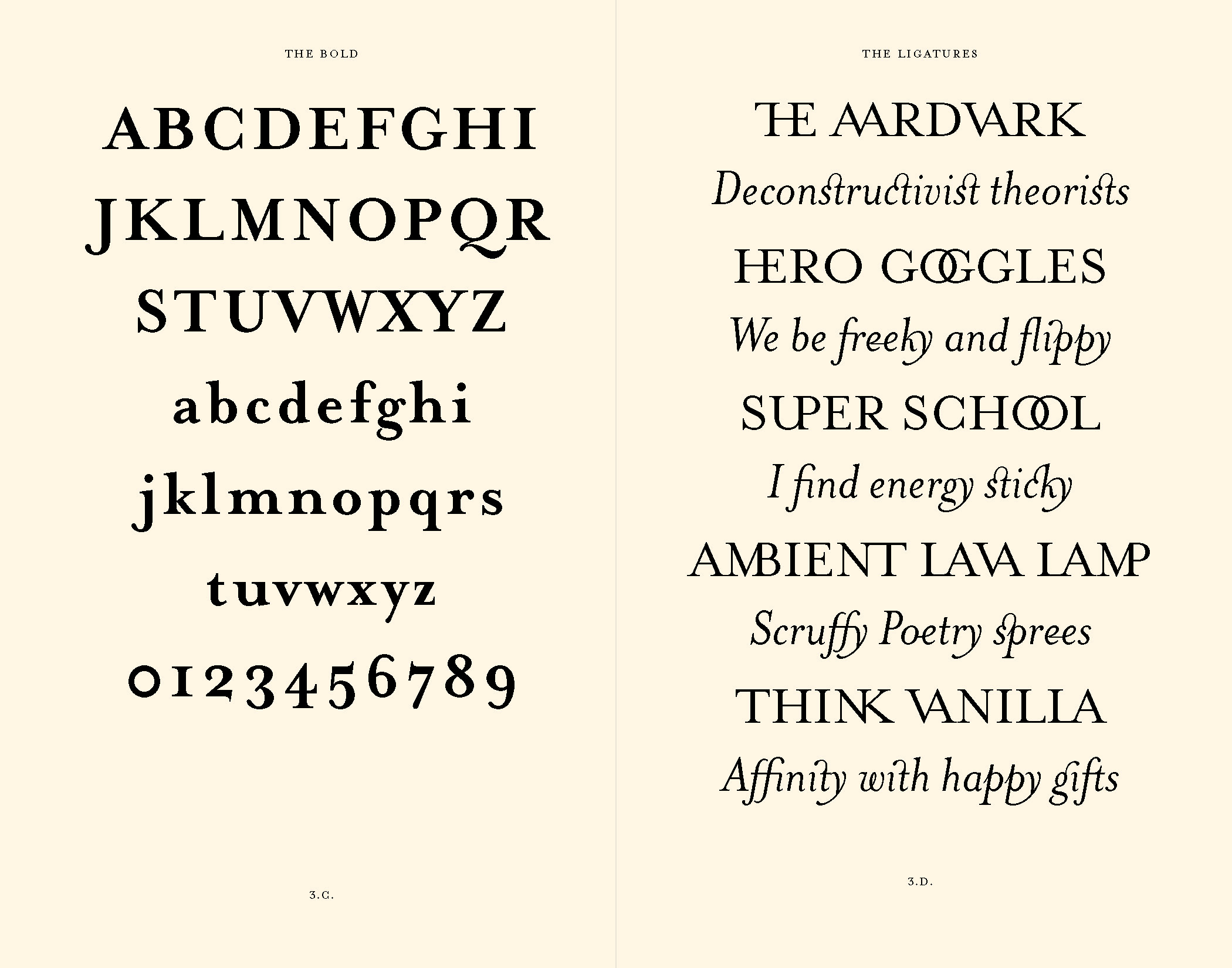
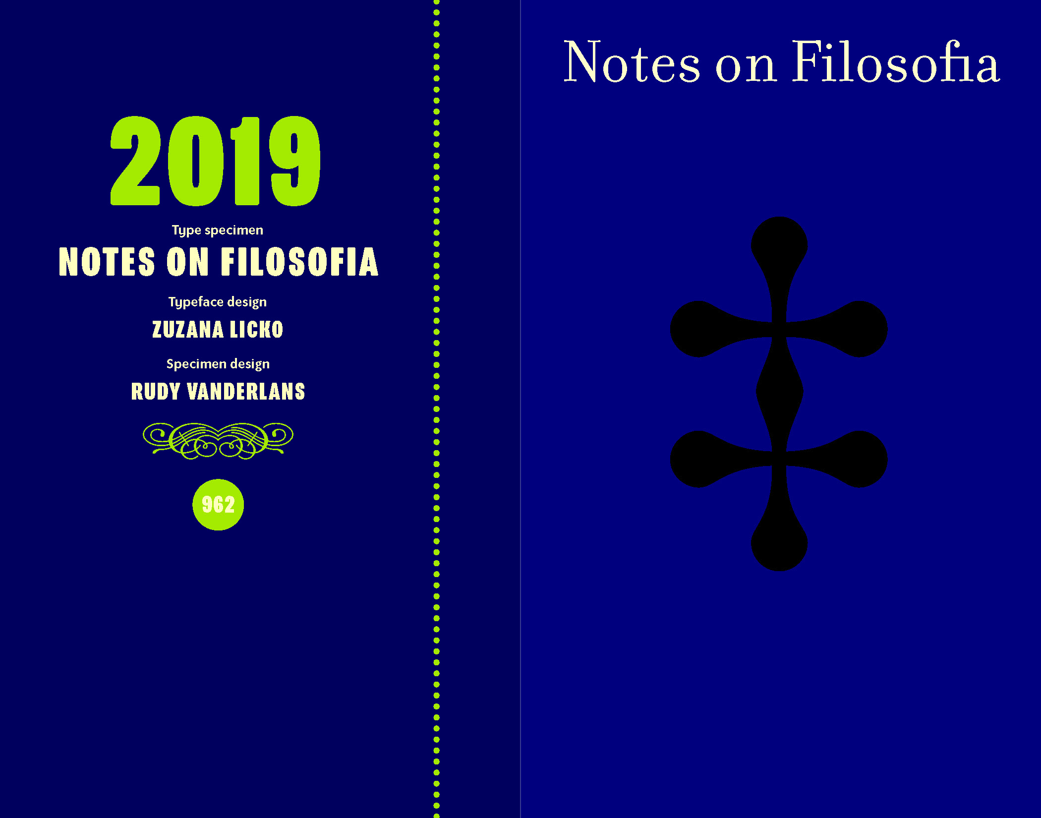
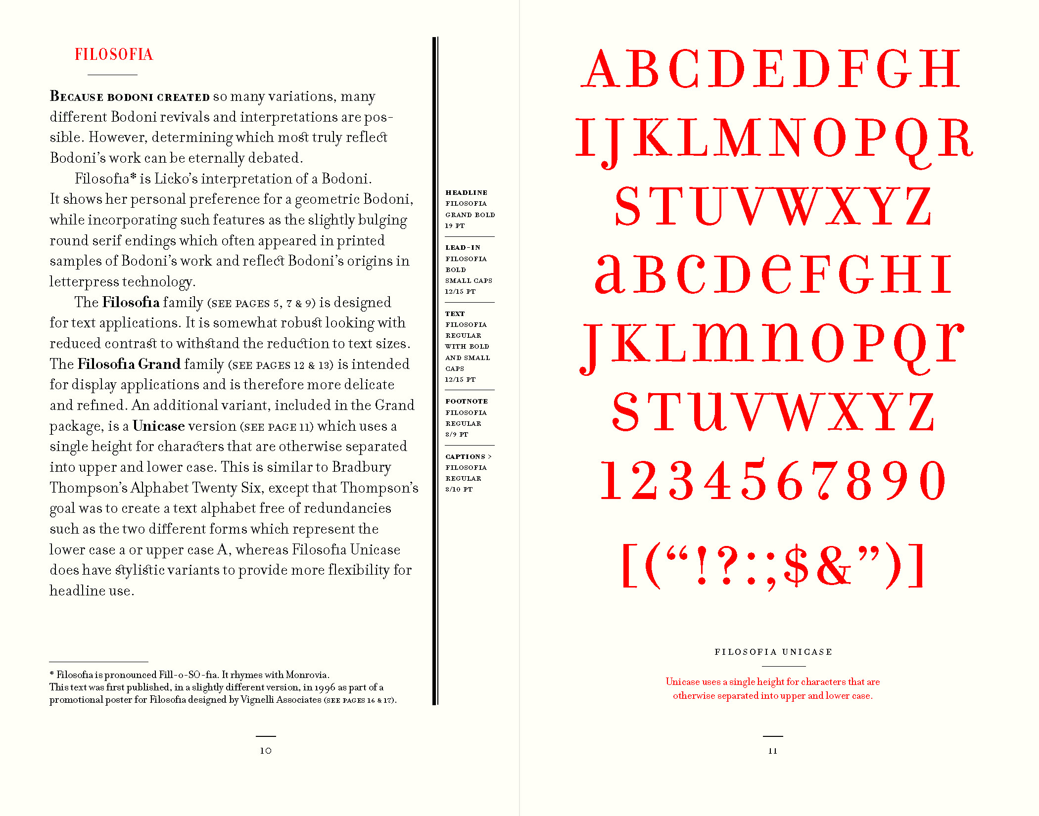
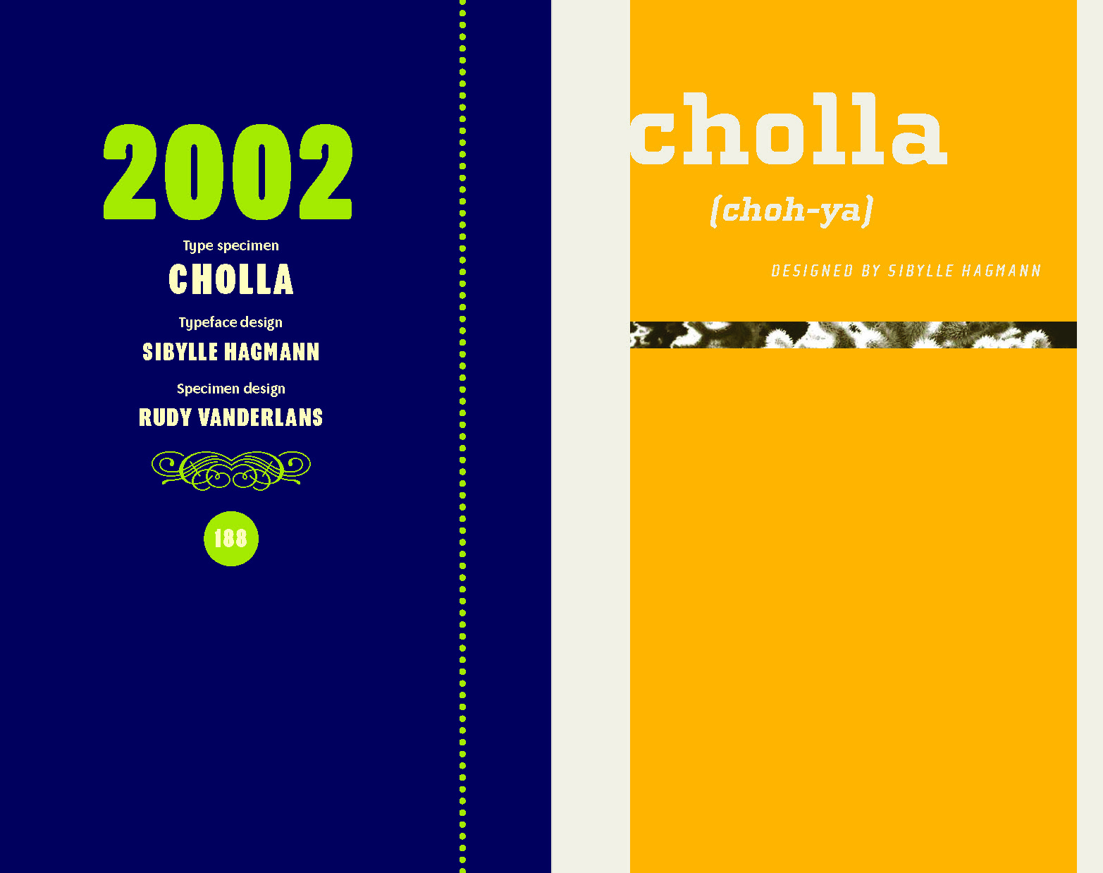
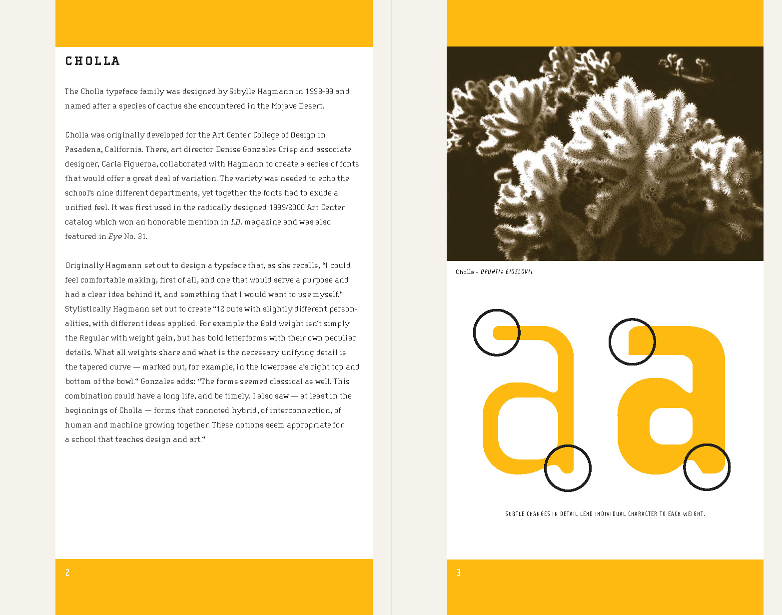
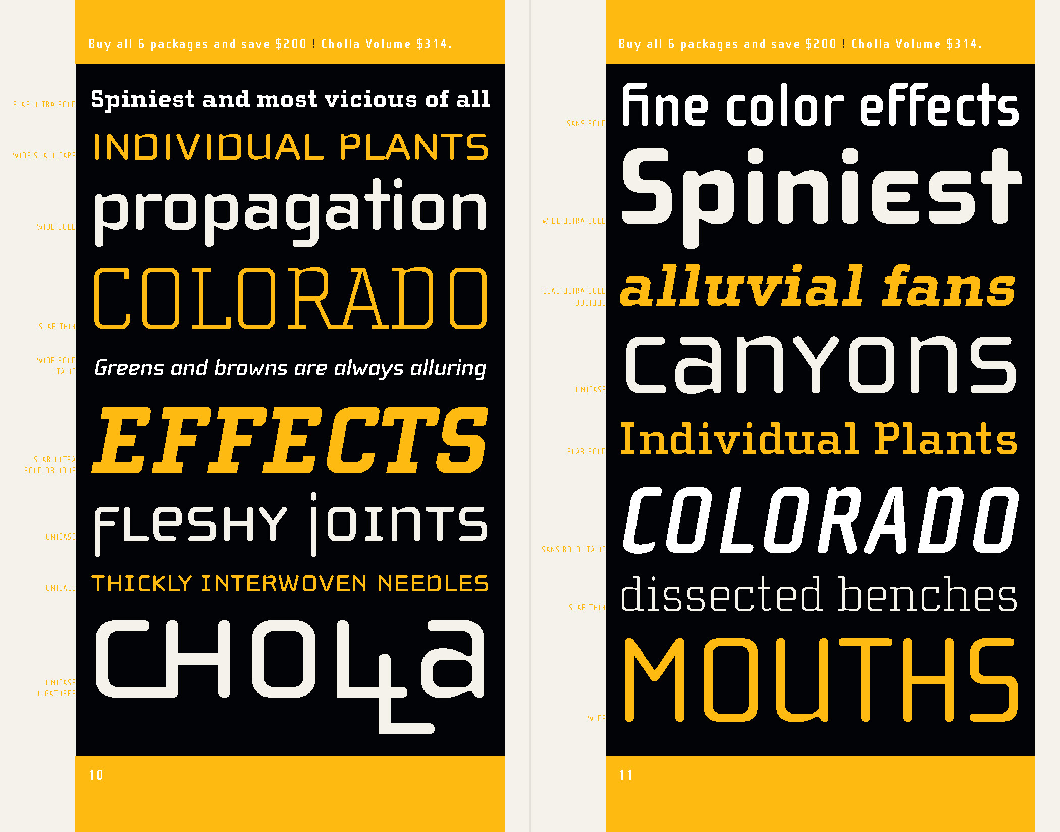
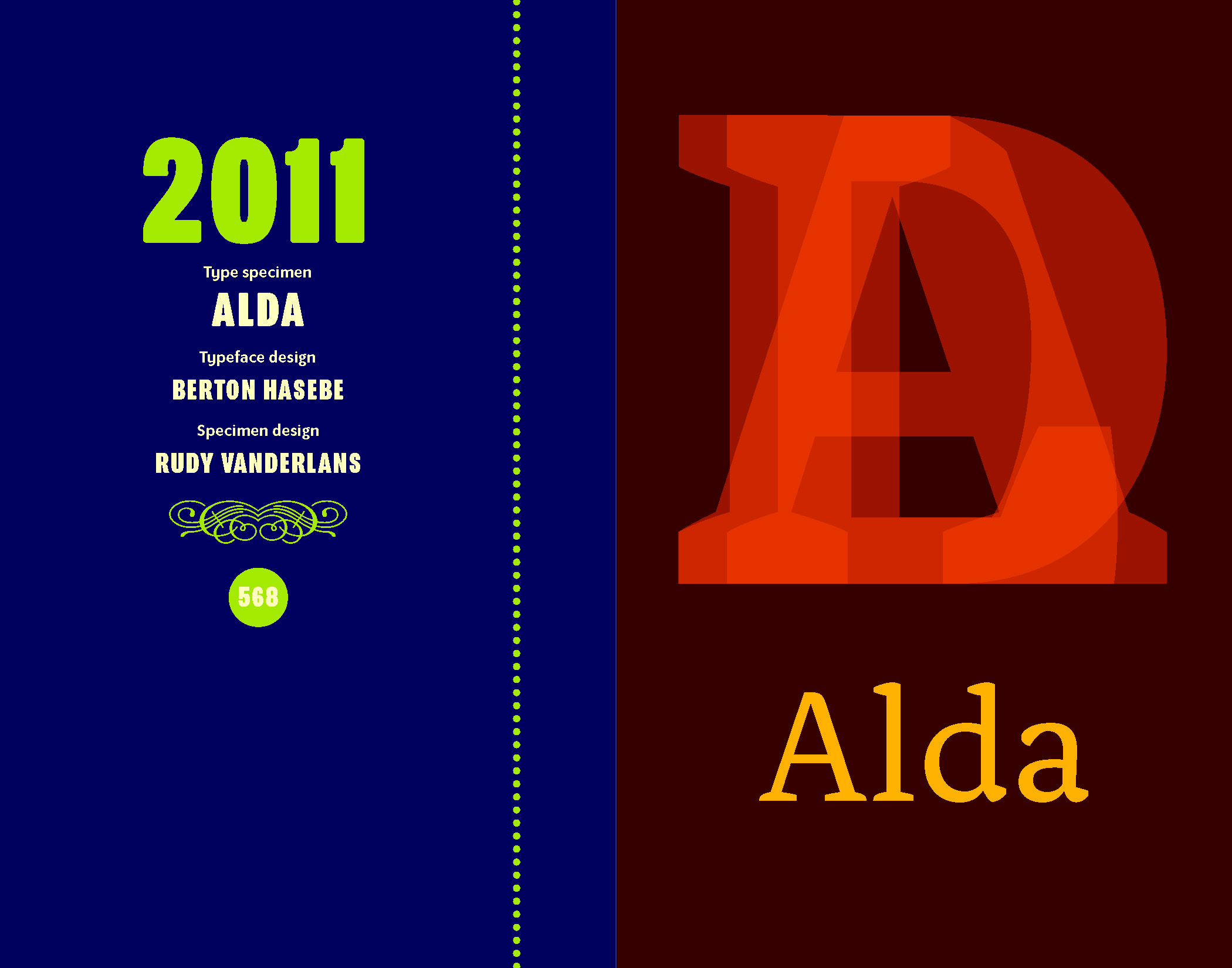
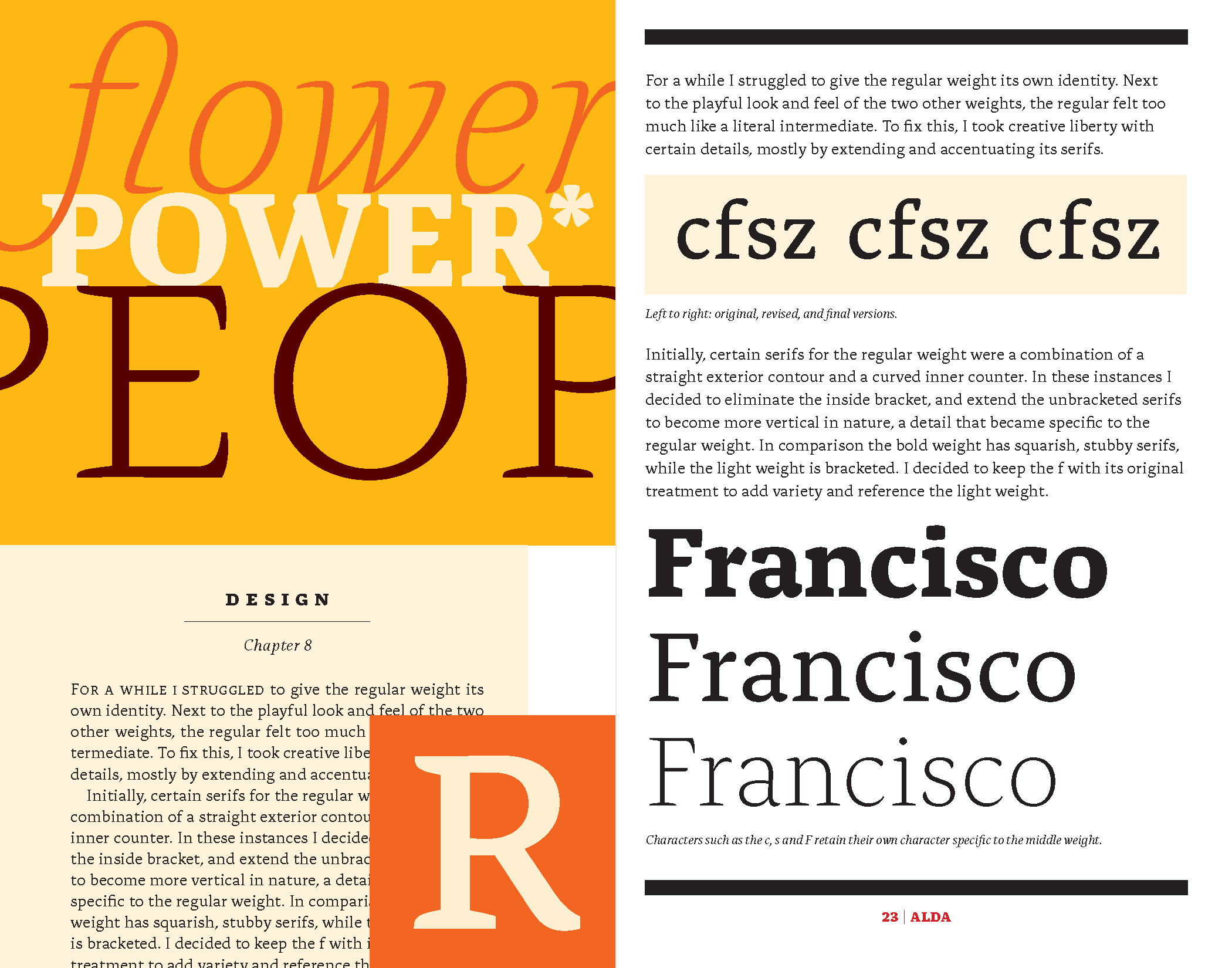
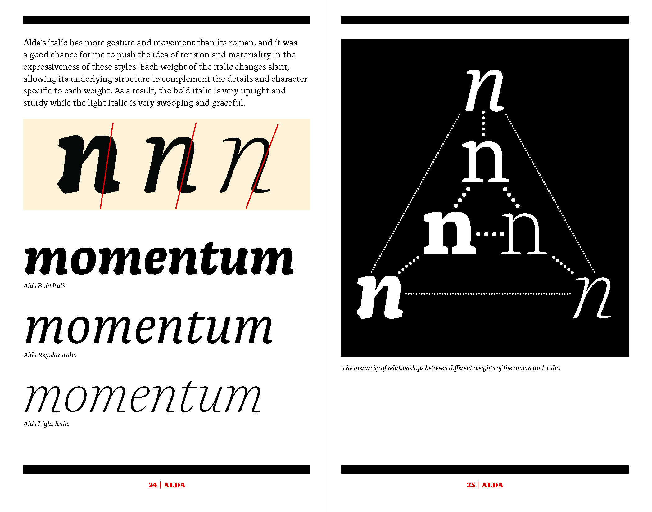
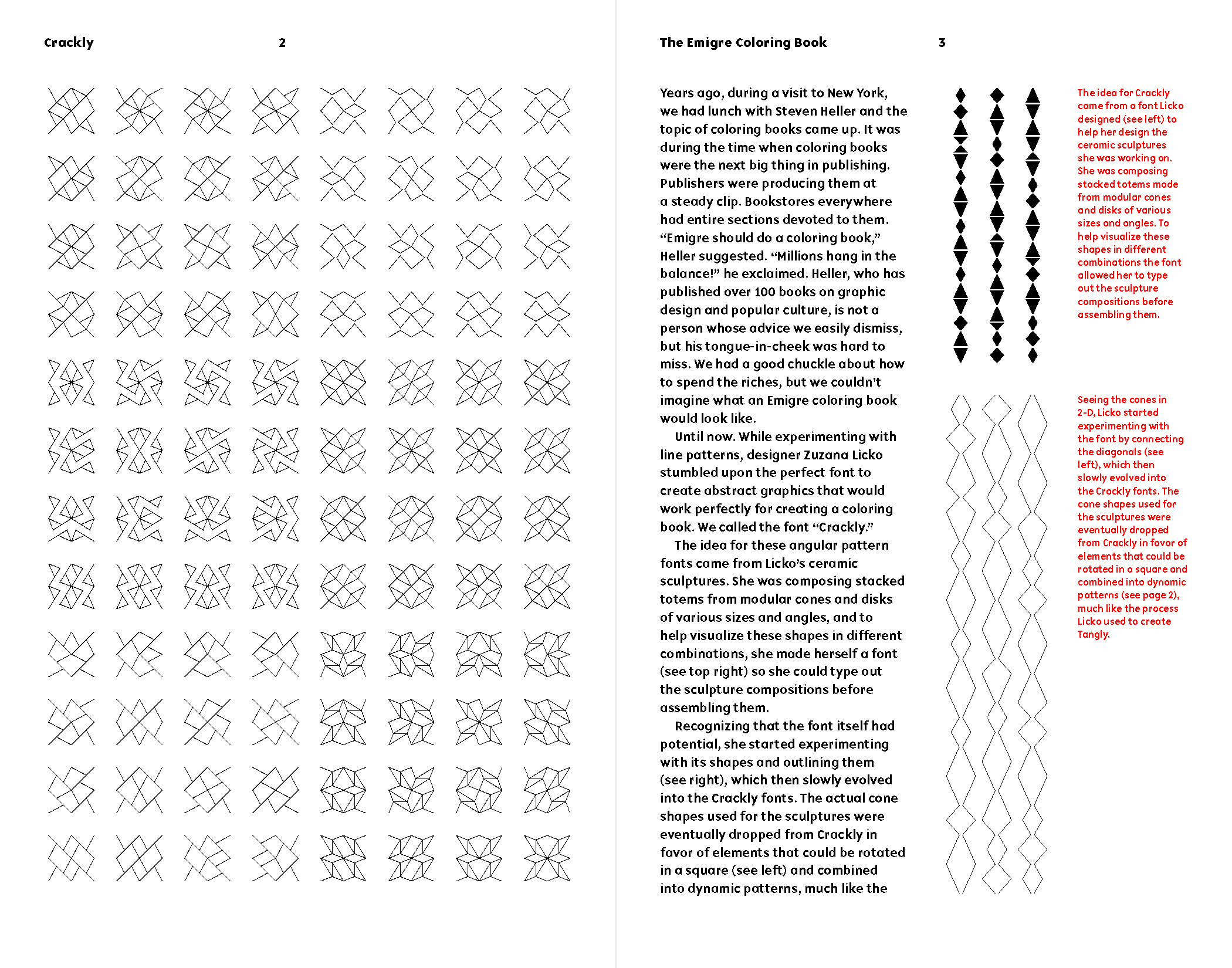
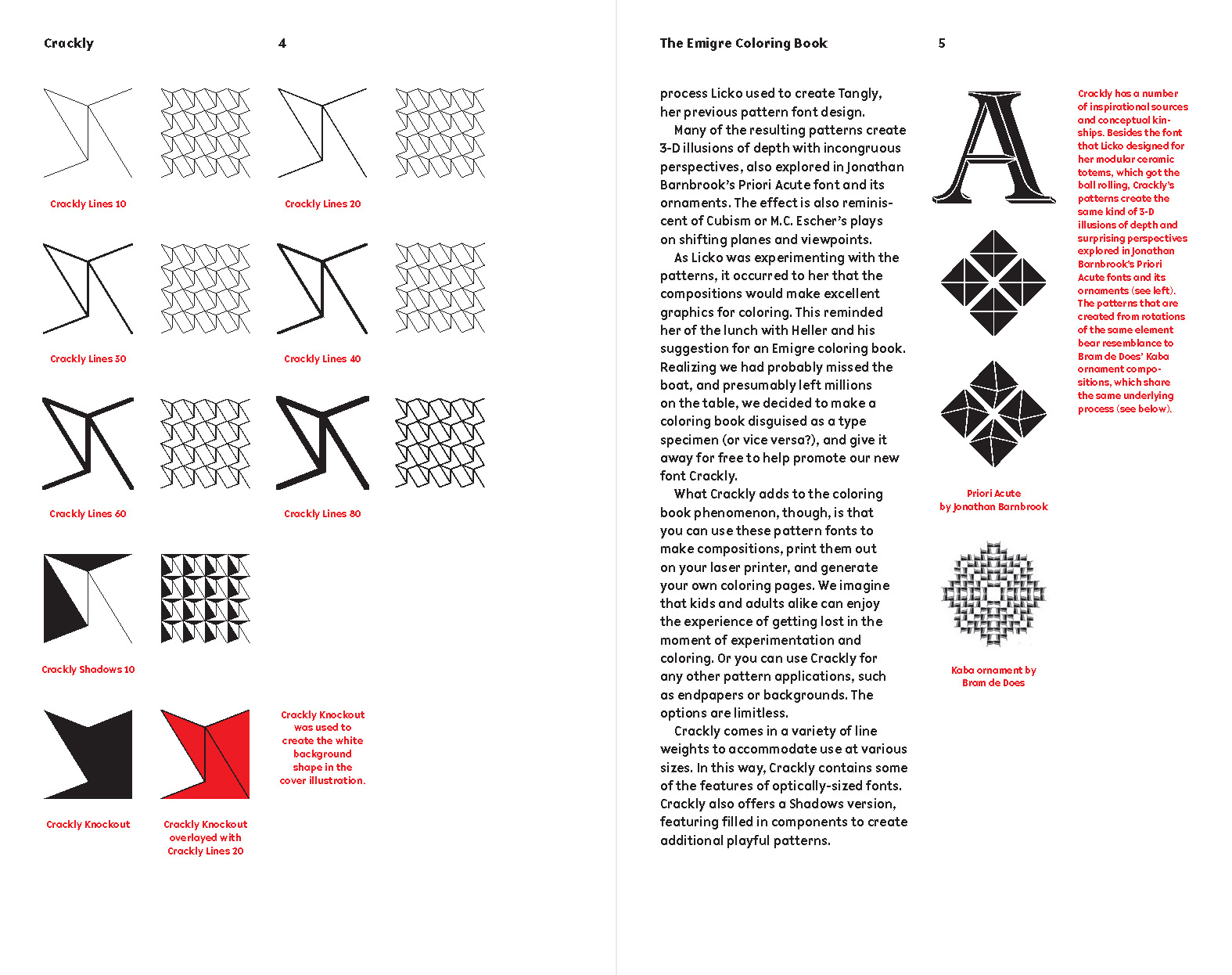
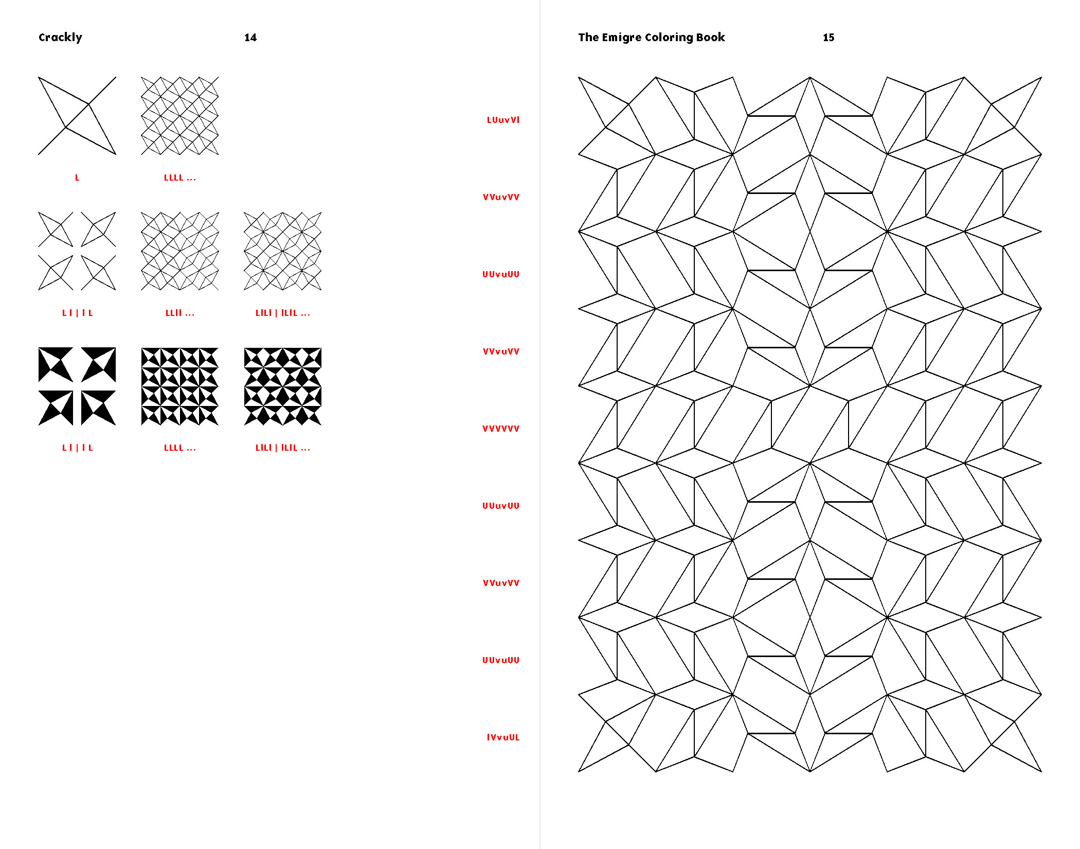
This sense of structure is one of many things that separates Licko from other type designers of the early desktop publishing days who are associated with grunge. Emigre was experimental, for sure, but grunge they were not. In fact, VanderLans bristles a bit when they are tossed in that bucket as a default way to describe chaotic 1990s work that broke the rules. As this volume’s collected type specimens show, the foundry’s output actually varied widely—from the pioneering bitmaps of Licko’s Oakland (1985) and her pattern material for Tangly (2018) to her highly personal tributes to Baskerville (Mrs Eaves; 1996) and Bodoni (Filosofia; 1996). The work they collected from collaborators, too, spanned the gamut from risk-taking and genre-defining (Sibylle Hagmann’s Cholla; 1998–1999) to sober and refined (Berton Hasebe’s Alda; 2008).
Typeface Highlights from Emigre Fonts
These are hi-fi captures. Click an image to enter fullscreen view, then click or pinch to enlarge.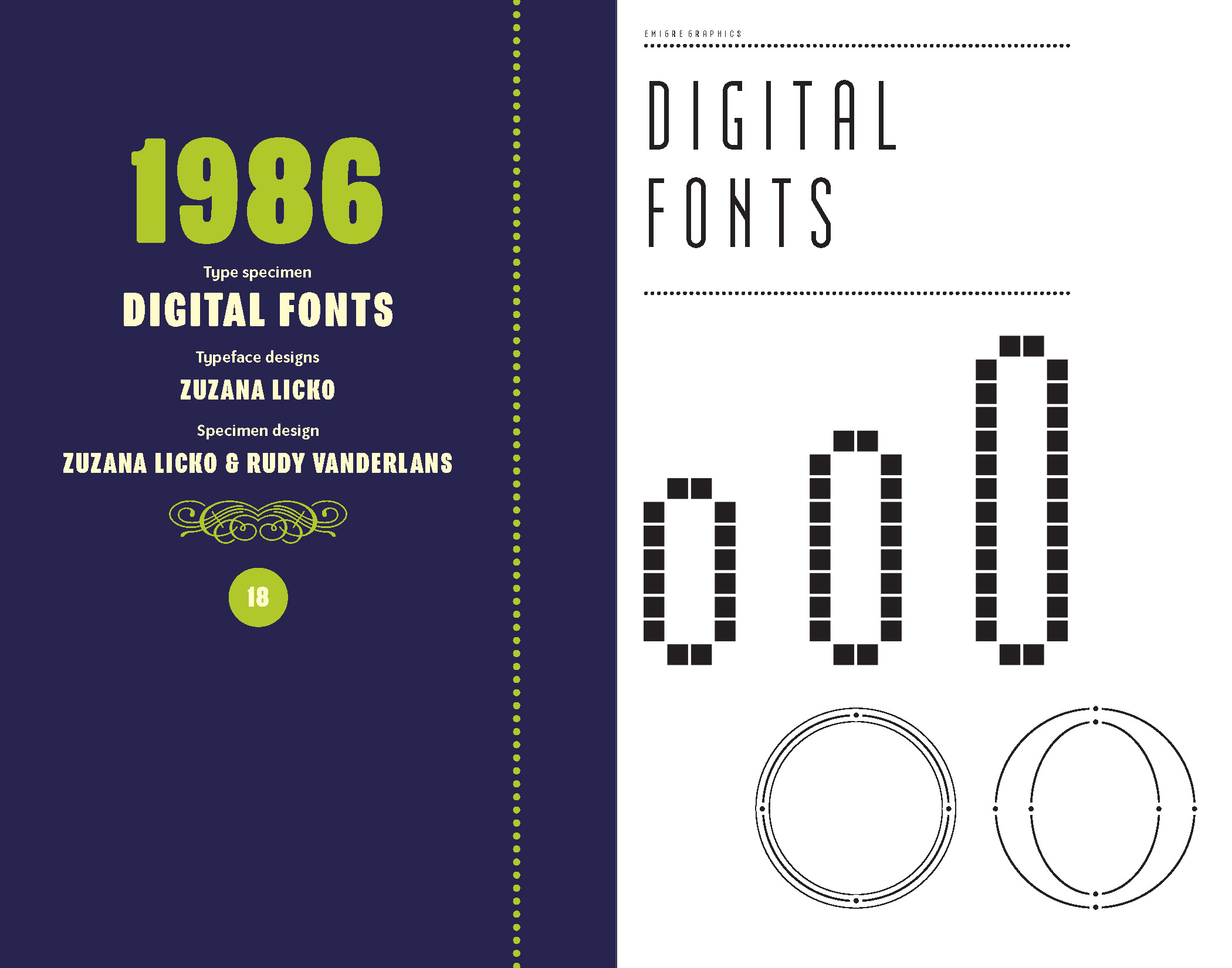
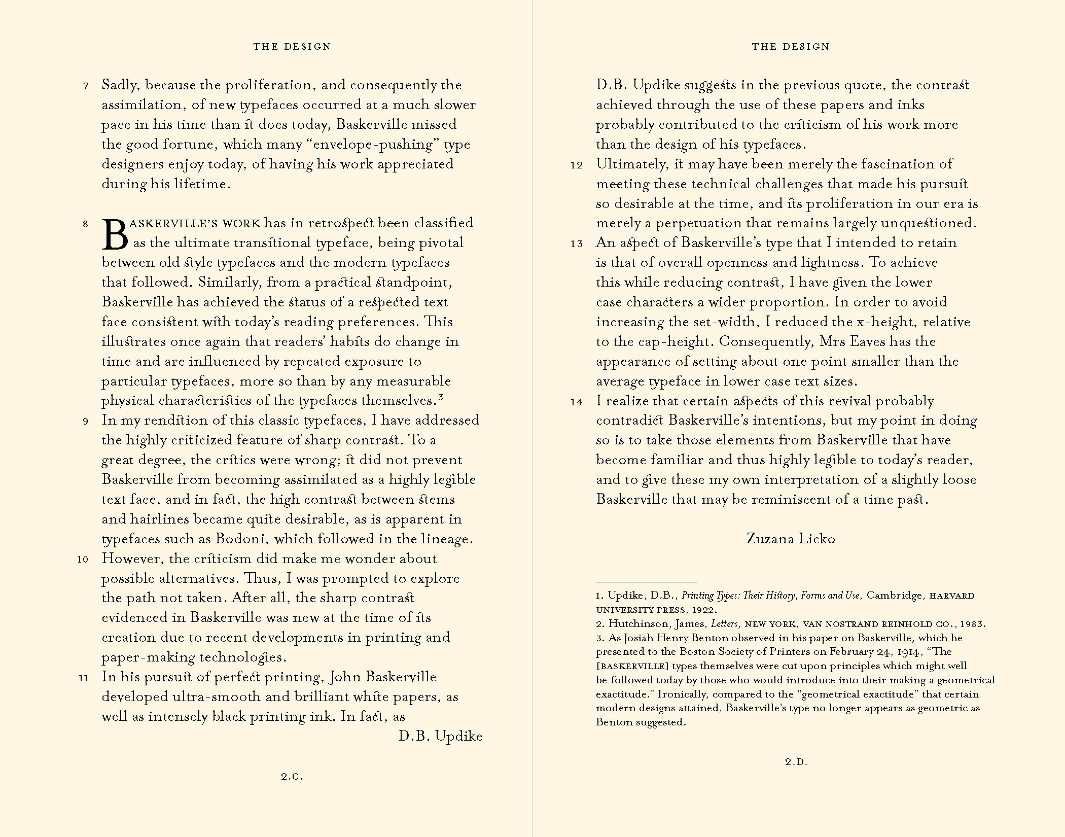
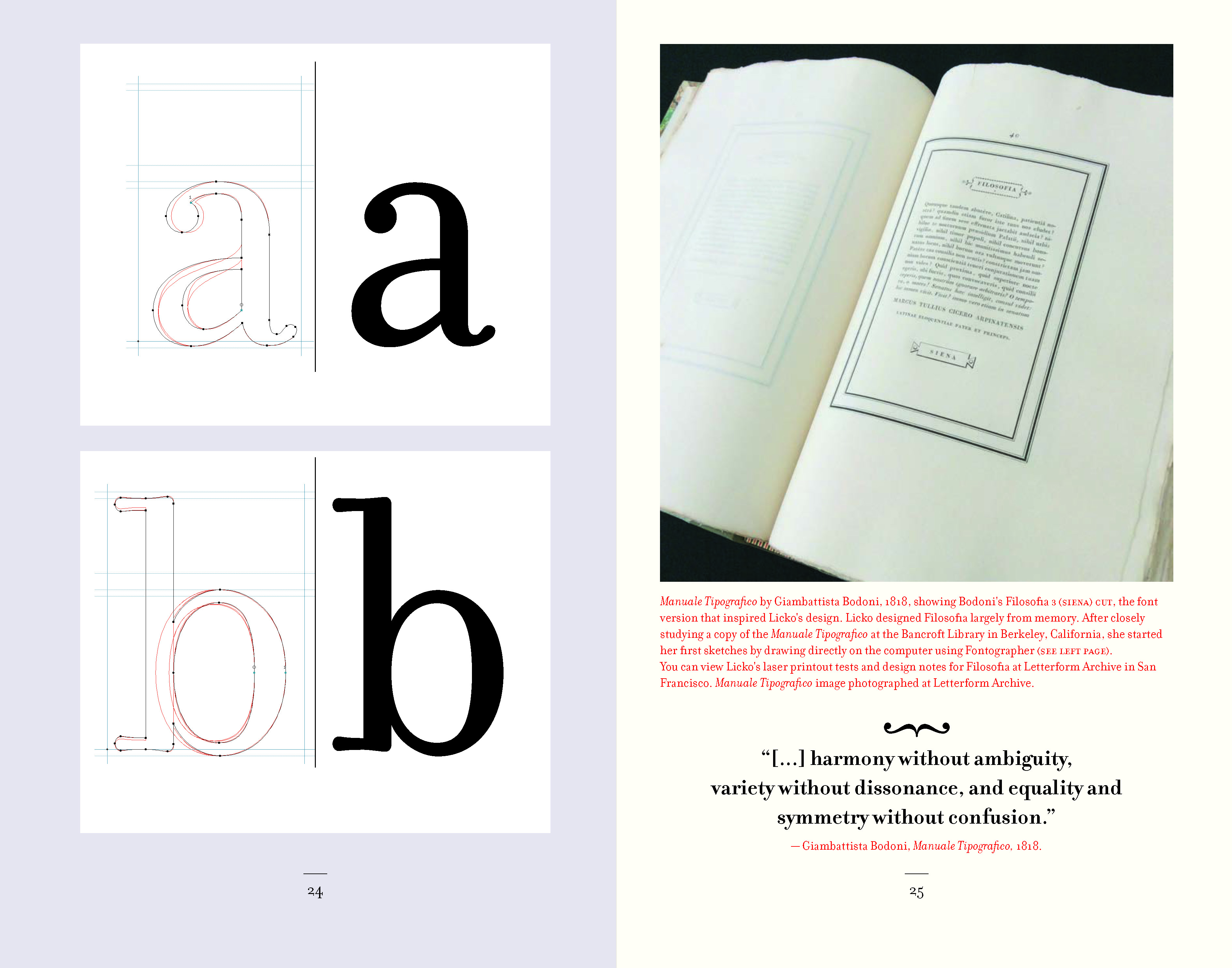
What made Emigre unique as a foundry is that they were among the very first to use the Mac—a new tool made for graphic designers—to create original typefaces rather than doing the safe thing that established companies were doing at the time: simply digitizing the old metal classics. In fact, the ability to draw fonts on-screen came along at just the right time for Licko, who sidestepped calligraphic tradition, embraced the constraints of the pixel grid, and made type that was entirely new.
Hardcover, 5.25 × 8.25 inches, 1,264 pages.
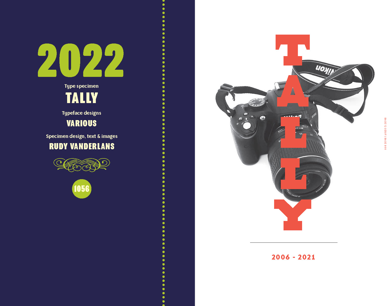
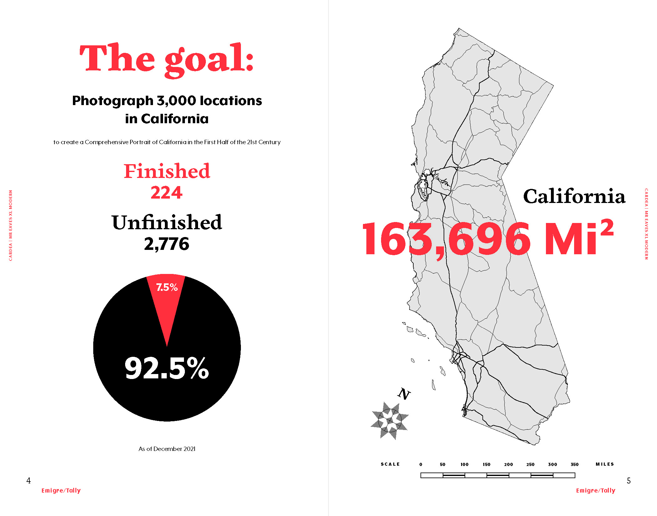
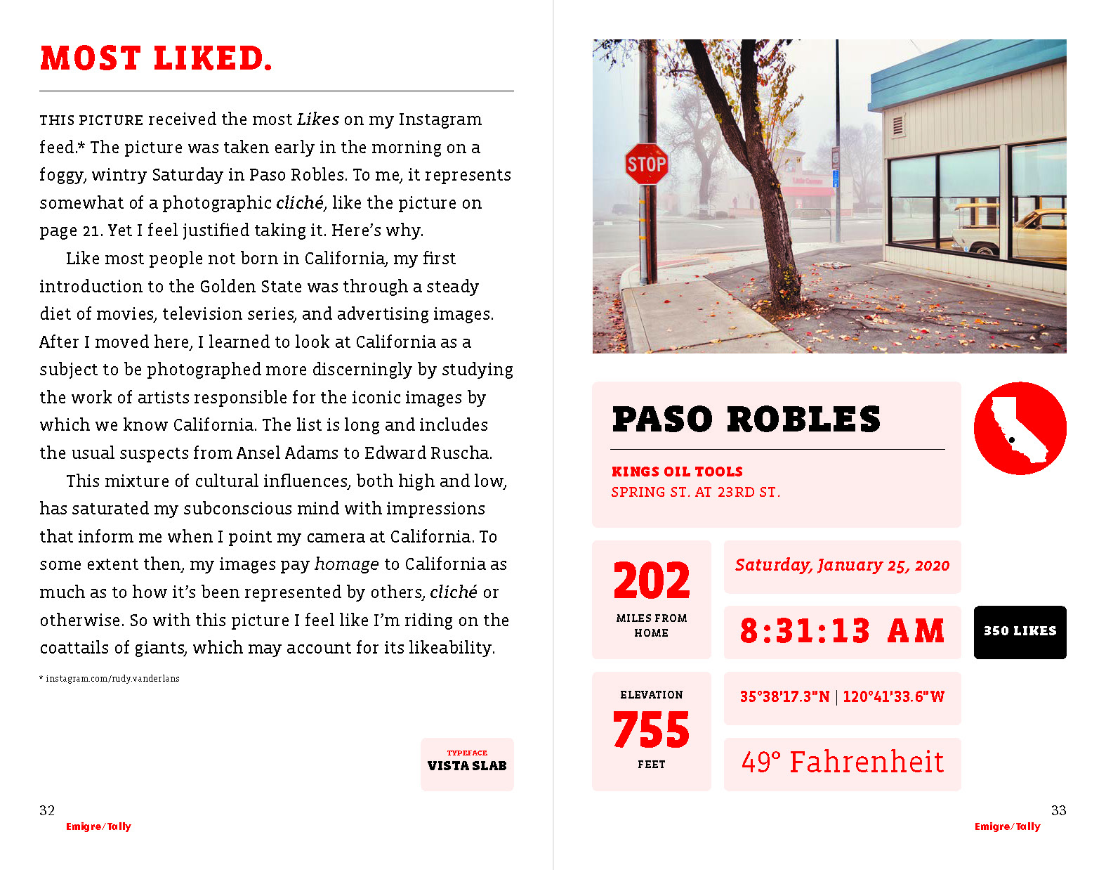
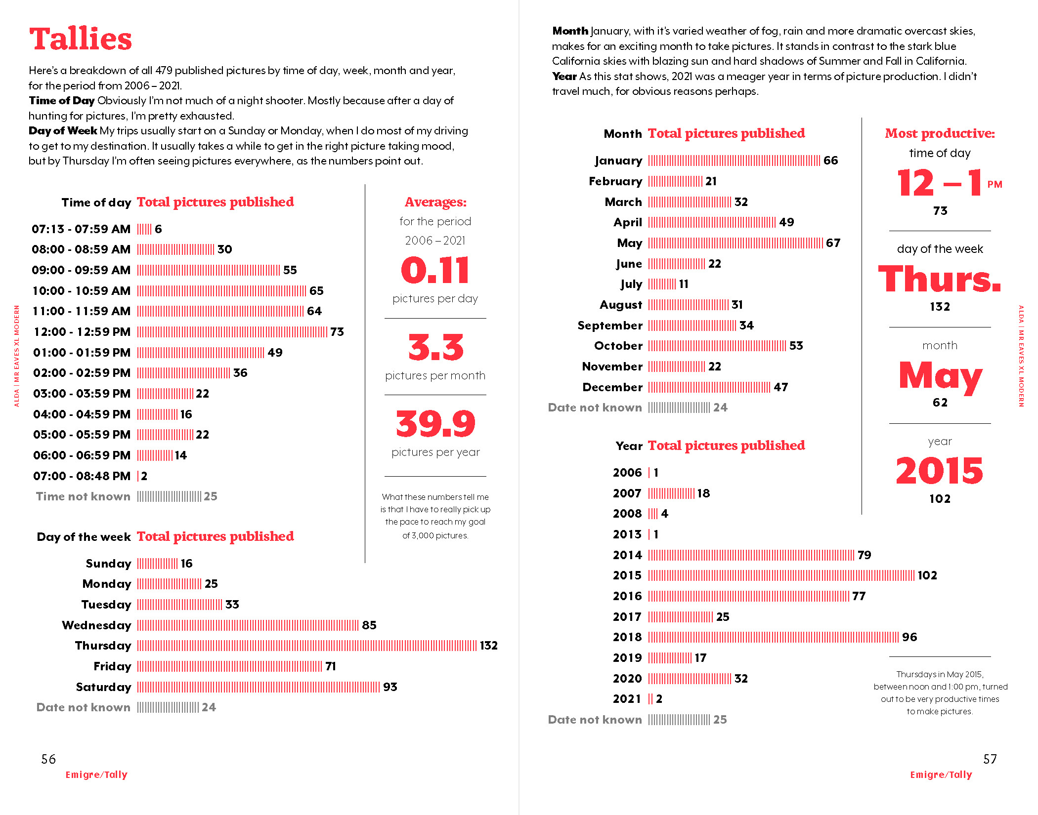
What also makes VanderLans and Licko the perfect design pair is that he is as adept at using typefaces as she is at making them. Most specimens in this book were designed by VanderLans. He showcases his partner’s fonts in a way that both demonstrates their utility and makes them objects of desire. His clear layouts—removed from the more radical compositions of Emigre magazine’s early years—are combined with lucid writing, always informative and often dryly funny. The specimens also vary in approach, with Crackly (2019) and Tally (2022) providing examples of how the couple worked their individual hobbies—pattern design and travel photography—into catalog concepts. While most type specimens present new releases, this compilation covers a period when Emigre issued many booklets revisiting their back catalog. It shows the versatility and perennial relevance of the type they chose to publish, both internally and from a long list of forward-thinking designers. Like any good specimen, it’s a snapshot of type and design history, and an invitation to reimagine what each typeface can do today.
Type Specimen Highlights from Emigre Fonts
These are hi-fi captures. Click an image to enter fullscreen view, then click or pinch to enlarge.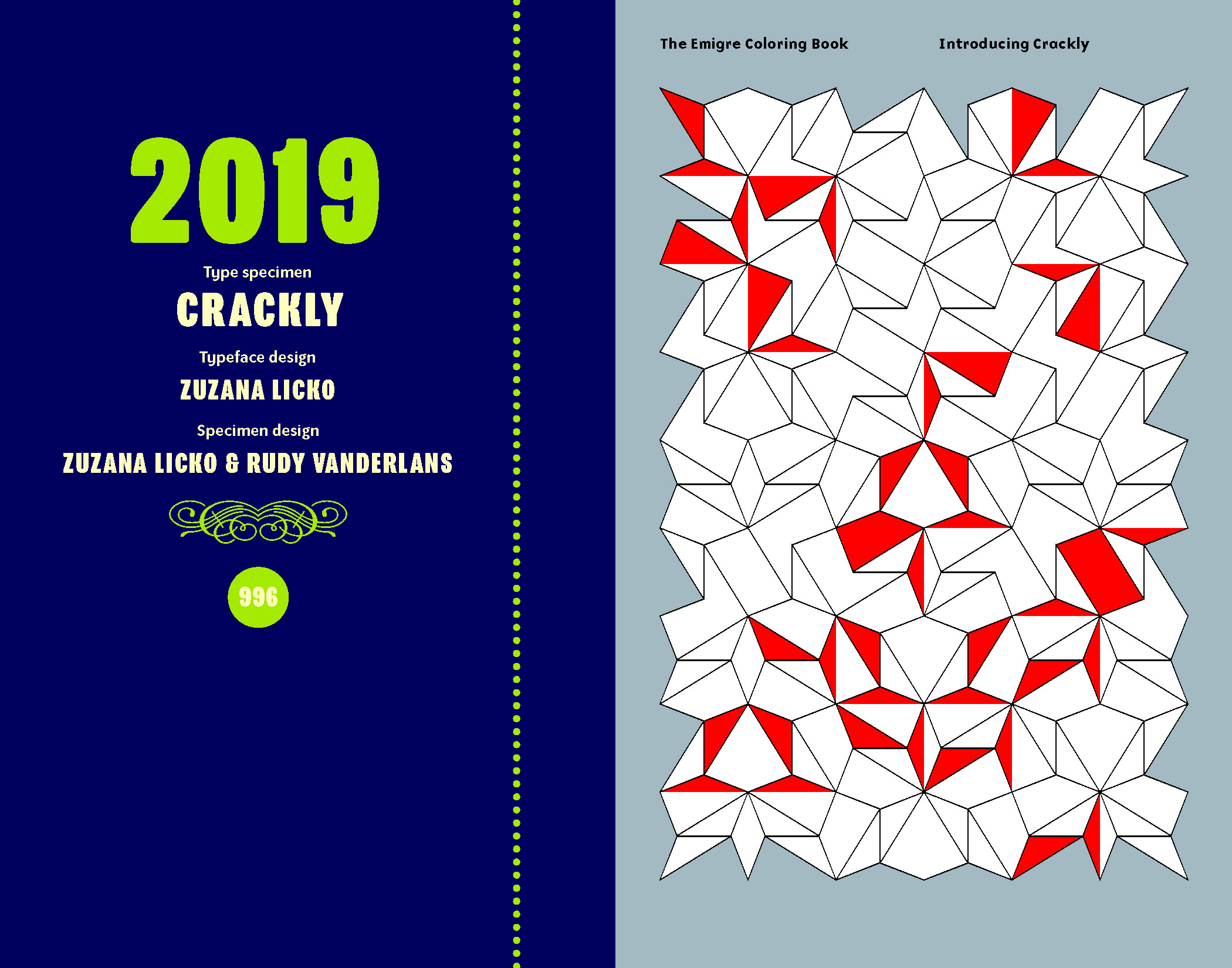
As a curator at Letterform Archive, I’m always thinking about what artifacts will energize current type and graphic design audiences—as well as those one hundred years from now. We’re honored to have the Emigre archive on hand for future scholars and practitioners to learn from again and again.
— Stephen Coles, Associate Curator & Editorial Director
Thanks to a generous commitment from Rudy and Zuzana, every dollar we make from selling Emigre Fonts, Type Specimens, 1986–2024 goes directly to supporting Letterform Archive and its mission.