News
Inside NKF: Piet Zwart’s Avant-Garde Catalog for Standard Cables, 1927–1928
The new facsimile from Letterform Archive Books brings a Dutch design classic into the present.
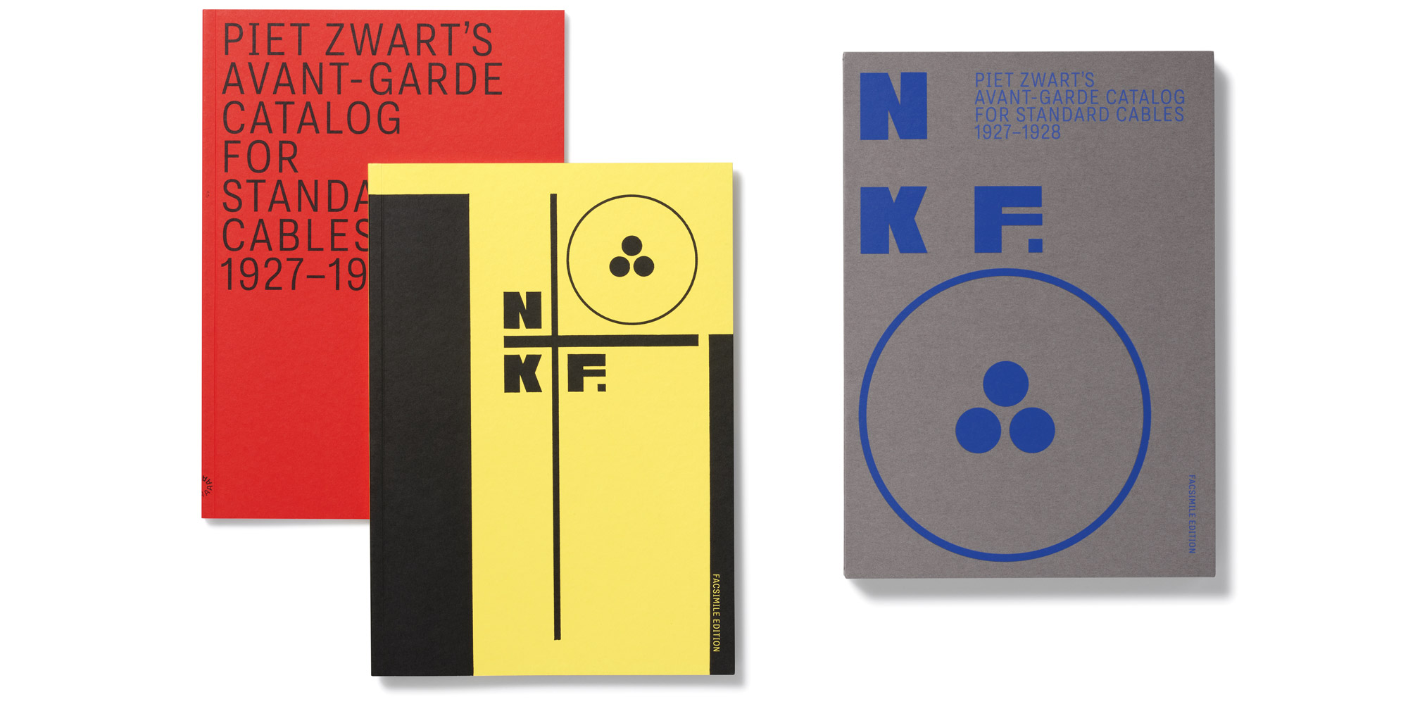
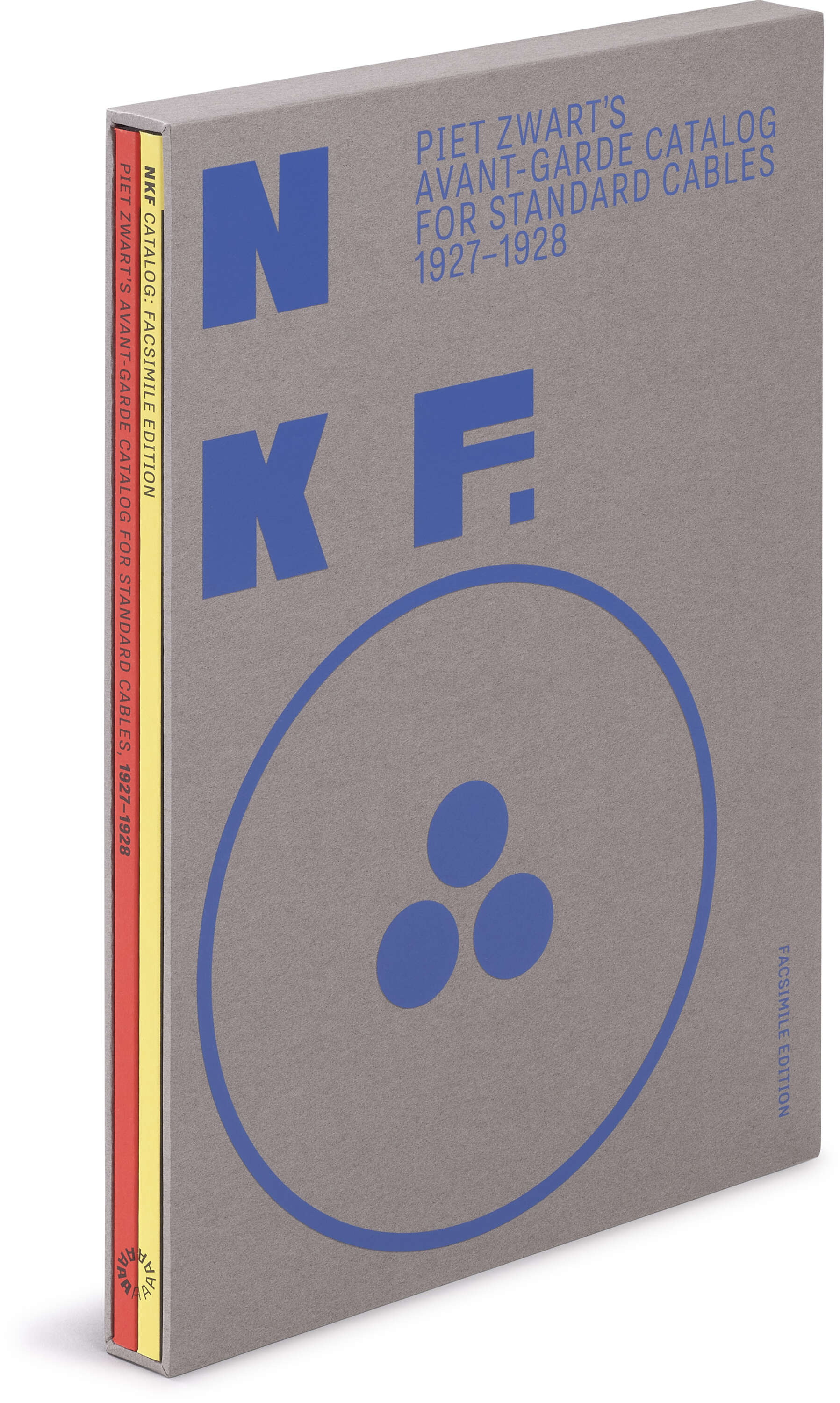
2 paperback volumes with slipcase, 8¼ × 11½ inches, 120 pages.
A cable catalog—sounds niche! But a cable catalog that was also the defining statement of a Dutch design legend? A catalog that sent shocks through art and design circles, helped rewrite the rules of typography, and has inspired designers for almost a century? We love niche, but the book Piet Zwart made for Dutch cable manufacturer Nederlandse Kabelfabriek (NKF) was made to break boundaries.
NKF: Piet Zwart’s Avant-Garde Catalog for Standard Cables, 1927–1928, the latest in Letterform Archive’s series of facsimiles devoted to rare and significant works from the collection, brings Zwart’s unexpected masterpiece to contemporary audiences for the first time. Issued in a slipcase with a companion volume filled with essays by design historians Philip B. Meggs and Paul Stirton, crisp new Zwart translations, and a stunning survey of other NKF designs, this edition sheds light on a design revolutionary through the lens of his most important work.
Typotekt on Wire
Before partnering with NKF, Zwart (1885–1977) studied applied arts in the Netherlands, taught design classes, and produced work as an all-around designer and architect. His early projects ranged from furniture to full-scale interiors and energetically engaged with the latest modernist movements, including the Vienna Secession, De Stijl, and the gathering avant-garde currents of international Dada and constructivism.
But only with Zwart’s first NKF jobs in 1923 did his new design practice and professional identity take shape. Inspired in part by the figure of the engineer, “that new kind of person… using today’s scientific resources to promote the reconstruction of all areas of life without historicizing traces, fundamentally, directly,” Zwart fashioned himself not as a typographer, nor an architect, but as a typotekt—a builder of typographic constructions. In the following decades, in now-famous work for NKF, the Netherlands Postal Service, the furnishings supplier Bruynzeel, and many others, Zwart restlessly pursued ways of reinventing the page along ever more active and functional lines.
As his principal client through the early 1930s, NKF facilitated this ambition. With almost no prior brand identity or creative direction, the young manufacturer offered Zwart a blank canvas, as well as the freedom to experiment and iterate. If on the surface its products were unremarkable, wrapped in technical jargon, and interesting only to a small audience of buyers, Zwart recognized their deep significance. Sinews of an industrial society in the making, functional and standardized to the extreme, charged with energy, and humming with messages, cables were, for Zwart, the perfect modern muse.
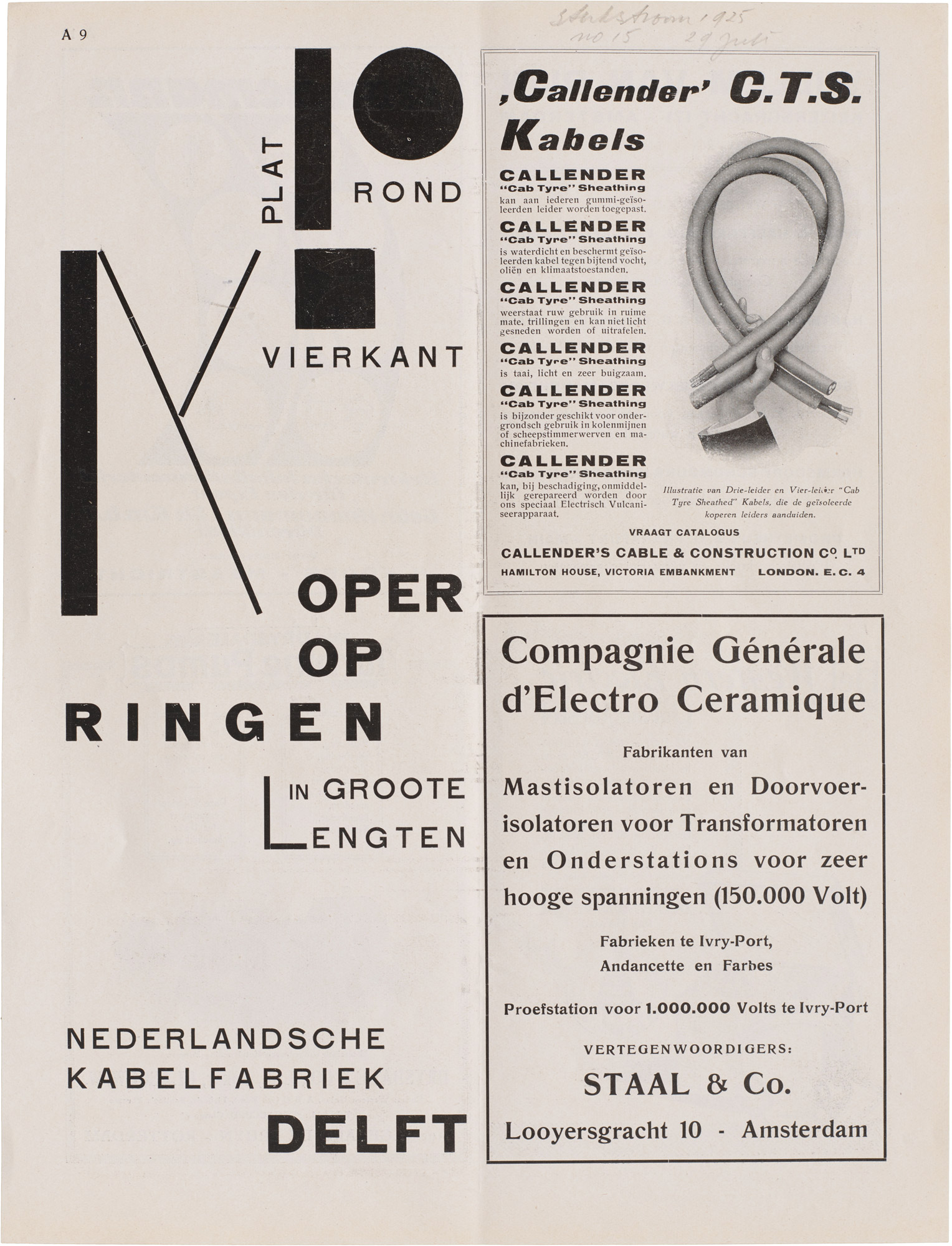
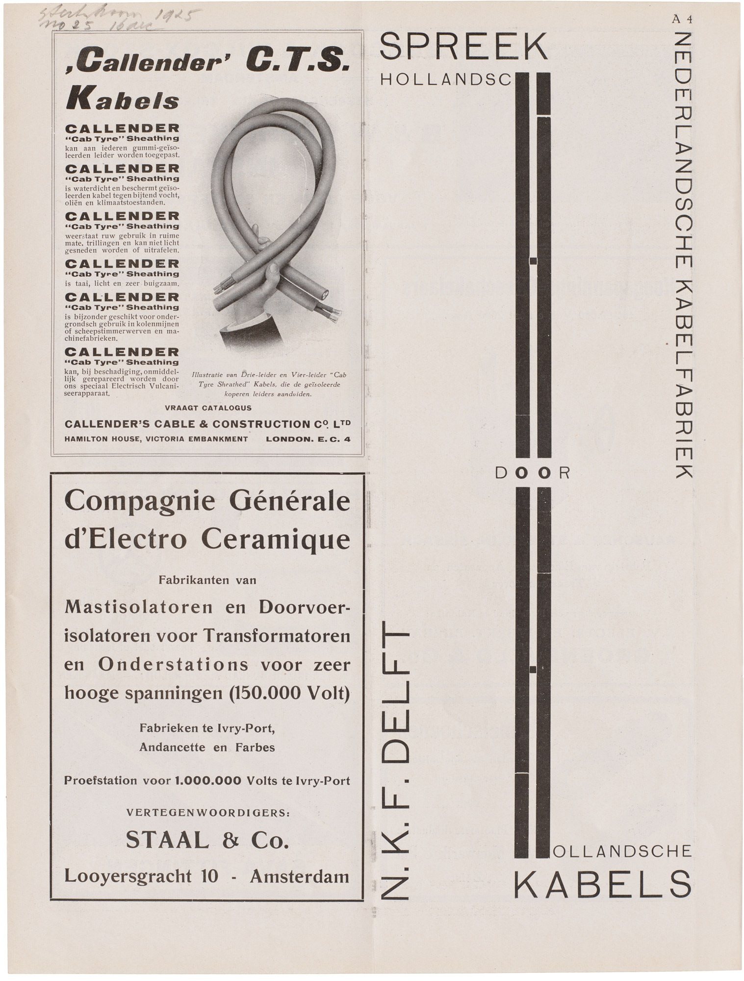
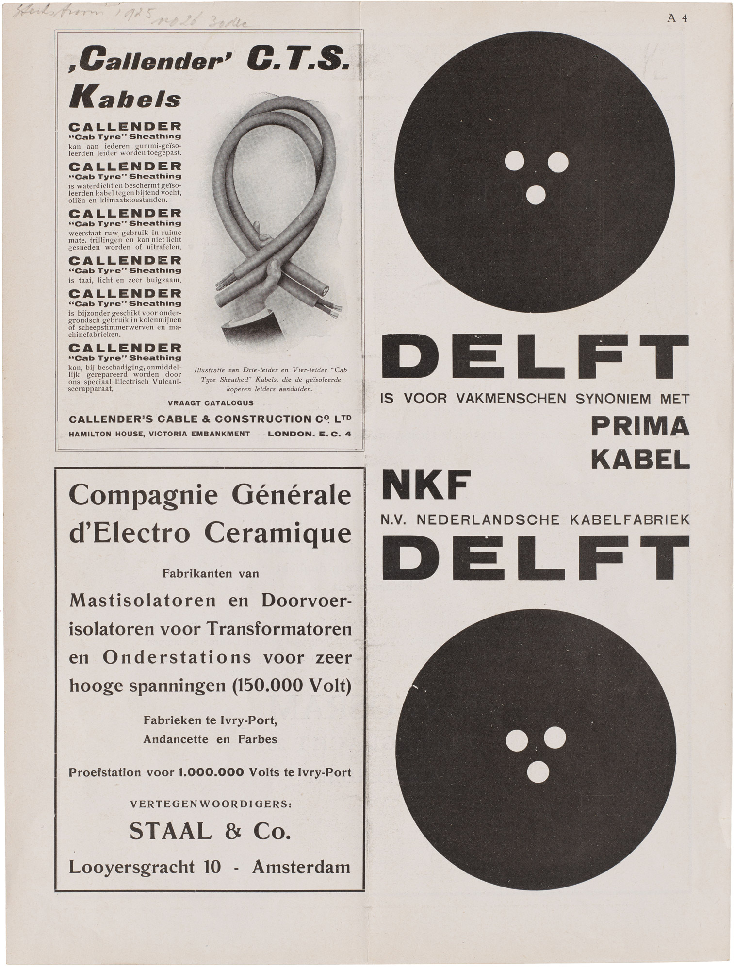
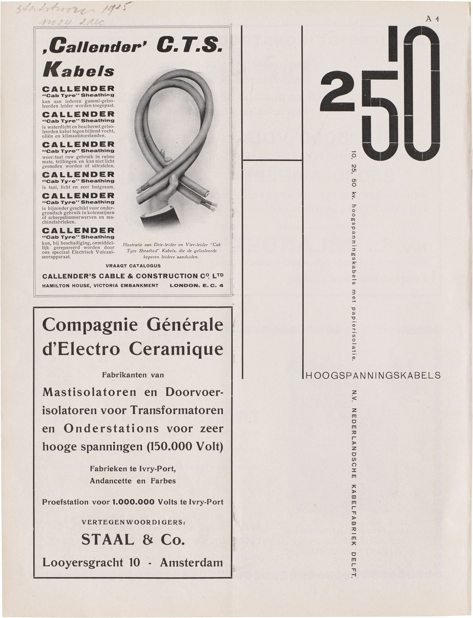
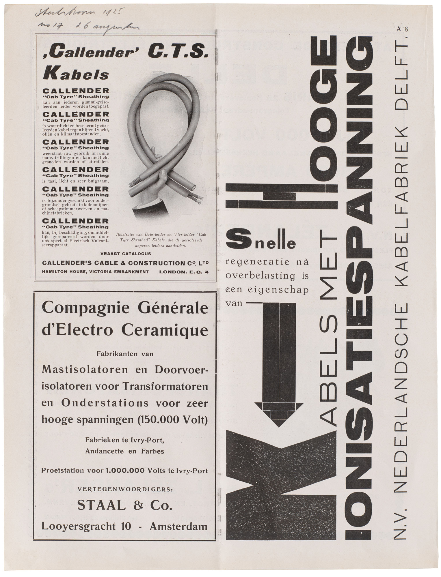
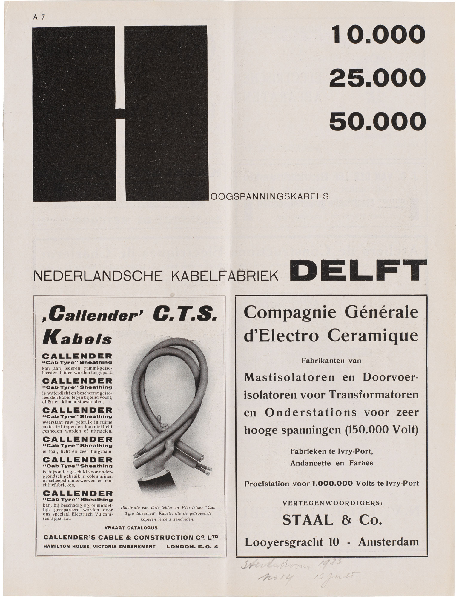
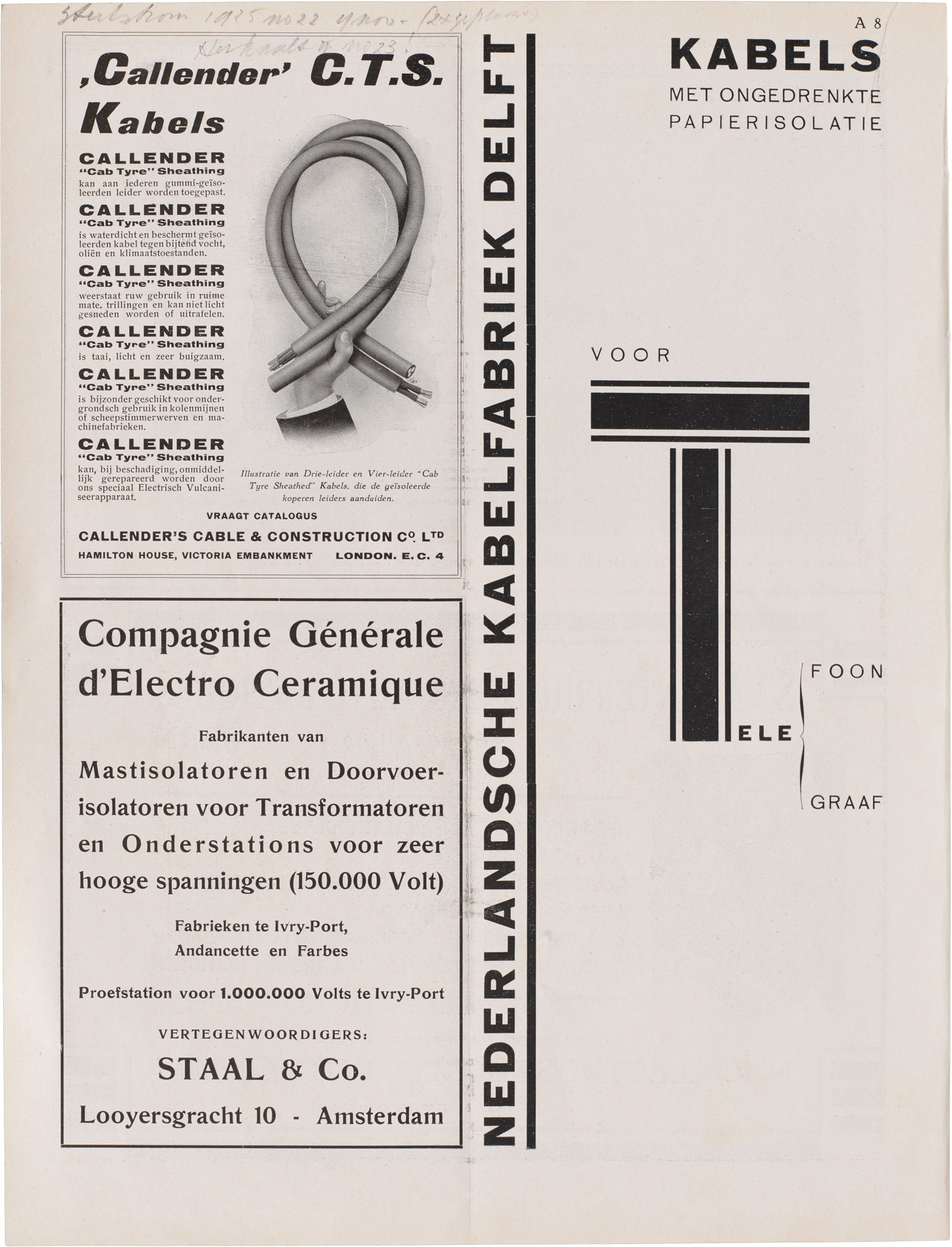
Zwart’s first commission, a biweekly series of letterpress trade journal ads he would continue to design for a decade, dictated a simple format yet allowed for intensive play with the materials of type. Turning these ads into his experimental workshop, Zwart explored typographic form, color, scale, orientation, and word–image relations, refining a range of constructive techniques later employed in his catalog. Letterform Archive’s collection of more than 100 of these ads, some of which are collected in NKF's supplement volume, includes many that reveal their effectiveness on pages shared with less adventurous fare. The examples below, all from 1925, use type blocks and directional text to animate phrases touting the “high ionization potential” of NKF cables and the various shapes of copper wire the factory could supply.
All images in the gallery below are hi-fi captures. Click an image to enter fullscreen view, then click or pinch to enlarge.
A glance at the competitors also helps us recognize the breakthroughs of Zwart’s later, more elaborate work for NKF. A period catalog for a U.S. cable manufacturer gives a good taste of the existing design trends Zwart dramatically rebelled against.
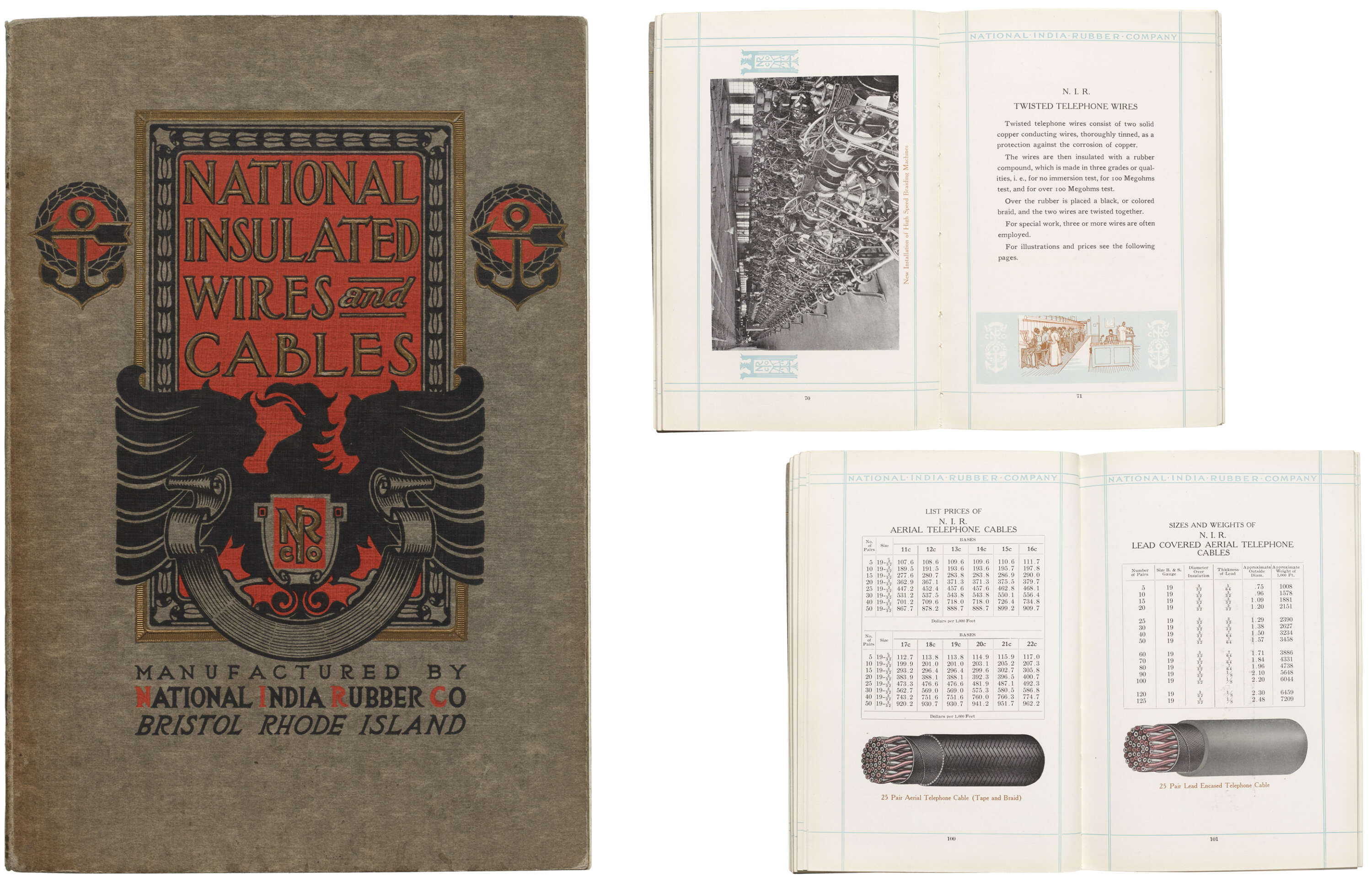
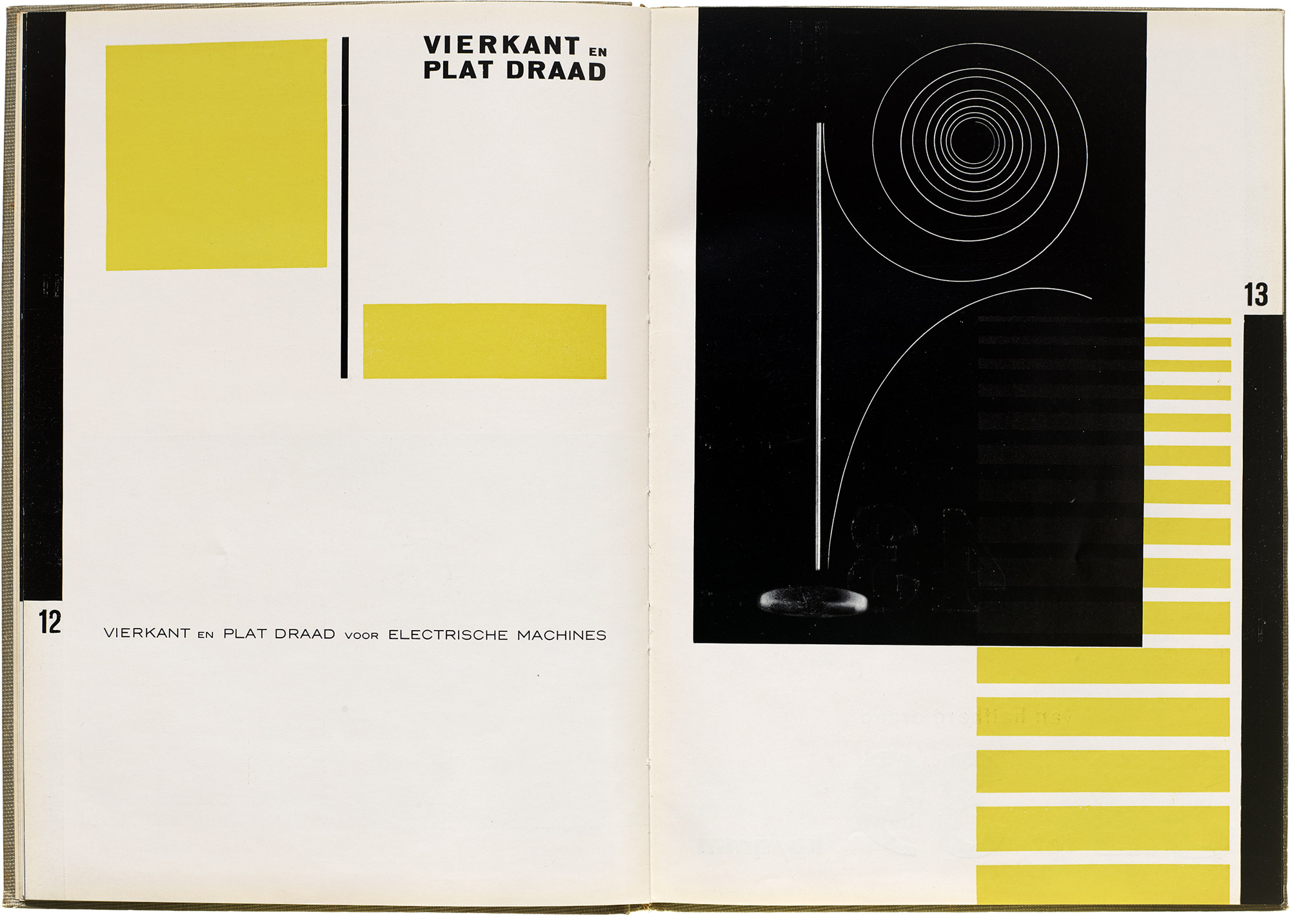
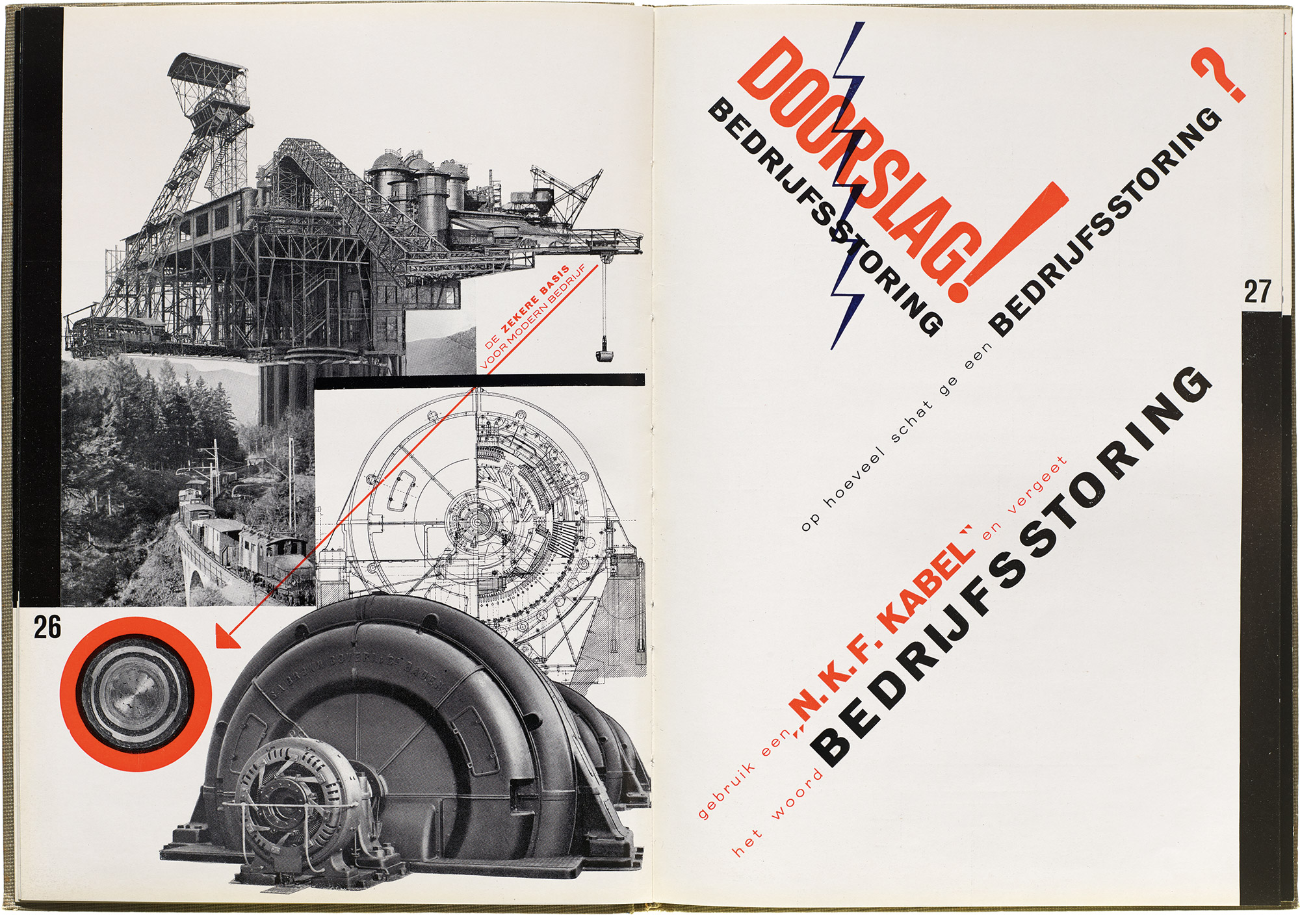
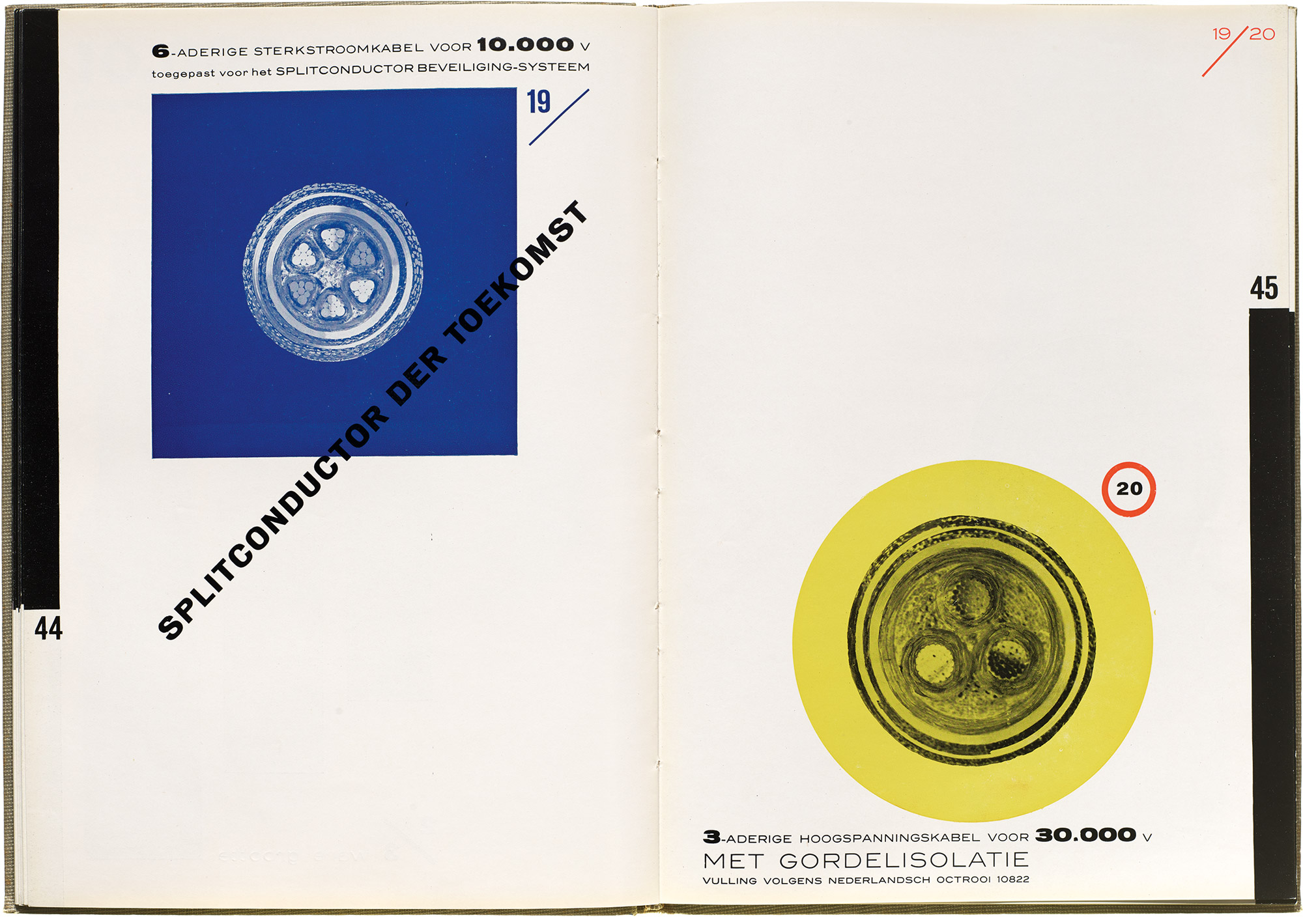
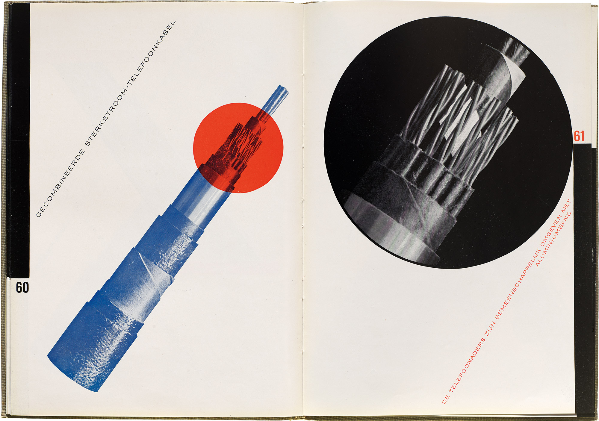
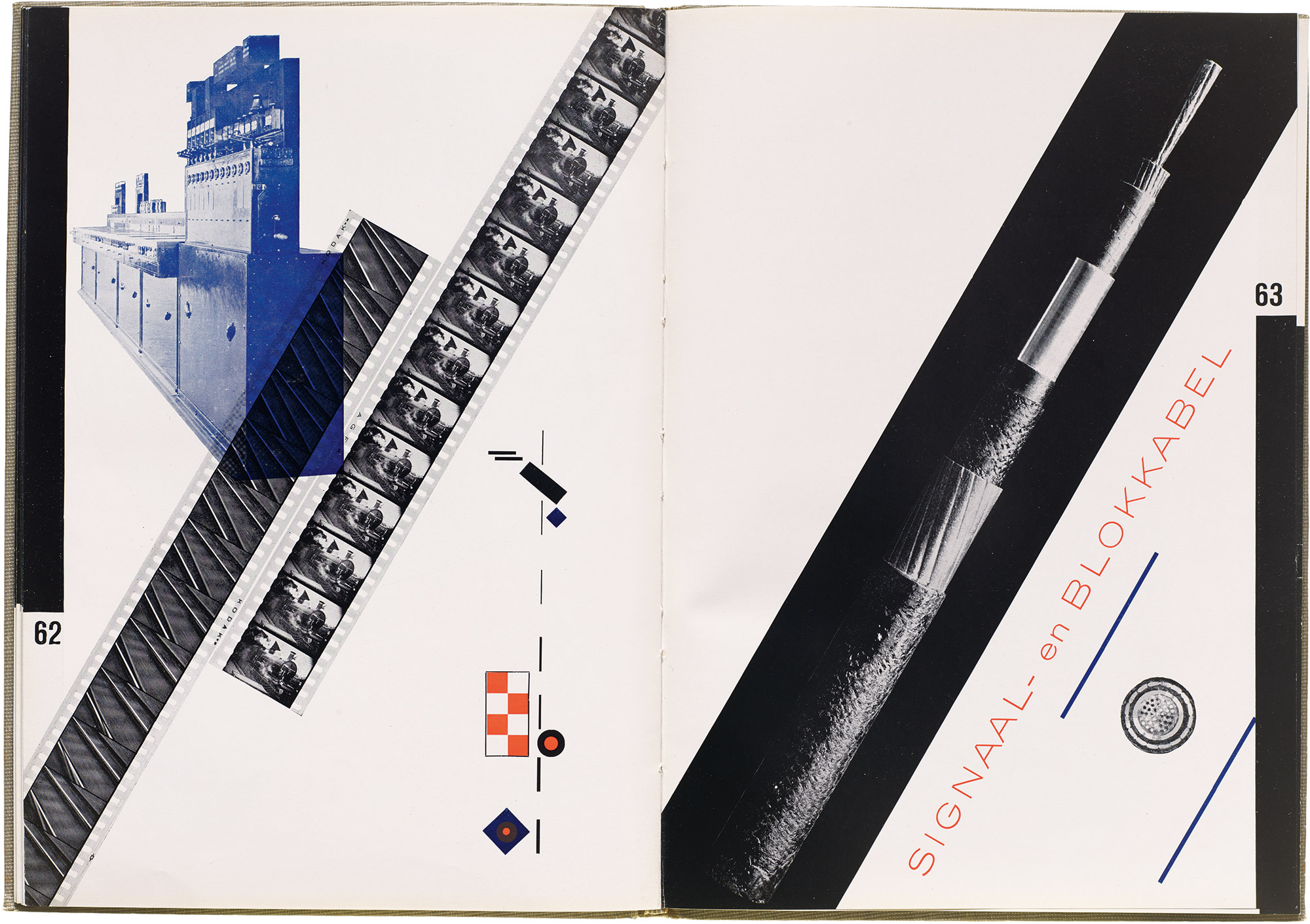
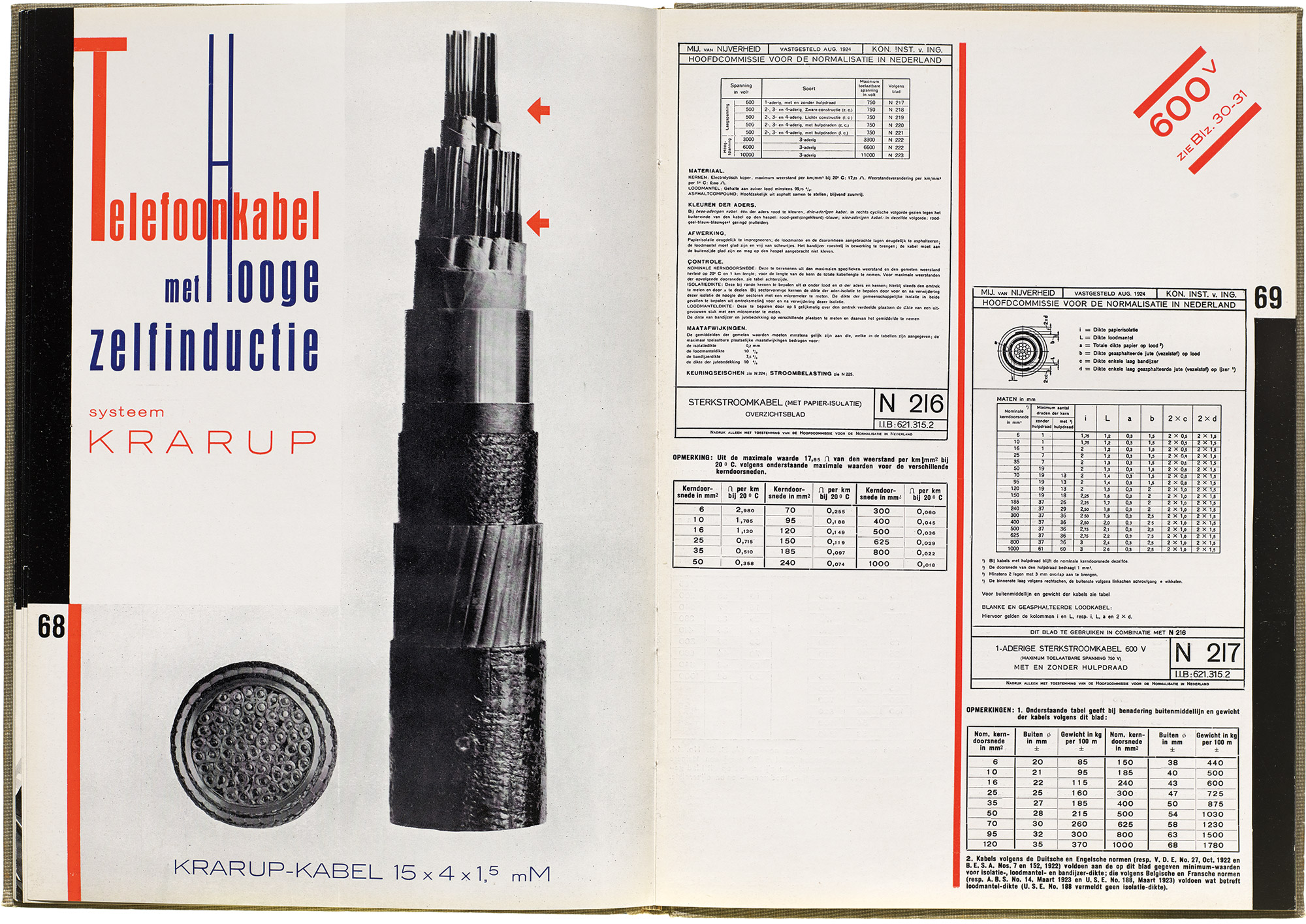
Next to this book’s static symmetrical layouts with pale borders, ornaments, and illustrations, Zwart’s catalog is design lightning. Black bars punctuate dynamic asymmetries, with pages held in tension by diagonals and stark contrasts. Razor-sharp photos lock together with sans-serif type, photograms, and elemental shapes, broadcasting technical information about the cables in clear diagrams and expressive hierarchies. Filmlike in momentum, the catalog’s studies in information design build and develop across 80 pages, in the process becoming undeniable statements about typography and the book, all while deftly serving their purpose as collateral for cables.
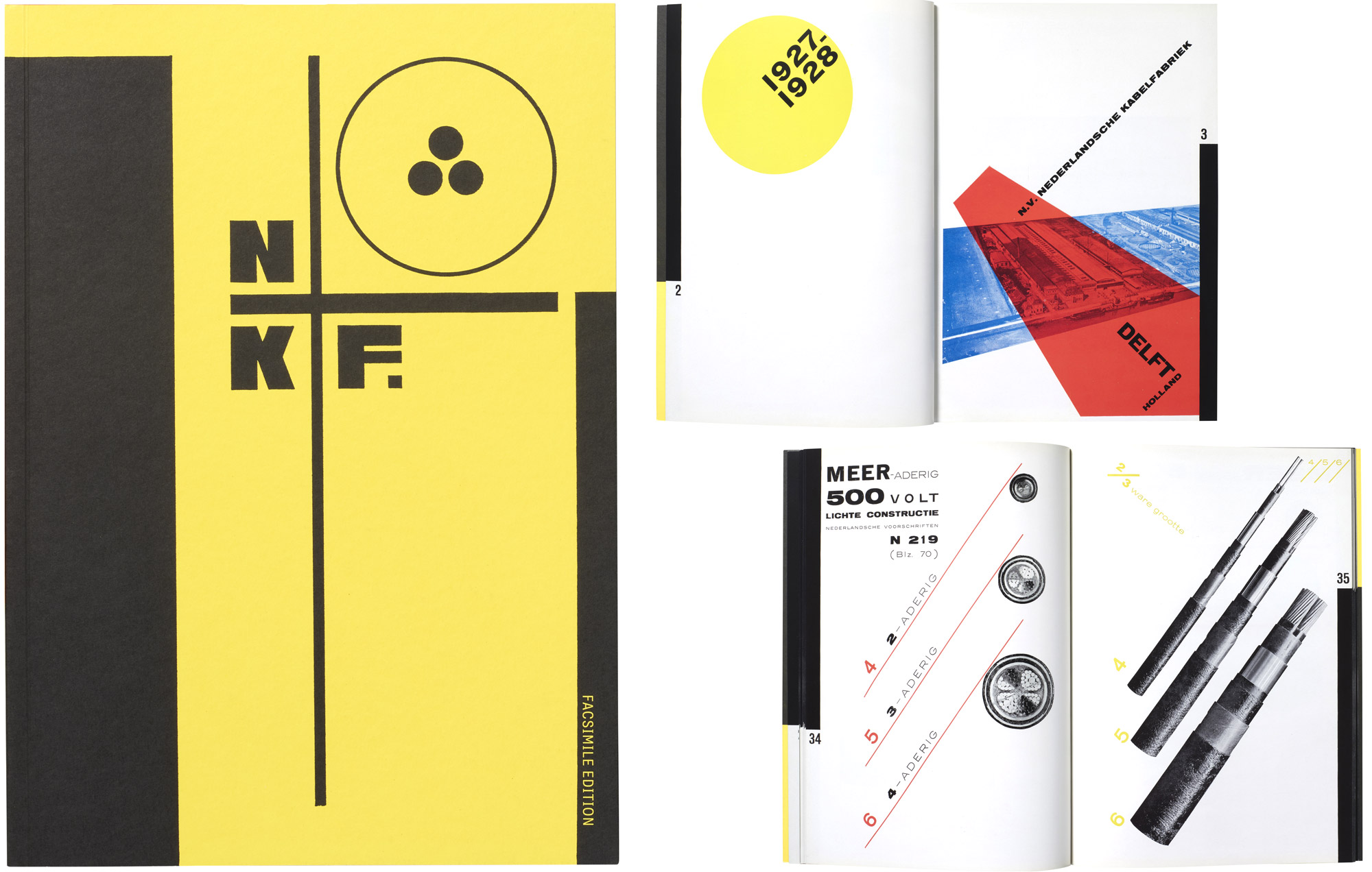
While at work on this landmark catalog, Zwart wrote to his wife, “There are some significant things in it, and I am trying various experiments which, I think, have never been used in advertising.” The result, a book finely tuned to transform experience with each page, asks to be encountered firsthand and read front to back.
All images in the gallery below are hi-fi captures. Click an image to enter fullscreen view, then click or pinch to enlarge.
The Facsimile
Photographed from one of Zwart’s own softcover copies, our facsimile follows his large DIN A4 format and faithfully reflects his choices of paper stocks with a textured yellow cover and glossy white paper for the interiors. Painstakingly color-matched and printed with stochastic screening to preserve fine details, the facsimile offers unmediated access to a work that until now was available only in special collection libraries.
The Supplement
Issued in the same softcover format on matte paper with more than 150 images, a companion volume supplies in-depth analyses and historical context, plus a wealth of fascinating material from Zwart’s NKF years, including Zwart’s own manifesto on type.
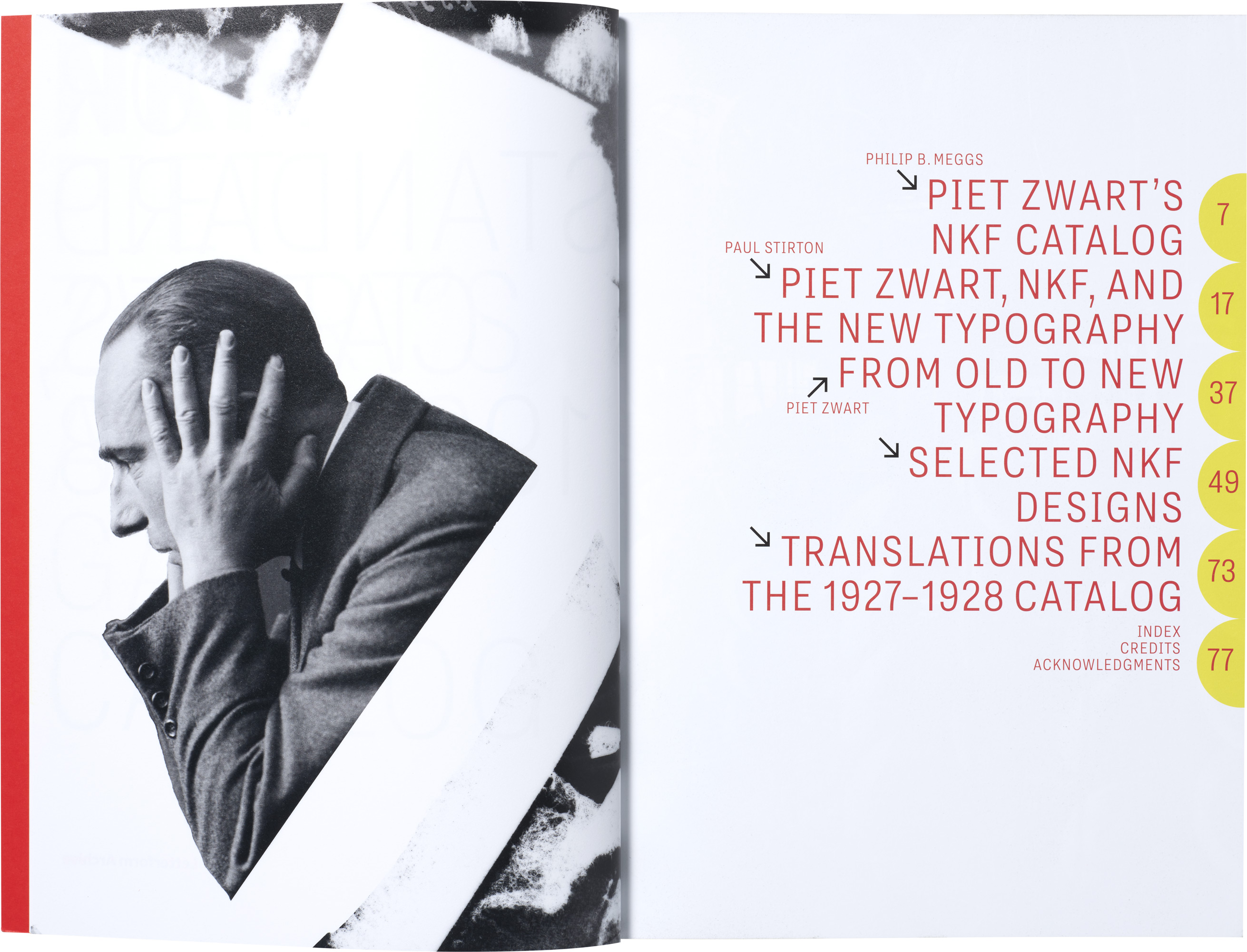
“Piet Zwart’s NKF Catalog,” by Philip B. Meggs
An introductory essay by late design writer Philip B. Meggs, whose bestselling Meggs’s History of Graphic Design opened countless doors to design history, guides readers on a page-by-page walkthrough of the catalog, elucidating its structure, explaining key elements, and situating it in the arc of Zwart’s career. Reading the catalog as a supreme example of the “designer as artist,” Meggs shows how “an ordinary, even pedestrian, line of industrial products” can, with the right approach, become subject-matter for significant creation.
“Piet Zwart, NKF, and the New Typography,” by Paul Stirton
Design scholar and author of Jan Tschichold and the New Typography Paul Stirton explores Zwart’s decade-long relationship with NKF, as well as his role in the international avant-garde scenes of his day. Telling one of history’s great client stories, Stirton details how Zwart’s early practices of learning by doing informed his later works’ meticulous manipulations of page and image.
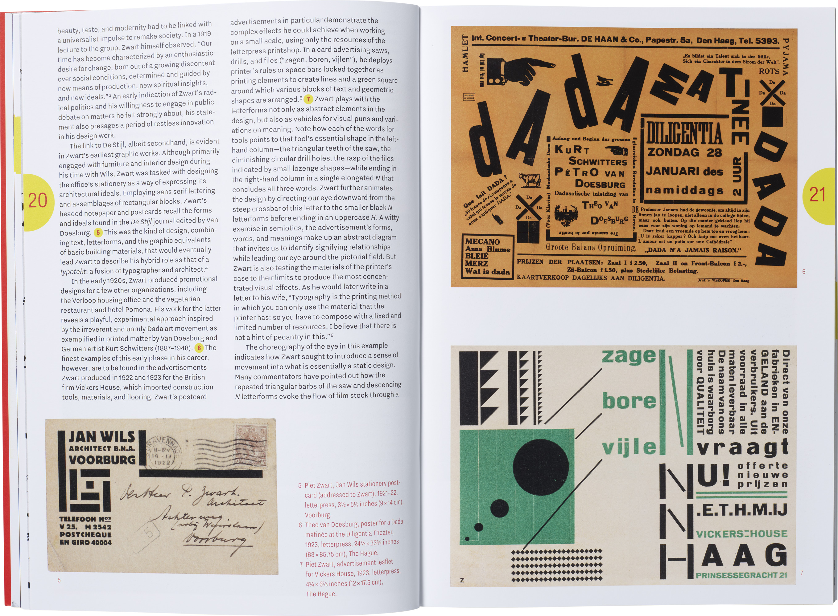
Bellwethers in an age of fast change and utopian thinking, Zwart’s type and photo experiments of the 1920s and ’30s reflect deep connections and involvement with the European artistic networks that defined what became known as the New Typography. Charting Zwart’s friendships, alliances, and feuds with avant-garde figures including Vilmos Huszár, Theo van Doesburg, El Lissitzky, Kurt Schwitters, and Jan Tschichold, Stirton’s essay brings the movement to life and highlights the originality of Zwart’s contributions, showing how powerfully these resonate today.
“from old to new typography,” by Piet Zwart

Left unpublished in 1930 and translated here for the first time, “from old to new typography” is Zwart’s manifesto. Set lowercase and delivered as if spoken through a megaphone, the essay summarily rewrites type history from the standpoint of the modern age with its “new spiritual tensions.” Its sweeping statements on new typography form a kind of reader’s guide to Zwart’s catalog, revealing reasons for its type selections (Kaart-Antieke, Annonce-Antieke) and indicating the ways it manifests the manifesto’s boldest ideas:
the new typography is fundamental. it rejects a predetermined formal structure, but builds up forms according to the function; it constructs a page with white and black in a way that expresses tensions in the text: explicit or plastic form. in advertising with its intrusive active text it employs all form-values that embody the compressive and tensile stresses of communication. not only with black and white, but also with color…. the new typography incorporates active red as a functional element: as a signal, an eye-catcher.
Zwart’s essay also brings out the political impulses underlying his programs for design. Claiming new typography as a product of technological and cultural progress, Zwart also portrays it as an instrument of struggle, “one of the most active tools [for] the realization of the culture of the masses, instead of that of a few sections of the population.”
The NKF Decade
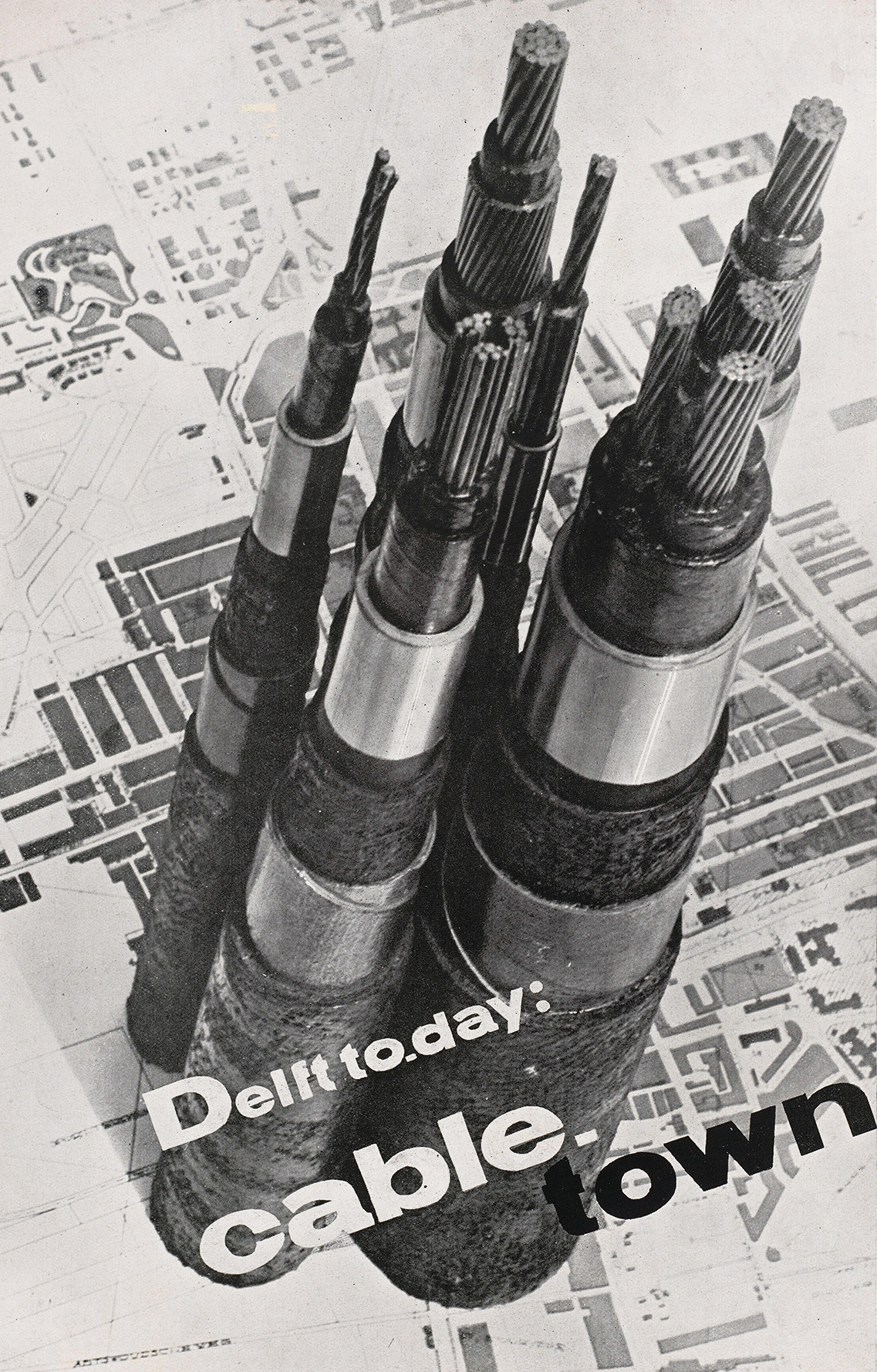
In the largest section of the supplement, reproductions highlight a vast archive of print designs for NKF. Representing every stage of Zwart’s work for the company, the book samples and contextualizes advertisements made over ten years, the colorful 1924 Standardization Booklet (Normalieënboekje) that shows Zwart at his most playful, and Zwart’s later experiments with photomontage in the 1929 English-language version of his catalog and his last NKF book, the 1933 Delft Cables (Delft Kabels).
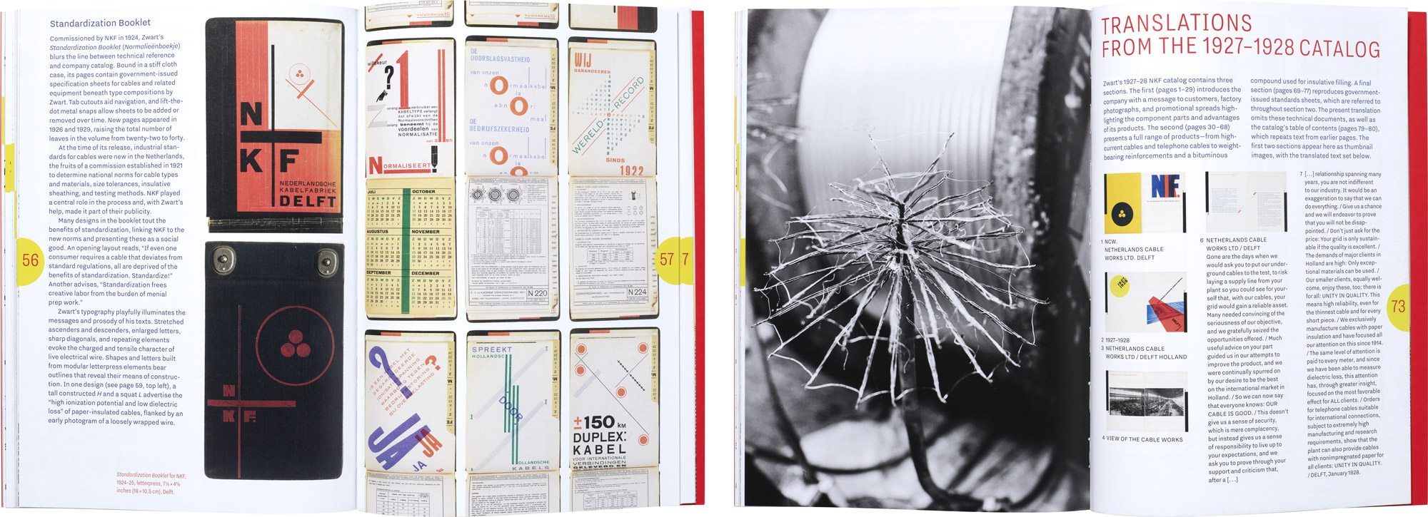
Right: A final section offers page translations for the 1927–1928 catalog, making crucial play between text and image accessible to English-language readers.
Designing for a Classic
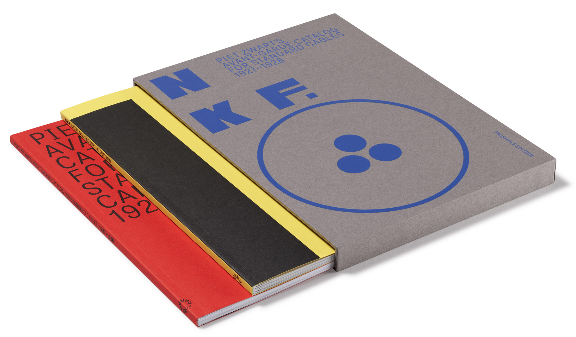
To realize this project, we looked to Dutch book designer Karen Polder. Polder began her work by carefully examining an original copy of Zwart’s catalog at the Huis van het boek in The Hague. Selecting closely matched materials for the facsimile, she also found cues to inform her fresh design in the supplement.
Inspired by the vertical organization marked out by black bars in Zwart’s original, Polder’s supplement uses a grid vertically divided in three. “Instead of black bars,” she explains in a recent Dutch interview, “I have used yellow circles with striking red page numbers, which have their own places per section and function as navigation throughout the book. For the font, I chose Nitti Grotesk by Bold Monday, as a contemporary counterpart to Zwart’s expansive typography.”
In section openers, Polder incorporates seven of Zwart’s stunning black-and-white photos for NKF and other projects. Her design for “from old to new typography” preserves Zwart’s original typographic choices and includes full-page images of his layout with illustrated references.
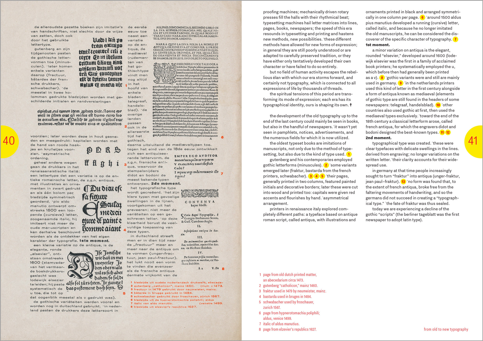
Housed in a slipcase featuring Zwart’s cable cross-section logo for NKF, this two-volume edition brilliantly preserves a design classic, offering a contemporary resource for study and inspiration.
To add NKF to your personal library, view a full video pagethrough, and find links to Paul Stirton and Elizabeth Meggs’s Letterform Archive salon about the book and related content, visit our shop at the link below. Members receive 10% off all Letterform Archive titles.
— Chris Westcott, Editor, Letterform Archive Books

