News
Jack Stauffacher on Working with Type
For the printer and designer whose wood type prints are the subject of Only on Saturday, crafting a perfect page meant getting a feel for the written word, its history — and what it means to be human.
Jack Stauffacher was a celebrated teacher, mentor, and typographic thinker whose legacy in art and design is explored in the pages of Letterform Archive’s third book, Only on Saturday. Although he never penned a complete guide to his thinking, Stauffacher’s shorter essays, interviews, and printed work offer insight into the practices and ideas that animated his work with type. In this post, we’ll explore a few of these notions — including the delicate relationship between reader and typographer, the generative power of limitations in design, and the value of our historical efforts to express our humanity.
“The Perfectible Reading Device”
It wasn’t lack of ambition that kept Stauffacher from printing up his dictums on design. By the mid-1940s, he had already resolved “to shape the ideal book,” and many years later, those attending his famed Friday lunches were rarely in doubt about his opinions about a particular work. But Stauffacher didn’t seem to believe that the path to perfection could be found in fixed rules or stubbornly held positions. “Any dogmatic language that is too absolute can confuse things,” he tells us in a 1962 essay reprinted in A Typographic Journey: The History of the Greenwood Press. “The inevitable polemic between modern and traditional is a moot question.” More can be learned, his writings and interviews repeatedly suggest, by attending closely to one’s own experiences of type, texts, and printed books.
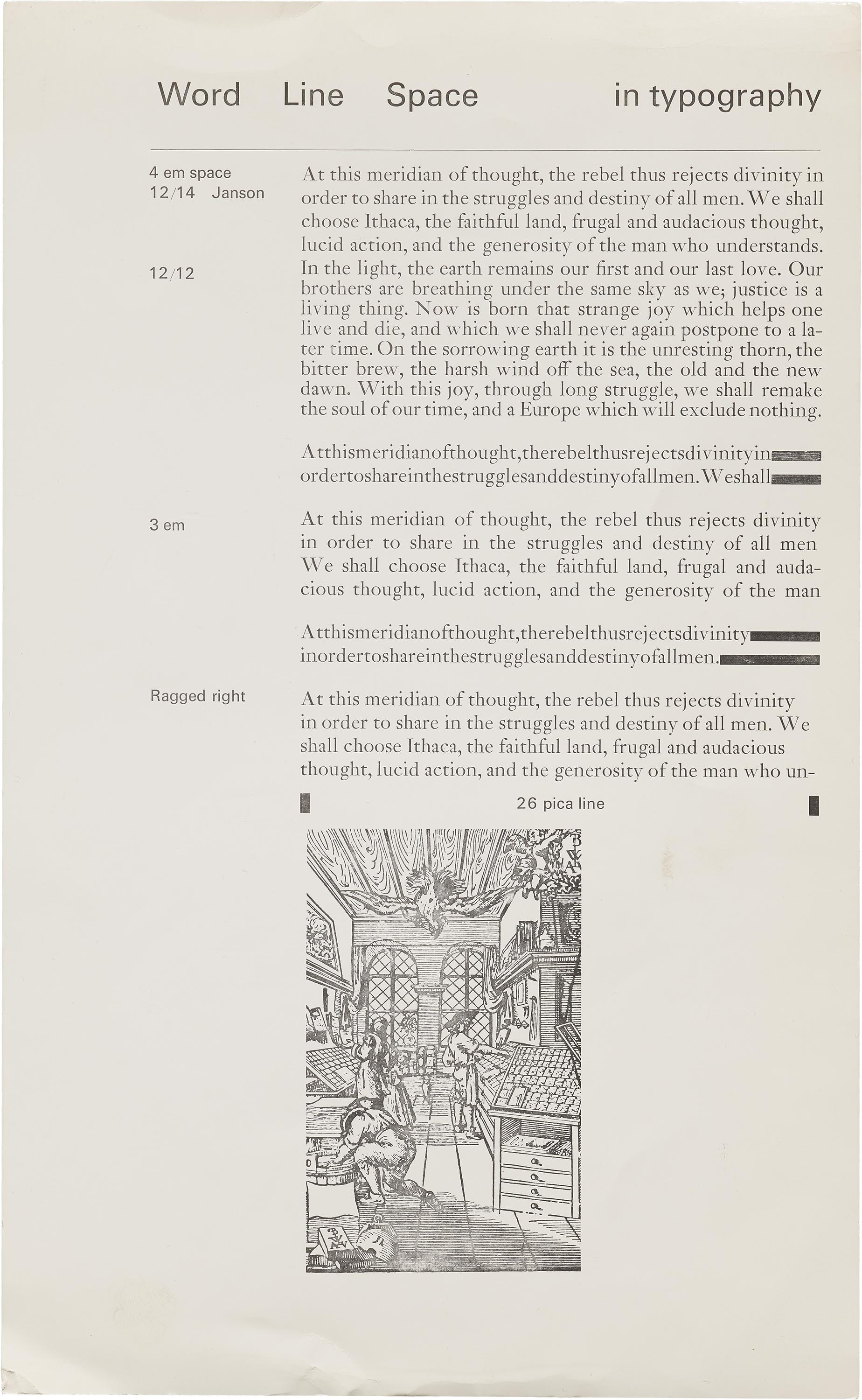
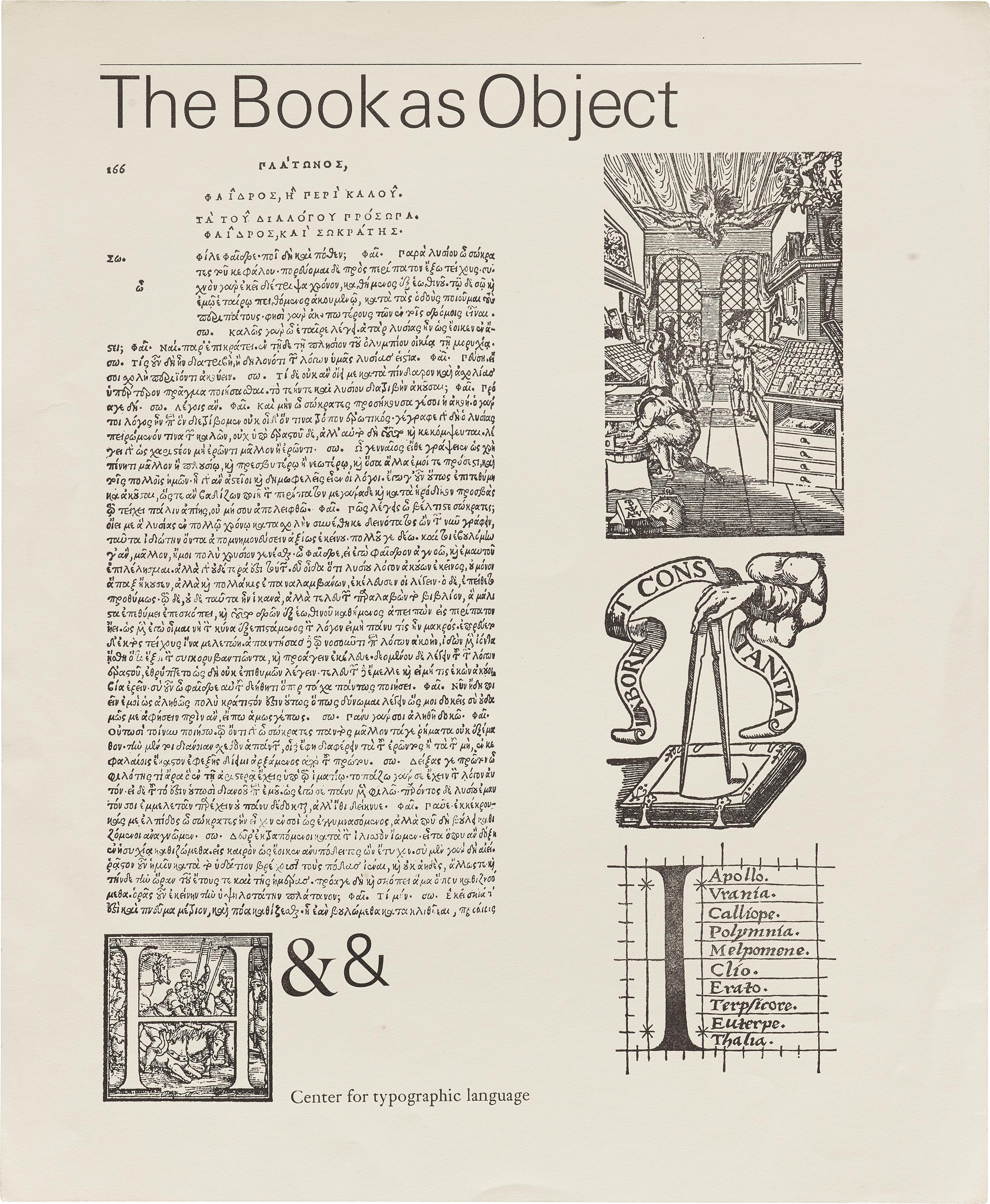
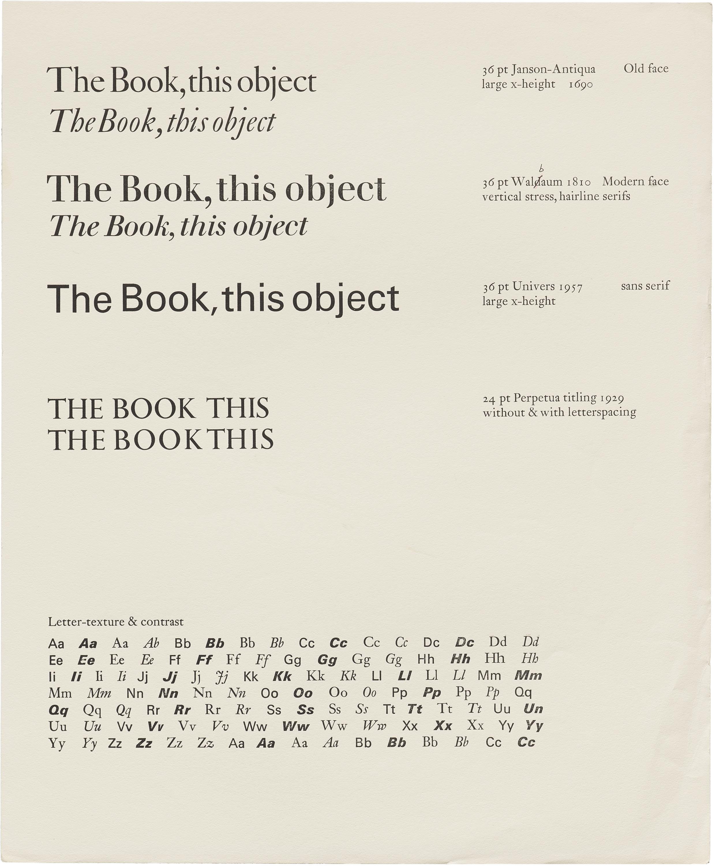
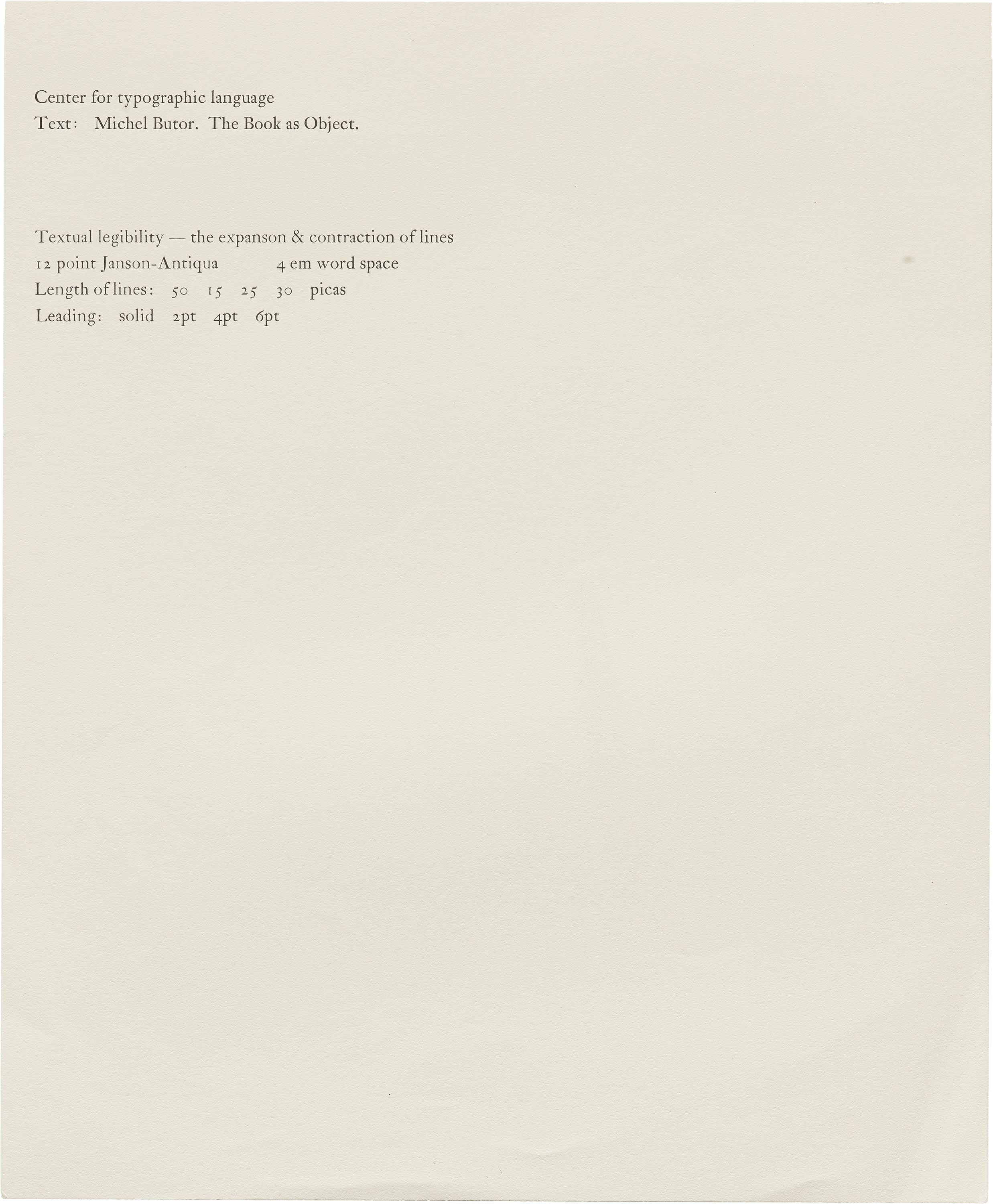
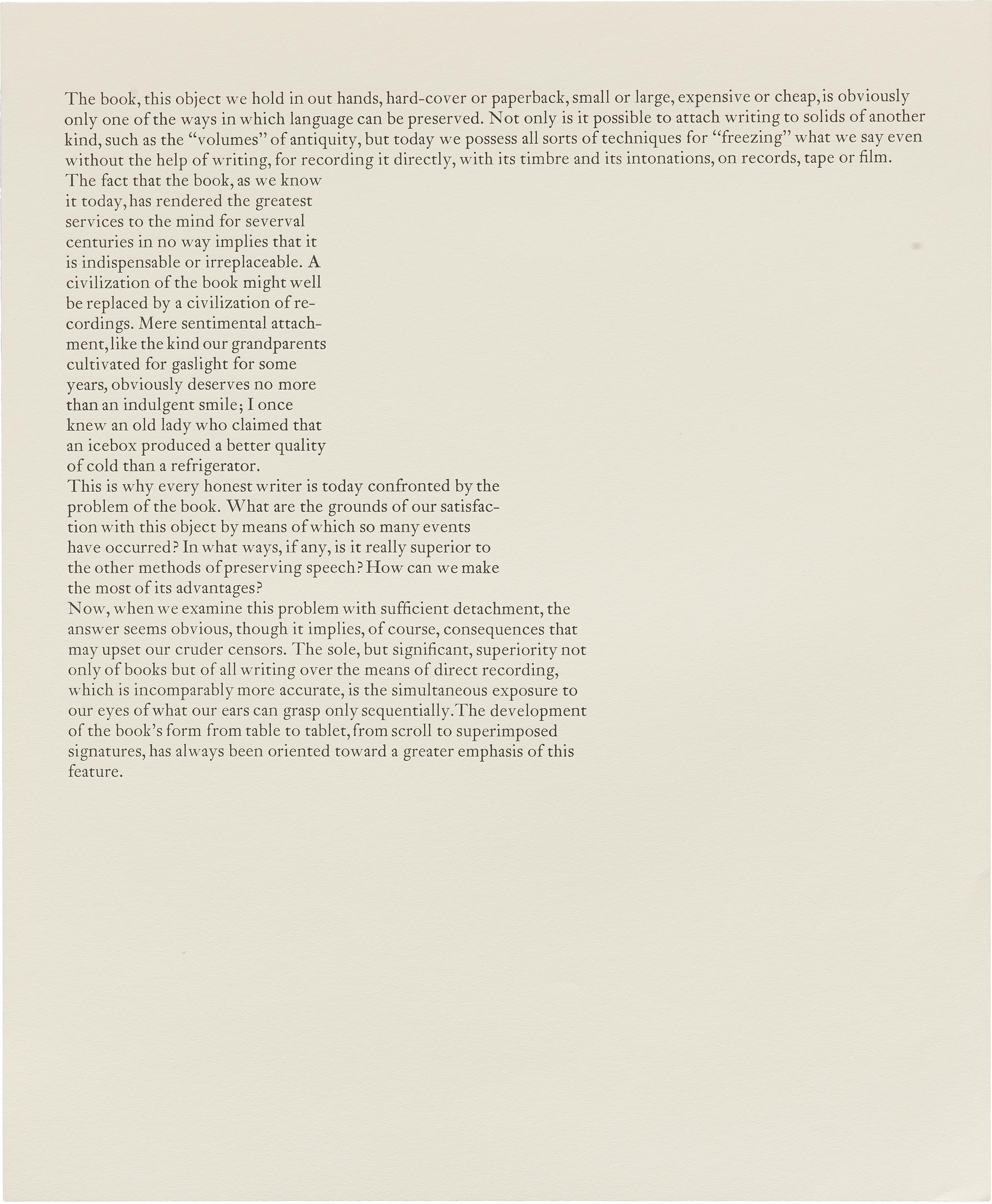
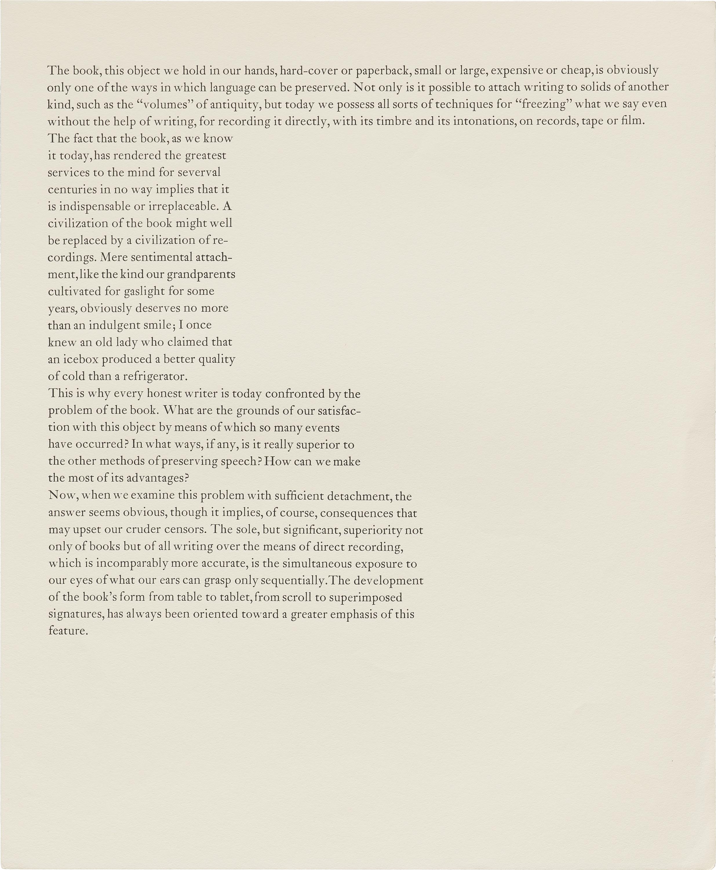
Reading, in other words, takes pride of place in Stauffacher’s public reflections. Quoting Paul Valéry’s claim that “a fine book is first of all a perfect reading device,” the same essay advises, “Typographic quality… is difficult to sustain unless there is a constant attention to the multiplicity of details along the path of reading. When we hold this reading device — this book — in our hands, we start again to understand the formal needs of the reader.” Here, Stauffacher shows his concern for the fundamental issues of legibility, readerly comfort, and the threat of distraction, which he insists we come to know best by actually reading. In teaching materials from his days as an instructor at the Carnegie Institute and the Center for Typographic Language, he encourages students to encounter these issues first for themselves, presenting blocks of text with differing line lengths, leading, and type choices, all free of further instructional comment.
“My primary goal has been to build a bridge between the author and the reader.” — Jack Stauffacher
Yet legibility and readability, at least as we usually understand them, were just the start of Stauffacher’s typographic interest in reading. An essay on “Literature on Typography” for AIGA Journal expands on his purpose: “My primary goal has been to build a bridge between the author and the reader. To do that, I need to understand the author. Then comes the task of integrating that understanding into the book as an aesthetic object, to create the perfect reading device.” With a reminder that designing always means interpreting — making decisions that shape how words and ideas will be received — Stauffacher presents typography as necessarily rooted in the substance of whatever is printed. “The designer who misinterprets the reading text” or seeks “a subjective design… at the expense of content… has failed in their translation,” he writes in his 1981 “Typographic Remarks,” while reading deeply prepares the designer to deliver the author’s words in a layout most in keeping with their significance.
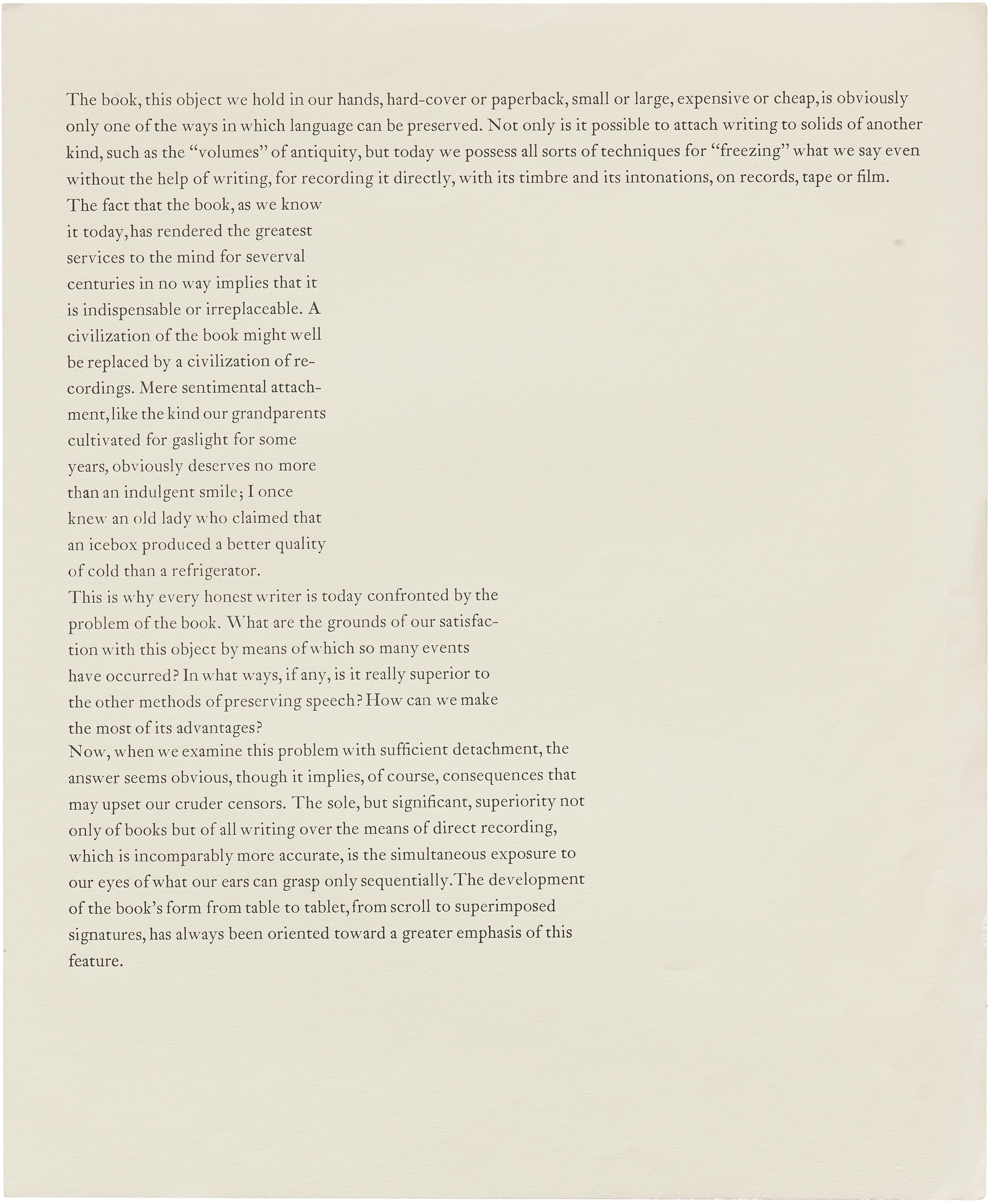
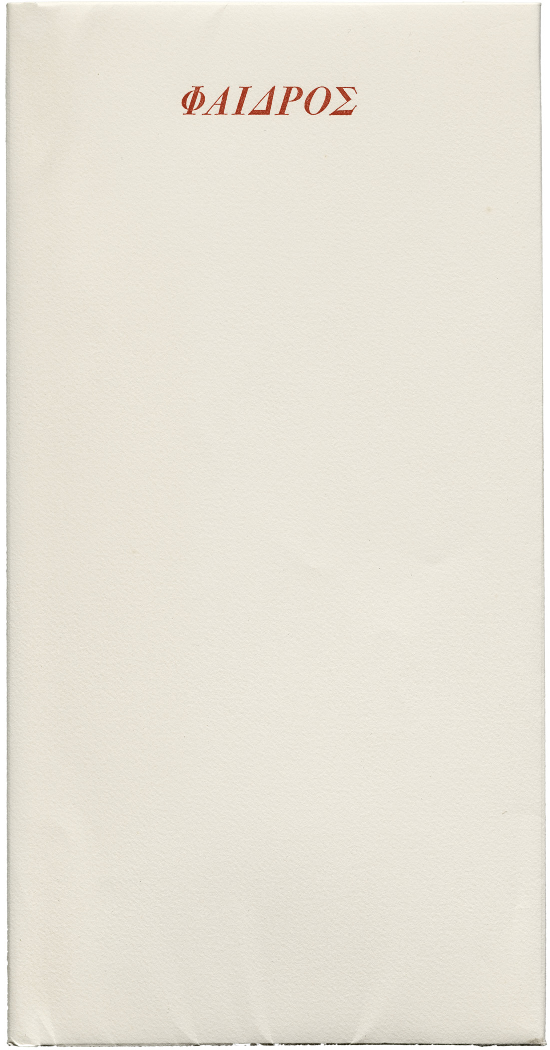
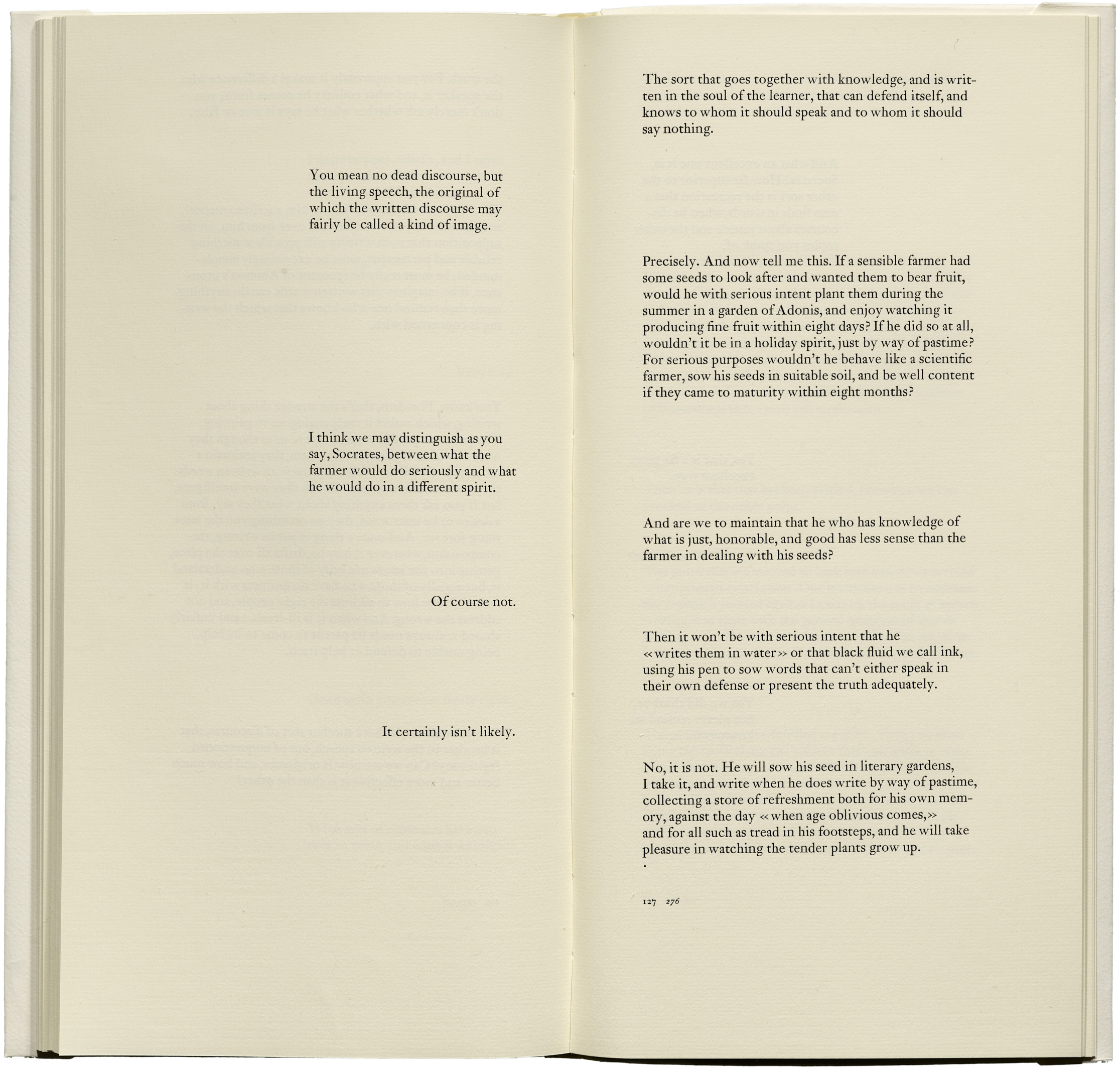
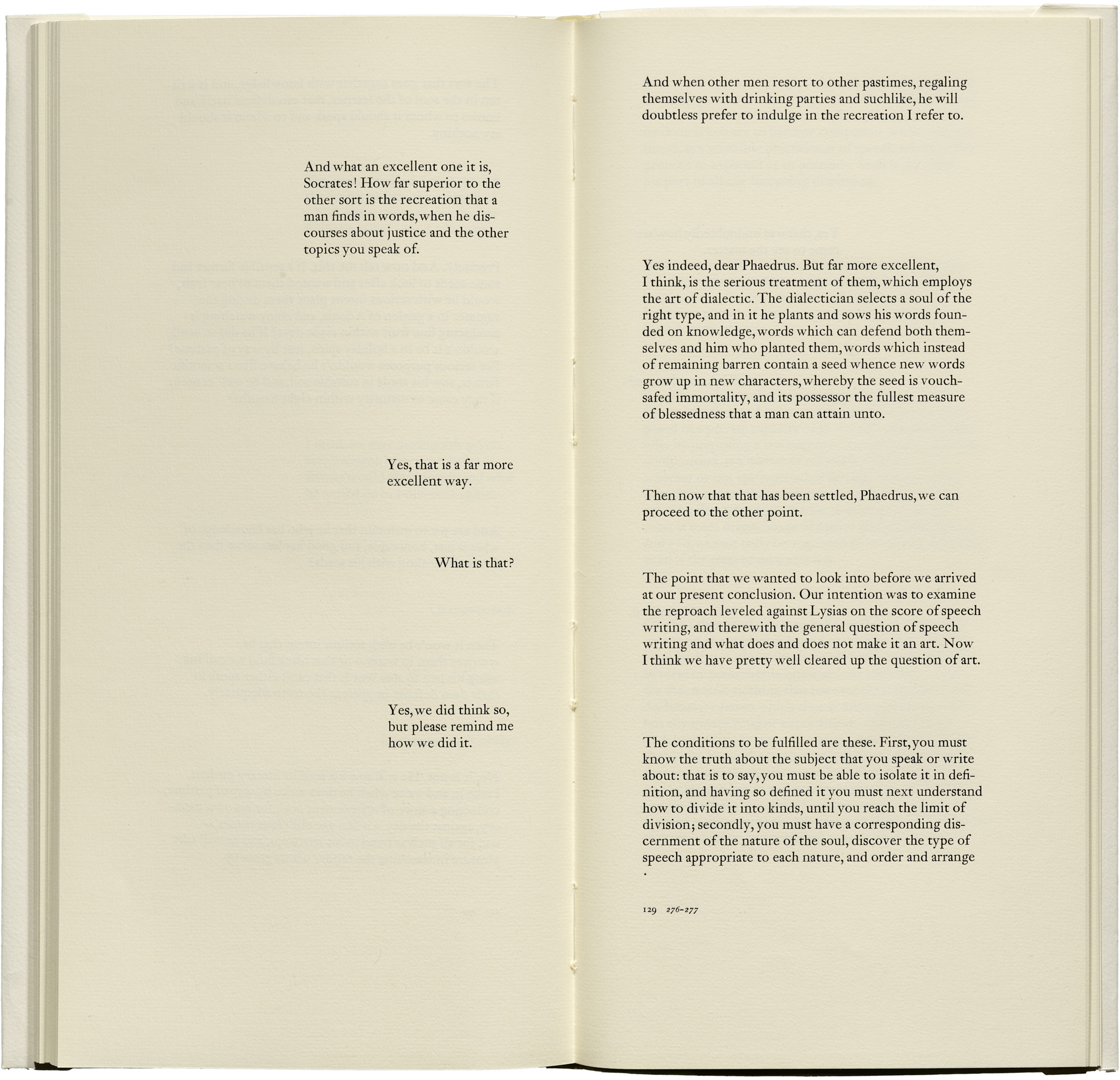
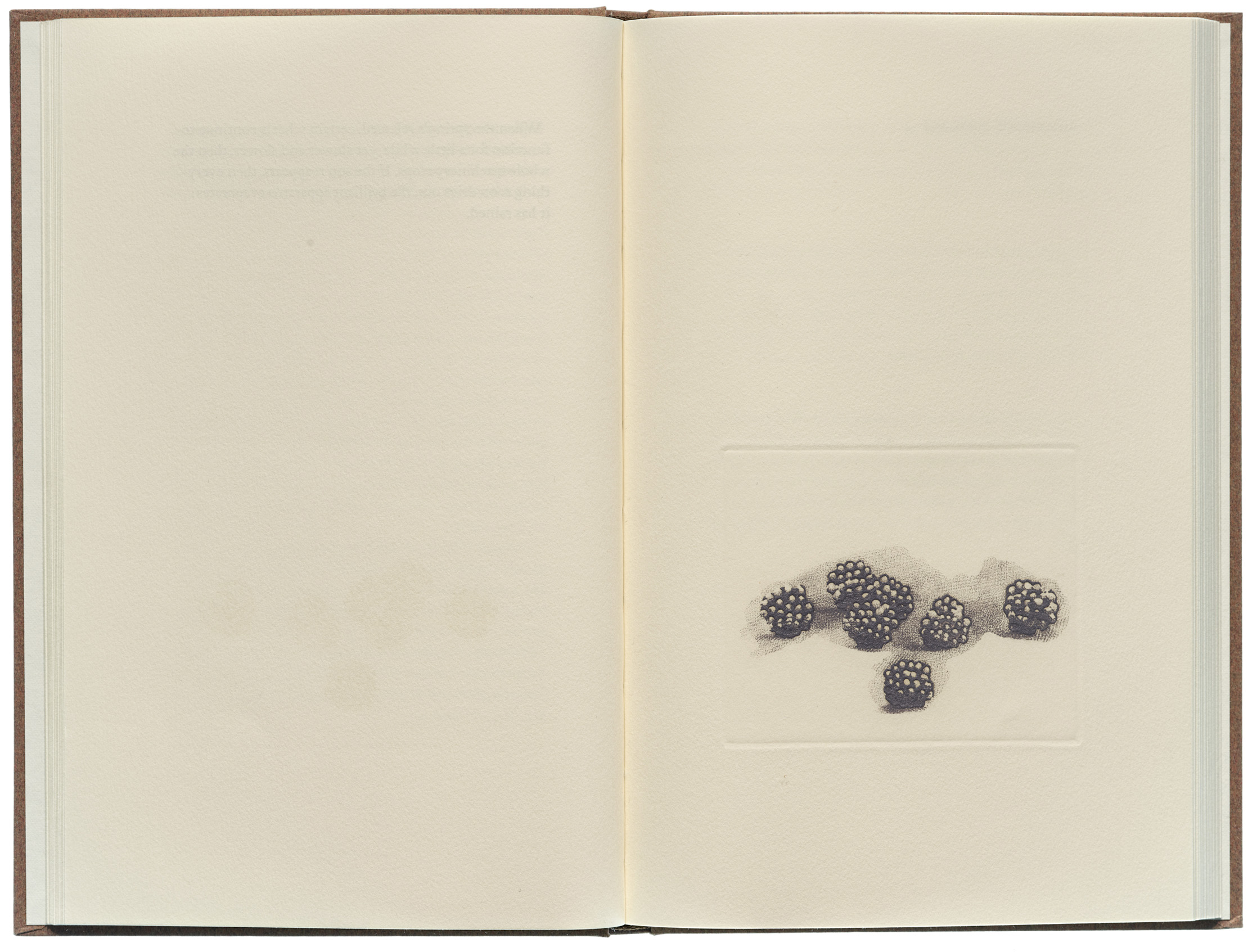
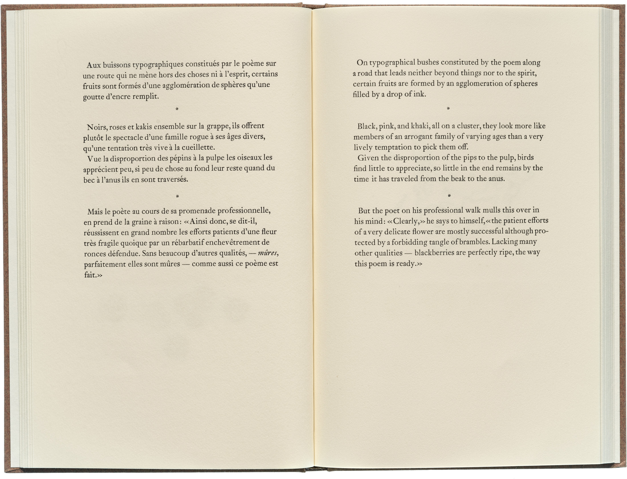
We get the clearest sense of Stauffacher’s thinking by looking at the books of his own Greenwood Press. Each takes cues from its source text in order to address the unique problems it poses for the designer. Most famously, Phaedrus (1977) proposes a simple yet dramatic departure from traditional dialogue format, giving presence to the book’s two voices by setting their words — and blank space to convey their silences — on facing pages. Dix poèmes / Ten Poems (1983), a book of poems by French modernist Francis Ponge (with translations by Serge Gavronsky and copperplate etchings by Elizabeth Quandt Barr), quietly balances words and image, original text and translation, cover and interior to convey what (in a 1996 interview) Stauffacher calls the poetry’s “calm and lucid and mysterious” engagement with everyday objects, and to ensure “the primary power [is] coming from the poems themselves.”

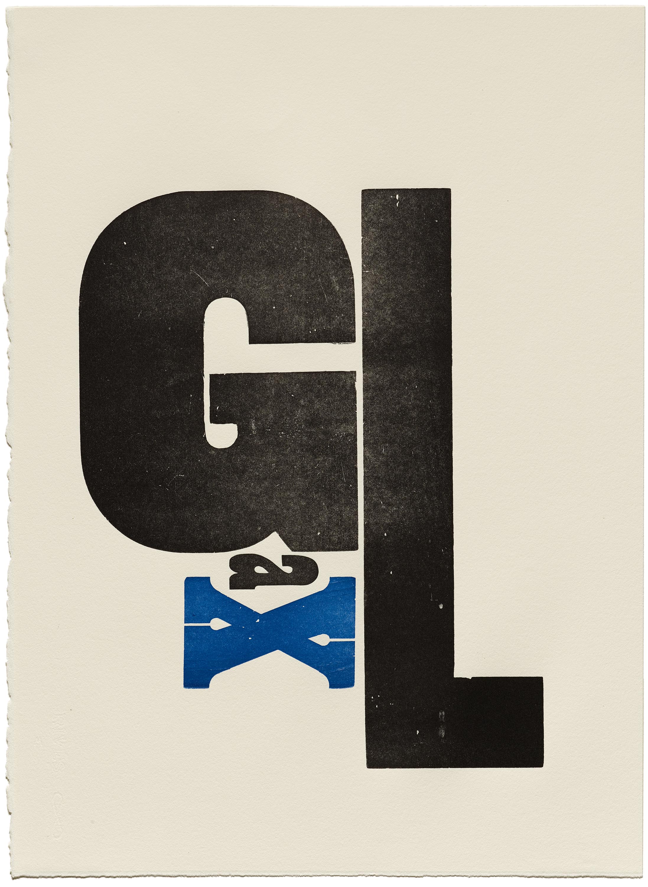
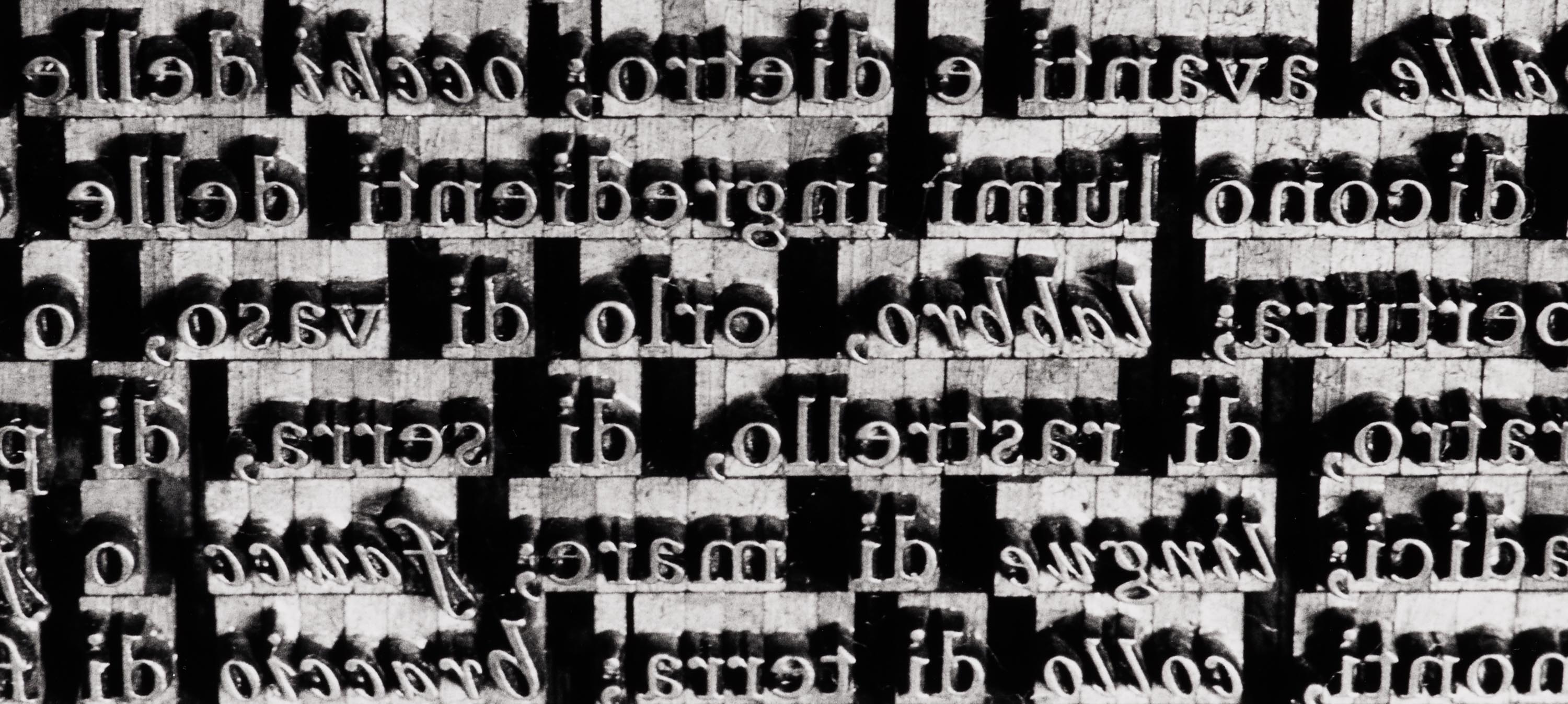
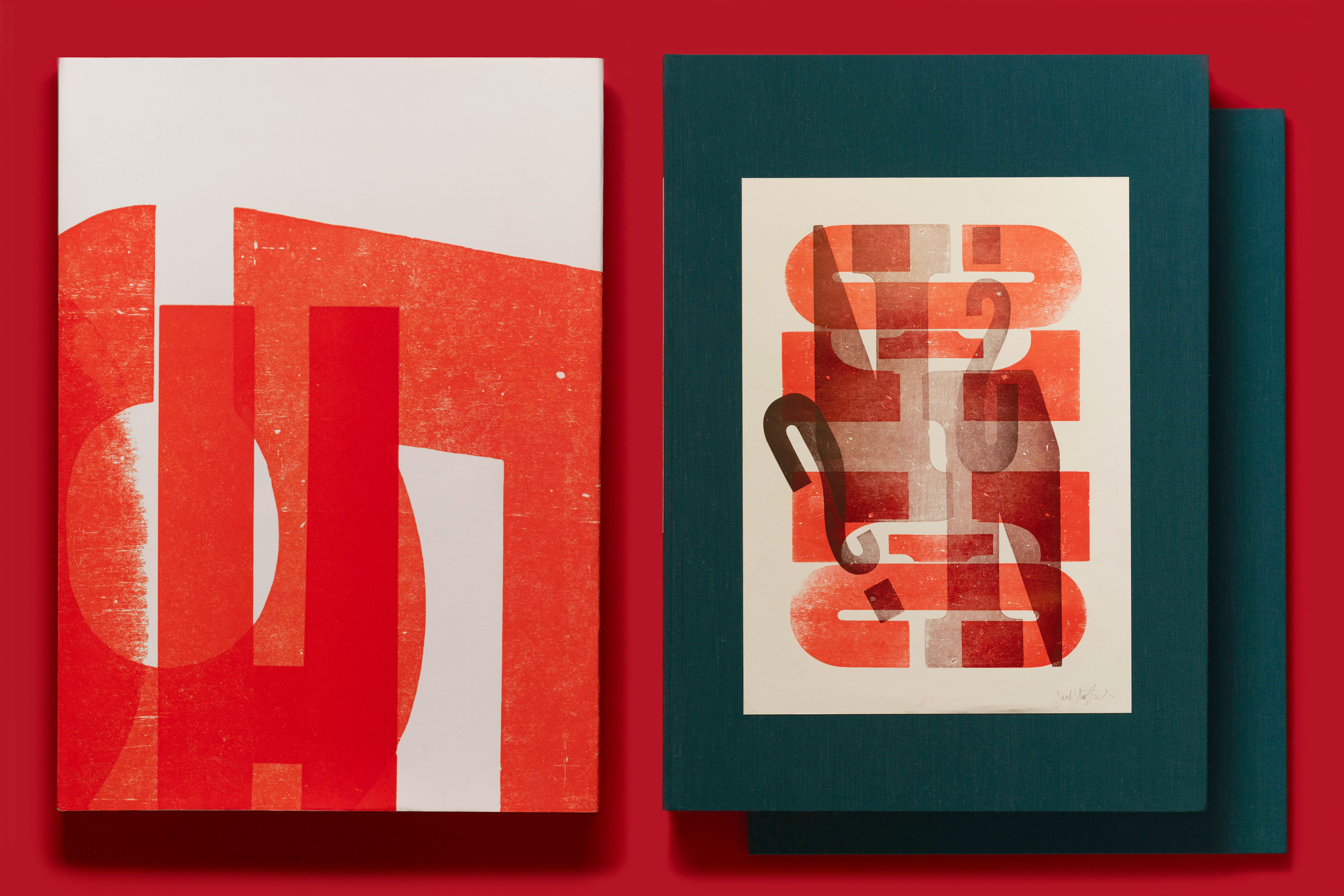
Even Stauffacher’s wood type prints evoke an idea of design in the service of reading. With their almost inevitable typographic integrity, they seem to imply that their arrangements of letters are best for saying their piece. In an interview in Only on Saturday Stauffacher explains, “Since legibility is a very formal exactness, [the] spaces between the letters, the leading between the lines all made very strict and, I would like to say, readable [arrangements].” The prints are “readable,” he says, “in a free way.” Out of his light-hearted practice of experimentation comes something legible and articulate — what Stauffacher calls “a formal declaration of good design.”
“The Goddess of Limits”
Stauffacher’s talk of perfection could sound a bit lofty, if not for his equal devotion to professional modesty. In “The Eyes of Nemesis” from 1962, he addresses the subject with a philosophical spirit, encouraging readers to see Nemesis, the Greek “goddess of limits,” as a guiding figure for designers working with type. Citing the 20th century’s rapid technological changes, chaotic new typographic landscapes, and expanding array of aesthetic choices, which taken together might leave a designer disoriented or detached from the traditional bases of craft, he advocates for “claiming our allegiance to man’s needs for limits and moderation” by reaching for constraints as enabling conditions for design.
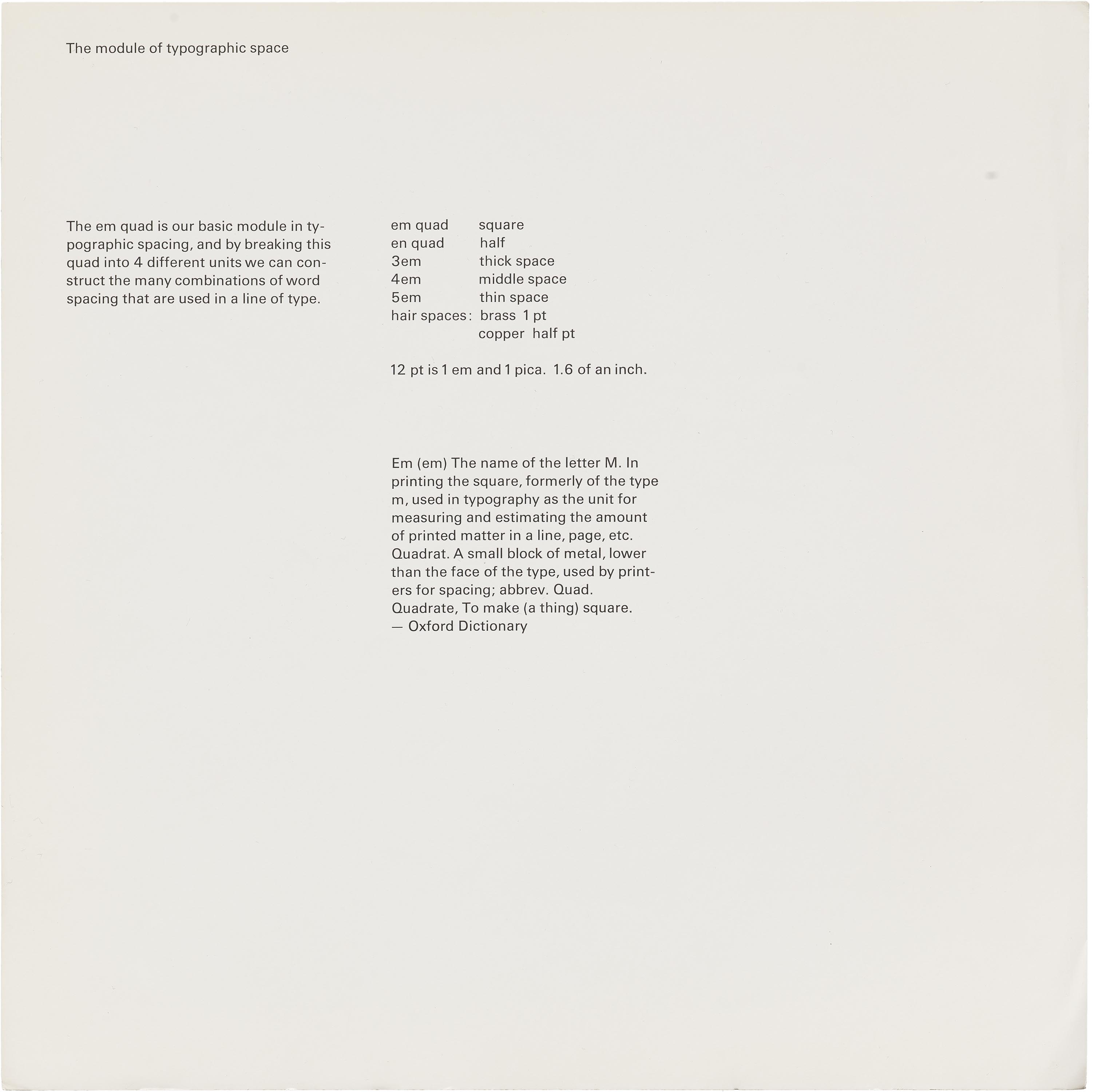
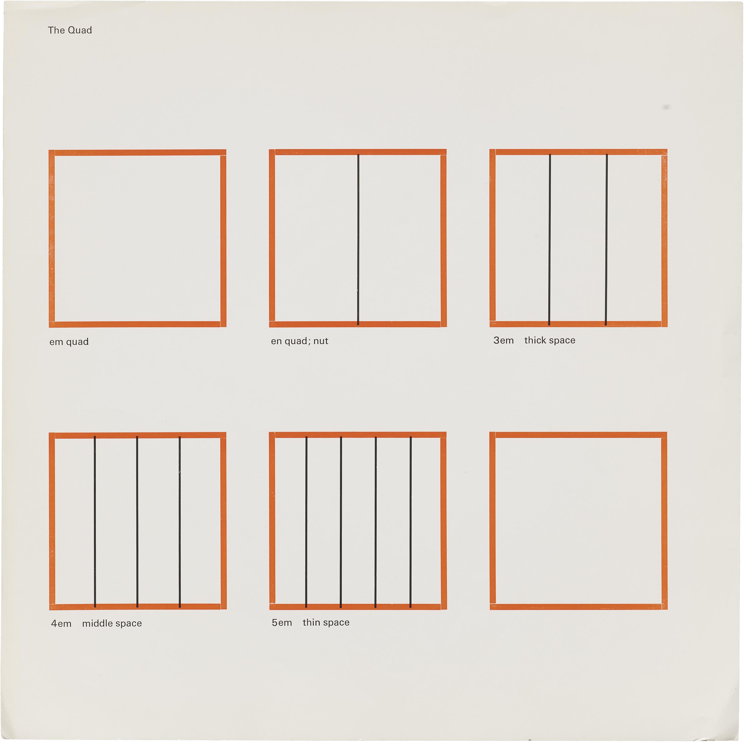
For instance, he suggests we can discover productive limits simply by attending to the physical forms and materials of the craft. “A printed word has its measure,” Stauffacher liked to say. “The typographic module is implicit and indicates our proportions, be they the type or the page sizes we select.” In early teaching materials, he playfully makes the point (and anticipates later wood type adventures) by giving visible presence to the em quad — the “basic module of typographic spacing” (and traditionally the square occupied by a metal type M in any given font).
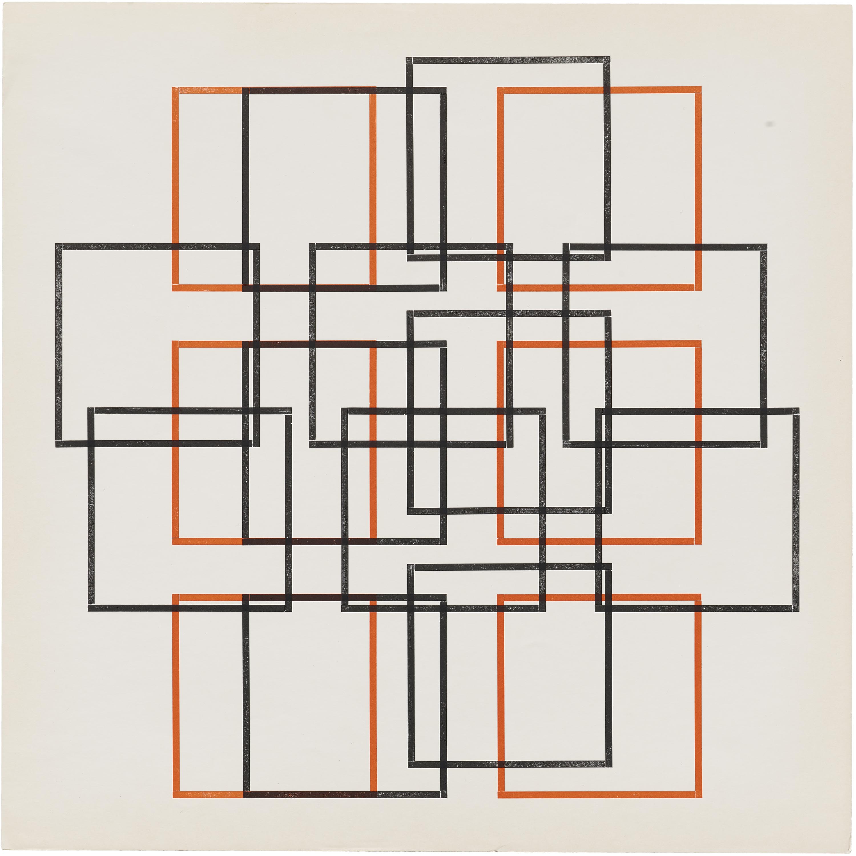
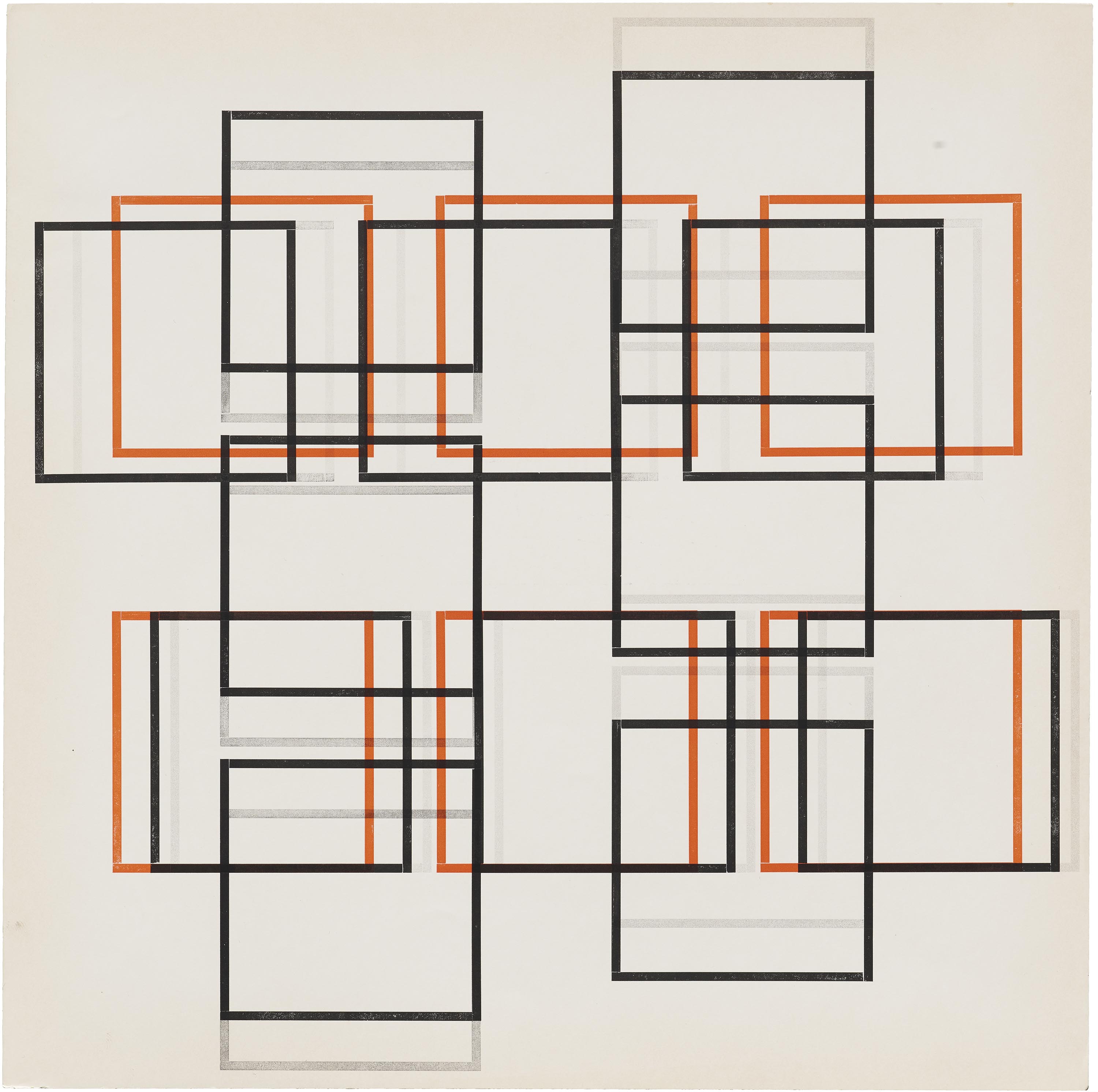
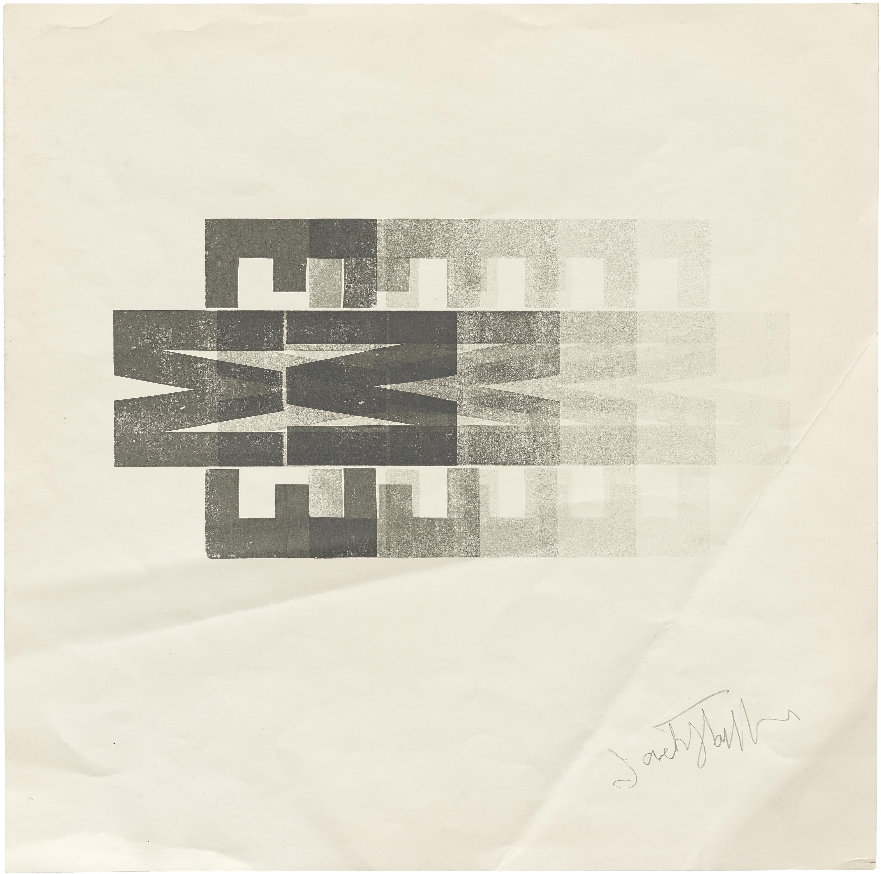

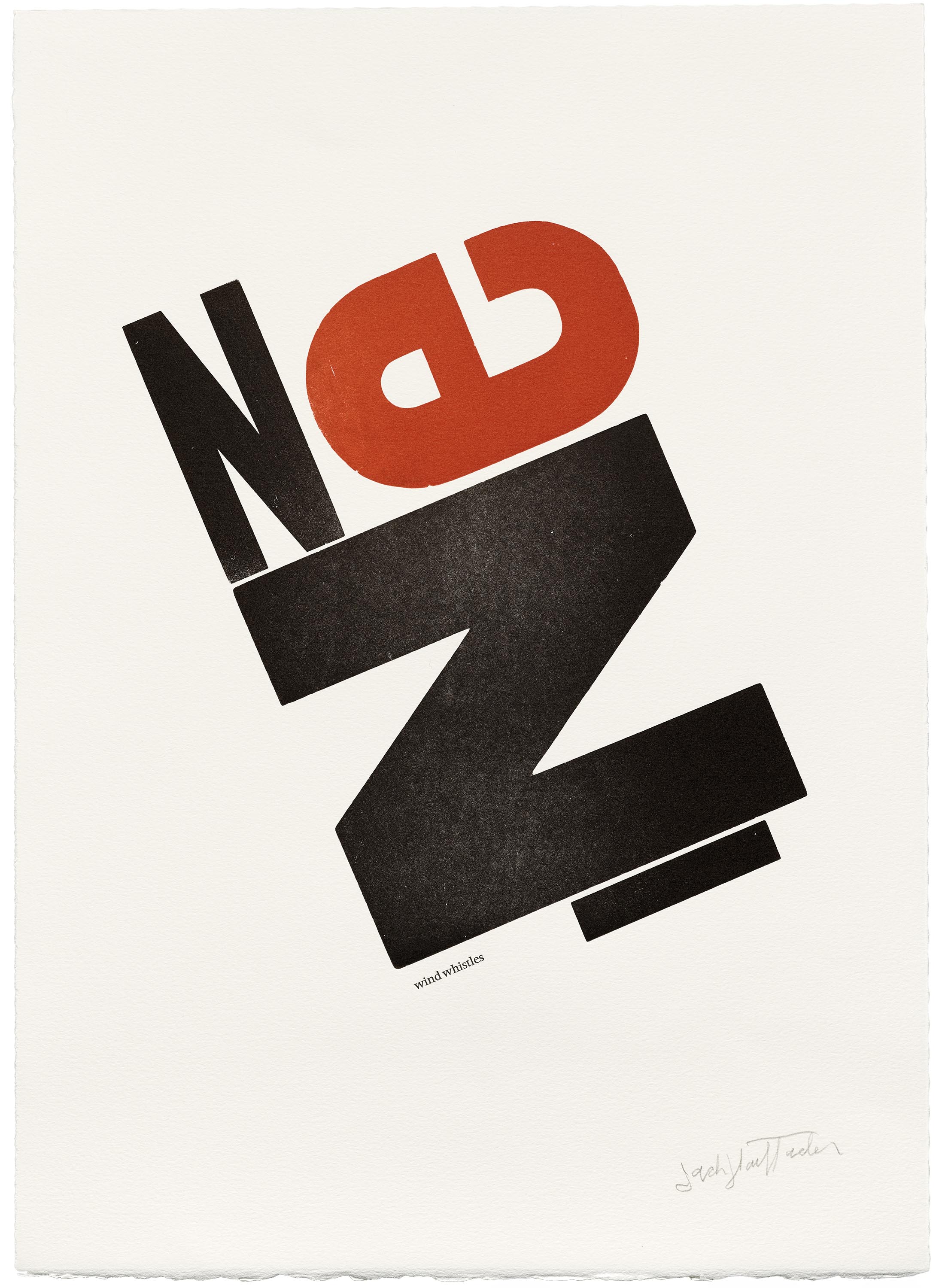
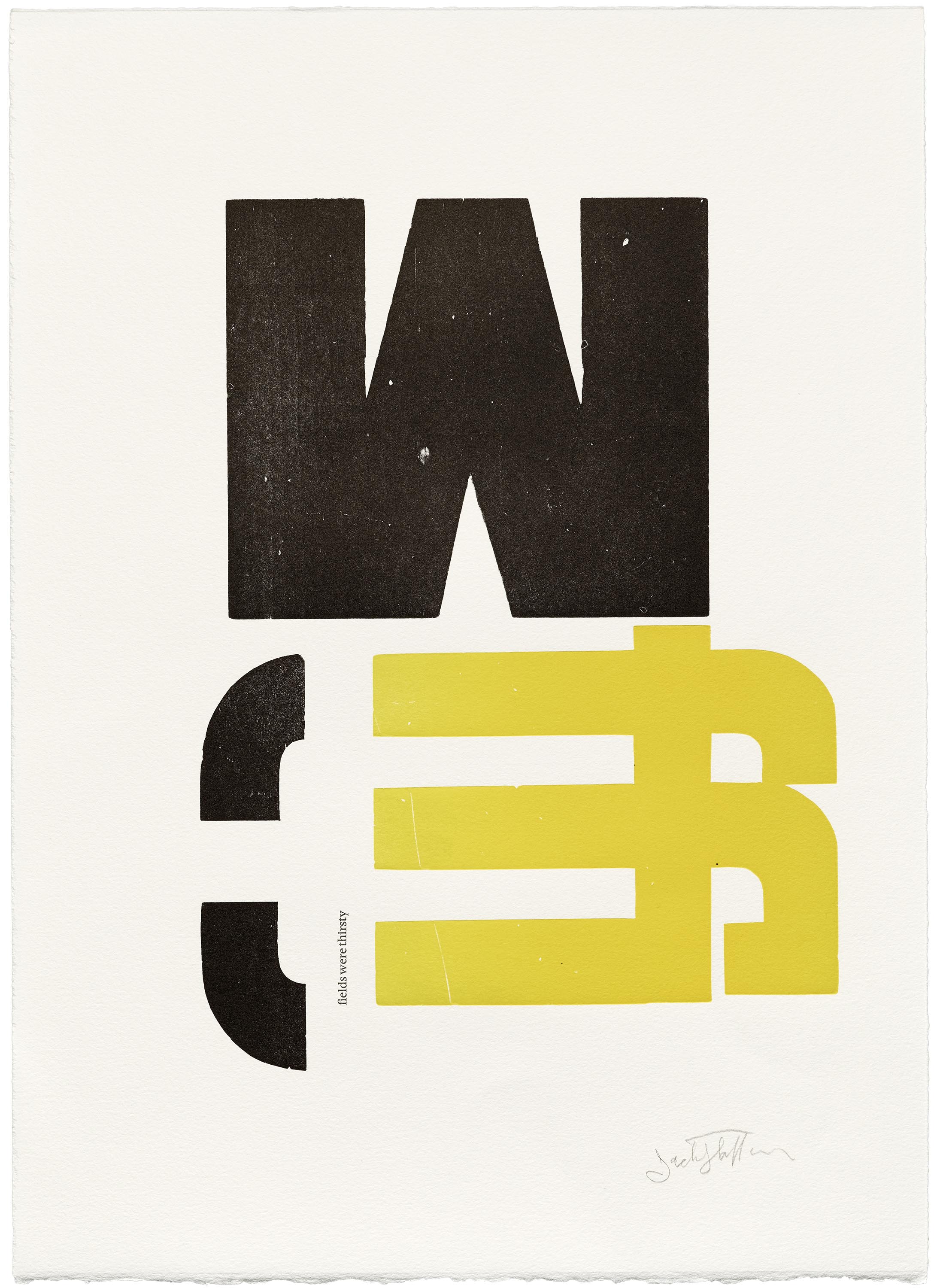
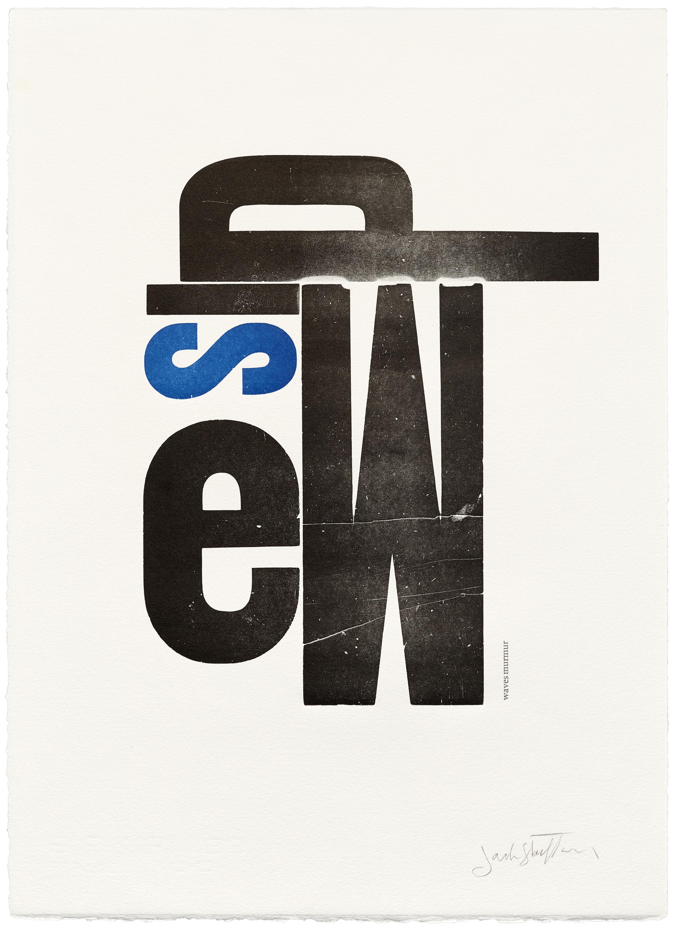
Such lessons informed his own interest in employing a limited typographic palette. While his studio stocked at least as many typefaces as you’d expect to find on an early Mac computer, nearly all of his handset books feature only one: the Baroque text type of Nicholas Kis (Janson-Antiqua, aka Kis-Janson), which over decades he got to know by heart. In his wood type prints, he explored within even narrower constraints, arranging an incomplete set of 66 mismatched letters to reveal the wealth of possibilities present in their forms.
In his lifetime, Stauffacher exhibited a vast appreciation for inherited forms — and a real wariness of modern design’s tendency to abstract them in its search for new universals. To counter this shift, he persistently argued for the value of getting to know the long history of print, from Aldus Manutius in the 15th century up to current-day Adobe. “Under the impact of computers and the din of the marketplace,” he writes in “Typographic Remarks”, “We find typographic style born in the most contemporary environments, seemingly with little or no historical base.” As a corrective he advises, “When we start to cultivate and recognize the ancient traditions of typography in fresh contemporary ways… we start to comprehend the true essence that governs our limitations.”
Type’s Human History
Besides offering clues for how design can make good use of limits, historical thinking shaped Stauffacher’s sense of the designer’s responsibility to their moment. In the 1950s, while on a Fulbright fellowship to study the early history of Florentine printing, Stauffacher started to see typefaces and books as expressive elements of broader cultural climates. “I saw the book no longer isolated from its culture,” he explains in an interview with Ruth Tieser. “The very gestures of the epoch in which these books were made were permeated with the spirit of their times.” It was an insight that led to a conclusion as challenging as it was unavoidable: “Good design in bookmaking” aspires to participate in “the living and mysterious revelation of a culture, a people, a language.”
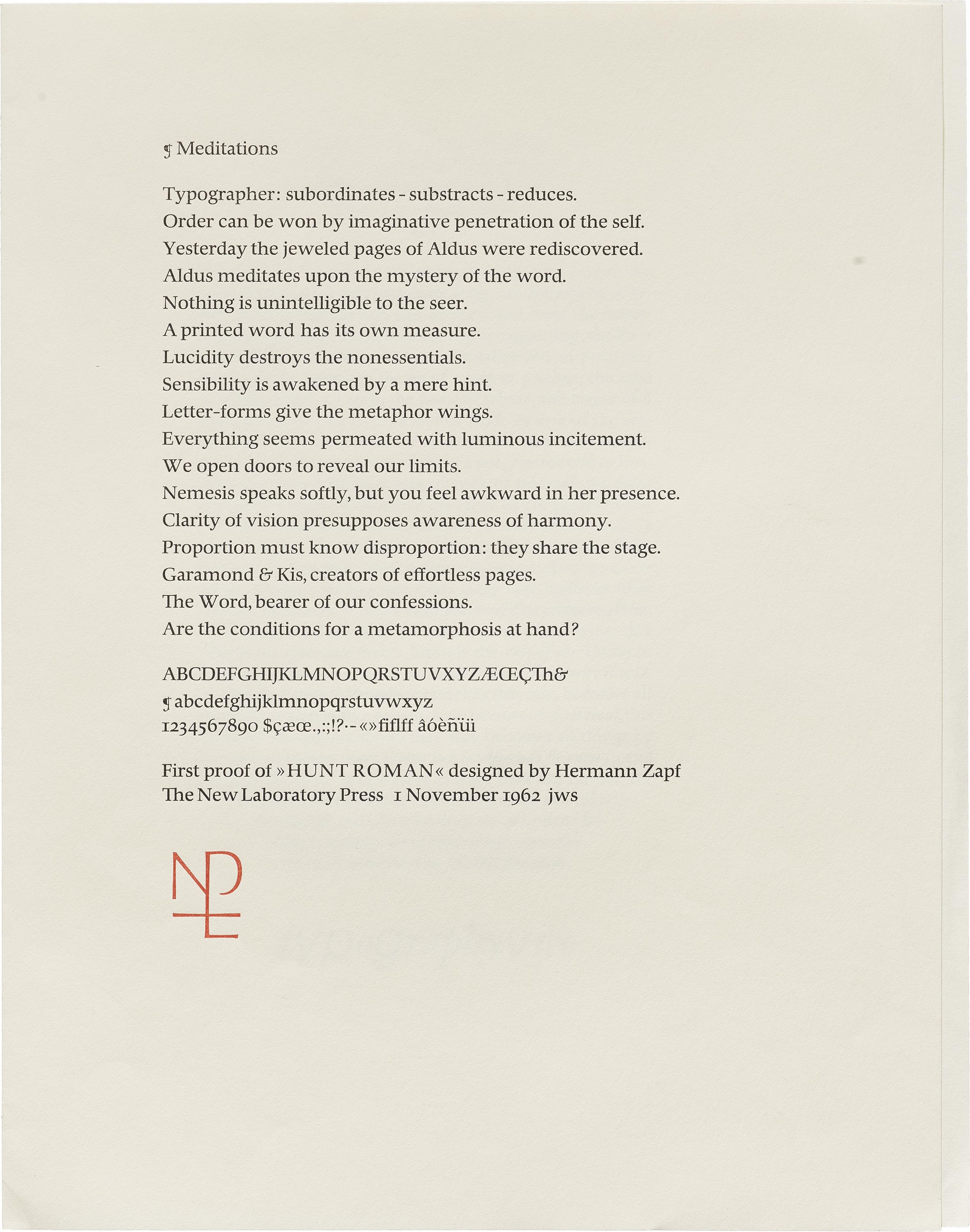
There’s a certain feeling of loss behind Stauffacher’s need to name this aspiration, an impression that industrialism has separated us from earlier humanistic cultures. “The very energy and vitality of modern science and technology have altered and changed our environment in ways beyond our understanding,” he tells Paul Karlstrom in a 1993 interview. “The graphic designer contributes to that changing culture in a profound way.” Yet his work doesn’t seek the restoration of older models, and it doesn’t settle into a mood of defeat. Instead, it proposes that design can play a role in a humanistic metamorphosis of our contemporary culture. Thus the question that ends his 1962 “Meditations,” which graces the first proof of Hermann Zapf’s Hunt Roman and condenses so many facets of his thinking:
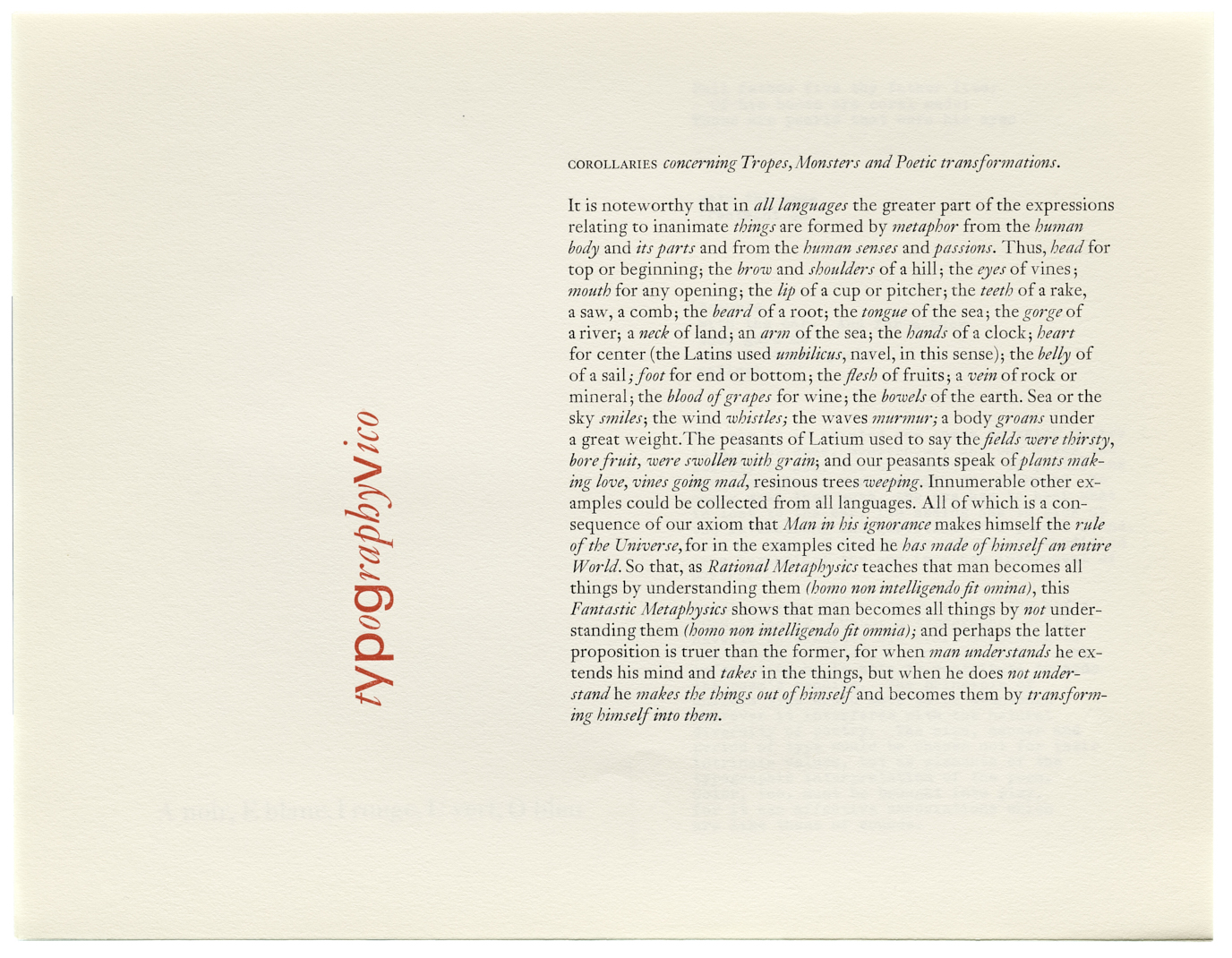
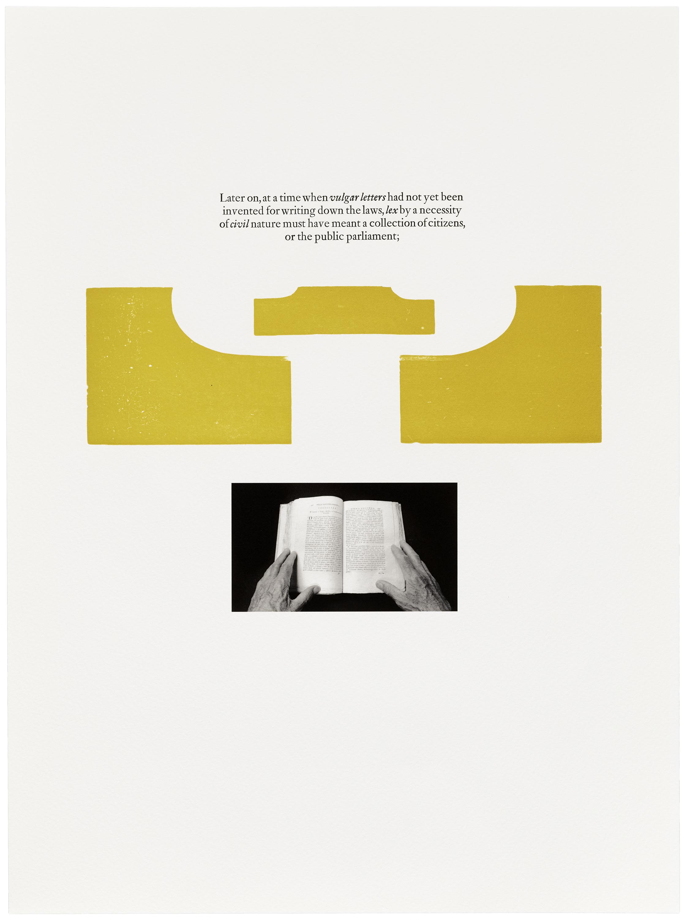
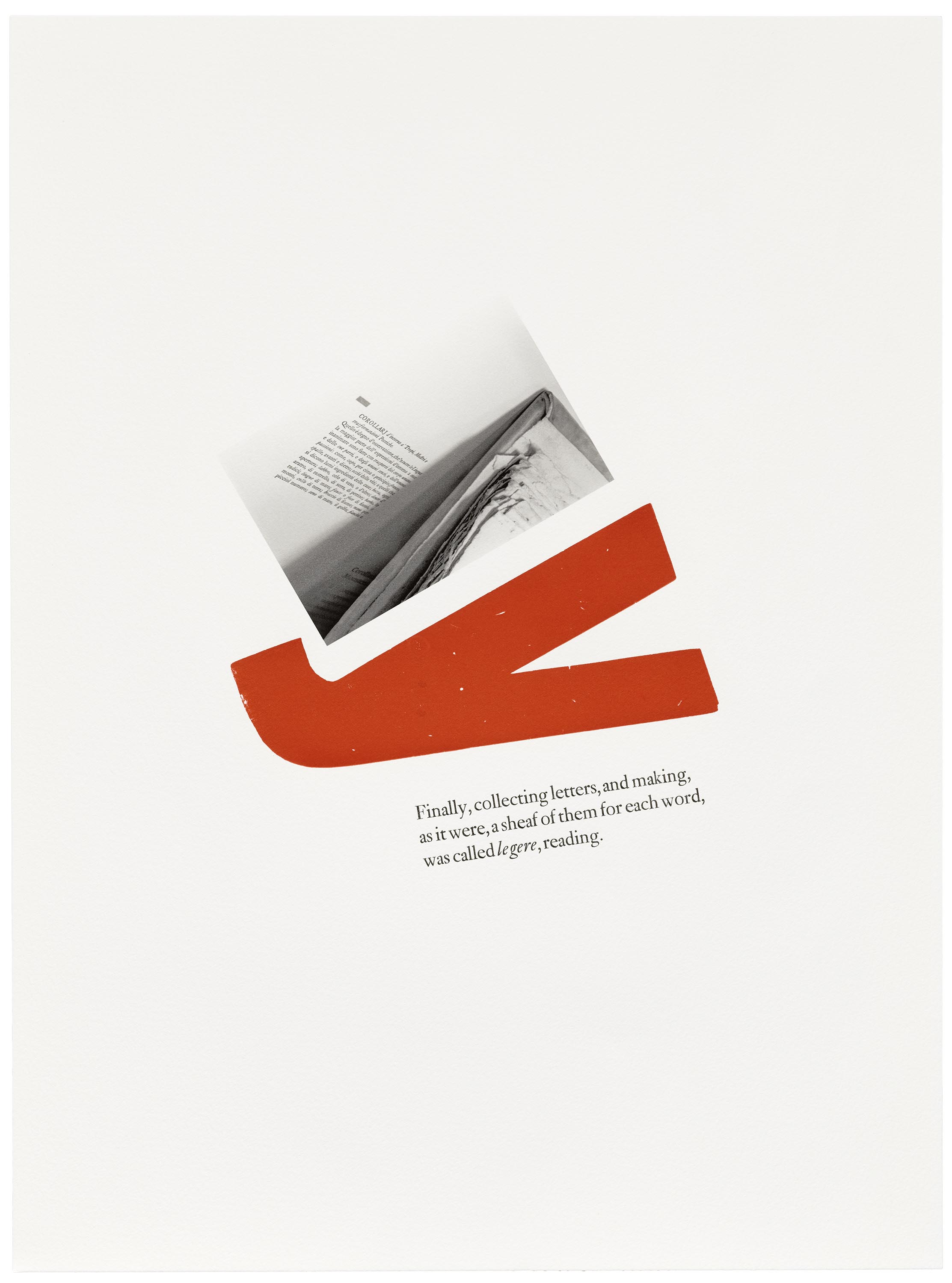
It’s a question that resonates in Stauffacher’s longtime engagement with the Italian humanist Giambattista Vico (1668–1744). Known for asserting that “the true is what is made” (verum ipsum factum), Vico’s philosophy explores the ways humans fashion themselves — as well as their history — by fashioning objects in the material world. Vico locates the ancient origins of language in written “poetic characters,” which he claims were not abstract, conventional letters, but metaphorical gestures and objects continuous with their human makers and whatever they sought to convey.
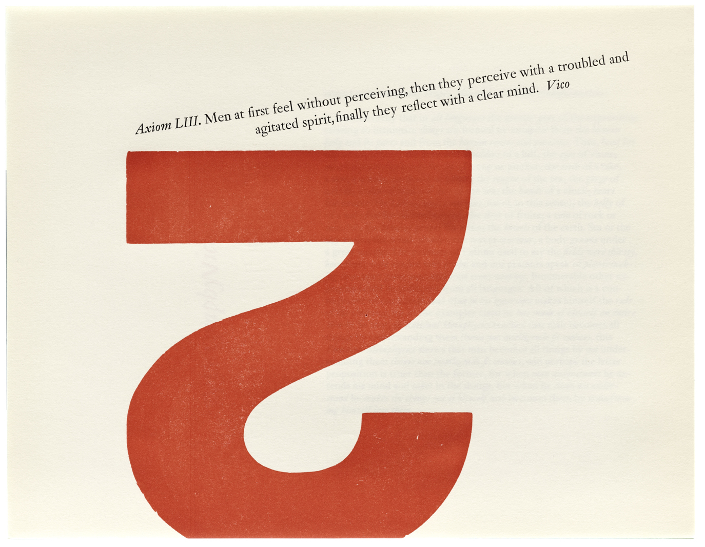
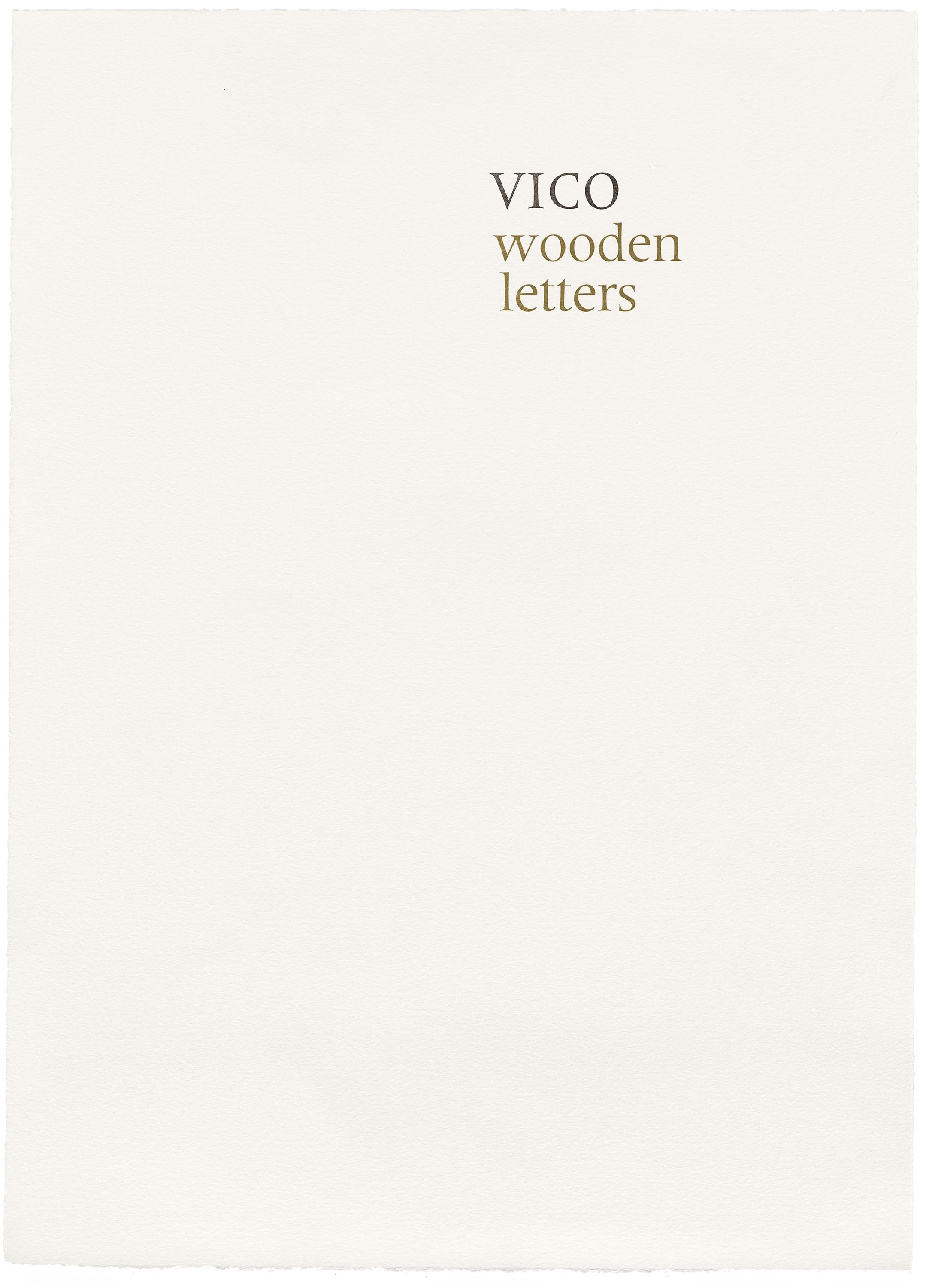
In Stauffacher’s Vico-inspired wood type prints, from the pages of Open Letter 1 (1973) and the portfolios of Vico Wooden Letters (2003) and Vico duodecimo Axiom 65 (2006), we find an interest in this inventive power of metaphor, not to mention the surplus of humanity visible in the simple sans-serif letters out of which they are made. Salvaged from their past commercial uses, Stauffacher’s wooden letters are allowed to mean without needing to say. They bear the marks of their histories, arrive at new gestural configurations, and reveal sides of themselves not previously on view.


Despite Stauffacher’s reluctance to explain them further — or maybe his resistance to the idea that they can be readily explained with words — his way of speaking about them in a short video for LACMA underscores the human relevance and potential he sees in even the most overlooked materials of design:
They radiate their own life, and it’s pleasantly connected with another letter that also has its life. And each one has its own identity, yet they can all be integrated into one image…. They have a heartbeat. They are not just dead, wooden letters. They are waiting to be used again, by people with passion.
Find out more about Stauffacher’s wood type prints in Letterform Archive’s latest publication, Only on Saturday. By reserving a copy on Kickstarter before November 15, you’ll support our efforts to preserve Stauffacher’s work and help us bring this important book into print.
— Chris Westcott, Assistant Editor