News
This Just In: Jason Munn
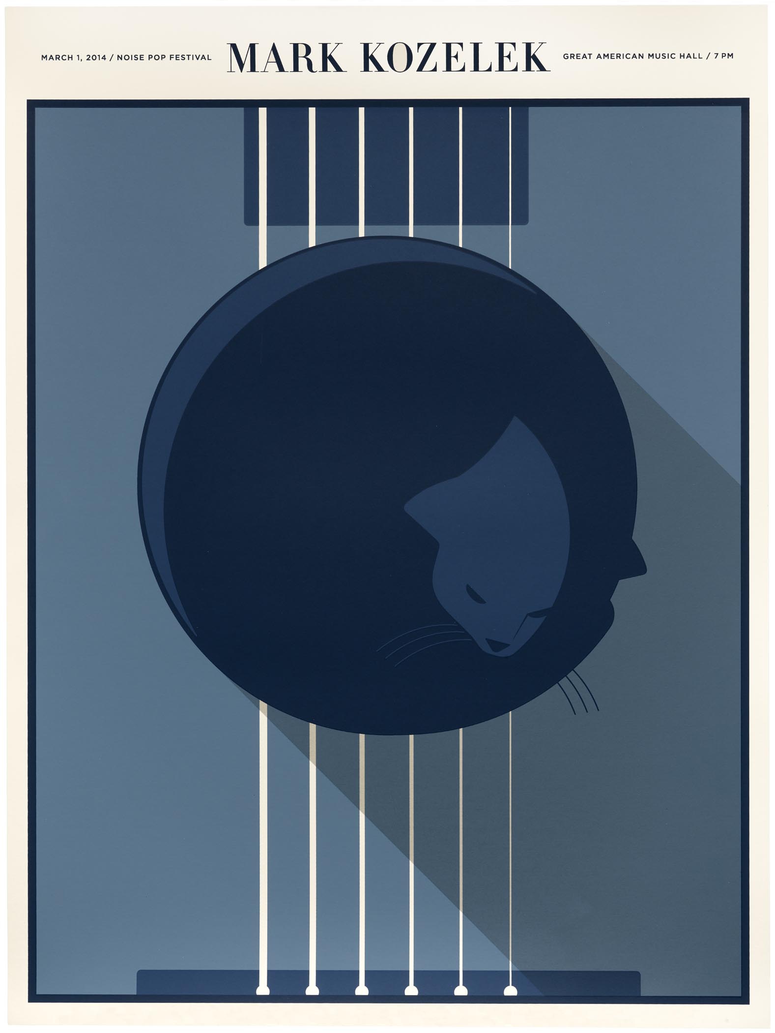
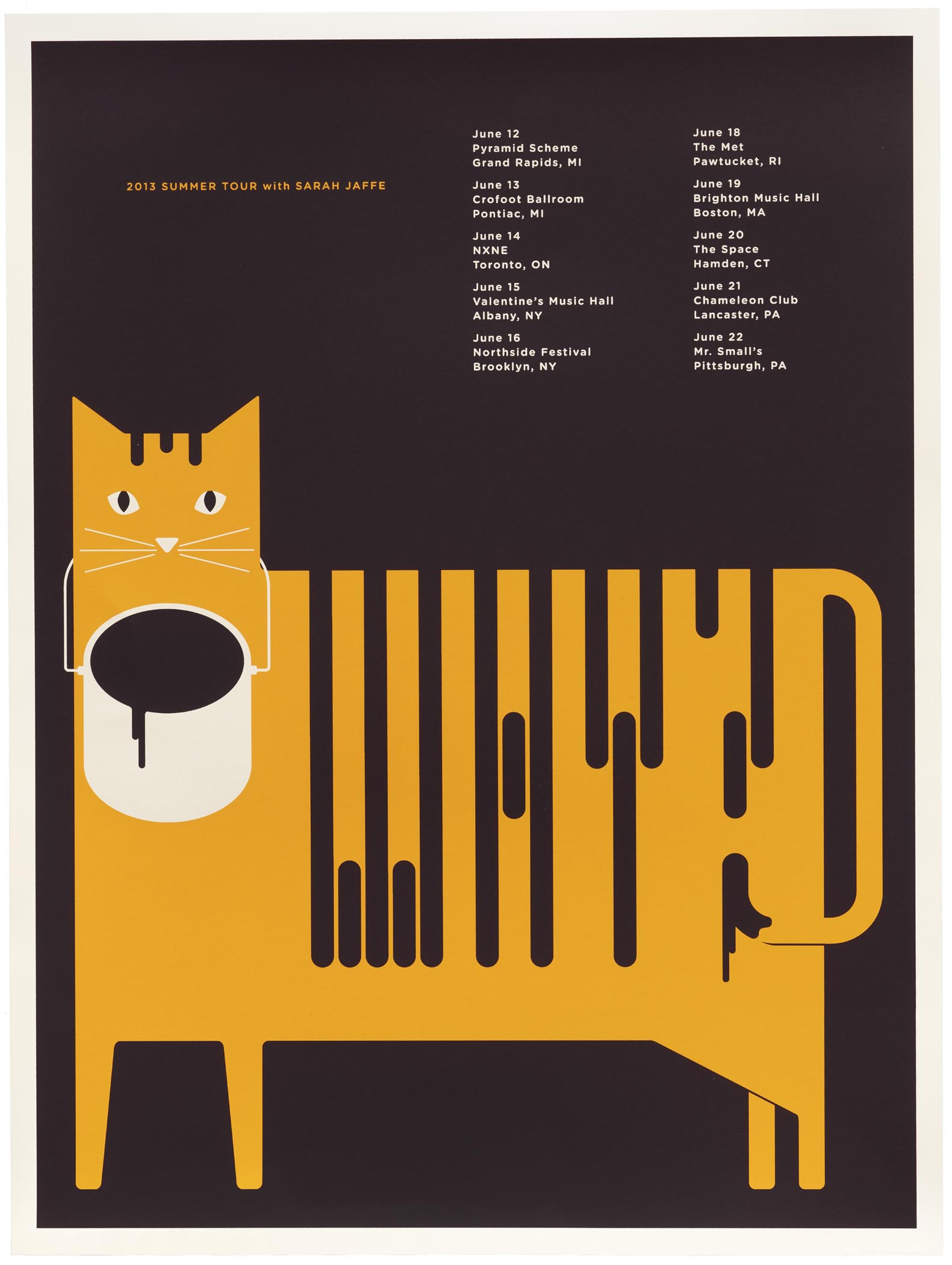
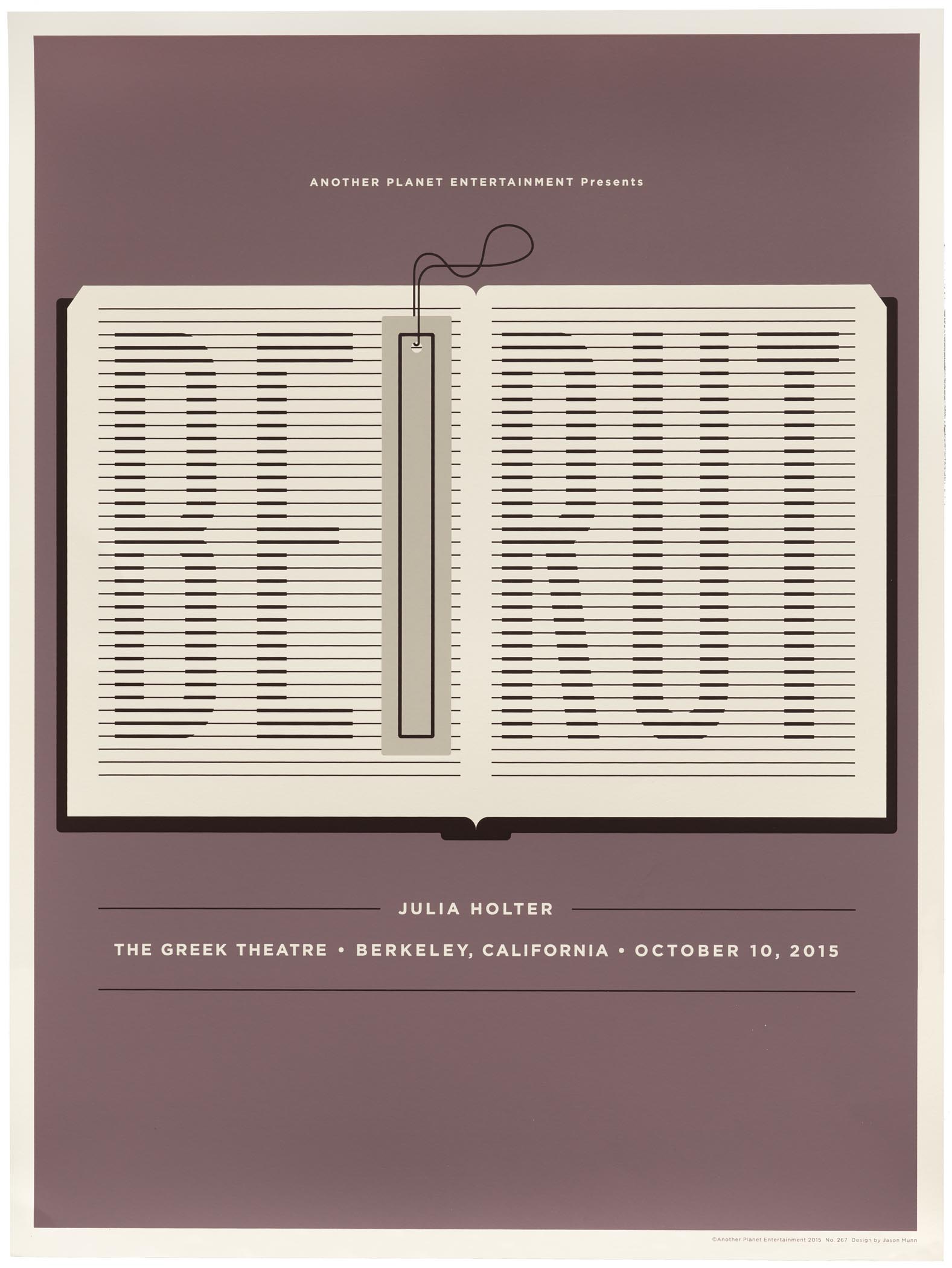
Jason Munn’s minimalist gig posters capture a conceptual duality, inviting music fans to take a closer look.
Our Assistant Librarian, Kate Long, had the chance to catch up with Jason Munn earlier this month. He was just back from the holidays and kind enough to carve out some time for a call between projects. Munn — who formerly worked under the moniker The Small Stakes — generously donated a nice collection of prints to Letterform Archive late last year. Many of the posters promote bands through simple imagery and unique lettering that are often integrated or interchangeable. Sometimes words take the place of pictures. The use of text as image firmly establishes Munn’s work as an important chapter in the story of Bay Area poster design. It was great to hear his take on music, design, and the in-between.
What made you interested in doing gig posters?
First, I was into music. Growing up I loved CD album packaging and skateboard graphics — that was my introduction to art to be honest. I would see gig posters in design annuals and at record shops and was always fascinated. I knew way more about music than I did about design — especially early on. When I moved out here in 2002, I had an interest in doing gig posters, but I didn’t really know how it worked or if there was any way to make it work. There wasn’t any specific model or anything like that, and a lot of the bands I was interested in didn’t have a budget.
My friends were booking shows at The Ramp, and they knew I was trying to get into design. They were like, “Hey, why don’t you make a poster for every show?” So those were my first “assignments”. They did one to two shows per month, so it wasn’t crazy, and I knew a little about how to screen print. I had taken a class when I lived in Madison. I could at least get ink on the paper. The first few weren’t pretty, but I was glad to have a finished project that I designed and printed. At the same time, I was contacting bands I liked that were coming to play. That’s really how it all started.
Prior to moving out here in ’02, I went to school in Madison, Wisconsin at Madison Area Technical College. It was a cool little two-year program. The first class I had was typography. I was like, “What is this?” It really changed my view. I was like, “This is what I like!” The program taught me how to build something, because it approached design as a trade. I learned how to have a thought and execute it through printing. That whole process opened my eyes a lot, and I think that is what I took into making things on my own — knowing how to send things to the printer. Where I went to school, I took classes on prepress, so I was learning the technical side of how to set up files for a printer, etc. I think that allowed me to be on my own sooner than I’d planned. I felt more comfortable taking on small freelance jobs, because I felt I had an understanding of the printing process.
Do you still do all of your own printing?
Not anymore. I work with two different printers for the most part. Monolith and Bloom Screen Printing. They are in Alameda and Oakland. Bloom is where I used to print when I was printing my own work. It’s also a one-man shop, and the owner, Nat Swope, took me under his wing and taught me.
San Francisco is an interesting place to work on music posters. There’s a pretty rich tradition of that here with the psychedelic posters. Is that part of why you chose the Bay Area?
Not at all, to be honest. I came here in ’96 for a brief time, and eventually went back to Wisconsin and back to school. I moved back out here in 2002. At that time, I was working in Madison at a design studio part time. I was ready to leave Wisconsin for sure, and I had a few cities in mind, and Oakland kept being the one. I can’t say exactly why. My best friend was here so that helped, and I liked a lot of the design that was coming out of the area at that time.
I learned more about posters and the rich history here the more I met printmakers in the Bay Area. There was definitely a community of people making posters here, and I was going to so many shows. It felt really natural, but it was very much a learning process, the process of making posters. Because the posters are out in the world and I was continually working, it pushed me to work through phases at a quicker pace. Early on it was collage-based and using found imagery, because that made sense to me at the time. As time went on, I started to have other ideas, and I needed to be able to draw to make it work. That’s why I started illustrating. Because I was screen printing, the drawing needed to be simple. All those things came together. In hindsight it just sort of happened.
I felt like I was turning stuff out quickly. I would design it and then go print it. I was doing other design projects, as well, in between the posters. I’d take what I’d learned from making the posters into other work. I did a lot of shirt designs and similar things that went hand-in-hand with posters because of the bands. I was also doing editorial illustration. I don’t do that much anymore, but at the time I learned a lot through that conceptual thinking and quick turnaround.
When you are working on your posters, how do you decide between using type and hand lettering?
I think it’s more or less what feels right for the design. Some of the earlier stuff was a little more messy, and the hand-done went well with the messier colleagues or illustrations I was doing. I started to really embrace the more minimal look, and I’ve done a lot of customization of type that I make in Illustrator that are cleaner versions of something that would have been hand done on some of my older posters. The general idea sort of dictates that; there’s not a whole lot of hand lettering in my work now. If I need to make a band name, or whatever else in the design, fit into the illustration, then I’ll make something custom to fit. A lot of times there is a duality or another image the type needs to work with.
Can you talk about that duality?
That sort of look always resonated with me. There was this magazine that we used to get called World. It’s like nature, and science, and things like that for kids. They’d have these images cropped in, and you’d have to figure out what they were. So in some ways it helped me see actual things in abstract imagery. If they cropped in on a leaf super close and the veins started to look like something else — I remember liking that a lot.
“Bands have two sides to them — the music could sound beautiful, but the lyrics would be dark. You hear it one way, but it’s saying something else, and I wanted my imagery to do sort of that same thing. ” — Jason Munn
I think of my posters when I was starting to do a lot more collage work — the idea of fitting images together to create new meaning starting to send me down that way. Thinking about how two things come together to make a new thing or using negative space to create something else. I started doing that with music too, seeing that duality. Bands have two sides to them — the music could sound beautiful, but the lyrics would be dark. You hear it one way, but it’s saying something else, and I wanted my imagery to do sort of that same thing. That stuff translated into the editorial work and posters for other things. A lot of design work I do is posters, even if not for music. It’s that kind of work people respond to. It’s something tangible, but it can get too abstract and people will only see one thing or the other. It’s cool to see what people gravitate toward. I try to see the in-between and find the right balance between two images.
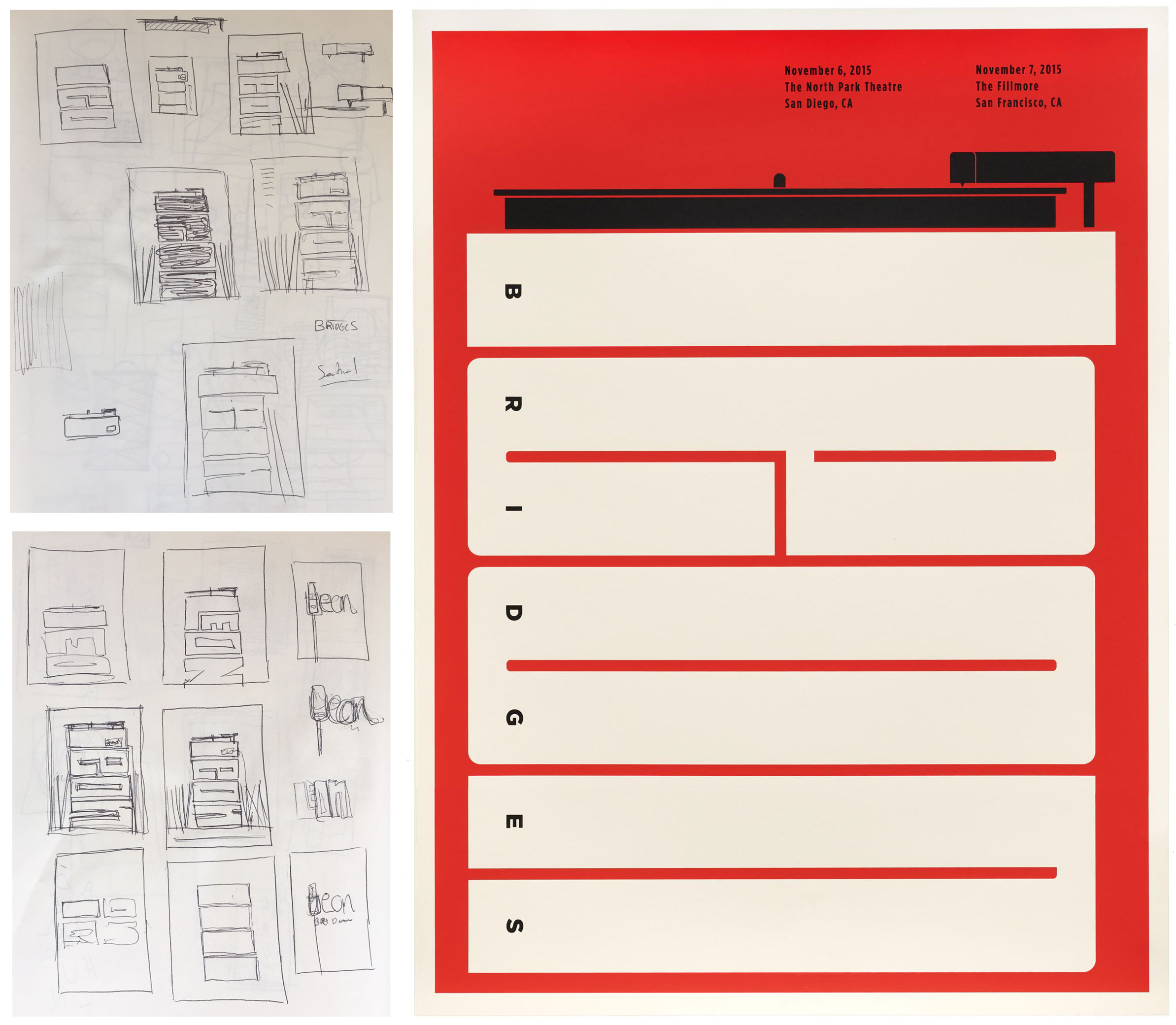
A lot of our visitors are students and budding designers. Could you talk a little about your design process?
My process now is primarily all sketching. It’s obviously keeping a client in mind — it’s a little driven by that and how I’m feeling about it. I’ve been doing a lot of stuff for Warby Parker. They have a type of imagery they want me to stick to. Their stores have a lot of books — this sort of library modern space — and of course, they want to show glasses. I will often gravitate toward those sorts of limitations.
When I do a band poster, it can be like, “Do whatever you want.” But that’s so open, so part of me first searches for something about the band that I want to translate visually — like the title of the album or a nod to the backstory of the band. Like I said, now it’s just lots of sketching and me drawing the same thing over and over again — seeing what can be done with it from every angle, upsidedown — to find what else is in it. Sometimes the designs are a little more abstract in nature, where it’s just shape and form. That’s something I’ve been more and more interested in — having the end result be a little more open-ended. Instead of something always ending at, “Do you see it?”
San Francisco, 2015.
I keep a super routine day. I feel like that helps me turn off and on, at least subconsciously. I sketch a lot in the morning and spend time on the computer in the afternoon. It’s taken me so long to find a rhythm to things. It gets broken up, but I try to stick to a good routine. It’s how I keep my ideas moving.
How is sketching by hand different than working on the computer for you?
Sketching is just me trying lots of different things, and then I usually put little stars by things that maybe have a little something. I mark things that may have possibility. I do quick mockups in Illustrator to see what starts sticking. I do a 10-minute mockup to see if I can get that to work — just doing generalized shapes, so I can see the possibility ... but then I end up fiddling with it for a week. That happens a lot. If I don’t have anything to work on on the computer, I will fill up sketch books. The afternoon can turn into that, but I usually have multiple projects, so there is generally something to work on.
Who or what inspires you?
Honestly, it’s so much of the client itself. Aesthetically, I love mid-century design. I love the Abram Games, “Maximum Meaning, Minimal Means” approach to design. That’s always what I’m trying to do: get rid of things that aren’t necessary, but still maintain a conceptual thought. I’m kind of like that with many things. I like that simplification with meaning behind it — not just simple to be simple. I like a good design to work on many levels, to solve a problem, and do a lot with a little.
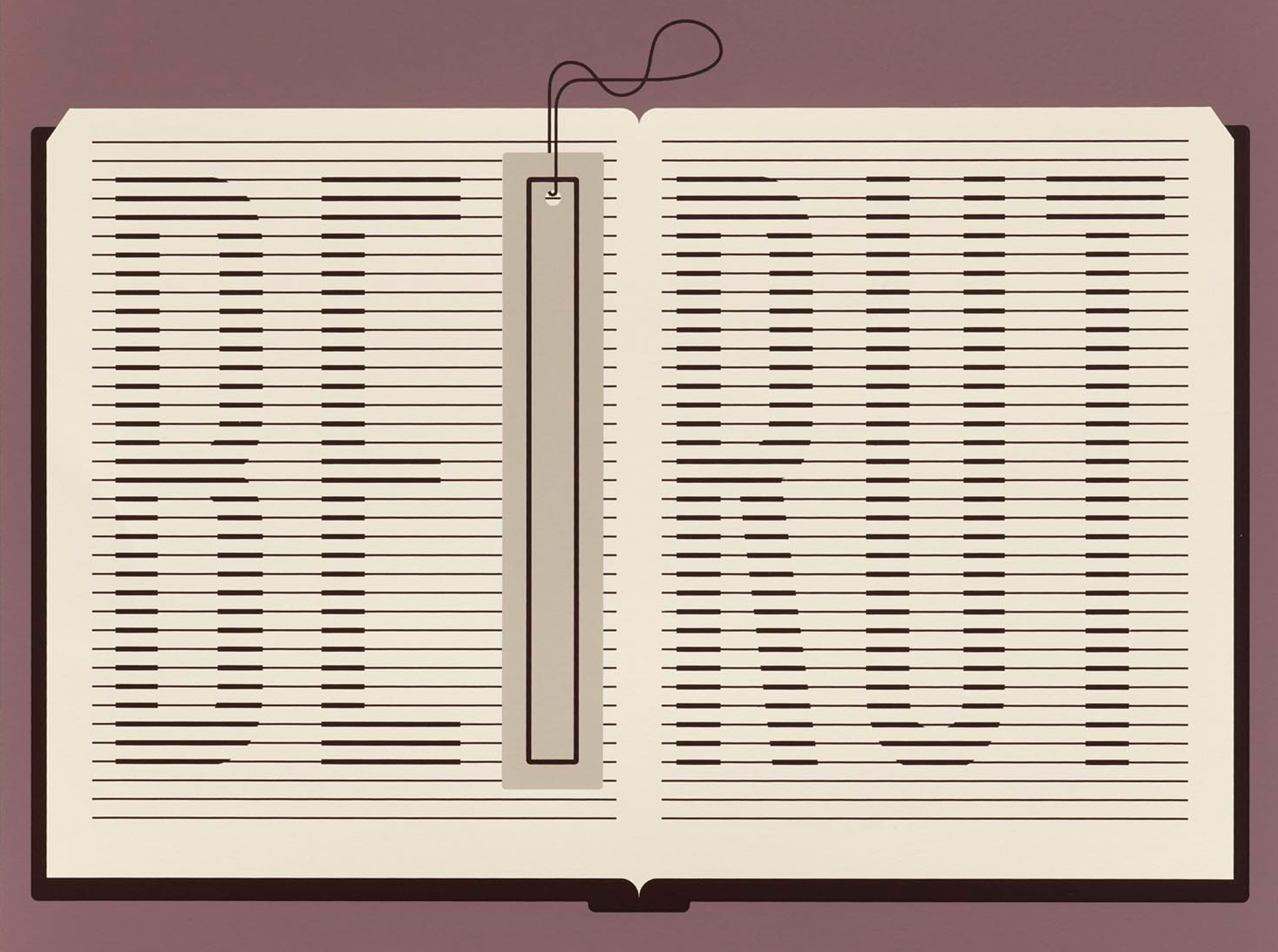
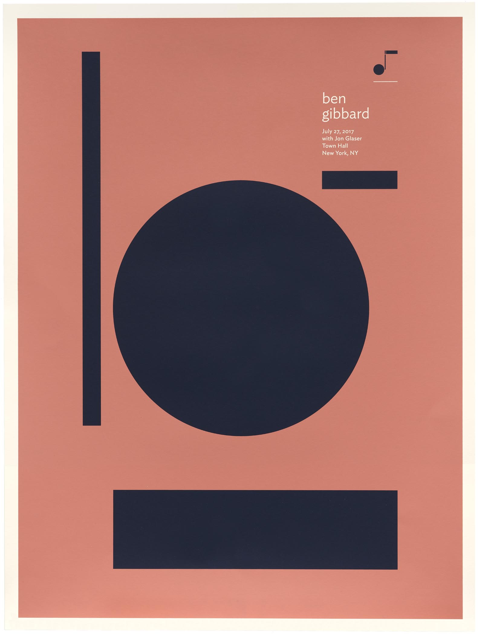
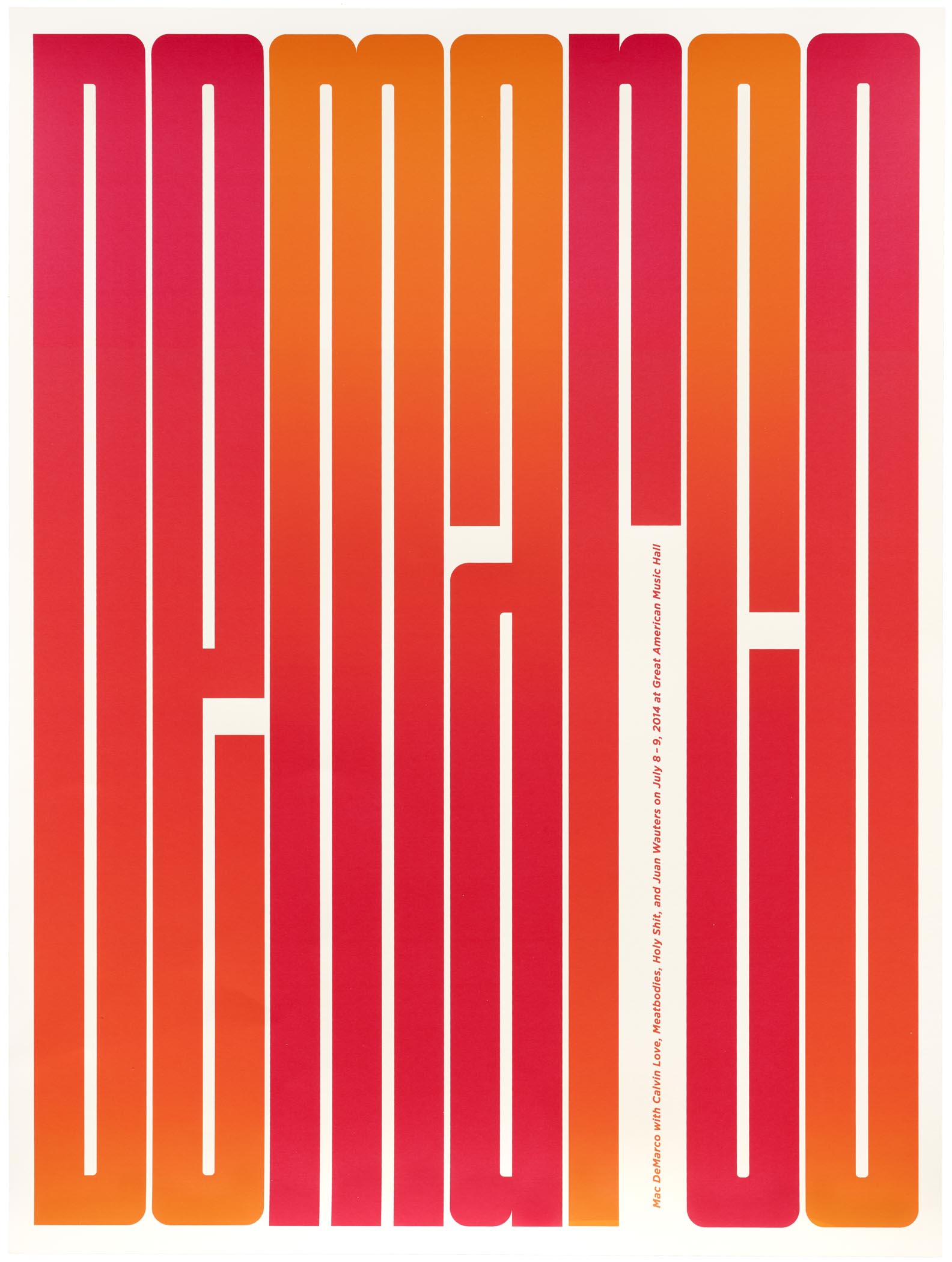
A Selection of Works from Jason Munn
All images in this gallery are high res and zoomable. Click an image to enter fullscreen view, then pinch (on trackpad or mobile) or use browser zoom (on desktop).


To keep updated on what’s new at Letterform Archive join our mailing list.