News
From the Collection: The Alphabet Lithographs of Jean Midolle
An enigmatic portfolio of fantastical lettering styles continues to fascinate designers and historians. Our guest author Dan Reynolds highlights a few favorite plates.
Jean Midolle was a 19th-century French calligrapher and graphic artist. Not much information regarding the details of his life is available. According to François Pétry, he “was born in 1794 in Besançon, or nearby in Choucenne” [Lerch]. John A. Lane describes his years of activity as having ranged from 1830 through 1846 [Lommen]. During that time, he worked in Geneva, Mulhouse, St. Gallen, and Strasbourg; in addition to his artistic practice, he also taught [Lerch]. Michael Twyman suggests that his son may have carried out at least some of an 1846 work attributed to Midolle, although there is even less information on “Midolle fils” available than the father. By the 1840s, the Midolle family may have moved to Belgium, where that later portfolio was published [Twyman].
Letterform Archive’s Tholenaar Collection includes the Spécimen des écritures modernes comprenant les romaines flueronées, gothiques noveles, fractures, françaises, anglaise, italienne et allemande, one of several Midolle portfolios printed in the mid-1830s by Frédéric Emile Simon at Strasbourg. Many of its prints are chromolithographs and Twyman writes that these “were just as successful in promoting Simon fils as they were their designer, and this leaves open the question of who invented them” [Twyman]. Lithography itself had come from Bavaria in 1796; by 1834, color lithography — or chromolithography — was still relatively new, and the Simon fils printing house was at the forefront of its development. That alone is enough to make this a significant piece in the history of printing. The portfolio is also a helpful reminder to type lovers like myself that Letterform Archive contains much more than just type specimens and fine typography. Instead of a narrow definition of the media in which designed letterforms might appear, it fosters a broad one.
These prints themselves differ from much of Midolle’s other work; they display a series of alphabets, rather than 19-century interpretations of manuscript illumination. Some of the alphabets in the portfolio have resonated over the past century with graphic designers and typographers alike, especially the Alphabet Diabolique and the Alphabet Lapidaire Monstre. Even though my personal favourites in the portfolio are the Gothique Composée prints, I visited the Letterform Archive in the summer of 2017 to examine another plate: a hybrid blackletter-roman design simply entitled Midolline.
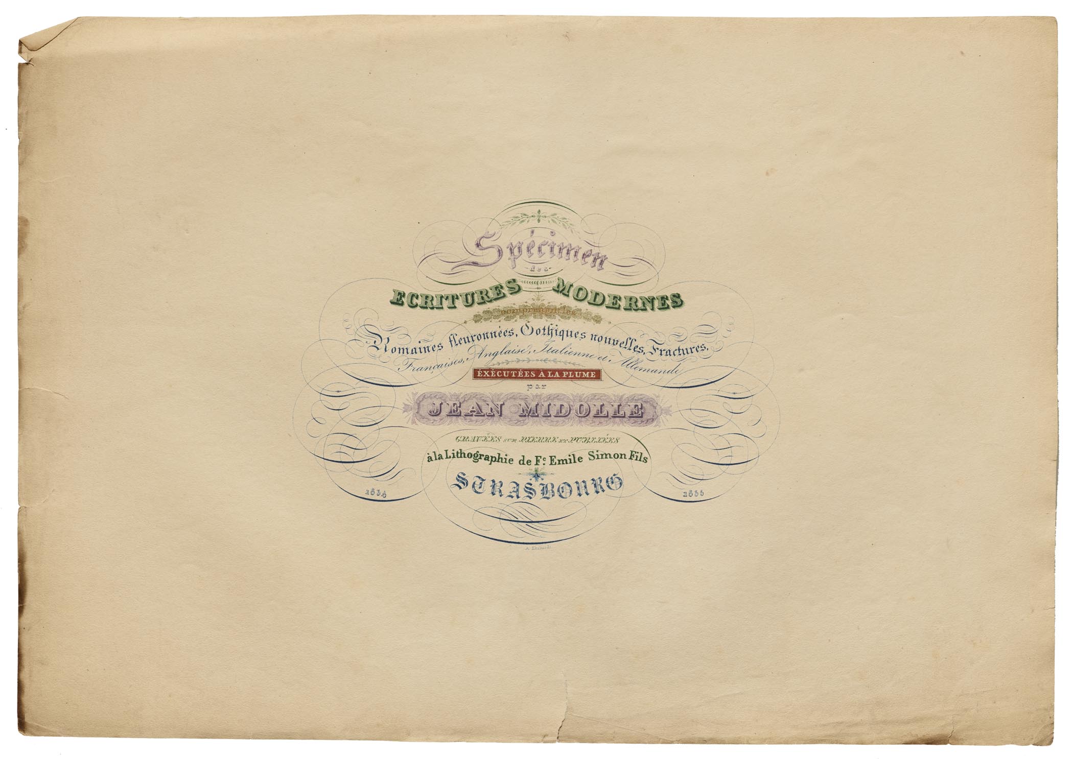
Title Page
While many printers and typographers favor grid-based layouts, more “free form” compositions are also possible in letterpress printing; the same is true when it comes to working with multiple colors. Nevertheless, producing a composition like the title page of the Spécimen des écritures modernes, shown here, would have been very difficult for a letterpress printer to achieve, especially the lines reading “comprenant les,” “éxécutées à la plume,” “Jean Midolle,” and the A above Strasbourg. Lithography and chromolithography offered new avenues of creativity in printing; if you could draw it, you could print it. Lithographic printers challenged traditional letterpress operators — who may have never even been trained in drawing — to up their game. Typefoundries came to their assistance; they must have also felt under pressure to develop more detailed, expressive typefaces that could be used in compositions similar to this.
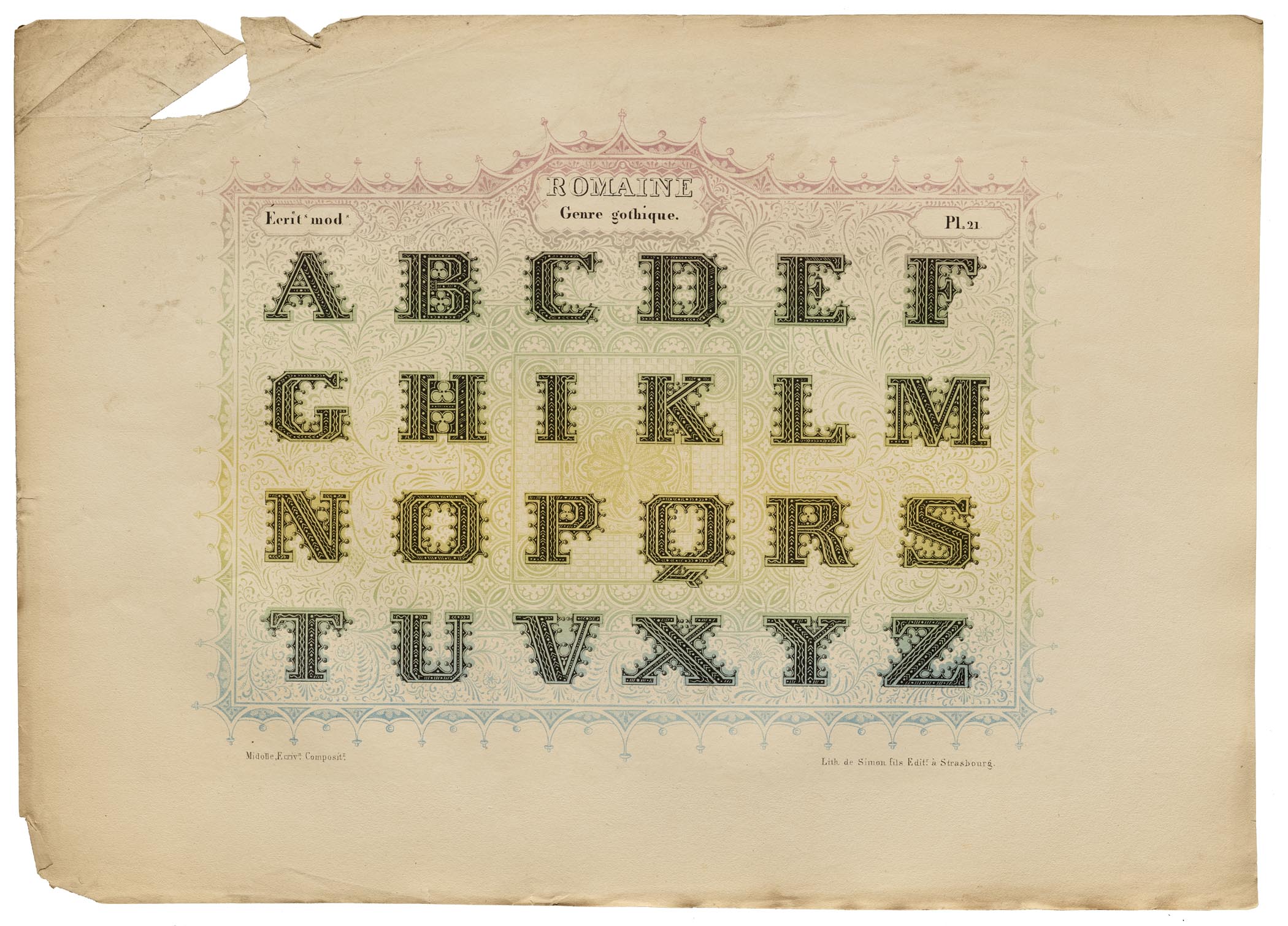
Romaine Midolline
According to John A. Lane, the chromolithographers who prepared this portfolio’s plates were Auguste Ehrhardt, C. Fasoli, and E. Lemaître [Lommen]. Michael Twyman mentions additional chromolithographers who carried out Midolle’s designs during this period [Twyman]; but they were not involved in this particular portfolio’s production. The letters in this two-color alphabet could have been produced as foundry type — although they weren’t — with one piece of type being used to print the lighter parts of each letter, and another piece for the dark. Nevertheless, I have to ask myself if typefounders would have ever considered producing typefaces that went in similar directions to the letters in this print if it hadn’t been for the examples set by Midolle and his contemporaries.
.jpg)
.jpg)
Gothique Composée
Looking at these exquisite gothic architectural-element drawings, I wonder how Midolle’s work might have fit into the larger “Gothic Revival” in the arts. This would have been printed around the time when Charles Barry and Augustus Pugin produced their design for the new Palace of Westminister — where the U.K. Parliament is housed — and Michel Wlassikoff writes of a “cathedral style” of book frontispieces appearing in France during this time as well. Chromolithographs like this one would have gone through the printing press multiple times; for each pass through a press, the sheet would be printed from its one lithographic stone. I suspect that this plate would have needed at least three stones: one to print the rainbow effect behind the lettering, as well as another for the green portion of the border, and a third stone for the black-ink used in the border, the letters, and the titling information.
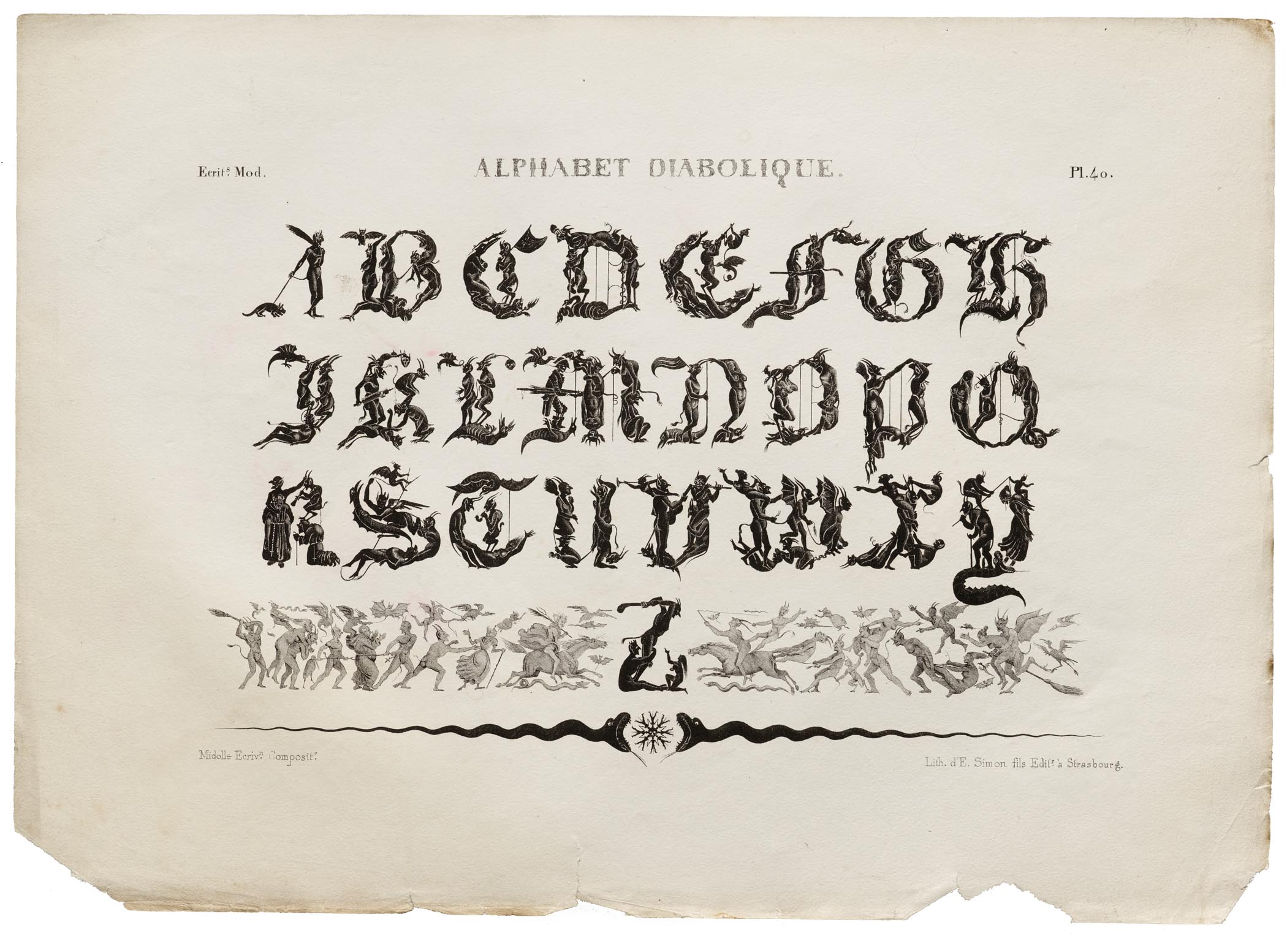
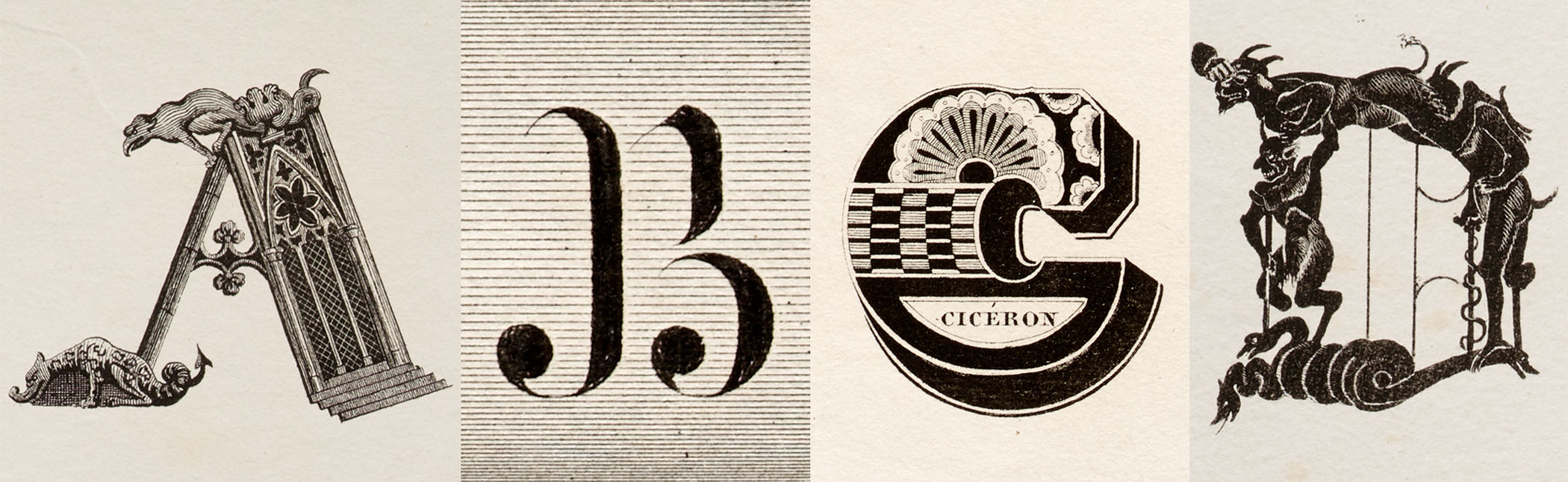
Alphabet Diabolique
The Alphabet Diabolique was one of four Midolle alphabet-prints reproduced in a portfolio that the West Berlin typefoundry H. Berthold AG made as their corporate Christmas gift in 1967; that was the first place that I encountered Midolle’s work. Perhaps more than any of the other designs in the Spécimen des écritures modernes, the diabolic figures in this alphabet can even catch the attention of individuals who don’t have any explicit interests in lettering or typography. While Midolle wasn’t the first artist to use human — or human-like — figures to form the shapes of letters, I still admire the detailed drawings he used in these compositions very much.
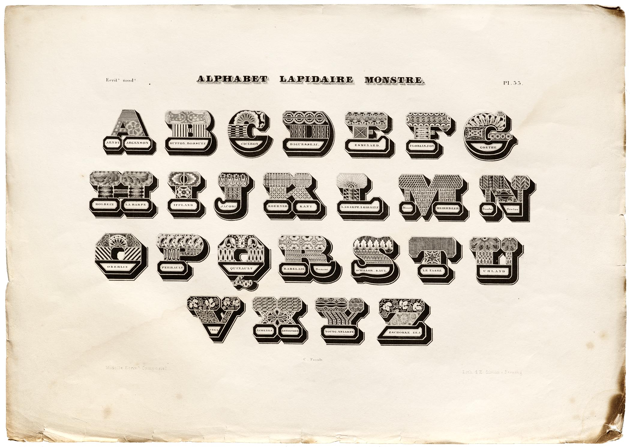
Alphabet Lapidaire Monstre
Based on information from Fonts In Use, the Alphabet Lapidaire Monstre may be the prints from Midolle’s Spécimen des écritures modernes that have proven the most popular with visual designers in the 20th and 21st centuries. Like many of the other images reproduced in this post, its letters would have been difficult to produce as foundry type for letterpress printing — thanks to their intricate patterns, and the caption texts enclosed within the letters themselves. Those “captions” contain the names of well-known artists, authors, musicians, and scientists, etc. Despite the title of this alphabet, there is nothing monstrous about its letters, either in terms of their ornamentation, or in the personalities referenced.
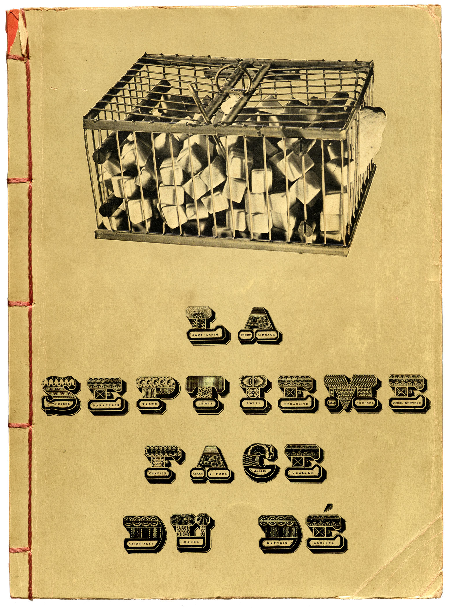
Alphabet Lapidaire Monstre was reproduced in various mid-20th-century sourcebooks, making its way into art and advertising. But the most iconic use may be Marcel Duchamp’s 1936 cover design for La septième face du dé (The Seventh Face of the Die) by the Surrealist Georges Hugnet. Duchamp’s appropriation of the alphabet replaces the original artist names with those of Surrealist influences and practitioners, including Sade, Freud, Rimbaud, Paracelsus, Swift, Heraclitus, Roussel, Chaplin, Jarry, Uccello, and Saint-Just. Zoom into the hi-fi image of the cover shown on this page to see more detail. This book, also held in the Letterform Archive collection, is a prime example of the Archive’s penchant for connecting disparate worlds and uses.
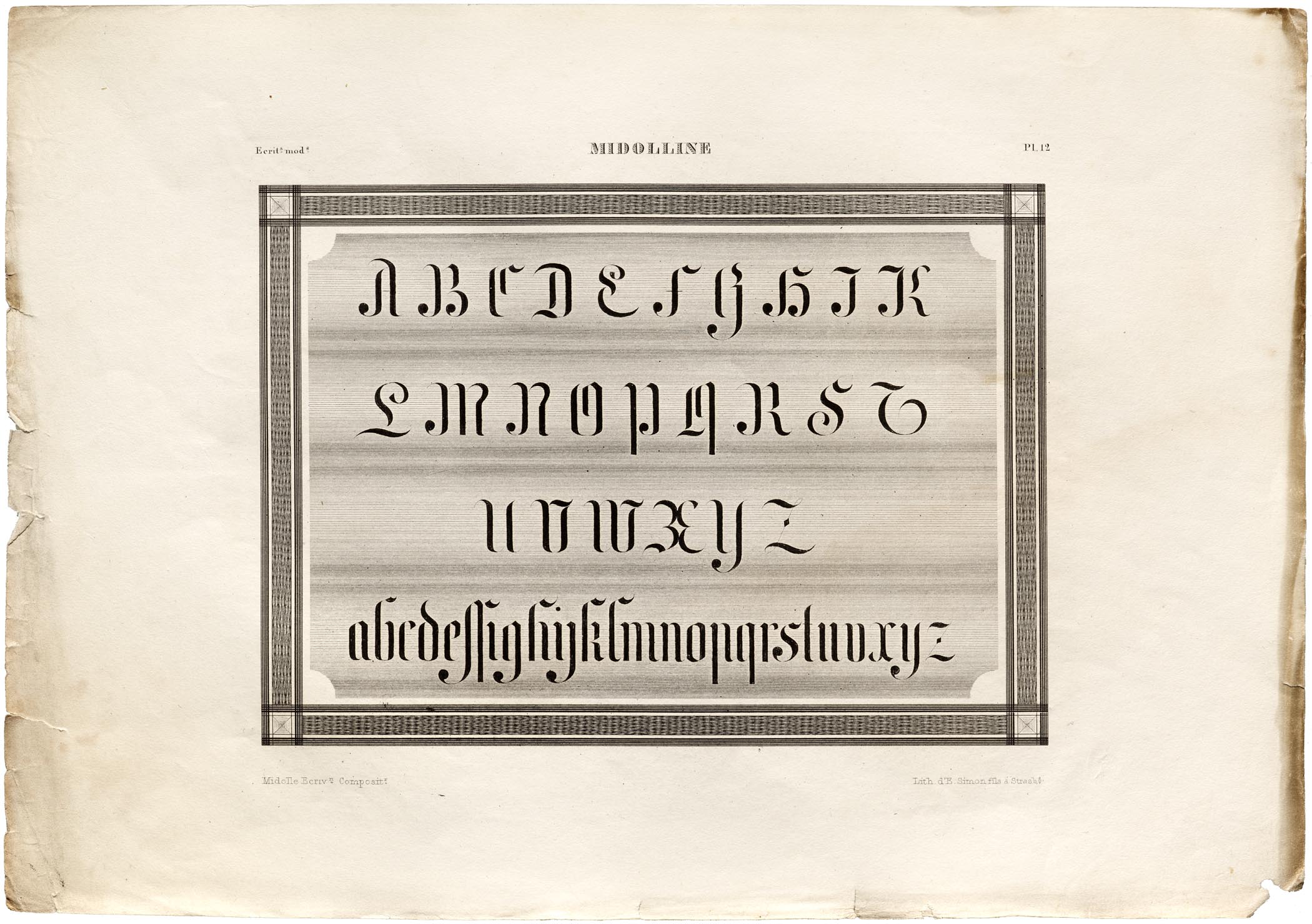
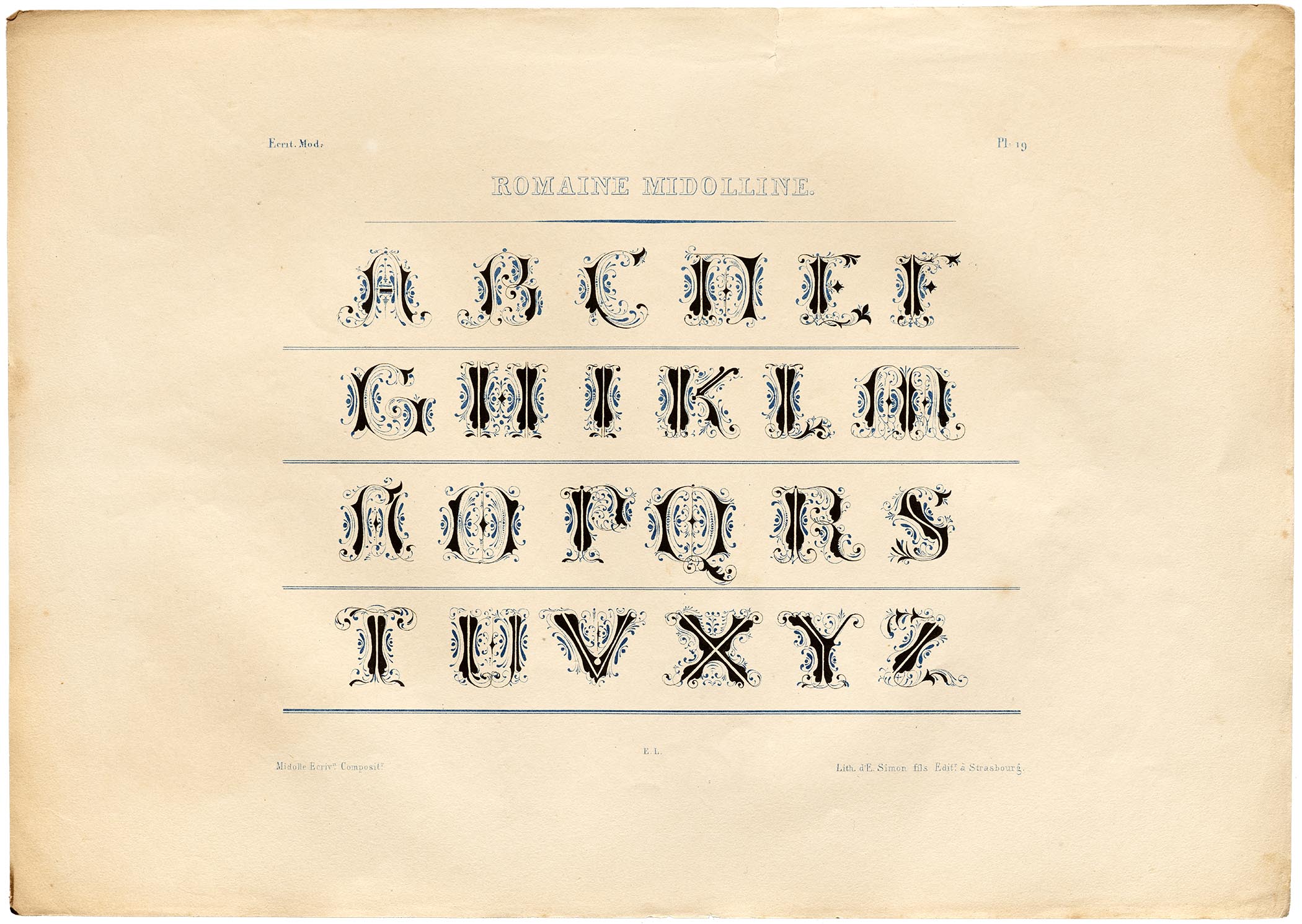
Midolline
Compared with the designs in the other images accompanying this post, Midolline probably seems the least fanciful. Not only could a typeface be made in this style, a typeface with this appearance eventually was produced. The narrow letterforms in the Midolle print contain many hints of blackletter — especially the majuscule F, H, and M, as well as the minuscule d and x. Midolle worked as a calligrapher and illuminator, and his experience with pen-shaped letterforms seems to be more at the forefront of this design than in the other alphabets depicted in this post. The Midolline plate is not the only design in the Spécimen des écritures modernes portfolio that features both majuscule and minuscule letters; however, without the discovery of more information, it is impossible to say whether Midolle designed these letterforms with an intent to someday collaborate with typefounders and convert them into type.
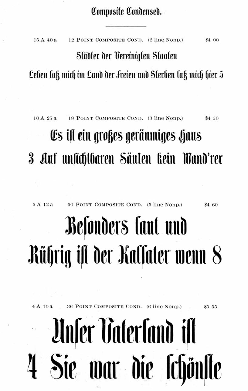
About fifteen years after this portfolio’s publication, the printing and typefounding company of Eduard Haenel in Berlin produced a typeface that was also named Midolline. Its letterforms are similar to those in Midolle’s print. Since we do not know the date of Midolle’s death, it is difficult to imagine how this typeface actually came about. I suspect that Haenel might have produced it as a posthumous tribute to Midolle, for display at the 1851 Great Exhibition at the Crystal Palace in London — the first of the World’s Fairs — but that is just a guess. What is certain is that many other typefoundries across Europe acquired matrices for the Midolline types. The design was eventually sold in the U.K. as Saxon Text by the Edinburgh and London-based Miller & Richard typefoundry. After the American Civil War, multiple foundries in the United States would carry it, too. They sold it under the name Composite. In 1854/55, just a few years after Haenel’s Midolline had been produced, the Trowitzsch & Sohn printing and typefounding firm published a derivative typeface called Schmale Midolline. “Schmale” means “condensed” in German, and like the original Midolline design, the condensed version found its way into the product ranges of many other typefoundries. In the United States, Schmale Midolline was sold as Composite Condensed.
In the mid-19th century, there were no means by which a typeface’s name could be trademarked or otherwise legally protected, at least in Germany. In fact, most typefaces did not have unique names at all, at least not the way that we think of them as having proper names today. When Haenel first produced Midolline, it was an anomaly in their product range: both because of its appearance, as well as because of its name. For a time Midolline became a type classification term in Germany, used to describe all blackletter-roman hybrids. Other German typefoundries — like Flinsch in Frankfurt am Main — created additional designs that were also marketed with the term Midolline (or Midoline) in their names, such as Halbfette Midolline, Moderne Midolline, and Schmale Midolline. Because so many Midolline types had been in circulation, late-19th and early-20th century German typographers were not certain which foundry had been responsible for first bringing it into the world. Thanks to attributions in a collection of Haenel specimens at another archive — Berlin’s Art Library — I have been able to finally reconstruct some details regarding the types’ origins and distribution. But that is another story.
— Dan Reynolds is a type designer, educator, and design historian in Berlin and Braunschweig, Germany. His BFA in graphic design is from the Rhode Island School of Design; his MA in typeface design is from the University of Reading; and his dissertation for a German philosophical doctorate is on track to be submitted in March 2018 (please wish him luck!).
Bibliography
- Dominique Lerch, “The Simons, father and son, engravers and lithographic printers in Strasbourg (1802–1881) — a hight point in French lithography,” Journal of the Printing Historical Society, new series number 26 (summer 2017), p. 25–40
- Mathieu Lommen, The book of books — 500 Years of graphic innovation, London: Thames & Hudson (2012)
- Michael Twyman, A history of chromolithography, London/New Castle: The British Library/Oak Knoll Press (2013)
- Michel Wlassikoff, The story of graphic design in France, Corte Madera: Gingko Press (2005)