News
Lautsprecher Gets Its Voice Back
Jakob Erbar’s least known typeface went silent in World War II. David Jonathan Ross used a specimen at the Archive to bring it back to life.
One look at the web or our phones these days and it’s obvious that a certain style of typeface dominates contemporary design: the geometric sans serif. It feels like nearly every company, from tech startup to multinational corporation, is finding safety and clarity in the genre’s circular rounds, sharp corners, and clean finish. Meanwhile, there’s also a growing hunger for things that are handmade and handwritten, authentic and imperfect. These universal desires for mechanical order and human warmth are pulling in opposite directions.
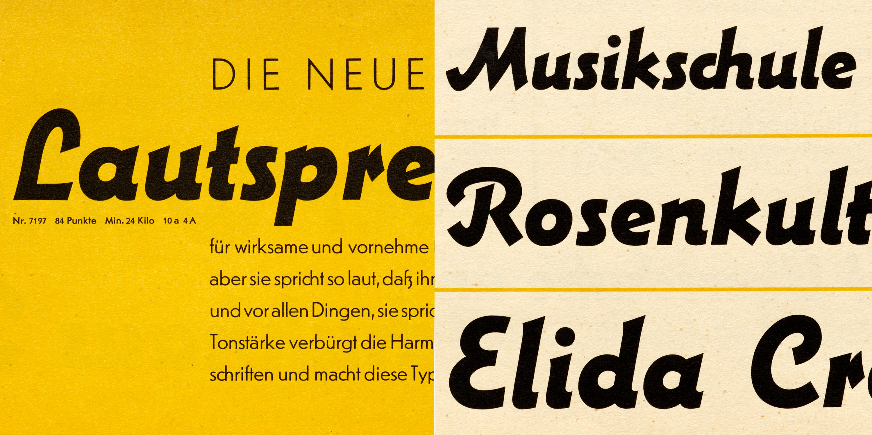
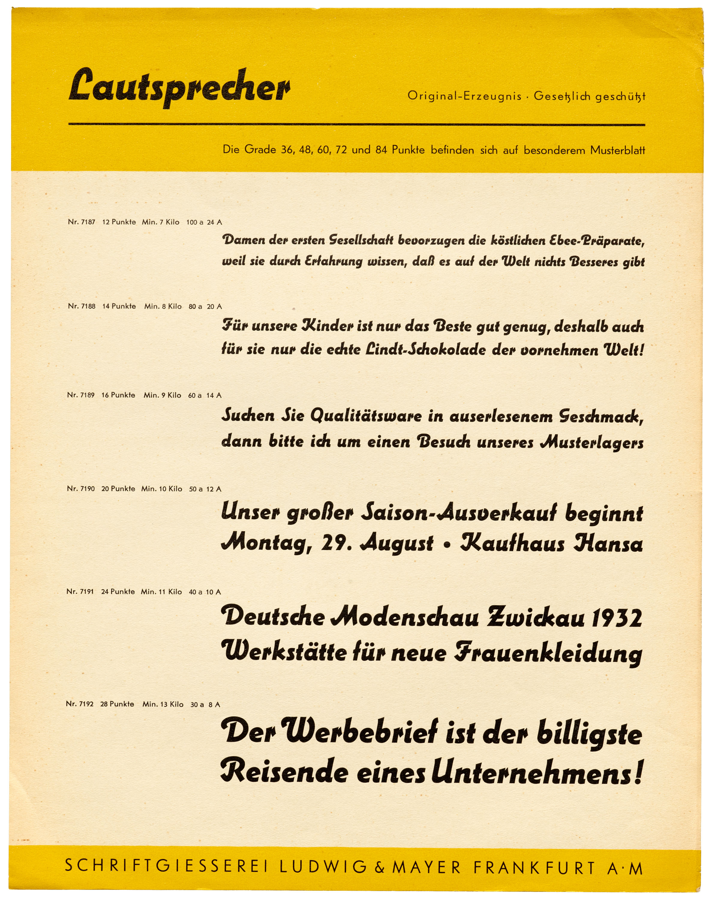
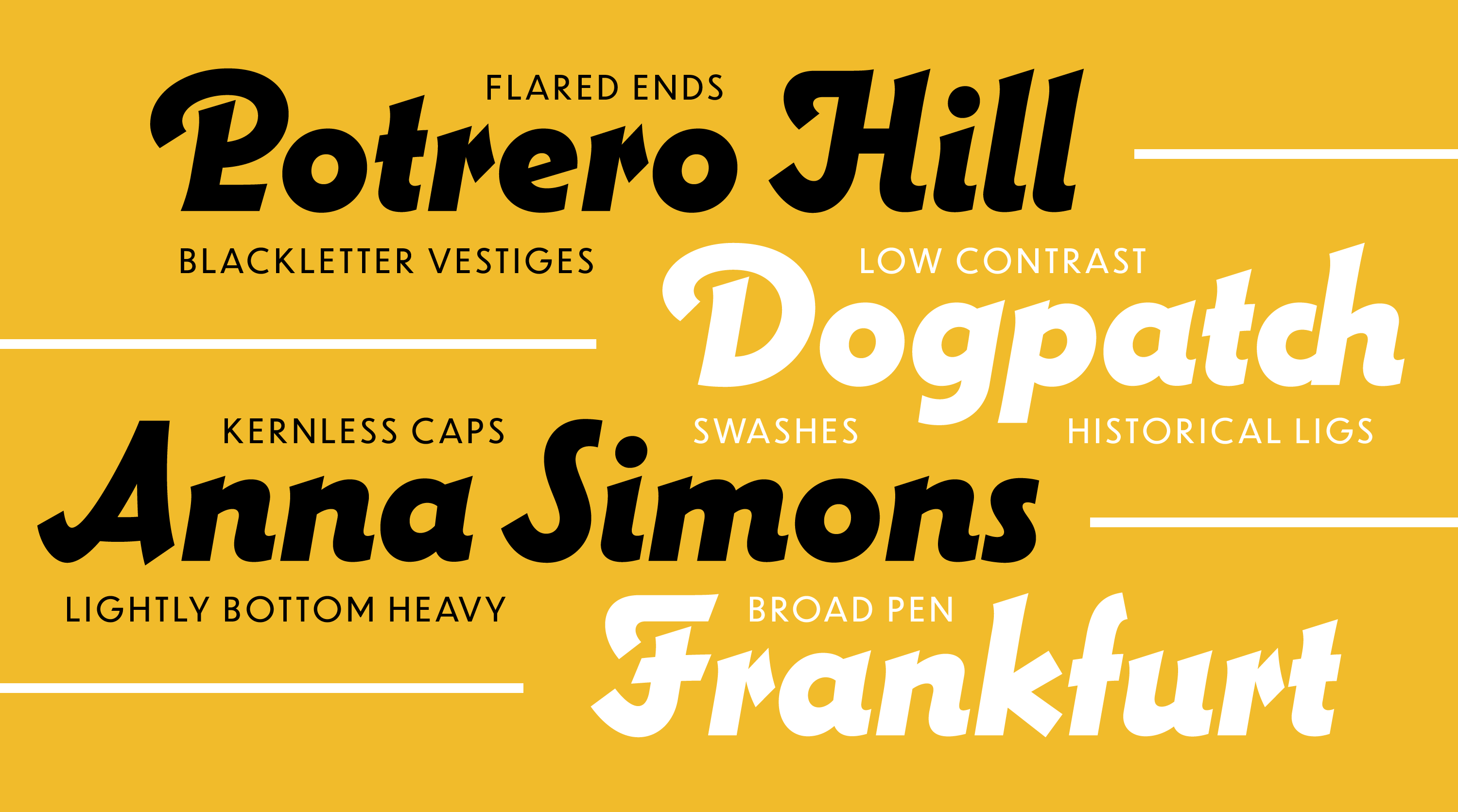
Lautsprecher (German for “loudspeaker”) is a virtually unknown metal typeface from 1931 that somehow hits tones both geometric and calligraphic, right at a time when we’re tuned into those very frequencies.
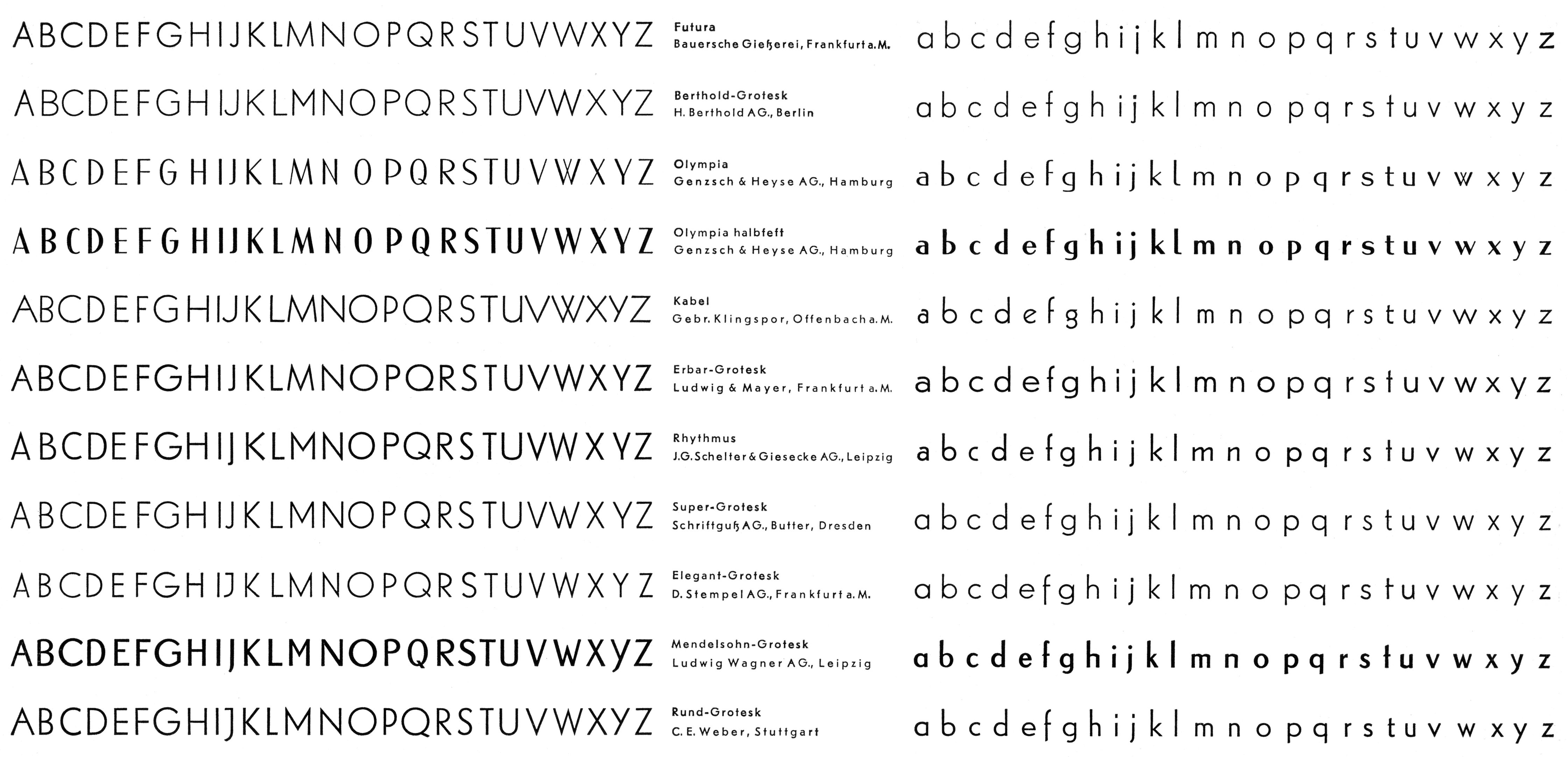
The idea of the geometric sans rose in tandem with modernism. Typefaces like Berthold-Grotesk, Elegant-Grotesk, Kabel, and Nobel were all issued in the second half of the 1920s and quickly went mainstream. A quick look through the Archive’s periodical collection shows they had already gained editors’ attention and designers’ favor by the end of the decade. Futura, released in 1927, is now known as the prototypical geometric sans. Yet some scholars say Jakob Erbar, a professor and designer in Cologne, was the first to explore the idea, having sketched his eponymous Grotesk as early as 1913 and issued it as a product by 1926.
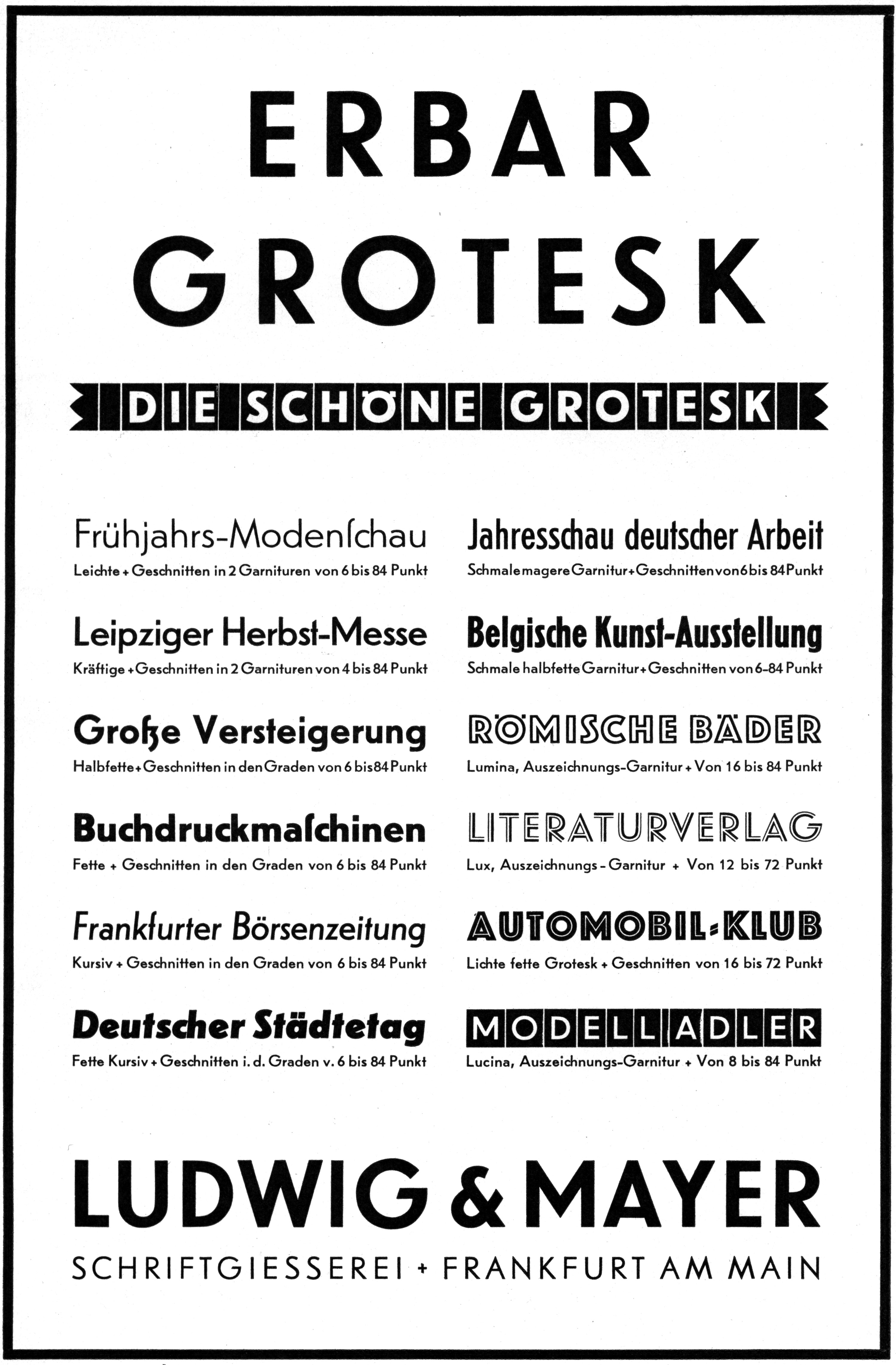
In the late 1920s and early 1930s, Erbar-Grotesk, like Futura, filled the pages of trade journals like Gebrauchsgraphik and Archiv für Buchgewerbe. It was such a success for Ludwig & Mayer that the foundry expanded the family to 12 styles within five years. Various ads and specimens of the time show a loosely related group of four roman weights, two italic weights, two condensed weights, and four related display types: Lichte fette Grotesk, Lucina, Lumina, and Lux.
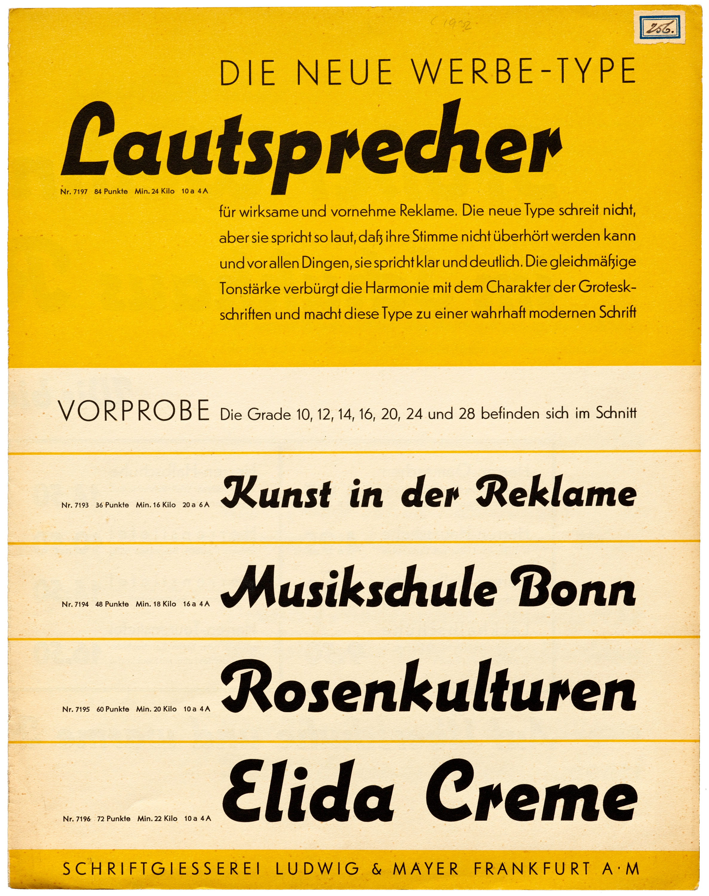
What the ads don’t show is Lautsprecher, a typeface that feels right at home with the Erbar-Grotesk clan. Designed by Erbar around 1931, Lautsprecher appears to take its cue from the Grotesk’s bold italic, but with a calligraphic swing. There are swashy capitals and lively strokes that bend and swell, referencing brush or pen. Still, under it all, an italic geo-sans plays the base notes.
It makes sense that such a script would come from Erbar. “In Düsseldorf he learned calligraphy from Peter Behrens, Fritz Helmuth Ehmcke, and Anna Simons, and Simons in turn introduced the teaching of Edward Johnston’s broad-pen writing to Germany,” said Dan Reynolds who recently earned his doctorate studying the history of German type. “And Erbar’s first typeface was Feder-Grotesk, a very calligraphic sans.”
What’s not so clear is what happened to Lautsprecher, but it probably has to do with the unfortunate timing of its release right before World War II. Ludwig & Mayer’s operations were destroyed in 1943, and that loss may have included all the matrices that made the type. The foundry essentially started over after the war. What’s more, Jakob Erbar died in 1935, so he wasn’t around to defend his work and carry it forward.
“I don’t know if Lautsprecher was dear to his heart,” said Florian Hardwig, type historian and editor of Fonts In Use. “But this is also something to keep in mind when looking at how the foundry modified his Erbar-Grotesk later on, bringing it more in line with Futura.”
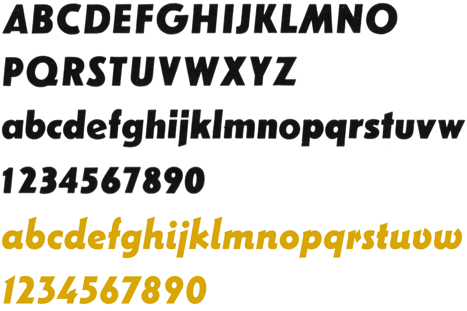
Not only is Lautsprecher absent from Ludwig & Mayer ads from the period, it’s also not in any of their bound catalogs found at the Archive. Fortunately, a four-page brochure in the Tholenaar Collection brought it to our attention. Recently, we sent hi-fi images to our friend and talented type designer David Jonathan Ross as a candidate for revival. As to be expected from a perennial pro, David did an excellent job converting the printed specimen into a functional digital font. For the most part, he followed Erbar’s lead, maintaining the mild idiosyncrasies of the original, while adding a few useful extras for modern designers.
I love its details, like the itty-bitty serifs, the hooks on the L and J, and the distinctive diamond terminal on the r. I love its subtle bottom-heaviness and how it incorporates both geometric and organic forms. And I love how Erbar dealt with the constraint of the metal block, chopping off letters like S so that they did not need to hang over the following letter. I am someone who was taught that a typeface is “a beautiful collection of letters, not a collection of beautiful letters.” But Lautsprecher’s little idiosyncrasies are a helpful reminder that there is some flexibility in how systematic a typeface needs to be. — David Jonathan Ross.
Read more about Lautsprecher DJR at Font of the Month Club, David’s great subscription service, where Lautsprecher is the font of September.
To support Letterform Archive’s move campaign, DJR is generously gifting Lautsprecher DJR and a one-year Font of the Month Club membership to those who donate $250 or more. The offer is valid only until October 7. Now you can put Erbar’s forgotten type to use in your own work, look forward to another 12 fonts from DJR, and help the Archive make the transition into our new home, where we’ll have more room to preserve and share hidden gems like Lautsprecher.
— Stephen Coles, Associate Curator & Editorial Director