News
From the Collection: Legacies of Swiss Style, Part 1—Typografische Monatsblätter
An influential trade journal reveals the origins of Swiss typographic style and provokes conversation between objects at Letterform Archive.
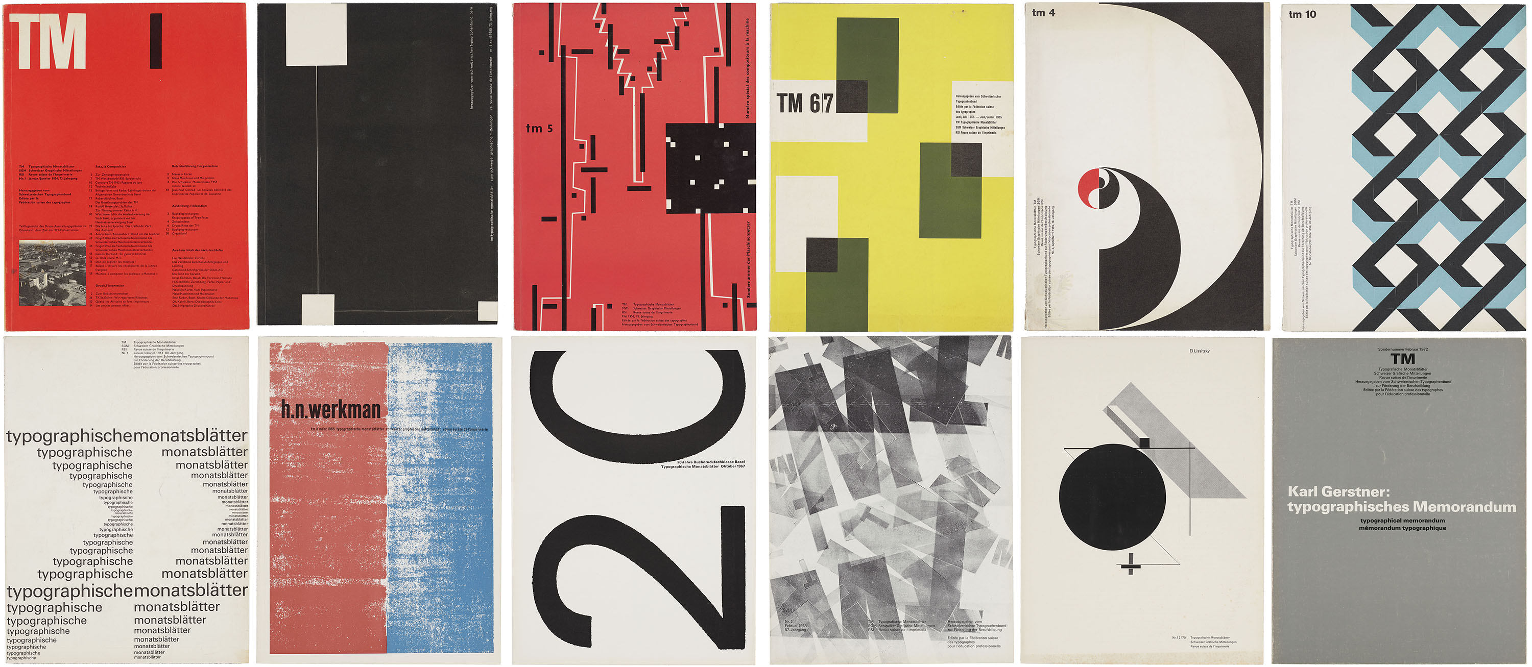
In 1952, the competing Swiss trade journals Schweizer Graphische Mitteilungen and Revue suisse de l’imprimerie merged with Typografische Monatsblätter (TM), a monthly periodical advertised as the leading publication of the Swiss graphic design industry. Tailored to a diverse audience of design professionals, the magazine published articles in German, French, and English under the editorial direction of Rudolf Hostettler (1919–81), with Robert Büchler (1914–2005) overseeing its initial art direction. Unlike many contemporary trade publications that focus primarily on showcasing finished work, TM combined writing on professional practice with long-form essays devoted to design theory and criticism. From the early ’50s through the ’60s, both the journal’s editorial content and visual approach were strongly influenced by contributing editor Emil Ruder (1914–70), whose tenure at the Allgemeine Gewerbeschule Basel helped to establish the foundational principles of Swiss Style.
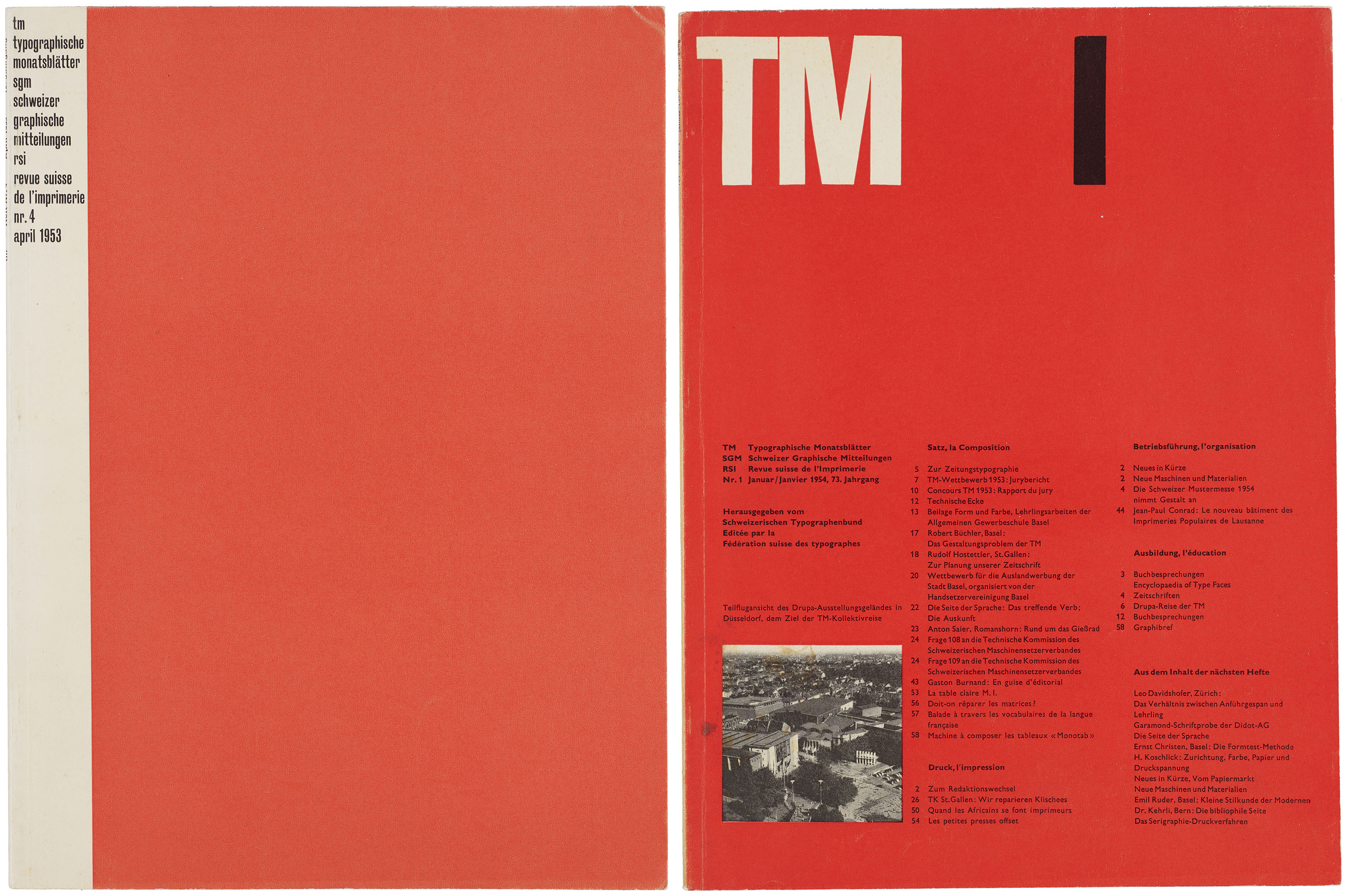
With the ambition of demonstrating the “high typographic standard prevailing in Switzerland,”1 TM was refashioned in the early 1950s to appeal to a more cosmopolitan audience. Büchler’s designs for the first three issues of the newly consolidated journal established a unified visual style that reinforced the publication’s progressive outlook. Although originally intended for Swiss typographic associations, TM would develop an international readership through academic and professional circles. Contributors and collaborators from abroad helped extend the influence of Ruder and the Basel School to audiences in the United States, England, Japan, and Mexico.2 Circulating among Swiss professionals and international readers alike, TM came to function as both a conventional trade journal and a forum for debates about the future of modern graphic design.3
All images in the gallery below are hi-fi captures. Click an image to enter fullscreen view, then click or pinch to enlarge.
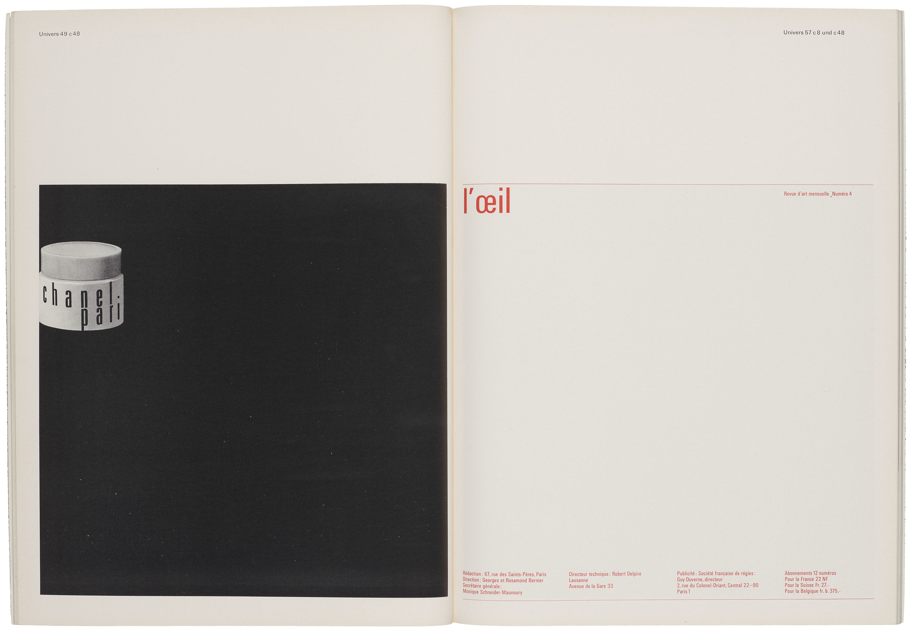
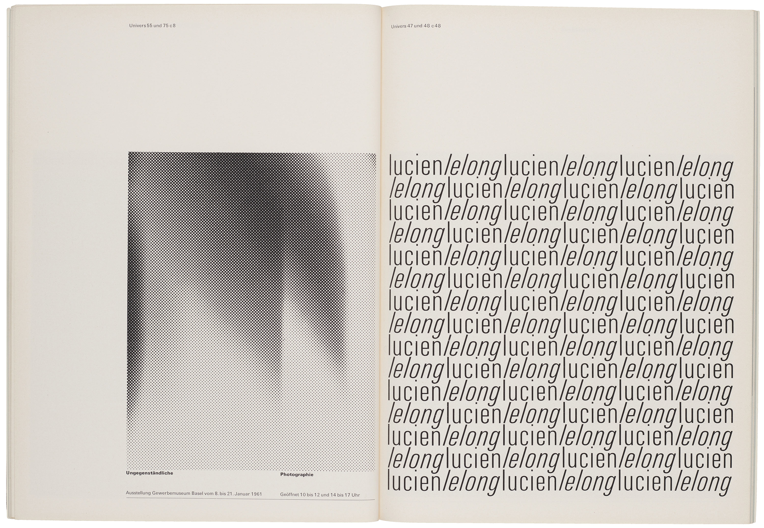
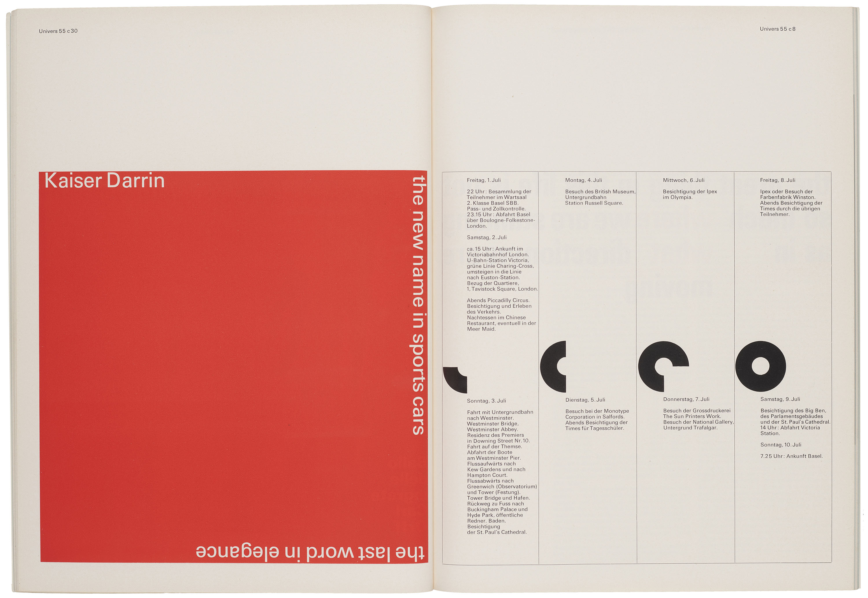
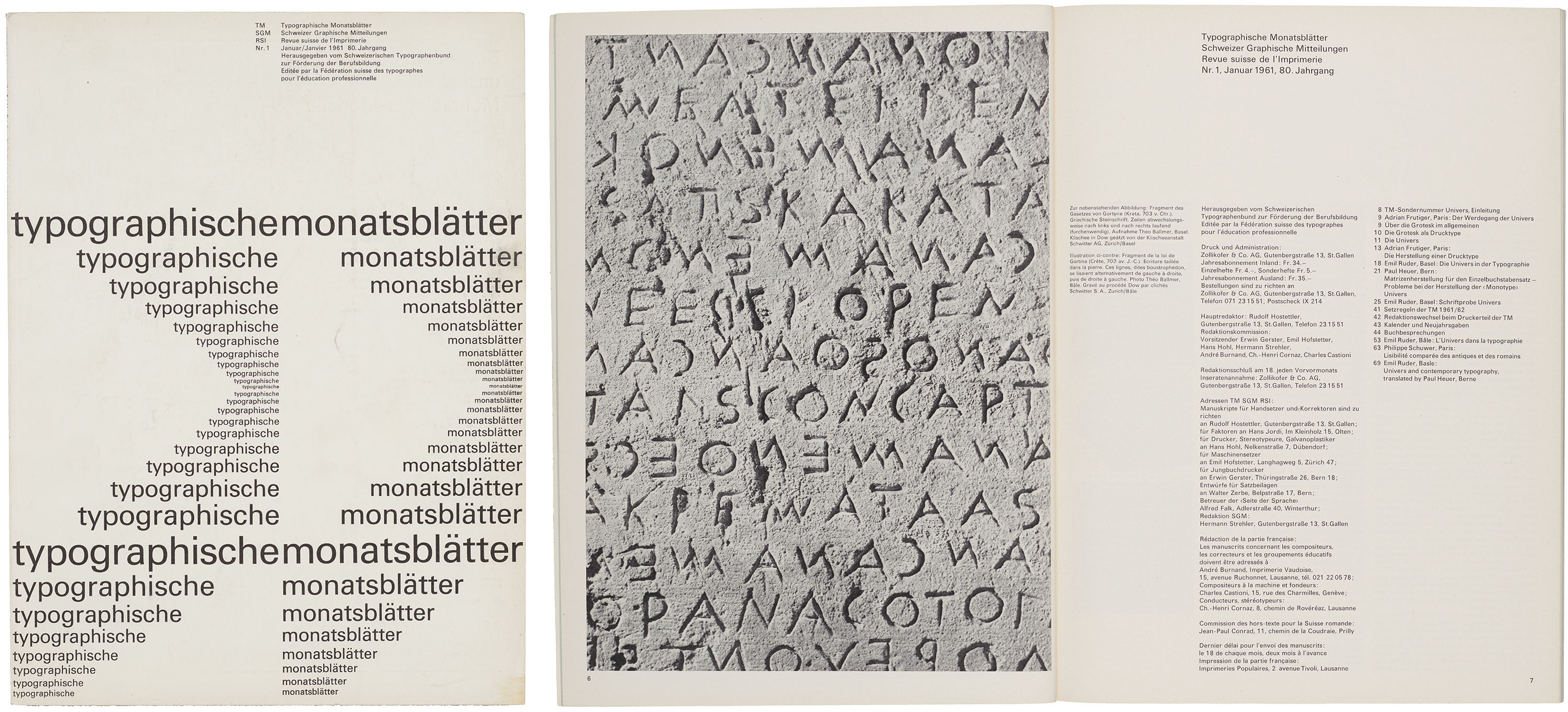
Ruder assumed responsibility for the art direction of the January 1961 issue in which he showcased the new typeface Univers in a wide variety of applications. Designed by Adrian Frutiger (1928–2015) and introduced by type foundry Deberny & Peignot in 1957, the systematic sans-serif face set a new precedent by offering a unified font family rather than a loose collection of related designs. Created in concert with recent advancements in phototypesetting, Univers’ emphasis on consistency resonated with the modernist design philosophy promoted by the editorial board of TM. One of the most compelling issues of the era, this love letter to Frutiger’s design exemplifies the visual qualities associated with Swiss Style: sans-serif typefaces, consistent stroke weights, clear hierarchies, asymmetry, and the disciplined use of grids.4
As a new staff member at Letterform Archive who is also new to this phase of modern design history, the prospect of writing about the Archive’s 642 issues of TM was a bit daunting. With the intent to orient myself with Swiss Style and the strengths of the collection, choosing to explore TM through the “Pioneers of 20th Century Typography” series became a practical way to move through the stacks and familiarize myself with the designers surveyed in each publication. Consisting of nine issues published from 1964–1979, each supplement is dedicated to a specific designer whose work shaped the development of modern graphic design and, by extension, the Swiss typographic style.
All images in the gallery below are hi-fi captures. Click an image to enter fullscreen view, then click or pinch to enlarge.
Interwar Innovation
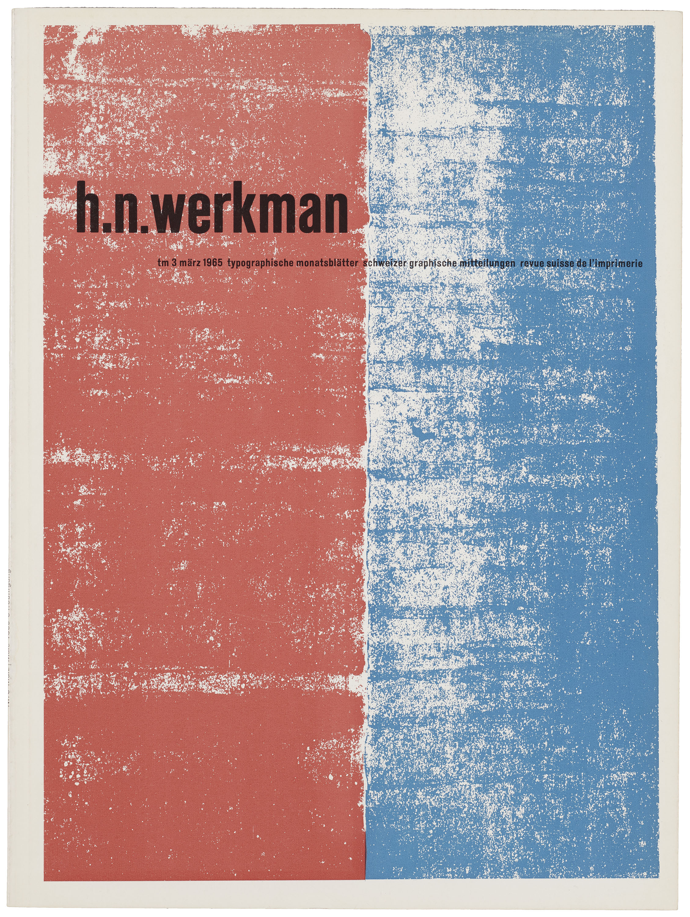
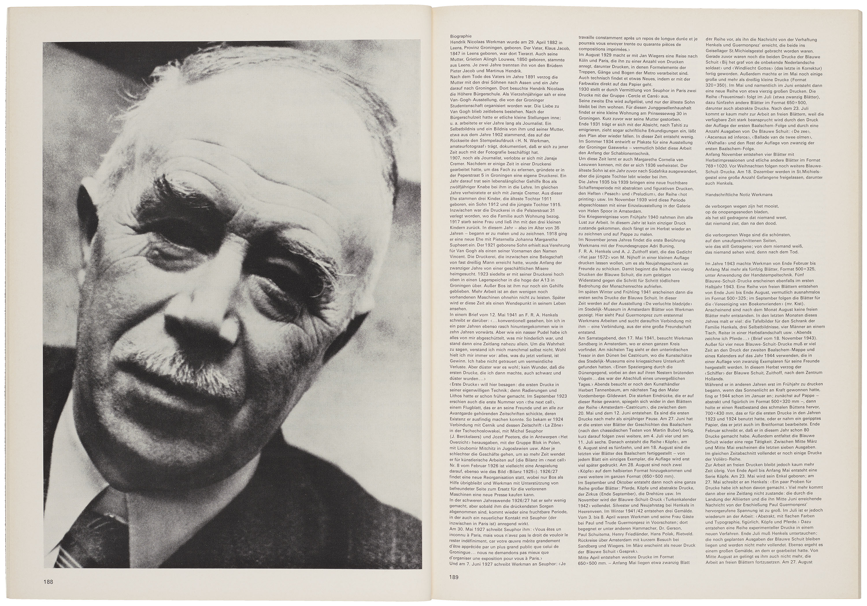
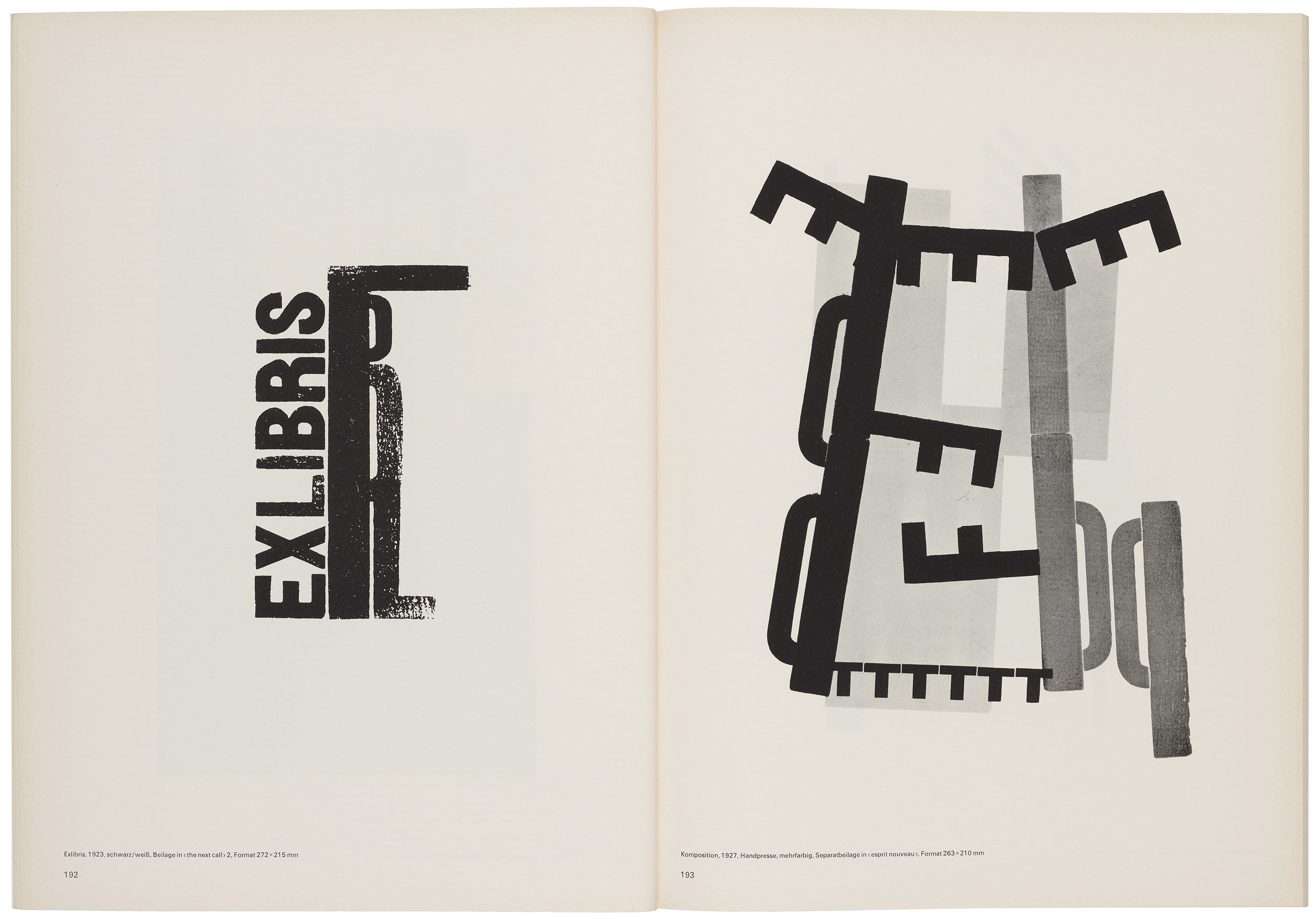
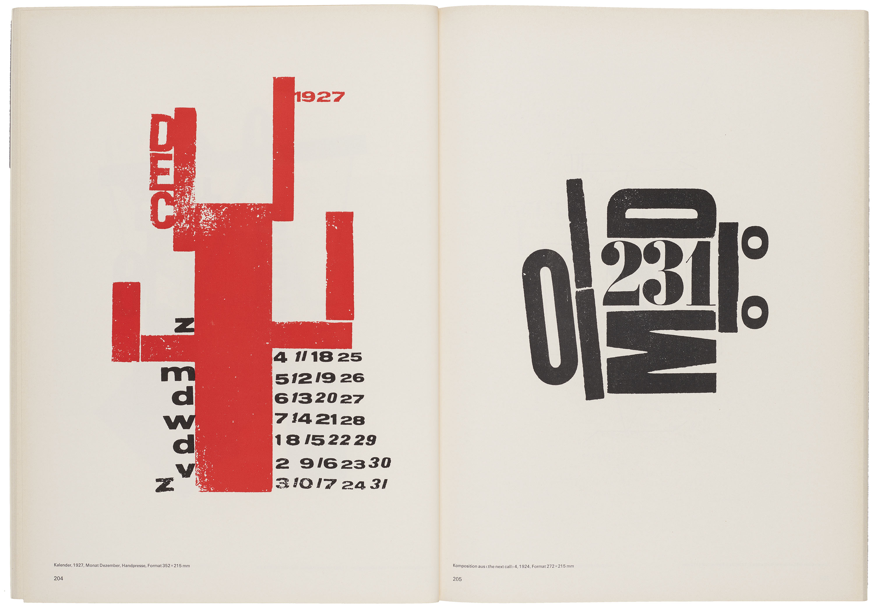
Published in 1964, the first issue of the series was dedicated to Dutch designer Piet Zwart (1885–1977), and was followed by a similar feature on Dutch printmaker H. N. Werkman (1882–1945) in March 1965. With a strong emphasis on materiality and process, Werkman’s experimental printmaking practice combined hand press techniques, expressive use of color, and unconventional arrangements of type. Some compositions required dozens of printing passes to achieve the layered effects more commonly associated with painting than letterpress printing.
All images in the gallery below are hi-fi captures. Click an image to enter fullscreen view, then click or pinch to enlarge.
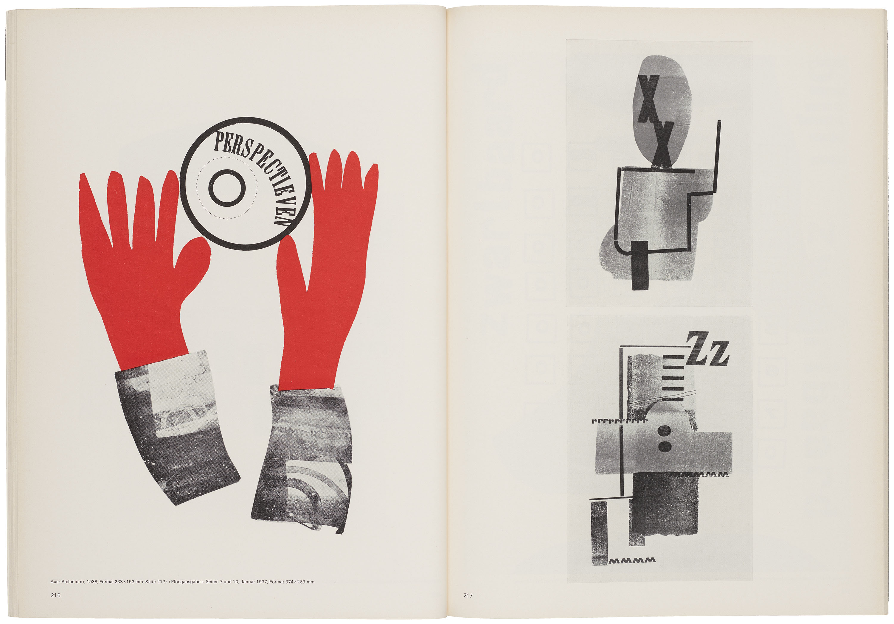
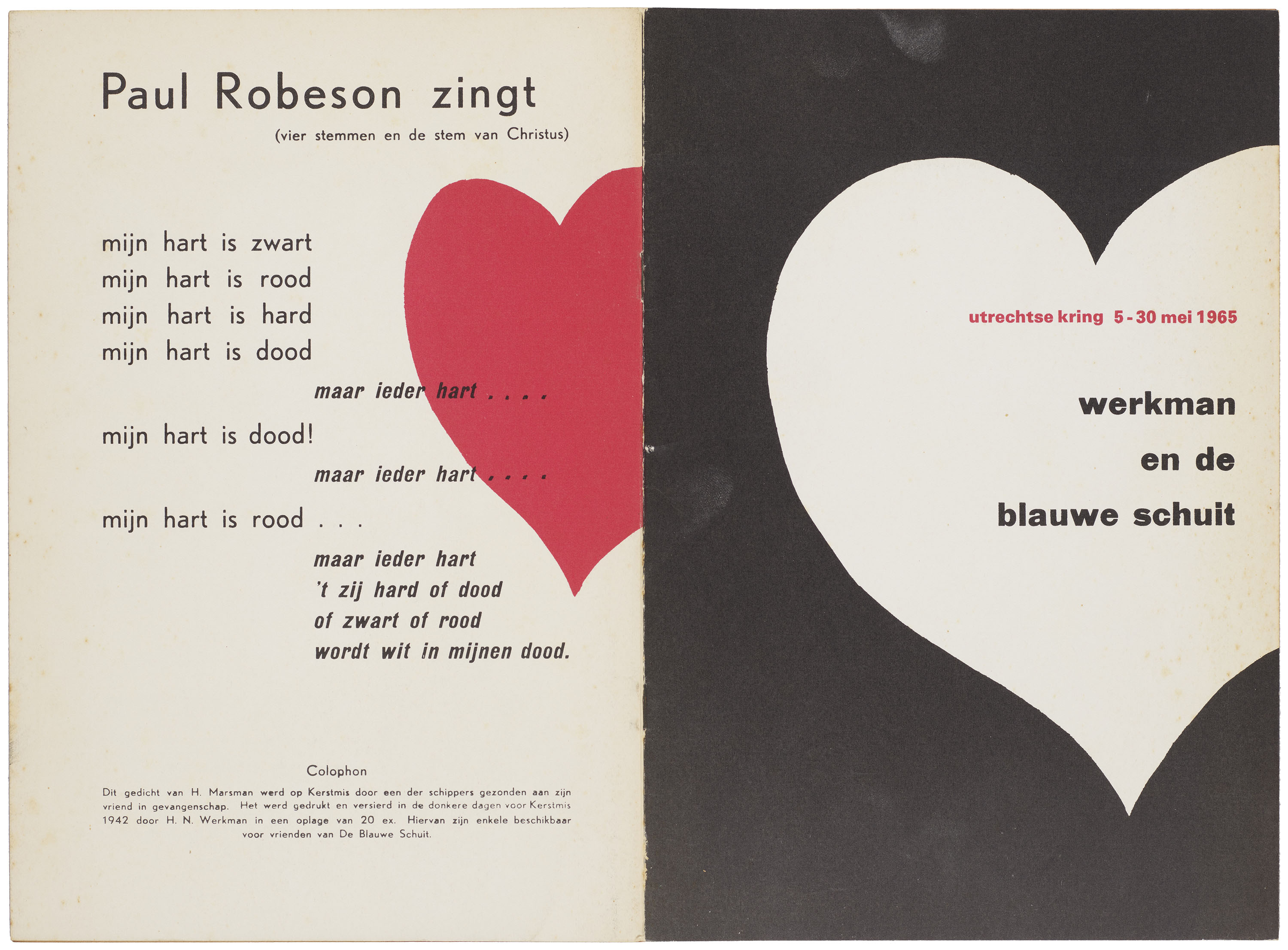
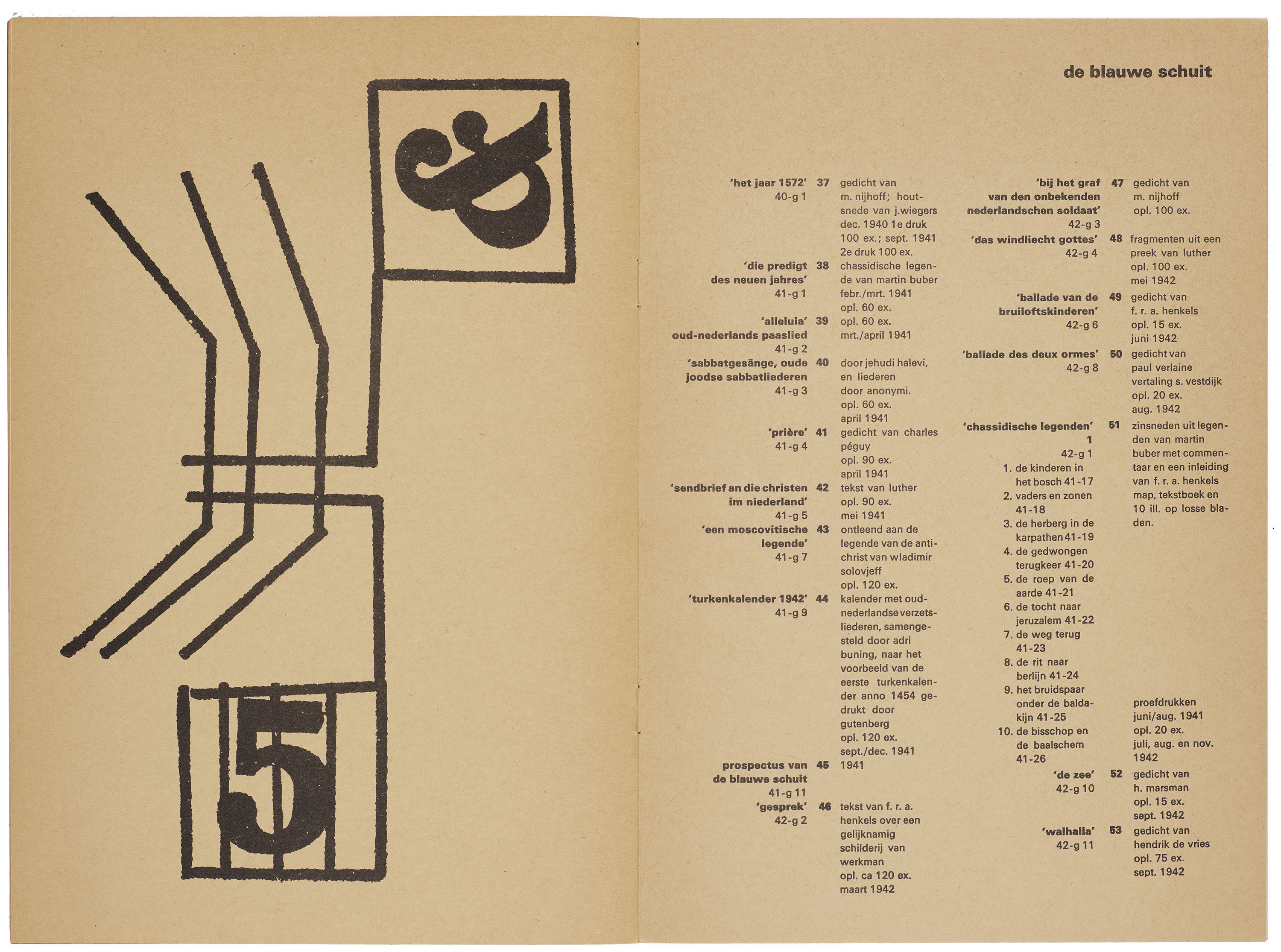
Following the German invasion of the Netherlands in 1940, Werkman established De Blauwe Schuit (The Blue Barge), an underground printing operation that produced anti-fascist pamphlets and self-published journals. These small, spare booklets fostered dialogue between artists and writers at a moment when creative expression was actively suppressed, anticipating the role trade periodicals would later play as forums for debate and exchange.
All images in the gallery below are hi-fi captures. Click an image to enter fullscreen view, then click or pinch to enlarge.
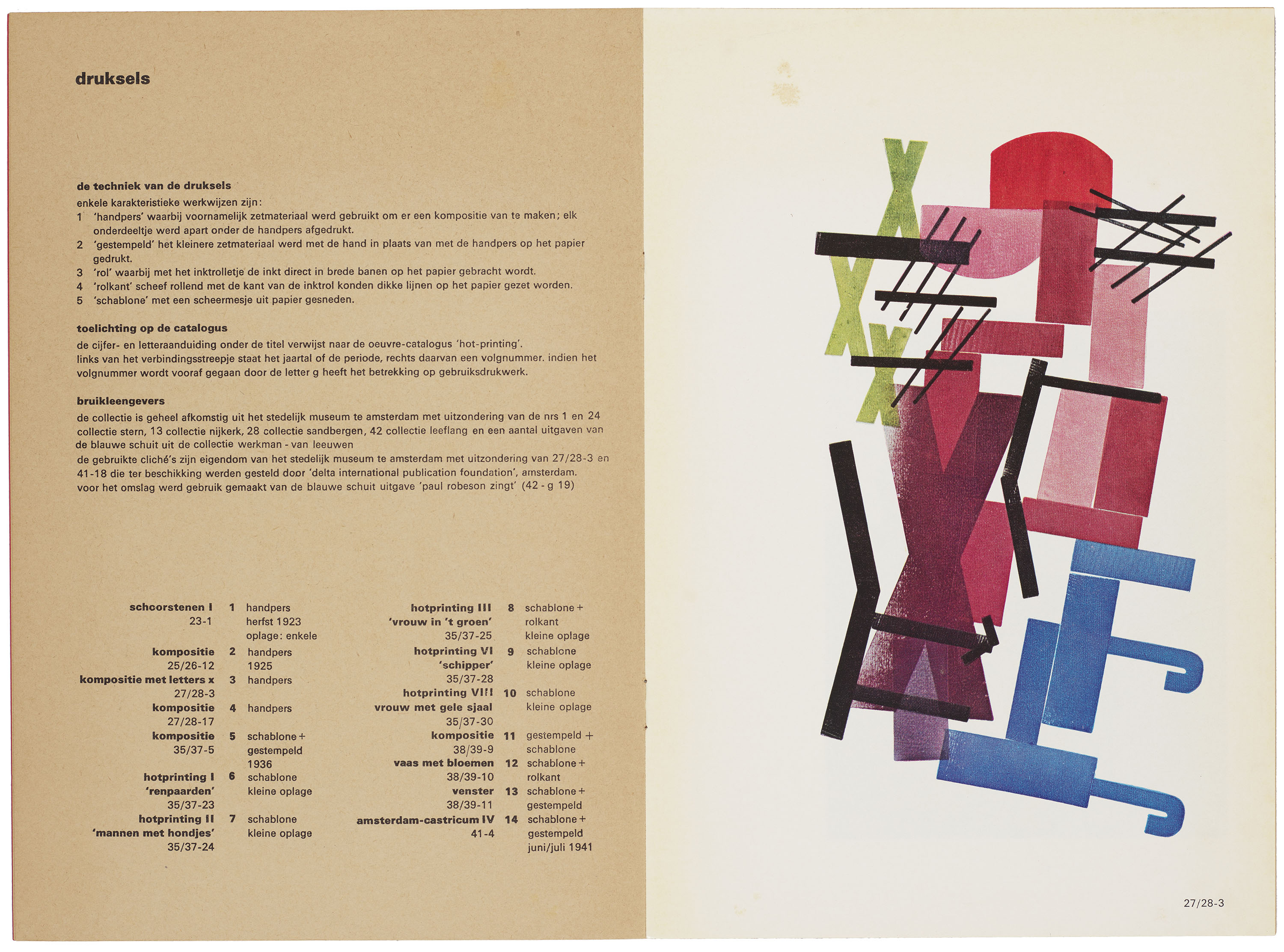
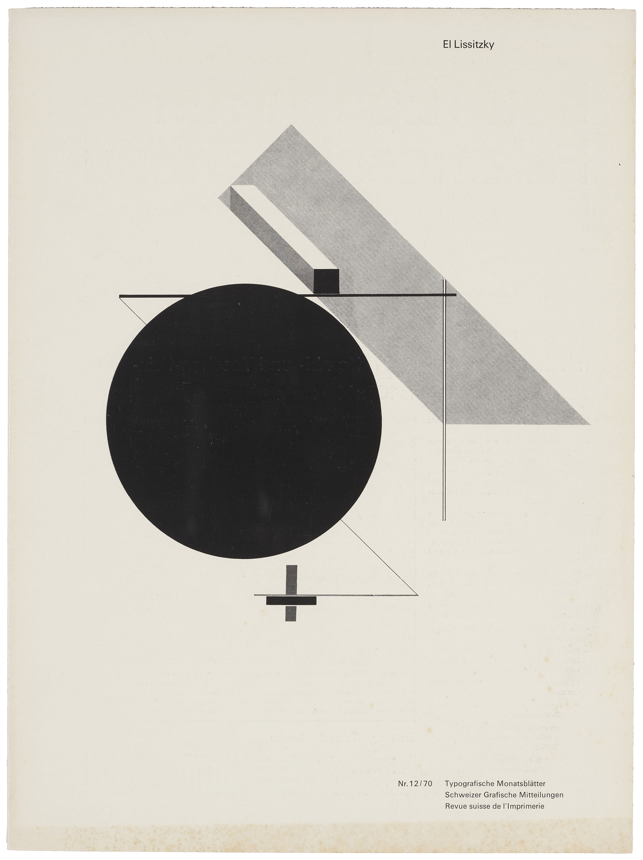
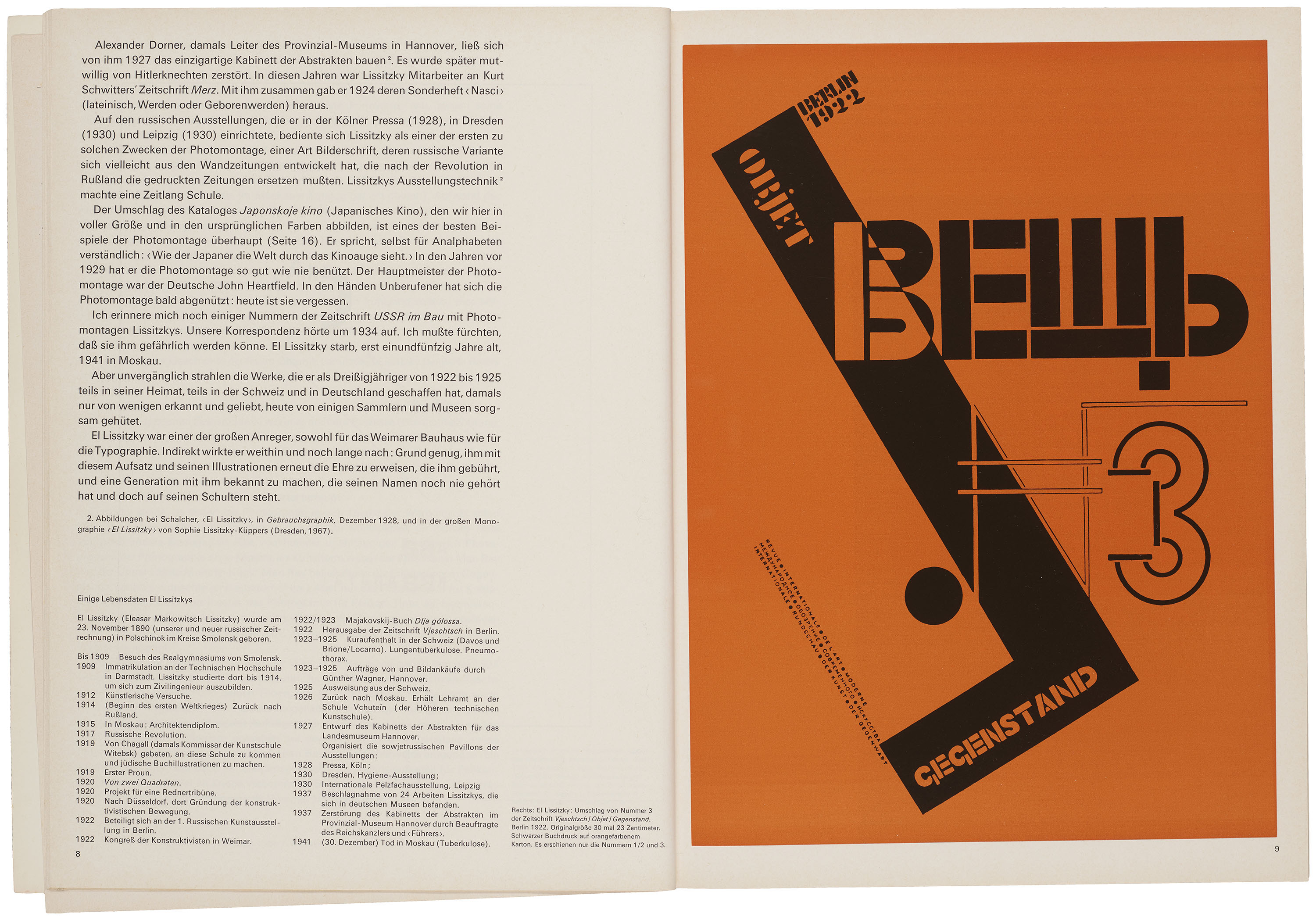
Framed as a predecessor of modern Swiss typography, Werkman’s practice underscores the careful attention to craft and process encouraged by Ruder and his colleagues at the Allgemeine Gewerbeschule Basel. Werkman’s oeuvre also reflects broader trends in modern art and design, including the influence of El Lissitzky (1890–1941), whose work was highlighted in the December 1970 issue of TM. As demonstrated by the Bauhaus’s translation of Constructivist principles into a legible design vocabulary, the interactions between fine art and design would remain crucial to the development of modern typography during the postwar period.
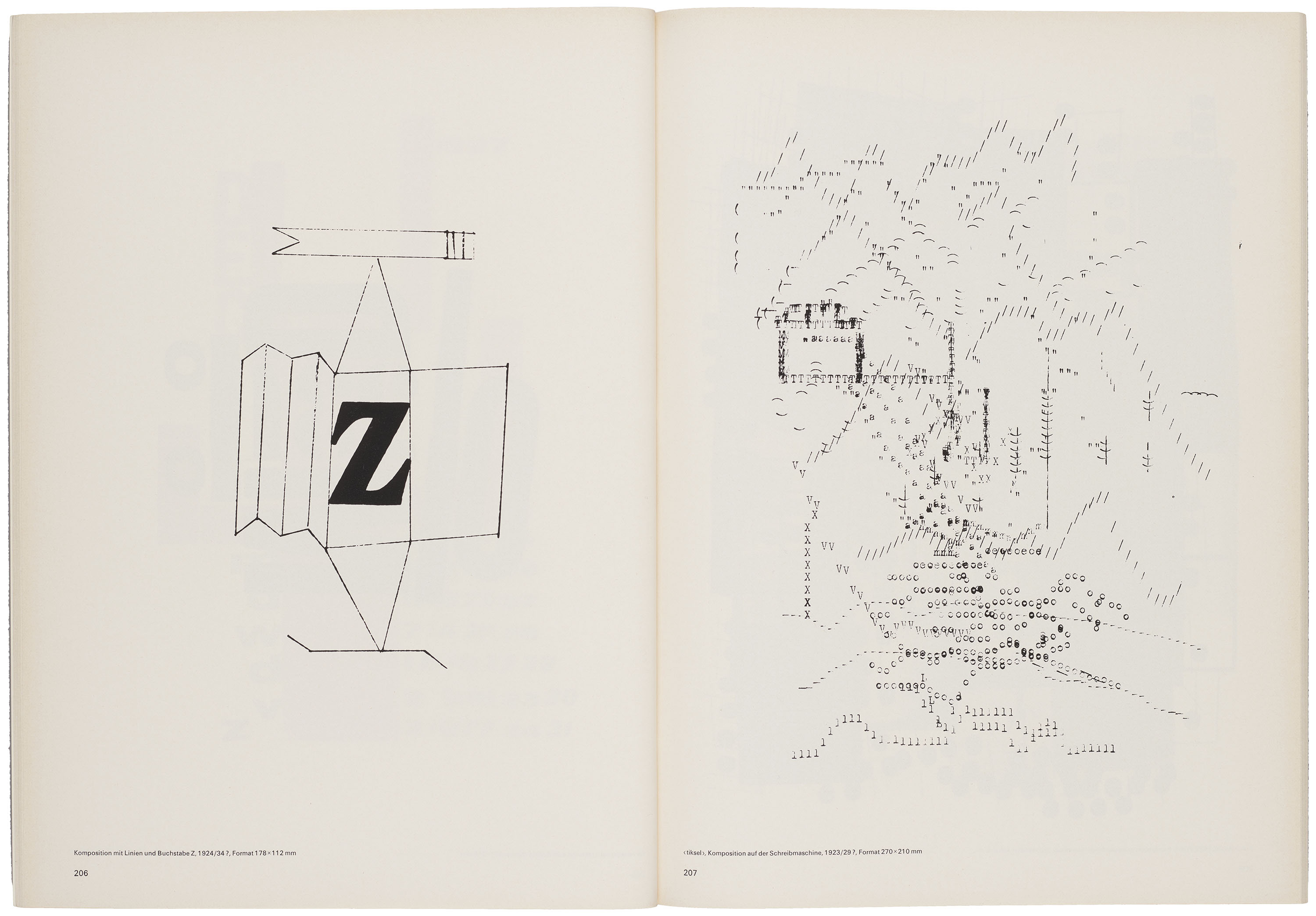
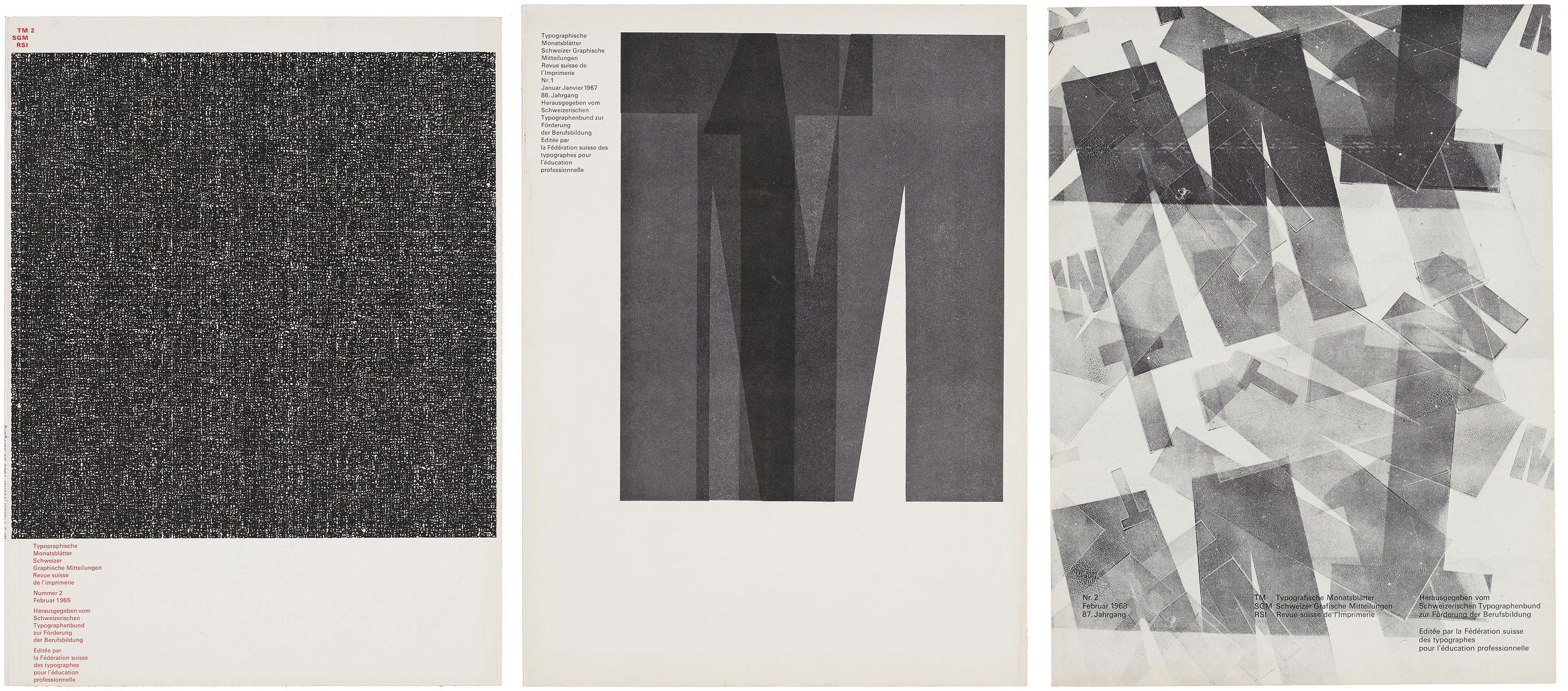
In the years that followed the Werkman retrospective, student work began to feature more prominently on the covers of TM. The cover designs for the 1967 and 1968 print runs showcase two expressive interpretations of Ruder Grotesk, a versatile wood typeface developed at the Basel School. Even prior to these interventions, the dense, overlapping grids of text developed for the 1965 print run resemble Werkman’s own “typestract” experiments.
Thinking Inside the Box
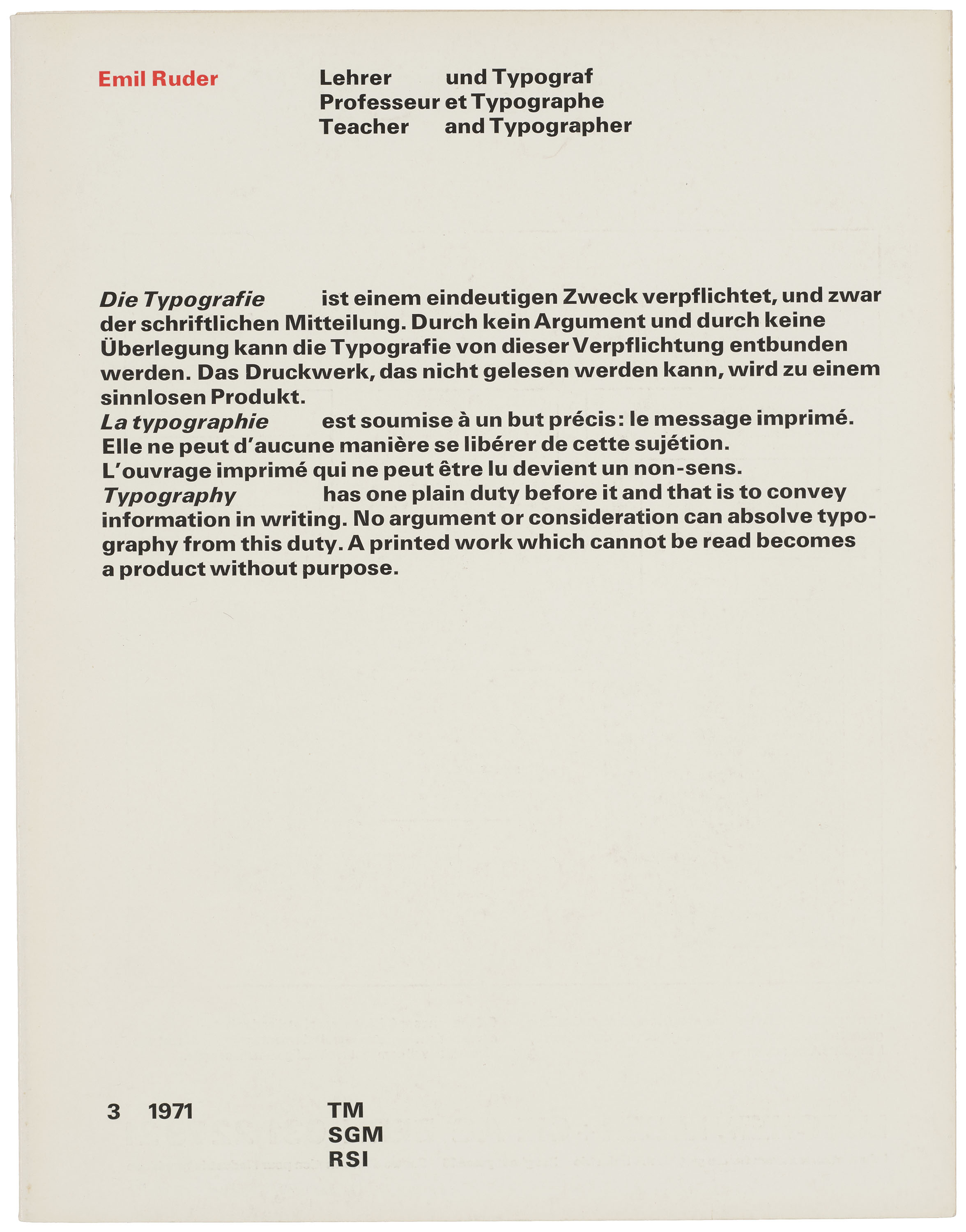
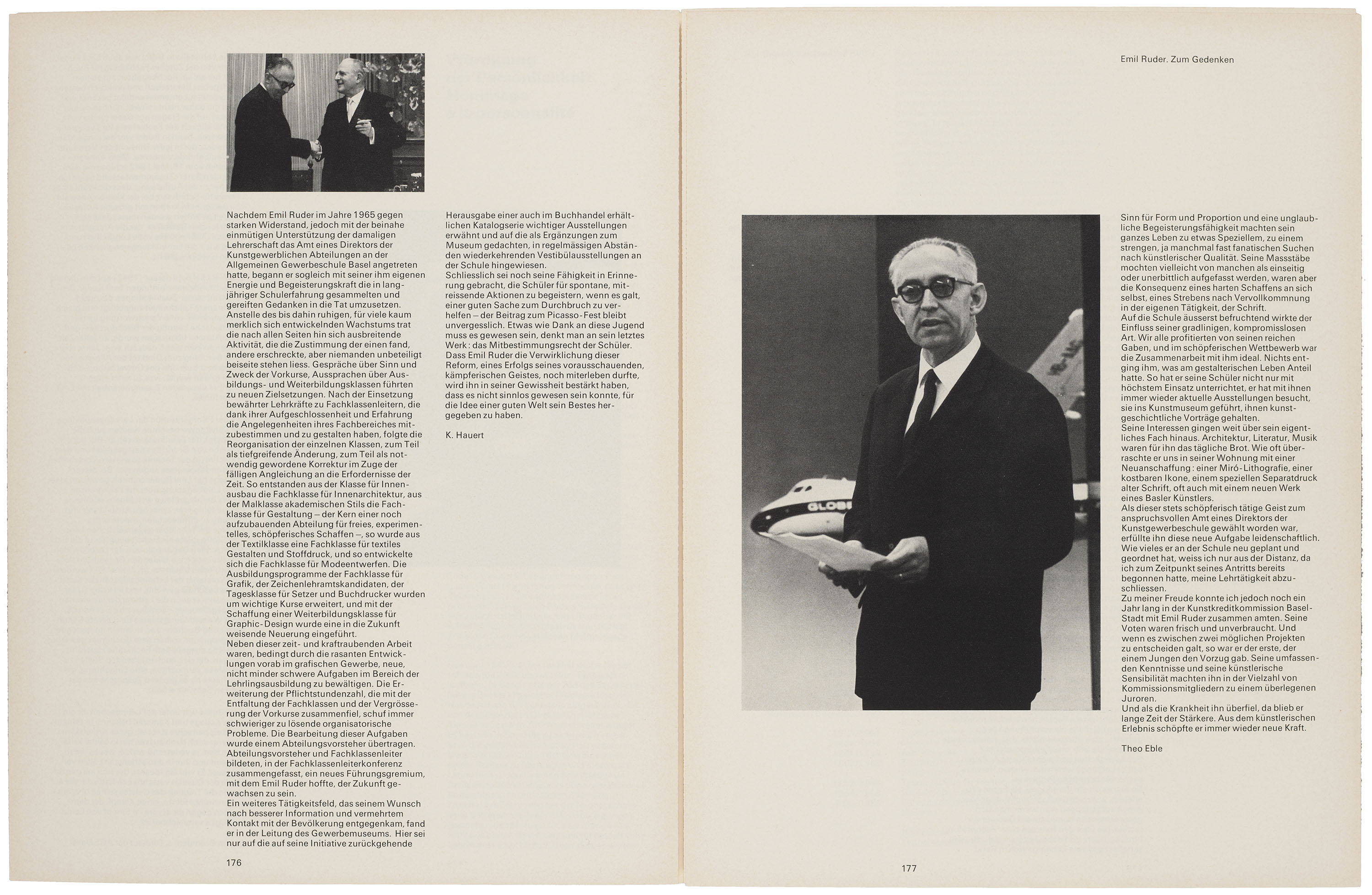
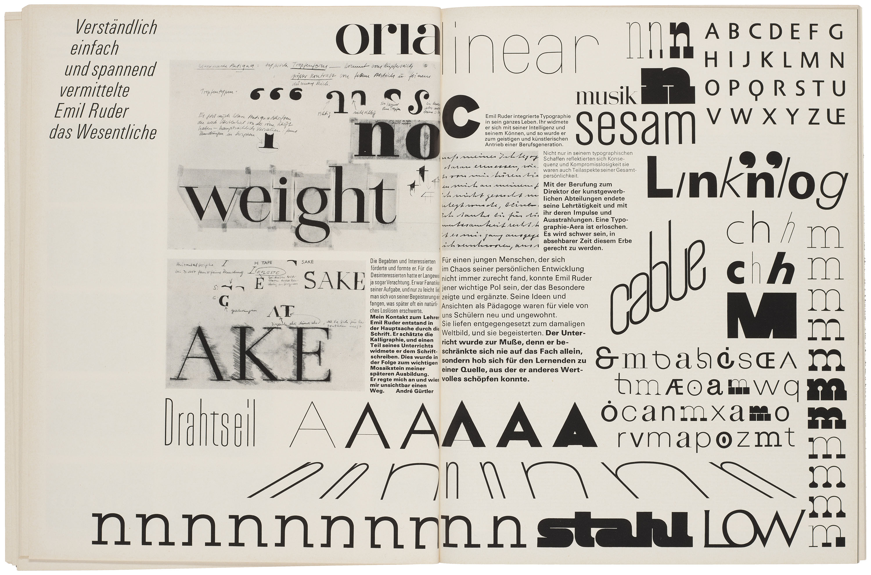
After Ruder’s death in 1970, TM published a substantial review of his career as designer and educator in the March 1971 issue. Bringing together excerpts from Ruder’s writings, student work and reflections, and essays by his peers, the issue demonstrates the scope of his contributions to Swiss Style. Although his pedagogy continued to have an outsized influence at the Basel School and his students and colleagues were well positioned to carry on his legacy, Ruder’s memoriam in TM certainly marked the end of a formative chapter in Swiss design history.
All images in the gallery below are hi-fi captures. Click an image to enter fullscreen view, then click or pinch to enlarge.
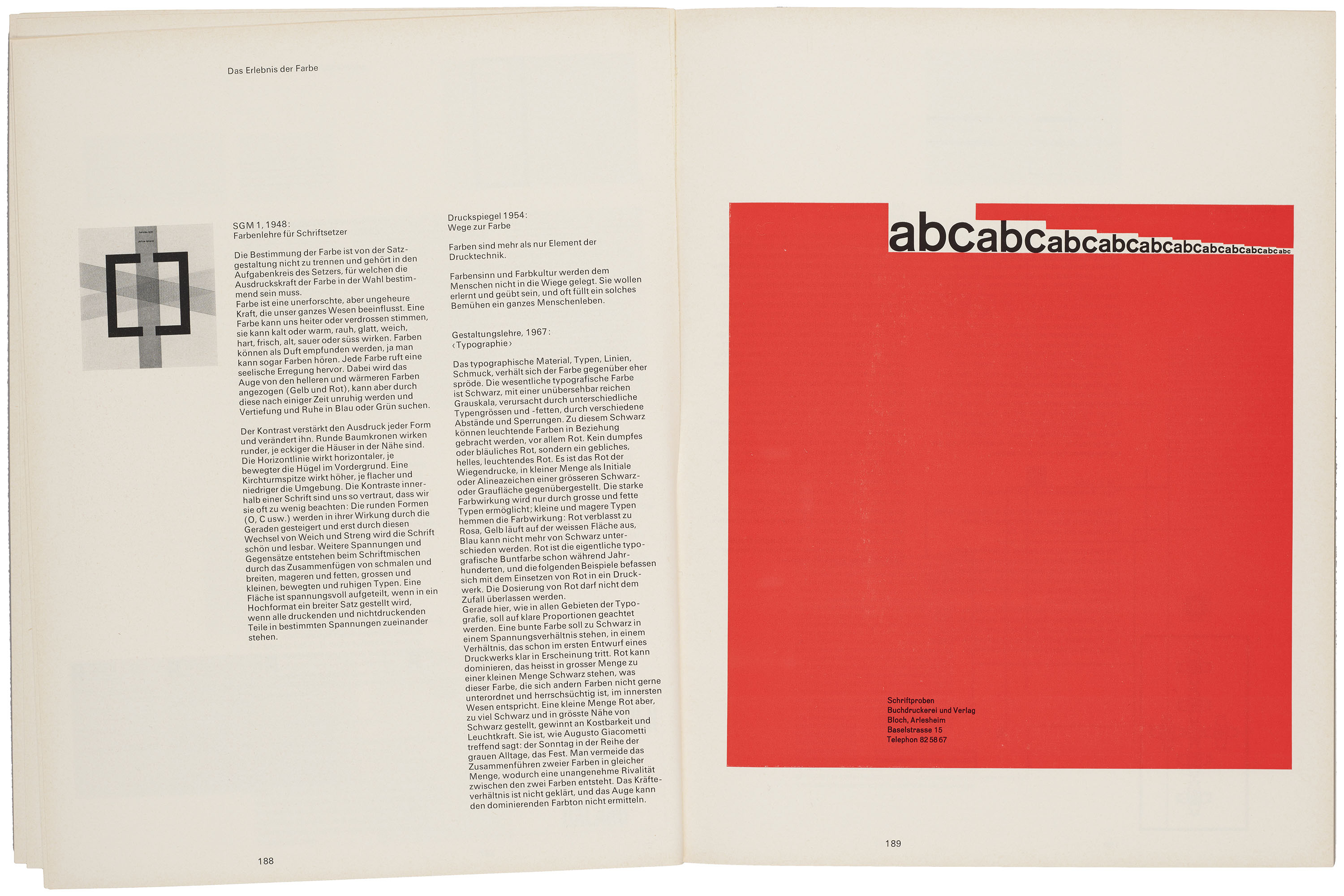
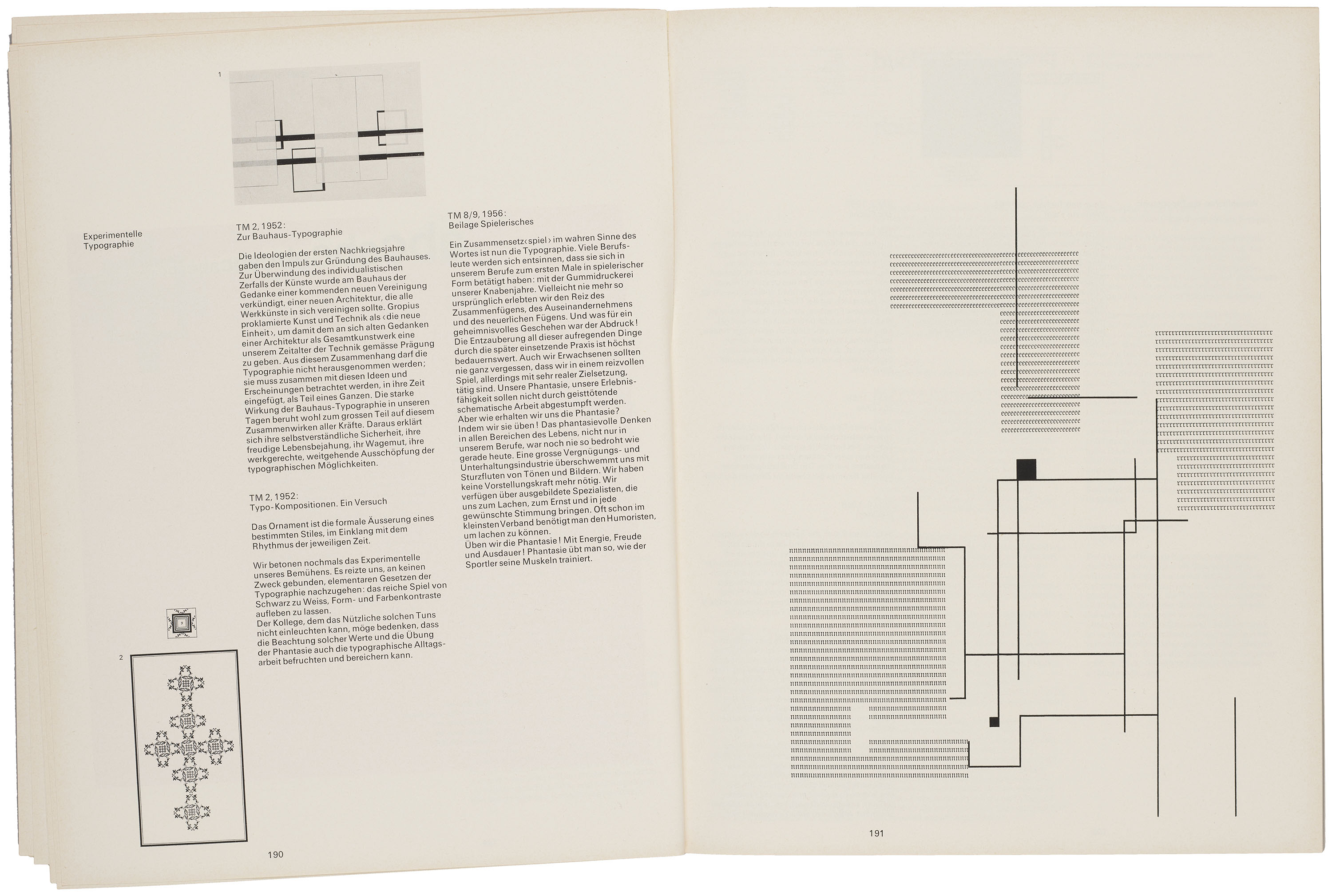
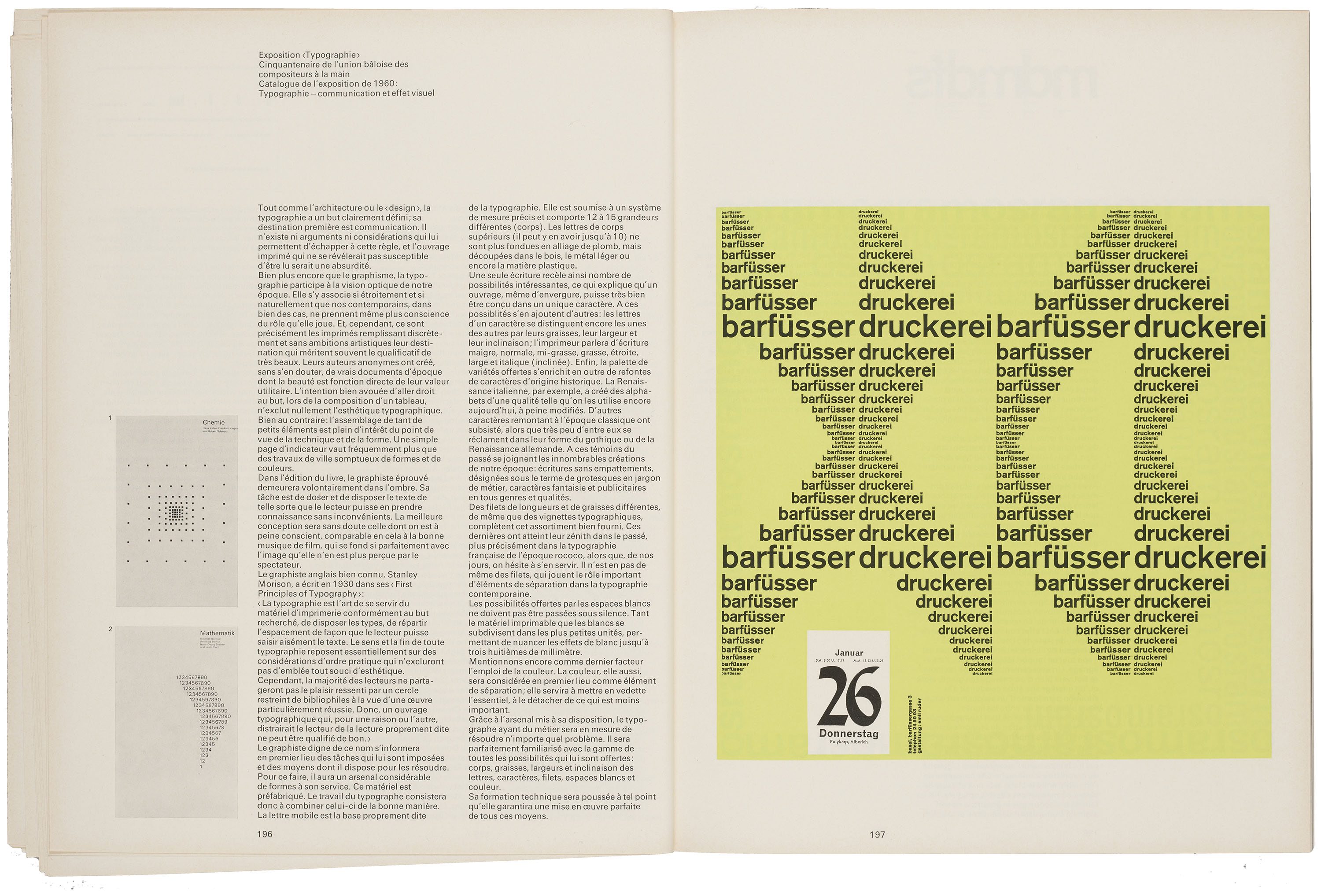
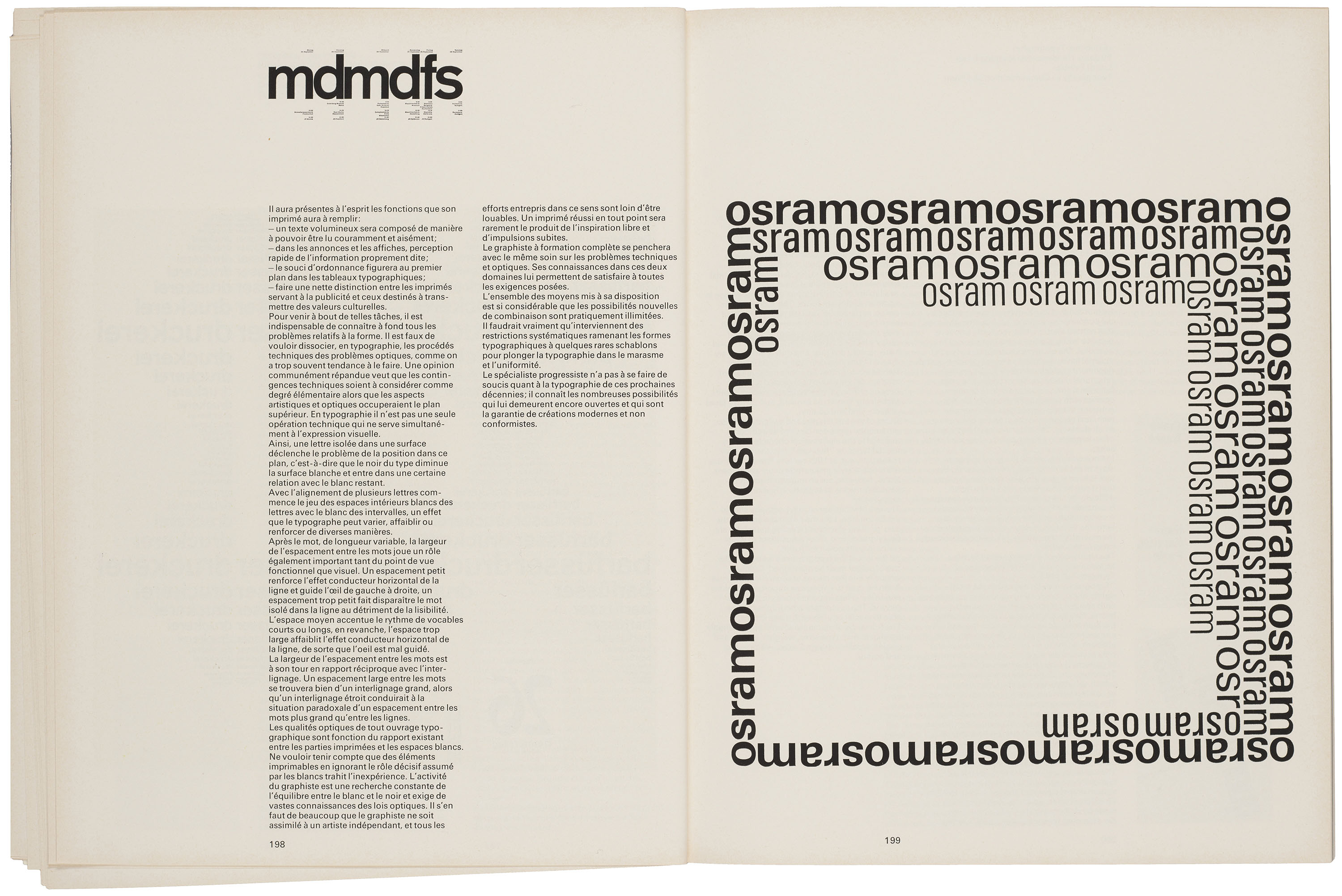
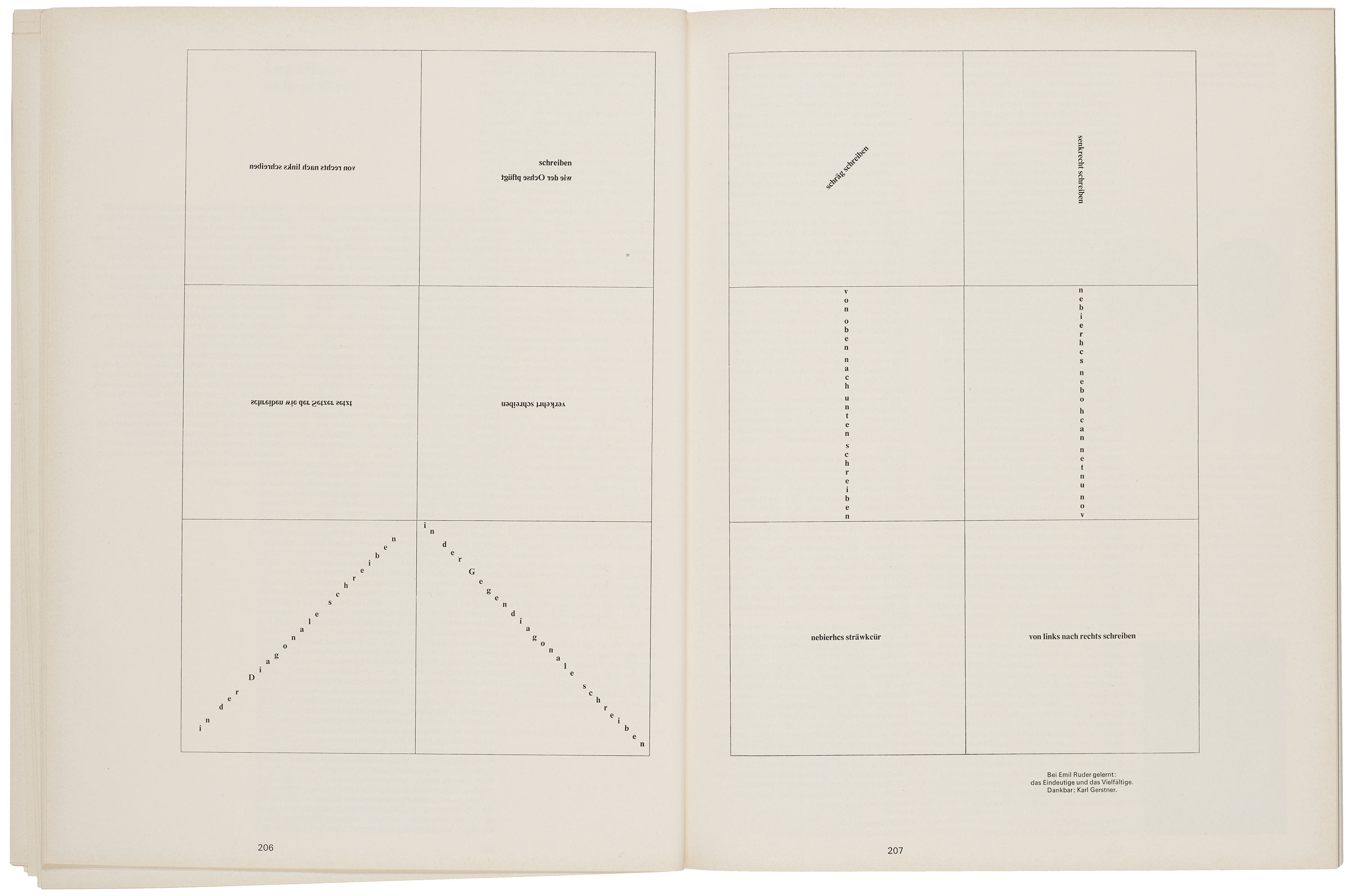
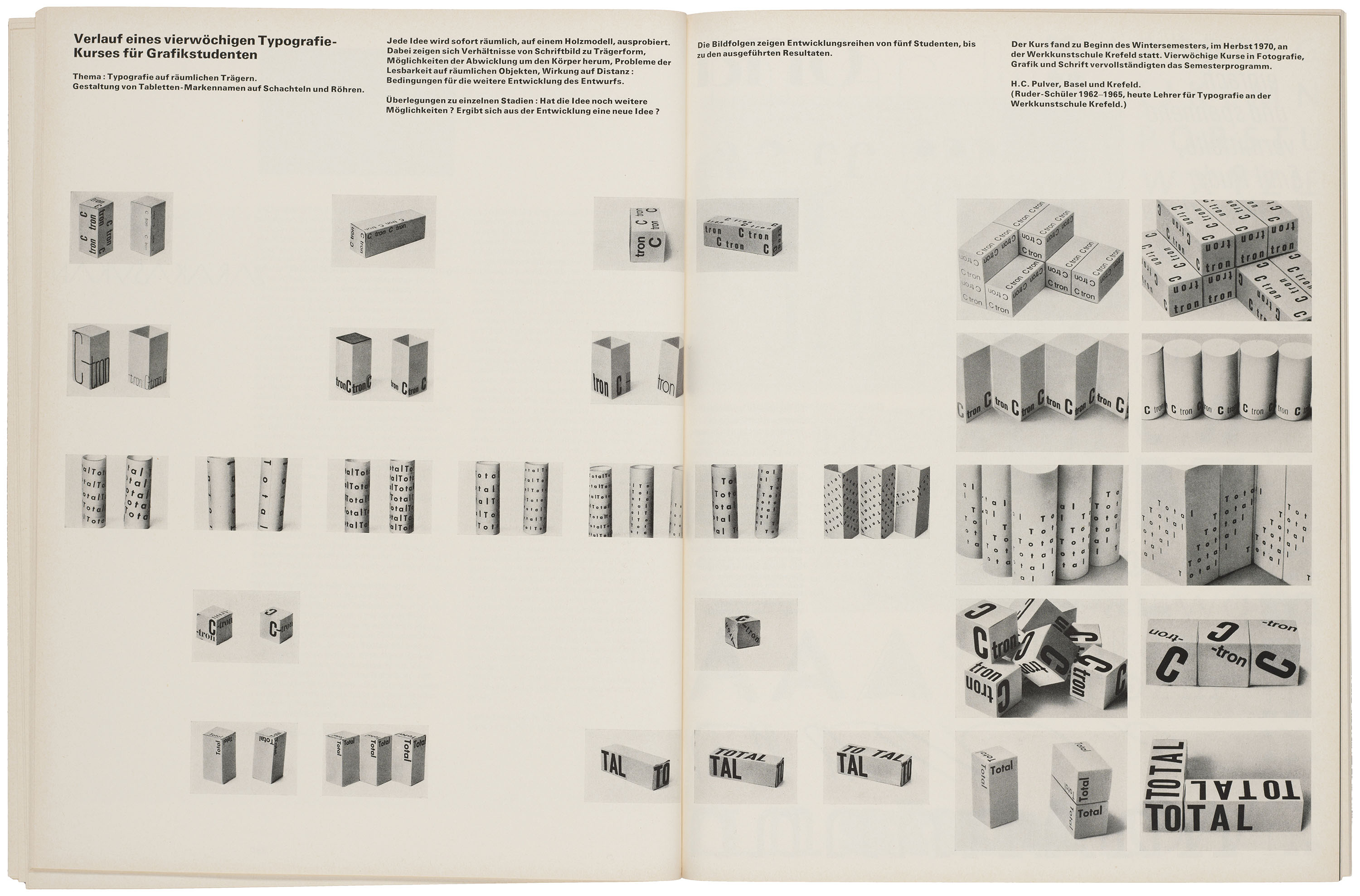
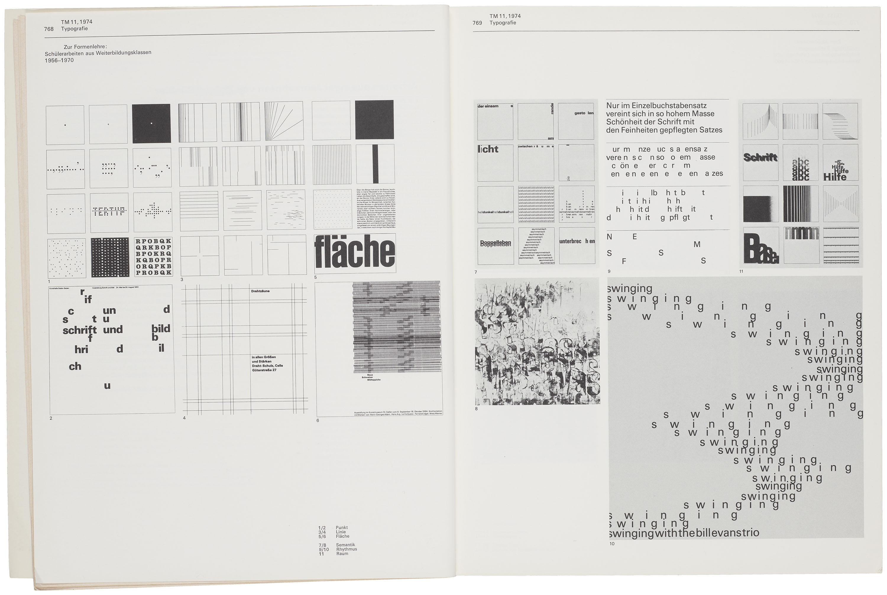
Building on the precedents set by the Bauhaus, the Basel School promoted an interdisciplinary understanding of design. In Typographie: A Manual for Design (1957), Ruder deploys architectural language to describe typography as a spatial practice grounded in the skillful use of proportion, rhythm, and structure. Within this framework, the grid functions as a kind of scaffold capable of supporting numerous methods of construction, including the experimental work that appeared in TM in the late 1960s. Consequently, one of Ruder’s most significant contributions to modern graphic design is certainly the development of the systemized grid.
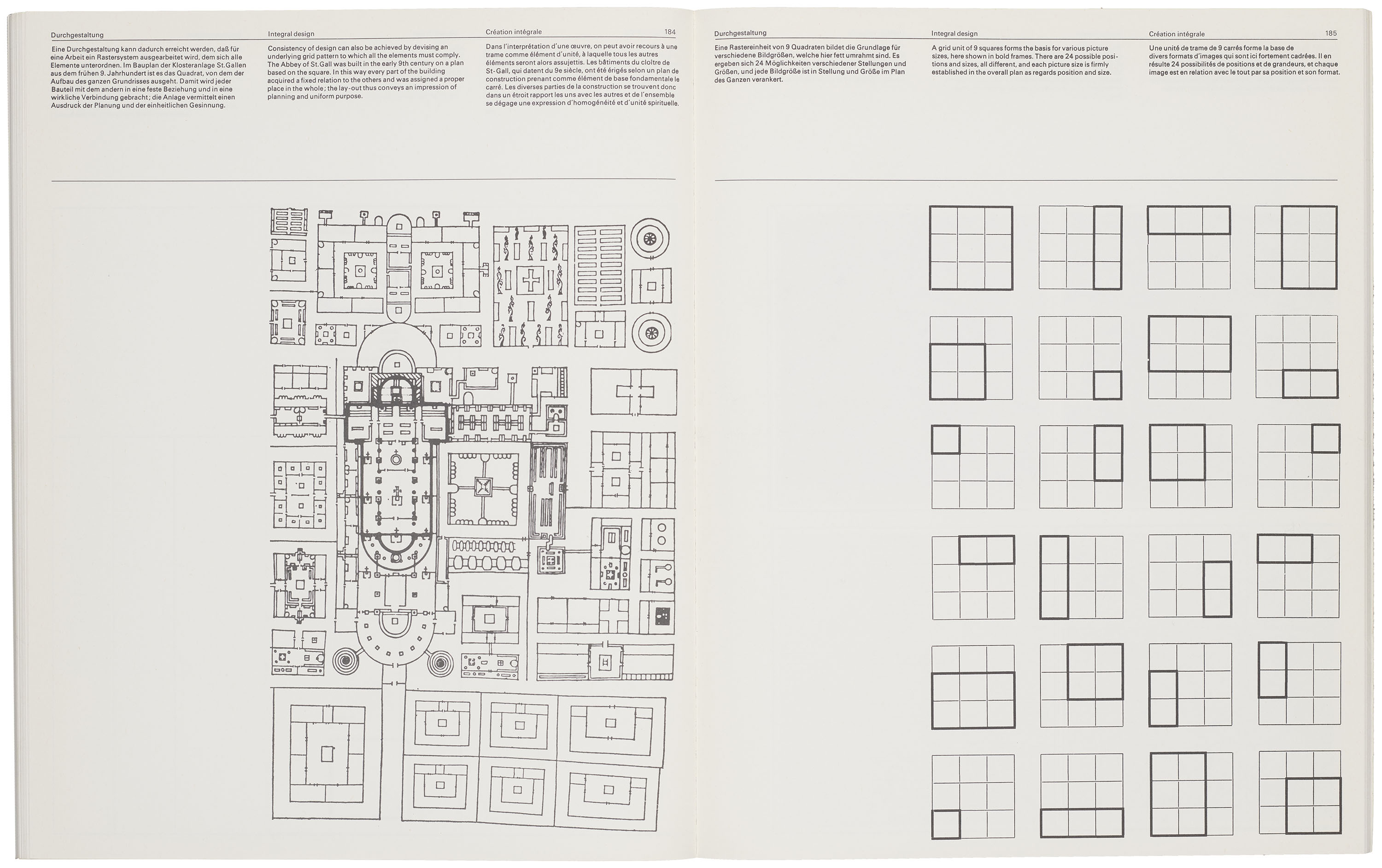
All images in the gallery below are hi-fi captures. Click an image to enter fullscreen view, then click or pinch to enlarge.
From Text to Image
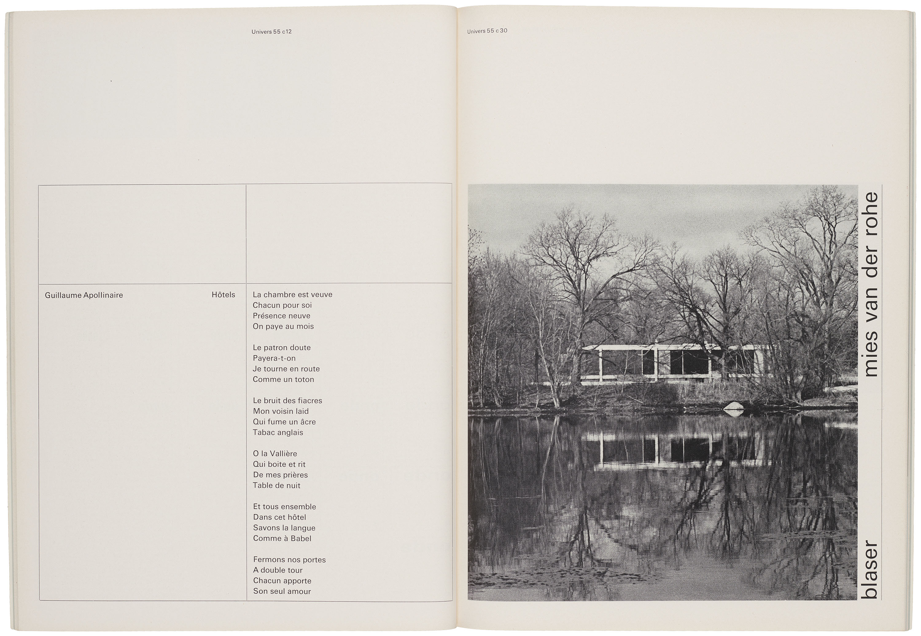
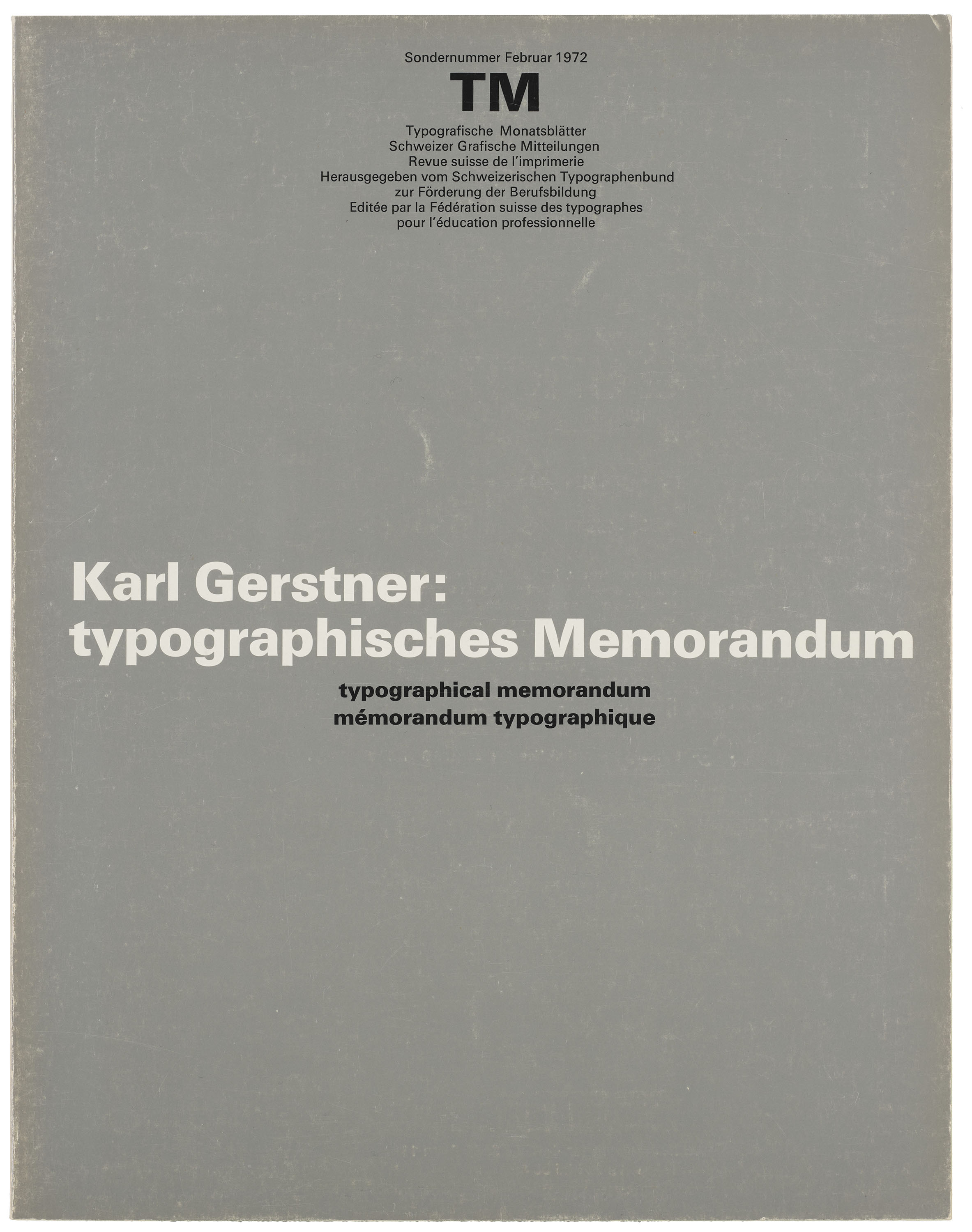
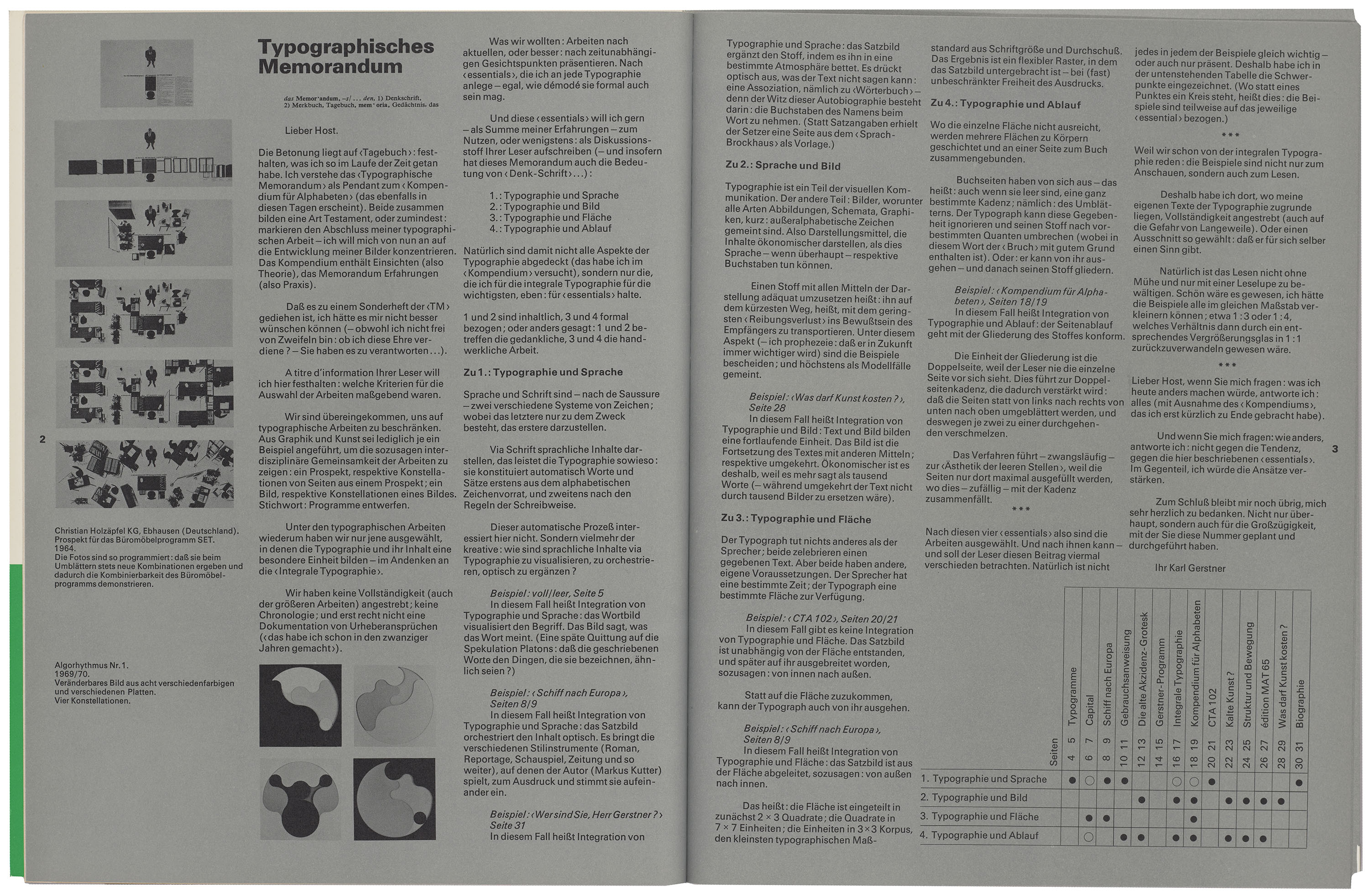
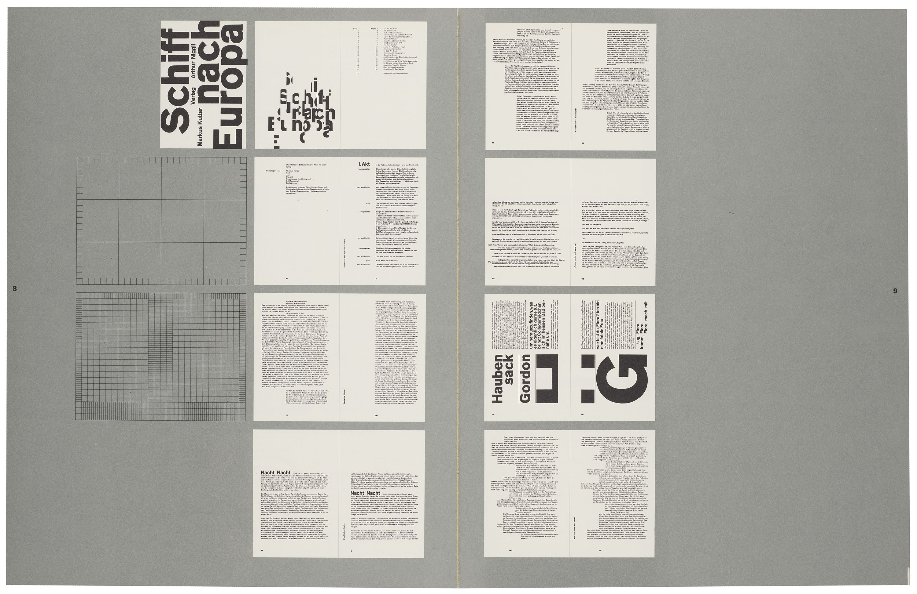
In his “Typografisches Memorandum” for the February 1972 issue of TM, Karl Gerstner (1930–2017) reiterates the concept of “integral typography” developed with Ruder in the June/July 1959 issue. Earlier in his career, Gerstner sought to integrate typographic form and literary content in a way that would enhance the meaning of the text, a strategy exemplified by his “visual organization” of the novel Schiff nach Europa (1957).
All images in the gallery below are hi-fi captures. Click an image to enter fullscreen view, then click or pinch to enlarge.
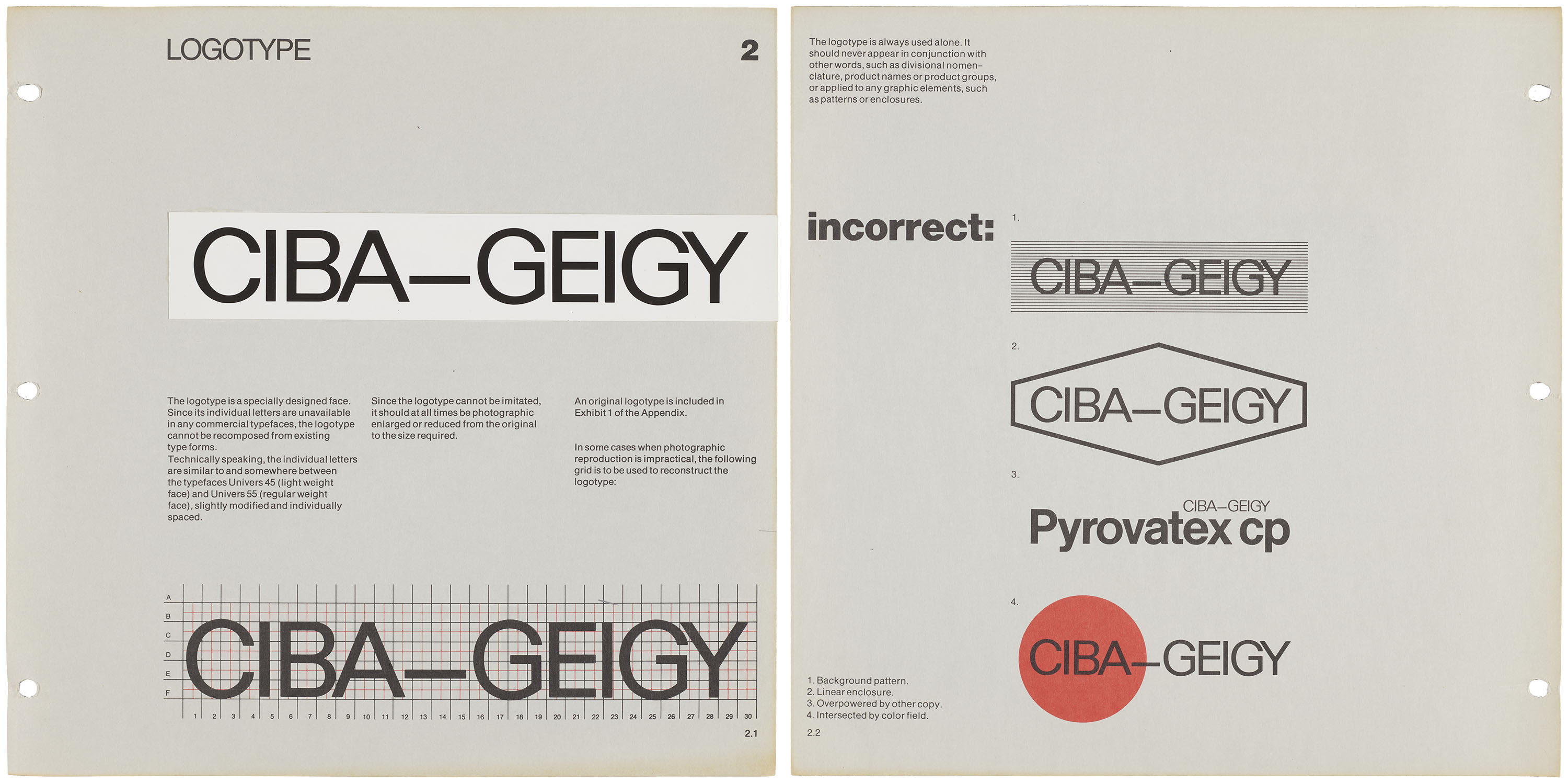
As a founding member of the agency Gerstner, Gredinger + Kutter (GGK), Gerstner was likely drawn to advertising for its capacity to amplify meaning as a comprehensive visual system. One of the leading advertising agencies in Switzerland, GGK’s creative projects contributed to the spread of the International Typographic Style, which disseminated Swiss design as a widely adopted strategy for corporate branding and visual communication. Gerstner’s early ambition to become a chemist was at least partly fulfilled through his work for the pharmaceutical company Ciba-Geigy, whose brand guide demonstrates the minimal approach of the modern logotype.
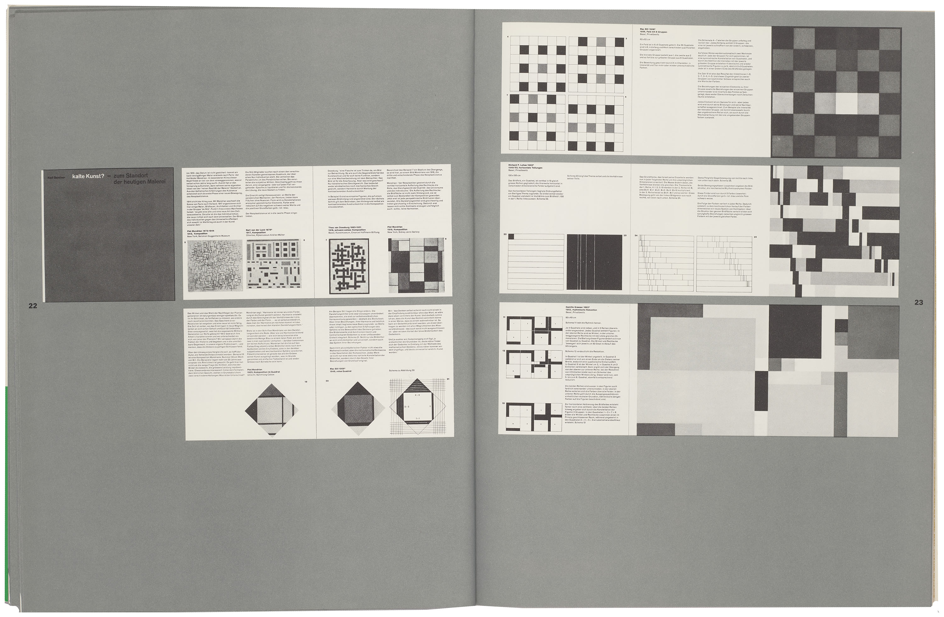
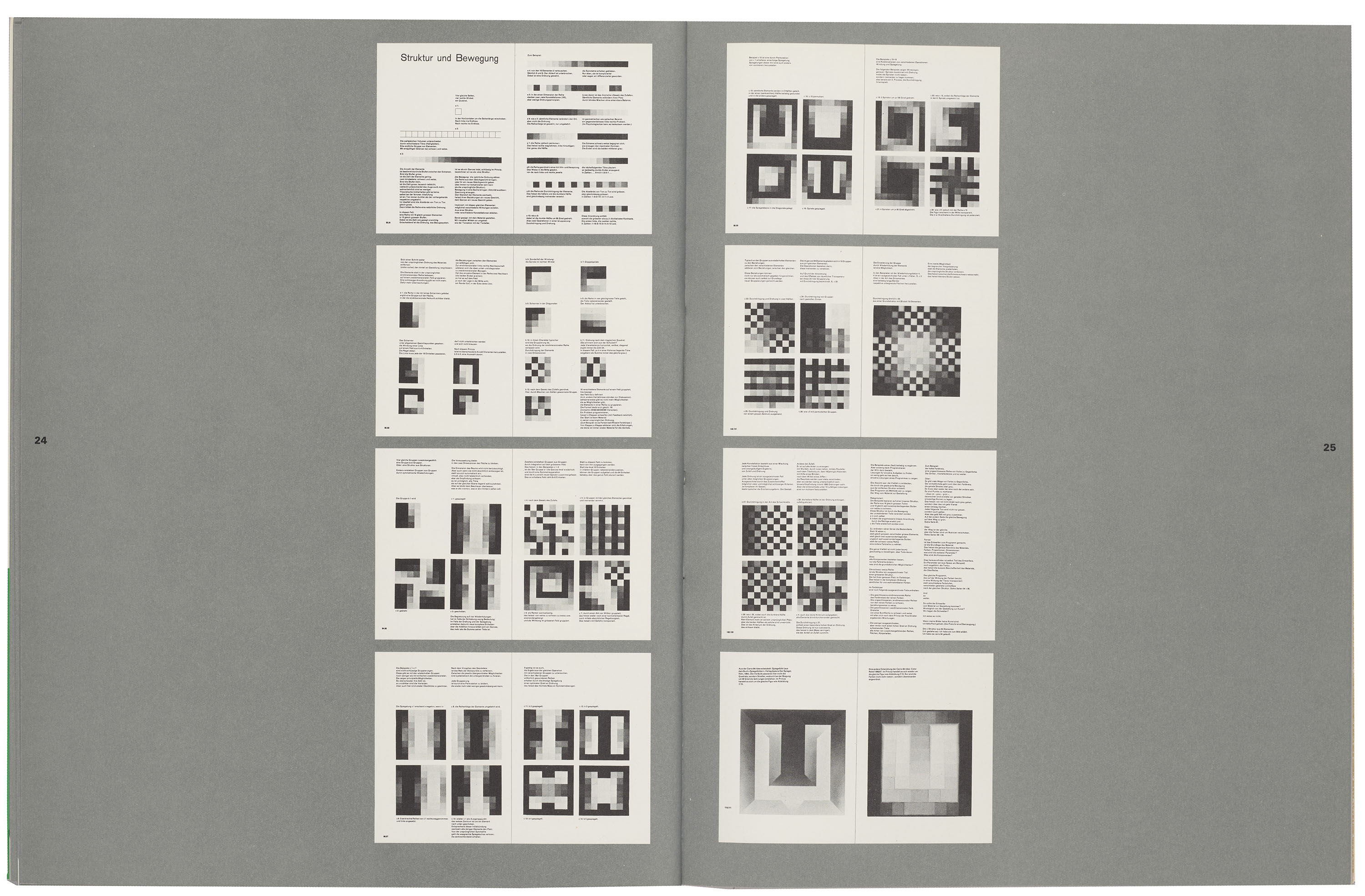
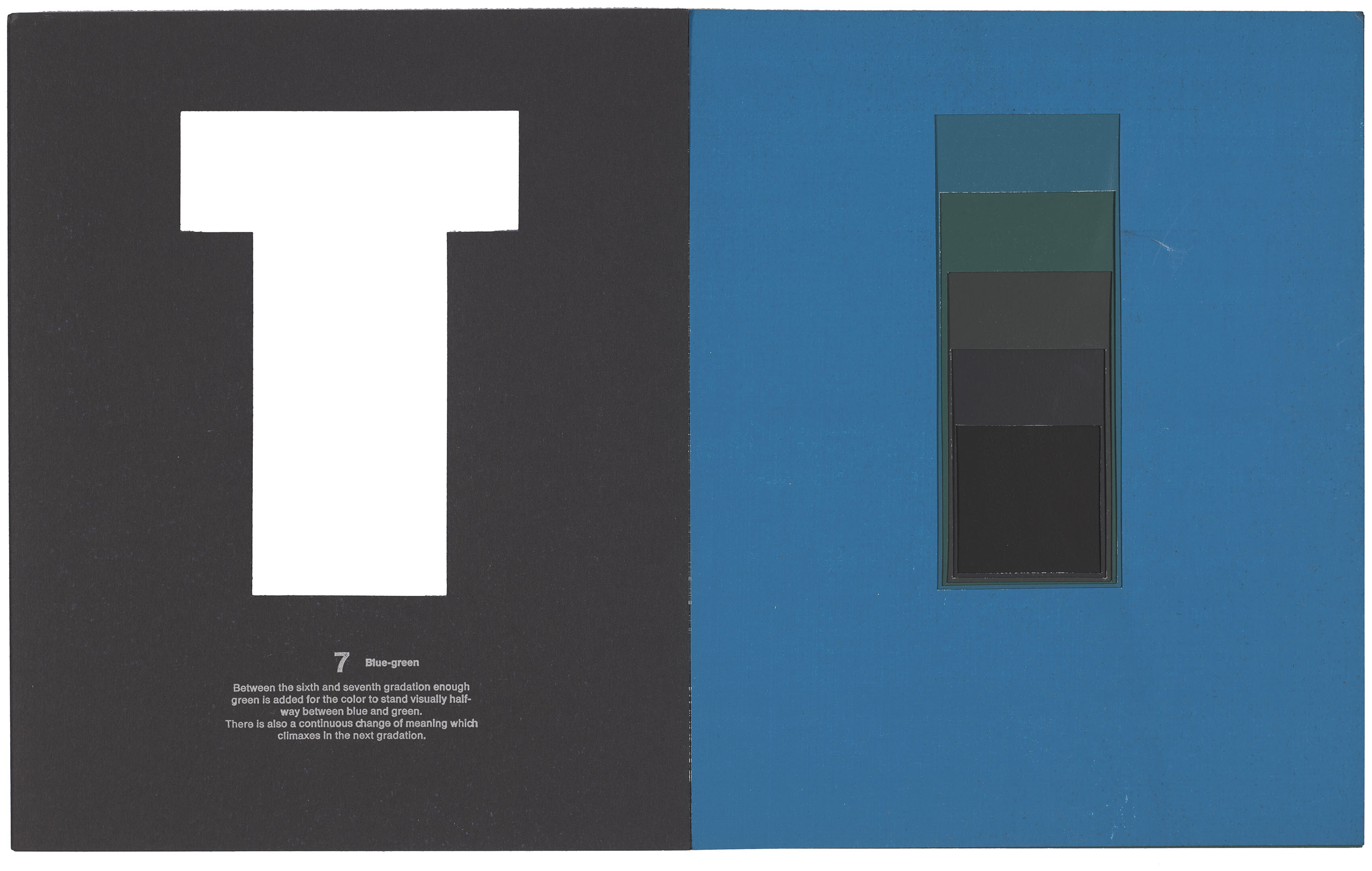
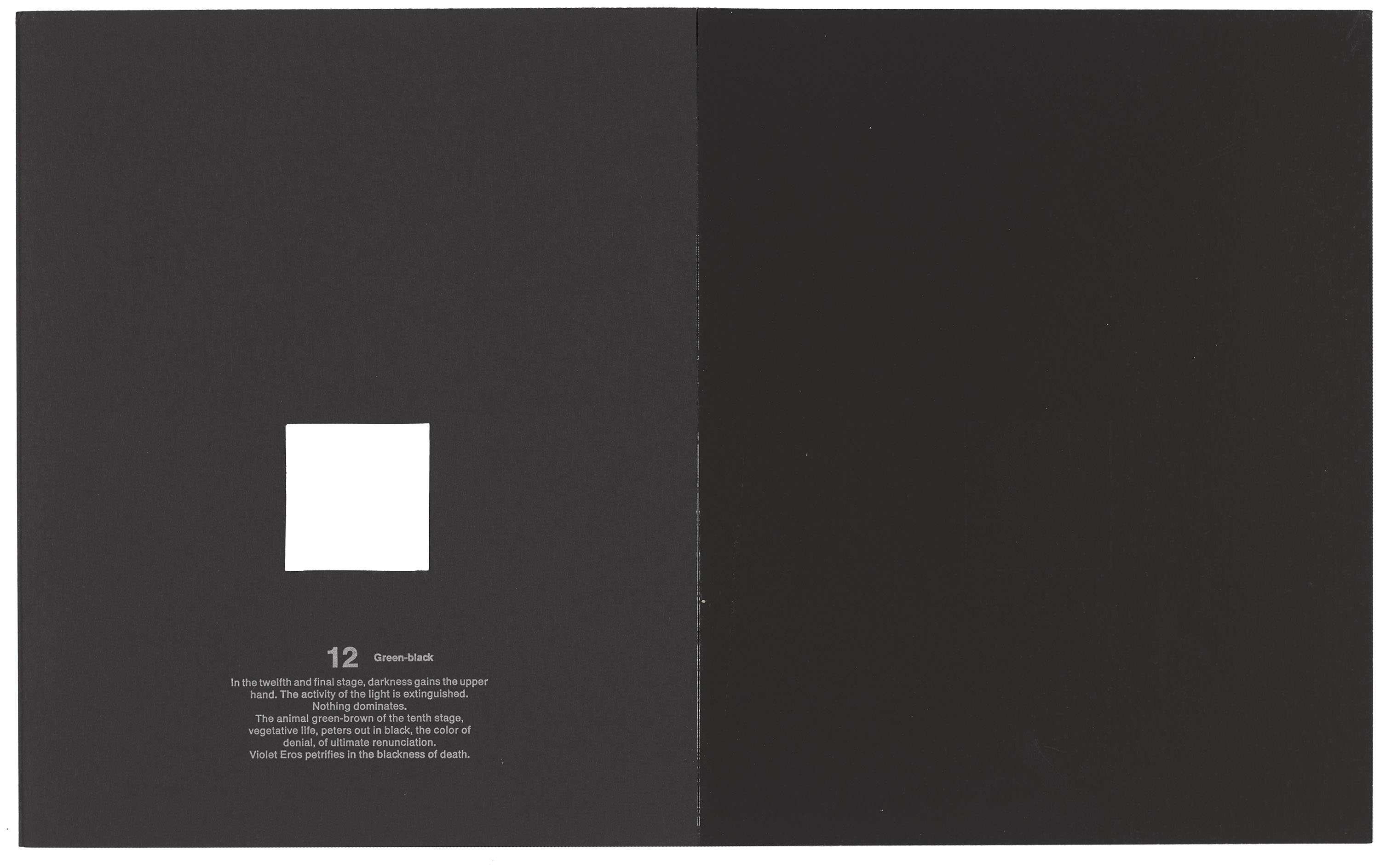
In the 1972 supplement for TM, Gerstner openly acknowledges what he saw as the expressive limits of typography, announcing his intention to move beyond the discipline. Arguing instead for the communicative potential of color, he resolved to focus on his image practice. First published in 1957, kalte Kunst?—zum Standort der heutigen Malerei anticipates this later disposition, proposing a rational approach to color informed by the same systematic logic as Ruder’s contributions to typography. By the ’70s, Gerstner increasingly turned to painting, producing abstract works that combined the emotional intensity of pure color with the mathematical precision of the grid.
All images in the gallery below are hi-fi captures. Click an image to enter fullscreen view, then click or pinch to enlarge.
History Repeating
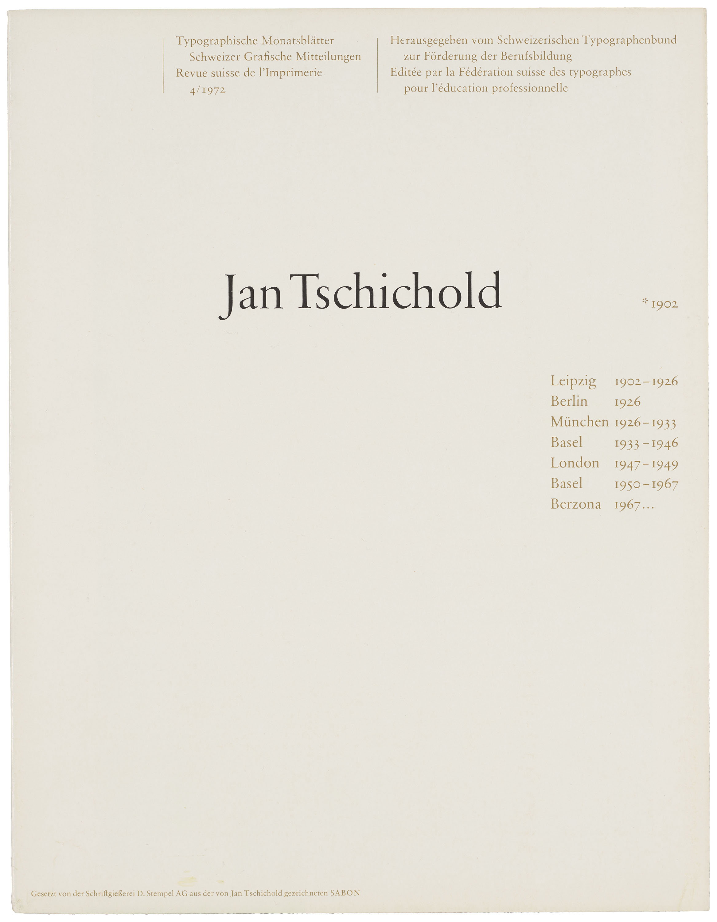
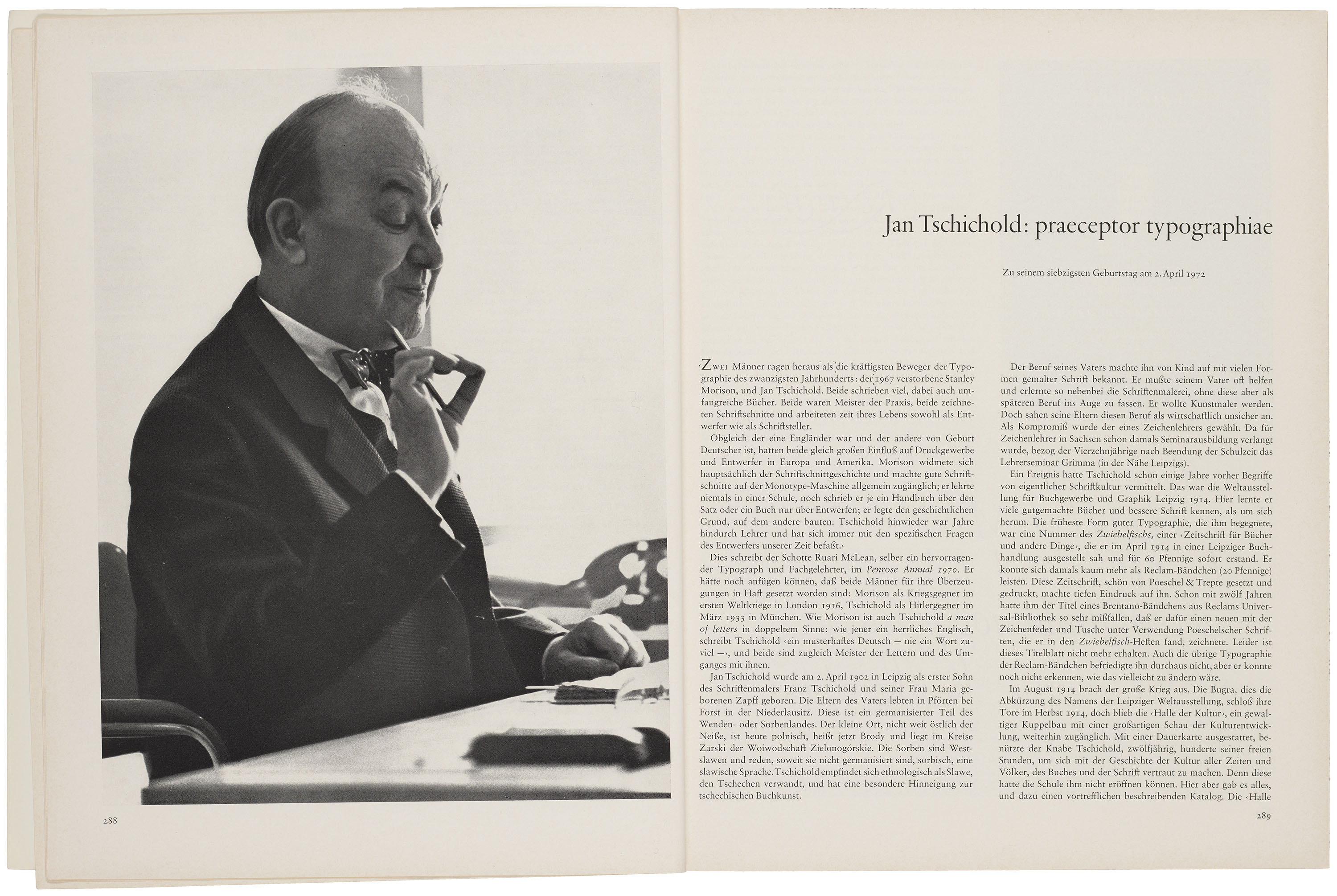
The April 1972 issue of TM commemorated the legacy of Jan Tschichold (1902–1974), whose close yet often contentious relationship with the TM editorial board underscores the internal debates that shaped Swiss design. While his early manifesto Die neue Typographie (1928) was instrumental in defining modernist design principles, his later work reflects a growing skepticism towards universal narratives. A long-time collaborator of Hostettler’s, Tschichold was noted for both his numerous essays for TM and his persistent criticisms of its art direction and editorial content.
All images in the gallery below are hi-fi captures. Click an image to enter fullscreen view, then click or pinch to enlarge.
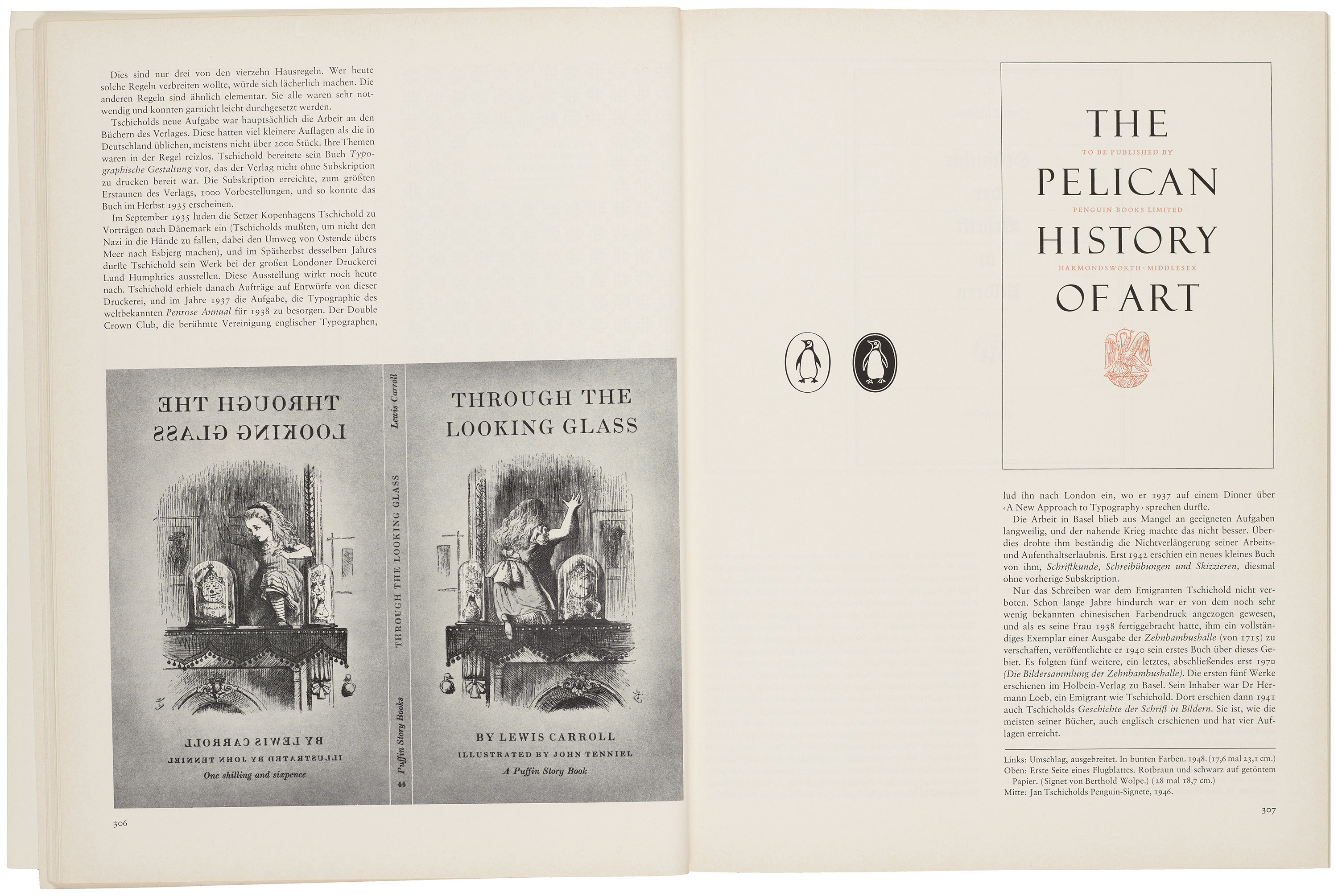
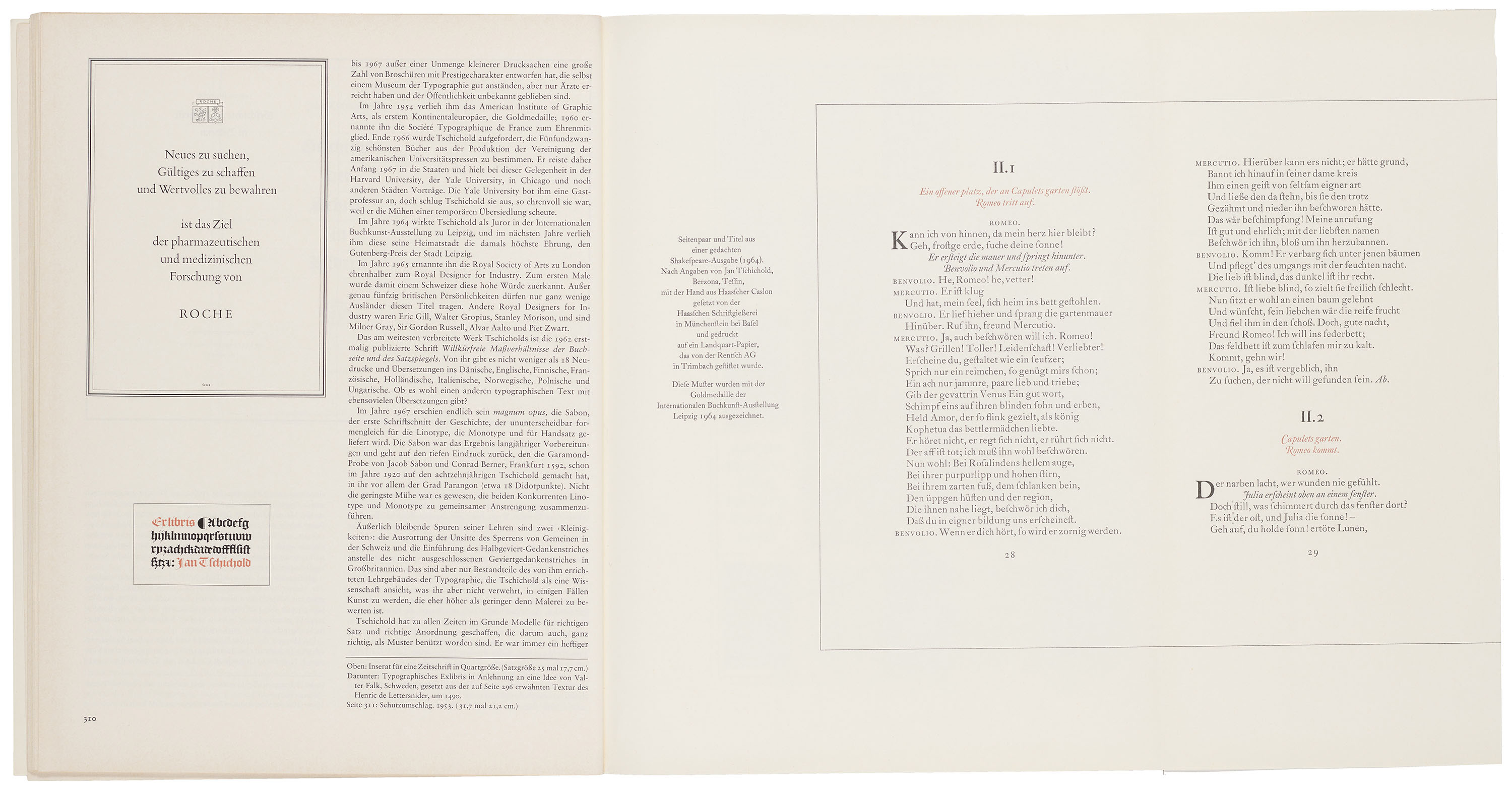
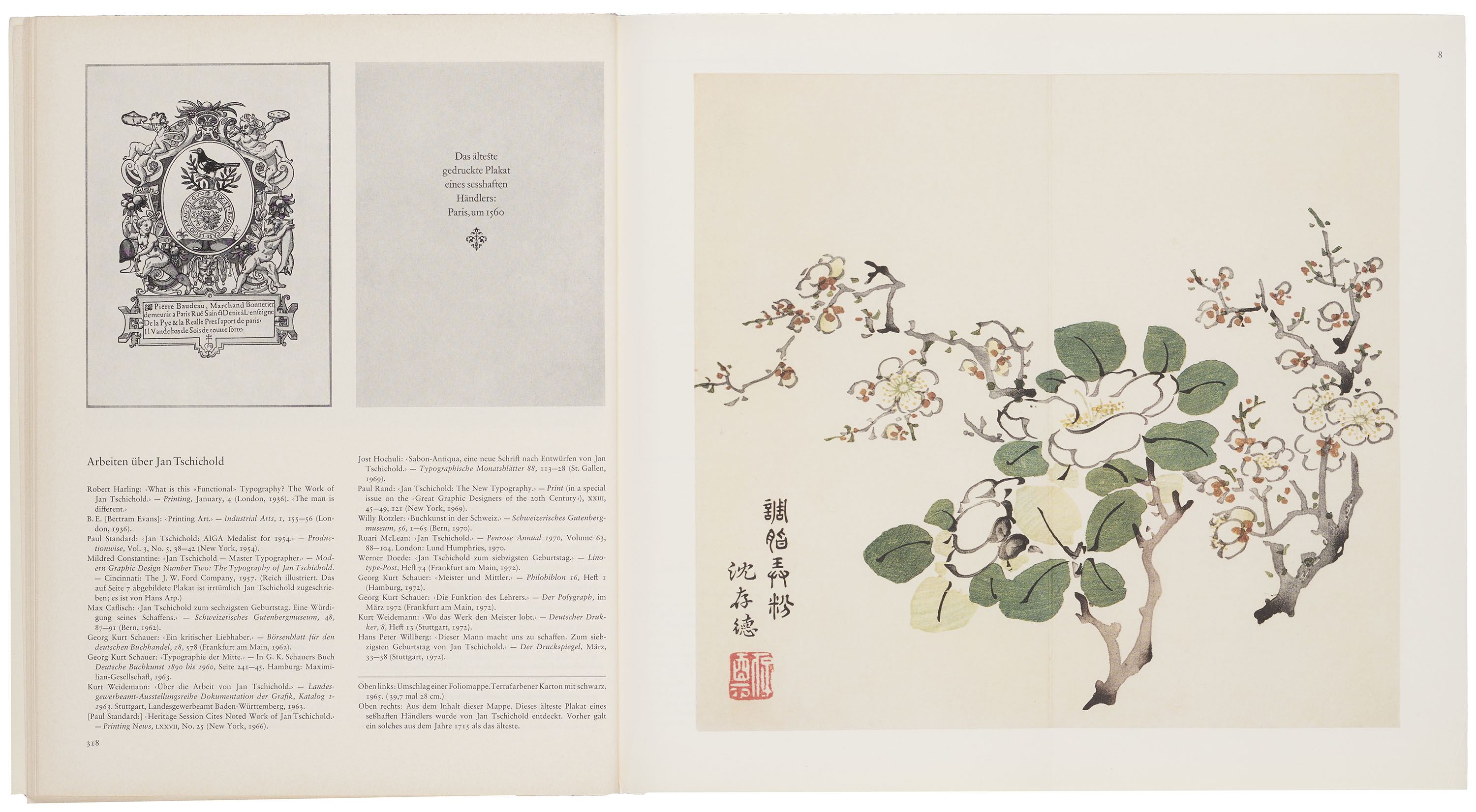
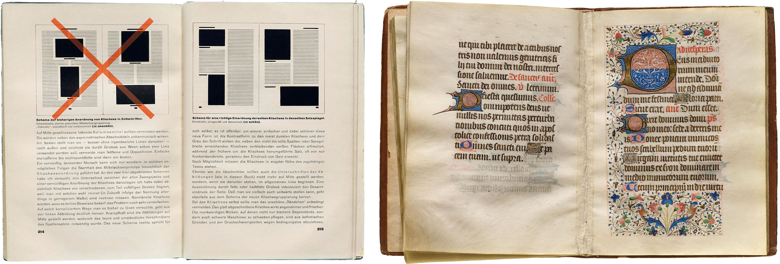
Considered a somewhat regressive figure by some contemporaries, Tschichold’s renunciation of the modernist ideals he had helped establish was shaped by a growing conviction that totalizing design systems risked replicating the logic of authoritarianism. Emphasizing historical referentiality and audience specificity, Tschichold’s later approach is evident in his logo and book designs for Penguin, and an award-winning design for Romeo und Julia set in the 19th-century typeface Caslon (see gallery above). Tschichold’s supplement in TM presents an extensive bibliography of the designer’s works, which included numerous edited facsimile editions on subjects ranging from seventeenth-century European calligraphy to Japanese woodblock prints. The supplement concludes with an essay written by Tschichold that considers a twelfth-century medieval manuscript as a model for developing well proportioned margins.
Looking Back, Moving Forward
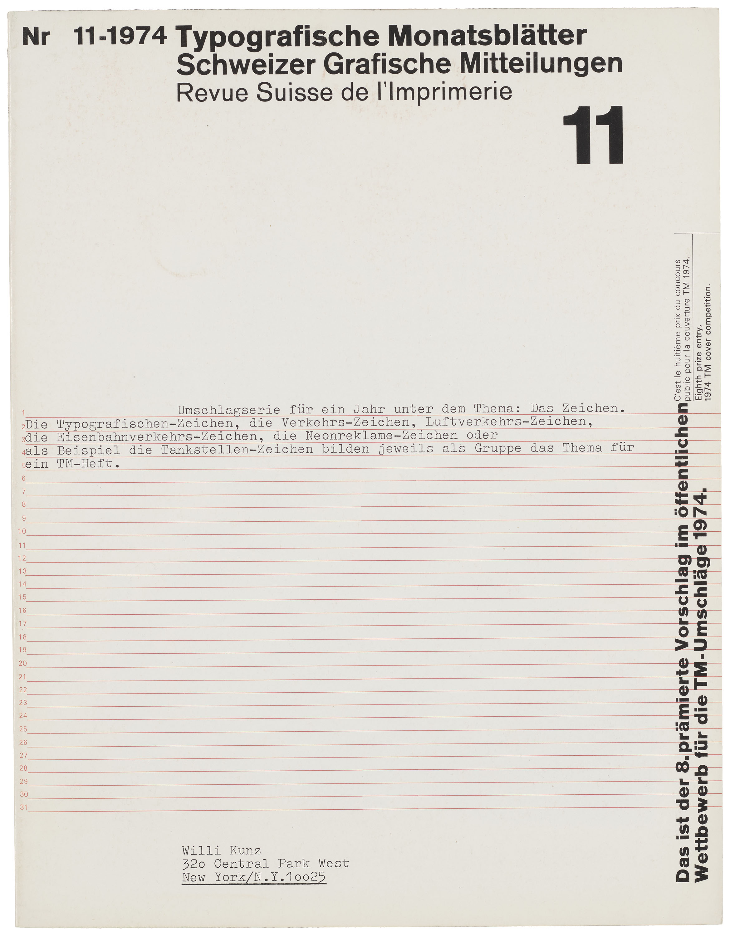
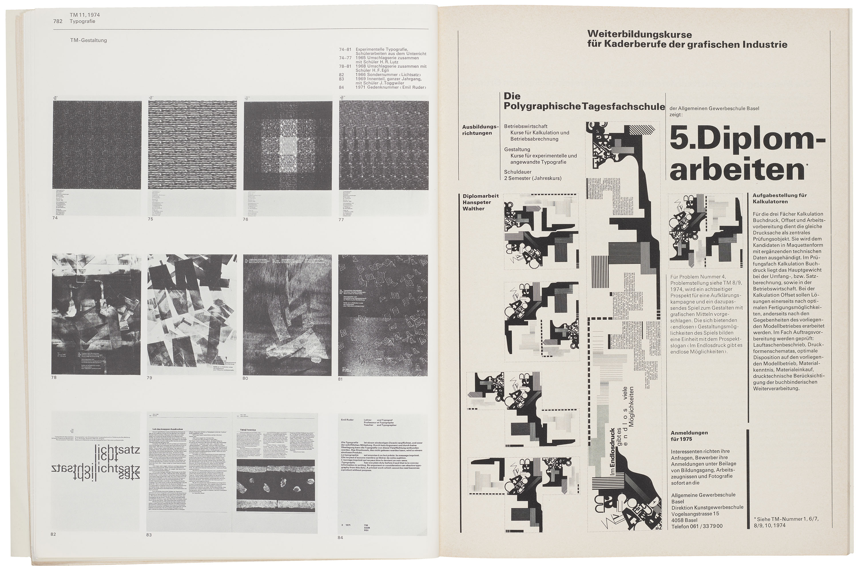
Published in November of 1974, the seventh issue of “Pioneers of 20th Century Typography” includes a brief retrospective of Büchler’s contributions to the art direction of TM. Departing from the extended editorials of previous issues, Büchler’s supplement presents little more than a visual overview of the designer’s creative works, including three pages devoted to the many issues designed under his supervision.
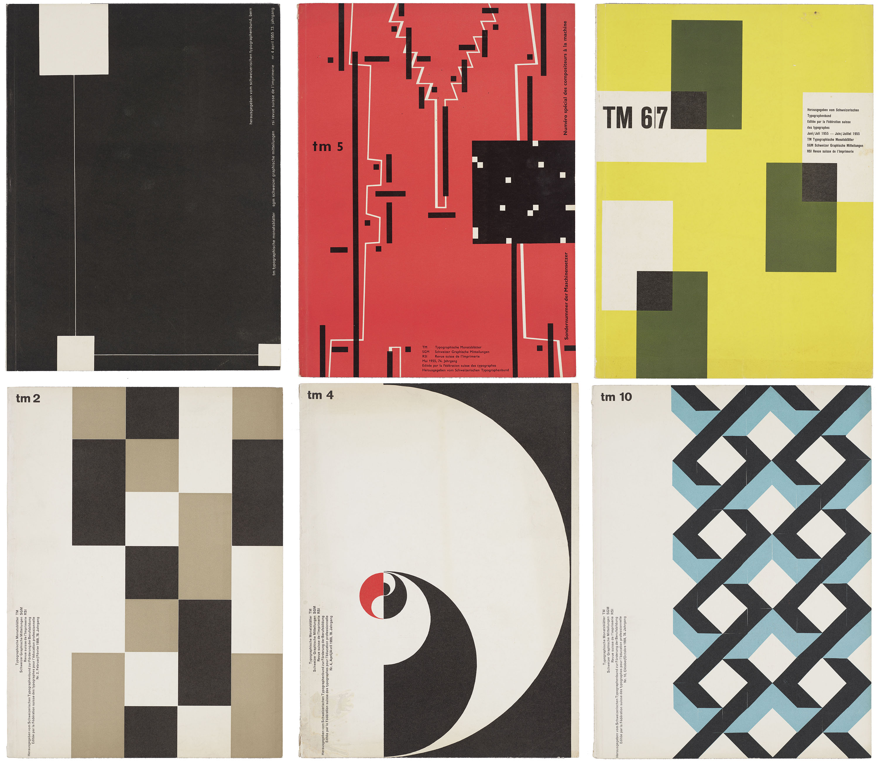
Büchler’s clean geometries and integration of the interior and exterior of the publication established a visual standard that later designs would continue to reference, yet the bold use of color during the 1950s was gradually eclipsed by the austere monochromatic scheme that dominated the ’60s.
All images in the gallery below are hi-fi captures. Click an image to enter fullscreen view, then click or pinch to enlarge.
Letterform Archive holds 642 issues of Typografische Monatsblätter, spanning 1933 to 2014. You can see them in person, along with a number of works by the designers mentioned here, by scheduling a guided tour or research visit.
In the later 1960s, the experimental designs developed by Ruder’s students were featured more prominently in TM, indicating a larger shift in the journal’s editorial sensibility. With the passing of the key figures who defined the magazine’s midcentury character, the rationality of the Ruder era was now subject to reevaluation. While the foundational principles of Swiss Style endured, new perspectives began to emerge that no grid could possibly contain.
—Zachary Sauer, Editorial Assistant
- Typografische Monatsblätter 80, no. 1 (January 1961). ↩︎
- Led by François Rappo, Louise Paradis, and Roland Früh, École cantonale d’art de Lausanne (ECAL) conducted an extensive research project on TM that culminated in an excellent publication and online archive. Our survey is indebted to their foundational work on this subject. See 30 Years of Swiss Typographic Discourse in the Typografische Monatsblätter: TSI RSI SGM 1960–90 (Lars Müller, 2013). ↩︎
- During the 1980s, the journal Emigre would also serve as an important forum for design discourse. ↩︎
- The rivalry between proponents of Univers in Basel and advocates for Helvetica in Zürich will be addressed in a contributed essay by Tan Wälchli in Letterform Archive’s forthcoming publication Modern Type. ↩︎