News
From the Collection: Ludmila Hellmann-Kavalla
Original artwork from an Austrian student’s portfolio reveals the process of mid-century fashion advertising and illustration.

Ludmila Hellmann-Kavalla, also known as Mila Kavalla, was an Austrian illustrator and graphic designer. Born in Baden, Lower Austria in 1924, she graduated from Vienna Academy of Applied Arts in 1950 where she trained under E. J. Wimmer-Wisgrill in the master class for fashion. While at the training academy, she met her future husband and business partner Roman Hellmann with whom she set up the “Hellmann-Kavalla” design office where she worked until about 1955.
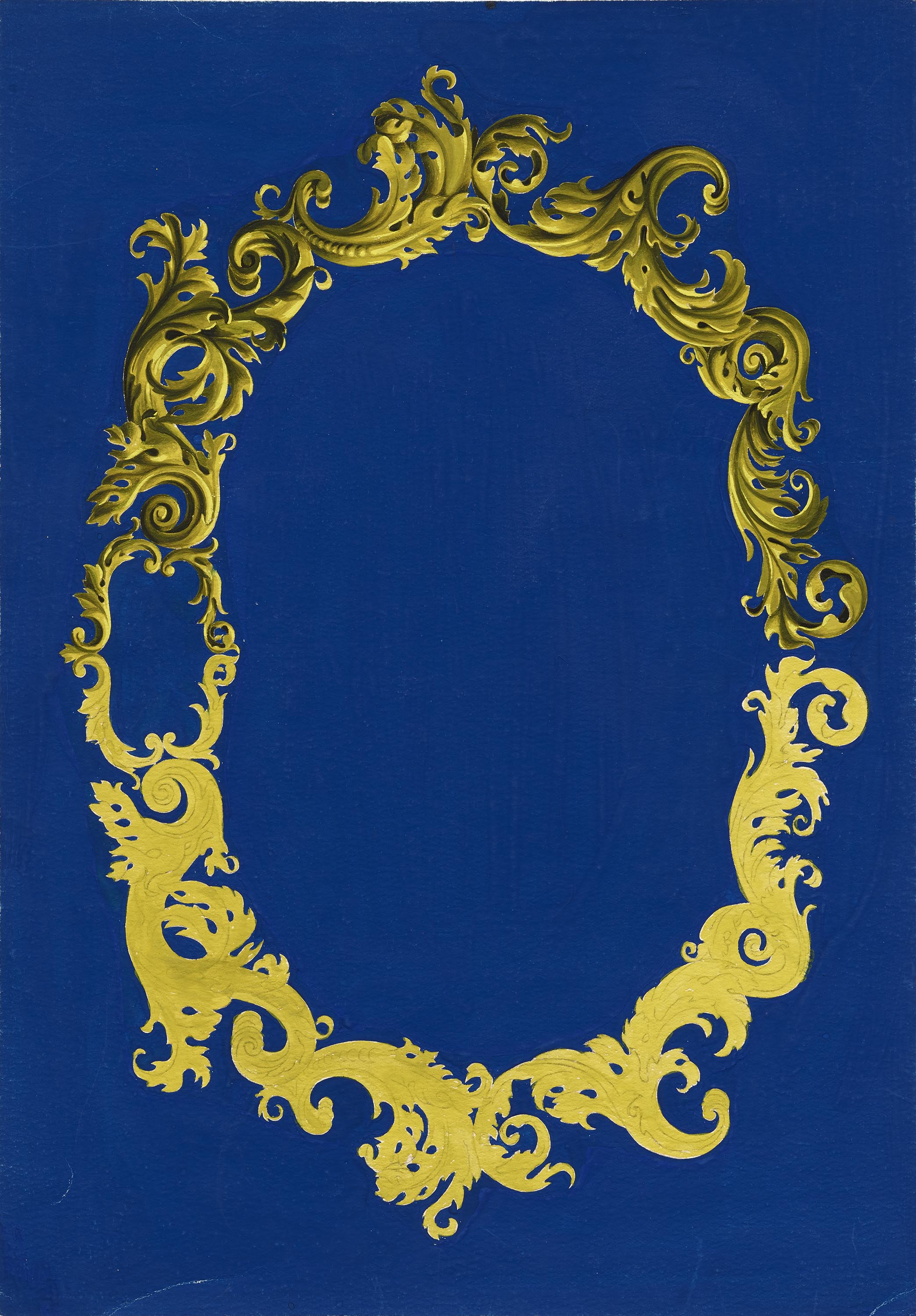
Letterform Archive recently acquired a wide-ranging collection of her work, from original artwork she created as a student at the academy, to client commissions from her early career. The Online Archive features 25 objects from the Kavalla collection. It is a joy to examine the high-fidelity images and appreciate the brushwork and gouache detailing that went into creating the designs. Her training at an applied art institute would have focused on the professional execution of illustration and lettering, as students were being trained to execute commercial jobs. The process material allows us a glimpse into the tricks and techniques she employed to get the best possible results. Zooming in lets you see preliminary pencil marks or how corrective brush strokes were used to clean up slips and smudges.
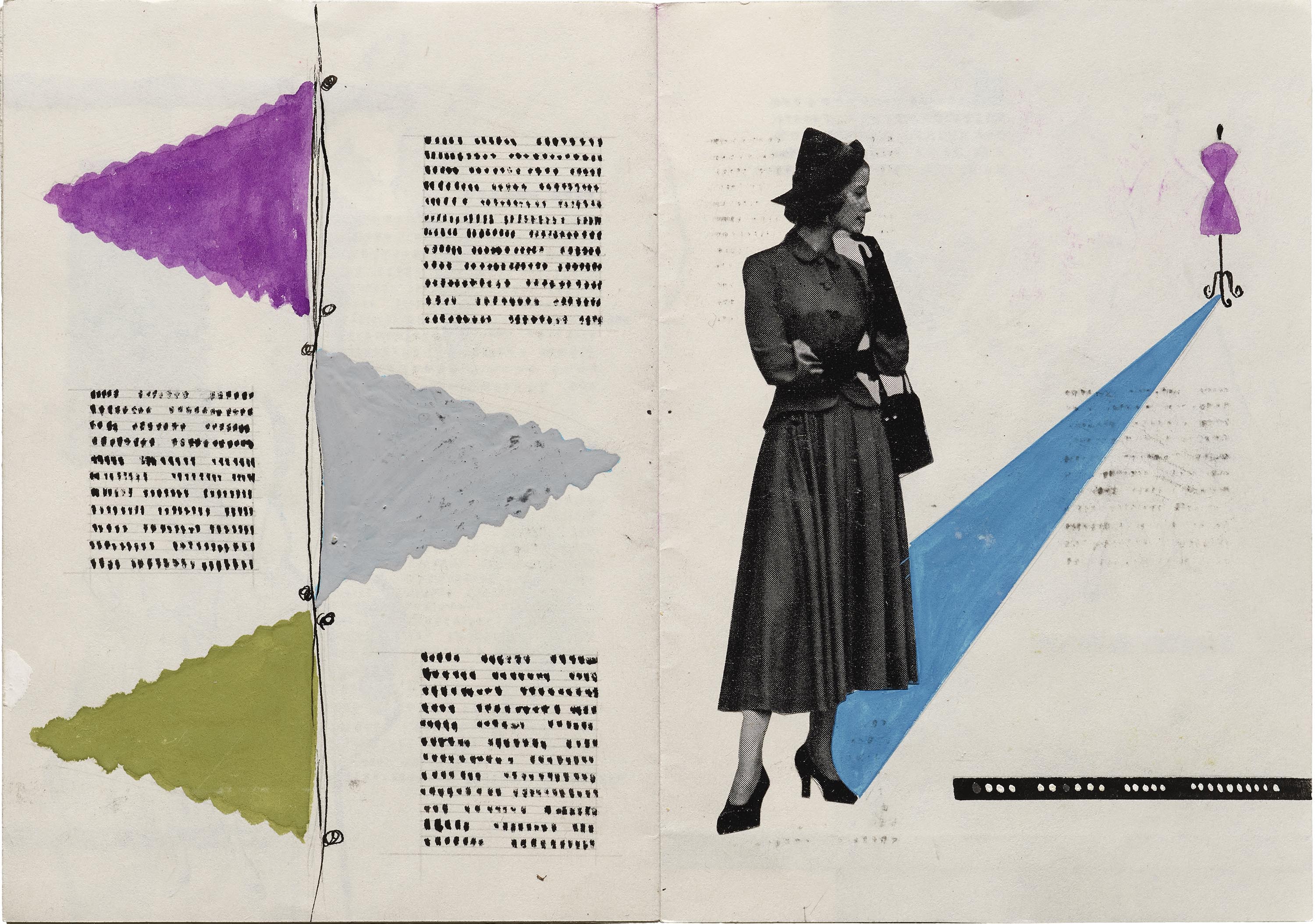
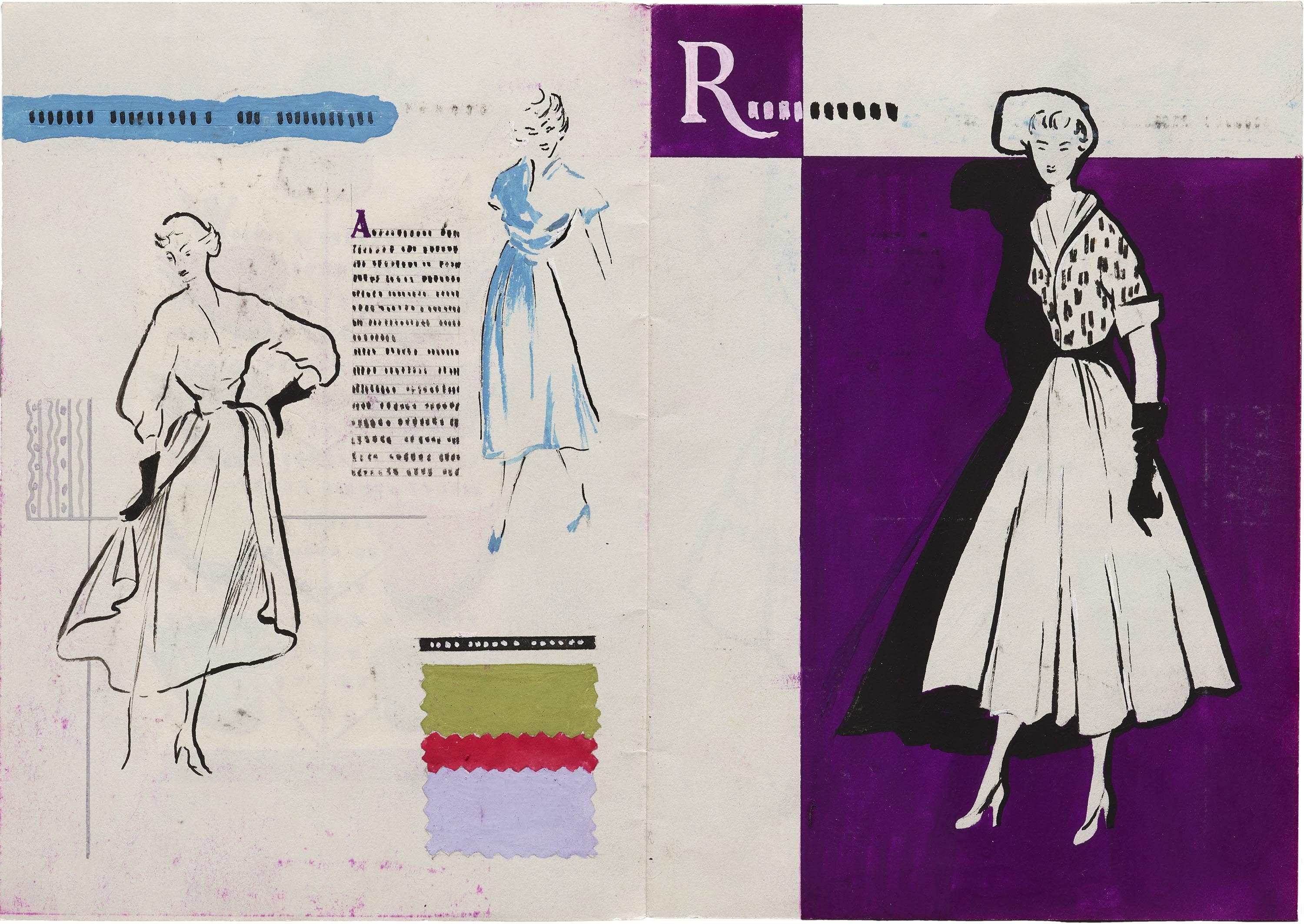
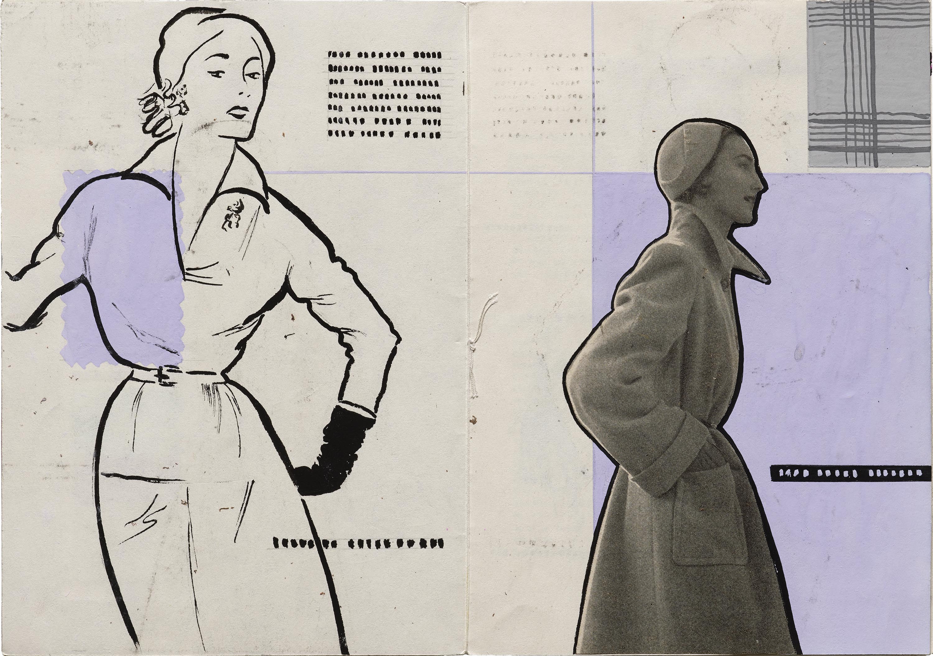
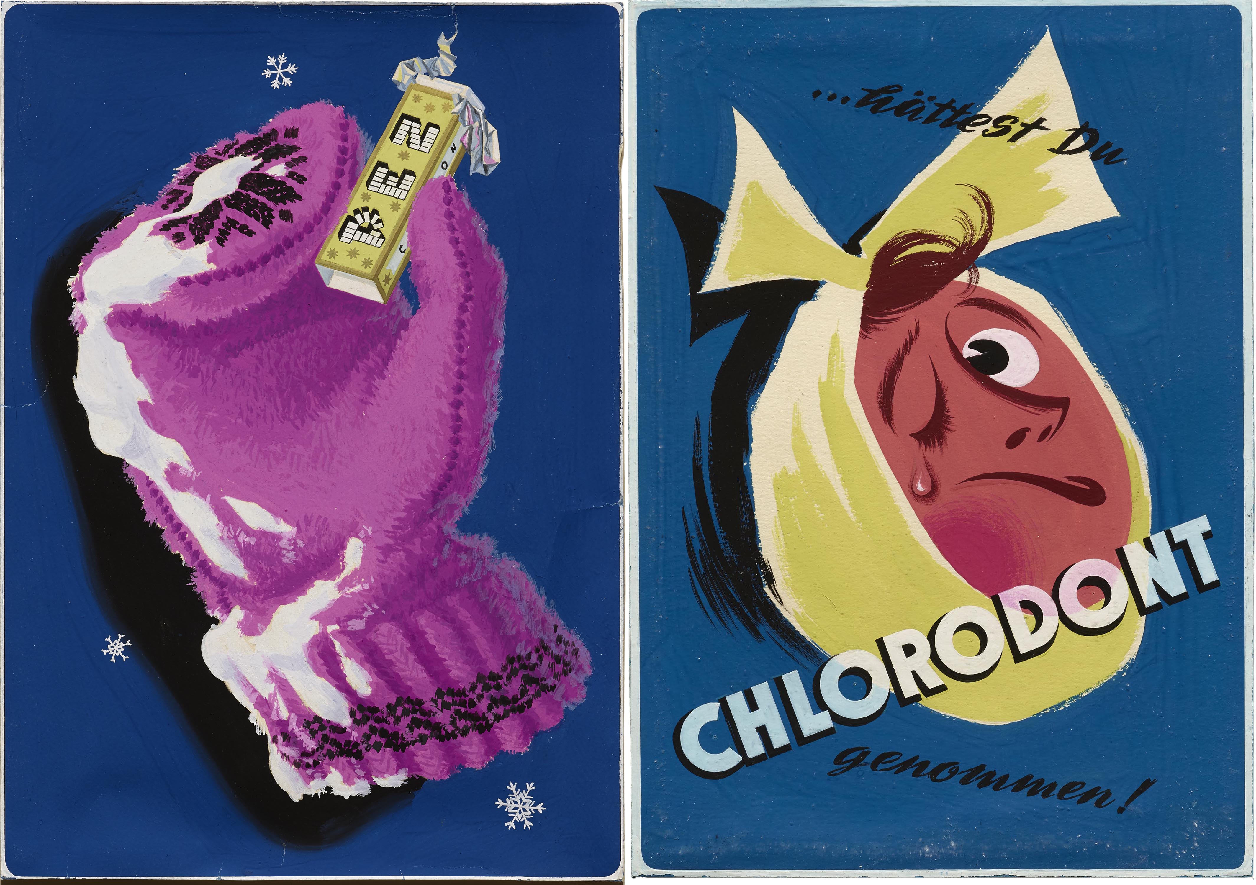
Kavalla’s diploma studies included training in textiles, tailoring, and fashion accessories. This would have included creating patterns and dresses. One can see the influence of fashion design in her illustration work, and it’s a significant theme across her graphic designs too. A range of layouts featuring mannequins or knitting yarns, as well as a complete dummy booklet for an unnamed apparel brand, demonstrate how her inclination for fashion paired well with her skills as an illustrator. Even a poster for a pharmaceutical product sports a rather confident bandage knot on a person afflicted with a toothache. The artwork for PEZ ditched the usual hand shown in other posters, instead featuring a well-rendered fashion accessory: a snow-covered mitten holding up the Austrian candy.
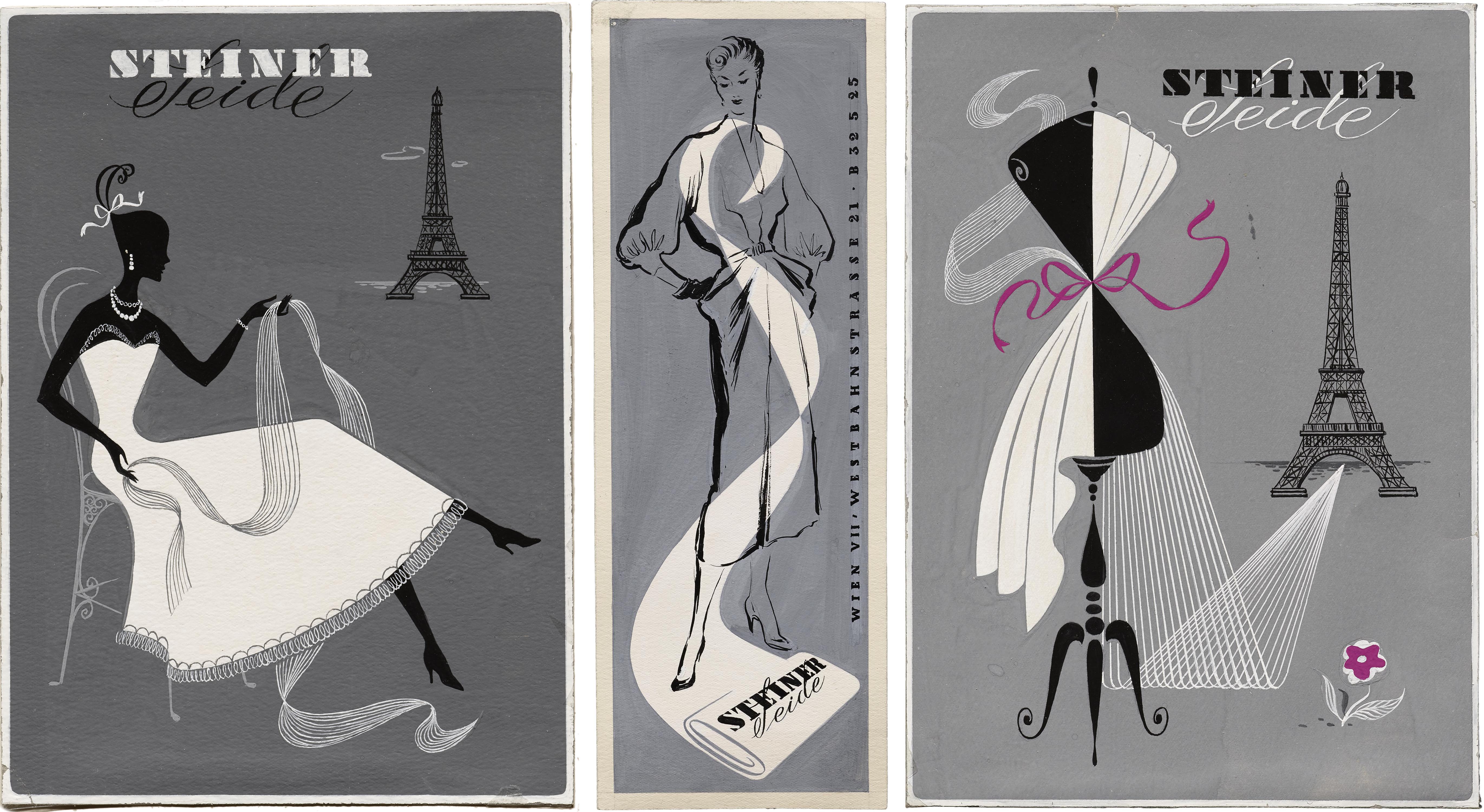
The Steiner Seide campaign consists of three distinct designs using the same brand identity. Seide — which means silk in German — is visually represented by converging strands that create a runway, a scarf, or a draped cloth, all of which loosely form the letter S. This typographic connection to the initials of the brand is executed very delicately in each illustration. The Eiffel tower used in two of the ads implies that the Steiner designs come straight off the runways of Paris.
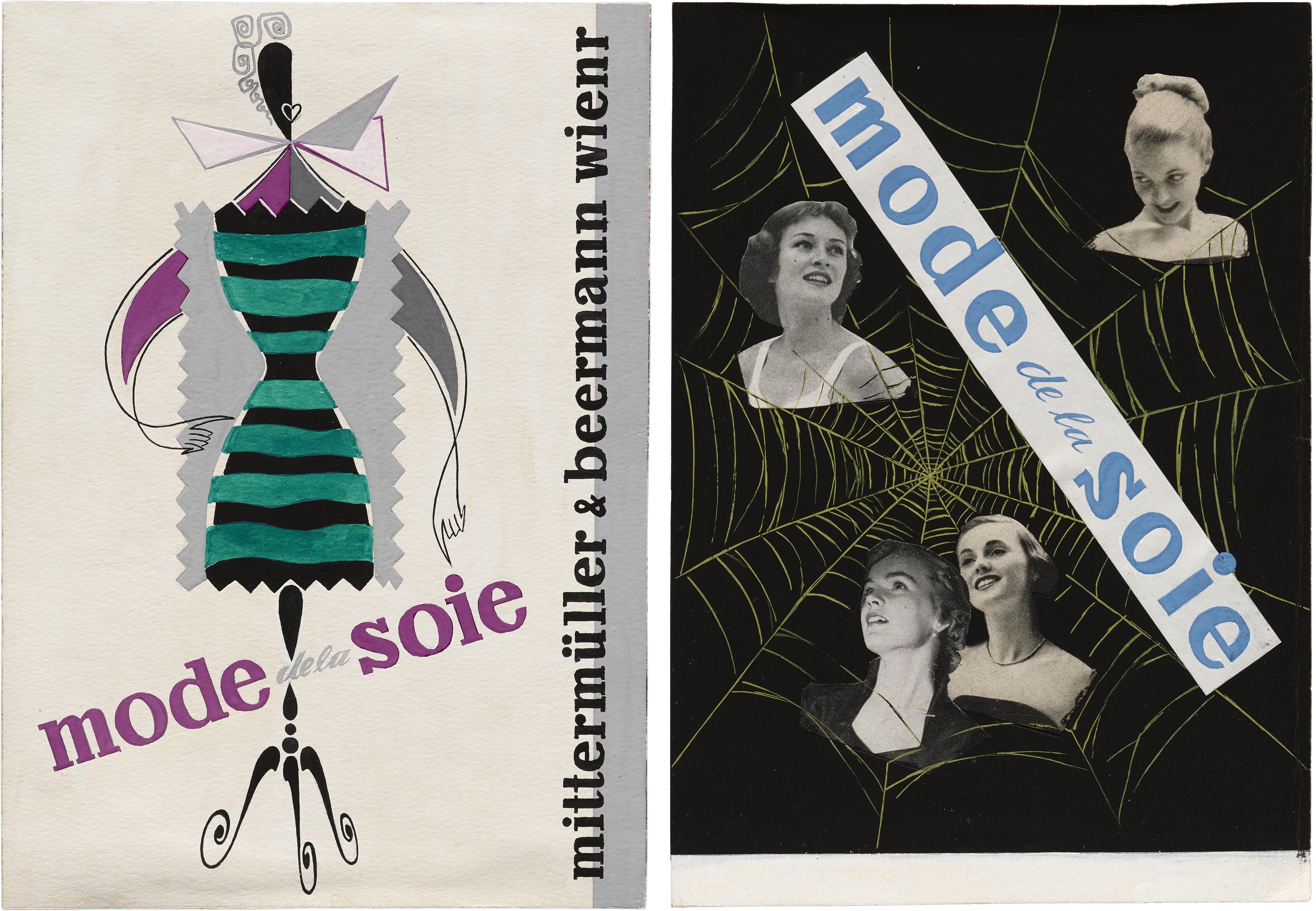
Mode de la soie — French for “silk fashion” — is used as a tagline in two designs. One uses the background of a spider’s web to tie together a collage of photographic headshots. The other feels like it may have been a final submission as it shows some illustrated swatches styled on the mannequin and includes the brand name “mittermüller & beermann wienr”. The penultimate e in Wiener seems to have been sacrificed for lack of space — and possibly time. Perhaps a submission deadline stopped Kavalla from redoing the layout.
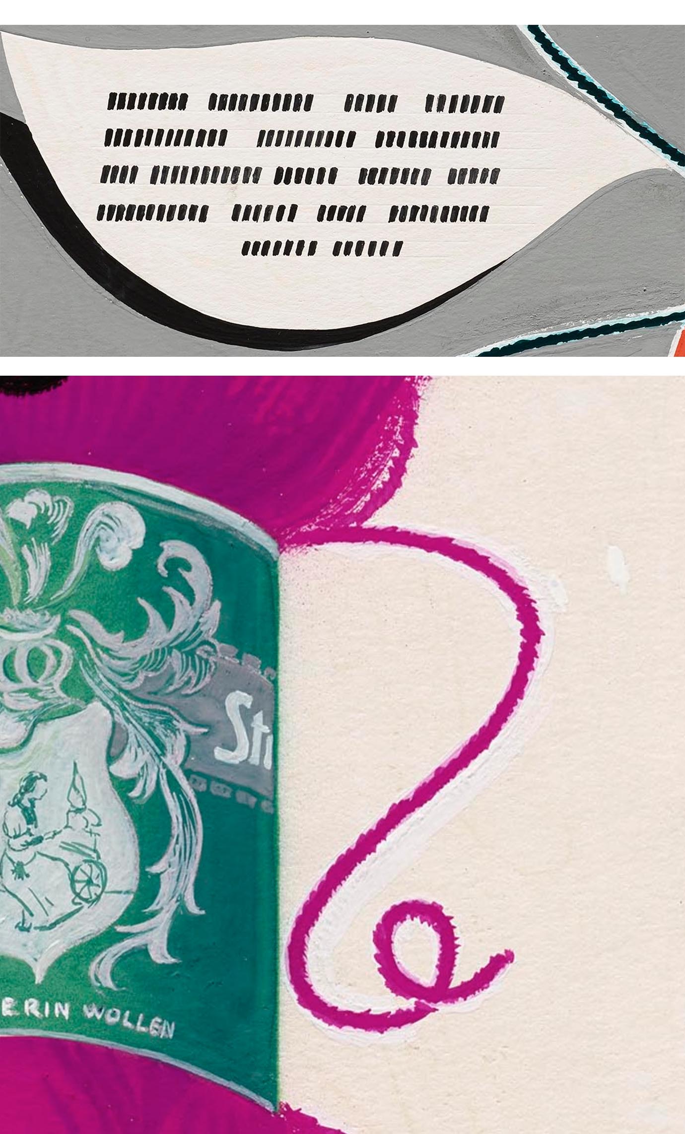
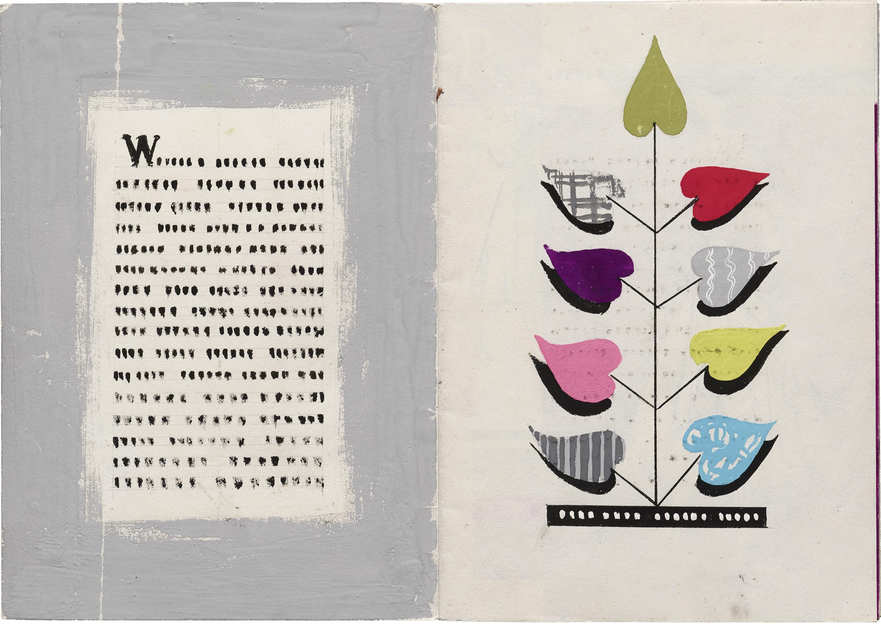
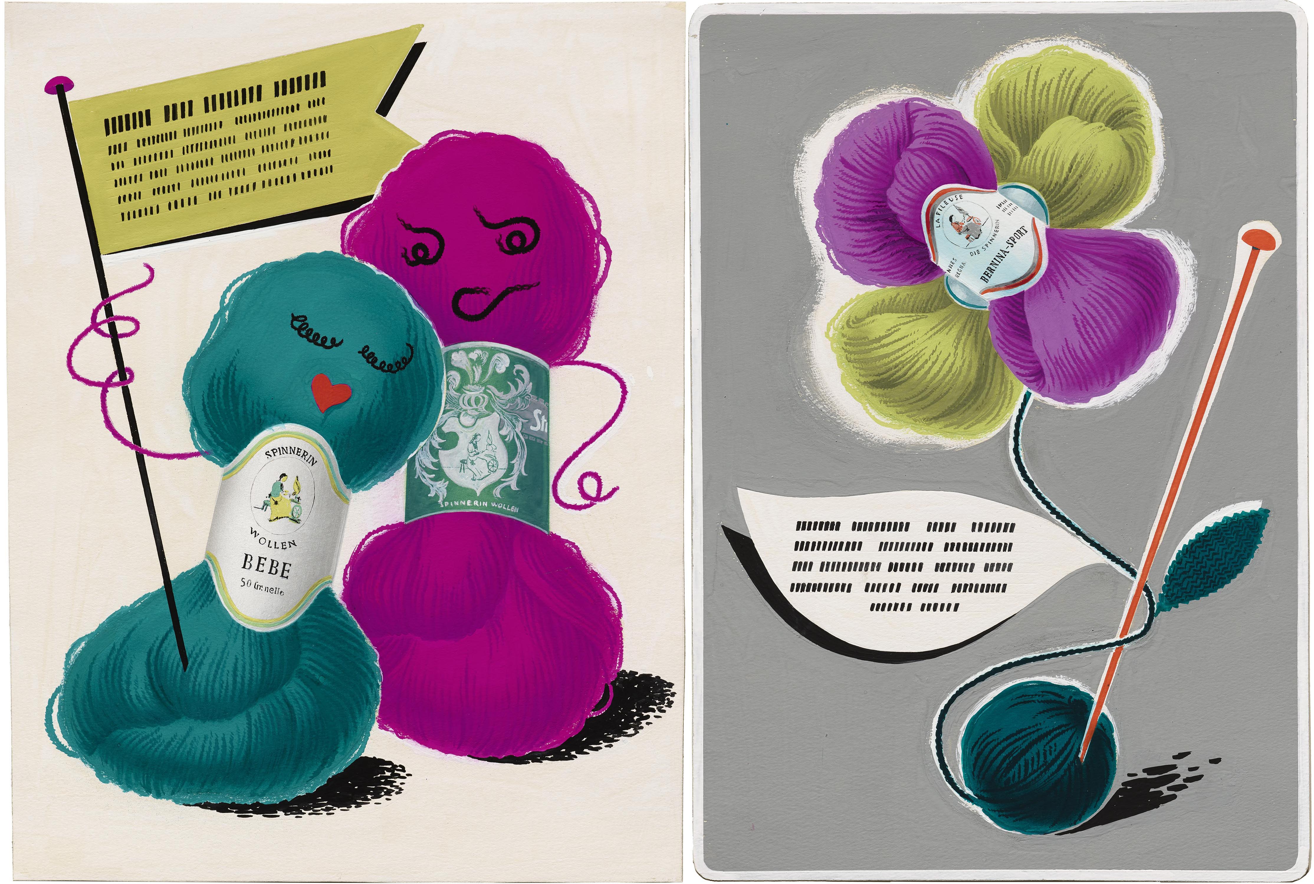
Two pieces advertising skeins of wool include both the German and French words for weaver, Die Spinnerin and La Fileuse. The product is charmingly anthropomorphized in one ad and displayed as a cruciform floral arrangement in the other. In lieu of copywriting, the layouts include dummy text represented by meticulously placed brush strokes. Zoom in to see how she created straight and evenly spaced baseline guides by scoring (and rescoring) the paper. The size of the strokes varies to indicate textual hierarchy. This technique can also be seen in the mocked up fashion booklet.
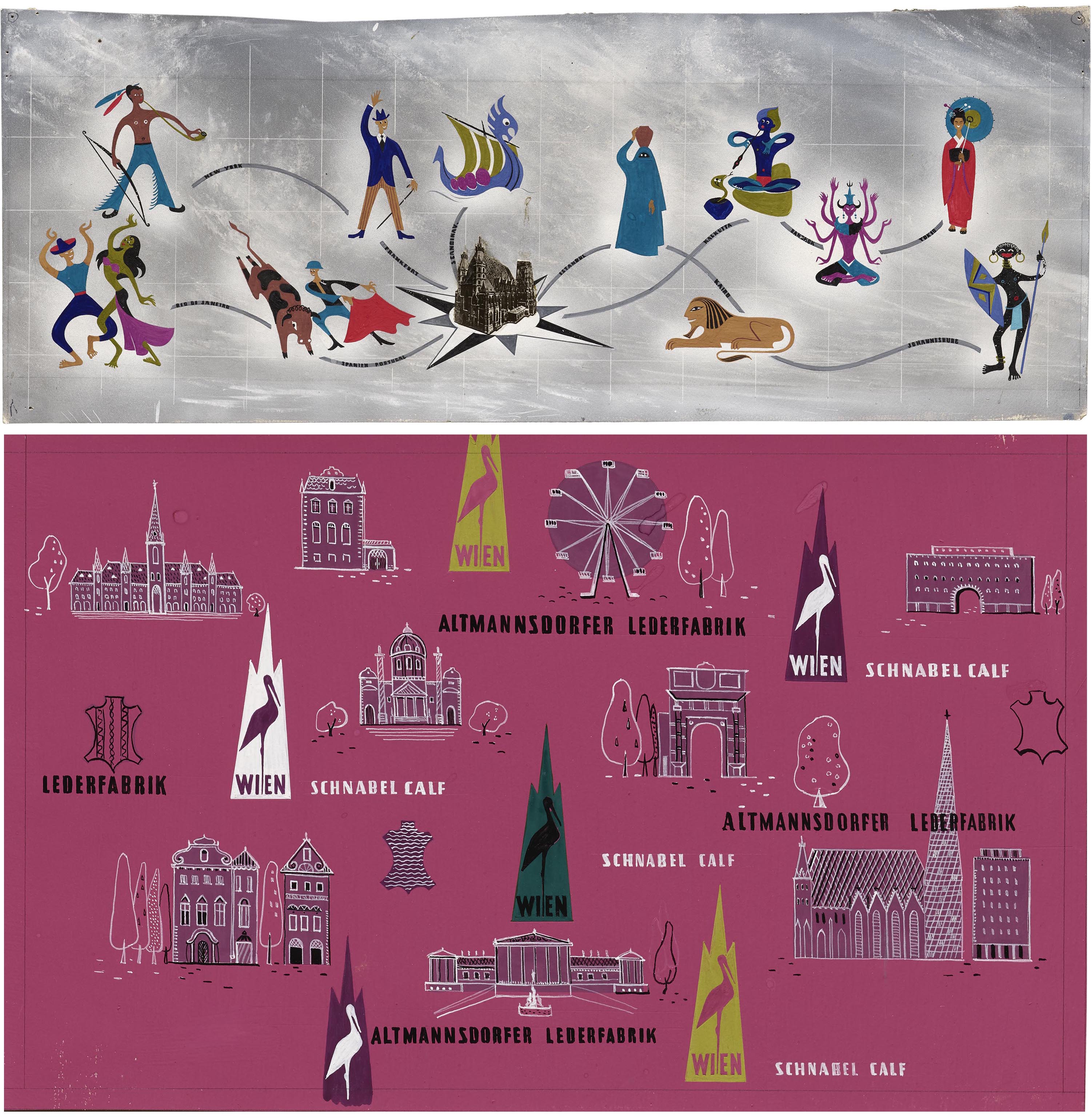
Apart from fashion, travel is a theme in Kavalla’s work. One illustration features various destinations around the world with Vienna at the center, represented by a cutout photograph of St. Stephen’s Cathedral. Thirteen international cities are identified by playful caricatures. Unfortunately, many are stereotypes that have not aged well. In the poster (or wrapping paper?) for a leather factory, illustrations of Vienna sites are interspersed with the names of the factory, Altmannsdorfer Ledenfabrik, and its parent company, Schnabel Calf. One can also imagine a variable logo of sorts in the outline of an animal hide.
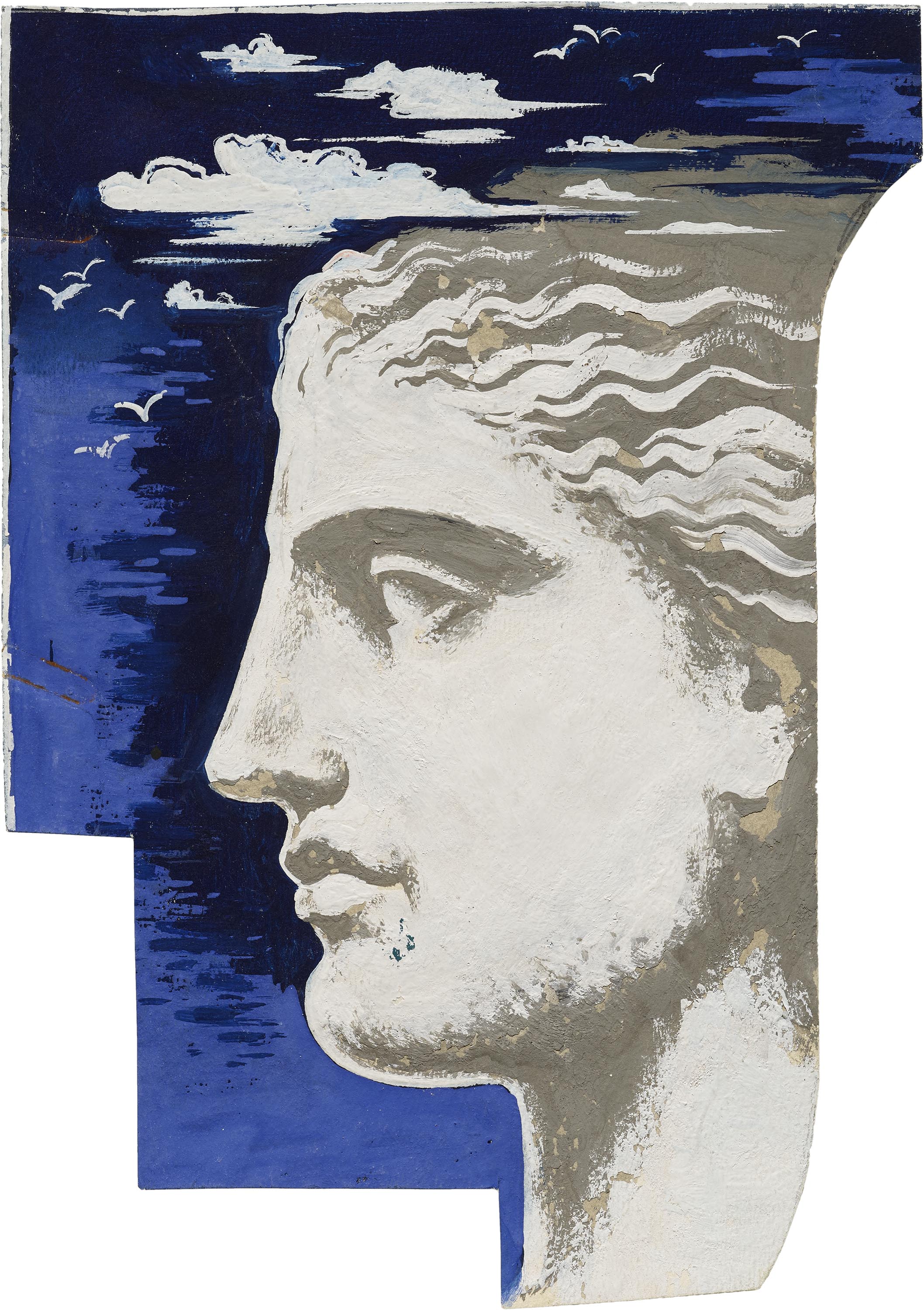
A poster for the Venice Biennale gives you another glimpse of Kavalla’s process. The finished piece shows the face of a woman emerging from a gondola with lettering along its curved body, but a similar face recurs in what looks like an alternate puzzle piece for the poster. It’s quite possible this gray-hued profile was in the first iteration of the design, and was replaced with the blue one. This cut-out technique would have saved Kavalla from recreating the rest of the illustration and lettering from scratch.
A series of holiday promotions for the Austrian shoe brand Humanic appear to be actual commissions from the company that had recently reset operations after World War II. The Archive has three original artworks, as well as prints of one of the designs. All of them feature the Humanic brand written in a consistent manner and sometimes including the tagline “der gute Österreichische Schuh” (the good Austrian shoe). The final design, featuring a Christmas wish and Humanic-branded gift box, is quite close to its original artwork. Some of the shoes displayed on either side have changed, as indicated by the handwritten notes next to the comp, while the gift box wrapping gets more details and the brand name. Other small changes include a softer border and the addition of the designer’s and printer’s names.
Kavalla’s illustrations and designs are lush with color and lively, well executed lettering. They are filled with visual puns, alliterations, and translation devices that are supported with a lot of attention to detail and craftsmanship. It’s especially delightful to see how her explorations as a student that exhibit the fun she was having while refining her craft. She had a knack for transforming familiar objects into her own icons by interpreting them in a delightful way. Take this last Humanic poster, for example, in which two figures are caught mid-motion in a hygrometer. Their expressions portray the sense of life and humor that she imbued in all her work.
Head to the Online Archive to discover more work by Ludmila Kavalla and explore these artworks in greater detail.
Tanya George is a Mumbai-based designer and educator with a wide-ranging freelance practice that includes designing letterforms for brand identities as well as fonts and across different Indian scripts. She also conducts type walks around Mumbai, along with typography workshops, and writes about type.