News
This Just In: Mark Fox and Angie Wang
The San Francisco duo demonstrate the impact of the designer’s voice in politics and graphic design.
Mark Fox and Angie Wang do not shy away from deploying design as critique. Together they are Design is Play, a studio practice formed in 2008 recognized for award-winning branding and identity work in addition to political graphics. They are educators of design and typography at California College of the Arts, as well as advocates of issues they care about. Fox and Wang’s collection at the Archive is worthy of attention — for both its aesthetic merit and its cultural relevance in our current political moment. Many have debated the designer’s role in politics, and Fox and Wang set an example of how design can pull back the curtain to describe how the world is, or even imagine how it could be.
Prior to his collaboration with Wang, Fox had been creating commercial and political graphics under the pseudonym BlackDog for over twenty years. Those born and raised in the 1960s like Fox can probably recall this period of political unrest and dissatisfaction. He recalls gruesome photographs of the Vietnam War in the media — U.S. soldiers who were badly injured to others holding decapitated VietCong heads. He remembers his brothers getting call numbers for the war, and while they were never drafted, the world that he witnessed shaped his political consciousness.
A majority of Fox’s work as BlackDog dates to the 1990s, but his productions build on the knowledge of countercultural response to “government run amok” in the preceding decades. Working pre-Internet, Fox made his statements visible by entering design competitions, which then circulated his work in annuals or exhibited it in traveling shows.
Wang had little experience making political posters until a few weeks before the 2016 election, provoked by sound bites that made her apprehensive about the possibility of Trump getting elected. Her hesitation to protest is shaped by her experience growing up in 1970s Taiwan under Chiang Kai-shek’s Kuomintang government, a dictatorship that declared martial law from 1949 to 1987. “I had learned that people who spoke out against the government disappeared, were jailed or killed,” she said. “Coming here, I never took the democracy for granted, but it makes me nervous to exercise my free speech. Free speech has a different meaning for people who weren’t born with that privilege, and on top of that there are the cultural prescriptions of Asian culture, of obeying authority and practicing politeness.”
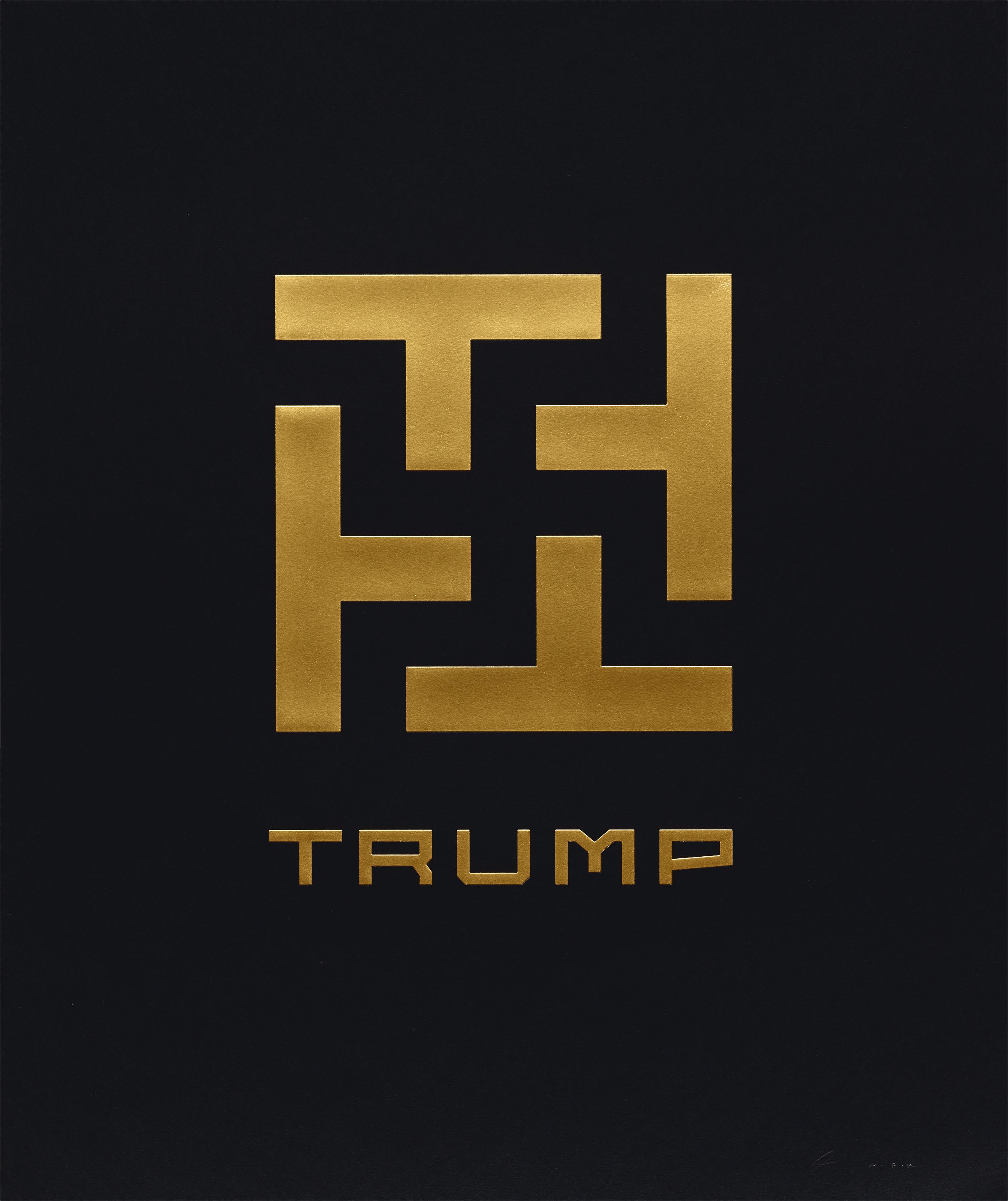
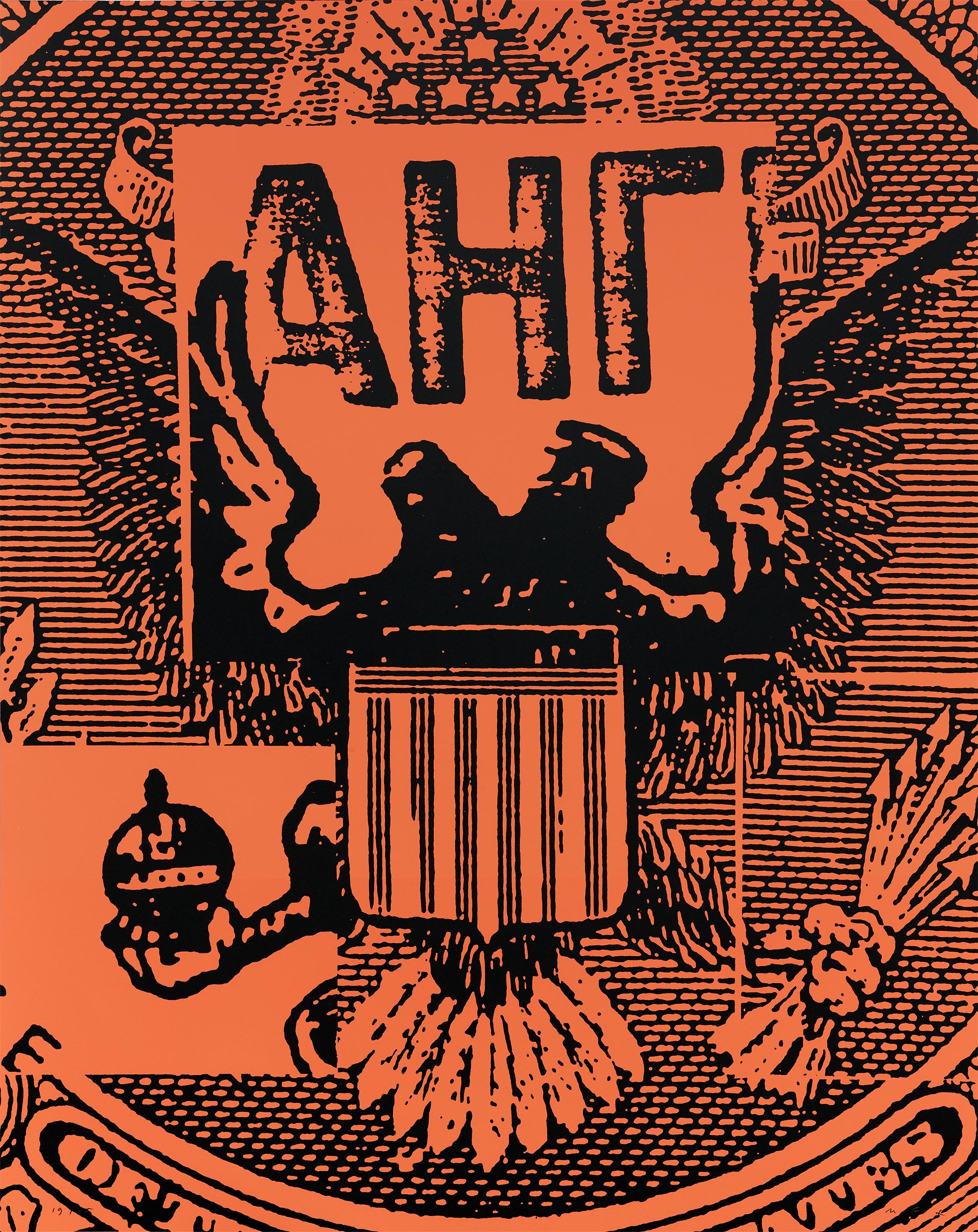
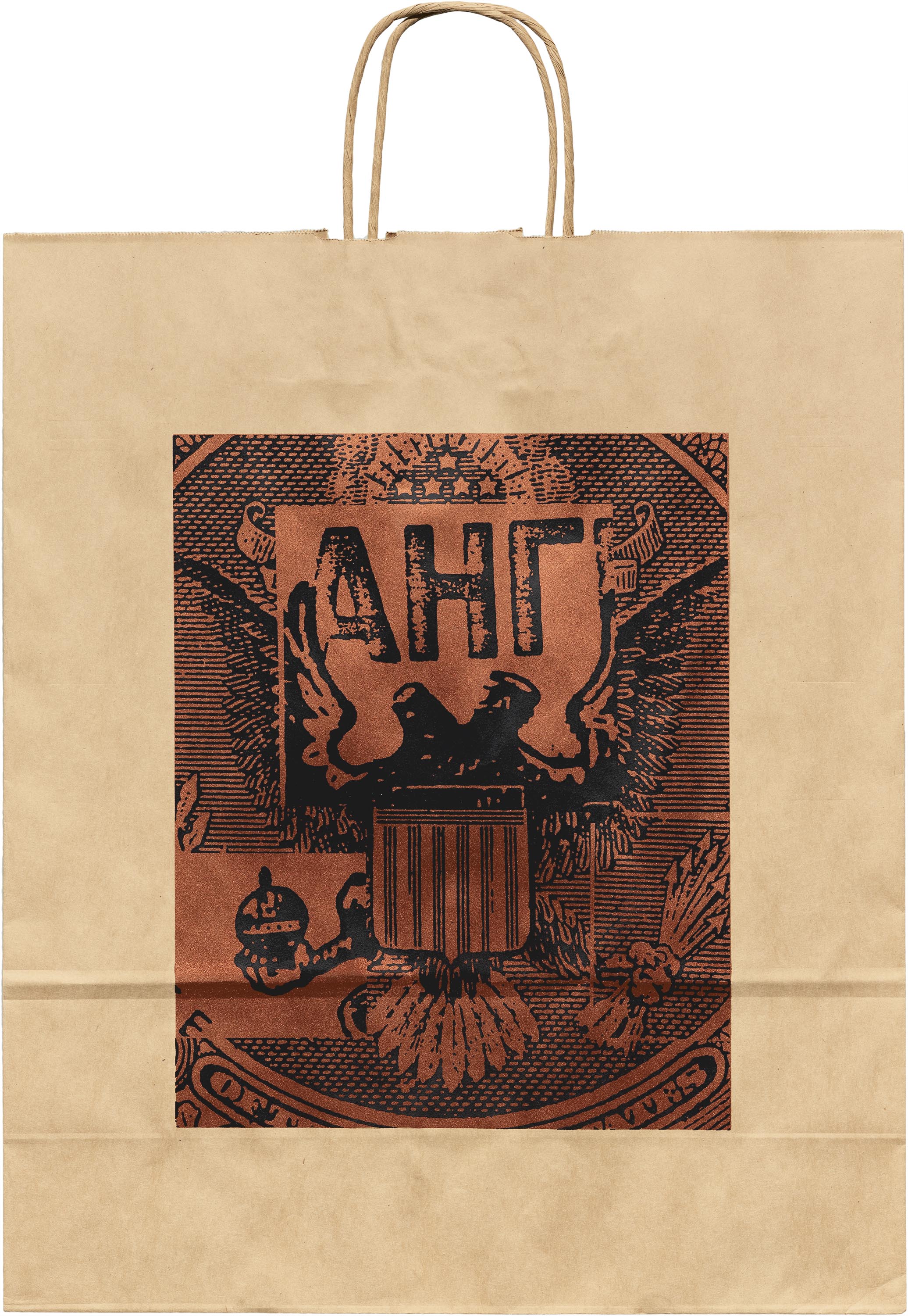
The uncertainty about the nation’s future mobilized Fox and Wang to make Trump 24K Gold-Plated. The poster is intentionally lacking the grittiness of agitprop posters that one might expect: four gold, embossed letter Ts, rotated and pointed inwards, could be read as a celebration of Trumpian luxury. “We wanted it to look blingy because for many Trump supporters, he is seductive, the epitome of power, wealth, and success,” Fox said. “He looks shiny and attractive, but if you look at the negative spaces maybe there’s something else.” To Fox and Wang, the spaces represent Trump’s divisive rhetoric tearing at the fabric of American society.
Earlier this year, they each contributed to a traveling poster show alongside designers who responded to the idea of social tolerance. “We’re at a point in our society where we accept that there are different groups and identities, but somehow we’re less tolerant. It’s one thing to be politically correct, but it’s another to embrace the differences. I realized how hard it is, and how few people can really practice that,” Wang said. She shared a few words in Chinese that seem to capture the essence of practicing tolerance better than the English word, including 宽容 (kuānróng), 包容 (bāoróng), and 容忍 (róngrěn). “They all have the character ‘容’ , which means to “contain or to hold” which suggests to me a close proximity, physical contact, or an intimacy greater than mere acceptance,” she wrote later in an email. “When combined with other characters, the words deepen their meanings: to hold width and breadth, to wrap or embrace, and to endure and bear.’”
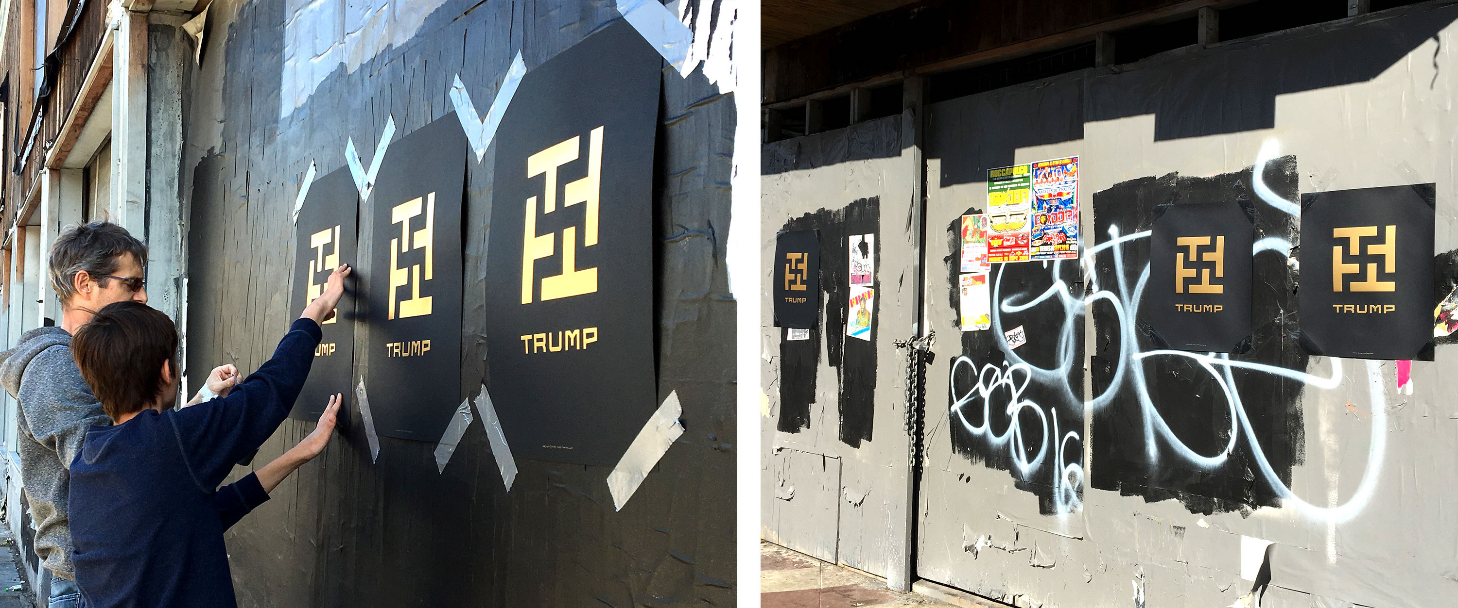
But it was the swastika that sparked controversy and criticism both on and offline, from strangers and from people they knew personally. One of their colleagues felt that the swastika should be reserved only for the Holocaust. However, Fox and Wang have attempted to demonstrate the way symbols evolve and change meaning throughout history in their work and research. “I don’t think that symbols are frozen in time. They can acquire different meanings with use, and it can get messy and complicated,” Wang said. They explain that the swastika is historically a symbol of dynamism and cyclical renewal associated with the sun from India, but that in the context of Trump 24K Gold-Plated, it represents hate speech and nationalist demagoguery.
Leading up to the election, Fox and Wang sent Trump 24K Gold-Plated to museums in the U.S. and abroad. The day after votes were cast, major international museums such as Zürich’s Museum für Gestaltung and Warsaw’s Poster Museum at Wilanów took the piece into their collections, but to this day Fox and Wang have not heard from any U.S. institutions other than Letterform Archive, Center for the Study of Political Graphics in Los Angeles, and the Library of Congress. “It’s like playing hot potato as a kid — nobody wants the hot potato,” Fox said.
In 2017, the poster made its way into the Type Directors Club’s 63rd Annual Communications Design exhibition, earning a “Judge’s Choice” award from juror Spencer Charles in the poster category. Charles released the following statement supporting his decision:
“The judging for this competition took place the weekend after the U.S. presidential inauguration, the same weekend the nation was dealing with the fallout from the immigration ban that had just been enacted. Because of this context, and because of the thoughtful execution of this poster, it provoked a conversation unlike any other entry in the competition. Additionally, it demonstrated that typography can (and should) extend beyond formal and aesthetic considerations and can very powerfully communicate the spirit of its content, even if that purpose is to agitate and make a political statement.”
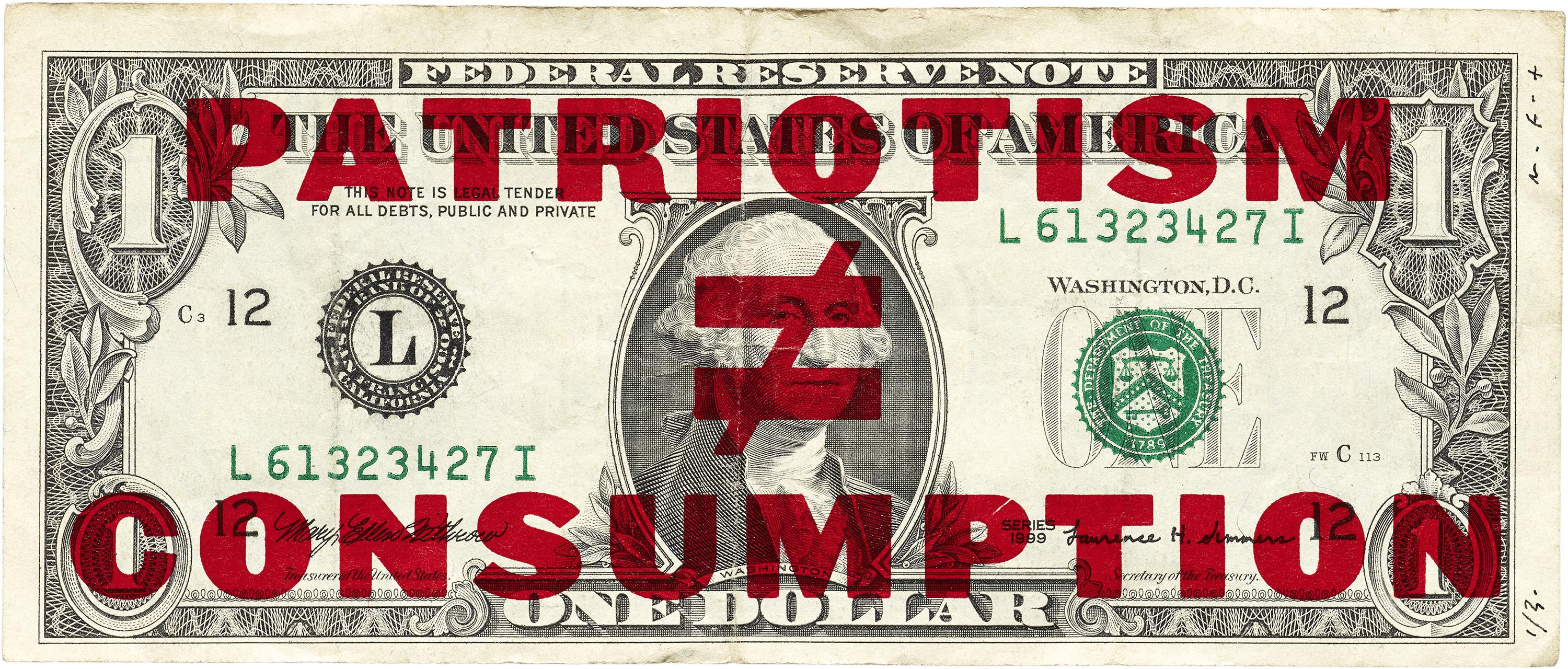
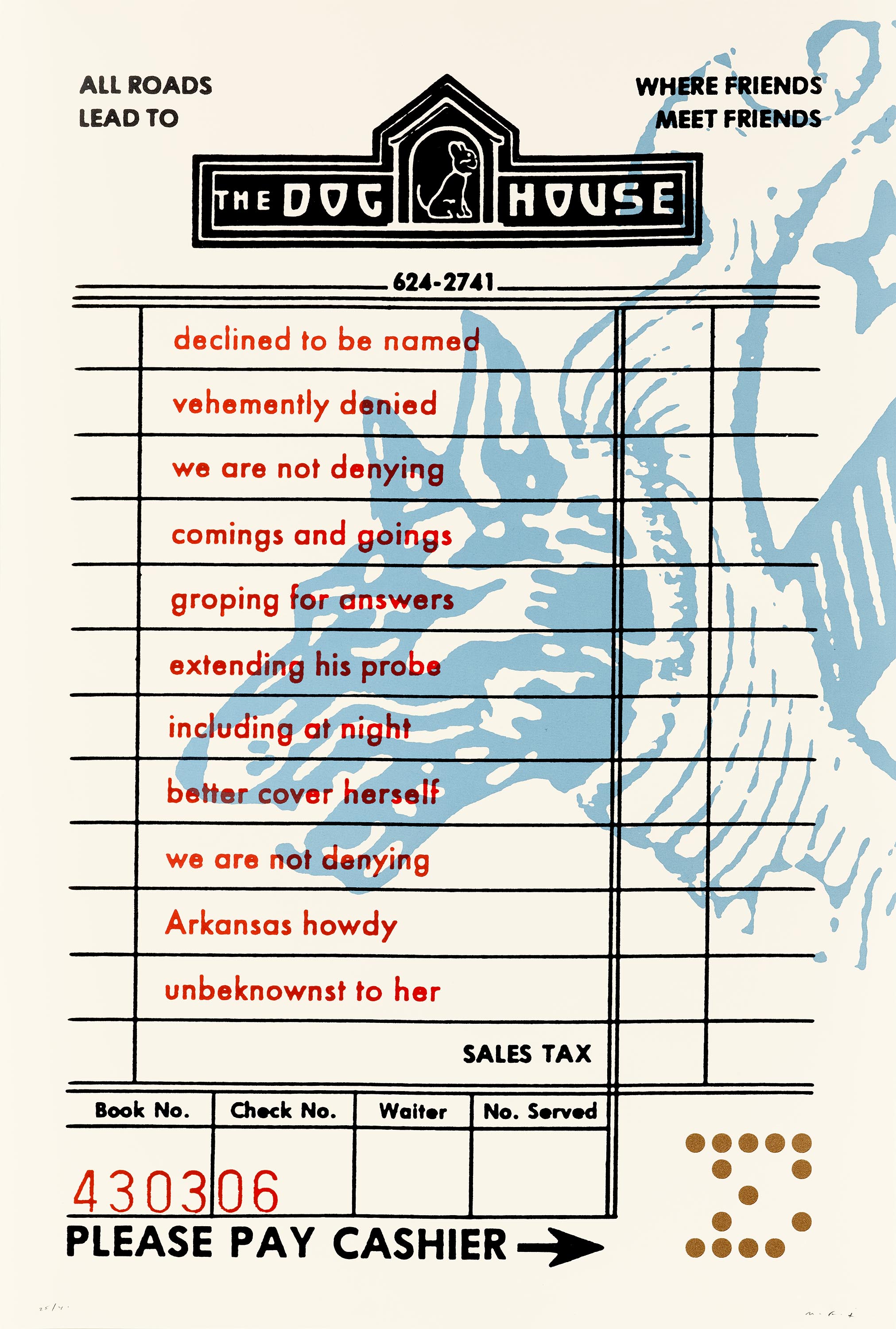
Regardless of party affiliation, no one is exempt from Fox and Wang’s critique. OBOMBA addresses the increase in drone warfare under the Obama administration. The design and materiality of the sign — screen printed on sheet metal with reflective glass beads mixed into the ink — reference fallout shelter signs issued in America during the Cold War.
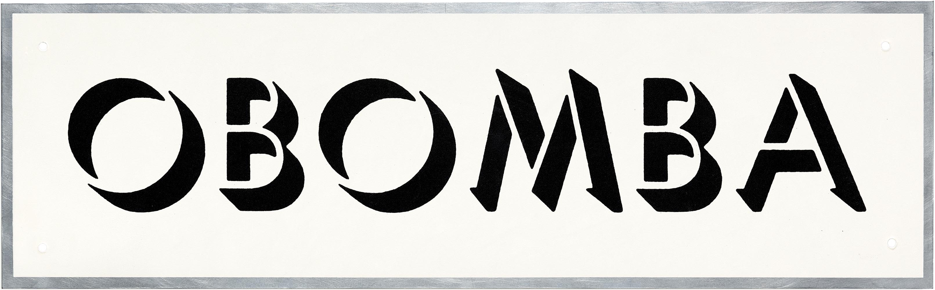
The work calls attention to the tangledness of politics, policies, and parties. “Whether a presidential administration leans left or right, there will always be policies and actions that not everyone’s going to agree with,” Fox said, referencing the 2014 drone strike under the Obama administration that killed innocent Yemeni civilians at a wedding after being suspected as terrorists. “Even though I support Obama, that was a policy I found incredibly offensive, unethical, inhuman, and worthy of critique.”
As partners in life and as Design is Play, Fox and Wang are still learning from each other’s design process and culture. When designing, Fox is often more direct, distilling complex ideas into striking, memorable forms, while Wang is more of a systems thinker who enjoys seeing how one idea plays out in multiple ways. Fox grew up with political activism on his mind and recognizes the ways he carries his privilege as a white male, while Wang grew up witnessing the consequences of political activism and navigates the culturally prescribed obedience often assigned to Asian women. “There’s an interesting push-pull, a certain tension — and tension isn’t always a bad thing,” Wang said. “In a way, that translates into an awareness of each other’s cultural and lived experiences.” Over time, they’ve come to appreciate how their differences enrich their work.
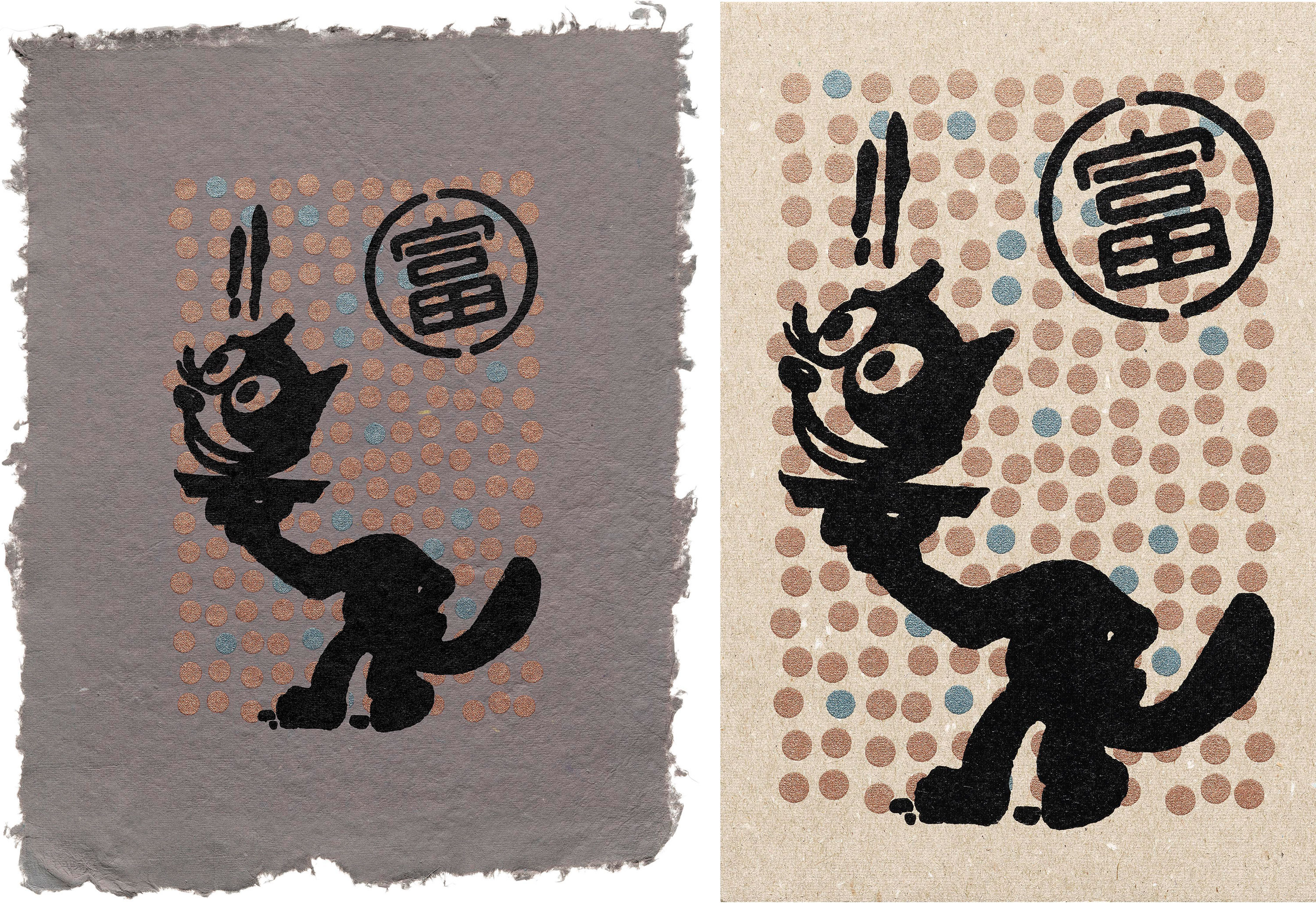
Selections from the Fox and Wang Collection
All images in this gallery are hi-fi captures. Click an image to enter fullscreen view, then pinch or use browser zoom to enlarge.
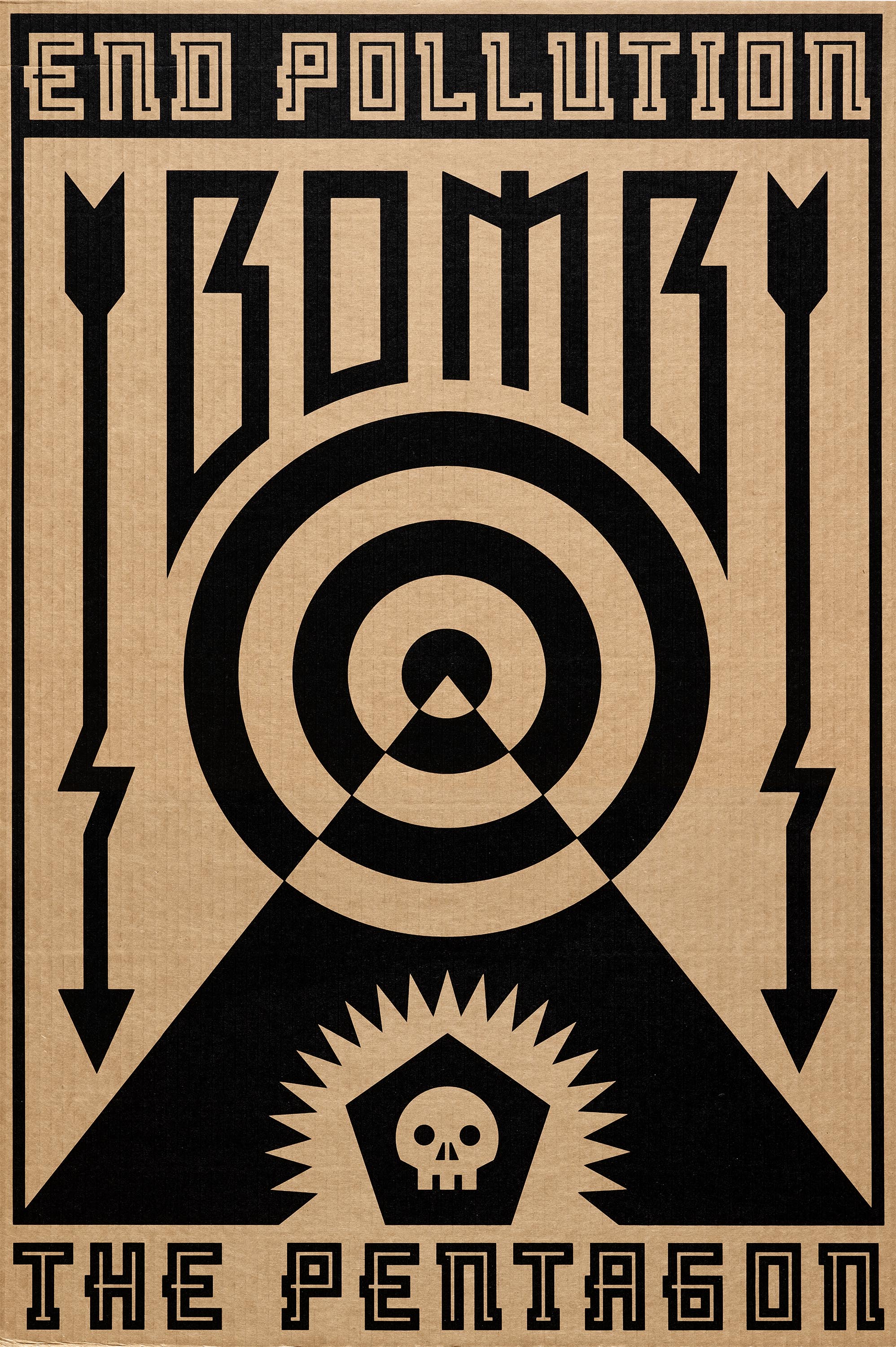


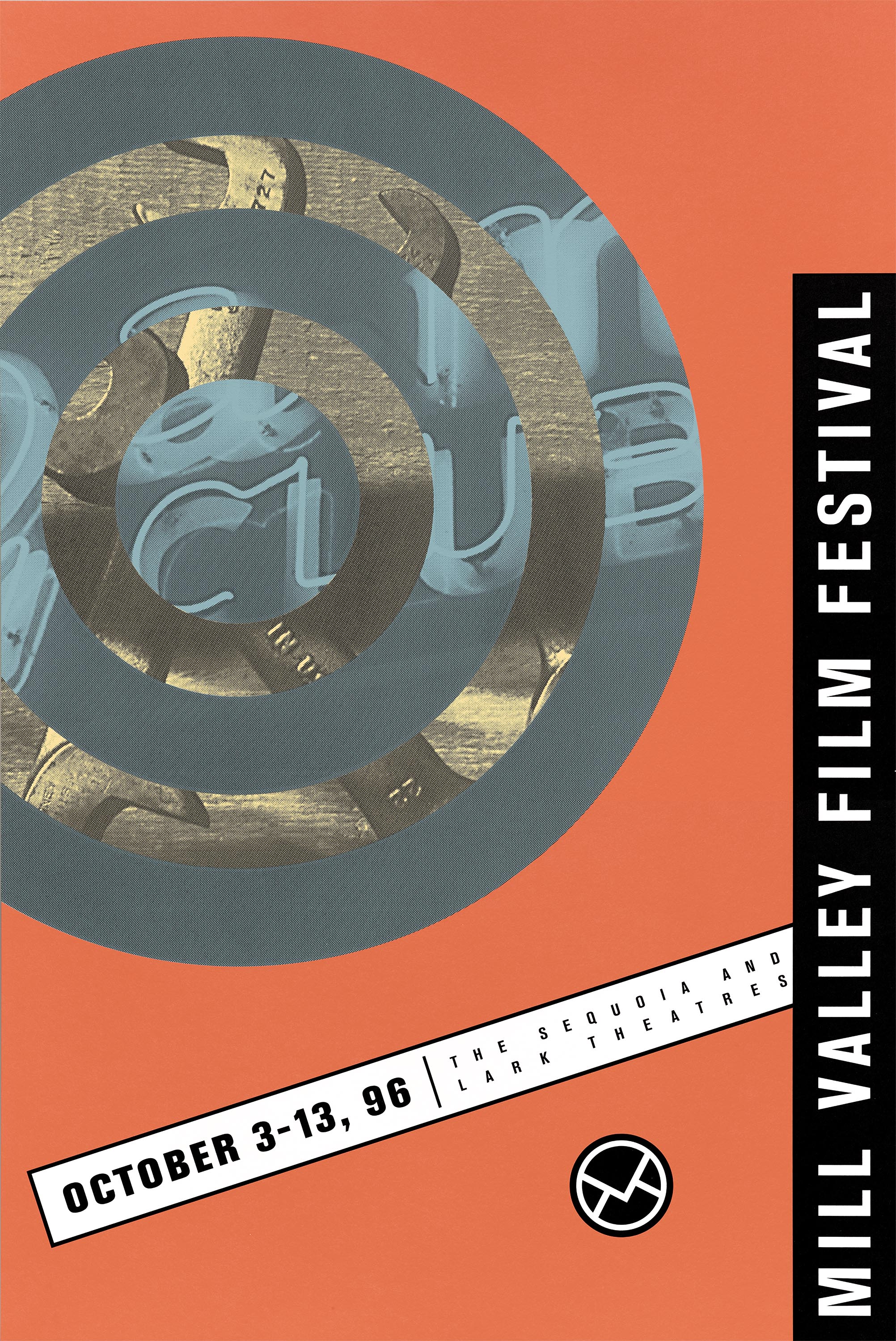
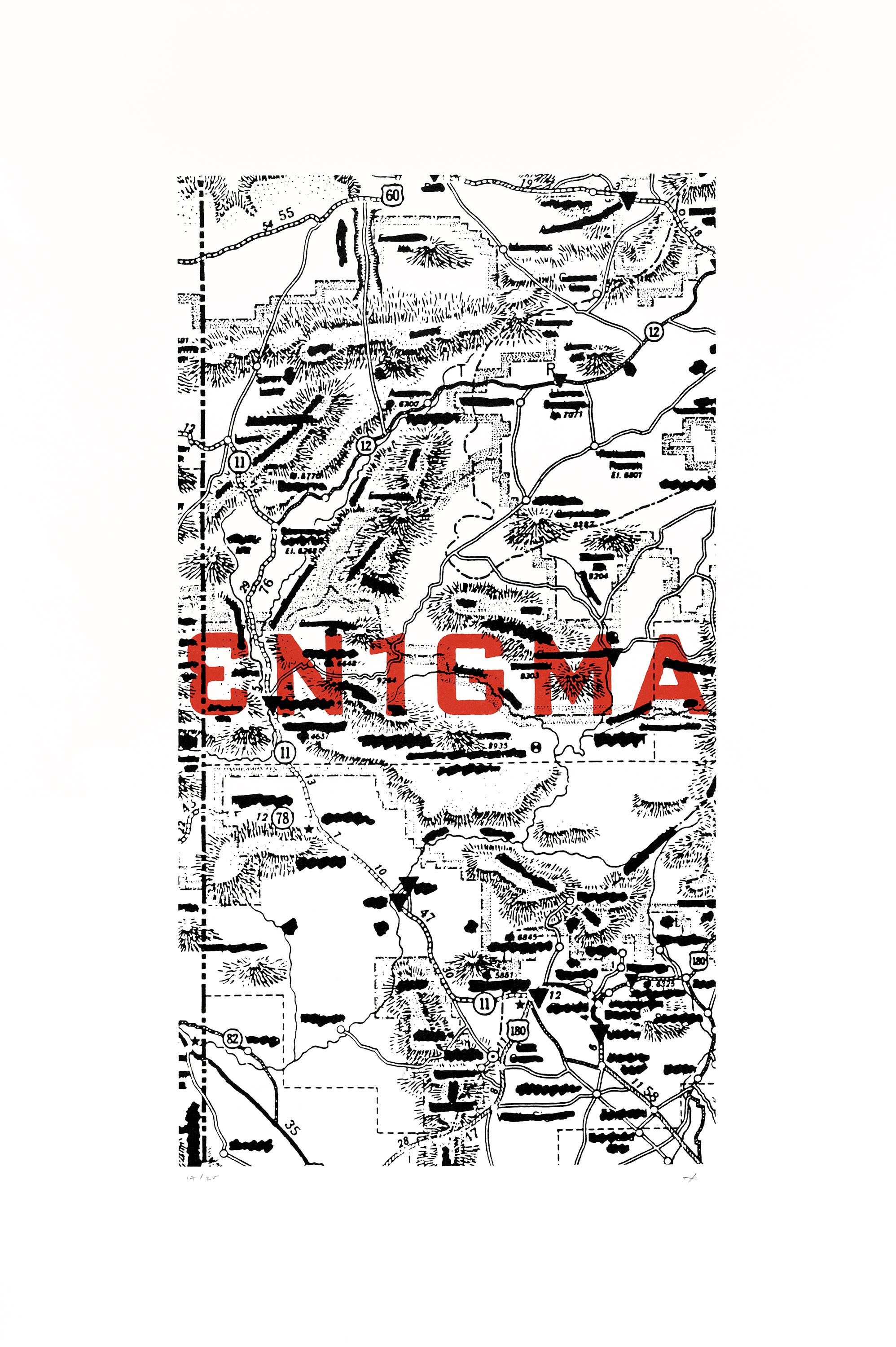
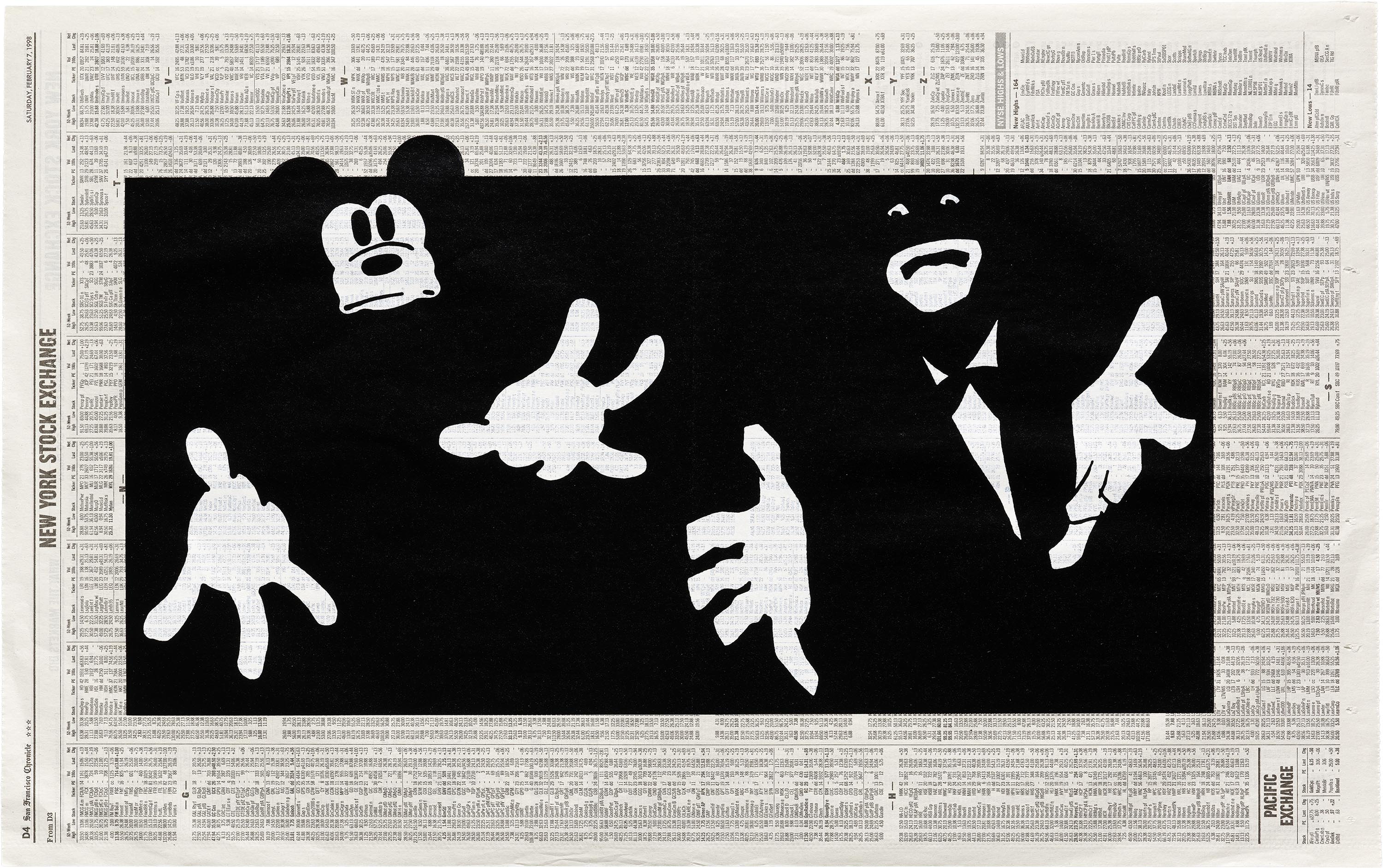

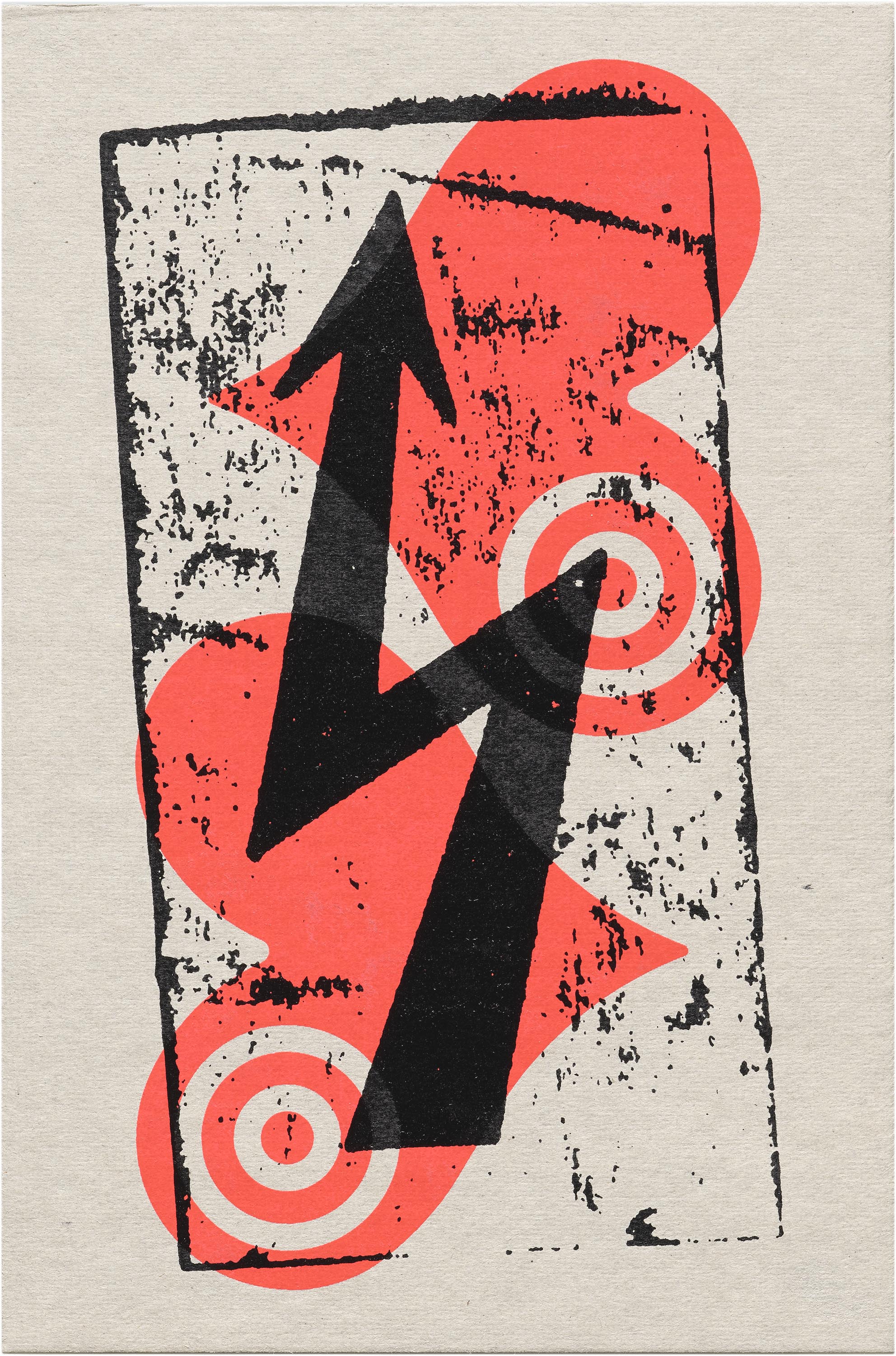
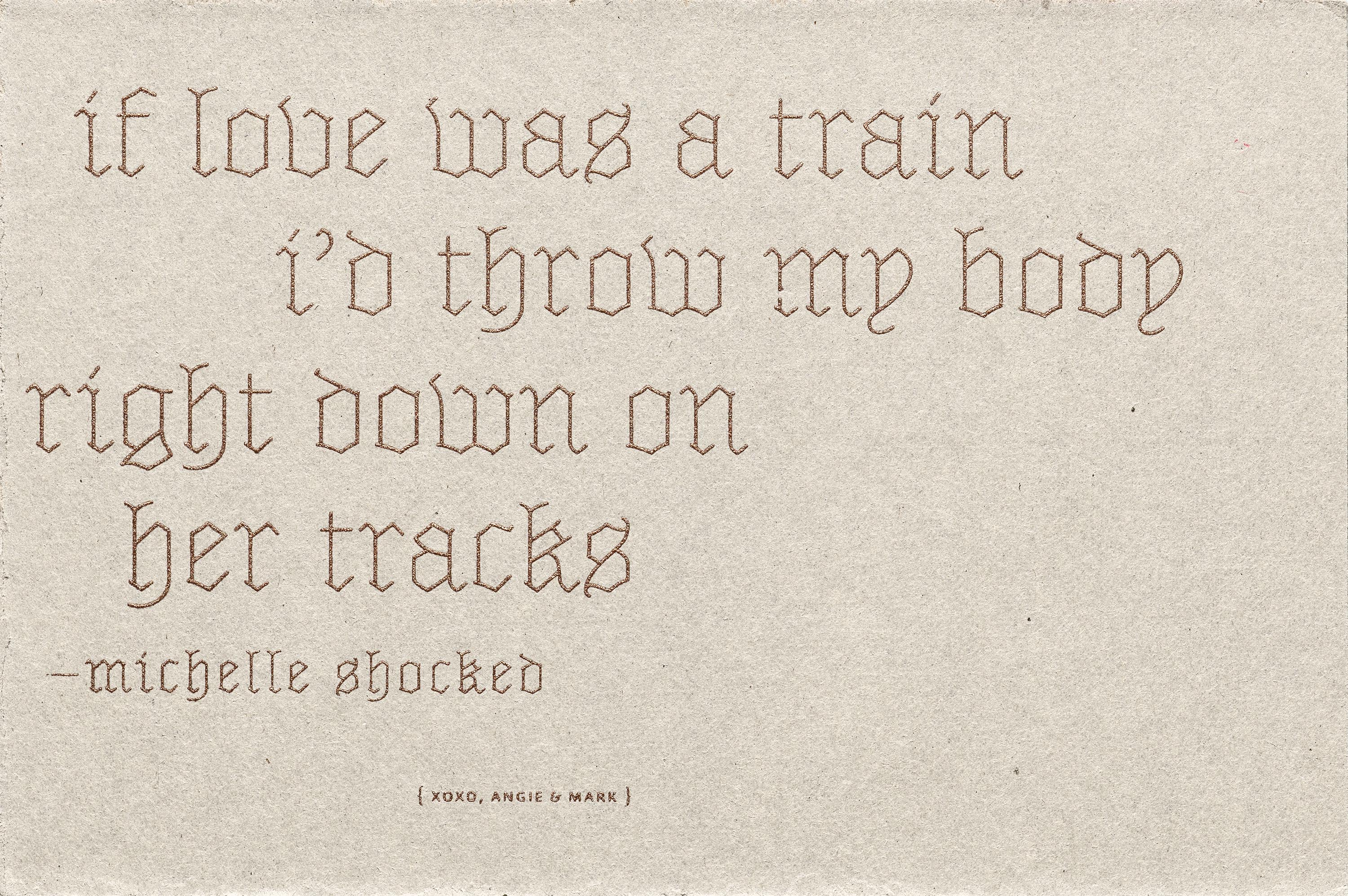
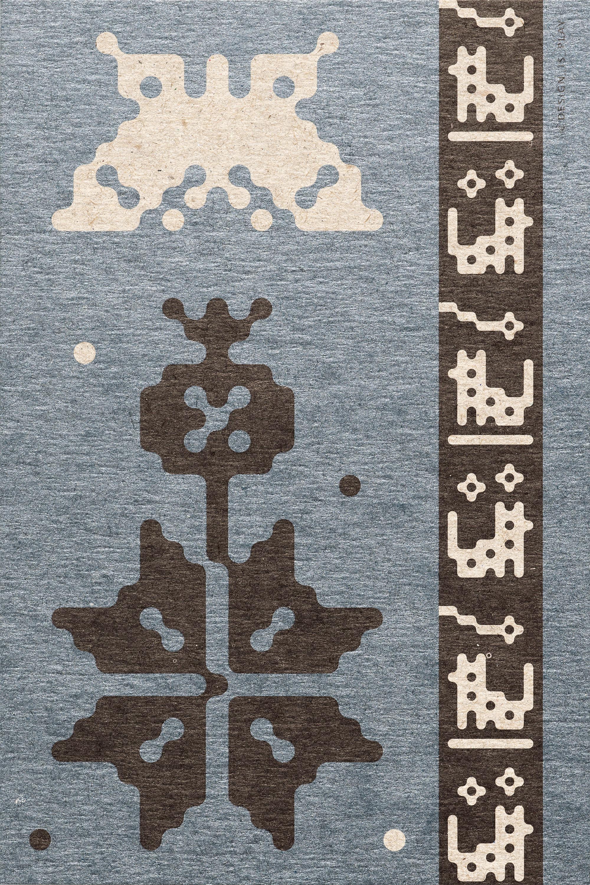
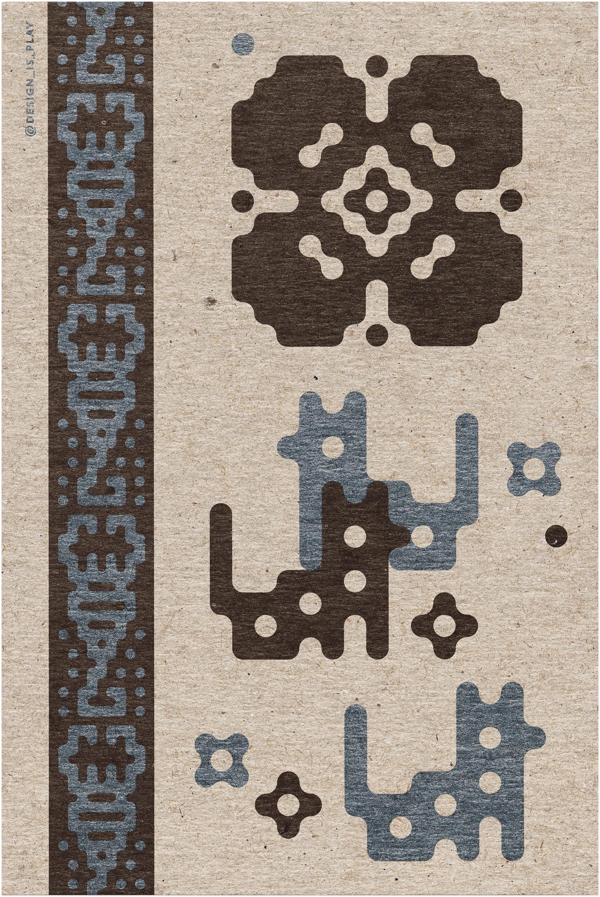

Letterform Archive is honored to hold a selection of the work of Fox and Wang. Their work offers many examples of the ways in which designers are influenced by the political zeitgeist and can activate their talents for discourse.
“People often think that we’re wasting our time, or we might as well go march. But our thought is, if we were writers, we would write about how we felt. If we were singers, we would sing. You use your talents to express your opinion,” they said, filling in each other’s sentences. “We can’t separate who we are as people from who we are as designers. We teach what we preach, we practice what we preach. Designers are humans first.”
— Florence Fu, Editorial Assistant