From the Collection: Laini (Sylvia Abernathy)
The Chicago-based activist’s dynamic album covers of the 1960s expand our sense of design history.
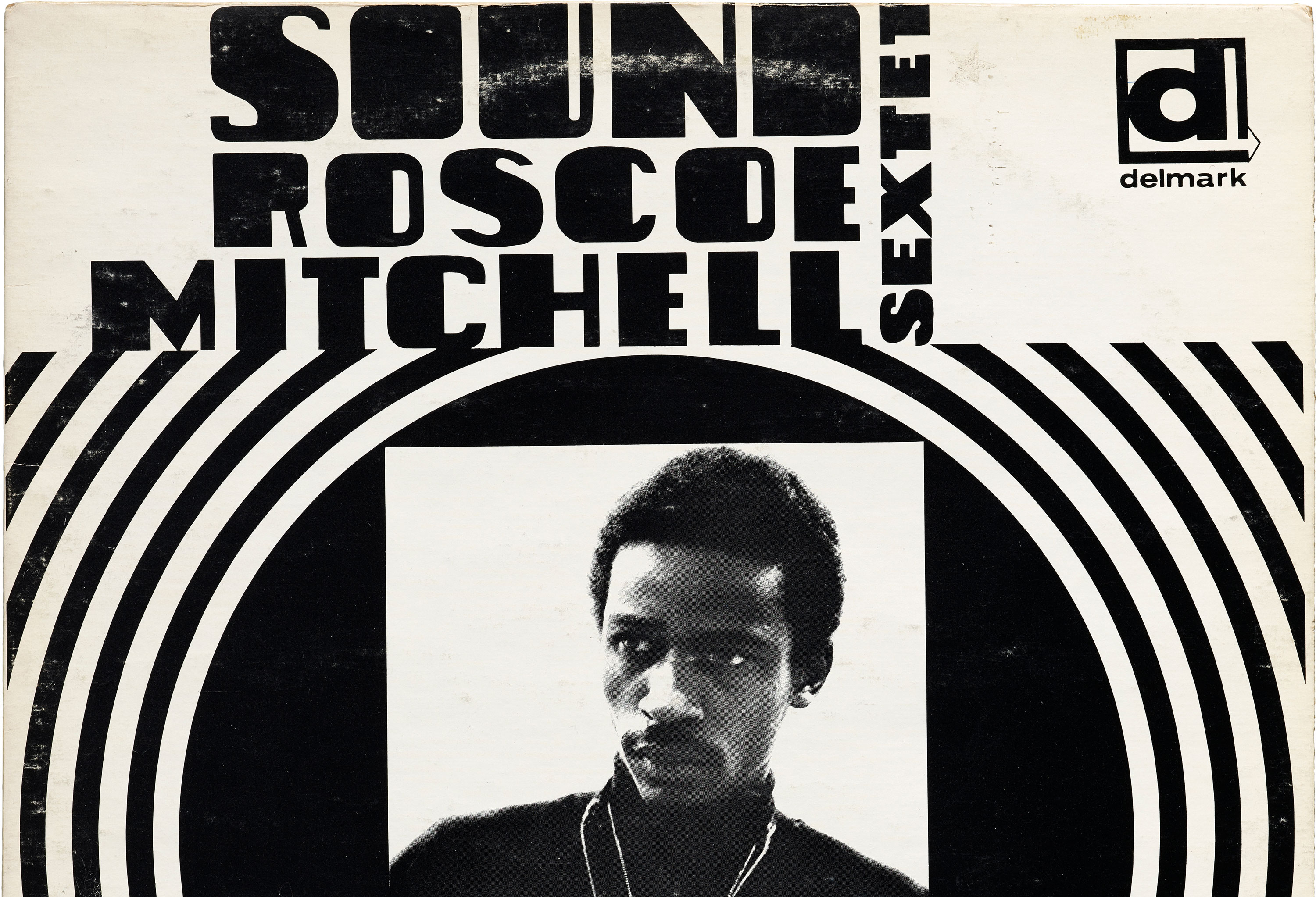
In late 1960s Chicago, Sylvia Abernathy was all at once a college student, activist, and graphic designer. Having later changed her name to “Laini”, Abernathy is best known for working on the Wall of Respect, a community mural in the South Side on 43rd and Hayward Streets. The effort was collaborative, a creative orchestration by the Visual Arts Workshop arm of the Organization of Black American Culture (OBAC). During these years, Abernathy was also designing album covers for jazz musicians under Delmark Records. Four of Abernathy’s albums live at the Archive and hold a special place in our collection. They represent a part of her work that has yet to be researched extensively, and they demonstrate a way of combining type, image, and color that sets her apart from her contemporaries.