News
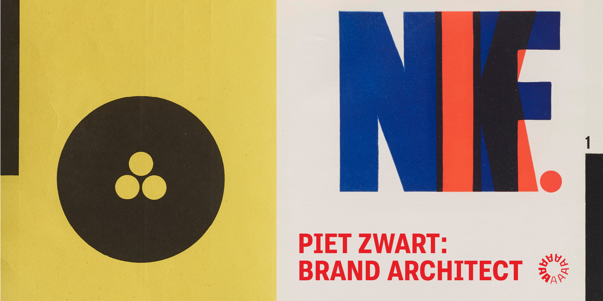
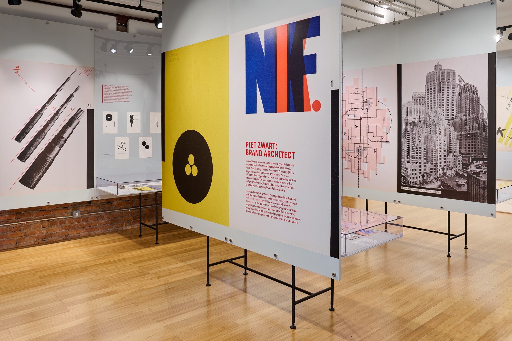
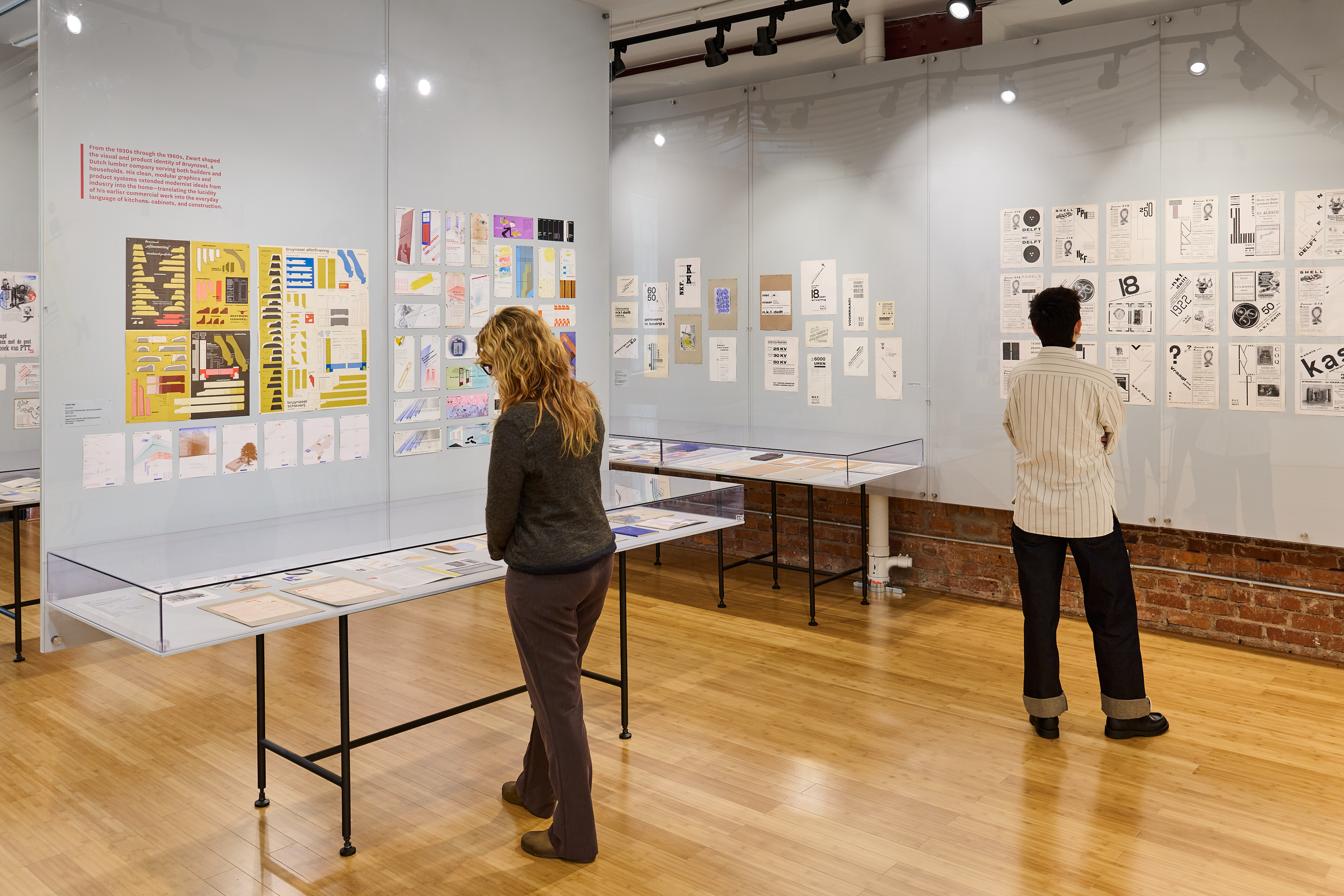
Piet Zwart: Brand Architect
Discover the designer who showed how type alone could carry a brand’s voice. Two hundred objects are on view at Letterform Archive through May 3, 2026.
See the Exhibition
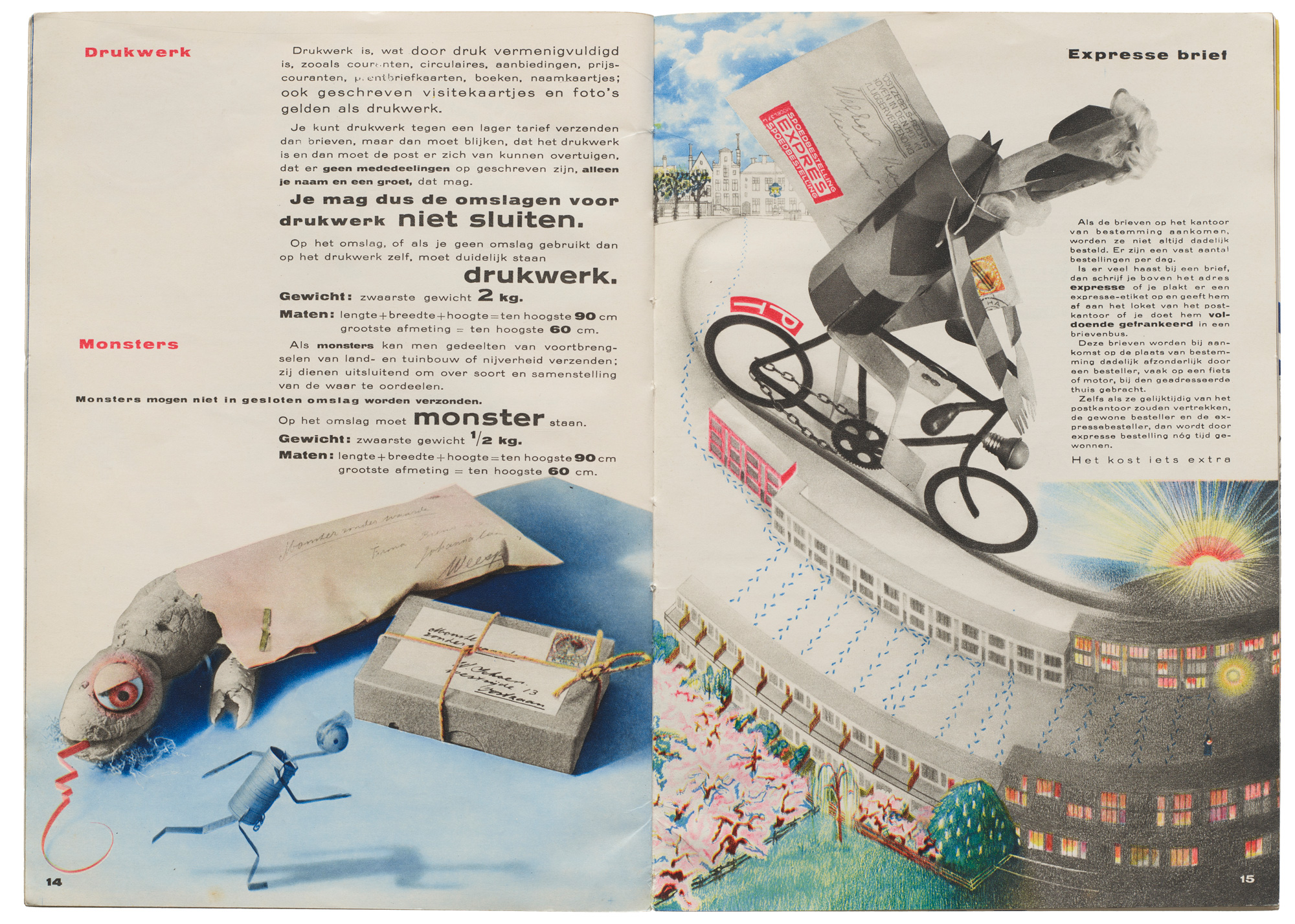
The brilliant Dutch modernist Piet Zwart (1885–1977) described himself as a “typotekt”. The term captured his multidisciplinary approach, creating a legacy that bridged architecture, industrial design, interior design, graphic design, typography, and photography.
From the 1920s to the 1960s, Zwart profoundly influenced both the Netherlands and the international design community, and many of his works are celebrated as milestones in design history. His signature photomontages, playful type compositions, and bold color fields elevated everyday subjects into platforms for graphic exploration, leaving a lasting imprint on future generations of designers.
Curated by Letterform Archive’s founder and curator, Rob Saunders, the exhibition draws from our deep collection of Zwart’s work. On display are 200 objects highlighting iconic graphic identity programs for Nederlandse Kabelfabriek Delft (NKF), Dutch Postal Telegraph and Telephone Company (PTT), Bruynzeel Lumber Company, and others. Some items originated from Zwart’s personal archive.
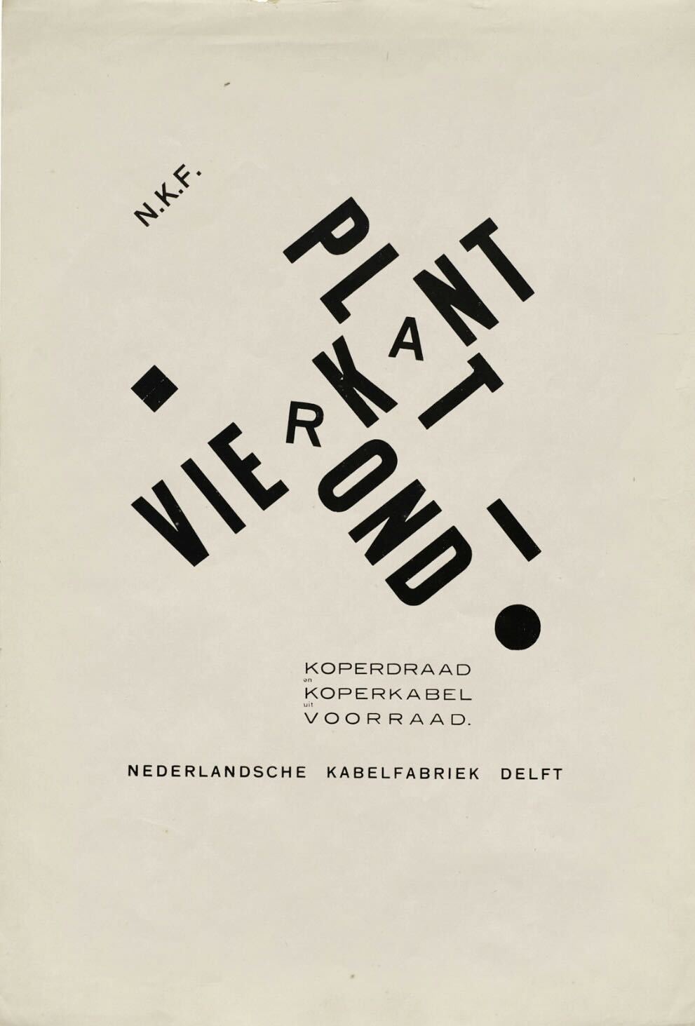
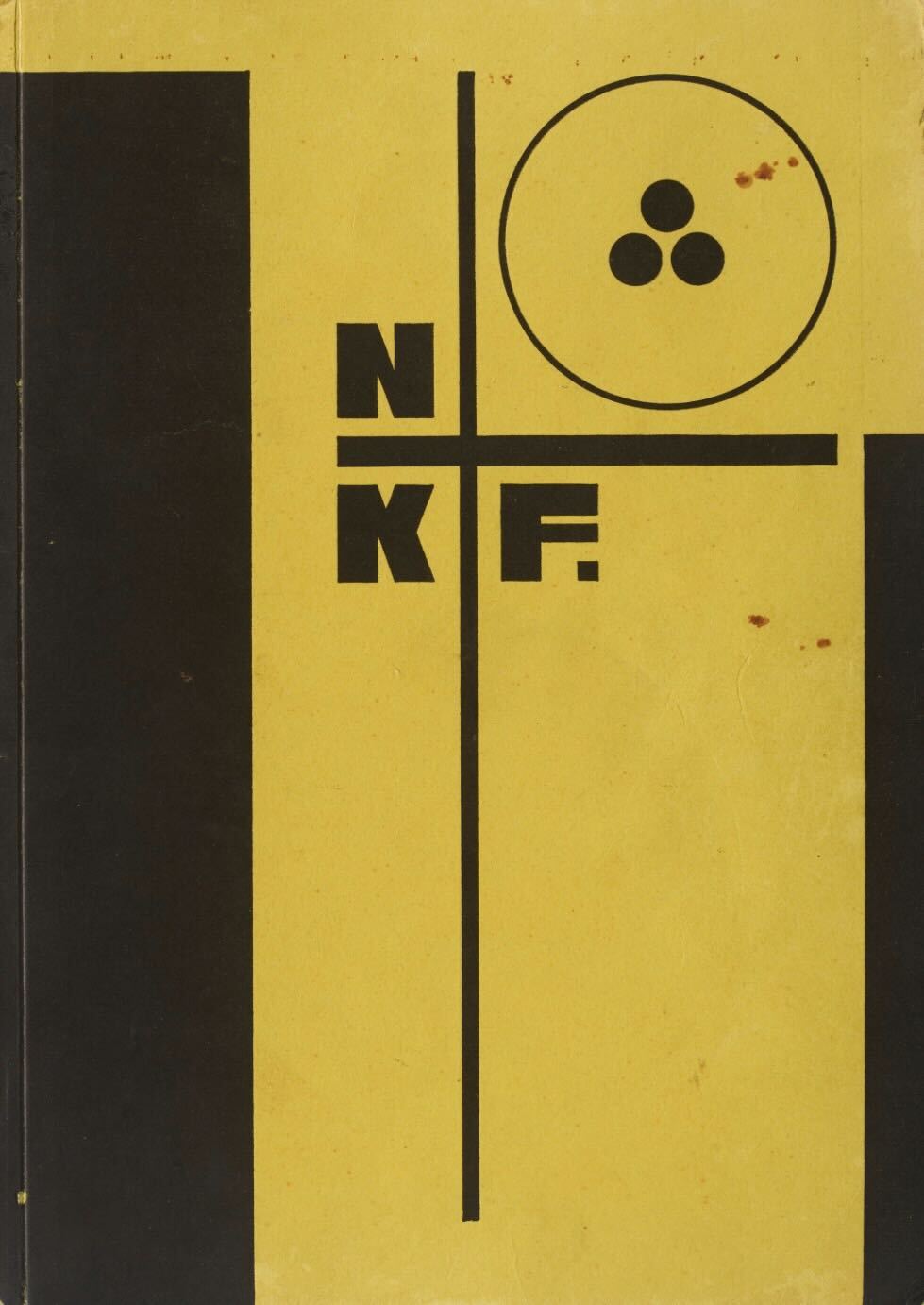
Zwart's collaboration with the Nederlandse Kabelfabriek Delft (NKF) from 1923 to 1928 transformed an ordinary industrial manufacturer into an icon of modern design. In advertisements, catalogs, and the celebrated Standard Cables catalog of 1927–1928, he fused architecture, typography, and photography into a single visual language. What had been utilitarian product information became a bold act of branding-proof that even a cable company could project innovation, precision, and optimism through design.
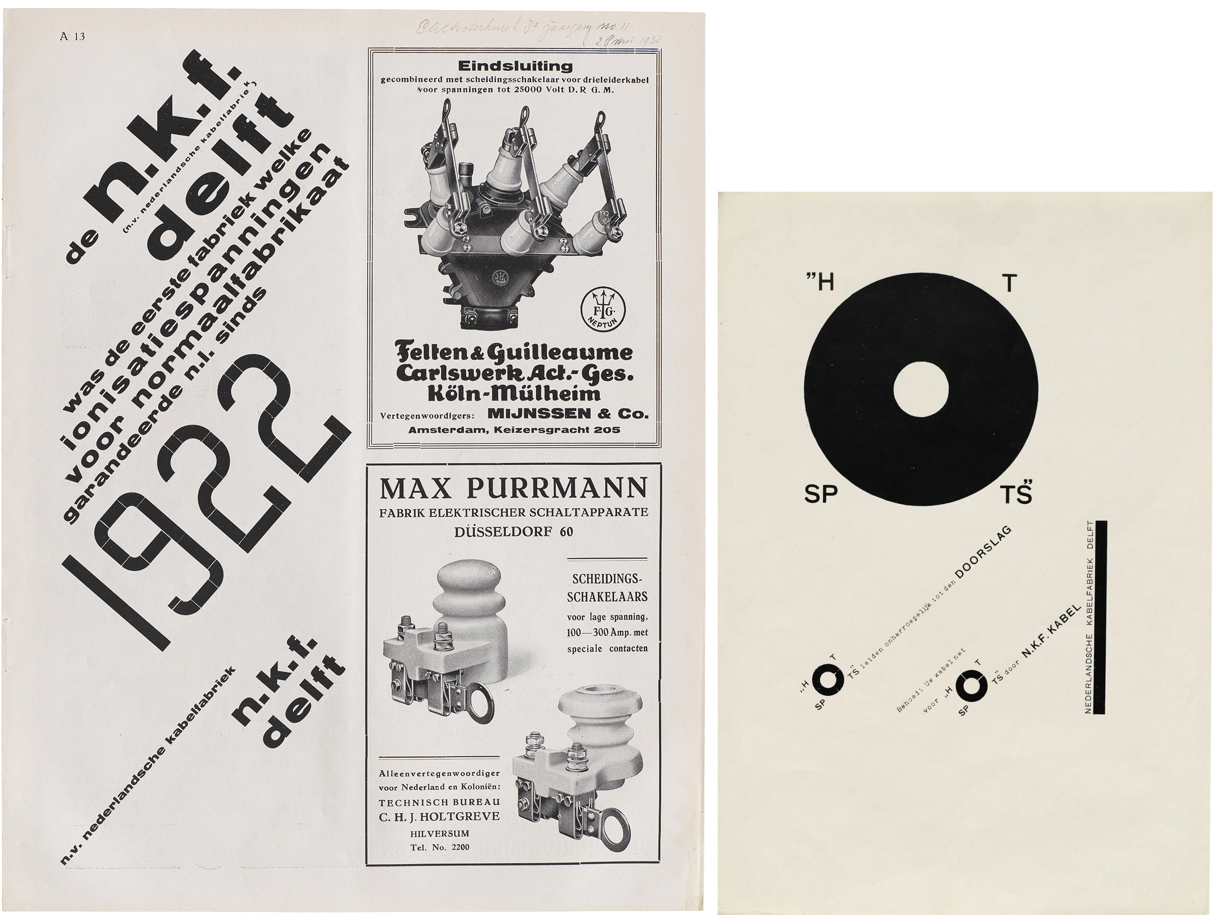
Zwart’s spare, asymmetrical ads for NKF broke the 90-degree grid and stood out on magazine pages surrounded by the dense and cluttered design of the period. In his letterpress compositions, Zwart often used metal rules and ornaments to create letters, minimalist illustrations, and organizational structure. One example (above) repurposes constructed circles as both the letter O and a cross-section of industrial cable.
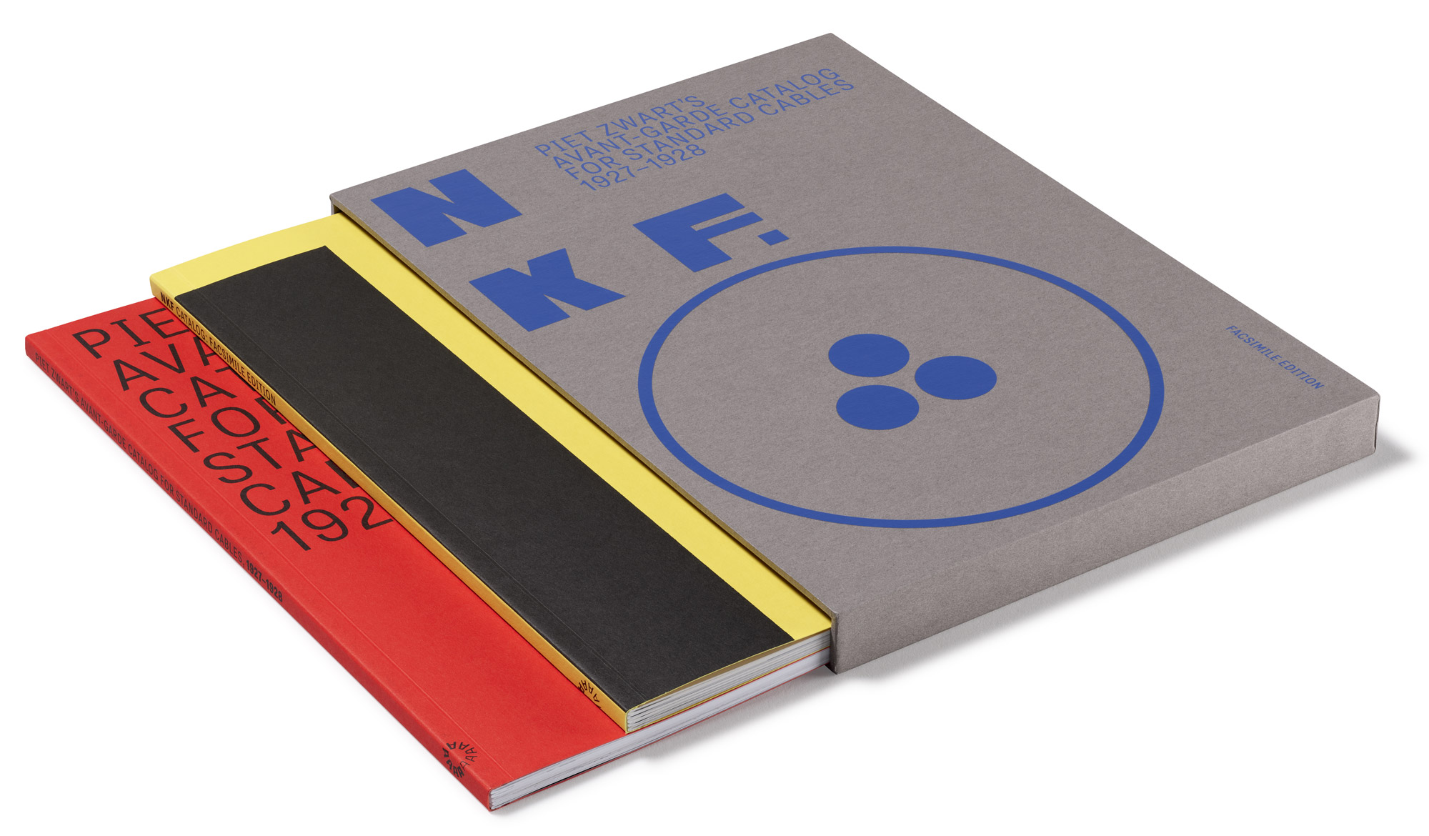
NKF: Piet Zwart’s Avant-Garde Catalog for Standard Cables, 1927–1928. Two softcover volumes (facsimile and critical supplement) housed in a slipcase. 160 pages. 8.25 × 11.5 inches. 4 colors throughout.
Buy the bookThe exhibition is supported by the recent publication from Letterform Archive Books, NKF: Piet Zwart’s Avant-Garde Catalog for Standard Cables, 1927–1928. The founding masterpiece of modern typography is a remarkable case study in visual communication, transforming the humble cable into a subject for experimental graphic design. This first-ever facsimile of the catalog offers gallery guests an opportunity to take a piece of Zwart brilliance home with them.
Piet Zwart: Brand Architect runs through May 3, 2026. The show is open to the public during main gallery open hours, Thursday through Sunday. General admission is $10, but, as always, Thursdays are free. Tickets available in advance, or at the door.