News
From the Collection: Portuguese Type Specimens
Guest expert António Fonseca surveys our collection of metal type catalogs from the foundries of Portugal.
I first heard about Letterform Archive in 2018. I was trying to locate a Portuguese type specimen for an article I later presented at the 9th Typography meeting in Tomar, Portugal. During my research, I found a reference to the foundry I was researching in the book Type: A Visual History of Typefaces and Graphic Styles, which documented the extensive collection of Jan Tholenaar, a Dutch bibliophile who gathered an impressive collection of books, type specimens, pamphlets, and other ephemera throughout his life.
Portuguese Foundry Type Catalogs at Letterform Archive
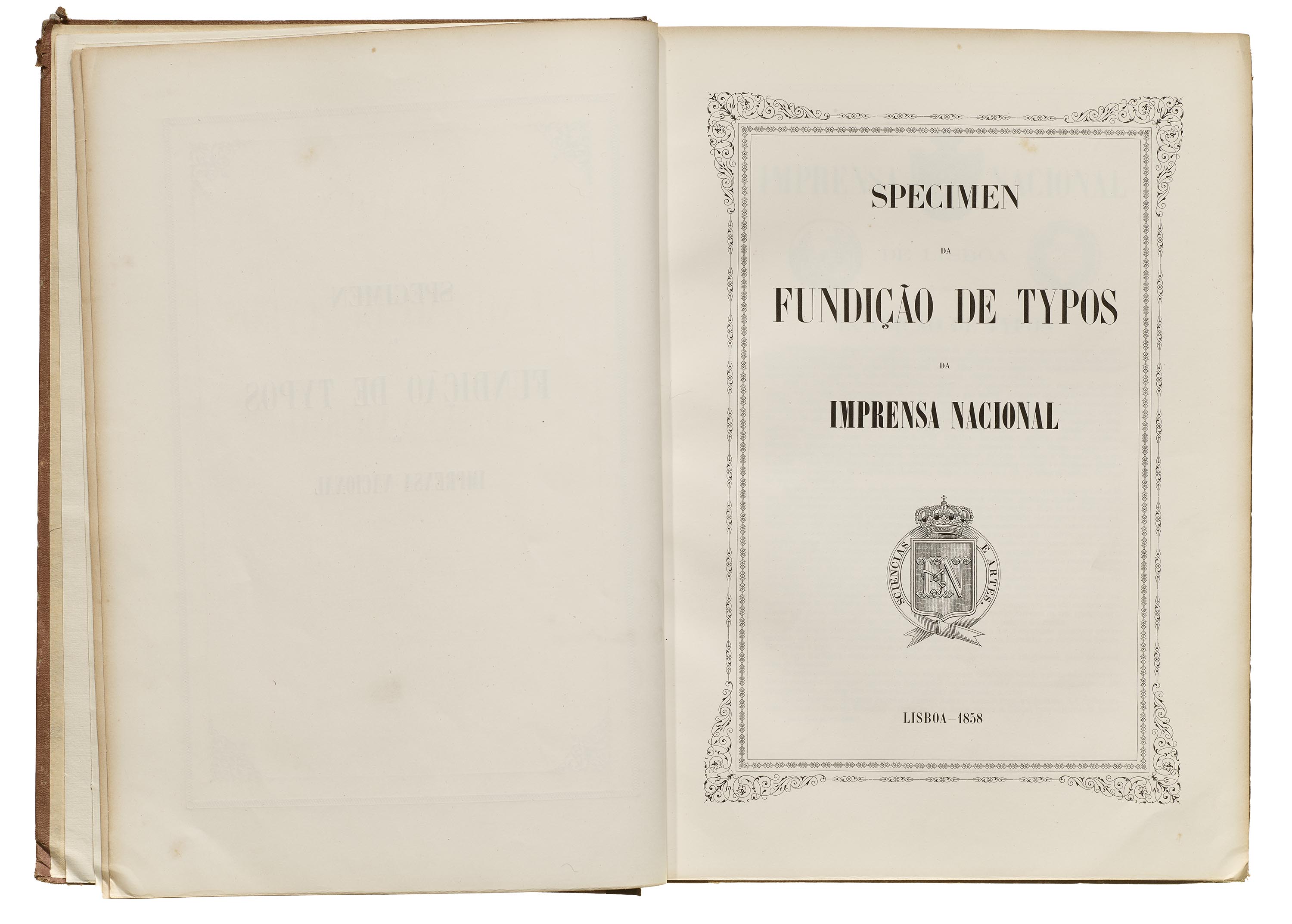
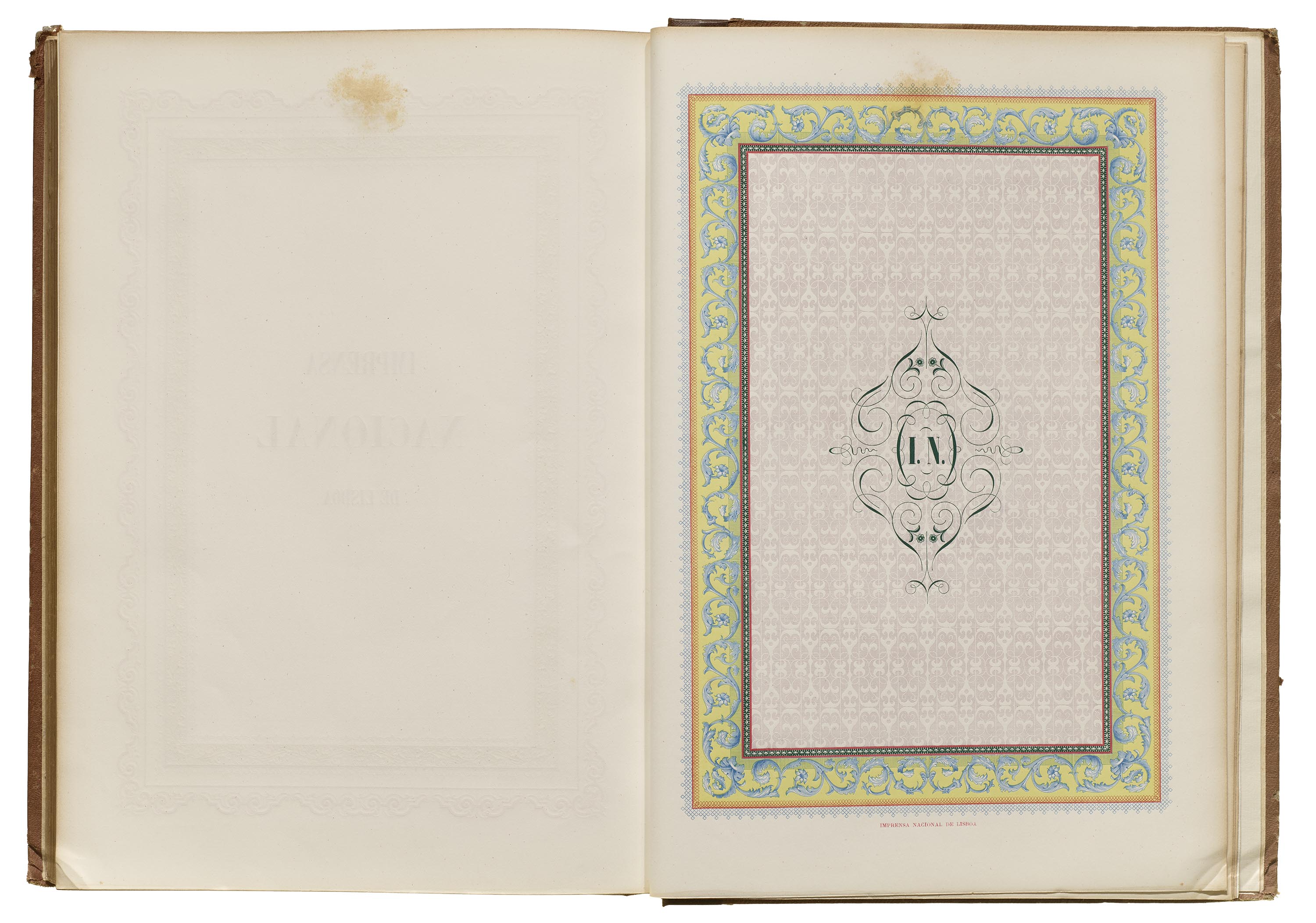
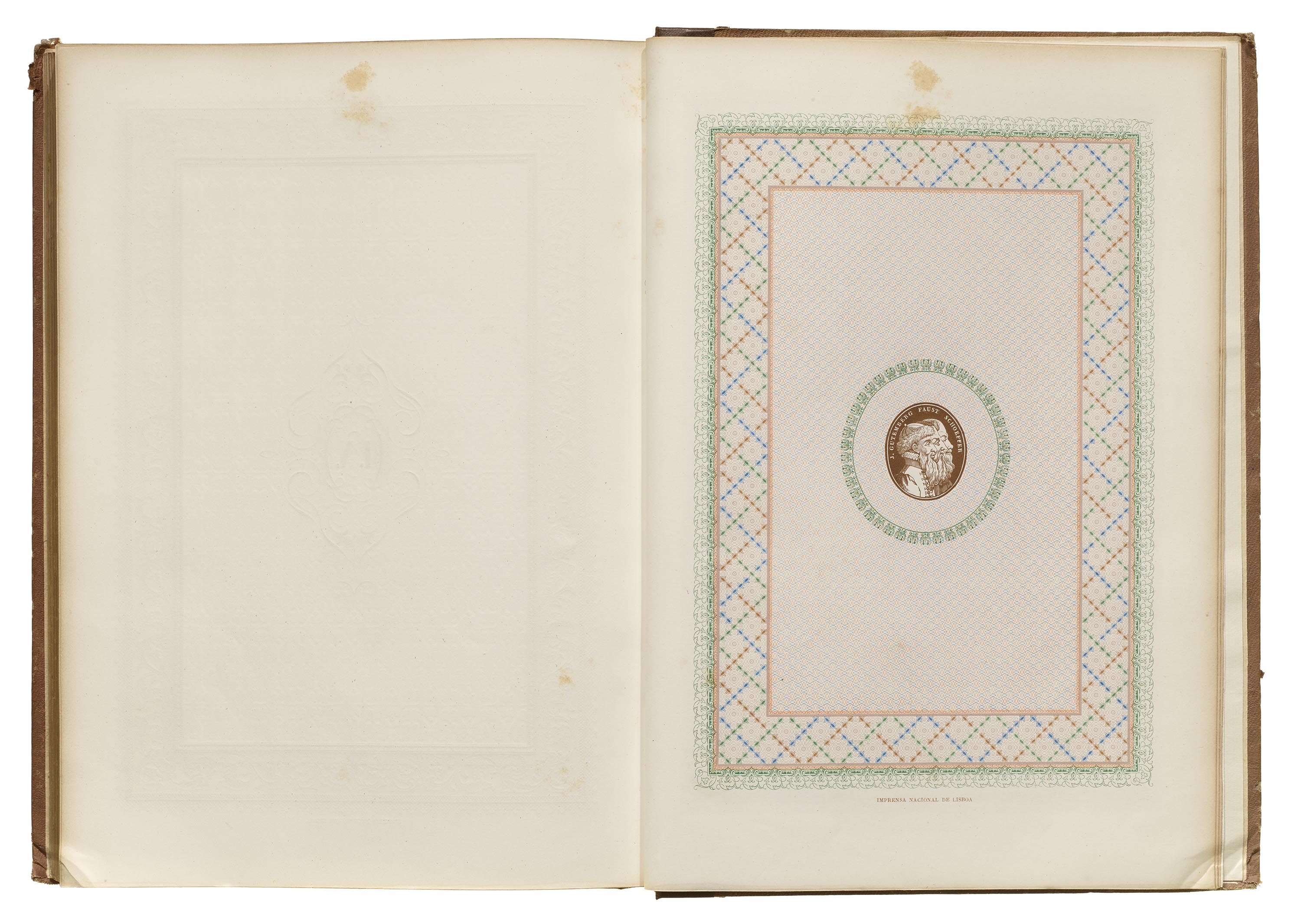
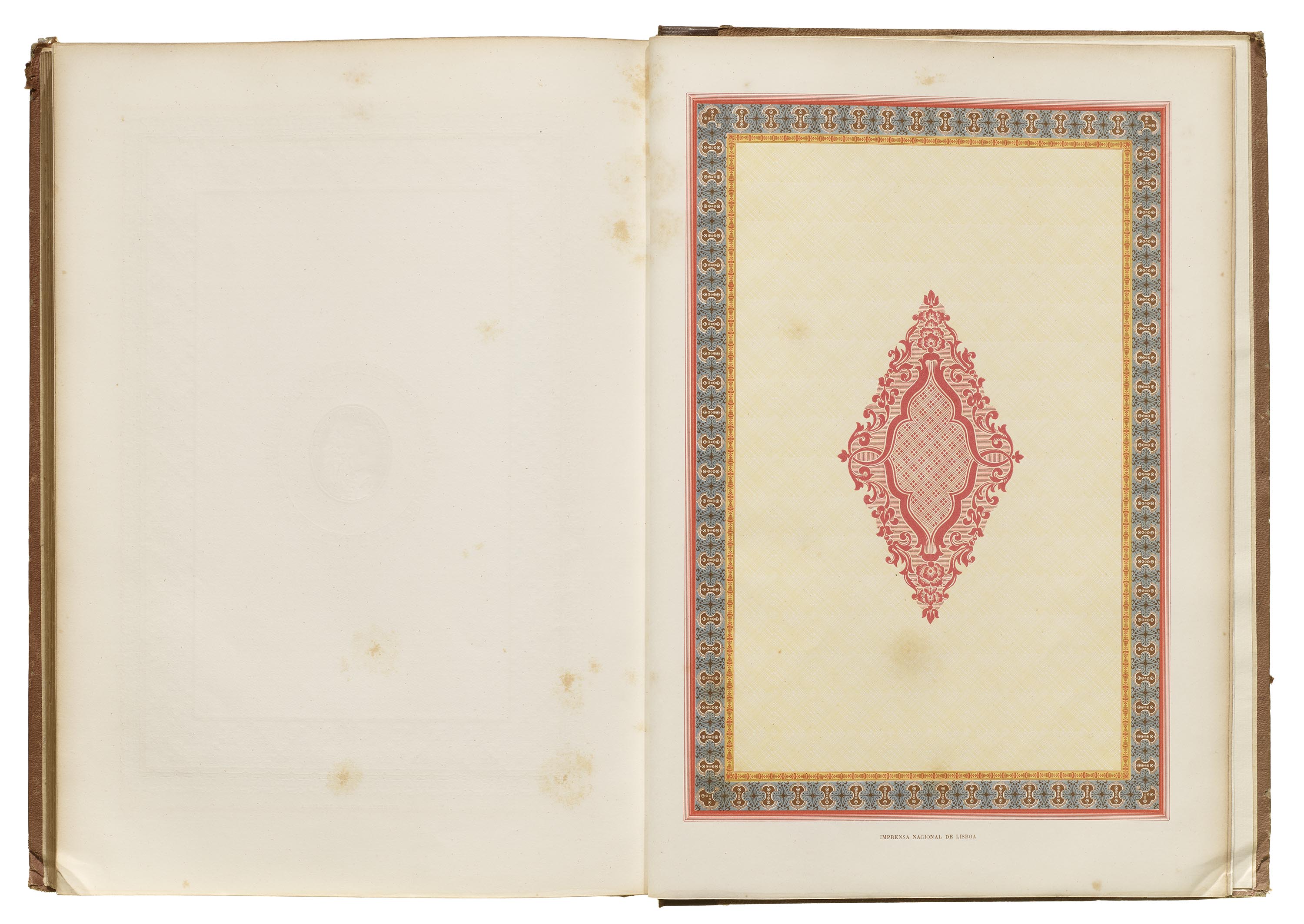
Imprensa Nacional, Lisbon, 1858
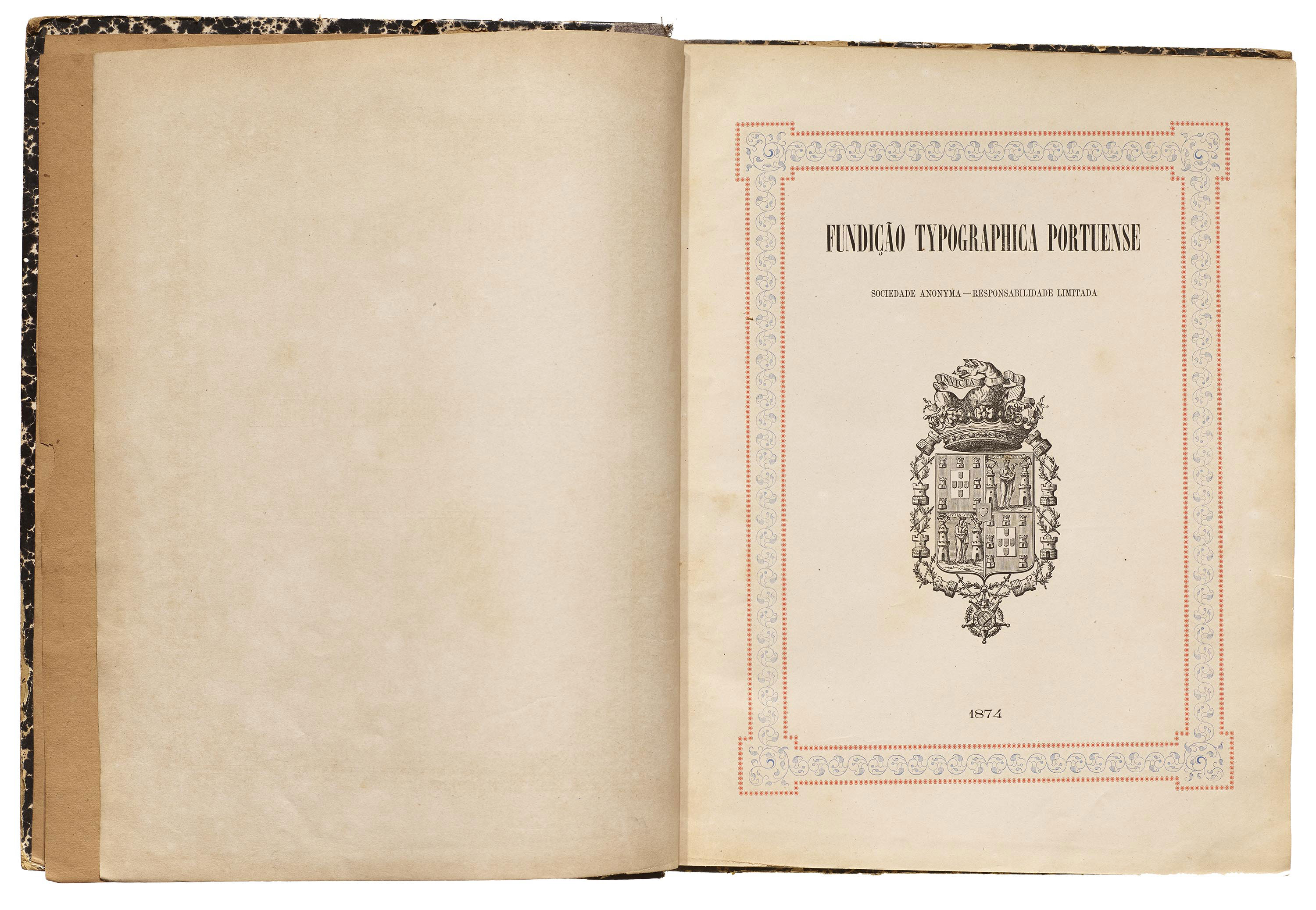
Fundição typographica Portuense, Porto, 1874
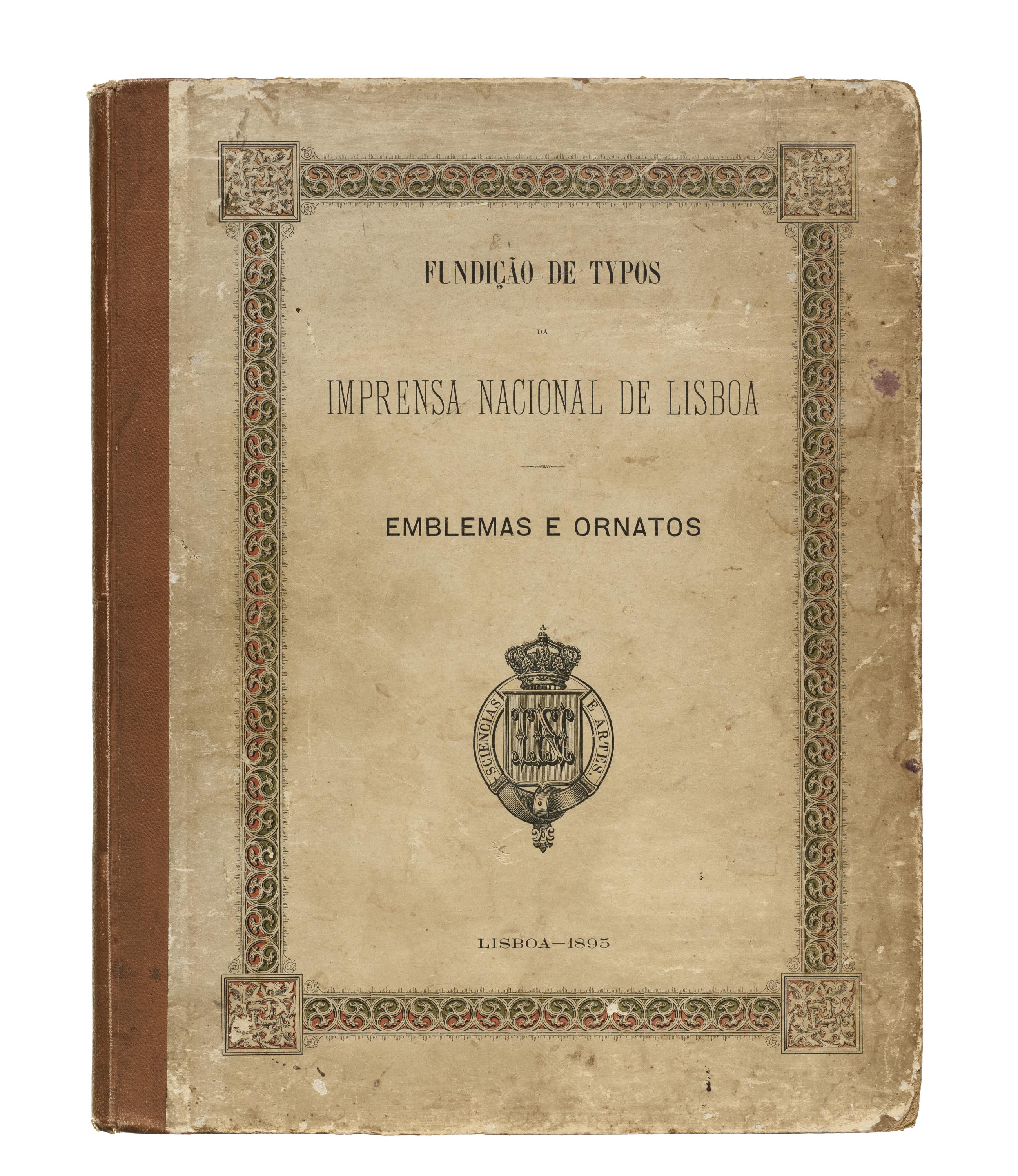
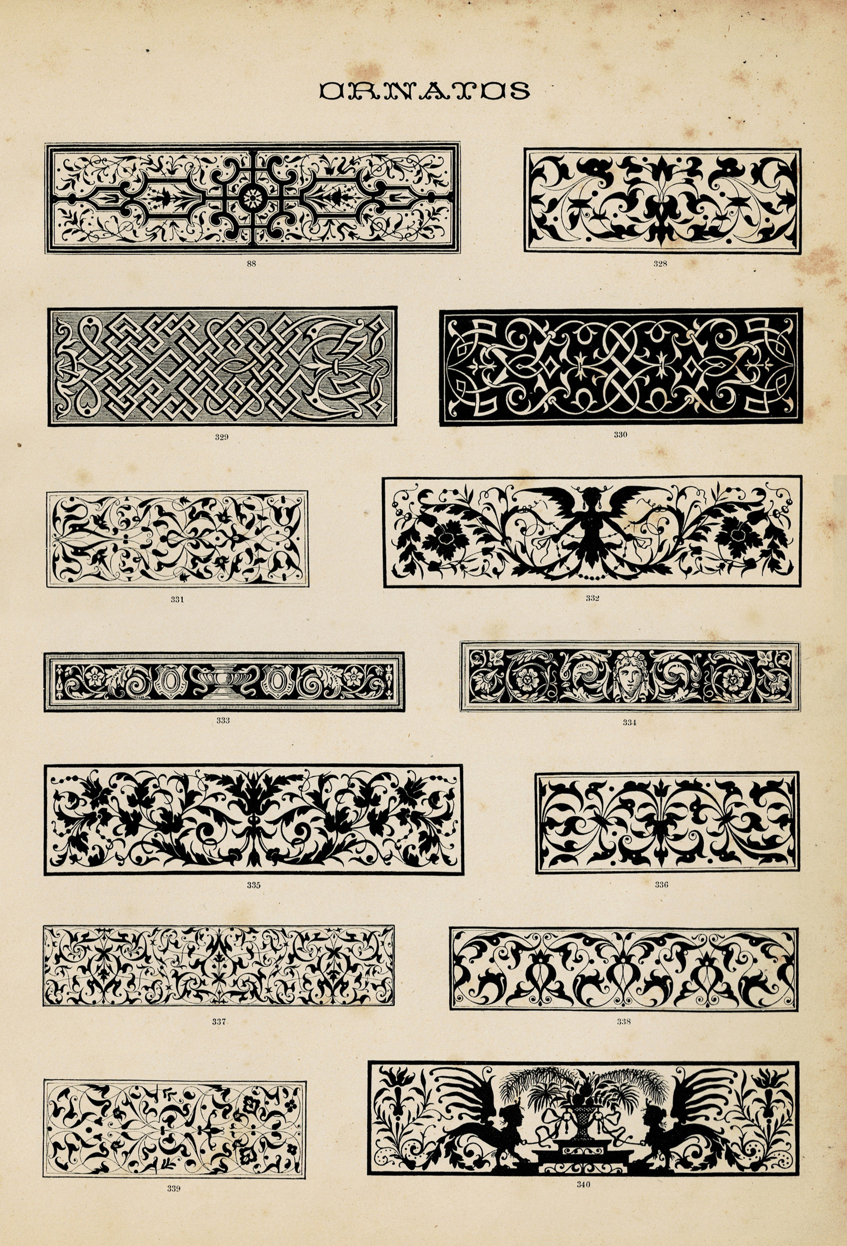
Imprensa Nacional, Emblemas e ornatos, Lisbon, 1895
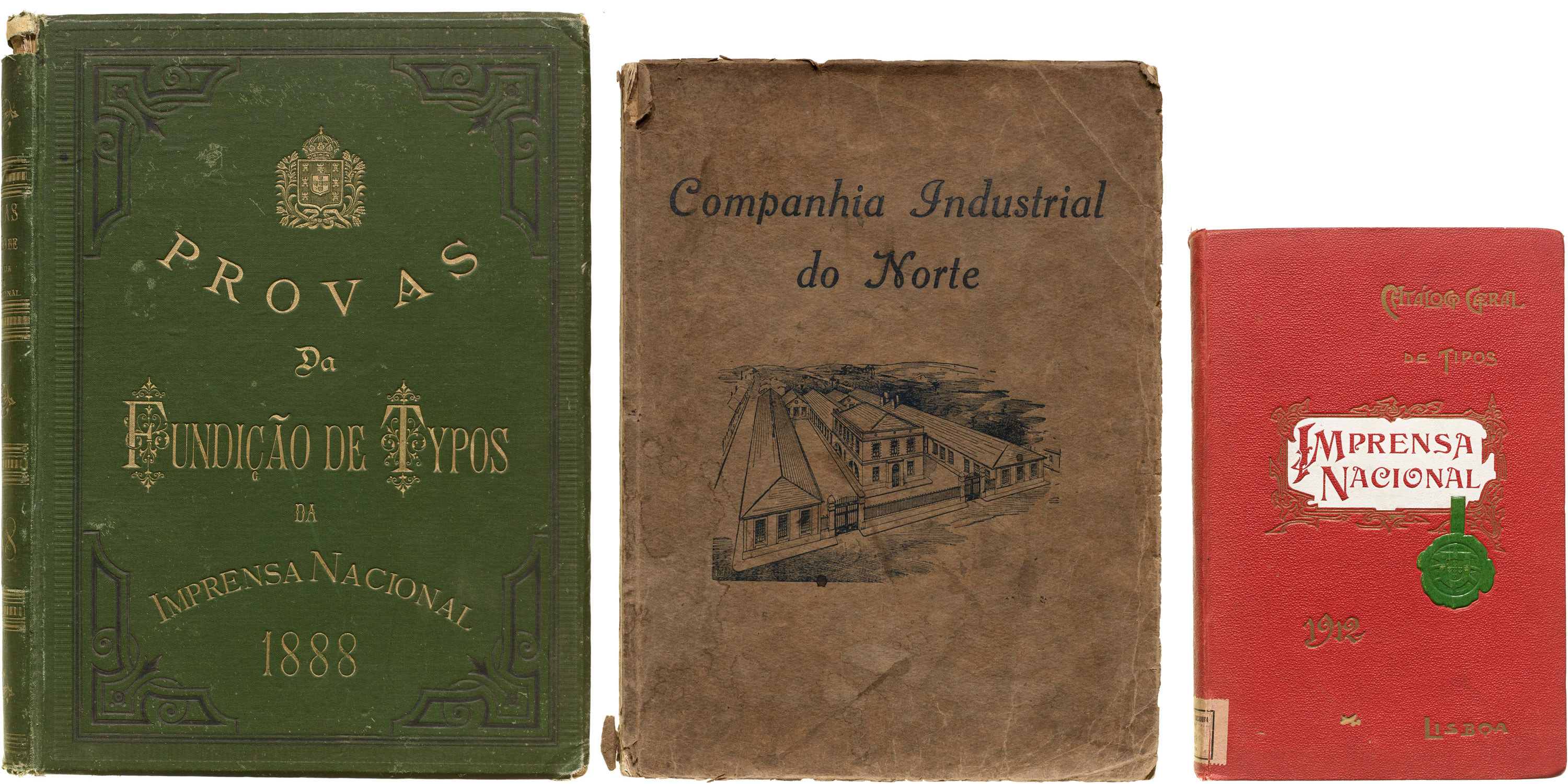
Imprensa Nacional, Lisbon, 1888
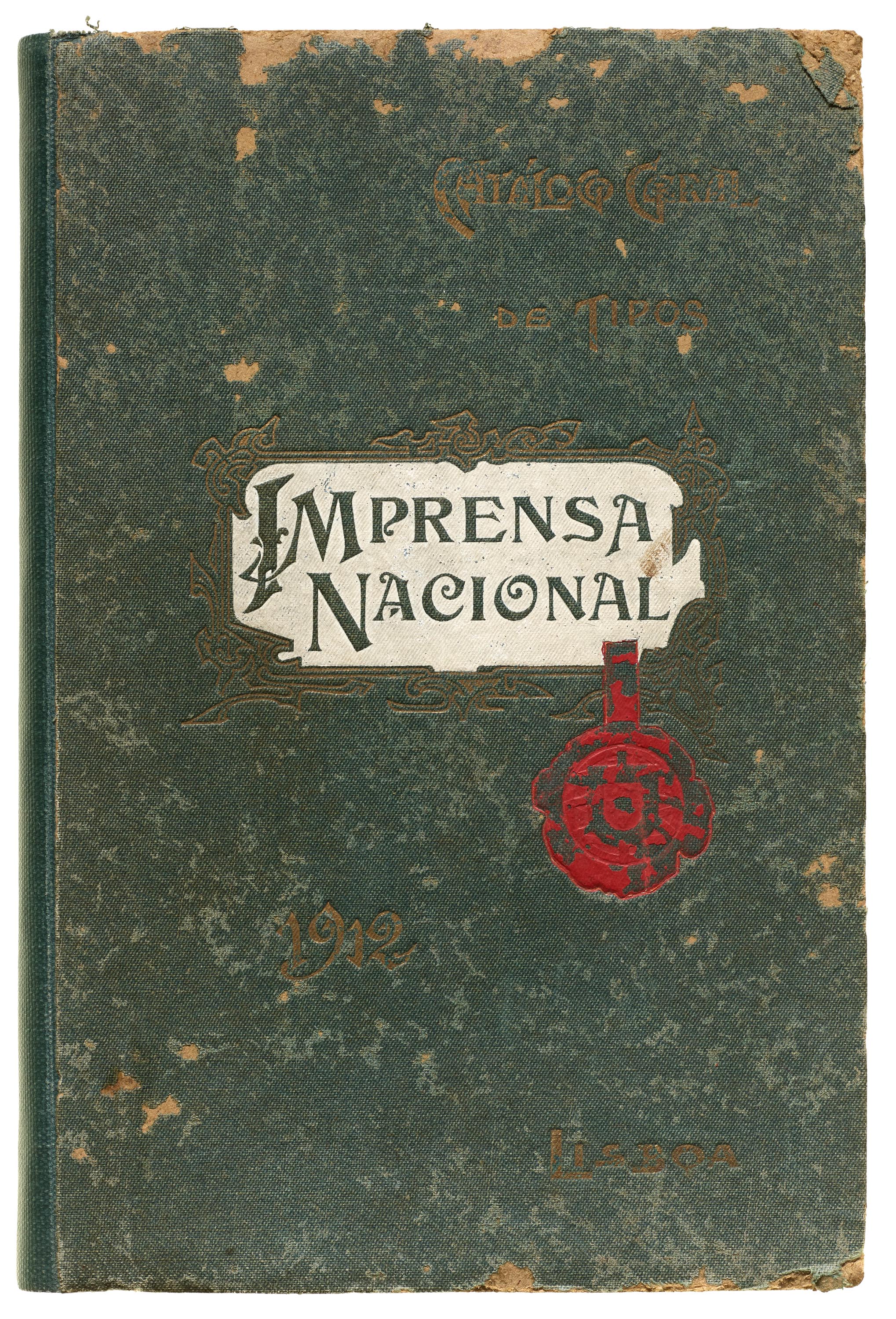
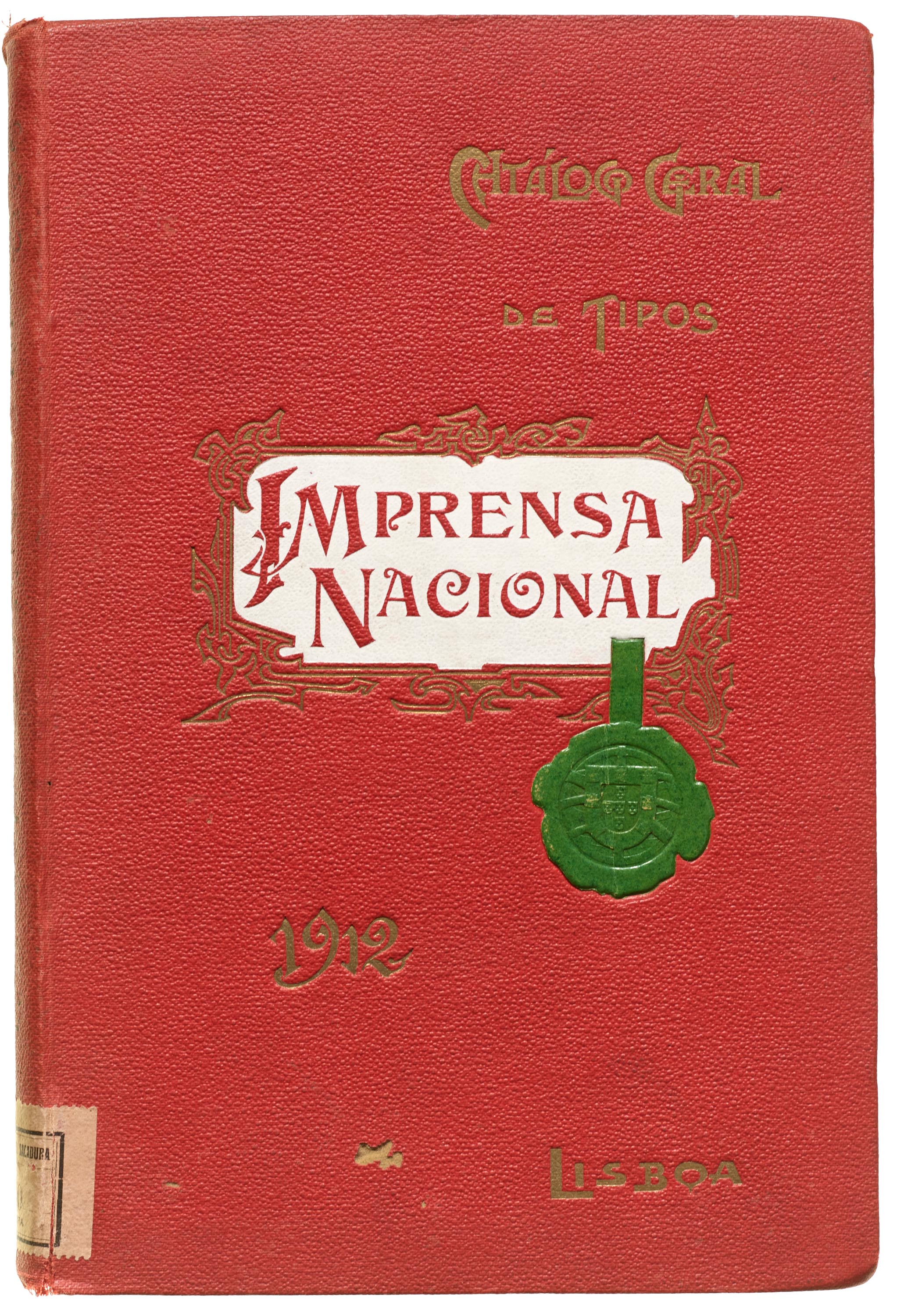
Imprensa Nacional, Lisbon, 1912
Imprensa Nacional, Lisbon, 1916
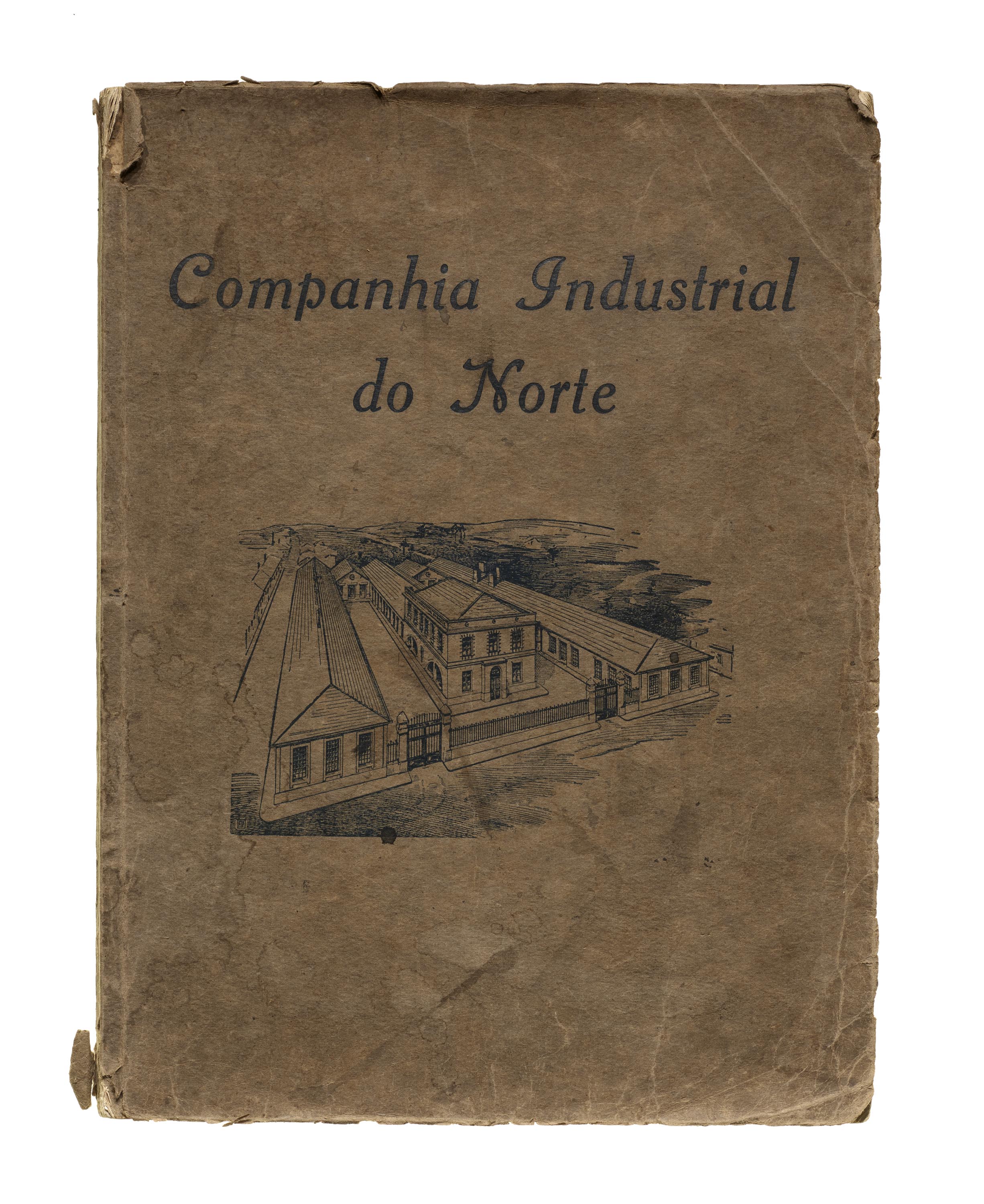
Fundição Typographica Portugueza (Companhia Industrial do Norte), Porto, ca. 1915
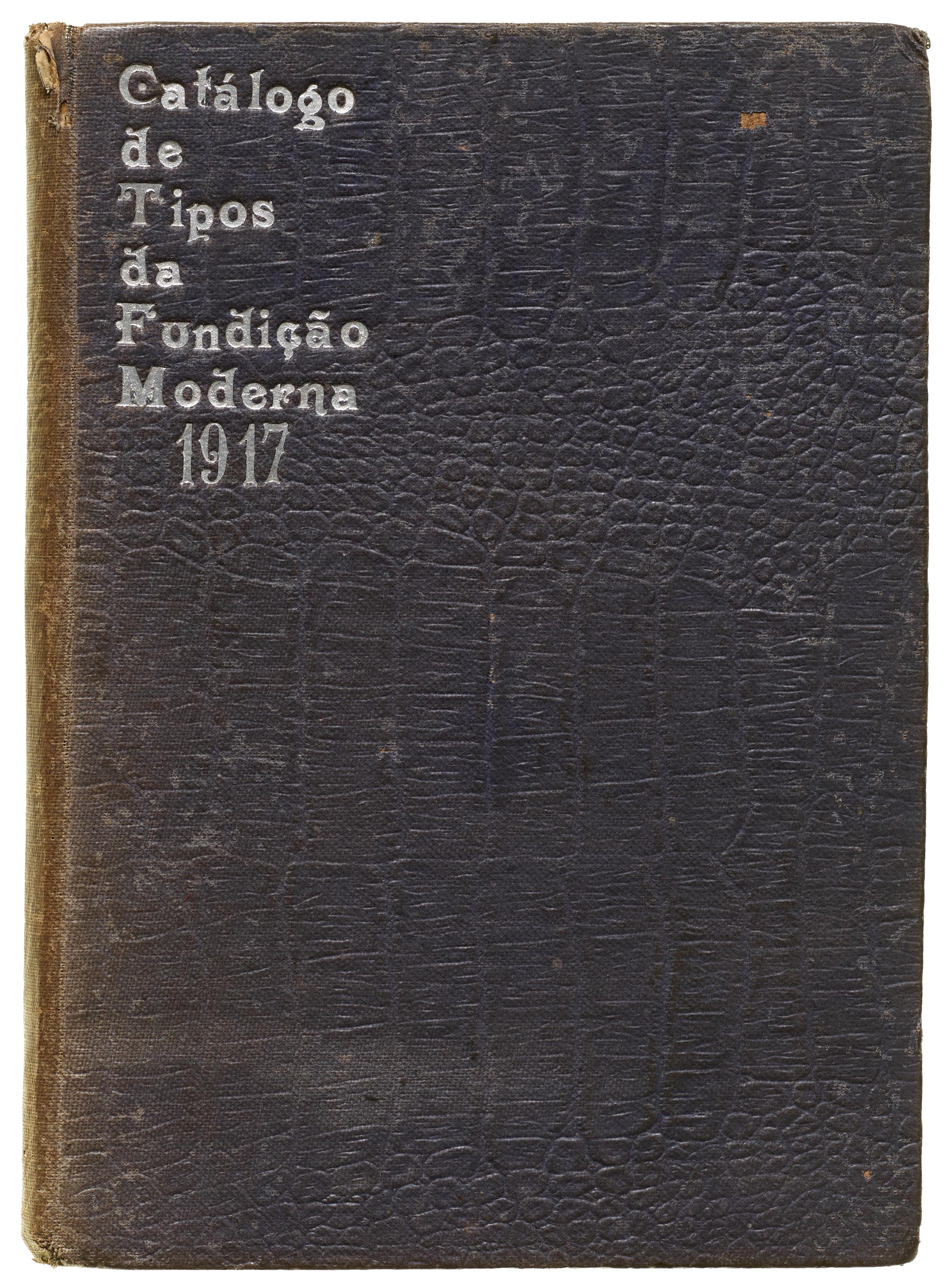
Fundição Moderna (Corvaceira & Affonso), Lisbon, 1917
The Jan Tholenaar Collection, now part of Letterform Archive, has catalogs from foundries and printers around the world, from 1500 to the second half of the 20th century. It includes several works of Portuguese type makers from the end of the 19th century to the first quarter of the 20th century. Most of the Portuguese items in the Archive come from the Tholenaar collection, and although it does not cover all existing pre-digital type foundries, it includes several foundries, such as Imprensa Nacional, Fundição Typographica Portuense, Fundição Typographica Portugueza, and Fundição Moderna.
This article is a brief tour through the history of Portuguese type foundries and their catalogs represented in the Archive’s collection. Whenever possible, I’ll offer a brief introduction to each foundry and a description of the content in their catalogs represented here. Thanks to Stephen Coles for locating the books and providing insight into the collection, and April Harper for photographing the highlights.

Imprensa Nacional (National Printing Office)
On December 24, 1768, the Impressão Régia (Royal Press) was created in Portugal. The name Imprensa Nacional (National Printing Office) was only adopted decades later. The press was installed in a palace at the center of Lisbon, which was still recovering from the Great Lisbon Earthquake of 1755. Under the new name Imprensa Nacional (National Printing Office), the press described itself as “a Printing Workshop, which can be made useful and respectable by the perfection of its features, and by the abundance and tidiness of its prints”. The press began operating in the middle of 1769 with material acquired from Manescal da Costa Printing Workshop, which was one of the best equipped at the time.
Impressão Régia incorporated the Royal Academy of History type foundry, established in 1732 and often credited as the first company to produce metal typefaces in Portugal. A Frenchman named Jean Villeneuve was hired as its director with the objective to promote the country’s graphic arts. In 1768, the foundry integrated with the Impressão Régia, and Villeneuve continued as a director. The foundry supplied typefaces to the press and other printing workshops in the kingdom as it was forbidden to import foreign typefaces for some time. The press was active until the 1980s.
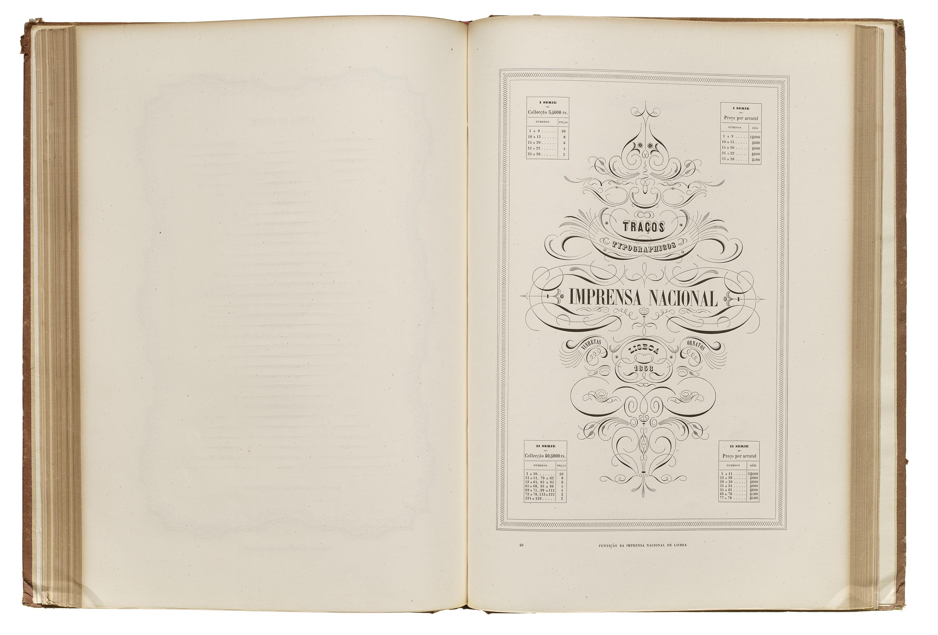
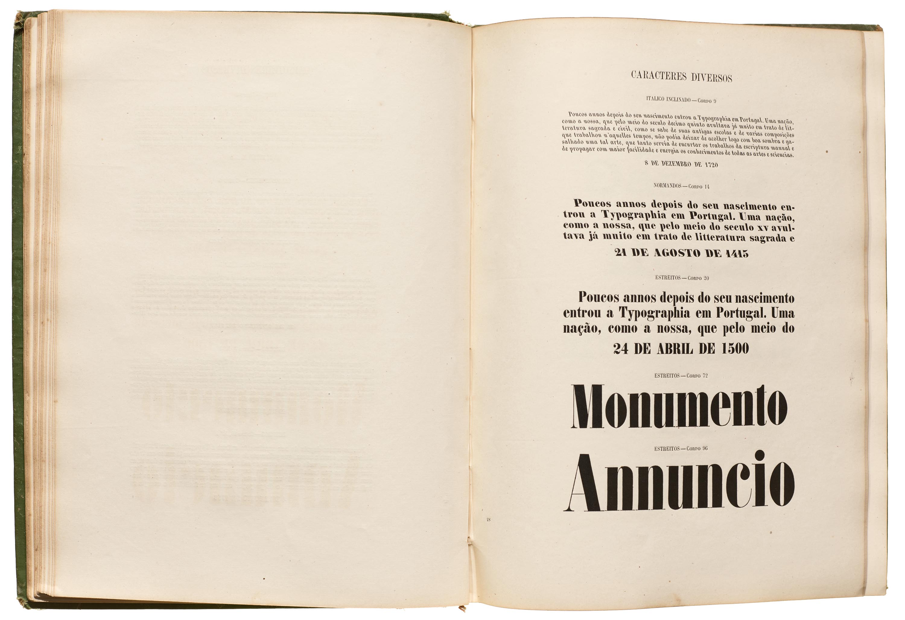
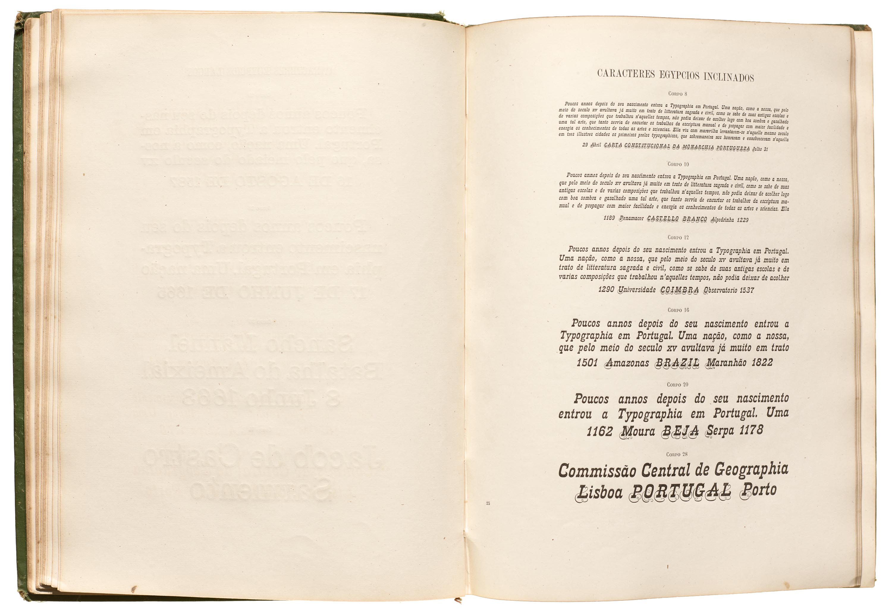
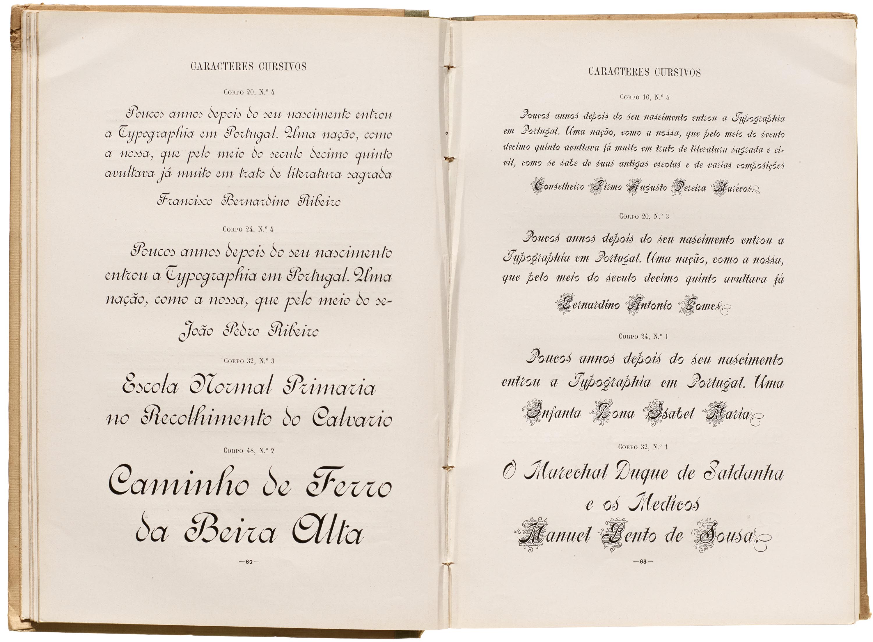
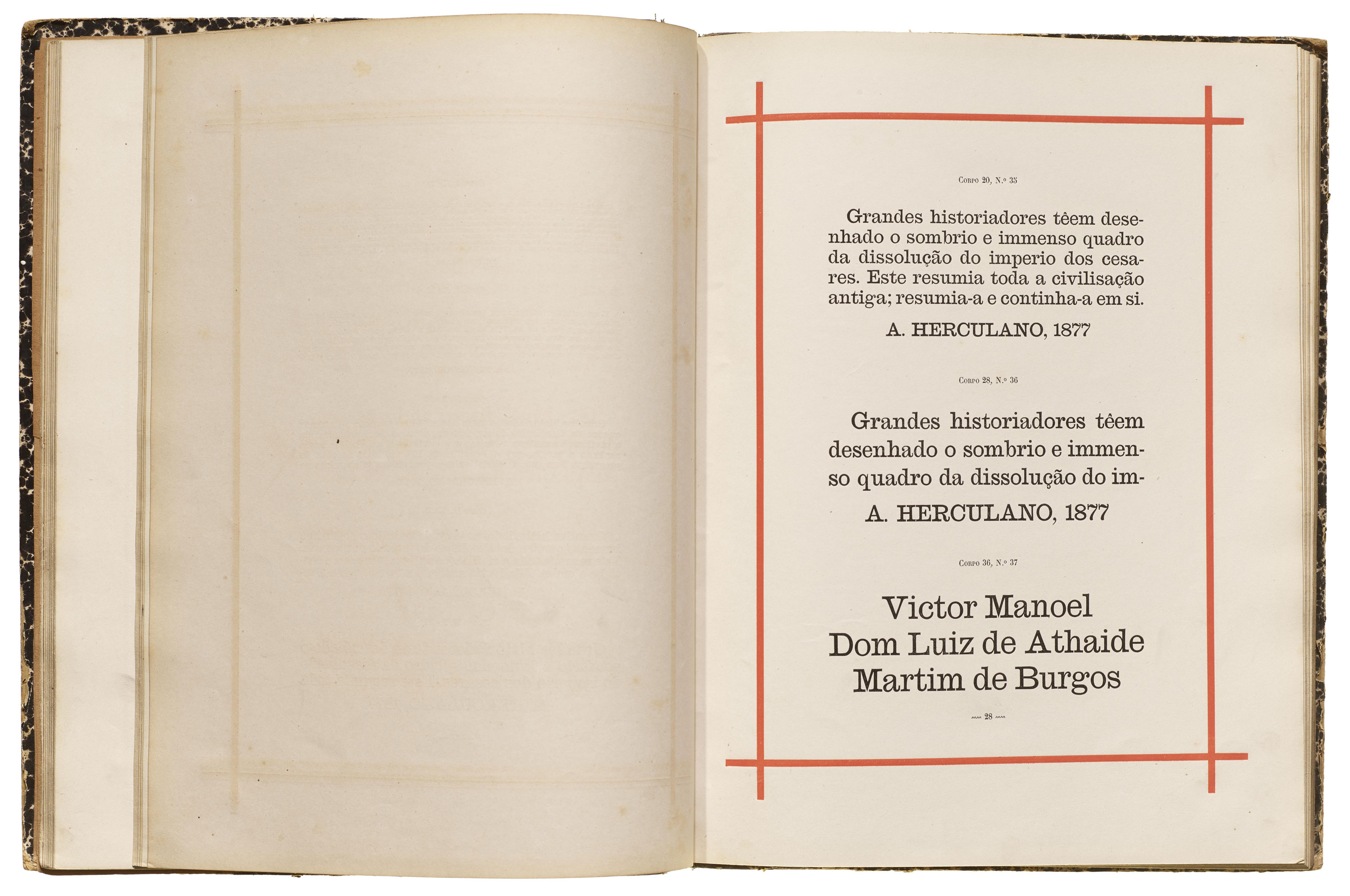
The first Imprensa Nacional type specimen was published in 1838. Twenty years later, the 1858 type specimen was published and presented as proof of the foundry’s technical and artistic skills. The specimen presents a well-defined hierarchy in three categories: text (roman and italic) typefaces, display typefaces, and typographic ornaments.

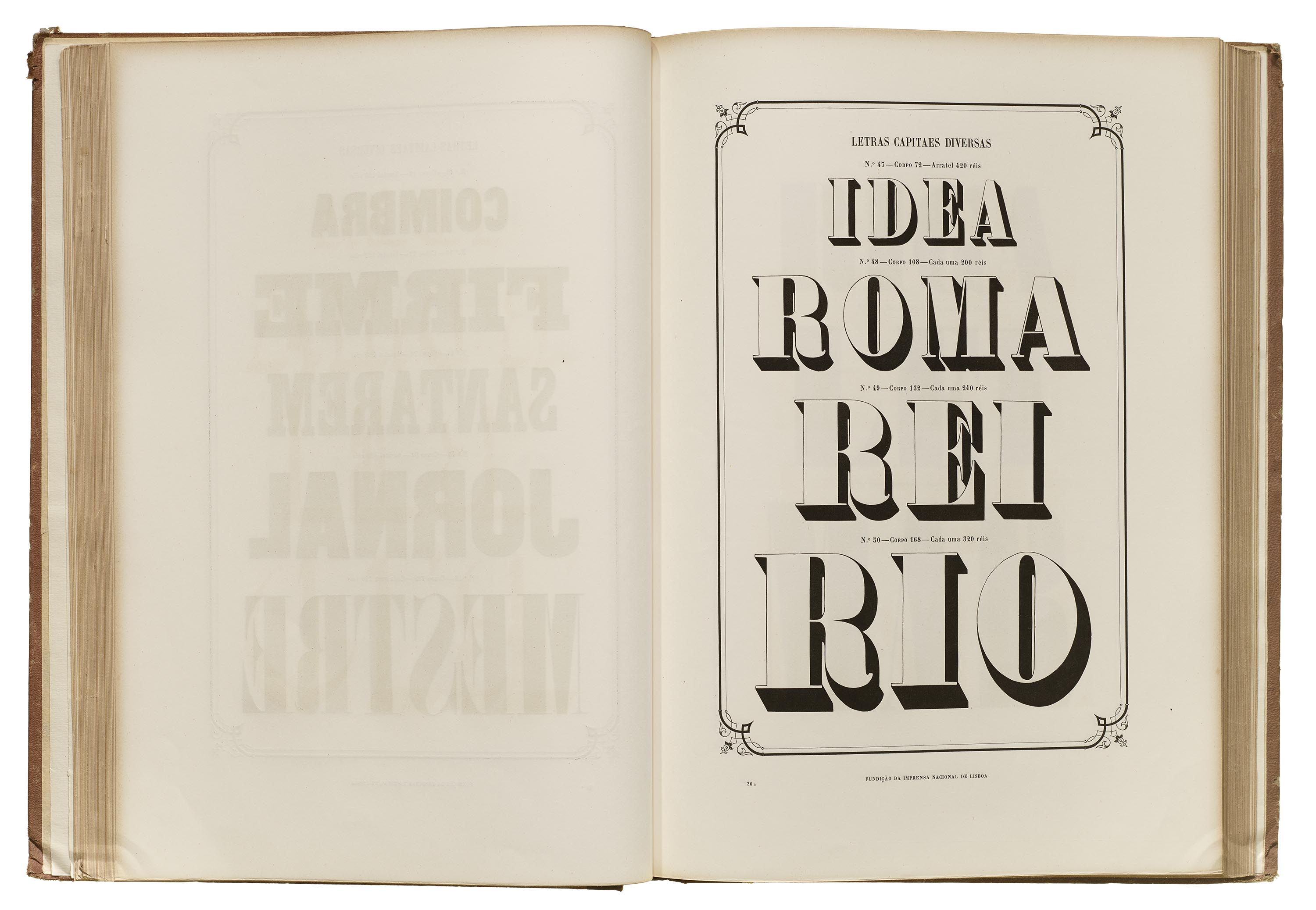
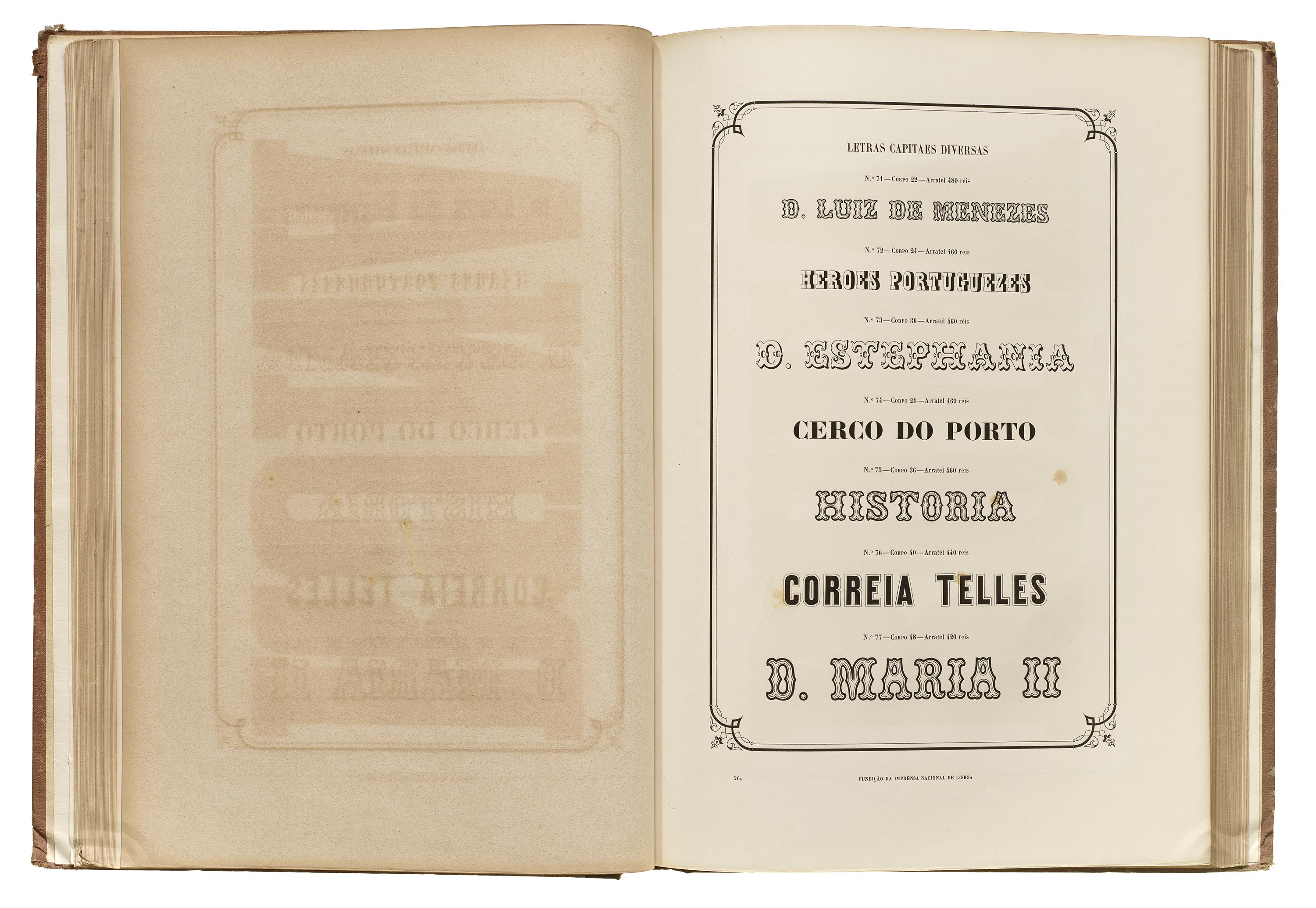


The roman and italic typefaces are composed mostly of modern serif styles. The display typefaces are divided into subcategories of various genres. The capital letters are predominant, although there are a few lowercase styles, as well as some special characters, blackletter (“German”), and other alphabets (“Oriental” and Greek).
The 1858 specimen introduces sans serif typefaces (named “Antigas” in Portuguese at the time). Their simple design and low contrast make them extremely durable, and they quickly became an appreciated style for advertising purposes. Many of the sans serifs in this specimen are also quite condensed.
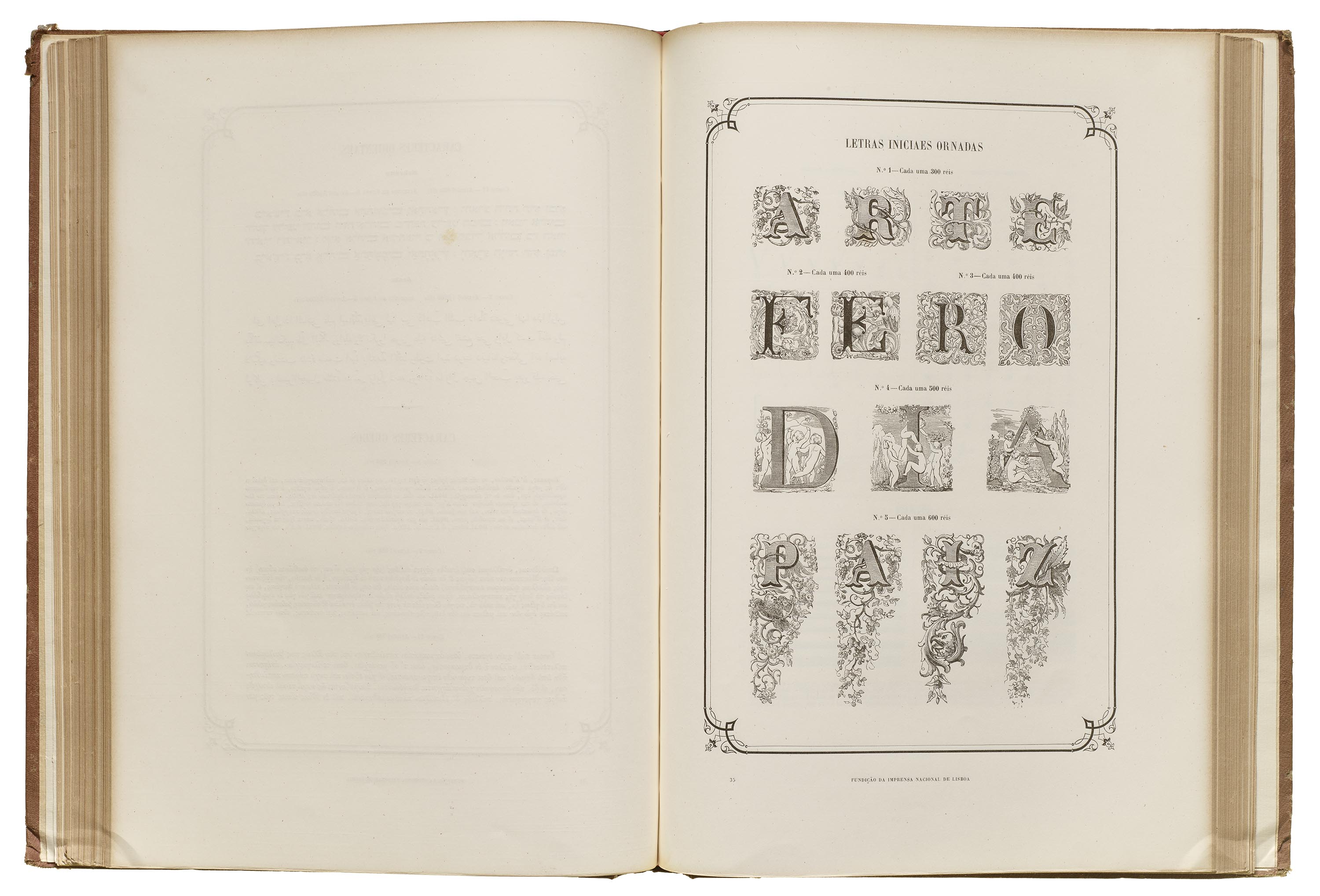
Other catalogs were published between 1858 and 1888. Each increases in size with the number of fonts available, and includes a greater variety of roman and italic typefaces, from small to big body sizes, compact to wide, in sans and serif styles. Additional scripts are supported, including Arabic, Hebrew, and Devanagari. Also included are ornate initials, excellent collections of brackets, single and varied fillets, rules, ribbons, roulettes, ornaments, vignettes, and certificates of various sizes.


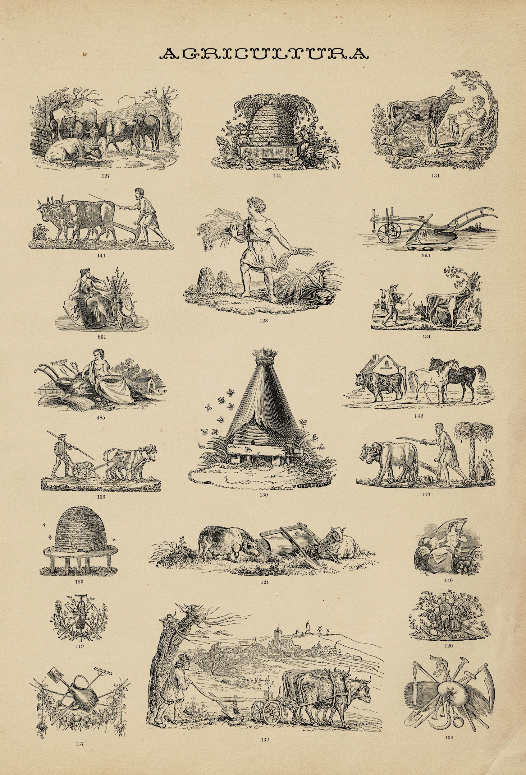
The 1895 edition is a catalog that does not present alphabetic fonts, but cuts of emblems and ornaments, as the title Emblemas e ornatos indicates. It is printed on one side only and has a total of 48 pages. The first section begins with the pricing of different badges, followed by the theme’s respective pages: Religion, Funeral, Science, Navy, Trophies, Commerce, Agriculture, Fine Arts, Typography, Arts and Crafts, Natural History, Miscellaneous, Medals, and Signs. The second section also includes a price list, in two pages, and 11 pages of ornaments with miscellaneous pieces that were very in vogue at the time.
The beginning of the 20th century brought many changes to Portugal, and the National Printing Office was not immune. There was great political discontent, and the Republican movement, having gained popular support, eventually established the Republic on October 5, 1910 — ending more than 770 years of monarchy.
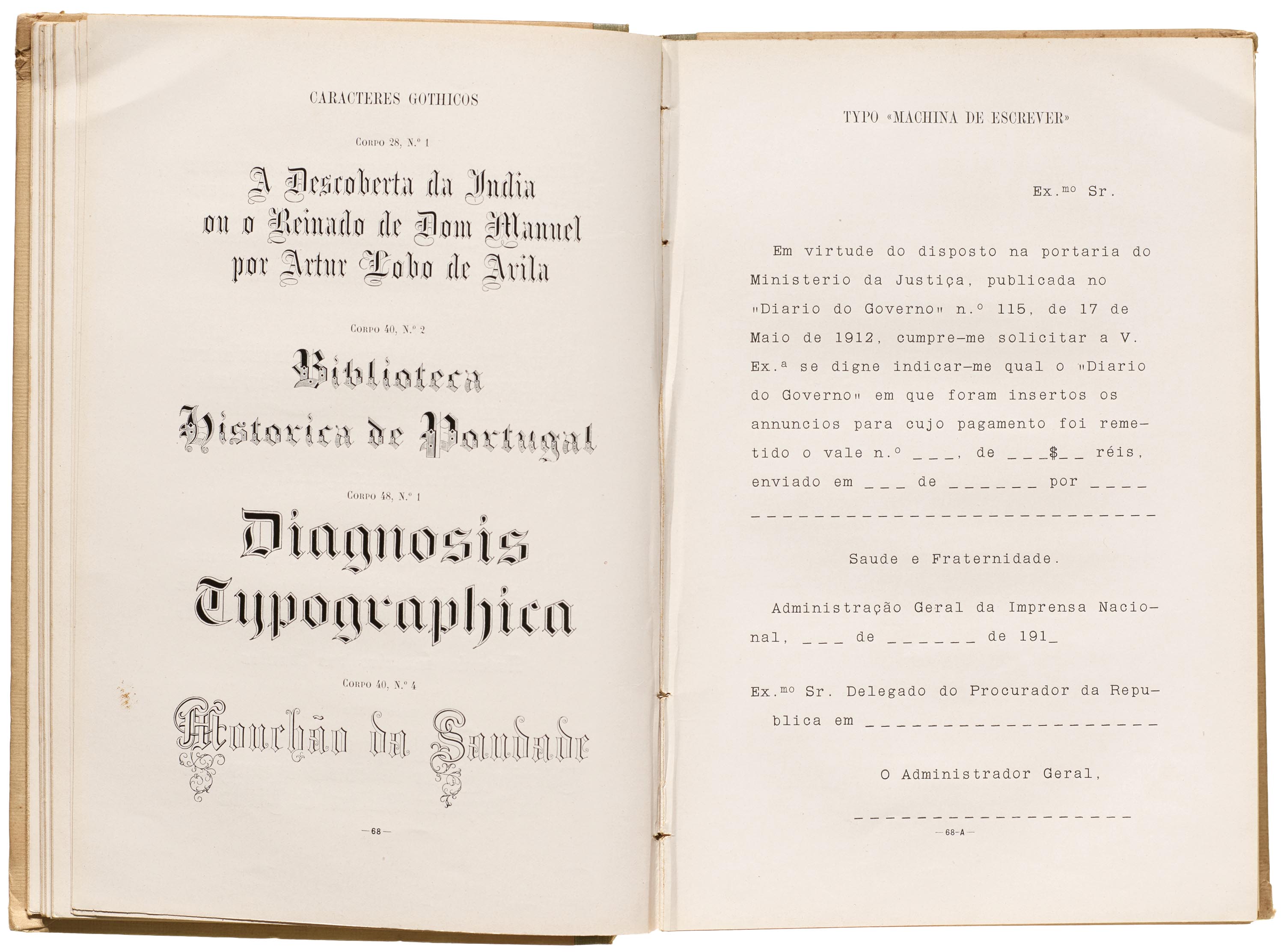
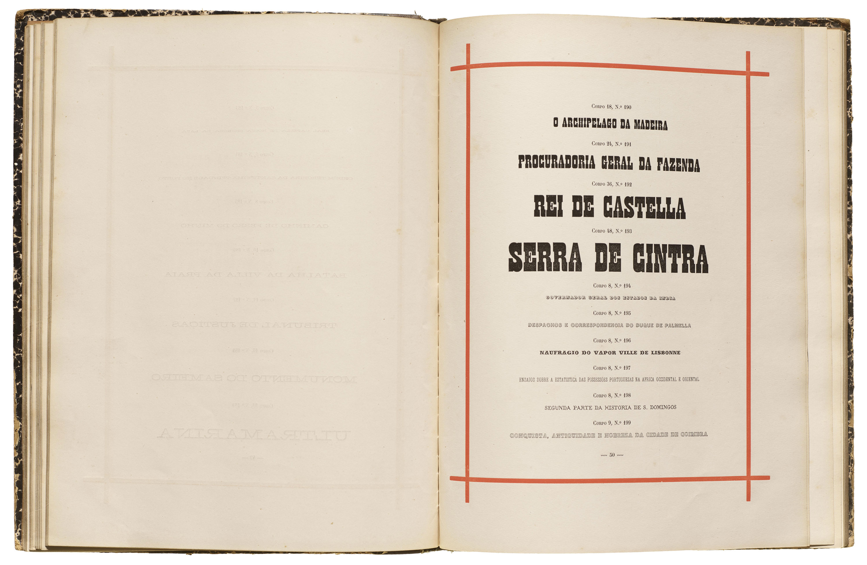
Two years later, Imprensa Nacional published a new type catalog. This 1912 publication came in either a red or green binding (now the national colors of the Republican flag), each decorated with art nouveau ornamentation. The catalog introduced new typefaces styles such as Elzevir in lowercase, more sans serifs, Egyptian slab serifs, as well as a typewriter font. Some fonts are advertised for use in the Linotype machines that were becoming very popular around the industrialized world.
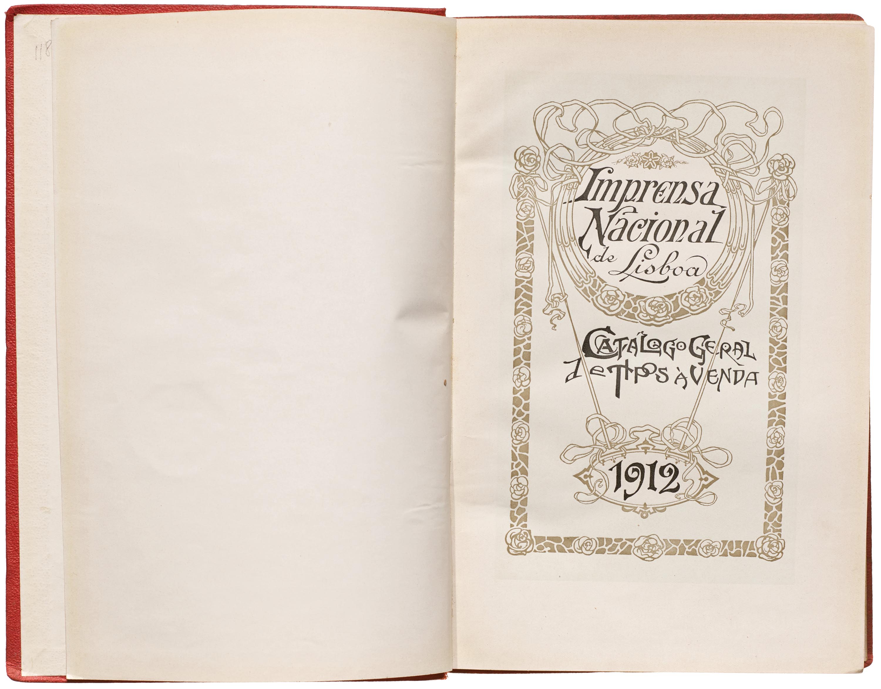

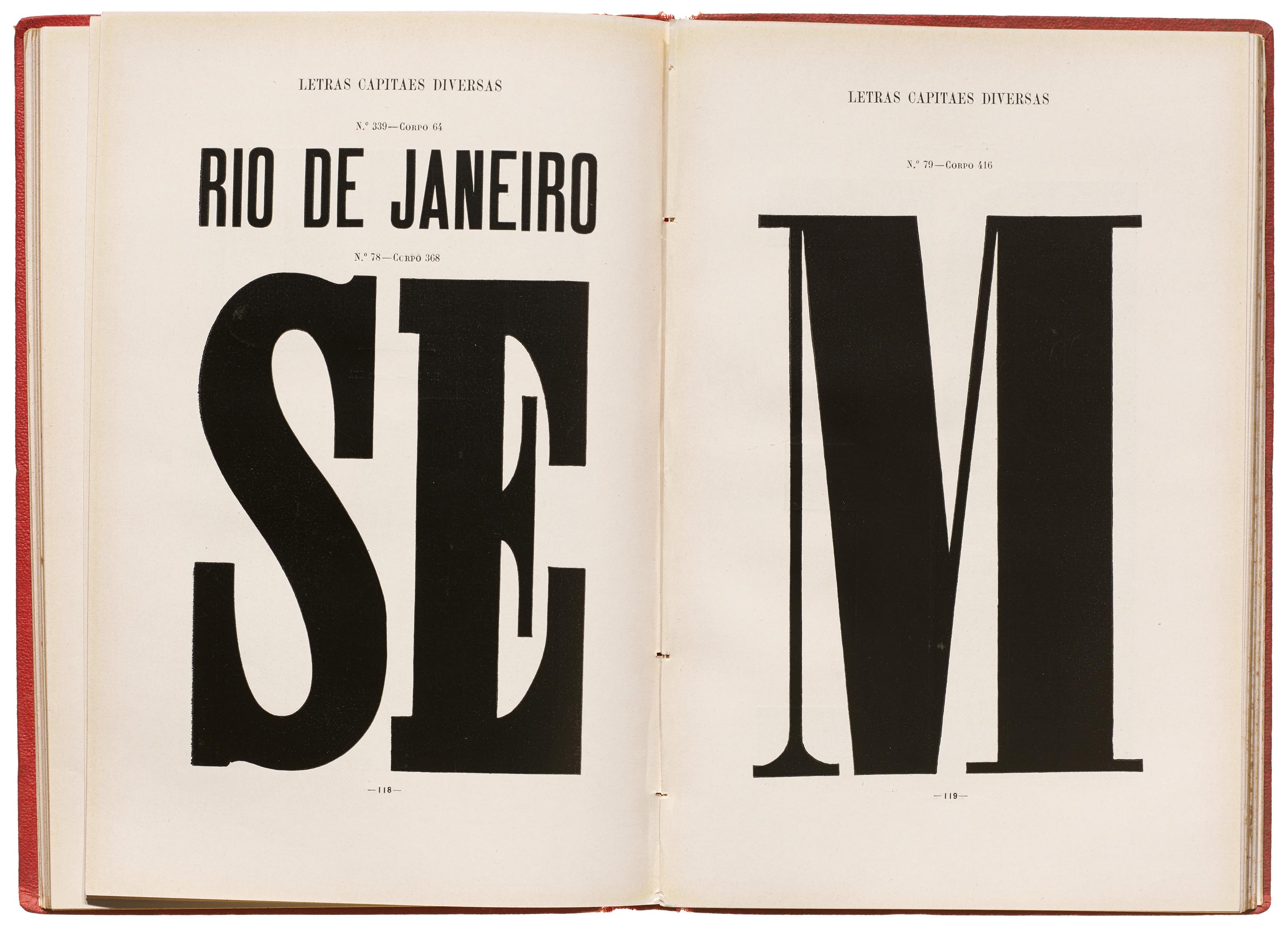
The catalog presents 116 roman and italic fonts in sizes 4–32 point; 135 display fonts in sizes 5–132 point; 53 script fonts in sizes 10–48 point; 18 gothic (sans serif) fonts in sizes 8–80 point; 18 German, Greek, Oriental, and Russian fonts; 493 miscellaneous capital and display fonts in sizes 5–440 point; 28 ornate initial letters; 120 monograms; 198 signs; 104 decorative fillets; various collections of brackets; 236 rules, ribbons and ornaments; 1,230 vignettes; 18 certificates; 71 corner elements; and 16 national emblems.
When comparing the 1888 specimen book to the 1912 catalog, there is a small increase of 22 roman and italic fonts, 41 display fonts; 73 styles of ornamental capitals, and 10 other ornamental styles. Emblems, vignettes, and ornaments increased at about the same rate.
The Archive also holds a 1916 catalog from the Imprensa Nacional. Between these two editions, at least one other was released, in 1915.
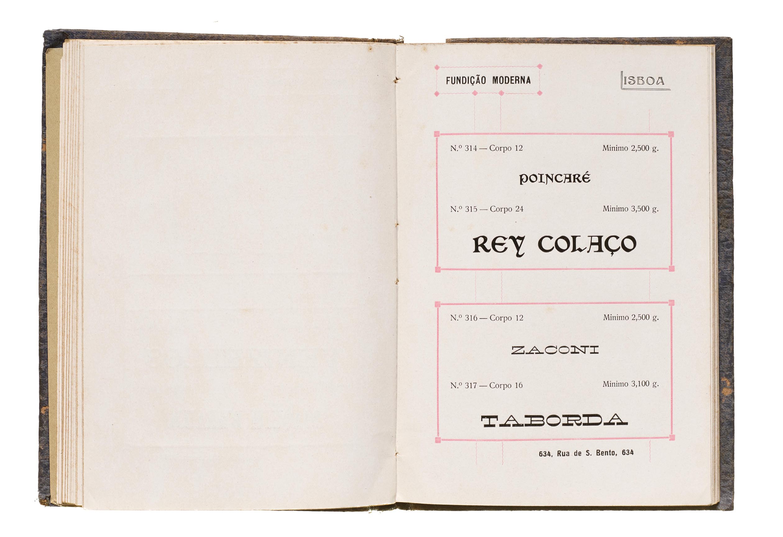
Fundição Moderna (Modern Foundry), 1917
Not much is known about Corvaceira & Affonso, also known as Fundição Moderna. Albino Cardoso Corvaceira returned to Portugal from abroad at the turn of the 19th century, and invested in a small foundry in Lisbon, expanding his work. Some years later Corvaceira joined António Joaquim Affonso to establish Corvaceira & Affonso.
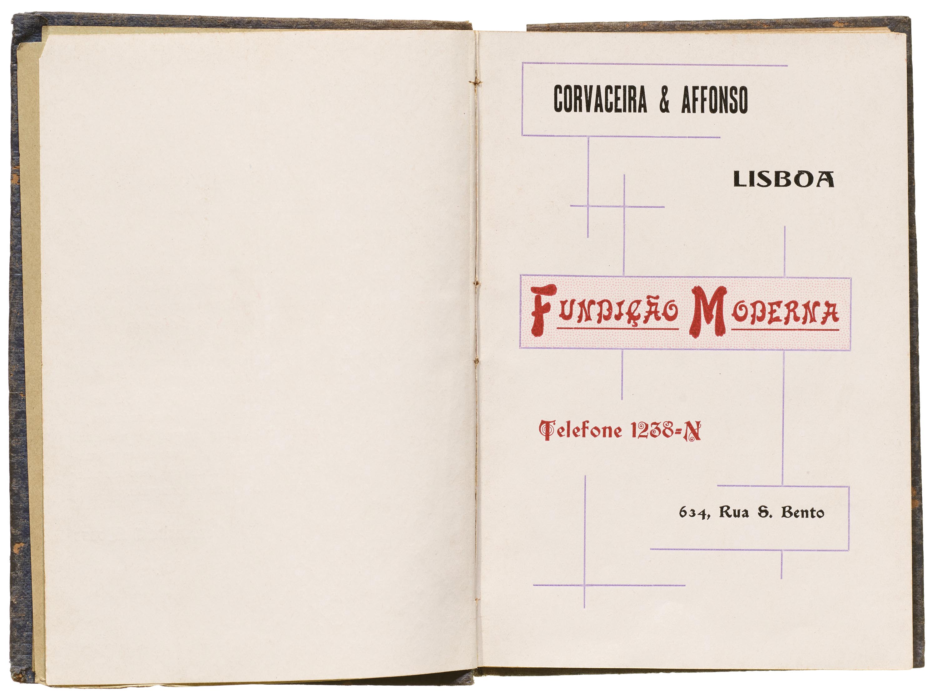
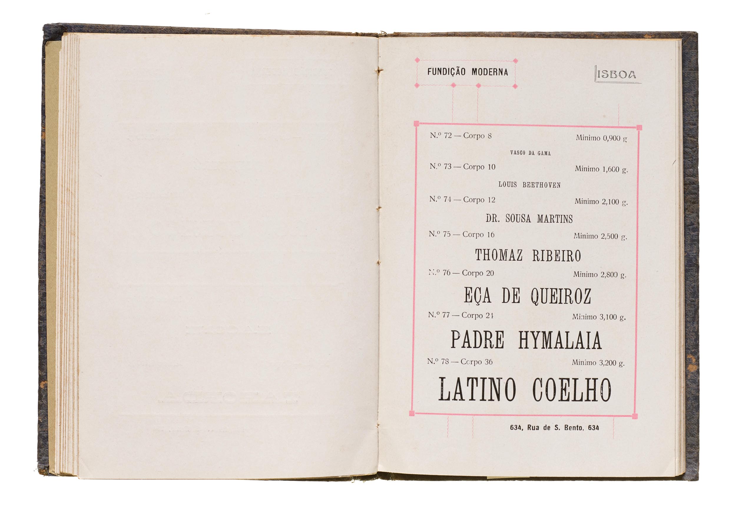
While it is unknown how long Modern Foundry operated, they published at least two different catalogs. The 1917 catalog is the most well-known, with several copies having survived today. Approximately 12 x 17 cm, it consists of about 98 pages printed on one side and features more than 170 fonts. The first section, composed of roman typefaces, has 14 pages, followed by 56 pages of display type, 13 pages of vignettes, and six pages of emblems.


Fundição Typographica Portuense (Portuense Typographic Foundry)
Fundição Typographica Portuense was founded in 1874, during a time of great industrial development in Portugal that occurred mainly in the north of the country, in the city of Porto.
Portuense’s 1878 catalog is probably the first catalog that the foundry published. The large, hardcover catalog consists of 258 pages printed on one side. The first four chapters are dedicated to typefaces, and the remaining feature ornamental material with a variety of image cuts, such as animals, professions, coats of arms, historical figures, some allusions to monarchic Portugal, etc. The book is divided into nine sections: Roman and Italic, Fantasy, Gothic, Cursive, Simple and Combination Vignettes, Embellishment Rules and Brackets, Ornaments, Emblems and Coats of Arms, and Exhibition Medals.
The Roman and Italic section presents 15 pages of type with 29 serif fonts types and their respective italics in sizes 5–20 point. The Fantasy (display) section is over 38 pages, with 255 font styles in sizes 5–96 point. The Gothic typefaces section consists of two pages with seven sans serif font variations in 12–28 point. There is just one page in the Cursive section with two fonts in 16 and 24 point. Simple and Combination Vignettes are presented in 12 pages, with 116 vignettes of different styles and sizes, and sizes 5–60 point. The Embellishment Rules and Brackets section features 124 lines of different styles and sizes. The Ornaments section includes ornaments, the four playing card suits in two colors, small capitals, and fraction figures.
The Emblems and Coats of Arms section incudes 27 pages with scores of cuts featuring animals, professions, musical instruments, religious motifs, and icons of the Portugal monarchy. The Exhibition Medals section includes engravings of medals (one- or two-sided) from several World’s Fairs, such as Oporto 1865; Paris 1855, 1867, and 1878; London 1862; Vienna 1873; and Philadelphia 1876.

After the dissolution and closure of Fundição Typographica Portuense in 1909, Américo Augusto Vieira de Castro bought all the furniture, machines, tools, and other inventory that belonged to the foundry. In 1910, Viera de Castro, along with another partner, founded a new foundry in the same facilities named Fundição Typographica Portugueza (Portuguese Typographic Foundry).
Fundição Typographica Portugueza (Portuguese Typographic Foundry)
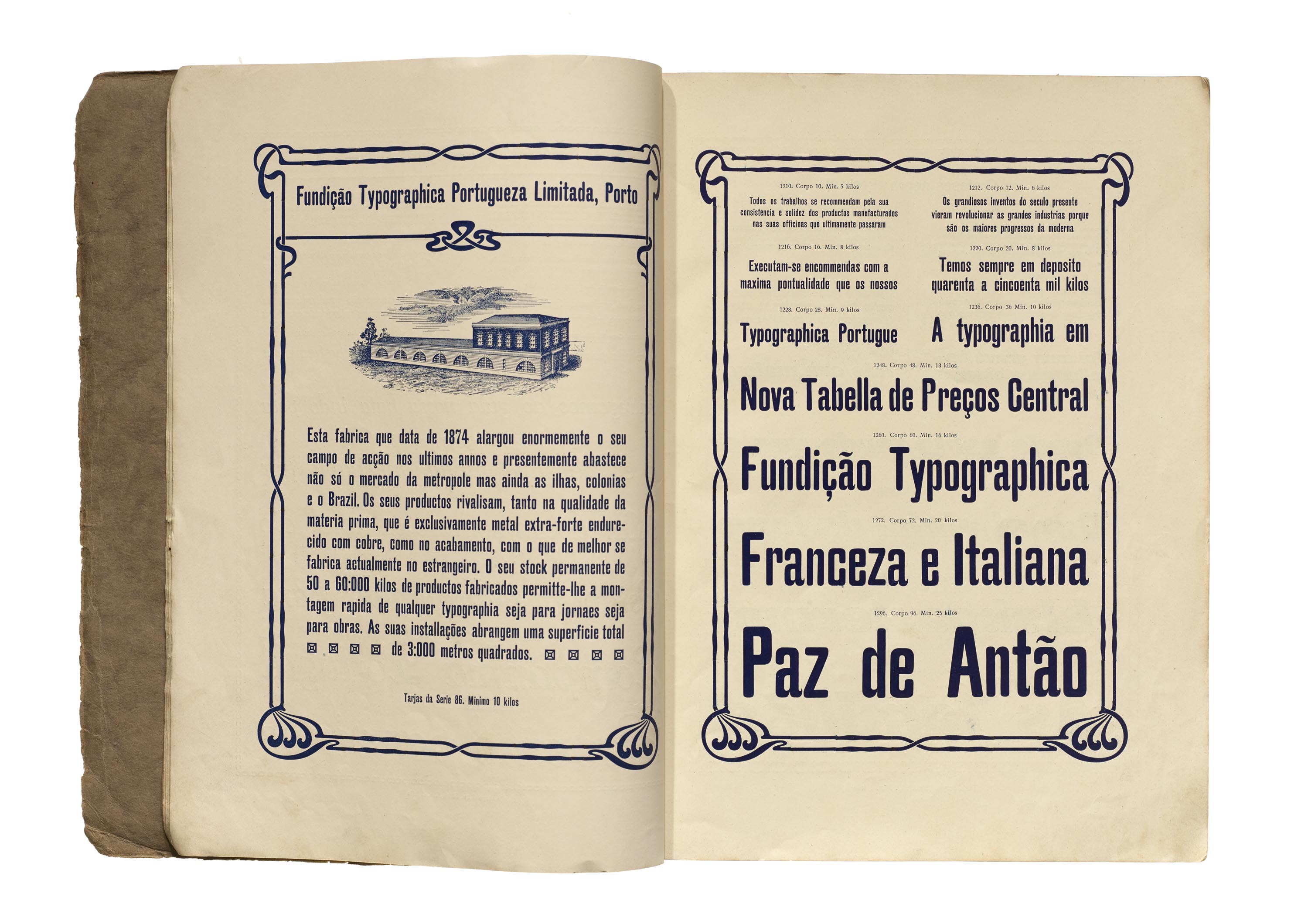
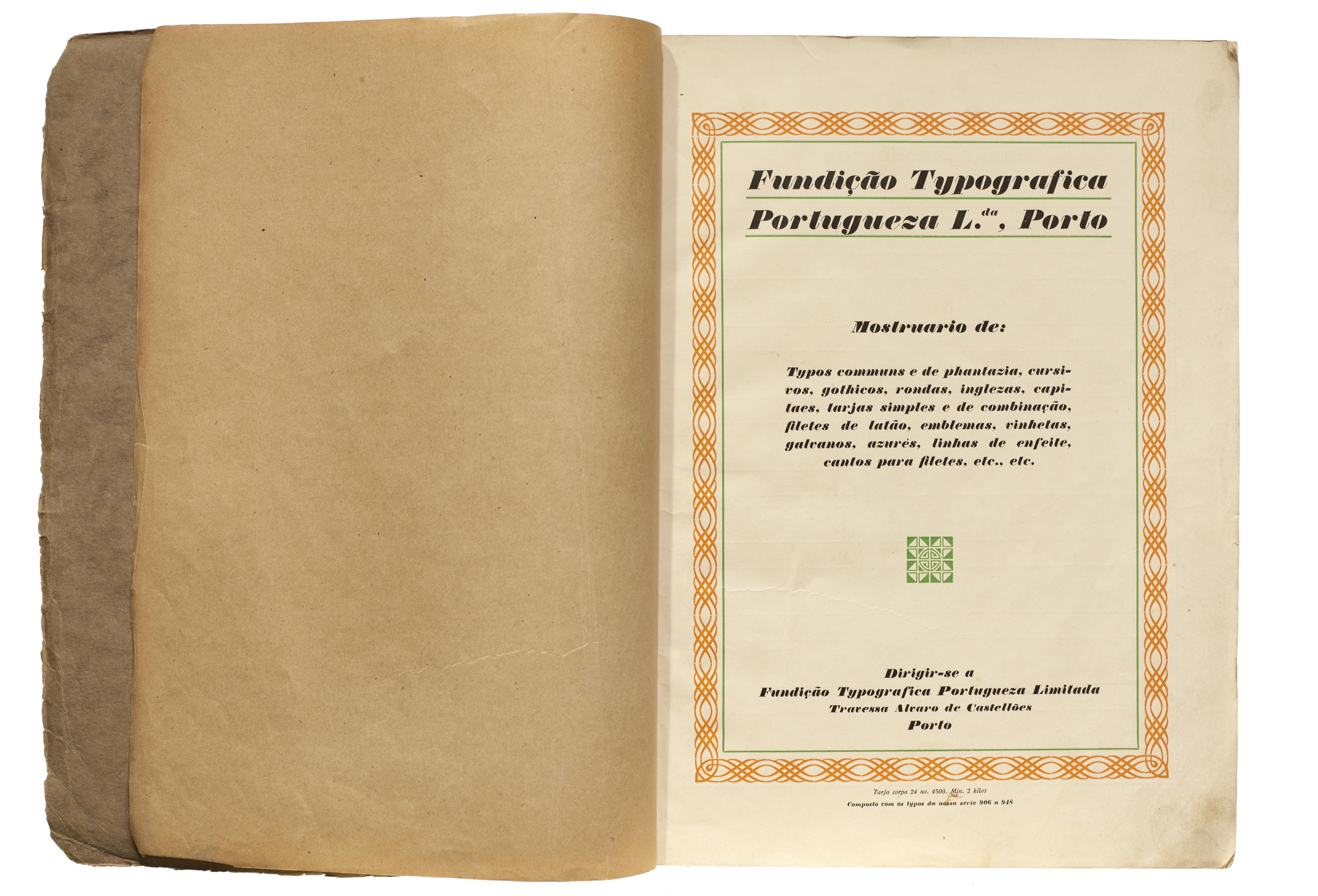
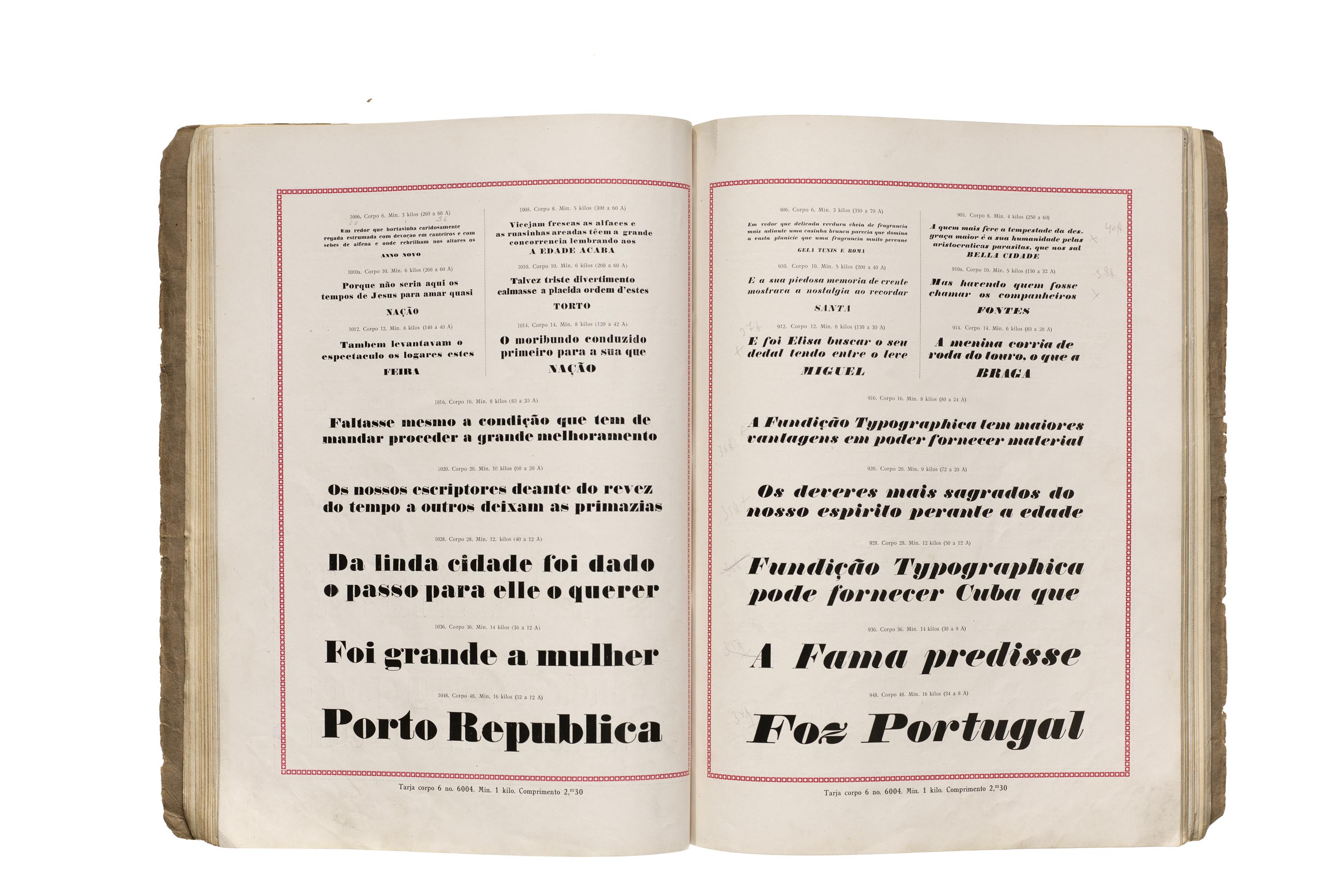
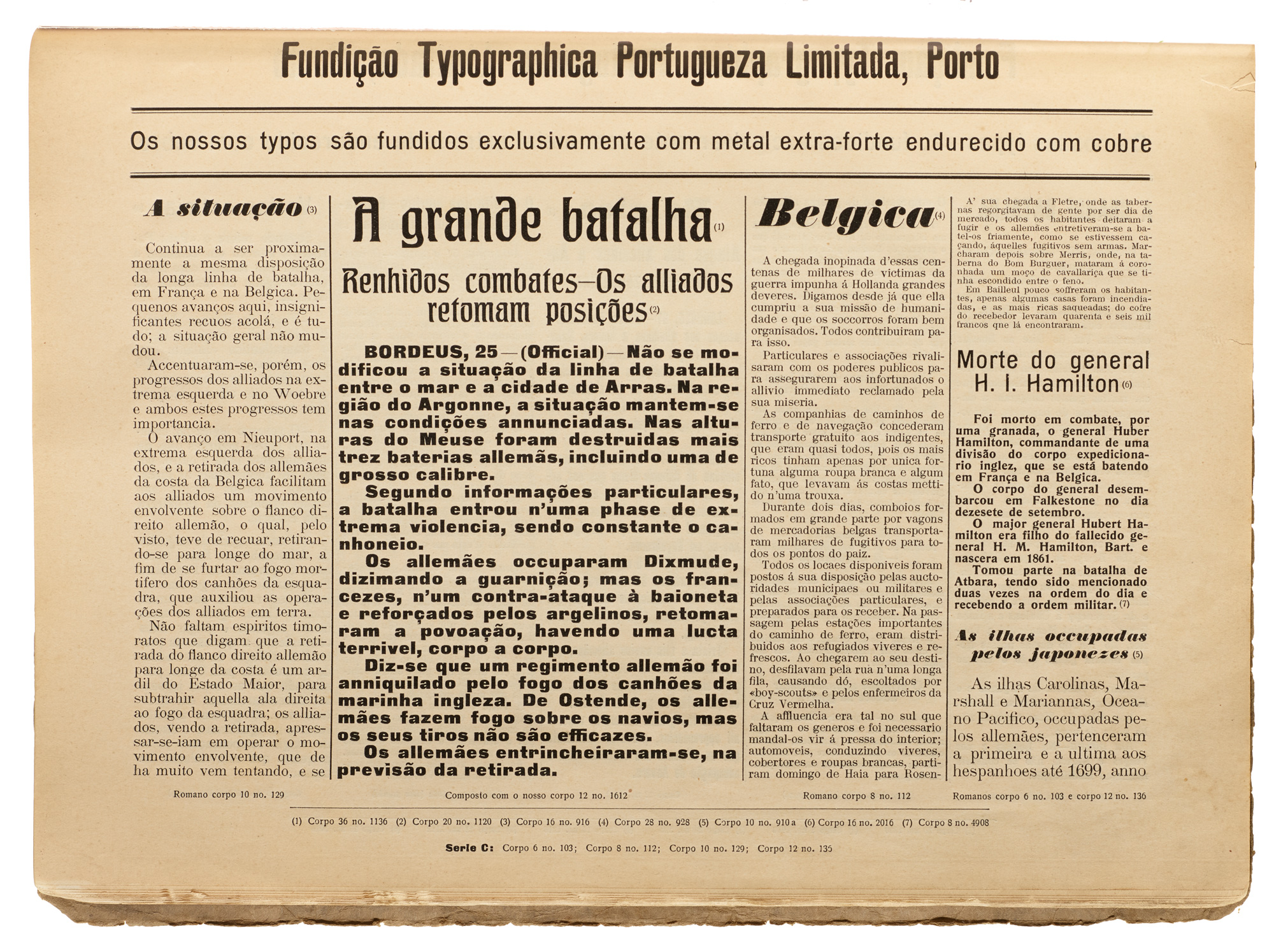
Fundição Typographica Portugueza’s catalog found in the Tholenaar collection is entitled Companhia industrial do Norte. This name corresponds to the company that owned the foundry, in addition to other businesses. The volume consists of about 183 pages, printed on both sides.
The catalog does not show the year of publication, and there seems to be no clear categorization of contents. In fact, from a detailed analysis, we find several repeated pages (with different edges), which indicates that the volume is probably a cluster of bound pages with more than one catalog. Even so, it appears to be an effort to compile the foundry’s offerings into a cohesive package.
Some pages function as advertising for the company, while also displaying typefaces. These texts offer some clues about the foundry’s dynamism, including the fact that they were exporting abroad to countries like Brazil and Spain.


In addition to these foundry catalogs, the Archive holds type specimens published by independent presses, which were usually used by these companies to let customers know what was available for printing. The collection includes books from Imprensa Portugueza (1908), Papelaria e tipografia Joaquim Alves D’Assis, and Tipografia Universal (1913).
António Fonseca is a Portuguese graphic designer with more than 20 years of experience. After an initial degree in communication, he received his master’s degree from the University of Porto where he wrote his dissertation about a typeface designed by Ladislas Mandel. He has a keen interest in Portuguese typeface history and has been researching and publishing other studies about pre-digital Portuguese type foundries and specimens.
References
- Canaveira, R. (2002). Dicionário de tipógrafos e litógrafos famosos. Portugal: Página Gráfica.
- Canhão, M. (1941). Os caracteres da imprensa e a sua evolução histórica, artistica e ecónomica em Portugal. Lisboa: Gremio Nacional dos Industriais de Tipografía Fotogravura.
- Diogo, Manuel (2016). A tipografia de caracteres móveis no contexto da produção editorial contemporânea (master’s thesis, Universidade de Lisboa).
- Gini, P. (1929). História da “Funtipo”. Lisboa: Funtipo.
- Imprensa Nacional de Lisboa. (1888). Provas da fundição de typos da Imprensa Nacional. Lisboa.
- Malaquias, M. (2007). Livros técnicos sobre Tipografia publicados em Portugal. In Cadernos de Tipografia (Ed. 1, pp. 10–14).
- Queiroz, M. I., José, I., & Ferreira, D. (2019). Indústria, arte e letras: 250 anos da Imprensa Nacional.
- Ribeiro, J. V. (1912). A Imprensa Nacional de Lisboa: Subsídios para a sua história, 1768–1912. Lisbon: Impr. Nacional.
- Rodrigues, Sofia Leal (2012). Desenho, Tipografia e Publicidade: O Caso do Modernismo Português (PhD thesis, Universidade de Lisboa).
- Rodrigues, Sofia Leal (2013). Os primeiros espécimes tipográficos da Imprensa Nacional, 1838–1888. In: Arte teoria. - Lisboa, 2000-. - Nº 16-17 (2013/14), p. 51-62. ISSN 1646-396X.