News
This Just In: Quiet Type by Zai Divecha
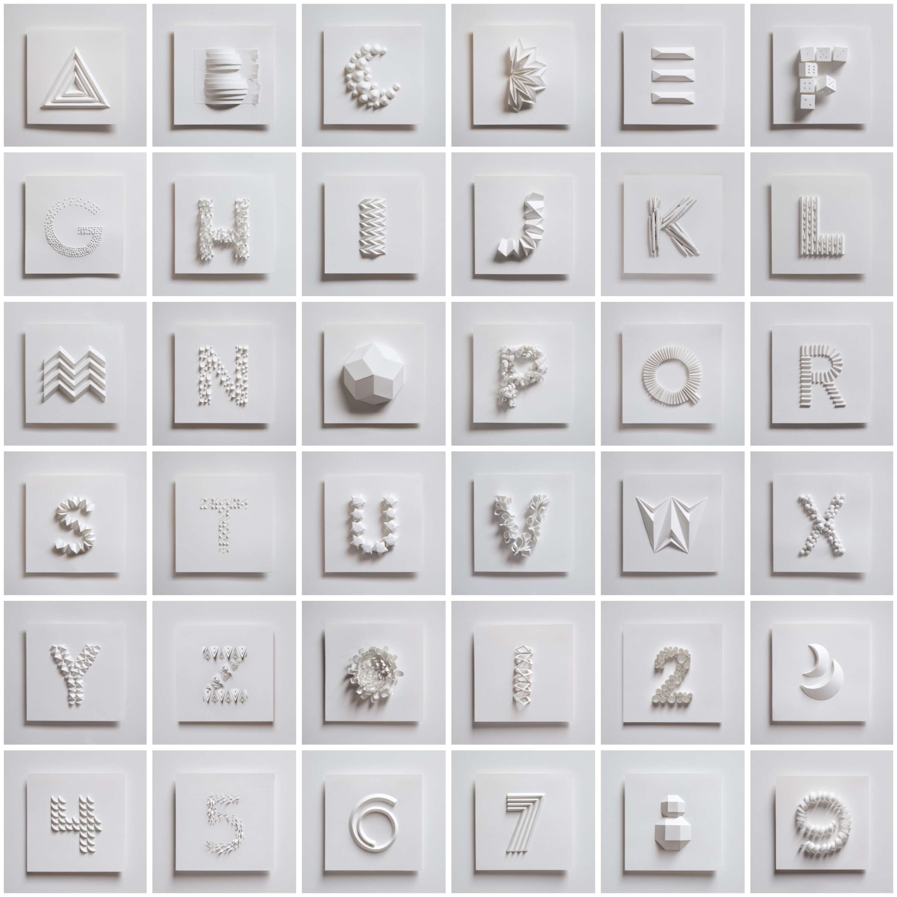
A remarkable sculptural installation of 26 letters and 10 numbers will grace the walls of our new home.
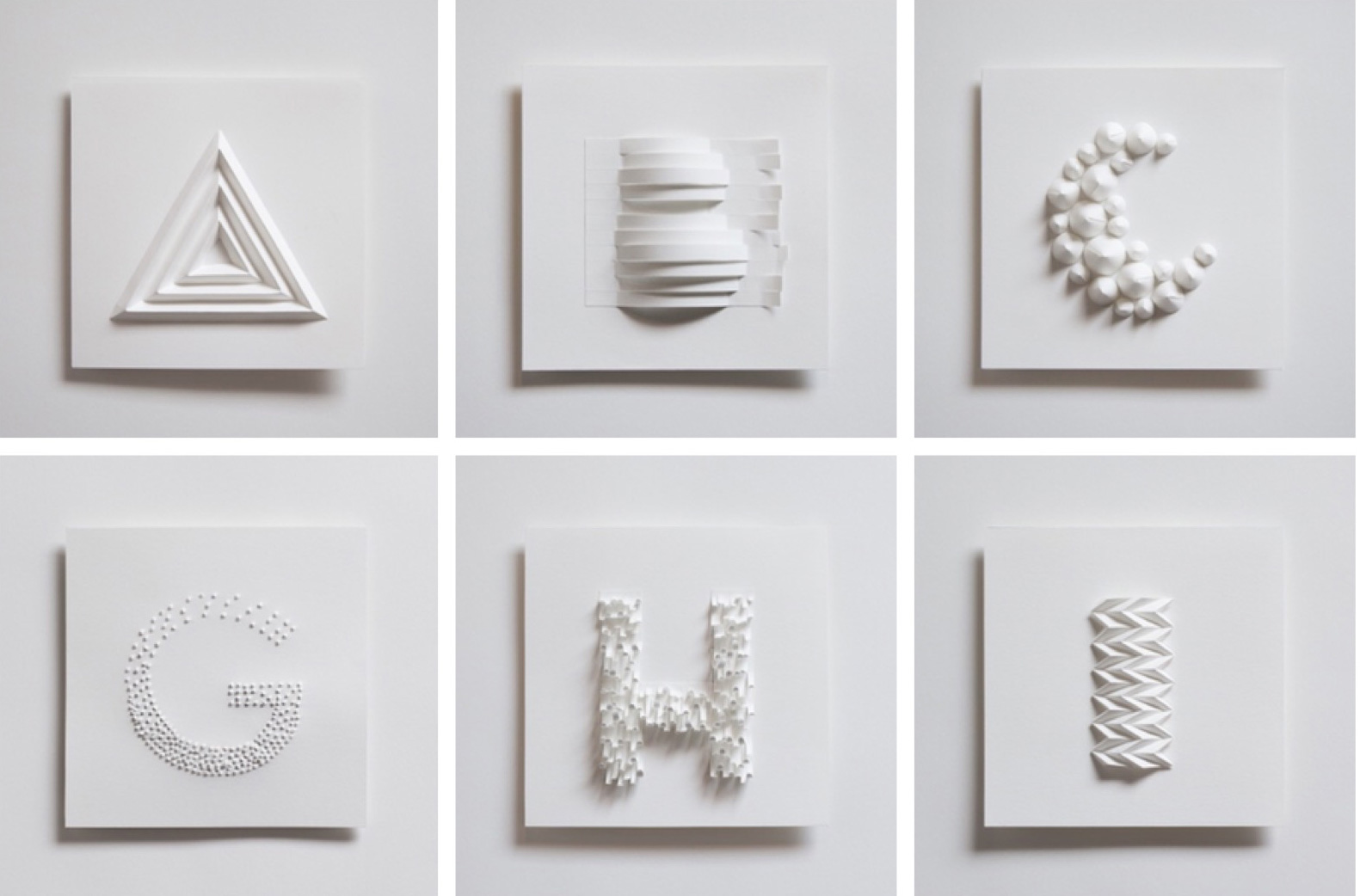
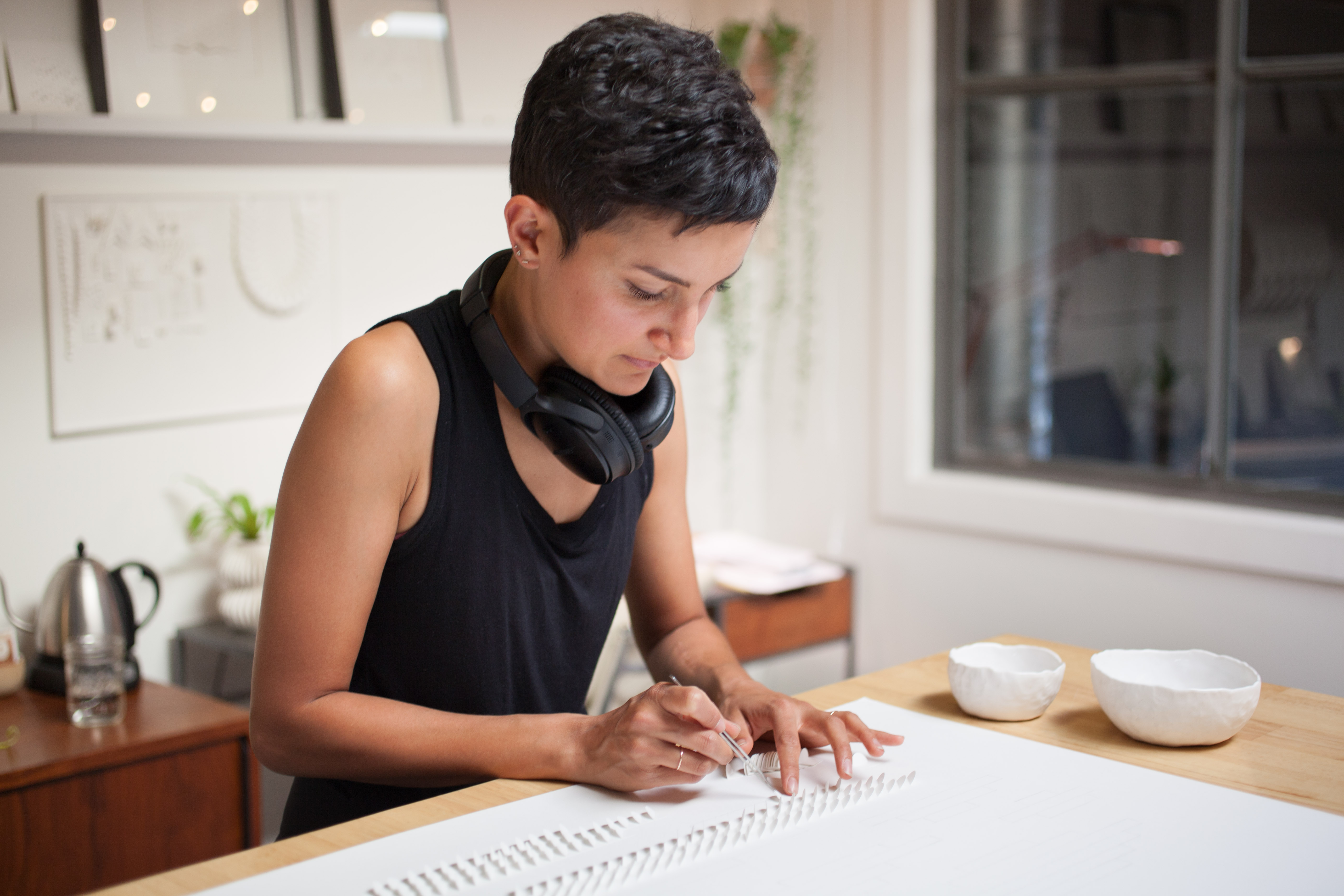
In 2019, San Francisco paper artist Zai Divecha (she/her) created 36 letters and numbers for the 36 Days of Type challenge. Letterform Archive is proud to announce our acquisition of Quiet Type, which will be on permanent display in our new location. Collections Programming Manager sair goetz interviewed Zai.
What drew you to participate in 36 Days of Type? Can you talk a little bit about your relationship to typography?
I’ve always had a casual interest in typography, but I’m not that well-versed in the field. I took one letterpress class when I was an undergrad at Yale, and absolutely loved it. But I’ve never properly studied typography, letterforms, or graphic design.
My friend Simona Bunardzhieva, who’s a graphic artist and illustrator, participated in the 36 Days of Type the year prior, and I followed her participation via Instagram. It seemed like a fun, fast-paced challenge, and I was drawn to the rigor of it.
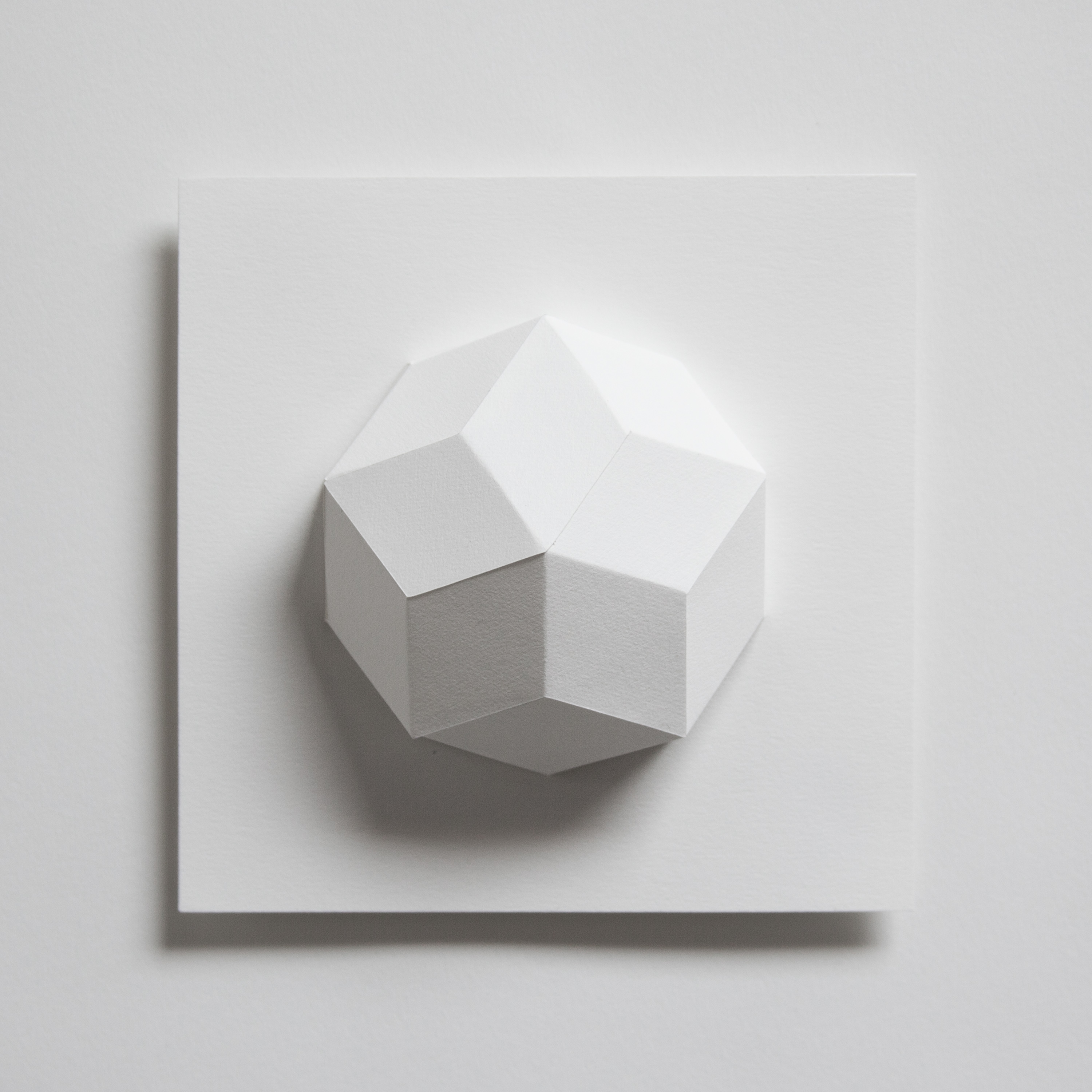
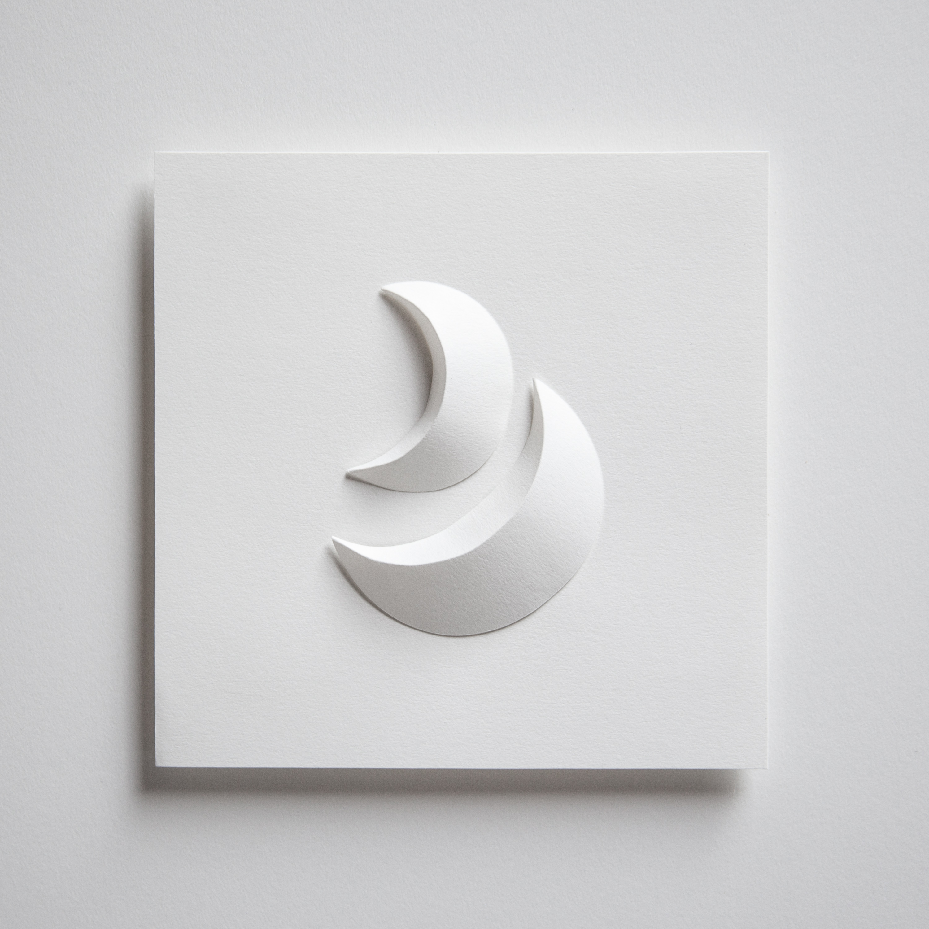
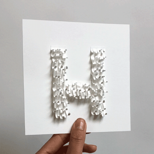
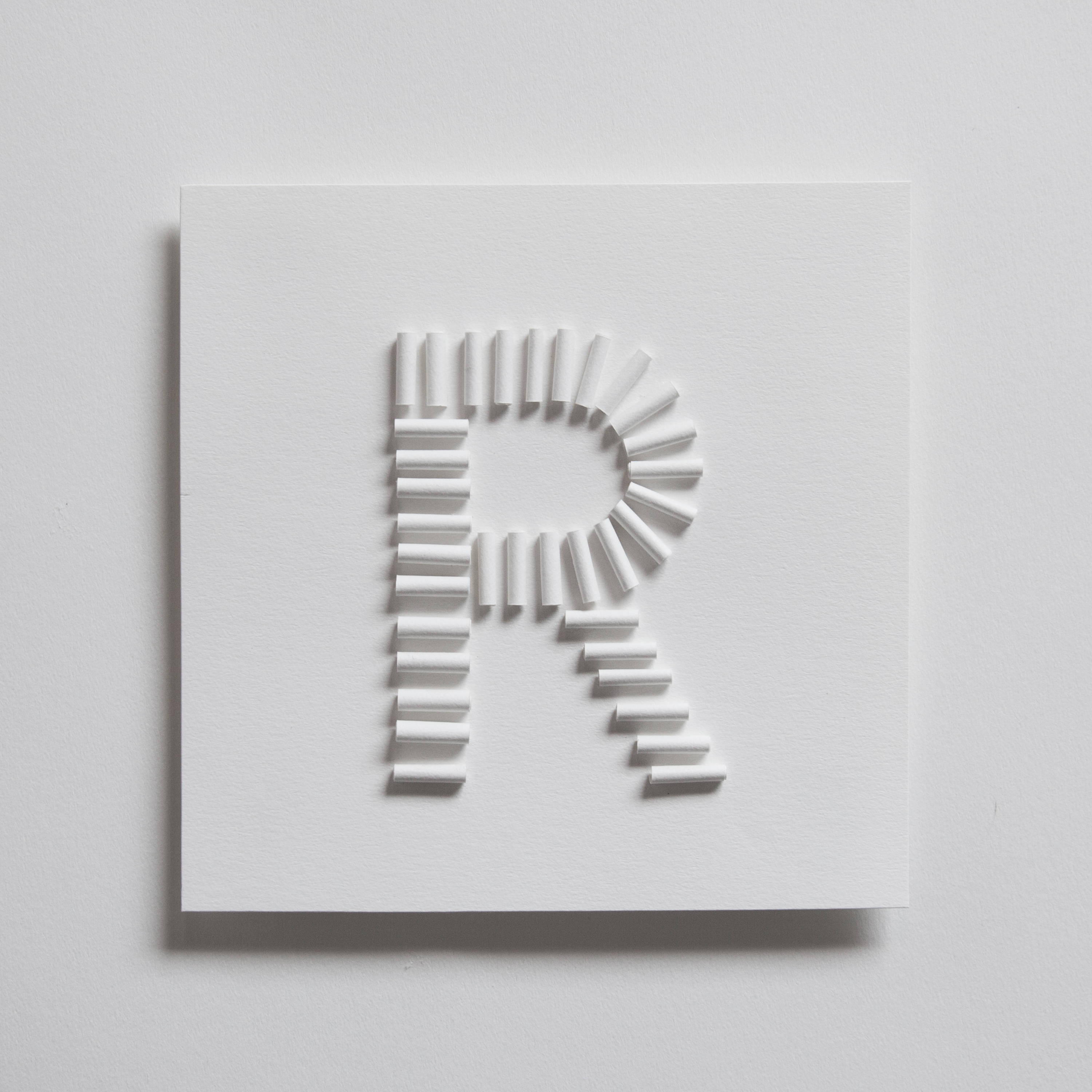
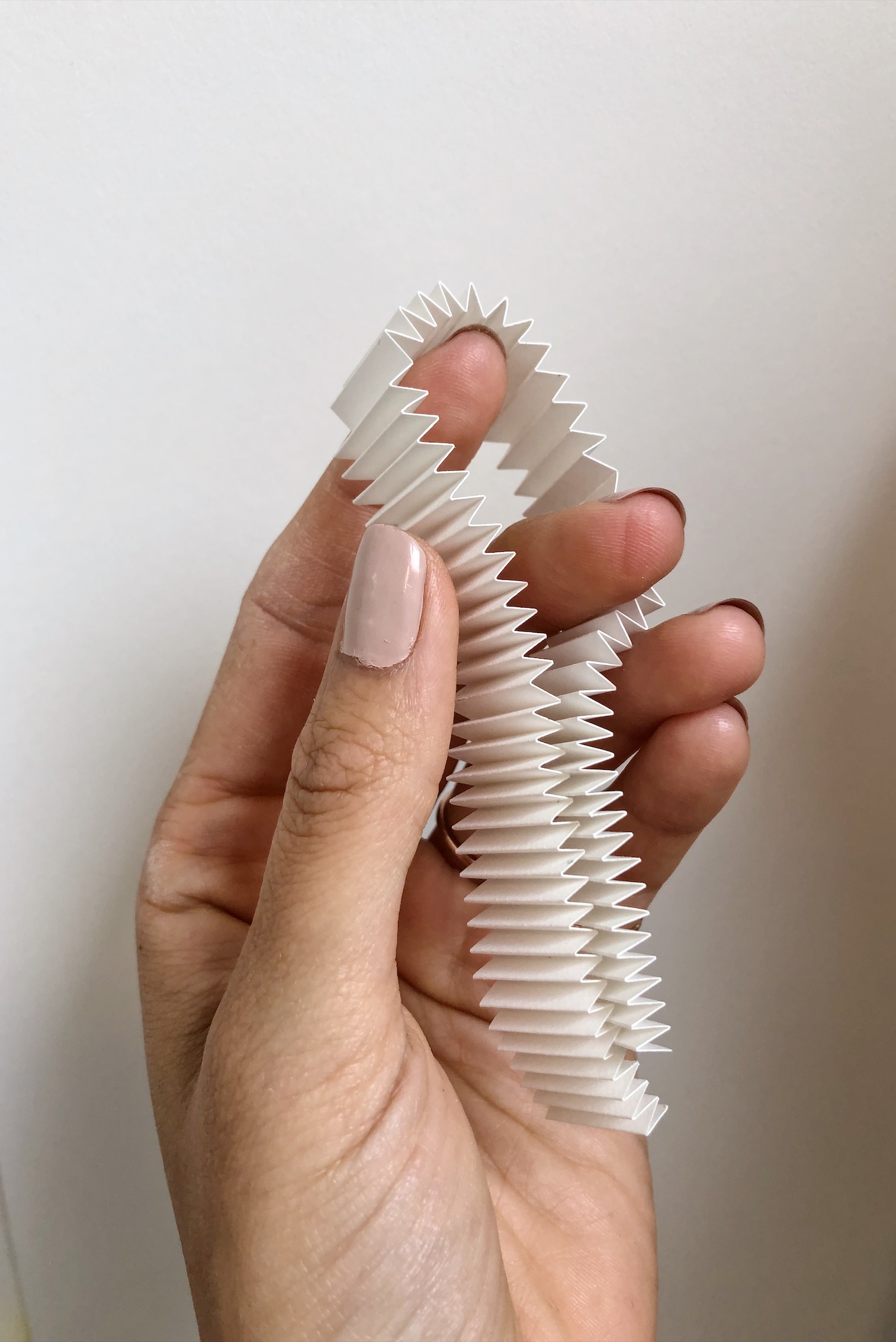
At the time, I didn’t have much of a daily creative practice. Most of the art that I was making was for private commissions. I saw it as an opportunity to force myself to carve out time to experiment, take risks, and hone new paper techniques. My goal was to produce one letter or number per day, using only glue and white paper, adhered to a 5 × 5-inch card, and using as many different paper techniques or textures as I could come up with.
Turns out I work very well with lots of constraints! The fast-paced nature of the challenge forced me to move much faster than I would have otherwise. I got much better at saying, “good enough, gotta move on now,” which was a gift.
Walk us through the process of sketching/ideation. Do you start first with texture? Did you look at specific typefaces?
I definitely let the technique or texture drive the creative vision! I would test a given technique on a very small scale: for instance, I’d poke a few holes in a piece of scrap paper, or make a few cuts with a craft knife to make little flaps.
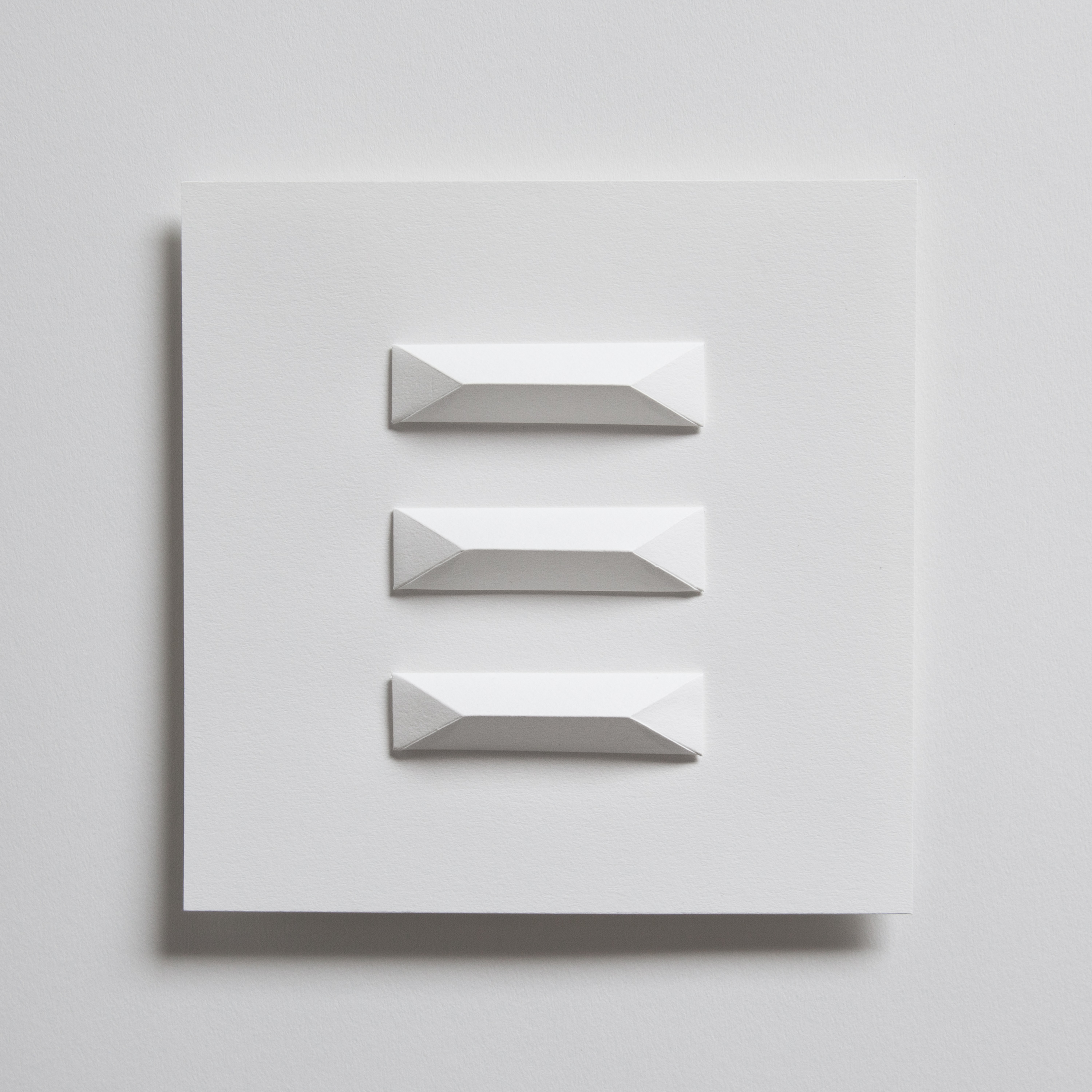
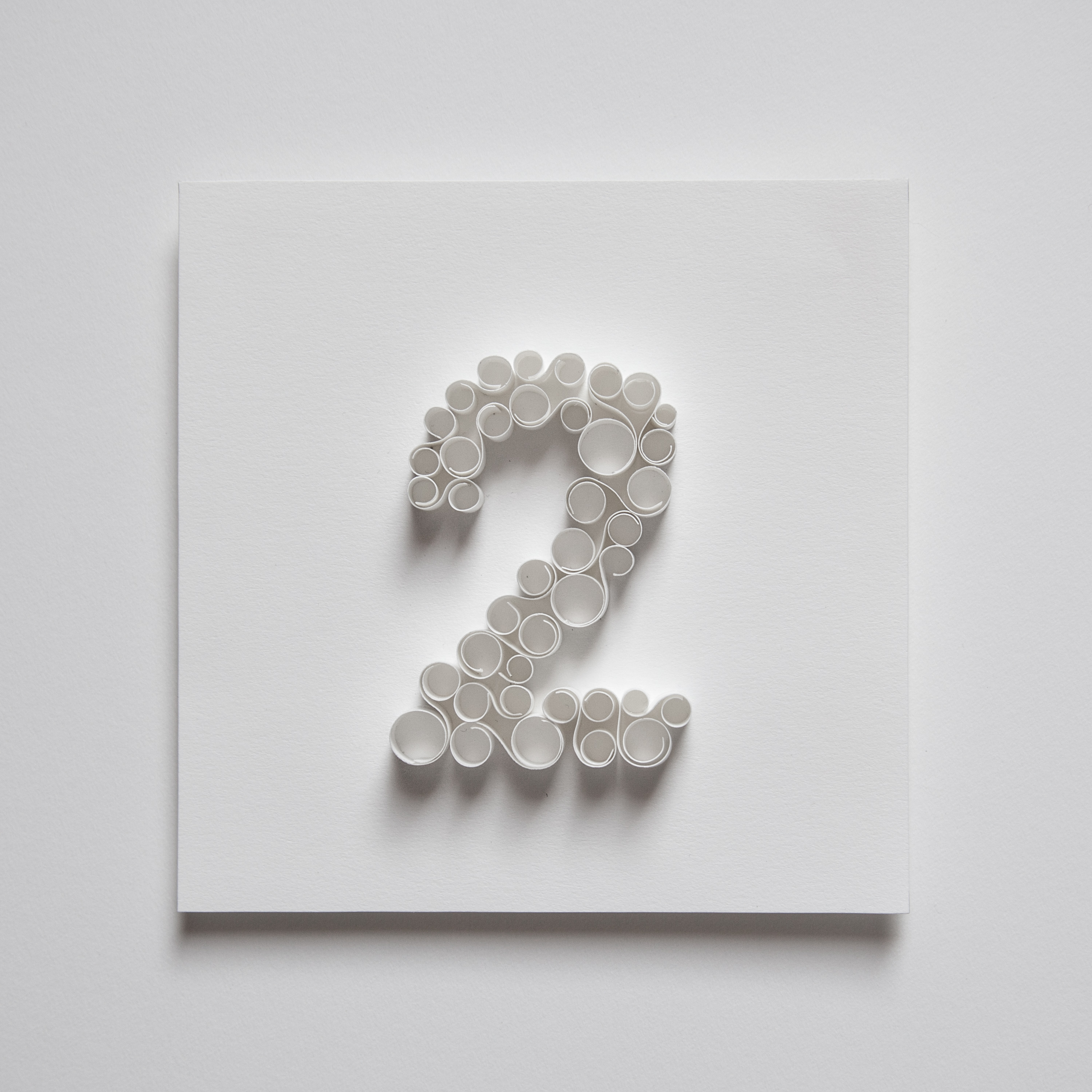
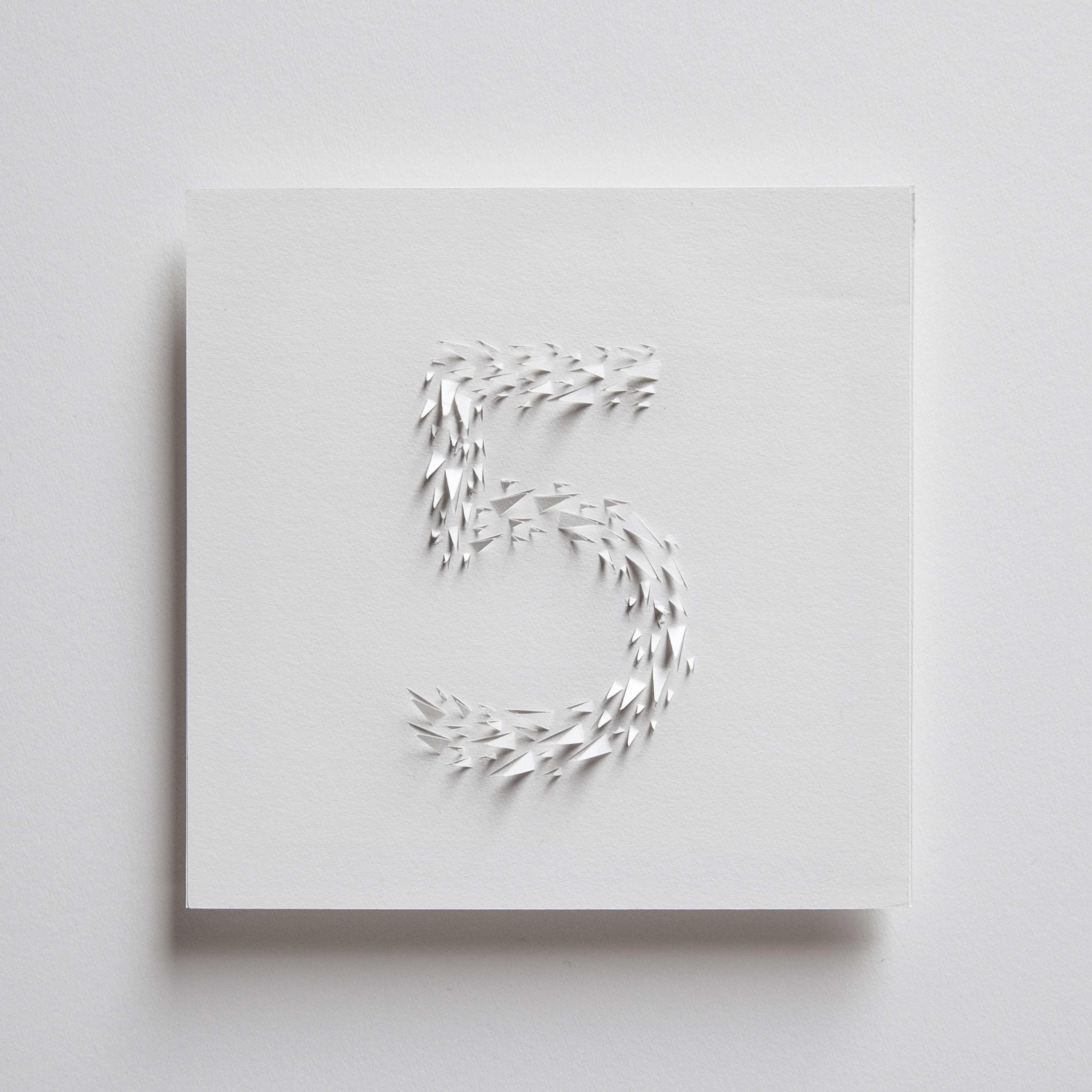
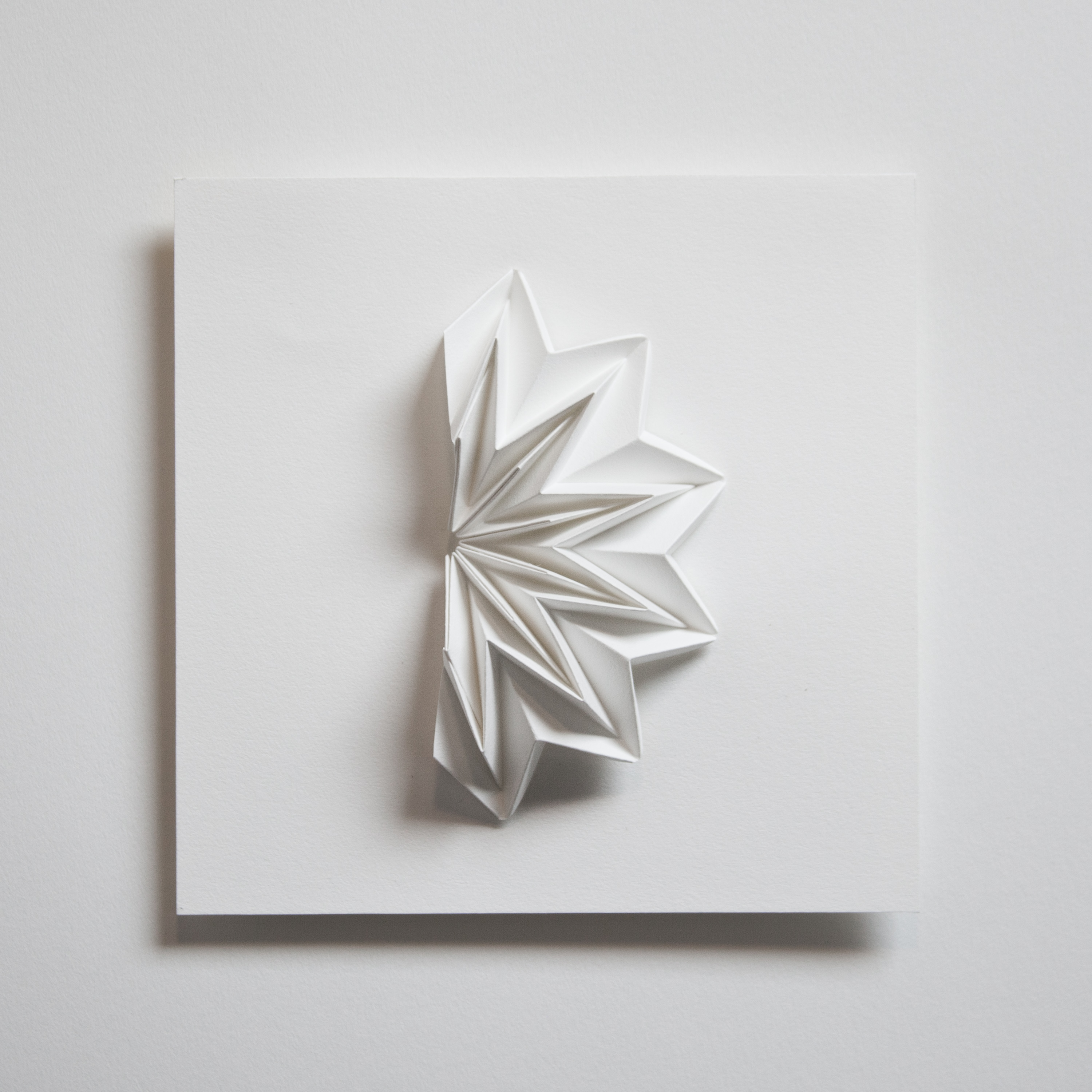
Once I found a technique that I liked, I’d map out a diagram of the letter in Illustrator. Some of my letterforms ended up more on the abstract, geometric end of the spectrum (A, E, O, 3), while others more closely resembled traditional letterforms (H, R, 2, 5). For the more literal interpretations, I referenced a handful of sans serif typefaces. I played around with a few options to see which would best lend itself to the technique I wanted to use for that specific letter.
Then I’d draw my “die line” patterns in Illustrator, and use a plotter cutter machine to cut and score the parts. I’d fold, assemble, and glue by hand, and then scramble to get it photographed and posted on Instagram before the 4pm deadline each day.
Can you talk about which forms challenged or excited you most? Were there any that you wish you could redo? Happy accidents?
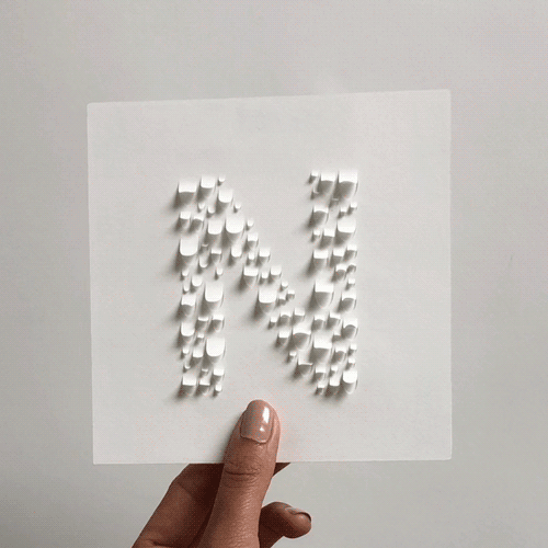
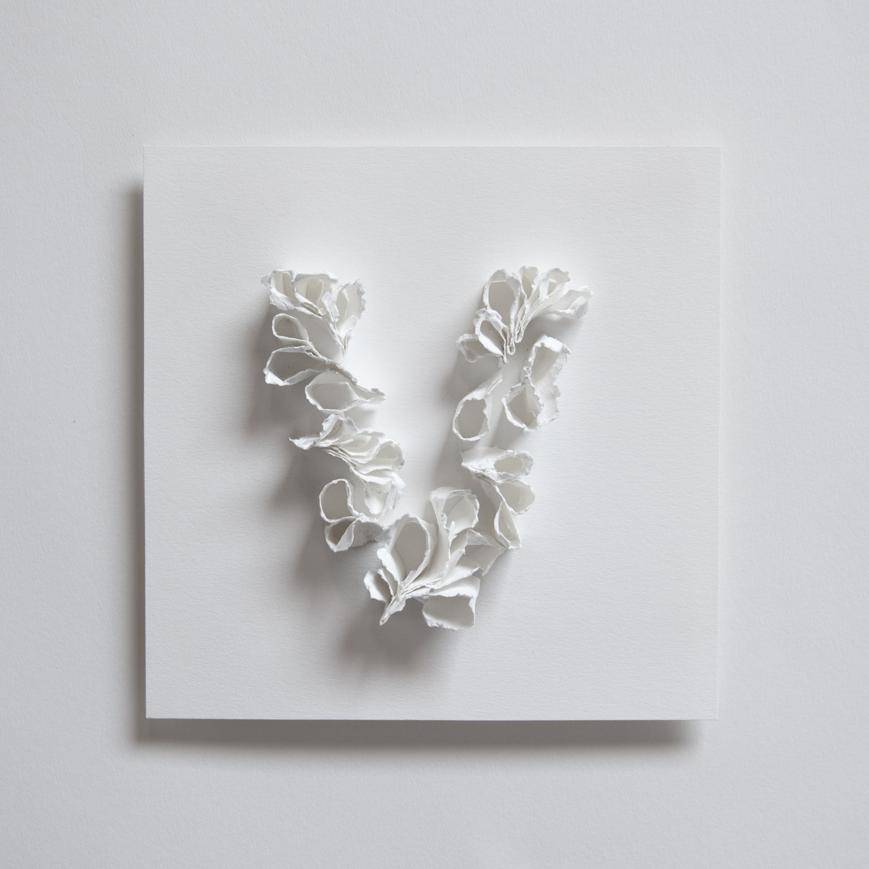
Before this project, I did a lot of paper pleating — folding paper into geometric, accordion-type folds. So I was especially excited to explore the more organic motifs, like the furry shag of H, the raindrops of the N, and the coral-like ruffles of the V. That was totally new. I went on to explore many of those techniques in much larger works over the last couple years.
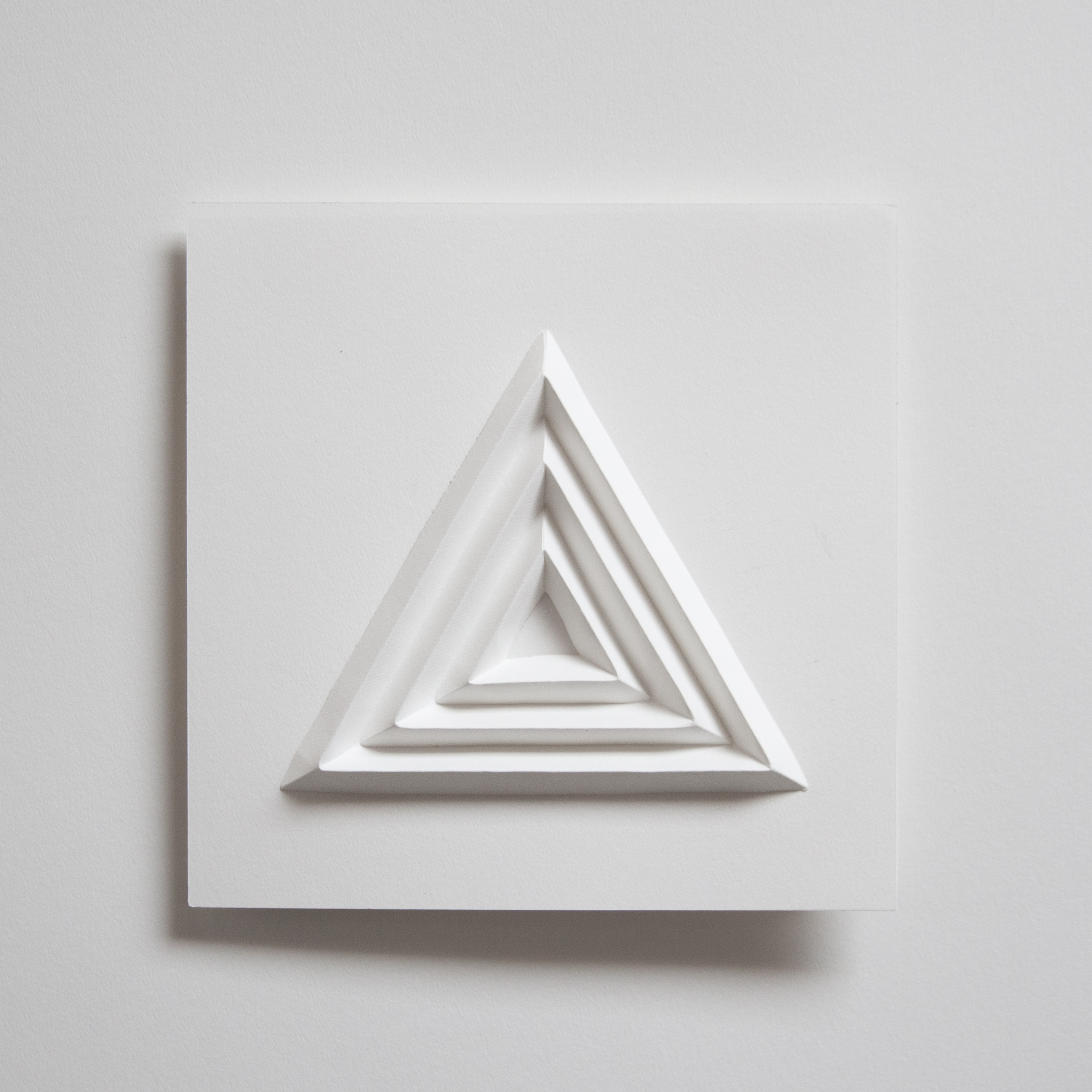
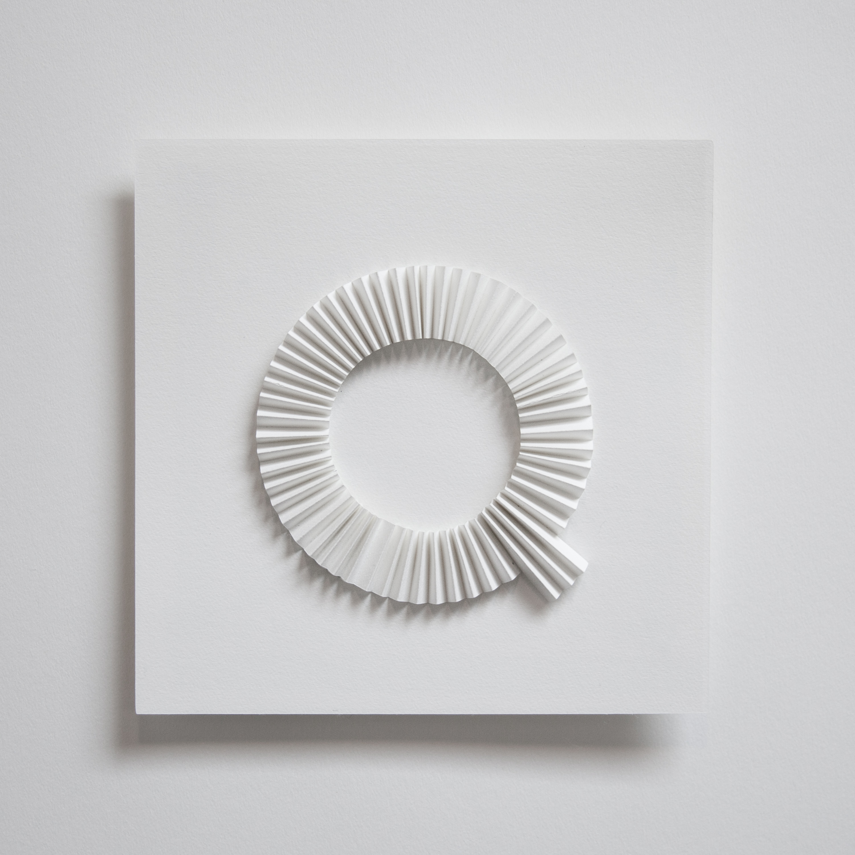
With most pieces, I let the technique drive the overall vision. But in a few cases, the shape of the letter or number took the driver’s seat. Like for the A, I immediately knew I wanted to make a triangle shape, so I figured out what techniques could lend themselves to making a triangle. And for D, I knew I could make an accordion that was pinched on one side to form a half-circle. Q was also really satisfying! I pleated a long strip, and just extended the paper in one part bit to make the tail of the Q.
There are a lot that I wish I could redo. I had to move so fast throughout this whole project, that there was no time to fine-tune or iterate. With each piece, I had to commit very early on to a specific direction, and then follow through immediately. That intensity was the beauty of the challenge, and I grew a lot as a result.
Can you imagine your letterforms becoming a typeface? Spelling something? What might they say? Alternatively, is it important to you that your first foray into letterforms was to create something that didn’t say anything?
You know, since I did this project, I’ve gotten a lot of commission requests to spell out custom phrases or names, but I’ve turned them all down. I feel like this was a one-time art installation, a complete set. I don’t want to break it up into smaller parts, and I’m not eager to use these letters to make actual language. It feels the most right to me to see them as a complete set, in the order that I made them.
This is one of the many reasons I was so thrilled that Letterform Archive was interested in acquiring the installation! It would mean that the whole set would stay together, and would be experienced by people who love typography and letterforms, just for their own sake, not just as a means for creating language.
[Quiet Type] would be experienced by people who love typography and letterforms, just for their own sake, not just as a means for creating language. — Zai Divecha
This work relies on form, texture, and light (3D phenomena) to create what we commonly experience as flat colored shapes on a differently colored flat plane (2D phenomena). Many early letterforms (such as the relief writing on our cuneiform tablet, or early latin alphabet inscriptions) also used texture rather than color to create letterforms. Do you think that three-dimensional text changes how we read?
I hadn’t considered the reading angle specifically before, but I have thought a lot about form and contrast. In my work as a fine artist, I use an exclusively white color palette: white paper on a white background. All of the contrast, texture, and patterns that you perceive in my work are a result of just shadows and light. I think there’s something very calming about having a monochromatic substrate, and letting light and shadows do the work for you to create contrast. It often reminds me of patterns found in nature: the bark of a tree, texture on rock, or patterns in coral. Nature patterns always feel soothing and calm to me.
There’s something very calming about having a monochromatic substrate and letting light and shadows do the work for you to create contrast. — Zai Divecha
Is there anything else about the project you’d like to share?
I’m so honored that my installation has found its forever home here at Letterform Archive. I truly cannot imagine a more ideal place for it. It’ll get to be experienced by people who are genuinely excited about typography! What a gift! I usually try not to be too sentimental about what happens to my art after it leaves my studio. But when it’s this perfect, I can’t help but feel a deep sense of joy.
I hope that it brings your visitors a bit of delight, or a moment of calm. Maybe it’ll encourage someone to make their own alphabet, or get out scissors and glue and play with paper. I can’t wait to come visit myself.
— sair goetz, Collections Programming Manager