News
This Just In: Schriftenkartei, a Typeface Index
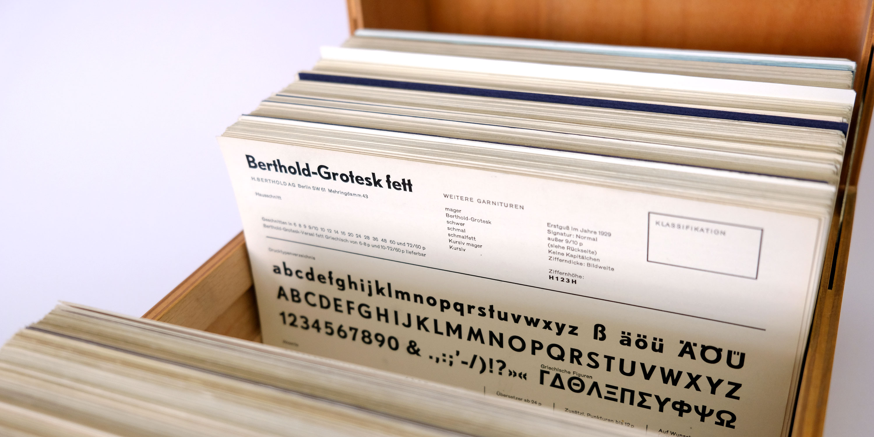
This treasure chest of 600+ specimen cards holds a complete snapshot of the last metal type foundries in Germany.
Produced between 1958 and 1971, the Schriftenkartei (Typeface Index) represents a West German agency’s effort to catalog all the country’s typefaces in production at the time. The cards are useful for type researchers and designers as they share a common format and show complete character sets — a resource not often included in foundry specimens. Thanks to a generous donation, a set of these cards is now in Letterform Archive’s collection, and scans are available online.
Cataloging the Type Founding Industry
In the 1950s, metal fonts were still the primary method for delivering type, but the hundreds of foundries that once flooded the market in the 19th century had folded or merged by then. In Europe and North America, most countries were left with just one or two companies (if any at all) producing original typefaces. West Germany, on the other hand, had seven active foundries.
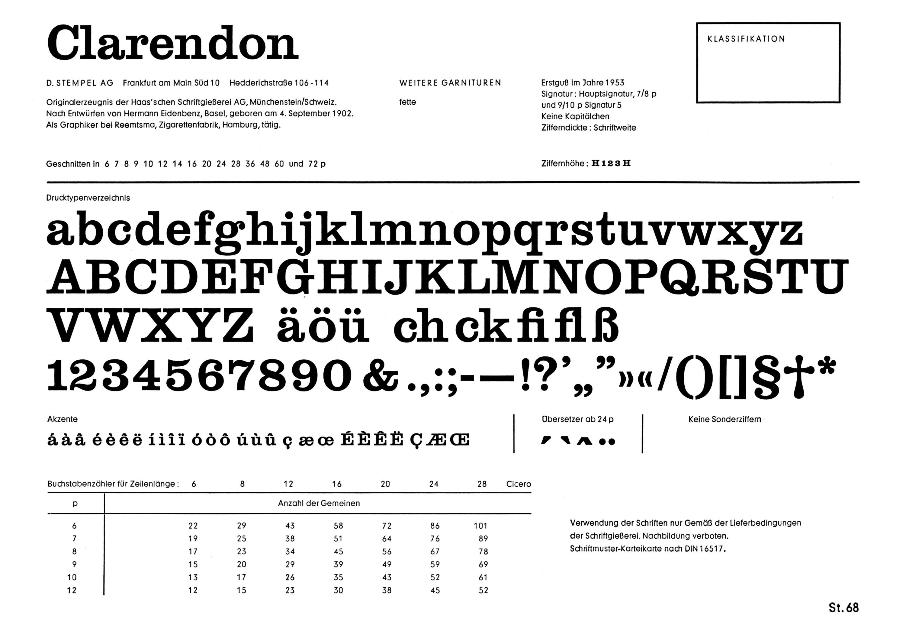
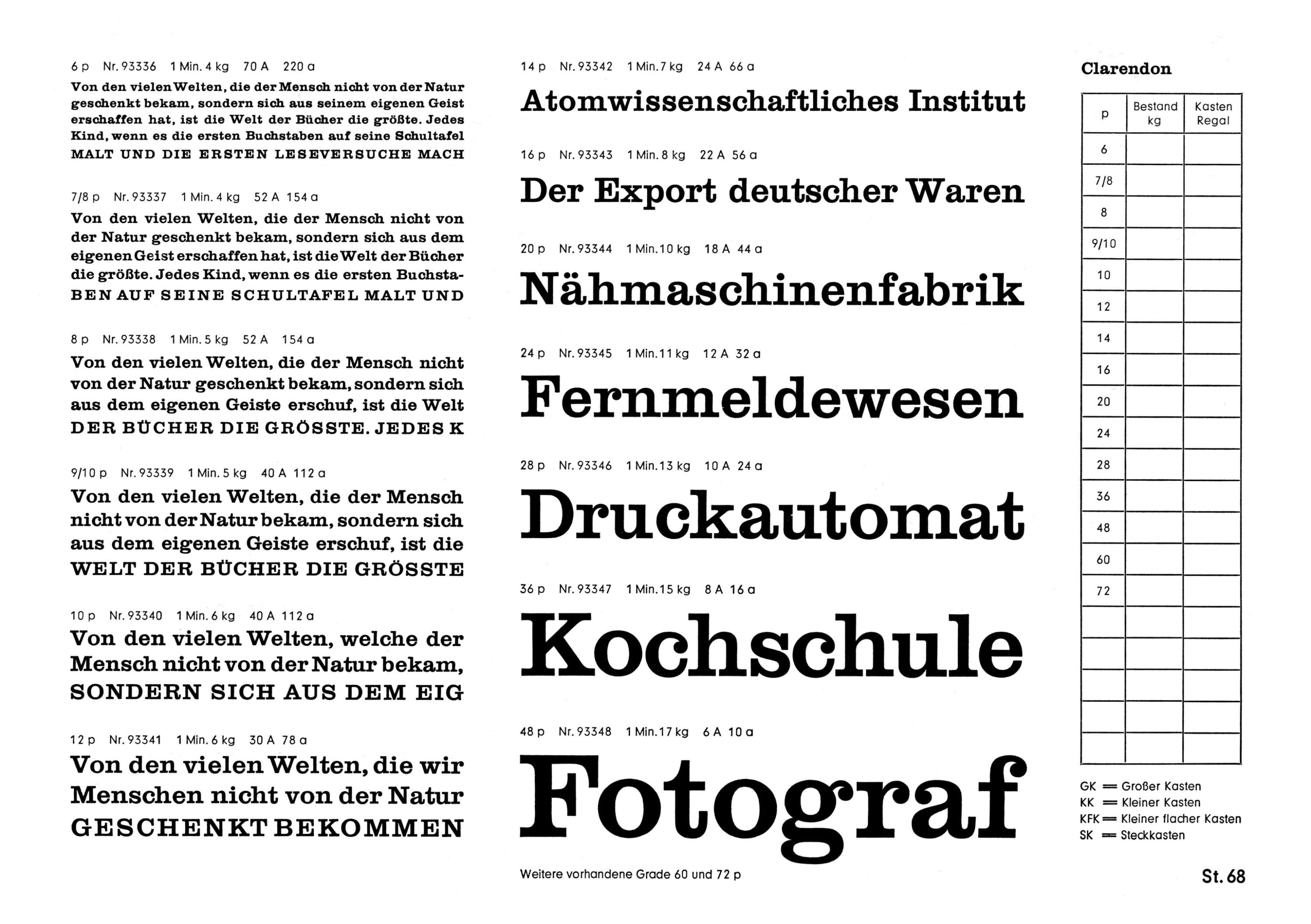
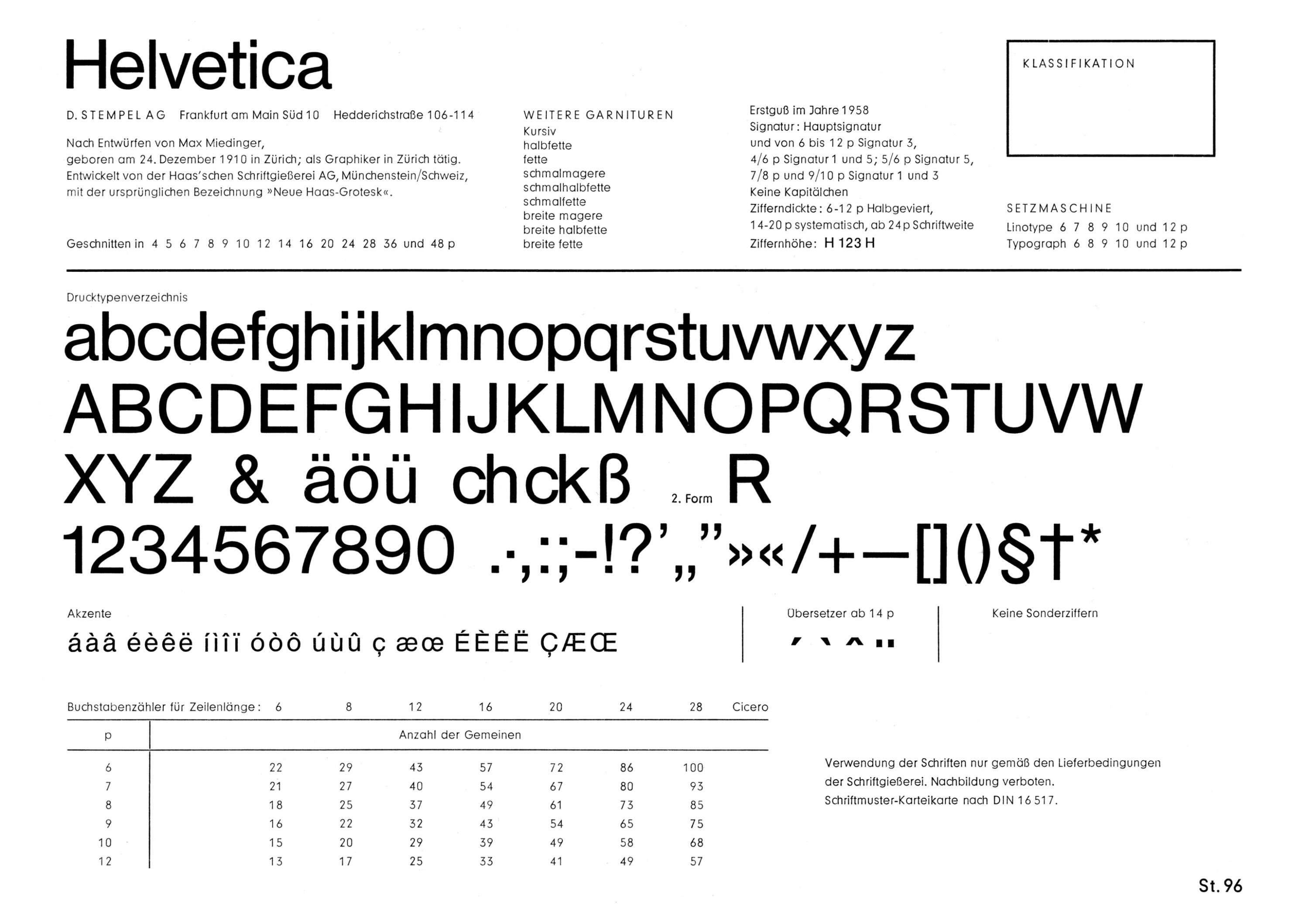
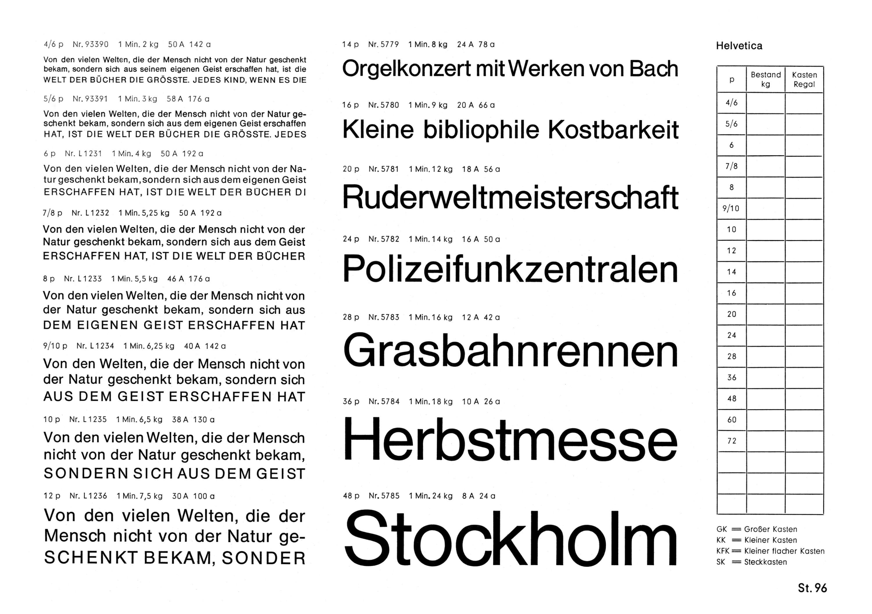
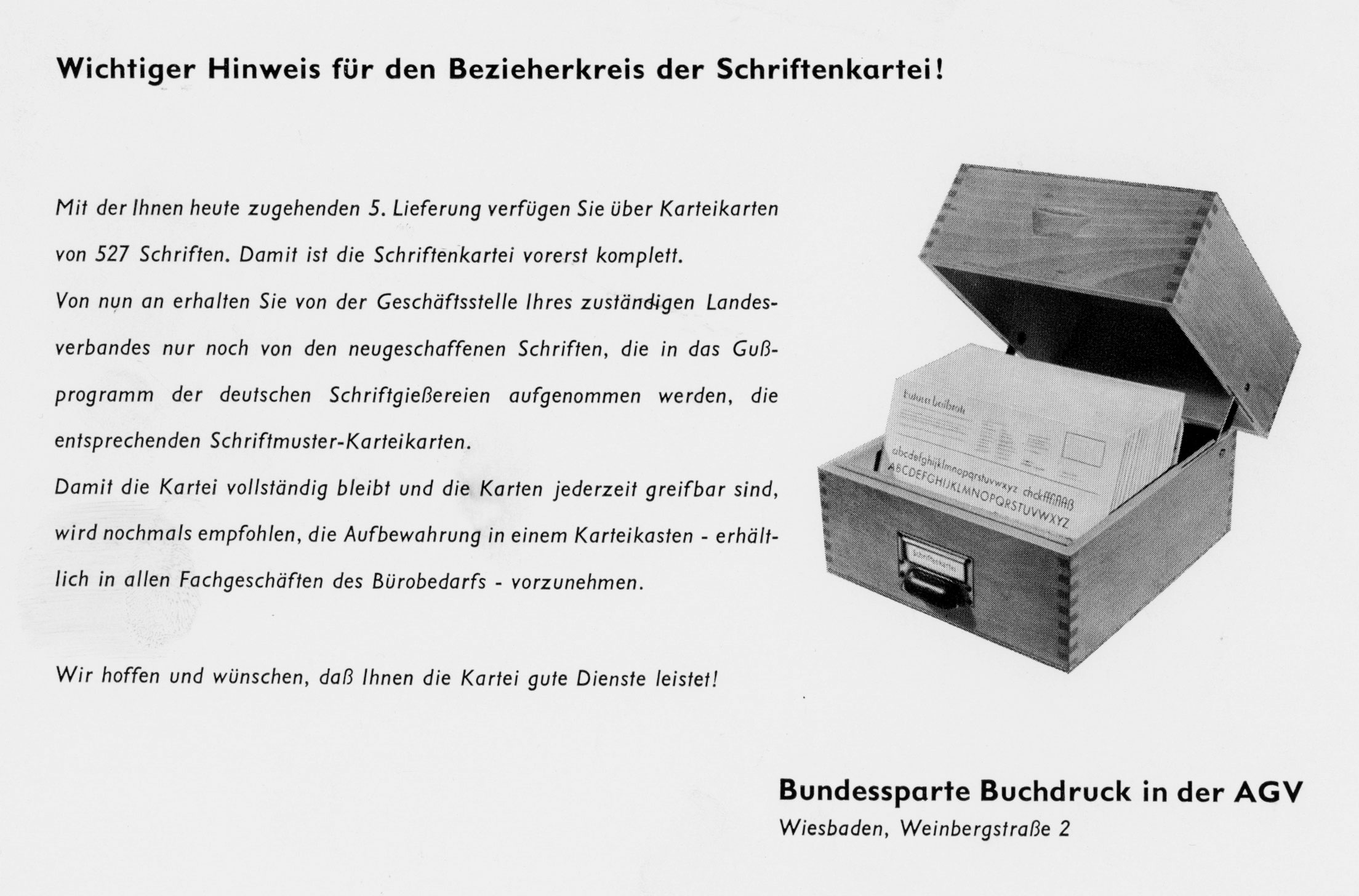
Initiated by the Arbeitsgemeinschaft der graphischen Verbände des deutschen Bundesgebietes e.V., Bundesverband Buchdruck (Working Group of the German Graphic Associations, Federal Book-Printing Division), the index represented the last attempt to comprehensively document all available foundry types in the country. All seven foundries were on board: Bauersche Gießerei, H. Berthold AG, Genzsch & Heyse, Ludwig & Mayer, D. Stempel AG, Johannes Wagner GmbH, and C. E. Weber. The cards were published over more than ten years, documenting new typefaces issued after the initial batch was printed. Included are names that have become icons of 20th-century design, such as Akzidenz-Grotesk, Clarendon, Futura, Helvetica, and Optima.
A project similar to the Schriftenkartei unfolded in East Germany (GDR) around the same time, producing a set of cards for typefaces from VEB Typoart in Latin (79 typefaces) and Cyrillic.
A Unique View of 20th-century Type Design
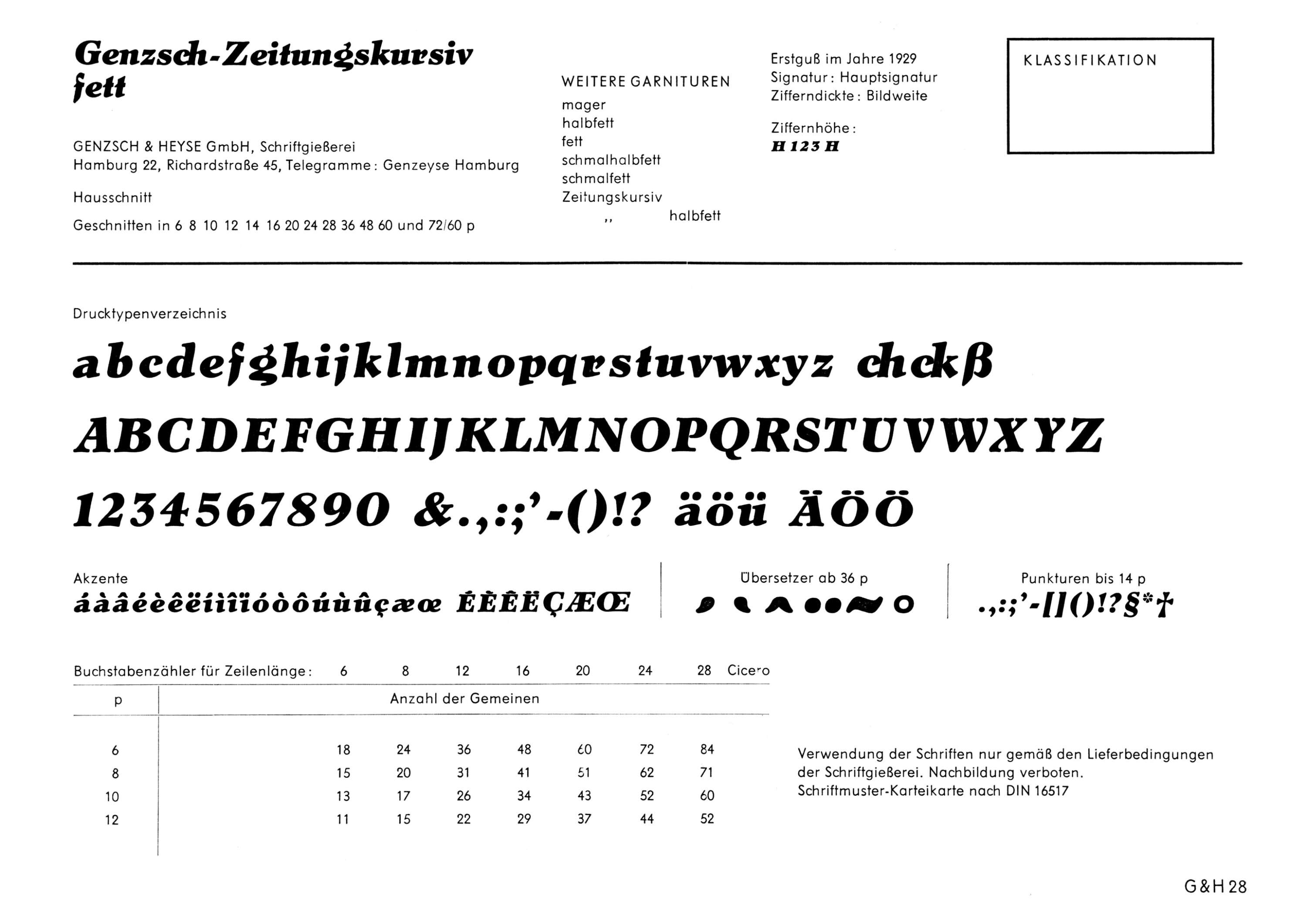
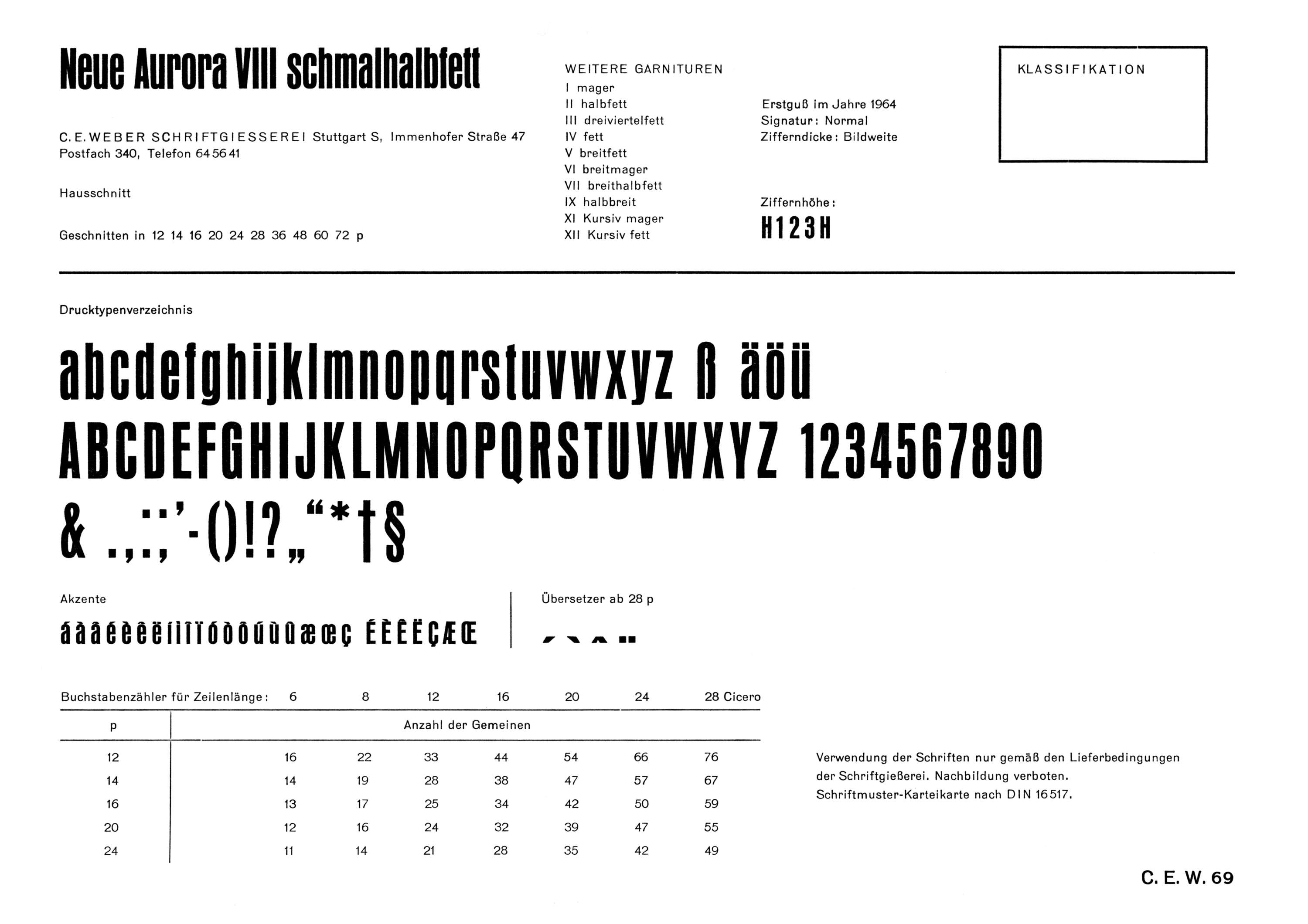
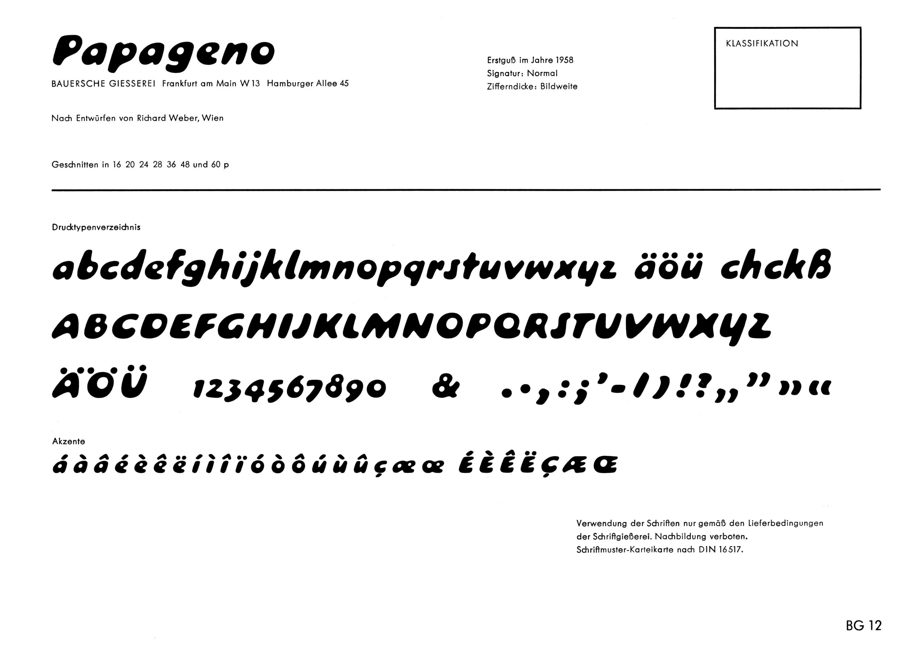
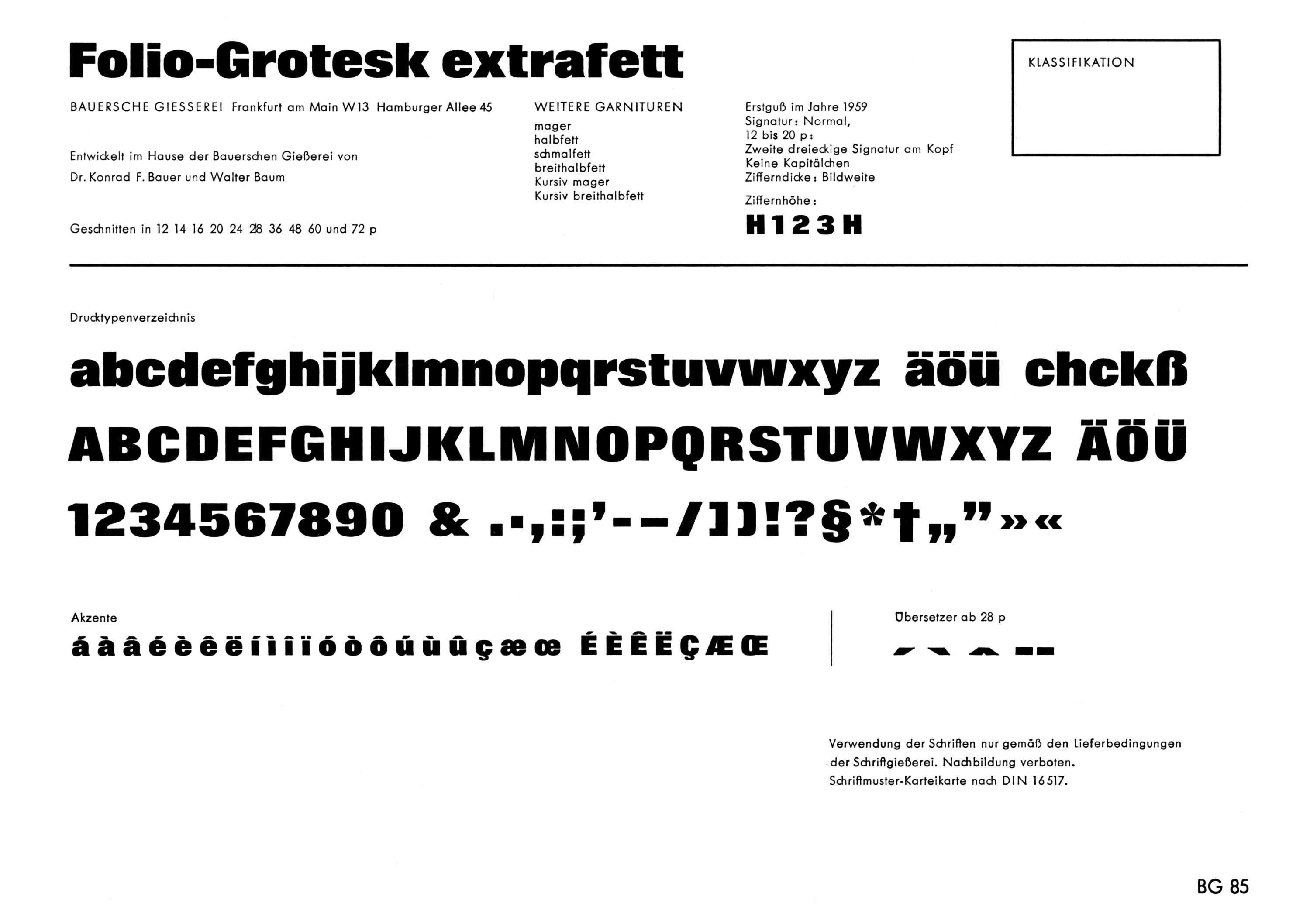
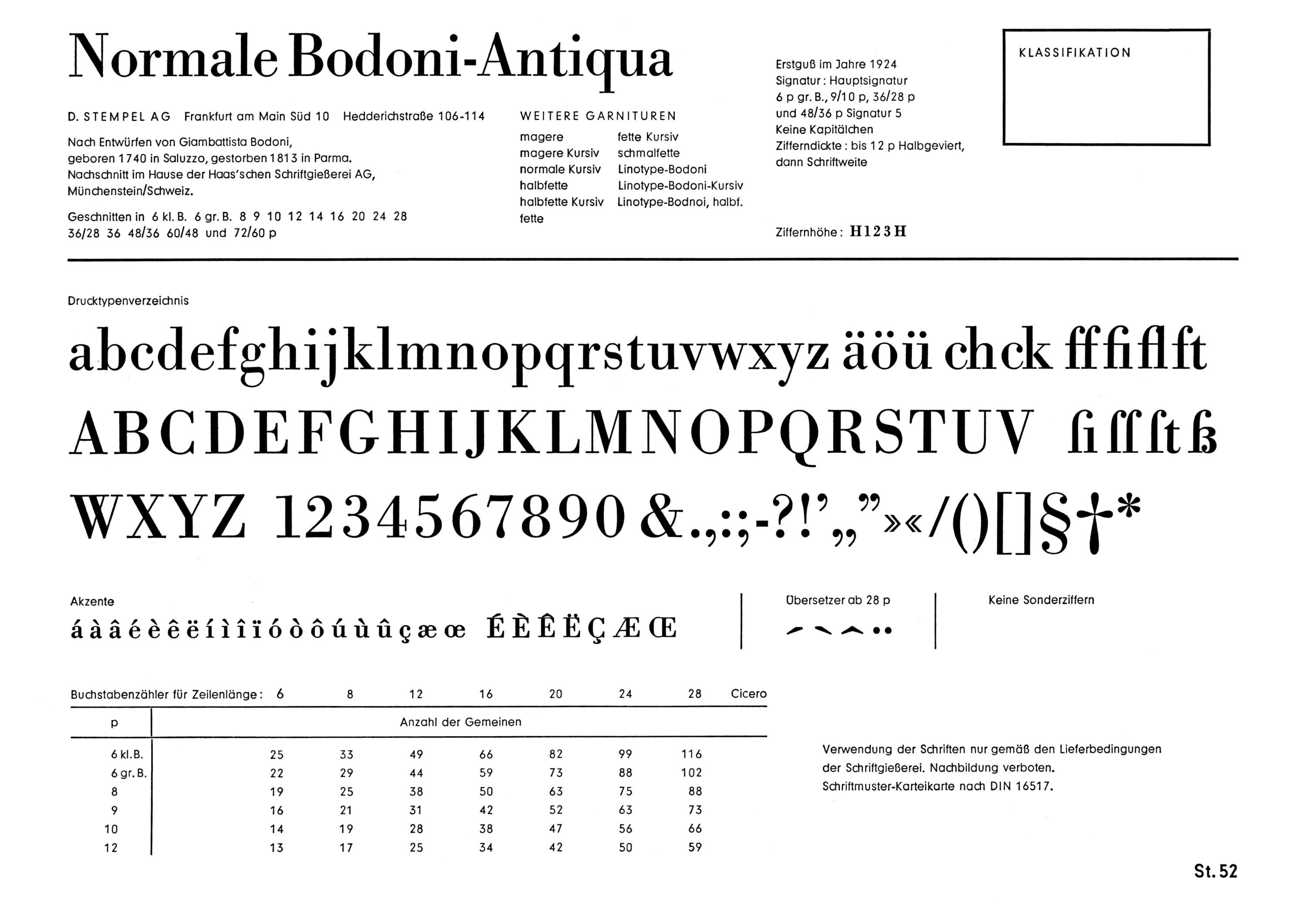
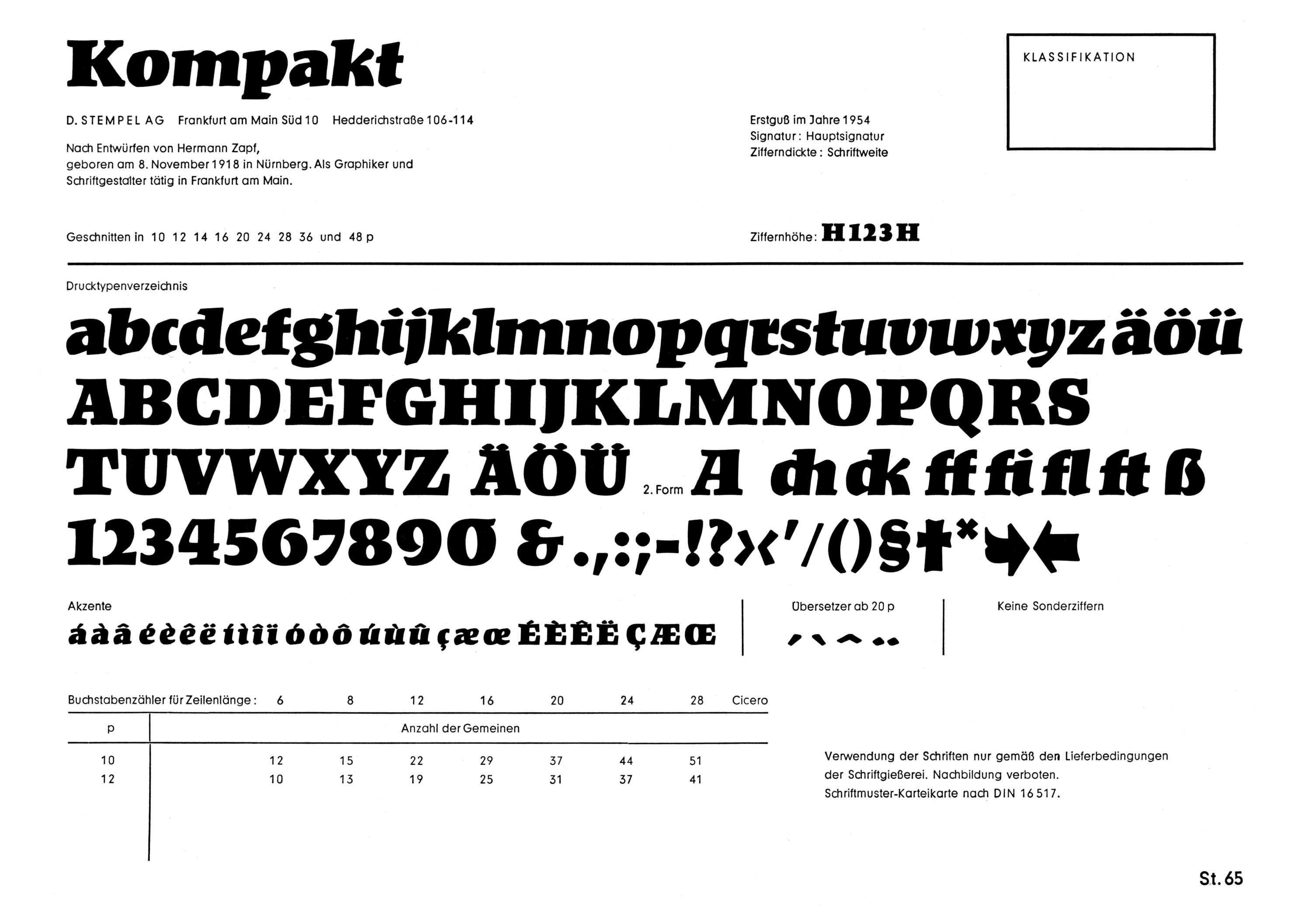
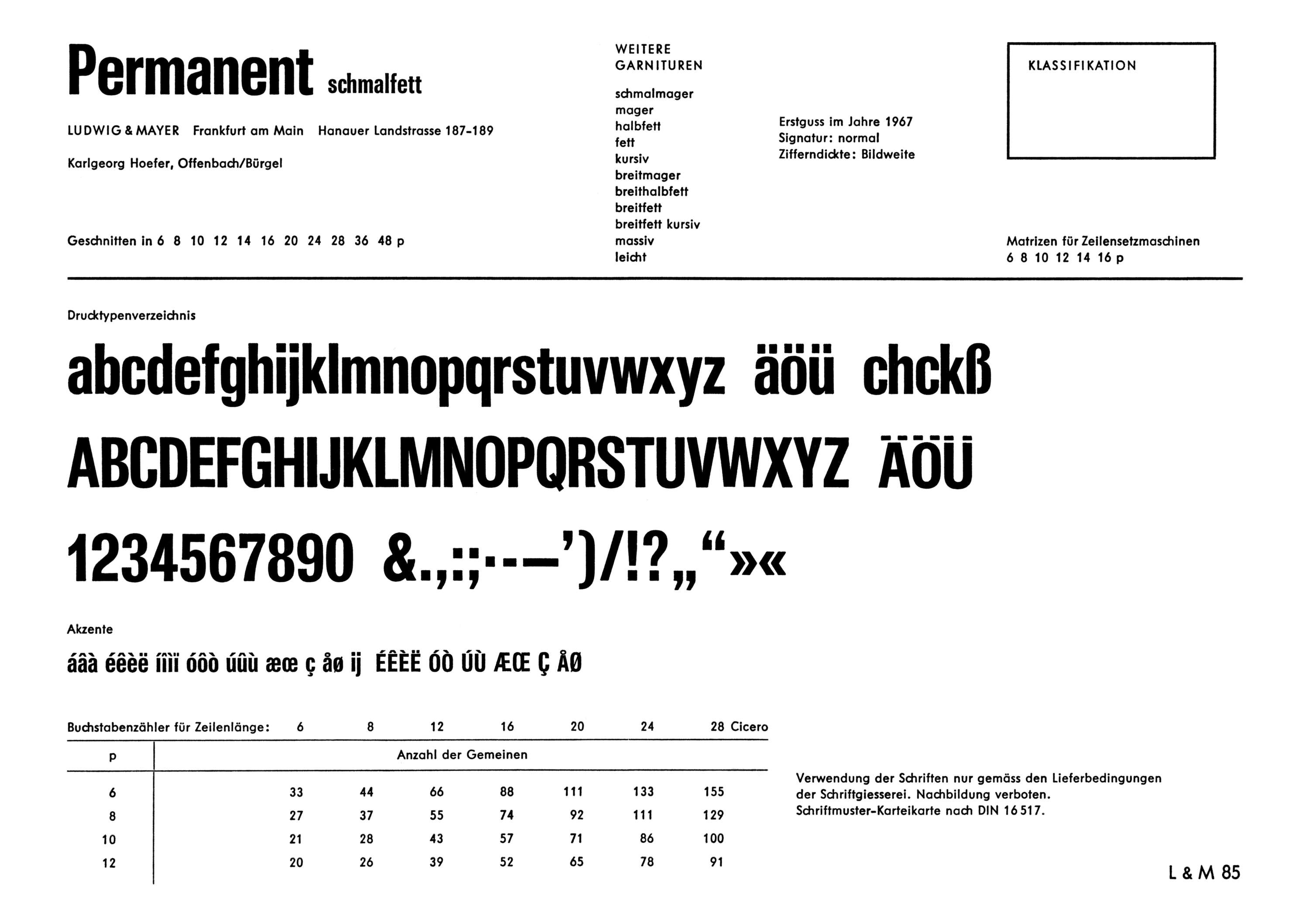
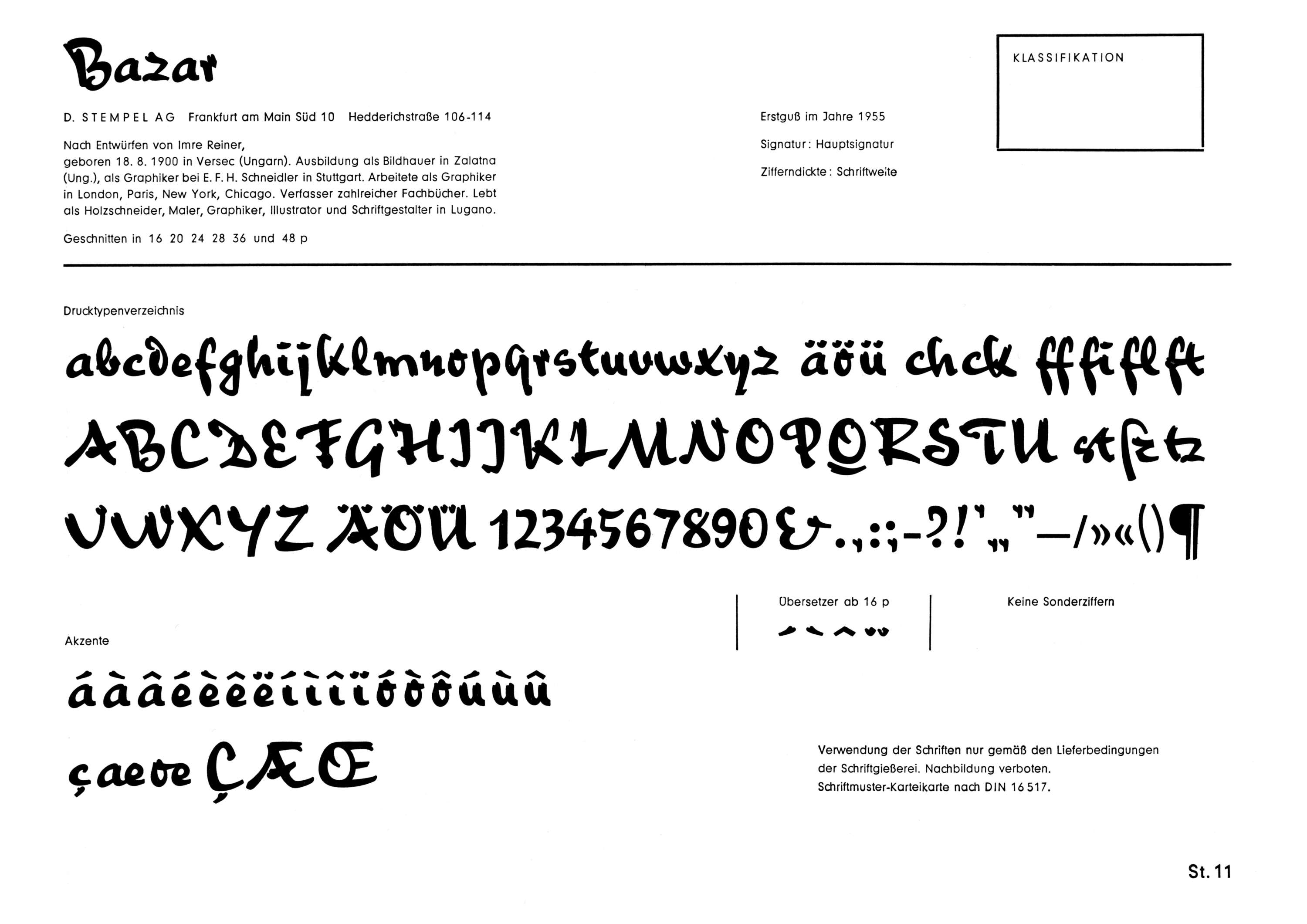
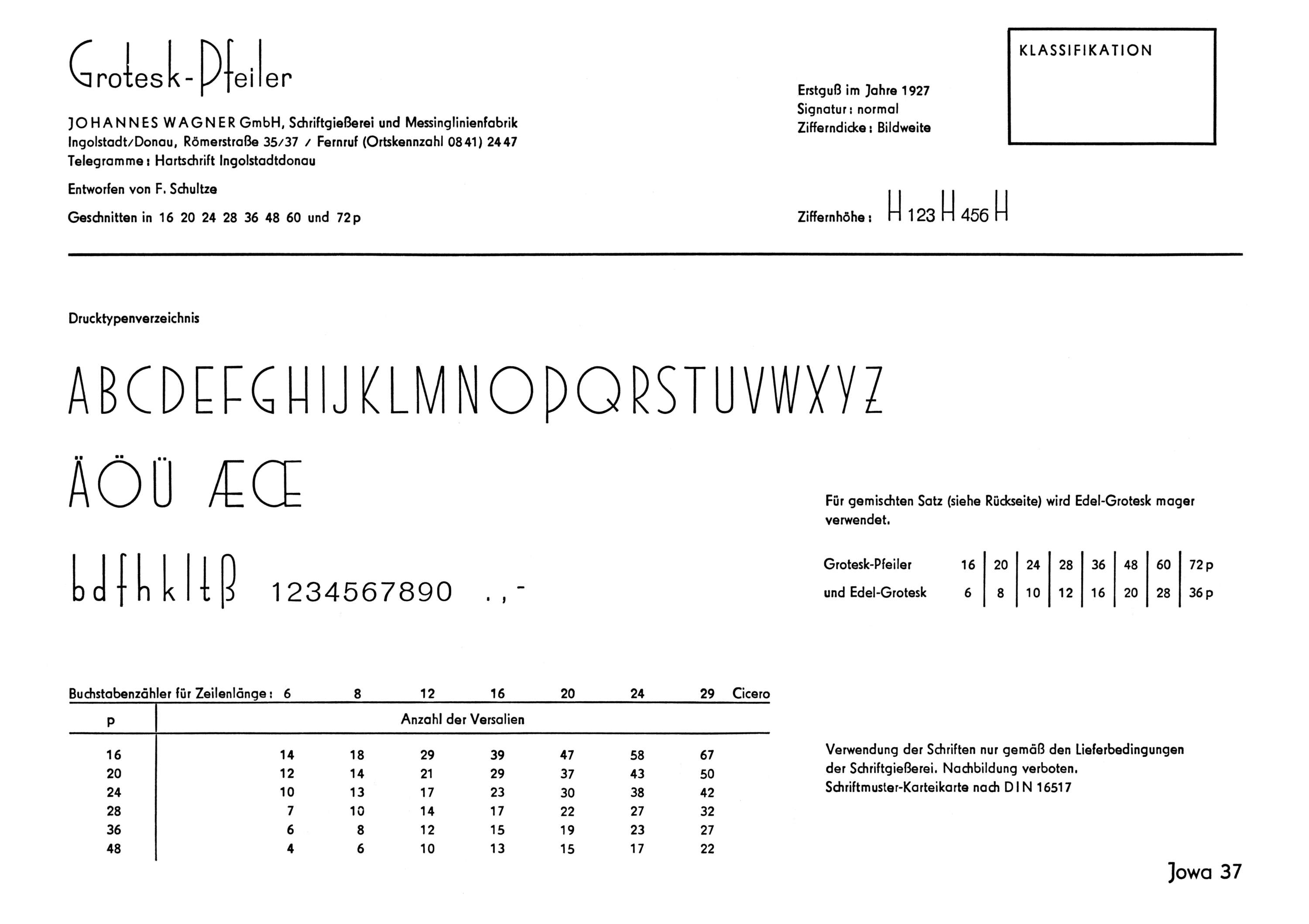
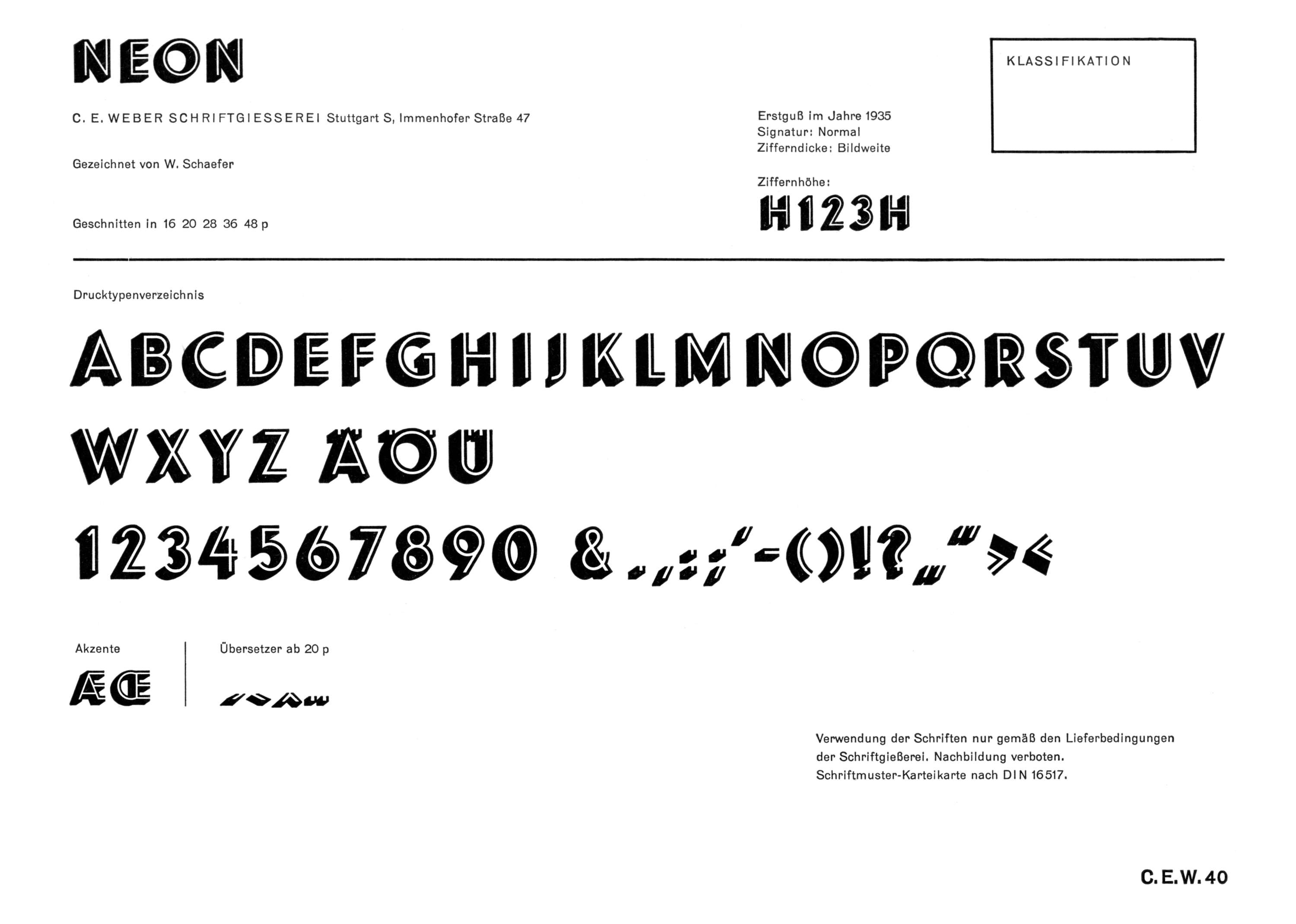
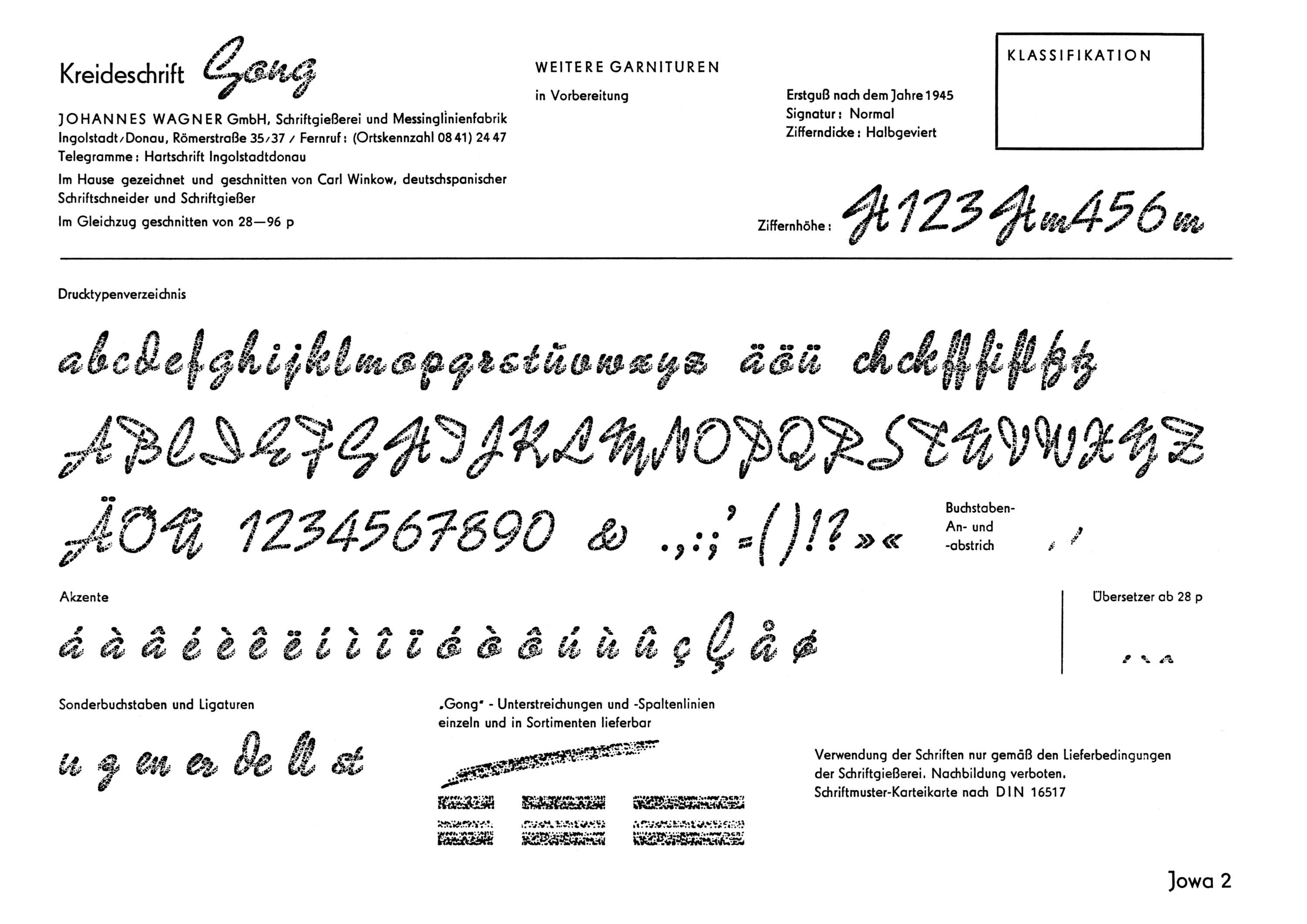
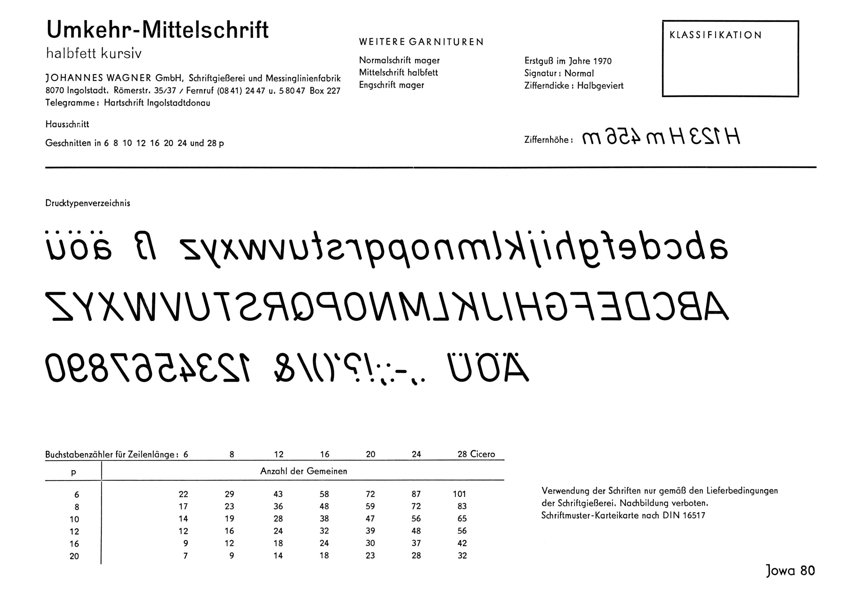
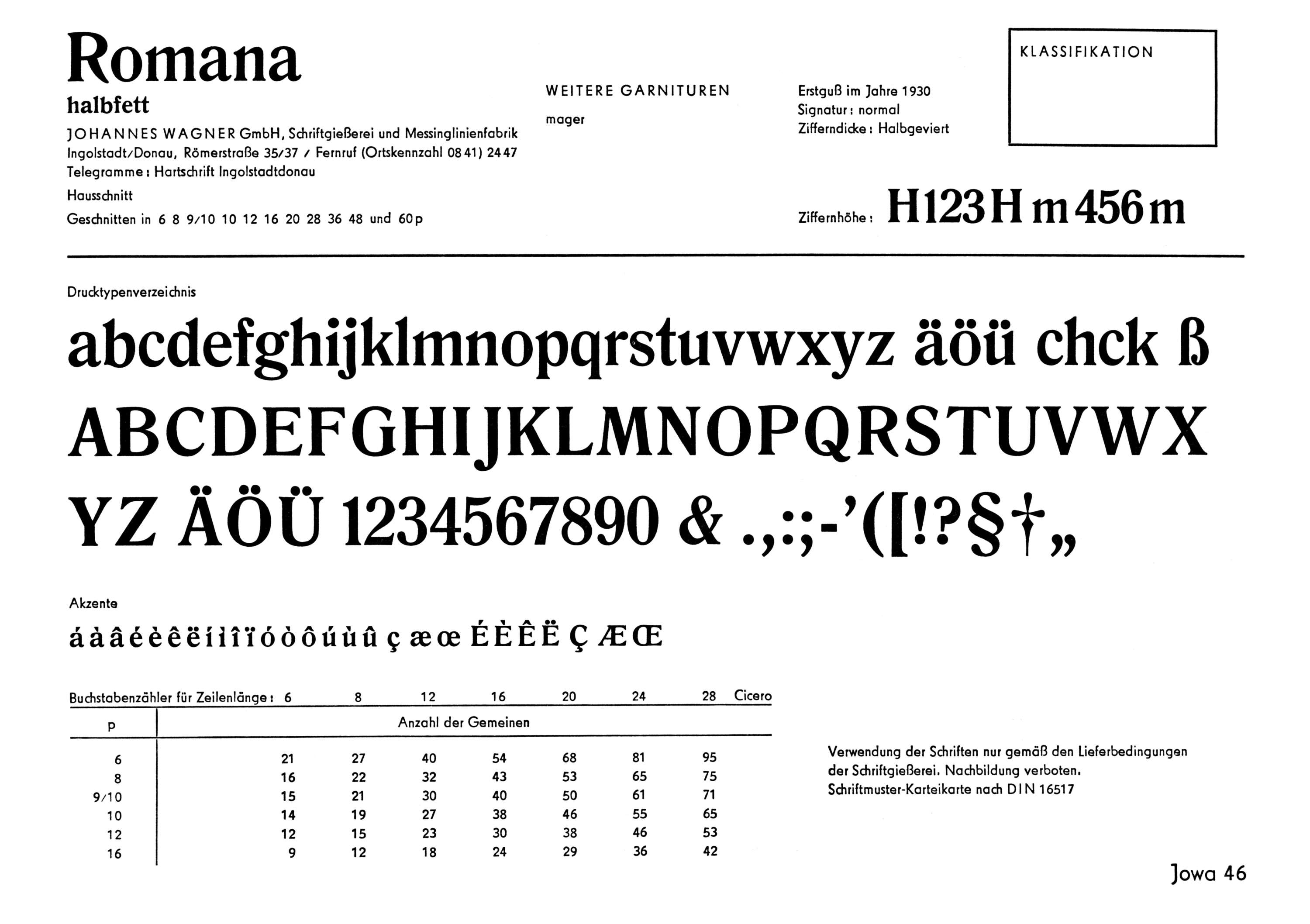
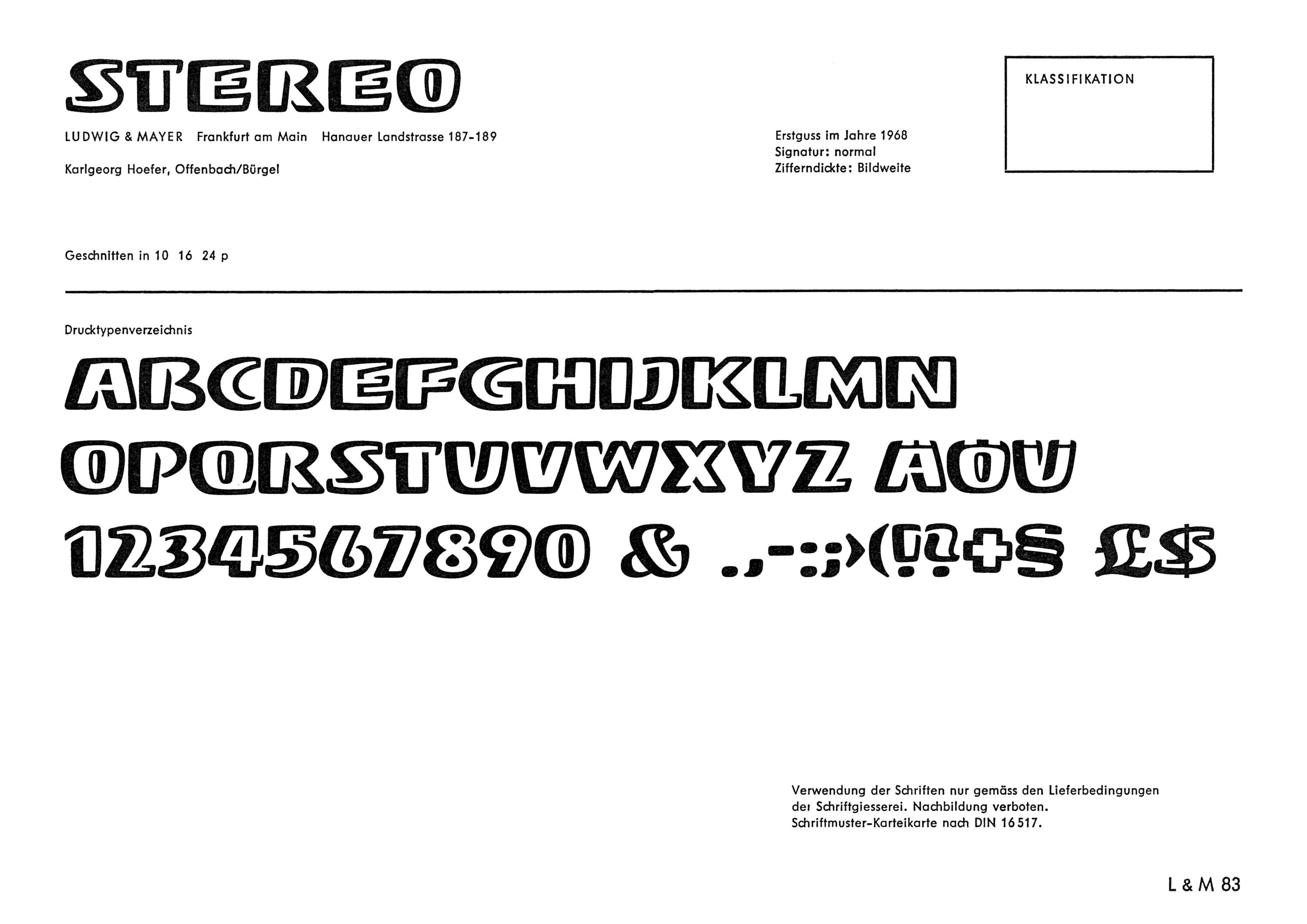
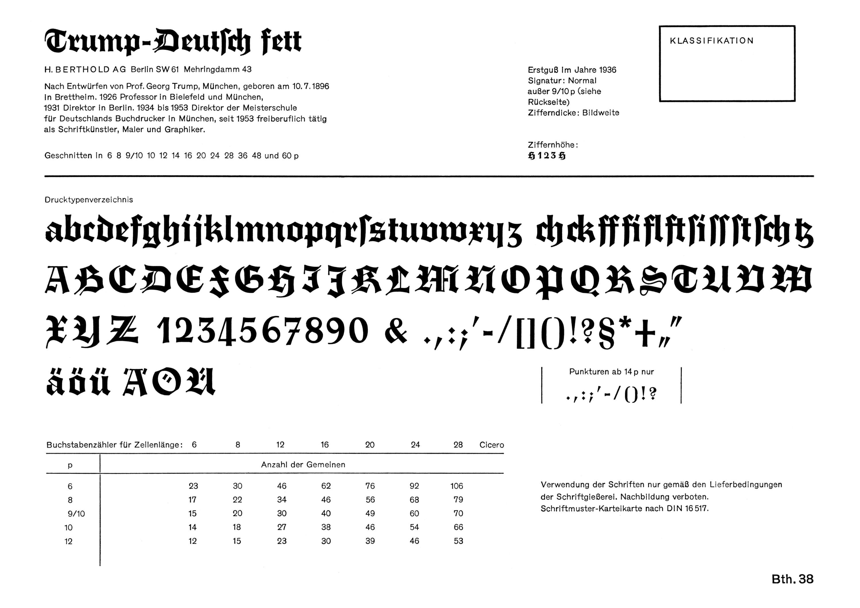
The Schriftenkartei cards differ in important ways from the typical specimens produced by foundries to showcase their own type. Foundry-published ads, leaflets, and booklets are often eyecatching and inspiring, but they usually omit complete character sets. The index also facilitates comparison because each card has a fairly standardized layout, with a full glyph showing on the front and waterfall settings (in all available sizes) on the back. They are also a useful reference for historians seeking information on who originated a typeface, when it was first cast, and in what sizes.
At the time of their printing, only the members of West Germany’s National Printing Association could buy the cards. The circulation is estimated at fewer than 400 copies. Of these, only four were known to exist in publicly accessible collections, all in Germany — until now.
Accessible to All
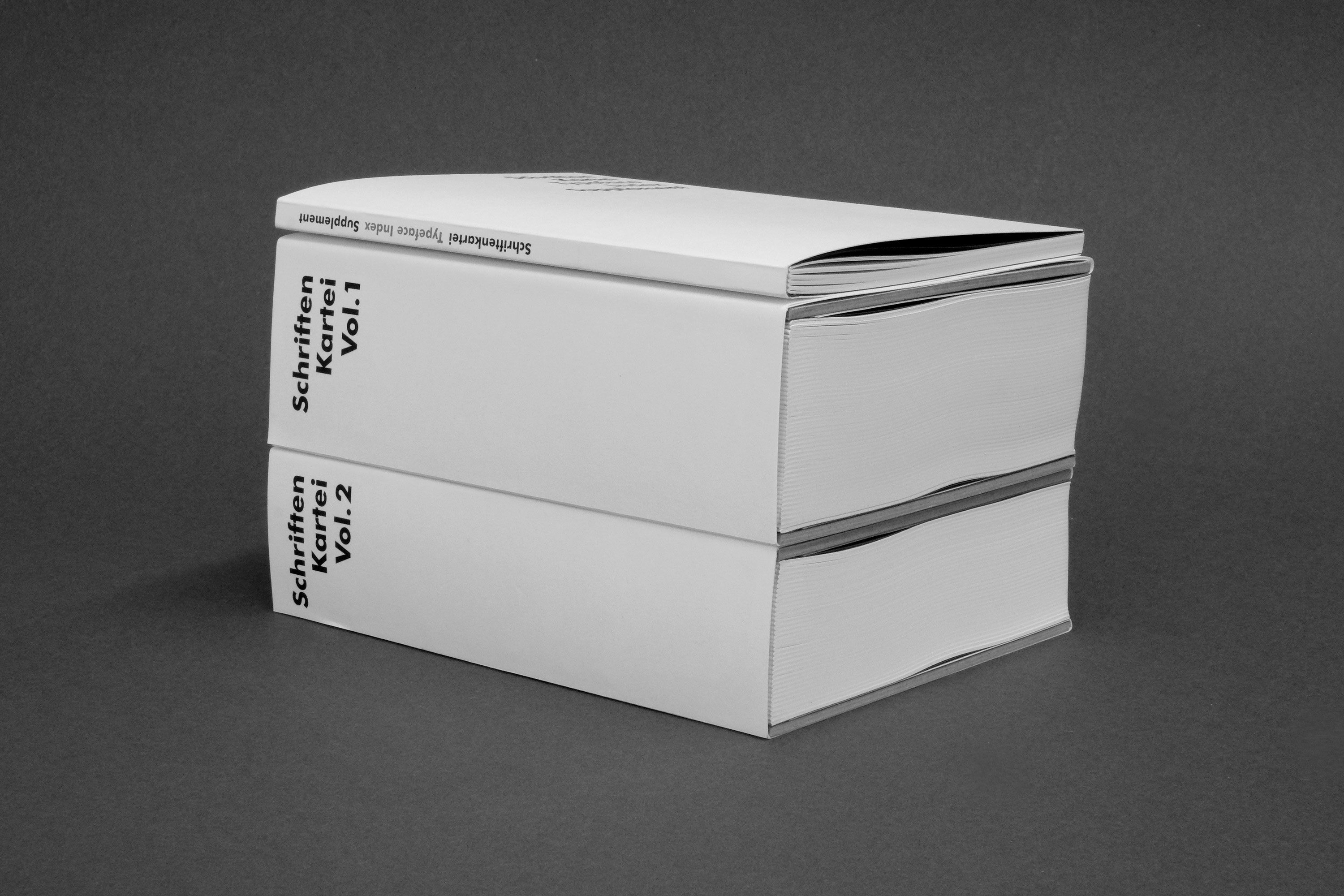
When Michael Wörgötter, a Munich-based designer and educator, came across his own Schriftenkartei set earlier this year, he understood their value for designers and researchers and wanted to make them as widely accessible as possible. He scanned each card at 1200 DPI, and reprinted them in two bound volumes, along with a handy supplementary guide, written in German and English, that offers historical background. The books are available for purchase directly from Wörgötter.
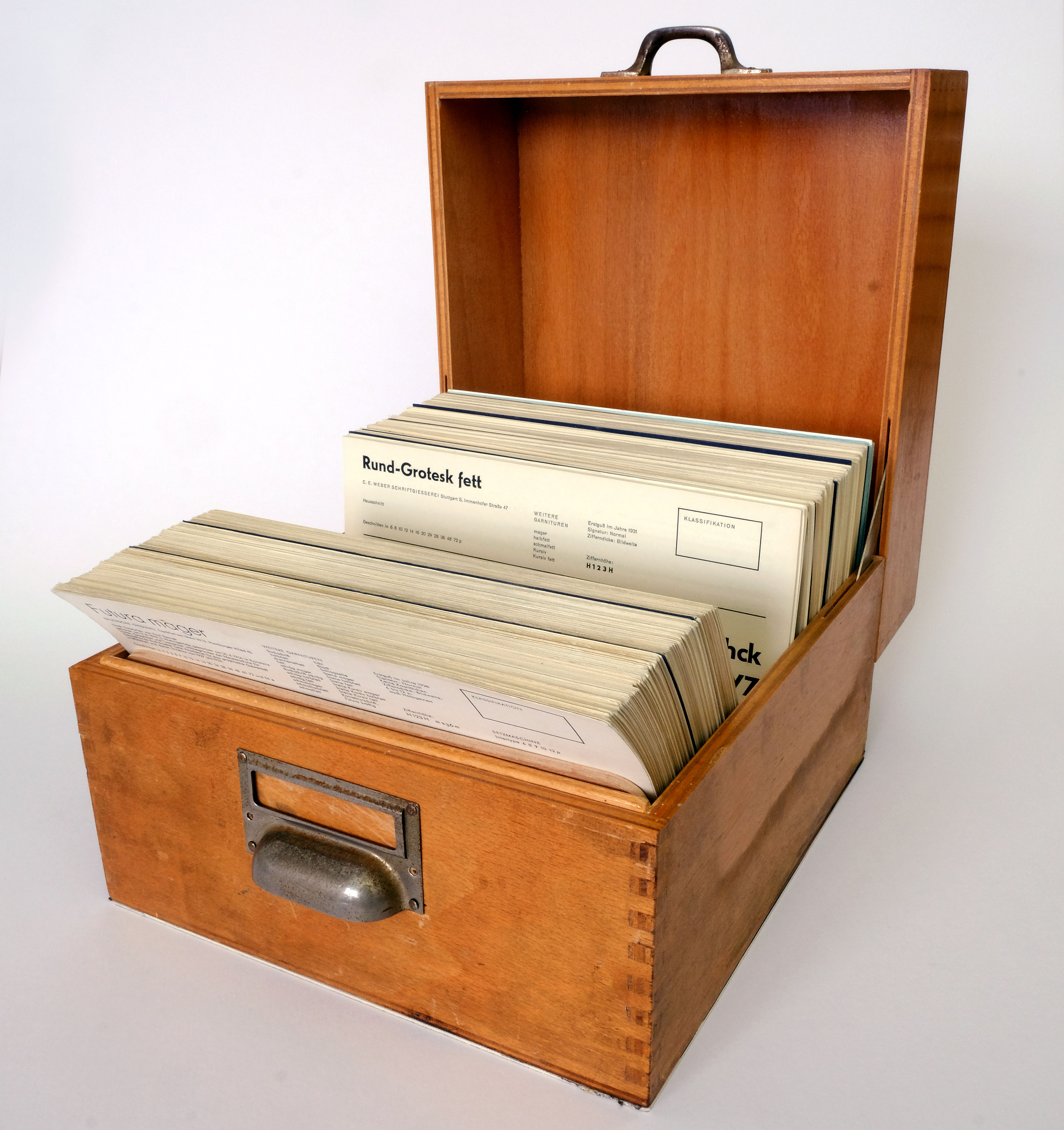
Wörgötter graciously donated his original boxed set of over 600 cards to Letterform Archive for our visitors to consult in person. He also invited us to host his digital scans, which are now available on Flickr where they are tagged, searchable, downloadable, and embeddable anywhere. In the future, we will provide our own photographic captures of the cards in our Online Archive.
Below are some highlights from the collection showcasing some of the more influential and novel type designs of the period. The captions on each image link to the typeface’s entry on Fonts In Use for more information.
— Stephen Coles, Associate Curator & Editorial Director, with special thanks to Michael Wörgötter for research and images
Schriftenkartei Gallery
The selected sample images below are high-res scans. Click an image to enter fullscreen view, then pinch or click to enlarge.