News
Seen Together: Ludwig & Mayer Type Specimen and Poster Design for Chlorodont
What connects a 1930s type specimen to a student’s assignment from the 1950s? A century-old oral hygiene brand from Germany!
Spanning stylistic and topical boundaries, Letterform Archive’s collection often invites unexpected and evocative connections. Seen Together is a new blog series featuring our favorite object pairings—works that may come from very different times and places, yet sit next to each other in dialogue on a tour table.
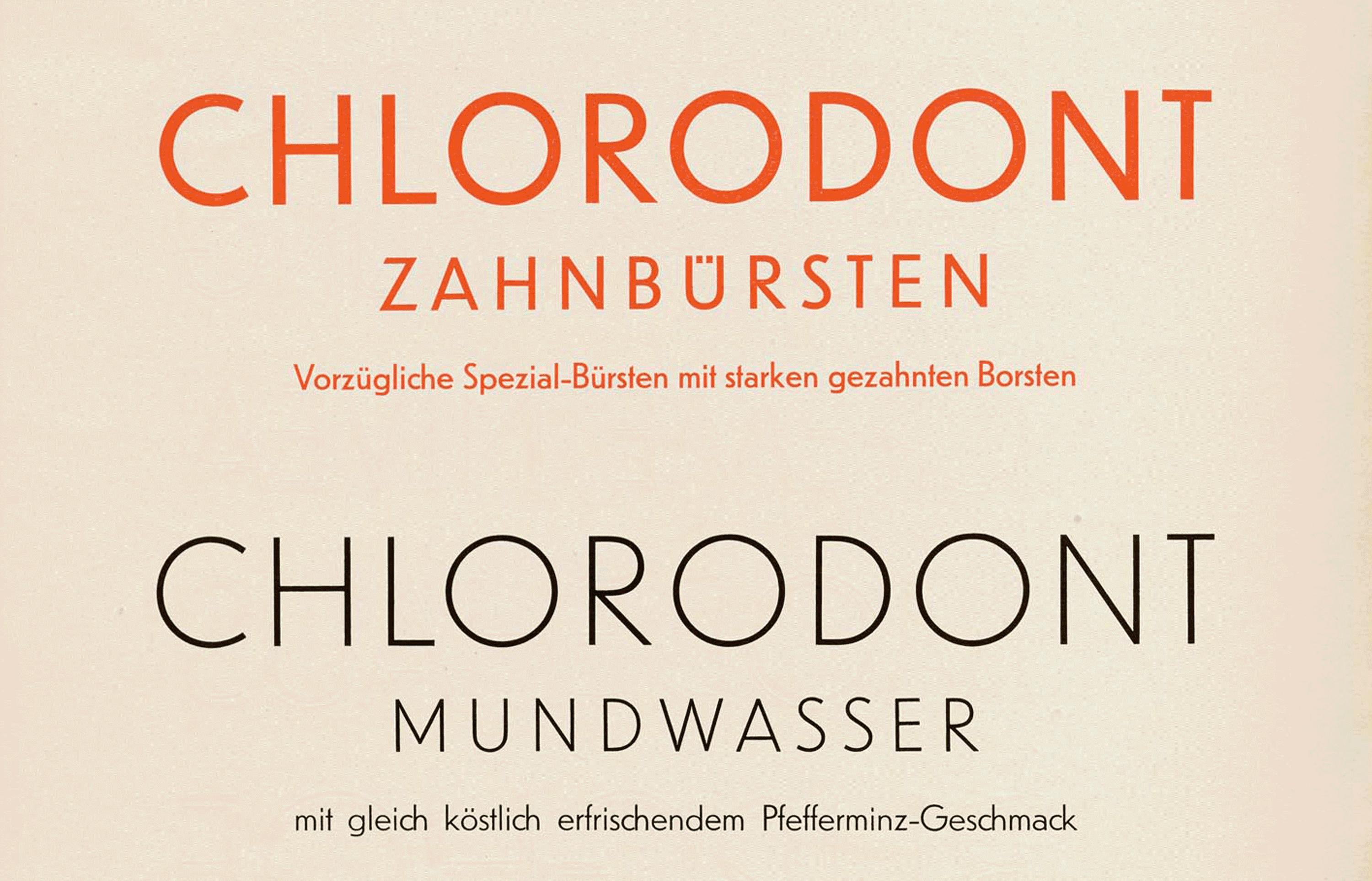
Tucked away in the last page of a specimen book for Erbar-Grotesk, an influential geometric sans-serif typeface designed by Jakob Erbar in the 1920s, is a sample featuring Chlorodont. The typographically playful advertisement showcases toothpaste, toothbrushes, and mouthwash. Instead of relying on neutral sample text, as it does throughout the book, this page demonstrates its typefaces through lively promotional copy: “refreshingly tasting peppermint toothpaste” and “excellent specialty brushes.” The shifting hierarchy of headlines, subheads, and descriptive text helps highlight the different weights and sizes offered by the type family while also showing how it could construct mood, trust, and consumer appeal. By 1924, Clorodont was a leading brand of oral care already using sans-serif lettering on its packaging and advertising. The 1930s Ludwig & Mayer specimen used the name as a vehicle for demonstrating the expressive possibilities of their modern type.
Based in Dresden, Chlorodont appears throughout commercial advertising and typographic culture in fascinating ways. The brand promoted itself by grounding its advertisements in scientific illustrations and also building a hygiene regimen. Its popularity meant that the brand spread across Europe and became well known beyond German borders.
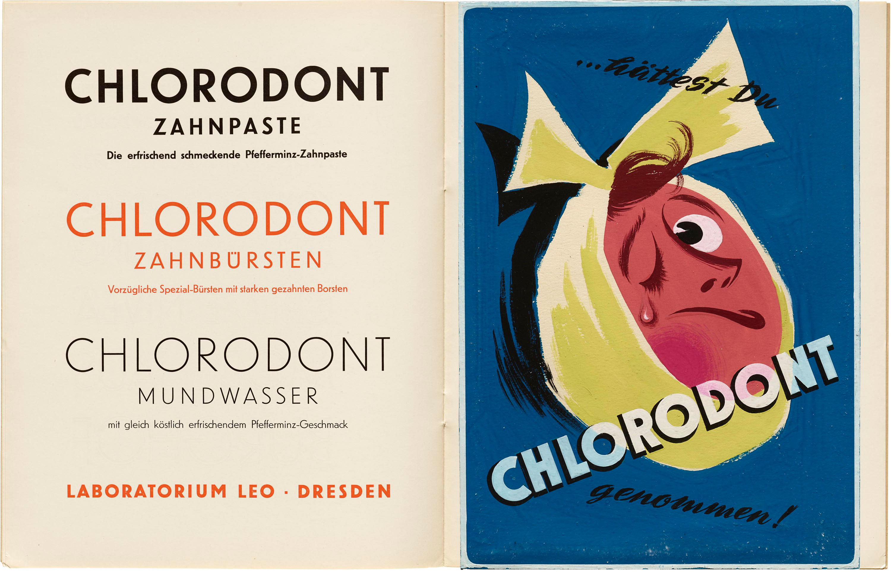
We see this in examples of advertising for Chlorodont in other European languages, such as Italian and Russian. A few decades after its appearance as a Ludwig & Mayer type specimen, the brand endures, inspiring Lumilla Kavalla, a student of commercial art in Austria. Her ad features an illustrated figure suffering from a toothache, with a dramatic bandage knot wrapped tightly around the face. Rather than softening the discomfort, Kavalla transforms it into a striking visual motif. The image is paired with a bold, transparent “Chlorodont,” connecting the language of modern typography with the emotional directness of illustration.
Side by side, the type specimen and Kavalla’s poster reveal how a single consumer product could move fluidly between typography, branding, and graphic experimentation. Chlorodont became a thread linking commercial print culture with design education, showing how everyday products often served as testing grounds for new visual ideas.