News
Shaped Text: An Aesthetic Whole
From ancient practice to contemporary children’s books, the endeavor to form text into image is found throughout the Archive.
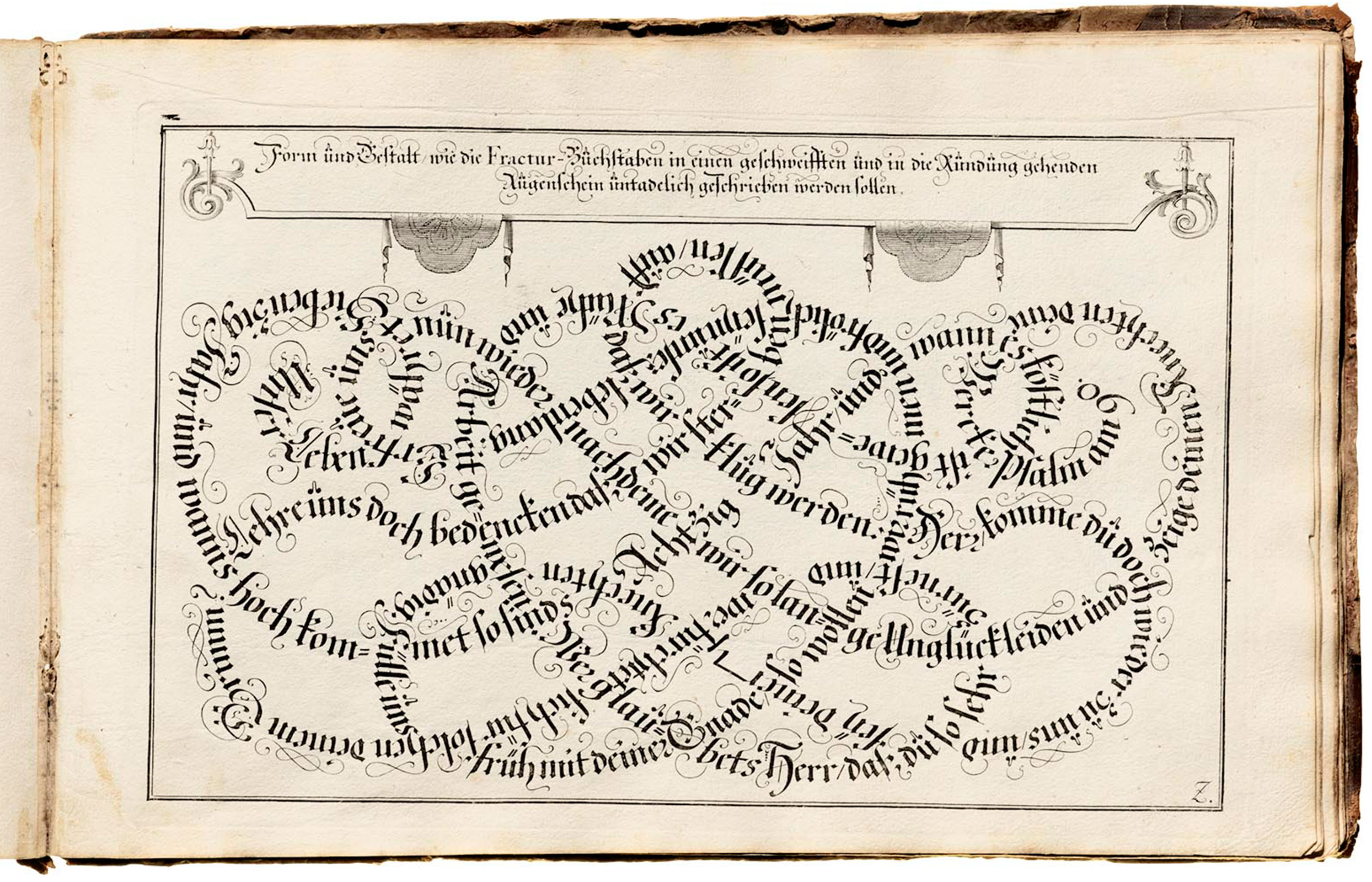
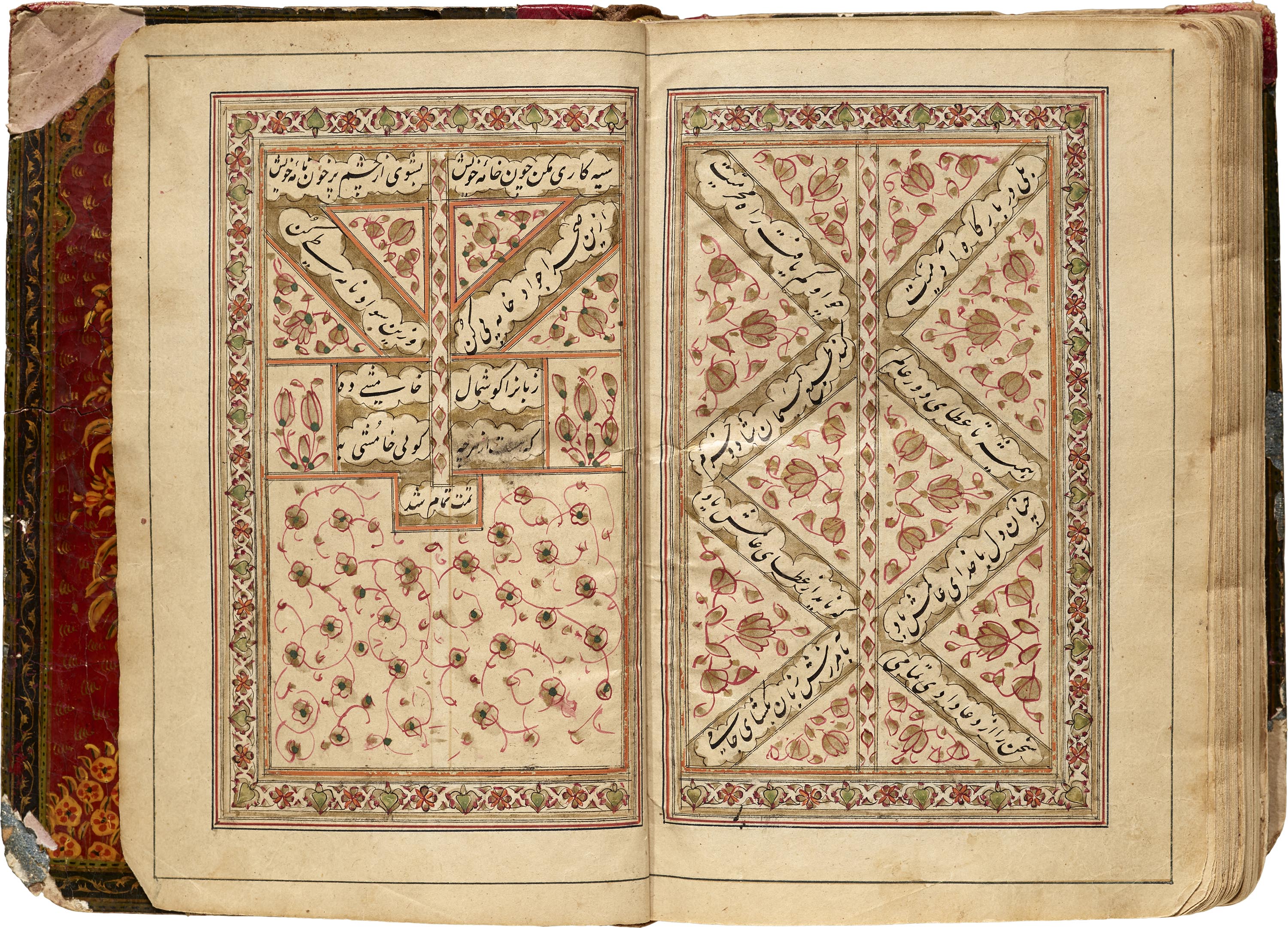
In a limited edition publication from 1963 entitled Eccentric Typography and Other Diversions in the Graphic Arts, Walter Hart Blumenthal laments the lack of resources exploring shaped text, or what he calls pictoral typography, contour typography, and shaped verse. This practice of arranging text to appear as an image is old and varied, and has many names but no single origin. Scribes of medieval manuscripts fashioned text into the likeness of the cross, and writing masters twisted words into knots. Surviving examples of this kind of poetry and prose exist independently in both Eastern and Western writing systems dating back as early as the Hellenistic Greek era. Fluxus artist and poet Dick Higgins released Pattern Poetry: A Guide to an Unknown Literature in 1987 — an extensive cultural and historical overview of over 2,000 works of shaped text — in which he beautifully describes this tradition as “the story of an ongoing human wish to combine visual and literary impulses, to tie together the experience of these two areas into an aesthetic whole.”
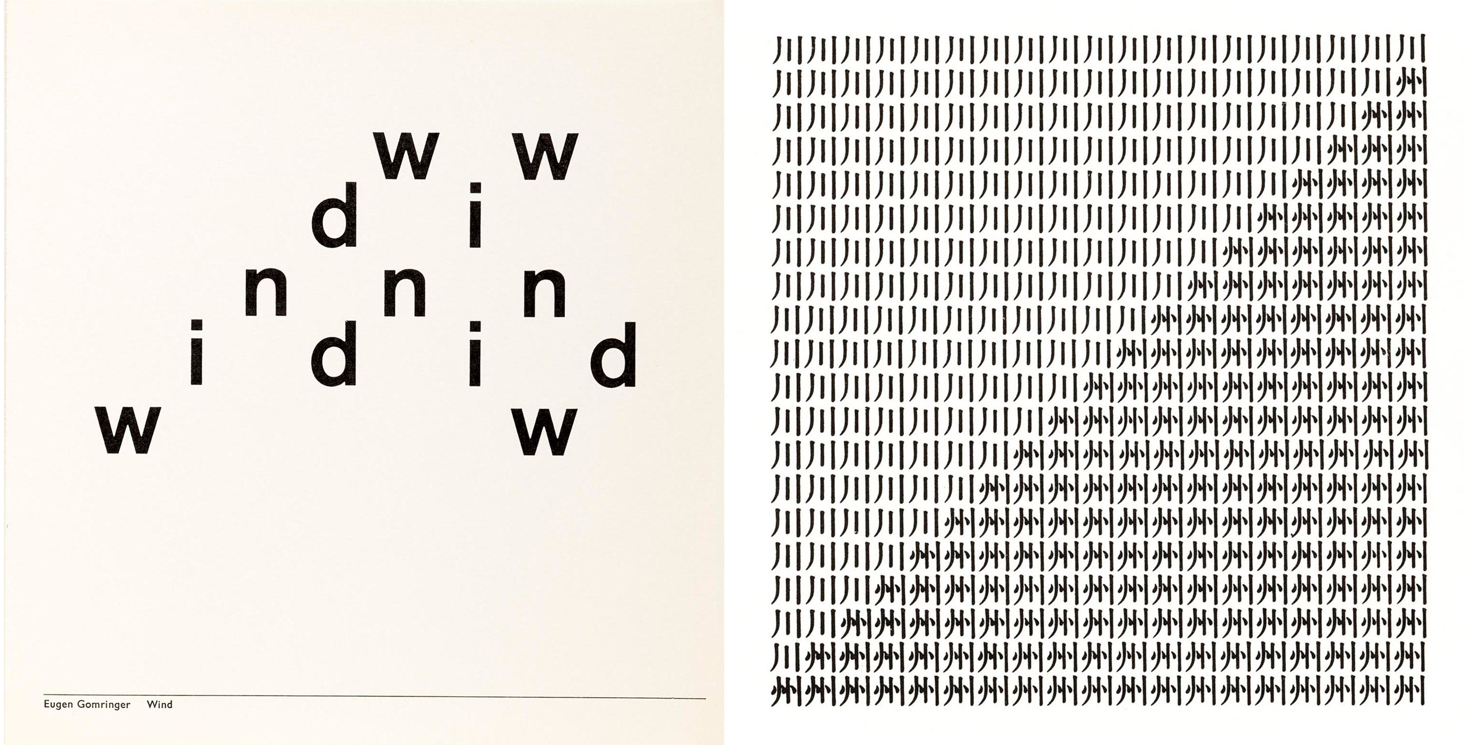
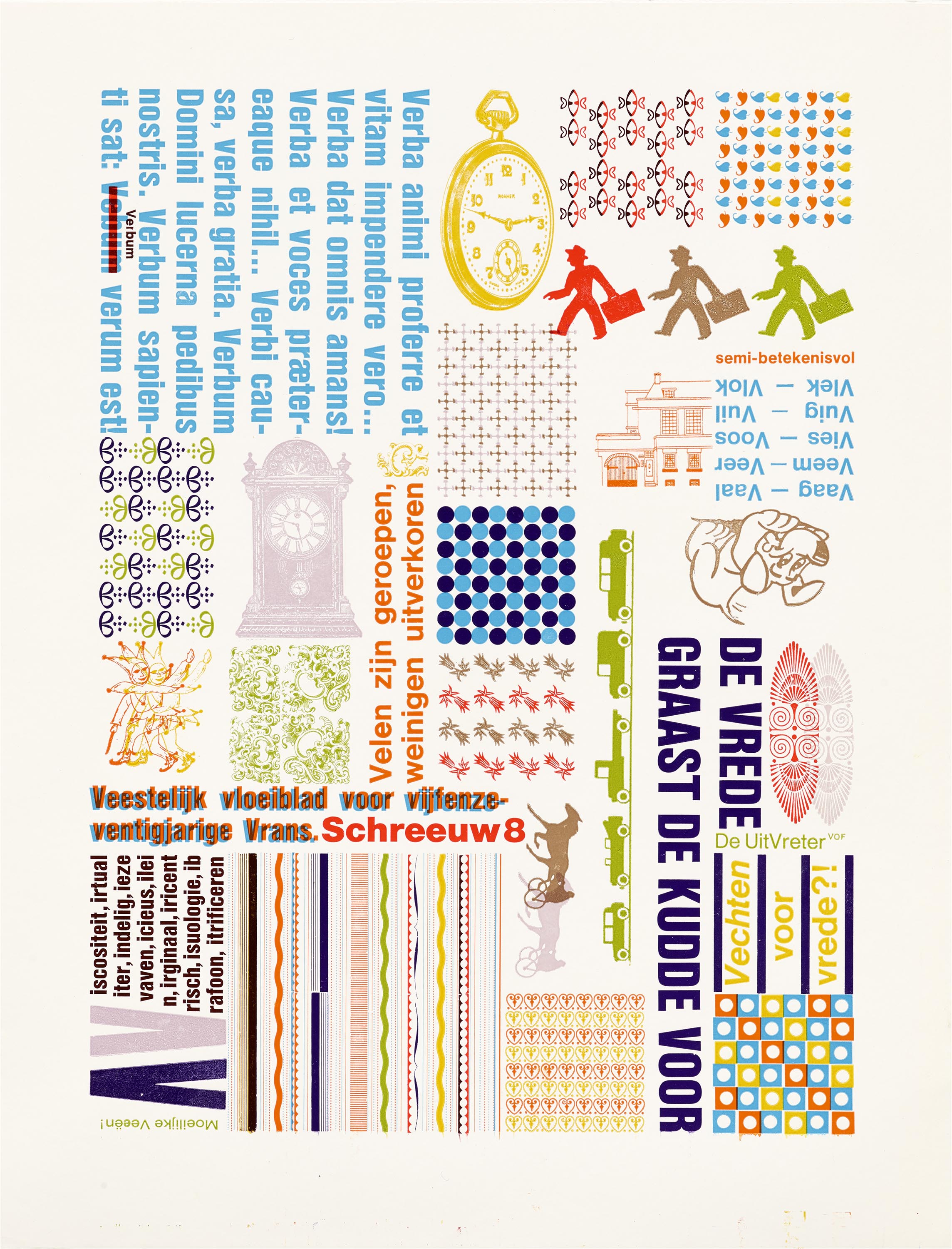
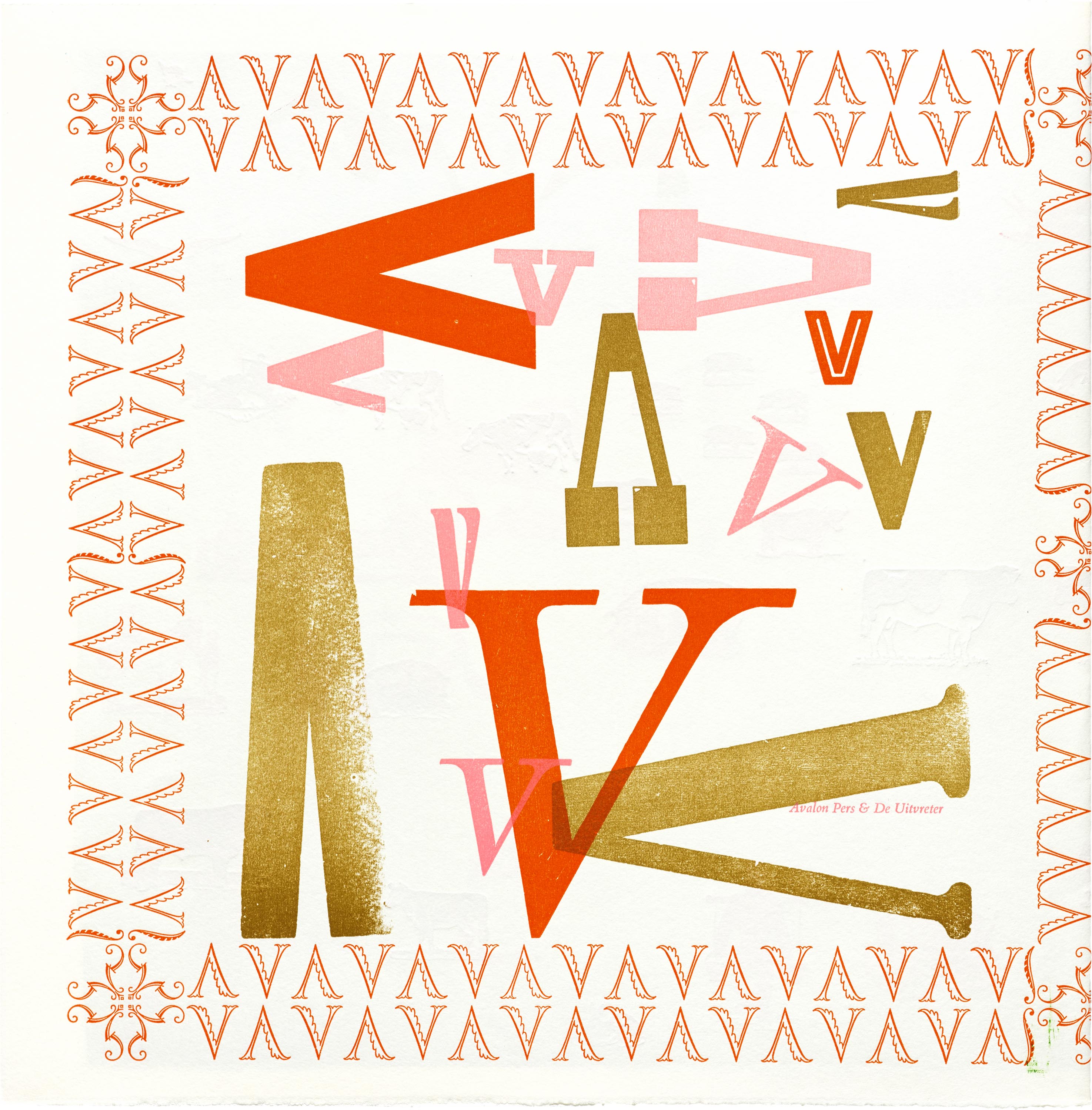
Artists and designers who shape text into image are represented throughout our collection. The most recognized and requested pieces of shaped text at Letterform Archive are works of concrete poetry, made popular by modernist poets of the 1950s and ’60s. (Also called pattern or visual poetry, this genre is characterized by the visual arrangement of textual elements — the text of the poems functions simultaneously as copy and image.) Our visual language collection is abundant with works like these by Gomringer and Niikuni.
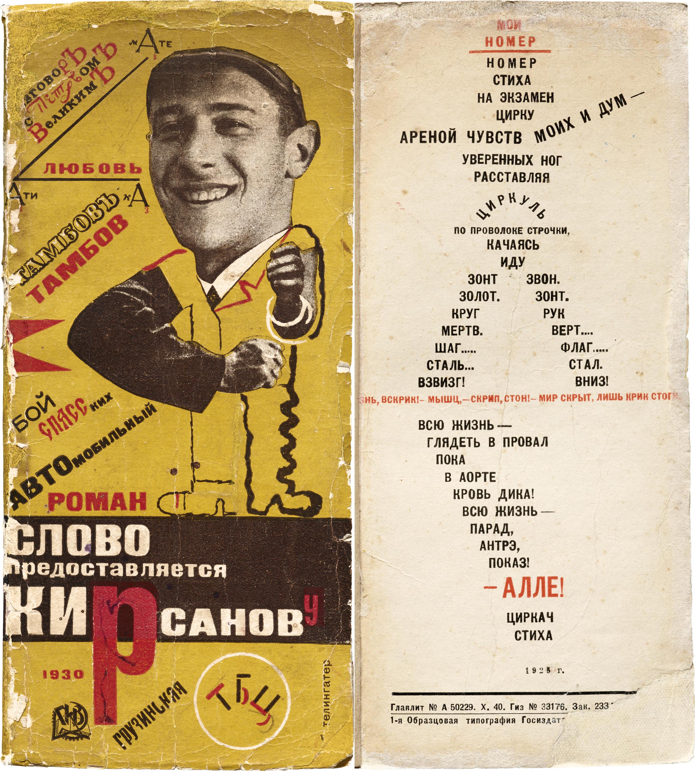
Of the hundreds of pieces of shaped text at Letterform Archive, the ones that sneak up on you are often the most compelling — like a person in the back of a collection of Russian poetry designed by Telingater. Every page of his book is full of interesting Russian avant garde typography, but on the very last page, a tiny man greets you.
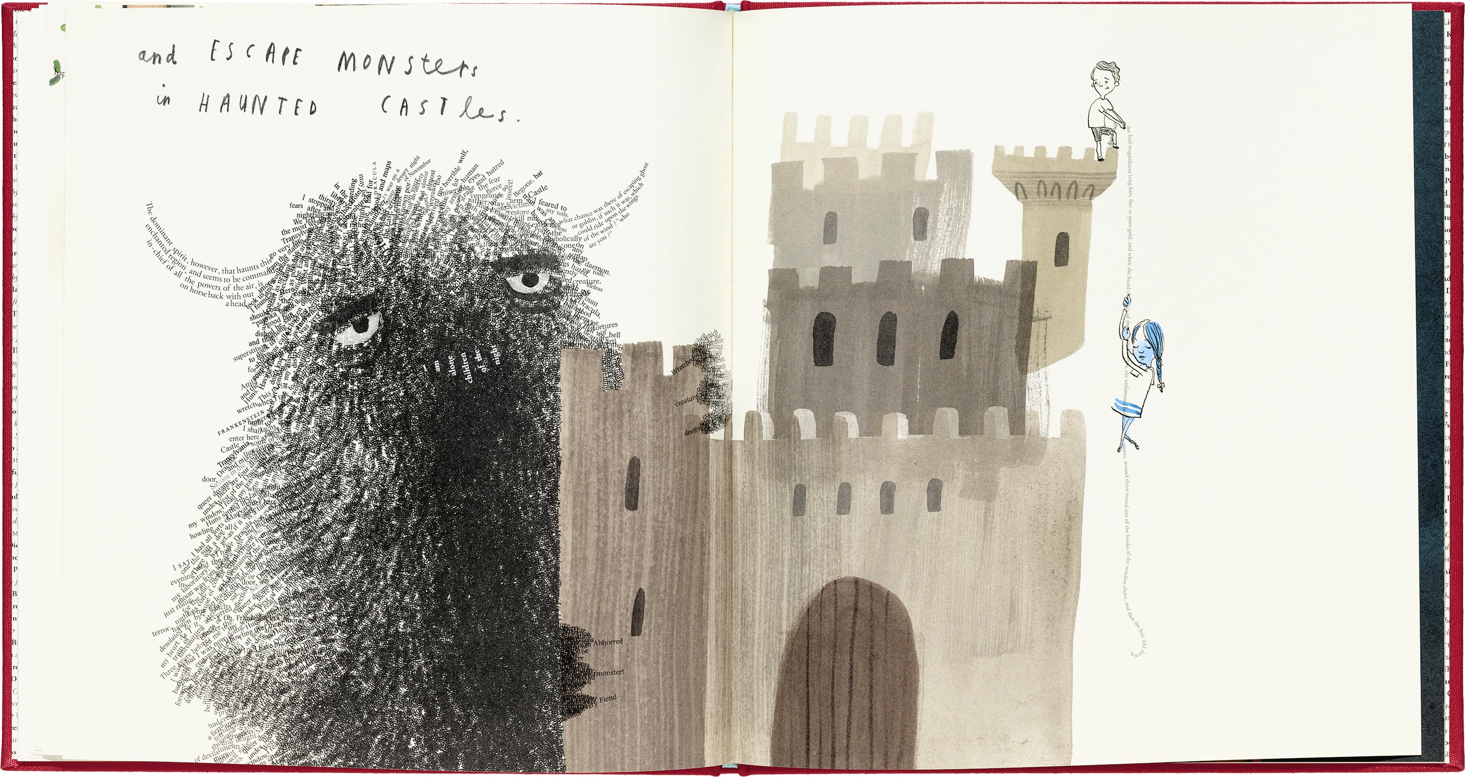
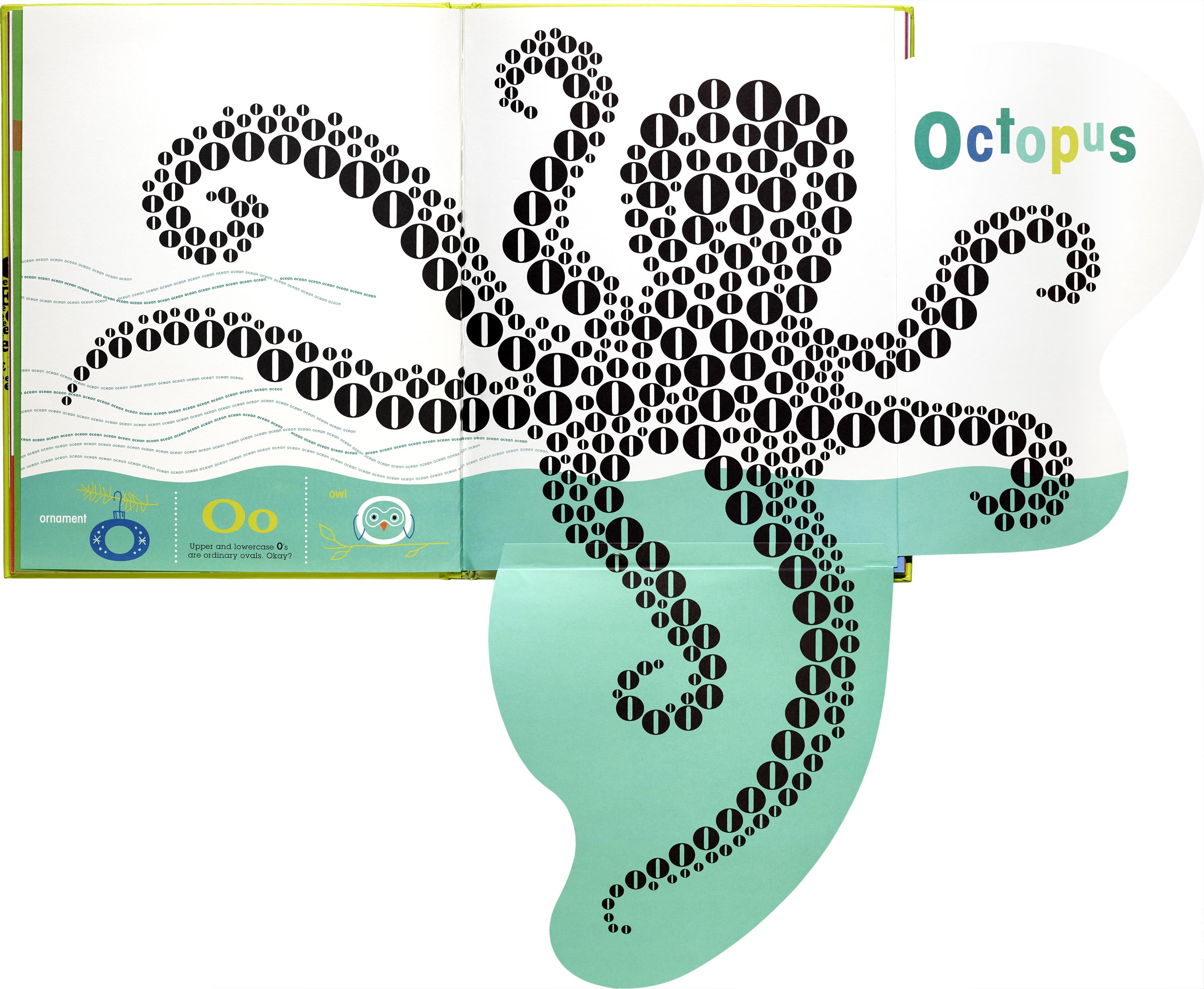
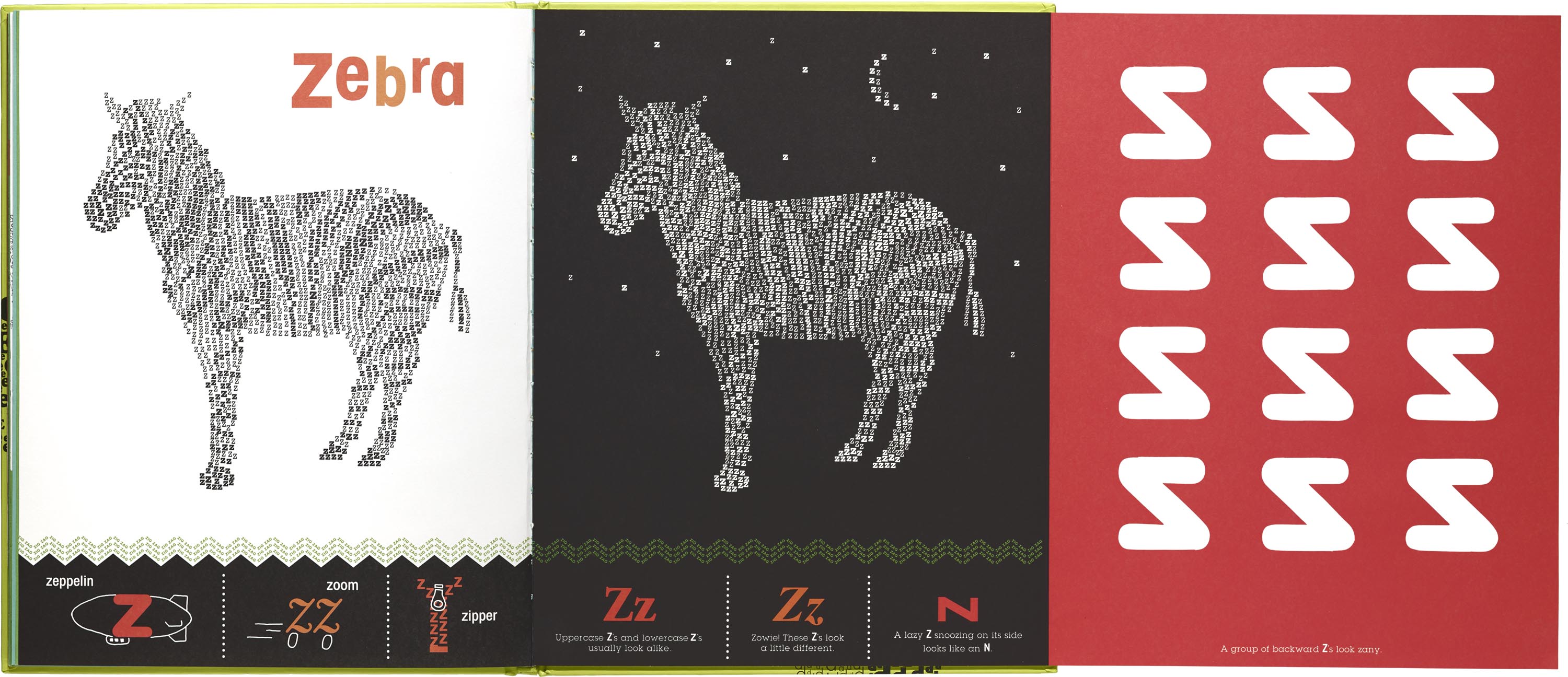
In a similar way, many of our children’s books employ shaped text to delight young readers. These stories are powerful, creative, and push the typical boundaries of books for adults. Author and illustrator duos like Sharon Werner and Sarah Forss and author-illustrator Maira Kalman employ shaped text to engage early readers, facilitate literacy, and, like any good storybook, it creates bonding experiences for adults and kids. A Child of Books, the team effort of Oliver Jeffers and Sam Winston, is worth a special mention. Excerpts from classic literature become textual illustrations of the narrator’s story and invitation to use your imagination. On each page, viewers are reading three things at once: the story Jeffers and Winston created, the stories they loved, and the images that bind the two threads into a twist on Higgins’ aesthetic whole. It blows our visitors’ minds (and mine) every time. Read it to the kids in your life.
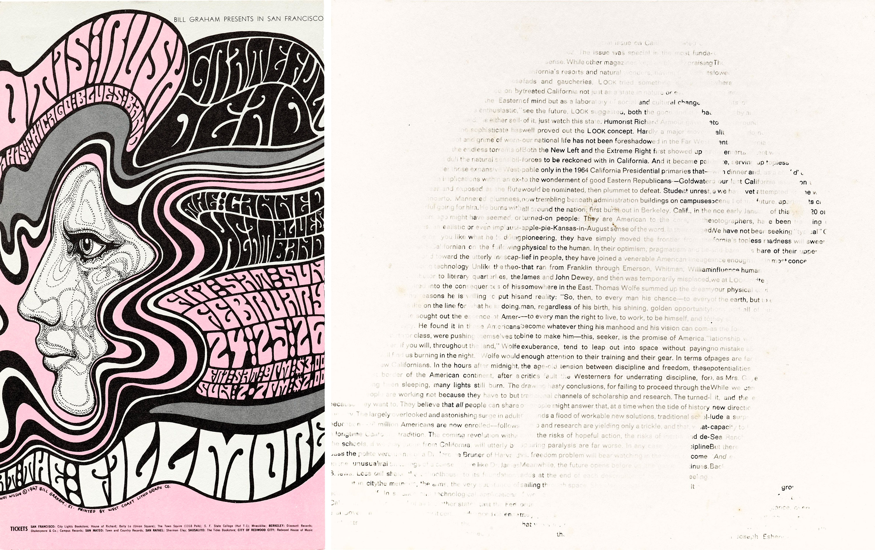
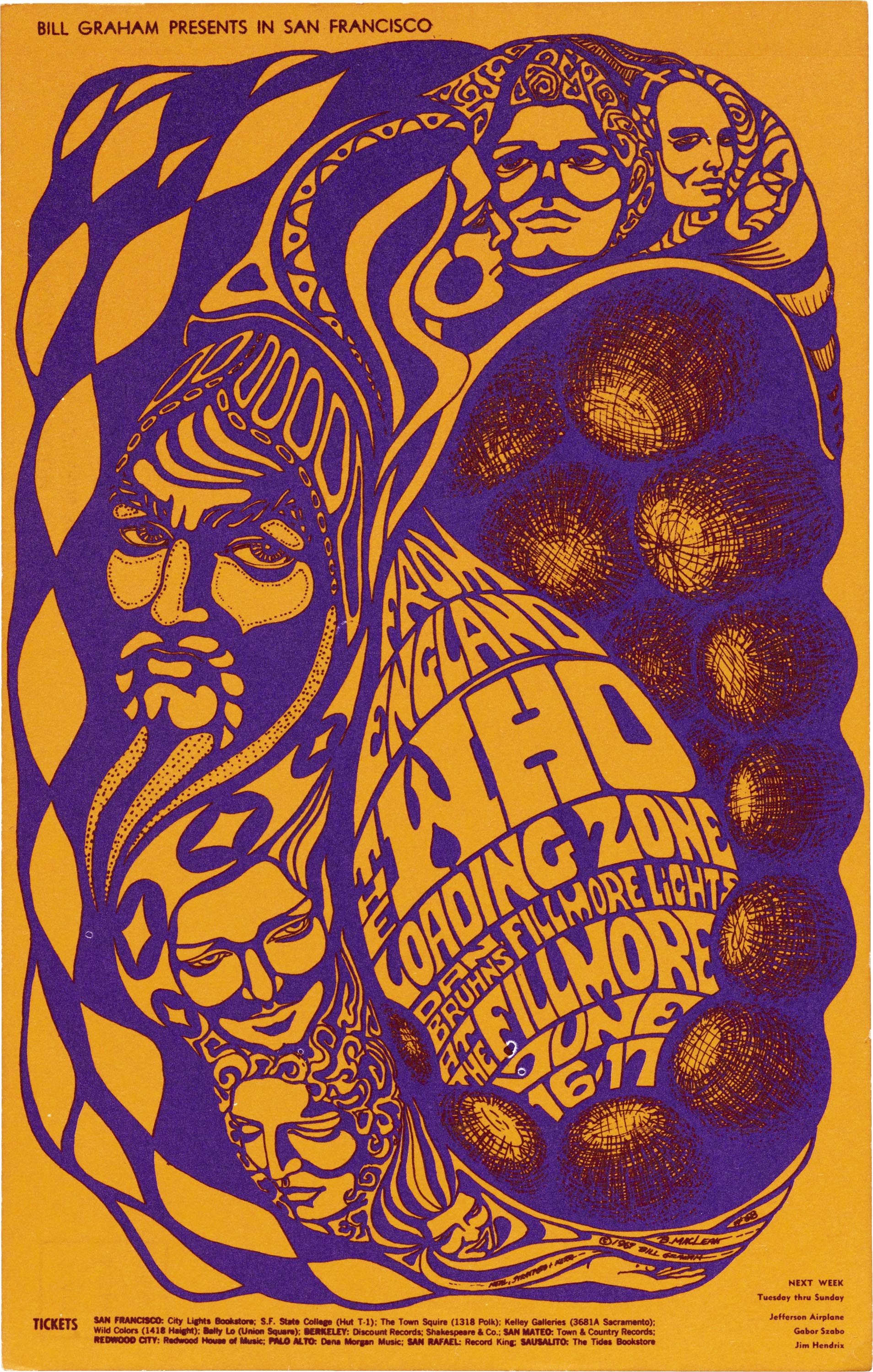
As new tools to produce books and art become available, the process of creating shaped text changes, but the results continue to charm and excite readers. Psychedelic artists like Wes Wilson seamlessly wove lettering and image together into iconic rock show promotions — notice how the lettering creates waves in the woman’s hair. An interesting comparison to Wilson’s hand-lettered and drawn female profile is Aaron Marcus’ computer-aided concrete poetry. The use of lighter and darker letters creates the full portrait of a woman. As technology progresses, the “human wish to combine visual and literary impulses” remains constant and strong.
For a tradition with such rich roots and varied executions, it is unfortunate that shaped text is dismissed by some critics and often relegated to a footnote in literary and design curriculums. For researchers and the generally curious alike, our collection features shaped texts in poetry and books, posters, type specimens, and all kinds of ephemera. The pieces are skillfully made and often humorous, turning shaped phrases into little inside jokes between the creator and the reader. On your next visit, no matter your request, we invite you to keep your eyes peeled for shaped text — you’re bound to encounter some.
More Shaped Text Selections from the Archive
All images in this gallery are hi-fi captures. Click an image to enter fullscreen view, then pinch or use browser zoom to enlarge.


![John Combrie & Sheila Bourne, Kickshaws Press, [Untitled], Revised 1992.](https://letterformarchive.org/wp-content/uploads/legacy/Image_Requests_201816532.jpg)
![Timm Ulrichs, Zusammenfassung and [Untitled] in Visuelle Poesie, ca. 1968.](https://letterformarchive.org/wp-content/uploads/legacy/Image_Requests_201816593.jpg)
— Kate Long, Assistant Librarian