News
From the Collection: Sylvie Vodáková’s Book Covers for Květy Poezie
Meet the Czech designer who shaped how generations of readers encountered poetry.

Sylvie Vodáková occupies a distinctive, yet largely unheralded, place in Czech design. Over several decades, beginning in the late 1950s and continuing well into the 2000s, she developed a visual language marked by restraint, clarity, and a deeply human touch. Her long-running involvement with the Květy Poezie (“Flowers of Poetry”) series made her not just a designer of books, but a quiet custodian of Czech literary culture.
Born on July 31, 1926 in Martin (Slovakia) as Sylvie Riczniaková, Vodáková came of age in the postwar founding of the Czechoslovak Republic. Many designers—especially women, whose contributions are only now gaining wider recognition—carved out an intelligent and emotionally attentive visual language within the limits of Communist rule. Vodáková developed her own voice in this transitional climate.
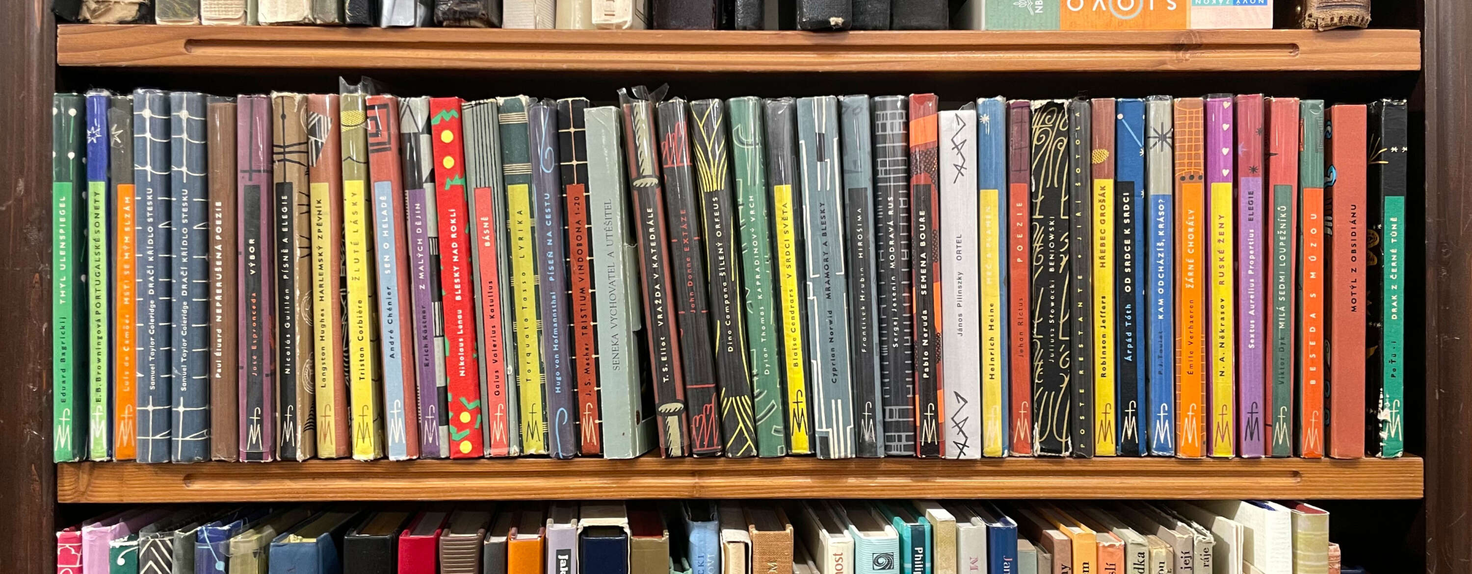
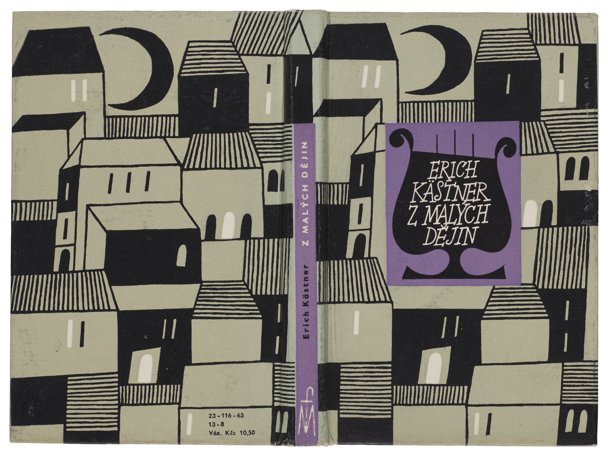
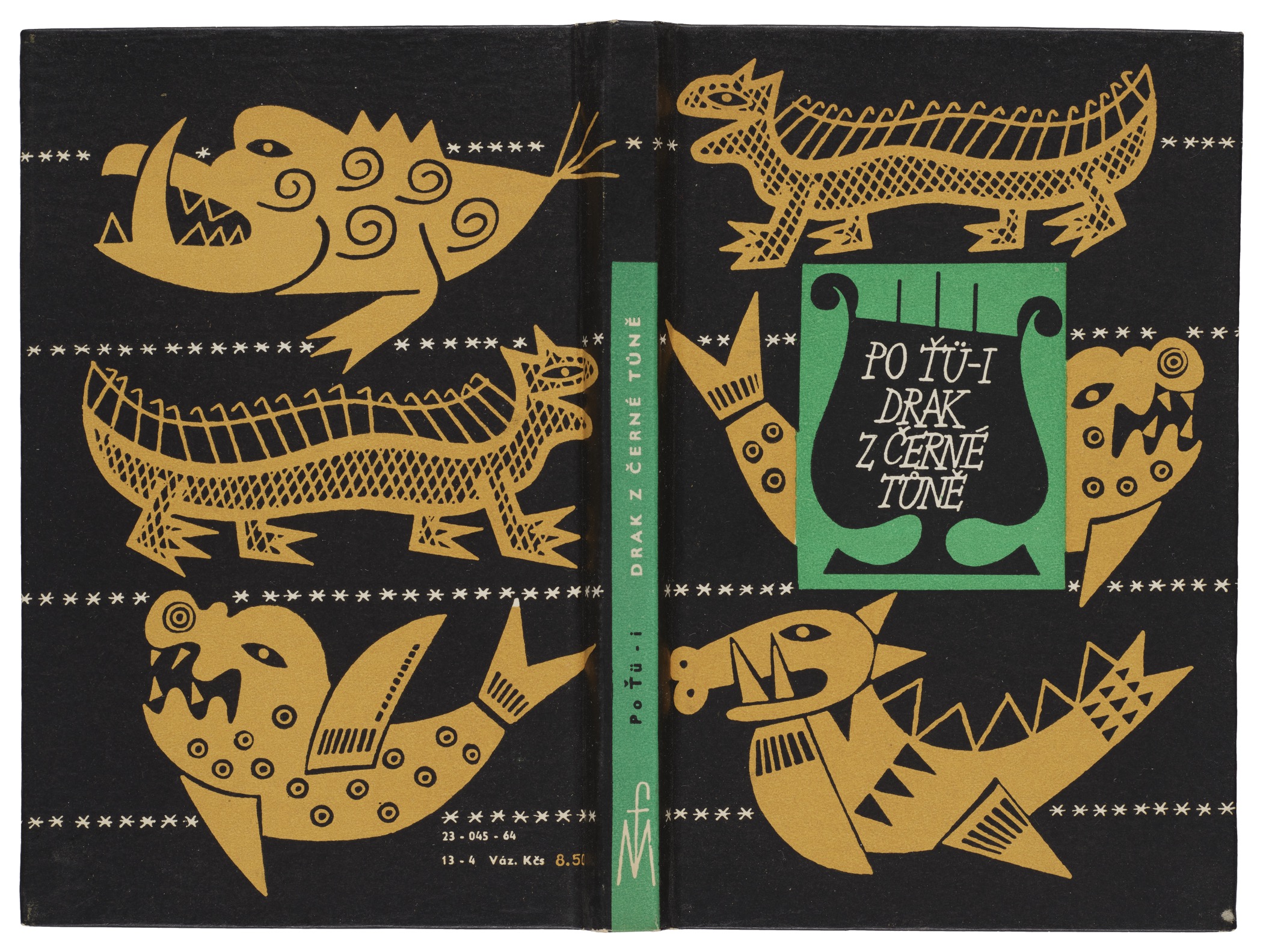
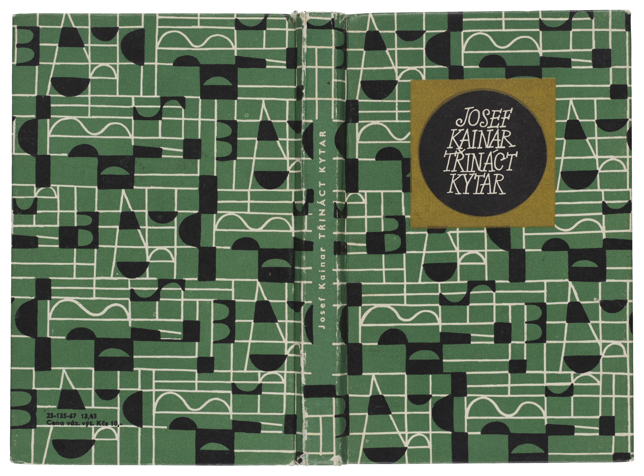
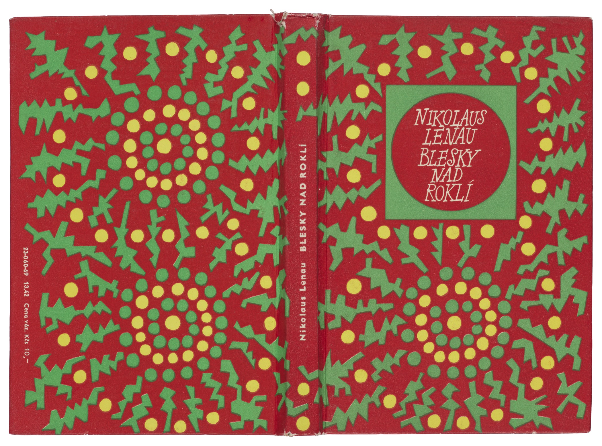
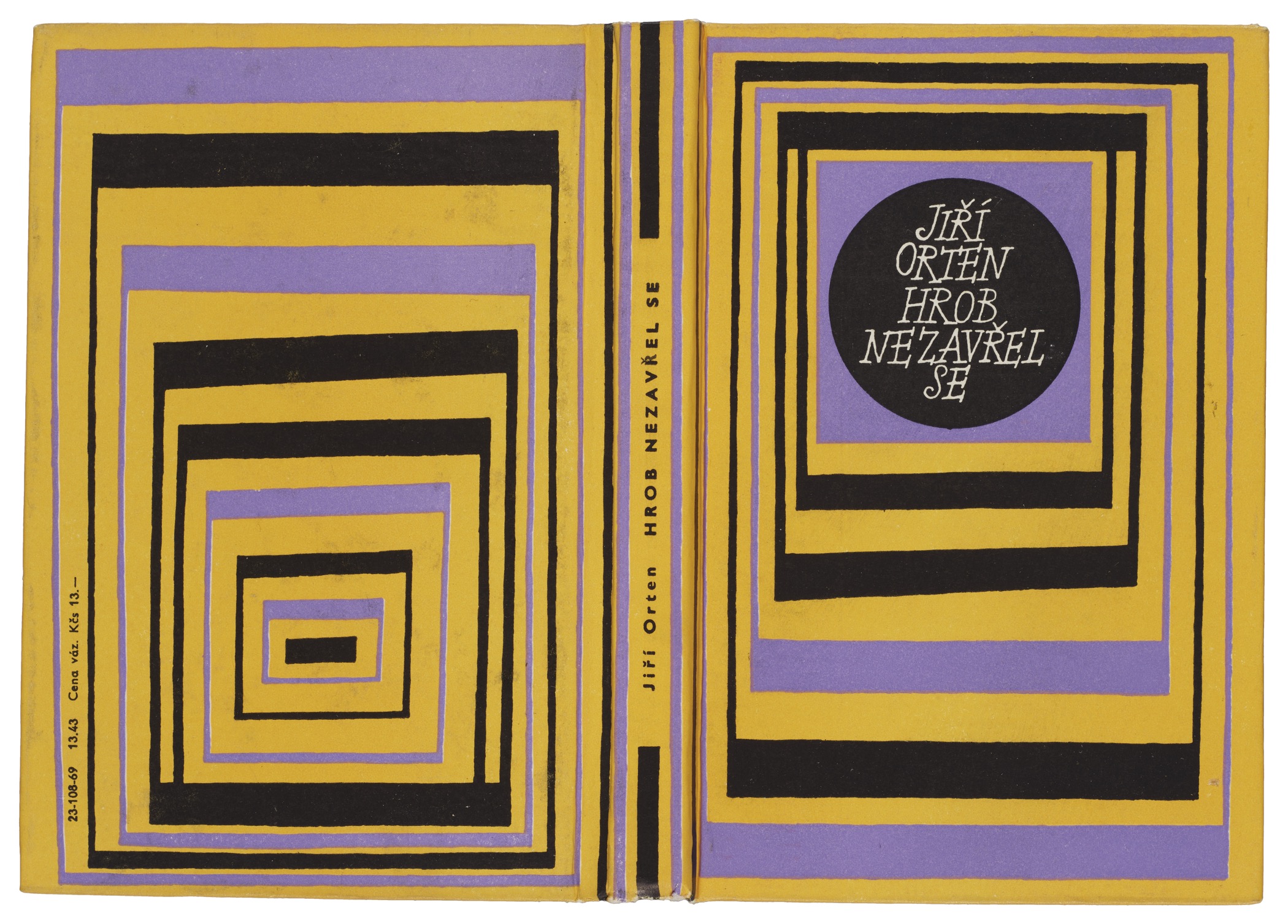
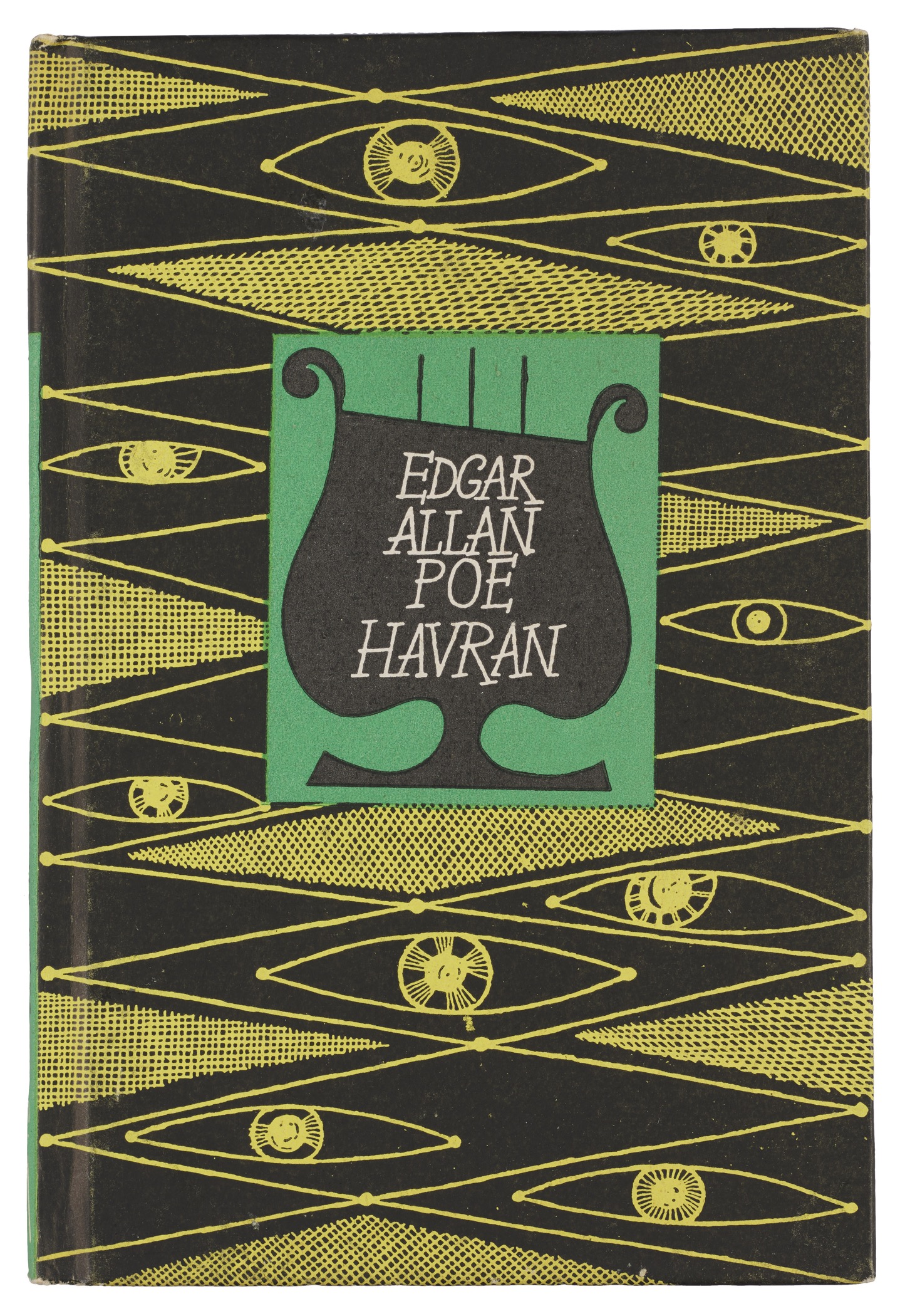
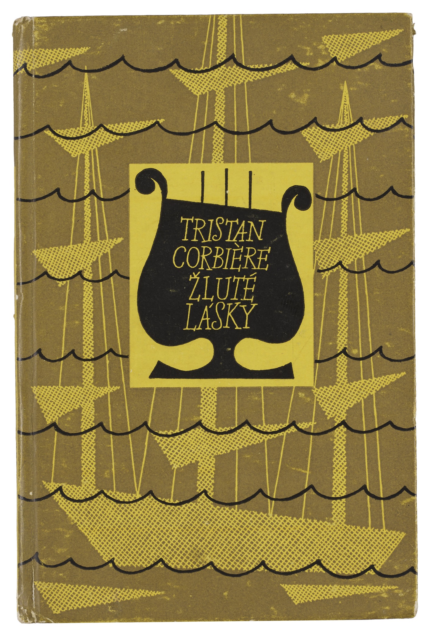
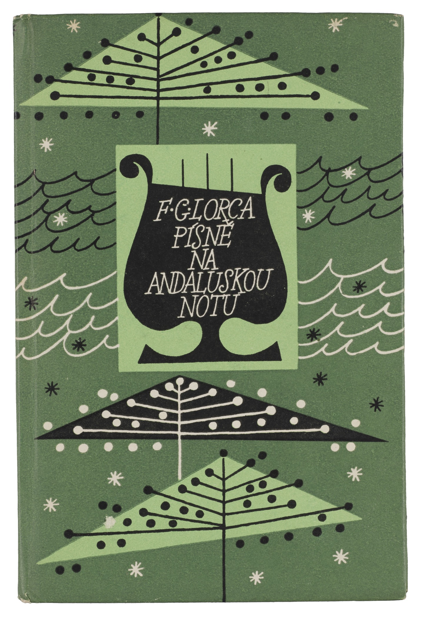
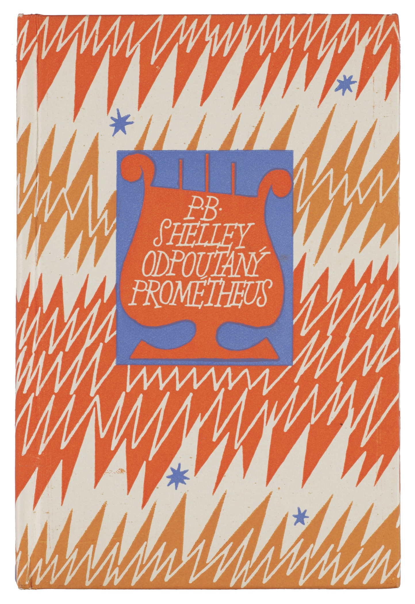
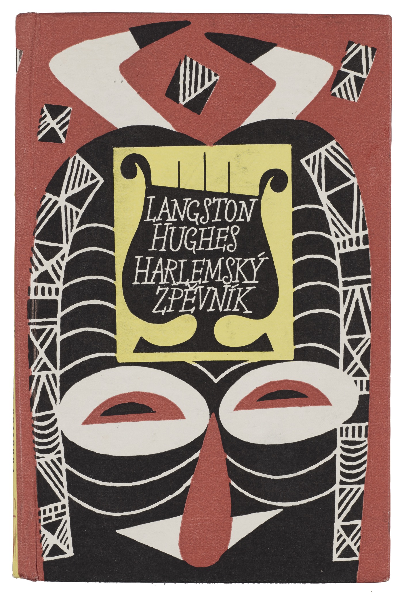
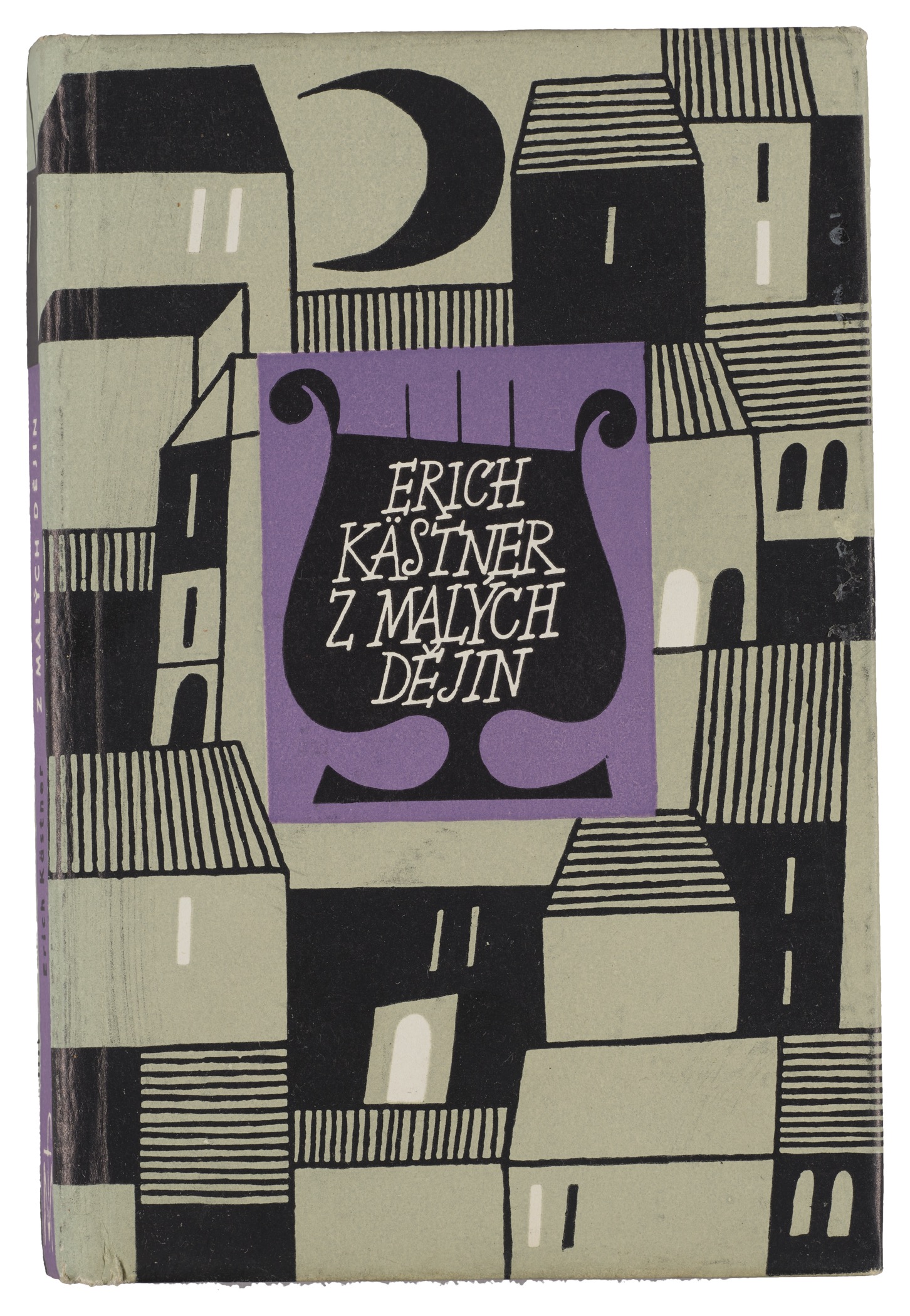
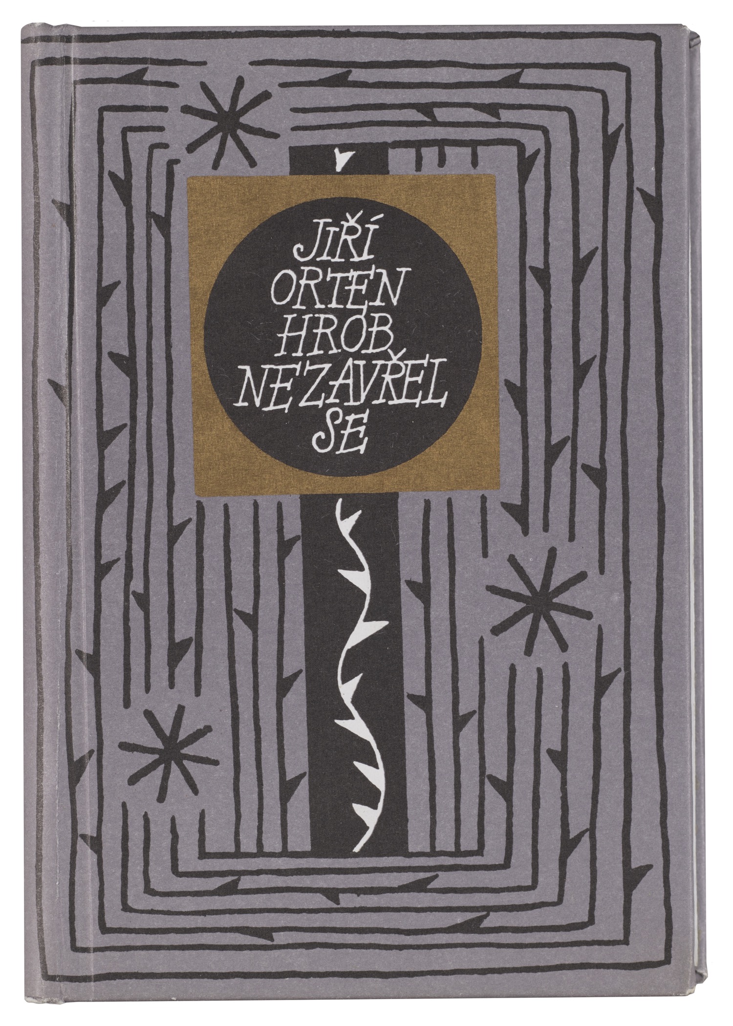
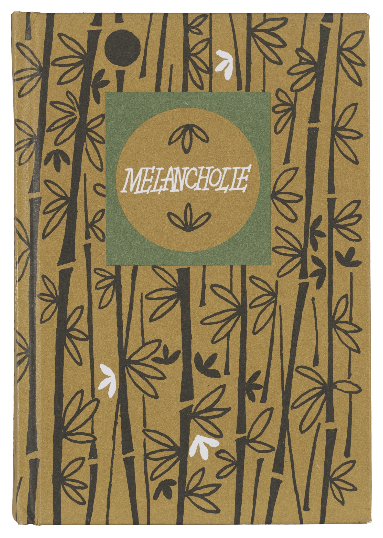
A pivotal moment in her career came when the artistic design of the Květy Poezie covers was entrusted to her as a young artist. From the late 1950s onward, nearly every one of the series’s 242 titles carried her visual signature. Mladá Fronta adhered to Vodáková’s design language for the entire run, with the exception of fourteen volumes published between 1987 and 1991 (nos. 159–172) when a new designer took over the designs and also changed the size. In 1991, the publisher, Mladá Fronta, returned to her original format and visual approach, an acknowledgment of the designer’s defining influence.
Stephen Coles, Letterform Archive’s associate curator, first encountered the series at a bookstore in Prague where they filled several dedicated shelves.
The series immediately drew me in—a row of colorful spines, uniform in height and typography, with a hint at the hand-drawn variety that awaits you on the covers. Her title lettering is remarkably consistent over the 50 years, and exhibits the liveliness and improvisation I associate with Czech typographic design. Each binding is filled with attractive patterning. Every little tome charms you. While the books are a regular fixture in Czech households, they are rarely seen in the U.S.. I knew we had to bring some home to Letterform Archive.
This degree of continuity of the Květy Poezie series is rare, even in the wider history of international publishing. Perhaps the best parallel is the mid-20th-century gift books of Peter Pauper Press. Both lines cultivated the idea of affordable, beautifully made books as objects of everyday cultural life. Both lines featured custom lettering, patterning, and decorative minimalism to make reading texts of all kind approachable without diluting its intimacy. Yet, while Peter Pauper generally employed whimsical, figurative motifs, Vodáková went a more abstracted route.
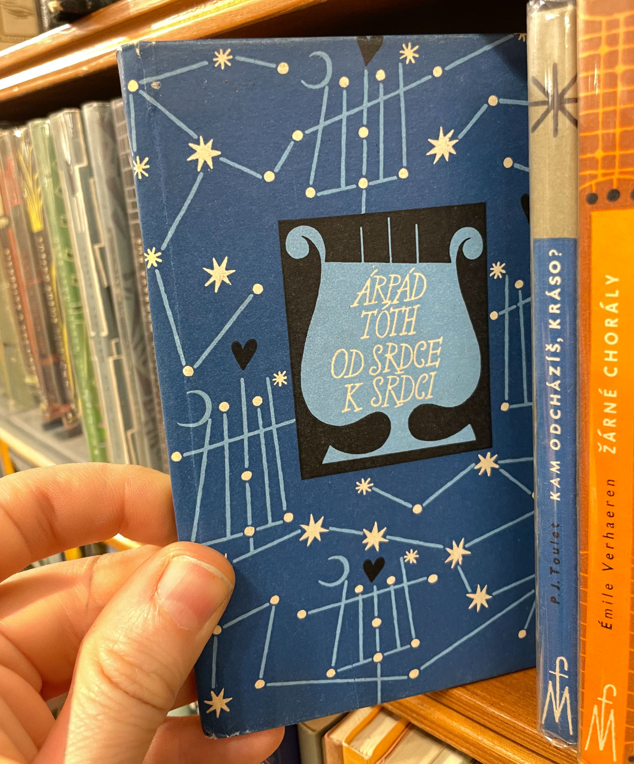
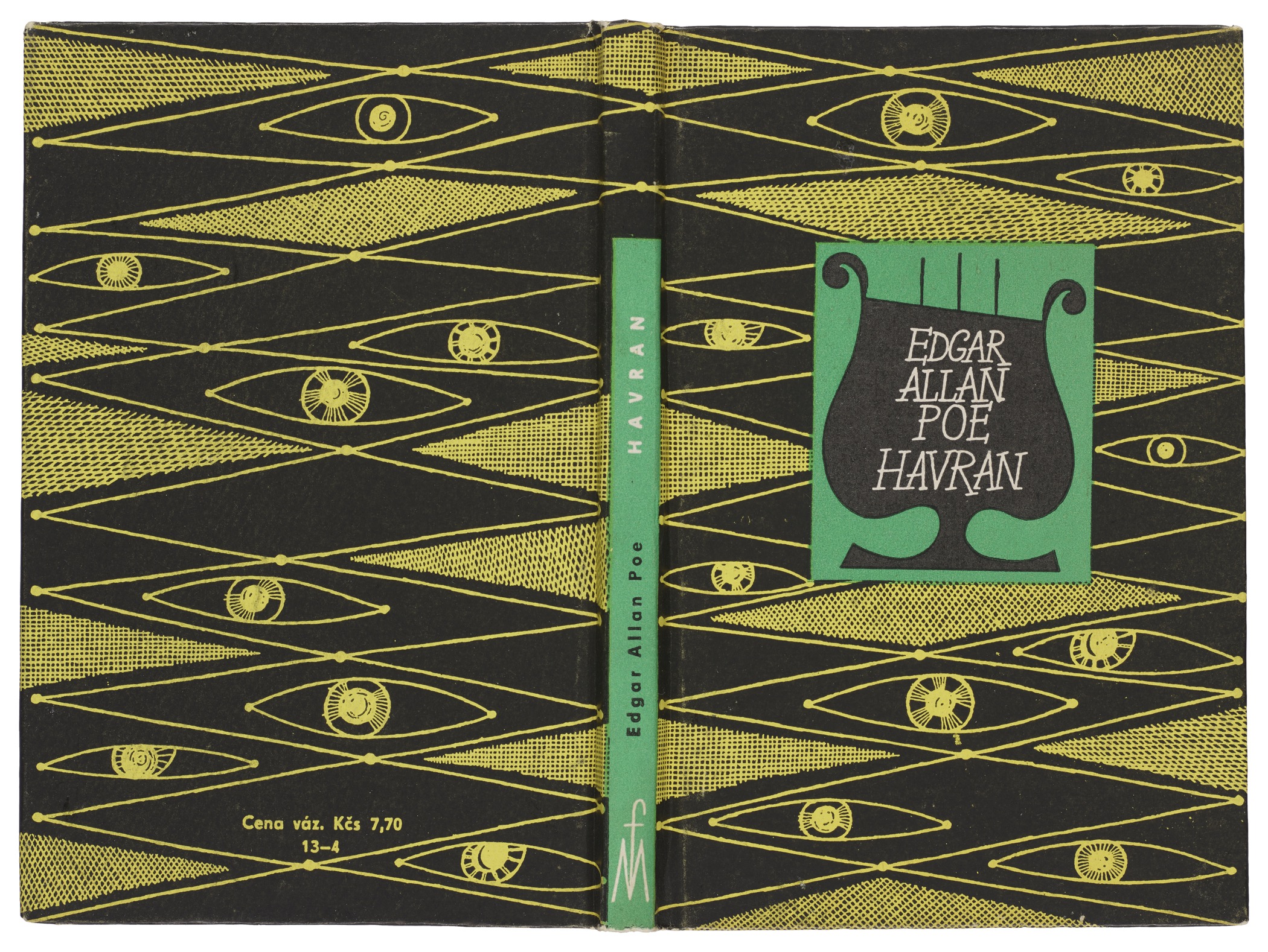
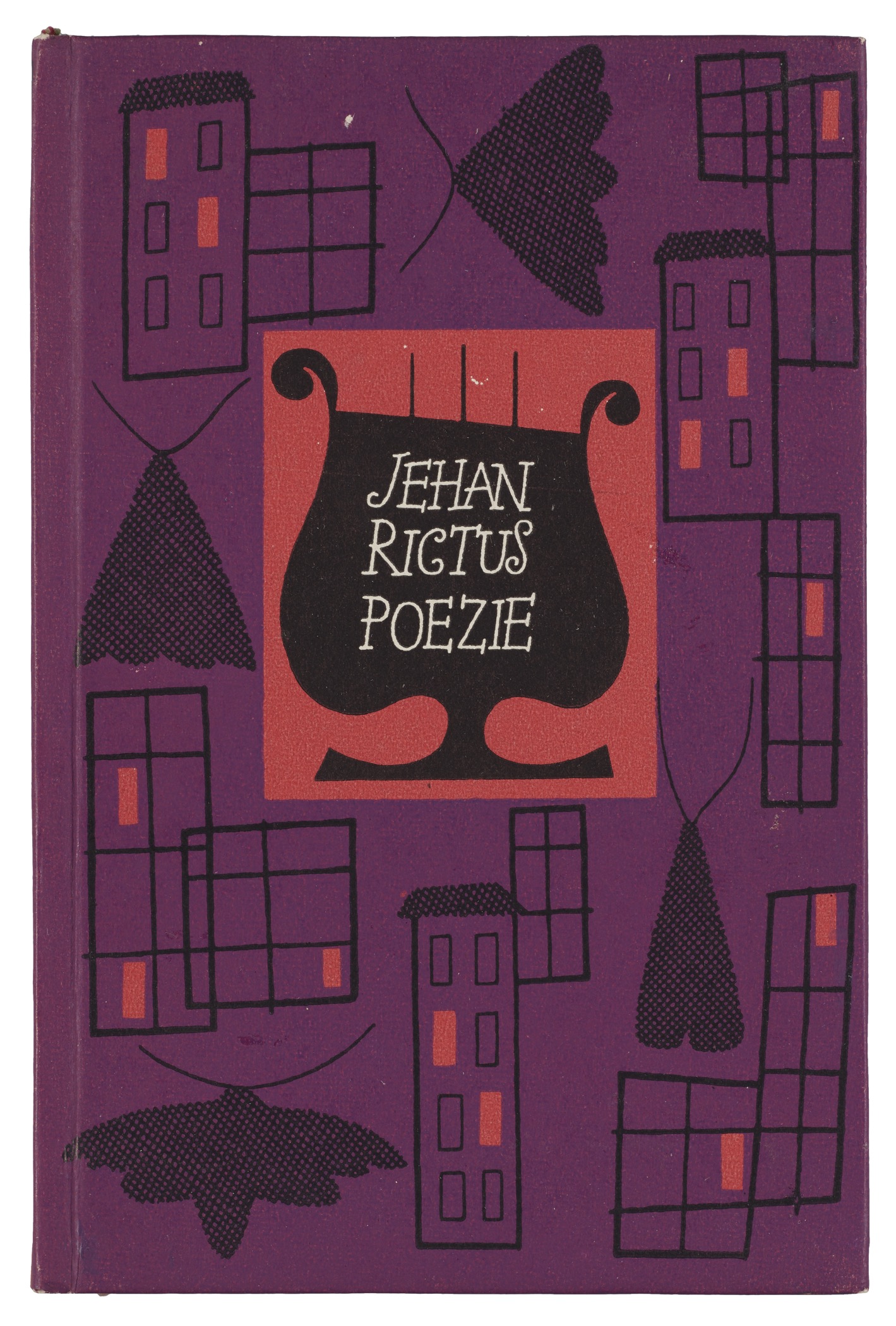
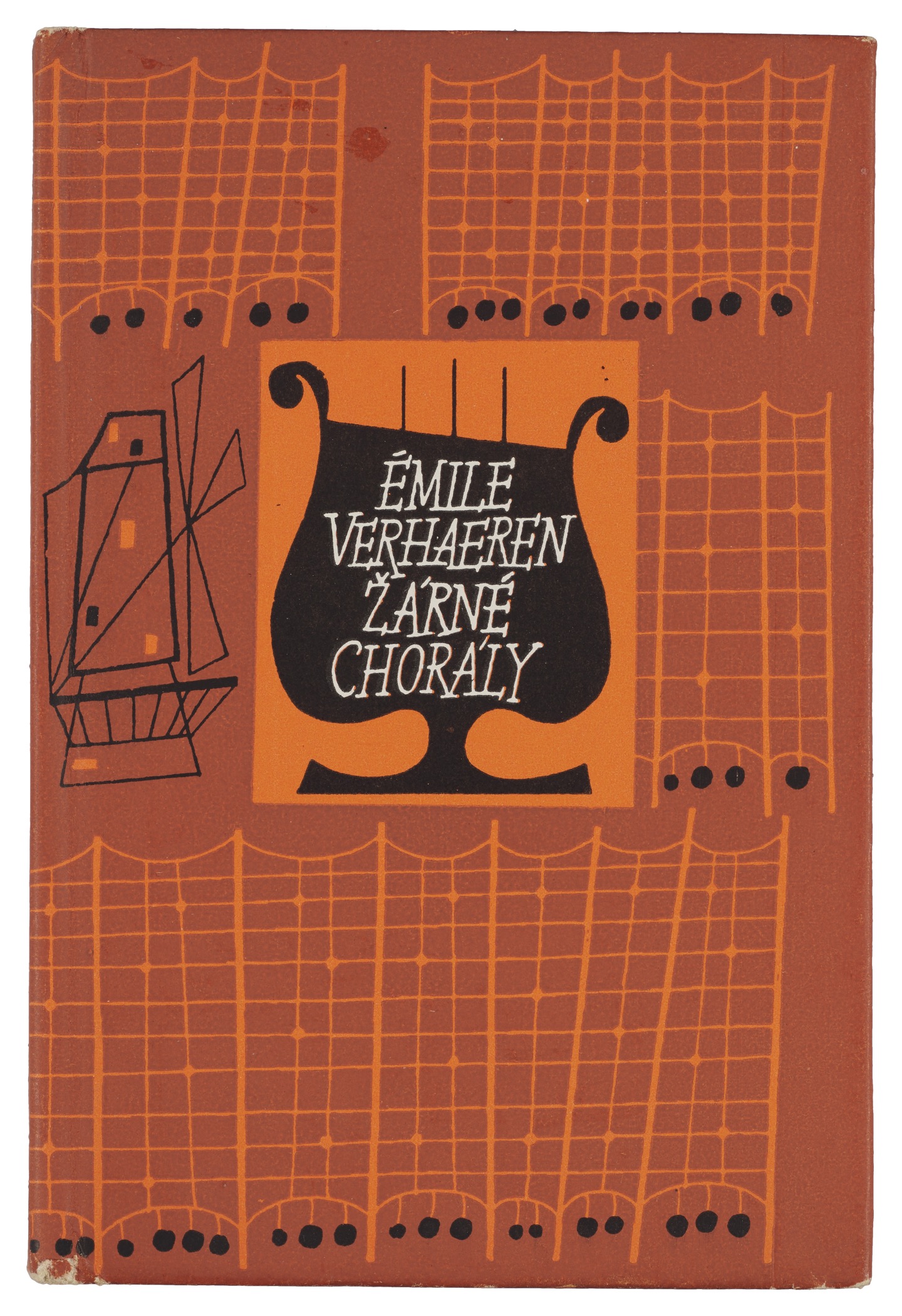
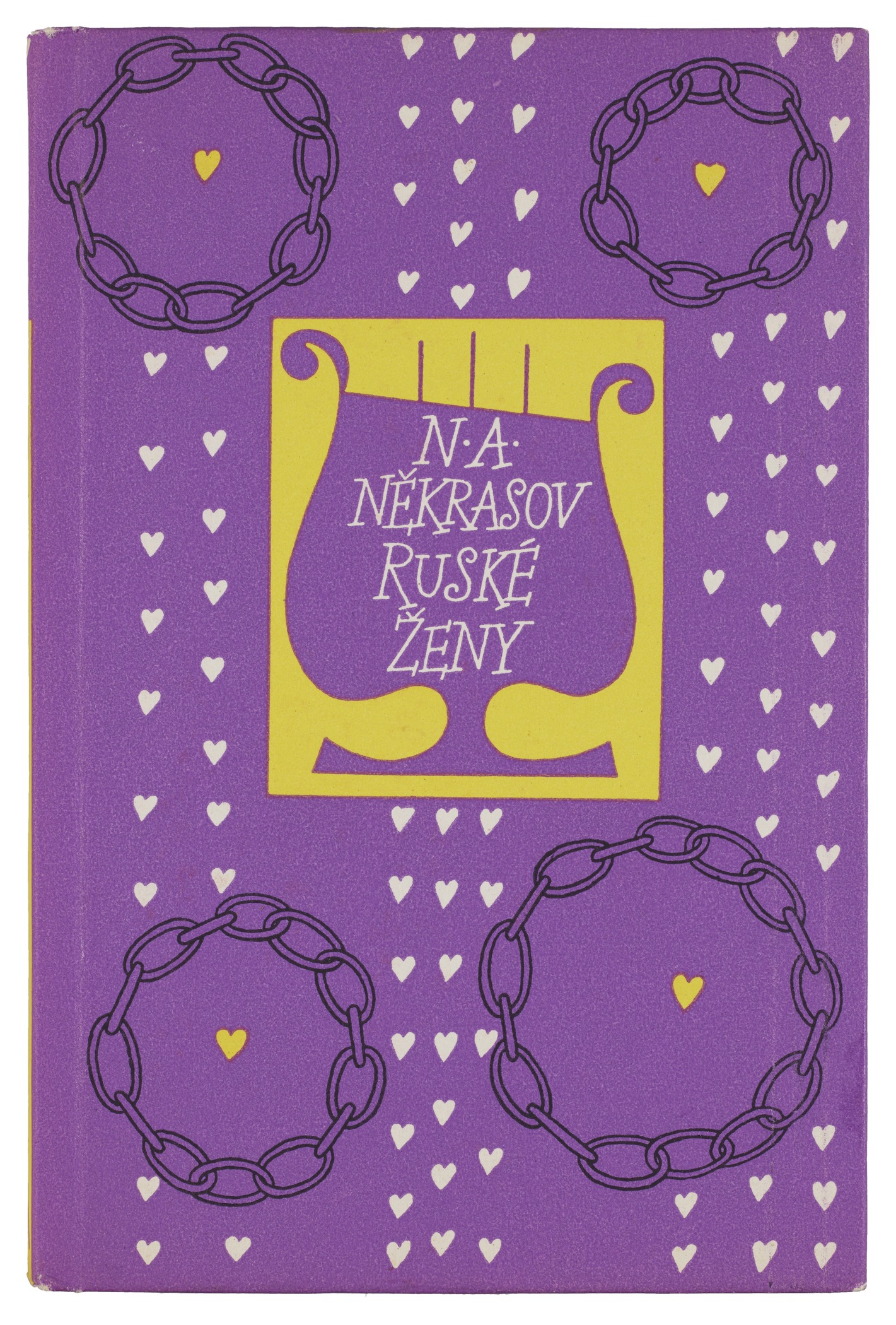
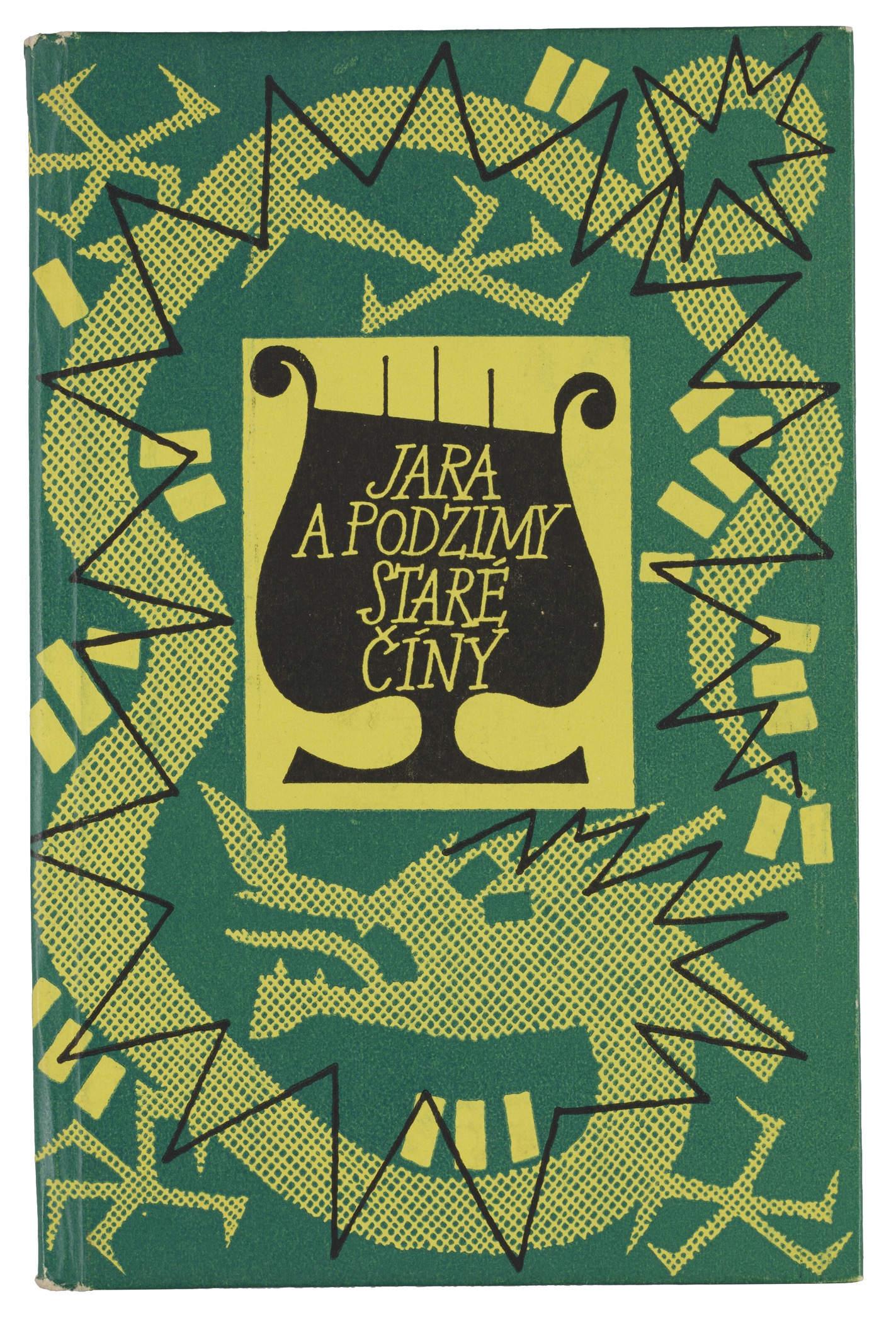
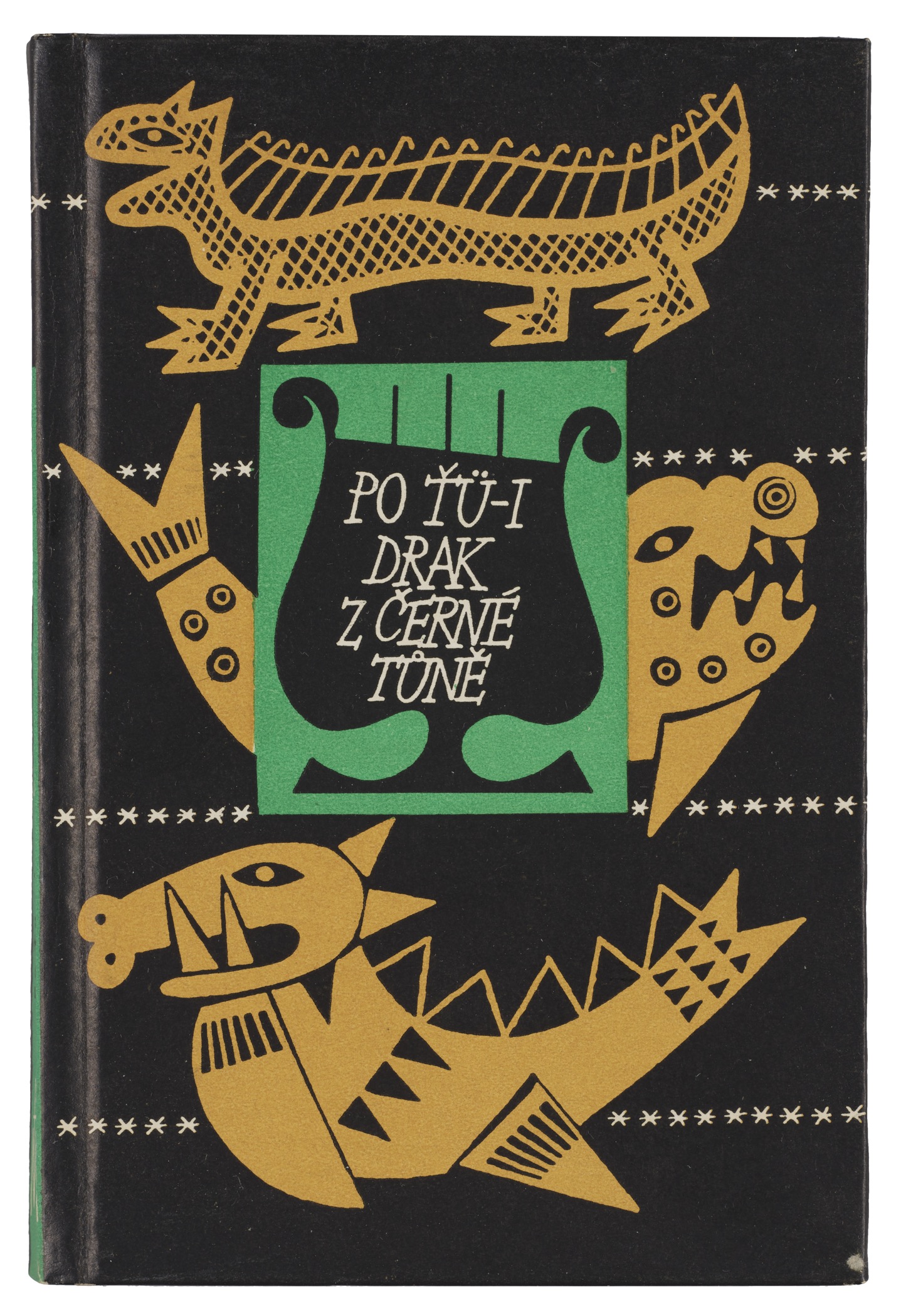
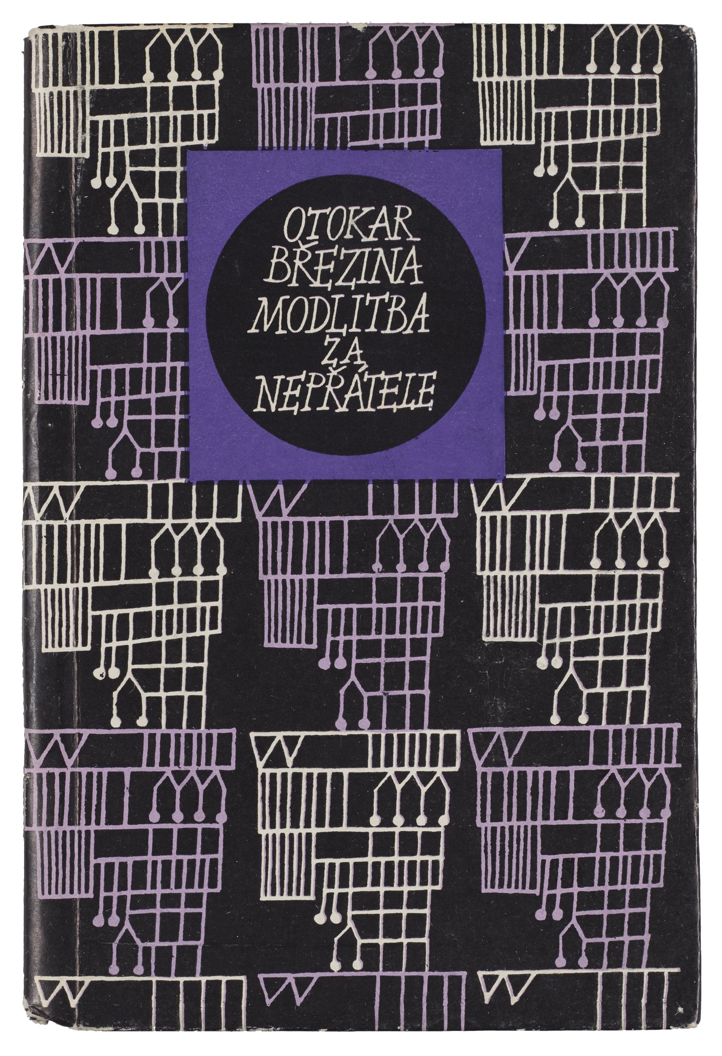
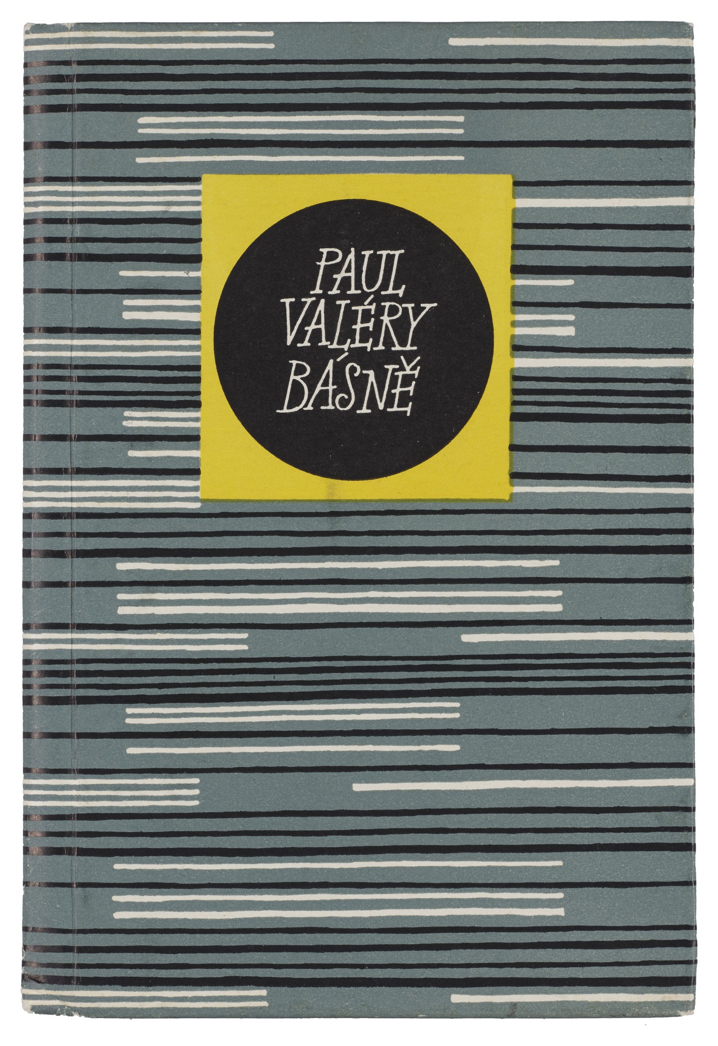
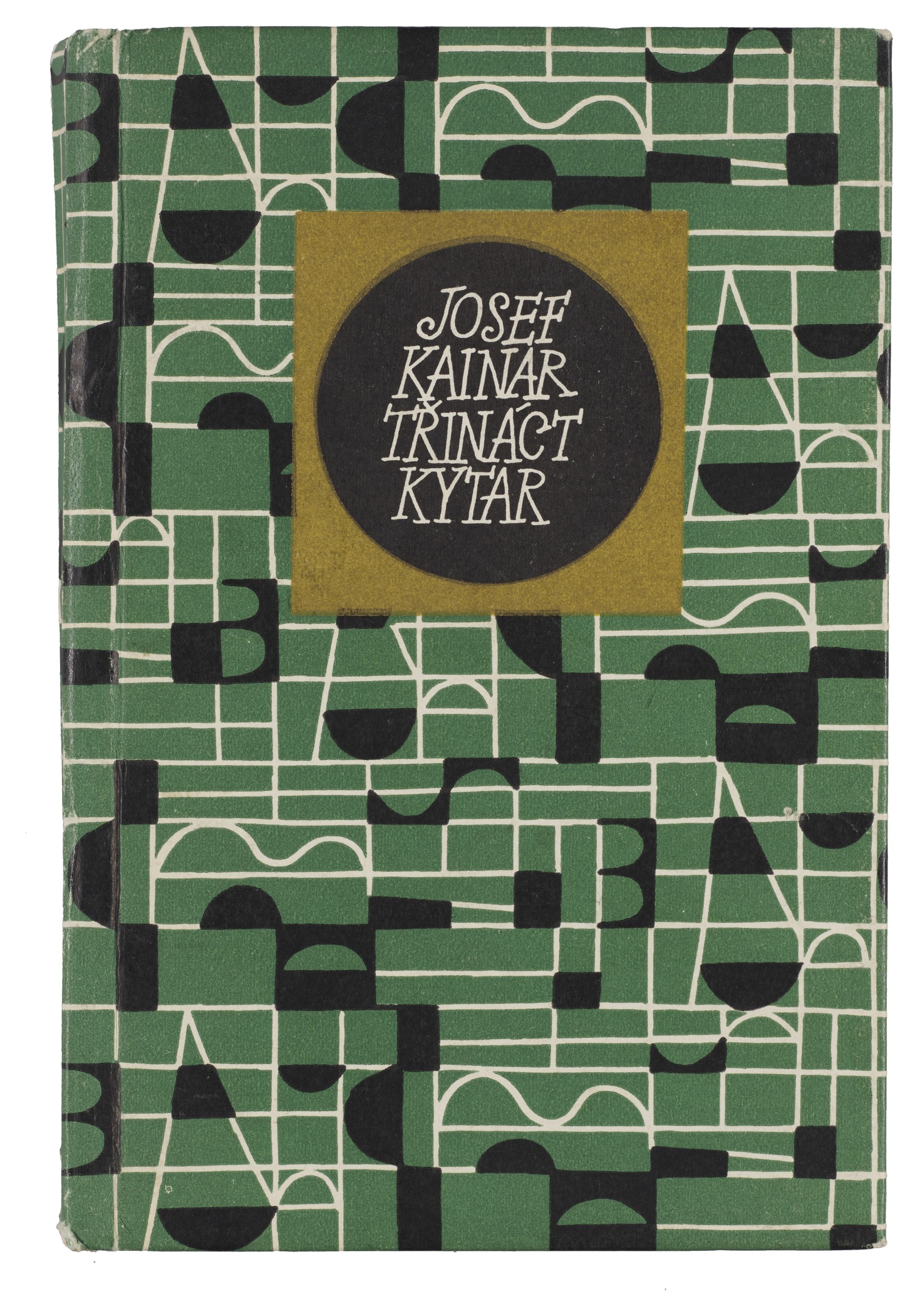
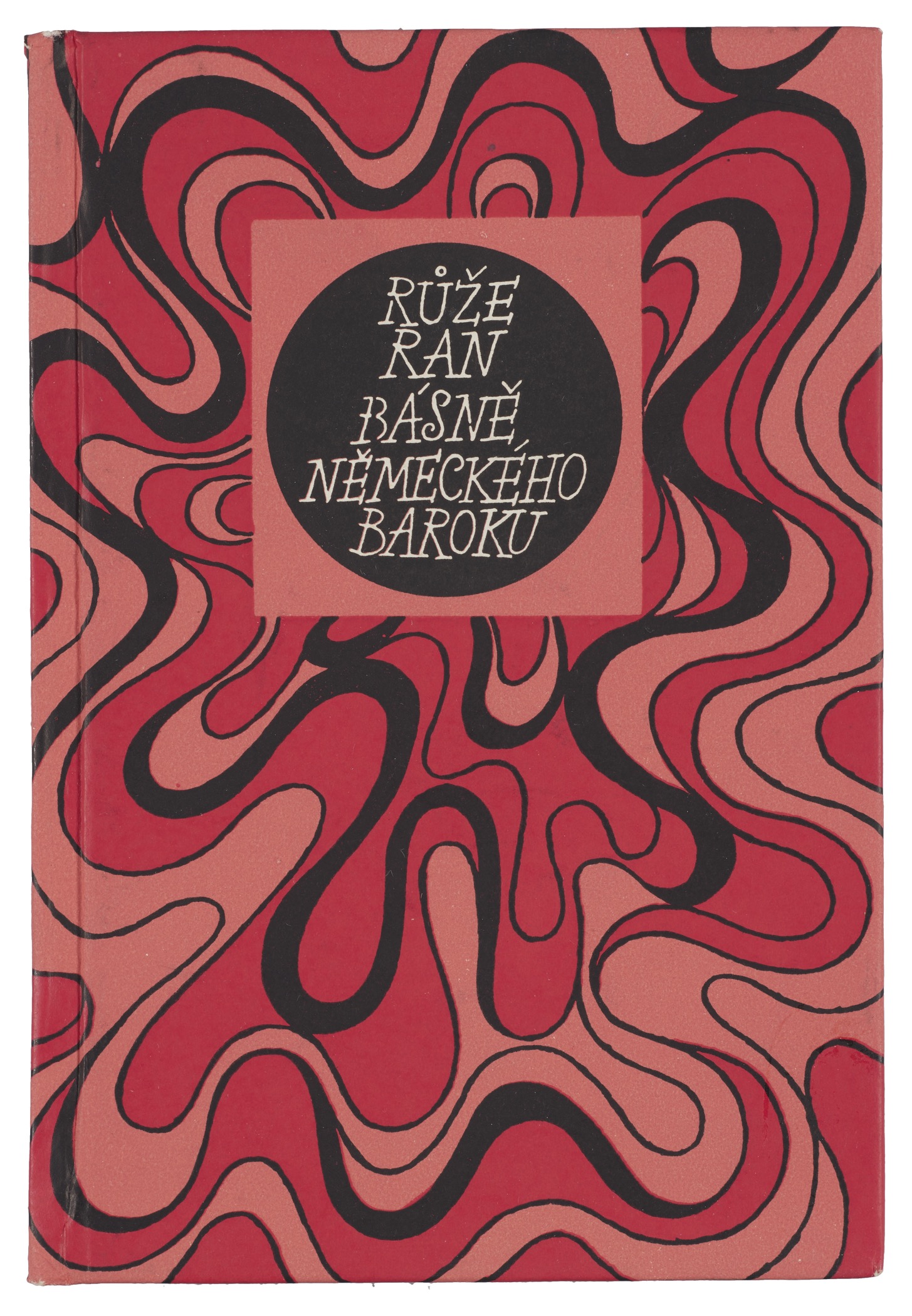
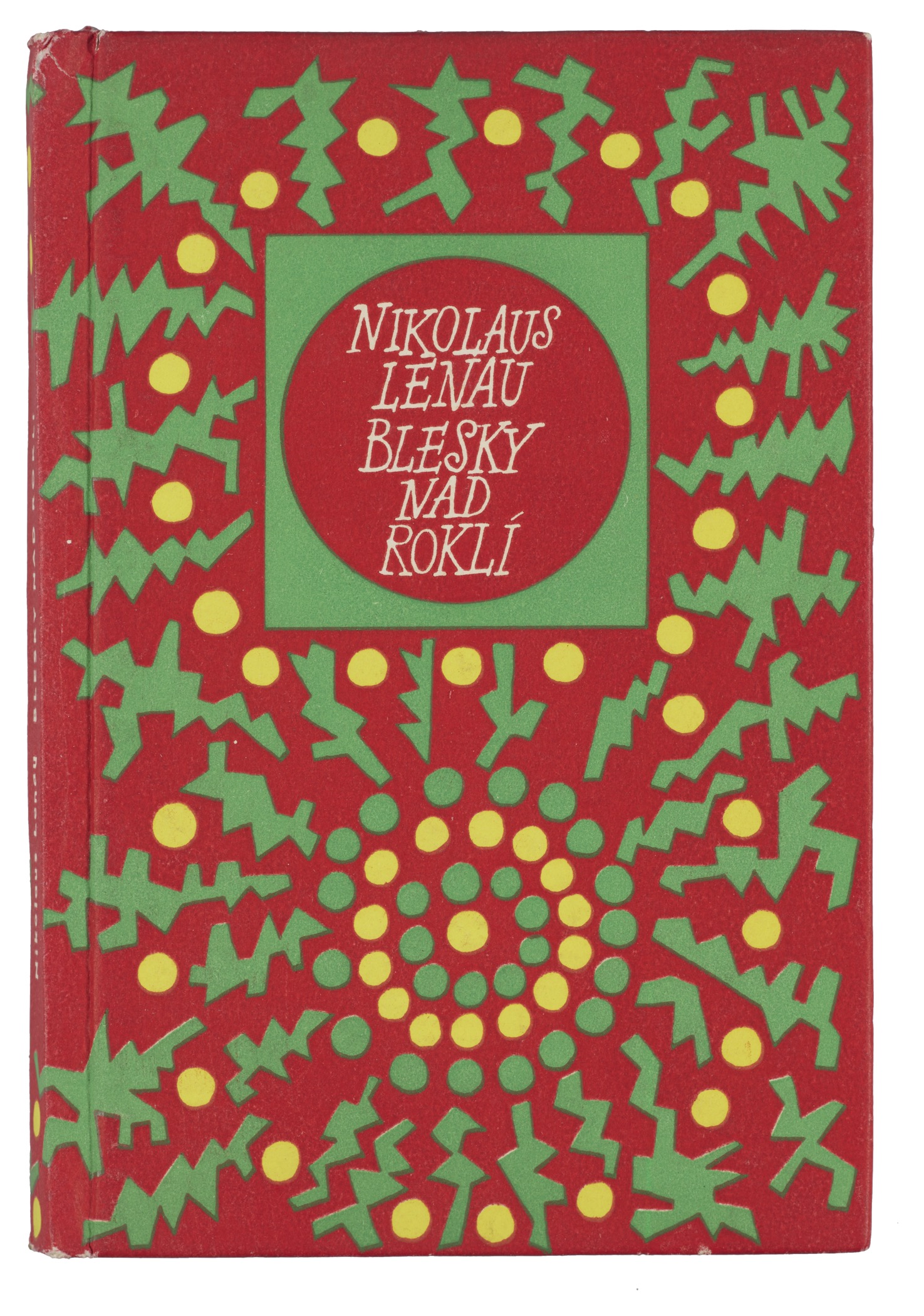
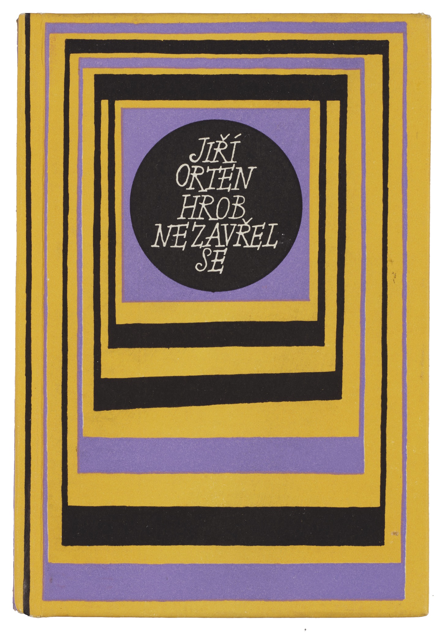
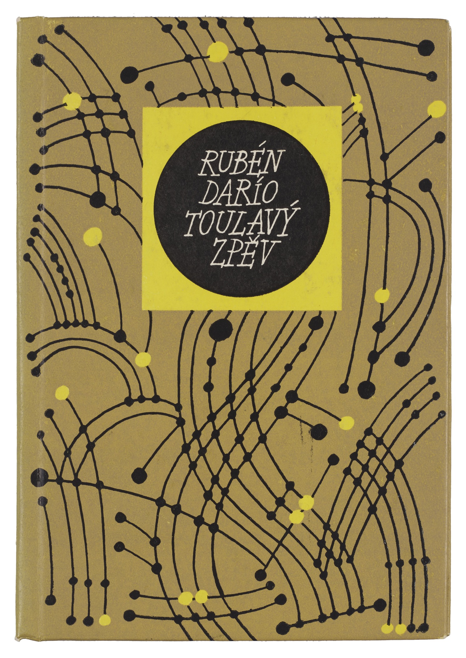
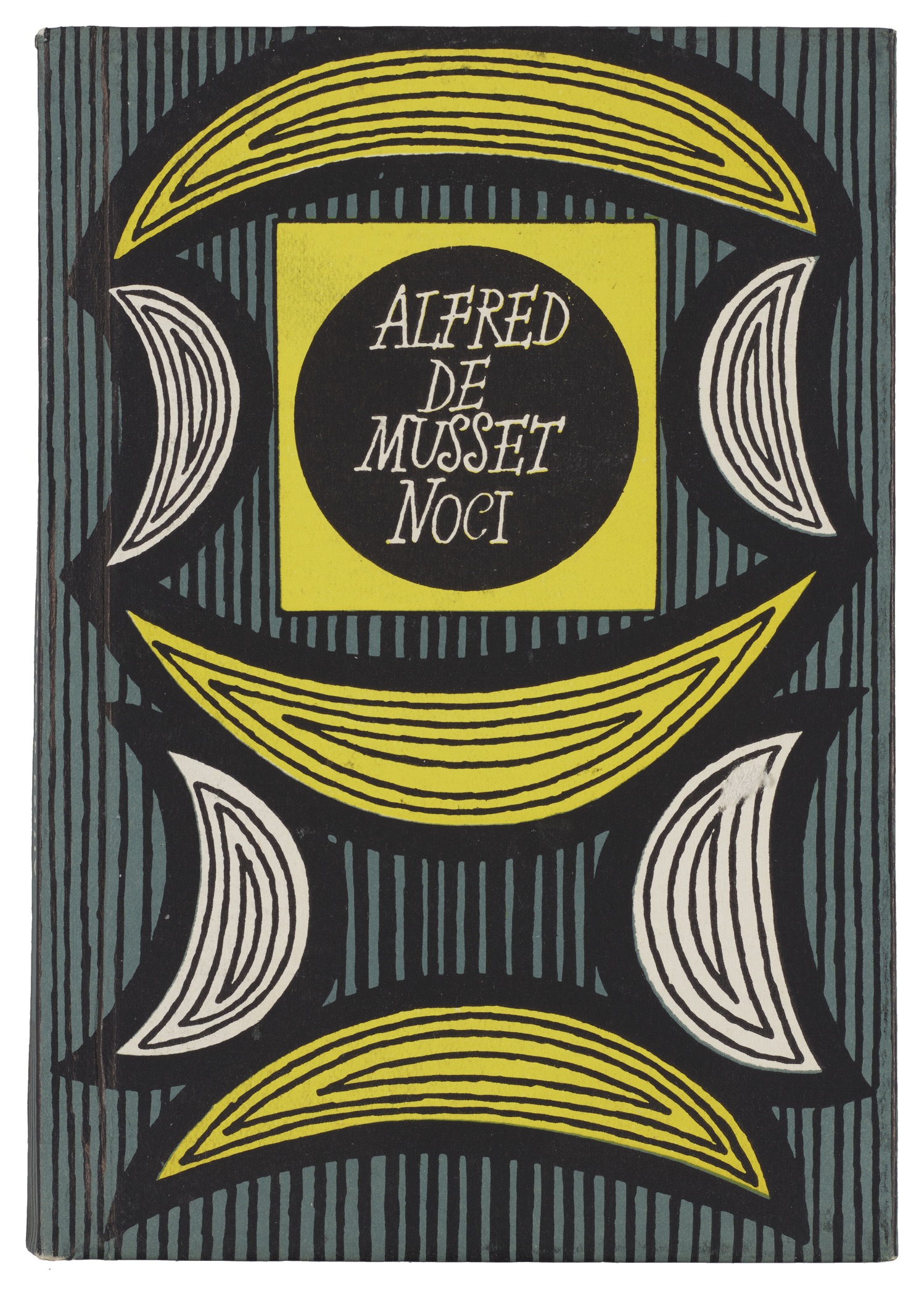
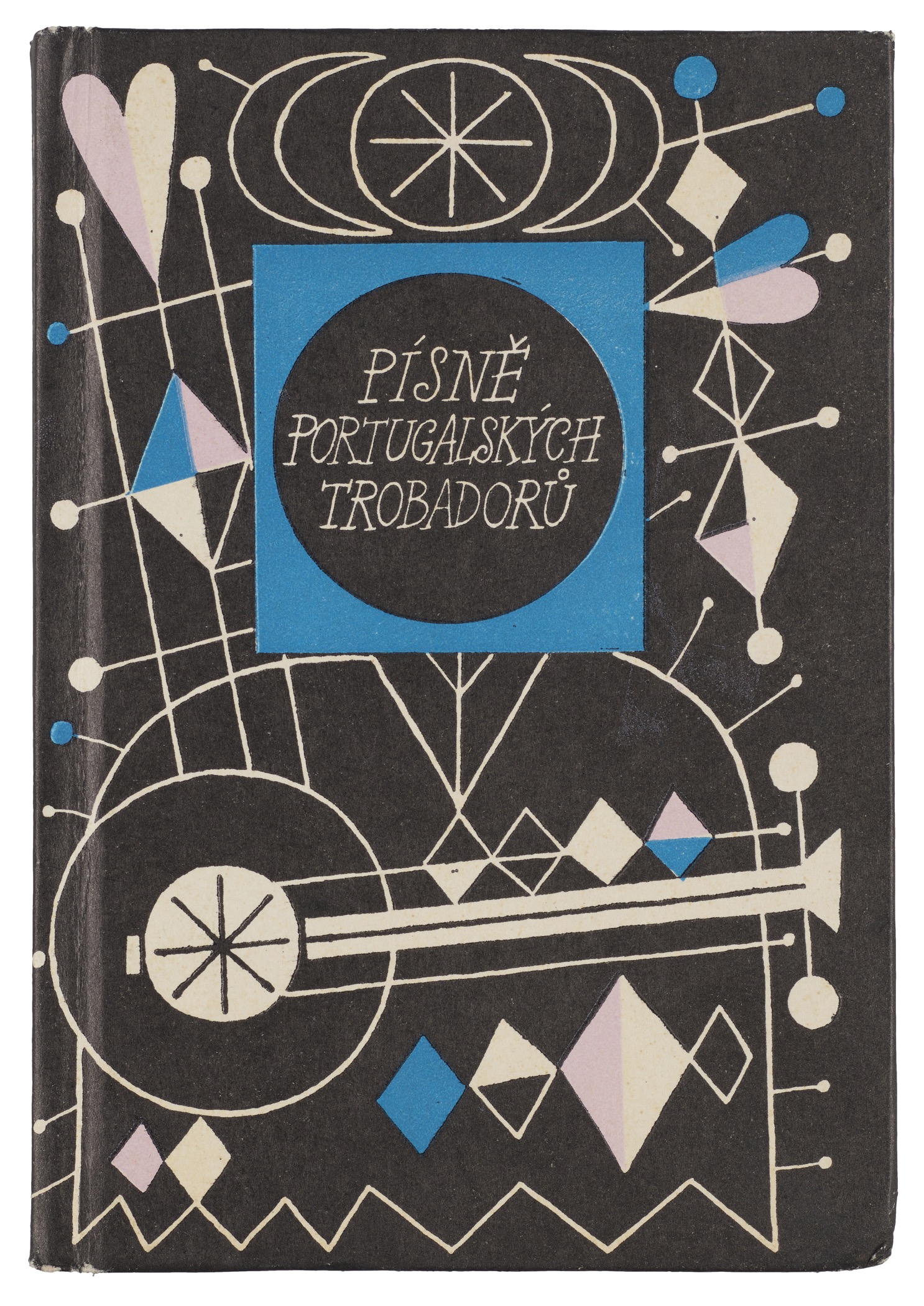
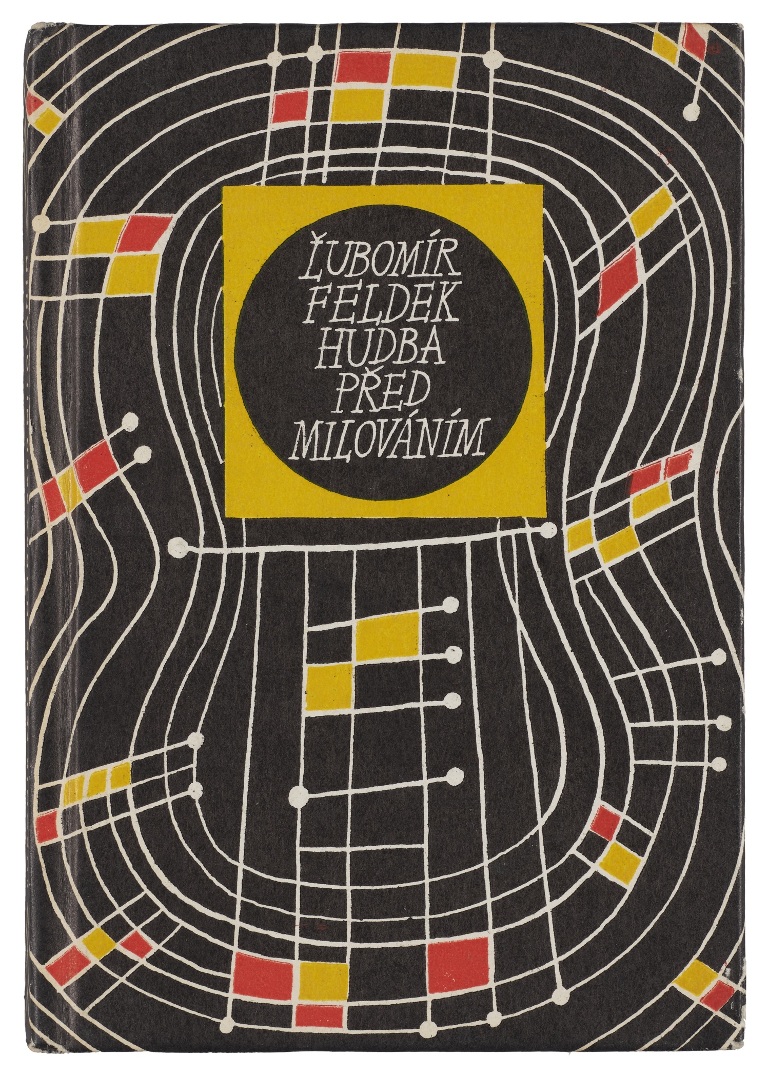
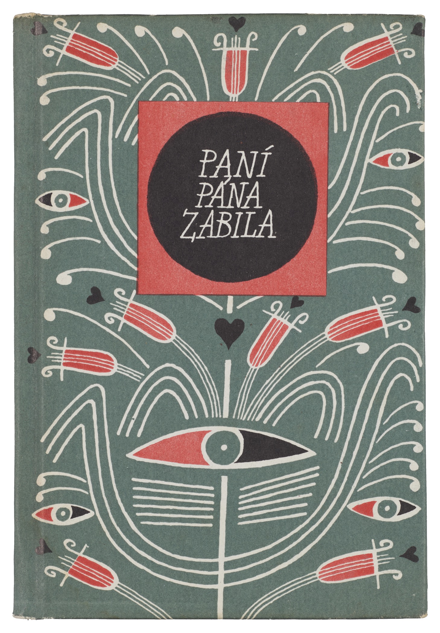
A defining feature of Vodáková’s work is her hand-lettered titling, written in capitals for both author and title, and stacked within either a lyre shape or circular frame. The rhythmic lettering is neither overly expressive nor purely functional, giving each book a gentle and lively presence. Personality is balanced with discipline: strokes are lively but controlled, expressive without being overindulgent. And while the style echoes casual serifs that were popular in mid-20th-century type, the rough edges, irregular shapes, and freedom from the baseline show that they are written rather than type set.
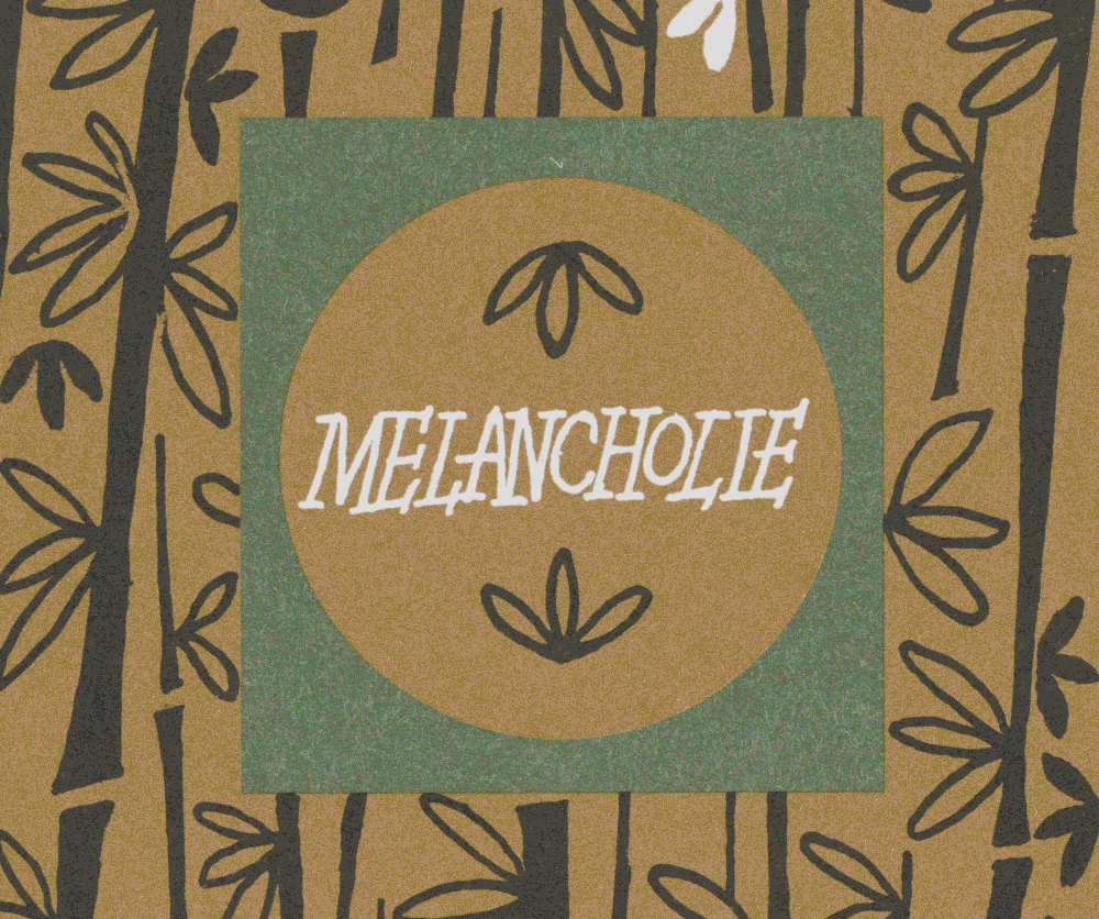
Vodáková typically worked within modest formats and production constraints, yet her compositions never feel cramped or utilitarian. She favored centered or gently asymmetrical arrangements, using space deliberately to create visual breathing room. This contributes to the meditative—poetic—quality often associated with her covers. Pattern and ornament play a subtle but important role in her work. Rather than illustration in a narrative sense, Vodáková often employed repeating motifs, textures, or abstract forms. Dots, lines, and ornaments function as visual accompaniment to the text. These elements rarely explain the book’s content; instead, they set a mood, much like a prelude in music. When figurative imagery appears, it remains understated and is usually more symbolic than literal. Carefully modulated color palettes also lend the series cohesion. Even within the modest production constraints typical of the time, she created covers that feel warm, intimate, and timeless. The only significant alteration to the design scheme appears in 1965, when the frame for the title switched from a lyre to a simpler circle framed in a square.
While little has been written about Vodáková, some bibliographic evidence hints at her design philosophy. In 1961 she wrote an article about the series, “O básnické edici – tentokrát z hlediska výtvarníka” (“On a Poetry Edition – This Time from the Viewpoint of an Artist”), showing that she actively reflected on the responsibilities of the designer in shaping poetry for readers. She must have seen design as co-authorship of the reading experience, shaping the reader’s first emotional encounter with a book. (That said, we were unable to get access to the article, so we welcome help from the Archive community who can access it in Czech libraries.) Vodáková’s last design for the Květy Poezie series was published in 2008 and she died on September 23, 2016.
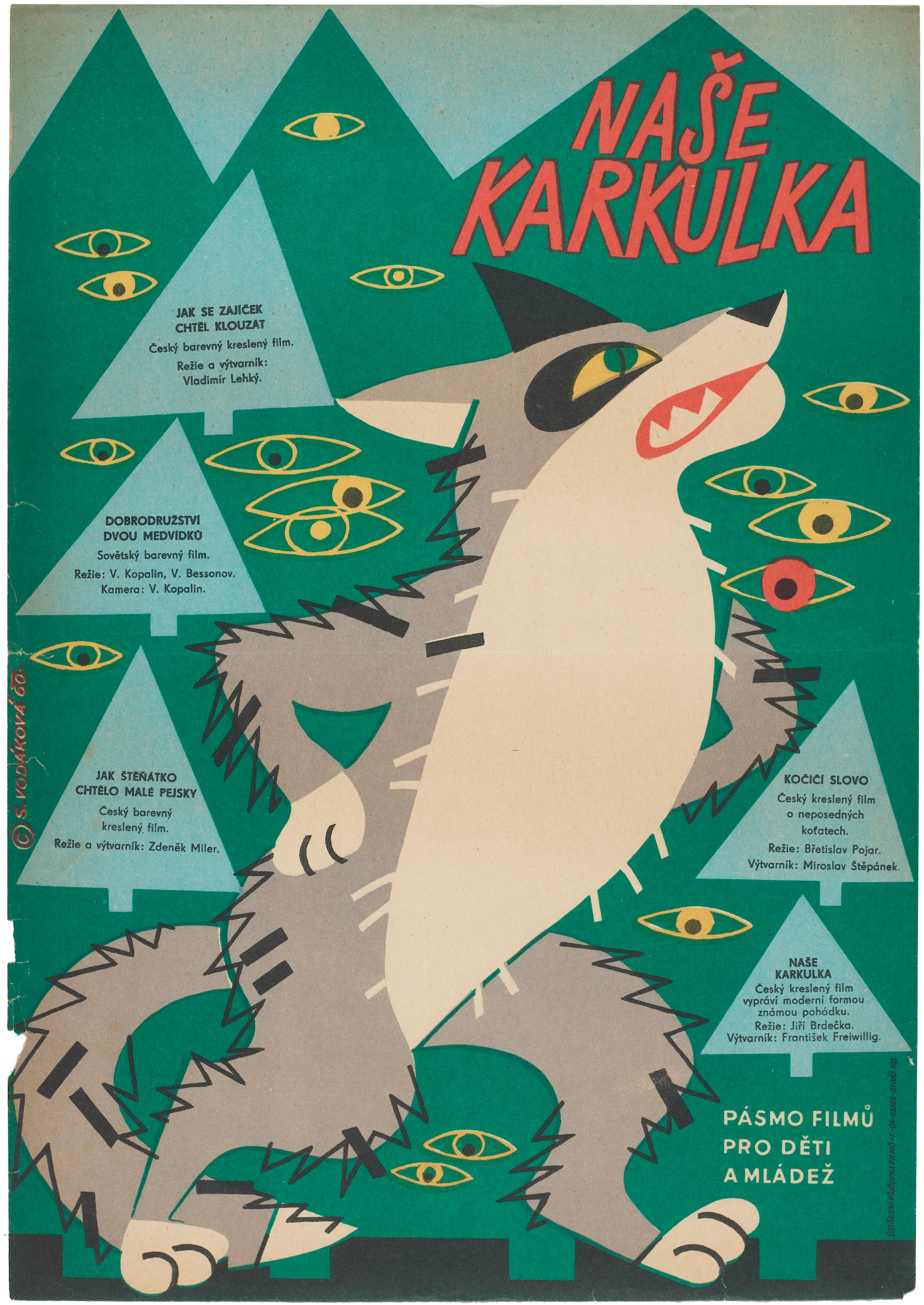
Beyond poetry, Vodáková was active as an illustrator of children’s books. She also designed film posters, further demonstrating her range and adaptability. Yet it is her epic run of poetry bindings that may define her legacy. Individually, they were rarely recognized by the profession, garnering just two honorable mentions in Most Beautiful Books of Czechoslovakia competition. But collectively, over their forty-year run, they model what sustained, thoughtful design can achieve. Design can slow the reader down, draw them gently into the world of language, and reveal how visual subtlety can hold emotional weight.
Sylvie Vodáková’s contribution is therefore not merely a historical slice of Czech book culture. Her work can teach today’s designers how to embody care, clarity, and intimacy, offering readers not merely spectacle, but space for reflection.
Letterform Archive holds 24 books from the Květy Poezie series, spanning 1959 to 1998. You can see them in person by requesting a guided tour or research visit.
All images in the gallery below are hi-fi captures. Click an image to enter fullscreen view, then click or pinch to enlarge.
Join our mission to preserve and share design gems—like Vodáková—with the world: make a year-end donation today.