News
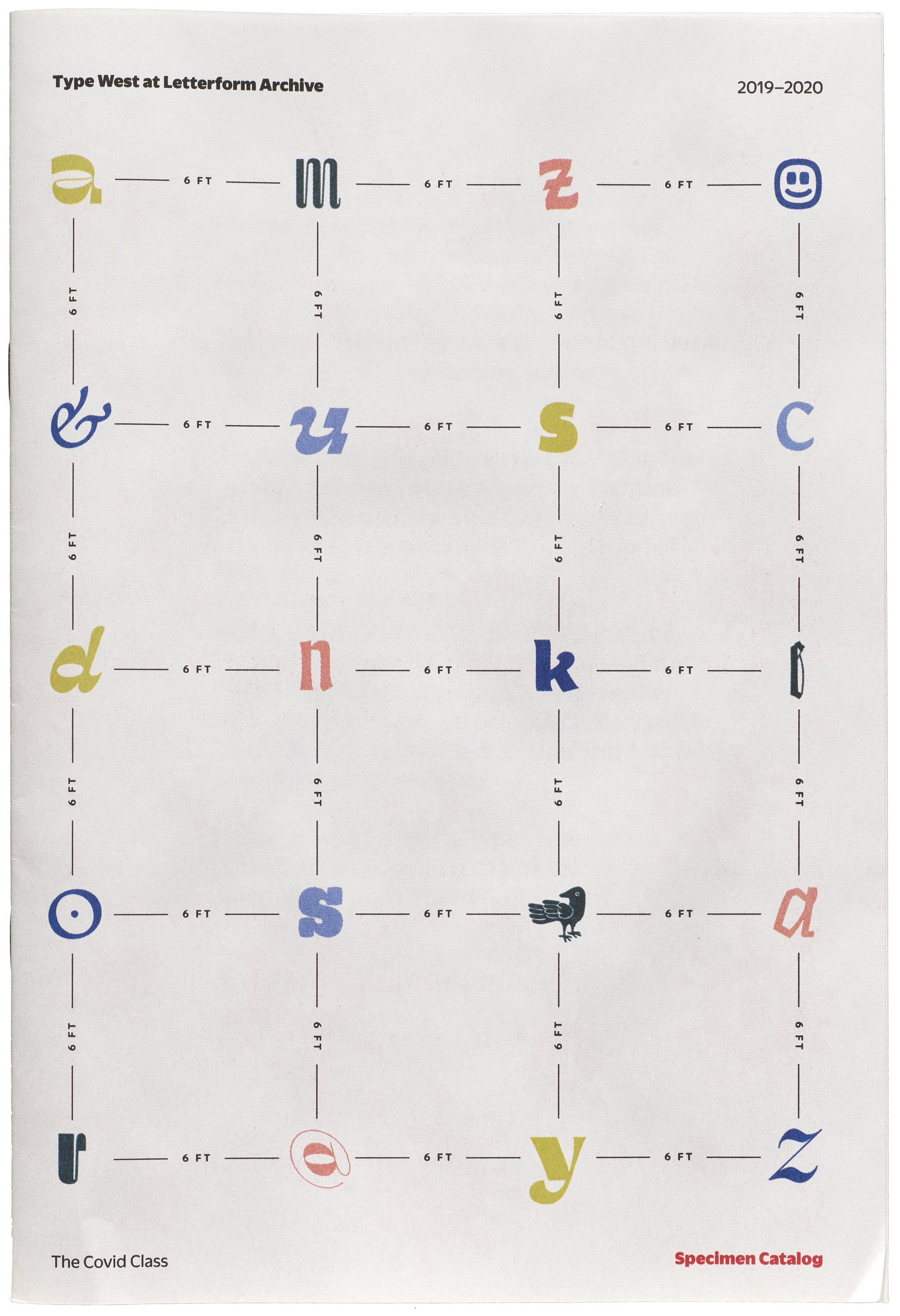
Type West 2020 Specimens
Web and print specimens showcase 14 original typefaces produced by recent graduates of our yearlong program in type design.
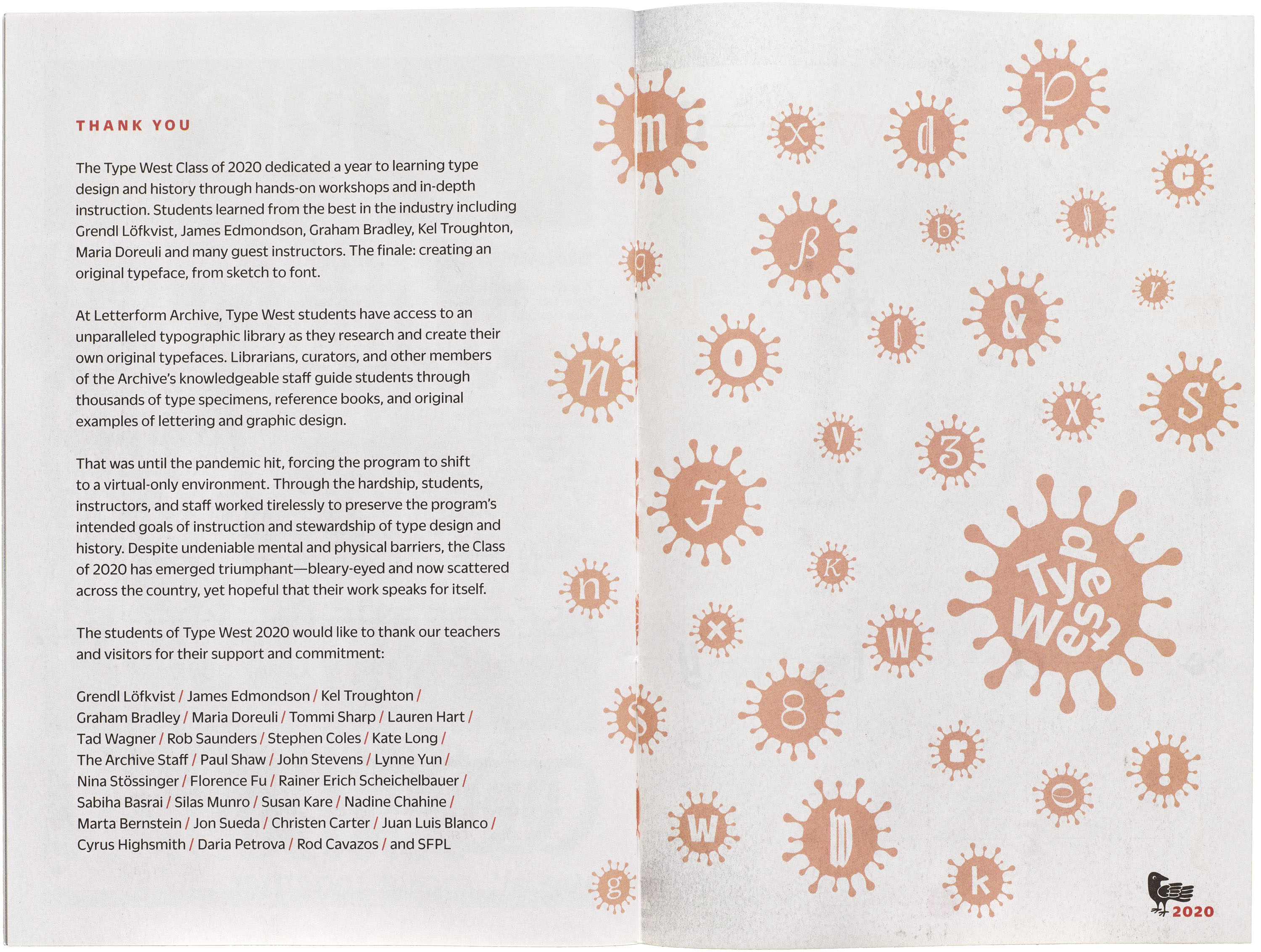
The Type West Class of 2020 dedicated a year to learning type design and history through hands-on workshops and in-depth instruction. Students trained with the best in the industry, including Grendl Löfkvist, James Edmondson, Graham Bradley, Kel Troughton, Maria Doreuli, and many guest instructors. The finale: creating an original typeface, from sketch to font.
At Letterform Archive, Type West students have access to an unparalleled typographic library as they research and create their own original typefaces. Librarians, curators, and other members of the Archive’s knowledgeable staff guide students through thousands of type specimens, reference books, and original examples of lettering and graphic design.
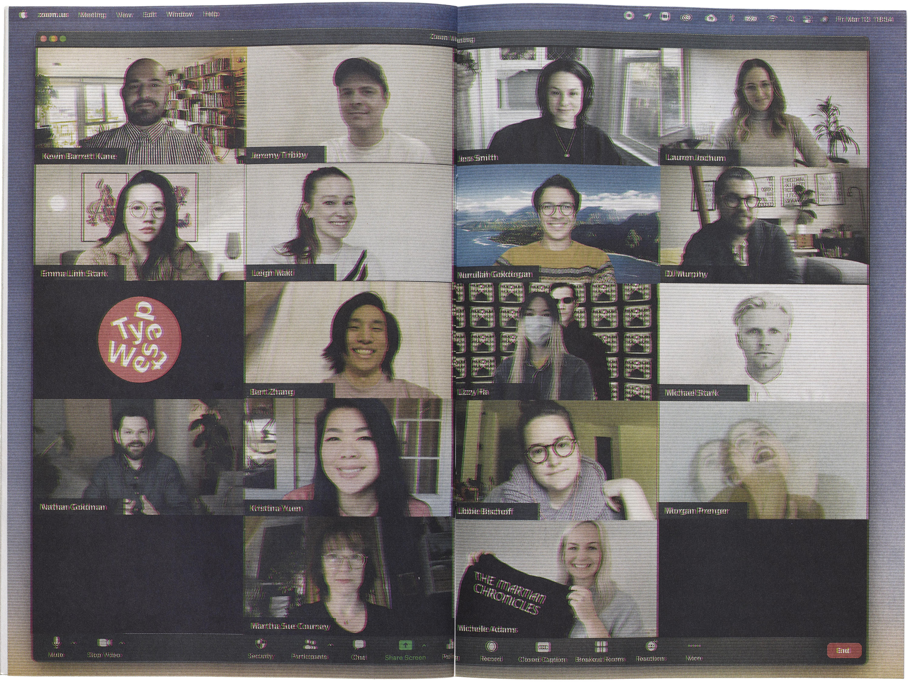
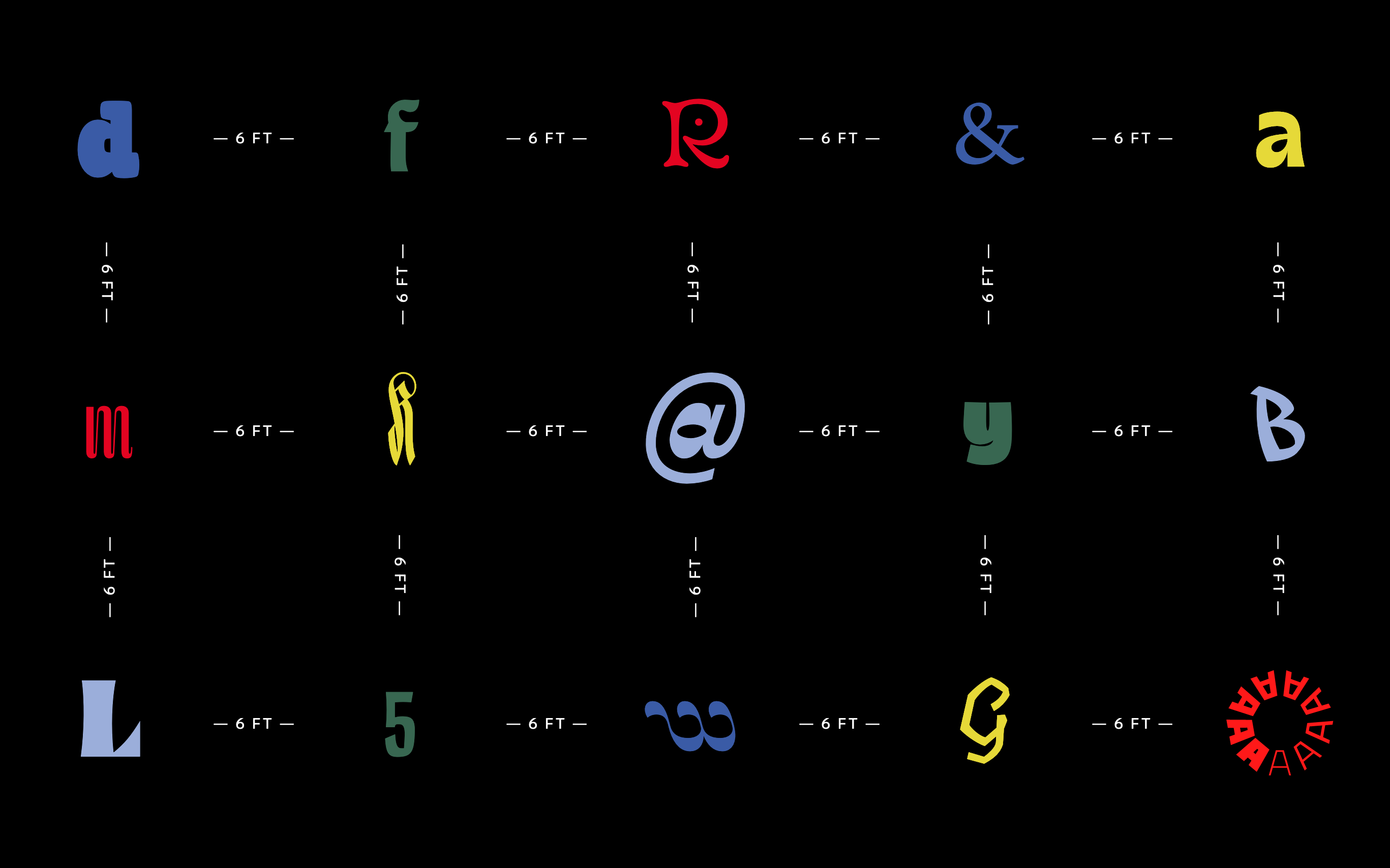
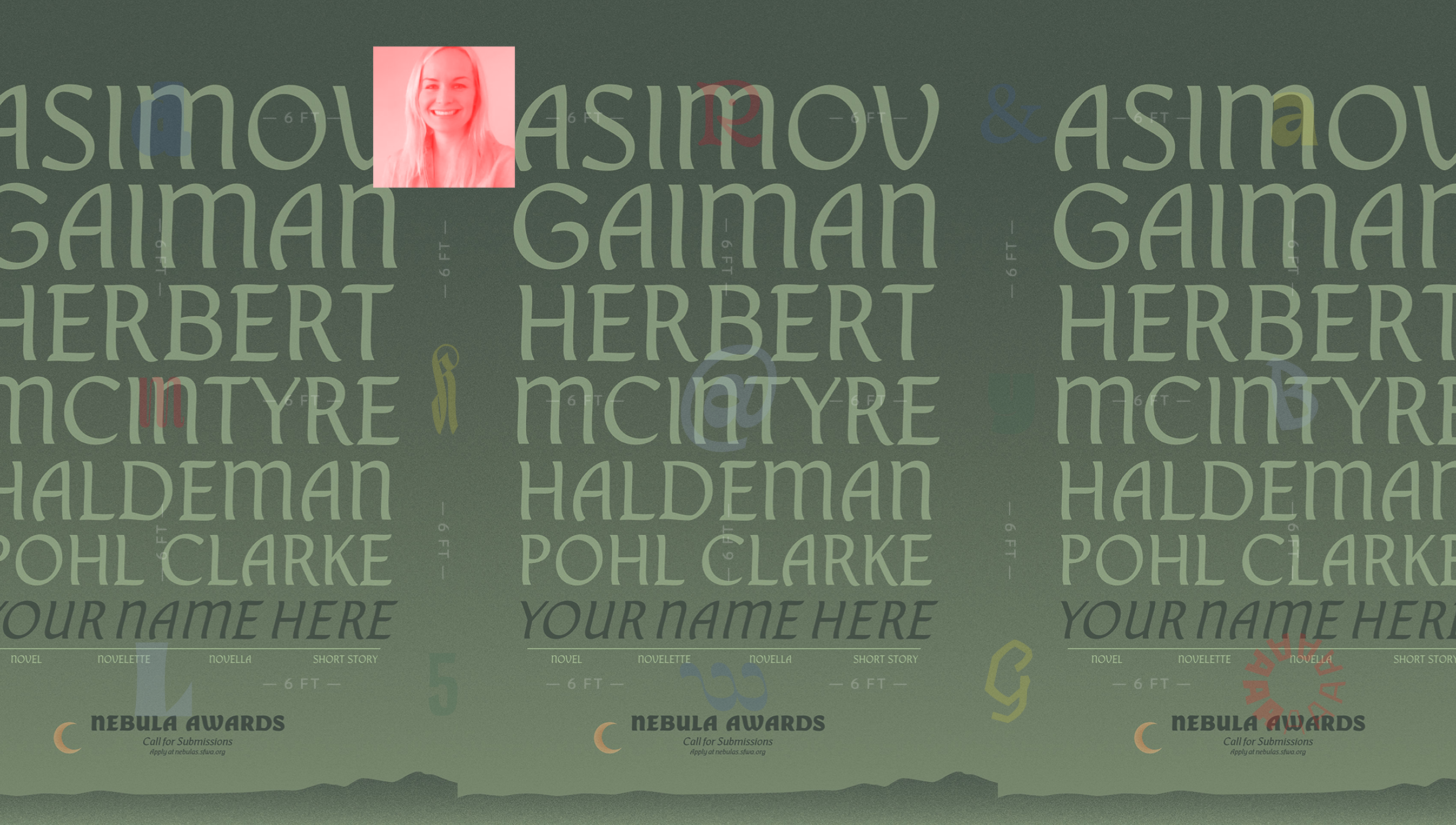
That was until the pandemic hit, forcing the program to shift to a virtual-only environment. Through the hardship, students, instructors, and staff worked tirelessly to preserve the program’s intended goals of instruction and stewardship of type design and history. Despite undeniable mental and physical barriers, the Class of 2020 emerged triumphant, producing 14 original typefaces that represent the growth, skill, and ingenuity of each student. The range of typeface styles also reflect the breadth of ideas and perspectives of the class as a whole. Their designs are showcased below, on a dedicated website, and in a printed booklet.
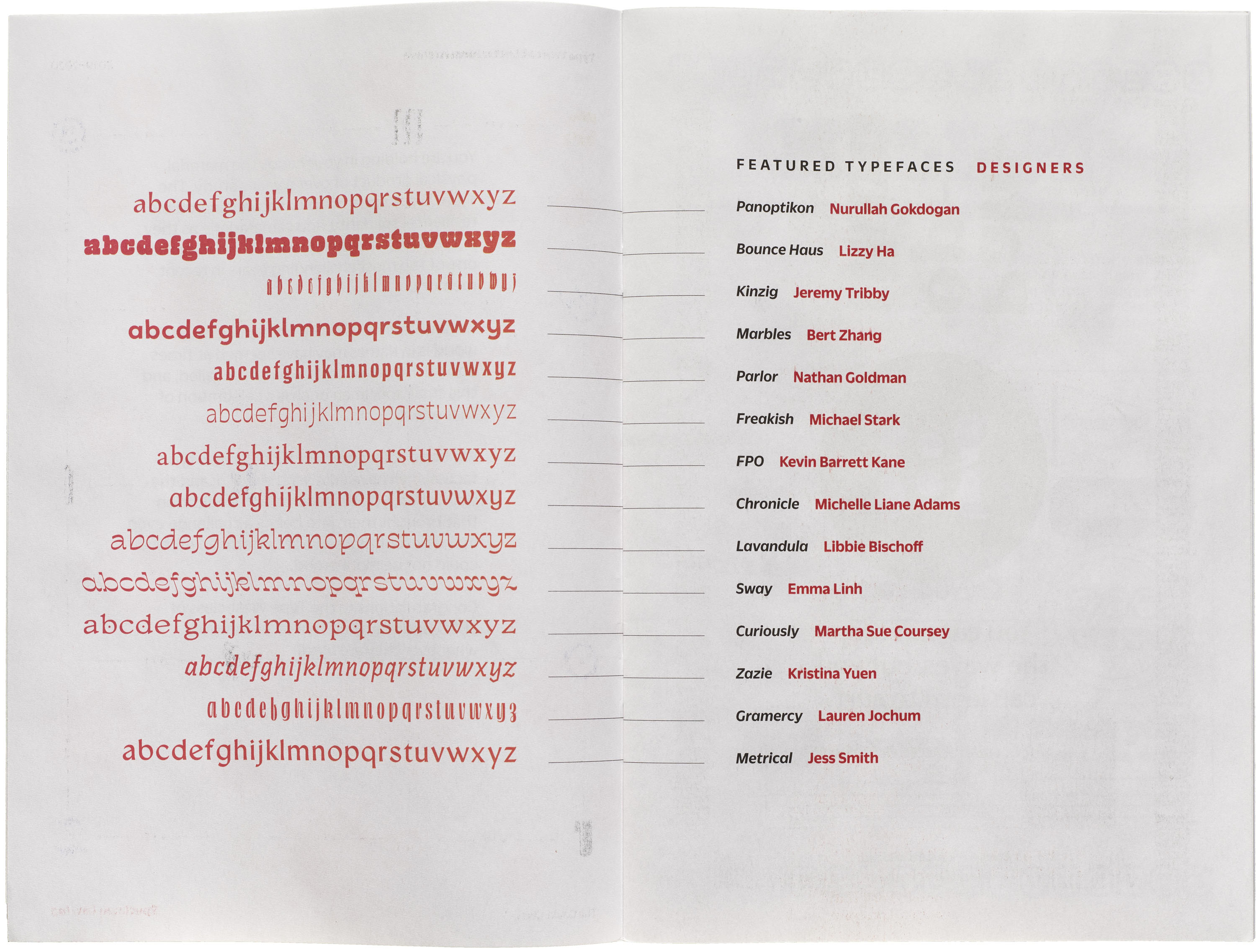
The Typefaces
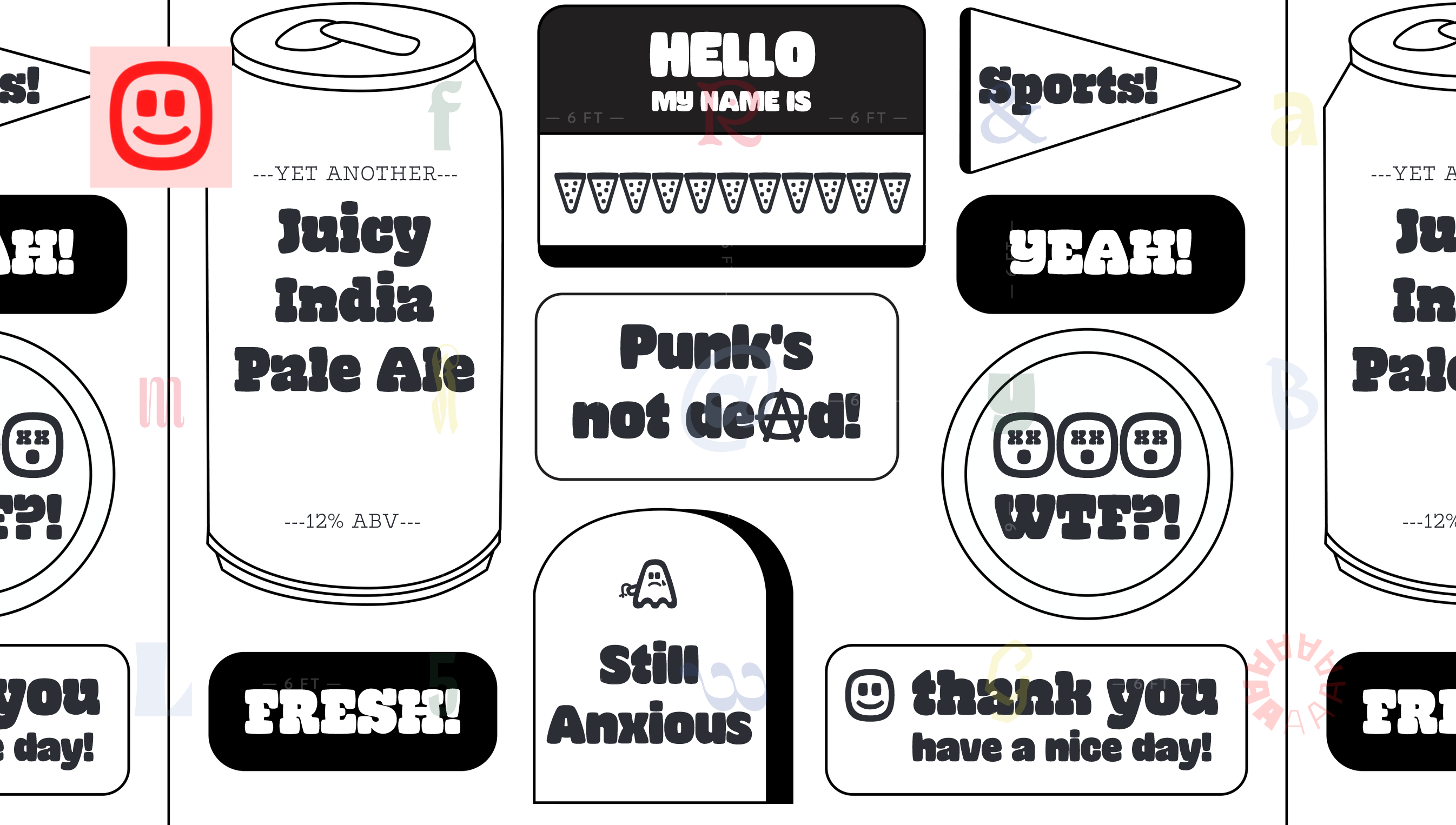
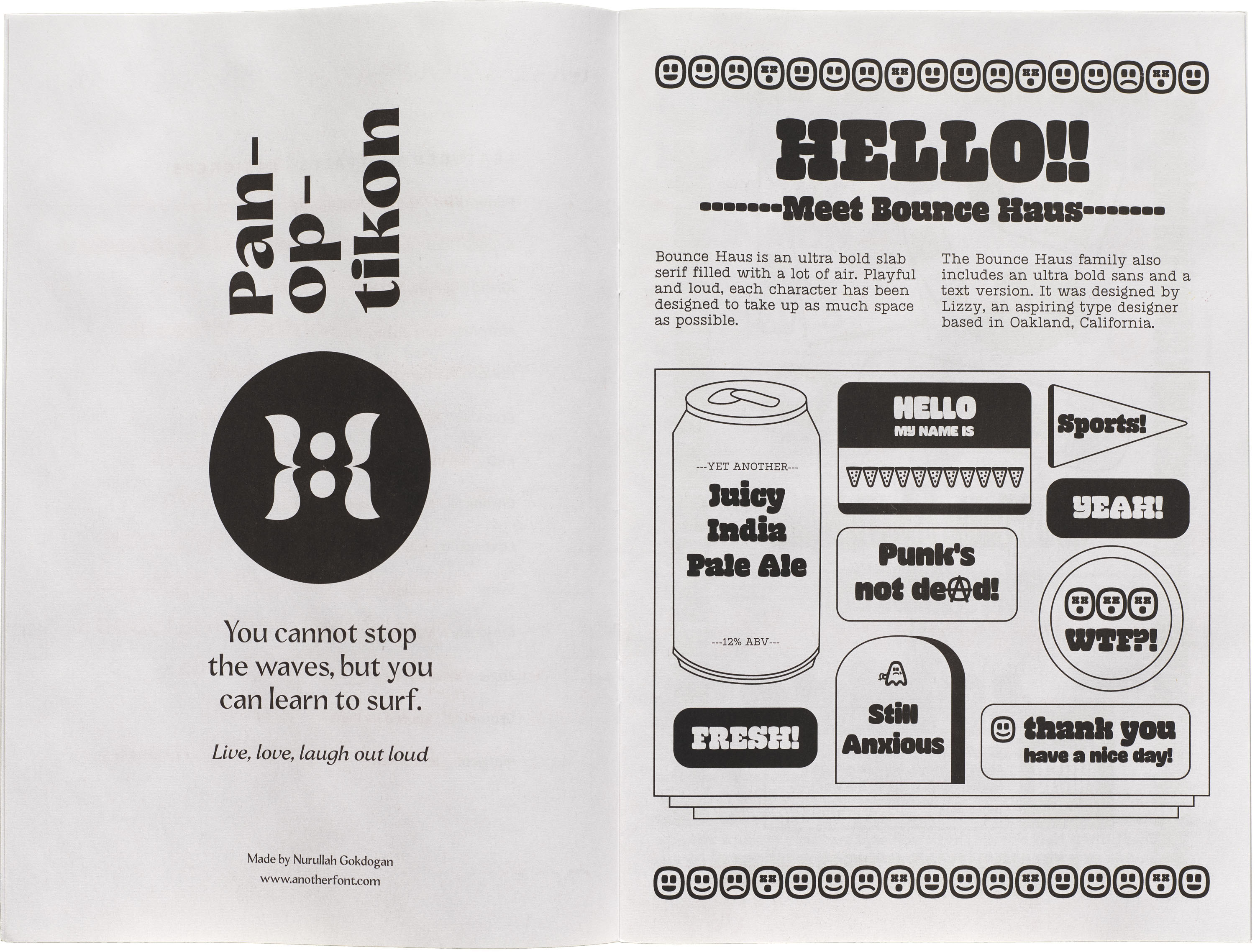
Bounce Haus by Lizzy Ha
Bounce Haus is an ultra bold slab serif filled with a lot of air. Playful and loud, each character has been designed to take up as much space as possible.
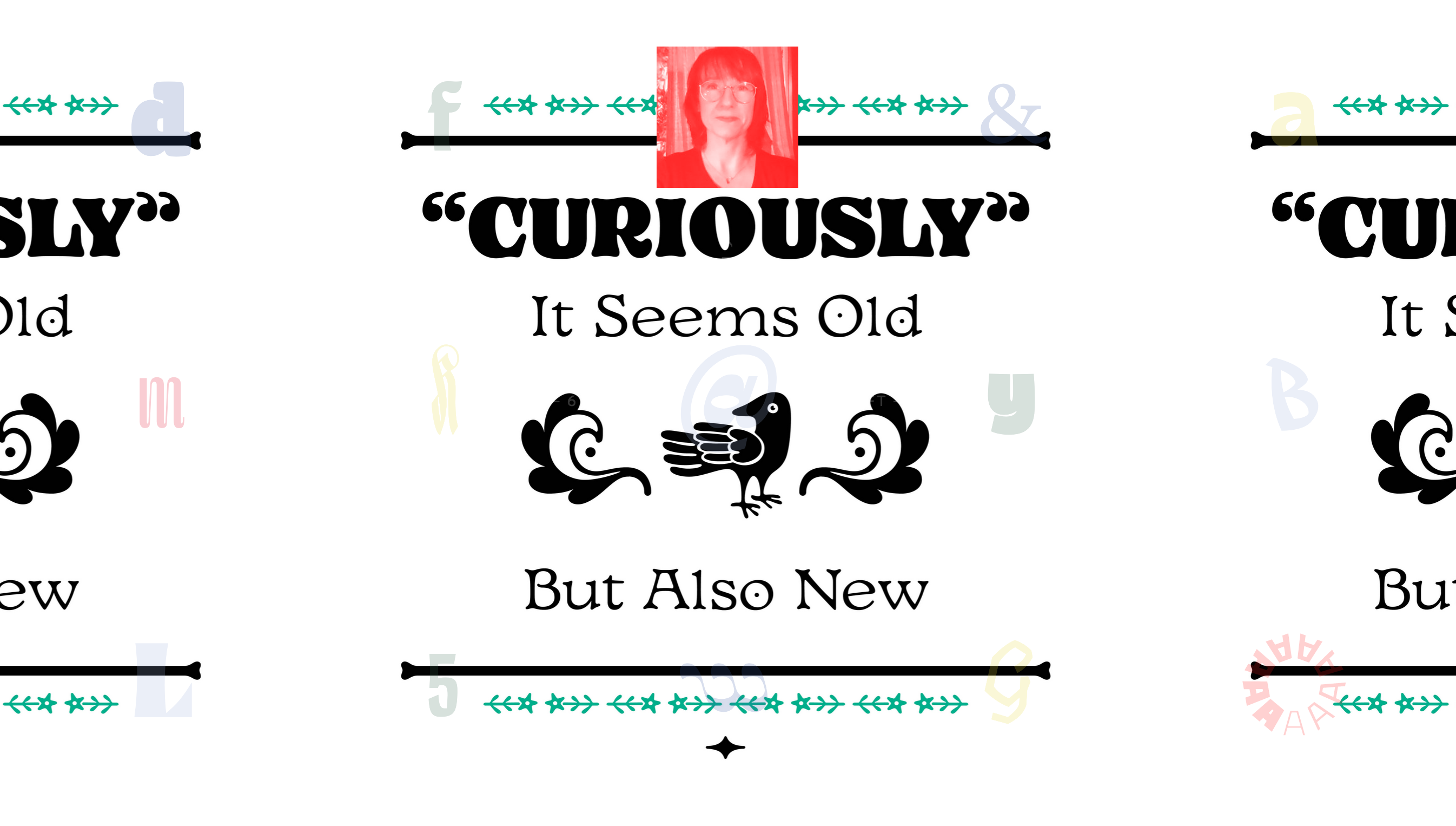
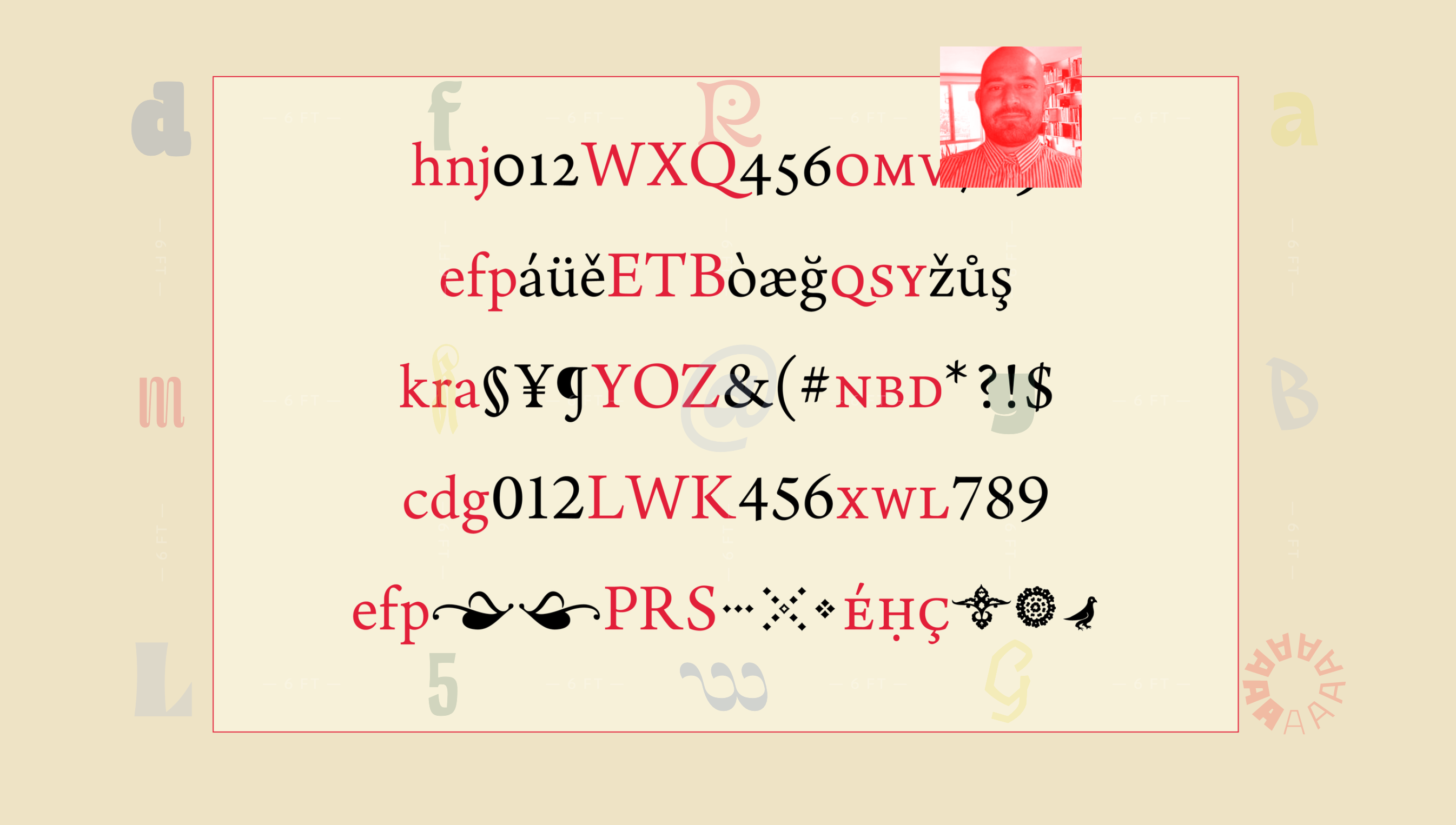
Curiously by Martha Sue Coursey
Curiously is an unusual old-style serif display family fueled by a fascination for 15th century Roman letterforms and beautiful children’s books. It comes in Regular, Black and Text with a set of ornaments for the regular weights. The family works well for logos, branding, book covers, and editorials. Perfect for artisan brands or handmade goods. Use it for that weird book you’ve been meaning to write.
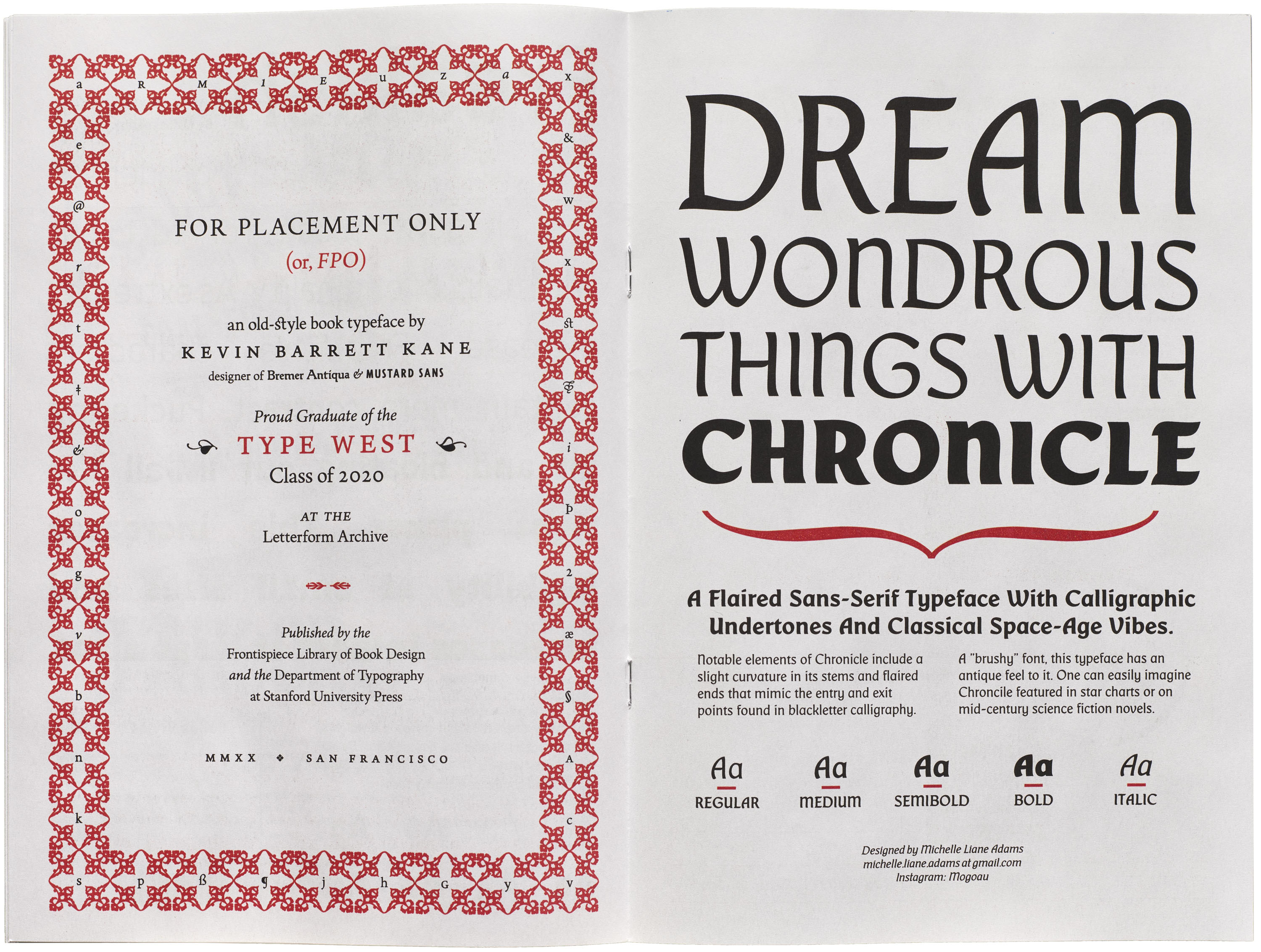
Chronicle by Michelle Liane Adams
Chronicle is a a flaired sans-serif typeface with calligraphic undertones and classical space-age vibes. Notable elements of Chronicle include a slight curvature in its stems and flaired ends that mimic the entry and exit points found in blackletter calligraphy. A “brushy” font, this typeface has an antique feel to it. One can easily imagine Chroncile featured in star charts or on mid-century science fiction novels.
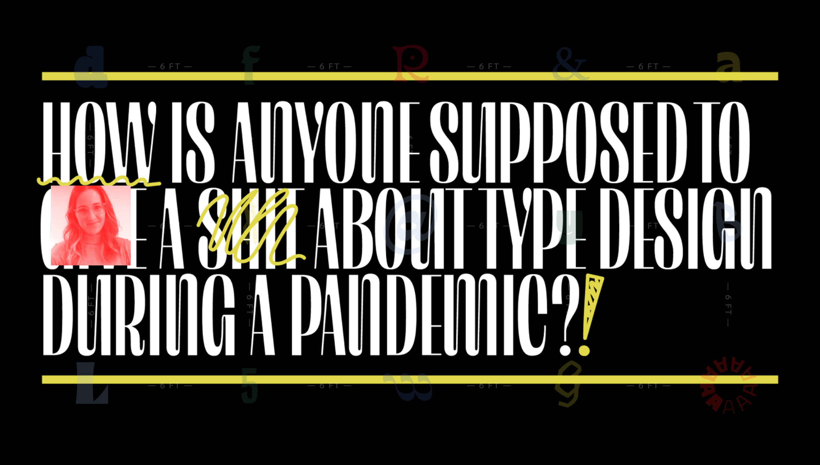
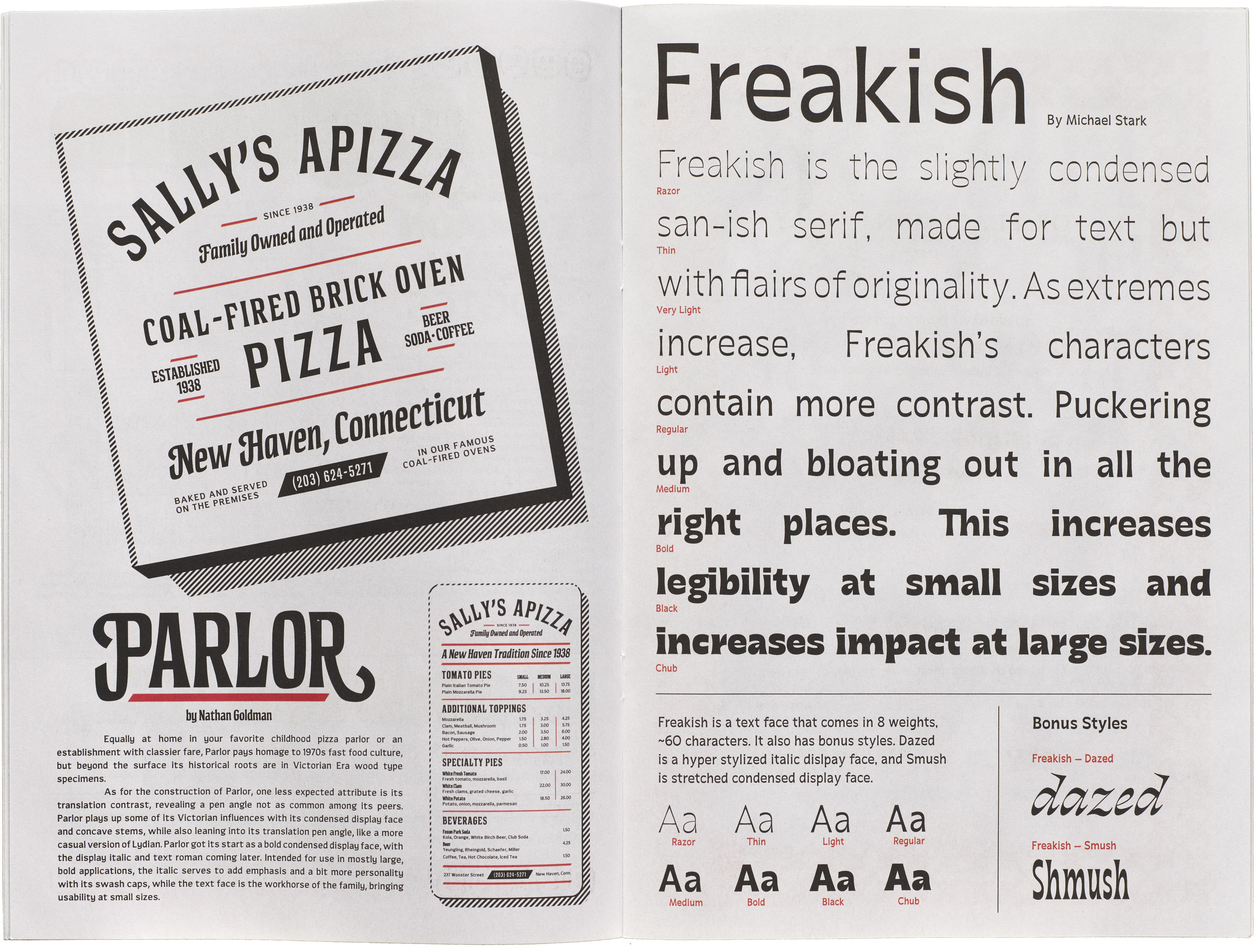
Freakish by Michael Stark
Freakish is a text face that comes in 8 weights, ~60 characters. It also has bonus styles. Dazed is a hyper-stylized italic display face, and Smush is a stretched condensed display face.
FPO by Kevin Barrett Kane
FPO (for placement only) is an old-style typeface for books that very much lives up to its name—it is still in progress.
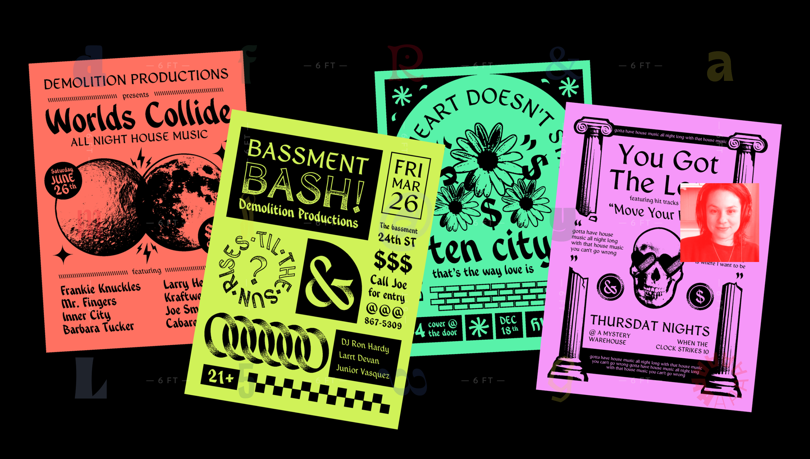
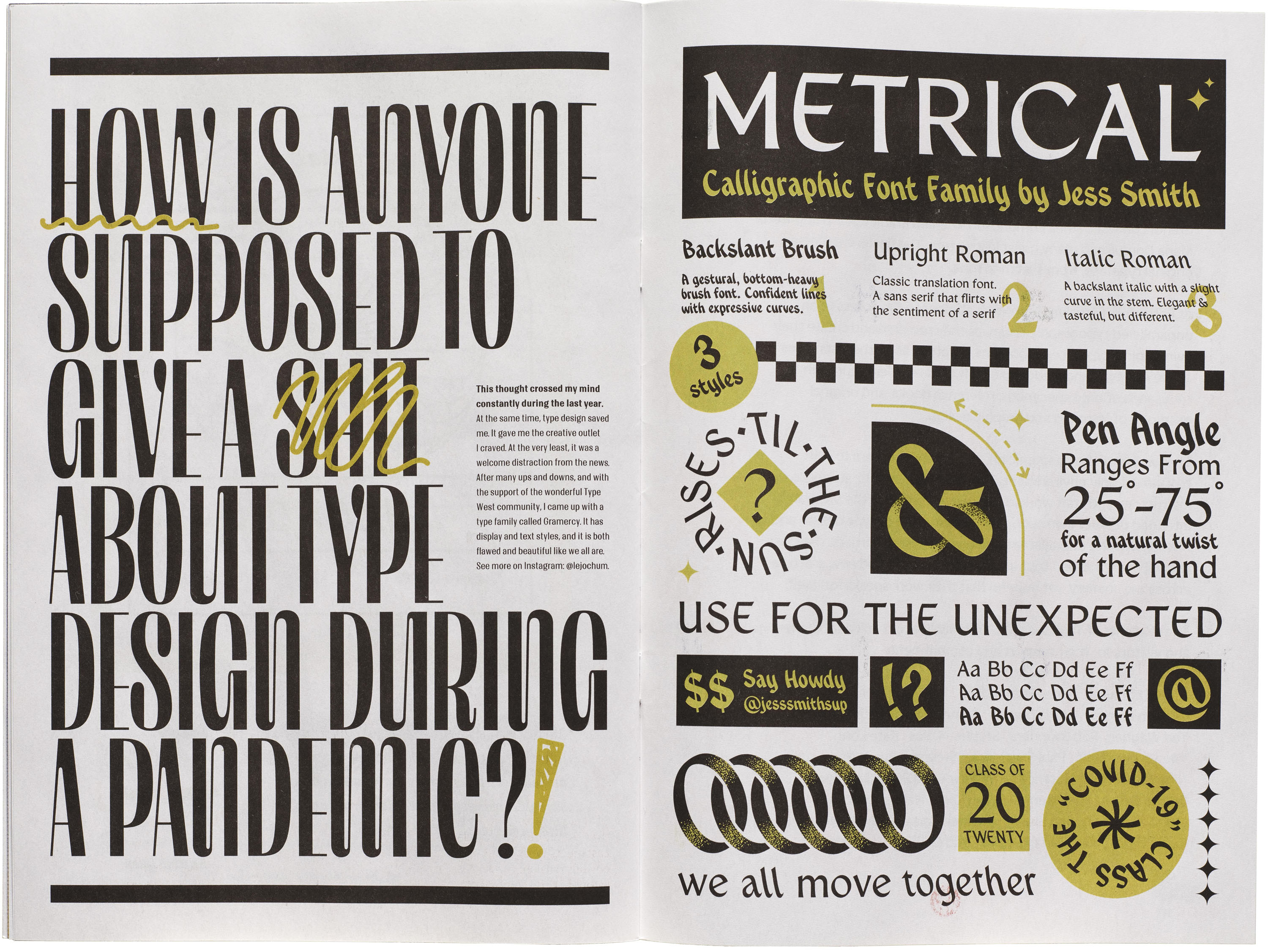
Gramercy by Lauren Jochum
A high contrast, high drama typeface, with both display and text styles. What should you use it for, you ask? You could use it to brand a hotel—say, the Gramercy Park Hotel. You could use it to design those “X MONTHS OLD” cards you put next to your baby and post on Instagram. Or maybe you should use Gramercy for the label on your homemade persimmon wine. I guarantee it will make it look top notch (but it won’t make it taste good). Oh! How about those name cards for your cousin’s wedding shower that you forgot you had to organize? Wherever you decide to use it, Gramercy will turn heads.
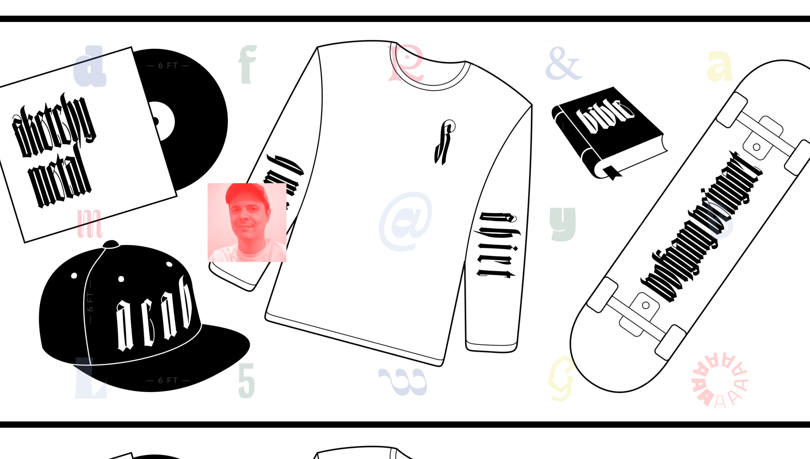
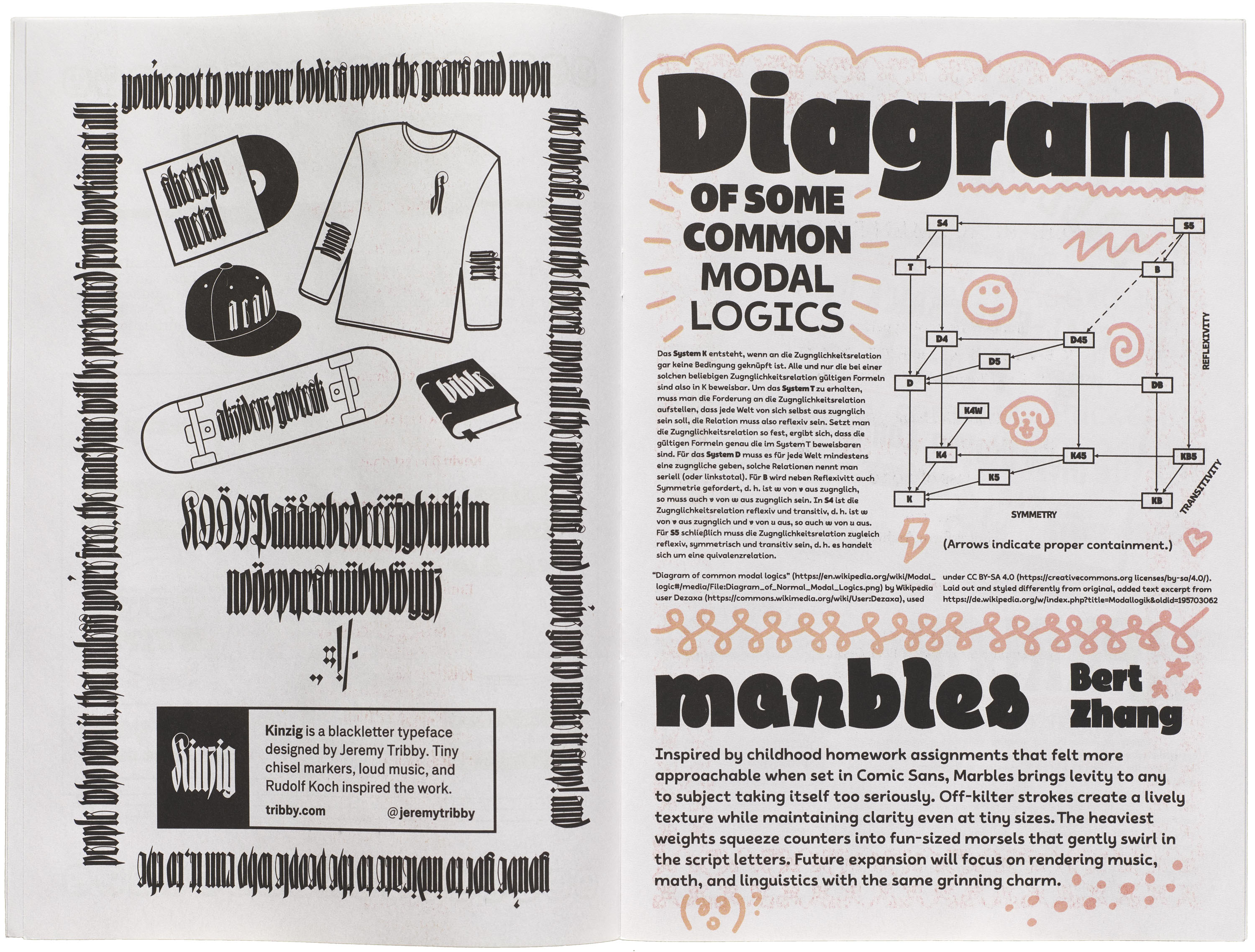
Kinzig by Jeremy Tribby
Tiny chisel markers, loud music, and Rudolf Koch inspired the work.
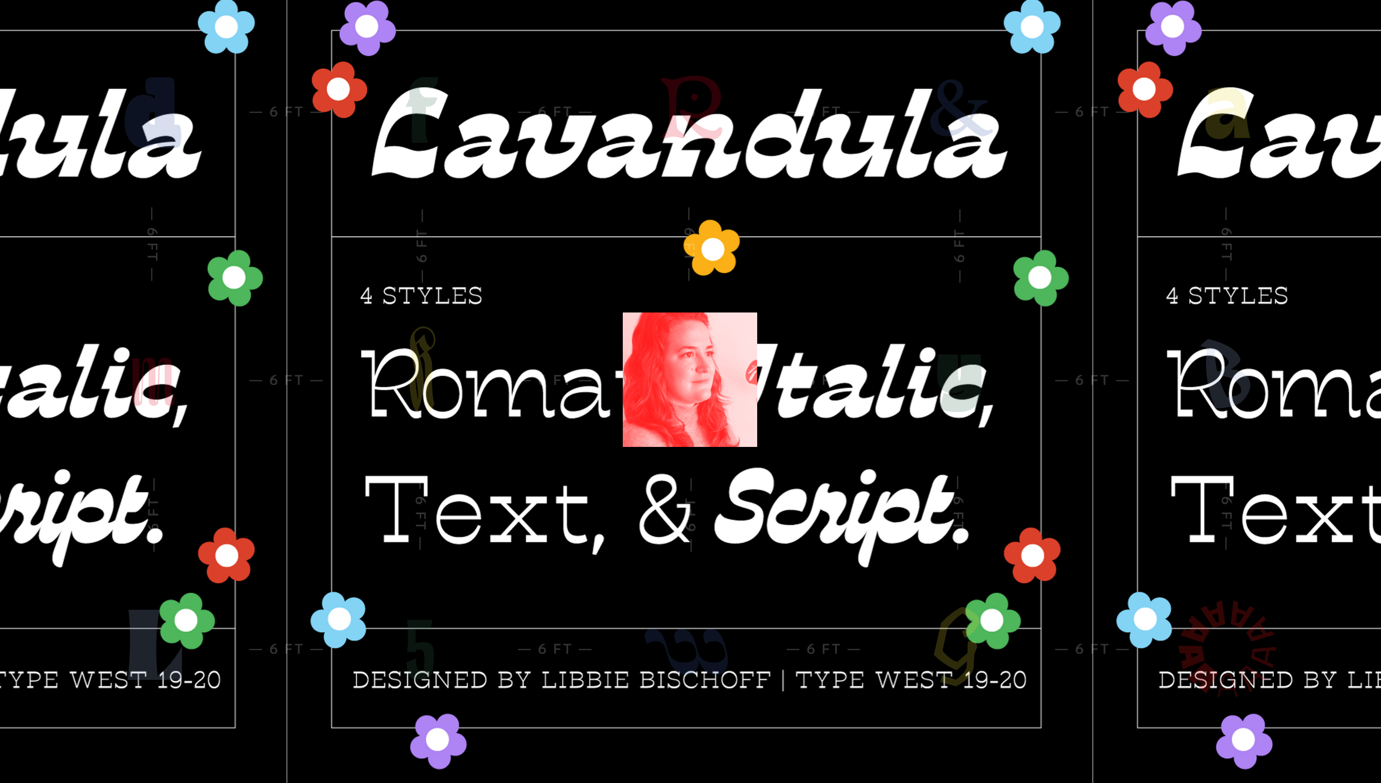
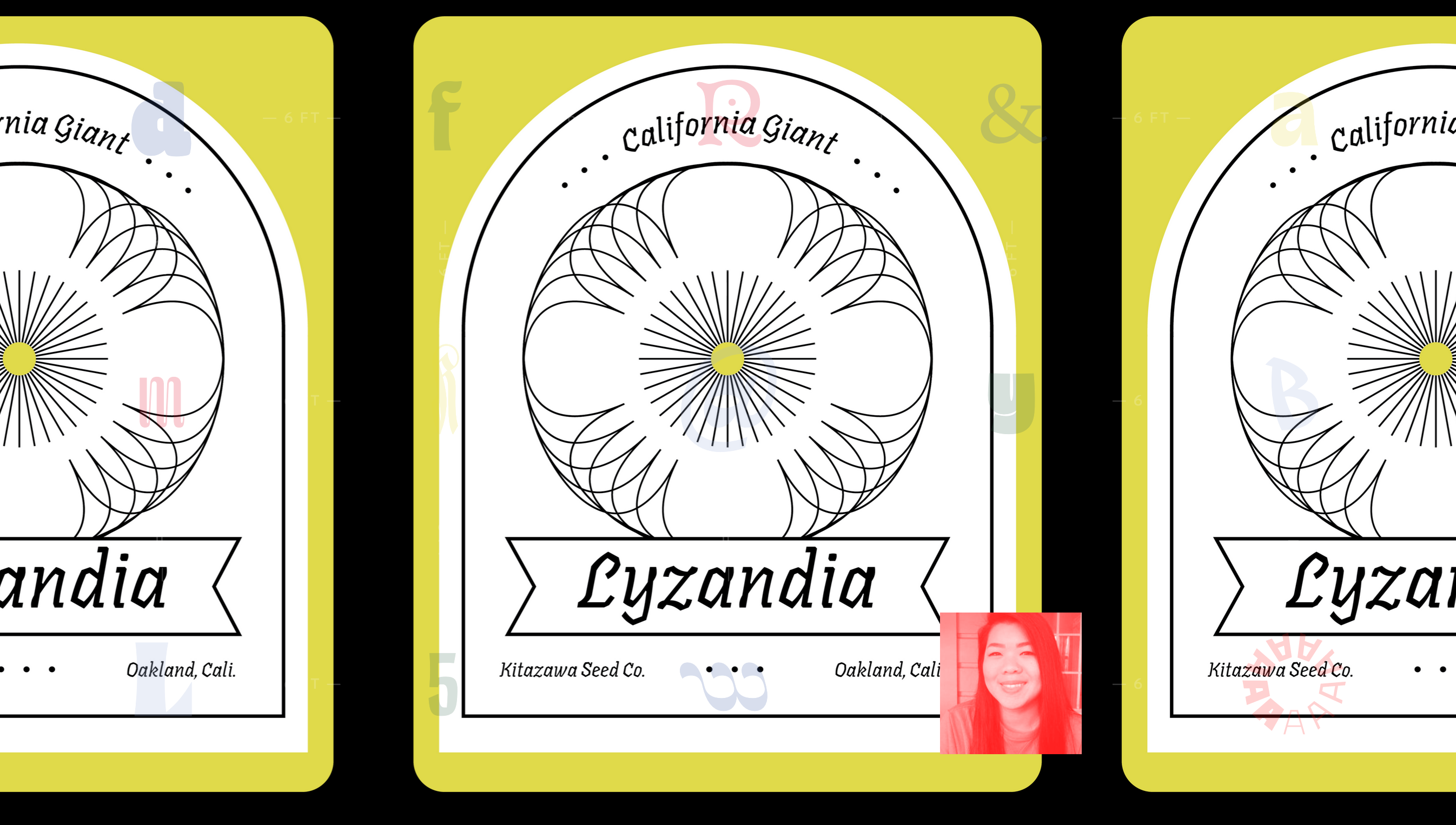
Lavandula by Libby Bischoff
Lavandula is like a bite from a typographical maraschino cherry. It’s juicy, packs a punch, and is just a little bit too much. Consistently rhythmic in it’s reverse contrast style, Lavandula would feel at home on a gig poster or on your dad’s upcoming high school reunion t-shirt.
Lavandula is a high contrast, reverse stress type family doused in italic influence. In its infancy, Lavandula was designed to reject classic reverse contrast tropes like wanted posters or western themes. One of the less obvious features is its reliance on reversed-translation angle which gives it a very approachable vibe. This type family has 4 styles to play with — including a script version of the bold italic that feels like lettering but flows like type. There’s no shortage of fun to be had with this sprightly type family.
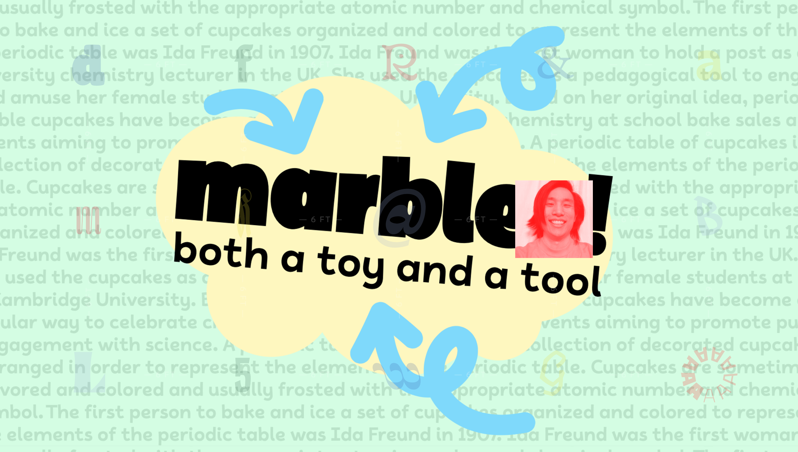
Marbles by Bert Zhang
Inspired by childhood homework assignments that felt more approachable when set in Comic Sans, Marbles brings levity to any subject taking itself too seriously. Off-kilter strokes create a lively texture while maintaining clarity even at small sizes. The heaviest weights squeeze counters into fun-sized morsels that gently swirl in the script letters. No matter how arcane the subject, Marbles renders it with the same grinning charm.
Metrical by Jess Smith
The Metrical family is packaged as an unconventional font pairing that is dynamic yet grounded. With a current choice of three styles, use them separately for something classic, or use them together for something unexpected. The Roman is a modest translation construction that alludes to the broad nibbed pen while keeping its composure. The Brush is expressive and doesn’t hold back on the hand’s natural tendencies. Whether applying this family to wedding invitation or a xeroxed rave flyer, the result is a unique mix of elegance and fun.
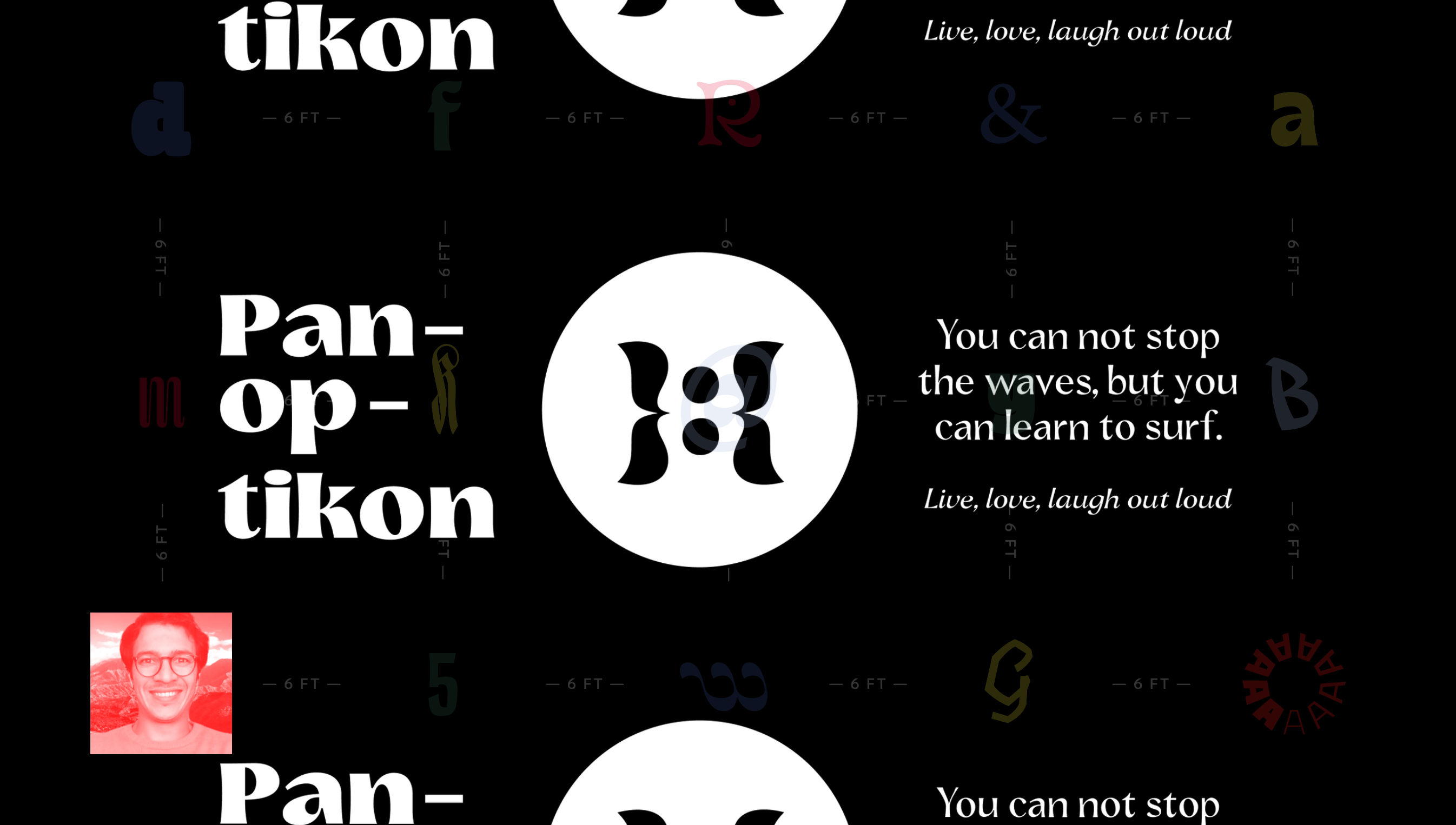
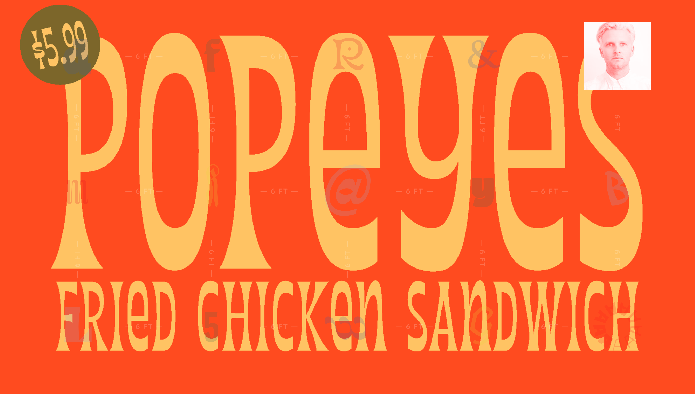
Panoptikon by Nurullah Gokdogan
Panoptikon is a sans serif display typeface that comes in 3 styles: bold, regular and italic. The typeface is high-contrast and fun to use for museum exhibitions. If you want a playful and authoritative display face, Panoptikon will satisfy your needs for the exhibition. Concave stems give it a dynamic form. Geometric sans serif fonts are everywhere and art needs some fun and playful headlines and descriptions.
Parlor by Nathan Goldman
Equally at home in your favorite childhood pizza parlor or an establishment with classier fare, Parlor pays homage to 1970s fast food culture, but beyond the surface its historical roots are in Victorian Era wood type specimens.
As for the construction of Parlor, one less expected attribute is its translation contrast, revealing a pen angle not as common among its peers. Parlor plays up some of its Victorian influences with its condensed display face and concave stems, while also leaning into its translation pen angle, like a more casual version of Lydian.
Sway by Emma Linh
Sway is a reverse-contrast typeface that’s shamelessly offbeat. Angular yet organic. East meets West. Smooth and edgy. There’s obvious tension, but what is a great story without a little conflict?
Zazie by Kristina Yuen
Zazie is an unconventional, angular italic typeface that playfully straddles the line. Chunky slab serifs are balanced by soft, slight curves with a bit of swing. Casual yet composed. Comfortable at both display and text sizes.
The Specimen Booklet
The 24-page Type West Class of 2020 booklet features specimen pages designed by each student to showcase their typeface.
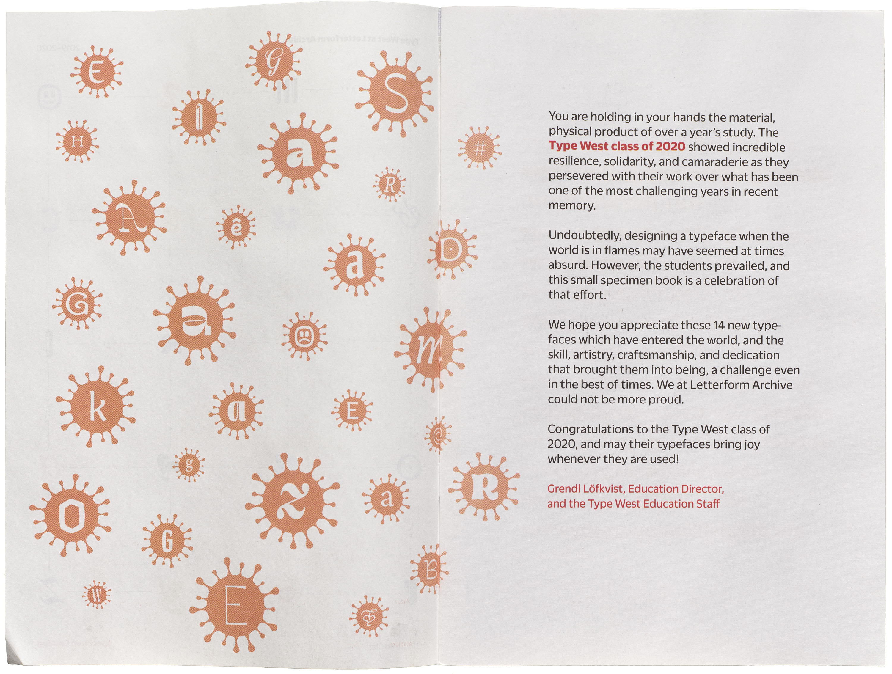


“The Type West Class of 2020 showed incredible resilience, solidarity, and camaraderie as they persevered with their work over what has been one of the most challenging years in recent memory. Undoubtedly, designing a typeface when the world is in flames may have seemed at times absurd. However, the students prevailed, and this collection of specimens is a celebration of that effort.
We hope you appreciate these new typefaces which have entered the world, and the artistry, craftsmanship, and dedication that brought them into being, a challenge even in the best of times. We at Letterform Archive could not be more proud. Congratulations to these talented designers, and may their typefaces bring joy whenever they are used!”
— Grendl Löfkvist, Education Director, and the Type West Education Staff
The Archive has a few extra copies of the Class of 2020 specimen booklet available to the public. It’s free — you just pay for shipping.