News
Type West Alumni Spotlight: 2024–2025
The Archive’s type design program turns 10 this year! Take a look at what a half-dozen recent grads created during their time here.
It’s hard to believe it’s been ten years since the inaugural class of TypeWest (then known as Type@Cooper West) welcomed its first type design students! In 2025, we graduated 24 talented individuals from our local cohort in San Francisco and 17 other cities worldwide. The website showcasing their final typeface projects is now live!
The Archive’s collection of more than 100,000 items of graphic design and typography supports Type West’s robust curriculum, with historical examples in over 100 scripts, psychedelic gig posters from 1967’s Summer of Love, the work of contemporary artists and designers, and much more.
Members of the worldwide Type West alumni community have gone on to build their own brands or release fonts through respected foundries, and quite a few have moved into educational roles to mentor the next wave of talent. Preparations are already underway to honor the past ten years of Type West with a gallery exhibition at Letterform Archive this coming fall, but we couldn’t resist this opportunity to share outstanding work by recent graduates of the program.

Brigitte La, USA, 2025 In-Person
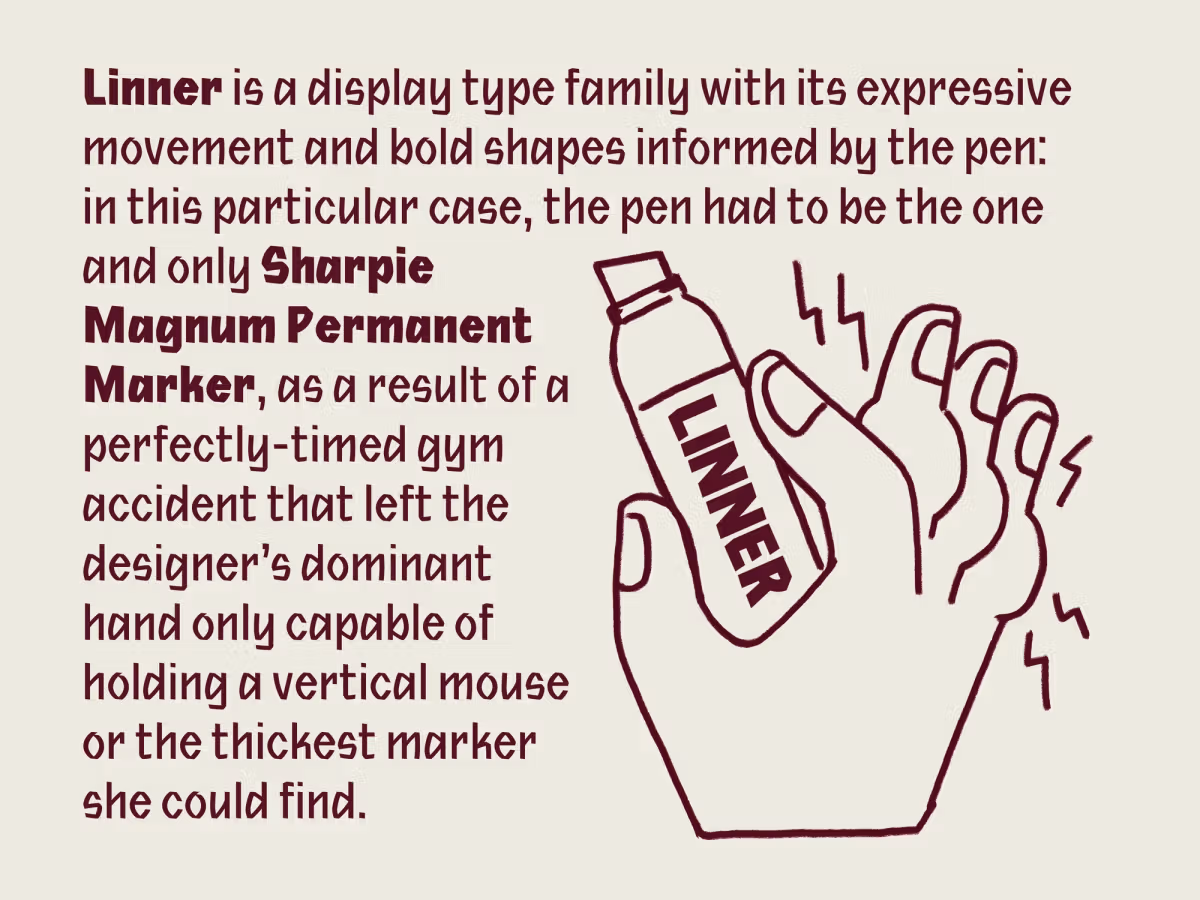
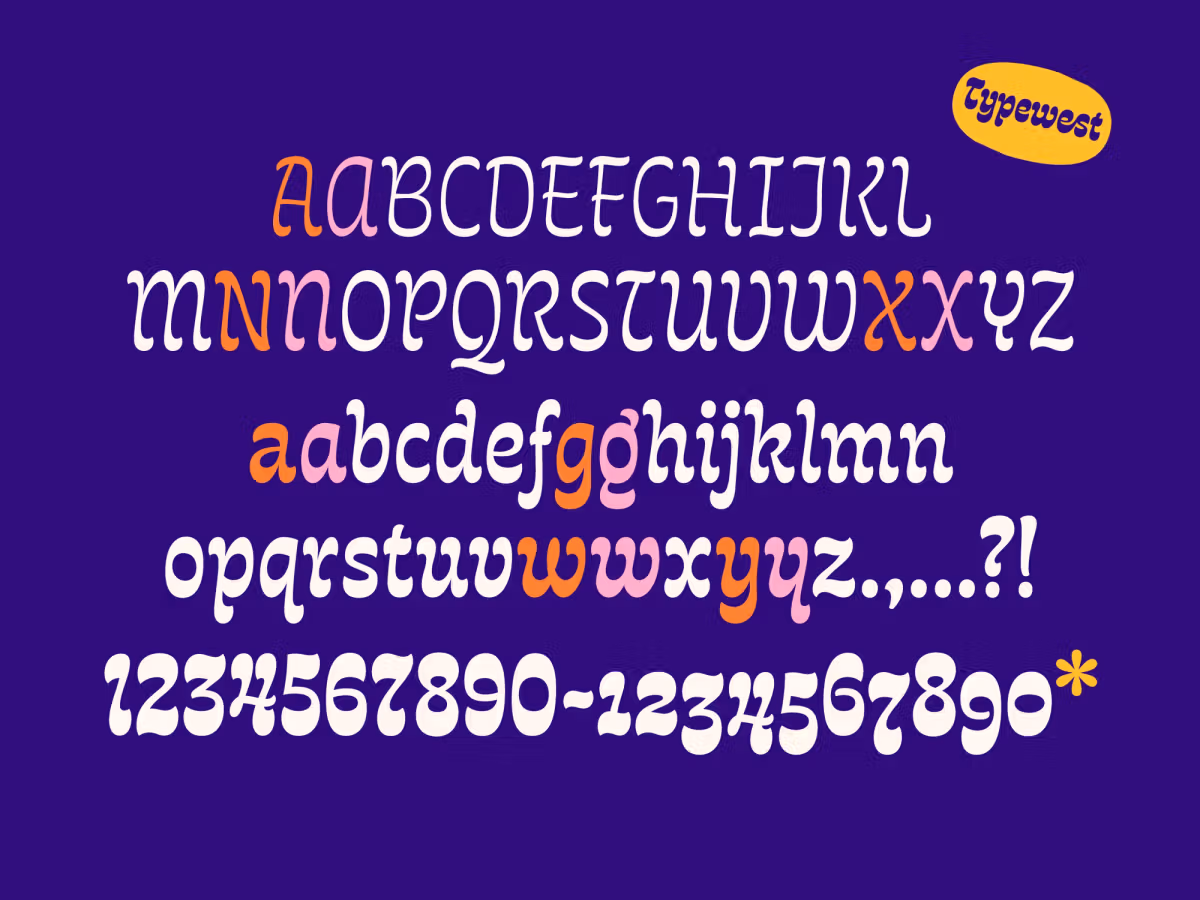
Brigitte La is a Vietnamese-American designer and illustrator who describes herself as fueled by cookies, cookbooks, and cartoons. She works on branding and packaging projects (and fights for first place in Mario Kart) with the team at Stout, a small-but-mighty San Francisco design studio. Her lively, colorful drawings can be found on packaging for a variety of edibles, hard seltzer, and restaurant branding. A native of Southern California, she spent plenty of time in the sun while receiving her BFA at Cal State University in Long Beach. Her typeface Linner boasts a tall x-height, angled terminals, and a bit of handmade flair. Its characters are informed by the bold strokes of the Sharpie Magnum Permanent Marker, with a nod to traditional calligraphy.
I came to Type West mainly to build my confidence in working with type. I left with much more: diving into the depths of type history and seeing so many typographic artifacts in person, getting our hands dirty in workshops where we carved stone, building sketching into our process, and absorbing all we could in guest lectures on diacritics, font production, and beyond.

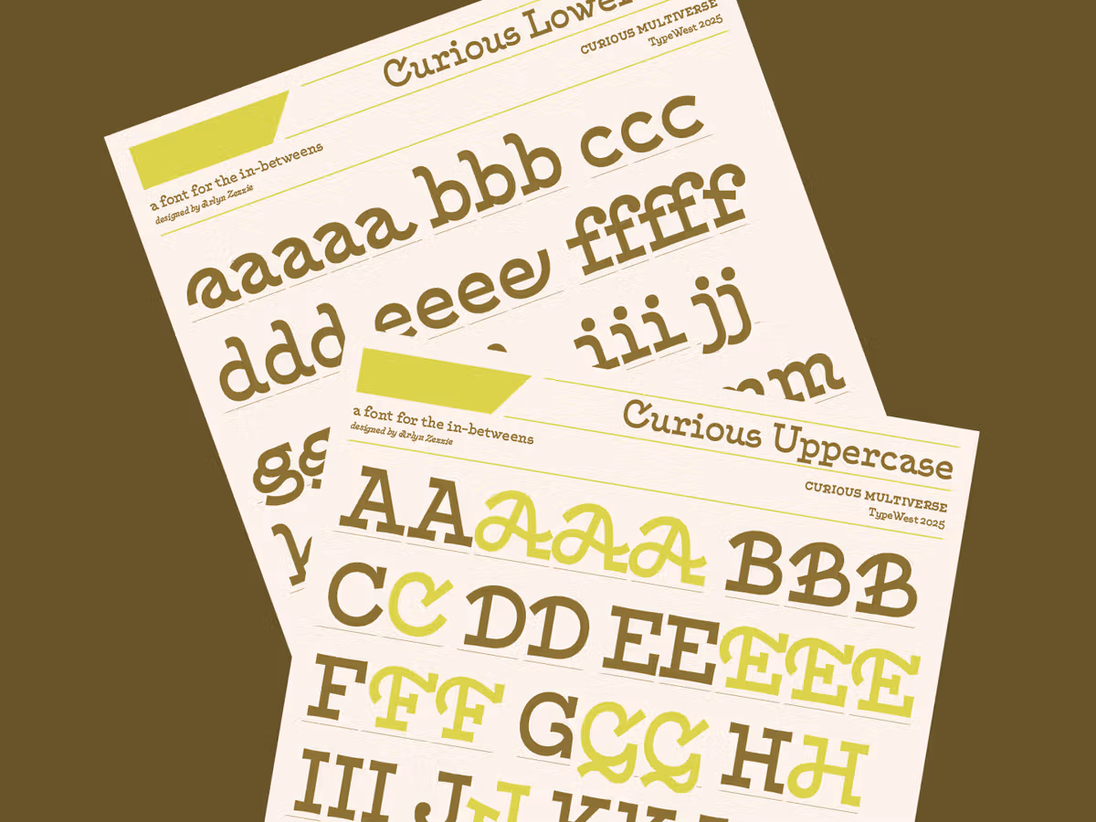
Arlyn Zezzie, USA, 2025 Online
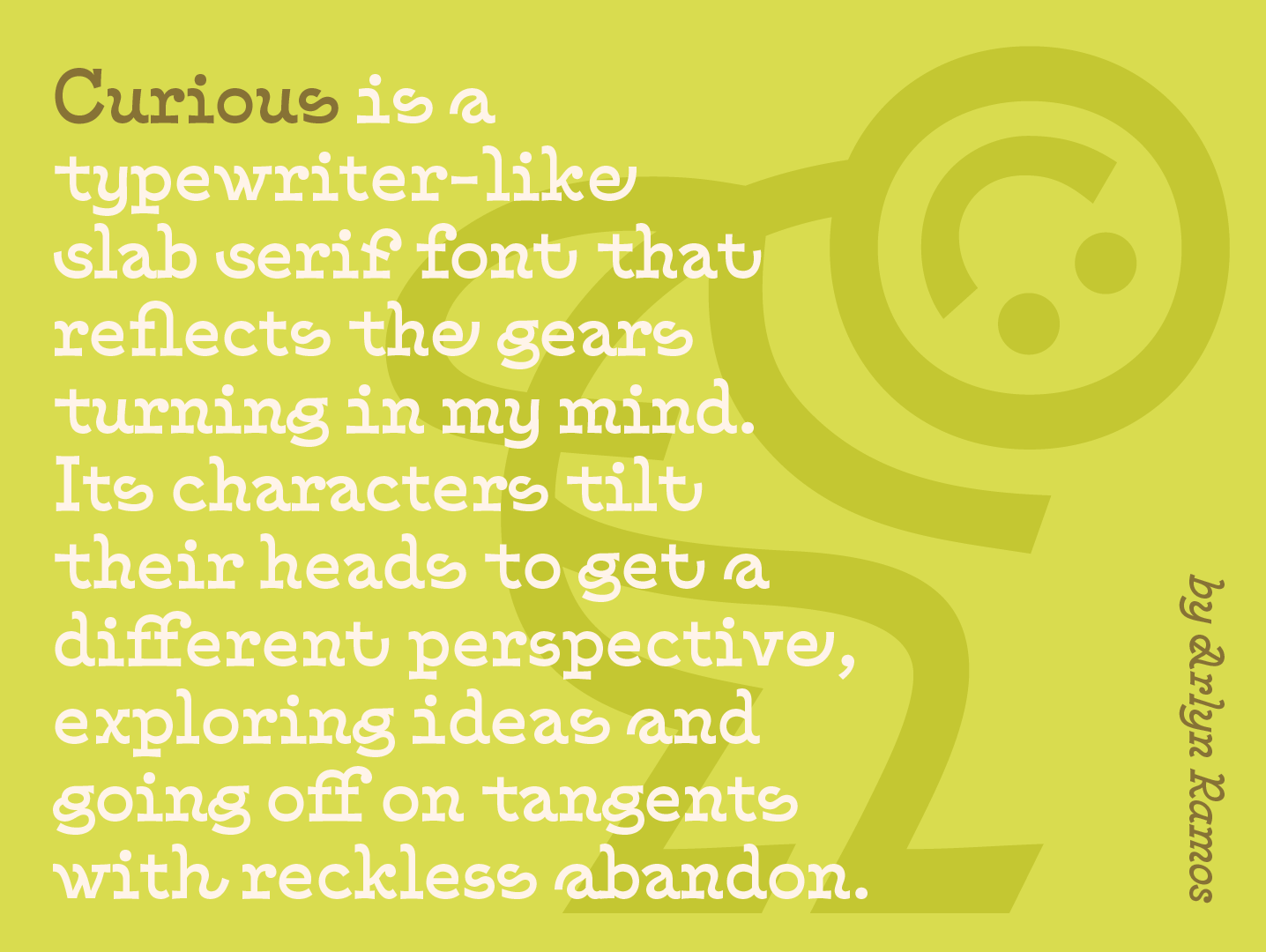
Arlyn Zezzie is a multidisciplinary Ilokano Fil-Am (Filipina-American) designer living in Hawaii who brings strategic thinking, unhinged curiosity, and systems-conscious typographic craft to everything she does. She’s especially energized by exploring roots and authenticity while embracing contemporary form. Arlyn works best in the in-betweens—where worlds overlap, where tradition and experimentation collide—and translates these insights into slightly off-kilter custom type and brand identity systems. Her project, Curious, was designed with all of this in mind: it’s a text face that loves to veer off-script as display as well as a slab-serif flaunting scripty influences.
One of my biggest Type West takeaways was the “permission to be curiouser”—to push boundaries and to lean in to the “what if”s. I feel an immense appreciation for the whole village that shaped us—my fellow classmates, the TAs, the instructors, staff, and guest lecturers and instructors.”

Chris Willmore, USA, 2024 In-Person
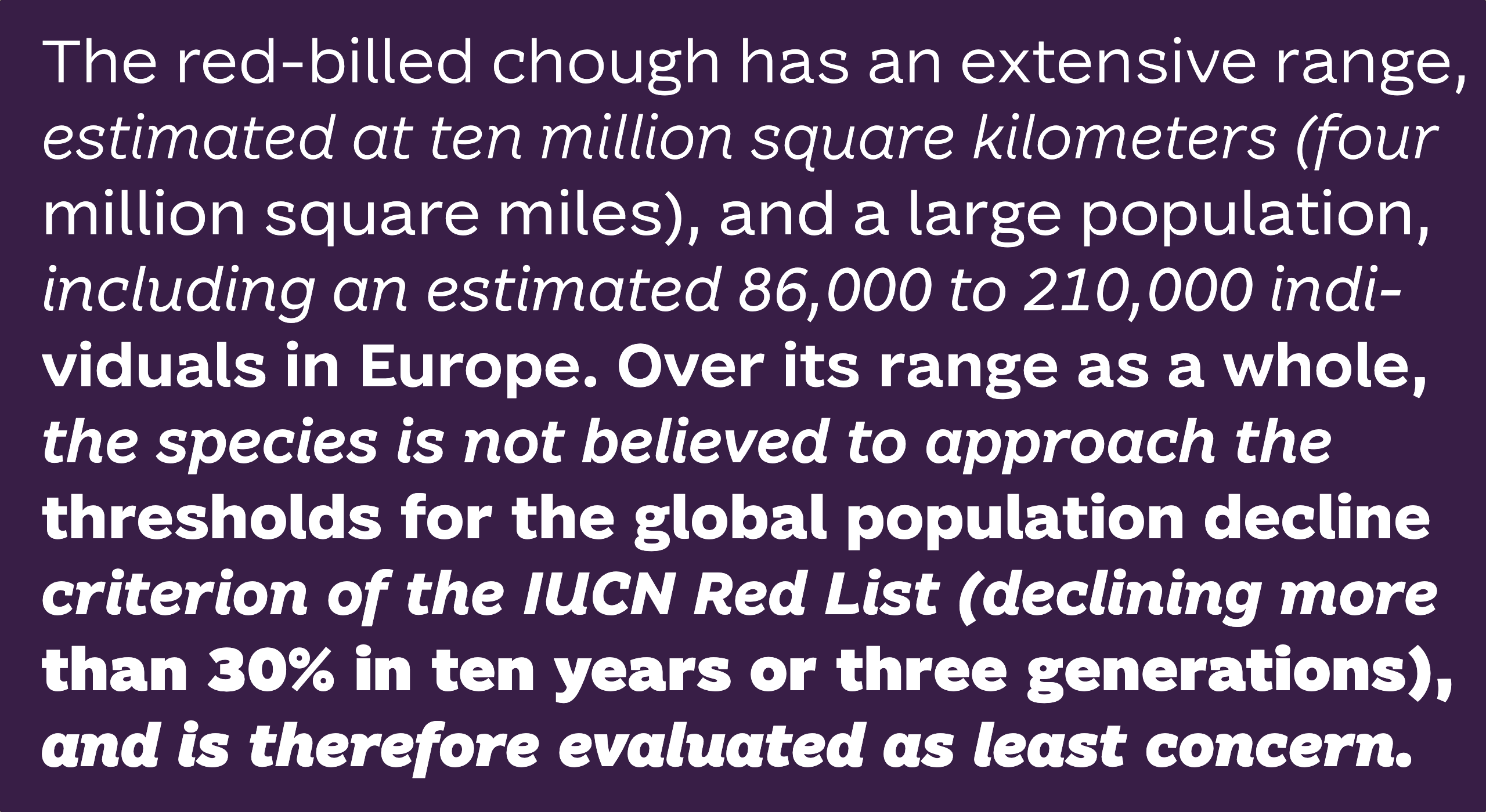
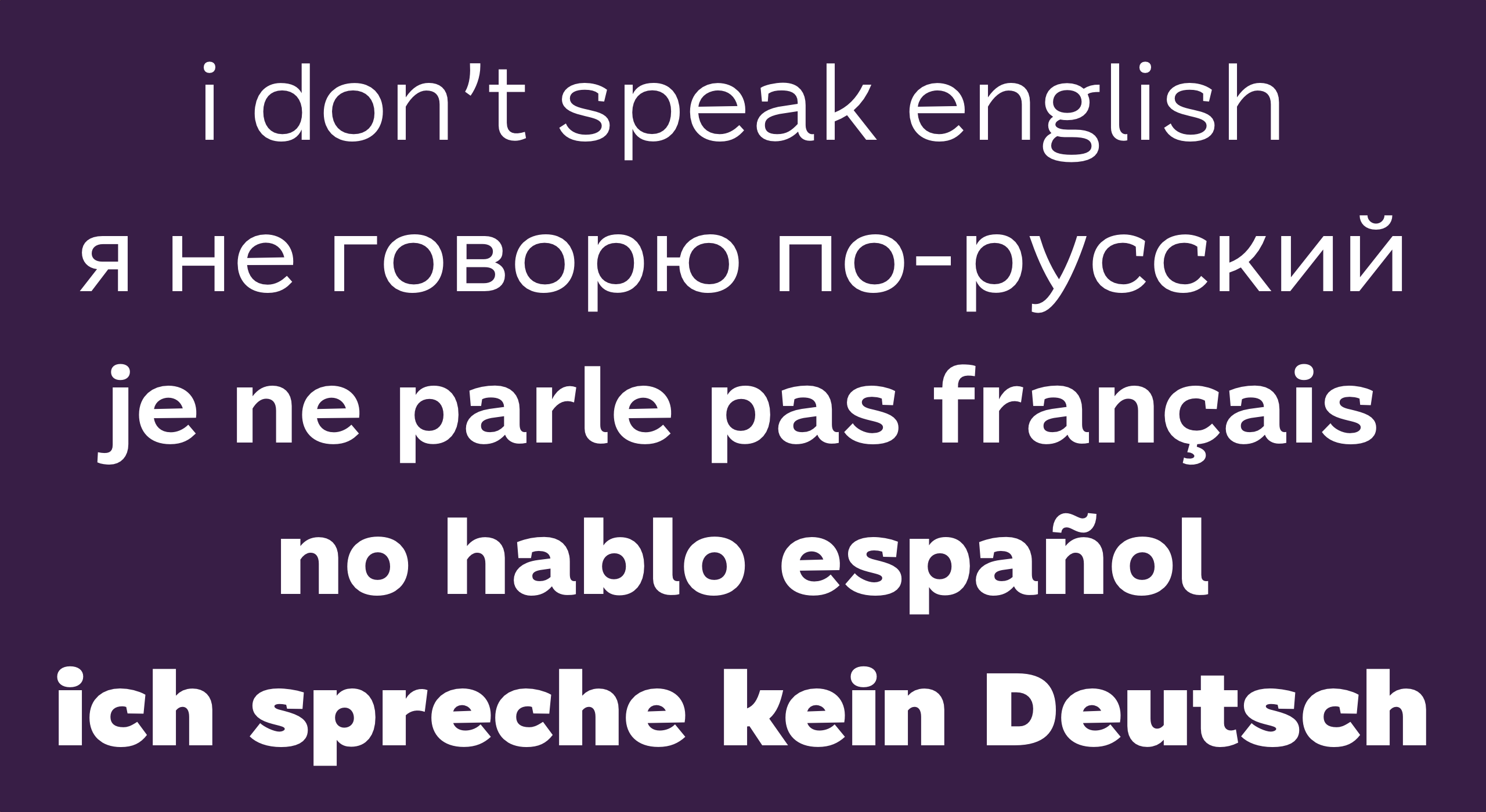
Software engineer and DJ Chris Willmore (Treedub) discovered his passion for drawing letters after taking ILT Academy’s “Introduction to Latin Type Design” course in 2022. He started his Fontober challenge, drawing an alphabet every day during the month of October, in 2023, before joining Type West in 2024. He went on to serve as the design TA for Type West’s 2025 in-person cohort His 2024 project, Chough (pronounced “chuff”), is a highly legible sans serif typeface with a high x-height and a playful personality. The family features a full complement of weights from light to black; a true italic; stylistic alternates for simplified forms of a, g, and y; and Cyrillic and extended Latin support.
More than anything else, I loved being in the room with a bunch of other font nerds, people who care the same way I do about how letters look. I was inspired by seeing how everyone’s projects evolved from week to week, and how we shaved off the rough edges of our designs while maintaining a sense of personality and playfulness.
Flora de Carvalho, Brazil, 2025 Online
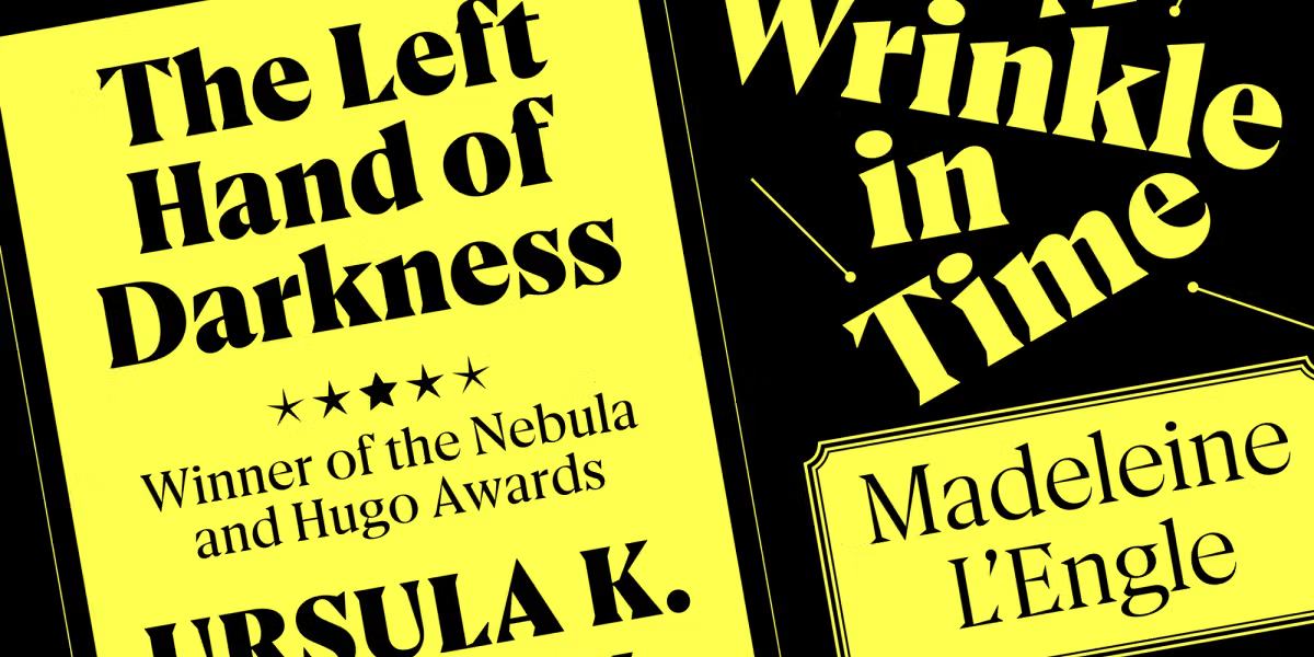
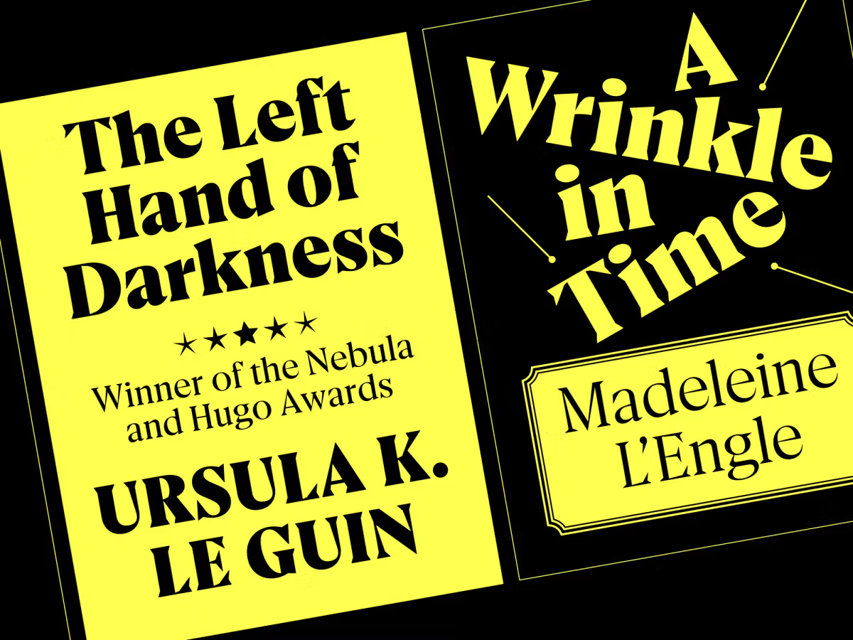
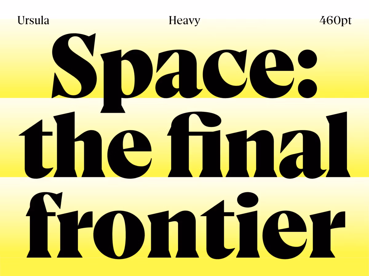
Flora de Carvalho, a recipient of the prestigious Malee Scholarship 2025 from Sharp Type, has been working with graphic design and typography for 15 years—no surprise, since their mother is also a graphic designer. Their first type family, Vinila, was published by Plau in 2019, and since then they have independently developed original projects and custom fonts for Brazilian companies. In 2021, they founded Recorte magazine, where they serve as coordinator, editor, and designer. Ursula was inspired by science fiction book covers from the photocomposition era. The typeface was named after author Ursula K. Le Guin, specifically her 1969 book The Left Hand of Darkness, a pioneering queer novel set on a planet where the inhabitants have no fixed sex or gender identities. The concept of fluidity is reflected in the typeface through its combination of softness and sharpness, which becomes more apparent in the bolder styles, as well as in its distribution of weight – while letters like ‘o’ have a strong vertical axis, others like ‘e’ and ‘c’ follow a steeper angle.
Before Type West, I had been designing letters for 12 years. I had many half-baked typefaces, but it felt like I was walking in circles, never finishing anything. With guidance from the instructors I was finally able to trust my craft and deliver projects that felt complete, concise, and consistent. The learning environment was full of challenges, but also love and support.
Edgar Capula, Mexico, 2025 Online
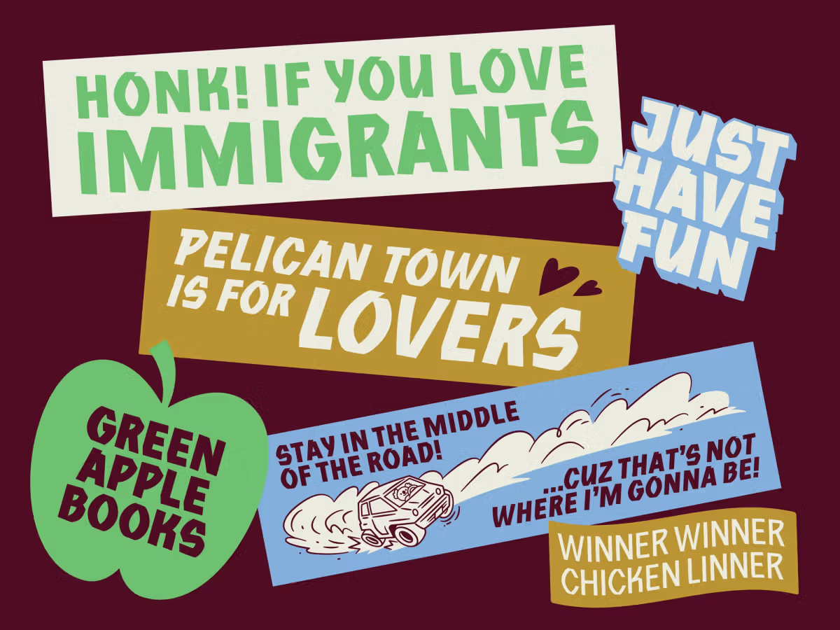
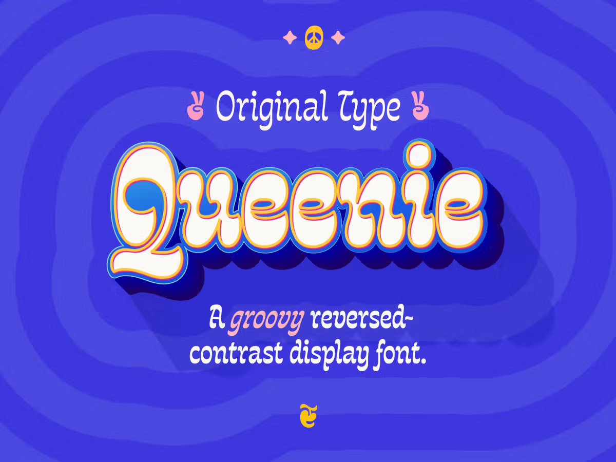
Based in Mexico City, Edgar released his first type family, Cosmos Deco, in 2024 through the Argentine foundry Sudtipos. His work received a Silver Mention at the 2023 a! Diseño Awards in Mexico. Edgar also plans to release his Type West typefaces, Agustina and Queenie, through Sudtipos. Queenie is a playful, variable, display type family inspired by the spirit of the psychedelic era’s posters and lettering, and the designer’s love for ’60s and ’70s music, especially The Beatles. The soul of the typeface lies in its reversed contrast and fluid letterforms with a groovy, funky rhythm. Its bold curves carry the personality of the letters; there are no straight strokes in this typeface.
As an international student, I feel very fortunate to have met people from so many different countries and to have learned a little from each of them, expanding my perspective and the way I relate to others. Type West helped me blur the barrier between student and professional, and now I feel more a part of the type community, with the confidence to call myself a type designer.

Burçin Canbay, Turkey, 2025 Online
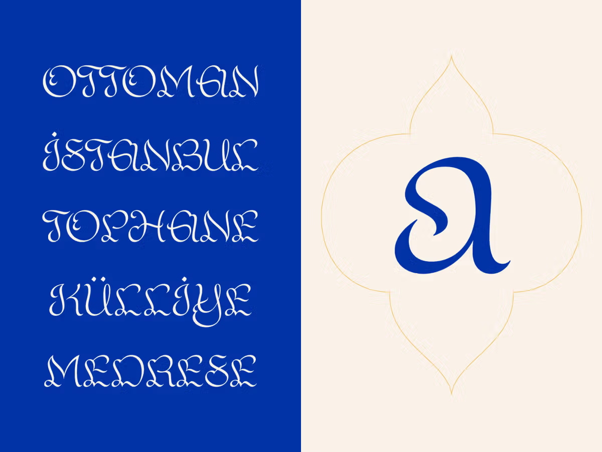
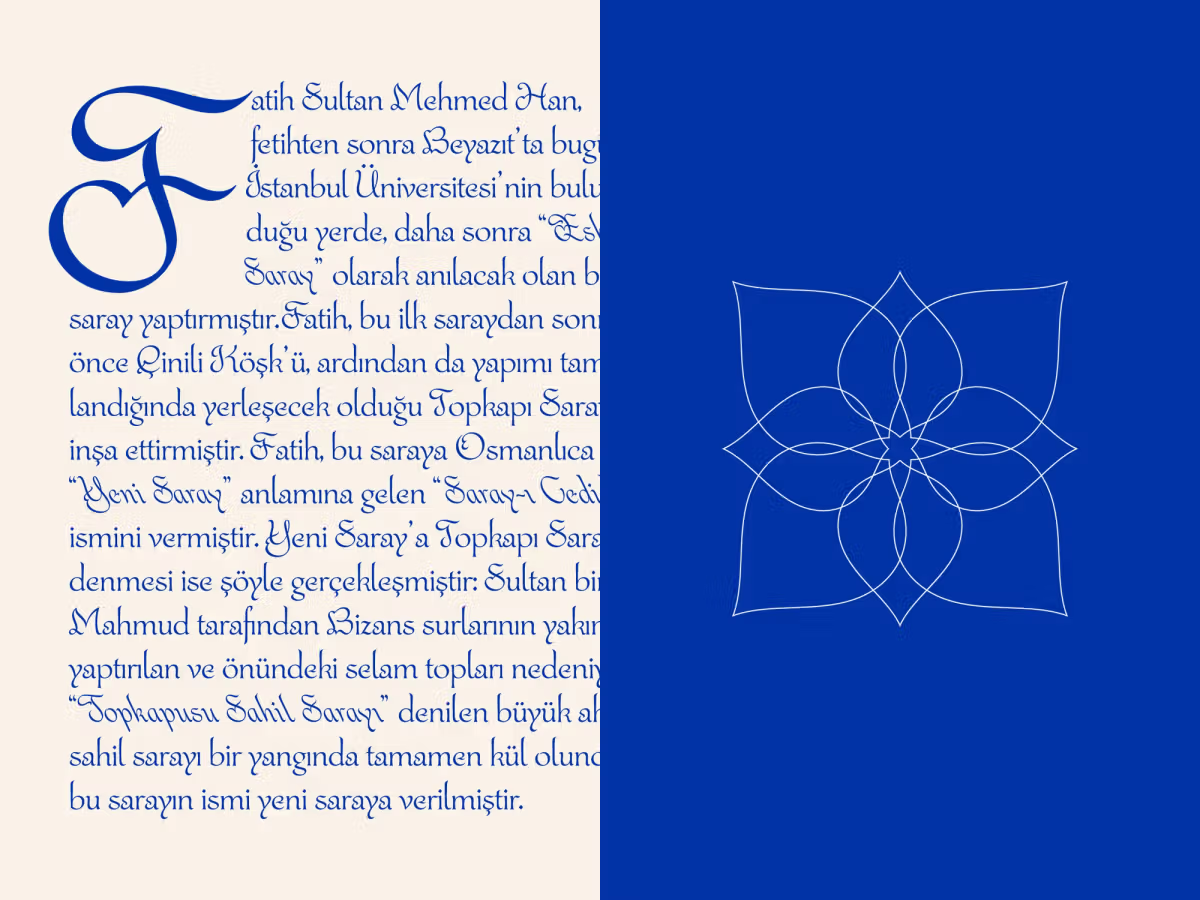
For Istanbul’s Burçin Canbay, what began as a love for lettering soon evolved into crafting complete typefaces. Her typeface Topkapi is inspired by the movement and visual logic of Islamic calligraphy. It features diagonal stress and vertical emphasis, gracefully expressed through tall ascenders and descenders. Flowing curves and generous terminals reflect the ornamental visual language of Topkapı Palace in her home city.
Type West was a transformative experience for me, training my eye to see letters more critically and intentionally, and teaching me how to evaluate proportion, rhythm, and spacing with clarity. Learning directly from designers I admire was incredibly valuable, and gave me the confidence to approach type design as both a historical discipline and a contemporary practice.
Applications for Type West 2027 open in September. Join the mailing list for the latest news!