News
Jennifer Morla on Drawing Ideas from the Eames, Sol LeWitt, and More
The Author of Morla : Design treats us to her best-loved inspiration sources — and shares how far-ranging influences make it into her work.
The stories behind these projects — and 150 more — can be found in Morla : Design, Letterform Archive Publication No. 2, available for a limited time on Kickstarter.
In the era of Pinterest, it’s clear that inspiration is king. But how do you take the raw stuff — the art you see in a museum, or clips of a film — and incorporate its lessons into your design practice in a way that feels fresh and useful?
In Letterform Archive’s second publication, Morla : Design, Jennifer Morla shares with us some of her biggest sources of inspiration — and offers a peek at how she’s used their teachings to stock her own design tool kit. “Of course, when you do client work, you’re always looking for the appropriate solution”, Morla shares. “But these are some projects in which I was able to harness my favorite influences and put them to new use in the service of a great brand or product.”
Sol LeWitt and the Art of Process
“In my first two years of college [at Hartford Art School in Connecticut], we exclusively studied conceptual art”, Morla says. “We weren’t allowed to pick up a pencil and draw — instead, we had to argue and defend concepts.” It was fittingly at Hartford that Morla first encountered the work of Sol LeWitt, an American artist who famously used systematic, guideline-driven approaches to creating art.
The LeWitt piece that first caught Morla’s eye was a canvas that the artist had marked in the center and then, with his eyes closed, tossed a pen at a million times. The goal was ostensibly to hit the bull’s-eye, but the final result was a ring of “misses” all around it. “It taught me that process can create beauty — that process can become part of the design solution”, Morla says.
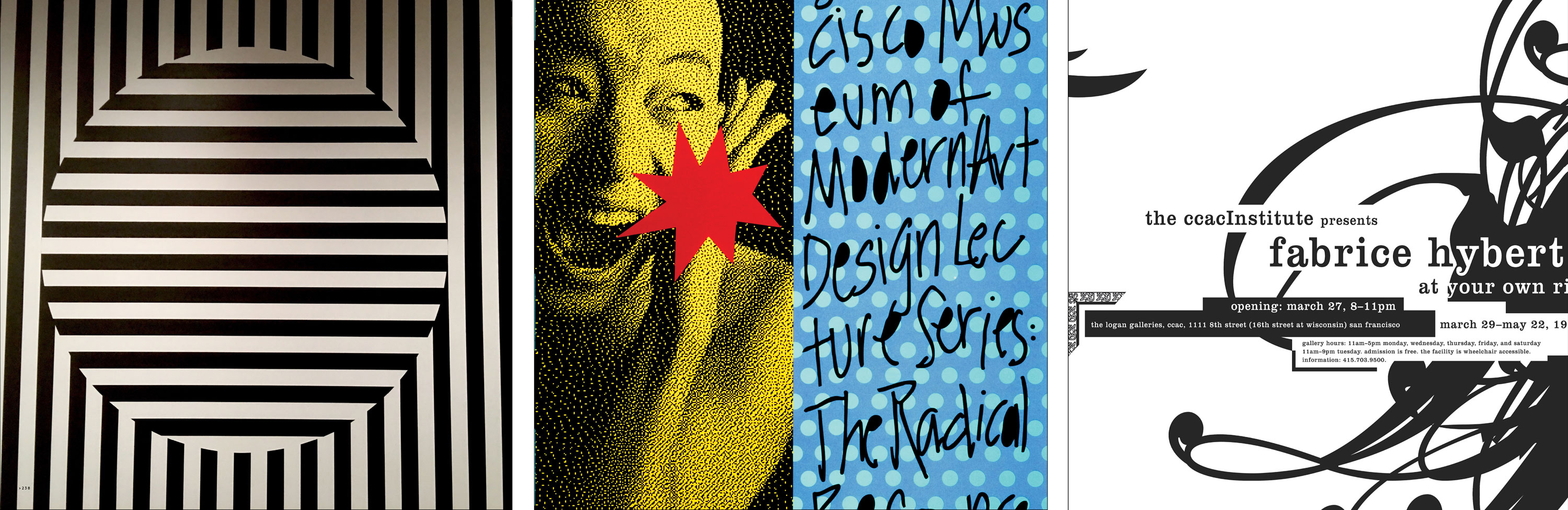
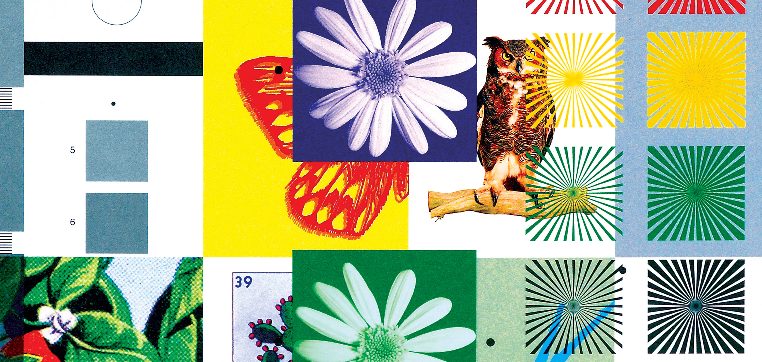
You can see an openness to process — and its inherent accidents — in Morla’s 1991 poster for SFMOMA’s lecture series entitled the Radical Response. When scanning an image of a model mid-scream, the digital render came out strangely pixelated instead of even in tone. “Surprisingly, I prefered the rawness of the pixels”, Morla says. “This ‘mistake’ not only added a textured interest, but it communicated something even more relevant to the series’ content: It pictured the radical digital future itself.” These accidents, Morla holds, are not mere byproducts of the work. Instead, they can be major forces in shaping and sharing the work’s message.
LeWitt is also renown for artworks that explore repetition, presenting simple lines and shapes in near infinite variations. “The recurrence of identical forms in his white-cube installations and the perfect geometry of his massive wall drawings — all these elements have found their way into my design vocabulary”, Morla says. In her poster for CCAC Institute’s 1999 Fabrice Hybert exhibition, for example, Morla repeated an F over and over again, layering the character into an inky mass with a few recognizable flourishes. “The thing in and of itself often doesn’t feel like much, but when you use it a number of times, it creates a bigger impact”, Morla says. Put simply, multiples work.
The Eames and Innovation — Plus Humor
One of Morla’s fondest childhood memories is visiting the IBM Pavilion at the 1964 World’s Fair, where she first encountered the work of Charles and Ray Eames. “It just blew me away”, she remembers. “Not only did you have projectors and images all around, you were on phones and pushing buttons and all sorts of stuff. The Eames always created immersive environments. They were a multidisciplinary workshop. That’s a key part of my process today — whether it’s a book or a website or a retail space.”
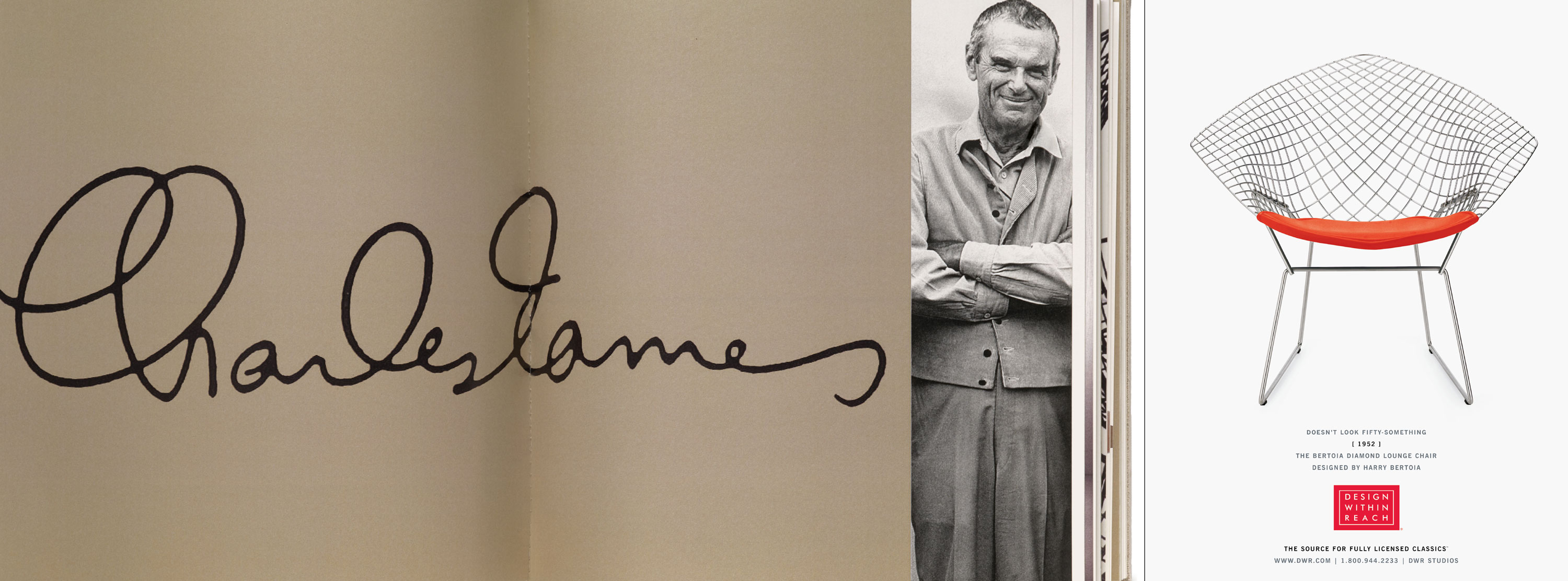
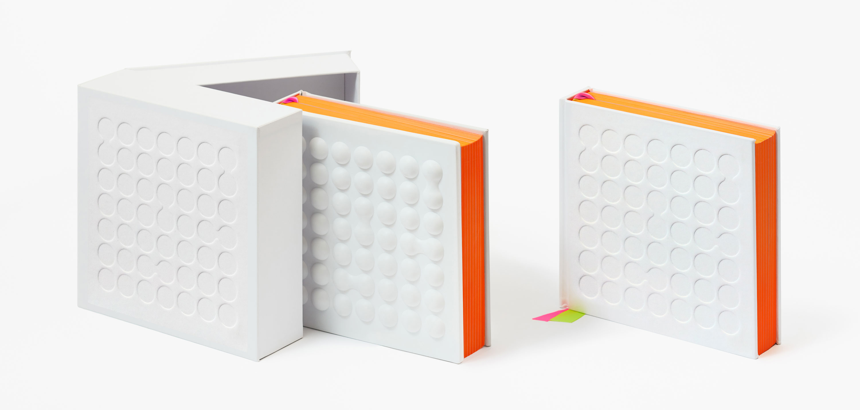
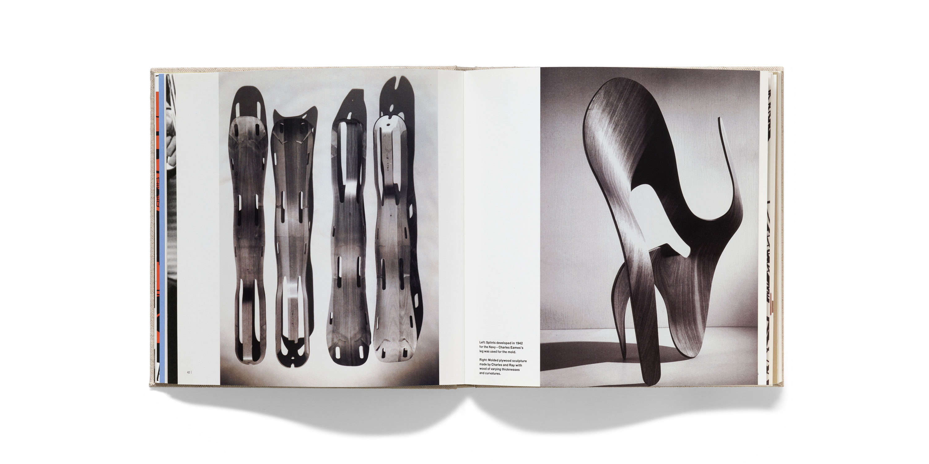
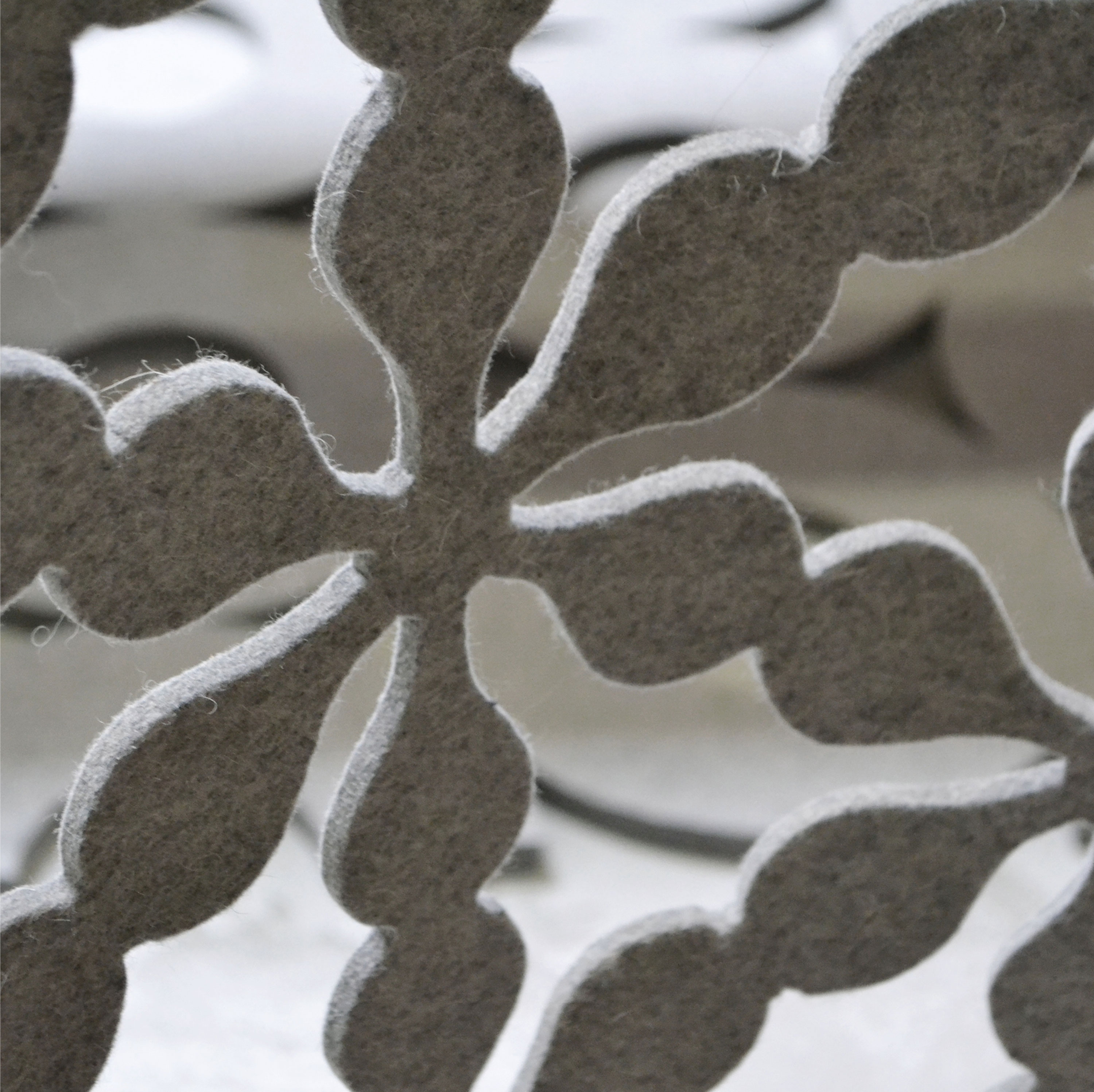
Morla shares the Eames’s inventive bent, too: “Charles was hired by the military to design a new leg splint, and that’s how he learned to mold wood, leading to his famous molded plywood chair”, Morla explains. “For each piece they did for Herman Miller, they spent years prototyping in their office. They had die casting, aluminum casting, everything, right on site to make sure that the job was perfect.” A similar enthusiasm for innovation pops up in Morla’s vacuum-formed covers — first for Clorox’s 100th anniversary book, then Morla : Design itself — and in her industrial felt textile creations for San Francisco’s Workshop Residence, one of which is a web of interlocking asterisks (set in Eames Century Modern, no less).
A final lesson that Morla absorbed from the midcentury-modern duo? Humor helps. “Their work wasn’t afraid to be charming and playful”, she says. This spirit is on full view in the animated holiday card Morla did for the Cooper Hewitt Design Museum, as well as a cover for Hemispheres magazine and timeless yet droll creative direction for Design Within Reach.


Peter Brook and the Power of Scale
Of all Morla’s influences, opera may seem the least likely to manifest itself in her design work. But for Morla, two wildly different stagings by British dynamo director Peter Brook taught her the power of scale. The first was 1983’s La Tragedie de Carmen. “Both the cast and orchestra performed right on stage, and the sparse set was covered with gravel and dirt, concealing the source of pyrotechnic flames that shot up mystically throughout the performance”, Morla remembers. “The proximity of the cast and orchestra to the audience, combined with Brook’s sublime, minimalist staging, brought Bizet’s tragedy to life and inspired new ways of thinking about my environmental projects.”
Conversely, Morla’s second exposure to Brook’s work was a lesson in maximalism. A nine-hour production (thankfully interrupted by a dinner break), Mahabharata featured “luscious colors, intricate sets, and performers laden in jewels”, she says. It was larger than life. “My lesson learned: Magnifying extremes, thereby heightening the experience, creates a memorable impression.” You can see massive scale at work in Morla’s retail design for brands like Levi’s, in which she blew up photographs to cover entire walls.
John Baldessari and the Importance of Surprise
Morla constantly seeks to surprise in her work — to subvert the viewer’s expectations in order to give the message impact and make it more memorable. She’s drawn to the photo collages of contemporary artist John Baldessari: “Baldessari uses dots to create tension in a narrative he composes from found photography”, Morla explains. “In the cover for New Langton Arts catalog, I borrowed the dot as a graphic overlay, and used it as a wayfinding device on the interior to communicate New Langton’s radical approach to ‘multidisciplinary programming’.”
But when it comes to surprising the viewer, it’s hard to outdo the work of land artist Christo, who regularly disrupts the landscape by draping it in fabric, or Walter de Maria, whose Lightning Field — an installation of 100 lightning rods in New Mexico — makes for a transformative vista. “With all of these artists, there’s an element of surprise — of ‘This wasn’t what I expected’”, Morla shares. “I like design to do that, but for real clients and real projects.” An example is her work for the New York Times magazine’s “The Shock of the Familiar” issue, in which she disarms viewers with a simple tactic: flipping the magazine’s masthead on the cover.
You can read more about Morla : Design on our Kickstarter page, which recently reached its funding goal. Thank you to the many backers of this incredible project.